


| Color Name | Eider White SW 7014 |
| Brand | Sherwin-Williams |
| LRV | 73, light, off-white range |
| Undertones | Gray base; violet-pink shift in cool or north-facing light |
| Best For | South- and west-facing rooms, bedrooms, and living rooms with warm wood or beige finishes |
| Avoid In | North-facing rooms with cool flooring, dark rooms under poor artificial lighting, bathrooms with cool-white tile |
Eider White SW 7014 is not the soft, safe off-white it appears to be on the chip. In a north-facing room with gray flooring, it reads as a pale lavender-gray.
In a south-facing space with warm wood, it looks exactly like what you wanted: a quiet, grounded white that doesn’t fight the room.
The difference is enough to make or break the project, which is why this color rewards people who test it and trips up everyone who doesn’t.
Here is what Eider White Sherwin-Williams actually looks like room by room, what lighting does to it, when it works, and the one situation where you should walk away from it.
Eider White Undertones: What Makes This Color Complicated
Light is one of the biggest reasons Eider White can look different from room to room. In natural light, it may read soft white, pale gray, or slightly greige. Under artificial light, the bulbs can pull out undertones that were less noticeable during the day.
Natural Light
Natural light has the greatest impact on how Eider White reads, so test it on multiple walls before buying paint.
- North-facing natural light: Gets cooler, muted light throughout the day. Eider White may look grayer and less white here. Violet or pink undertones can show more clearly, especially near cool gray floors or tile. Low daylight may make the color feel flat or shadowed, so warm wood, beige decor, warm bulbs, and layered lighting can help balance it.
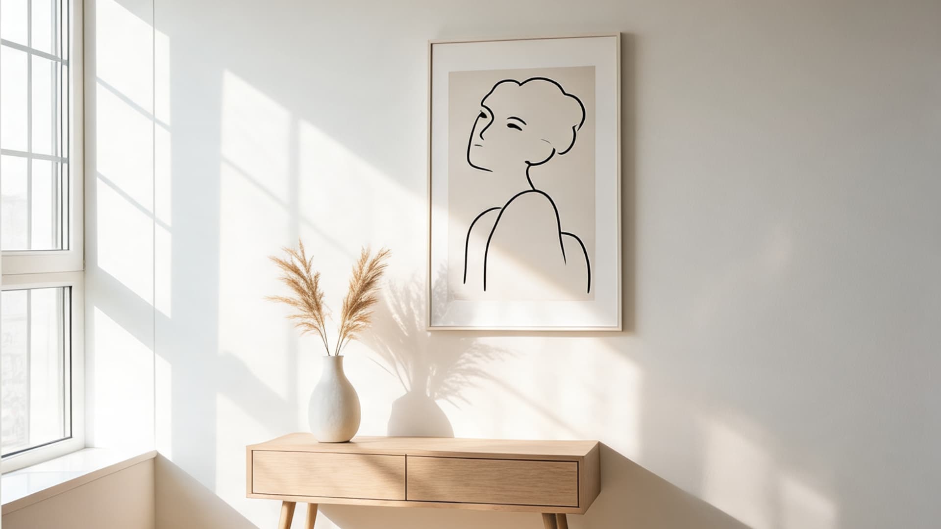
- South-facing natural light: Gets warmer, brighter light for much of the day. Eider White usually looks softer and more balanced here. The gray undertone feels less strong, and the color can read as a gentle white rather than a pale gray. This is often one of the best settings for Eider White if you want a light look without a stark white finish.
- East-facing natural light: Gets bright morning light and softer afternoon light. Eider White may look fresher and lighter early in the day, especially with direct morning sun. Later, it can look more muted or gray as shadows increase. Check the sample in both the morning and evening before deciding.
- West-facing natural light: Looks cooler earlier and warmer later in the day. Eider White may look grayer in the morning, then warmer or slightly greige in afternoon light. Evening sun can soften the gray undertone. It works well with wood, brass, beige, taupe, and linen, but test it on shaded and sunlit walls first.
Tip: Test Eider White on at least two walls before buying paint. A wall with direct light may look soft and bright, while a shaded wall in the same room can look cooler or more gray.
Artificial Light
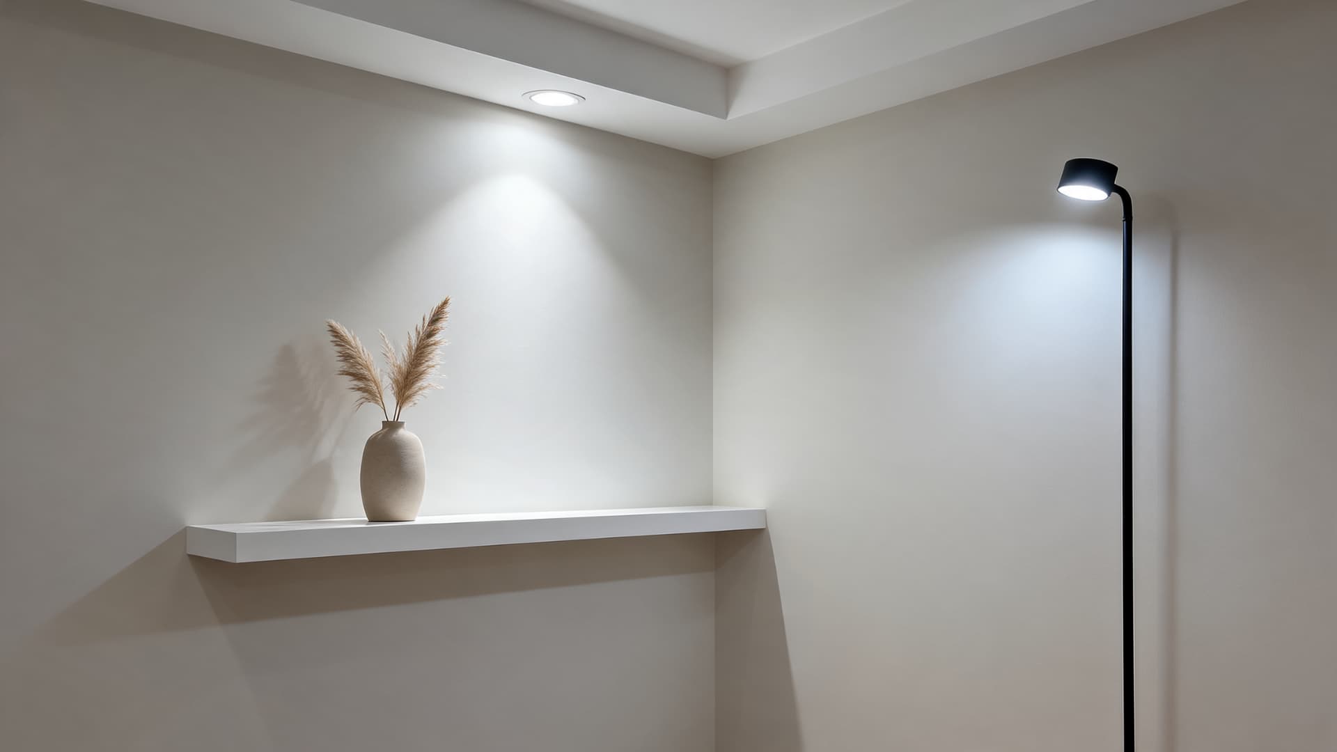
Artificial light can change how Eider White looks after sunset. Warm bulbs may make it feel softer, but they can also bring out pink or beige hints. Cool LED bulbs can make the gray undertone more pronounced, which may make the color look sharper or colder. If the room has poor lighting, Eider White may look dull, flat, or shadowed instead of bright and relaxed.
|
Artificial Light Type |
How Eider White May Look |
|
Warm white bulbs |
Softer, warmer, possibly slightly pink-beige |
|
Cool white bulbs |
Grayer, cooler, sharper |
|
Daylight bulbs |
Brighter but may expose undertones |
|
Low lighting |
Duller, flatter, more shadowed |
|
Layered lighting |
More balanced and natural |
The best way to judge Eider White is to test it at night with the bulbs you actually use. This matters most in bathrooms, kitchens, hallways, and laundry rooms because those spaces often rely more on artificial light than natural daylight.
Is Eider White Warm or Cool?
This question comes up constantly and the honest answer is: it depends on the room. Technically, Eider White’s RGB values (226/222/216) and its violet-gray undertone put it slightly on the cool side of neutral.
But it behaves as a warm color in warm environments and a cool color in cool ones.
That makes it different from a reliably warm off-white like Sherwin-Williams Creamy SW 7012, which holds its warmth regardless of light direction.
Eider White is more reactive. It borrows from its surroundings. That quality is useful in a well-considered room and difficult in one that hasn’t been thought through.
Best Finishes for Eider White
The finish you choose affects how Eider White looks and performs. Higher-sheen finishes reflect more light, so the color can look brighter and sharper. Lower-sheen finishes absorb more light, giving Eider White a softer and more muted look.
Flat or matte finishes work best for ceilings, adult bedrooms, and low-traffic rooms because they bring out Eider White its softest look and help hide minor wall flaws.
Eggshell is the most practical choice for most walls, including living rooms, bedrooms, dining rooms, and hallways, since it has a slight sheen and keeps the undertones soft.
Satin works better in kitchens, bathrooms, laundry rooms, mudrooms, and high-use areas because it is easier to wipe clean and can make Eider White look slightly brighter.
Semi-gloss is best for trim, doors, cabinets, and built-ins, but it may make gray or violet-pink undertones more noticeable.
Choose the finish based on the room’s use. Walls, ceilings, trim, cabinets, and high-traffic spaces all need different levels of durability and cleanability.
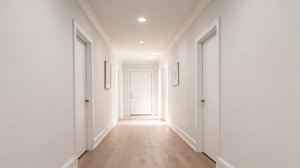
How Eider White Looks Room by Room
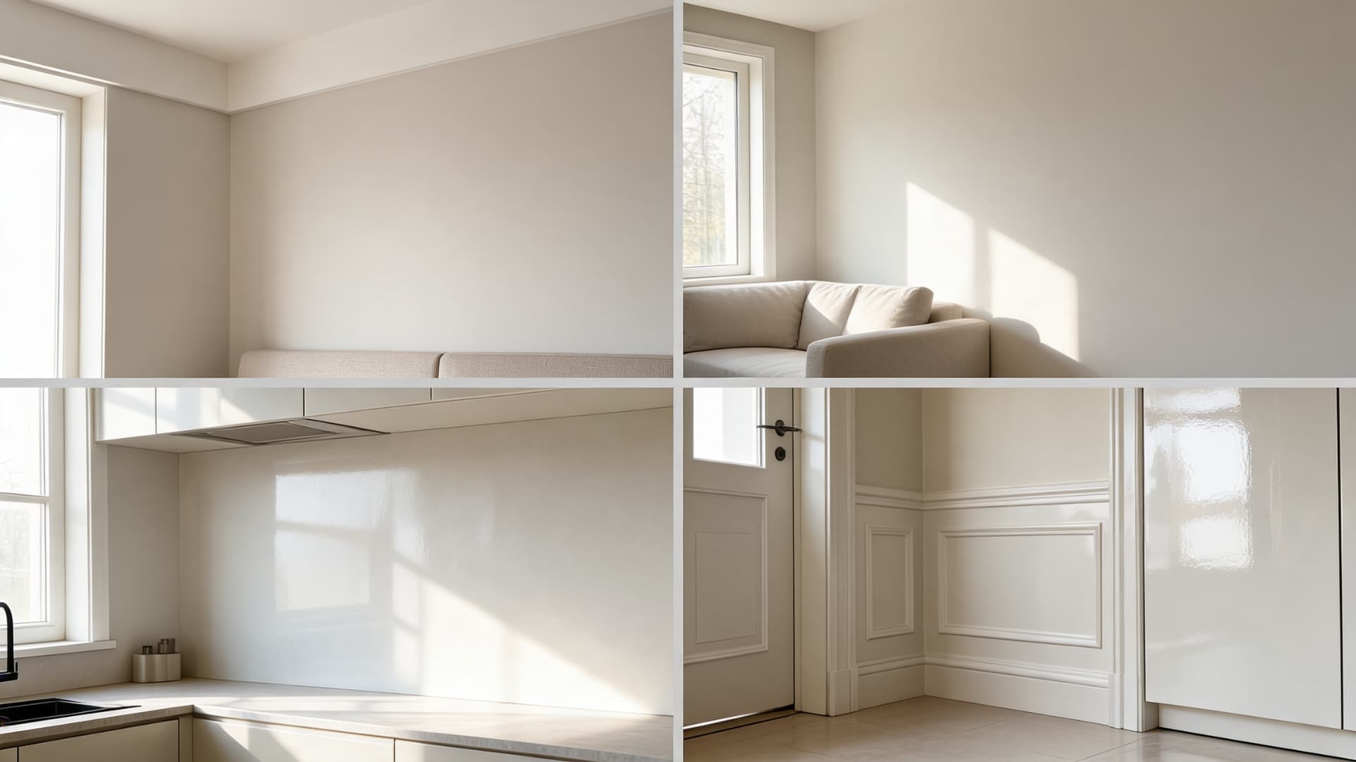
Eider White can work in many rooms, but it is not a one-size-fits-all white. Because it has a gray undertone, the color reacts strongly to surrounding fixed finishes. Flooring, trim, tile, countertops, cabinets, rugs, and large furniture pieces can all change how Eider White reads.
1. Living Rooms
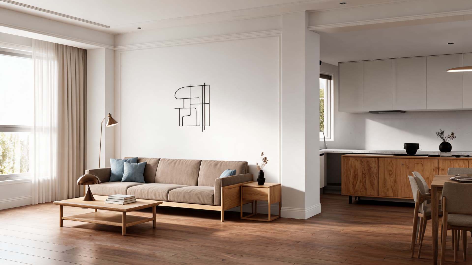
Eider White works well as a soft neutral wall color in living rooms, especially when bright white feels too sharp. It gives the walls a calm, quiet look without making the room feel plain. Because it has more depth than a crisp white, it can help a living room feel softer and more finished.
This color pairs well with beige, taupe, warm gray, muted blue, black, brown, leather, rattan, and natural wood. If your living room has warm wood floors or beige upholstery, Eider White can feel balanced and easy to live with. If the room has cool gray flooring or many silver-toned finishes, the paint may look grayer.
In open-concept spaces, test Eider White near trim, flooring, and nearby kitchen finishes. A color that looks soft in the sitting area may look cooler beside a backsplash, countertop, or cabinet color.
2. Bedrooms
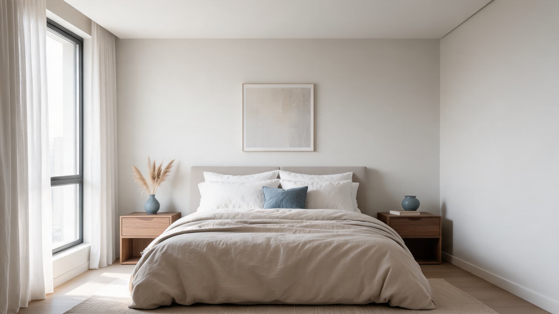
Eider White can create a calm, restful bedroom feel because it is soft without being too creamy. It works well when you want a light wall color that still has a little depth. In bedrooms, it can make the space feel relaxed, especially when paired with linen bedding, warm wood furniture, soft whites, muted blues, and layered neutrals.
Dark bedrooms are the exception. If the room has one small window and most light comes from overhead, the gray-violet combination can make the space feel heavier than intended. In darker bedrooms, Repose Gray SW 7015 gives you a more intentional gray-leaning look rather than an accidental one.
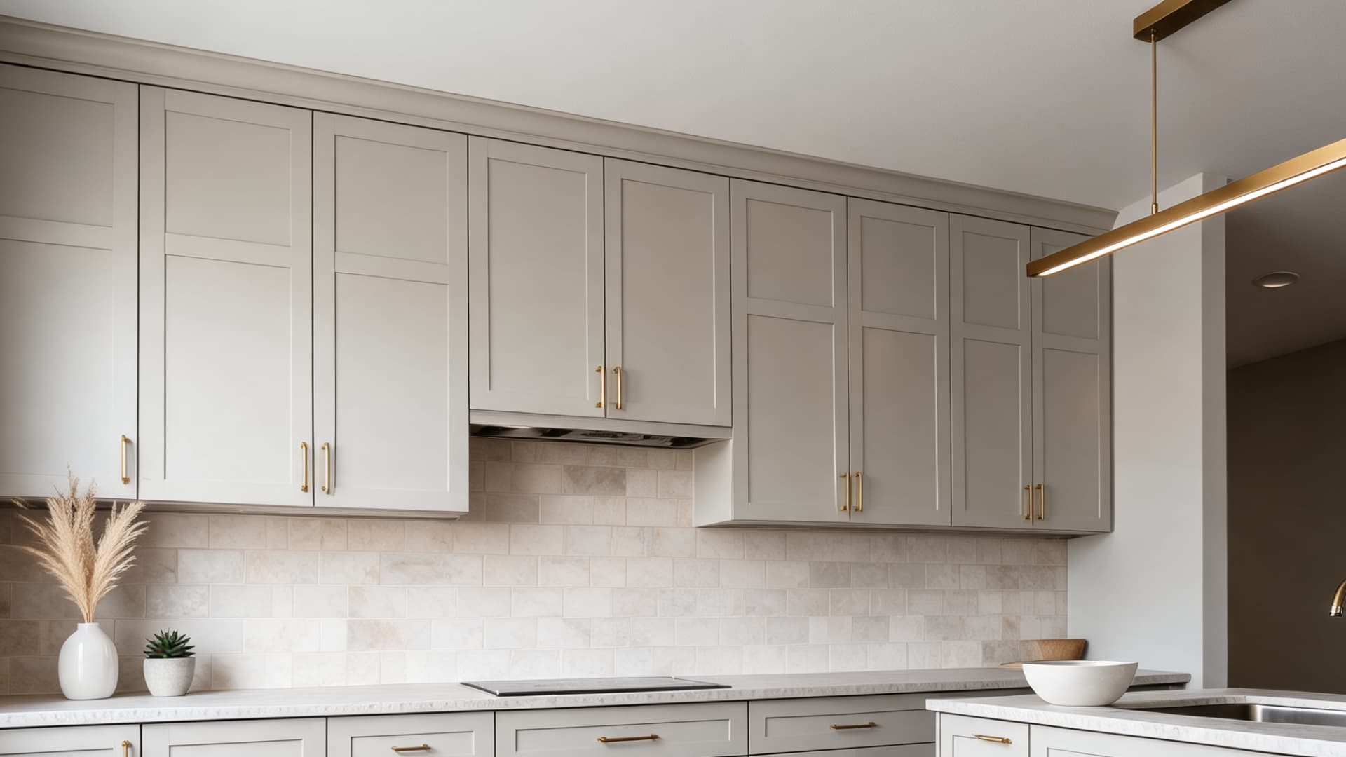
3. Kitchens
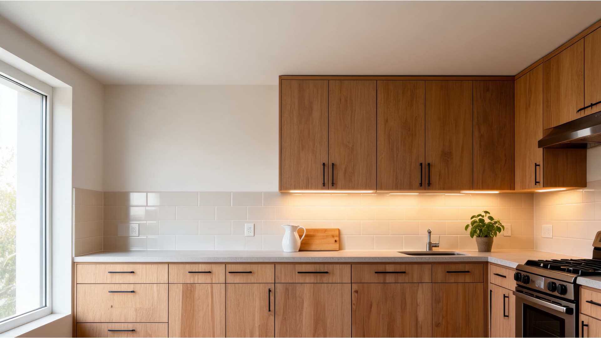
Eider White can work on kitchen walls, but kitchens need extra testing because they have so many fixed finishes. Counters, backsplash tile, cabinets, flooring, appliances, and hardware can all affect the undertone.
This shade pairs well with white, greige, gray, blue, and wood cabinetry when the finishes are balanced. It can look soft and fresh beside warm wood cabinets or muted painted cabinets. It can also work with black or brass hardware for more contrast.
The risk comes from cool white quartz, pink-beige tile, blue-gray stone, or very creamy cabinets. Those surfaces may pull out the gray, violet, or pink side of Eider White. Before painting kitchen walls, place the sample beside your counters and backsplash during the day and at night.
4. Bathrooms
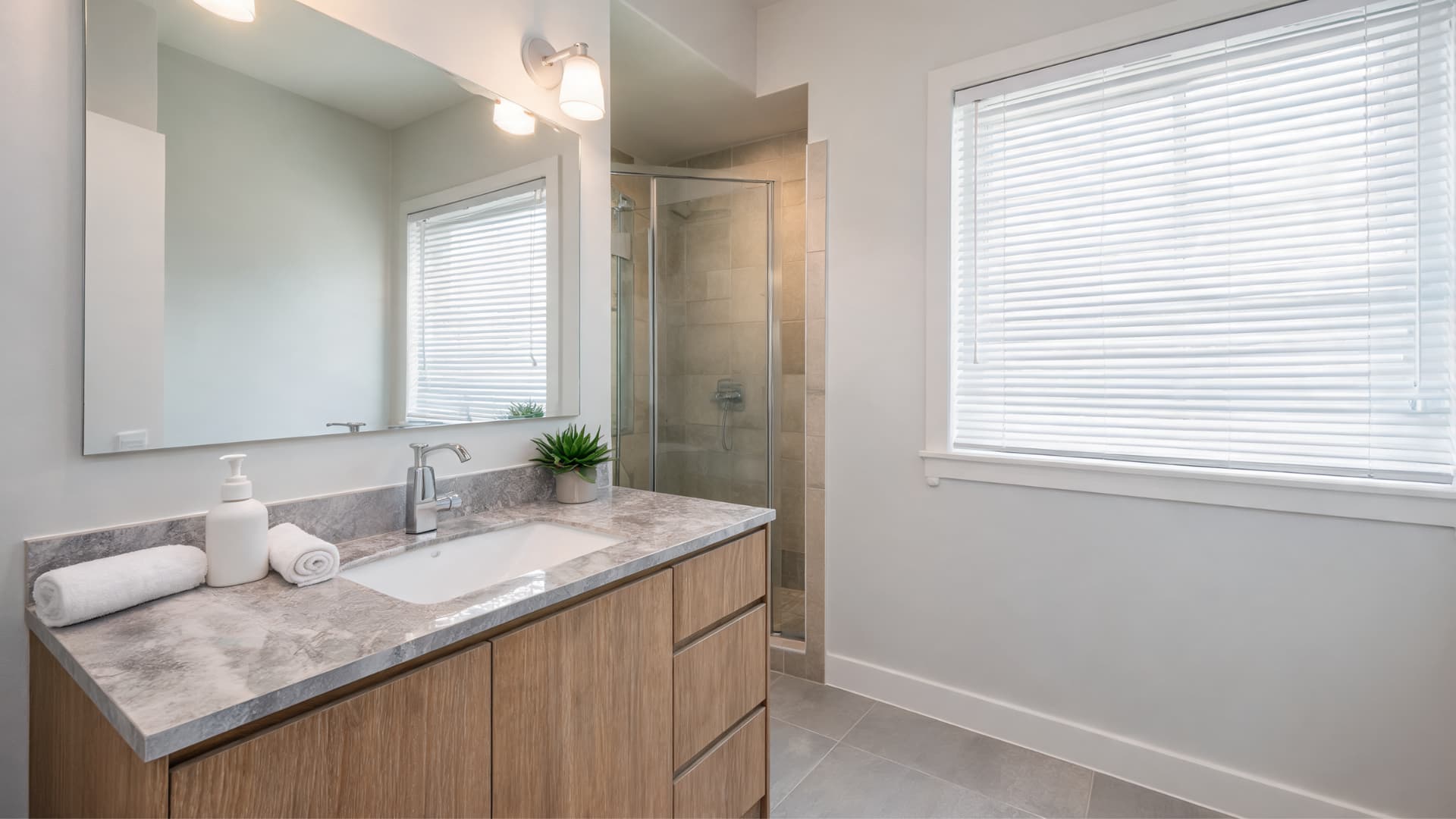
Bathrooms can be tricky because many rely more on artificial light than natural daylight. Eider White may look soft and clean in a bright bathroom with balanced lighting, but it can turn gray, violet, or slightly pink under poor bulbs.
This is especially important if your bathroom has white tile, marble-look counters, gray flooring, or cool metal finishes. Those materials can make Eider White look cooler than expected. On the other hand, warm wood vanities, soft beige tile, and warmer lighting can help the color feel calmer.
Test Eider White beside the vanity, tile, mirror, and light fixture. Do not judge it only during the day. Check it at night too, since that is when bathroom lighting can change the paint the most.
5. Cabinets and Built-Ins
Eider White can work for cabinets and built-ins, but it is not the safest choice if you want a crisp white for cabinets. Its gray undertone becomes more noticeable on cabinetry because cabinets sit right next to counters, backsplash materials, hardware, and wall colors.
On built-ins, Eider White can look soft and subtle, especially in living rooms, offices, bedrooms, or mudrooms. It works best when the surrounding palette includes warm wood, soft stone, muted walls, or brushed brass and black accents.
For kitchen cabinets, be more cautious. If your counters are bright white, cool gray, or pink-beige, Eider White may look slightly dingy or undertone-heavy. Use a large painted sample board and move it around the room before committing.
6. Exterior
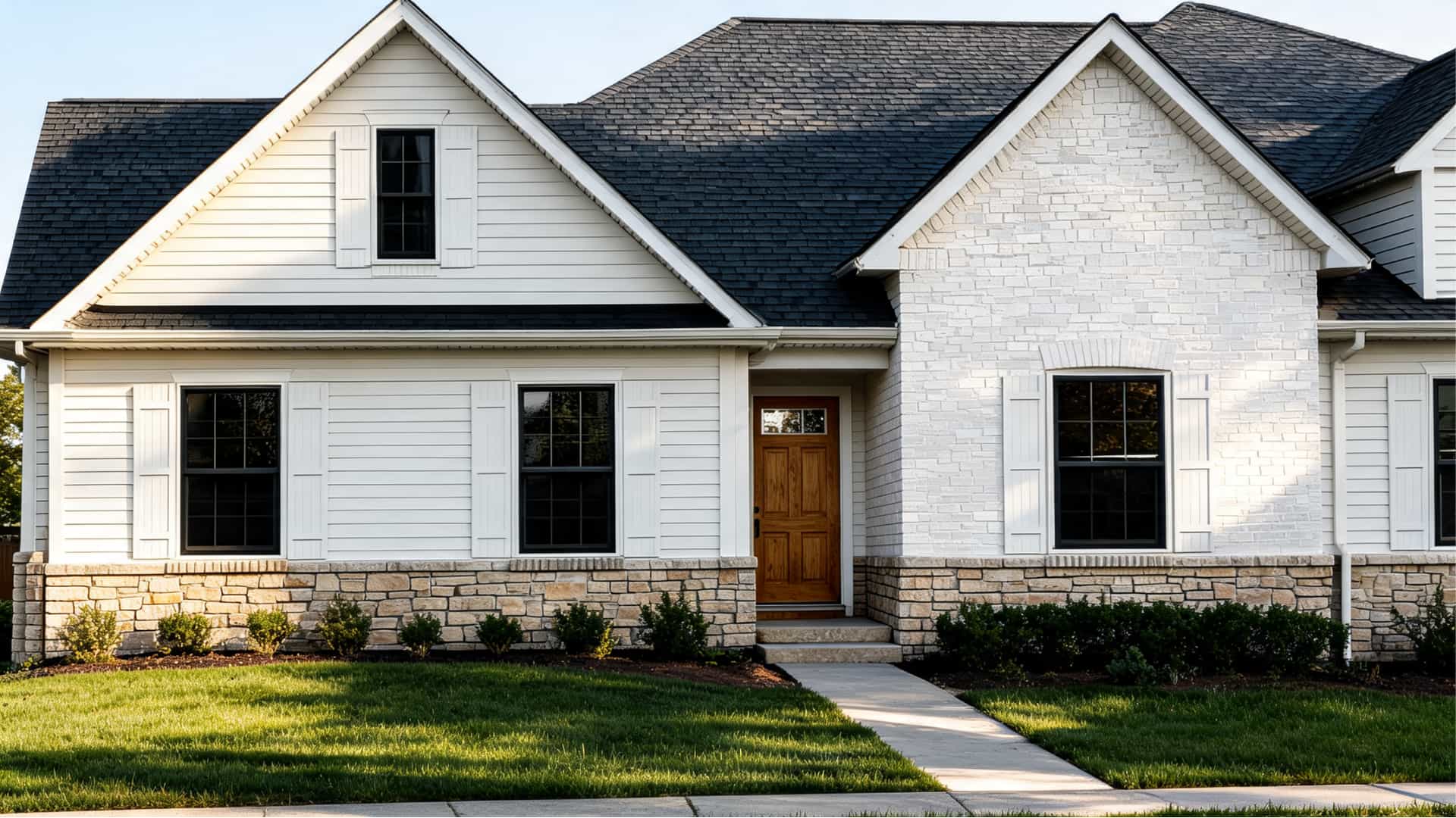
Sherwin-Williams lists Eider White for exterior use, and it can be a good choice if you want a softer white than a bright, crisp one. Outdoors, Eider White often looks lighter because it gets more natural light than an interior room.
It can work for siding, trim, painted brick, shutters, or exterior accents, depending on the home’s materials. It pairs well with warm stone, muted brick, black accents, soft gray details, natural wood doors, and darker roof colors.
Tip: Paint a large sample on more than one side of the house before choosing it, because shaded areas may look grayer while sunny areas may look much brighter.
That is why it may look like a soft white in one space, a pale gray in another, or a slightly greige white in warmer light. Before using it throughout the room, test it alongside the materials already in the space.
Comparison With Similar Sherwin-Williams Colors
If you are looking at Eider White, you may also be comparing it with other soft whites from Sherwin-Williams. Many look close on a small chip, but undertones, LRV, and lighting can make them feel very different on a full wall.
|
Color Compared With Eider White |
LRV |
How It Differs |
|
74 |
Warmer and more beige-influenced than Eider White. Eider White reads cooler, grayer, and may show violet or pink in some lighting. |
|
|
83 |
Cleaner, brighter, and lighter. Eider White is grayer, softer, and more muted. |
|
|
84 |
Brighter, cleaner, and more neutral. Eider White has more gray depth and softness. |
|
|
82 |
Warmer and creamier. Eider White feels cooler and grayer. |
|
|
76 |
Slightly warmer and less gray. Eider White can feel cooler and more shadowed. |
|
|
66 |
More of a light gray-greige. Eider White is lighter and closer to off-white. |
Use this table as a starting point, then sample the closest two or three colors in your own room. Small chips can look similar, but larger samples will show which undertone works better with your light, trim, and flooring.
Best Colors to Pair With Eider White

Eider White pairs best with colors that respect its gray undertone. Since it can lean cool, the best coordinating colors either connect with that gray base or add enough warmth to keep the room from feeling flat.
Sherwin-Williams lists Snowbound, Morris Room Grey, and Aqua-Sphere as official coordinating colors for Eider White. You can also pair it with deeper grays, muted blues, warm neutrals, and dark accents.
- Morris Room Grey SW 0037: A deeper gray that works well for accent walls, built-ins, doors, or furniture. It gives Eider White more depth and contrast.
- Aqua-Sphere SW 7613: A muted blue-green that works well in bedrooms, bathrooms, laundry rooms, or accent areas. It connects nicely with Eider White’s cooler side.
- Mindful Gray SW 7016: A soft gray that can work in nearby rooms, cabinetry, or neutral palettes. It keeps the look calm and connected.
- Dorian Gray SW 7017: A deeper gray option for doors, accent walls, built-ins, or exterior details. It creates more contrast than Mindful Gray.
- Urbane Bronze SW 7048: A dark warm neutral that works well on exterior accents, doors, furniture, or dramatic trim. It adds depth without feeling too cold.
- Riverway SW 6222: A blue-gray accent color that pairs well with Eider White in bedrooms, offices, bathrooms, or built-ins.
- Black Fox SW 7020: A deep warm neutral that works for doors, accents, cabinets, and exterior details. It gives Eider White a stronger, more grounded look.
Warm woods, beige textures, woven accents, and natural materials also help soften Eider White’s gray undertone. They are especially useful if the room already has cool lighting or gray flooring.
Decor Styles and Flooring: Eider White Goes Best With
Eider White works best when the room has enough warmth, texture, or contrast. Since it has a gray undertone, it can feel flat if everything around it is also cool gray. The right accents help the color feel softer, warmer, and more finished.
Best Decor Styles for Eider White
Eider White works across several decor styles because it is quiet and flexible. It fits best in spaces that use layered neutrals, warm materials, and subtle contrast.
- Transitional: Creates a soft neutral backdrop for mixed warm and cool finishes.
- Modern farmhouse: Works with wood, black accents, soft white trim, and simple textures.
- Coastal: Pairs well with blue, gray, linen, rattan, and light wood.
- Minimal: Adds softness without bringing in a strong wall color.
- Traditional: Works with warm wood, classic trim, muted accents, and layered fabrics.
- Organic modern: Fits stone, wood, woven textures, and calm neutral palettes.
The key is to keep the room from feeling too cold. Even a few warm accents, like wood furniture, woven shades, brass lighting, or beige textiles, can make Eider White feel more balanced.
Flooring That Works With Eider White
Flooring is one of the biggest reasons Eider White can look gray, pink, or slightly muddy. Since floors cover so much visual space, they can change how the paint reads more than small decor pieces do.
Flooring that usually works well with Eider White includes:
- Natural oak: Adds warmth and keeps the gray undertone balanced.
- Warm medium wood: Helps Eider White feel softer and less cool.
- Walnut: Adds depth and contrast without clashing.
- Light beige tile: Works if it does not have a strong pink undertone.
- Warm gray tile: Can connect with the gray undertone while still feeling soft.
- Neutral carpet: Keeps the room calm and easy to style.
- Soft greige flooring: Works when the greige leans balanced, not too purple or pink.
Before painting, place your sample right against the flooring, not just high on the wall. That gives you a more accurate idea of how Eider White will look once the whole room comes together.
Where to Buy Eider White Sherwin-Williams
A simple way to test it is to order a Sherwin-Williams color chip, peel-and-stick sample, or paint sample, then place it on at least two different walls. Check it in the morning, afternoon, evening, and under artificial light.
Note: Wet paint can look different from dry paint, so let the sample dry fully before judging the color.
You can buy Eider White SW 7014 through the official Sherwin-Williams Eider White page or at a nearby Sherwin-Williams store. The color page lets you view the paint details and shop interior or exterior paint options.
You can also use theSherwin-Williams store locatorto find a nearby location by ZIP code, postal code, or current location.
For help choosing the right paint line, finish, or amount of paint, contact Sherwin-Williams through their official contact page or call customer support at 1-800-474-3794. Product availability can vary by store, so check online or call your local Sherwin-Williams before planning the full project.
Frequently Asked Questions
Does Eider White make a room look bigger?
Eider White can help a room feel more open because it is a light, soft white. It works best when the room has decent daylight, simple furniture, and enough contrast so the walls do not feel flat.
What ceiling color works with Eider White walls?
A clean white ceiling usually works best with Eider White walls. Pure White, Extra White, or High Reflective White can create a brighter ceiling line, while Snowbound gives a softer, less sharp look.
Can Eider White work with black hardware?
Yes, black hardware works well with Eider White because it adds contrast against the soft gray-white base. Use it on cabinets, doors, lighting, or furniture when you want the room to feel more defined.
Is Eider White a good resale color?
Eider White can be a good resale color if it suits the home’s lighting and finishes. It feels neutral, soft, and easy to decorate around, but sampling matters because undertones can show differently in each room.
Final Verdict
Eider White is the kind of white that needs a little context to make sense. It is soft, muted, and flexible, but its depth of gray means your lighting and finishes matter.
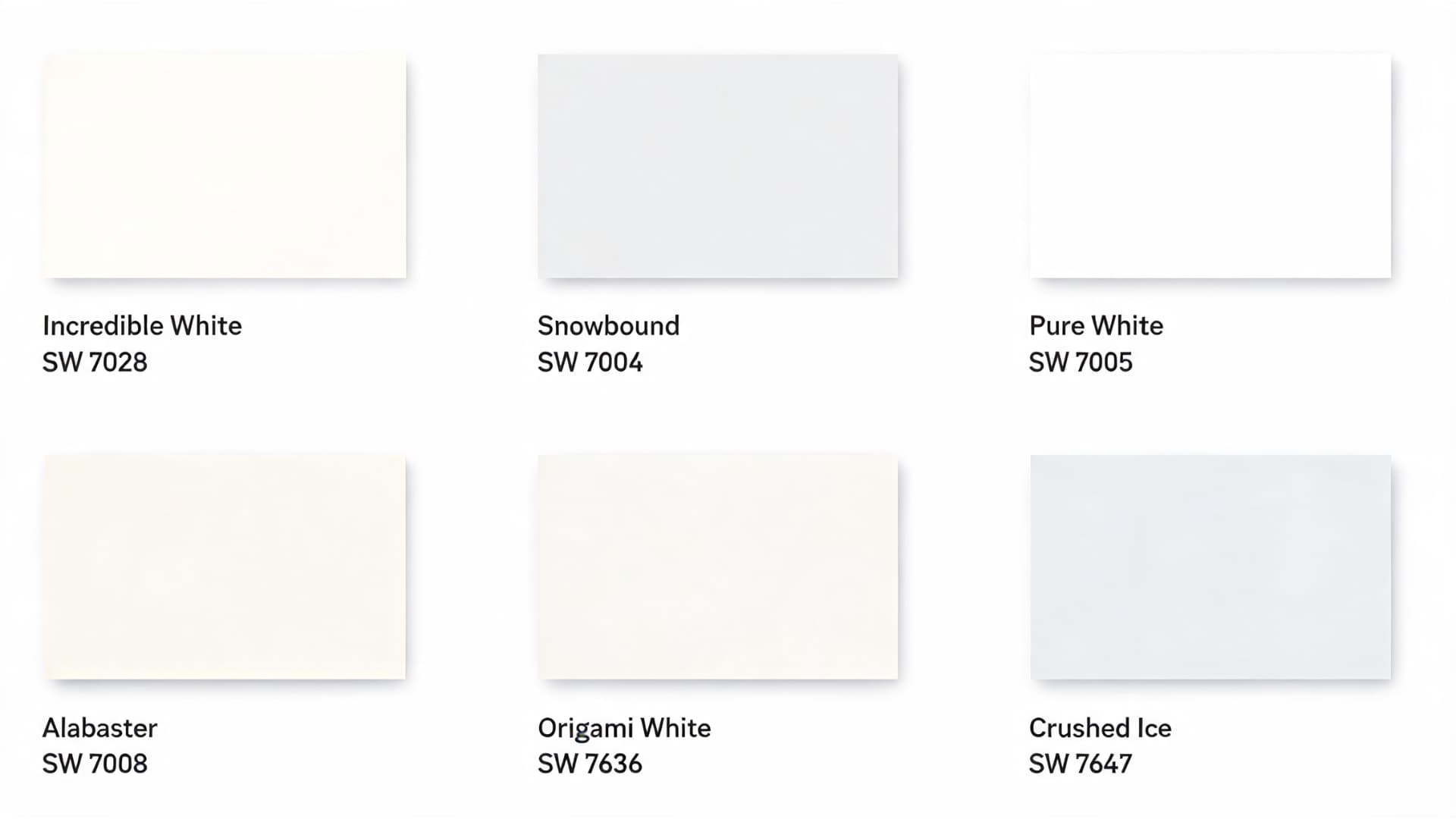
If you want a gentle white that does not feel stark, Eider White SW 7014 can be a strong choice for bedrooms, living rooms, balanced kitchens, bright bathrooms, and muted exterior palettes. I would be more careful with it in dark rooms or spaces with cool finishes, since it may look gray or slightly flat. Before buying, sample Eider White Sherwin Williams beside SW Incredible White, Snowbound, and Pure White, then share which one looked best in your space.
Have you tried Eider White in your home? Share how it looked under your lighting so other readers can compare.


