


Creamy SW 7012 is the warm white that makes your room look like you spent months testing colors. Creamy doesn’t demand attention. It just makes every room feel warmer, quieter, and more put-together without you being able to explain exactly why.
I’ve seen it work in spaces where every other white looked cold, flat, or just slightly off. This one lands every time.
I’ll walk you through everything you need to know about Creamy SW 7012, its exact color codes, undertones, LRV, and how it reads under different lighting conditions throughout the day.
I’ll also put Sherwin-Williams Creamy vs Alabaster side by side so you can see the difference clearly before committing to either. By the end, you’ll know whether this is the right color for your space and exactly where to pick it up.
Sherwin-Williams Creamy (SW 7012) at a Glance
Sherwin-Williams Creamy (SW 7012) is a warm off-white paint color with soft yellow undertones. It is not a bright, stark white. Instead, it feels smooth, cozy, and inviting without turning too beige.
The subtle yellow warmth keeps it from looking cold or flat. At the same time, it avoids the muddy or heavy look that some warm whites can have, making it easy to use across different spaces.
Creamy has a gentle, welcoming feel that works well in traditional, modern, and farmhouse-style homes. Compared to crisp whites, it looks softer and more relaxed, helping create a comfortable atmosphere. Here’s a clear breakdown of color details:
| Detail | Value |
| Color Name | Creamy |
| Code | SW 7012 |
| Undertones | Soft yellow |
| RGB | 237 / 226 / 199 |
| HEX | #EDE2C7 |
| LRV | 81 |
If your existing fixtures or floors have a gray or cool-green lean, a more neutral off-white like Sherwin-Williams Balanced Beige may give you more flexibility.
| Pro Tip: Before committing to a full gallon, paint a 12×12-inch section directly on your wall and leave it for 48 hours. Check it at 7 am, at midday, and again at 7 pm under your artificial lighting. Creamy shifts enough across those windows that what you see on a paint chip will not tell the full story. |
Sherwin-Williams Creamy vs Alabaster

If you’re choosing between Sherwin-Williams Creamy and Alabaster, this simple comparison table will help you quickly see the key differences.
| Feature | Sherwin-Williams Creamy (SW 7012) | Sherwin-Williams Alabaster (SW 7008) |
|---|---|---|
| LRV (Light Reflectance Value) | 81 – bright, but slightly rich | 82 – bright and a touch lighter |
| Undertones | Noticeable yellow warmth | Soft beige with a hint of gray |
| Overall Warmth | Warmer and more golden | Warm but more balanced |
| Appearance in Sunlight | Can look creamier and slightly golden | Stays soft and lightly warm |
| Appearance in Low Light | Adds warmth to cooler rooms | Feels neutral and calm |
| Best For | Cozy, traditional, or warm-toned spaces | Modern, transitional, or mixed-tone spaces |
| Pairs Well With | Wood tones, brass, earthy colors | Grays, black hardware, marble |
| Risk Factor | May look too yellow in very bright rooms | Safer choice if unsure about undertones |
This table makes it easier for you to quickly spot the real differences and decide which one fits your space better.
Sherwin-Williams Creamy in Different Lighting
Lighting can completely change how Creamy looks in your space, so it’s important to understand how it reacts throughout the day.
- Natural Light (North vs South Facing Rooms): In north-facing rooms, Creamy can look slightly more muted and soft since cooler light reduces its warmth. In south-facing rooms, it appears warmer and brighter, with its gentle yellow undertones becoming more noticeable without feeling too strong.
- Morning vs Evening Light: In the morning, Creamy tends to look fresh and light, especially with soft daylight. By evening, under warmer light, it deepens slightly and feels cozier, giving your space a relaxed and inviting glow.
- Artificial Lighting (Warm vs Cool Bulbs): Warm bulbs (2700K–3000K) enhance Creamy’s cozy, yellow undertones, making it feel richer and more comfortable. Cool bulbs (4000K+) can flatten the warmth a bit, making the color appear more neutral and less creamy.
- Shadow vs Direct Light: In shadowed areas, Creamy may look a touch more beige or subdued. In direct light, it reflects more brightness and looks closer to a soft, warm white.
Understanding these lighting shifts helps you avoid surprises and ensures Creamy looks just right in your home.
Sherwin-Williams Creamy Home Ideas
If you’re wondering where Sherwin-Williams Creamy works best, this table shows how you can use it throughout your home with smart pairings.
1. Walls
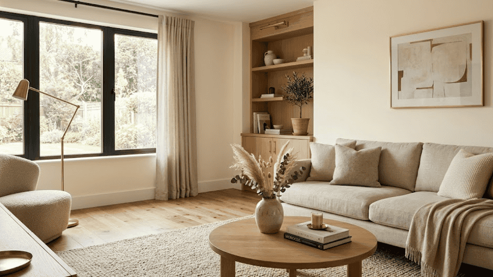
Creamy works beautifully on walls when you want a soft, warm backdrop that doesn’t feel too stark or bright. It gently reflects light, helping your room feel open while still cozy.
This makes it perfect for living rooms and bedrooms where comfort matters most. Pair it with warm wood flooring, neutral fabrics, and brass accents to create a calm, inviting space that feels balanced and easy to live in.
2. Kitchen Cabinets
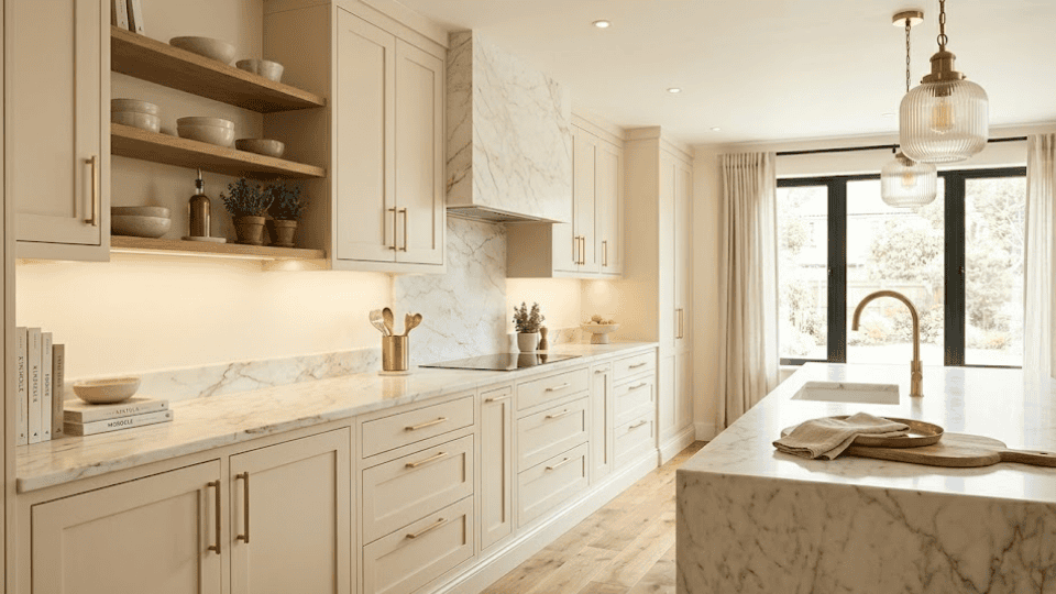
On kitchen cabinets, Creamy gives you that rich off-white look without feeling flat or overly plain. It adds warmth, making the kitchen feel more welcoming than cooler whites.
To keep the space from feeling heavy, pair it with light countertops like white quartz or marble. Adding brushed gold or brass hardware enhances the warmth and gives your kitchen a polished, timeless finish.
3. Trim and Doors
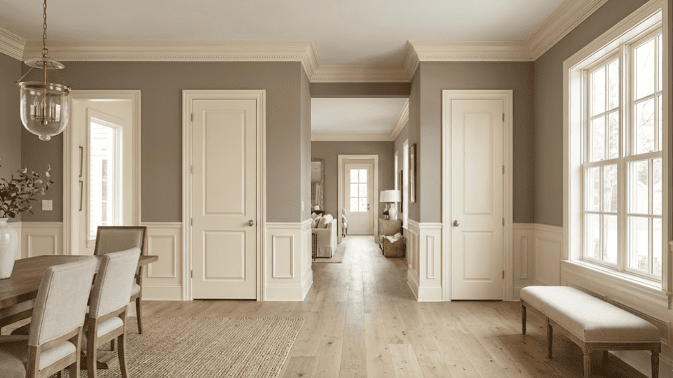
Using Creamy on trim and doors creates a smooth, soft contrast when paired with deeper wall colors. It’s a great alternative to bright white trim, especially if your home leans warm. Instead of a sharp contrast, you get a more blended, cohesive look.
It works best with taupe, greige, or soft tan walls, helping the entire space feel more connected and less visually harsh.
4. Exterior
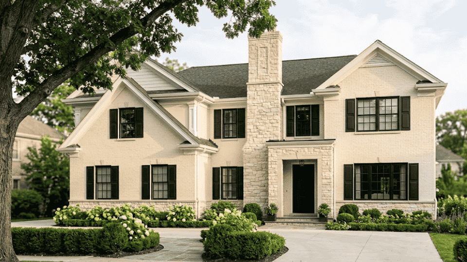
Creamy is also a strong choice for exteriors because it avoids the harsh brightness that pure whites can have in sunlight. It looks warm and welcoming without feeling dull or yellow.
In natural light, it maintains a soft glow that complements materials like brick and stone. Pair it with dark shutters or black accents to create a clean, classic exterior that still feels approachable.
Colors to Pair With Sherwin-Williams Creamy
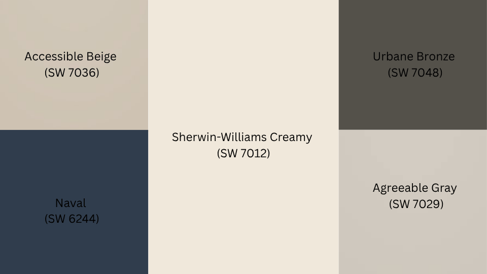
If you want Creamy to feel balanced and not too yellow, pairing it with the right shades makes all the difference. These colors help add contrast, depth, and a more polished look to your space.
- Accessible Beige (SW 7036): A warm greige that blends smoothly with Creamy, creating a soft and cohesive look without harsh contrast or cool undertones.
- Agreeable Gray (SW 7029): A popular neutral that adds subtle contrast while still keeping the space calm, balanced, and easy on the eyes.
- Urbane Bronze (SW 7048): A deep, rich brown-gray that grounds Creamy and adds depth, perfect for accents, cabinets, or statement walls.
- Naval (SW 6244): A classic deep navy that creates a bold contrast against Creamy, adding elegance without overwhelming the warmth.
When you pair Creamy with these tones, your space feels layered and intentional. The warmth stays balanced, and nothing feels too flat or overpowering.
How to Achieve Different Looks With Sherwin-Williams Creamy
Creamy’s warm yellow base is versatile enough to anchor several distinct visual styles. The look you land on depends entirely on the colors you pair with it. Here’s a clear breakdown:
| Look | Color 1 | Color 2 | Color 3 | Why It Works |
| Monochromatic | Antique White SW 6119 | Alabaster SW 7008 | Navajo White SW 6126 | Same warm family, varying depth, soft and seamless |
| Classic Contrast | Naval SW 6244 | Urbane Bronze SW 7048 | Tricorn Black SW 6258 | Deep saturated tones create clean, high-contrast results |
| Earthy and Natural | Accessible Beige SW 7036 | Bungalow Beige SW 7511 | Restrained Gold SW 6129 | Warm greige and gold echo Creamy’s undertones naturally |
| Modern and Calm | Agreeable Gray SW 7029 | Repose Gray SW 7015 | Mindful Gray SW 7016 | Cool neutrals contrast Creamy’s warmth without sharp edges |
| Dramatic and Grounded | Caviar SW 6990 | Iron Ore SW 7069 | Rockwood Shutter Green SW 2809 | Very dark tones anchor Creamy and add significant depth |
Testing pairings as physical samples in your own lighting before committing is the most reliable step. Colors read differently on your walls than they do on screen, and Creamy in particular shifts noticeably across lighting conditions throughout the day.
Is Sherwin-Williams Creamy Right for You?
Deciding whether Sherwin-Williams Creamy fits your home comes down to the overall feeling you are after and the existing tones already present in your space. This color works well if you want warmth without committing fully to beige or tan.
It suits rooms where a soft, traditional white feels more appropriate than a sharp, bright one. If your space runs cold and needs a gentle visual anchor, Creamy provides that without feeling heavy or overpowering on the walls. It carries just enough yellow undertone to register as warm without reading as yellow.
If you are drawn to warm wood tones, brass fixtures, natural linen, or earthy decor, Creamy will feel like a natural fit rather than a forced choice. It is a color that tends to settle well rather than demand attention.
What to Pair With Sherwin-Williams Creamy
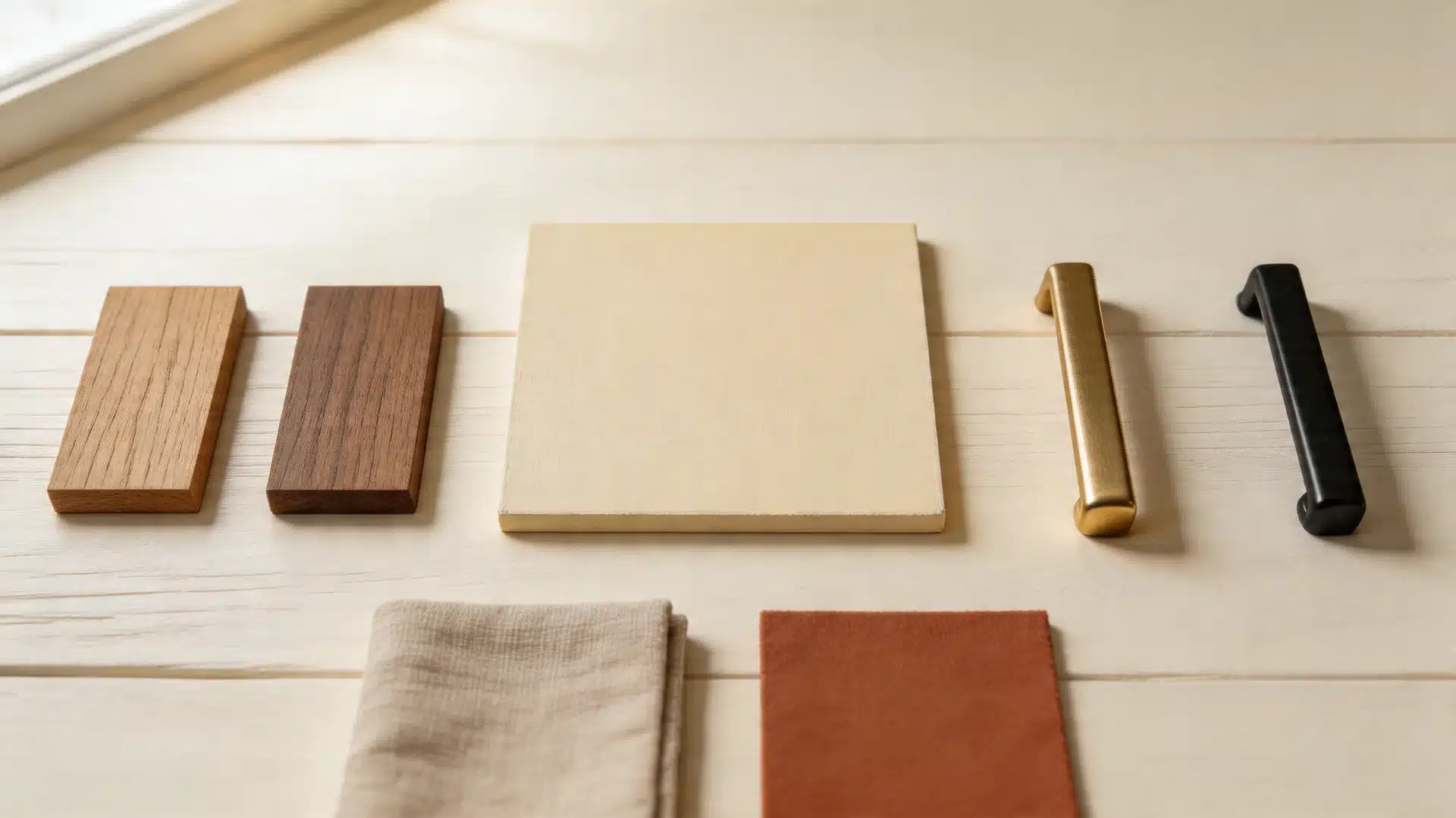
Creamy’s warm yellow base complements natural, earthy tones across every surface. Choosing the right wood, metal, and fabric shades keeps your space feeling balanced and intentional. Here’s a clear breakdown:
| Factors | Wood Tones | Metal Tones | Fabric & Textiles |
| Works Well | Oak, walnut, pine, warm-toned medium woods | Brushed brass, aged gold, warm bronze, matte black | Linen, oatmeal, terracotta, rust, camel, dusty sage, muted olive |
| Avoid | Ebony, gray-washed, or cool-toned finishes | Chrome, polished silver | Stark white fabrics |
| Best Use | Flooring, ceiling beams, furniture, open shelving | Cabinet hardware, light fixtures, door handles | Cushions, curtains, rugs, throws |
| Why It Works | Warm wood grains echo Creamy’s golden undertones | Warm metals mirror the yellow base and feel cohesive | Earthy neutrals layer warmth without competing with walls |
| Finish Type | Matte, natural oil, or light satin | Brushed or matte finishes over polished | Natural weaves and matte textures over synthetic sheens |
| Rooms To Try | Living room, bedroom, kitchen | Kitchen, bathroom, entryway | Bedroom, living room, dining room |
The right pairings keep Creamy looking warm without tipping too yellow. Stick to natural materials, matte finishes, and earthy tones throughout the space. When in doubt, test samples together before making a final call.
Colors Similar to Sherwin-Williams Creamy
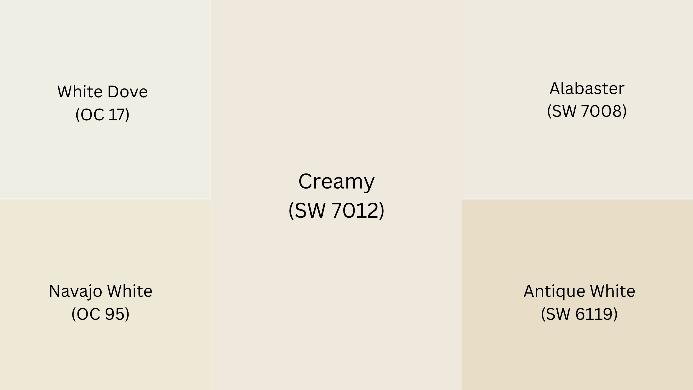
If Creamy isn’t quite landing, these warm off-whites cover the same general territory with slightly different profiles.
For a close comparison of how Sherwin-Williams Natural Choice SW 7011 compares as an alternative, that article walks through a color with a similar LRV but a softer, more neutral undertone profile.
- Benjamin Moore White Dove(OC-17): Benjamin Moore. A clean, warm white with soft gray-yellow undertones. Slightly cooler than Creamy but equally versatile across walls, trim, and cabinets.
- Benjamin Moore Navajo White(OC-95): Benjamin Moore. A warmer, creamier white with visible yellow-beige undertones. Sits closer to Creamy in tone, ideal for traditional and rustic interiors.
- Sherwin-Williams Alabaster(SW 7008): Sherwin-Williams. A soft, warm white with subtle beige undertones, slightly lighter than Creamy with an LRV of 82. Less golden, more balanced, a safer choice if Creamy feels too yellow for your space.
- Sherwin-Williams Antique White(SW 6119): Sherwin-Williams. A warm off-white with soft yellow-beige undertones, sitting slightly deeper than Creamy. Works well in traditional spaces where a little more richness on the walls is welcome.
Any of these makes a smooth transition if Creamy doesn’t suit your space. Testing a sample in your own lighting remains the safest step before committing to a full room.
Where to Get Sherwin-Williams Creamy SW 7012
You can purchase Sherwin-Williams Creamy (SW 7012) at any Sherwin-Williams retail store or directly through their official website at www.sherwin-williams.com.
Creamy is available in both interior and exterior paint formulas, so you can use it on walls, cabinets, furniture, or even siding. You can choose from finishes such as matte, satin, semi-gloss, or gloss, depending on your project. For example, satin or semi-gloss works beautifully on cabinets, while matte is great for walls.
If you want to test it first, you can order a peel-and-stick sample from Samplize. It lets you see the true color in your own lighting without the mess of traditional sample paint.
Final Words
Now you’ve seen what Sherwin-Williams Creamy really looks like, how it compares to Alabaster, and where it works best. I always say that warm whites can either feel soft and inviting or slightly off if the undertones aren’t right.
Creamy leans warm, but it does so gently, making it work in many homes. If you want a white that isn’t stark or cold, this color is worth testing. I still recommend grabbing a sample and checking it in your own lighting before making a final choice. Paint always shifts once it’s on your walls.
If this helped you, save it for later and share it with anyone choosing between Creamy and Alabaster, or drop a comment with which color review you would like next.
Frequently Asked Questions
Is Sherwin-Williams Creamy too yellow for a white room?
It depends on the lighting and the comparison. In north-facing rooms, it reads closer to a soft off-white. In strong sunlight, especially in south-facing spaces, it can look more golden. Next to a true white, it will appear noticeably warmer.
What is the LRV of Sherwin-Williams Creamy SW 7012?
Creamy has an LRV of 81, which means it reflects a high amount of light. It sits in the brighter off-white range. In direct sunlight, its warm undertone can become more visible, so testing in your space is still important.
Is Creamy good for kitchen cabinets?
Creamy works well in kitchens with warm finishes like wood tones and brass hardware. It becomes harder to manage in mixed-tone spaces. If you want a more flexible cabinet color, Alabaster SW 7008 is usually the safer option.
What colors pair best with Sherwin-Williams Creamy?
Creamy pairs best with warm and balanced tones. Good options include Accessible Beige SW 7036, Urbane Bronze SW 7048, Agreeable Gray SW 7029, and Naval SW 6244. Cooler grays and blues may clash with its yellow undertone.
How does Creamy compare to Sherwin-Williams Alabaster?
Creamy is warmer and leans more golden, while Alabaster feels softer and more neutral. Alabaster works across more spaces and styles. Creamy suits rooms that already have a consistent warm color scheme throughout.
Can Creamy SW 7012 be used on exterior walls?
Yes, it can work well, especially on shaded or north-facing exteriors. On sun-heavy sides, the yellow tone becomes stronger. Always test on different sides of the home. Pairing with darker trim helps balance the warmth.
What trim color goes with Sherwin-Williams Creamy walls?
A clean white like Pure White SW 7005 creates a soft contrast without looking too sharp. For a gentler match, Cloud White offers a similar warmth. Avoid cool, bright whites since they highlight Creamy’s yellow tone.
Does Creamy look good in a north-facing room?
Yes, it performs well in north-facing rooms. The cooler natural light softens its yellow tone, making it feel more balanced. It adds warmth to spaces that might otherwise feel dull or slightly cold.


