

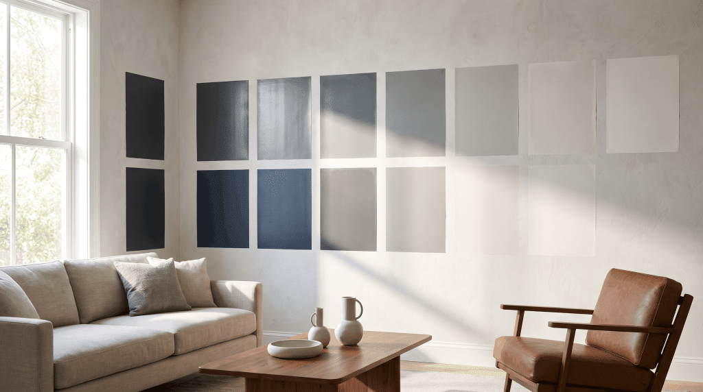


LRV stands for Light Reflectance Value. It tells you the percentage of visible light that a paint color reflects from a surface. This number gives you an idea of how light or dark a color may feel once it is applied to a wall.
Paint manufacturers measure LRV using color measurement tools such as spectrophotometers. These devices analyze how a surface interacts with light and assign a value to the color on a fixed scale.
Designers, architects, and homeowners use LRV as a reference because it helps predict how a color may perform in different spaces.
A deep charcoal absorbs much of the available light, while a soft white reflects more light into the room.
Here is how common colors typically behave:
| Paint Color | Typical LRV Range | LRV Behavior |
|---|---|---|
| Black | 0–5 | Absorbs nearly all light and creates a deep, dramatic look. |
| Dark Navy | 5–15 | Absorbs significant light and adds depth to a space. |
| Medium Gray | 35–60 | Offers balanced light reflection with a neutral appearance. |
| Soft White | 75–90+ | Reflects significant light and helps make spaces feel brighter. |
Point to remember: a higher LRV does not automatically mean a color is “more white.” A bright yellow can also have a high LRV. LRV only measures light reflection, not whether a color is warm, cool, neutral, or colorful.
How Does the LRV Paint Scale Work?
The LRV scale runs from 0 to 100. Zero represents pure black, which absorbs the most light. One hundred represents pure white, which reflects the most light.
Most paint colors fall somewhere between these extremes because real pigments cannot achieve a perfect black or perfect white.
A color below the middle of the scale generally absorbs more light, while a color above the middle reflects more light.
Here is a simple way to understand the ranges:
| LRV Range | Appearance | Best Used For |
|---|---|---|
| 0–20 | Deep and dramatic | Accent walls, cozy spaces |
| 20–40 | Dark to medium | Bedrooms, offices, feature areas |
| 40–60 | Balanced colors | Living rooms, dining rooms |
| 60–80 | Light and airy | Kitchens, bedrooms, open spaces |
| 80–100 | Bright whites | Ceilings, small rooms |
For example, Sherwin-Williams Eider White has a moderate LRV and reflects a balanced amount of light, making it softer and less bright than high-reflectance whites while adding a subtle gray undertone to a space.
Why LRV Matters When Choosing Paint Colors
Understanding LRV removes much of the guesswork from choosing paint. It helps you predict how a color may feel before you commit to painting an entire room.
1. LRV Controls How Bright or Dark a Room Feels
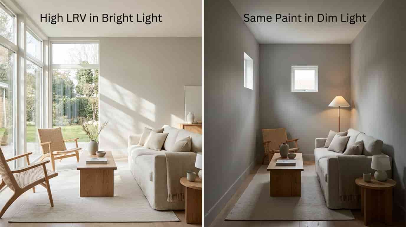
High LRV colors reflect more available light around a room. This can make a space feel brighter, cleaner, and more open. Low LRV colors absorb more light, creating a deeper and more dramatic atmosphere.
The same paint color can look completely different depending on the room. A gray with an LRV of 60 may appear light and airy in a sunny living room but feel much darker in a hallway with limited natural light.
2. LRV Can Change the Perceived Size of a Room

Higher LRV colors can also change how large or small a space feels. They reflect more light, which helps small rooms appear more open and creates a brighter, airier look.
These lighter shades work especially well in spaces with limited natural light because they help maximize the available brightness and make the room feel less enclosed.
Lower LRV colors absorb more light, which can add warmth and a sense of intimacy to a room. These deeper shades create a cozy or dramatic atmosphere by making spaces feel more enclosed and inviting.
They also work well in large rooms, helping balance open areas and making them feel more grounded and comfortable.
3. LRV Helps Avoid Paint Color Mistakes
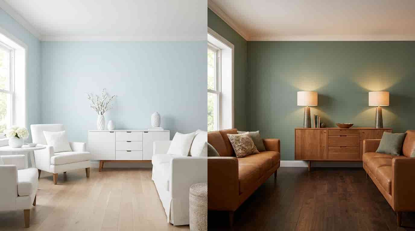
Many common paint complaints happen because light changes how colors appear in a room.
A shade that looks lighter online may feel different on a wall, while a gray paint can take on blue tones or a white shade may appear more yellow than expected.
LRV helps explain some of these differences, but color perception also depends on factors like lighting, flooring, furniture, surrounding colors, and paint undertones.
For example, a pale wall placed next to dark flooring may look deeper and warmer than the same paint used in an all-white room.
How Lighting Affects LRV Paint Colors
Lighting can make or break a paint color. The direction your windows face changes the type of natural light entering a room, and that light affects how your paint’s LRV is perceived.
A color that looks balanced in one room may appear darker, warmer, cooler, or brighter somewhere else. Understanding your room’s lighting helps you choose an LRV that works with the space instead of against it.
North-Facing Rooms
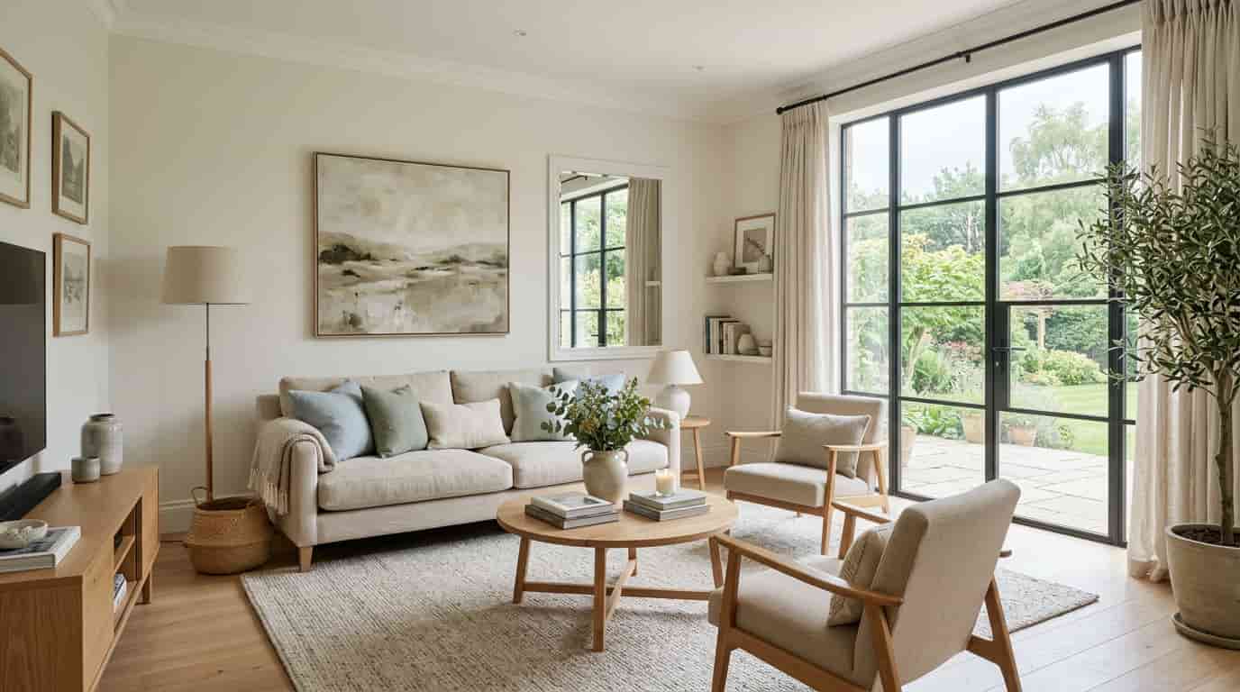
North-facing rooms receive cooler, softer natural light throughout the day. Because this light has a blue-gray quality, paint colors can appear slightly darker or cooler than expected.
Higher LRV paints often work well in these spaces because they reflect more available light and help prevent the room from feeling closed in.
Colors with slight warmth can also help balance the cooler quality of northern light.
South-Facing Rooms
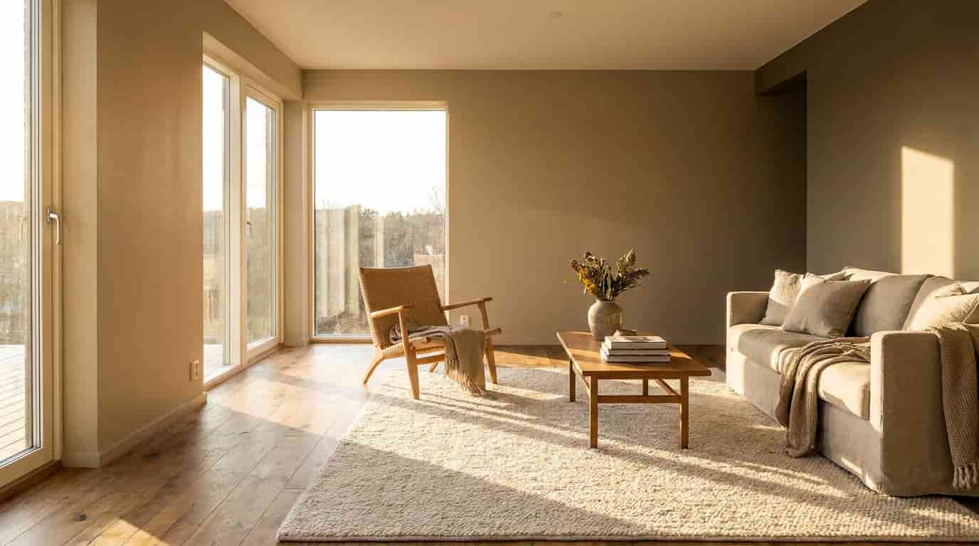
South-facing rooms receive strong, warm daylight for most of the day. This abundant light makes colors appear brighter and more vivid.
Very high LRV paints may sometimes feel too bright or washed out in these rooms. Medium LRV colors often provide a better balance because they reflect enough light without losing depth.
East-Facing Rooms
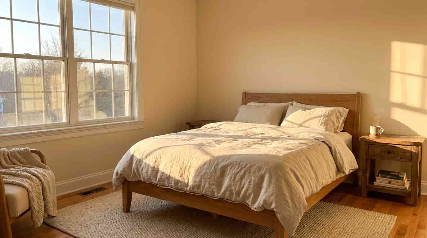
East-facing rooms change noticeably throughout the day.
Morning light is warm and golden, which can make warm paint colors appear richer. As the day progresses, the room receives less direct sunlight, and colors may appear cooler or more muted.
Recommendation: Test paint samples at different times of the day. A color that looks bright and welcoming in the morning may feel completely different by evening.
West-Facing Rooms
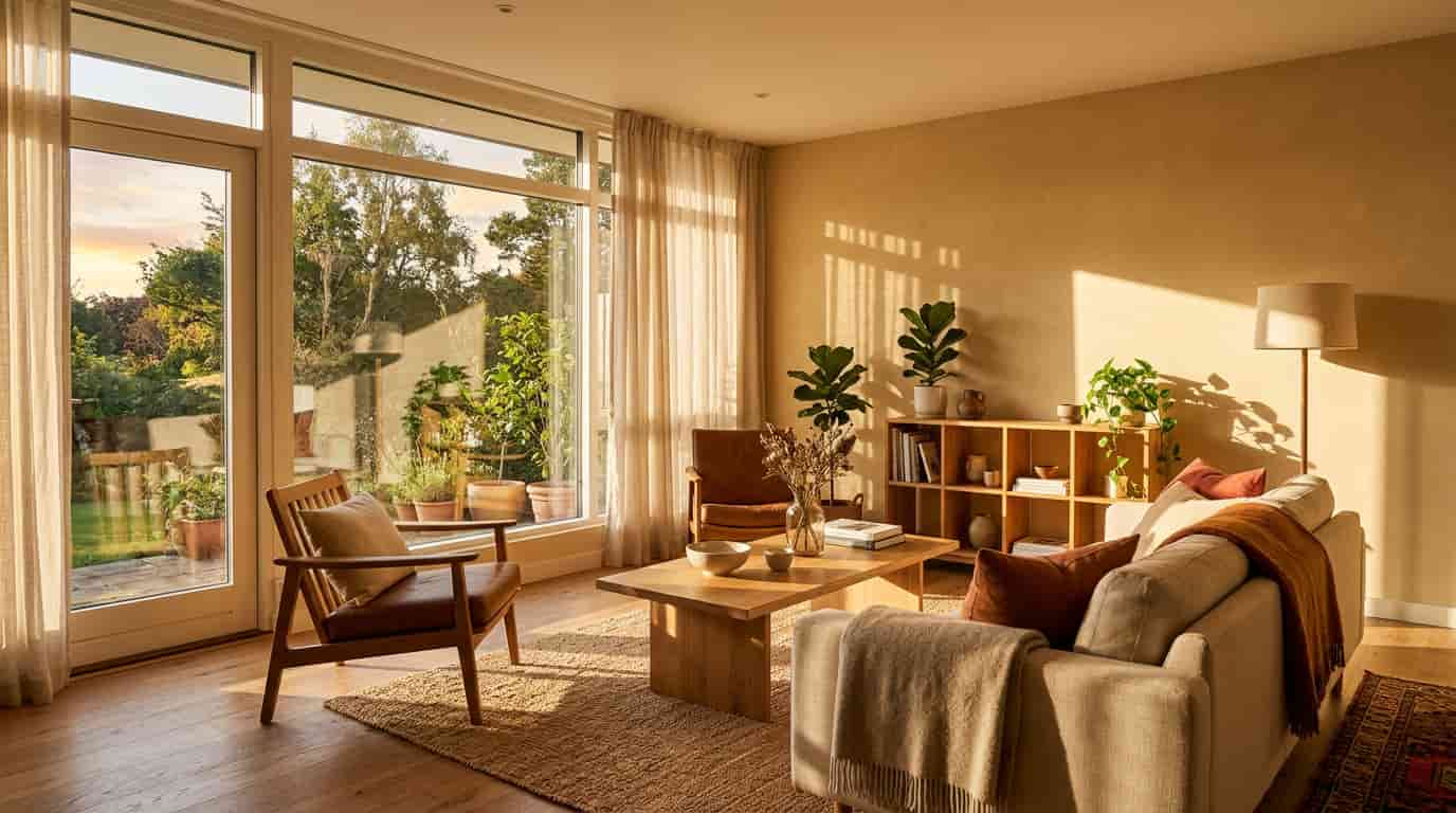
West-facing rooms get strong afternoon sunlight, which makes warm tones more noticeable as the day goes on.
Shades like beige, cream, and greige can appear richer and warmer in this late-day glow. Test paint samples in the afternoon, as colors that look balanced in the morning may appear more intense by evening.
How LRV and Undertones Affect Paint Appearance
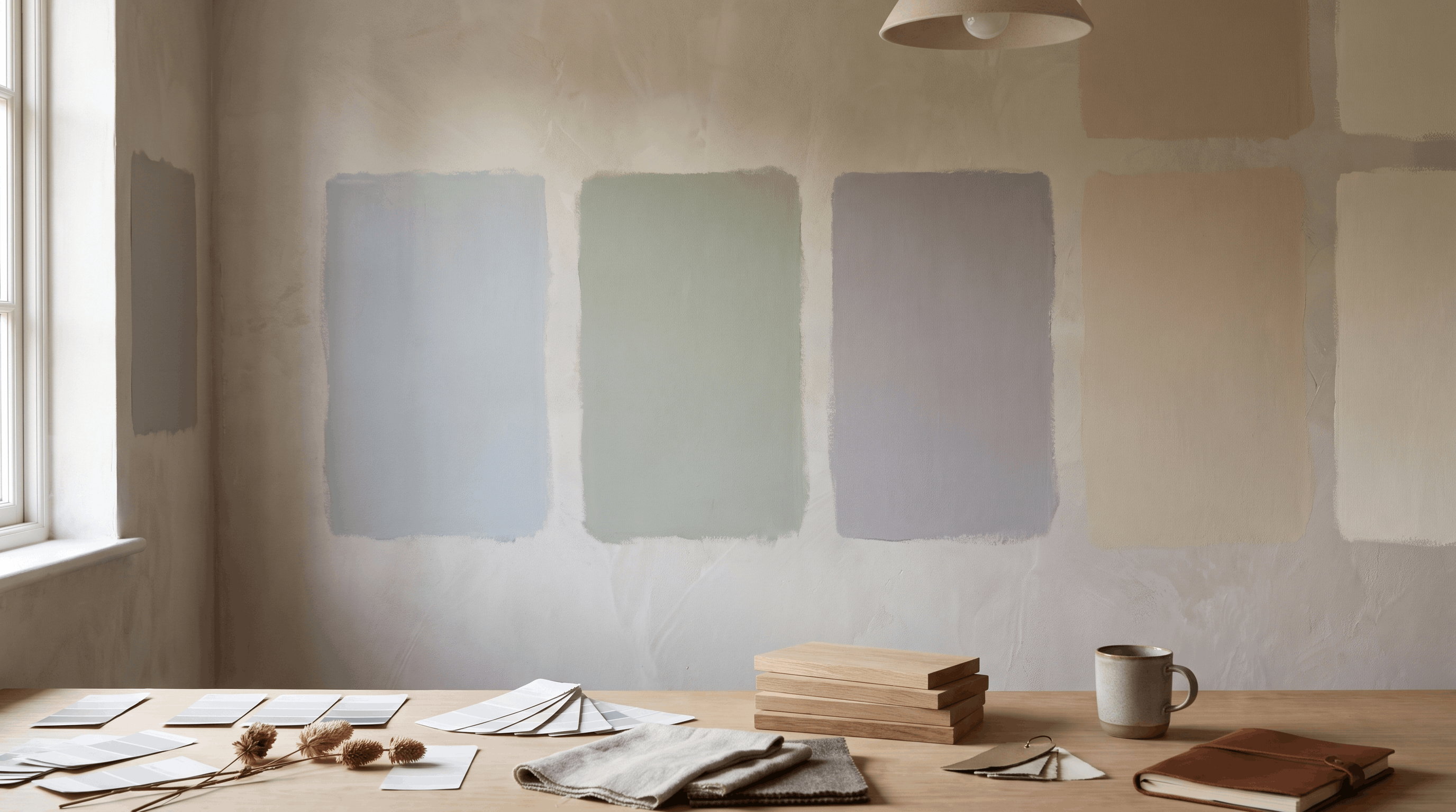
LRV and undertones are two different factors that influence how paint appears. Understanding both helps explain why two similar colors can look completely different once they are on your walls.
LRV tells you:
→ How much visible light a color reflects
Undertones tell you:
→ The hidden color influence underneath the main shade
A gray paint may have blue, green, or purple undertones. White paint may lean warm, with yellow or beige undertones.
| Factor | What It Affects |
|---|---|
| LRV | Amount of light reflection |
| Undertones | Color direction and warmth |
| Lighting | How the color changes throughout the day |
| Surroundings | How your eyes perceive the color |
This is why two paints with the same LRV can create completely different feelings in a room. LRV explains brightness, while undertones explain personality.
Does Paint Finish Affect LRV?
Paint finish, also called sheen, changes how a surface reflects light. While the official LRV value is measured for the color itself, the finish can influence how bright or soft that color appears once applied.
| Paint Finish | Light Reflection |
|---|---|
| Flat | Least reflective |
| Matte | Soft reflection |
| Eggshell | Moderate reflection |
| Satin | More noticeable reflection |
| Semi-gloss | High reflection |
| Gloss | Maximum reflection |
A glossy finish can make a color appear brighter because the surface bounces more light. A flat finish absorbs more light and usually creates a softer appearance.
Both can influence the final look of a room.
Choosing the Right LRV Paint for Different Rooms
There is no single perfect LRV for every home. The right choice depends on natural light, room function, and the mood you want to create.
| Room | Suggested LRV Range | Why |
|---|---|---|
| Small bedroom | 60+ | Helps create an open feeling |
| Living room | 50–70 | Provides balanced brightness |
| Kitchen | 60–85 | Reflects available light |
| Bathroom | 60+ | Helps prevent a closed-in feeling |
| Home office | Depends on mood | Works with both bright and dramatic styles |
When selecting paint, consider how much natural light enters the room, the feeling you want to create, and how the color works with existing finishes.
A well-lit space may handle deeper shades, while rooms with limited light often benefit from colors that reflect more brightness.
A bright home office may benefit from a higher LRV paint, while a reading room designed for relaxation may work better with a deeper shade.
Why Exterior Paint LRV Matters
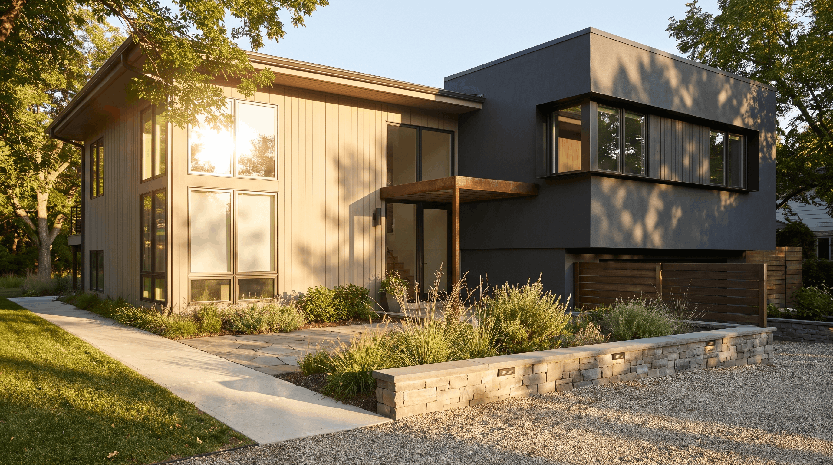
LRV is not only important for interior walls. It also plays a role when choosing exterior paint colors.
Outdoor surfaces receive much stronger and more direct sunlight than interior walls, which can change how a color appears throughout the day.
A paint color that feels balanced indoors may look much brighter, warmer, or more intense outside.
Exterior LRV is especially important because darker colors absorb more heat, while lighter colors reflect more sunlight.
This can affect how a home’s exterior feels visually and how certain surfaces respond to temperature changes.
Lower LRV colors can create a dramatic, modern look, but they may require more consideration on surfaces exposed to intense sunlight. Higher LRV colors often create a lighter appearance and help reflect more light.
The best exterior color choice balances the look you want with how the paint will perform in your specific environment.
How to Choose Paint Based on LRV and Room Conditions
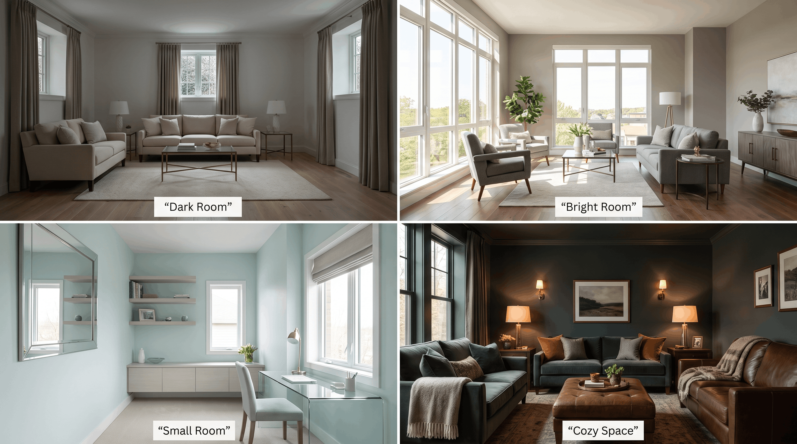
A paint color’s LRV should work together with your room’s lighting, size, and purpose.
- For Dark Rooms: Choose higher LRV colors, soft whites, and light neutrals to reflect limited light. These shades help brighten the space, reduce heaviness, and create a more open feel.
- For Bright Rooms With Lots of Sunlight: Choose medium LRV colors and balanced neutrals to maintain depth. They reflect enough light while preventing the room from feeling overly bright or washed out.
- For Small Rooms: Choose higher LRV colors with soft undertones and light finishes to make small spaces feel brighter. These shades reflect light and create a more spacious appearance.
- For Cozy or Dramatic Spaces: Choose lower LRV colors, rich shades, and deeper neutrals to add warmth and depth. These tones create a cozy atmosphere while adding character and visual interest.
Frequently Asked Questions
What is a good LRV for interior paint?
A good LRV depends on the room, lighting, and desired mood. Many homeowners start with mid-range values around 50–70 because they balance brightness and depth.
Is higher LRV paint better?
Not always. Higher LRV colors help brighten darker spaces, but very bright rooms may benefit from a lower LRV to avoid a washed-out appearance.
Does LRV affect paint color?
LRV affects how light or dark a color appears, but it does not determine the undertone. A color’s warmth or coolness comes from its underlying pigments.
What LRV is best for a small room?
Higher LRV colors often work well in small rooms because they reflect more light and create a more open feeling. However, the right choice also depends on natural light and room function.
Can two paints with the same LRV look different?
Yes. Two colors with the same LRV can appear different because of undertones, lighting, finish, and surrounding materials.
Make LRV Work for You Before You Pick Up a Brush
LRV explains one of the biggest mysteries homeowners face when choosing paint: why a color looks different from a sample card to the actual wall.
It gives you a practical way to understand brightness, compare colors, and create the right feeling in each room. But LRV should work alongside other factors, not replace them.
Before committing to a color, check its LRV, test samples in your own space, and observe how the shade changes throughout the day.
A little planning before painting can help you choose a color that looks right, not just on a card, but where it matters most: on your walls.