

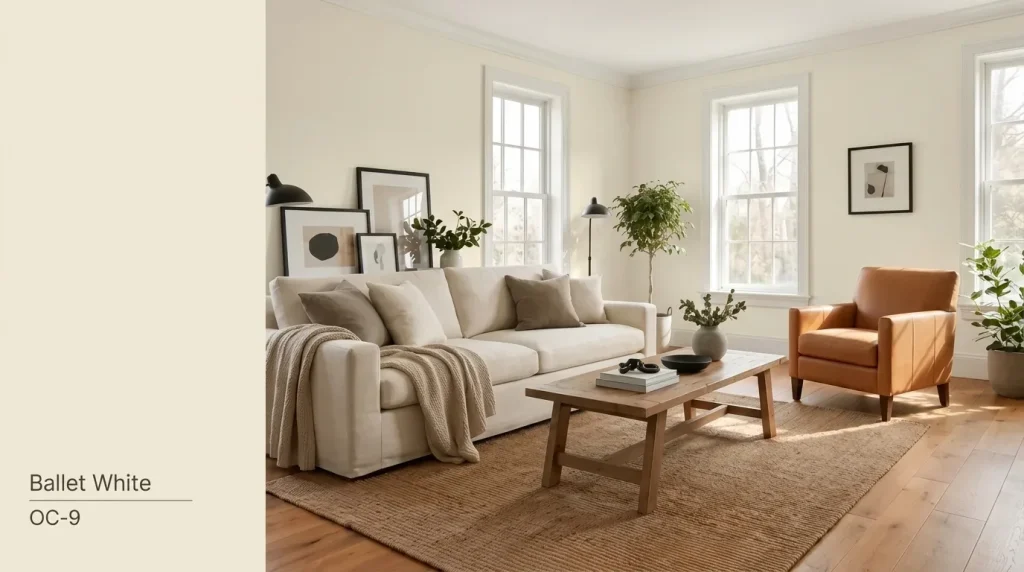


One of my clients once stood in her half-painted living room and asked me a question I hear all the time. “Why does this white look completely different than it did on the swatch?”
That’s the thing about Benjamin Moore Ballet White OC-9. It’s a warm, muted off-white with more depth than a plain white. It has a soft, creamy base with a touch of beige.
After ten years of color consulting, I’ve learned that the chip never tells the whole story. A color can look cream in the morning and lean gray by evening.
It depends on your room’s light, your finishes, and the time of day. Natural light shifts constantly. So does artificial light, flooring, and even the stone on your countertop.
What Color Is Benjamin Moore Ballet White?
Ballet White is not a bright, crisp white. It falls between a warm off-white, cream, and light greige, offering enough depth to stand out without feeling heavy.
Its soft beige, gray, and subtle green undertones shift with lighting, creating a warm and balanced look that works well in many interiors.
Ballet White works beautifully in interiors that need a calm, welcoming backdrop and pairs well with natural materials, warm wood tones, soft neutrals, and layered textures.
| Color Detail | Ballet White OC-9 |
|---|---|
| Brand | Benjamin Moore |
| Collection | Off White Collection |
| Color family | Warm off-white |
| LRV | 71.97 |
| Main undertones | Cream, beige, gray, and occasional muted green |
| Best general use | Walls, cabinets, trim, and exteriors |
| Overall appearance | Soft, warm, muted, and grounded |
Benjamin Moore includes Ballet White in its Off White Collection with an official LRV of 71.97. This high LRV allows it to reflect plenty of light while maintaining its cozy warmth.
Pro Tips: Because lighting greatly affects how Ballet White appears, always test a sample on your walls before committing to the full space. Its final look depends on room direction, natural light, and surrounding colors.
Where Does Benjamin Moore Ballet White Work Best?
Benjamin Moore Ballet White is a versatile off-white that shines in the right spaces. Here’s where it works best and what to consider before using it.
1. Living Rooms and Open-Plan Spaces
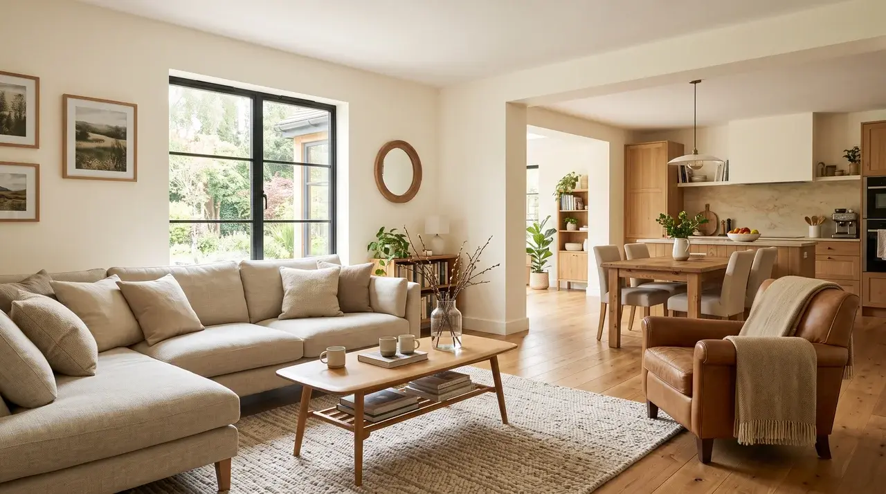
Ballet White connects adjoining rooms beautifully without looking stark, making it ideal for open floor plans and flowing spaces. Its warm undertones complement natural wood, stone, linen, leather, and neutral fabrics.
Pair it with Benjamin Moore White Dove OC-17, Edgecomb Gray HC-173, or Saybrook Sage HC-114 for a balanced, timeless color palette.
2. Bedrooms
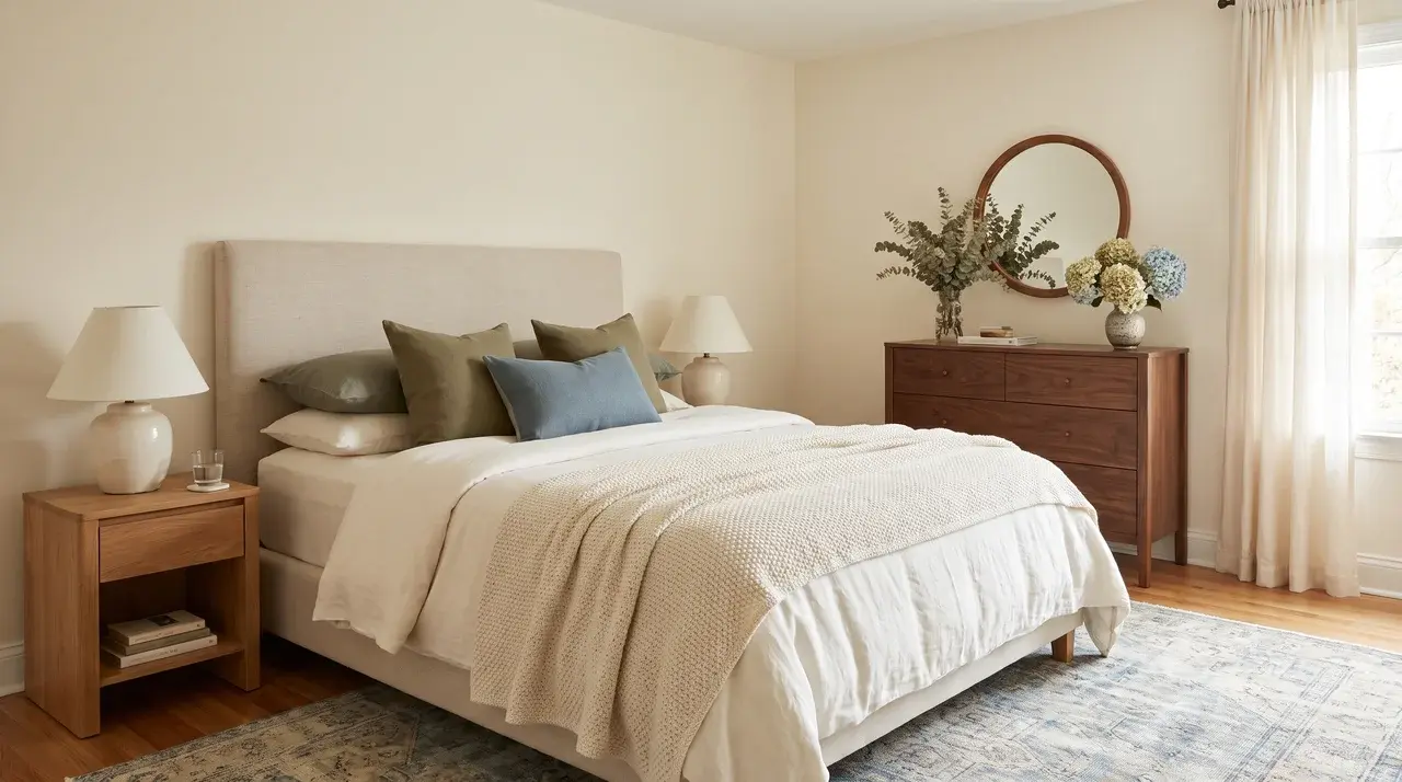
In a bedroom, Ballet White creates a softer, more relaxing backdrop than a bright white, giving the space a warm and inviting feel.
Its gentle beige-greige undertones promote a calm atmosphere without appearing dull or overly creamy.
It pairs beautifully with ivory bedding, warm oak or walnut furniture, and muted green or dusty blue accents.
For a cohesive Benjamin Moore palette, consider Saybrook Sage HC-114 for a soothing accent wall, or White Dove OC-17 for crisp trim and ceilings.
3. Kitchens and Kitchen Cabinets
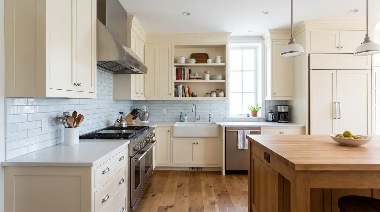
Ballet White behaves a bit differently on walls than on cabinetry. Cabinet sheen tends to make the color look lighter, since shinier finishes bounce more light back at your eyes.
Always check it beside your backsplash tile, countertops, flooring, and appliances first.
Kitchens mix many materials in one space, so testing against everything nearby saves you from a costly repaint later.
One warning: cool white quartz or blue-white subway tile can make Ballet White appear dingy or yellow by comparison.
4. Bathrooms
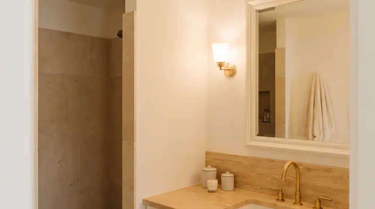
Bathrooms often have limited natural light and lots of reflective surfaces. Both factors affect how Ballet White actually reads once it’s on the wall, sometimes more than you’d expect.
It works well with warm marble, limestone, travertine, brass, and brushed nickel fixtures.
These materials share the same soft, warm undertone that Ballet White carries. Be careful pairing it with icy gray tile or stark blue-white fixtures, since the mix can clash and look off.
Always sample the paint first, right in your own bathroom lighting, before committing to the full room.
5. Hallways and Low-Light Areas
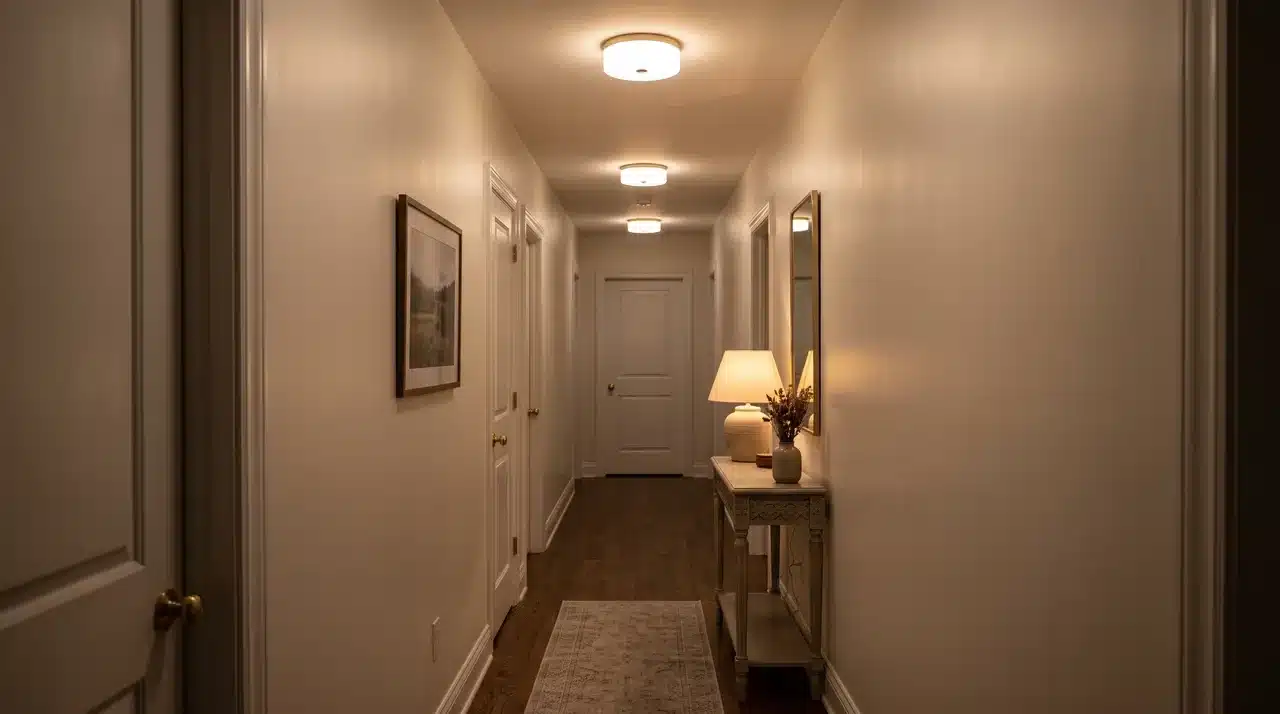
Ballet White can bring a soft, inviting warmth to a windowless space, making it feel more comfortable than cooler white paints.
However, no paint color can create natural light where none exists. In hallways or rooms without windows, Ballet White may appear flatter or more beige because of limited illumination.
Before deciding to switch paint colors, consider upgrading your artificial lighting instead.
Brighter LED bulbs, additional fixtures, or a better color temperature can dramatically improve how the paint looks, helping the space feel brighter, more balanced, and visually appealing.
6. Trim, Doors, and Ceilings
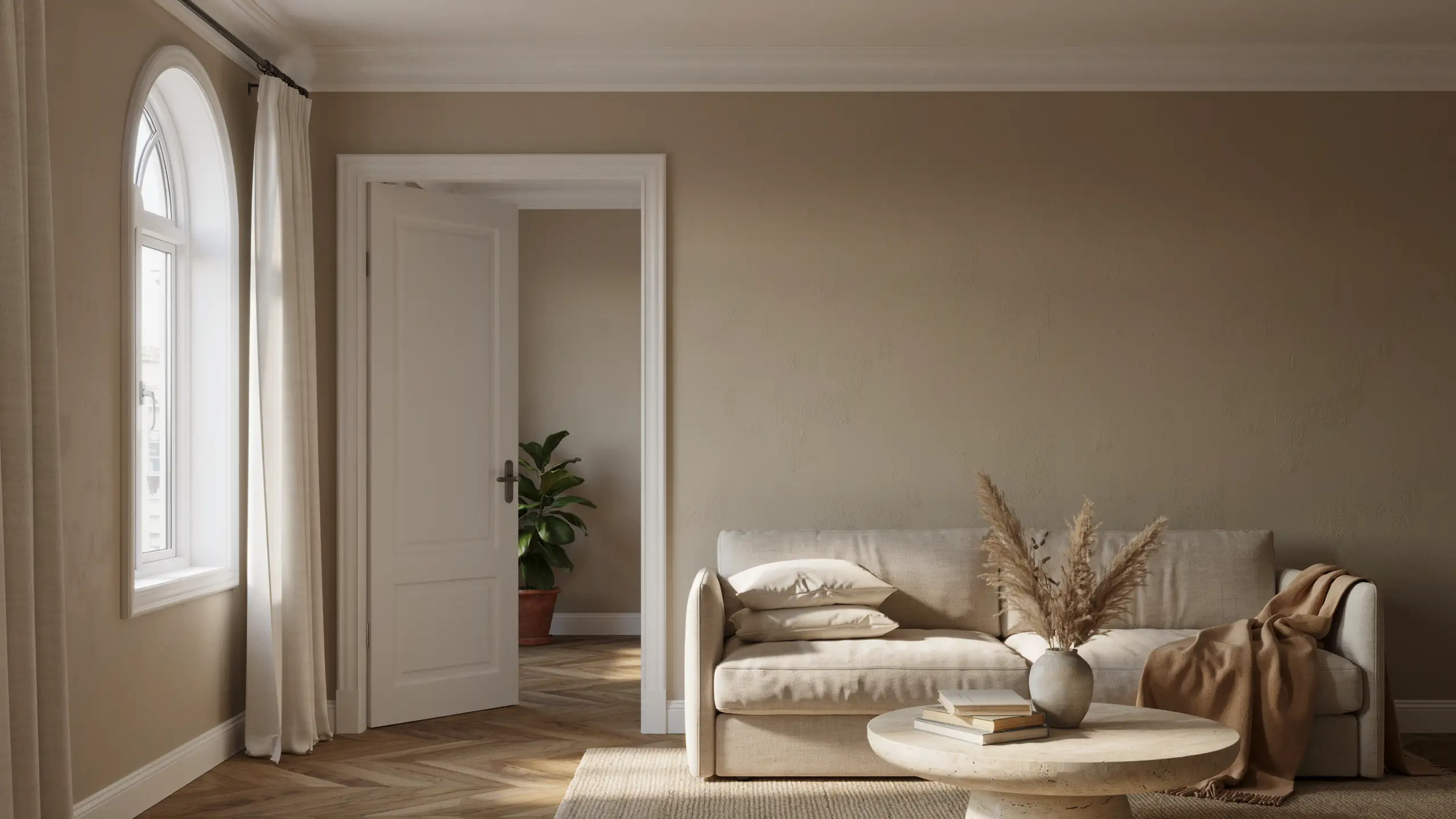
Ballet White works beautifully as a trim color when paired with darker warm neutrals, creating a soft, elegant contrast without feeling too stark.
It also performs well as both a wall and trim color when used in different finishes, such as eggshell on the walls and semi-gloss on the trim, for a subtle tone-on-tone effect.
However, avoid pairing Ballet White with another off-white that has very similar undertones.
Without enough contrast, the combination can appear unintentional, making the overall design feel flat rather than polished and cohesive.
Colors That Coordinate Well With Ballet White
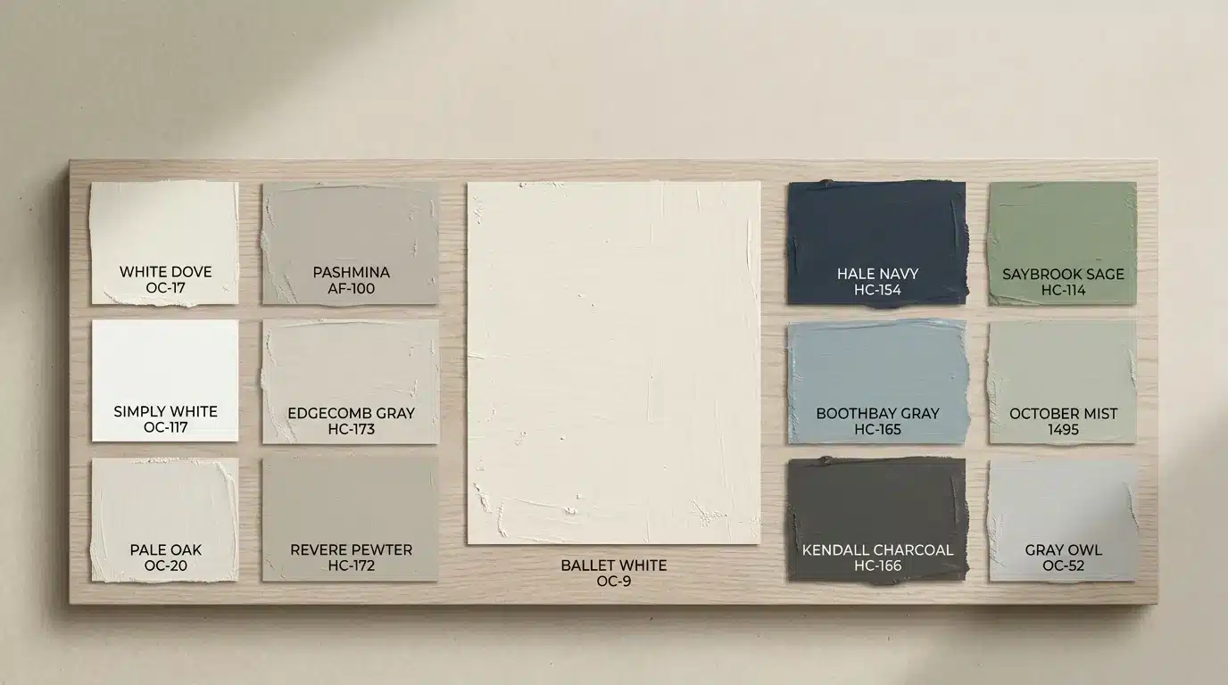
Benjamin Moore Ballet White pairs beautifully with warm neutrals, soft whites, and muted blues or greens.
Crisp whites create contrast, while earthy tones and deeper shades add balance and depth. These combinations help highlight Ballet White’s creamy, timeless appearance in any interior style.
Recommended Color Pairings:
-
White Trim & Ceilings: White Dove OC-17, Simply White OC-117, Chantilly Lace OC-65
-
Warm Neutrals: Pashmina AF-100, Edgecomb Gray HC-173, Revere Pewter HC-172, Kendall Charcoal HC-166
-
Blue & Green Accents: Hale Navy HC-154, Boothbay Gray HC-165, Saybrook Sage HC-114, October Mist 1495
Paint Finishes that Complement BM Ballet White
The right paint finish enhances Ballet White’s soft warmth while improving durability and ease of maintenance
| Surface | Suggested finish | Why it works |
|---|---|---|
| Living and bedroom walls | Matte or eggshell | Soft appearance with manageable cleaning |
| Kitchen and bathroom walls | Eggshell or satin | Better moisture and stain resistance |
| Cabinets | Satin or semi-gloss | Durable and easier to wipe clean |
| Trim and doors | Satin or semi-gloss | Adds definition and withstands handling |
| Ceilings | Flat | Reduces glare and surface imperfections |
| Exterior siding | Low-lustre | Offers durability without excessive shine |
Sheen changes how light bounces off a surface. The same color can look lighter in one finish and richer in another.
Paint Colors that are Similar to Ballet White
If Ballet White isn’t quite right, these shades share its soft, warm character with small shifts in tone.
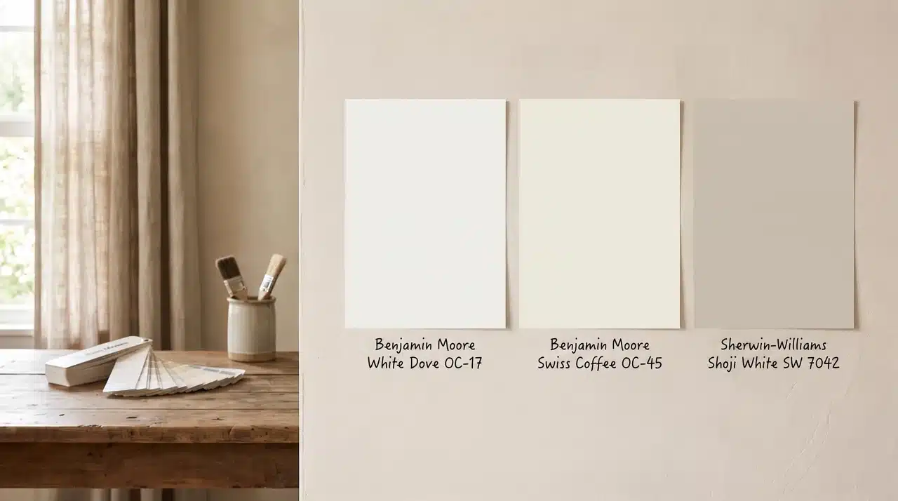
White Dove OC-17
White Dove is one of Benjamin Moore’s most popular soft whites. It reads brighter and crisper than Ballet White, with far less beige weight behind it.
This makes it a strong pick if you want a clean, airy feel without going all the way to a stark white.
Many painters choose White Dove for trim, ceilings, or whole-house schemes where a soft but bright backdrop is the goal.
It stays warm enough to avoid feeling cold, but it won’t carry the same creamy depth as Ballet White.
| Feature | Ballet White OC-9 | White Dove OC-17 |
|---|---|---|
| LRV | 71.97 | 85.4 |
| Undertone | Warm greige, cream, faint green | Soft, clean warmth |
| Best For | Balanced warmth, most rooms | Brighter, crisper spaces |
Swiss Coffee OC-45
Swiss Coffee is a creamier, more traditional off-white. It carries more visible yellow warmth than Ballet White, giving it a cozier, old-world feel that many people associate with classic interiors.
This color tends to lean warmer in every kind of light, including cooler north-facing rooms. If you love the idea of a true cream but find Ballet White too muted, Swiss Coffee may be the better fit.
| Feature | Ballet White OC-9 | Swiss Coffee OC-45 |
|---|---|---|
| LRV | 71.97 | 81.56 |
| Undertone | Warm greige, cream, faint green | Warm, yellow-leaning cream |
| Best For | Balanced warmth, most rooms | Traditional, cozy interiors |
Shoji White SW 7042
Shoji White is Sherwin-Williams’ closest match to Ballet White. It sits in the same warm greige family, but the undertone balance leans slightly cooler and more neutral overall.
If you’re set on a Sherwin-Williams product but want something close to Ballet White’s character, Shoji White is worth sampling.
Just remember that paint formulas across brands are never identical, even when the numbers look similar on paper.
| Feature | Ballet White OC-9 | Shoji White SW 7042 |
|---|---|---|
| LRV | 71.97 | 71 |
| Undertone | Warm greige, cream, faint green | Warm greige, cooler balance |
| Best For | Balanced warmth, most rooms | Sherwin-Williams equivalent |
When Ballet White May Not Be the Right Choice
Ballet White isn’t for every home. It may not fit if you want a crisp, clean, gallery-like white instead of something softer and warmer.
It also struggles when nearby permanent finishes carry strong blue, violet, or cool gray undertones, since Ballet White’s warmth can clash rather than blend in.
Rooms that already lean warm, with golden light and wood tones, can start to feel too creamy once Ballet White joins the mix. Low-light spaces bring a similar risk.
If you want something bright and true white, dim rooms can make this shade look duller than expected. Placed next to a true white, it can also read dingy by comparison.
If you dislike beige, cream, or shifting undertones, this color will likely bother you over time. And if your trim sits too close to Ballet White, you’ll lose the contrast that makes trim details stand out.
Is Benjamin Moore Ballet White a Good Choice?
Ballet White suits homes that want a warm, substantial off-white rather than a crisp, cold one.
It performs best with warm materials, transitional rooms, natural finishes, traditional interiors, and softly layered color palettes.
Its final look depends heavily on your room’s undertones and lighting. That’s simply how this color works.
The smartest move is to sample it at a large scale before making your final decision.
Frequently Asked Questions
What Are The Undertones In Benjamin Moore Ballet White?
Benjamin Moore Ballet White has warm beige and greige undertones. It can appear creamy in warm light and slightly gray in cooler conditions.
Is Benjamin Moore’s Ballet White Too Yellow?
Ballet White is not overly yellow. Its balanced beige undertones create warmth without looking bright yellow, especially when paired with natural lighting.
What Is The Difference Between Ballet White And Swiss Coffee?
Ballet White is softer and more muted with greige undertones, while Swiss Coffee is warmer, creamier, and has stronger yellow-beige characteristics.
What Makes Ballet White So Popular?
Ballet White is popular because it offers a versatile neutral backdrop that works beautifully with modern, traditional, and transitional interiors while feeling warm and timeless.
Does Ballet White Look Dingy?
Ballet White usually does not look dingy. However, in low-light rooms or with cool finishes, its beige undertones may appear slightly muted.