


If you’re considering Sherwin-Williams Rosemary for your home, you probably want to know exactly how it will look on your walls before committing.
I understand that feeling. Deep greens can shift quickly depending on light, and what looks perfect online can feel very different in your space.
Sherwin-Williams Rosemary is a rich, gray-toned green that feels calm, grounded, and refined without becoming overpowering.
In this guide, I’ll walk you through its undertones, lighting behavior, LRV, best finishes, ideal rooms, and coordinating colors. You’ll also see how it compares to similar shades so you can decide confidently.
By the end, you’ll have a clear picture of whether this deep green truly fits your home and style.
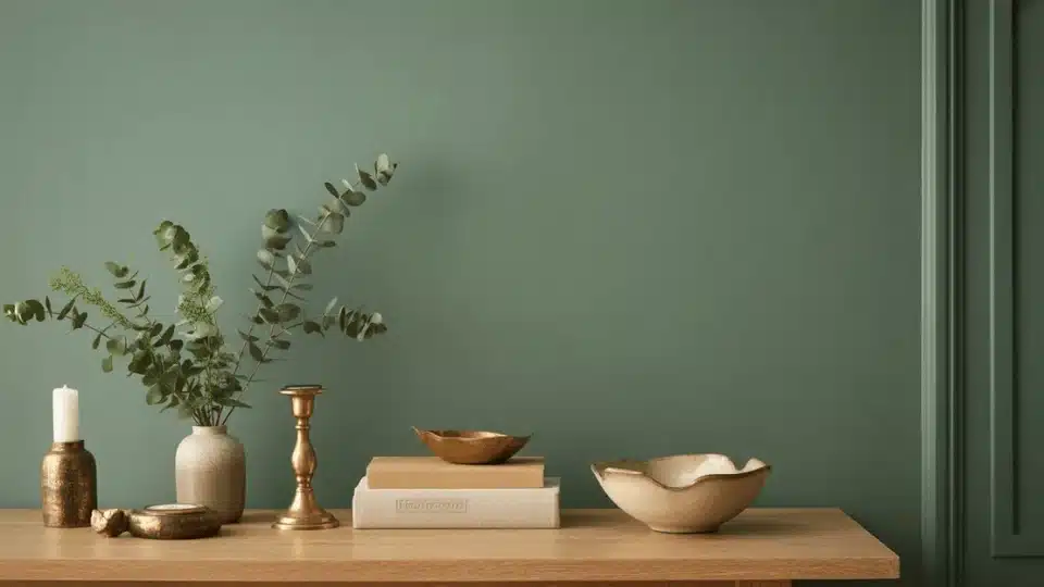
Sherwin-Williams Rosemary at a Glance
Sherwin-Williams Rosemary is a deep green paint color with soft gray undertones. It is not a bright or bold green. Instead, it feels calm, earthy, and balanced.
The gray mixed into it keeps it from looking too sharp or too colorful. This makes it easier to use in many rooms without feeling too dark or heavy.
Rosemary has a natural, organic feel that works well in modern, farmhouse, and classic homes. Unlike very dark forest greens, it has a softer look that adds depth without taking over the space. It pairs beautifully with warm whites, brass hardware, and natural wood tones.
You can use it on walls, kitchen cabinets, built-ins, or even exterior siding. It adds richness while still feeling welcoming and cozy.
Color Details:
RGB: 64 / 75 / 63
HEX: #404B3F
LRV: 14
Sherwin-Williams Rosemary Undertones Explained

Rosemary is a deep green with soft gray undertones that keep it balanced and grounded. Those gray notes prevent it from looking overly bright, muddy, or too forest-dark. Depending on lighting, you may also notice a faint earthy warmth that gives it a natural, organic feel.
- In north-facing rooms, Rosemary can appear cooler and slightly deeper, with the gray undertones becoming more noticeable.
- In south-facing spaces, natural sunlight brings out a subtle warmth, making the green feel richer and more inviting.
- In east-facing rooms, morning light softens the color and highlights its calm, muted quality.
- In west-facing rooms, late afternoon light can introduce a slightly warmer, earthier tone.
Before committing, test large samples on multiple walls and observe the color throughout the day. Lighting and surrounding materials can noticeably influence how Rosemary reads in your space.
Pairing SW Rosemary with SW Oyster White is a classic never-going-out-of-style combination that you can consider. It looks so sleek and natural without doing much.
Where to Use Sherwin-Williams Rosemary SW 6187
Rosemary is a versatile, deep green that works in many parts of the home. Because of its soft gray undertones, it feels balanced and easy to style in both modern and classic spaces.
1. Rosemary for Kitchen Cabinets
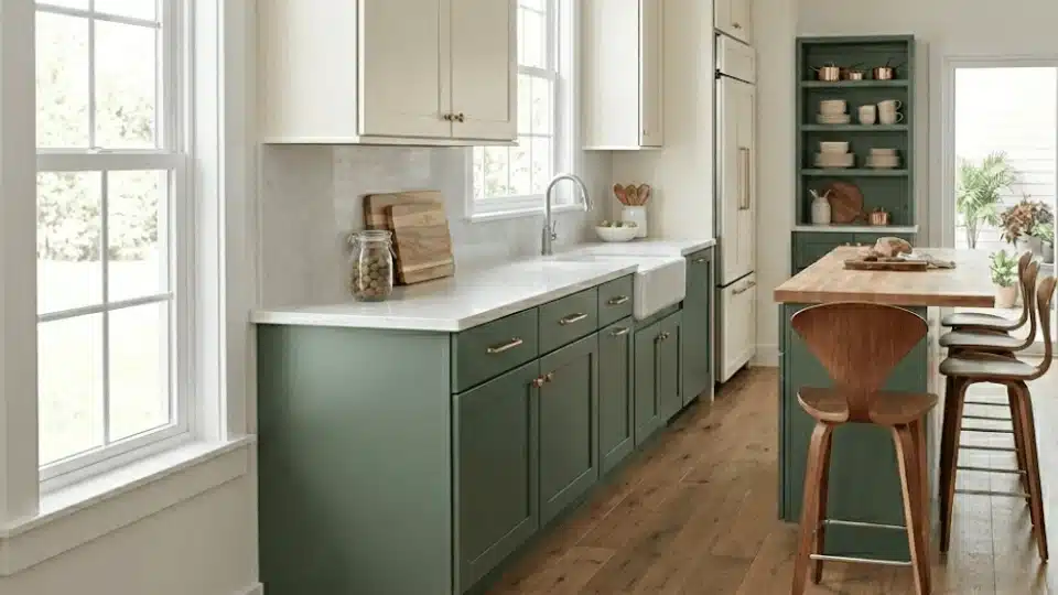
Rosemary works beautifully on kitchen cabinets, especially lower cabinets. Since it is a deeper green with gray undertones, it adds contrast without feeling too bold.
I love using it on base cabinets while keeping upper cabinets white or cream to balance the space. It pairs especially well with brass or brushed-gold hardware, which warms the cool green tone.
It also looks beautiful next to white quartz or marble countertops because the light surface keeps the kitchen from feeling too dark.
2. Rosemary in Bedrooms
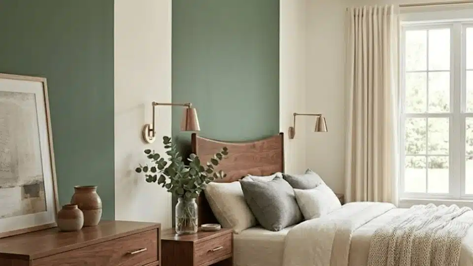
In bedrooms, Rosemary creates a calm and cozy mood. The gray undertones soften the green, so the room feels relaxing instead of dramatic. I’ve found that it works especially well behind the bed as an accent wall.
It pairs nicely with neutral bedding like beige, cream, or soft gray. Add warm wood furniture and layered lighting, and the space feels restful and inviting, perfect for winding down at the end of the day.
3. Rosemary in Living Rooms
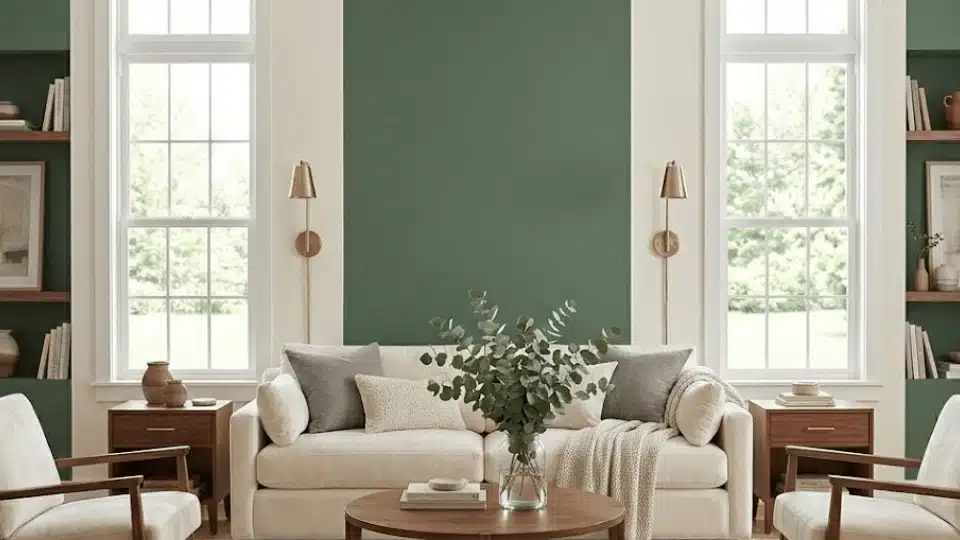
Rosemary can add depth to a living room without making it feel heavy. It looks beautiful on an accent wall, especially behind a fireplace or TV unit. I also like it on built-in shelves or cabinets because it makes décor pieces stand out.
When paired with light sofas, textured rugs, and warm metals, the space feels balanced. The color adds character while still keeping the room comfortable and welcoming for everyday living.
4. Rosemary for Exterior

Rosemary is also a strong choice for exterior use. On siding, it creates a rich, natural look that blends well with the surrounding outdoor environment. Pair it with warm white trim to keep the home looking fresh and clean.
It also works beautifully on front doors, making a bold yet classy statement. If your home has stone details or natural wood accents, Rosemary ties everything together, giving the exterior a timeless, grounded feel.
Sherwin-Williams Rosemary Coordinating Colors

Choosing the right coordinating colors can make Sherwin-Williams Rosemary SW 6187 look even more beautiful. Since Rosemary has soft gray undertones, it pairs best with shades that feel warm, natural, and slightly muted.
| Coordinating Color | Undertone | Why It Works with Rosemary | Best Ways to Use It |
|---|---|---|---|
| Sherwin-Williams Alabaster SW 7008 | Warm creamy white | Softens Rosemary’s cool gray undertones and keeps the space bright without harsh contrast. | Trim, ceilings, upper cabinets |
| Sherwin-Williams Accessible Beige SW 7036 | Warm greige | Blends smoothly with Rosemary’s muted base, creating a natural and cohesive flow. | Adjacent walls, living rooms |
| Sherwin-Williams Natural Linen SW 9109 | Warm beige | Adds warmth and balances the depth of Rosemary, making the room feel cozy. | Bedrooms, large wall areas |
| Sherwin-Williams Urbane Bronze SW 7048 | Deep warm charcoal | Enhances depth for a modern, dramatic look while staying earthy. | Doors, accent trim, exteriors |
| Sherwin-Williams Pure White SW 7005 | Soft neutral white | Creates clean contrast without making Rosemary look too dark or heavy. | Cabinet contrast, trim, ceilings |
This mix of warm neutrals, soft grays, and natural textures helps Rosemary look balanced, rich, and easy to live with in both modern and classic homes.
Sherwin-Williams Rosemary vs. Similar Colors
Before choosing Sherwin-Williams Rosemary SW 6187, it helps to compare it with other popular green shades, including tones like Healing Aloe Review, to see how undertones and depth differ.
Even small differences in undertones can completely change how a color feels in your home.
1. Rosemary vs. Sherwin-Williams Dried Thyme SW 6186

Dried Thyme is slightly lighter and warmer than Rosemary. It leans more toward olive, giving it a softer, more relaxed feel. Rosemary, on the other hand, has stronger gray undertones that make it look cooler and a bit deeper.
In bright rooms, Dried Thyme feels earthy and natural, while Rosemary feels richer and moodier. If you want warmth, choose Dried Thyme. If you prefer depth and contrast, Rosemary stands out more.
2. Rosemary vs. Sherwin-Williams Evergreen Fog SW 9130

Evergreen Fog is much lighter and more muted compared to Rosemary. It has a heavier gray undertone, which can make it look soft and airy, almost like sage green.
Rosemary feels darker and more dramatic, especially in lower light. Evergreen Fog works well if you want a calm and subtle look. Rosemary is better if you want bold depth that still feels refined and balanced.
3. Rosemary vs. Sherwin-Williams Pewter Green SW 6208

Pewter Green is darker and cooler than Rosemary. It has more blue-gray undertones, which can make it feel sharper and more modern.
Rosemary has a smoother balance of gray and green, giving it a softer and more organic look. In bright light, Pewter Green may feel slightly heavier. Rosemary keeps a touch of warmth, making it easier to use in both traditional and contemporary spaces.
Is Sherwin-Williams Rosemary SW 6187 Right for Your Home?
Choosing the right paint color can be stressful, especially when you are considering a darker shade. I’ve found that Rosemary is bold, but it’s also calm and balanced because of its soft gray undertones.
It’s a great choice if you love rich, earthy colors that make a room feel cozy and grounded. It works beautifully on cabinets, built-ins, or accent walls, especially if you already have warm wood, brass hardware, or creamy whites.
However, if your room has very little natural light, it may feel darker than you expect. In that case, a lighter sage green might be easier to live with. I always suggest testing a sample first and checking it throughout the day to see how the lighting affects it.
Design Styles that Suit Rosemary Sherwin-Williams
Sherwin-Williams Rosemary SW 6187 works beautifully across many design styles. Its gray-green balance makes it flexible, whether your home feels modern or more traditional. Here’s how it fits into popular interior looks:
- Moody Modern: Deep green walls, black accents, and clean lines create a bold yet refined space. Rosemary adds drama without feeling too sharp, especially when paired with matte black fixtures and minimal décor.
- Organic Modern: Natural wood, linen fabrics, and warm neutral tones soften Rosemary’s depth. The color feels earthy and grounded, perfect for calm, nature-inspired interiors.
- Cottage: Paired with creamy whites, floral patterns, and vintage details, Rosemary feels cozy and charming. It works beautifully on kitchen cabinets or built-ins.
- Traditional: With brass hardware, rich wood furniture, and classic trim, Rosemary feels timeless and elegant rather than trendy.
- Farmhouse: Combined with shiplap walls, rustic wood beams, and warm metals, Rosemary adds depth while keeping the space welcoming and relaxed.
No matter your style, Rosemary adapts easily and brings a rich, natural feel to the room. The key is balancing it with lighter tones and warm textures so the space feels inviting, not heavy.
Where to Get Sherwin-Williams Rosemary SW 6187
You can purchase Sherwin-Williams Rosemary (SW 6187) at any Sherwin-Williams retail store or directly through their official website at www.sherwin-williams.com.
Rosemary is available in both interior and exterior paint formulas, so you can use it on walls, cabinets, furniture, or even siding. You can choose from finishes such as matte, satin, semi-gloss, or gloss, depending on your project. For example, satin or semi-gloss works beautifully on cabinets, while matte is great for walls.
If you want to test it first, you can order a peel-and-stick sample from Samplize. It lets you see the true color in your own lighting without the mess of traditional sample paint.
Final Coat
Now you have a complete understanding of Sherwin-Williams Rosemary, including its gray-green undertones, lighting shifts, ideal uses, and coordinating colors.
I’ve covered how it performs in kitchens, bedrooms, living rooms, and exteriors, along with how it compares to similar greens. When you know how a color reacts to natural and artificial light, you avoid expensive mistakes and second-guessing.
The key is simple: test it in your own space and observe it throughout the day before making a final decision. That small step protects your budget and your confidence.
If you’re planning to use Rosemary, share where you’re considering it. I’d love to hear how it looks in your home.


