

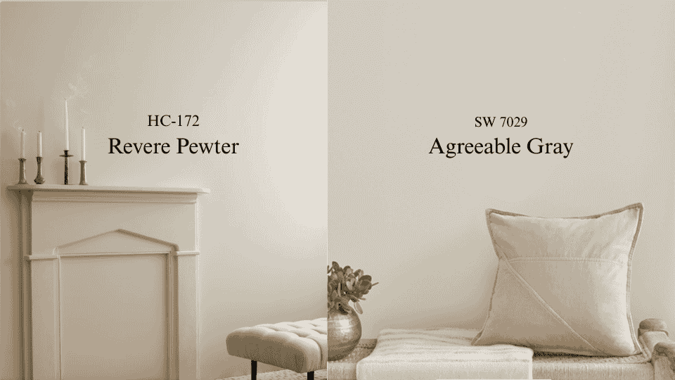

Years of color consulting have shown me that the debate between Revere Pewter HC-172 and Agreeable Gray SW 7029 never really goes away. Both sit in that middle ground between gray and beige, but they feel completely different on a wall.
Revere Pewter brings warmth through its green-gray undertones. Agreeable Gray stays cooler and lighter with a beige-tan base. That difference determines whether a room feels settled and cozy or open and fresh.
Over a decade of watching these two perform across different homes and lighting conditions comes down to one thing: the right choice depends entirely on your space. Let me walk you through everything I learned so you can make the right call for your space.
What is Revere Pewter?
Revere Pewter HC-172 from Benjamin Moore sits right in that sweet spot where gray meets beige with a twist. This color has warm undertones that lean green and gray, creating a complex, layered look that changes throughout the day.
With an LRV of 55, it’s medium-depth, not too dark, not too light, which means it adds substance to walls without making rooms feel heavy.
What makes Revere Pewter special is how it reads differently in different spaces. In north-facing rooms, those green undertones come forward, giving walls an almost sage-like quality.
Under southern light, the gray softens, and the warmth glows through. This color can look like rich putty in one house and soft moss in another.
It’s a chameleon that rewards homes with good natural light but can feel muddy in darker spaces. The color works beautifully with natural materials, think warm wood floors, leather furniture, and stone countertops.
What is Agreeable Gray?
Agreeable Gray SW 7029 from Sherwin-Williams takes a different approach to the greige formula. This color leans cooler and lighter with beige-tan undertones that stay consistent across different lighting conditions.
Its LRV of 60 makes it brighter than Revere Pewter, which is why you’ll see it recommended for smaller rooms or spaces that need more light reflection. What’s appreciated about Agreeable Gray is its reliability. It doesn’t shift dramatically from morning to evening or play tricks depending on which direction your windows face.
The color maintains a neutral, balanced presence that works with both warm and cool accent colors. It’s become the default choice for open-concept homes because it flows easily from room to room without creating jarring transitions.
Agreeable Gray pairs effortlessly with white trim, stainless steel appliances, and contemporary furniture, clean without feeling cold, neutral without being boring.
Revere Pewter vs. Agreeable Gray: The Breakdown
Let me give you a straightforward comparison that cuts through the marketing fluff and gets to what actually matters when you’re standing in the paint aisle:
| Feature | Revere Pewter | Agreeable Gray |
| LRV | 55 (medium) | 60 (lighter) |
| Undertones | Green-gray | Beige-tan |
| Warmth | Warmer, cozier | Cooler, fresher |
| Best Lighting | Natural light, south-facing | Works in any lighting |
| Room Feel | Intimate, grounded | Open, airy |
| Style Match | Traditional, transitional | Modern, contemporary |
| Color Shifts | Noticeable throughout the day | Stays consistent |
| Best With | Wood, leather, stone | White, steel, minimal decor |
Both colors have their strengths, but the right choice depends on your lighting conditions, room size, and whether you prioritize warmth or brightness in your space.
Best Rooms for Revere Pewter and Agreeable Gray
Testing both colors in different rooms across dozens of homes has revealed where each one truly shines and why it matters.
1. Living Rooms
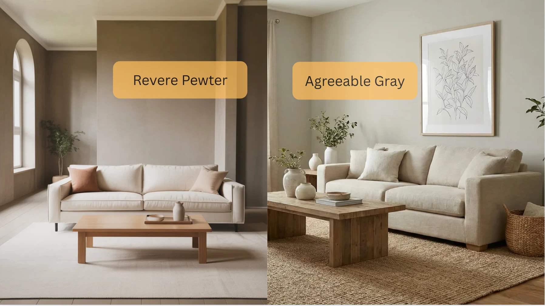
Revere Pewter works magic in living rooms where you want people to relax and stay awhile. The warmth in this color makes large spaces feel more intimate without shrinking them visually.
It’s particularly stunning in living rooms with hardwood floors and lots of seating, the kind of room where you curl up with a book on Sunday afternoons. The green-gray undertones complement natural textures like jute rugs, linen sofas, and wood coffee tables.
However, if your living room doubles as a workspace or you prefer a lighter, more energized feel, Agreeable Gray keeps things bright and focused without adding warmth that might feel too casual.
2. Bedrooms
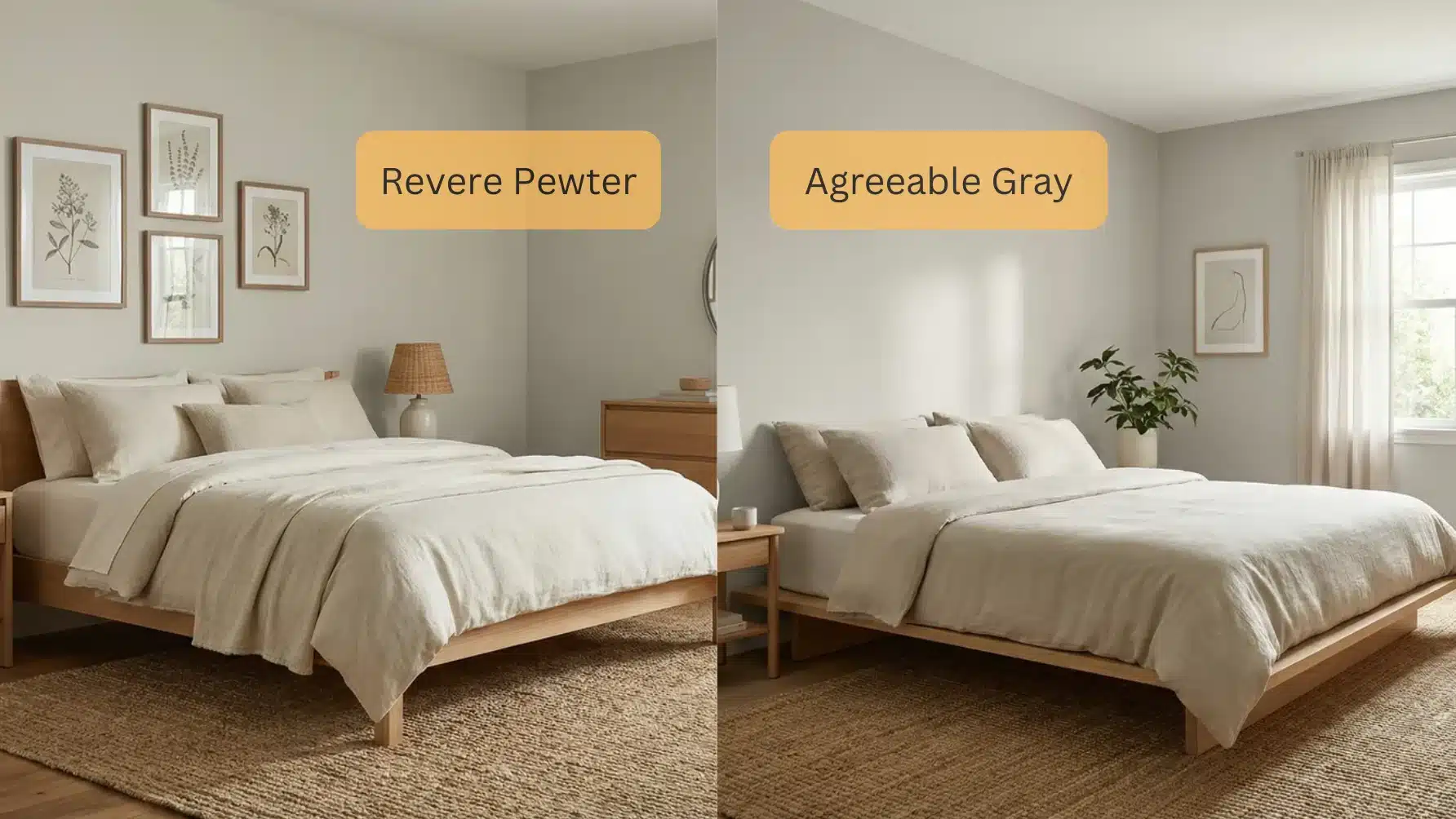
For bedrooms, Revere Pewter creates that restful cocoon feeling always recommended for sleep spaces. The warm undertones make bedrooms feel like retreats where you can shut out the world.
It works beautifully in master bedrooms with white bedding and wood furniture, never failing to create that five-star hotel vibe.
Agreeable Gray works better in bedrooms where you get ready in the morning and want good, clear light for choosing clothes and applying makeup.
It’s also the top pick for guest bedrooms in modern homes where the style skews contemporary. The lighter tone keeps smaller bedrooms from feeling closed in.
3. Kitchens
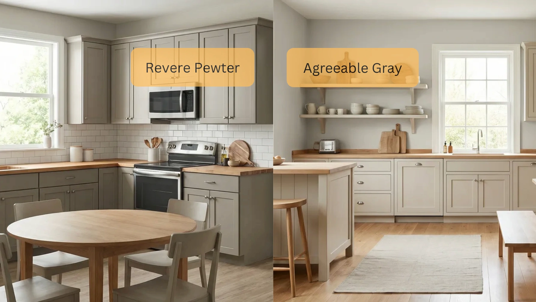
Agreeable Gray wins in most kitchens, especially those with white cabinets and stainless steel appliances. The color reflects light beautifully, making meal prep easier and keeping the space feeling clean and organized.
It looks fantastic in both traditional and modern kitchens because it doesn’t compete with cabinet hardware, countertops, or backsplashes.
Revere Pewter can work in larger kitchens with lots of natural light, particularly in farmhouse or transitional styles where you want walls to add warmth rather than fade into the background.
But be cautious, in galley kitchens or spaces with limited windows, Revere Pewter might make the room feel cramped.
4. Bathrooms
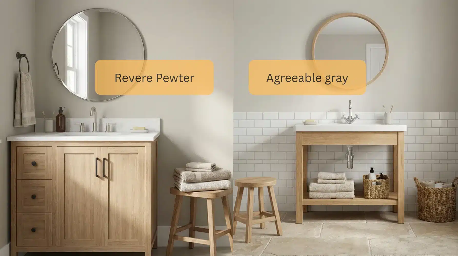
Bathrooms present unique challenges because of artificial lighting and often limited natural light.
Agreeable Gray handles this better, staying consistent under vanity lights and avoiding the green cast that Revere Pewter can develop in spaces dominated by artificial lighting. Agreeable Gray is recommended for bathrooms with white fixtures, chrome hardware, and minimal natural light.
Revere Pewter shines in larger bathrooms with windows, especially those going for a spa-like feel with natural stone, wood vanities, and warmer metal finishes like brass or oil-rubbed bronze. The warmth complements the organic materials beautifully.
5. Home Offices
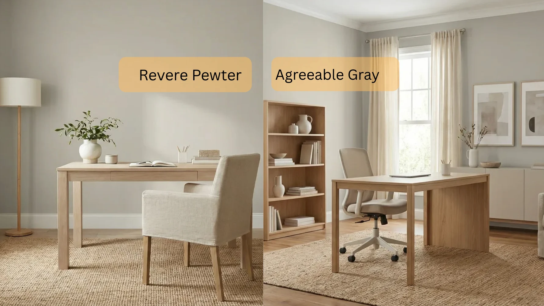
Agreeable Gray tends to be the better choice for home offices because it keeps the space feeling bright and focused without adding warmth that might make you feel too relaxed.
The lighter, cooler tone works well with computer screens and task lighting, and it doesn’t create color casts that might affect video calls.
Revere Pewter can work in home offices that double as libraries or creative studios where you want a more grounded, contemplative atmosphere.
If your work requires concentration and energy, Agreeable Gray keeps you alert. If you need a calming space for creative work, Revere Pewter provides that.
Real Opinions: What Homeowners Are Saying
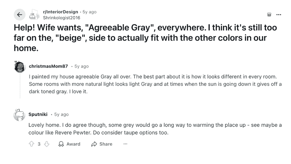
In a Reddit discussion on the InteriorDesign subreddit, users shared mixed feelings about Agreeable Gray. One user mentioned that while the color looked good in some rooms, it didn’t feel gray enough, leaning too much toward beige in certain spaces.
Another user praised Agreeable Gray for how it shifted in light, with some rooms showing a light gray tone while others revealed a darker shade in the evening.
A few other commenters suggested trying Revere Pewter for a warmer, more grounded feel. One user said, “I do agree though, some grey go a long way to warming the place up – see maybe a colour like Revere Pewter.”
If you’re debating between the two colors, this Reddit thread shows how personal preferences and lighting can make a big difference in how they look in your home.
Cost Comparison of Revere Pewter and Agreeable Gray
Price matters when you’re painting multiple rooms. Here’s what you’ll actually spend on each color, including the available coverage and finish options:
| Factor | Revere Pewter | Agreeable Gray |
| Brand | Benjamin Moore | Sherwin Williams |
| Price per Gallon | $55–$75 | $40–$70 |
| Coverage per Gallon | 400 sq ft | 400 sq ft |
| Finish Options | Matte to high gloss | Flat to gloss |
| Coats Needed | 2 coats recommended | 2 coats recommended |
| 12×12 Room Cost | $55–$75 (1 gallon) | $40–$70 (1 gallon) |
| Primer Required | Yes, for the best results | Yes, for the best results |
| Durability | Excellent | Excellent |
Benjamin Moore generally costs slightly more than Sherwin-Williams, but both brands offer excellent coverage and durability. One gallon covers approximately 400 square feet, so a typical 12×12 room needs about 1 gallon for two coats.
How These Two Colours Compare to Other Popular Neutrals?
Both colors sit in crowded fields of popular neutrals from their respective brands. Here’s how Revere Pewter and Agreeable Gray compare to their closest competitors:
Revere Pewter vs Other Benjamin Moore Colors
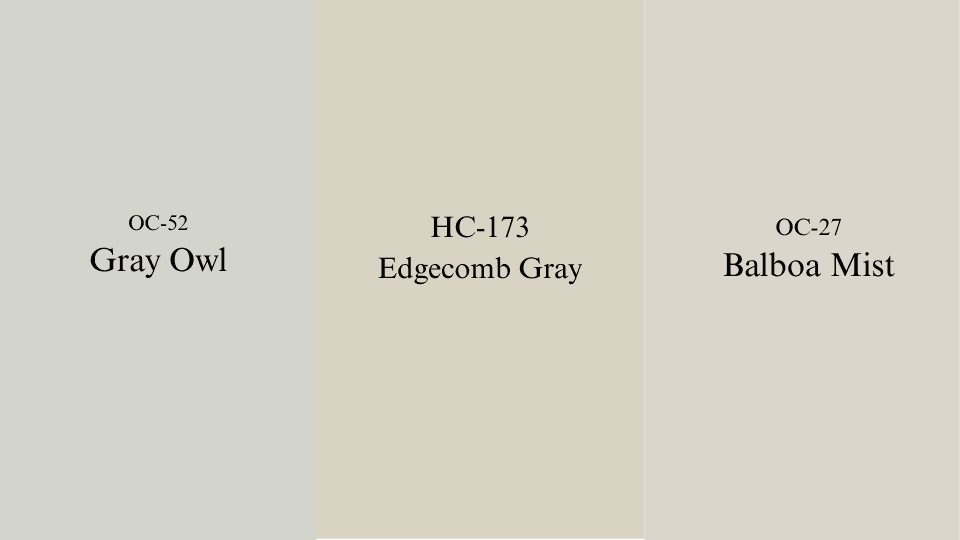
If you’re drawn to the warmth and depth of Revere Pewter, here’s how it compares to other popular Benjamin Moore shades:
- Gray Owl(OC-52): Cooler and lighter, ideal for bright, airy spaces without the green undertones of Revere Pewter.
- Edgecomb Gray(HC-173): Warmer beige tone, lacking the complex green-gray undertones that make Revere Pewter unique.
- Balboa Mist(OC-27): Softer and lighter, great for small rooms, but doesn’t offer the same depth as Revere Pewter.
Revere Pewter shines with its rich, deep green-gray, setting it apart from other neutrals while still offering versatility.
Agreeable Gray vs Other Sherwin-Williams Colors
Agreeable Gray is beloved for its soft balance of gray and beige. Let’s see how it stacks up against other Sherwin-Williams colors:
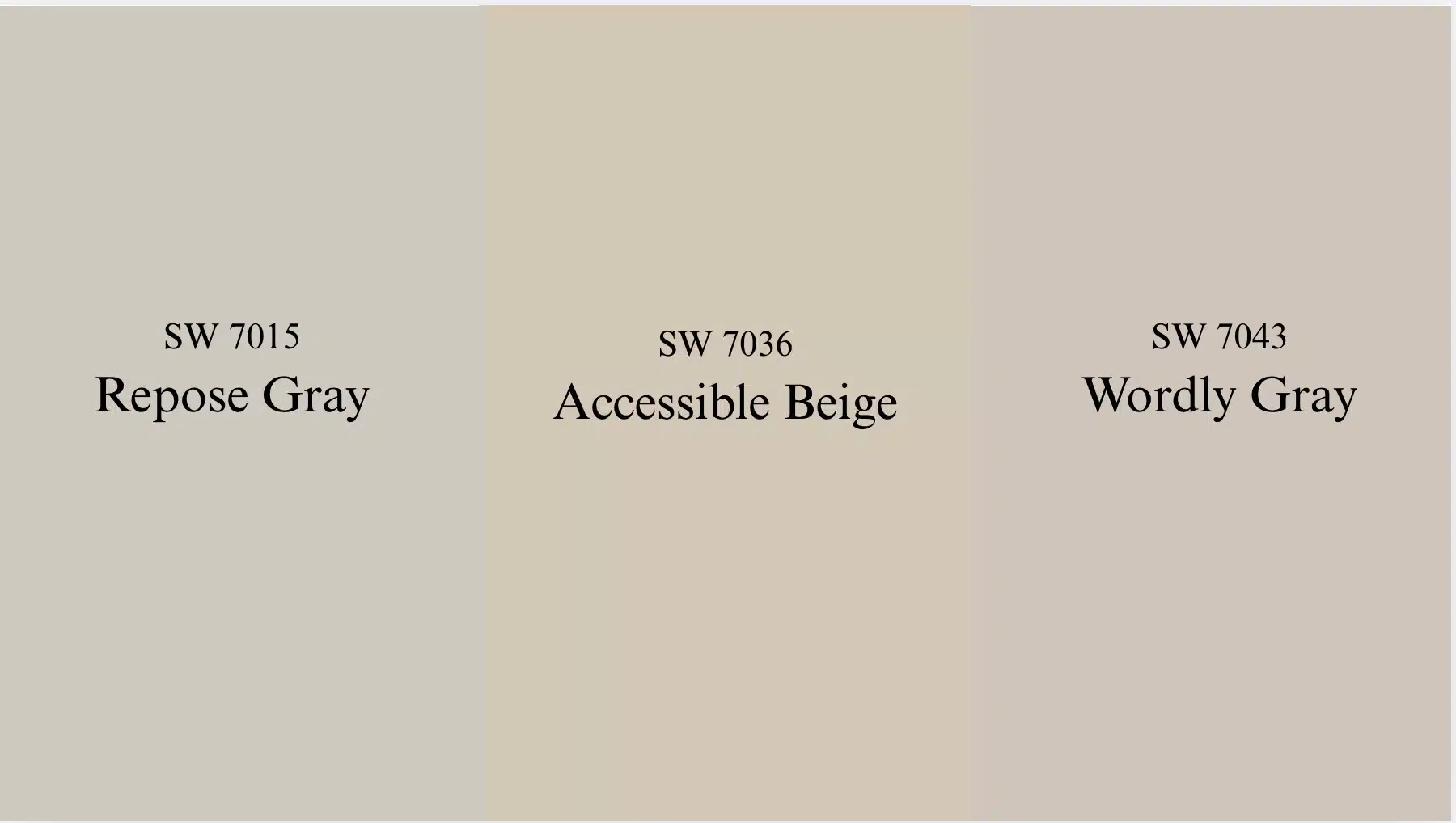
- Repose Gray(SW 7015): True gray with minimal beige, offering a crisper, modern feel compared to Agreeable Gray.
- Accessible Beige(SW 7036): Warmer, with more beige, ideal for spaces that need an extra layer of coziness.
- Worldly Gray(SW 7043): Similar LRV but cooler undertones, offering less versatility in different lighting conditions compared to Agreeable Gray.
Revere Pewter and Agreeable Gray are the perfect greige shades, balancing gray and beige, which is why they remain popular choices.
Durability: Which Lasts Longer?
Both Revere Pewter and Agreeable Gray perform well over time, but certain conditions favor one over the other. Both colors hold up equally well in high-traffic areas when you use quality paint with the right finish.
Eggshell or satin finishes work best for hallways and living rooms because they’re washable without looking too shiny. Where they differ is in fade resistance. Agreeable Gray maintains its color better in rooms with intense direct sunlight because lighter colors fade less noticeably.
Revere Pewter can develop a slightly grayer appearance over several years in sun-drenched rooms, though this happens gradually. Your room’s sun exposure matters more than the color choice itself.
Final Thoughts
After working with both colors across countless client projects, the Revere Pewter vs Agreeable Gray decision always comes back to one question: how do you want the room to feel? Revere Pewter adds depth and warmth but needs good natural light to work at its best.
Agreeable Gray stays reliably open and light across most conditions. Put samples on your actual walls, check them at different times of day, and let your space give you the answer.
What reads perfectly at noon can shift by dusk. Trust your light, trust your instincts, and the right color will make itself obvious. Drop a comment below, I’d love to hear which color you choose!


