

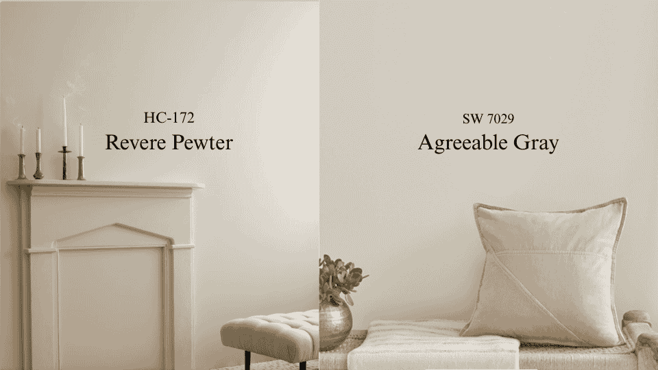


I have repainted more rooms in Revere Pewter than any other color on my shelf. Not because it is a bad color. Because people choose it from a showroom chip and then take it home to a room that cannot support it.
That is the whole comparison, really. Revere Pewter HC-172 reads at LRV 55.51 and carries a green thread under a warm taupe base. Agreeable Gray SW 7029 sits at 60 with much quieter undertones. On a fan deck the two look like siblings. On a wall, in a specific room, with your specific windows, they are not close.
If you want the short answer: Agreeable Gray if your light is limited, mixed, or north-facing. Revere Pewter if you have real daylight and you want the walls to hold some weight.
What is Revere Pewter?
Revere Pewter is a warm greige with green sitting underneath a taupe base. Benjamin Moore publishes its LRV as 55.51. Medium depth, so the walls read as an actual color rather than a soft white.
The green is the whole story. Most people cannot see it on the chip. Nearly everyone sees it once it is on 300 square feet of drywall in the wrong light.
The clearest version I have seen was a nursery on the north side of a house in Bend. Two windows, both facing a neighbor’s fence. The parents had fallen for Revere Pewter in a friend’s sunroom and could not understand why theirs looked like a hospital corridor by three in the afternoon. It was the same paint. Their friend had four hours of southern sun and they had none, and the green rose to fill the gap.
Give it daylight and it turns into something else entirely. Warm putty, a little grounded, beautiful against wood floors and leather and stone. That is why the online photos of this color contradict each other so violently. Everyone is shooting a different house.
What is Agreeable Gray?
Agreeable Gray is lighter, at LRV 60, and built more simply. A beige-gray mix without much going on beneath it.
I want to be honest about it: this is not an exciting color. It flattens in weak light and picks up a faintly cool, almost dusty cast against a bright white trim. I have had clients tell me their walls looked like a rental.
What it does instead is behave. It moves a little through the day, but always within a narrow lane. It never shocks you in the fourth room after you have already committed in the first three. Sherwin-Williams sells more of this than any other color they make, and that is a fact about reliability rather than beauty.
When I cannot control the light, or when one color has to run through an open plan that faces four directions, I specify Agreeable Gray without much internal debate.
Revere Pewter vs. Agreeable Gray: Side by side
|
Feature |
Revere Pewter HC-172 |
Agreeable Gray SW 7029 |
|---|---|---|
|
Brand |
Benjamin Moore |
Sherwin-Williams |
|
LRV |
55.51 |
60 |
|
Beneath the surface |
Warm taupe, green thread |
Soft beige-gray, muted |
|
Through the day |
Moves a lot; green rises in cool light |
Moves within a narrow lane |
|
Poorly lit rooms |
Goes murky |
Goes flat, but holds |
|
Feel |
Grounded, weighted |
Open, undemanding |
|
Best company |
Wood, leather, stone, aged brass |
White trim, chrome, cooler metals |
|
How it fails |
Green cast in the wrong exposure |
Reads like a rental in a big empty room |
Is a 5-point LRV difference noticeable?
LRV runs 0 to 100 and describes how much light a color throws back at you. A five-point gap sounds trivial. Clients hear it and stop worrying.
Here is where it bites. In a bright room, both colors have plenty of light to work with and you would struggle to care. In a dim room, every point of reflectance is doing real labor, and Revere Pewter’s extra depth tips into heaviness much faster. The worse the light, the bigger that small number gets.
Which is also why I no longer let anyone decide from a chip. A two-inch square held under kitchen downlights tells you nothing useful about November at four in the afternoon. Sampling properly in your own light is the only step in this process I refuse to skip.
Best Rooms for Revere Pewter and Agreeable Gray
Testing both colors in different rooms across dozens of homes has revealed where each one truly shines and why it matters.
1. Living Rooms
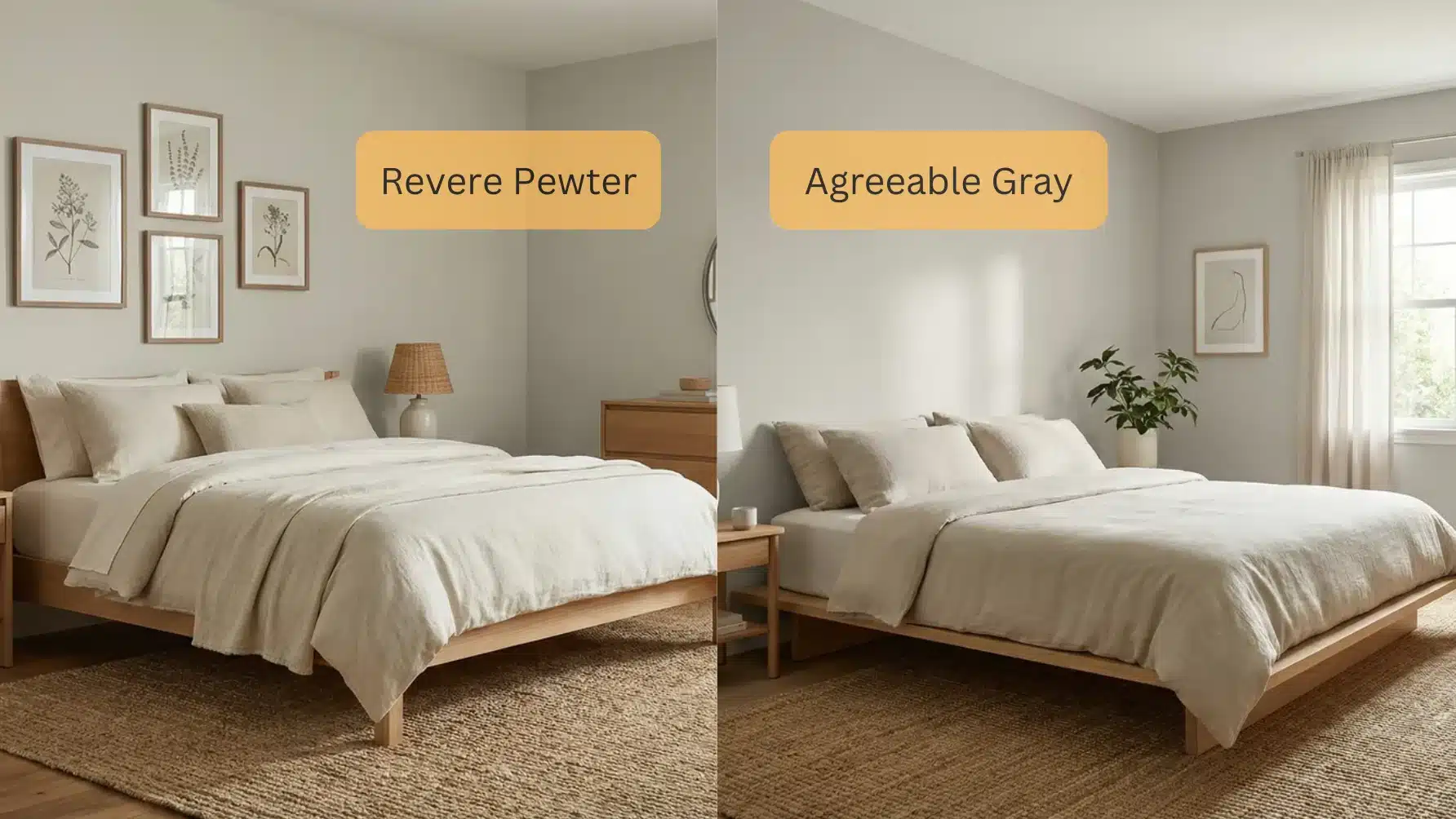
This is Revere Pewter’s room. Living rooms are usually the largest and best-lit space in the house, which is exactly what it needs. The extra depth stops a big room from reading like a waiting area, and the warm base agrees with hardwood, jute, and linen without any effort from you.
The exception is an open plan. Once a single color has to turn a corner into a kitchen with different windows, I stop caring about character and start caring about consistency.
2. Bedrooms
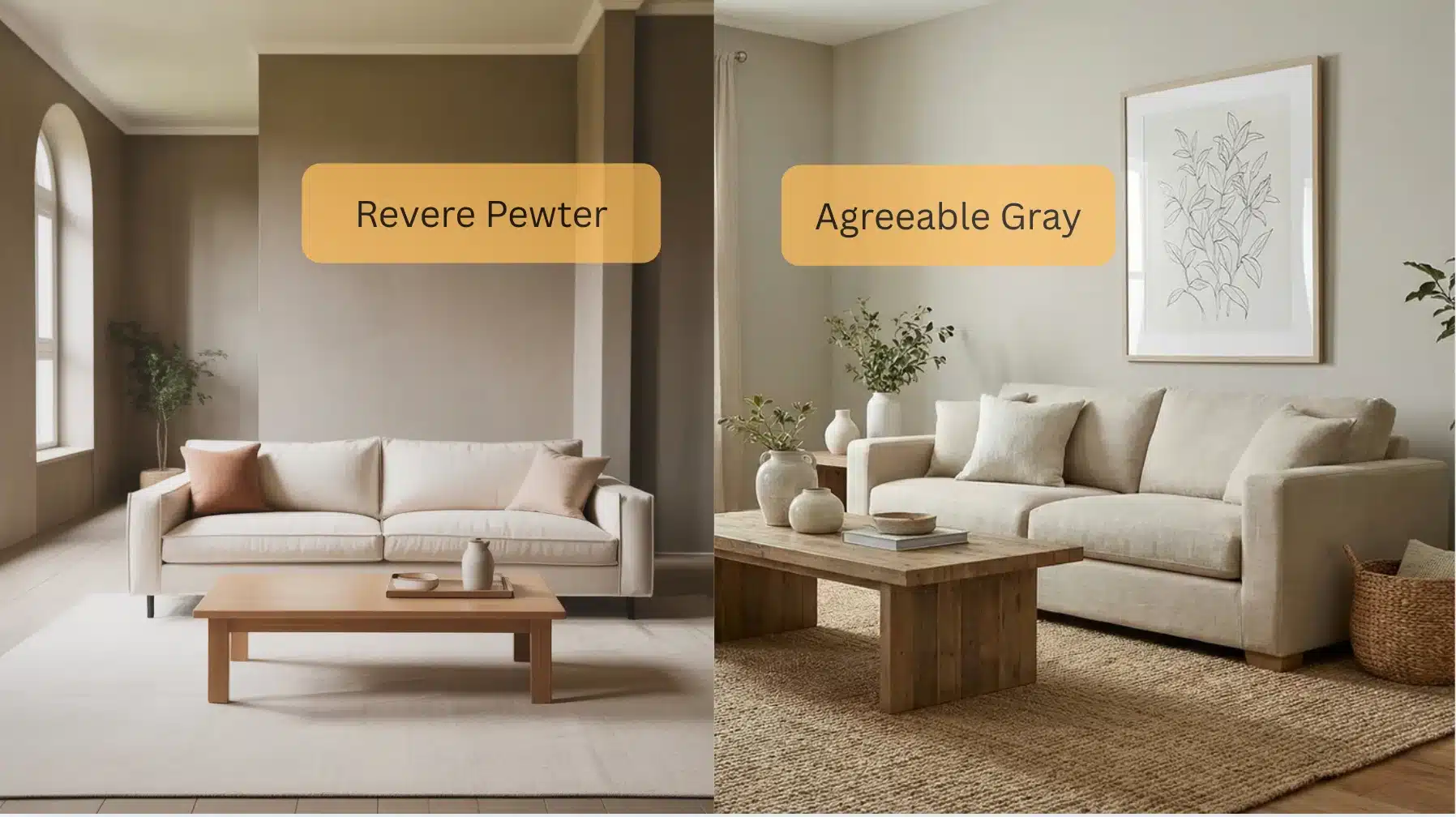
Revere Pewter closes a bedroom in slightly, which is the point of a bedroom. I have specified it in primary bedrooms with white bedding and walnut furniture more times than I can count, and it has never once let me down when the room had a window worth the name.
Agreeable Gray earns its place in the bedroom you get dressed in. Clearer light, easier to judge what you are wearing, and the higher value keeps a small room from tightening around you. That trade between depth and brightness runs through most warm bedroom color decisions.
3. Kitchens
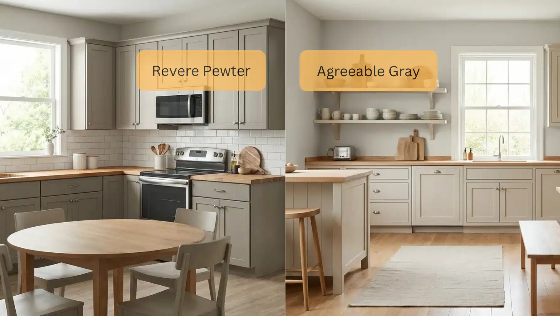
Agreeable Gray takes most kitchens, and it is not close. A kitchen is already full of finishes competing for attention. The wall color’s job is to stay out of the argument, and quiet undertones do that.
It sits beside white cabinets and stainless steel without dragging green or yellow into the room.
Revere Pewter works in a big farmhouse kitchen with windows on two walls. In a galley with one window over the sink, it will close in on you by winter.
4. Bathrooms
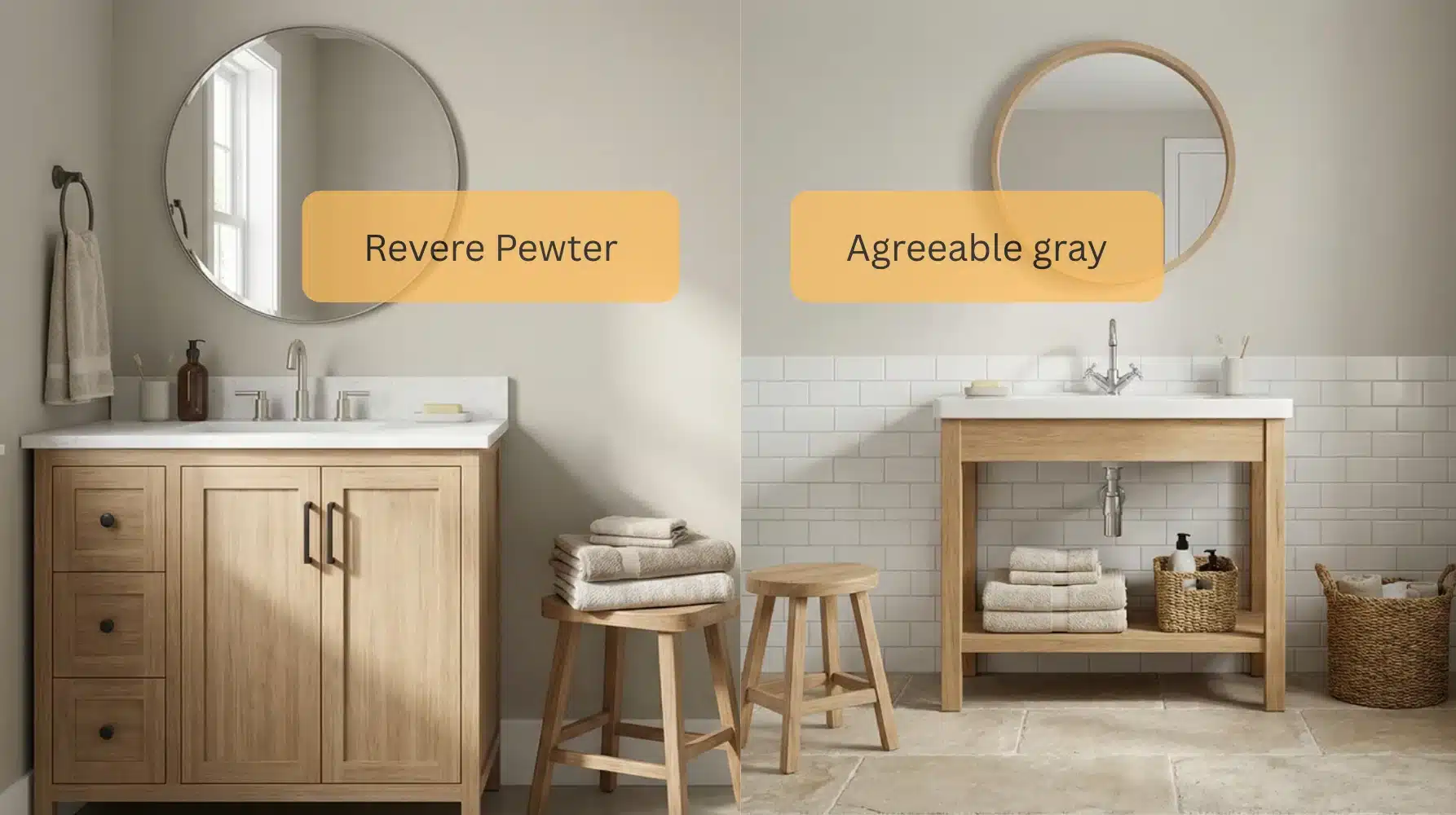
Bathrooms are the hardest test I give a color, because most of them run entirely on bulbs. Cool LEDs pull Revere Pewter’s green straight to the surface. I have seen it read frankly sage under 5000K vanity strips.
Put a real window in the room and it comes back into play, and it looks right next to stone, a wood vanity, and aged brass or oil-rubbed bronze.
5. Home Offices
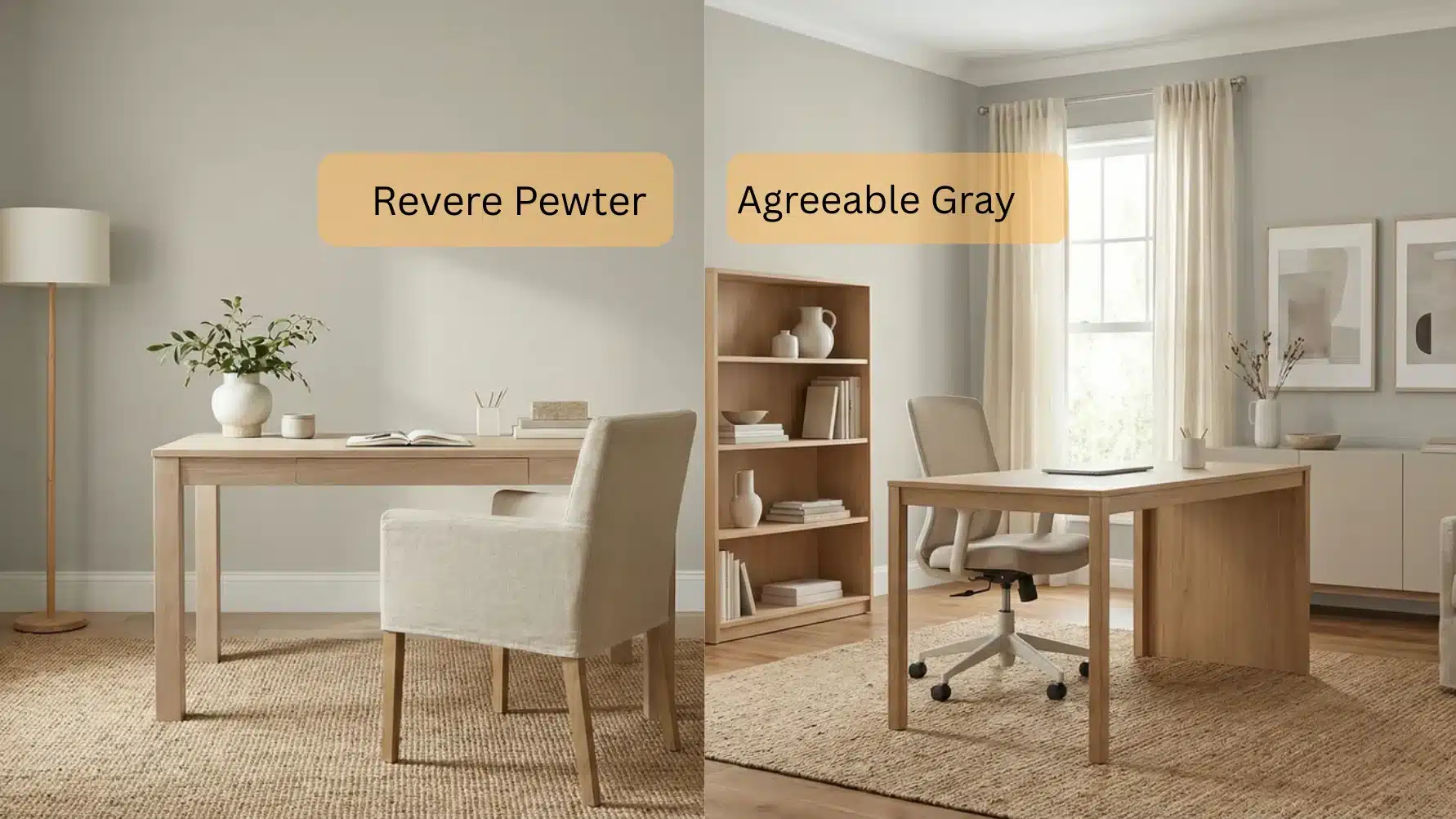
One practical reason I lean Agreeable Gray here: it throws less color onto your face on video calls. Revere Pewter can push a faint green tint into camera light, and once a client notices it on a Zoom recording they cannot unsee it.
If the room is more study than workstation, reverse that. Revere Pewter gives it the settled, library quality that suits reading.
Can you use both in one house?
Not in rooms that can see each other. I have tried. Through a doorway, the beige in one and the green in the other read as a mistake rather than a decision, and the value gap makes whichever wall is darker look faintly dirty.
Separate closed rooms on different floors, nobody will ever know. My rule: stand in one spot. If you can see both colors from there, pick one.
There is a brand trap here too. These are mixed in different bases with different pigment loads. Ask Sherwin-Williams to match Revere Pewter and you will get something that looks right on the lid and loses exactly the behavior you wanted the color for. If you want Revere Pewter, buy Benjamin Moore.
Real Opinions: What Homeowners Are Saying
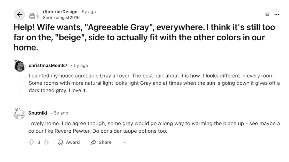
A thread on the InteriorDesign subreddit lays out the same split I see in consultations. Several people liked Agreeable Gray but said it did not read gray enough in their rooms, leaning beige.
Another described it as light in the morning and noticeably deeper by evening. A few pointed the original poster toward Revere Pewter for warmth instead, with one summing it up as “some grey go a long way to warming the place up.”
Both camps are right about their own houses. That is the part worth taking from it.
Cost Comparison of Revere Pewter and Agreeable Gray
|
Factor |
Revere Pewter |
Agreeable Gray |
|---|---|---|
|
Brand |
Benjamin Moore |
Sherwin-Williams |
|
Price per gallon |
$55 to $75 |
$40 to $70 |
|
Coverage per gallon |
About 400 sq ft |
About 400 sq ft |
|
Coats |
2 |
2 |
|
12 x 12 room, walls only |
2 gallons |
2 gallons |
|
Primer |
Over bare or dark surfaces |
Over bare or dark surfaces |
Do the arithmetic before you get to the register, because the one-gallon assumption catches almost everyone. A 12 by 12 room with 8-foot ceilings gives you about 384 square feet of wall. Knock off roughly 35 for a door and a window and you are near 350. Two coats is 700 square feet. That is two gallons.
Sherwin-Williams discounts often enough that the gap between the brands is usually smaller than the list prices suggest. For a whole house, the full interior painting cost breakdown covers labor and prep alongside the paint itself.
If neither is quite right
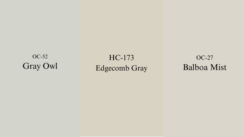
The three I reach for when a client likes Revere Pewter but the room will not take it: Gray Owl OC-52, cooler and lighter with the green removed. Edgecomb Gray HC-173, which keeps the warmth and drops the complexity, and is far easier to live with. Balboa Mist OC-27 for small rooms that cannot carry the depth.
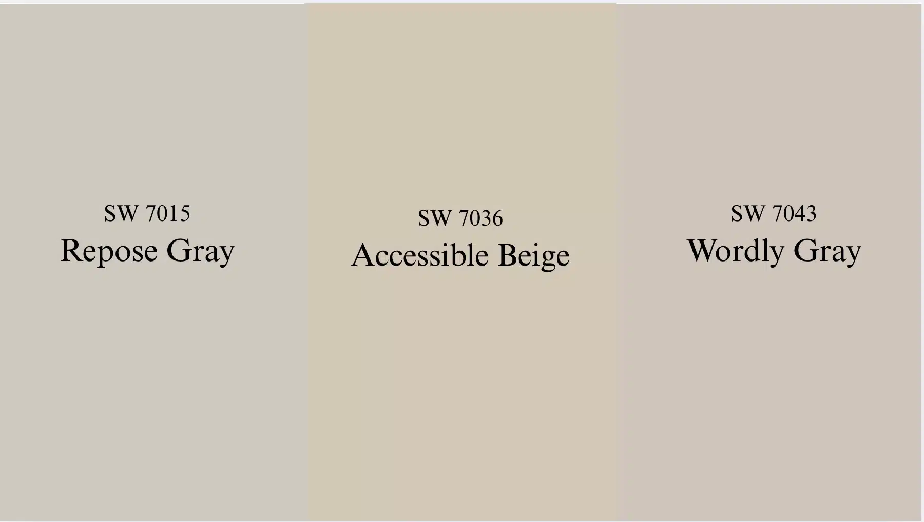
On the Sherwin-Williams side, Repose Gray SW 7015 is a truer gray with the beige pulled back. Accessible Beige SW 7036 pushes into Revere Pewter’s warmth without importing the green, and it is where a lot of my clients land when they wanted Revere Pewter and have a north-facing house. Worldly Gray SW 7043 sits at a similar value with a cooler cast.
Durability: Which Lasts Longer?
Both hold up. The finish matters more than the color does, and I would argue that more strongly than almost anything else here. Eggshell and satin wash clean without throwing glare, which is why they end up in hallways. Flat marks the moment anyone touches it, and picking the right sheen for the room buys you more durability than either of these colors will.
On fading, lighter colors lose their look more slowly, so Agreeable Gray has a small advantage in a room that takes hard direct sun. Revere Pewter can drift a touch grayer over several years in that situation. Sun exposure drives it far more than the color choice does.
What I would actually do
For most houses, Agreeable Gray. It asks less of the room, it survives mixed exposures, and it will not ambush you in the third bedroom.
Revere Pewter when the conditions genuinely suit it: real daylight, wood and stone already in the room, and a client who wants to notice the walls. Under those conditions, nothing else I specify has quite the same depth.
Buy a sample pot of each. Paint two coats on poster board rather than the wall, and carry the boards around the room over a full day, including after the lamps go on. If you are choosing trim at the same time, settle how the trim white sits against the wall now rather than repainting baseboards twice.
Frequently Asked Questions
When should you not use Revere Pewter?
Avoid it in north-facing rooms with small windows, bathrooms lit only by cool LEDs, and galley kitchens. In weak light the green surfaces and the walls turn murky.
Is Revere Pewter still popular?
Yes, though less dominant than a decade ago. It has held a place in Benjamin Moore’s best sellers for years. Warmer, simpler greiges now absorb some of that demand.
What Sherwin-Williams color is closest to Revere Pewter?
Anew Gray SW 7030 and Mega Greige SW 7031 come nearest on depth and warmth. Neither reproduces the green undertone, since the brands use different pigment bases.
What is replacing Agreeable Gray?
Warmer neutrals are taking its place in new work, mainly Accessible Beige and Shoji White. The move is away from gray-leaning greige toward colors with visible warmth.
Can Revere Pewter and Agreeable Gray go in the same house?
Only in rooms that cannot be seen at once. Side by side or across an open plan, the difference beneath them reads as a mismatch rather than a deliberate pairing.
Which works better in a dark room?
Agreeable Gray, clearly. Its LRV of 60 returns more light, and its muted base does not swing the way Revere Pewter’s green does when the light drops.