


I’ve fitted bar stools to hundreds of counters. The number-one complaint I hear from clients is that their stools feel “off.” Almost every time, the culprit is a mismatch between seat height and counter height by just two or three inches. I’ll help you understand what the standard bar stool height actually is and why it matters when choosing seating for your counter or bar. You’ll also learn how to measure your counter properly, how bar stools differ from counter stools, how to figure out how many stools fit your space, and the spacing that keeps seating comfortable. By the end, you’ll know exactly what height works best for your space. What is the Standard Bar Stool Height: Quick Answer The standard bar stool height is usually 28 to 30 inches from the floor to the seat. This height works best with bars or counters that are about 40 to 42 inches high. You will often see this setup in home bars, pub-style tables, and tall kitchen bar areas. Stool Type Seat Height Best Counter Height Common Use Dining / Short 16–23 in 28–33 in Low dining tables, casual seating Counter Height 24–26 in 34–36 in Kitchen islands, breakfast bars Bar Height 28–30 in 40–42 in Home bars, pub tables, tall islands Extra-Tall / Spectator 33–36 in 44–48 in Custom bars, entertainment spaces How to Measure the Right Bar Stool Height Choosing the correct bar stool height helps ensure comfort and proper seating posture. A simple measurement can help you avoid stools that feel too high or too low. Measure Counter Height: Measure the distance from the floor to the underside of your counter or bar surface. This measurement determines which stool height category will work best. Leave Enough Legroom: For comfortable seating, leave about 10–12 inches of space between the stool seat and the bottom of the counter. This allows enough room for legs to move freely. Check Standard Stool Heights: Most bar stools fall into common ranges. Counter stools are usually 24–26 inches, while bar-height stools are typically 28–32 inches tall. Consider Adjustable Options: If multiple people will use the stools or your counter height is unusual, adjustable stools can provide flexibility and better seating comfort. Quick Formula: Counter height (in inches) − 10 to 12 inches = ideal seat height Example: 42-inch bar − 12 inches = 30-inch seat height Taking a few minutes to measure correctly helps ensure your stools fit the space well. Proper height improves comfort, posture, and the overall look of your kitchen or bar area. Bar Stool Height vs. Counter Stool Height From my experience, stool height is one of the most important details. The right choice gives you comfortable legroom and helps your stools fit perfectly with your counter. 1. Counter Stool Height Counter stools usually have a seat height of 24 to 26 inches, which makes them a good match for counters that are about 34 to 36 inches high. This is the common height for many kitchen islands and breakfast bars in homes. With this setup, you still get about 10 to 12 inches of legroom, which helps you sit comfortably while eating, working, or chatting in the kitchen. One thing I notice in my own workshop is that when clients bring me measurements from their kitchen island, they almost always measure to the top of the counter. But I always ask them to remeasure to the underside because the thickness of a quartz or butcher block top can add an inch or more, which changes your stool height recommendation. 2. Standard Bar Stool Height Standard bar stools typically have a seat height of 28 to 30 inches. These stools are designed for bars or counters that are around 40 to 42 inches tall. This height is very common in home bar areas, pub-style tables, and entertainment spaces. When paired with the right bar height, these stools provide enough legroom so sitting feels relaxed and comfortable. 3. Extra-Tall Bar Stool Height Extra-tall bar stools usually have a seat height of 33 to 36 inches. They are made for very tall counters or bars that measure about 46 inches or more in height. These stools are not as common as standard ones but are often used in special bar setups or custom entertainment spaces where the counter is higher than usual. 4. Short / Dining Height Stools Short stools, also called dining-height stools, sit between 16 and 23 inches from the floor to the seat. They pair with lower surfaces between 28 and 33 inches tall. You won’t encounter these often in a traditional bar setup, but if someone has a low custom table or a platform seating arrangement, this is the category to know. Why the 10–12 Inch Rule Matters for Comfort The 10–12 inch rule is important because it helps your bar stool feel comfortable every time you sit down. This rule means there should be about 10 to 12 inches of space between the top of the stool seat and the bottom of the counter or bar. If the gap is too small, your knees can press against the counter, which can feel tight and annoying after a few minutes. With enough space, you can slide in easily, move your legs, and stand up without bumping the surface. This extra room also lets you sit with your back straight, rather than leaning forward in a cramped position. In simple words, the right gap keeps sitting relaxed, natural, and much more enjoyable for daily use. A client of mine once came back after installing beautiful, solid oak stools I had built for her kitchen island. She complained they felt “claustrophobic.” The stools were the perfect size at 24 inches. The problem was that she had replaced her original laminate top with a thick 2-inch marble slab, which had quietly eaten into the legroom. That single inch made all the difference. The fix was simple. I trimmed the base legs down slightly, but it’s a good reminder to always re-measure after any counter renovation. Seat Width and Depth: The Dimensions Most People Overlook Most guides stop at seat height. But seat width and depth are just as important, especially if you’re buying for multiple people or a shared kitchen island. Seat width on a standard bar stool ranges from about 15 to 20 inches. Wider seats (18 to 20 inches) feel more comfortable for extended sitting, but take up more space along the counter. Narrower seats (15 to 16 inches) work well in tight layouts where you need to fit more stools. Seat depth typically runs from 12 to 16 inches for counter-height stools. A shallower seat (12 inches) helps the stool slide fully under the counter when not in use. A deeper seat feels more like a proper chair but may not tuck away as cleanly. When I build stools to order, I default to a 16-inch seat depth for most clients. It strikes the right balance: comfortable enough for a full meal, compact enough to tuck neatly under the counter. I’d only go deeper for someone who specifically wants the stool to double as a reading or lounge seat near the counter. How Many Bar Stools Fit at Your Counter? Once you’ve nailed the height, the next question most people have is: how many stools will actually fit? The answer depends on the stool width and the amount of elbow room you want. As a general rule, plan for 26 to 30 inches from the center of one stool to the center of the next. This leaves at least 6 inches between seats on standard-width stools, which is the minimum for comfortable seating without bumping elbows. Quick Formula: Counter length in inches ÷ 28 = approximate number of stools Example: An 84-inch island ÷ 28 = 3 stools comfortably. For stools with arms or swivel bases, increase the spacing between seats to 8 to 10 inches, since the stool footprint is wider when in use. I’ve had clients insist they can squeeze four stools onto a 90-inch island. Mathematically, you can. But I’ve seen the result in real kitchens. It becomes hard to pull out a stool without knocking the neighbor’s, and nobody wants to sit in the end seats. Three comfortable stools almost always beat four cramped ones. Stool Types and How They Affect Height and Fit The style of stool you choose affects more than just looks. It changes how the stool fits under the counter, how much clearance you need, and how comfortable it feels for daily use. Backless Stools: Backless stools have the smallest footprint and tuck cleanly under most counters. They work well in tight layouts or anywhere you want to keep the counter line visually open. The tradeoff is less support for longer sitting sessions. Low-Back and Full-Back Stools: Low-back stools provide modest lumbar support without protruding too far above the counter. Full-back stools offer the most comfort but add 15 to 20 inches of height above the seat, which can look heavy in smaller kitchens. If you go full-back, check that the total stool height doesn’t tower awkwardly above the counter surface. Swivel Stools: Swivel stools are great for social spaces because the seat rotates, making it easy to turn and talk without getting off the stool. They typically require a bit more side clearance than stationary stools, since the seat swings out slightly during rotation. Stools with Arms: Arm stools feel the most chair-like and comfortable for long meals. The critical thing to check is arm height. If the arms are taller than the underside of your counter, the stool won’t slide under at all. Always measure arm height against your counter clearance before buying. Adjustable vs. Fixed Height Bar Stools: Which is Better? If you’re choosing between adjustable and fixed bar stools, the right option depends on how you plan to use them. Both types can work well, but each one has its own benefits. Feature Adjustable Bar Stools Fixed Height Bar Stools Height Seat height can be raised or lowered Seat height stays the same Best For Counters with unusual heights or multi-use spaces Counters with a known standard height Flexibility Very flexible for different users and setups Limited flexibility Stability May feel slightly less sturdy depending on the base Usually more solid and stable Design Often modern with metal bases and levers Usually simple and classic designs Maintenance Moving parts may need occasional care Very low maintenance Quick tip: If you want flexibility and shared seating, adjustable stools are a helpful option. If you prefer a simple, sturdy option and know the exact height you need, fixed stools are a great choice. Common Mistakes to Avoid When Choosing Bar Stool Height Before you buy your bar stools, it helps to know the common mistakes people often make so you can avoid comfort problems later. Checking total stool height instead of seat height: Always look at the seat height from the floor. The backrest height does not determine whether the stool will fit your counter. Not leaving enough legroom: Make sure there are about10–12 inches between the stool seat and the counter. This space helps you sit comfortably without your knees hitting the surface. Forgetting about spacing between stools: If stools are placed too close together, it becomes hard to sit, turn, or get up. Leave enough room for easy movement. Guessing the counter height: Never estimate. Measure from thefloor to the top of the counter so you can choose the correct stool size. Ignoring adjustable options when unsure: If your counter height feels tricky or slightly unusual, an adjustable stool can help you get the right fit. Not accounting for arm height on stools with arms: Many buyers check seat height and ignore arm height. If your counter has a low overhang, stool arms can prevent the stool from sliding under the counter at all. Always check arm clearance before purchasing. Forgetting to re-measure after a counter renovation: A new countertop material, especially stone or solid wood, can add 1 to 2 inches of thickness. This changes your required seat height. Always re-measure against the underside of the finished counter, not just the old surface height. Keeping these simple tips in mind will help you choose the right stool height and make sure your seating feels comfortable every day. Final Words Choosing the right standard bar stool height can make a big difference in how comfortable your kitchen, island, or home bar feels. When you measure your counter properly and leave about 10–12 inches of legroom, seating becomes much more relaxed and practical for everyday use. In my experience working with furniture and wood, even well-built stools can feel awkward if the height doesn’t match the counter correctly. The good news is that getting it right is simple once you know the basic measurements. Take a moment to measure your counter before buying stools and compare it with the recommended seat heights. Use the quick-reference table at the top of this guide, apply the formula, and check your stool spacing before you commit. Getting it right the first time saves you the hassle of returning stools or living with discomfort.

If you’ve been saving black and white bathroom ideas but still feel unsure how to make them work. I’ve seen this color combo look amazing in one space and completely flat in another. The difference usually isn’t the colors. It’s how they’re balanced. You’re probably wondering how to add contrast without making your bathroom feel cold, dark, or dated. That’s exactly what this guide will help you figure out. I’ll walk you through modern layouts, small-space tricks, vintage details, bold statements, and softer layered looks. I’ll also cover tile choices, accent materials, and common mistakes that can throw the whole design off. By the end, you’ll know which direction fits your space and how to execute it confidently Why Black and White Bathrooms are a Classic Choice Black and white is one of those combinations that’s hard to get wrong, yet easy to overthink. It’s been a go-to in bathroom design for over a century, and the reason is simple: contrast does the heavy lifting. It creates visual interest without needing much else. But beyond just looking sharp, a well-planned black-and-white bathroom can feel warm, layered, and completely personal, or bold and dramatic, depending on how far you take it. The size of the space doesn’t matter as much as most people think, either. Small bathrooms, powder rooms, and full master baths all respond well to this palette. The black-and-white bathroom ideas ahead cover both ends of that spectrum, so there’s plenty to work with regardless of budget. Modern Black and White Bathrooms Ideas Clean lines and minimal clutter define modern black-and-white bathrooms. The focus is on sharp contrasts, sleek fixtures, and materials that feel intentional rather than busy. 1. Matte Black Fixtures Against White Walls Matte black faucets, towel bars, and cabinet hardware against crisp white walls create a contrast that feels sharp without being overdone. The matte finish avoids the cold, reflective quality that polished chrome can bring to an otherwise clean space. It works best in bathrooms with decent natural light, where the black accents can stand out clearly without making the room feel noticeably darker. 2. Floating Vanity in Black With White Countertop A black floating vanity paired with a white countertop gives the bathroom a grounded, modern look while keeping the floor visually open beneath it. This works particularly well in smaller spaces, where every visible inch of floor makes the room feel less boxed in. The white countertop keeps the vanity from feeling too heavy and maintains the contrast at the most visible point. 3. Frameless Glass Shower With Black Metal Frame A frameless glass shower with thin black metal framing adds structure to the bathroom without adding visual bulk. I’ve tried this myself, and the black framing made the whole shower feel like a deliberate design choice rather than just a functional enclosure. Pairing it with white wall tile inside keeps the contrast clean and prevents the enclosure from competing with other elements in the room. 4. Black Ceiling With White Walls Painting the ceiling black while keeping the walls white is an underused move that adds real drama to a bathroom. It draws the eye upward, making the space feel more deliberate and considered. This works best in bathrooms with decent ceiling height; in very low-ceiling rooms, a black ceiling can feel oppressive rather than dramatic, so it’s worth assessing the proportions first. 5. Black Grout With White Subway Tile White subway tile is one of the most common bathroom choices, but black grout changes its entire character. The grid pattern becomes sharply defined and graphic rather than soft and blended. I’ve tried this in a bathroom update, and the difference was immediate. It’s a low-cost way to add visual weight without committing to darker walls or floors that are much harder and more expensive to change later. 6. Black and White Geometric Floor Tile A geometric black-and-white floor tile with hexagons, diamonds, or triangles adds a bold pattern to the bathroom, with little else in the room to carry the design. I’ve seen this in a colleague’s bathroom, and it genuinely stopped me mid-conversation. Keeping walls and fixtures neutral lets the floor lead, and larger geometric patterns tend to suit bigger bathrooms, while smaller-scale geometry works better in compact spaces. 7. White Freestanding Tub on Black Floor Tile A white freestanding tub placed directly on black floor tile creates a focal point that’s immediately noticeable when entering the room. A friend of mine did this in her renovation last year, and it completely changed how the bathroom felt from the doorway. Keeping the walls light ensures the tub remains the centerpiece, and a floor-mounted matte-black faucet ties the fixture back to the floor. 8. Recessed Black Niche in White Shower Wall A shower niche finished in black tile against a white shower wall adds a functional storage detail that feels well thought out rather than purely practical. I’ve tried this myself, and it’s one of those details that looks simple but takes real planning to get proportionally right. Keep the niche sized to the wall; too large and it dominates the space; too small and it disappears into the surrounding tile. 9. White Walls With a Single Black Accent Wall One black accent wall behind the vanity or bathtub creates visual focus without making the entire room feel closed in. A cousin of mine tried this behind the vanity and said it was the single change that made the bathroom feel finished. Matte paint holds better in bathrooms than glossy finishes, which tend to highlight every watermark and smudge far more noticeably on a dark background. 10. Black Framed Mirrors Above White Double Vanity Two black-framed mirrors positioned above a white double vanity create symmetry and visual structure in a bathroom that can otherwise feel unanchored. I’ve seen this in a colleague’s home, and it pulled every other black element in the room together instantly. It’s one of the simpler updates that noticeably shifts the overall feel of a bathroom without requiring significant investment or renovation. Small Black and White Bathroom Ideas Small bathrooms benefit from contrast more than most people expect. The key is knowing where to place black so it defines the space rather than makes it feel smaller. 11. White Walls With Black Penny Tile Floor Black penny tile on the floor against white walls keeps the contrast at ground level without making the walls feel any closer. A friend redid her narrow bathroom floor with this exact combination, and it completely changed how spacious the room felt. It’s a reliable approach where wall space is already tight and needs to stay as light as possible to avoid feeling cramped. 12. Vertical Black Tile Strip in White Shower A single vertical strip of black tile running floor to ceiling inside a white shower draws the eye upward, making the ceiling feel noticeably higher. A colleague tried this in a rental bathroom renovation and said it was the most impactful change made with the least amount of tile. Centering the strip or aligning it with the showerhead keeps the detail looking intentional rather than accidental. 13. Black Vanity in a Small All-White Bathroom A dark vanity in a small bathroom sounds like it would shrink the space, but it actually anchors it instead. My cousin installed a black vanity in her small guest bathroom and said every visitor assumes the room is larger than it actually is. Keeping the countertop and sink white maintains the contrast and prevents the vanity area from feeling too heavy in an otherwise light room. 14. Half-Wall Black Tile With White Above Tiling the lower half of the wall in black and keeping the upper half white creates a clear visual divide, making the ceiling feel taller. A friend of mine did this in a narrow bathroom, and it immediately gave the room more structure. Finishing the dividing line with a thin trim tile or metal strip keeps the transition looking deliberate and clean rather than abrupt. 15. Large White Tiles With Thin Black Grout Lines Large-format white tiles with thin black grout lines keep the walls clean and simple while still adding contrast through the grid. A colleague renovated her bathroom with this exact tile choice and mentioned the reduced grout lines alone made cleaning noticeably easier. In a small space, this approach stays visually calm while the black grout adds just enough definition to prevent a completely flat look. 16. Black Mirror in a Small All-White Bathroom A large black-framed mirror in an otherwise all-white bathroom serves as a strong focal point without taking up any floor space. My cousin swapped out a plain, frameless mirror for a large black-framed one and said it was the most noticeable change in the room for the least money spent. Oversized mirrors also reflect more light, helping smaller bathrooms feel more open and less enclosed. 17. White Beadboard With Black Floor and Fixtures White beadboard paneling on the lower walls paired with black floor tile and black fixtures creates a compact design that works particularly well in cottage-style or older homes. The beadboard adds surface texture to the white without introducing any new color into the palette. The black floor ties the fixtures together into one cohesive look that reads as intentional rather than a collection of separate decisions. 18. Black Shower Curtain in a White Bathroom A black shower curtain against white walls and a white tub is one of the most affordable ways to introduce contrast without any renovation work. A colleague made this single change in her rental bathroom, and the room looked completely different within minutes. Solid matte black works better than patterns here, in a small space; a printed curtain quickly makes the room feel busier than intended. Vintage-Inspired Black and White Designs Vintage black-and-white bathrooms lean into patterns, details, and materials that feel like they’ve been in place for decades, in the best possible way. 19. Classic Checkerboard Floor Tile Black-and-white checkerboard floors are the most recognizable vintage bathroom detail and still hold up remarkably well in modern homes. A cousin of mine installed this in a full bathroom renovation and said every guest comments on the floor before anything else in the room. Smaller 2×2-inch tiles give a more authentic period feel, while larger squares read as more contemporary and graphic. 20. Clawfoot Tub on a Patterned Black and White Floor A white clawfoot tub on a patterned black-and-white floor is a combination that has worked in bathroom design for well over a century. A friend restored an older home and kept this exact pairing intact; it’s the first thing anyone notices walking in. Keeping surrounding elements simple ensures the tub and floor receive the full visual attention they deserve without unnecessary competition. 21. Black Subway Tile With White Grout Reversing the usual setup, black subway tile paired with white grout instead of the other way around, gives a vintage feel with a noticeably moodier and more dramatic edge. The white grout lines make the tile pattern stand out clearly against the dark background. It works well in half-baths or on shower walls where a stronger visual statement suits the size and purpose of the space. 22. Pedestal Sink With Black Hex Floor Tile A classic white pedestal sink positioned over black hexagonal floor tile feels period-accurate without being stiff or overly formal. The pedestal design keeps the floor open and fully visible, letting the tile pattern do its intended work without obstruction. Adding a simple black-framed mirror directly above completes the look without pulling the overall design in any unnecessary or competing directions that would dilute the vintage feel. 23. Black and White Encaustic Cement Tile Encaustic cement tiles with black-and-white geometric or floral patterns bring a handcrafted quality that feels vintage without appearing dated or overly nostalgic. Each individual tile has a slight variation in tone and surface texture, adding warmth that machine-made tiles rarely replicate. These work well as a feature floor or a single accent wall; covering every surface in the room tends to feel visually overwhelming quickly. 24. White Wainscoting With Black Upper Walls White paneling on the lower half of the walls, with black-painted walls above, reverses the typical wainscoting setup in an unexpected, genuinely dramatic way. It suits powder rooms particularly well, where making an impact matters more than everyday practicality. Keeping the ceiling white rather than extending the black upward prevents the room from feeling too enclosed or visually heavy from every direction. 25. Black Claw Feet on a White Freestanding Tub Painting the claw feet of a white freestanding tub black is a small finishing detail that makes a more noticeable difference than expected. It visually connects the tub to other black elements in the room, fixtures, mirrors, or floor tile, without requiring any significant redesign. The detail reads as intentional and considered rather than coincidental, which elevates the overall finish of the bathroom noticeably. 26. Vintage Black and White Wallpaper as an Accent A single wall of black-and-white vintage-pattern wallpaper, florals, damask, or toile adds personality to a bathroom without overwhelming the space. Keeping the remaining walls plain white lets the pattern breathe and stand out on its own terms. This works best behind the vanity or toilet wall, where it functions as a backdrop rather than competing directly with functional bathroom elements. Black and White With Gold or Brass Accents Gold and brass warm up the sharpness of black and white without softening the contrast itself. Used carefully, they considerably shift the mood of the space. 27. Brass Faucet Against Black and White Tile A brass faucet set against black-and-white tile adds warmth at the most visible point in the bathroom. The warm gold tone cuts through the starkness of the palette without disrupting the overall contrast. Brushed brass tends to age more gracefully in bathroom environments than polished versions, which show water spots and fingerprints far more readily and require noticeably more upkeep to stay looking clean. 28. Gold-Framed Mirror Above a White Vanity A gold- or brass-framed mirror above a white vanity introduces warmth at eye level, making a real and immediate difference in how the room feels. It softens the contrast between black and white just enough to keep the space from feeling cold or clinical. Pairing it with white walls and black floor tile keeps the gold feeling grounded rather than out of place in the palette. 29. Black Tile Shower With Brass Shower Fixtures A black-tiled shower with brass fixtures is one of the stronger material combinations in this palette. The warm metal set against dark tile creates depth and richness that a single-finish bathroom rarely achieves. Using matte-black tile rather than glossy keeps the contrast from feeling overly harsh, and the brass reads noticeably warmer against a matte surface than against a shiny or reflective one. 30. Black Hardware With Brass Cabinet Pulls Mixing black hardware on faucets and towel bars with brass cabinet pulls creates a layered look that feels curated rather than accidental or indecisive. The key to making this work is consistency in finish; brushed versions of both metals tend to sit together more naturally than mixing matte black with polished brass, which can feel mismatched and pull the overall design in two different directions simultaneously. 31. White Bathroom With Brass Lighting Fixtures Wall sconces or overhead lighting in a brass finish warm up an otherwise cool black-and-white bathroom more than most people anticipate. Lighting fixture finish matters as much as bulb temperature in setting the mood of a space. Warm-toned bulbs paired with brass fixtures keep the bathroom from feeling clinical or stark, a common outcome when black-and-white bathrooms rely entirely on cool-white lighting. 32. Brass Towel Bars in a Black and White Bathroom Swapping out standard chrome or matte-black towel bars for brass ones is a quick, low-commitment change that noticeably shifts the room’s temperature. It adds warmth without requiring any renovation work. This works especially well in bathrooms that already lean toward the softer end of the black-and-white spectrum rather than the bold or high-contrast end, where warmer metals can feel slightly out of place. 33. Black and White Tile With a Gold Clawfoot Tub A gold- or brass-finished clawfoot tub in a black-and-white tiled bathroom is a statement piece that justifies its presence through sheer contrast. The metallic finish ties the palette together in an unexpected but effective way. Keeping the walls and floors simple ensures the tub remains the clear focal point rather than competing visually with a busy or pattern-heavy background that divides attention throughout the room. Black and White With Wood Elements Wood softens the contrast of black and white in a way that few other materials can match. It adds warmth and texture without introducing a competing color into the palette. 34. Walnut Vanity With Black and White Tile Floor A walnut vanity paired with a black-and-white tile floor creates a balanced look that feels warm and steady. The rich brown tone naturally softens the sharp contrast between black and white without competing with either color. In my experience, walnut works especially well when the tile pattern feels bold or graphic. The visible wood grain adds texture and depth, which keeps the space from feeling flat. It’s a simple way to introduce warmth while still keeping the overall palette clean and defined. 35. Wood Floating Shelves in a Black and White Bathroom Open wood shelving in a black-and-white bathroom adds warmth and breaks up the visual rigidity of the palette without introducing a new color. Natural or lightly stained wood works better than painted shelves here; the grain and warm tone add an organic quality that painted surfaces can’t match. Keeping shelf styling minimal lets the wood itself remain the focus rather than the objects placed on it. 36. White Shiplap Walls With Black Fixtures and Wood Floor White shiplap walls paired with black fixtures and a wood-look floor tile create a relaxed, layered version of the black-and-white palette that suits casual or farmhouse-influenced bathrooms well. The shiplap adds surface texture to the white without introducing color. Wood-look porcelain tile is a practical choice in bathrooms where real hardwood flooring isn’t typically recommended due to ongoing moisture exposure. 37. Black Vanity With a Wood Countertop A black vanity topped with a live-edge or butcher-block wood countertop is an unexpected pairing that works more naturally than it might sound. The wood brings warmth directly to the vanity area, which is often the coldest part of a high-contrast black-and-white bathroom. Sealing the wood surface properly is essential in a wet environment; untreated wood deteriorates quickly with regular exposure to water and moisture. 38. Teak Shower Mat Against Black and White Tile A teak shower mat laid on black-and-white floor tile is a small addition that has a noticeable warming effect on the overall space. The natural wood introduces warmth and tactile texture at floor level, where it’s immediately felt underfoot rather than just seen from a distance. Teak holds up well in wet bathroom environments compared to most other wood types and requires relatively little maintenance. 39. Wood-Framed Mirror in a Black and White Bathroom A natural wood-framed mirror softens a black-and-white bathroom in a subtle yet effective way, easy to overlook until it’s in place. It introduces warmth at eye level without altering other elements in the room. This works particularly well in bathrooms that already feature a black vanity or black fixtures, where a second black-framed mirror might feel too heavy or overly repetitive overall. 40. Bamboo Accessories in a Black and White Bathroom Bamboo soap dispensers, trays, and small storage containers add organic warmth to a bathroom that’s otherwise composed entirely of hard surfaces and sharp contrast. They’re also easy to swap out if the design direction changes later. Small accessories tend to make a more significant visual impact in a high-contrast bathroom than in a softer, more neutral space, where the eye isn’t drawn as sharply. Bold and Dramatic Black and White Bathrooms Bold black and white bathrooms aren’t the right fit for every space or every person, but when they work, they’re genuinely hard to forget. 41. All-Black Walls With White Fixtures and Floor Fully black walls with white fixtures and a white floor flip the usual black-and-white ratio entirely and make an immediate impact. It’s a dramatic choice that works best in powder rooms or bathrooms that don’t see heavy daily use. The white floor and fixtures prevent the room from feeling like a sealed box despite the dark walls surrounding every surface in the space. 42. Black and White Graphic Wall Mural A large-scale black-and-white graphic mural on a single wall makes an instant statement without touching any fixtures or tile. Abstract patterns, architectural line drawings, or oversized botanical prints all work well in this format. Keeping everything else in the room plain, white walls, simple fixtures, gives the mural enough visual space to land without competing elements fragmenting the impact it’s meant to create. 43. Black Marble Walls With White Floor Black marble walls paired with white floor tile create a rich, layered look that goes beyond basic contrast. The natural veining running through black marble adds movement and depth that flat-painted or standard-tiled walls simply can’t replicate. It’s a more expensive approach, but even a single black marble feature wall can fundamentally change the character and perceived quality of an entire bathroom space. 44. High-Contrast Striped Tile Walls Floor-to-ceiling vertical stripes in alternating black and white tile create height and drama at the same time. The stripes make the room feel noticeably taller while the high contrast keeps the walls visually active. Keeping the floor a single solid color, either black or white, balances the intensity of the striped walls without making the room feel sparse or under-designed. 45. Black Wet Room With White Mosaic Accents A fully black wet room with small white mosaic tile accents used as a border or feature strip creates a space that feels immersive and intentional. Darker tile in wet rooms is a practical advantage because grout lines and water marks are far less visible on dark surfaces. The white mosaic accents prevent the space from becoming a single flat field of dark color, which would read as one-dimensional. 46. Black and White Maximalist Pattern Mix Mixing multiple black-and-white patterns, stripes on one wall, a checkerboard on the floor, and geometric tile in the shower creates a maximalist bathroom that works specifically because the palette stays strictly two-tone throughout. The shared color constraint is what holds the mix together and keeps it from feeling chaotic. It’s a bold approach that suits bathrooms where confident and deliberate design choices are the clear intention. Soft and Airy Black and White Designs Not every black-and-white bathroom needs to be high-contrast or dramatic. These ideas use the palette lightly, keeping the space open, calm, and easy to live with day to day. 47. White Walls With Soft Grey and Black Accents Introducing soft grey alongside black creates a gentler version of the black-and-white palette, where the contrast remains but is noticeably less intense. The grey acts as a visual buffer between the two extremes, softening the overall feel without eliminating the contrast that makes the palette work. This suits the main bathrooms used daily, where a slightly softer atmosphere tends to feel more comfortable and sustainable over time. 48. White Shaker Vanity With Black Hardware A white shaker-style vanity fitted with simple black hardware, small knobs or bar pulls, keeps the contrast understated and entirely functional. It’s one of the quieter ideas on this list, but it suits family bathrooms or everyday spaces where the design needs to be livable rather than statement-making. The result feels clean and considered, without the coldness that higher-contrast versions of the black-and-white palette can sometimes carry. 49. Light Grey Tile With Black Fixtures Light grey tile on walls or floors paired with black fixtures creates a softer take on the high-contrast palette that still reads as deliberate and considered. The grey sits close to white in most lighting conditions, adding just enough warmth to prevent the space from feeling stark. It’s a forgiving combination that translates well across a wide range of bathroom sizes and overall design directions. 50. White Linen Curtains With Black Rod in White Bathroom A white linen window curtain hung on a black curtain rod adds softness and organic texture to a bathroom without disrupting the palette. The linen brings a quality that hard tile and fixture surfaces can’t provide on their own. It also filters natural light gently rather than blocking it, which tends to make white bathrooms feel noticeably warmer and more inviting at different points throughout the day. 51. White Bathroom With Black Potted Plants Dark green plants placed in black pots on a white vanity or open shelf add life to a black-and-white bathroom without introducing a competing accent color that pulls the palette out of balance. The plant itself brings color, but the black pot keeps the palette grounded and consistent. Snake plants, ZZ plants, and pothos all handle bathroom humidity well and require relatively minimal ongoing care. 52. Soft White Walls With a Black Freestanding Tub A matte-black freestanding tub in an otherwise all-white bathroom creates a single, strong focal point that anchors the entire space. The contrast is clear and immediate but not overwhelming because the rest of the room stays deliberately quiet around it. This works especially well in larger bathrooms, where the tub is visible from the doorway and can serve as the room’s primary design centerpiece. 53. White Bathroom With Black and White Abstract Art Hanging black-and-white abstract art on a white bathroom wall adds visual interest without changing a single fixture, tile, or structural element in the room. It’s the lowest-commitment way to introduce the palette intentionally. Framing each piece in a simple black frame ties the artwork back to existing black elements and keeps the overall look considered and cohesive, rather than decorative afterthoughts. Common Mistakes to Avoid A few missteps can flatten the whole design. Avoiding these early saves time, money, and a lot of second-guessing later. Too much black in low-light rooms: Darker walls absorb what little light exists, making the space feel smaller and heavier than intended. Mixing cool and warm whites: Bright white tile next to cream fixtures creates an unintentional clash that’s hard to unsee once noticed. Ignoring texture completely: A flat, all-smooth finish removes the depth that makes black-and-white bathrooms feel layered rather than stark. Forgetting contrast balance: Going too heavy on one color without anchoring the other leaves the design feeling unresolved and incomplete. Choosing glossy black tile without considering upkeep: Every water spot and fingerprint shows clearly on glossy dark surfaces, whereas matte finishes simply don’t. Getting these right from the start makes the rest of the design decisions significantly easier to land confidently. Wrapping It Up Now you’ve seen how flexible black and white can really be. You’ve looked at bold statements, softer layered versions, vintage touches, warm wood additions, and ways to introduce brass without losing contrast. You also know the common mistakes that can make the space feel flat or unbalanced. I always tell people to start with one strong anchor piece. It could be a patterned floor, a walnut vanity, or a matte black fixture set. Once that’s in place, the rest becomes easier to build around. Think about your lighting, room size, and how you actually use the space. Then choose one idea and move forward. If you’re torn between options, tell me what your bathroom looks like, and I’ll help you narrow it down.
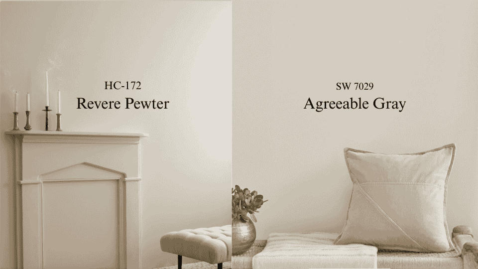
I have repainted more rooms in Revere Pewter than any other color on my shelf. Not because it is a bad color. Because people choose it from a showroom chip and then take it home to a room that cannot support it. That is the whole comparison, really. Revere Pewter HC-172 reads at LRV 55.51 and carries a green thread under a warm taupe base. Agreeable Gray SW 7029 sits at 60 with much quieter undertones. On a fan deck the two look like siblings. On a wall, in a specific room, with your specific windows, they are not close. If you want the short answer: Agreeable Gray if your light is limited, mixed, or north-facing. Revere Pewter if you have real daylight and you want the walls to hold some weight. What is Revere Pewter? Revere Pewter is a warm greige with green sitting underneath a taupe base. Benjamin Moore publishes its LRV as 55.51. Medium depth, so the walls read as an actual color rather than a soft white. The green is the whole story. Most people cannot see it on the chip. Nearly everyone sees it once it is on 300 square feet of drywall in the wrong light. The clearest version I have seen was a nursery on the north side of a house in Bend. Two windows, both facing a neighbor’s fence. The parents had fallen for Revere Pewter in a friend’s sunroom and could not understand why theirs looked like a hospital corridor by three in the afternoon. It was the same paint. Their friend had four hours of southern sun and they had none, and the green rose to fill the gap. Give it daylight and it turns into something else entirely. Warm putty, a little grounded, beautiful against wood floors and leather and stone. That is why the online photos of this color contradict each other so violently. Everyone is shooting a different house. What is Agreeable Gray? Agreeable Gray is lighter, at LRV 60, and built more simply. A beige-gray mix without much going on beneath it. I want to be honest about it: this is not an exciting color. It flattens in weak light and picks up a faintly cool, almost dusty cast against a bright white trim. I have had clients tell me their walls looked like a rental. What it does instead is behave. It moves a little through the day, but always within a narrow lane. It never shocks you in the fourth room after you have already committed in the first three. Sherwin-Williams sells more of this than any other color they make, and that is a fact about reliability rather than beauty. When I cannot control the light, or when one color has to run through an open plan that faces four directions, I specify Agreeable Gray without much internal debate. Revere Pewter vs. Agreeable Gray: Side by side Feature Revere Pewter HC-172 Agreeable Gray SW 7029 Brand Benjamin Moore Sherwin-Williams LRV 55.51 60 Beneath the surface Warm taupe, green thread Soft beige-gray, muted Through the day Moves a lot; green rises in cool light Moves within a narrow lane Poorly lit rooms Goes murky Goes flat, but holds Feel Grounded, weighted Open, undemanding Best company Wood, leather, stone, aged brass White trim, chrome, cooler metals How it fails Green cast in the wrong exposure Reads like a rental in a big empty room Is a 5-point LRV difference noticeable? LRV runs 0 to 100 and describes how much light a color throws back at you. A five-point gap sounds trivial. Clients hear it and stop worrying. Here is where it bites. In a bright room, both colors have plenty of light to work with and you would struggle to care. In a dim room, every point of reflectance is doing real labor, and Revere Pewter’s extra depth tips into heaviness much faster. The worse the light, the bigger that small number gets. Which is also why I no longer let anyone decide from a chip. A two-inch square held under kitchen downlights tells you nothing useful about November at four in the afternoon. Sampling properly in your own light is the only step in this process I refuse to skip. Best Rooms for Revere Pewter and Agreeable Gray Testing both colors in different rooms across dozens of homes has revealed where each one truly shines and why it matters. 1. Living Rooms This is Revere Pewter’s room. Living rooms are usually the largest and best-lit space in the house, which is exactly what it needs. The extra depth stops a big room from reading like a waiting area, and the warm base agrees with hardwood, jute, and linen without any effort from you. The exception is an open plan. Once a single color has to turn a corner into a kitchen with different windows, I stop caring about character and start caring about consistency. 2. Bedrooms Revere Pewter closes a bedroom in slightly, which is the point of a bedroom. I have specified it in primary bedrooms with white bedding and walnut furniture more times than I can count, and it has never once let me down when the room had a window worth the name. Agreeable Gray earns its place in the bedroom you get dressed in. Clearer light, easier to judge what you are wearing, and the higher value keeps a small room from tightening around you. That trade between depth and brightness runs through most warm bedroom color decisions. 3. Kitchens Agreeable Gray takes most kitchens, and it is not close. A kitchen is already full of finishes competing for attention. The wall color’s job is to stay out of the argument, and quiet undertones do that. It sits beside white cabinets and stainless steel without dragging green or yellow into the room. Revere Pewter works in a big farmhouse kitchen with windows on two walls. In a galley with one window over the sink, it will close in on you by winter. 4. Bathrooms Bathrooms are the hardest test I give a color, because most of them run entirely on bulbs. Cool LEDs pull Revere Pewter’s green straight to the surface. I have seen it read frankly sage under 5000K vanity strips. Put a real window in the room and it comes back into play, and it looks right next to stone, a wood vanity, and aged brass or oil-rubbed bronze. 5. Home Offices One practical reason I lean Agreeable Gray here: it throws less color onto your face on video calls. Revere Pewter can push a faint green tint into camera light, and once a client notices it on a Zoom recording they cannot unsee it. If the room is more study than workstation, reverse that. Revere Pewter gives it the settled, library quality that suits reading. Can you use both in one house? Not in rooms that can see each other. I have tried. Through a doorway, the beige in one and the green in the other read as a mistake rather than a decision, and the value gap makes whichever wall is darker look faintly dirty. Separate closed rooms on different floors, nobody will ever know. My rule: stand in one spot. If you can see both colors from there, pick one. There is a brand trap here too. These are mixed in different bases with different pigment loads. Ask Sherwin-Williams to match Revere Pewter and you will get something that looks right on the lid and loses exactly the behavior you wanted the color for. If you want Revere Pewter, buy Benjamin Moore. Real Opinions: What Homeowners Are Saying A thread on the InteriorDesign subreddit lays out the same split I see in consultations. Several people liked Agreeable Gray but said it did not read gray enough in their rooms, leaning beige. Another described it as light in the morning and noticeably deeper by evening. A few pointed the original poster toward Revere Pewter for warmth instead, with one summing it up as “some grey go a long way to warming the place up.” Both camps are right about their own houses. That is the part worth taking from it. Cost Comparison of Revere Pewter and Agreeable Gray Factor Revere Pewter Agreeable Gray Brand Benjamin Moore Sherwin-Williams Price per gallon $55 to $75 $40 to $70 Coverage per gallon About 400 sq ft About 400 sq ft Coats 2 2 12 x 12 room, walls only 2 gallons 2 gallons Primer Over bare or dark surfaces Over bare or dark surfaces Do the arithmetic before you get to the register, because the one-gallon assumption catches almost everyone. A 12 by 12 room with 8-foot ceilings gives you about 384 square feet of wall. Knock off roughly 35 for a door and a window and you are near 350. Two coats is 700 square feet. That is two gallons. Sherwin-Williams discounts often enough that the gap between the brands is usually smaller than the list prices suggest. For a whole house, the full interior painting cost breakdown covers labor and prep alongside the paint itself. If neither is quite right The three I reach for when a client likes Revere Pewter but the room will not take it: Gray Owl OC-52, cooler and lighter with the green removed. Edgecomb Gray HC-173, which keeps the warmth and drops the complexity, and is far easier to live with. Balboa Mist OC-27 for small rooms that cannot carry the depth. On the Sherwin-Williams side, Repose Gray SW 7015 is a truer gray with the beige pulled back. Accessible Beige SW 7036 pushes into Revere Pewter’s warmth without importing the green, and it is where a lot of my clients land when they wanted Revere Pewter and have a north-facing house. Worldly Gray SW 7043 sits at a similar value with a cooler cast. Durability: Which Lasts Longer? Both hold up. The finish matters more than the color does, and I would argue that more strongly than almost anything else here. Eggshell and satin wash clean without throwing glare, which is why they end up in hallways. Flat marks the moment anyone touches it, and picking the right sheen for the room buys you more durability than either of these colors will. On fading, lighter colors lose their look more slowly, so Agreeable Gray has a small advantage in a room that takes hard direct sun. Revere Pewter can drift a touch grayer over several years in that situation. Sun exposure drives it far more than the color choice does. What I would actually do For most houses, Agreeable Gray. It asks less of the room, it survives mixed exposures, and it will not ambush you in the third bedroom. Revere Pewter when the conditions genuinely suit it: real daylight, wood and stone already in the room, and a client who wants to notice the walls. Under those conditions, nothing else I specify has quite the same depth. Buy a sample pot of each. Paint two coats on poster board rather than the wall, and carry the boards around the room over a full day, including after the lamps go on. If you are choosing trim at the same time, settle how the trim white sits against the wall now rather than repainting baseboards twice. Frequently Asked Questions When should you not use Revere Pewter? Avoid it in north-facing rooms with small windows, bathrooms lit only by cool LEDs, and galley kitchens. In weak light the green surfaces and the walls turn murky. Is Revere Pewter still popular? Yes, though less dominant than a decade ago. It has held a place in Benjamin Moore’s best sellers for years. Warmer, simpler greiges now absorb some of that demand. What Sherwin-Williams color is closest to Revere Pewter? Anew Gray SW 7030 and Mega Greige SW 7031 come nearest on depth and warmth. Neither reproduces the green undertone, since the brands use different pigment bases. What is replacing Agreeable Gray? Warmer neutrals are taking its place in new work, mainly Accessible Beige and Shoji White. The move is away from gray-leaning greige toward colors with visible warmth. Can Revere Pewter and Agreeable Gray go in the same house? Only in rooms that cannot be seen at once. Side by side or across an open plan, the difference beneath them reads as a mismatch rather than a deliberate pairing. Which works better in a dark room? Agreeable Gray, clearly. Its LRV of 60 returns more light, and its muted base does not swing the way Revere Pewter’s green does when the light drops.
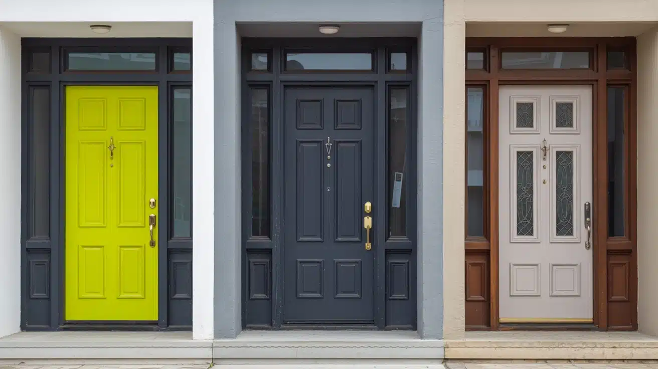
Your front door sets the tone before anyone steps inside, and one wrong color can throw everything off. I have seen homes look dull or harsh just because of a poor paint choice. If you’re unsure what works, this focus on the colors you should never use at Home will help you avoid common mistakes. You will learn which shades can clash, fade quickly, or require too much upkeep, and what to use instead. This makes your choice easier and saves time, money, and effort while giving better results. Let’s fix your front door paint color and make it feel right from the moment you first look at it. The Influence of Front Door Colors The front door is far more than just a functional entryway; it is the defining focal point of your home’s exterior and the first architectural detail a visitor encounters. Acting as the visual anchor of the façade, it frames the entire composition of a home’s curb appeal. A well-chosen front door color can upgrade even the most modest exterior, while a poor choice can completely undermine an otherwise beautiful home. Refined blue-gray tones like Debonair SW 9139 are increasingly appearing on front doors precisely because they strike that balance between calm authority and quiet personality. Beyond appeal, color psychology plays a pivotal role in design decisions: warm hues signal a welcoming, friendly atmosphere, cool tones project calm authority, and bold choices communicate a unique personality. Understanding these dynamics is essential before committing to any front door color for your home’s perfect look. Three Front Door Paint Colors to Never Use Your front door is the first thing visitors notice; choosing the wrong color can undermine your home’s entire curb appeal before anyone even steps inside. While personal taste always plays a role, certain colors consistently create problems that go beyond appeal. Here are three front door paint colors worth reconsidering before you pick up that brush. 1. Bright or Neon Colors Bright and neon colors might feel exciting on a mood board, but they rarely translate well onto a front door. These high-intensity shades can overwhelm your home’s exterior, clash with natural surroundings, and create a visual imbalance that feels unsettling rather than welcoming. What looks bold in theory often reads as harsh and uninviting in practice, particularly against brick, stone, or neutral siding. Over time, extreme saturation also fades unevenly, leaving your door looking worn far sooner than expected. You can consider these alternatives instead for your project next time: Sherwin-Williams Smoky Blue (SW 7604): A muted, urbane blue that adds character without overwhelming your exterior palette. Benjamin Rooftop Garden (CSP-765): A deep, earthy green that feels grounded, natural, and effortlessly stylish on any door. Farrow & Ball Mizzle (No.266): A soft, complex sage green that blends beautifully with both modern and traditional home styles. 2. Dark Colors Without Natural Light Dark shades like deep black or heavy brown can look strikingly sleek on the right home, but without adequate natural light, they quickly turn oppressive and uninviting. A shadowed entryway paired with a very dark door creates a visually heavy entrance that feels closed off rather than welcoming. Beyond appeal, dark colors absorb significantly more heat, accelerating paint deterioration and causing fading, peeling, and cracking far sooner than lighter alternatives would. For your next project, you can consider these alternatives: Sherwin-Williams Charcoal Blue (SW 2739): A rich, deep neutral that retains refinement while reflecting slightly more light than true black Benjamin Moore Slate Teal (2058-20): A refined slate tone that brings depth and interest without swallowing light from your entryway Behr Brodway (PPU18-20): A warm charcoal gray that feels strong and contemporary without creating an oppressive, lightless entrance 3. White (If Not Maintained Properly) White feels like the safe, classic choice for a front door, and in theory, it is. But in practice, a white front door demands relentless upkeep. It attracts dirt, scuffs, and staining faster than almost any other color, and without regular cleaning and repainting, it quickly shifts from crisp and graceful to tired and neglected. Against certain exterior styles, white can also read as flat and personality-free, blending into the facade rather than creating the welcoming focal point your entrance deserves. Consider these alternatives if you want next time: Sherwin-Williams Alabaster (SW 7008): A warm, creamy off-white that hides minor marks far better while retaining that clean, bright appeal. Benjamin Moore White Dove (OC-17): A soft, slightly warm white with gentle depth that feels refined and far more forgiving than stark pure white. Farrow & Ball Pointing (No.2003): A warm antique white with subtle complexity that adds quiet classiness without the harsh maintenance demands of bright white. Front Door Color Ideas That Stand the Test of Time Avoiding the wrong front door color is only half the battle; choosing the right one is where your home’s personality truly begins. Here are seven alternatives that deliver lasting curb appeal. Color Why It Works Perfect For Vibe Soft Pastels Light pink, mint, or powder blue create calm without overpowering Modern, coastal, neutral exteriors Gentle & serene Earthy Tones Olive, terracotta, and warm brown blend naturally with wood and stone Rustic, farmhouse, nature-inspired homes Grounded & natural Warm Neutrals Taupe, beige, and soft mocha pair effortlessly with almost any exterior Traditional homes, mixed-style neighborhoods Cozy & classic Charcoal or Slate Gray Dark yet understated, creates a sleek modern look without heaviness Contemporary, minimalist, lighter exteriors Sleek & urbane Classic Navy Blue Bold enough to stand out, refined enough to stay timeless Colonial, cottage, beach-style homes Calm & stately Bold Red or Burgundy Adds personality and warmth without feeling loud or overwhelming Traditional, Victorian, neutral exteriors Warm & inviting Black (With Caution) Classic and striking, especially paired with gold or brass hardware Modern, minimalist, classic-style homes Sleek & bold Each of these shades brings its own distinct character while standing the test of time. As part of the wider move toward colors replacing gray, deeper options show just how much personality a single door color can carry when matched thoughtfully to your exterior, architecture, and surrounding landscape. How to Choose the Perfect Front Door Color Choosing the right front door color starts with testing paint samples directly on your door, observing how they shift across morning, afternoon, and evening light before committing. Beyond aesthetics, consider what your chosen color communicates: red signals warmth and energy, blue evokes calm and trust, while black projects quiet confidence. It also helps to browse current design trends, not to follow them blindly, but to understand which directions feel fresh yet enduring. The perfect front door color balances your personal style, your home’s exterior palette, and the lasting impression you want every visitor to carry away. Common Mistakes to Avoid When Painting Your Front Door Even the best color choice can fall flat if the application goes wrong. Avoid these critical mistakes first. Finish Matters: Choosing the wrong finish, matte, satin, or gloss, can drastically affect how your door’s color looks and wears. Surface First: Skipping proper cleaning, sanding, and priming leads to peeling, uneven coverage, and a paint job that deteriorates quickly. Patience Pays: Rushing coats without allowing adequate drying time between layers results in streaks, bubbling, and an unprofessional finish. Color Isolation: Never choose your door color in isolation; always evaluate it alongside your siding, trim, and hardware. Nail these basics and your front door will look professionally painted, polished, and picture-perfect for years. Frequently Asked Questions (FAQ) How do undertones affect paint colors in different rooms? Undertones can shift with lighting and nearby colors, making the same shade look warmer, cooler, lighter, or slightly dull in different spaces. Should ceilings and trim use the same paint color as walls? Using the same color creates a smooth look, while different trim shades add contrast and help define edges, door, and architectural details. How often should you repaint to keep colors looking fresh? Most walls need repainting every five to seven years, but busy areas may require updates sooner due to marks, fading, and regular wear. Can neutral paint colors work with bold furniture or decor? Yes, neutral shades act as a steady base, helping bold furniture stand out clearly without making the space feel too busy or cluttered Final Touch Choosing the right front door color can make or break how your home feels from the outside. I have seen how small paint choices can change the whole look fast. You now know why neon shades feel harsh, dark tones need light, and white needs care to stay clean. You also have safer color ideas that hold up better over time. This helps you avoid wasted effort, extra costs, and a door that feels off. When you follow this Front Door Paint: Three Colors to Never Use at Home Guide, your entry looks more welcoming and balanced. Try a new shade, test it in daylight, and see the difference. Share your results or check more ideas next!
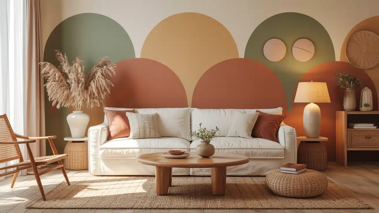
Gray has had a long run, but the walls are shifting, and the colors taking its place are warmer, richer, and far more personal. If you have been asking what color is replacing gray in modern homes, the answer is not one shade but a whole movement toward tones that feel lived-in rather than curated. The shades taking over bring depth, warmth, and personality that cool gray simply never delivered, and the shift is showing up in homes everywhere. I walk you through the top emerging home paint trends so you can find the shade that actually fits your space, your light, and the atmosphere you want to wake up to every day. Why Home Paint Colors Are Shifting For well over a decade, gray ruled the world of interior design, and honestly, it made a lot of sense. When minimalism swept into mainstream homes around the early 2010s, gray offered something no other color could. It was sleek without being stark, neutral without being boring, and effortlessly modern. From cool silver-tones to warm charcoal, it became the universal answer to the question of what color should I paint this, right down to picking a door paint color that felt safe and contemporary. As people spent more time at home, especially through the years of global disruption, they started craving color that felt alive, grounding, and deeply personal. Today, homeowners are turning to colors rooted in nature, memory, and warmth, signaling not just a design change, but a cultural one. Colors That Are Replacing Gray: Home Paint Home paint trends are shifting towards warmer, earthier tones, replacing cool grays with hues that bring personality, warmth, and depth to any space. These emerging shades are both inviting and versatile. 1. Warm Beige Warm beige creates an immediate sense of welcome, offering a soft and inviting atmosphere. Unlike gray, it adds warmth and comfort to any space, making it feel more lived-in. Beige evokes the familiar emotions of hearth and sand, blending effortlessly with natural elements like wood, linen, and terracotta. This versatile color is ideal for creating a cozy and relaxing environment that feels both stylish and inviting. Here are three great options for incorporating warm beige into your home, each offering unique qualities to suit different spaces: Sherwin-Williams Accessible Beige: A soft, versatile beige that pairs well with natural wood and linens. Benjamin Moore Revere Pewter: A warm, light beige perfect for creating bright, cozy spaces. Behr Swiss Coffee: A soft, light beige that brightens rooms without feeling sterile. 2. Soft Taupe Soft taupe strikes a balance between traditional richness and modern restraint, creating a refined and grounded atmosphere in any room. Its soft brown undertones add depth and dimension, offering more warmth than gray. Taupe pairs seamlessly with both antique and contemporary furniture, adding a touch of luxury without overwhelming the space. Perfect for creating a refined, welcoming environment, taupe works wonders in living rooms, bedrooms, or dining areas. Here are some great taupe options to consider for your next project: Sherwin-Williams Perfect Greige: A balanced taupe that adds warmth without overwhelming the space. Benjamin Moore Edgecomb Gray: A versatile taupe perfect for creating subtle refinement in any room. Behr Classic Taupe: A warm, neutral taupe ideal for both traditional and modern spaces. 3. Earthy Terracotta Terracotta brings a sun-baked warmth into your home, evoking imagery of clay pots and Mediterranean villages. This rich, earthy color connects interiors with nature, offering a bold statement while grounding a space. Its warmth conjures images of soil, pottery, and ancient earthen walls. Terracotta pairs beautifully with natural textures like rattan and woven materials, making it a perfect color for boho-inspired decor or accent walls. Here are some great examples of earthy terracotta hues to brighten your space: Sherwin-Williams Cavern Clay: A warm, sun-baked terracotta that adds rustic appeal. Benjamin Moore Rust: A rich, warm terracotta that brings depth and an earthy, grounded quality to accent walls and living spaces. Behr Red Curry: A deep terracotta that brings an earthy vibe to any room. 4. Sage Green Sage green soothes the mind, bringing calmness and serenity to a space. It embodies the tranquility of a garden at dusk and is ideal for bedrooms or wellness-focused rooms. The calming hue connects interiors to nature, helping lower stress levels. Sage green remains classy, never out of style, making it a versatile choice for creating a restful environment that fosters relaxation and peace. Here are three great sage green options to try in your home: Sherwin-Williams Sage: A muted green that evokes a calming, natural ambiance. Benjamin Moore Hollingsworth Green: A soft and serene shade, perfect for creating calm, restful spaces. Behr Silver Sage: A cool, relaxing sage green that pairs well with light neutrals 5. Warm Off-White Off-white with warm undertones is a gentler alternative to gray. It brightens a room while neutralizing the harshness of cooler tones. This soft, welcoming color creates a cozy atmosphere, offering more warmth and personality than traditional white or gray. Perfect for ceilings, walls, and trim, it improves the natural light in a room and serves as an ideal backdrop for art and furniture. Here are some warm off-white shades to try: Sherwin-Williams Alabaster (SW 7008): A creamy, warm off-white with subtle yellow undertones that feels inviting on walls, ceilings, and trim alike. Benjamin Moore White Dove: A clean, warm off-white that feels fresh without reading as stark or cold. Behr Antique White: A soft, warm neutral that works beautifully on walls, trim, and cabinetry alike. 6. Muted Blue Muted blues bring serenity and a peaceful vibe, making them perfect for bathrooms or spaces meant for relaxation. This cool color evokes the calmness of water and sky, adding depth without overwhelming the space. Muted blue pairs effortlessly with warm brass accents and white tile, creating an urbane and restful atmosphere. Ideal for coastal or Scandinavian-inspired designs, it’s both calming and stylish. Here are three beautiful muted blue shades to try: Sherwin-Williams Debonair: A refined, muted blue with quiet refinement that works beautifully in bathrooms and relaxation-focused spaces Benjamin Moore Misty Blue: A cool, muted blue perfect for adding calm refinement to a room. Behr Blueprint: A deep, tranquil blue that offers intricacy without feeling too bold. 7. Dusty Pink Dusty pink offers refinement and warmth without being overpowering. This refined shade is gender-neutral and adds a touch of classiness to bedrooms, dressing rooms, or living spaces. Unlike traditional pinks, dusty pink feels mature and welcoming, balancing warmth with subtlety. It pairs beautifully with dark woods, olive greens, and warm metallics, making it a versatile choice for any style. Here are some great dusty pink options to try: Sherwin-Williams Romance: A muted, refined pink perfect for creating soft, inviting spaces. Benjamin Moore First Light: A delicate, dusty pink ideal for adding warmth and character. Behr Rosewater: A soft, muted pink perfect for creating a cozy, feminine feel. 8. Olive Green Olive green brings a deep, earthy tone that grounds a room with its rich, natural feel. It adds depth and visual weight, making it perfect for living rooms, kitchens, or any space that needs a bit of grounding energy. Olive green pairs well with natural materials like wood, stone, and copper, creating a warm, inviting environment. This color is ideal for adding personality and purpose to your space without overwhelming it. Here are some top olive green shades to try: Sherwin-Williams Ripe Olive: A rich, earthy olive green perfect for living rooms and kitchens. Benjamin Moore Olive Branch: A warm, green that complements natural textures. Behr Chinese Jade: A deep green with brown undertones that creates a cozy, grounded space. 9. Deep Charcoal Deep charcoal adds drama to a room, providing a bold alternative to gray. This color offers rich depth and a striking contrast, making it perfect for accent walls or modern industrial spaces. Charcoal pairs beautifully with exposed concrete, steel, and raw timber, improving the natural textures of the room. It’s ideal for creating a striking focal point or adding an air of modern refinement to any room. Here are some bold, deep charcoal options to consider: Sherwin-Williams Peppercorn: A deep, dramatic charcoal that pairs beautifully with lighter accents. Sherwin-Williams has a strong lineup ofdeep, moody wall colors that work exceptionally well in accent-focused spaces. Benjamin Moore Kendall Charcoal: A rich, urbane charcoal that adds depth and drama to any space. Behr Cracked Pepper: A bold charcoal that creates contrast without overwhelming the space 10. Pale Lavender Pale lavender introduces a subtle grace that converts spaces into serene, dreamy environments. This soft color offers a calming atmosphere without being overly feminine or childish. Lavender pairs beautifully with warm grays, creating a layered, urbane look. It’s perfect for bedrooms, bathrooms, or any space where you want to evoke tranquility and relaxation. This color works in various interiors, making it a refined alternative to traditional neutrals. Here are some lovely pale lavender shades to explore: Sherwin-Williams Grape Mist: A soft, pastel lavender that improves the tranquility of any room. Benjamin Moore Misty Lilac: A soft, airy lavender that brings a delicate and refined quality to bedroom and bathroom walls. Behr Lavender Cloud: A calming, light lavender that pairs well with gray for a refined look 11. Golden Mustard Golden mustard adds warmth and personality to any room, infusing spaces with energy and vibrancy. This retro-inspired color offers a bold, sun-soaked feel, making it perfect for accent walls or small decor pieces. Mustard adds a sense of memories while remaining contemporary and fresh. It pairs beautifully with deep navy, black, and natural wood, adding a memorable touch to your home without being overwhelming. Here are some golden mustard options to brighten your space: Sherwin-Williams Gold Crest: A vibrant mustard that adds warmth and energy to any room. Benjamin Moore Golden Honey: A rich, golden mustard ideal for creating a statement wall. Behr Mustard Seedx: A bold, energetic mustard that adds a sunny pop of color to your space. How to Incorporate these New Home Paint Trends Introducing a new paint color doesn’t require a full renovation. Start small with an accent wall or a single room, and let the color breathe alongside your existing pieces before committing fully. Color Best Rooms Room Size & Light Pairs With Warm Beige Living rooms, hallways Any size; expands dim spaces Linen, oak wood, cream textiles Soft Taupe Bedrooms, dining rooms Medium–large; warm south light Bronze fixtures, walnut, velvet Terracotta Kitchens, accent walls Use sparingly in small, dark rooms Rattan, terrazzo, raw linen Sage Green Bedrooms, home offices Great in north-facing rooms White trim, matte black, natural wood Warm Off-White Any room, ceilings Best for small or low-light spaces works with everything Muted Blue Bathrooms, reading nooks Brightens north-facing rooms Warm brass, driftwood, white Dusty Pink Bedrooms, dressing rooms Mid-size, well-lit rooms Dark walnut, olive green, warm gold Olive Green Kitchens, living rooms Large rooms with bright windows Stone, copper, timber, terracotta Deep Charcoal Accent walls, offices Large, well-lit spaces only White plaster, brass, warm timber Pale Lavender Bedrooms, bathrooms Morning light improves it best Warm gray, ivory, soft metallics Golden Mustard Accent walls, alcoves Avoid in very dark or tiny rooms Deep navy, black iron, natural wood Creating harmony between new paint and existing furniture is less about matching and more about balancing. Anchor bold wall colors with neutral furnishings, and let warm tones in rugs, throws, or wood finishes bridge any contrast naturally. Tips for Maintaining Your New Trendy Walls Finish matters: Choose eggshell or satin finishes, which resist scuffs and help keep rich color tones intact longer. Gentle cleaning: Wipe walls with a damp microfiber cloth; harsh cleaners fade warm earthy tones and dusty hues prematurely. Touch-up stock: Always keep a small sealed tin of the exact paint. Color-matching years later is notoriously unreliable and frustrating. Sunlight protection: UV-filtering window film prevents warm tones like mustard and terracotta from fading or shifting over several years. Accessory harmony: Refresh cushions, throws, and art to complement your new wall color. Small changes make the palette feel intentional and complete Wrapping Up As homes move away from gray, warmer and more personal hues are gaining popularity in interior design. The answer to what color is replacing gray points clearly toward earthy tones that foster comfort and connection. Beige, taupe, terracotta, and sage green are just a few of the colors bringing warmth, dimension, and depth to your home. These shades help create a welcoming environment that gray simply could not. Each color offers unique benefits, from calming sage to bold terracotta, helping you craft the perfect atmosphere. If you are updating a room or making a bold change, these colors convert spaces into something special. I would love to hear your thoughts, drop a comment below or check out other ideas in related blogs.
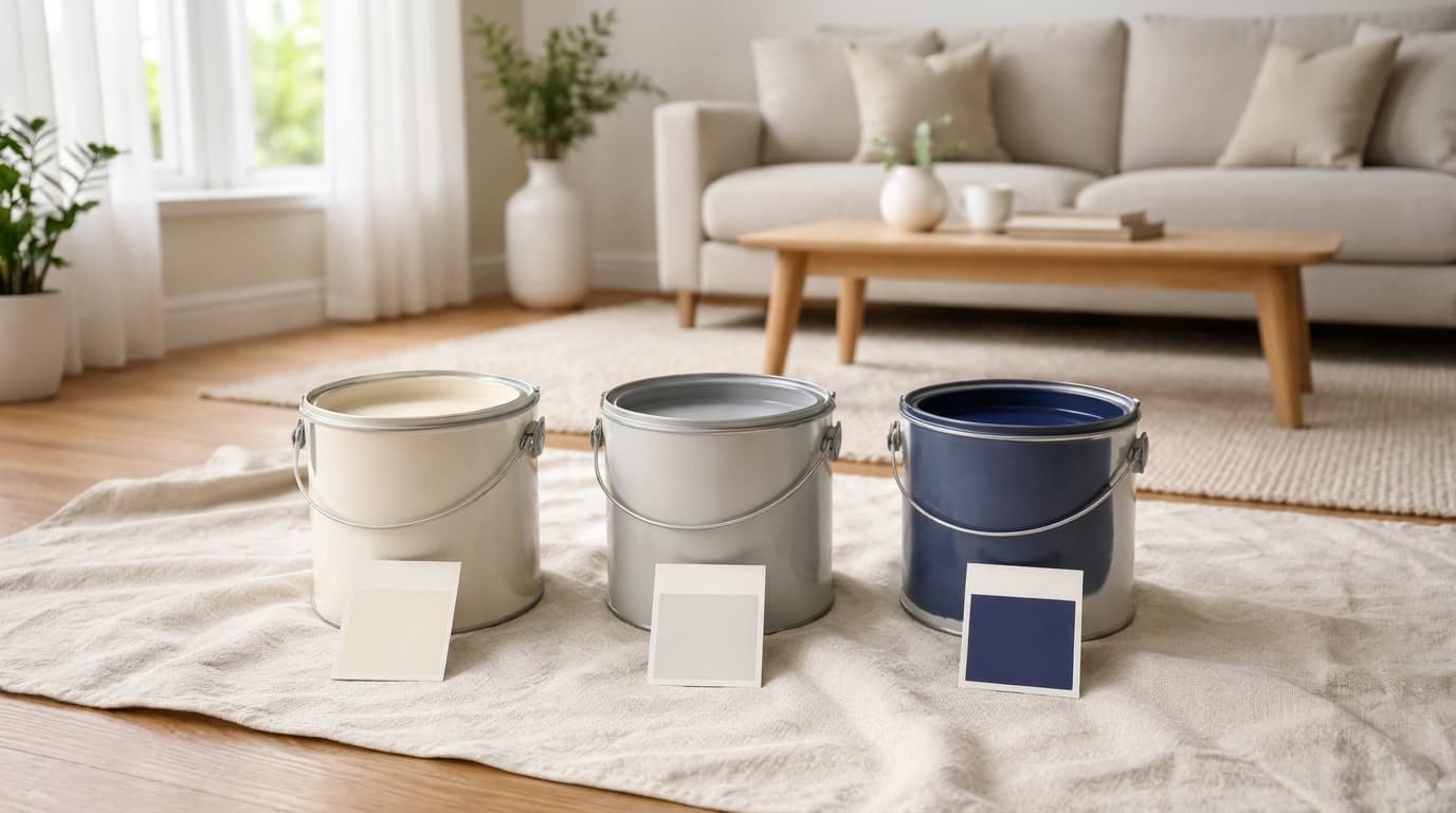
Your walls are the largest canvas in your home, yet most people gamble on trendy shades that look outdated within years. The secret to a space that always feels polished comes down to understanding which paint colors never go out of style. These are not just safe choices. They are smart, strategic ones that lift your home’s atmosphere, complement any furniture, and hold their visual charm year after year. If you are refreshing one room or reimagining your entire home, these shades are the only starting point I would ever recommend. The Psychological Power of Paint Colors Color is far more than a visual choice; it is a silent, powerful force that shapes how we feel, think, and live within our spaces every single day. Classy paint colors have endured not just because they look beautiful, but because they speak directly to our deepest psychological needs for comfort, calm, and belonging. From the crisp clarity of white to the grounding depth of navy blue, these shades create emotional atmospheres that trendy colors simply cannot replicate. Understanding the psychological power behind classic paint colors helps you move beyond surface-level decorating and make intentional choices that genuinely change how your home feels to everyone who walks through the door. Key Factors That Affect How Paint Colors Look Even the most lasting shade can look completely different once it hits your walls. Here is what actually matters before you commit to any color: Natural light direction changes how a color reads throughout the day, making the same shade look warm, cool, dark, or soft depending on which way your room faces. Artificial lighting at night shifts color significantly: warm bulbs soften tones, while cool white bulbs make the same shade appear sharper or washed out. Room size and height determine how a color feels, with lighter tones opening up small spaces and deeper shades grounding larger ones. Existing floors and fixtures interact with wall color in ways most people underestimate, making undertone matching far more important than simply matching the color itself. Every neutral has undertones of yellow, pink, green, or gray that become visible depending on your lighting, surroundings, and the other elements already in the room. Finish and outdoor reflection are the two most overlooked variables, as sheen level and nearby trees or brick can quietly change how your chosen color actually reads on the wall. Getting these factors right before choosing saves far more time and money than sampling after the fact. The Top 3 Graceful Paint Colors for Your Home When it comes to creating a home that feels both stylish and enduring, the right paint color makes all the difference. These three classics have stood the test of time for good reason. 1. Classic White: The Neutral White is the undisputed king of Classic paint colors. It instantly brightens any space, reflects natural light beautifully, and creates the illusion of greater square footage. Whether your style is minimalist, traditional, or coastal, white adapts effortlessly. It pairs with every furniture tone and accent color, making it the most versatile choice a homeowner can reach for, room after room, year after year. Here are other White Paint Shades options you can consider: Sherwin-Williams Pure White (SW 7005): A clean, warm-toned white that works beautifully in living rooms and kitchens without feeling stark. Benjamin Moore Chantilly Lace (OC-65) : A crisp, bright white with cool undertones, perfect for trim, ceilings, and modern interiors. Behr Ultra Pure White (PR-W15): An affordable, versatile bright white ideal for bathrooms, ceilings, and open-plan spaces. 2. Soft Gray: A Cool, Urbane Hue Soft gray has quietly become one of the most beloved neutrals in interior design, and it’s easy to see why. It carries just enough depth to add character without overwhelming a space. Gray bridges the gap between warm and cool tones; shades that sit comfortably alongside wood finishes, metallics, and bold accent colors. Understanding when Pale Oak fails can actually help clarify why soft gray works so reliably in the spaces where warmer neutrals struggle. From contemporary apartments to classic suburban homes, soft gray brings polish and calm to every room it touches. Here are other soft gray paint shades you can consider: Sherwin-Williams Repose Gray (SW 7015): A perfectly balanced greige that shifts beautifully between warm and cool lighting conditions. Benjamin Moore Edgecomb Gray (HC-173): A warm, soft gray with subtle beige undertones, ideal for bedrooms and living rooms. Sherwin-Williams Alpaca (SW 7022): A warm mid-tone greige with soft brown-gray undertones that adapts effortlessly to both warm and cool lighting conditions. 3. Navy Blue: Bold a nd Classic Navy blue is proof that a bold color can still be lasting. Its deep, rich tone carries an air of depth and confidence that has graced everything from coastal cottages to luxury interiors for centuries. Navy adds instant drama as an accent wall, brings a refined look to kitchen cabinetry, and even works as an all-over room color when paired with the right lighting and furnishings. It’s the rare bold hue that never goes out of style. You can also consider this navy blue paint shade for your next project. Benjamin Moore Hale Navy (HC-154) : A rich, classic navy with slight warm undertones, bold on cabinetry and accent walls alike. Sherwin-Williams Naval (SW 6244) : A deep, moody navy that creates a striking statement wall or whole-room Shifting with ease. Farrow & Ball Hague Blue (No.30) : A dramatic, heritage navy-teal hybrid that adds depth and luxury to any living space How to Choose the Right Shade Within These Colors? Picking the right shade is where most people get stuck. Two whites can look completely different on your wall, and the same goes for gray or navy. Start by looking at your existing elements. Your flooring, furniture, and trim all pull color in a direction, and your wall shade needs to work with them, not against them. Always test swatches before committing. Pin them next to your fixed elements and step back to see how everything sits together in the actual space. Check your samples at different times of the day. Morning light and evening light can make the same shade look completely different. Getting this right saves you from having to repaint twice. Matching Paint Colors to Your Interior Style and Space Choosing Classic paint colors for your home can be tricky. These key factors will guide you toward the perfect choice. Factor Key Consideration Best Pick Modern Style Clean lines, minimal décor Cool whites, soft grays Farmhouse Style Warm, cozy textures Creamy whites, warm greiges Coastal Style Breezy, natural tones Bright whites, blue-grays Traditional Style Formal, structured spaces Navy blue, warm whites Small Room Needs to feel open Light white, pale gray Large Room Needs warmth and depth Soft gray, navy accent Low Natural Light Colors appear flat Light-reflective whites Bright Natural Light Colors can wash out Medium grays, cool whites By considering style and space, you’ll confidently select colors that fit your home’s needs and stand the test of time. Tips for Applying Paint Colors Applying paint colors requires more than just choosing the right shade. These tips will help you improve the overall look by coordinating furnishings, fabrics, and decor. Complementary Furnishings: Pair lasting colors with neutral or contrasting furniture to maintain balance and avoid overpowering the space. Fabric Coordination: Choose fabrics that improve the wall color, opting for textures that complement its depth and tone. Artwork Placement: Incorporate artwork that either contrasts with or complements the wall color to create visual interest. Avoid Overuse: Don’t overwhelm a room with a single color; balance it with accents. Frequently Asked Questions (FAQs) What Is The Best Front Door Color for Resale Value? Neutral shades like navy blue, deep gray, and muted green tend to appeal to a wider range of buyers. They feel safe, clean, and easy to match with most home styles. Should Your Front Door Color Match Your Interior Doors? Not always. Your front door can stand out more than interior doors. It should match your home’s outside colors, not your indoor palette. How Do I Test a Front Door Color Before Painting? Paint a small section on the door and check it at different times of day. Light changes how the color looks, so testing helps avoid regret. What Paint Finish Is Best for a Front door? A satin or semi-gloss finish works best. It is easier to clean, resists weather damage, and keeps your door looking fresh longer Final Words Choosing the right colors does not have to feel complicated. The paint colors that never go out of style work because they are built around balance, light, and versatility rather than trends, and that is something I come back to every time I advise on a space. Classic white, soft gray, and navy blue have proven that over and over again. Pair them with the right furniture, fabrics, and decor, and your space will always feel fresh and considered. If working with a small room or an open floor plan, these shades offer flexibility that most colors simply cannot match. Try applying even one of these to your next project and see the difference for yourself.
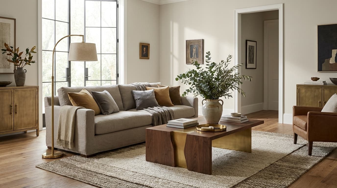
Pale Oak shows up on nearly every designer shortlist, and yet it quietly disappoints in more homes than most people admit. There is a good chance you have stood in a freshly painted room and felt something was slightly off, but couldn’t name it, and I have seen that happen more times than I can count with this exact color. Knowing when not to use Pale Oak matters as much as knowing where it works, because it responds strongly to light, undertones, and the elements already in the room. What follows covers every condition where it fails, the lighting situations, the undertone clashes, and the open-plan mistakes, so the right call gets made before the paint goes on the wall. What Is Pale Oak and Why Is It So Popular? Pale Oak (Benjamin Moore OC-20) is a soft greige, a carefully balanced mix of gray and beige with faint pink undertones that surface depending on the light. It sits in a middle ground that feels neither too warm nor too cold, which is exactly why it became one of Benjamin Moore’s most reached-for neutrals. Its LRV of 68.64 places it in the mid-range, light enough to keep walls receding in a well-lit room, warm enough to add depth without feeling heavy. Those drawn to this balance often find themselves comparing it to Alpaca by Sherwin-Williams , a similarly warm greige that handles undertone shifts similarly. It works well in spaces with balanced natural light, warm wood floors, and cohesive interiors, the kind of conditions where its undertone stays quiet, and the color reads as a clean, considered neutral. The problem starts when those conditions aren’t present. When NOT to Use Pale Oak in Your Home Pale Oak is forgiving, until it isn’t. These are the six situations where it works against the room rather than with it. 1. Rooms with Low Natural Light In a north-facing or enclosed room, Pale Oak stops looking like a greige and starts looking like a mistake. It loses its warm balance and pulls toward a flat, slightly muddy tone that neither reads as gray nor beige, just dull. The color needs light to activate its warmth, and without it, the walls feel unfinished rather than neutral. Small enclosed bathrooms and basement rooms are the most common casualties, a problem rarely seen with colors that consistently perform regardless of light conditions. 2. Spaces with Strong Cool-Toned Elements Pale Oak and cool-toned spaces are a quiet conflict waiting to happen. Cool gray floors, blue-undertone tile, and chrome or silver fixtures all pull against its warm pink-beige base. The result isn’t a clash, it’s something subtler and harder to fix. The color reads slightly pink and slightly off, and the room never feels cohesive, regardless of how carefully everything else is chosen. 3. Open Floor Plans Without Color Flow Planning Pale Oak doesn’t shift subtly across an open plan; it shifts noticeably. One end of the room reads warm greige. The other reads faint pink. The color hasn’t changed, the light has. In a connected space where natural light enters from different directions, Pale Oak behaves like two different colors in the same room, and the inconsistency is impossible to unsee once noticed. 4. Rooms with Heavy Warm Lighting Warm artificial lighting does to Pale Oak what strong sun does to butter: it pushes everything in one direction. Under 2700K bulbs, the beige and pink undertones surface, and the color reads heavier and slightly dated. What looked like a balanced greige in the showroom feels noticeably warmer at night. The effect is most pronounced in rooms that rely entirely on artificial light after dark. 5. Spaces Where You Want a Crisp, Clean Look Pale Oak is soft. It is not sharp, and it was never designed to be. If the goal is bright, clean contrast, the kind that makes trim pop and rooms feel freshly finished, Pale Oak will fall short every time. It sits in a muted register that feels considered in the right space and simply flat in the wrong one. For crisp, clean results, a warm white with a higher LRV will always outperform it. 6. Rooms with Bold or Busy Decor In a room that’s visually busy, Pale Oak disappears rather than anchors. Dark furniture, strong patterns, and statement pieces need a wall color with enough presence to hold its own. Pale Oak is too soft to provide that contrast; it gets absorbed into the room rather than grounding it, and the walls end up looking like an afterthought rather than a deliberate choice. None of these are edge cases. They are the exact conditions most homes operate in, which is why testing before committing is non-negotiable. Common Mistakes People Make with Pale Oak These five mistakes account for most of the “I hate my paint color” moments that happen after Pale Oak goes on the wall. Not testing in their own lighting: store lighting tells you nothing about how it behaves on your wall Pairing with wrong undertones: cool gray floors and warm pink-beige walls create an immediate conflict Using it across an entire home: Pale Oak shifts in every room with different light sources Assuming it works with every trim: stark white pulls the pink out and makes both colors look worse Treating it as a universal neutral: Pale Oak is more condition-dependent than most colors in its category Every one of these is avoidable. The fix in each case is the same; test it in your actual space before the decision is final. Better Alternatives When Pale Oak Doesn’t Work When Pale Oak fails, it’s rarely the category that’s wrong, just the specific color. These four alternatives stay in the same family but sidestep the conditions where Pale Oak falls short. Alternative Best Colors The Problem It Solves Soft warm white BM Chantilly Lace (OC-65) , SW Alabaster (SW 7008) Brighter and cleaner without the pink risk, it works in low light where Pale Oak goes flat Neutral greige with less pink SW Accessible Beige (SW 7036) , BM Balboa Mist (OC-27) Same greige family, more stable undertone, less condition-dependent Light taupe BM Revere Pewter (HC-172) More depth without the softness, holds its own against bold decor and dark furniture Muted green or blue SW Evergreen Fog (SW 9130) , BM Horizon (1478) Sidesteps the undertone conflict entirely in cool-toned spaces where greige never lands right None of these is a compromise. Each one solves a specific problem that Pale Oak creates in the wrong conditions. How to Test Pale Oak Before Committing Most paint regrets come down to one skipped step. Here is exactly how to test Pale Oak before the decision is final. Get a large swatch, not a chip: Paint a 12×12-inch swatch directly on the wall. A small chip tells you nothing at scale. Check it at three times of day: morning, afternoon, and evening, with your actual bulbs on. The evening reading is usually the most revealing. Hold it against everything in the room: flooring , trim, and fixtures simultaneously. Undertone conflicts only show up when colors sit next to each other. View it from the doorway. Distance changes how the color reads entirely. Live with it for 48 hours. One viewing is never enough. The sample costs a few dollars. The repaint costs significantly more. There is no good reason to skip it. Tips for Making Pale Oak Work If You Still Want It Pale Oak doesn’t need to be ruled out entirely; it needs the right conditions. Get these four things right before committing, and the color performs exactly the way it should. Pair with warm wood tones: they share the same undertone family and keep the color balanced Use consistent warm lighting across the entire space: inconsistent bulbs create inconsistent readings Choose soft white trim like BM White Dove or SW Alabaster: they sit in the same undertone register Test in every connected room before committing: light shifts across spaces, and so does the color Get these four right and Pale Oak performs exactly the way it should, quiet, warm, and considered rather than pink, flat, or mismatched. Final Thoughts Pale Oak has earned its reputation, but a popular color used in the wrong conditions will always disappoint. I hope what you read here made that distinction clear. Knowing when not to use Pale Oak is what separates a room that looks considered from one that gets repainted. You now know the lighting conditions that work against it, the undertone conflicts to avoid, the open-plan mistakes to avoid, and exactly what to reach for instead. That is everything you need to make a confident call before the paint goes on the wall. If you have tried Pale Oak in your home or have a question about your specific space, drop it in the comments. Frequently Asked Questions (FAQs) Does Pale Oak Look Pink or Beige? It depends entirely on your light. Warm conditions read beige, cool or north-facing light pulls out the pink noticeably. What Is the Best Trim Color to Use With Pale Oak? White Dove and Alabaster are the most consistent performers, as both carry warm undertones that sit in the same register as Pale Oak. Can You Use Pale Oak in a Bathroom? Yes, but only in bathrooms with good natural light, warm fixtures, and no cool-toned tile working against it.
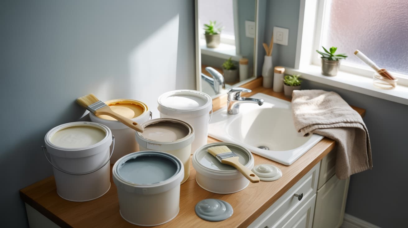
A small bathroom that feels cramped is rarely about the size of the room; it’s about the color on the walls. Paint colors that make rooms look larger do exist, and I’ll be honest, picking the wrong one is genuinely easy to do when every chip on the rack looks completely different once it hits your wall. What works in your bathroom depends on your lighting, your tile, and your ceiling height, not a universal rule written for a space that looks nothing like yours. Paint names, finish recommendations, and ceiling color strategy are all ahead, organized by bathroom type, so everything you read actually applies to your situation, not just a generic renovation that looks nothing like yours. Understanding How Paint Colors Affect Space The eye doesn’t measure a room; it reads light. When a color reflects light back into the space, walls appear to push away from each other, and the room feels larger. When it absorbs light, the walls pull forward and the space contracts. Light colors with a high Light Reflectance Value make walls appear to recede. For a windowless bathroom, stick to colors with an LRV of 65 or above. A soft neutral like SW Natural Choice is a reliable option in this range, offering warmth without sacrificing reflectivity. Dark colors aren’t automatically a problem. A deep navy on a single accent wall adds depth and makes the room feel longer. A dark ceiling removes the hard visual edge that white creates, making the room read taller. Placement and lighting determine whether dark works, not the color itself. Best Paint Colors to Make Your Small Bathroom Look Bigger Not every paint color earns its place on a small bathroom wall. These Colors do, and here’s exactly why each one works. 1. Sherwin-Williams Alabaster (SW 7008) Alabaster sits in that rare category of whites that actually feel warm. Its creamy, yellow-leaning undertone pulls slightly toward yellow rather than toward blue or gray, so it never reads clinical or cold under artificial light. In a small bathroom, that warmth does something useful; it makes the walls feel like a deliberate choice rather than a default. It reflects light generously, while the undertone stops it from feeling stark or exposed. That same warmth is what connects it to the broader family of SW beige and greige tones, where depth and comfort sit closer together than most people expect. LRV: 82 Hex Code: EDEAE0 RGB: 237 , 234 , 224 2. Benjamin Moore Simply White (OC-17) Simply White leans slightly warmer than most whites on the market, with a faint yellow-cream undertone that keeps it from tipping into stark territory. In a small bathroom, this undertone is what makes the difference; it prevents the harsh brightness that pure whites create under overhead lighting. The walls feel illuminated rather than bleached. It adapts well to both natural and artificial light, making it one of the most consistently reliable whites for compact spaces, regardless of window placement. LRV: 89.52 Hex Code: F1EDE2 RGB: 241, 237, 226 3. Sherwin-Williams Agreeable Gray (SW 7029) Agreeable Gray carries a warm beige Gray undertone beneath its gray surface, which is exactly why it photographs so differently from room to room. In a small bathroom with warm-toned bulbs, it leans toward greige. In natural light, it reads as a clean, soft gray. That adaptability is its strength. At LRV 60, it sits right at the threshold where a color reflects enough light to keep walls receding without losing the depth that makes a room feel considered rather than cautious. LRV: 60 Hex Code: D1CBC1 RGB: 203 , 209 , 193 4. Benjamin Moore Pale Oak (OC-20) Pale Oak carries a sandy, warm undertone with faint pink notes that surface in certain light, particularly in the late afternoon or under warm bulbs. It reads closer to a blush greige than a traditional beige, which gives it a softness that works well in small bathrooms where you want warmth without visual weight. Against brass or unlacquered bronze fixtures, those pink undertones become quietly intentional. Against white tile, it adds just enough color contrast to make the room feel layered rather than flat. LRV: 68.64 Hex Code: DDD9CE RGB: 221, 217, 206 5. Sherwin-Williams Window Pane (SW 6210) Window Pane is a pale aqua with a blue-green undertone that leans toward green rather than blue in most lighting conditions. In a small bathroom, that green base keeps it from reading too cold or nautical; it feels more like a soft mineral tone than a traditional bathroom blue. Its higher LRV means it reflects light well, and the cool undertone creates the spatial recession effect that makes walls appear to push back. It adds personality without making the room feel decorated. LRV: 72 Hex Code: D7E1DA RGB: 215, 225, 218 6. Benjamin Moore White Dove (OC-17) White Dove has a soft, gray-white base with a faint warm undertone, keeping it dimensional rather than flat. It sits a step below pure white on the brightness scale, which is exactly what makes it work in small bathrooms; it reflects light without the overexposed quality that brighter whites can create. Under warm overhead lighting, it reads as a clean, slightly creamy white. In natural light, it pulls slightly cooler. That range of behavior makes it one of the most consistent performers in windowless spaces. LRV: 83.16 Hex Code: F0EEE4 RGB: 240, 238, 228 7. Farrow & Ball Borrowed Light (No. 235) Borrowed Light has a pale, watery blue undertone with gray mixed in that prevents it from reading as a primary color. In strong natural light, it appears almost white with a blue suggestion. In lower light, the blue deepens slightly into a soft, cool gray. That shift makes it well-suited to small bathrooms; it behaves differently at different times of day, which keeps the room from feeling static. LRV: 67 Hex Code: DCE5E3 RGB: 220, 229, 227 8. Sherwin-Williams Evergreen Fog (SW 9130) Evergreen Fog is a muted sage with equal parts green and gray in its base, which stops it from reading either too earthy or too cold. In daylight, the green surfaces and the room feel fresh. Under evening lighting, the gray takes over, and the room settles into something warmer and more grounded. For a small primary bathroom with natural light, this dual behavior is an asset. The muted quality of the green keeps the walls from advancing toward you; it recedes in a way that brighter, more saturated greens do not. LRV: 30 Hex Code: 95978A RGB: 149, 151, 138 9. Benjamin Moore Balboa Mist (OC-27) Balboa Mist sits in a narrow space between white and greige, light enough to reflect well, warm enough to add depth. Its undertone is a soft combination of beige and gray, with no strong lean in either direction, making it unusually forgiving across different tile colors and fixture finishes. In a small bathroom, that neutrality is a practical advantage. It doesn’t fight with anything already in the room. The walls recede quietly, the space feels open, and the color demands no attention. LRV: 67.37 Hex Code: D9D2C4 RGB: 217, 210, 196 10. Sherwin-Williams Sea Salt (SW 6204) Sea Salt has a blue-green base with a gray undertone, softening it into something closer to a coastal neutral than a true color. In natural light, the blue reads more clearly, and the room feels fresh and open. Under warm artificial light, the gray takes over, pulling toward a soft sage. That behavioral range makes it one of the most versatile colors on this list. In a small bathroom, the cool base creates a sense of spatial recession. LRV: 63 Hex Code: CBD4CF RGB: 203, 212, 207 11. Benjamin Moore Sea Dream (2039-60) Seadream has a clean, cool blue-green undertone with very little gray, making it one of the more saturated options on this list despite its lightness. In a small bathroom with white tile and chrome fixtures, that clarity reads as fresh and deliberate. The cool undertone visually pushes the walls back, and the higher LRV keeps the room bright. It works best in bathrooms with at least some natural light. LRV: 74.61 Hex Code: BFDCD8 RGB: 191, 220, 216 12. Farrow & Ball Mizzle (No. 266) Mizzle is one of the more complex colors on this list, a green base with brown, gray, and yellow undertones that shift dramatically with the light source. In morning natural light, it reads as a warm, mossy green. In the evening under warm bulbs, it pulls toward an earthy olive. The muted, low-saturation quality of the green makes it recede rather than advance, and the shifting undertones keep the room from ever looking the same twice. LRV: 68 Hex Code: C9C7B8 RGB: 201, 199, 184 13. Sherwin-Williams Comfort Gray (SW 6205) Comfort Gray sits in the same blue-green family as Sea Salt but with a stronger gray presence that grounds it more firmly. The blue undertone is subtle enough that it doesn’t read as a color statement; it reads as a very sophisticated neutral with just enough cool depth to keep walls receding. In a small bathroom with matte black fixtures and white subway tile, the gray base pulls everything together without competing. It reflects light well and behaves consistently across different lighting conditions, making it a reliable choice for bathrooms. LRV: 54 Hex Code: B5C0B9 RGB: 181, 192, 185 14. Benjamin Moore Pale Moon (OC-108) Pale Moon has a warm, ivory-adjacent undertone with faint yellow notes that surface in lower light, which is exactly what makes it work in basement bathrooms or spaces with limited windows. Most light colors appear cold or gray in low-light conditions. Pale Moon’s warmth compensates, keeping the room feeling inhabited rather than dim. The walls reflect light softly rather than aggressively, and the yellow undertone adds a quiet coziness without making the space feel heavy. LRV: 77.98 Hex Code: F1E6C8 RGB: 241, 230, 200 15. Sherwin-Williams Zurich White (SW 7626) Zurich White occupies the space between a true white and a greige; it has a barely warm undertone that keeps it from reading as stark, but not enough warmth to categorize it as beige. That in-between quality is its most useful characteristic in a small bathroom. It doesn’t lean strongly toward warm or cool, which means it works well with almost any tile color or fixture finish without clashing. Walls reflect light cleanly. LRV: 75 Hex Code: E8E0D5 RGB: 232, 224, 213 16. Benjamin Moore Revere Pewter (HC-172) Revere Pewter has a warm gray base with green and brown undertones, making it one of the most light-sensitive colors on this list. In strong natural light, it reads as a clean, medium gray. In lower light or under warm bulbs, those brown undertones surface, and the color pulls noticeably darker. In a small bathroom, this means placement matters; with good natural light, it adds sophistication and depth without closing the room in. Without it, the color can work against the space. LRV: 55.51 Hex Code: CBC3B4 RGB: 203, 195, 180 17. Farrow & Ball Pale Powder (No. 204) Pale Powder has a dusty, blue-green undertone with enough gray mixed in to keep it from reading as a color statement. It sits in a quiet register, the kind of color that’s hard to name precisely, which is part of what makes it so effective in a small bathroom. The eye doesn’t land on it and think “blue” or “green”; it just reads as light, slightly cool, and unusually serene. That ambiguity keeps walls from advancing. LRV: 72 Hex Code: D9E4DF RGB: 217, 228, 223 18. Sherwin-Williams Accessible Beige (SW 7036) Accessible Beige has a warm, sandy base with subtle gray undertones that prevent it from reading as a traditional yellow beige. The gray keeps it modern, while the warm base keeps it from feeling cold, a balance that makes it one of the most forgiving colors in a small bathroom. It works alongside warm-toned tile, cool-toned tile, and everything in between because the undertone sits in a genuinely neutral position. LRV: 58 Hex Code: D5CCBF RGB: 213, 204, 191 19. Benjamin Moore Soft Chamois (OC-13) Soft Chamois has a Warm cream with faint peachy notes in to keep it from reading as a saturated or bold color choice. The yellow undertone adds genuine warmth to a small bathroom, the kind that makes the space feel inhabited and considered rather than simply light. In natural light, the yellow reads cleanly, and the room feels sunny without being loud. Under warm artificial light, the gray undertone surfaces and the color settles into something quieter. LRV: 76.83 Hex Code: F4E7D2 RGB: 244, 231, 210 20. Sherwin-Williams Sensitive Tint (SW 6267) Sensitive Tint has a pale lavender base with enough gray to keep it grounded. In strong light, it reads almost as white with a faint color suggestion, and in lower light, the lavender becomes slightly more present without ever feeling bold. That restrained quality is what makes it work in a small bathroom. The cool undertone creates the spatial recession effect that pushes walls back visually, while the lavender note adds just enough personality to make the room feel intentional. LRV: 59 Hex Code: D7D6DF RGB: 215, 214, 223 21. Benjamin Moore Horizon (1478) Horizon has a soft, cool gray base with a blue undertone that surfaces consistently across different lighting conditions, unlike some gray-blues that shift dramatically; this one stays relatively true. In a small bathroom, that consistency is an asset because the spatial recession effect is reliable rather than dependent on the time of day. The blue undertone visually pushes walls back, the gray keeps it grounded, and the overall effect is a room that feels fresher and more open than its size suggests. LRV: 59.52 Hex Code: D2D7DB RGB: 210, 215, 219 Any of these colors will work in the right conditions. The one that belongs in your bathroom depends on your light source, your existing tile, and the height of your ceiling. Paint Colors to Avoid in a Small Bathroom Not every color fails in a small bathroom for obvious reasons. These five do, and understanding exactly why will save you a repaint and a lot of second-guessing. Stark bright white reads clinical under artificial light, amplifies every imperfection, and bounces light harshly rather than distributing it evenly across the room. Saturated warm reds, oranges, and mustard yellows have low LRVs that pull walls physically forward, creating claustrophobia rather than the coziness these shades suggest in larger spaces. High-contrast two-tone schemes bisect the room horizontally, making it feel shorter and narrower at the same time, which is the opposite of what a small bathroom needs. Cool dark grays without strong lighting absorb light aggressively and feel heavy rather than moody, unless the room has adequate lumens to compensate for the absorption. Flat matte finish in any color absorbs light, holds moisture, and deteriorates faster in a bathroom environment, undermining even a well-chosen color over time. Avoiding these is as important as picking the right color. The best shade with the wrong finish or contrast scheme will work against the room, regardless of its LRV. How to Pair Paint With Your Existing Bathroom Most bathrooms getting a fresh coat of paint already have tile, fixtures, and lighting in place. The paint has to work around all three, not the other way around. Match undertones, not colors The goal is matching undertones, not the color itself. Hold a paint chip against your tile in natural light — if it looks greenish or yellowish next to the tile, the undertones are fighting. You want the chip to read as a quieter, lighter version of the same tone. White tile: warm neutral or greige Gray or blue-gray tile: pale aqua, soft sage, or cool gray Beige or stone tile: warm neutrals like Agreeable Gray or Accessible Beige Black or dark tile: light neutrals with high LRV (75+) to create contrast and keep the space from compressing. Alabaster or White Dove work well here. Colorful or patterned tile: pull the quietest, least saturated tone from the tile pattern and find a paint that matches it at a much lower saturation. The tile carries the design work; the walls recede. Factor in Your Fixture Finish Fixture finish changes how paint reads more than most people expect. Brass pulls warm undertones forward; a greige next to brass looks richer than it does on its own. Chrome pairs naturally with pale blues and soft grays. Matte black works with almost any color but looks sharpest against mid-tone walls with enough contrast to define it. Test paint under your actual lighting Warm bulbs (2700K) push cool colors toward green. Cool bulbs (5000K) make warm tones look washed out. Test a swatch at least 12 by 12 inches on multiple walls, and view it in the morning, midday, and evening with the light on. The chip under store lighting tells you almost nothing about how the color will behave on your actual wall. Get all three of these right, undertone, fixture finish, and lighting, and the color you pick will look exactly the way it should. Get one wrong, and even the best color on this list will disappoint. Strategic Techniques to Make Paint Work Harder The right color is only half the job. Placement determines whether it actually works. Paint the ceiling lighter than the walls: removes the hard visual edge that makes the room feel capped. Vertical lines draw the eye upward: a painted stripe from floor to ceiling adds height without structural work. Deeper accent wall behind the vanity adds depth: same color family, stronger value. Contrasting colors add edges, and edges shrink rooms. Paint trim the same color as the walls: white trim segments the room. Matching it in a higher sheen keeps the eye moving. Placement costs nothing extra, and does more for the room than switching colors ever will. Final Thoughts Picking the right color for a small bathroom feels like a small decision until you’re standing in a freshly painted room that looks nothing like you expected. I hope this made the process less overwhelming and much more certain. The paint colors that make rooms look larger aren’t a secret; they’re just specific, and specificity is exactly what most paint advice skips. You now know which colors work, why they work, how to pair them with your tile and fixtures, and which ones to avoid entirely. That’s everything you need to get it right the first time. If you’ve tried any of these colors or have a question about your specific bathroom, drop it in the comments.
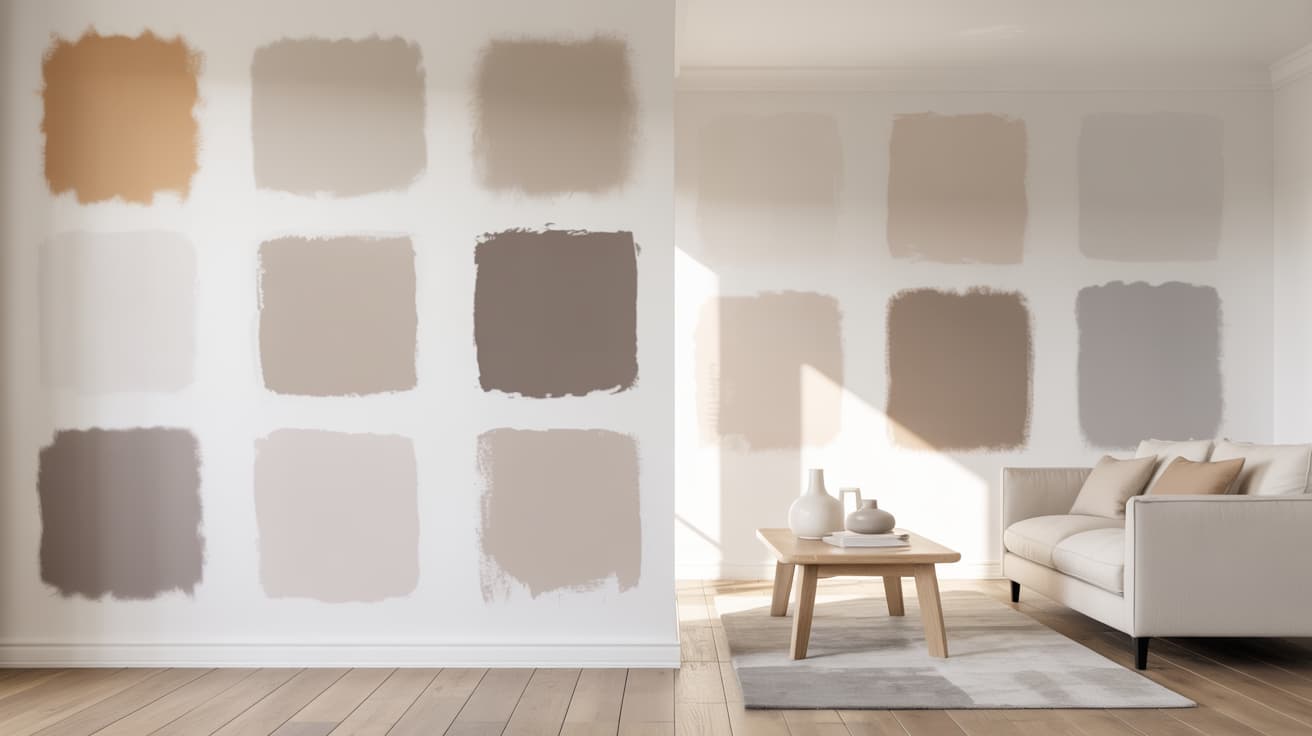
Greige and beige sound like straightforward color categories until you’re standing in your living room holding paint chips that all look different at the store. One reads too yellow, another goes gray, and the one you loved online looks nothing like it does on your wall. You’re not imagining it. These colors shift depending on your lighting, flooring, countertops, and even the time of day. Pick the wrong undertone and a warm beige can look orange next to cool tile, or a greige can turn flat and blue-gray in a north-facing room. From real-room performance to perfect pairings, every popular greige and beige Sherwin-Williams makes, broken down so you can get it right the first time. Greige and Beige: What You Need to Know Before Choosing Most people use greige and beige interchangeably, but they behave very differently on a wall. Greige is a direct blend of gray and beige with a subtle cool undertone, giving it a muted, considered quality. Beige is warmer, leaning toward tan, cream, or yellow, and depending on the formula, it can carry pink or orange undertones. That is why two beiges that look identical on a chip can read completely differently on your walls. Getting the category wrong is costly; the stakes are even higher when choosing colors that expand space in rooms where every decision shows. A beige with orange undertones next to cool gray tile looks dirty. A greige with blue undertones in a dark room turns cold and flat. The right choice comes down to your space, your lighting, and your existing finishes. The Most Popular Sherwin-Williams Greige Paint Colors Not every greige works in every home. These are Sherwin-Williams’ most reached-for picks for versatility and consistent real-world results, and Natural Choice by Sherwin-Williams earns its place among them as one of the most reliably warm options available. 1. Agreeable Gray SW 7029 Sherwin-Williams’ single most popular color, greige or otherwise. What makes it so universally loved is its ability to sit right in the middle, not too warm, not too cool. Its balanced gray-beige base with a whisper of green and taupe means it carries just enough warmth to feel inviting without ever tipping into full beige territory. It balances warm and cool tones better than almost anything else in the lineup, making it work across nearly every room and finish combination. Pair with Pure White or Extra White trim for the cleanest result. Detail Value LRV 60 HEX #D1C5B4 RGB 209 / 203 / 193 Best For Whole-home, living rooms, bedrooms 2. Worldly Gray SW 7043 Worldly Gray is the rare greige that doesn’t commit hard to any one direction, and that’s precisely its strength. Its soft gray-beige base with a barely-there taupe pull that never fully commits to green or purple gives it a vague, organic warmth that sits comfortably between gray and beige without pulling noticeably toward either. That flexibility makes it highly adaptable to both warm and cool finishes. A slightly lighter feel than Amazing Gray, making it a great choice when you want depth without a noticeable green pull. Detail Value LRV 57 HEX #CEC6BB RGB 206 / 198 / 187 Best For Open concepts, transitional spaces 3. Anew Gray SW 7030 Anew Gray occupies a quietly confident space in the greige family. Its warm gray-beige base, with a soft taupe undercurrent and a faint earthy brown undertone, adds subtle warmth. It quiet depth without tipping into full beige territory, making it a strong choice for homeowners who want more personality than Agreeable Gray but aren’t ready to commit to a true beige. Needs decent natural light to perform at its best; in darker rooms, it can feel flat. Works beautifully paired with warm accent tones like Urbane Bronze or Dovetail on trim and cabinetry. Detail Value LRV 47 HEX #BFB6AA RGB 191 / 182 / 170 Best For Whole-home, well-lit spaces 4. Amazing Gray SW 7044 Amazing Gray earns its name by delivering something genuinely beautiful in the right space. Its muted gray-beige base with a quiet but unmistakable olive-green undertone rooted in earthy, organic warmth gives it a grounded quality that most neutrals simply can’t replicate. That green hue can flash depending on your lighting and surrounding finishes, but it’s never overwhelming. Gorgeous alongside brick, natural wood floors, and stone. Also holds up exceptionally well as an exterior color on homes with natural materials. Detail Value LRV 45 HEX #B0A695 RGB 176, 166, 149 Best For Exteriors, brick and stone homes 5. Intellectual Gray SW 7045 Intellectual Gray sits at a depth that makes it one of the most versatile and popular cabinet greiges Sherwin-Williams offers. Its medium-toned gray-beige base, with a grounded, slightly smoky undertone that leans neither warm nor cool, holds a quiet, authoritative presence and is strong enough to add real presence without overpowering a space which is exactly what you want on cabinetry, where the color needs to anchor the room without competing with countertops or backsplash. Detail Value LRV 36 HEX #A8A093 RGB 168 / 160 / 147 Best For Cabinets, accent walls, exteriors 6. Analytical Gray SW 7051 Analytical Gray is for those who want their greige to actually commit. Unlike many grays that offer only a passive nod to green This one carries a deep gray-beige base with a pronounced muddy olive-green undertone that reads earthy, complex, and deliberately organic. A noticeable but never overwhelming character that gives it a genuine personality. Works best in spaces with neutral or cool fixed elements that won’t amplify the green further. Detail Value LRV 47 HEX #A9A090 RGB 169, 160, 144 Best For Neutral or cool fixed elements 7. Mega Greige SW 7031 Mega Greige earns its cozy reputation through its rich gray-beige base layered with warm yellow-brown undertones that read almost like a sun-warmed tan, inviting, soft, and deeply comfortable. A blend that makes any space feel instantly welcoming the moment it hits the walls. The extra warmth works in its favor in living rooms and bedrooms where a snug atmosphere is the goal. Balance it with lighter textiles and décor to avoid the room feeling too heavy or closed in. Detail Value LRV 37 HEX #ADA295 RGB 173 / 162 / 149 Best For Living rooms, bedrooms, cozy spaces 8. Functional Gray SW 7024 Functional Gray is the darkest and most saturated pick on this list. It carries a deep, fully saturated gray-beige base with a dense, complex undertone that blends cool gray authority with just enough warm beige to keep it from feeling cold or industrial. A commanding quality that makes it unlike anything else in this lineup. Built for accent walls, focal points, and feature spaces where a lighter color simply wouldn’t have enough presence. Detail Value LRV 37 HEX #ABA39A RGB 171 / 163 / 154 Best For Accent walls, focal points, feature spaces These eight cover the full range from light and airy to deep and dramatic; there’s a greige here for every room, every lighting condition, and every combination of fixed elements. The Most Popular Sherwin-Williams Beige Paint Colors Beige is back, and it never really left. These seven Sherwin-Williams beiges bring warmth, approachability, and classic appeal to any space, without the starkness of white or the coolness of gray. 9. Accessible Beige SW 7036 Accessible Beige holds the title of Sherwin-Williams’ most popular beige for good reason. Its soft, warm beige base with a gentle tan undertone that sits cleanly between yellow and orange, without tipping into either, gives it a natural adaptability It works across an incredibly wide range of finishes and room types. Keep surrounding colors warm to avoid them looking dingy. Detail Value LRV 58 HEX #C9B99A RGB 201, 185, 154 Best For Open concepts, mixed wood tones 10. Balanced Beige SW 7037 Balanced Beige is the natural next step when Accessible Beige feels too light for your space. Its medium warm-beige base with a richer, slightly deeper tan undertone. It carries a quiet golden warmth. Without reading, yellow deepens the palette, adding richness and body while maintaining the same approachable warmth. Pairs well with creamy whites, creating a cohesive, grounded palette without feeling heavy. Detail Value LRV 46 HEX #C0B2A2 RGB 192 / 178 / 162 Best For Well-lit rooms, warm wood finishes 11. Canvas Tan SW 7531 Canvas Tan brings an earthy, grounded quality that sets it apart from lighter beiges. Its deep, warm tan-beige base, with a strong earthy brown undertone that leans toward natural clay and raw linen,is grounded, organic, and unapologetically warm. It works particularly well in spaces anchored by dark furniture and accessories. Use lighter trim and textiles alongside it to keep the overall palette feeling balanced and breathable. Detail Value LRV 64 HEX #DCD1BF RGB 220 / 209 / 191 Best For Dark furniture, brown floors, earthy spaces 12. Neutral Ground SW 7568 Neutral Ground occupies a unique position in the beige family. Its light, warm tan-beige base with a soft, diffused undertone that blends equal parts sandy beige and muted brown without any yellow push or gray pull makes it genuinely one of the easiest neutrals to live with. That balance is what makes it so appealing for spaces where you need warmth spread across a significant amount of wall area without any one undertone taking over. Detail Value LRV 53 HEX #C0AE96 RGB 192, 174, 150 Best For Large open spaces, transitional homes 13. Shoji White SW 7042 Shoji White is one of those rare colors that crosses comfortably between two families. Its light, warm beige base with a soft green-gray undertone that reads like a sun-warmed off-white, quietly urbane, never yellow, never stark. Gives it a light, warm refinement that creates an inviting atmosphere without reading yellow. Light enough to feel fresh, warm enough to feel welcoming. Detail Value LRV 74 HEX #E6DFD3 RGB 230 / 223 / 211 Best For Whole-home, paired with soft white trim 14. White Duck SW 7010 White Duck manages something that very few colors in this family pull off: it feels simultaneously warm, light, and inviting. Its airy, warm-beige base with a delicate green undertone, sitting at the intersection of beige, greige, and soft sage, is luminous, fresh, and naturally warm without a trace of yellow, giving it that rare quality. Pairs beautifully with SW Alabaster and Greek Villa on cabinetry for a cohesive kitchen palette. Detail Value LRV 74 HEX #E5DFD2 RGB 229 / 223 / 210 Best For South-facing rooms, warm, earthy homes 15. Sand Beach SW 7529 Sand Beach earns its place as the great middle ground of this beige lineup. Its light sandy-beige base with a warm, sun-bleached undertone that evokes natural linen and pale driftwood, soft, approachable, and completely free of any dominant color pull, makes it so useful When you want warmth without commitment. Sits lighter than Canvas Tan but warmer than Accessible Beige, making it the natural choice when neither feels quite right. Detail Value LRV 63 HEX #CEBEAB RGB 206, 190, 171 Best For Transitional spaces, open floor plans From light and barely-there to warm and grounding, these seven beiges cover every scenario, whether you’re painting one room or looking for a color that carries through an entire home. How Lighting Changes Greige and Beige Lighting is the single most overlooked factor in paint color selection. The same color can look warm and inviting in one room and cold and flat in another, and the paint hasn’t changed. Natural Light: How Room Exposure Affects Color North-Facing: Pulls gray out of greige and makes beige look dull; always choose warmer undertones in both families South-Facing: Both families perform at their best, with the most flexibility to go lighter or deeper with confidence East-Facing: Warm morning light fades to cool blue tones by afternoon, test samples at multiple times before committing West-Facing: Cool and flat in the morning, warm golden light by evening, best for rooms used primarily in the afternoon or evening Artificial Light: How Bulb Temperature Shifts Color Warm Bulbs (2700K–3000K): Amplify warmth in both families, watch yellow-leaning beiges as they can push toward orange on large surfaces Cool Bulbs (4000K–5000K): Pull gray out of greige and flatten warm beiges. If your color looks off at night, the bulbs are usually the culprit Dimmer Switches: Give real-time control over how warm or cool your color reads, one of the most underused tools in paint selection Before finalizing any color, test your sample under both natural and artificial light at different times of day. What looks perfect at noon needs to look just as good at Night. How to Choose Between Greige and Beige These things determine the right call every time: fixed elements, light exposure, and LRV. Get these right, and the color almost picks itself. Check fixed elements first: flooring, tile, and cabinetry stay. Your paint works around them. Warm elements pair with beige: honey oak floors and earthy stone lean toward beige. Cool elements pair well with greige: gray tile, white quartz, and stainless steel look better with it. Match undertones before sampling: the undertone in your paint needs to complement what’s already in the room. Use LRV for room size: small or dark rooms need an LRV of 60 or higher. Larger rooms can handle lower values. Get these things right, and the color stops feeling like a guess and becomes the only logical choice for your specific space. Tips Before You Pick Up a Paintbrush A few things most paint guides skip over, but genuinely make a difference when choosing between greige and beige. Keep samples large: at least 12×12 inches for an accurate read Photograph your samples: a quick photo often reveals undertones the eye misses when standing in the room Order peel-and-stick samples: mess-free, repositionable, and easy to test across multiple walls without painted swatches Avoid choosing in the paint store: fluorescent lighting misrepresents both greige and beige every single time Prime over sample patches: leftover swatches bleed through new paint if not primed, especially with lighter colors These small details are easy to overlook but consistently separate a result you love from one you repaint six months later. Final Thoughts Picking the right paint color is never just about what looks good on a chip; it’s about how it performs in your actual space. The popular Sherwin-Williams greige and beige paint colors each bring something different to a room, and understanding undertones, LRV, and lighting is what separates a great result from a costly repaint. In my experience, the homeowners who get it right are the ones who test first and trust what they see in their own light, not someone else’s photos. Check your samples at different times of day, hold them against your fixed elements, and commit with confidence. Drop your color choice in the comments or share it with someone still stuck on paint chips. Frequently Asked Questions (FAQs) How many paint samples should you test before committing? Three to five is a reasonable range. Test each one in at least two spots on the same wall and revisit them at different times of day before making a final decision. Can greige and beige be used together in the same home? Yes, the key is varying the depth. Use a lighter beige in one zone and a slightly deeper greige in an adjacent space, keeping trim consistent throughout to tie everything together. Does paint finish affect how greige and beige look? Yes. Flat and matte finishes make colors appear darker and warmer. Eggshell and satin reflect more light and can shift undertones; always sample in the finish you plan to use
I used to think the space under a deck didn’t matter, but it does. Once you notice uneven boards, open gaps, or random storage piling up, it becomes hard to ignore. If you’re facing the same thing, you might be searching for modern deck skirting ideas that actually help your space look clean. Good skirting can hide clutter, support airflow, and match the style of your home. It also helps your deck feel more finished without adding extra work. In this guide, I’ll share modern deck skirting ideas that keep things simple, clear, and easy to manage. So let’s start with the options that make the biggest difference. What Makes Deck Skirting Look Modern Modern deck skirting uses clean lines, simple shapes, and smooth finishes. Most updated designs avoid busy patterns and lean toward straight boards or panels. Dark colors like black or charcoal create a sharp look, while light tones keep things bright and neat. Materials such as composite, PVC, metal, and well-finished wood work well because they stay uniform and hold up over time. Modern skirting also keeps the space under the deck organized. Even spacing, trimmed edges, and a clear layout help the whole deck look fresh and intentional. How to Choose the Right Modern Skirting Use this quick guide to match your deck skirting to your home, climate, budget, and upkeep needs without stress today. Match the skirting style to your deck height, railing style, and home design. Pick a material that fits your climate and upkeep needs. Plan for steady airflow under the deck to prevent moisture issues. Add access panels or doors if you store items or need utility entry. Set a budget early so you can compare wood, composite, PVC, and metal. Check the ground slope to avoid gaps or uneven lines during installation. Modern Deck Skirting Ideas Modern deck skirting ideas use clean lines, simple boards, and smooth panels to update your deck. These options help you hide gaps, add style, and keep upkeep low. You’ll also see several inexpensive deck skirting ideas here that work well when you have a small budget. 1. Horizontal Cedar Slats Horizontal cedar slats give your deck a clean and updated look. The warm tone of the wood pairs well with many siding colors, and the straight lines keep the style simple. You can change the spacing between boards to control airflow and privacy. Cedar is light, easy to cut, and holds stain well, which helps you keep it looking fresh through the seasons. This option works for most deck heights and remains a good pick if you want a natural finish. 2. Black Composite Panels Black composite panels create a sharp and smooth look that suits many modern homes. The panels stay steady in rough weather and only need light cleaning during the year. Because composite stays uniform, you don’t deal with knots or twists. You can choose full sheets or plank styles, depending on how much detail you want. This option also works well if you want a long-lasting setup without regular repairs. The dark tone hides dirt and gives your deck a simple, strong finish. 3. Vertical Narrow Slats Vertical narrow slats add height to your deck and give the space a tidy layout. This style works well if your siding or fence also uses straight lines. The narrow boards create a steady pattern without feeling heavy. You can stain the slats in light or dark tones depending on your home’s look. This setup also helps with airflow because the slim gaps keep air moving under the deck. It’s a flexible choice that fits many outdoor layouts and needs little upkeep. 4. Metal Grid Panels Metal grid panels offer a simple way to update your deck with strong, clean lines. The grid layout keeps the look neat while still allowing good airflow under the deck. These panels handle rough weather, resist bugs, and hold their shape well over time. You can paint them black or charcoal for a sharper finish or leave them coated in a neutral metal tone. This choice works well for both tall and low decks and pairs nicely with metal railings or simple wood trim. 5. PVC Panels in Matte White PVC panels in matte white keep your deck bright and tidy while giving you a smooth finish that holds up to moisture and sun. The panels do not warp, swell, or split, which makes them a steady choice for many climates. They also clean quickly with a simple wash. The matte surface helps the panels blend with trim, siding, and railings. If you want a clean, quiet look without much upkeep, this option offers a simple and long-lasting solution for your deck. 6. Wood Slats with Black Frame Wood slats with a black frame create a clean outline that helps the skirting stand out in a simple way. The wood adds warmth, while the dark frame keeps the setup sharp. You can install the slats horizontally or vertically based on your layout. This style works well when your home already uses black accents on windows or railings. The frame also helps keep the boards aligned, giving you a neat finish. It’s a good pick for decks that need both structure and style. 7. Composite Boards Installed Horizontally Composite boards installed horizontally give your skirting a steady, smooth layout that stays clean with very little work. The boards resist fading, cracking, and bending, which helps them last longer than many wood options. The horizontal lines make the deck feel wider and more open. You can match the boards to your deck surface or choose a new shade for contrast. Because the composite holds its shape, the final look stays even and simple through the seasons, making this a strong choice for busy homeowners. 8. Smooth Concrete Base with Wood Trim A smooth concrete base with wood trim gives your deck a steady and grounded feel. The concrete keeps pests and moisture away from the underside of the deck, while the wood trim softens the look. This mix works well for homes that use both stone and wood elements. You can stain the trim to match your deck boards, which helps the whole setup feel connected. The concrete stays firm over time, and the simple trim line gives the skirting a clean border. 9. Perforated Metal Sheets Perforated metal sheets provide steady airflow and a clean finish. The small holes help with ventilation while keeping the deck looking neat and simple. These sheets stand up well to rough weather, making them a good pick for many climates. You can choose round or square holes depending on your style. A dark-coated finish works well with wood decks, while lighter tones match bright trim. This option suits both low and raised decks and requires little more than a basic wash for upkeep. 10. Black Vinyl Lattice in A Clean Frame Black vinyl lattice in a clean frame gives you an updated look at a low cost. The dark tone helps the lattice feel simple and modern, not busy. The frame keeps the panels tight and straight, which improves the final result. Vinyl holds up to rain and sun without much upkeep and stays light enough for easy cutting. This style also gives good airflow, which helps protect the deck. It’s a budget-friendly choice when you want a neat look without extra work. 11. Slatted Wood with Gravel Base Slatted wood with a gravel base gives your deck a tidy and steady layout. The gravel helps with drainage, keeps mud away from the boards, and reduces moisture under the deck. The wood slats sit slightly above the gravel, which prevents early wear and keeps the lines clean. You can stain the boards in light or dark tones based on your deck style. This setup works well for raised decks that need airflow and a clear barrier at ground level. It stays easy to maintain year-round. 12. Reclaimed Wood Slats Reclaimed wood slats offer a low-cost way to update your deck while keeping a simple look. The boards already have character, so you can sand them lightly and apply a clear coat or stain. When installed with even spacing, the layout feels clean without looking rough. This approach works well if you want to save money while still getting a strong result. Reclaimed wood is easy to cut and replace, making it practical for DIY work. It’s a steady choice for decks that need airflow and warmth. 13. Composite Panels with Hidden Fasteners Composite panels with hidden fasteners give your deck a smooth surface with no visible screws or nails. This creates a steady, uninterrupted look that suits many updated outdoor spaces. Composite holds its shape through different seasons, so you won’t deal with bending or splitting. The panels come in several colors, allowing you to match your deck boards or create a contrast. Because the fasteners stay out of sight, the final layout feels clean and direct. You also get a setup that needs very little upkeep. 14. Metal + Wood Combo Panels Metal and wood combo panels give you a strong, balanced look that works with many deck styles. The metal provides a firm base and resists weather, while the wood adds warmth. You can run the wood boards horizontally or vertically, depending on your layout. This mix works well when your railing or trim already uses metal. The panels hold up well over time and only need basic cleaning. This option also helps you manage airflow while creating a clear border around the deck. 15. Solid Privacy Composite Walls Solid privacy composite walls give full coverage under your deck and remove any open spaces. This style works well if you want a simple, protected area with no gaps. Composite stays strong through heat, rain, and cold, so the panels remain uniform over time. You can choose smooth or lightly textured surfaces to match your deck boards. The walls also help block pests and reduce clutter under the deck. This option fits well for tall decks or backyards that need more privacy or storage. 16. Horizontal Shiplap-Style Boards Horizontal shiplap-style boards give your deck a clean and even layout. The slight overlap between boards helps block gaps while keeping the lines straight. You can use natural wood or composite, depending on your upkeep needs. This style fits homes with simple siding or smooth trim. The boards sit neatly in a frame, which helps them stay aligned through changing seasons. It’s a practical pick if you want something easy to clean and steady in appearance without extra detail or patterns. 17. Minimal Acrylic Panels Minimal acrylic panels offer a clear, simple finish that pairs well with updated outdoor spaces. These panels can be frosted for privacy or left clear to match open layouts. Acrylic stays light, easy to cut, and resists moisture, making it steady in wet or sunny climates. You can frame the panels with wood or metal for a neat border. This style works well for low decks or areas where you want a clean look without solid boards. A quick wash keeps them looking fresh. 18. Deck Skirting with Led Strip Lighting Deck skirting with LED strip lighting gives your deck a clean glow at night while keeping the layout simple during the day. LED strips can run along the top or bottom edge of the skirting to highlight straight lines or add soft ground lighting. You can use wood, composite, or metal panels as the base material. The lights stay low-energy and easy to control with timers. This setup works especially well for decks used in the evening and helps guide foot traffic safely. 19. Black Aluminum Panels Black aluminum panels provide a strong and simple finish that holds up well in many climates. Aluminum resists rust and keeps its shape through heat and cold. The dark tone helps the skirting blend with black railings or window trim. Panels come in smooth or lightly vented styles, depending on your airflow needs. They are light enough for easy handling, yet firm enough to protect the underside of the deck. This option keeps upkeep low while giving your deck a steady, updated look. 20. Clean Stucco Finish A clean stucco finish gives your deck a solid, smooth surface that works well with many home styles. Stucco covers gaps fully and offers a uniform look that stays steady through weather changes. You can match the color to your home’s siding for a connected layout. Stucco also blocks pests and protects the underside of the deck from debris. This option works best for raised decks with strong framing. Once installed, it only needs light cleaning to stay fresh through the seasons. 21. Bamboo Slat Skirting (Inexpensive + Modern) Bamboo slat skirting gives your deck a clean and natural look at a low cost. The slim slats create steady lines that work well with many outdoor styles. Bamboo is light, easy to cut, and holds up well when sealed. You can mount the slats in tight rows for more coverage or leave small gaps for airflow. This option works for both low and raised decks and offers a simple way to freshen the space without high material costs. It stays easy to maintain throughout the year. 22. Modern Brick-Look Panels Modern brick-look panels give your deck a solid appearance without the weight of real brick. These panels install quickly and stay steady through weather changes. You can choose darker or lighter tones depending on your siding or trim. The panels fit well under taller decks and help block clutter from view. They also resist pests and keep their shape better than many natural materials. If you want a firm, simple finish that needs little upkeep, this option helps create a clear base for your deck. 23. Angled Slat Skirting Angled slat skirting uses boards set on a steady diagonal, which helps the deck stand out while keeping the layout simple. The angle creates smooth lines that work well with both wood and composite boards. You can change the angle based on your deck height and airflow needs. This setup works well when you want more coverage than straight slats but still want good ventilation. Staining or painting the boards gives you full control over the final look. It’s a flexible pick for many homes. 24. Slatted Privacy Fence Style A slatted privacy fence style gives full coverage under your deck while keeping the lines straight and neat. The boards sit close together, blocking clutter and creating a steady screen. You can run the slats horizontally or vertically, depending on your layout. This design works well for homes with simple railings or clean siding lines. It also helps reduce wind under the deck while still allowing small gaps for air movement. The finished look stays tidy with basic cleaning and light seasonal checks. 25. Charcoal Fiber-Cement Panels Charcoal fiber-cement panels offer a firm, smooth surface that handles heat, rain, and moisture well. The dark color blends easily with many deck designs and hides dirt between cleanings. These panels stay flat over time and resist dents, making them useful for busy outdoor spaces. You can install them with slim trim boards for a clean border. Fiber-cement fits tall decks especially well, giving the base a steady appearance. Once in place, the panels need only occasional washing to stay in good shape. 26. Simple Plywood Panels Painted Black Simple plywood panels painted black give your deck a clean look without a high price. When trimmed neatly, they create a steady, uniform surface that hides open spaces under the deck. Exterior-grade plywood handles weather better and takes paint evenly. The black finish blends with many railing and trim styles while hiding small marks or dirt. This is a helpful choice if you want a fast solution that still looks tidy. A light wash and touch-up paint keep the panels looking fresh. 27. Live-Edge Wood Skirting (Simple Cut Edges) Live-edge wood skirting uses boards with natural edges to give your deck a warm, simple look. The edges keep slight shape changes, but the skirting stays clean when trimmed to the same height. You can mount the boards close together or leave small gaps for airflow. A clear coat highlights the grain and protects the wood from weather damage. This style works well with decks that already feature wood surfaces or natural landscaping. It offers a steady finish while keeping a natural feel. 28. Horizontal 2×2 Slat Style A horizontal 2×2 slat style creates short, even gaps that help with airflow while still giving good coverage. The slim boards line up neatly and stay light enough for simple installation. You can stain or paint them to match your deck. This style works for low and raised decks because the pattern stays steady across different heights. The small slats also help reduce warping when sealed well. It’s a tidy option when you want straight lines without heavy boards or complex framing. 29. Minimal Stone Veneer Skirting Minimal stone veneer skirting gives your deck a firm and clean base without the weight of full stone. The panels attach easily to a support surface and stay steady through weather changes. You can choose smooth or lightly textured finishes based on your siding. Stone veneer helps block pests and offers full coverage for stored items under the deck. It works best for raised decks with strong lower framing. A light rinse during the year keeps the surface looking clean and even. 30. Wood Slats with Hidden Storage Doors Wood slats with hidden storage doors give you a neat layout while providing access to the space under the deck. The doors blend with the slats, so the surface looks smooth from a distance. Hinges and latches stay inside or behind the boards to keep the front clean. This setup works well for storing outdoor tools, cushions, or seasonal items. You can adjust the slat spacing for airflow while still keeping the storage area protected. It’s a practical choice for small yards or busy families. 31. Mixed-Width Horizontal Boards Mixed-width horizontal boards give your deck a steady look with a bit of variety. By using two or three board sizes, you create a clean pattern without making the skirting feel busy. The boards line up in straight rows, which keeps the layout calm and simple. You can stain all boards one color or use slight shade changes for a soft contrast. This style works well for wider decks because the lines help anchor the base. Upkeep stays manageable with seasonal cleaning and sealing. 32. Modern Trellis-Style Panels Modern trellis-style panels use larger openings and firm framing to keep the look simple and updated. Unlike older trellis designs, this version avoids thin strips and uses sturdy material with clean spacing. The panel layout allows strong airflow while still giving good coverage. You can choose wood, composite, or metal depending on your upkeep needs. This style works well for low and raised decks and matches many railing designs. A quick wash keeps the panels looking fresh through the seasons. 33. Corrugated Metal Painted Black (Inexpensive) Corrugated metal painted black offers a low-cost way to give your deck a bold, steady finish. The black surface hides marks and blends well with many trim colors. Corrugated panels stand up to rain, heat, and direct sun, making them reliable in tough climates. They also install quickly using basic tools. This style works especially well for raised decks where you want full coverage. The simple lines of the metal keep the layout clean, and light yearly washing helps it stay in good shape. 34. PVC Slats in Natural Wood Tone PVC slats in a natural wood tone give your deck a warm look without the upkeep of real wood. The slats resist moisture, insects, and fading, which helps them stay steady over time. Their uniform shape keeps the layout neat and simple. You can install the slats horizontally or vertically, depending on your deck height. This style works for many outdoor spaces because it matches common deck colors while staying easy to maintain. A quick wash brings the surface back to a clean finish. 35. Concrete Block Skirting with Smooth Finish Concrete block skirting with a smooth finish gives your deck a firm base that stays steady for many years. The blocks create full coverage and help protect the underside from pests and debris. Once the surface is coated or sealed, it takes on a clean, uniform look that matches many home styles. This option works best for raised decks with strong framing. You can add a simple trim along the top to connect the skirting to the deck structure. Seasonal rinsing keeps it looking neat. Maintenance Tips for Long-Lasting Modern Skirting Keep your skirting in good shape with simple checks, steady airflow, clean surfaces, and small repairs that prevent bigger issues over time. Wash panels or boards once or twice a year to remove dirt and buildup. Check for loose screws, warped boards, or shifting panels. Clear leaves and debris from the ground to maintain airflow. Re-seal wood when it starts to fade or feel dry. Inspect vents and gaps to ensure steady airflow under the deck. Fix small problems early to avoid costly repairs later. Final Thoughts You’ve seen how small changes under a deck can update the whole area. Clean lines, steady materials, and simple upkeep can make your outdoor space feel more organized and easier to use. The ideas you’ve read through can help you fix problem spots, hide clutter, and give your deck a more complete look. You don’t need a large project to see progress. You just need one clear plan that fits your space. As you think through these modern deck skirting ideas, I hope you’ll try one and see how much it helps. If you want more outdoor guidance, feel free to explore my other blogs for added support.

I’ve noticed how Harvard and Dark Academia often show up together online, almost like they belong to the same world. You see old libraries, quiet halls, and people reading classic books, and it all feels calm and meaningful. It’s easy to get pulled into that image, similar to how people view Light Academia style . But if you look closer, it’s not really about Harvard itself. It’s about how we imagine it. I’ll help you understand where that image comes from and why it feels so powerful. You’ll see how history, stories, and style all mix together to create something that feels real, even when it’s not. Understanding Dark Academia and Its Connection to Harvard Actually, a way of imagining intellectual life. Harvard plays a key role because it represents elite education, prestige, and deep knowledge. Instead of focusing on the real university, the aesthetic turns Harvard into an ideal symbol of academic excellence. This creates a version of learning that feels meaningful and dramatic rather than ordinary. Harvard acts as a symbol , not the actual focus The aesthetic turns reality into an ideal academic world Emphasis is on prestige and intellectual identity Focus often shifts to appearance over real learning It creates a romanticized version of knowledge Dark Academia is less about real academic life and more about how people imagine it. It reflects a desire to see learning as something beautiful and meaningful, even if that image is not entirely true to reality. Harvard’s Historical Roots Behind Dark Academia Dark Academia draws inspiration from Harvard’s long academic history, but what it presents is not the full reality; it is a filtered version shaped by aesthetic preferences and cultural storytelling. Harvard in Reality: Founded in 1636 with strong ties to elite education Historically shaped by restricted access and hierarchy Focused on classical studies but within rigid systems Harvard in Dark Academia: Seen as an intellectual haven Emphasizes literature, philosophy, and tradition Removes social and historical complexities Literature plays a major role in bridging these two versions. Works like The Secret History reimagine elite academic environments, making them feel both intellectually intense and emotionally compelling. As a result, Harvard’s complex past becomes simplified into a powerful but incomplete aesthetic narrative. Why Harvard Became the Core Symbol of Dark Academia Harvard’s role in Dark Academia is not accidental; it is structural. The aesthetic depends on a powerful symbol that instantly conveys prestige, tradition, and intellectual depth , and Harvard fulfills this better than almost any institution. Its constant presence in media, literature, and global discourse reinforces its image as the pinnacle of academic achievement. Through repetition, images of historic campuses, elite student life, and intellectual legacy, Harvard is transformed from a real university into an archetype of “ideal academia.” Architecturally and culturally, it aligns with the aesthetic’s visual language, making it feel timeless and universal. Ultimately, Harvard functions less as a place and more as a symbol of intellectual aspiration and exclusivity , representing a broader world of elite academic tradition rather than itself alone. How is Harvard transformed into an Atmosphere? Dark Academia does not replicate Harvard; it reinterprets it through a system of visual and behavioral elements, turning a real institution into a symbolic experience. 1. Visual and Environmental Translation Harvard’s libraries and architecture are simplified into dim lighting, antique furniture, and towering bookshelves; elements that signal depth and timelessness. Through abstraction, real spaces become portable environments that feel intellectual but are detached from reality. This breaks down when the space becomes purely decorative without real engagement. Key Points: Focus on dim lighting, vintage interiors, and bookshelves Signals history and intellectual depth Uses abstraction to recreate Harvard anywhere Becomes an atmosphere, not a real place Fails when reduced to decoration without meaning 2. Fashion as Institutional Identity Dark Academia fashion mirrors traditional academic dress, using tweed, cardigans, and muted tones to reflect Harvard’s scholarly image. Through mimicry, it creates a visible sense of belonging, but remains limited to appearance rather than real intellectual depth. Key Points: Inspired by traditional academic clothing Acts as an identity and belonging signal Reflects intellectual culture visually Creates an appearance of scholarship Limited without real intellectual substance 3. Curated Intellectual Behavior The aesthetic highlights activities like reading classics and studying philosophy, reflecting Harvard’s historical focus. This selective approach creates a refined but narrow version of intellectual life, often excluding modern and diverse perspectives. Key Points: Focus on classics and philosophy Highlights select forms of knowledge Creates a stylized intellectual lifestyle Ignores modern disciplines Limits broader intellectual exploration The Myth vs Reality of Harvard in Dark Academia Dark Academia presents Harvard through a romanticized lens that contrasts sharply with its real-world complexity. Aspect Myth Reality Image Beautiful, intense, intellectual Complex, modern institution Knowledge Transformative, poetic Structured, demanding Students Introspective, meaningful lives Competitive, high-pressure Access Open and universal Historically restricted System Timeless sanctuary Bureaucratic, evolving Intellectualism Aesthetic performance Genuine engagement Outcome Emotional, idealized narrative Nuanced, imperfect reality This comparison highlights how Dark Academia reshapes Harvard into a symbolic ideal, emphasizing meaning and beauty while overlooking the realities that define it. Why Harvard-Focused Dark Academia Resonates Today? Harvard-focused Dark Academia resonates today because it reflects a response to digital overload, fast-paced education, and a lack of depth in modern life. As a symbol, Harvard offers an imagined world of slow, meaningful, and intellectually rich learning . This effect intensified during COVID-19, when empty campuses became objects of nostalgia and idealization . As a result, Harvard represents permanence, focus, and depth ; qualities many feel are missing today, though this appeal can fade if it remains only an aesthetic escape. Harvard and Dark Academia as a Cultural Construct The relationship between Harvard and Dark Academia is best understood as a layered system where a real institution is transformed into a cultural idea. Harvard provides the historical base, but it does not remain unchanged; it is reshaped, simplified, and reinterpreted through narrative and aesthetic expression. History: real traditions, architecture, and intellectual legacy Myth: selective romanticization of certain elements Aesthetic: visual and behavioral expression of that myth Mechanism: feedback loop between culture, perception, and imagery Outcome: Harvard becomes a symbolic idea, not just an institution Over time, this process creates a self-sustaining cultural construct. Harvard exists not only as a university but as an imagined ideal, blending reality, myth, and aesthetic into a single, powerful narrative. Final Thoughts When you look at it closely, the version of Harvard in Dark Academia isn’t something you can visit; it’s something people create in their minds. That’s what makes it so appealing. It gives you a way to slow down and connect learning with meaning, even if real life doesn’t always feel that way. Understanding Harvard and Dark Academia helps you see the difference between what looks good and what actually matters. You can still enjoy the mood and inspiration, but you don’t have to get stuck in the illusion. Real learning can be messy, and that’s okay. If you’re curious about ideas like this, you can always check out my more posts for simple insights and fresh perspectives.

I kept seeing “Green Academia” all over Pinterest and Instagram, but most posts only showed outfits or color palettes. That left me wondering what it actually means and why people connect with it. If you are in the same spot, this will help. In this guide to Green Academia, I will explain colors, vibes, and style in a simple way, alongside the Light Academia style . You will learn what defines the aesthetic, how the colors work, what kind of mood it creates, and how style fits into it. By the end, you will see how everything connects, so it feels clear instead of confusing. What Is Green Academia and What Defines It? Green Academia is an aesthetic built around learning, nature, and a quiet, grounded lifestyle. It blends academic life with the natural world. Instead of focusing only on books or fashion, it connects knowledge with the environment. At its core, Green Academia comes from a simple idea. People want to feel intellectual while staying connected to nature. That need shapes everything in this style. Here is how it works in practice: Cause: Interest in science, nature, and slow living Mechanism: Mixing academic elements with organic materials and tones Outcome: A calm, thoughtful aesthetic that feels both scholarly and natural This is why it feels different from other trends. It is not just about looking a certain way. It reflects how someone thinks, studies, and interacts with the world. A common mistake is thinking Green Academia is just Dark Academia with green colors. That is not accurate. Green Academia is less dramatic and more rooted in real-world science and sustainability. The Green Academia Color Palette and Why It Works The color palette is one of the strongest parts of this aesthetic. But it is not random. Every shade has a purpose. Core Colors and Their Role The main colors come straight from nature: Moss green Olive green Forest green Earthy browns Soft beige and cream Warm gray These colors work together because they already exist together in nature. Forests, soil, and plants naturally combine these shades. The effect is simple. Low contrast and muted tones reduce visual noise. That makes the space or outfit feel calm and focused. This is why the palette supports studying and quiet thinking. Accent Colors and Their Function Accent colors include: Burgundy Mustard yellow Deep navy These are used in small amounts. They add depth without breaking the natural feel. If you overuse these accents, the balance shifts. The look starts leaning toward Dark Academia or vintage fashion instead of Green Academia. Why These Colors Feel Academic? Muted tones are often linked with seriousness and focus. Bright colors demand attention. Soft tones allow concentration. There is also a visual connection to old libraries, worn books, and botanical studies. That connection reinforces the academic feel. A common misunderstanding is using bright green. Neon or overly saturated greens do not fit. They break the calm and grounded tone. The Green Academia Vibe and Atmosphere The vibe is where everything connects. It is not just about how things look, but how they feel together. Green Academia creates a calm, thoughtful space that blends learning with nature. Intellectual and scientific focus: It is shaped by a real interest in subjects like botany, ecology, and natural history. Plants and books are not just decor. They reflect genuine study and curiosity. Mood and emotional tone: The atmosphere feels calm and reflective, without being heavy. It is lighter than Dark Academia, with softer lighting and fewer dramatic elements. Too much darkness can shift the vibe away. Sustainability as a core layer: Sustainability is essential here. It comes from environmental awareness and shows through second-hand choices and natural materials. Ignoring this weakens the entire aesthetic. Green Academia Fashion and Style Logic Once the vibe and core ideas are clear, the clothing starts to make more sense because it directly reflects the same balance of structure, practicality, and connection to nature. 1. Core Clothing Pieces and Why They Exist Common pieces include: Blazers Knitted vests Turtlenecks Pleated trousers These pieces are not random. Structured clothing suggests focus and organization. That aligns with academic life. The outfits are also designed for comfort during long study sessions. That is why they are simple and functional. 2. Material and Texture Importance Materials matter just as much as the design. Common fabrics include: Wool Tweed Corduroy Cotton These are durable and natural. They age well and feel grounded. Synthetic fabrics often look too modern or artificial. They break the connection to nature and tradition. 3. Accessories and Their Function Accessories are minimal but meaningful: Leather bags Scarves Berets or simple hats These items are practical. A bag carries books. A scarf adds warmth. They are not just for style. They support the lifestyle behind the aesthetic. Interior and Environmental Expression of Green Academia Green Academia is not limited to clothing. It extends into living spaces. The goal is to create an environment that supports calm thinking and study. Key elements include: Wooden furniture Bookshelves filled with real books Plants and botanical elements Warm lighting The mechanism is simple. Natural textures combined with academic objects create a layered space. This makes the environment feel lived-in and thoughtful. Lighting also plays a role. Soft, warm light reduces harsh contrast and creates a relaxed atmosphere. This approach works because it mirrors real study environments from the past, but with a stronger connection to nature. It can fail when spaces become too modern or minimal. Clean, empty rooms remove the depth that this aesthetic depends on. How Green Academia Differs From Similar Aesthetics Many people mix Green Academia with other aesthetics because they share some visual overlap. A clear comparison makes it easier to understand what sets it apart. Aspect Green Academia Dark Academia Goblincore Core Focus Science, nature, and learning Literature, classics, and philosophy Nature through collecting and curiosity Mood Calm, grounded, reflective Dramatic, intense, moody Playful, chaotic, earthy Color Direction Muted greens, browns, soft neutrals Deep browns, blacks, burgundy Mixed natural tones, often uneven Approach to Nature Studied and understood Symbolic or atmospheric Collected and appreciated Structure Organized and academic Structured but dramatic Unstructured and spontaneous The difference is not just visual. It comes down to how each aesthetic approaches knowledge, nature, and mood. Understanding these distinctions helps keep the aesthetic consistent and avoids mixing elements in a way that feels unclear. Common Misunderstandings About Green Academia Many people interpret this aesthetic at a surface level, which leads to a few common mistakes. It is just a color trend: This ignores the deeper academic and environmental foundation behind the aesthetic. It is only about fashion: Green Academia also includes mindset, study habits, and lifestyle choices. It is the same as Dark Academia: The tone, focus, and subject matter are clearly different. Sustainability is optional: Removing this element weakens the entire concept. More details make it better: Over-accessorizing creates clutter instead of a calm, focused feel. Being aware of these points helps you understand the aesthetic more clearly and avoid a shallow interpretation. Quick Summary of The Green Academia Aesthetic Green Academia connects learning with nature in a simple and grounded way. It combines academic life with environmental awareness It uses muted greens, browns, and soft neutrals The mood is calm, thoughtful, and focused Clothing is structured, practical, and made from natural materials Spaces include wood, books, and plants Everything links back to one idea. Knowledge and nature can exist together in a balanced way. Wrap Up Once you see how this aesthetic works, it becomes easier to shape it in your own way. You do not need to copy outfits or rooms exactly. What matters is the connection between learning, nature, and the choices you make around them. When I think about Green Academia colors, vibes, and style, it really comes down to staying intentional. The colors you pick, the materials you use, and even what you read or study all play a part in making it feel real and consistent. Take your time with it. Start small, notice what feels right, and build from there. If you want more simple ideas and guidance like this, you can check out other posts for more help.