


Painted stairs can completely change how a staircase feels inside a home, and they do it without the cost of a full replacement. A fresh coat of paint covers scratches, uneven wood tones, and the kind of wear that stain would only draw attention to. It also opens up a color range that stained wood simply cannot reach, from soft warm whites to deep charcoal and everything in between. Painted stairs are not a shortcut. They demand proper surface prep, the right primer, and a paint product built for foot traffic. Skip any of those steps and the finish will chip, scuff, or peel within months instead of lasting years. This blog covers how to paint stairs correctly, which colors work best for different home styles, and how to keep the finish looking good long after the project is done. Are Painted Stairs a Good Idea? Paint hides dents, old stains, and uneven wood grain better than any other finish. It also opens up a full range of colors, from crisp white to deep charcoal. Stained wood cannot match that range. Softer woods like pine and poplar take paint especially well. These woods are common in older staircases. Paint covers the flaws that stains would only highlight. Here is a quick side-by-side to help you decide: Factor Painted Stairs Stained Stairs Color options Unlimited, any shade Limited to wood tones Hides imperfections Yes, very well No, highlights flaws Durability on treads Chips and scuffs faster Wears more evenly Best for Softer woods, budget updates Hardwoods with good grain Maintenance Touch-ups every 1-3 years Occasional resealing Upfront cost Higher, needs primer and coats Lower, fewer materials 15 Painted Stairs Ideas for Every Home Style This finish works with nearly every design style. Farmhouse, modern, minimalist- it fits them all. The right color and pattern depend on your home’s palette and ceiling height. It also depends on how much contrast you want between treads and risers. Below are six popular directions homeowners take, each suited to a different look and budget. 1. Classic White Painted Stairs White remains the most requested option for good reason. It reflects light and makes a narrow stairwell feel larger. White also pairs with almost any wall color. A soft white with a bit of warmth tends to feel more inviting than a stark, cool white. The tradeoff is that the scuffs show more easily. A durable, washable sheen matters here more than in most other rooms. 2. Black Painted Stairs for a Modern Look Black creates drama and works well in contemporary or industrial-style homes. It also hides scuffs and dirt better than white. That makes it a practical pick for busy households. Pairing black treads with white risers, or the reverse, adds contrast. It does this without overwhelming a small space. 3. Two-Tone Painted Staircases This look pairs one color on the risers and another on the treads. Some homeowners paint the stringer and leave the treads as natural wood. This approach adds color without committing to one bold shade. It also works well when you want to tie the staircase to a nearby room’s color scheme. 4. Painted Stair Risers with Pattern or Design Patterned risers turn a staircase into a focal point. Homeowners use stencils, wallpaper, or hand-painted designs on each riser. The pattern often varies from step to step. This works well in hallways or basements where the stairs are the main visual feature. Keep the treads in a solid, durable color. That way, the pattern will not compete with foot traffic wear. 5. Neutral Painted Stairs Gray, greige, and soft taupe offer a middle ground. They sit between stark white and bold color. Neutrals hide everyday wear better than white. They still keep the space feeling calm and put together. This is a popular pick for homeowners who plan to change decor over time. 6. Bold and Colorful Painted Stairs Some of us want our staircase to make a statement. Navy, emerald, and even a bright yellow bring real personality to the space. This approach works best when surrounding walls stay neutral and best to paint the stairs. That way, the staircase becomes the clear focal point. It won’t compete with busy wallpaper or artwork nearby. 7. Ombre Painted Stairs An ombre staircase shifts gradually from a dark shade at the bottom to a lighter tint near the top. Some homeowners mix white into the same base color for each step. Others go the opposite way, moving from light to dark as the stairs rise. This effect works well in entryways and adds real visual movement without using more than one color family. Keep the transition subtle, since jumps that are too dramatic between steps can look uneven instead of intentional. 8. Painted Faux Runner Stairs A faux runner mimics a fabric stair runner using paint alone. Painters tape off a center strip on each tread and riser, then fill it with a contrasting color. The outer edges stay in a solid neutral to frame the look. This approach offers the charm of a traditional runner without the need to clean or replace fabric. A satin or semi-gloss finish on the runner section keeps it easy to wipe down. 9. Striped Painted Risers Striped risers bring a graphic, structured look to a staircase. Horizontal stripes tend to make a narrow staircase feel wider. Vertical or diagonal stripes draw the eye upward instead. Homeowners often use two contrasting shades, such as gray and white or navy and cream, for a clean finish. Careful taping matters most here, since crisp lines make the difference between a polished look and a messy one. 10. Chalkboard Painted Stairs Chalkboard paint turns stair risers into a spot for notes, doodles, or seasonal messages. It works well in family homes because kids can draw without leaving permanent marks. The dark, matte finish also gives the staircase a simple, modern edge on its own. This style suits basements, playrooms, and other casual spaces more than formal entryways. Wipe risers clean with a soft cloth before adding a fresh chalk design. 11. Geometric Stencil Painted Stairs Geometric stencils bring a modern, graphic pattern to plain risers. Triangles, hexagons, and diamond shapes are common choices for this look. A single accent color against a neutral base keeps the pattern from feeling too busy. This style works especially well in contemporary or minimalist homes with clean, simple decor elsewhere. Stencils also let you repeat a pattern from a rug or backsplash for a more pulled-together space. 12. Painted Stairs That Match the Walls Painting a staircase the same color as the surrounding hallway creates a calm, continuous look. This approach works well in smaller homes because it eliminates visual breaks between the stairs and the walls. It also makes a narrow hallway feel larger and more open. This style suits homeowners who want their staircase to blend in rather than stand out. A slightly higher sheen on the stairs than on the walls still gives the treads enough durability for daily wear. 13. Dark Treads with Light Risers This is a practical twist on the standard two-tone staircase. Painting the treads dark while keeping the risers pale puts the contrast where it works hardest. Black, charcoal, deep brown, and navy hide everyday scuffs better on a walking surface than lighter shades do. The pale risers keep the staircase from feeling too heavy overall. This split shows up often in real staircase projects because it suits traditional and modern homes alike. Use floor-rated paint on the treads, and add an anti-slip additive for better grip. 14. Alternating Color Painted Risers Unlike an ombre staircase, which shifts gradually, this treatment repeats two fixed colors riser by riser. Muted green and cream, or dusty blue and soft gray, can alternate from the bottom step to the top. The look adds color without stencil work or complicated patterns. Keeping the treads in one neutral shade stops the staircase from feeling too busy. Benjamin Moore features this exact alternating-riser technique in its own painted stair gallery, which makes it a tested look rather than a purely decorative idea. 15. One-Color Statement Stairs Paint the treads, risers, stringers, and often the balusters in one solid color, while the surrounding walls stay a contrasting shade. Deep green, charcoal, navy, or terracotta can turn the whole staircase into one architectural feature. Unlike stairs painted to match the walls, this treatment intentionally sets the staircase apart. It also cuts maintenance, since there are no pattern lines or color transitions to touch up. How to Paint Stairs for a Long-Lasting Finish Step 1: Prepare the Surface: Remove dirt and grease with a mild cleaner. Sand any existing finish so the new paint has something to grip. Repair cracks, dents, or damaged wood before you pick up a brush. Step 2: Prime the Stairs: Primer seals the wood and provides a surface for paint to bond to. This one step reduces peeling and chipping more than almost anything else you can do. Step 3: Apply Stair Paint: Use quality brushes and rollers suited to the paint you choose. Apply thin coats rather than one thick layer. Follow the drying times on the label between coats. Step 4: Allow Proper Curing Time: Paint can feel dry to the touch within hours, but full curing takes longer. Keep heavy foot traffic off the stairs for at least 24 to 48 hours, longer if the label recommends it. Choosing the Right Paint for Stairs Picking paint for a staircase means two decisions, not one. First comes color, then comes the product itself. The right shade depends on light levels, nearby wall colors, and how much wear the stairs get. 1. Best Paint Colors for Stairs Below is a quick reference of colors that consistently perform well, based on guidance from major paint brands. Color Name Brand Best For Pure White Sherwin-Williams Bright, airy stairwells Alabaster Sherwin-Williams Soft warmth without stark white White Dove Benjamin Moore Warm white for treads and risers Hale Navy Benjamin Moore Bold, dramatic staircases Agreeable Gray Sherwin-Williams Neutral, hides everyday wear Revere Pewter Benjamin Moore Warm greige for busy households 2. Use Floor and Porch Paint Stair treads need floor or porch paint, not standard wall paint. These products are built for horizontal surfaces that take constant foot traffic. They resist scuffing, cracking, and peeling far better than a regular interior paint. Risers and balusters can use a durable semi-gloss wall paint instead, since they see less direct wear. For exterior stairs, choose a paint rated for outdoor use and temperature swings. 3. Choose the Right Paint Finish Sheen matters as much as paint type. Semi-gloss and high-gloss finishes hold up best on treads because they resist scuffs and wipe clean easily. A flat or matte finish hides small imperfections well, but scratches and dents show through quickly. For a balance of durability and a softer look, try satin on risers. Save semi-gloss or gloss for the treads. Problems with Painted Stairs and How to Avoid Them Most issues with a painted staircase trace back to prep, product choice, or timing. Here are the four problems homeowners run into most, along with simple fixes. 1. Paint Peeling or Chipping: Peeling almost always comes down to skipped primer or rushed prep. Grease, dust, or old wax left on the wood keeps new paint from bonding. Sand the surface, clean it well, and prime before you paint. Let each coat cure fully before the stairs see regular foot traffic again. 2. Visible Scratches and Scuff Marks: Scuffs show up fastest on flat or matte finishes and on very dark or very light colors. A semi-gloss or gloss sheen resists marks better and wipes clean more easily. Adding a runner or rug on the treads also reduces visible wear over time. 3. Slippery Painted Stair Surfaces: Glossy paint can feel slick underfoot, especially in socks or smooth-soled shoes. Adding a non-slip additive or choosing stair-tread paint adds grip without significantly changing the look. Runners, grip strips, or textured paint on treads also help on stairs used by kids or older family members. 4. Uneven Paint Coverage: Thin or blotchy coverage has a few common causes. The paint may have gone on too thick, too thin, or too soon after the last coat. Apply thin, even coats and let each one dry completely before adding the next. Two coats over a properly primed surface almost always give full, even coverage. Painted Stairs vs Stained Wood Stairs Painted stairs give you more design freedom and hide flaws better. Stained stairs cost less upfront and wear more evenly over time. Consideration Painted Stairs Stained Wood Stairs Color flexibility Any color or pattern Limited to wood tones Wood grain visibility Covered Highlighted Best wood types Softer woods, pine, older stairs Hardwoods with strong grain Repair visibility Touch-ups can show Touch-ups blend in more easily Upfront cost Higher, primer plus paint Lower, fewer coats needed Long-term upkeep More frequent touch-ups Occasional resealing Useful Tips for Creating Durable Painted Stairs A few habits separate a paint job that lasts years from one that needs redoing within months. Sand between coats: Light sanding removes dust nibs and helps each layer bond to the last. Work in thin coats: Thick paint traps moisture underneath and can crack or bubble as it dries. Match the primer to the surface: Bare wood, old paint, and glossy finishes each need a different bonding primer. Paint every other step first: This keeps a path open on the staircase while each coat cures. Round sharp tread edges slightly: Thin, sharp edges chip faster under regular foot traffic. Give paint real cure time: Dry to the touch is not the same as fully cured. Keep heavy traffic off treads for at least 24 to 48 hours. Choose floor-grade paint for treads: Standard wall paint was never built for constant impact. Touch up small chips early: A quick fix now prevents water and dirt from working their way under the paint later. Final Thoughts A painted staircase is one of the most affordable ways to change the feel of a home. The right paint type, sheen, and primer make the difference between a finish that lasts years and one that needs constant touch-ups. A classic white, a bold navy, or a two-tone design all follow the same rules. Prep well, prime first, and use paint made for foot traffic. With a bit of patience, a fresh coat can keep a staircase looking good for years before it needs attention again. Frequently Asked Questions Can You Paint Wooden Stairs Without Sanding? Light sanding is usually recommended because it helps the paint bond properly and reduces the risk of peeling. Are Painted Stairs Slippery? They can be if you use glossy paint. Satin finishes and slip-resistant additives can improve traction. What is the Most Durable Paint for Stairs? Floor and porch paints, or high-quality enamel paints designed for heavy traffic, usually last longer. Should Stair Treads or Risers Be Painted? You can paint both, but many homeowners paint risers and stain or seal treads because treads take more wear. How Many Coats of Paint Do Stairs Need? Most stair projects need primer plus two coats of paint, depending on the surface and paint coverage.
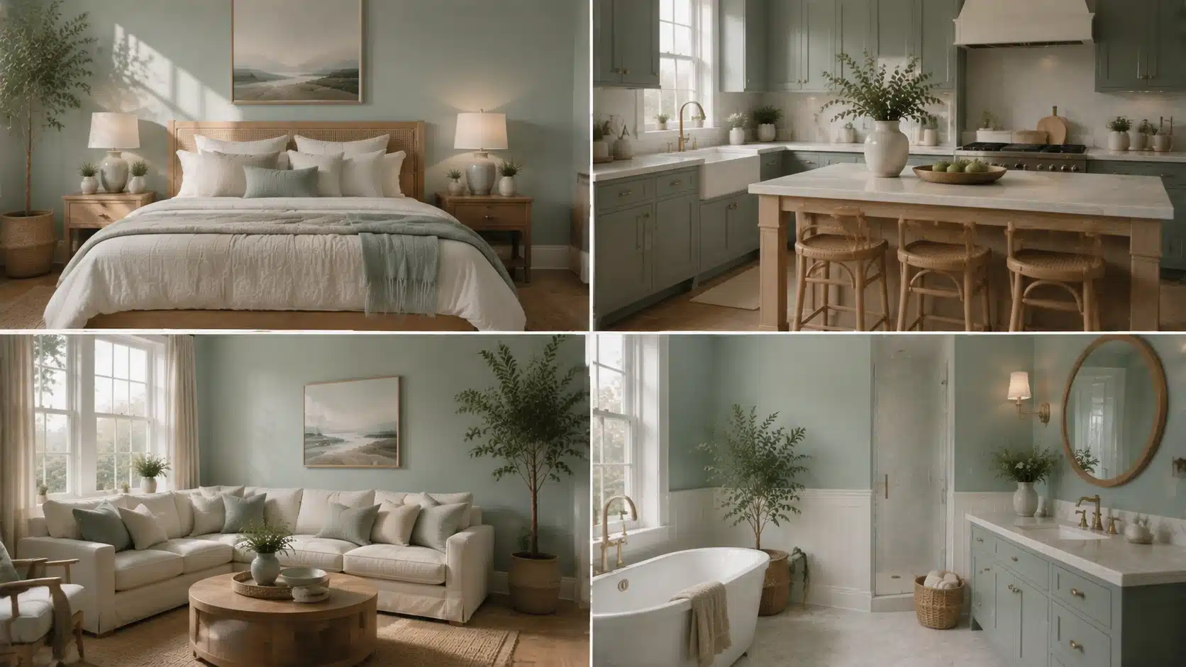
Quick summary: Benjamin Moore Beach Glass is a muted blue-green-gray shade that changes subtly with lighting and surrounding colors. Benjamin Moore Beach Glass is the kind of paint color that can look soft and coastal in one room, then slightly cooler or greener in another. That versatility is part of its appeal, but it also means choosing it requires a closer look at undertones, natural light, surrounding finishes, and coordinating colors. This article breaks down Benjamin Moore Beach Glass 1564, including its LRV and blue-green-gray undertones. How it behaves in different lighting conditions, the best rooms to use it in, how to coordinate whites and accent colors, and how it compares with similar popular shades. What Color is Benjamin Moore Beach Glass? Benjamin Moore Beach Glass 1564 is a soft blue-green paint color with a gray undertone that keeps it from ever looking too bright or too tropical. This shade sits in Benjamin Moore’s blue-green family, but it is not the bright aqua or classic beachy turquoise that its name might suggest. It reads as a muted, weathered blue-green with a gray cast, closer to the color of real sea glass than a swimming pool. Depending on lighting, some rooms will pull more blue while others lean slightly green, but the gray keeps both extremes in check. Benjamin Moore’s own product page describes it as a calming blue with a gray undertone, adding versatility to the shade. Color details Feature Details Paint brand Benjamin Moore Color name Beach Glass Color number 1564 Color family Blue-green LRV 49.7 Overall feel Calm, coastal, muted Benjamin Moore Beach Glass Undertones Undertones are the quiet influence sitting beneath the main color, and they are what make this shade a bit of a chameleon. Here is how each one shows up. Gray undertone: The gray keeps the color from ever feeling tropical or overly saturated. It softens the color and gives it a more grown-up, sophisticated quality, which is part of why it works in so many different design styles. Blue undertone: In cooler, north-facing light, the blue becomes more obvious. This is when the color leans closest to a true sea-glass blue, with an airy, almost weightless feel. Green undertone: Warm, direct sunlight tends to coax out the green side of the color. Paint experts who specialize in undertone analysis note that this warm-light shift is what gives the color its sea-glass character in south-facing rooms. Is Benjamin Moore Beach Glass Blue or Green? If you are trying to decide whether this color leans more blue or green, it can be a little hard to pin down at first. It is technically a muted blue-green, but on the wall it often reads more like a soft sea-glass blue. Its gray undertone keeps it from looking too teal or too close to seafoam. The gray undertone is what stops it from reading as a true teal or seafoam shade. How it compares to similar blues and greens: Color How it differs from Beach Glass Beach Glass Soft blue-green with gray Palladian Blue Brighter and more distinctly blue Healing Aloe Lighter and softer overall Quiet Moments Lighter, with an LRV close to 61, and leans slightly more blue Benjamin Moore Beach Glass LRV and Light Performance LRV, or light reflectance value, measures how much light a paint color bounces back into a room versus how much it absorbs. The scale runs from 0 (pure black) to 100 (white). This color has an LRV of 49.7, according to the official listing of Benjamin Moore, which places it almost exactly in the middle of the scale. North-facing rooms: Cooler, indirect light pulls the color deeper and grayer, and some of that airy, coastal quality fades. North-facing rooms never get direct sun, so the color settles into a moodier, more subdued side. South-facing rooms: Direct sun keeps the color feeling fresh and calming, and its blue-green tones read clearly without looking washed out. The strong, warm light in south-facing rooms tends to bring out the green side rather than the blue. East-facing rooms: Morning sun brings a brief window of warmth, so the color can look slightly greener early in the day before settling into a cooler, more blue-gray tone for the rest of the afternoon. West-facing rooms: Afternoon and evening sun bring the strongest warm light of the day, which can push the color toward its greener, warmer side as the sun gets lower in the sky. How Lighting Conditions Change the Look of Beach Glass Beyond room orientation, the type and intensity of light in a space play a big role in how the color performs day to day. Darker rooms: The color pulls deeper, grayer, and cooler, losing some of its lighter coastal quality when natural light is limited Lighter, sun-filled rooms: It reads fresh and clear, with the blue-green tones showing up most true to their intended shade. Warm bulbs: Warm-toned lighting emphasizes the green side of the color, giving it a slightly more sea-glass, earthy feel indoors. Cool LED bulbs: Cooler artificial light highlights the blue-gray side, making the color feel crisper and more subdued. Designer tip: Test the color on at least two walls in the room, ideally one that gets direct sun and one that does not, since the same gallon can look noticeably different depending on exposure. Where to Use Benjamin Moore Beach Glass in Your Home This color adapts well across the home, from calm living spaces to spa-style bathrooms, though its best use depends on light, function, and nearby finishes. 1. Living Rooms with Benjamin Moore Beach Glass This shade creates a relaxed, easygoing backdrop that works well with natural textures like linen, rattan, and light wood tones. It is calm enough to live with daily without feeling monotonous. In larger living rooms with plenty of natural light, it can anchor the whole space without competing with furniture or artwork. It also works well on a single accent wall for those who want the color without committing to a full room. 2. Bedrooms with Benjamin Moore Beach Glass Because it leans more toward soothing than energizing, it is a popular bedroom choice. Pairing it with soft white or warm cream bedding helps balance its cooler undertone. It tends to work best in bedrooms that get some natural light during the day, since darker bedrooms can make the color feel flatter and less restful. Layering in warm-toned nightstands or lamps also helps keep the room from feeling too cool at night. 3. Bathrooms with Benjamin Moore Beach Glass This is one of the most popular applications for the color, since its blue-green, water-inspired quality suits spa-style bathrooms especially well. It pairs naturally with white tile, marble, and brushed metal fixtures. Because bathrooms often rely more heavily on artificial lighting, it is worth testing the color under the room’s actual vanity lights before committing. This helps confirm whether it leans more blue or green once the sun goes down. 4. Kitchens with Benjamin Moore Beach Glass This shade also works as a cabinet color, particularly when the surrounding walls stay lighter and neutral. Warm hardware finishes, such as brass or bronze, help offset its cool base. It also pairs well with butcher block or light wood countertops, which help balance out the coolness of the paint. For kitchens with limited natural light, keeping the walls a shade or two lighter than the cabinets helps the space feel open. Colors That Pair Well with Benjamin Moore Beach Glass The right trim and accent colors can make this shade feel warmer, cooler, brighter, or more grounded, depending on the look you’re going for. Best White Trim Colors The right white trim can either soften the cool undertones of this shade or create a sharper contrast around doors, windows, and architectural details. Benjamin Moore White Dove: Adds warmth and prevents the overall palette from feeling too cool. Benjamin Moore Simply White: Creates a cleaner, crisper contrast against the blue-green walls. Benjamin Moore Super White: Gives the room a more modern, high-contrast finish. Benjamin Moore’s coordinating suggestions also include whites such as Snow White OC-66 and Super White OC-152, giving you additional options for creating a balanced color scheme. Overall, the best trim color depends on how much contrast you want. Softer whites create a warmer transition, while crisp whites highlight the wall color’s blue-green character. Best Accent Colors for Benjamin Moore Beach Glass Choosing the right accent colors can help this cool-toned shade feel more balanced and connected to the rest of the room. The best pairings either add warmth, create subtle contrast, or build on its soft coastal character. Navy Blue: Adds depth and a bit of drama without clashing with the cooler base tone. Warm wood tones: Balance the cool undertones and keep the space from feeling sterile. Soft beige and greige: Create a quiet, layered coastal palette that feels soft and cohesive. Natural greens: Reinforce the organic, sea-glass feel of the color and work especially well with plants and natural materials. Overall, these accent colors help bring out different sides of the shade. Navy creates contrast, wood adds warmth, and softer neutrals and greens keep the palette calm and natural. Benjamin Moore Beach Glass Compared with Similar Colors Beach Glass has good company among other Benjamin Moore blue-greens, and seeing how it stacks up can help confirm it’s the right fit before buying a sample. Paint color Difference from Beach Glass Benjamin Moore Quiet Moments Lighter and slightly softer, with a higher LRV near 61 Benjamin Moore Healing Aloe More muted and gray overall Benjamin Moore Palladian Blue Brighter and more clearly blue Benjamin Moore Mount Saint Anne Deeper and more saturated Benjamin Moore Night Mist Leans more green-gray and reads slightly lighter Benjamin Moore Iced Marble Very close in tone and often used as a match Of all these options, Beach Glass still stands out for its balance. It is neither as light as Quiet Moments nor as saturated as Mount Saint Anne, which is part of why it remains such a versatile, easy-to-live-with choice. What Not to Use with Benjamin Moore Beach Glass Choosing it without testing samples: Screen colors and in-store chips rarely match how a paint color behaves on an actual wall. A physical sample tested at home is the only reliable way to judge it. Using too many cool colors: Pairing this color with an entirely cool-toned room, including cool grays, cool whites, and chrome fixtures, can make the space feel cold rather than calm. Ignoring lighting direction: Because it sits at a mid-range LRV, the room’s light exposure has an outsized effect on how the color reads throughout the day. Pairing it with the wrong whites: Some stark, blue-based whites can make the color look flatter and more blue-gray than intended. Warmer whites tend to soften that effect. Is Benjamin Moore Beach Glass a Good Paint Color? Overall, Beach Glass earns its popularity. It suits many homes and styles, though like any mid-tone color, it rewards some planning around lighting and trim choices. Pros Cons Calm and versatile across multiple design styles Can shift noticeably depending on the room’s lighting Softer and more livable than a traditional bold blue May feel too cool in rooms with limited natural light Works well with both warm and cool accent colors Requires more careful trim selection than a true neutral Adds color to a room without overwhelming it Can look different across an open floor plan with varied light In the end, Beach Glass remains a dependable, versatile choice for homeowners seeking a calm, coastal-inspired color that adapts to nearly any room, style, or lighting condition. Testing at Different Times of Day Paint behaves differently under morning, afternoon, and evening light. Morning light tends to bring out the cooler blue-gray side of this shade, midday sun softens it toward green, and evening artificial light can deepen it slightly. Viewing a sample across all three helps avoid surprises after the whole room is painted. Real home application examples A Beach Glass bathroom vanity paired with brushed nickel hardware A single Beach Glass accent wall behind a bed with warm wood furniture Living room walls in Beach Glass paired with oak floors and linen upholstery Frequently Asked Questions Is Benjamin Moore Beach Glass Warm or Cool? It leans cool overall, thanks to its gray and blue undertones, though warm natural light can bring out softer green notes throughout the day. What is the LRV of Benjamin Moore Beach Glass? Benjamin Moore Beach Glass 1564 has an LRV of 49.7, placing it in the medium range of the light reflectance scale. Does Benjamin Moore Beach Glass Look Green? It can, particularly in warm, direct sunlight, but most homeowners describe it as a muted blue-green rather than a true green. What White Goes Best with Benjamin Moore Beach Glass? White Dove, Simply White, Snow White, and Super White are all strong options, depending on whether the goal is warmth or crisp contrast. Is Benjamin Moore Beach Glass Good for a Bathroom? Yes. Its soft, water-inspired blue-green tone pairs especially well with white tile, marble, and spa-style design details. Making Beach Glass Work in Your Home Benjamin Moore Beach Glass is the rare paint color that never quite settles, it shifts with the morning light, changes when a lamp turns on, and responds to every piece of furniture placed nearby. That quiet unpredictability is exactly what makes it worth living with. Test it on two walls, check it at different times of day, and pair it with a warm white trim before committing. Do that, and Beach Glass tends to earn its place on the wall, not just for one season, but for years.
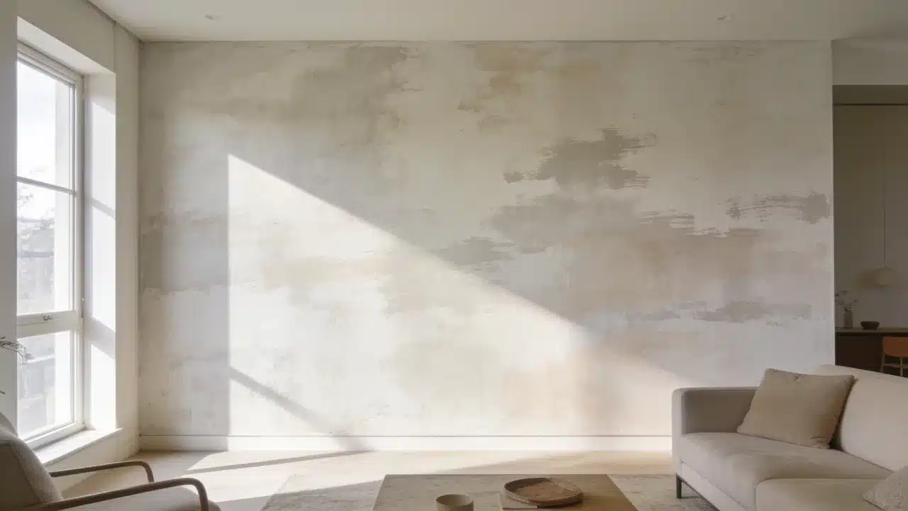
Limewashing walls starts with preparing the surface and applying thin mineral-based layers with a block brush. Random crisscross strokes create the cloudy variations that define this finish. The appeal comes from how the color changes as lighting shifts throughout the day. A wall that reads soft white at noon can look warm and shadowed by late afternoon. After a decade working with color, I have found that this changing appearance is one reason homeowners connect with limewash. The process involves preparing the wall, applying multiple coats, and caring for the finished surface. What is Limewash Paint and How Does It Work? Limewash is one of several textured wall finishes unlike regular paint, which creates an even surface with a consistent sheen, it’s applied in thin, semi-transparent layers that leave visible brushstrokes. Limewash is applied in thin, semi-transparent layers, allowing brushstrokes and color variation to remain visible. The brushwork stays visible in the final coat. That variation is the point. Color behavior matters here. The paint appears darker when wet and noticeably lighter once dry. Adding extra paint too early can reduce the soft variation that gives limewash its character. Let each layer dry fully before assessing the wall. Tools and Materials Needed to Limewash Walls Collect all materials before starting. Limewash dries differently from standard wall paint, so stopping halfway across a wall can create visible transition marks. Item Purpose Limewash paint Creates the textured finish Mineral primer Helps limewash bond with walls Block brush Creates the signature movement Drop cloth Protects floors Painter’s tape Protects edges Stir stick Keeps paint consistent Spray bottle Helps maintain a wet edge How to Prepare Walls for Limewashing Proper preparation helps limewash absorb evenly and creates a more consistent finish. Skipping any of these steps affects the final result. Clean and Repair the Wall: Remove dust, grease, and dirt with a damp cloth and mild cleaner. Fill holes with patching compound. Let everything dry before priming. Prime the Surface: New drywall requires mineral primer. Previously painted walls need primer only if the existing finish is glossy or in poor condition. Highly porous surfaces can absorb limewash quickly, resulting in uneven color if not properly prepared. Test the Color and Finish: Apply a sample patch to the actual wall. This finish reads differently at 7 am than at 7 pm. Check both before committing. How to Limewash Walls Step by Step Follow the order carefully because preparation, drying time, and application technique all affect the final appearance. Step 1: Prepare the Limewash Paint Stir thoroughly for at least two minutes before use. Follow the product’s dilution instructions if thinning is required. Pour the paint into a clean application bucket and stir again. Continue stirring during application to maintain an even consistency. Settled paint creates uneven coverage and color variation across the wall. Step 2: Apply the First Coat Using the Limewash Technique Load the block brush about a quarter of the way up the bristles. Apply using loose, unstructured crisscross strokes from the center of each section. Keep a wet edge throughout and work in small sections. Deposit most of the paint at the center and feather outward to blend the edges. Do not aim for full coverage on the first coat. Step 3: Add Additional Layers for Depth Let the first coat dry fully before adding a second coat, typically 12 to 24 hours, depending on humidity and temperature. The wall will look darker when wet and lighter when dry. Apply each additional coat using the same crisscross technique. Two coats suit most walls. A third thin coat adds consistency where needed. Step 4: Finish, Cure, and Evaluate the Wall Remove painter’s tape once the final coat dries. Stand back and assess the full wall in both morning and evening light before deciding if another coat is needed. Allow full curing before touching the surface. Mist lightly if the manufacturer recommends it. A matte sealer is optional but adds protection in high-traffic areas. Limewash Wall Care and Maintenance Limewash walls require less maintenance than many traditional painted surfaces. Keeping water exposure to unprotected areas to a minimum is what matters most. For cleaning, use a dry or barely damp cloth. Strong cleaners strip the finish. For repairs, apply a thin layer of the original product over the affected area. Feather the edges using the same crisscross approach as the original coat. Sealing is optional. A matte sealer adds protection in high-traffic areas. Without sealer, the surface may change gradually as it ages. How to Choose Limewash Colors for Different Rooms Limewash changes with lighting, so a shade can look different throughout the day. This helps reveal how the color responds to morning and evening light. Bedrooms: Soft neutrals like warm white, beige, and muted taupe work well. These shades create a calm backdrop while keeping the limewash texture visible. Living Rooms: Warm earth tones such as sand, clay, soft brown, and muted olive pair well with natural materials and add depth to larger spaces without feeling heavy. Small Rooms: Lighter shades like soft cream, pale beige, and light gray can help small rooms feel more open. Always test the color first, because limewash can appear stronger across an entire wall. Low-Light Rooms: Avoid very cool shades in rooms with limited sunlight, as they can make the space feel cold. Warmer neutrals and earthy colors usually work better under softer lighting. Can You Paint Over Limewash? You can paint over limewash after checking the surface condition and preparing it for the new coating. Run a hand over the existing wall. If material transfers, the layer must be stabilized before anything is placed on top. Remove loose or dusty limewash, or stabilize it before applying primer and new paint. Clean the wall with a damp cloth, then let it dry completely. Apply a suitable primer before the new paint. Water-based paints tend to work over primed limewash. Oil-based products need a compatible intermediate primer. Mistakes to Avoid When Limewashing Walls These common issues usually arise from problems during preparation or application. Mistake Cause Fix Finish looks streaky Too much paint applied Use thinner layers Texture looks flat Not enough stroke variation Add another coat Paint color does not stick Poor surface preparation Prime correctly first Color looks wrong Assessed before full drying Wait until completely dry Application lines visible Wet edge lost mid-wall Work faster and maintain wet edge Frequently Asked Questions What are The Disadvantages of Limewash Paint? Limewash may require more preparation than regular paint, and the final color can be difficult to judge until each coat has fully dried. Does Limewash Paint Need a Primer? Primer is recommended on new drywall, glossy surfaces, and highly porous walls to improve adhesion and create more even absorption. How Long Does Limewash Last on Interior Walls? A properly applied limewash finish can last for years indoors when protected from excessive moisture and cleaned gently. Can You Apply Limewash with a Roller? A roller can speed up coverage on large areas, but a block brush creates the natural variation and texture associated with limewash. What Surfaces Can be Limewashed? Limewash works best on porous surfaces such as plaster, brick, and mineral-based walls that allow the finish to be properly absorbed. Happy Reading The process for limewashing walls is more forgiving than most paint techniques. Variation is the point, and a perfectly even coat works against the finish. Get surface preparation right, use the crisscross stroke, and let each layer dry before assessing the color. The finish looks different at 7 am than at 7 pm. That movement is part of what makes it worth the effort. Try a small section first to test the technique. Share the result in the comments once done.
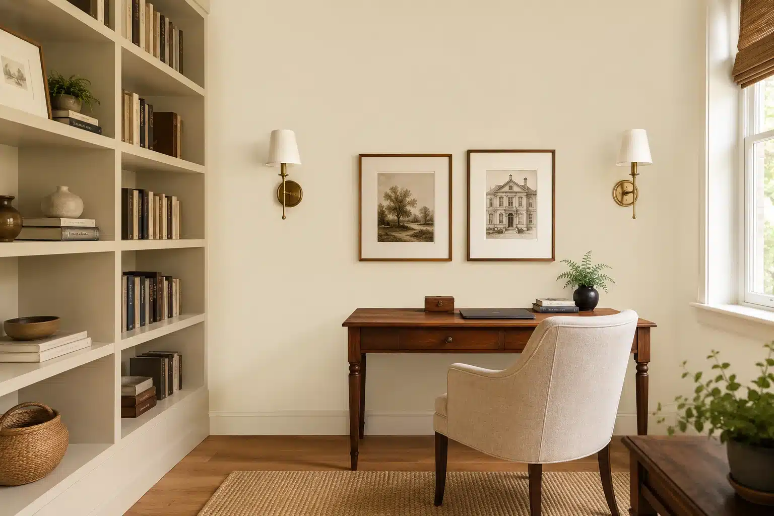
When I help someone choose a beige paint color, the worry is almost always the same: “What if it looks yellow, dull, or too dark once it’s on the wall?” That is a fair worry. Beige can look calm on a sample card, then shift completely once it sits beside your flooring, trim, furniture, and afternoon light. Manchester Tan Benjamin Moore is one of those colors that looks simple at first, but it has enough warmth and undertone movement to deserve a closer look. So before you order a gallon of Benjamin Moore Manchester Tan HC-81, let me walk you through what it actually does on a wall, how its undertones shift with light, which rooms it suits, which ones it does not, and what finishes and colors to pair it with. By the end of this, you will have a clear answer for your specific space. Color Name Manchester Tan Code HC-81 Also Known As Berber White / 955 LRV 63.24 Color Family Warm beige / light tan neutral Collection Historical Colors Color Temperature Warm Undertones Soft green-gray Best For Warm-finished rooms, south or west-facing spaces, traditional and transitional interiors Avoid In Cool-tiled rooms, north-facing rooms with no warm lighting, crisp contemporary interiors What Is Benjamin Moore Manchester Tan HC-81? Manchester Tan HC-81 is a warm, light beige from Benjamin Moore’s Historical Colors collection, a palette of 191 time-honored hues inspired by America’s historic landmarks. It sits in the warm neutral family, closer to a soft tan than a yellow or cream, and it is also listed under the alternate names Berber White and 955. On a scale from 0 to 100, that places it comfortably in the medium-light range. It is not so light that it washes out, and not so deep that it weighs a room down. That middle ground is exactly why it has worked well in living rooms, bedrooms, whole-home designs, and traditional exteriors for years. Color Details: Color Name: Manchester Tan Code: HC-81 Also Known As: Berber White / 955 LRV: 63.24 Color Family: Warm beige / light tan neutral Collection: Historical Colors Color Temperature: Warm Undertones: Soft green-gray One thing worth setting straight before going further: Manchester Tan is not a plain beige. It carries undertones that shift depending on the light in your room, and those undertones are worth understanding before you pick up a brush. What Undertones Does Manchester Tan HC-81 Have? Manchester Tan is not a plain beige. It carries a soft green-gray undertone that stays invisible in warm, well-lit rooms and becomes visible the moment the light turns cool or ambient. Understanding this shift is the single most important thing you can do before painting. In warm 2700K to 3000K light, or in a room that faces south or west, the warm beige comes forward, and the color reads exactly as the chip suggests. In north-facing rooms, overcast daylight, or under cool white LEDs at 4000K or higher, the green undertone surfaces and the color starts to look muted, flat, or slightly off. It is not a defect. It is the color behaving exactly as it should, and the fix is almost always a bulb change rather than a repaint. That green undertone is subtle on the chip. Light is what decides whether it shows up in your room. How Does Manchester Tan HC-81 Behave in Different Light? Manchester Tan HC-81 can shift a lot with the light, so it helps to see how it reacts from morning to evening before you choose where to use it. Natural Light Manchester Tan is noticeably sensitive to natural light. In bright daylight, the warm beige comes forward, and the color feels settled and friendly. In lower or cooler light, the subtle green undertone becomes more visible, giving the color a slightly muted, earthy quality. The direction your room faces makes a significant difference in how this plays out throughout the day. North-Facing Rooms: Manchester Tan can look cooler, flatter, and slightly greener in north-facing rooms. Use warm 2700K to 3000K bulbs and lighter trim to keep the beige tone soft. South-Facing Rooms: South-facing light brings out Manchester Tan’s warm beige side beautifully. Just be careful with orange-toned oak or very warm flooring, which can make it look too golden. East-Facing Rooms: Morning light makes Manchester Tan feel soft and warm. By afternoon, it settles into a calmer, slightly muted beige that usually feels balanced. West-Facing Rooms: Afternoon light makes Manchester Tan look richer and warmer. In the morning, it may appear more muted, so test it at both times before deciding. Artificial Light The bulb you use changes how Manchester Tan reads as much as natural light does. Warm bulbs, such as soft white or bulbs rated at 2700K to 3000K, bring out the beige warmth and make the color feel grounded and cozy. Cool white or daylight bulbs at 4000K or higher push the green undertone forward and can make the color look more muted or slightly off. For the best result, test your actual bulbs against the sample before finalizing any room. What Paint Finish Should You Use for Manchester Tan? Finish changes how much light bounces off the surface, which directly affects how Manchester Tan reads in a real room. In matte it looks softer and more muted. In satin, it reads slightly cleaner and more defined. Choose based on the surface and its use, not just personal preference. Understanding how paint finishes differ by sheen before you buy will save you a second trip to the store. Flat / Matte: Best for low-traffic walls and ceilings. It gives Manchester Tan its softest, most muted look, but it is not ideal for busy rooms or high-touch surfaces. Eggshell: Best for living rooms, bedrooms, and most walls. It keeps the color balanced, reads naturally, and is easier to clean than matte. Satin: Best for kitchens, hallways, and bathrooms. The slight sheen adds durability and makes Manchester Tan look a little crisper. Semi-Gloss: Best for trim, doors, and cabinets. It gives a sharper definition and wipes clean easily, but it is too reflective for regular walls. High Gloss: Best for very small accent details only. It is highly reflective and can deepen the color, but it almost never works well on walls. My usual recommendation is simple: eggshell on most walls, satin in kitchens and bathrooms, and semi-gloss on all trim and cabinets without exception. You can review Benjamin Moore’s paint sheen guide to match the right formula to your surface type and room conditions. How Does Manchester Tan HC-81 Look in Different Rooms? The undertones and lighting behavior above translate differently depending on the room, its fixed finishes, and how the space is used day to day. Here is what to expect across the most common spaces. 1. Living Rooms Manchester Tan is one of those colors that makes a living room feel like it has always been that color. It works well when the room includes warm wood furniture or flooring, cream or off-white upholstery, woven textures, and soft ambient lighting. The color adds enough warmth to make the space feel lived-in without looking heavy or overdone. Pair it with a warm white trim, and the walls read clean and intentional. It suits both traditional layouts and transitional open-plan spaces. 2. Bedrooms In bedrooms, Manchester Tan creates a calm, grounding backdrop. It sits well with white or soft linen bedding, warm wood nightstands and headboards, and the kind of warm lamp light that makes a room feel restful by 9 pm. Avoid cool gray bedding or icy white linens because those will pull the green undertone forward and create a visual mismatch that is hard to resolve without repainting. If you are choosing a warm bedroom color scheme, this color pairs naturally with soft neutrals and natural materials. 3. Kitchens On kitchen walls, Manchester Tan pairs well beside cream or wood cabinets, warm stone counters, and tile with earthy or sandy tones. It brings a soft, grounded quality to the kitchen without competing with surrounding materials. It reads particularly well beside natural stone backsplashes, butcher block surfaces, and warm hardware finishes like brass or oil-rubbed bronze. For a full picture of how warm neutrals perform in kitchens, the kitchen wall colors with white cabinets breakdown covers the most useful pairings. 4. Cabinets On cabinets, Manchester Tan offers a softer, more organic alternative to stark white. It looks best against countertops that carry some warmth, such as quartz with a warm cream or beige veining. If your counters are very cool or very white, the green undertone in Manchester Tan may create a contrast that reads as dated rather than classic. Test a sample on a cabinet door before committing to the full kitchen. 5. Bathrooms Bathrooms can go either way with this color, depending entirely on the fixed finishes. Creamy white tile, warm gray tile, or tile with earthy tones: Manchester Tan can look beautiful and intentional. Cool, icy white, or blue-gray tile: the undertones may create a subtle clash that works against the warmth you are trying to achieve. Observe the sample under both natural and artificial bathroom lighting before deciding. 6. Hallways Hallways are often low-light and narrow, which makes color choice feel more high-stakes than it needs to be. Manchester Tan works in hallways when the trim is lighter and warm bulbs are used overhead. The LRV of 63.24 is high enough to keep the space from feeling closed in, as long as there is enough contrast between wall and ceiling to prevent everything from blending together. Getting the room match right is half the work. The other half is choosing a finish that makes the color behave the way you actually want it to on that specific surface. How to Test Manchester Tan Before Painting Here is the failure pattern I have seen many times: someone falls in love with a photo online, orders paint, does a full room, and then stands back and wonders why it looks dull and slightly green. The photo was taken in a south-facing room with warm wood floors. Their room faces north with cool tile. The fix is simple. The Benjamin Moore Color Sample costs $5.99 and covers approximately two square feet in two coats. That is cheap insurance before committing to a full gallon. Get the Right Sample: Order or pick up a Benjamin Moore 8oz brush-on color sample of Manchester Tan HC-81. Apply Two Full Coats: Apply two coats on a large foam board or directly on two different walls. Test in Multiple Positions: Place the sample on a wall that receives direct light and one that does not. Observe at Four Points in the Day: Check the sample in the morning, at midday, in the late afternoon, and at night under your usual lighting. Hold It Against Fixed Materials: Hold the sample next to your trim, flooring, countertops, tile, and any fabric you plan to keep. Check Your Bulbs: If the room looks flat under artificial light, test a warm 2700K bulb before deciding the color is wrong. A sample test takes one weekend. Repainting a room takes considerably longer and costs considerably more. The 48-hour test is the single step that most people skip, and most people regret skipping. Similar Colors to Benjamin Moore Manchester Tan HC-81 If you are shortlisting warm neutrals, it helps to see how Manchester Tan sits against its closest alternatives. One comparison from the same brand and one from a different brand help you understand what you are actually choosing between. Color Code Brand LRV Tone Key Difference vs. Manchester Tan Jute AF-80 Benjamin Moore 63.3 Soft neutral, green-brown undertone Nearly identical LRV but softer and more gray-brown in base character Shaker Beige HC-45 Benjamin Moore 53.53 Warmer, deeper tan-beige Noticeably darker and warmer with a stronger golden undertone Accessible Beige SW 7036 Sherwin-Williams 58 Warm greige, soft green-gray undertone Darker than Manchester Tan, leans grayer and less warm overall Jute sits in the same LRV zone as Manchester Tan but has a softer, more gray-brown character that suits organic and natural-material interiors. Benjamin moore Shaker Beige goes noticeably deeper and warmer, the better choice when you want the walls to carry more visual weight. If you are already working within a Sherwin-Williams palette and want a comparable warm neutral, the Balanced Beige SW 7037 review covers a similar greige that reads slightly cooler and darker than Manchester Tan. If the color feels close but you are not fully decided, Jute is the nearest Benjamin Moore alternative. If you want the same warmth with more depth, Benjamin moore Shaker Beige is the natural next step. What Colors Go Well With BM Manchester Tan HC-81? Manchester Tan works best with colors that share its warmth without fighting it. Benjamin Moore’s recommended coordinating colors for HC-81 are a smart starting point because they keep the palette soft, warm, and easy to use across connected spaces. White Ice OC-58: A clean, lightly warm off-white that works well for trim, ceilings, and doors. It gives Manchester Tan a clear definition without making the walls look too yellow or too green. Bleeker Beige HC-80: A deeper beige that pairs naturally with Manchester Tan in adjoining rooms, built-ins, or exterior details. It adds depth while staying in the same warm neutral family. Constellation AF-540: A soft muted blue that balances Manchester Tan’s warmth. It works well in bedrooms, living rooms, or accent areas where you want a gentle contrast. Georgian Brick HC-50: A warm red-brick accent that pairs well in small doses. Use it for a front door, fireplace detail, shutters, or decor rather than large wall areas. These pairings give you enough range for trim, ceilings, adjoining rooms, and accent details. The main rule is simple: keep the surrounding colors warm and muted so Manchester Tan feels connected to the rest of the room. Where to Use Manchester Tan and Where to Avoid It Manchester Tan is not universally safe just because it is a familiar classic. Getting this decision right before you paint saves a repaint later. Here is an honest breakdown of where it works and where it does not. Situation Use It Avoid It Floor Material Warm oak, walnut, natural stone with warm veining, and terracotta Very cool gray tile, blue-tinted stone Countertops Butcher block, warm quartz, earthy granite Icy white quartz, cool gray stone Hardware Brass, oil-rubbed bronze, warm nickel Chrome, polished nickel, cool matte black Trim Color Off-white, warm white, cream Stark white with a blue or gray base Lighting Warm bulbs 2700K to 3000K, south or west-facing rooms Cool white LEDs, dark north-facing rooms without added warmth Design Style Traditional, transitional, farmhouse, organic modern Crisp, contemporary, minimalist, cool-toned modern Room Size Most sizes with proper contrast and trim Very small dark rooms without warm bulbs or contrast In rooms where the fixed finishes are warm and the light is generous, Manchester Tan does exactly what a good neutral should: it holds everything together without drawing attention to itself. In rooms where the finishes are cool, or the light is limited, the yellow-green base can start to read as dated or dingy, no matter how much you like the swatch. Benjamin Moore Manchester Tan HC-81: Paint Line to Use The paint line matters more than most people expect, and it matters especially with a color like Manchester Tan, where the warmth and depth need to come through consistently across coats. Benjamin Moore Aura Interior: This is the strongest option for most rooms. The color depth is noticeably richer, coverage is superior, and the durability holds up in high-traffic areas. For cabinets or accent walls where you want the color to look exactly right, Aura is worth the price difference. Benjamin Moore Regal Select: A reliable mid-tier option for standard walls. It applies smoothly, covers well in two coats, and works consistently in bedrooms, living rooms, and hallways. A good choice when Aura is over budget. Benjamin Moore ben: Suitable for low-traffic rooms like guest bedrooms or storage areas where performance demands are lower. For Manchester Tan specifically, you may need a third coat to get the full warmth and depth of the color. For trim and cabinets, Benjamin Moore Advance in semi-gloss is the formula I reach for consistently. It levels beautifully, cures hard, and makes Manchester Tan look clean and intentional on any architectural detail. Is Benjamin Moore Manchester Tan HC-81 Still Worth Choosing? Yes. Manchester Tan HC-81 is still a very good warm beige for homes that suit it. It is light enough to keep a room from feeling heavy, warm enough to feel grounded, and muted enough to work across a range of furniture styles and materials. What makes it hold up in 2026 is the same thing that made it work when Benjamin Moore first included it in the Historical Collection: it does not try to do too much. It is a supportive color, not a showstopper, and in most homes, that is exactly what you need from a wall color. The right answer for your home depends on what light your rooms receive, what fixed finishes you are working around, and which finish you choose. Get the sample, observe it across a full day, and hold it against the real materials in your room. Then decide. Frequently Asked Questions Does Manchester Tan HC-81 work with oak floors? Yes. Manchester Tan pairs naturally with both golden oak and more natural oak tones because its warm beige base shares the same color temperature as the wood. Warm white trim ties the combination together cleanly. Can Manchester Tan work as a whole-house color? Yes. Its LRV of 63.24 holds up across different room sizes and light conditions, and it flows well between connected spaces without feeling jarring in transitions. Consistent trim color throughout keeps the palette cohesive. What happens if I use Manchester Tan in a room with gray tile? The yellow-green base in Manchester Tan will likely conflict with cool gray tile. The contrast tends to read as dated rather than warm. A cooler greige or a true warm gray would be a better fit for that specific room. Is Manchester Tan good for an open-plan living and dining space? Yes. The LRV is high enough to feel open and the muted warmth reads consistently across different zones of the room. Pair it with Bleeker Beige HC-80 on a built-in or accent surface to add depth while staying within the same color family. How does Manchester Tan look on an exterior in shaded areas? In shaded exterior conditions, the green undertone becomes more visible and the color can read closer to a muted sage or khaki than a warm beige. Test a large sample board in the shaded area specifically, not just in full sun, before choosing it for exterior siding. Is Benjamin Moore Manchester Tan still a relevant color in 2026? Yes. It holds up because it does not trend, it reads as settled and permanent in the right room, and its LRV sits in a useful middle range. The rooms where it fails are the same ones that would have tripped it up twenty years ago: cool-tiled, north-facing, or too contemporary in finish. Final Thoughts Choosing the right warm neutral takes more than matching a chip to your sofa cushion. Lighting direction, floor material, trim color, and finish all pull a color in directions you will not see on a swatch. Benjamin Moore Manchester Tan HC-81 has earned its long-running reputation because it does the quiet work well. It is warm without being golden, light without being weak, and muted enough to work across a wide range of interiors. But it is not the answer for every home. If the fixed finishes in your room are cool, or if you want a crisp, contemporary result, there are better options. Do the sample test, observe it at different times of day, and hold it against the materials that are not moving before you buy. Drop a comment below and tell me which room you are planning to use it in and what direction it faces. I will share my honest take.
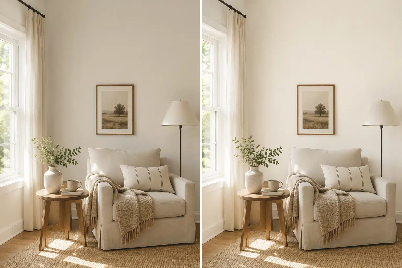
After years of helping people choose white paint, I can say this with confidence: white is never just white. That is exactly why the Shoji White vs Alabaster debate comes up so often in my work. Both are warm Sherwin-Williams whites, but they do not act the same once they are on a wall. Alabaster feels brighter, creamier, and closer to a soft classic white. Shoji White feels deeper, calmer, and more greige. That small shift can change how your entire room reads at 8 am, at sunset, and under warm lamps at night. And here is the part most comparison articles skip: the wrong one does not just look a little off. It can make your trim look yellow, your floors look washed out, and your whole room feel like something is not quite right without you being able to name it. This comparison will help you understand undertones, LRV, lighting, room use, trim, cabinets, and sample testing so you can pick the one that fits your home instead of guessing from a tiny chip. What Is Sherwin-Williams Shoji White SW 7042? Shoji White SW 7042 from Sherwin-Williams sits between white and light beige. It is a warm off-white with a greige base, which gives it more depth than a bright white without making it feel like a true beige. With an LRV of 74 and a HEX value of #E6DFD3, Shoji White reflects a good amount of light but still has enough body to soften a room. Its undertones lean greige, soft beige, and subtle gray-green, so it can shift depending on light and nearby finishes. What makes Shoji White useful is its quiet warmth. In bright rooms, it can feel soft and clean. In darker spaces, it may look more muted or slightly gray-green. It works best when you want walls that feel calm, warm, and grounded without turning creamy yellow. What Is Sherwin-Williams Alabaster SW 7008? Alabaster SW 7008 from Sherwin-Williams is a soft warm white that reads brighter and cleaner than Shoji White. It still has warmth, but it sits closer to a classic white than a greige off-white. With an LRV of 82 and a HEX value of #EDEAE0, Alabaster reflects more light, which makes it a strong choice for trim, cabinets, ceilings, and rooms that need a brighter feel. Its undertones lean cream and soft yellow-beige, so it avoids feeling cold or stark. What people like about Alabaster is its balance. It feels warm without looking heavy. The one caution is placement. Besides cool whites, blue-gray tile, or icy countertops, its creamy base can look more yellow than expected. Shoji White vs Alabaster: Quick Comparison SW Shoji White is deeper, warmer, and more greige, while Alabaster is brighter, creamier, and closer to a classic soft white. If you only take one thing from this guide, that sentence is it. The table below shows exactly where they differ across every major decision point. Feature Shoji White SW 7042 Alabaster SW 7008 LRV 74 82 Main Feel Deeper, soft off-white with a greige quality Brighter, warmer white with cream softness Undertones Greige, soft beige, subtle gray-green Cream, soft yellow-beige Best For Walls, whole-home color, exteriors, open layouts Trim, cabinets, ceilings, and brighter rooms Looks Like Soft warm greige-white Soft creamy white Risk Can look muted or dingy in dark or cool rooms Can look yellow beside cool or stark whites Best Trim Pairing Pure White SW 7005 for cleaner contrast Can be used on the trim itself Overall Pick Better for depth and softness Better for brightness and classic warmth Choose Shoji White if you want a warmer, deeper, calmer off-white that adds presence to walls without reading as cream or yellow. It is the better choice when the room already has warmth, and you want the walls to settle into the background. Choose Alabaster if you want a brighter, softer white that still feels warm and welcoming. It is the more flexible color for trim, cabinets, and rooms where you need light reflection without starkness. Real Homeowner Feedback Paint choices get personal fast, and homeowner feedback often shows what swatches cannot. In a Reddit thread, the Shoji White vs Alabaster debate came up often, with a few clear patterns. Shoji White users liked its greige quality on whole-home walls, especially with warm wood floors. Many said it made rooms feel calm and settled. A few noticed it looked flatter or greener in north-facing rooms until they changed to warmer bulbs. Some also said it looked more like a very light beige beside stark white trim. Alabaster users were happiest with trim and cabinets. Several described it as a safe, warm white for kitchens, though some said it looked yellow in rooms with strong afternoon light or warm wood tones. In side-by-side tests, Shoji White often felt more interesting, while Alabaster felt safer. The main lesson is simple: your light, finishes, and surface matter more than the paint name. Test both colors side by side before choosing. How Each Color Behaves in Different Light Light is what decides whether the undertone you chose works for you or against you. No color behaves identically across morning, afternoon, and evening, or across north-facing and south-facing rooms. These two are no different. Shoji White in Different Light Conditions In a south-facing room with strong daylight, Shoji White reads warm, soft, and slightly beige, the way it looks on the chip, or better. The light fills out its warmth, and the greige quality settles nicely. In a north-facing room with cool diffused light, the gray-green shoji white undertones can come forward. At 7 a.m. in winter in a room with white or cool-gray tile and no warm wood anchor, Shoji White can look flat, not warm. By 7 pm under warm lamps it recovers. But if the room spends most of its hours in cool northern light, test carefully before committing. Under warm LED or incandescent bulbs at night, Shoji White softens and reads beautifully as a warm neutral. It is one of the better-performing off-whites in evening light. Alabaster in Different Light Conditions Alabaster is the more consistent performer across light conditions, which is part of why it gets recommended so often for trim, cabinets, and ceilings. Its higher LRV keeps it reading clean and bright across most conditions. In a north- or east-facing room with limited direct sun, Alabaster is often a stronger choice than Shoji White because it has more reflectance to keep the room feeling open rather than dim. It will not get moody or green in low light. The watch-out for Alabaster is placement beside cool whites in strong afternoon sun. South-facing rooms in the late afternoon can pull Alabaster’s yellow undertone forward noticeably, especially if it is sitting next to a crisp, bright white on the trim or adjacent wall. Pro Tip: Before buying a gallon of either color, get a Samplize peel-and-stick sample (or paint a 12×12-inch patch on foam board) and move it around the room at 7 am, noon, and 7 pm. What you see under noon light in a south-facing room will be different from what you see at dusk under warm lamps. That 20-minute test prevents a full repaint. Best Rooms for Shoji White and Alabaster Both colors can work across the home, but they solve different problems depending on the room. The key is matching each color to what the room actually needs. 1. Living Rooms Shoji White works better in living rooms where you want warmth, softness, and a backdrop that lets wood tones, linen, and natural textures carry the space. It creates a grounded, settled quality that feels calm rather than designed. Alabaster works better in living rooms that need more brightness, especially if the room has limited natural light or if you want the walls to feel lighter than the furnishings. It also pairs more cleanly with rooms that have cooler material accents. 2. Bedrooms Shoji White gives a bedroom that quiet, wrapped-in quality that makes a room feel restful at any hour. It works especially well in bedrooms with warm wood furniture, soft linen bedding, and warm lamps. Alabaster creates a lighter, fresher bedroom feel. It is the better choice when the room has low ceilings or limited natural light, and you want the space to feel open rather than cozy. 3. Kitchens Alabaster is almost always the stronger kitchen cabinet choice. Its LRV of 82 reads cleaner and brighter against most countertop materials, especially against quartz, honed stone, or subway tile. That same dynamic applies when the walls are a different white entirely, since white cabinet paint pairings shift significantly depending on whether the countertop is warm stone or cool quartz. Shoji White on the walls may create a dull contrast if your kitchen has white quartz, cool stone, or gray tile, which is hard to resolve. In a kitchen with warm oak, butcher block, or earthy stone, Shoji White can feel deliberate and grounded. 4. Bathrooms Alabaster is usually the safer bathroom choice because the higher LRV keeps small or low-light spaces feeling fresh and open. Shoji White can work in bathrooms that have warm tile, natural stone, brass fixtures, and wood accents, but test it carefully. Bathrooms with white or gray porcelain tile and chrome hardware can make Shoji White’s gray-green side come forward in a way that reads as dingy rather than warm. 5. Exteriors Shoji White is often a surprisingly strong exterior choice. Natural daylight makes it read as lighter and more balanced outdoors than indoors, which means many of the low-light concerns disappear on the exterior. It gives a soft, organic white quality that works well with natural wood, warm brick, and earthy stone. Alabaster produces a brighter white exterior and suits homes with more contrast in their architectural details, though it can appear creamier in direct afternoon sun. 6. Open-Plan Spaces Alabaster works better for open-plan homes that have significant white architectural detail — white millwork, coffered ceilings, built-in shelving- where everything needs to feel consistent and clean. Shoji White’s LRV of 74 gives it enough depth to sit comfortably beside richer accent walls, while Alabaster performs better alongside the warm white paint options that already lean bright and airy throughout the space. Room use gets you part of the way there. Trim and cabinets are where many otherwise good choices fall apart. Paint Finish and Product Line to Use Finish affects how the undertone reads in real conditions. The wrong finish on the right color can still produce a result that looks off. The difference between satin vs semi-gloss matters more on trim and cabinets than on walls, where matte and eggshell both soften undertones effectively. Surface Best Finish Better Color Choice Notes Walls Eggshell or matte Shoji White or Alabaster Choose based on light level and depth preference Trim Semi-gloss Alabaster or Pure White Provides cleaner definition and durability Cabinets Satin or semi-gloss Alabaster usually Test Shoji White only with warm counters and materials Bathrooms Satin Alabaster for brightness Shoji White only with warm tile and warm fixtures Exteriors Satin or low-luster exterior Either Test outdoors in direct and shaded conditions For the product line, Sherwin-Williams Emerald Interior and Duration are both strong wall choices. Emerald has better depth and durability for rooms where performance matters. For trim and cabinets, Emerald Urethane Trim Enamel is worth the investment because it levels well, cures hard, and makes both white tones look intentional on architectural detail. The final pick should be based on how the room feels with the color on the wall, not just the color name on the chip. How These Two Colors Compare to Other Popular Sherwin-Williams Whites Both Shoji White and Alabaster sit in a crowded field of popular Sherwin-Williams neutrals. Here is how each compares with the colors most often mentioned alongside them. Shoji White vs Other Sherwin-Williams Colors If you are drawn to Shoji White’s depth and greige warmth, here is how it sits against its closest Sherwin-Williams neighbors: White Duck SW 7010: Nearly identical LRV of 74. White Duck can carry a slightly more noticeable green-gray undertone while Shoji White leans a touch creamier and warmer overall. In most rooms, they look very similar, but Shoji White is the warmer of the two. Pure White SW 7005: Noticeably cleaner and cooler with an LRV of 84. Better suited for trim than for walls when you want a crisp result beside Shoji White. Not interchangeable on walls. Accessible Beige SW 7036: It is essentially a deeper version of Shoji White with an LRV of 58. Same greige-leaning undertones, more committed to a warm neutral than an off-white. Natural Choice SW 7011 sits in that same greige family, a warm off-white with beige and green-adjacent undertones that behaves similarly to Shoji White in low light. Shoji White and Alabaster remain the main pair to test if you want a soft warm Sherwin-Williams white. Everything in this list helps you confirm which direction to step in from there. Alabaster vs Other Sherwin-Williams Colors If Alabaster is on your shortlist, here is how it compares with the alternatives that come up most often: Greek Villa SW 7551: A touch lighter and softer than Alabaster with a similar warm quality. Greek Villa can feel a little more cream-yellow and less grounded. Alabaster sits slightly more muted and neutral beside it. Snowbound SW 7004: Cleaner and slightly cooler than Alabaster, but still soft. It works better when Alabaster feels too creamy, especially beside cooler finishes or cleaner trim colors. Natural Linen SW 9109: Warmer and more committed to a beige feel than Alabaster. Suits interiors that lean traditional or organic rather than clean and fresh. Alabaster remains the better test color if you want a soft warm white that still feels bright. These comparisons help you decide whether you need something creamier, cleaner, or warmer than Alabaster. Coordinating Colors for Shoji White and Alabaster Shoji White and Alabaster both work best with warm, soft, and slightly muted colors. The main difference is simple: Shoji White needs cleaner contrast because it is deeper, while Alabaster can handle warmer pairings because it reflects more light. Main Color Coordinating Color Best Use Why It Works Shoji White SW 7042 Pure White SW 7005 Trim, ceilings, doors Adds clean contrast without feeling harsh. Shoji White SW 7042 Fawn Brindle SW 7640 Accents, built-ins Adds muted greige depth. Shoji White SW 7042 Accessible Beige SW 7036 Connected rooms Creates a deeper warm neutral flow. Alabaster SW 7008 Townhall Tan SW 7690 Accents, exteriors Adds warm beige depth. Alabaster SW 7008 Dakota Wheat SW 9023 Warm accents Supports Alabaster’s creamy base. Alabaster SW 7008 Pure White SW 7005 Trim, ceilings, doors Gives cleaner white contrast. For Shoji White, I would keep trim cleaner and accents muted. For Alabaster, I would use broader warm accents when the room needs contrast. Both colors can look beautiful, but they need different support colors to feel intentional. Common Mistakes When Choosing Between Shoji White and Alabaster Getting this decision wrong is easier than it should be, and most of the time it comes down to one of these situations. Choosing from photos only: Online images rarely show the true undertone. A photo taken in a south-facing room with warm oak floors shows you a completely different version of the color than what your north-facing bathroom will produce. Ignoring trim color: Trim can make white look wrong. Two warm whites side by side without testing can create a visual muddiness that neither color deserves. Using Shoji White in a dark room without testing: In low natural light with cool bulbs, Shoji White can shift from warm greige to a flat, slightly greenish tone. Testing is not optional here. Pairing Alabaster with stark white: Placed beside a crisp, cool white, Alabaster can look more yellow than you expected. The contrast amplifies the cream undertone. Testing only one wall or one time of day: Both colors shift meaningfully with the direction of light. A sample on one wall at 10 am is a partial answer, not a full one. Forgetting fixed finishes: Your floors, countertops, tile, and stone are not moving. Those materials control how the paint color reads more than the chip ever will. The right choice becomes much clearer once the design goal is set before the color is. Trim, Cabinets, and Ceilings: Which Color Works Better? This question comes up often when Shoji White and Alabaster are both on the shortlist. The simple answer is that Shoji White usually works better on walls, while Alabaster is usually stronger for trim, cabinets, and ceilings. Surface Better Choice Why It Works Walls Shoji White Gives more softness, depth, and a calmer wall color result. Trim Alabaster Its higher LRV creates definition without looking as stark as pure white. Cabinets Alabaster Gives a clean, warm-white cabinet look that works in most kitchens. Ceilings Alabaster Keeps ceilings brighter and avoids the flat look Shoji White can have in low light. Shoji White Walls + Trim Pure White SW 7005 Creates cleaner contrast than Alabaster while still looking soft beside Shoji White. Shoji White cabinets can work in warm kitchens with natural materials, but they may look muted beside cool countertops. Alabaster trim beside Shoji White walls can look creamy rather than crisp, while Shoji White trim beside Alabaster walls can look dull. If you want clean contrast, Pure White is usually the safer trim test. Frequently Asked Questions Can I use Shoji White walls with Alabaster trim? You can, but test it first. Alabaster beside Shoji White may read creamy rather than crisp, which softens the definition between wall and trim. If you want cleaner visual contrast with Shoji White walls, test Pure White SW 7005 against your sample before choosing the trim color. Why does Shoji White look beige in my house? Shoji White has greige undertones and an LRV of 74, which gives it more depth than a typical white. Warm flooring, warm bulbs, and lower light levels all pull the beige side forward. Test it beside your trim and materials under both daylight and artificial light before deciding it is wrong for your room. Is Alabaster too yellow for kitchen cabinets? Alabaster can read as yellow on cabinets when placed beside cool-white counters, blue-gray tile, or stark white walls. In warmer kitchens with wood tones, brass hardware, and cream or warm stone, it usually reads soft and clean. Test a sample on an actual cabinet door in your kitchen lighting before ordering paint. Which color is safer for a home sale? Alabaster is generally the safer resale choice because buyers typically expect brightness on trim, cabinets, and ceilings. Shoji White can still work well for walls in homes with warm finishes, but it carries more risk in rooms with cool or mixed materials where the greige side might not appeal to every buyer. Can I paint the walls and trim the same color? Yes, with a finish change. Use eggshell or matte on walls and semi-gloss on trim. This creates definition through sheen rather than color contrast. This approach works better with Alabaster than Shoji White if the goal is a bright, cohesive result. With Shoji White, the same approach can work in warm, well-lit rooms, but test first. Final Thoughts Picking between two warm whites sounds like it should be simple. In practice, it is the kind of decision that catches people off guard because both colors look fine on a chip and then behave very differently on a wall. The comparison between Shoji White vs Alabaster is really a question about what your room needs. Shoji White is softer, deeper, and more beige. Alabaster is brighter, creamier, and more versatile across surfaces and finishes. Neither is the universal answer. Test them together in your actual light beside your actual materials. Wait 48 hours. Then choose based on the room, not the screen. Drop a comment with your room direction, flooring color, and whether you are painting walls, trim, or cabinets. I will help you think through which one makes more sense.
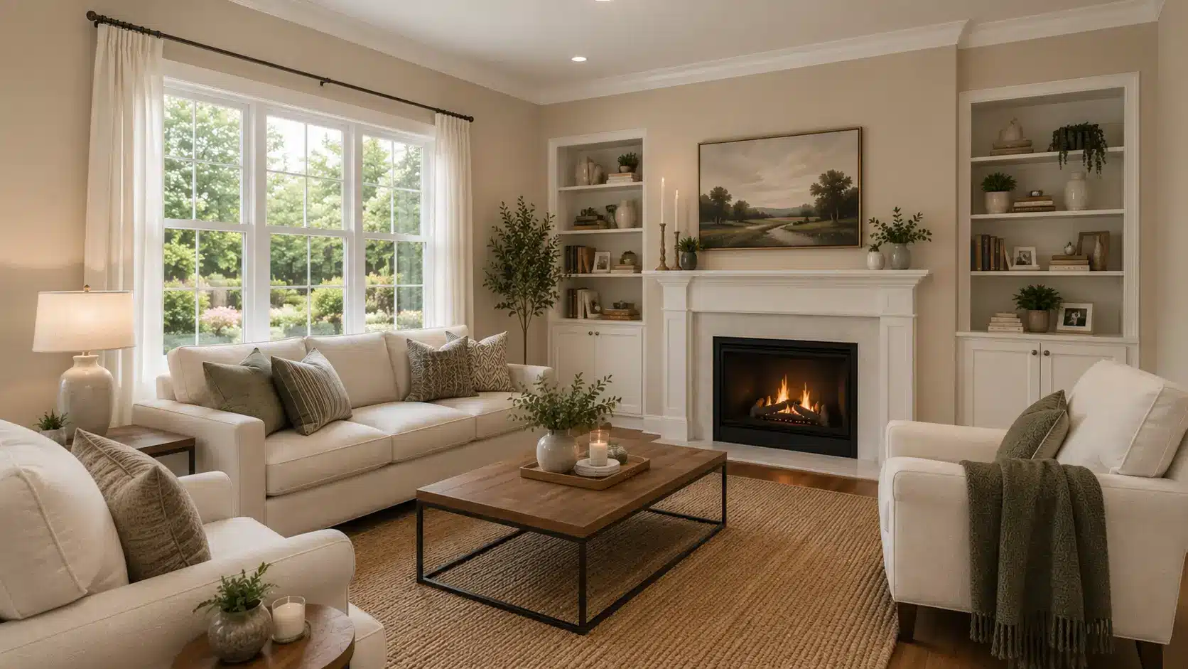
Paint colors often look simple on a swatch, but I know how tricky they can feel when a swatch looks calm while the wall tells a different story. That is why you may want a clear look at Bungalow Beige before choosing it for your home. Bungalow Beige by Sherwin-Williams is a warm neutral that brings softness and depth without feeling too yellow or dated. I like how it can work on interior walls, exteriors, and cozy rooms, but its look can shift with lighting, trim, and nearby finishes. If you want a warm, welcoming backdrop, this color is worth getting to know closely. My goal here is to help you see where it works best and what to check before painting. Paint Name Bungalow Beige Brand Sherwin-Williams Color Code SW 7511 Also Known As HGSW7511 Color Family Neutral / Beige LRV 53 RGB 205 / 191 / 176 Hex Value #CDBFB0 Best For Walls, living rooms, bedrooms, hallways, dining rooms, exteriors Avoid Pairing With Cool blue-grays, icy whites, stark modern grays, overly cool finishes What Sherwin-Williams Bungalow Beige Actually Looks Like on a Wall Bungalow Beige SW 7511 looks soft and settled on a paint chip. On a wall, it reads warmer than you expect, especially once natural light hits it from the side. That’s not a problem, but it is what you’re choosing. This is a mid-tone warm beige with an LRV of 53, which puts it right in the middle of the light-to-dark scale. It doesn’t brighten a room the way a pale off-white would, and it doesn’t anchor a space the way a deep greige does. What it does is create a warm, settled backdrop that feels comfortable without demanding attention. The hex value is #CDBFB0, and the RGB sits at 205 / 191 / 176, confirming just how much warmth is baked into the base. It belongs to the same neutral family as Sherwin-Williams Balanced Beige, but reads noticeably warmer once you place them side by side. Bungalow Beige works well in traditional, farmhouse, cottage, and transitional homes where warm wood tones, cream accents, stone, and brick are already part of the room. It’s a harder fit in spaces that lean modern or cool. Bungalow Beige Undertones: What’s Actually In There The undertones in Bungalow Beige are warm tan and soft gold, with a faint brown base that shows up most noticeably in low natural light. Unlike some beiges that carry pink or gray, this one stays consistently warm. There’s no surprise shift toward mauve in north-facing rooms. What you get instead is a slight deepening toward tan or caramel when the light gets flat. That golden undertone is what makes it work so well with wood tones, brick, stone, and warm metals. It’s also what makes it difficult next to cool finishes. Place Bungalow Beige beside a gray quartz countertop or an icy white cabinet door, and the warmth in the wall color can read as muddy rather than cozy. The undertone isn’t subtle enough to disappear into a cool room. The clearest way to understand the undertones is to hold a trim swatch next to the paint sample before you commit. Pure White SW 7005 sits cool enough to create visible tension with Bungalow Beige. Alabaster SW 7008 or Antique White SW 7035 will support it. Testing this relationship is not optional for this color. Bungalow Beige Undertones and Lighting Effects Lighting can change how Sherwin-Williams Bungalow Beige looks once it is on the wall. This warm beige has soft tan and brown undertones, so it can appear lighter, deeper, warmer, or slightly earthy depending on the room. Because Bungalow Beige is not a pale cream or a cool greige, it should be tested near flooring, trim, cabinets, counters, brick, stone, and wood finishes before painting a full space. Check the sample in the morning, afternoon, evening, and at night so you can see how much warmth it shows throughout the day. In Natural Light Natural light can make Bungalow Beige look soft, warm, muted, or richer based on the direction of the room. In bright spaces, it often feels open and welcoming. In shaded spaces, its tan and brown tones may become more noticeable. North-facing rooms: The light is usually cooler and softer. Bungalow Beige may look more muted or slightly earthy in these rooms. It can still feel cozy, but it works best with warm white trim, wood tones, cream decor, and soft lighting. South-facing rooms: They receive warmer daylight for most of the day. This light can make Bungalow Beige feel brighter, softer, and more inviting. It is one of the better lighting conditions for this color because the warmth makes the beige look smooth rather than dull. East-facing rooms: East-facing rooms get bright morning light, which can make Bungalow Beige look fresh and softly warm early in the day. Later, as the natural light fades, the color may look deeper or more muted. Warm bulbs can help keep it balanced. West-facing rooms: West-facing rooms get stronger afternoon and evening light. During this time, Bungalow Beige can look warmer, richer, and cozier. This makes it a good choice for living rooms, dining rooms, bedrooms, and spaces used more in the evening. In Artificial Light Artificial lighting can change Bungalow Beige after sunset. Warm white bulbs can bring out more of its tan and brown side, making the room feel cozy and relaxed. Cool LED or daylight bulbs can make Bungalow Beige look flatter or slightly dull. If you want the color to stay warm and balanced, soft white bulbs are usually a safer choice. Layered lighting also helps this color look better. Use ceiling lights, table lamps, floor lamps, or wall sconces together so the beige feels even across the room. This keeps Bungalow Beige looking warm, soft, and comfortable during the day and at night. Where Bungalow Beige Fits in the SW Neutral Range Sherwin-Williams runs its neutral palette from crisp whites all the way through deep earthy tones. Bungalow Beige sits in the warm beige tier, well above mid-tone browns but below the lighter off-whites like Antique White (LRV 73) or Worn Linen (LRV 63). Its closest peers by tone are Accessible Beige SW 7036 (LRV 58), which reads slightly lighter and less warm, and Relaxed Khaki SW 6149 (LRV 42), which is noticeably deeper. Bungalow Beige lands between these two. It has enough depth to feel finished but doesn’t risk making a room feel heavy the way a low-LRV earth tone can. The reason it gets described as a dependable neutral is that its warmth isn’t polarizing. Unlike stronger warm beiges that can read as orange in certain lights, the gold in Bungalow Beige stays muted enough to remain livable. It’s warm enough to feel cozy. It’s neutral enough to feel timeless. That combination is genuinely rare in a single color. Among the most popular SW beige and greige paint colors, Bungalow Beige stands out for how consistently it reads warm without tipping into yellow. Choosing the Right Finish for Bungalow Beige The finish you choose for Sherwin-Williams Bungalow Beige can change how warm, smooth, or rich it looks in your space. Flatter finishes make it feel softer and more muted, while glossier finishes reflect more light and can make the beige look slightly brighter. Matte and eggshell finishes are best for walls because they keep Bungalow Beige calm, warm, and easy to live with. Satin finishes work well for trim, doors, kitchens, bathrooms, and exteriors because they add light reflection and are easier to clean. Semi-gloss finishes are a good choice for doors, trim, cabinets, and high-touch areas where durability matters. Finish Best For Why It Works Matte Bedrooms, low-traffic walls Soft look with very low shine Eggshell Living rooms, hallways, dining rooms Good balance of softness and durability Satin Trim, doors, bathrooms, kitchens, exteriors More washable with light reflection Semi-gloss Trim, cabinets, doors Durable, cleanable, and slightly brighter Room-by-Room Uses: Where Bungalow Beige Works Best Bungalow Beige is a versatile neutral that can work in many areas of a home. Its warm undertones and balanced depth help create comfortable spaces that feel inviting and timeless. 1. Living Room In living rooms, Bungalow Beige gives the space a warm, settled feel. It can sit behind cream sofas, wood tables, woven rugs, stone fireplaces, and warm white trim without feeling too strong. You can use it when the room needs a soft, neutral backdrop that feels cozy yet open, especially with natural light, plants, textured pillows, and simple art pieces nearby at home, too. 2. Bedroom Inside bedrooms, Bungalow Beige can create a calm, warm, and restful mood. It pairs well with white bedding, beige fabrics, wood nightstands, soft lamps, and muted green or brown accents. If you want a room that feels comfortable at night and gentle in the morning, this shade can work well on all walls, especially with warm bulbs, linen curtains, and simple decor that keeps the space peaceful and balanced throughout the day. 3. Hallways and Entryways Around hallways and entryways, Bungalow Beige adds warmth to spaces that often feel plain or narrow. It also hides small marks better than bright white paint. You can pair it with warm white trim, wood flooring, black hardware, or simple wall decor for a welcoming first impression that feels clean, soft, and easy to maintain in busy daily areas and active family homes too. 4. Kitchen Kitchens are where Bungalow Beige can go wrong if the cabinet color isn’t right. It works alongside cream cabinets, wood open shelving, beige backsplash tile, stone counters, and brass or bronze hardware. This is not a color for a kitchen with gray quartz, white shaker cabinets, and polished chrome. That combination will make the wall color look muddy. If your kitchen leans warm in its fixed finishes, Bungalow Beige is a strong wall option. For more on how warm beige and cabinet color interact, the kitchen paint and cabinet color covers the pairing logic in more detail. 5. Bathroom Inside bathrooms, Bungalow Beige can make the space feel warmer and softer, especially when the space has cream tile, wood vanities, warm stone, or brushed brass fixtures. It can help small bathrooms feel more finished without making them feel closed in. Use it with soft white trim, warm bulbs, simple mirrors, and light towels so the room stays fresh, calm, and easy to live with every day for guests and family too. 6. Exterior On exteriors, Bungalow Beige has enough warmth and depth to hold up well in natural light. It works well on siding, stucco, brick, and trim. Pair it with warm white accents, dark shutters, black hardware, stonework, or a wood front door for a soft, welcoming exterior that feels classic, calm, and connected to natural outdoor materials year-round, in every season, outside around the home too. From living rooms to exteriors, Bungalow Beige adapts easily to different settings. Choosing the right room, lighting, and finishes can help this warm neutral look its best. Coordinating Colors for Bungalow Beige SW 7511 The warm tan and gold undertones in Bungalow Beige narrow the coordinating palette. Colors that lean cool or carry gray will create visible tension. Colors that share a warm base will support it. 1. Trim Colors Warm whites are the right trim choice. Alabaster SW 7008 is a soft warm white that supports the gold undertone without going creamy. Antique White SW 7035 is slightly warmer and works especially well in traditional spaces. Pure White SW 7005 sits too cool and will create a visible clash at the edge. 2. Accent and Coordinating Wall Colors Deep navy, dark forest green, and soft terracotta all work as accent colors against Bungalow Beige. Naval SW 6244 provides strong contrast without fighting the warmth. Retreat SW 6207 is an earthy muted green that pairs naturally. For a softer contrast, Accessible Beige SW 7036 reads lighter and slightly cooler, making it useful in adjacent open-plan spaces where a subtle tonal shift is the goal. Alpaca SW 7022 is worth considering if you want a more gray-leaning option in a connecting room; it shares some warmth with Bungalow Beige but reads noticeably more neutral. For a full comparison of how these neutrals differ in real rooms, the Alpaca paint review walks through the undertone differences clearly. 3. Flooring Warm wood tones, honey oak, walnut, and medium-brown hardwood all sit naturally with Bungalow Beige. Light beige tile and warm stone also work. Cool gray hardwood, bleached white oak, and dark gray tile are difficult pairings because they pull the room in opposing temperature directions. Bungalow Beige vs. Similar Sherwin-Williams Colors Bungalow Beige sits between soft neutral and warm beige, so comparing it with nearby shades helps you see its real character before choosing it for walls. Compared with Neutral Beige Paint Colors Bungalow Beige SW 7511 fits well with neutral beige paint colors because it feels calm, balanced, and easy to use in many rooms. Compared with Accessible Beige SW 7036, it usually feels warmer and less beige. Next to Canvas Tan SW 7531, it can look slightly deeper and cozier. Compared with Natural Linen SW 9109, Bungalow Beige feels more grounded and less creamy. This is helpful for spaces with wood floors, cream trim, stone, brick, and warm white accents that need a soft, settled wall color. Compared with Warm Beige Paint Colors Bungalow Beige SW 7511 also belongs with warm beige paint colors because it carries soft tan, brown, and earthy undertones. Compared with Kilim Beige SW 6106, it feels more muted and less golden, which can make it easier to live with. Next to Nomadic Desert SW 6107, it looks lighter and softer. Compared with Shiitake SW 9173, Bungalow Beige can feel warmer, more classic, and more traditional. It works well when the room already has wood, cream, stone, brass, or warm lighting that supports its cozy beige base. These comparisons show where Bungalow Beige sits: warmer than many neutral beiges, softer than stronger warm beiges, and flexible enough for cozy everyday spaces. How to Sample and Test Bungalow Beige SW 7511 A poor sample test is one reason Bungalow Beige can look different after the full room is painted. This warm beige can shift with light, trim, flooring, and nearby finishes, so it should be tested in the actual space first. Buy the real Sherwin-Williams paint sample, not only a printed card or digital color chip. Paint at least two 12-inch by 12-inch samples on different walls in the same room. Check the samples in morning, afternoon, and evening light with your lamps on. Hold your trim, flooring, cabinets, counters, or fabric swatches beside the paint, because undertone clashes often show up near these fixed finishes. The finish also matters. Lower sheen can make Bungalow Beige feel softer, while satin or semi-gloss can make it look brighter or richer. For a cleaner option, peel-and-stick samples can help you move the color around the room before making a final choice. Pros and Cons of Bungalow Beige SW 7511 Before choosing Bungalow Beige, it helps to see where it works well and where it may fall short. Its pros and cons can make the decision clearer. Pros Cons Warm and welcoming beige that makes rooms feel cozy Can look too warm in rooms with yellow bulbs Works well in living rooms, bedrooms, hallways, and dining rooms May feel muted or dull in low natural light Pairs nicely with wood, cream, stone, brick, and warm white trim Not ideal with cool gray floors or icy white finishes Has enough depth to feel finished without looking too dark May not give a crisp modern white or cool neutral look Can work on interiors and exteriors Needs proper sampling because lighting can change its undertone Hides small marks better than very light whites Can feel heavy in very small spaces without good lighting Overall, Bungalow Beige is a strong choice for warm, comfortable spaces, but testing it first helps you avoid surprises in lighting, finishes, or undertones. Common Mistakes to Avoid with Bungalow Beige Most problems with Bungalow Beige happen when the color is picked too quickly. It is warm and flexible, but it still needs the right light, trim, flooring, and fixed finishes. Screen-only choice: Choosing Bungalow Beige from online photos can lead to disappointment because cameras, editing, screens, and lighting can all change how warm, tan, or muted the color appears. Ignored flooring: Cool gray floors or icy tile can fight the warm undertones of Bungalow Beige and make the walls feel mismatched or dull. Wrong trim pairing: A very cool white trim can make Bungalow Beige look heavier, warmer, or less balanced than expected. Poor lighting check: Using Bungalow Beige in a shaded room without testing can be risky, as low light may bring out more of its tan and brown depth. Too much beige: Pairing beige walls with tan sofas, honey wood floors, and warm decor can make the space feel flat. Add contrast with white, black, green, stone, or textured pieces. Avoiding these mistakes helps Bungalow Beige look calm and intentional. The goal is to choose a warm beige that works with the whole space, not against it. Frequently Asked Questions Does Bungalow Beige look yellow on the wall? It doesn’t typically read as yellow. The undertones lean warm gold and tan rather than yellow. Under yellow-toned bulbs, the warmth can become more pronounced, but in most lighting conditions it reads as a soft warm beige rather than a yellow wall. Sampling in your actual light is the safest way to confirm this for your specific room. Is Bungalow Beige a good color for an open floor plan? Yes, provided the connected spaces share warm fixed finishes. Keep trim and door colors consistent throughout so the beige reads as a single decision across the space. Add contrast through rugs, furniture, and art rather than through adjacent wall colors that shift cooler. What trim color works with Bungalow Beige? Warm whites are the right choice. Alabaster SW 7008 and Antique White SW 7035 both support the gold undertone without creating tension at the edge. Avoid Pure White SW 7005 and similar cool-leaning whites, which will make the wall color look heavier and more golden than expected. Can Bungalow Beige be used on an exterior? Yes. The LRV of 53 gives it enough depth to hold up in natural light without washing out. It works on siding, stucco, and brick. Pair it with warm white trim, dark shutters, and natural stone or wood accents for a classic exterior that holds across all seasons. Does Bungalow Beige work in a small bathroom? It can, provided the fixed finishes are warm. With cream tile, wood vanities, and brushed brass fixtures, it reads as warm and finished. Avoid it in bathrooms with cool tile, chrome fixtures, or minimal natural light, where it can feel flat and heavy rather than cozy. What ceiling color pairs with Bungalow Beige walls? A soft warm white, Alabaster SW 7008 is a reliable choice. It keeps the ceiling from going stark or cool against the warm wall. Avoid cool whites or pure bright whites, which will make the warmth in the walls look more pronounced and unintentional by contrast. Is Bungalow Beige a good color for resale? Generally yes. Warm neutrals appeal to a wide range of buyers and are easy to style around. The main risk is pairing it with cool finishes that are already fixed in the home. If the floors, countertops, and cabinets lean cool, Bungalow Beige may not be the strongest resale choice compared to a true greige like Agreeable Gray. Final Takeway Bungalow Beige can be a smart choice when you want warmth without making a room feel too dark or heavy. I like that it works in many spaces, but you still need to check lighting, trim, flooring, finishes, and sheen before painting. You have also seen how it compares with other beige shades, where it works best, and what mistakes to avoid. That matters because beige can change fast once it hits real walls. Bungalow Beige gives you a soft, cozy base when the rest of the room supports its warm undertone. Try a real sample first, watch it through the day, and share your thoughts in the comments.
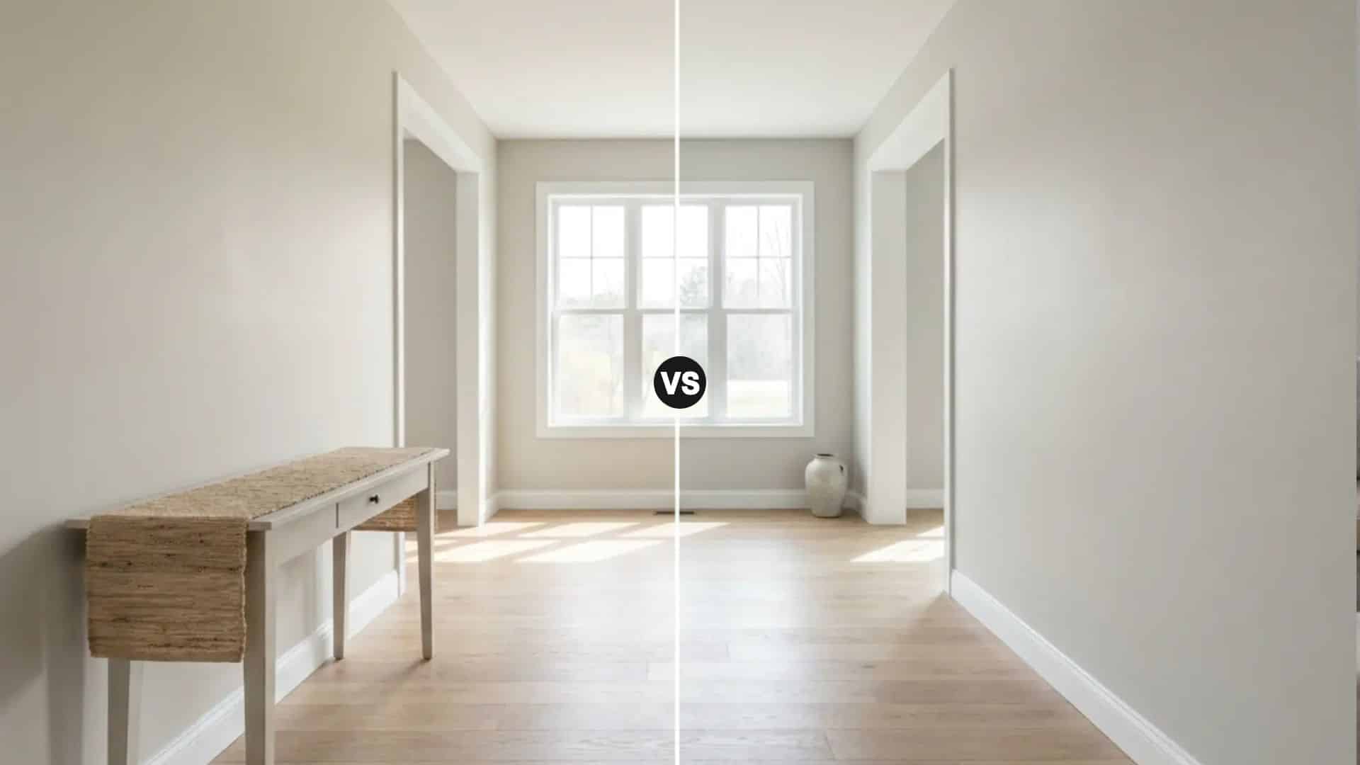
Comparison Agreeable Gray (SW 7029) vs Repose Gray (SW 7015) Brand Sherwin-Williams Agreeable Gray LRV 60, medium-light; reflects well in most conditions Repose Gray LRV 58, medium-light; marginally deeper Agreeable Gray Undertones Warm beige-greige with soft green-taupe influence Repose Gray Undertones Cool gray-greige with green and occasional violet Best For AG: living rooms, open plans, warm-finish spaces. RG: bedrooms, kitchens, modern interiors Avoid In AG: rooms with exclusively cool, gray-forward finishes. RG: north-facing rooms with cool lighting only Agreeable Gray (SW 7029) and Repose Gray (SW 7015) are the two most compared paint colors in the Sherwin-Williams range, and the reason people keep getting stuck between them is that on a chip, they look almost identical. On a wall in a real room, they create noticeably different atmospheres. One leans warm. One leans cool. And choosing the wrong one, given your lighting and finishes, is one of the more common and avoidable paint mistakes I see. This guide covers how Agreeable Gray and Repose Gray actually differ in undertone, temperature, lighting behavior, and room suitability. I’ll give you a clear recommendation based on what’s in your space, not just what looks good in a photo. What Is Agreeable Gray (SW 7029)? Sherwin-Williams Agreeable Gray (SW 7029) is a warm greige, equal parts gray and beige, with a soft green-taupe undertone that becomes more visible in north-facing light or under cool LEDs. In south-facing rooms with direct sun, it reads as a beautiful, settled beige-gray. It holds its warm character more reliably across lighting conditions than almost any other neutral in the Sherwin-Williams range, which is the core reason it became the brand’s best-selling color overall. LRV is 60, which places it in medium-light territory. It reflects enough light to work in smaller spaces without washing out in larger, bright rooms. Color Code SW 7029 Color Family Warm greige Hex #D1CBC1 LRV 60 That warm, beige-forward quality is what makes Agreeable Gray so adaptable across different room types and mixed-finish spaces. If your home has warm wood floors, cream cabinetry, or a combination of traditional and contemporary furniture, it tends to pull everything together without looking like a calculated neutral. Note: Accessible Beige (SW 7036) is warmer and more beige than Agreeable Gray, making it a better fit for spaces with cream finishes and traditional wood tones. Agreeable Gray has a stronger gray influence, so it reads softer and more flexible across different room styles. If you want a neutral that leans more definitively toward beige, Accessible Beige is the pick. If you want a greige that adapts to both warm and cool finishes, Agreeable Gray is usually more versatile. What Is Repose Gray (SW 7015)? Sherwin-Williams Repose Gray (SW 7015) sits one step cooler than Agreeable Gray. It reads as a true, sophisticated gray on a wall rather than a warm greige, but it still carries enough warmth in its undertone to stay inviting rather than cold. It’s not a blue-gray or a silver-gray. It’s closer to what most people picture when they imagine a “perfect gray” that actually works in a home. The LRV is 58, marginally lower than Agreeable Gray, which means it carries a touch more depth. In practice the difference is subtle, lighting will have a far greater effect on how light or dark either color reads than those two LRV points. Color Code SW 7015 Color Family Gray-greige Hex #CCC8C1 LRV 58 Repose Gray is Sherwin-Williams’ most popular cool-leaning greige, which tells you something important: there is a large group of homeowners who want a neutral that feels clean and refined without tipping into warm beige territory. If that description fits your home, Repose Gray is worth testing seriously. Agreeable Gray vs Repose Gray: The Key Differences Both colors live in greige territory, but their undertones push them in different directions. Here is the full head-to-head. Feature Agreeable Gray (SW 7029) Repose Gray (SW 7015) Undertones Warm beige-greige with green-taupe influence Gray-greige with green and occasional violet Warmth Warmer, cozier appearance Slightly cooler, more neutral appearance LRV 60 — reflects slightly more light 58 — marginally darker with more depth Versatility Works with warm and cool finishes alike Best with cooler finishes and modern palettes Trim Compatibility Warm and crisp whites both work Best with Pure White or Extra White Cabinet Compatibility White, cream, wood, greige cabinets White, gray, and cooler-toned cabinetry Best For Living rooms, open plans, mixed-finish spaces Bedrooms, kitchens, offices, modern interiors Overall Feel Warm, welcoming, approachable Clean, refined, sophisticated The table confirms the pattern, but the most important detail is the undertone difference. Both colors have green undertones, but in Agreeable Gray that green is buffered by beige warmth, keeping it earthy and settled. In Repose Gray the green is more exposed, which is what gives it a slightly cooler, more neutral quality. Knowing which undertone register fits your room is how you make this decision confidently. Undertones Up Close This is where most people get tripped up, and it’s the detail the paint chip never shows you clearly enough. Agreeable Gray’s undertone is warm greige — beige-forward with a subtle green-taupe quality. In most rooms under most lighting, that green-taupe stays quiet and the beige warmth leads. In cool north-facing rooms or under cool artificial light, the green-taupe quality can become more visible, reading as slightly earthy. But even then, Agreeable Gray holds its warm character more reliably than Repose Gray does in the same conditions. Repose Gray’s green undertone is less buffered. Without the beige layer that softens it in Agreeable Gray, the green in Repose Gray reads more cleanly as gray in most lighting conditions. That’s the source of its sophistication. It’s also the source of its most common complaint: in north-facing rooms with cool recessed lighting, Repose Gray can shift toward lavender in the corners by evening. A warm lamp mitigates this, but if you want to avoid the risk entirely in a north-facing room, Agreeable Gray is the safer call. Pro Tip: Before committing to either color, test a sample on two walls in your room — one with direct light and one without. Check the samples at 7am, noon, and 7pm. The shift you see in those three windows tells you more than any chip card or online photo ever will. How Lighting Affects Agreeable Gray vs Repose Gray Lighting is not just a factor in how these colors look, it is the primary factor. The same paint can behave like two completely different colors depending on which direction your room faces and what bulbs are in your fixtures. Natural Light by Room Orientation In north-facing rooms, Agreeable Gray retains more warmth and reads as a settled, earthy greige. Repose Gray in the same room can look noticeably cooler and grayer, and may shift toward lavender in corners under low light by evening. In south-facing rooms, both colors benefit from strong, warm sunlight. Agreeable Gray reads as a soft, comfortable beige-gray. Repose Gray remains more balanced and gray-forward rather than warming toward beige. In east-facing rooms, morning sunlight brings out warmth in both shades. By afternoon they settle into a more neutral appearance, with Agreeable Gray holding its warmth slightly better as the light cools. In west-facing rooms, the warm late-afternoon and evening light makes Agreeable Gray feel richer. Repose Gray takes on a warmer quality too, but stays closer to its core gray register rather than shifting fully toward greige. Artificial Lighting Under warm LED or incandescent bulbs, Agreeable Gray leans into its greige warmth. Repose Gray also warms up, but generally maintains a cleaner gray appearance rather than shifting toward beige. Cooler LED lighting mutes both colors. Repose Gray reads noticeably cooler under these conditions, and Agreeable Gray loses some of its warmth without losing its structure entirely. If your home uses predominantly cool recessed lighting, Agreeable Gray is the more forgiving choice between the two. Room-by-Room: Where Each Color Works Best Because lighting, flooring, trim, and furniture all interact differently room to room, the Agreeable Gray vs Repose Gray comparison genuinely produces different answers depending on the space. Here is where each color tends to land. 1. Living Room Agreeable Gray is the stronger choice for most living rooms. Its warm greige undertone creates an inviting backdrop for gathering spaces, and it adapts well to the mix of furniture, flooring, and textiles that most living rooms contain. In rooms with direct sunlight, it reads as soft and beige-forward without feeling heavy. Repose Gray suits modern and transitional living rooms where a cleaner, more refined gray is the target. It works particularly well if your furniture and textiles lean cool, or if you have a lot of white trim and metal hardware creating a contemporary palette. 2. Bedroom Repose Gray is the stronger bedroom choice for most people who want a calm, sleep-ready environment. Its subtle coolness promotes a restful atmosphere, and in sun-filled bedrooms it can deliver a spa-like quality that Agreeable Gray’s warmer undertone doesn’t quite replicate. That said, if you are in a north-facing bedroom with cool recessed lighting, test Repose Gray carefully before committing — the lavender shift at night is real and not everyone finds it restful. Agreeable Gray produces a cozier, more enveloping bedroom. It feels comfortable rather than clinical. For bedrooms used as both sleeping and reading spaces, or rooms with warm-toned wood furniture, Agreeable Gray often feels more settled. 3. Kitchen Repose Gray has become one of the most popular kitchen colors of the past decade, and it earns that. Paired with white cabinetry, marble countertops, or stainless steel appliances, it creates a clean, polished look that complements crisp finishes without competing with them. It works equally well as wall paint in a bright kitchen or on the cabinets themselves as a sophisticated, muted gray. Agreeable Gray is the better fit for kitchens with warm wood cabinetry, natural stone, or farmhouse-leaning design. Its higher LRV (60 vs 58) also helps smaller kitchens feel a little more open while keeping them warm rather than cold. 4. Bathroom Repose Gray’s cooler undertones work well in bathrooms with white tile, chrome fixtures, and marble surfaces, reinforcing a clean, fresh aesthetic. In bathrooms with strong natural light, it reads genuinely spa-like. Agreeable Gray handles bathrooms better when warm finishes are involved — brushed brass hardware, beige stone, or warm wood vanities. In low-light or windowless bathrooms, its warmth also makes the space feel less stark than Repose Gray does under the same conditions. 5. Dining Room Agreeable Gray is generally preferred in dining rooms because its warmth makes the space feel inviting during meals without adding visual heaviness. The balanced greige undertone complements wood tables, upholstered chairs, and warm lighting comfortably. Repose Gray suits formal dining rooms with cooler, more contemporary furnishings — think metal-base chairs, concrete or stone table tops, and pendant lighting in matte black or brushed nickel. Its cleaner gray register creates a more composed backdrop for that aesthetic. 6. Open Floor Plans Agreeable Gray is usually the stronger choice for open-concept layouts, and the reason is practical: in open plans, one color has to work across different lighting conditions simultaneously. Agreeable Gray’s balanced warmth holds better across the range of light from a bright kitchen facing one direction to a shadowed hallway facing another. Repose Gray can absolutely work in open plans with cool, consistent finishes throughout, but it needs more care in mixed-light environments to stay cohesive. 7. Exterior Both colors translate well to exteriors. In direct sunlight, Agreeable Gray reads warmer and slightly more beige. Repose Gray reads cleaner and more gray-forward. In winter or under overcast skies, Agreeable Gray holds its warmth better. Repose Gray can read distinctly cooler in flat light, which works on contemporary homes but can feel cold on farmhouse or traditional styles. For trim, Agreeable Gray pairs well with Alabaster coordinating colors like Shoji White and White Dove that share its warm base. Repose Gray works best alongside Pure White (SW 7005), Extra White (SW 7006), or High Reflective White (SW 7757). For curb appeal, Agreeable Gray fits farmhouse, transitional, and traditional homes. Repose Gray excels on modern and contemporary exteriors. Agreeable Gray vs Repose Gray With Different Flooring Flooring interacts with wall color more than most people expect. The undertones in your floor can draw out or suppress the undertones in your paint. Here is how both colors perform with common flooring types. Flooring Type Agreeable Gray Repose Gray Better Choice Honey Oak Excellent Good Agreeable Gray Red Oak Excellent Fair Agreeable Gray White Oak Excellent Excellent Tie Gray Flooring Good Excellent Repose Gray Beige Tile Excellent Good Agreeable Gray Dark Hardwood Excellent Excellent Tie The pattern is consistent: Agreeable Gray is the safer bet with warm-toned wood and beige tile floors. Repose Gray is better suited to cool gray flooring and modern hard-surface materials. White oak and dark hardwood give both colors room to work because those floors are neutral enough not to pull the undertones in either direction. How These Two Compare to Other Sherwin-Williams Neutrals If you’re still deciding, it helps to see where Agreeable Gray and Repose Gray sit within the broader range of popular Sherwin-Williams neutrals. Sometimes the right color isn’t one of the two you started with. Colors Close to Agreeable Gray Color Code Hex How It Differs from Agreeable Gray Repose Gray SW 7015 #CCC8C1 Cooler and more gray-forward, with less beige warmth Accessible Beige SW 7036 #D1C7B8 Warmer and more beige, better for cream finishes and warm wood Worldly Gray SW 7043 #CFC6BA Slightly deeper and warmer, stronger taupe influence Alpaca SW 7022 SW 7022 #CCC5BD Similar softness, but shows more violet or taupe under certain light Gossamer Veil SW 9165 #D3CEC4 Lighter and softer with a cleaner greige look and less warmth Colors Close to Repose Gray Color Code Hex How It Differs from Repose Gray Agreeable Gray SW 7029 #D1CBC1 Warmer and more greige, softer and cozier feel Mindful Gray SW 7016 #BCB7AD Darker and moodier, more depth for cabinets or accent walls Light French Gray SW 0055 #C2C0BB Cooler and more traditional gray, less beige influence Crushed Ice SW 7647 #D6D3CC Lighter and brighter with a softer, more airy neutral look Colonnade Gray SW 7641 #C6C0B6 Warmer and slightly deeper, stronger beige-taupe undertone Both comparison tables reinforce the same point: Agreeable Gray is the most flexible greige in this range because it sits squarely between warm and cool without committing fully to either. Repose Gray is the best clean-gray option that still carries enough warmth to function in a home rather than feeling like an office wall. When Not to Use These Colors Every paint color has conditions where it works against you. These are the situations where I’d tell a client to reconsider before they open the can. When to Avoid Agreeable Gray Before choosing Agreeable Gray, check the room’s fixed finishes, lighting, and trim color. Its warm greige base can look wrong when every other surface leans cool or yellow. Avoid it in rooms with cool gray flooring, cabinetry, and textiles. Its beige warmth may look accidental against cool-toned finishes. Do not pair it with strongly yellow-white trim colors. Greek Villa can make Agreeable Gray read muddy. Compare it with Benjamin Moore Revere Pewter if testing greige options. When to Avoid Repose Gray Before choosing Repose Gray, test it in the exact room at different times of day. Its violet undertone can become more visible in cool light and shadowed corners. Avoid it in north-facing rooms with cool recessed LED lighting. It may shift lavender in corners by evening. Do not pair it with yellow-toned whites on trim. SW Greek Villa and SW Antique White can clash with it. Full-wall samples show the conflict better than small chips. Common Mistakes When Choosing Between These Two Colors Most of the regret I hear after paint decisions comes from one of four places. Choosing from online photos or paint chips alone. Both colors can look identical on a chip and wildly different on a wall. The photo’s lighting, camera white balance, and room’s finishes all create a version of the color that may have nothing to do with how it behaves in your room. Ignoring flooring undertones. Warm oak floors and cool gray floors create two completely different environments for these paint colors. Choosing the paint before accounting for what’s underfoot is the most common structural error in this decision. Choosing the wrong trim. Repose Gray needs crisp, clean whites, Pure White or Extra White. Agreeable Gray is more forgiving and works with warmer whites like Alabaster or White Dove. Pair Repose Gray with a warm-yellow white and the mismatch becomes visible once both are on full walls. Skipping actual samples. Order a peel-and-stick sample from Samplize, or brush a large patch on at least two walls, and check it at 7am, noon, and 7pm. The 30-minute investment before committing to gallons is always worth it. Frequently Asked Questions Which color is better for small rooms? Agreeable Gray is usually better for small rooms because its LRV of 60 reflects slightly more light than Repose Gray. It also feels warmer, which can make tight spaces feel softer. Repose Gray can still work if the room has bright light and crisp finishes. Can I use these colors on kitchen cabinets? Yes, both can work on kitchen cabinets. Repose Gray gives cabinets a cleaner, more modern gray look, especially with white counters. Agreeable Gray feels warmer and softer, making it better with wood tones, cream finishes, or a more relaxed kitchen style. Do these colors work with wood trim? Agreeable Gray usually works better with wood trim because its warm greige base blends well with natural brown, oak, and walnut tones. Repose Gray may feel too cool beside orange or golden wood, but it can work with darker or cooler stained trim. Which color looks better with white oak floors? Both colors can look good with white oak floors. Agreeable Gray creates a warmer, more blended look, while Repose Gray gives stronger contrast and a cleaner style. Test both beside your exact flooring because white oak can lean warm, neutral, or slightly gray. Are these colors good for rental properties? Agreeable Gray is often safer for rentals because it works with more furniture styles, flooring tones, and lighting situations. Repose Gray can also work well, especially in modern rentals. For broad appeal, Agreeable Gray is usually the easier neutral to manage. Which color hides wall imperfections better? Repose Gray may hide minor wall imperfections slightly better because it has a little more depth. Agreeable Gray is lighter, so bumps or uneven drywall may show more in strong light. A matte or eggshell finish can also help reduce visible flaws. Can these colors be used in basements? Agreeable Gray is often the safer basement choice because it keeps more warmth in low natural light. Repose Gray can look flat or cool if the basement has limited windows. Use warm lighting and large samples before choosing either color below grade. Which color is better for an accent wall? Neither is a bold accent color, but Repose Gray works better if you want a subtle darker contrast. Agreeable Gray is better for a soft, tonal accent beside warm whites or beige neutrals. For stronger contrast, pair either with a deeper gray or taupe. Final Verdict Choosing between two close neutrals gets easier when you look beyond the paint chip. Agreeable Gray works best when you want warmth, flexibility, and a soft greige backdrop. Repose Gray makes more sense when your space has cooler finishes, crisp whites, and a cleaner modern style. You also saw how lighting, flooring, trim, cabinets, and room type can change the final look. That is why the best answer to Agreeable Gray vs Repose Gray depends on your actual home, not a photo online. I’d test both colors on multiple walls before buying gallons. Try the sample test, then share which shade worked better in your space.
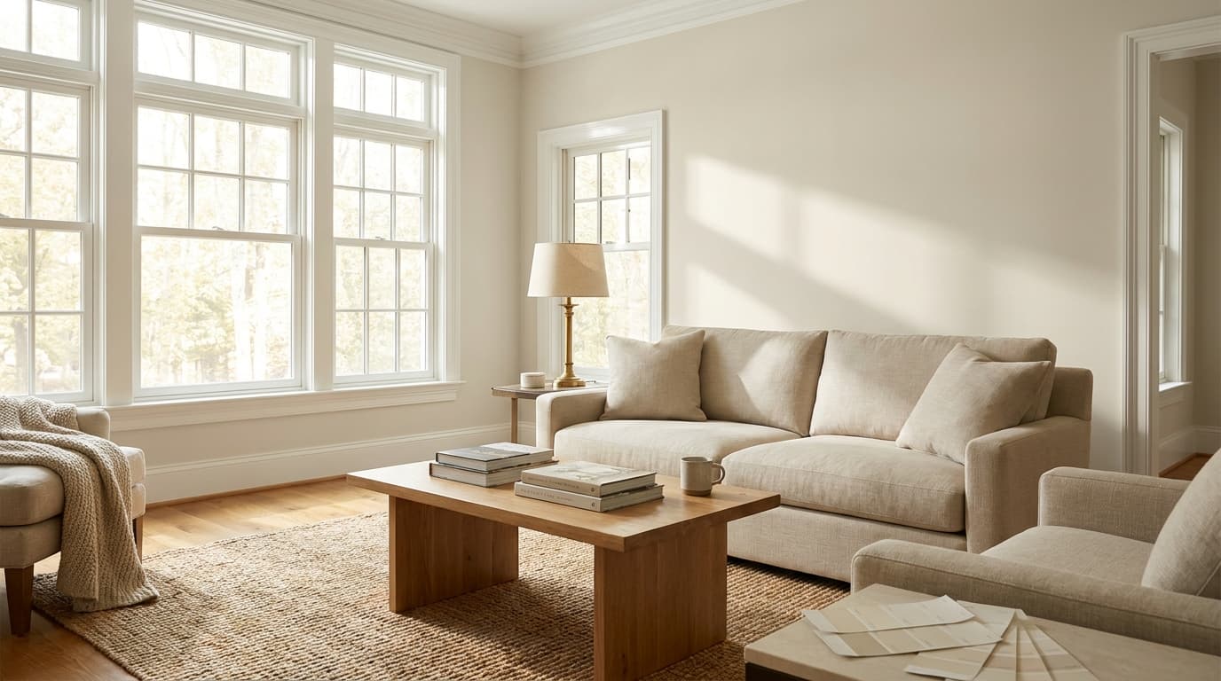
Color Name Natural Cream OC-14 (also: 1521 / Nature’s Essentials 1521) Brand Benjamin Moore Collection Off-White Collection LRV 64.78 — medium-light (not a white or off-white; a light greige) Undertones Warm beige-gray with a subtle green cast that shows in cool or low light Best For South- and west-facing rooms, living rooms, bedrooms, hallways, kitchens with warm finishes Avoid In Rooms dominated by cool gray tile, blue-gray counters, or icy white trim Benjamin Moore Natural Cream OC-14 is not a yellow cream, and it is not a gray. On the wall, it reads as a light greige, a warm, quiet neutral that sits between beige and gray without committing hard to either side. Its LRV of 64.78 puts it solidly in medium-light territory, which means it adds real color presence to a room while still reflecting a reasonable amount of light. If you walk in expecting something close to white, it will look darker than you anticipated. If you walk in expecting a traditional creamy yellow, it will look cooler and more grounded than you expect. That in-between quality is exactly what makes it useful. It has enough warmth to feel inviting, and enough gray-beige structure to look current rather than dated. The official collection is Benjamin Moore’s Off-White range, but at LRV 64.78, Natural Cream sits far enough from white that pairing decisions matter more here than with most off-whites. The sections below will walk you through exactly what this color does in different light, which rooms suit it, and what can go wrong when it is placed in the wrong conditions. Natural Cream Undertones: What the Chip Does Not Tell You The primary undertones in Natural Cream OC-14 are warm beige and muted gray. Those two sit in balance, which is what gives the color its greige character. But there is a third undertone that does not show up on most chips and only becomes visible in specific conditions: a soft green cast. It is not dominant. In warm, well-lit rooms you may never notice it. But in a north-facing room, on a gray winter day, or against cool-toned finishes, that green can pull forward and give the walls a slightly murky quality. This is the most important thing to know before committing to Natural Cream. The color does not lean yellow even in warm light, which many buyers see as a selling point after testing other greiges that turn amber. But the flip side is that its warmth relies on the room supporting it. Pull in blue-tinted trim, cool gray floors, or icy countertops, and Natural Cream loses its warmth fast and shows the green side instead. If you are still figuring out how undertones work throughout your space, choosing paint colors for your decor can help you build a more cohesive starting point. Avoid pairing it with Benjamin Moore Decorator’s White or any trim color with clear blue undertones. Those will make the wall color look grungy rather than soft. Warm whites like White Dove (OC-17), Chantilly Lace (OC-65), or Simply White (OC-117) are the right range for trim. If you want no contrast at all between walls and trim, Natural Cream can also be used on the trim itself. That green undertone is subtle on the chip — but light is what decides whether it shows up in your room. Here is exactly how that plays out. How Natural Cream Reads in Different Light Light changes this color significantly, and in some rooms, it changes it enough to make the difference between a color that works and one that does not. Natural light can make Natural Cream look warmer, cooler, brighter, or more muted depending on the direction your windows face. In sunny rooms, it often feels soft and warm. In cooler spaces, the gray side can become more noticeable. North-facing rooms: North-facing light is usually cooler and softer. Natural Cream may look more muted, grayer, or slightly green-gray in these rooms. It can still feel calm and elegant, but it often needs help from warm white trim, wood tones, layered fabrics, and soft lighting to keep the space from feeling flat. South-facing rooms: They receive warmer daylight for much of the day. This light brings out the beige warmth in Natural Cream and can make it feel softer, brighter, and more inviting. It is one of the easiest lighting conditions for this color because the warm light nicely balances its gray undertone. East-facing rooms: East-facing rooms get brighter morning light, so Natural Cream may feel fresher and warmer earlier in the day. As the light fades, the color can look more muted and gray. Warm lamps or soft white bulbs can help the room stay cozy later in the evening. West-facing rooms: West-facing rooms get stronger afternoon and evening light. During this time, Natural Cream can look warmer, creamier, and more relaxed. This makes it a strong choice for living rooms, dining rooms, and bedrooms where a soft evening glow feels comfortable. In Artificial Light Artificial lighting can significantly change the natural color after sunset. Warm white bulbs can bring out its beige side and make the room feel softer and more welcoming. Cool LED or daylight bulbs can make Natural Cream look grayer, flatter, or slightly green in some spaces. If you want the color to feel balanced, soft white lighting is usually the safer choice. Layered lighting also helps. Use ceiling lights, table lamps, floor lamps, or wall sconces together so the color looks even across the room. This keeps Natural Cream feeling warm, smooth, and natural from day to night. Beige vs Cream: Which Neutral Fits Your Space? Choosing between beige and cream can feel simple at first, but the difference becomes clear once the color goes on the wall. Beige has more depth and earthiness, while cream feels lighter, softer, and warmer. Feature Beige Cream Base Tone Brown, tan, or gray-based White with yellow or warm undertones Overall Look Grounded, warm, neutral Soft, light, cozy Best For Living rooms, bedrooms, hallways, open layouts Trim, walls, kitchens, bedrooms, soft neutral spaces Undertones Tan, gray, brown, sometimes green Yellow, ivory, warm white Room Feel Calm, settled, earthy Airy, gentle, warm Works Well With Wood tones, black accents, stone, taupe, warm whites Brass, soft whites, light wood, warm fabrics, muted colors Potential Risk Can look muddy or dated in poor lighting Can look too yellow if the undertone is strong Choose beige for a grounded neutral that adds depth and warmth to the room. It works well when the space has wood floors, stone, woven textures, or darker accents. Choose cream for a lighter, softer look that feels warm without adding too much color to the walls. For Benjamin Moore Natural Cream, the answer lies between the two. It has the warmth people like in cream, but the gray-beige base gives it more depth than a true creamy white. That makes it a good choice if you want softness without a strong yellow cast. Both beige and cream can look beautiful, but lighting, trim, and flooring decide the final result. Testing samples in the actual room helps you see which one feels balanced and natural. Coordinating Colors: Specific Paint Codes That Work Pairing decisions are where Natural Cream either pulls together or falls apart. Here are the specific codes that work, and the ones to avoid. Trim and ceilings: Benjamin Moore White Dove (OC-17) is the most reliable trim pairing — it is slightly warmer than a crisp white and creates a soft, cohesive transition without looking flat. Benjamin Moore Chantilly Lace (OC-65) works when you want more contrast and a slightly crisper edge. Benjamin Moore Simply White (OC-117) sits between the two and is a dependable all-purpose option. Avoid any trim color with blue or purple undertones; the contrast reads grungy against Natural Cream rather than clean. Accent and furniture colors: Natural Cream works with muted sage green tones, warm taupes, soft terra cotta, and earthy rust. It does not need strong color accents — a linen sofa, an oak table, and a brass lamp can be enough to finish the room. If you want a bolder accent, Benjamin Moore Newburyport Blue (HC-155) or a quiet forest green both work without fighting the wall color. Hardware and fixtures: Brushed brass, unlacquered brass, and warm bronze all suit Natural Cream well. Polished chrome and brushed nickel tend to pull out the cooler side of the undertone and can make the color look less warm than expected. Where Natural Cream Works Best Room by Room Some rooms set Natural Cream up to look its best. Others fight it. Here is the honest breakdown. 1. Living Room Living rooms are a strong match for Natural Cream because they typically have layered finishes, wood floors, upholstered furniture, and textiles, that reinforce the warmth in the wall color. Linen, leather, warm white curtains, and natural wood all work with it. The color gives the room a finished quality without drawing attention to itself, making it the right backdrop for a space where furnishings do the visual work. This is where Natural Cream earns its reputation as easy to live with. 2. Bedroom In a bedroom, Natural Cream creates a restful backdrop that stays warm enough to feel cozy at night without looking stark during the day. White bedding, taupe throws, wood nightstands, and muted green accents all pair well with it. The LRV of 64.78 means it reflects enough light to keep the room from feeling heavy, while still providing enough depth that the walls read as a real color rather than an almost-white. It suits both warm-wood and lighter-finish bedrooms well. 2. Kitchen Natural Cream works on kitchen walls and can also be used on cabinetry when the goal is a soft, warm finish that does not read as yellow. It suits white cabinets, warm wood cabinets, stone or quartz countertops in warm tones, and brass hardware well. Kitchens built around clean lines and restrained palettes, the kind covered in minimalist kitchen design, tend to be a particularly natural fit for this color on the walls. Where it struggles: kitchens with blue-gray tile backsplashes, icy white countertops, or very cool-toned cabinet colors. In those conditions, the green undertone becomes visible, and the overall look reads discordant rather than warm. 3. Bathroom Bathrooms require the most careful testing. Warm stone tile, soft white tile, beige floors, brushed brass, and wood vanities all work with Natural Cream. Cool gray tile or a predominantly chrome and gray bathroom will bring out the green undertone and make the color look muddier than intended. Bathrooms also tend to have less natural light than other rooms, which means the artificial lighting quality matters more here. Test under your actual bathroom lighting before buying gallons. 4. Hallways and Open Layouts Hallways and open-plan spaces need a neutral that reads consistently from one end of the home to the other, across changing light conditions. Natural Cream does this reasonably well because it is warm but not bold. It can run through entry halls, living rooms, dining rooms, and stairways without making a color statement. The key risk in open layouts is placing Natural Cream alongside cool-toned finishes in an adjacent space, the contrast will make the undertone shift more noticeable as you move through the home. 5. Exterior On exteriors, Natural Cream creates a soft, warm, and understated look that suits stone, brick, black shutters, warm wood doors, and creamy white trim. One important note: outdoor light is significantly stronger than interior light, and Natural Cream will appear lighter outside than it does inside. The LRV shifts perceptibly in full sun. Always test it on the actual exterior surface before painting a full elevation, and check it at different times of day since morning light and midday light read differently on an exterior. What Users Discuss About Benjamin Moore Natural Cream Redditusers discussing the room color options generally leaned toward Benjamin Moore Natural Cream as the safer and cozier choice for the space. Several commenters felt that Natural Cream would work especially well in a room with limited daylight because its warm undertones could keep the space feeling inviting rather than dark or moody. Others noted that darker green paint colors might feel overwhelming over time, particularly in a north-facing room. The original poster appreciated the feedback and mentioned wanting a comfortable atmosphere for relaxing with coffee and books during colder months. Overall, the discussion highlighted Natural Cream’s reputation as a warm, versatile neutral that can create a soft and welcoming look while remaining easier to live with long-term. Natural Cream vs. Similar Colors: The Comparisons That Matter These are the colors buyers consistently put Natural Cream next to when choosing. Here is the honest difference in each case. 1. Natural Cream vs. White Dove OC-17 White Dove is lighter (LRV around 83), softer, and functions as a warm white rather than a greige. Natural Cream has more visible body and reads as a wall color with real presence. Use White Dove when the goal is trim, cabinetry, or a very airy wall. Use Natural Cream when the walls need more depth and warmth than an off-white can provide. 2. Natural Cream vs. Edgecomb Gray HC-173 Edgecomb Gray has an LRV of 63, just slightly darker than Natural Cream at 64.78 — but it carries stronger green undertones and reads warmer on the wall. Natural Cream feels a little softer and creamier in comparison. The Benjamin Moore Moonshine review covers a similar greige territory if you want to see how another BM neutral at this depth reads in real rooms. If you want a greige that leans more definitively warm and earthy, Edgecomb Gray often wins. If you want slightly more lightness and a subtler undertone, Natural Cream is the better call. 3. Natural Cream vs. Pale Oak OC-20 Pale Oak is lighter (LRV 69) and carries taupe undertones rather than a beige-gray mix. It reads airier and slightly more delicate than Natural Cream. Pale Oak is the right call when the goal is a quiet, receding neutral. Natural Cream is the right call when the room needs more warmth and softness without going visibly beige. 4. Natural Cream vs. Swiss Coffee OC-45 Swiss Coffee is creamier and lighter, sitting closer to a soft off-white. Natural Cream has more gray-beige balance and reads more like a deliberate wall color with body. Swiss Coffee works when you want a very soft, slightly warm white. Natural Cream works when you want contrast between walls and trim, and want the walls to read as a distinct color rather than a near-white. These comparisons show that Natural Cream fills a specific gap — more depth than off-white, less warmth than a true beige, and a more current feel than many traditional cream colors. Whether that gap matches your room depends on what you are working with. How to Sample and Test Natural Cream OC-14 A poor sample test is the source of most of the disappointment that comes with this color. Here is how to do it properly. Buy the actual Benjamin Moore paint sample, not a printed swatch or a digital color chip. Paint at least two 12-inch by 12-inch samples on different walls in the same room. Walls receive different light at different times of day, and what looks warm on the south wall may look gray on the north wall. Let the paint dry completely before judging; wet paint is darker and masks the true undertone. Check the samples three times: morning light, midday, and evening with your artificial lights on. Hold your trim color and a piece of your flooring next to the sample. Those two elements, trim and floor, are where undertone clashes appear most clearly. The finish you choose also affects how the undertone reads: a lower sheen absorbs light and makes the color feel softer, while a shinier finish amplifies the surface and can pull the green forward. The differences between flat and satin paint finishes matter more with a complex neutral like this than with a plain white. For an easy, mess-free version of this process, Samplize peel-and-stick samples let you move a painted swatch from room to room without the prep and cleanup of a painted sample. They use real Benjamin Moore paint and give a more accurate read than any paper chip. Pros and Cons of Benjamin Moore Natural Cream OC-14 Pros Cons Warm without leaning yellow, which most greiges with warmth fail to manage Green undertone appears in cool or low-light conditions and against cold finishes More depth than off-whites like White Dove without the commitment of a full greige Will not read as a cream — buyers expecting ivory or rich cream will be surprised Works across living rooms, bedrooms, hallways, and open layouts consistently Needs warm finishes to support its warmth; cool-toned rooms fight it Pairs well with wood, stone, linen, brass, and natural textures Trim choice is critical — the wrong white makes the walls look dirty Shifts noticeably less toward purple or pink than most other greiges at this LRV Harder to assess accurately online — samples in real light are non-negotiable Use this table alongside your room’s specific light, trim, flooring, and finishes. Natural Cream earns its reputation in rooms that support its warmth. In rooms that work against it, the cons listed here are the ones you will feel most. Frequently Asked Questions Does Natural Cream work with black accents? Yes, Natural Cream works well with black accents. Black lighting, frames, hardware, or furniture can give the color more structure and contrast. The warmth in Natural Cream keeps the look from feeling too stark, especially when paired with wood, linen, or warm white details. Is Natural Cream good for a nursery? Natural Cream can work beautifully in a nursery because it feels soft, warm, and calm without being too sweet. It pairs well with light wood furniture, cream textiles, muted greens, soft blues, and warm neutrals. Test it first if the room has limited daylight. What curtains go with Natural Cream walls? Natural Cream pairs well with linen, oatmeal, ivory, taupe, muted sage, warm gray, or soft terracotta curtains. Choose natural fabrics if you want a relaxed look. Avoid icy white or blue-gray curtains because they may make the wall color look dull or slightly green. Can Natural Cream work with red brick? Yes, Natural Cream can work with red brick, especially if the brick has warm brown, rust, or clay tones. Its beige-gray base softens the brick without clashing. Add warm wood, brass, black accents, or cream trim to help the room feel connected. Is Natural Cream darker than Pale Oak? Natural Cream usually reads slightly deeper and warmer than Pale Oak. Pale Oak feels lighter, airier, and more taupe-based, while Natural Cream has more beige-gray body. If you want a wall color with a little more warmth and presence, Natural Cream may feel stronger. Does Natural Cream suit traditional homes? Yes, Natural Cream suits traditional homes because it works with wood trim, classic furniture, warm metals, and layered textiles. It feels refined without looking cold or too modern. It can also update older rooms while still respecting traditional details and warmer finishes. Can Natural Cream be used with navy accents? Yes, navy accents can look strong with Natural Cream. The wall color brings warmth, while navy adds depth and contrast. Use navy through pillows, rugs, cabinetry, art, or upholstery. A muted or slightly warm navy usually works better than a very bright blue. Final Verdict Natural Cream works best when you want a warm neutral that still feels calm and current. I like how it gives a room softness without making the walls look too yellow or too plain. You have seen how its greige base, LRV, lighting shifts, trim pairings, and sample testing all affect the final look. That matters because paint is not chosen in isolation. Floors, bulbs, furniture, and nearby whites can change everything. Benjamin Moore Natural Cream can be a beautiful choice when your space supports its warmth. Test it in real light, compare it with your finishes, and use the tips above before buying gallons. Share your room results in the comments or read a related paint review next.
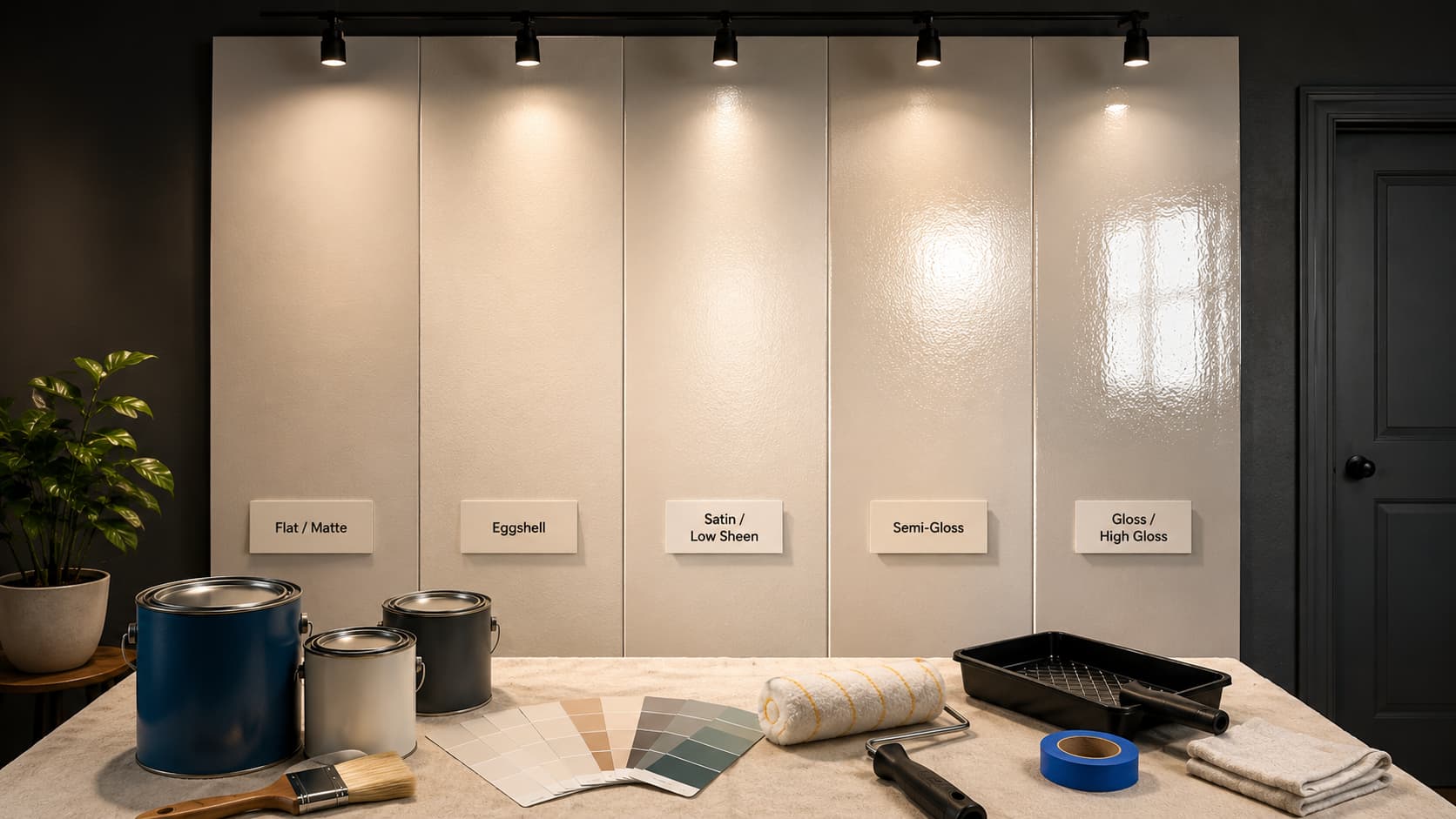
Choosing the right paint color is just one part of making a space look complete. Paint sheen is what gives walls, trim, and cabinets their personality, influencing how light reflects, how easy surfaces are to clean, and how long the finish lasts. Understanding paint sheens helps you decide which finish works best for each room, from bedrooms and living areas to kitchens, bathrooms, and exterior surfaces. Learning about the differences in sheen helps you choose finishes that make spaces feel comfortable, durable, and visually appealing without second-guessing your choice. What Paint Sheens Are? Paint sheen is the measure of how much light a dried paint surface reflects at you. Sheen is determined by the ratio of binder to pigment in the paint formula. More binder creates a denser, more reflective film. More pigment creates a porous surface that absorbs rather than reflects light. This ratio also affects durability; higher-sheen paints are harder, easier to wipe, and more resistant to moisture and scuffing. Lower-sheen paints are more forgiving of surface flaws but less resilient under daily use. That trade-off, surface forgiveness versus durability, is the real framework for choosing between finishes. It has nothing to do with personal taste and everything to do with the room you’re painting. Note: The same paint color can look different at different sheen levels. A higher-gloss finish reflects more light, making colors appear brighter and more saturated. A matte finish absorbs light, making colors feel deeper and slightly muted. Always test samples at your chosen sheen level before committing. Every Paint Sheen Type: Explained Simply Paint sheens become easier to choose when each finish is tied to real rooms, daily use, cleaning needs, and the kind of surface being painted. 1. Flat / Matte Flat and matte paints reflect almost no light, making them useful as they absorb light, so imperfections on walls appear less visible. They are ideal for ceilings with old seams or walls with repairs, as they hide flaws well. However, their porous surface makes them difficult to clean, as scrubbing can remove paint. Use flat and matte finishes primarily in adult bedrooms, on ceilings, and in low-traffic areas where walls aren’t frequently touched. Modern washable matte formulas from brands like Benjamin Moore (Aura Matte) have improved cleanability significantly, making them worth specifying if you want the flat look in a busier room. On textured walls, the gap between matte and flat paint behavior becomes more pronounced than the sheen scale suggests. 2. Eggshell Eggshell sits just above flat on the sheen scale, with enough glow to give walls a soft, clean look, not enough to create noticeable reflections. The name refers to the faint sheen on an actual eggshell, a useful visual reference: present but subtle. This is the finish I recommend for most living rooms, dining rooms, and adult bedrooms that require occasional light cleaning. It handles a damp cloth well without the scrub-sensitivity of flat paint, and it doesn’t pick up highlights from windows or lamps the way satin does. If you’re uncertain which finish to choose for a standard interior wall, eggshell is the safe, practical default. 3. Satin / Low Sheen Satin has a visible, pearl-like glow that reads as polished without crossing into obvious shine. It’s noticeably more durable than eggshell; the denser paint film resists moisture, holds up to repeated wiping, and maintains its surface longer in high-contact areas. This is the right finish for hallways, kids’ rooms, and any wall that gets regular hand contact. It also works well as a softer option for trim when semi-gloss feels too shiny for the aesthetic. One caveat: satin picks up application marks more readily than eggshell, so rolling technique matters. Uneven coverage and visible roller lines are clearly visible in angled light. Take your time with the application, satin on walls with regular moisture exposure rewards careful rolling far more than eggshell does. 4. Semi-Gloss Semi-gloss is a workhorse finish. It reflects significantly more light than satin, creates a tight, hard paint film, and wipes clean easily, including grease, moisture, and repeated fingerprint contact. That combination makes it the standard choice for trim, doors, window frames, cabinets, bathrooms, and kitchens. Because semi-gloss reflects light so effectively, it also shows every surface irregularity. Any wall patch, brush mark, or uneven roller stroke becomes visible at certain angles of light. Good prep, filling, sanding, and priming are not optional with this finish. On properly prepared surfaces, semi-gloss looks crisp and intentional. On unprepared walls, it looks worse than flat paint would have. 5. Gloss / High Gloss High-gloss is the hardest, most reflective finish available. The dried surface is essentially glass-like, which means it cleans with minimal effort, resists moisture and staining effectively, and creates bold visual contrast when used on doors, shutters, or cabinetry against matte walls. Use it only on smooth, well-prepared surfaces. High-gloss shows every flaw, every brushstroke, every small dent, every imperfect patch in sharp relief. Sanding the surface to a bare smoothness and applying a quality primer are the baseline prep requirements. In interiors, high-gloss walls read as extreme and can feel uncomfortable to live with. On exterior doors, trim, and furniture, it looks clean and purposeful. How Paint Sheen Behaves in Different Light Conditions Sheen doesn’t behave the same way in every room, and the direction of light is the variable that changes it most. In a north-facing room, natural light is cool and indirect. Higher-sheen finishes in north-facing spaces can look slightly gray or cold because the light they reflect lacks warmth. A satin or eggshell finish in these rooms reads truer to the color on the chip. Semi-gloss on walls in a north-facing room often looks streaky and cold. In a south-facing room, direct sun floods the space for most of the day. Lower-sheen finishes look their best here, rich, soft, and consistent. Higher-sheen finishes in south-facing rooms can feel overwhelming at midday when sunlight hits the wall directly and bounces back into the room. Artificial lighting has its own effect. Warm incandescent and warm LED bulbs soften the appearance of sheen; a satin wall reads closer to eggshell under warm light. Cool-white LEDs intensify sheen, making a satin finish look almost semi-gloss under bright overhead lighting. If you’re painting a room with cool-white downlights, step down one sheen level from what you’d normally choose. Pro Tip: Test your paint sample at the sheen you plan to use, on the actual wall, and observe it at three different times: morning light, midday, and after 7 pm with your lights on. Sheen’s behavior changes significantly across those three conditions. The 7 pm reading is often the most revealing. Choosing the Right Sheen for Different Rooms and Surfaces Each room requires a different paint sheen, so it should match traffic, moisture, light, and the frequency of surface touch or cleaning in daily use. 1. Bedrooms and Living Rooms Bedrooms and living rooms usually need a finish that feels easy on the eyes. Eggshell and satin work well because they give walls a soft look without too much shine. Eggshell hides small marks better, while satin adds a little more strength. These finishes suit spaces where comfort matters, but light cleaning is still needed. If color choice is still open, the paint colors that make bedrooms feel calm are worth pairing with an eggshell finish for the softest possible result. 2. Kitchens and Bathrooms Kitchens and bathrooms deal with moisture, splashes, grease, and regular wiping. Satin is a smart pick for walls because it cleans well without looking too glossy. Semi-gloss works better near trim, doors, or areas that get more moisture. These finishes help painted surfaces stay cleaner in rooms that work hard every day. Before finalizing wall and trim sheens, wall and trim color pairings can shift the decision about which finish works best in a room. 3. Hallways and Children’s Rooms Hallways and children’s rooms need paint that can handle fingerprints, scuffs, and frequent movement. Low-sheen paint or satin is usually the best choice because it gives enough durability while keeping shine under control. Flat paint may mark too easily here, and high gloss can make walls look too reflective. 4. Ceilings Ceilings usually look best with flat or matte paint. These finishes reduce glare from lights and windows, which keeps the ceiling looking smooth. Flat paint also hides small ceiling flaws better than shiny paint. Since ceilings are not touched often, cleanability is less important than a soft, even finish. 5. Trim, Doors, and Cabinets Trim, doors, and cabinets get touched more than walls, so they need stronger finishes. Semi-gloss is a reliable choice because it wipes clean and gives edges a neat look. High gloss works when the surface is very smooth and more shine is wanted. Good prep matters because shiny paint shows flaws. What Sheen for Exterior Paint? Here’s What Actually Works The right exterior sheen depends on the surface type, sunlight exposure, cleaning needs, and weather exposure. Use this table to match each outdoor area with a practical finish. Exterior Surface Best Sheen Why It Works Exterior siding Low sheen or satin Hides small flaws, reduces glare, and gives enough strength for outdoor use. Front doors Semi-gloss or gloss Handles touch, dirt, and fingerprints while giving a crisp, clean look. Trim and window frames Semi-gloss Helps edges stand out and adds protection against moisture and wear. Shutters Satin, semi-gloss, or gloss Works well for accents and makes cleaning easier. Porches and railings Satin or semi-gloss Handles touch, dirt, and weather better than flatter finishes. Garage doors Satin or semi-gloss Keeps the surface smooth while allowing easier washing when needed. Masonry or stucco Flat, low sheen, or satin Hides rough texture, cracks, and patch marks better than glossy paint. Outdoor furniture Semi-gloss or gloss Holds up to wiping and helps smooth painted pieces look cleaner. For most homes, keep large exterior walls softer and use more shine on touch points. This balance helps the paint look clean and last longer when exposed to the elements. Common Paint Sheen Mistakes to Avoid These are the errors worth knowing before you open the tin; each one is far easier to avoid than to fix after the paint dries. Using flat paint in bathrooms. Flat absorbs moisture, promotes mold behind the surface, and peels within a year of regular use. Satin or semi-gloss only in any room with regular steam or splashing. Applying high-gloss to unprepped walls. High-gloss reflects every dent, patch, and brush mark in sharp relief. Fill, sand, and prime thoroughly before any finish above satin. Painting cabinets in eggshell. Too soft for the contact cabinets to absorb daily, eggshell absorbs grease and stains, and fails to clean properly. Semi-gloss is the minimum for any painted cabinet surface. Using a single sheen throughout the entire house. High-traffic rooms wear out faster with a soft finish; low-traffic rooms look overworked with a hard one. Match sheen to traffic, moisture, and surface condition per room. Applying semi-gloss on rough or textured walls. Higher sheen amplifies surface texture; every bump and irregularity becomes the focal point rather than fading into the wall. Use flat or eggshell on textured surfaces. Skipping primer when switching sheen levels. Jumping from a lower sheen to a higher one without priming causes uneven adhesion, inconsistent reflectivity, and a patchy final surface. Prime first. Using interior paint on exterior surfaces. Interior formulas carry no UV resistance; they fade, chalk, and peel quickly outdoors. Always use exterior-grade paint on any outdoor surface, regardless of sheen. The most consequential mistake on that list is flat paint in a bathroom. It’s the one that creates real structural damage rather than just a cosmetic problem. Moisture works behind the paint film, and mold develops inside the wall cavity, not just on the surface. Frequently Asked Questions What paint sheen should I use for kitchen cabinet doors specifically? Semi-gloss at minimum. Cabinet doors take daily finger contact, grease, and repeated wiping; any finish softer than semi-gloss absorbs cooking residue, discolors, and stops cleaning properly within months. High-gloss is worth considering if the doors are very smooth and you want the extra durability. Does the sheen level change how long paint takes to cure? Yes. Higher-sheen paints contain more binder, which means the surface dries sooner but takes longer to cure and harden fully. Semi-gloss and gloss finishes typically need 2–4 weeks to reach full hardness. Avoid scrubbing or mounting hardware during that window, even if the paint feels dry to the touch. Can you mix sheens on adjacent walls in the same room? Technically, yes, but it rarely looks intentional. Adjacent walls with different sheens reflect light differently, which makes the same paint color appear as two slightly different colors depending on the angle. If you want contrast, use it between walls and trim, not between two walls of identical color. Which paint sheen holds up best on exterior siding? Satin or low-sheen. Large exterior field surfaces in high gloss reflect UV light aggressively, which accelerates paint degradation on wide, flat expanses. Satin provides enough durability to handle weather and washing without the UV drawback. Save semi-gloss and gloss for exterior trim, doors, and shutters where durability at contact points matters more than UV stability. Is a higher sheen always more durable indoors? More durable at the film level, yes, but not always the right durability for the surface. Semi-gloss on a heavily textured wall is technically hard but practically fails because every scrub catches the surface peaks and drags the finish away. Match the sheen’s durability to a surface smooth enough to handle it. On rough walls, a washable matte formula outperforms semi-gloss in real-world use. Final Verdict Choosing the right finish is really about matching paint to the way you live in each space. I would not pick sheen by shine alone. Think about traffic, moisture, wall flaws, cleaning, and light before you open the can. Soft finishes help walls look smooth, while stronger finishes protect doors, trim, cabinets, bathrooms, and outdoor surfaces. Paint sheens matter because they affect how color looks and how well the surface holds up over time. When you test samples, prep properly, and save your paint details, touch-ups become easier too. Try these tips on your next project, then share what worked best for you in the comments or read more paint care tips.