


Standing in the lighting aisle, holding two bulb boxes that look nearly identical, one says “cool white,” the other “daylight”, and you realize nobody ever actually explained the difference. The numbers on the packaging mean nothing without context.
Cool white vs daylight feels like a minor question until you install the wrong bulb and your living room starts to feel like a dentist’s waiting room.
Color temperature shapes how a room feels, not just how bright it looks. The right lighting choice plays a huge role in setting the mood, particularly in a minimalist kitchen design style, where simplicity and function come first.
I’ve watched people redo entire lighting setups after understanding just this one thing; the difference is always immediate.
This breaks down each temperature range, what it does to a space, and which rooms it belongs in.
What Are Light Bulb Color Temperatures?
Light bulb color temperature is measured in Kelvin (K), a number that tells you how warm or cool a light source appears. It has nothing to do with how hot the bulb gets physically. It’s purely about the tone of the light it produces.
The scale runs from 1000K to 6500K. Lower numbers produce a warm, amber-toned glow. Higher numbers push toward a crisp, blue-white light.
Most home lighting ranges from 2700K to 6500K, covering everything from soft warmth to sharp daylight brightness.
What most people don’t realize is that color temperature doesn’t just affect visibility; it directly influences how a room feels, how alert or relaxed you are, and even how well you sleep.
Cool White vs Daylight vs Warm White vs Soft White: What’s the Difference?
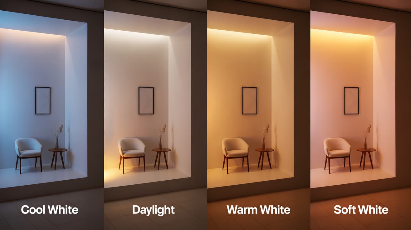
All four terms describe the same thing, the tone of light a bulb produces, but each sits at a different point on the Kelvin scale with a distinctly different effect on a room.
1. Soft White (2700K)
Soft white is the warmest option on the scale, the closest match to a traditional incandescent bulb. It produces a gentle, yellow-toned glow that feels familiar and easy on the eyes.
Best suited for bedrooms and living rooms where comfort matters more than brightness. It promotes rest and works best in rooms used in the evening.
2. Warm White (2700K – 3000K)
Warm white sits at the cozy end of the spectrum, slightly cleaner than soft white but still unmistakably warm. It creates an inviting, relaxed atmosphere without feeling dim or dull.
Ideal for dining rooms, lounges, and bedrooms. If you want a space to feel welcoming rather than clinical, warm white is the default choice.
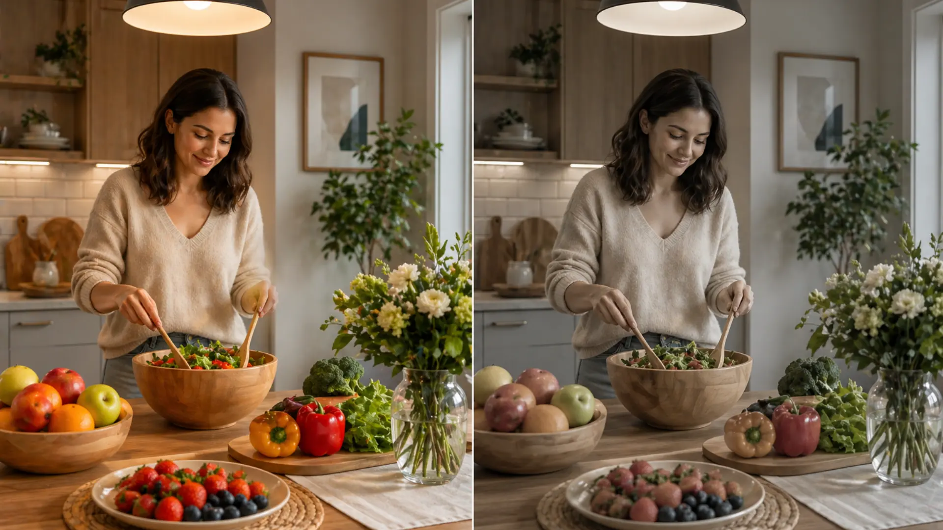
3. Cool White (4000K – 5000K)
Cool white produces a bright, neutral light with a subtle blue undertone. It’s noticeably crisper than warm white without feeling as intense as full daylight.
Best for kitchens, offices, and bathrooms where clarity and focus take priority over atmosphere. I’d describe it as the most versatile functional lighting option for most homes.
4. Daylight (5000K – 6500K)
Daylight is the brightest and most intense option available. It mimics natural outdoor light with a sharp, blue-white tone that maximizes visibility.
Best reserved for garages, workshops, study rooms, and home offices. It’s excellent for detailed work and reading, but in the wrong room, it can make a space feel cold and unwelcoming.
Understanding where each type sits on the scale makes every lighting decision significantly easier; the difference between a room that feels right and one that never quite does often comes down to this.
Color Temperature Comparison Table
| Color Temperature | Kelvin Range | Best For | Room Type | Mood |
|---|---|---|---|---|
| Soft White | 2700K | Warmth and relaxation | Bedrooms, Living Rooms | Cozy, Relaxing |
| Warm White | 2700K – 3000K | Inviting, casual warmth | Dining Rooms, Lounges | Calm, Welcoming |
| Cool White | 4000K – 5000K | Task-oriented, clarity | Kitchens, Bathrooms, Offices | Focused, Alert |
| Daylight | 5000K – 6500K | Precision tasks, natural lighting | Garages, Workspaces, Study Rooms | Energizing, Sharp |
How Light Temperature Affects Your Space and Mood
Choosing the right Kelvin range goes beyond aesthetics; it directly shapes how you feel in a room, much as selecting the best types of wood for furniture can influence the overall look and feel of your space.
The temperature of your light is one of the most powerful and most overlooked design decisions you can make:
- Cool White Lighting for Modern Spaces: Cool white creates an alert, focused atmosphere that suits clean, modern interiors and signals productivity to your brain.
- Daylight for Task-Oriented Activities: Daylight mimics a bright afternoon outdoors, keeping your mind sharp and your eyes accurate for precision tasks.
- Warm White for Inviting Atmospheres: Warm white creates a sense of safety and calm, ideal for rooms designed for rest and conversation.
- Soft White for Rest and Comfort: Soft white is the gentlest option, reducing stimulation and encouraging your body to naturally shift into rest mode.
Getting your light temperature right does not require an expensive renovation or a designer’s eye. Once you match the right Kelvin range to each room’s purpose, the difference in how the space feels becomes immediately noticeable.
Color Rendering Index (CRI): The Number People Always Skip
Kelvin tells you the tone of light, but CRI tells you how accurately that light shows the true color of everything in the room. The scale runs from 0 to 100, with 100 corresponding to direct sunlight.
Two bulbs at the same Kelvin can look identical on packaging but perform very differently in a real room. Under high CRI light, food looks more appetizing, fabrics read true, and skin tones look natural.
At low CRI, everything looks slightly off, in a way hard to name. For living spaces, aim for a CRI of 80 or higher. For kitchens, bathrooms, and art studios, 90 or higher is the right threshold.
How to Choose the Right Bulb Color Temperature
Getting this right doesn’t require expertise; it just requires asking the right questions about the room before you reach for a bulb. That’s genuinely all it takes.
- Identify the room’s purpose: Tasks need cooler light, rest needs warmth. The room’s function answers the question instantly.
- Check natural light: Dark rooms need slightly cooler temperatures to compensate. Bright rooms can afford warmer bulbs without feeling dim.
- Always choose LED: They cover every color temperature, use 80% less energy, and last far longer than any alternative.
- Check lumens, not wattage: Lumens measure actual brightness. Match lumens to room size, not the number on the box.
Once these four things are honestly considered together, the right bulb stops being a guess and becomes a straightforward decision you won’t need to revisit.
Common Mistakes When Choosing Bulb Color Temperatures
Most lighting problems aren’t about the bulb’s quality; they’re about the wrong temperature in the wrong room. These are the mistakes that cause it:
| Mistake | Why It’s a Problem | How to Fix It |
|---|---|---|
| Mixing warm and cool bulbs in the same room | Clashing tones make the space feel unsettled and visually inconsistent | Keep all bulbs in one room within 500K of each other |
| Ignoring the effect on sleep | Cool or daylight bulbs suppress melatonin and silently disrupt sleep quality | Use soft white 2700K in any room used before bed |
| Using one temperature throughout the entire home | No single temperature works everywhere; rooms feel either clinical or too dim | Zone your home; warm for rest areas, cool for task spaces |
These mistakes are easy to make and just as easy to correct. The fix in every case costs nothing more than swapping one bulb for a better-matched one.
Top 5 Tips for Optimizing Your Home Lighting
- Don’t use daylight bulbs in bedrooms: they can make the room feel too harsh and disrupt your relaxation.
- Focus on lighting tasks: Use Cool White (4000K-5000K) for kitchens and offices to stay alert.
- Warm up dining rooms: Warm White (2700K-3000K) will make your meals more inviting.
- Layer your lighting: Use multiple bulbs with different color temperatures for different areas of the room.
The Bottom Line
Lighting is one of those things you stop noticing when it’s right, and can’t stop noticing when it’s wrong. I hope this made the cool white vs daylight and warm white vs soft white decisions feel less confusing.
The Kelvin scale isn’t complicated once you connect it to how a room gets used. Warm temperatures belong where you rest.
Cool temperatures belong where you work. Getting that balance right makes a genuine difference to how each room feels day to day.
You don’t need to overhaul everything at once; start with one room. If this helped, share it with someone who’s been living under the wrong bulb for too long. Drop any questions in the comments below.
Frequently Asked Questions
Can color temperature affect eye strain?
Yes. Cool and daylight bulbs can cause eye strain during long exposure. Warmer temperatures are significantly gentler on the eyes over extended periods.
Do LED bulbs accurately maintain their Kelvin rating over time?
Most quality LEDs do. Cheaper bulbs can shift slightly warmer as they age, which is worth considering when buying budget options.
What color temperature works best for content creation?
Daylight (5000K–6500K) is the standard choice. It renders colors most accurately and closely matches the natural light that cameras are typically calibrated for.
Does color temperature change when you dim a bulb?
Most standard LEDs maintain their Kelvin rating at every dim level, but warm-glow dimmable bulbs shift toward warmer tones as brightness drops.
What color temperature is best for children’s rooms?
Warm white (2700K–3000K) for sleeping areas. A slightly cooler option around 3500K works for study or play zones within the same room.
Can you mix cool white and daylight bulbs in the same room?
Technically, yes, but the color gap creates visual tension. Stick to one temperature for main lighting and use the other only in separate zones.


