


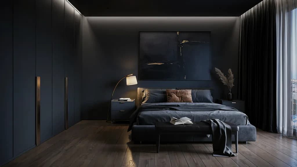
A well-planned black bedroom feels calm and grounded, not gloomy or cramped. Designers pair black walls with brass fixtures, warm wood, and soft linens. The result looks like a magazine spread and sleeps even better. If you’ve been eyeing black bedroom ideas. Black is often avoided because we worry it will make a bedroom feel smaller or absorb too much light. Used thoughtfully, however, it can create depth without sacrificing warmth or personality. These black bedroom ideas show how to use the color across walls, furniture, decor, and rooms of different sizes. Black Bedroom Wall Ideas for a Stylish Space Walls set the tone for a black bedroom. The amount of black you use, along with the room’s lighting, textures, and surrounding colors, determines whether the result feels cozy or overly dark. Some homeowners commit to four black walls. Others prefer just one accent wall or a patterned paper. Here are six ways to bring black onto your bedroom walls the right way. 1. Paint All Walls Black for a Dramatic Bedroom Painting every wall black makes the boldest statement on this list. It works best when the rest of the room balances it out. Use matte or eggshell black paint to create a sophisticated backdrop. Balance with lighter bedding, warm lighting, and textured fabrics. 2. Create a Black Accent Wall Behind the Bed A black accent wall behind the bed is the easiest way to try this trend without full commitment. A black wall creates instant contrast, especially against white, beige, or soft gray walls. It can still work in a small bedroom, since keeping the other walls lighter helps the space feel open. Use black only behind the headboard to create a focal point. Use lighter adjoining walls for stronger contrast. 3. Add Black Wall Paneling for Texture Black paneling turns a flat black wall into something with real depth. Vertical wood slats installed over black paint add texture and a natural element, softening the wall’s dark color. Molding or panel designs work the same way, adding shadow lines instead of relying on paint alone. Combine black paint with wood slats, molding, or panel designs. Use vertical details to emphasize height. Pair textured walls with simpler furniture so the room does not feel overly busy. 4. Try Black Wallpaper with Subtle Patterns Black wallpaper is a good option when a flat painted wall feels too plain. A subtle pattern adds movement without fighting the dark color. Recommend: Geometric prints Botanical patterns Textured finishes Helps prevent flatness in a dark room. Keep the pattern relatively subtle if the bedding, rugs, or furniture already contain strong prints. 5. Pair Black Walls with White Trim White trim is one of the simplest ways to keep a black bedroom from feeling heavy. White baseboards, doors, and molding draw the eye along clean lines rather than a single solid block of color. Use white or off-white baseboards and molding for contrast. Repeat the lighter trim color elsewhere through bedding or decor. Keep the contrast crisp for modern rooms or choose creamier whites for a softer look. 6. Use Black Ceiling Paint for a Cozy Effect A black ceiling pulls the whole room together. Painting the ceiling the same black as the walls creates a cocoon-like feeling that many find calming. In bedrooms with good natural light or high ceilings, this is a good addition. A low, dim room can feel closed in without enough light to balance it. Creates a cocoon-like atmosphere. Best suited for bedrooms with sufficient lighting and height. Black Bedroom Color Combination Ideas Black works best when another color controls the room’s warmth, contrast, or softness. Lighter neutrals can brighten it, while wood, green, or terracotta add warmer, more natural tones. Here are eight combinations that work well with black bedroom ideas. 7. Black and White Bedroom This is the classic pairing for a modern black bedroom. White keeps the room feeling crisp instead of heavy. Aim for roughly a 60/40 split between black and white surfaces, with white on larger areas like bedding or walls, so the room reads as sharp rather than stark. Use white bedding, rugs, or curtains against dark walls. Repeat black in smaller details to tie the palette together. Works especially well in modern, minimalist, and Scandinavian-inspired rooms. 8. Black and Beige Bedroom Pairing black with beige creates a softer, more effortless bedroom aesthetic and a cozy feel without feeling too dark. Warm beige keeps a black bedroom from feeling cold. Use beige on the largest surfaces, such as the walls or an area rug, and save black for furniture or accents so the room stays warm rather than heavy. Pair the combination with linen, wool, and woven materials. Use beige when you want contrast without a sharp black-and-white look. Add warm wood tones to make the palette feel more relaxed. 9. Black and Wood Bedroom Wood elements introduce warmth and a natural vibe, softening the boldness of black. Lighter woods like oak or ash brighten a black room more than darker walnut, so pick a wood tone based on how much natural light the space already gets. Add oak, walnut, or reclaimed wood furniture. Use visible wood grain to break up smooth black surfaces. Pair wood with black metal fixtures for a mixed-material look. 10. Black and Gold Bedroom Metallic decor pieces, like brass, gold, or silver, pop against a black wall and add a touch of luxury. Keep metallic details concentrated in a few areas so they feel intentional rather than decorative for their own sake. Use brass or gold on lighting, handles, or mirror frames. Repeat the same metal finish in two or three places. Balance reflective accents with softer fabrics and matte surfaces. 11. Black and Green Bedroom Deep green tones sit close to black on the color wheel, so the pairing feels natural rather than jarring. Olive, sage, or emerald all work well against black walls or bedding. Pair black with olive, sage, or emerald tones. Introduce green through bedding, upholstery, artwork, or plants. Add natural wood or woven materials to reinforce the organic feel. 12. Black and Gray Bedroom Layering black with different shades of gray keeps a room feeling modern without adding another color. Charcoal, soft gray, and black together read as one cohesive palette rather than clashing tones. Combine black with charcoal and soft gray. Use lighter gray on textiles to create contrast. Add texture so the monochromatic palette does not appear flat. 13. Black and Terracotta Bedroom Terracotta and other clay tones carry warmth that plain black walls lack on their own. This combination suits Mediterranean-style or earthy interiors especially well. Use terracotta through bedding, cushions, pottery, or rugs. Warm clay tones soften the intensity of black. Works well with Mediterranean and earthy interiors. 14. Black and Cream Bedroom Cream reads softer than bright white against black. It works well for anyone who wants contrast without a stark, high-fashion look. Use cream bedding, curtains, or rugs against black walls. Repeat cream across several surfaces to distribute the contrast. Works well in cozy, transitional, and traditional bedrooms. Black Bedroom Furniture Ideas Furniture is often the easiest way to bring black bedroom ideas into a room without committing to full black walls. A single black bed frame or dresser can do the work of an entire color scheme. Here are six ways to use black furniture well. 15. Add a Black Upholstered Bed An upholstered bed softens the hard edge that black furniture can have. Velvet, linen, or boucle textures add softness against the dark color. It pairs best with cream or oatmeal bedding and a woven jute or wool rug underneath. Velvet, linen, or boucle textures add softness. Creates a strong focal point. Pairs best with: cream bedding, natural rugs, and brass reading lamps. 16. Choose a Black Wooden Bed Frame A black wooden frame suits minimalist and contemporary bedrooms especially well. Its clean lines keep the piece from feeling too heavy in the room. Warm wood nightstands and a light oak floor balance the frame’s dark tone. Pair with oak or walnut side tables. Use white, beige, or muted bedding for contrast. Add a textured throw to soften the frame’s straight lines. 17. Use Black Nightstands for a Matching Look Matching black nightstands on either side of the bed create instant symmetry. Warm lamps on top keep the pair from reading as too stark. Gold or brass lamp bases and a soft table runner soften the matched black look. Creates symmetry around the bed. Add warm lamps to soften the appearance. Pairs best with: brass or gold table lamps, a light-colored table runner, and small ceramic decor pieces. 18. Add a Black Dresser or Storage Cabinet A black dresser adds real storage while keeping the room’s color story intact. Balance it with lighter decor pieces on top so it does not become the only dark element in the room. A woven basket or two, plus a light-colored vase, keeps the surface from feeling heavy. Style it with a cream, terracotta, or ceramic vase. Add rattan or woven baskets nearby. Hang a mirror above it to introduce a reflective surface. 19. Create a Black Built-In Wardrobe Wall A black built-in wardrobe wall gives the room a custom, cohesive look. Integrated interior lighting keeps it functional and stylish. Pairing the wall with a lighter ceiling and a wood- or brass-handle detail keeps the wall from closing in the room. Add warm interior wardrobe lighting. Use brass, bronze, or matte-gold handles for contrast. Keep the ceiling or surrounding walls lighter if the wardrobe occupies most of one wall. 20. Add Black Metal Furniture Accents Black metal furniture adds an edge without taking over the whole room. It works well in small doses across several pieces. Pair metal accents with warm wood or a soft textile to keep the look from feeling too industrial. Examples: Bed frames Side tables Shelving Mirrors Pair the metal with warm wood, linen, cotton, or one additional metal finish such as brass or bronze. Black Bedroom Decor Ideas Decor is what makes a black bedroom either feel flat or come to life. Texture, light, and a few well-placed accents make the biggest difference. These eight ideas cover the details worth getting right. 21. Layer Black Bedding with Different Textures Black bedding in a single flat fabric can look plain under normal light. Mixing textures adds depth without adding another color to the room. Include: Cotton sheets Quilted blankets Velvet pillows Linen throws Texture is what keeps black bedding from looking flat. A quilted blanket over smooth cotton sheets, or a velvet pillow against a linen throw, catches light differently across the bed. That variation gives the eye something to notice, even in a single color. 22. Add Warm Lighting to a Black Bedroom Layered lighting with warm bulbs prevents a black room from feeling too heavy. Lighting matters more in a black bedroom than almost any other design choice. Cover: Wall sconces Pendant lights Bedside lamps Dimmable fixtures Warm bulbs, in the 2700K to 3000K range, soften black paint and dark furniture. Cool white bulbs tend to make black surfaces look flat and a little cold. Dimmable fixtures let you adjust the mood between daytime brightness and evening warmth. 23. Use Mirrors to Reflect Light Mirrors and reflective surfaces can help bounce light around the room and offset the darkness. A large mirror does double duty in a black bedroom. Large mirrors help bounce natural and artificial light. Choose black frames for a cohesive look. 24. Add Large Artwork Against Black Walls Light-colored artwork stands out clearly against black walls and can break up a large uninterrupted dark surface. One substantial piece often creates a cleaner focal point than many small frames. Choose artwork with cream, white, muted, or metallic details. Size the piece to be proportional to the bed or dresser below it. Leave some empty wall space around the artwork. 25. Use Plants to Soften Black Interiors Wood elements and greenery introduce warmth and a natural vibe, softening the boldness of black. Plants achieve the same effect through color and life rather than texture. Use plants as small green accents against dark walls. Snake plants, pothos, and ZZ plants are well-suited to bedrooms with lower light levels. Choose simple planters so the foliage remains the main contrast. 26. Add Soft Rugs for Warmth A soft rug underfoot balances the hard visual weight of black walls or furniture. Texture matters here as much as color. Use: Cream rugs Beige textures Patterned designs 27. Style Black Curtains for a Dramatic Look Blackout curtains work best in bedrooms that need full darkness for sleep or in rooms with strong morning light. They can also make a room feel smaller on their own. Use blackout curtains when blocking morning or street light is the priority. Balance them with a lighter sheer layer or a light-colored curtain rod for contrast. Mount curtains higher to emphasize ceiling height. 28. Add Metallic Accents for Contrast Metallic finishes catch light in a way flat black paint cannot. A mix of one or two metal tones tends to look more intentional than several at once. Examples: Brass Gold Chrome Bronze Repeat the chosen metal through details such as lamp bases, handles, frames, or curtain hardware. Black Bedroom Style Ideas Black adapts to almost any design style, from stripped-down minimalism to full-on maximalism. The style you choose changes how much black you use and what you pair it with. Here are six directions to take a black bedroom. 29. Modern Black Minimalist Bedroom A minimalist black bedroom relies on simple shapes and very little clutter. The color does the visual work instead of pattern or ornament. Features: Clean lines Simple furniture Limited decoration Neutral accents 30. Luxury Black Bedroom with Velvet Details Velvet adds a soft, high-end feel that plain black paint or fabric cannot match on its own. This style leans dramatic on purpose. Use: Velvet headboard Plush bedding Statement lighting 31. Black Scandinavian Bedroom Scandinavian design usually avoids heavy color, so keep black light here. Keeping the rest of the room bright balances the one dark note. Balance black with: Light woods Neutral textiles Simple decor 32. Black Industrial Bedroom Industrial style pairs naturally with black, since both lean toward raw, unfinished materials. Metal and exposed surfaces fit right into this look. Combine it with: Black or aged metal finishes Exposed brick or concrete Dark furniture Warm wood details Adding wood or softer textiles keeps the room from feeling overly hard or utilitarian. 33. Black Bohemian Bedroom A boho black bedroom trades sleek surfaces for texture and pattern. Natural textiles and woven pieces warm up the coolness of black. Combine black with: Rattan Textiles Plants Handmade decor 34. Dark Cottage-Core Inspired Bedroom Dark Cottage-core style leans into black’s dramatic side rather than softening it. Rich fabrics and antique details give the room a sense of history. Use: Antique-style furniture Rich fabrics Ornamental details Black Bedroom Ideas for Different Space Types Not every home has the same room to work with. A black bedroom idea that works in a large main suite might not suit a small apartment or a low-light room. These ideas cover common real-world situations. 35. Small Black Bedroom Ideas A black accent wall can work in a small bedroom by anchoring the space and adding depth, as long as adjacent walls stay lighter. Full black walls can work too, but need more careful lighting. Try: Use black on one wall Add mirrors Keep furniture minimal Use layered lighting 36. Black Bedroom Ideas With Low Natural Light A room with little daylight needs extra help to keep black from feeling dim. Warm bulbs and reflective surfaces do most of the work here. Include: Warm bulbs Reflective surfaces Lighter fabrics Avoid full matte black everywhere, since matte finishes absorb more light than a satin or eggshell black would 37. Black Bedroom Ideas for Couples A shared bedroom needs a color palette and storage plan that work for two people, not one. Comfortable, neutral-leaning textures keep the space feeling calm for both partners. Include: Balanced color palettes Storage solutions Comfortable textures Neutral accents 38. Black Bedroom Ideas on a Budget You do not need a full renovation to bring black into a bedroom. Small, targeted changes get most of the visual impact for a fraction of the cost. Include: Black paint updates New bedding Decorative accents DIY furniture changes Things to Check Before Choosing Black Bedroom Walls A black bedroom can look striking, but it does not suit every space equally well. Before choosing the paint, consider your room’s size, lighting, and overall feel. How tall are your ceilings? Low ceilings can feel lower under a fully black room. If your ceilings sit under eight feet, consider stopping the black at the walls and keeping the ceiling white. Which direction do your windows face? A north-facing room gets soft, indirect light most of the day. Black can feel flat and cool in that kind of light. A south- or west-facing room gets warmer, stronger light, which balances black paint far better. How big is the room, really? Small bedrooms under 120 square feet can handle black on one or two walls without trouble. A fully black room that size often feels tighter than it is. Larger rooms have more room to absorb the color without feeling cramped. What color is your flooring? Dark hardwood or dark carpet paired with black walls can blur the line between floor and wall. Light flooring, like pale oak or a cream rug, gives the eye a clear stopping point. Does this room connect to another space? A black bedroom next to a bright, open hallway can feel like a sudden drop in energy. Adding a lighter accent near the doorway, such as a runner rug or a pale trim color, softens the transition. Final Thoughts Black is one of the boldest choices you can make in a bedroom, but it rewards a little planning. The best black bedroom ideas balance the color with light, texture, and warmth instead of using it alone. Walls, furniture, decor, and lighting all affect whether the final room feels cozy or cold. Start small if you’re unsure, with one accent wall or a few black furniture pieces, then build from there. Done well, a black bedroom can feel calm, grounded, and far more inviting than most people expect.
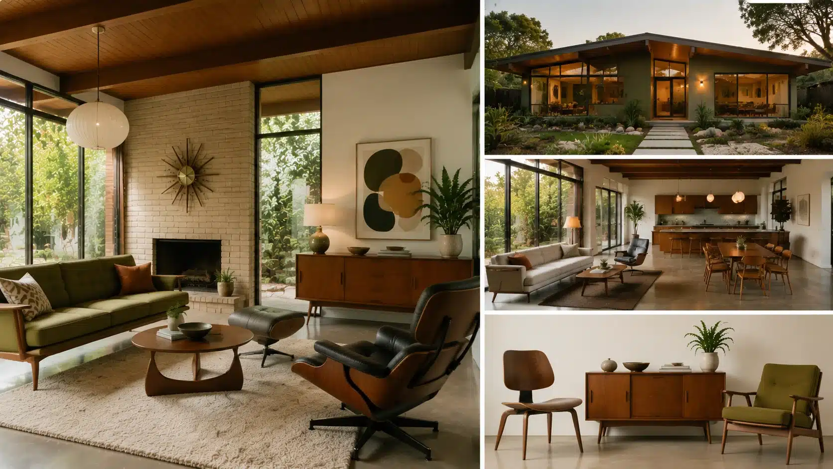
Quick Answer: Mid-century modern is a postwar design movement, roughly 1945 to 1969, built on uncluttered forms, tapered wood furniture, large windows, and open layouts. It values everyday usefulness over ornament, staying warm rather than stark. If you have walked into a room with clean lines and warm wood tones, you have likely seen mid-century modern design. The style gets mixed up with modern and contemporary decor all the time. That confusion makes it hard to know what you are actually shopping for. This blog breaks down what the style means, where it came from, and how it looks in real homes. You will find its history, its defining features, and room-by-room ideas. What Defines Mid-Century Modern Design? Mid-century modern design is defined by a balance of function, simplicity, and visual warmth. The style focuses on uncluttered spaces, practical furniture, and the thoughtful use of materials such as wood, leather, glass, and metal. Each element serves a purpose instead of adding decoration. Furniture features tapered legs, curves, and geometric shapes, while layouts focus on openness and indoor-outdoor connections. The style gained popularity after World War II as designers created practical pieces for changing lifestyles. Its timeless forms and usability keep it relevant in modern homes. The History Behind Mid-Century Modern Design Understanding its history reveals how postwar optimism, new technology, and a handful of designers built a style focused on practical, accessible living. Soldiers returned home, families expanded, and the country needed housing fast. Builders responded with smaller, simpler homes that dropped ornate details in favor of open layouts and clean construction. The Bauhaus School in Germany pushed the idea that design should serve everyday life rather than decorate it. Scandinavian minimal design added warmth through wood and handcraft. The International Style contributed glass walls and a stripped-down structure. Together, these influences gave American designers a starting point they reworked into something distinctly their own. A handful of designers defined the era and still get credit for it today, like: Charles and Ray Eames, this husband-and-wife team pioneered molded plywood and fiberglass furniture, including the Eames Lounge Chair. Eero Saarinen, known for the Tulip Table and Womb Chair, built both around a single sculptural base. Arne Jacobsen, a Danish architect and designer behind the Egg Chair and Swan Chair. Key Characteristics Of Mid-Century Modern Design The style stays easy to recognize through its balance of simplicity, warmth, and function, mixing architectural openness with carefully considered furniture and decor. Clean Lines And Simple Forms: Mid-century modern furniture and architecture rely on straight lines and simple shapes rather than heavy trim or carved details. Natural Materials And Warm Wood Tones: Teak, walnut, and oak appear throughout mid-century furniture, often left with a light finish that highlights the grain. Connection Between Indoor and Outdoor Spaces: Large windows and sliding glass doors were central to mid-century architecture, not just a decorative choice. Organic and Geometric Shapes: The style pairs sculptural, organic pieces, like curved chairs and rounded coffee tables, with more structured geometric forms. Functional Open Spaces: Open floor plans let mid-century homes feel larger than their square footage suggests. Mid-Century Modern Architecture Features Architecture from this era focused on simplicity, natural light, and a strong connection with nature. Mid-century homes used clean structures, open layouts, and materials that made spaces feel larger and more connected. Flat or low-pitched roofs replaced traditional steep designs, creating a simple geometric profile. Floor-to-ceiling windows brought in natural light and connected interiors with outdoor views. Open floor plans removed unnecessary walls between living areas, while post-and-beam construction used exposed supports to create flexible spaces without interior barriers. Indoor-outdoor living became a defining feature, with patios, courtyards, and sliding glass doors extending the home into the surrounding landscape. Famous examples include The Eames House in Los Angeles, which used prefabricated steel components to create an open design, and The Stahl House, known for its glass corners and dramatic city views. How to Create a Mid-Century Modern Home Today You can achieve this timeless look without turning your home into a museum. Combine classic pieces with modern comforts and your own personal taste. Start with One Statement Furniture Piece: Rather than replacing every item in a room, pick one anchor piece to build around. A lounge chair or a vintage credenza can set the right tone. Mix Vintage and Modern Elements: A room filled with vintage pieces can start to look like a theme rather than a home. Pair a contemporary sofa with a vintage-inspired coffee table. Choose Simple Materials: Stick to wood, glass, metal, and natural fabrics when picking new furniture or finishes. These materials echo the original style. Keep Decor Minimal: Mid-century rooms favor fewer well-made pieces over a room packed with accessories. Choose fewer items, but choose ones that serve a purpose. Mid-Century Modern Design Ideas for Different Rooms Each room can take on mid-century style in its own way. Thoughtful furniture, natural materials, and balanced color keep every space comfortable to live in. 1. Mid-Century Modern Living Room A low-profile sofa, a wooden coffee table, and a sculptural floor or table lamp form the backbone of a mid-century living room. Add one accent chair in Sherwin-Williams Cut the Mustard (SW 6384) or Benjamin Moore Hale Navy (HC-154) to break up the base. 2. Mid-Century Modern Kitchen Flat-panel cabinets in Benjamin Moore Swiss Coffee (OC-45) keep the space bright, while a kitchen island in Sherwin-Williams Renwick Olive (SW 2815) adds a period-accurate pop of color. Simple hardware, like slim brass or wood pulls, and open shelving keep the look consistent. 3. Mid-Century Modern Bedroom A platform bed with a low wooden frame anchors this look, especially against walls in Sherwin-Williams Kilim Beige (SW 6106). Add a nightstand or accent wall in Benjamin Moore Hale Navy (HC-154) for depth, then pair it with warm, layered lighting. 4. Mid-Century Modern Dining Room A mid-century dining room pairs a wooden table with sculptural pendant lighting overhead. For drama, paint an accent wall or built-in hutch in Sherwin-Williams Caviar (SW 6990), which grounds the space and lets a walnut table stand out. Pro tip: Balance a dark wall like Caviar with a lighter rug and plenty of natural light so the room does not feel closed in. 5. Mid-Century Modern Bathroom A mid-century bathroom leans on warm wood vanities, simple fixtures, and a spa-like palette. Benjamin Moore Beach Glass (1564) on the walls brings a calm, blue-green tone that pairs well with teak accents and brass hardware. Pro tip: Test Beach Glass on a poster board and move it around the room, since natural light shifts its blue and green undertones through the day. 6. Mid-Century Modern Home Office A simple wooden desk with tapered legs and an ergonomic chair with a molded shell fit the style well. Paint an accent wall in Sherwin-Williams Cavern Clay (SW 7701) behind the desk, and keep trim in Sherwin-Williams Alabaster (SW 7008) for contrast. Common Shades Used in Mid-Century Modern Interiors Color choices in this style pair earthy neutrals with bold accents, creating spaces that feel warm and balanced without ever looking overwhelming. Earthy Neutral Shades Most mid-century rooms start with a neutral base. These shades echo the natural materials used throughout the style and give bolder colors room to stand out. Shades like Benjamin Moore Walnut (CW-240), Sherwin-Williams Kilim Beige (SW 6106), and Sherwin-Williams Renwick Olive (SW 2815) work well on walls, floors, and larger furniture pieces. Bold Accent Colors Against that neutral base, mid-century interiors add pops of color through smaller pieces like chairs, pillows, and art. Shades like Sherwin-Williams Cut the Mustard (SW 6384), Sherwin-Williams Cavern Clay (SW 7701), and Sherwin-Williams Rustic Red (SW 7593) are common choices. Save bold colors for accent chairs, lamps, or artwork. This keeps the space from feeling too busy while still giving it personality. Popular Mid-Century Modern Furniture Pieces Furniture stands out as one of the clearest markers of this style, combining ergonomic shapes, solid craftsmanship, and materials built for everyday comfort. Furniture Piece Design Features Eames Lounge Chair Molded plywood shell with leather cushions Tulip Table Single pedestal base instead of four legs Wishbone Chair Curved wooden frame with a woven seat Credenzas Low, long storage pieces with clean fronts Lounge Sofas Straight lines with exposed wooden legs Exposed legs are one of the easiest ways to spot mid-century furniture. Lifting a sofa or chair off the floor made rooms feel more open, which mattered in smaller postwar homes. Low-profile designs served the same goal. A credenza that sits close to the floor takes up less visual space than a tall cabinet. Mid-Century Modern Vs Modern Vs Contemporary Design Although these styles share a clean look, their history, materials, and design approach differ enough to help individuals choose the right direction. Style Main Difference Mid-Century Modern Warm materials, vintage influence, organic shapes Modern A broader movement focused on simplicity and function without a fixed time period. Contemporary Reflects current trends, which shift as design preferences change Modern design is the umbrella term under which mid-century modern falls, tied to a specific era. Contemporary design changes with the times instead. It describes whatever is currently popular rather than a fixed set of features. Mistakes to Avoid With Mid-Century Modern Design Avoiding a few common mistakes helps keep the style authentic while creating a home that feels comfortable rather than overly staged or dated. Using Too Many Vintage Pieces: Filling a room with original mid-century furniture can make it look like a period set. Mix in newer pieces to keep the space feeling current. Choosing Poor-Quality Reproductions: Cheap reproductions often use thin veneers or weak joinery that wear out quickly. Look for solid-wood construction and quality materials. Making the Space Too Minimal: Mid-century design values simplicity, but a room stripped of all personality can feel empty rather than calm. Leave room for a few personal touches, like art or plants. Ignoring Comfort: Some mid-century pieces prioritize looks over ergonomics. Test seating before buying it, and pair statement chairs with genuinely comfortable options for everyday use. Mixing Too Many Design Styles: Combining mid-century pieces with several other unrelated styles at once can make a room feel disorganized. Choose complementary styles, like a Japandi interior design. Frequently Asked Questions What years are considered mid-century modern? The style generally spans the 1940s through the late 1960s, with its peak popularity in the 1950s and early 1960s. What makes a home mid-century modern? A mid-century modern home typically features an open floor plan, large windows, clean lines, and a strong visual connection to the outdoors through natural light and indoor-outdoor spaces. Is mid-century modern still popular? Yes. The style remains popular because of its timeless designs, functional layouts, natural materials, and ability to blend easily with modern furniture and decor. What colors are used in mid-century modern design? Common colors include warm wood tones, earthy neutrals, olive green, mustard yellow, burnt orange, and muted accent shades, creating a balanced and inviting look. What is the difference between mid-century modern and contemporary? Mid-century modern refers to a specific design movement from the mid-20th century, characterized by recognizable features. Contemporary design refers to current trends and continues to change over time. Why is Mid-Century Modern Design Still Popular? The style continues to draw homeowners because it combines a timeless look, practical layouts, durable materials, and furniture that still works in modern homes. Mid-century modern design has outlasted most decorating trends because its core ideas were never tied to a fad. Clean lines and open layouts work as well in a city apartment as they did in a 1950s suburban home. The style also lines up with a broader shift toward buying fewer, better things. A well-made walnut credenza or an original Eames chair can outlast several generations of mass-produced furniture.
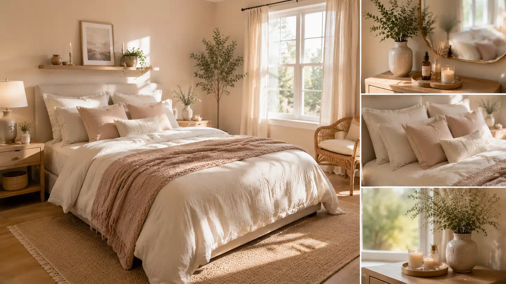
A bedroom should feel like a place where you can slow down, breathe, and reconnect with the person you share it with. Creating a romantic atmosphere doesn’t require expensive furniture or a full renovation. It comes down to a handful of simple choices: soft lighting, comfortable textures, warm colors, and small personal touches that make the room feel like yours. Whether you’re working with a spacious primary suite or a small rented apartment, these romantic, warm, and cozy bedroom ideas are for you. What Makes a Bedroom Feel Romantic, Warm, and Cozy? Before jumping into a list of ideas, it helps to understand the design principles that make a room feel this way in the first place. Most romantic bedrooms share three things: gentle lighting, soft textures, and details that feel personal rather than staged. Soft Lighting Creates a Relaxing Mood: Warm lighting between 2700K and 3000K creates a calming atmosphere. Layer bedside lamps, sconces, and candles rather than relying on harsh overhead lighting. Comfortable Textures Add Warmth: Layer soft bedding, cozy throws, rugs, and fabrics like linen, velvet, cotton, and boucle to add depth, comfort, and a welcoming feel. Personal Details Make the Room Feel Intimate: Add meaningful artwork, favorite books, or shared keepsakes to make the bedroom feel personal, lived-in, and connected to its occupants. Romantic, Warm, and Cozy Bedroom Ideas Once you understand the basics, it helps to see how those principles actually play out in a real room. Below are ideas, each with a few styling tips and a short note on why it works, so you can choose what best fits your space, style, and budget. 1. Layer Soft Neutral Bedding The bed sets the tone for the entire room, so it’s the natural place to start. Soft, neutral bedding in cream, oatmeal, or blush instantly reads as more romantic than bold patterns or stark white sheets, especially once you start layering a few pieces together. Styling Tips Stick to a tonal palette: cream, oatmeal, blush, or soft taupe Layer at least two textures, like linen under a knit throw Add four to six pillows in slightly varying shades for depth Avoid bold patterns that compete with the room’s softness Why It Works: Soft, neutral tones create a calming visual base that feels intimate rather than busy. Layering textures adds richness without adding clutter, which is the balance most romantic bedrooms are built on. 2. Add Warm Ambient Lighting Harsh overhead lighting works against a romantic mood almost every time. Swapping in warm, layered lighting from lamps, sconces, or string lights brings a soft, golden glow that makes a room feel intimate the moment you walk in. Styling Tips Choose warm white bulbs around 2700K over cool or daylight tones Add at least two light sources placed at different heights String lights along a headboard add an easy, romantic touch A dimmer switch gives you flexibility for different moods Why It Works: Warm lighting mimics candlelight and golden-hour sunlight, both of which we naturally associate with relaxation and closeness. 3. Hang Sheer Curtains Sheer curtains add movement, softness, and a slightly dreamy quality to a bedroom, especially when morning light filters through them. Styling Tips Layer sheer curtains behind heavier drapes for flexibility Choose soft white, cream, or blush sheers Hang curtains higher and wider than the window for extra drama Let the fabric pool slightly at the floor for a relaxed feel Why It Works: Sheer fabric diffuses light into a soft, glowing haze rather than harsh direct sun. That gentle movement and glow give the room a quietly romantic quality throughout the day. 4. Decorate with Candles Few things say romantic quite like candlelight. A small cluster of candles on a dresser or nightstand adds warmth and a flickering glow that no light bulb can fully replicate. Styling Tips Group candles in varying heights for visual interest Choose warm scents like vanilla, amber, or sandalwood Flameless candles work well if safety is a concern Place candles on a tray or mirror for extra glow Why It Works: Candlelight is soft, warm, and slightly unpredictable, qualities that read as far more romantic than steady artificial light. A calming scent adds another sense, deepening the overall mood. 5. Add Velvet Accents Velvet feels luxurious and romantic at the same time. A velvet cushion, bench, or headboard adds richness without redoing the whole room. Styling Tips Use velvet in small doses: cushions, a bench, or curtains Deep tones like emerald, burgundy, or navy feel especially romantic Pair velvet with softer fabrics like linen for balance Avoid overusing velvet, since it can feel heavy in large amounts Why It Works: Velvet catches and reflects light in a way that adds depth to a space. Its softness also invites touch, quietly reinforcing the cozy, intimate feeling a romantic bedroom aims for. 6. Create a Statement Headboard A bed without a headboard can feel slightly exposed, even if it’s hard to say why. A tall, upholstered headboard adds drama and an instant sense that the room was put together with intention. Styling Tips Go taller than standard for a more dramatic effect Curved or channel-tufted designs feel especially romantic Soft fabrics like velvet, boucle, or linen work beautifully Keep the wall behind it simple, so the headboard stands out Headboards: A headboard frames the bed and anchors it as the room’s clear focal point. Soft, curved shapes tend to feel more romantic than sharp, angular ones. 7. Use Soft Earthy Wall Colors Soft earthy tones like warm beige, terracotta, sage, or muted clay create a grounded, calming backdrop that feels romantic without leaning into anything too sweet or themed. They pair naturally with warm lighting and natural textures. Styling Tips Test paint samples in your room’s actual lighting before committing Consider an accent wall if a full repaint feels like too much Pair earthy tones with warm wood and soft textiles Avoid stark white trim if you want a softer overall look Why It Works: Earthy tones are rooted in nature, and we tend to associate them with warmth and safety. Unlike bright or cool colors, they create a sense of enclosure that reads as romantic rather than sterile. 8. Add Fresh Flowers Fresh flowers are one of the simplest, most classic ways to add romance to a bedroom. A single stem in a vase or a small bunch on the nightstand brings color, scent, and life into the space. Styling Tips A single stem or small bunch often feels more elegant than a large bouquet Choose soft-toned flowers like roses, peonies, or ranunculus Simple glass or ceramic vases keep the focus on the flowers Dried or faux flowers work well as a low-maintenance alternative Why It Works: Flowers introduce an organic, ever-changing element that static decor can’t replicate. They also add scent, which plays a real role in how romantic a space feels. 9. Style a Cozy Reading Corner A small seating corner, a comfortable chair, a soft throw, and maybe a side table give the bedroom a spot for quiet moments beyond the bed itself. It adds a layer of intimacy that the rest of the room doesn’t. Styling Tips Choose a genuinely comfortable chair, not just a decorative one Add a small lamp for soft, dedicated lighting Layer in a throw blanket and a cushion for extra coziness Keep the corner uncluttered so it feels inviting, not crowded Why It Works: A seating area separate from the bed adds depth to the room beyond sleeping. It also creates a natural spot for connection, whether that’s quiet reading or a shared cup of coffee. 10. Layer Rugs for Extra Warmth Layered rugs add warmth underfoot and visual depth to a room, softening hard flooring while adding texture. Layering a smaller textured rug over a larger neutral one creates a cozy, intentional look. Styling Tips Choose a large neutral base rug and a smaller accent rug on top Stick to soft, warm tones for a romantic feel Position rugs so they extend beyond the bed frame Mix textures, smooth and woven, for added depth Why It Works: Layered rugs add visual interest and warmth while grounding the furniture on top of them. Soft textures underfoot enhance the room’s overall sensory coziness. 11. Install Wall Sconces Wall sconces free up nightstand space while adding a soft glow on either side of the bed. It’s a small upgrade that instantly reads as more considered than basic table lamps. Styling Tips Plug-in sconces are an easy option if rewiring isn’t possible Choose warm metal finishes like brass or aged gold Mirror sconces on both sides of the bed for symmetry Pair with dimmable bulbs for extra flexibility Why It Works: Sconces add light at a flattering height without taking up surface space, so nightstands feel less cluttered. The soft glow also adds a sculptural element to the wall. 12. Hang Soft, Romantic Artwork Soft, muted artwork, florals, abstract shapes, or gentle landscapes add warmth and personality to bare walls without feeling overly themed. A single well-chosen piece often does more than a gallery wall of mismatched frames. Styling Tips Choose soft, muted color palettes that complement your walls Group smaller pieces in odd-numbered clusters Mix frame finishes for subtle variety Hang art at eye level when seated on the bed Why It Works: Art adds an emotional layer to a space, giving your eyes something meaningful to land on. Soft, romantic artwork reinforces the overall mood without competing with anything else in the room. 13. Add a Canopy Look A canopy, whether it’s a full frame or simple draped fabric, adds an undeniable sense of romance and drama to a bedroom. It frames the bed in a way that feels a little like a private world of its own. Styling Tips A curtain rod with draped sheer fabric works as a budget canopy Choose soft, lightweight fabrics that move easily Add fairy lights along the canopy frame for extra warmth Keep the rest of the room simple so the canopy stands out Why It Works: A canopy adds height and softness, drawing the eye upward and creating a sense of enclosure around the bed. That feeling of a room within a room is inherently intimate. 14. Use Natural Wood Furniture Natural wood furniture adds warmth and an organic, grounded feel to a bedroom, pairing beautifully with soft textiles and warm lighting. It also tends to age gracefully, gaining character rather than losing it. Styling Tips Mix wood tones intentionally rather than matching everything Look for secondhand or vintage pieces to save money Pair with brass or matte black hardware for an elevated look Keep surfaces relatively clear to let the wood grain show Why It Works: Wood introduces an organic, slightly imperfect element that contrasts nicely with smooth, manufactured surfaces. It reads as warm both visually and physically. 15. Add a Faux Fur Throw A faux fur throw draped over the bed or a chair adds an instant layer of softness and a small sense of indulgence. It’s the kind of detail that practically invites you to touch it. Styling Tips Drape loosely rather than folding it too neatly Choose cream, blush, or gray tones for a romantic feel Pair with other textures like linen or velvet for contrast Use on a chair or bench if bed space is limited Why It Works: Texture plays a big role in how luxurious a space feels, and faux fur is about as tactile as it gets. Its softness invites touch, reinforcing the room’s cozy, sensory feel. 16. Choose Blush and Cream Tones Blush and cream are about as classic as romantic color palettes get, and for good reason. These soft, warm tones feel gentle and intimate without tipping into anything overly themed. Styling Tips Use blush in smaller doses: pillows, throws, or art Pair with cream and warm white for balance Add brass or gold accents to elevate the palette Avoid using blush as the dominant wall color if you want subtlety Why It Works: Blush and cream sit close together on the color wheel, creating a soft, cohesive look without much contrast. That tonal closeness reads as gentle rather than bold or attention-grabbing. 17. Add Floating Shelves With Personal Touches Floating shelves are a great way to display small, meaningful items, such as a candle, a framed photo, or a small plant, without taking up floor space. They add personality to walls that might otherwise stay empty. Styling Tips Limit each shelf to three or four items for a curated look Mix heights and textures: a candle, a small frame, a plant Choose shelves in wood or matte black for versatility Leave some negative space rather than filling every inch Why It Works: Floating shelves add vertical interest and a personal touch without crowding the floor. Styled thoughtfully, they create small vignettes that feel intentional rather than generic. 18. Switch to Linen Bedding Linen bedding has an effortlessly relaxed, slightly rumpled look that feels romantic in a natural, lived-in way. It’s the opposite of stiff, overly formal bedding, and that’s part of the charm. Styling Tips Choose linen in soft neutral or muted tones Embrace the natural wrinkles rather than fighting them Pair with a few structured pillows for balance Wash linen regularly to keep it soft and fresh Why It Works: Linen’s natural texture and slight imperfections give a room a relaxed, lived-in feel that reads as more authentic than overly stiff bedding. 19. Add Warm Metal Accents A few gold or brass accents- picture frames, candle holders, a mirror frame- add warmth and a touch of glamour without overwhelming the space. They pair beautifully with soft, neutral palettes. Styling Tips Stick to one metal tone, gold or brass, for cohesion Use warm metal accents sparingly; a few well-placed pieces are enough Pair with soft neutrals or blush tones for balance Mirrors and candle holders are an easy starting point Why It Works: Warm metals reflect light beautifully, adding a subtle sparkle that feels elegant rather than flashy. In small doses, they elevate a room without shifting the mood away from cozy. 20. Keep the Room Clutter-Free This last idea isn’t about adding anything; it’s about editing. A clutter-free bedroom feels calmer, more intentional, and ultimately more romantic, since clutter pulls focus away from the details. Styling Tips Clear the surfaces of everyday clutter before bed each night Use baskets or drawers to hide functional items Limit decor to a few meaningful pieces per surface Do a quick reset of the room each morning Why It Works: Clutter keeps the brain subtly on edge, even if you’re not consciously aware of it. A clear, calm space lets the cozy details you’ve added actually stand out. 21. Use a Vintage or Antique Mirror An antique-style or curved mirror softens the hard lines of a bedroom while adding a gentle decorative note, even before it reflects any light. Styling Tips Look for curved or ornate frames over plain modern edges Place a mirror opposite a window to brighten the room Pair with a small tray or candle for extra glow Choose a size proportional to the wall it’s hung on Why It Works: A mirror with character adds a sense of history that a plain modern one can’t. Placed well, it also bounces light around the room, making it feel brighter and more open. 22. Add Scent with Diffusers and Sprays The smell of a bedroom shapes its mood more than most people realize. Soft floral scents or soothing woody notes, such as sandalwood, are always a safe, romantic choice. Styling Tips Use an essential oil diffuser for a subtle, consistent scent Choose calming notes like lavender, vanilla, or sandalwood A light mist of linen spray on the sheets adds a fresh touch Always keep candles attended if using them for scent Why It Works: Scent is one of the most overlooked design tools, yet it shapes how inviting a room feels the moment you walk in, layering in a sense that visuals alone can’t reach. 23. Choose Dimmable Lighting Fixed, bright lighting rarely feels romantic, no matter what else is in the room. A dimmer switch lets the space shift from bright and functional in the morning to soft and relaxed at night. Styling Tips Add dimmers to both overhead and lamp lighting where possible Pair with warm bulbs for the softest possible glow Keep at least one light source low and warm for evenings Test brightness levels at night before finalizing your setup Why It Works: The ability to adjust brightness gives you control over the room’s mood throughout the day, rather than being stuck with one fixed setting that may not fit the moment. 24. Layer in Natural Fiber Textures A jute or wool rug, a woven basket, or a natural-fiber lampshade adds an earthy softness that grounds the room. These textures pair naturally with wood furniture and warm color palettes. Styling Tips Choose a jute or wool rug for warmth underfoot Add a woven basket for blankets or extra storage Mix in a rattan or wicker accent piece for texture Keep the rest of the palette neutral, so textures stand out Why It Works: Natural fibers add visual and physical texture that manufactured finishes rarely match, giving the room an organic, grounded feel that supports the overall coziness. 25. Bring in Rattan and Woven Accents A rattan headboard, chair, or mirror frame adds a relaxed, natural quality that feels collected rather than store-bought. It’s an easy way to soften a room that leans a bit too modern or stark. Styling Tips Start with one rattan piece, like a chair or mirror Pair with soft textiles to balance the texture Avoid overusing rattan, since it can start to feel busy Mix with wood tones for a cohesive, natural look Why It Works: Woven, natural materials add texture and warmth without visual weight, keeping a romantic room feeling light rather than heavy. 26. Mix Patterns Through Throw Pillows A few well-chosen throw pillows in mixed patterns and textures add depth and personality to the bed without requiring a full bedding overhaul. Styling Tips Stick to a shared color family across all patterns Mix scales: one large print, one small print, one solid Use an odd number of pillows for a more natural look Swap seasonally to refresh the room without much cost Why It Works: Layered patterns catch the eye without overwhelming it, as long as the color palette stays consistent. It’s an easy, low-cost way to add richness to the bed. 27. Keep the Style Personal, Not Perfect The most romantic bedrooms rarely look like they came straight out of a showroom. A few personal, slightly imperfect touches, a favorite photo, a well-loved book, a plant that’s a little overgrown. Styling Tips Choose a few meaningful objects over a lot of generic decor Let one or two items show some wear or history Avoid matching every single element too perfectly Update small details seasonally to keep the room feeling lived-in Why It Works: A slightly imperfect, personal room feels warmer and more romantic than one that looks staged, since it reflects the people who actually live there rather than a catalog page. Tips to Make a Bedroom More Romantic A romantic bedroom doesn’t need to come with a large price tag. Small, budget-friendly swaps can shift the entire feel of the room, and the best updates often depend on how much space you’re actually working with. A larger bedroom has more room for layered pieces, while a smaller bedroom usually gets the most impact from one or two well-chosen changes. The table below breaks down simple, affordable options for each. Tips For Larger Bedrooms Update Budget-Friendly Option Lighting Add a floor lamp plus warm bedside lamps Bedding Layer a duvet, throw, and extra pillows Walls Framed artwork above the headboard Decor Fresh headboard and a small reading corner Furniture Rearrange pieces to create two zones Tips For Smaller Bedrooms Update Budget-Friendly Option Lighting Warm bulbs and one wall-mounted sconce Bedding Add a textured throw or extra pillows Walls Removable wallpaper or a single mirror Decor A candle and a small vase of flowers Furniture Rearrange the pieces you already own None of these updates require a big investment, and even one or two changes from the tables above can make a noticeable difference in how warm and romantic the room feels. Pro tip: Start with lighting and bedding first. They have the biggest visual impact for the least money. What to Avoid While Designing a Romantic Bedroom Even a well-decorated bedroom can lose its warmth if a few common mistakes creep in. Using only cool white lighting gives the room a harsh, clinical appearance that works against a romantic mood. Adding too many decorative items makes the space feel crowded rather than calm, which pulls attention away from the room’s overall warmth. Choosing style over comfort can leave a bedroom looking good in photos but feeling so stiff that it’s hard to relax. A romantic bedroom should prioritize rest. Ignoring bedding quality is an easy mistake to make, since the bed is the main visual and functional element in the entire room. Worn or mismatched bedding undercuts every other design choice. Frequently Asked Questions What colors make a bedroom feel romantic? Warm neutrals, muted pinks, deep reds, and earthy shades create a softer, more intimate bedroom atmosphere than cool or stark tones. How can I make my bedroom cozy without new furniture? Use lighting, layered bedding, curtains, a rug, and small decor changes to add warmth without replacing any major furniture pieces. What lighting is best for a romantic bedroom? Warm bulbs between 2700K and 3000K give off a soft glow that feels comfortable and relaxing rather than harsh or clinical. How can I make a small bedroom feel romantic? Use soft textures, warm lighting, a well-placed mirror, and simple decor choices to add coziness without crowding the room. Future Trends for a Romantic Bedroom A romantic bedroom isn’t defined by how much you spend. It comes down to a feeling, built from warm light, soft textures, and a few personal touches that make the space feel like your own. Looking ahead, expect romantic bedroom design to lean further into warm, low-glare lighting, natural materials, and softer, more textural fabrics as people continue favoring calm, restorative spaces over trend-driven looks. Start small if you need to. Swap the bulbs, add a throw, or bring in one piece of art, and let the rest follow.
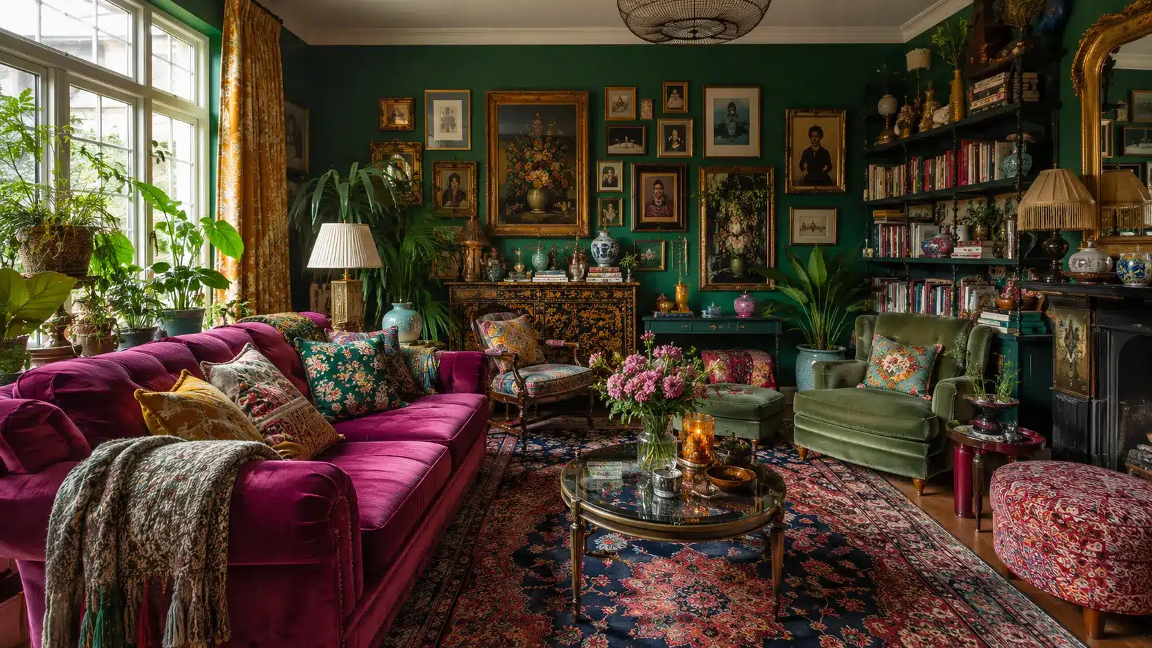
At some point, decorating started to mean taking things away. People were told to pare things back, stick to neutral colors, and hide their belongings. But for some homeowners, that approach never really felt right. Maximalist interior design takes a different approach. The colors you love should be on display. Your books go on the shelves. Ceramics, souvenirs from your travels, and even that inherited lamp that does not match anything all have a place in this style. The difference between a successful maximalist room and one that feels chaotic is all about intention, not just how much you have. Repeating colors, paying attention to scale, and sticking to a loose but consistent palette help keep a busy room feeling balanced. In this blog, you will learn about the history of maximalism, what makes it work, and how you can bring it into your own home step by step. What is Maximalist Interior Design? Maximalist interior design is a style that uses color, pattern, furniture, art, lighting, books, and personal objects to build a full, expressive room. It is often linked to the more-is-more idea, but the best maximalist rooms are still edited and thought through, with nothing added just to fill space. Bold color plays a big part, with deep, rich shades used across walls, furniture, and decor. Layered patterns and room layout ideas help florals, stripes, checks, and prints work together in the same room. Personal objects like books, art, and collections are displayed rather than hidden away. The result is a full room that still feels planned and intentional, never chaotic. A Brief History of Maximalist Interior Design Maximalist interior design is not new. Its roots can be traced to Victorian homes, Baroque interiors, Art Deco, and Hollywood Regency, where rich colors, ornate furniture, layered fabrics, and detailed artwork created dramatic spaces. Modern maximalism keeps that love of detail but focuses more on personality than wealth. Custom furniture, vintage pieces, modern lighting, travel finds, family heirlooms, and meaningful decor often appear together. The style made a strong comeback in the 1980s as bold colors and patterns returned to fashion. More recently, platforms like Pinterest and Instagram have helped popularize maximalism by showcasing colorful, layered homes to a wider audience. Key Features of Maximalist Interior Design These are the building blocks that give a maximalist room its bold, layered look. Most maximalist spaces use a mix of the features below. 1. Bold Colors: Maximalist rooms lean on jewel tones, bright paint, and deep, saturated shades. Some homeowners even paint the ceiling or a piece of furniture in a strong color to add contrast and make the room feel finished rather than flat. 2. Pattern Mixing: Florals, stripes, animal print, checks, and geometric patterns can all live in the same room. The trick is a shared color. When two patterns share at least one color, they read as a choice instead of a clash. 3. Layered Textures: Velvet, wood, metal, glass, wool rugs, cushions, wallpaper, curtains, and woven baskets all add texture. Mixing soft and hard materials gives a room depth, so it feels rich instead of flat. 4. Statement Furniture: A bold sofa, a patterned accent chair, a large coffee table, a vintage cabinet, or a sculptural side table can anchor an entire room. One strong piece often does more work than several small ones. 5. Gallery Walls and Art: Framed prints, paintings, mirrors, photos, and small wall objects grouped together build one of the most recognizable maximalist looks. A gallery wall turns empty space into a focal point. 6. Books, Collections, and Personal Objects: Shelves of books, ceramics, travel souvenirs, inherited decor, and plants give a maximalist room its personal feel. These pieces are what make the space feel like it belongs to one person, not a showroom. 7. Decorative Lighting: Chandeliers, colorful lampshades, table lamps, and wall sconces layered together add warmth and depth. Good lighting also keeps a full room from feeling dark or heavy. Why is Maximalist Interior Design Popular? Maximalist interior design is popular because it feels personal, warm, and creative. It gives homeowners permission to display what they love rather than hide everything away in storage. This style works especially well for people who enjoy color, vintage finds, art, books, and rooms that feel lived-in rather than staged. It also appeals to those tired of matching furniture sets and bare walls. Many people see their homes as a form of self-expression, and maximalism supports that idea. Social media has helped too, since bold, layered rooms tend to stand out and get shared more often. Stunning Maximalist Interior Design Ideas These ideas are an easy starting point if you want to bring maximalist style into a room without a full renovation. Each one works at a different budget, so you can pick where to start. 1. Use Bold Wallpaper Floral, tropical, geometric, vintage, or mural-style wallpaper can transform a plain room into a statement space in one step. Budget: Medium, averaging $50-$150 per roll of wallpaper. 2. Add Colorful Painted Furniture A cabinet, dresser, or sideboard painted in a deep teal, blue, green, or another saturated shade can bring character to the room while making older furniture feel fresh. Budget: Low to Medium, averaging $50-$300 depending on the furniture. 3. Mix Vintage and Modern Pieces Old furniture, modern lighting, and new decor can sit together in the same room without clashing, as long as a color or material ties them together. Budget: Medium, averaging $150-$600 per piece when buying secondhand or vintage. 4. Choose a Statement Sofa or Chair A velvet sofa, a patterned accent chair, a curved silhouette, or a bold color instantly creates a strong focal point. Budget: High, averaging $800 to $2,500 for a statement sofa, or $300 to $800 for an accent chair. 5. Layer Rugs, Cushions, and Curtains Textiles make a room feel warmer and fuller. Stacking a patterned rug under a plain one or piling different cushion prints together creates that layered maximalist look. Budget: Low to Medium, averaging $200 to $600 for a rug, cushions, and curtains combined. 6. Style Open Shelves Arrange books, ceramics, plants, candles, and photos with care so the shelf feels curated, not cluttered. Budget: Low, averaging $50 to $200 using items you already own plus a few new pieces. How to Start with Maximalist Interior Design Getting started does not mean redoing your whole home at once. These steps walk you through building the look gradually, so the room stays balanced instead of overwhelming. 1. Start with One Room Begin with a bedroom, living room, powder room, or reading corner instead of the whole house at once. This gives you a low-pressure space to test colors and patterns before committing further. 2. Choose a Color Palette Pick three to five main colors so the room feels connected, even with lots of pattern and decor. Write the colors down and refer back to them before buying anything new. 3. Pick One Statement Piece A large artwork, a bold rug, a patterned sofa, or a painted cabinet can serve as the anchor around which everything else builds. Choose this piece first, then build the rest of the room around its colors. 4. Add Layers Slowly Maximalism works best when it is collected over time. Rooms that are bought all at once often feel less personal than rooms built piece by piece. Give yourself permission to leave a corner unfinished while you look for the right piece. 5. Repeat Colors Around the Room Carry the same one or two colors through pillows, art, rugs, and lamps so the space feels tied together rather than scattered. This repetition is what makes a busy room read as designed instead of random. 6. Leave Breathing Space Keep walkways clear and avoid covering every surface. Empty space gives the eye somewhere to rest, which keeps a full room from feeling overwhelming. The Best Spaces to Embrace Maximalist Design Maximalist style can work throughout the home, but some rooms offer more freedom for bold colors, layered patterns, artwork, and personal collections. 1. Living Room Works well with gallery walls, patterned rugs, colorful sofas, books, plants, and layered lighting. This is often the room guests see first, so it can carry the boldest statement pieces. 2. Bedroom Works well with bold bedding, wallpaper, painted furniture, table lamps, and cozy textures. Keep the palette a little softer here so the room still feels restful at night. 3. Dining Room Great for statement lighting, dramatic wallpaper, mismatched chairs, and artwork. A bold dining room tends to feel more special for gatherings and meals. 4. Powder Room A small space where bold wallpaper, mirrors, and color can make a big impact without a big budget. Since guests only pass through briefly, it is a low-risk place to try a daring pattern. 5. Home Office Ideal for shelves, art, books, personal collections, and colors that feel creative rather than corporate. A layered, personal space here can make long work hours feel less sterile. Maximalist vs Minimalist: Two Opposite Design Philosophies These two styles sit at opposite ends of the interior design spectrum, so the differences are easy to see side by side. Style idea: Maximalism believes more is more, while minimalism believes less is more. Color: maximalism leans bold, rich, and mixed, while minimalism stays neutral, soft, and limited. Decor: maximalism is layered and personal, while minimalism is simple and reduced. Walls: maximalism favors art, wallpaper, and gallery walls, while minimalism keeps them clean, plain, and open. Mood: maximalism feels lively and expressive, while minimalism feels calm and quiet. Best for: maximalism displays personality, while minimalism creates visual calm. The Truth Behind Common Maximalist Design Myths Maximalist interior design is often misunderstood. Here are some common myths, cleared up. 1. Maximalism means clutter: Good maximalism is still planned. Every piece earns its place, even in a full room. Nothing gets added just to fill space. 2. It’s only for wealthy homes: Modern maximalism focuses on personality, not wealth. Homeowners mix vintage furniture, travel finds, and family heirlooms instead of buying everything new. 3. Patterns always clash in a maximalist room: Patterns feel intentional when they share at least one color. Florals, stripes, and checks can sit together without looking chaotic. 4. You have to fill every surface: Maximalist rooms still need breathing space. Keep walkways clear and leave some areas empty so the eye has somewhere to rest. 5. You need to buy everything at once: Maximalism works best when collected over time. Rooms built piece by piece often feel more personal than rooms bought all at once. Common Mistakes to Avoid with Maximalist Interior Design These are the most common ways a maximalist room can tip from bold into overwhelming. Mistake Why It Hurts the Room Adding too many unrelated items Every piece should connect through color, style, memory, or purpose Ignoring scale Too many oversized pieces can make a room feel cramped instead of full Mixing patterns without a color link Patterns feel intentional when they share at least one color Forgetting function A room should still be comfortable and easy to move through Not using enough lighting Layered rooms need enough light so they do not feel dark or heavy Final Thoughts Maximalist interior design is about bold color, layered detail, and personal expression. It’s popular because it feels warm and creative, giving homeowners permission to display what they love instead of tucking it away in storage. That’s why the style resonates with anyone drawn to color, vintage finds, art, books, and rooms that feel lived-in rather than staged. The best maximalist rooms feel full but thoughtful, built around repeated colors, useful furniture, and meaningful objects that make a space feel like home. Frequently Asked Questions Why Does Gen Z Like Maximalism? Gen Z likes maximalism because it supports self-expression, nostalgia, bold colors, and decorating with meaningful vintage or thrifted items. Which Interior Style Is Currently Trending? Maximalism is a leading 2026 interior trend, especially in spaces featuring layered patterns, rich colors, vintage details, and personal collections. What Design Style Is Shea McGee? Shea McGee’s “New Heritage” style combines classic architectural details, clean modern lines, warm materials, neutral colors, and layered textures. What is Y2K Interior Design? Y2K interior design recreates the late-1990s and early-2000s look using chrome, clear plastic, bright colors, curved furniture, and futuristic details. What Design Style is Jonathan Adler? Jonathan Adler is known for a playful modern style that blends mid-century furniture, bold colors, luxurious materials, and eye-catching decorative pieces.
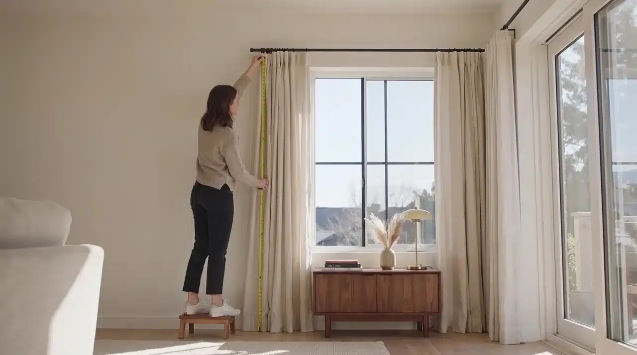
Quick Answer: Measure hardware placement first, calculate fabric width using your fullness multiplier, then determine drop length. Always measure at multiple points since walls aren’t perfectly even. Use a metal tape measure for best accuracy. A curtain that’s too short or narrow can make a room look unfinished, even with perfect fabric and color. Getting the fit right takes more than measuring your window. Measure the rod or track, decide the length, and factor in fullness before you buy. Hanging curtains the right way also matters. Skip these steps, and you risk gaps, thin panels, or curtains that don’t hang right. If you sew your own panels, knowing how to sew curtains matters as much as measuring them. Knowing how to measure for curtains helps you pick panels that fit your window and style. A few extra minutes with a tape measure save you from a costly reorder. Tools Needed to Measure Curtains You do not need special equipment to measure curtains. A few basic tools will get you accurate numbers: Metal tape measure: more rigid and accurate than fabric tape Step ladder: needed to reach rods mounted above eye level Pencil: to mark bracket positions on the wall Notebook or phone notes: to record measurements as you go Level (optional): to check that your rod brackets sit evenly Pro tip: Measure every window separately, even in the same room. Windows that look identical often have small differences of half an inch or more, especially in older homes. How to Measure for Curtains Step by Step Measuring for curtains is straightforward when you follow the right order. These four simple steps will help you get accurate measurements for a perfect fit and a professional-looking finish. 1. Decide Where the Curtain Rod or Track Will Go Measure only after you know where the rod will sit. Placement affects every number that follows. The standard rule is to mount the rod four to six inches above the window frame. Extending it beyond the frame on each side, usually four to ten inches, lets curtains stack fully open without blocking the glass. Expert recommendation: Place the rod several inches above and wider than the window frame, depending on your room style and available wall space. A higher rod also makes ceilings look taller, which is a common trick in small rooms. 2. Measure Curtain Width Curtain width follows this formula: Curtain width = Rod or track width × fullness ratio For example, a 60-inch rod × 2 fullness = 120 inches of fabric. If using two panels, each panel should be 60 inches wide. The extra width creates the folds for a fuller, more elegant look. Fullness is the extra fabric that creates soft folds when curtains are closed. Without it, curtains look flat and stretched, like a bedsheet pinned to a rod. Curtain Style Recommended Fullness Sheer curtains 2 to 3 times the width Standard curtains 1.5 to 2 times the width Heavy curtains 1.5 to 2 times the width Minimal look Around 1.25 times the width Never buy curtains equal to your window width. They will hang flat and stretched when closed, with no drape or texture at all. 3. Measure Curtain Length Curtain width is calculated by multiplying the rod or track width by your chosen fullness ratio. Fullness is the extra fabric that creates soft, natural folds instead of a flat appearance. Sheer curtains typically need 2–3× the rod width, while standard and heavy curtains look best at 1.5–2×, and minimalist styles around 1.25×. Avoid choosing curtains that match the exact width of your window or rod, as they will hang flat with little texture or drape when closed. 4. The Curtain Heading Style Your curtain heading style affects where you begin measuring, so it’s important not to overlook it. Eyelet curtains are measured from the top of the rod; rod pocket curtains require extra allowance for the fabric gathered above the rod; Tab-top curtains include the loop height; pinch-pleat curtains are measured from the hook position; and ring-top curtains start from the ring attachment point. Measuring from the wrong point can leave curtains hanging too high or dragging on the floor. Common Curtain Measuring Mistakes to Avoid Measuring the Window Instead of the Rod: This is the single biggest reason curtains look too narrow once hung. Measure curtains against the hardware, not the glass. Forgetting Fullness: Curtains need extra fabric width to form folds. Skipping this step leaves panels looking flat and stiff. Measuring Only One Side: Always check both width and height at multiple points. Walls and floors are rarely perfectly even. Ignoring Curtain Hardware: Rings, hooks, and clips all add height to your curtain’s starting point, which changes your final length. Buying Before Measuring: Ready-made curtain sizes vary between brands. An “84-inch” panel from one retailer is not always the same as one from another. How Curtain Length Changes the Look of a Room The exact drop length you choose changes the entire feel of a room, not just the fit. Floor Kiss: Curtains barely touch the floor, creating a tailored, clean look that suits modern spaces. Slight Break: A small amount of extra fabric folds gently at the bottom, giving a relaxed, lived-in appearance. Puddle Length: Extra fabric pools on the floor for a traditional, formal style, often used in dining rooms or living rooms. Homes with pets or young children usually do better with a floor-kiss or slightly shorter length, since puddled fabric collects dust and gets underfoot. High-traffic areas, such as hallways or entryways, also benefit from curtains that clear the floor rather than drag along it. Final thoughts Proper curtain measurements are the foundation of window treatments that truly complete a room. By measuring your hanging hardware first, calculating the width based on your desired fullness ratio, and selecting an appropriate drop length, you ensure the panels hang perfectly. Whether you’re hanging ready-made curtains or learning how to sew curtains from scratch, accurate measurements are essential. The right proportions transform a window from merely covered to elegantly finished. Taking time to measure correctly now prevents costly mistakes and ensures your curtains look professionally installed. These fundamentals apply whether you’re a beginner or an experienced sewer, making them indispensable for any curtain project. Frequently Asked Questions How Do You Measure What Size Curtains You Need? Measure the curtain rod width, choose a fullness ratio, then measure the drop from the rod to your desired curtain length. How Wide Should Curtains Be For a 54-Inch Window? Aim for a total curtain width of 81–108 inches (1.5–2× the width of the window) for a full, balanced appearance. What Size Curtains Do I Need For a 36-Inch Window? Choose curtains with a total width of 54–72 inches and measure the length from the rod to your preferred endpoint.
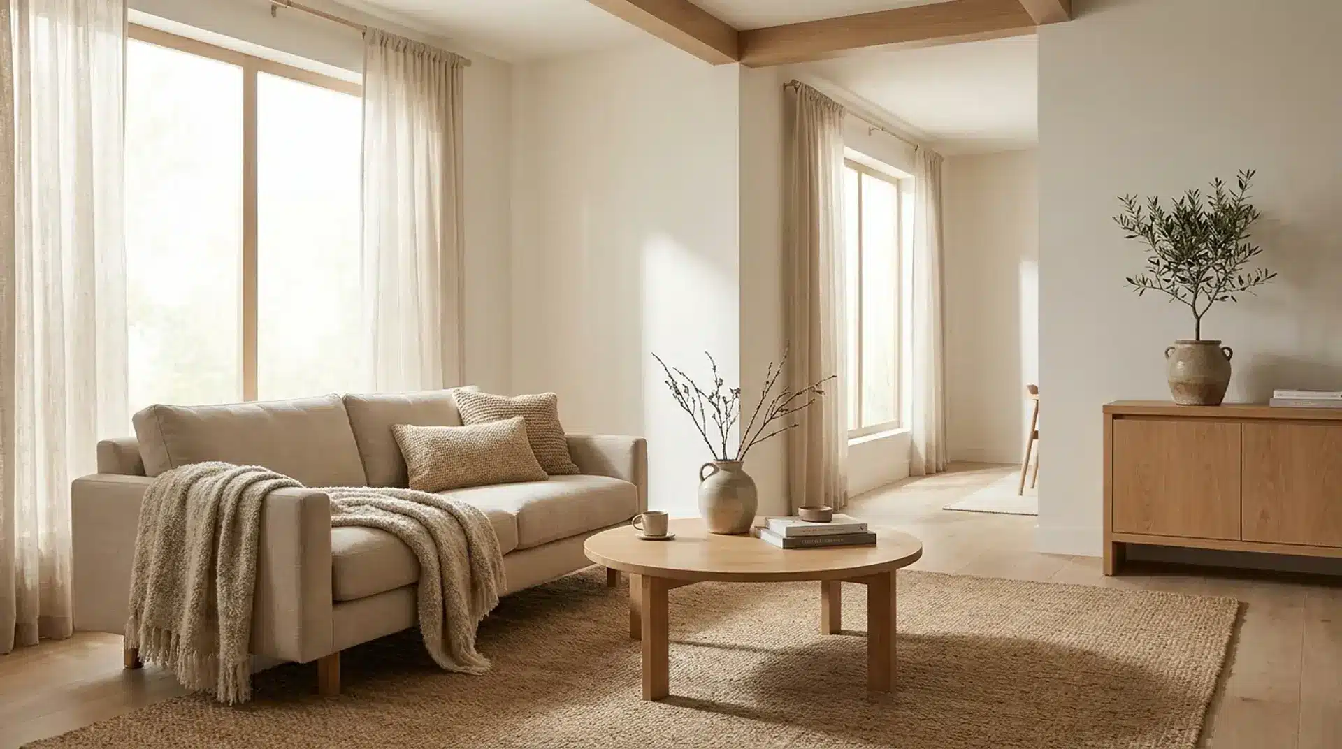
Quick Answer: Japandi interior design pairs natural materials like wood, stone, and linen with low-profile furniture and muted, earthy colors, favoring fewer well-crafted pieces over decoration to create rooms that feel simple, grounded, and purposeful. Japandi interior design blends Japanese minimalism with Scandinavian warmth to create rooms that feel calm, orderly, and lived in at the same time. It is not about buying matching furniture sets or copying a mood board. It is a way of choosing fewer, better objects and letting natural light, wood, and texture do the talking. If you have seen a room with low furniture, warm neutral walls, and a single ceramic bowl on a shelf, you have already seen Japandi in action. This blog breaks down where the style comes from, how to build its color palette, what materials and furniture belong in it, and how to apply it room by room, along with common mistakes people make along the way. What is Japandi Interior Design Japandi is a design style that merges Japanese wabi-sabi philosophy with Scandinavian hygge, creating homes that are simple, functional, and quietly warm. The word itself is a mashup of “Japanese” and “Scandi,” and design writers trace its rise in popularity to around 2017, when interest in slow living and decluttered spaces began to build momentum. Wabi-sabi is the Japanese idea that beauty exists in imperfection and the natural aging of things, such as a hand-thrown bowl with an uneven glaze. Hygge, the Danish concept, focuses on coziness, soft lighting, and creating a sense of comfort in everyday life. This fusion style has evolved from a niche trend into a mainstream approach used by architects and homeowners alike. Important Note: Japandi is not simply a beige room with wooden furniture. It is also not about making a space completely empty, filling it with Japanese-inspired decor, or using only light colors and minimalist furniture. The Core Principles of Japandi Style Before picking paint colors or furniture, it helps to know the values that hold the whole style together. These principles appear in every well-designed Japandi space and closely reflect the focus on natural materials, longevity, and mindful choices found in sustainable interior design. Intentional simplicity: Every object earns its place. Nothing sits in a room just for the sake of decoration. Natural materials: Wood, stone, linen, cotton, wool, and ceramic dominate, while plastic and glossy synthetic finishes are kept to a minimum. Muted, earthy colors: Warm neutrals and soft greens replace bright primaries and high-contrast feature walls. Craftsmanship over mass production: Handmade ceramics, joinery furniture, and woven textiles bring in small, honest imperfections. Functional beauty: A piece has to be both useful and attractive. If it fails either test, it will not be admitted to the room. Once these principles are clear, choosing furniture and colors becomes much easier because you filter every decision through the same short list of questions. Japandi vs Scandinavian vs Minimalist vs Wabi Sabi These four terms are often used interchangeably online, but they are not the same, and knowing the difference helps you shop and design with more confidence. Style Color Tone Furniture Key Idea Japandi Warm neutrals with earthy, darker accents Low, grounded, natural wood Balance of Japanese calm and Nordic comfort Scandinavian Bright whites, pale woods, occasional pastel pops Sleek, functional, light-colored Hygge, coziness, and long-winter brightness Minimalist Often stark white, gray, or black Sparse, sometimes industrial Reduction to the essential, less focus on warmth Wabi Sabi Muted, earthy, imperfect finishes Rustic, aged, handmade Beauty found in imperfection and aging Japandi: A balanced blend of Japanese minimalism and Scandinavian warmth, focused on natural materials, functionality, and understated comfort. Scandinavian: A bright, cozy design style that emphasizes light colors, clean lines, and practical furniture to create inviting, functional spaces. Minimalist: This approach removes unnecessary elements, prioritizing simplicity, clean forms, and only the essentials. Wabi-Sabi: A Japanese philosophy that celebrates imperfection, natural aging, and the quiet beauty found in handmade and weathered objects. As comparison guides from sites like 2Modern point out, Scandinavian rooms tend to be lighter and brighter, while Japandi leans into deeper, moodier contrast alongside its neutral base. Important Note: If bright, airy, and mostly white sounds like your taste, Scandinavian design may suit you better, while Japandi is the stronger fit if you want warmth paired with a bit of shadow and depth. The Best Colors for a Japandi Interior The Japandi color palette sits between the bright whites of Scandinavian design and the deeper, moodier tones found in traditional Japanese interiors. The right color choices play an important role in residential interior design, helping to create the warm, natural feel that Japandi spaces are known for. 1. Base Neutrals These soft, natural shades create a calming foundation that allows wood, stone, and textured fabrics to take center stage while keeping the room bright and balanced. Warm whites, sandy beige, taupe, and soft gray form the foundation for walls, ceilings, and larger furniture pieces. The word “warm” matters here, since a cool, blue-toned gray can clash with wood tones and make a room feel clinical rather than grounded. 2. Earthy Accents These nature-inspired tones add warmth and personality in small doses, bringing a sense of the outdoors into the space without disrupting its peaceful simplicity. They bring depth to neutral interiors through cushions, ceramics, artwork, and other handcrafted details without overwhelming the minimalist Japandi aesthetic. Use muted sage green, olive, clay, and terracotta sparingly on cushions, ceramics, or a single accent wall to bring in a bit of nature without overwhelming the palette. 3. Grounding Darks These deeper shades provide contrast and structure, helping define key features while adding depth to the otherwise light and neutral Japandi palette. Charcoal, espresso brown, and matte black show up in hardware, furniture frames, or dining tables to add contrast and keep the room from feeling flat. Keep finishes matte rather than glossy, since high shine reads as artificial and works against the natural, aged feel the style is going for. Japandi Design Materials, Furniture, and Textural Elements Materials are not just surfaces in a Japandi home, they are part of the design itself. The wood grain, the weave of a linen curtain, and the glaze on a ceramic vase are meant to be seen and felt, not hidden. 1. Wood and Natural Fibers Light oak, ash, walnut, bamboo, and rattan bring subtle variations in grain and texture while maintaining a clean aesthetic. Organic textiles like linen, cotton, hemp, and wool add softness to rugs, curtains, and upholstery. Natural fiber rugs typically range from $100–$400 for budget options and $500–$1,500 for higher-quality wool or handwoven designs. 2. Furniture Shapes Low-profile sofas, chairs, and tables create a relaxed atmosphere while reflecting traditional Japanese influences. Clean geometric forms replace decorative details, making craftsmanship, proportions, and natural materials the main visual elements. Expect to spend around $400–$900 on a budget Japandi sofa, $1,000–$2,500 on a solid wood dining table, and $200–$600 on a simple platform bed. 3. Ceramics, Metal, and Greenery Decorative elements are carefully chosen to add character while preserving a sense of calm. Brass, bronze, and copper details develop a unique patina over time, adding warmth and history to the space. Greenery is used thoughtfully, with plants like bonsai or peace lilies adding a refreshing natural element. Handmade ceramics and decor can cost anywhere from $50–$200 for a few accent pieces to $500 or more for artisan collections. How to Get the Japandi Look Room by Room The Japandi approach can be applied throughout the home by focusing on simplicity, natural materials, and thoughtful choices suited to each room’s purpose. Instead of adding more decoration, the style creates balance through texture, function, and carefully selected pieces. 1. Living Room Choose a low-profile sofa in breathable linen or wool, paired with a simple wooden coffee table and a textured rug to define the seating area. Keep surfaces uncluttered by displaying only meaningful objects, such as handmade ceramics, books, or natural accents. Soft lighting, warm neutrals, and organic textures help create a welcoming space. Furnishing a Japandi living room typically costs $1,000–$4,000, depending on the quality of the sofa, rug, lighting, and furniture you choose. 2. Bedroom The bedroom should support relaxation by using a restrained palette, limiting the room to a few complementary colors, and focusing on natural bedding materials like linen or cotton for a softer feel. A low platform bed, simple bedside tables, and minimal artwork can create a peaceful atmosphere. Avoid unnecessary decorations and instead introduce warmth. A Japandi platform bed typically costs $200–$600, while premium solid wood designs range from $800–$2,500. 3. Kitchen Light wood cabinetry, soft neutral tones, and understated hardware create a clean foundation without feeling overly modern or sterile. Keeping countertops clear and choosing durable natural materials help maintain an organized space. A Japandi-inspired kitchen refresh with new hardware, open shelving, and natural finishes can cost a few hundred dollars. At the same time, a full remodel may run into several thousand, depending on materials. 4. Bathroom Stone-inspired surfaces, wood-look vanities, woven storage baskets, and soft textiles can add depth to the space. Keep accessories minimal and focus on quality materials that create a spa-like atmosphere. Natural textures, warm lighting, and simple storage solutions help transform the bathroom into a quiet retreat that feels connected to the rest of the home. Updating a bathroom with wood-look vanities, stone-inspired surfaces, and quality fixtures typically ranges from $1,000 for minor upgrades to $5,000+ for a complete renovation. Common Mistakes to Avoid in Japandi Design A few small missteps can pull a room away from Japandi and toward a generic neutral interior instead. Choosing cool grays: Blue-toned grays clash with warm wood tones, making a room feel sterile rather than calm. Overfilling shelves: Open shelving should hold a few curated pieces, not double as general storage. Using glossy finishes: High-shine surfaces work against the natural, slightly imperfect feel the style depends on. Skipping contrast: A room that is all soft neutrals, with no darker anchor point, can feel flat rather than grounded. Mixing too many wood tones: Stick to one or two wood species to keep the room cohesive rather than busy. Avoiding these mistakes matters more than adding extra decor, since Japandi rewards restraint far more than it rewards accumulation. Final Thoughts Japandi interior design offers a practical way to create a calm, functional home without sacrificing warmth or personality. By focusing on natural materials, a considered color palette, and furniture that earns its place, any room can take on this balanced, grounded feel over time. Start small, choose one piece or one wall, and let the rest of the room follow at its own pace. Have you tried bringing Japandi style into your own home, or are you planning your first room? Share your experience, questions, or favorite sources of inspiration in the comments below. Frequently Asked Questions Why is Japandi Interior Design so Popular? Japandi has become popular because it combines the warmth of Scandinavian interiors with the simplicity of Japanese design. The result is a timeless, functional style that feels calm. Is Japandi A Good Choice for Families? Yes. Japandi prioritizes durable materials, functional layouts, and purpose-driven furniture, making it practical for everyday family life. Smart storage solutions also help. Can You Mix Japandi With Other Interior Styles? Yes. Japandi pairs well with modern, contemporary, rustic, and even industrial interiors as long as the overall look remains uncluttered and focused on natural materials. How to Make a Home Feel More Japandi without Renovating? Start by decluttering, replacing synthetic materials with natural ones, and switching to a warm neutral color palette. Add small updates like linen curtains, wooden accents, and handcrafted decor.
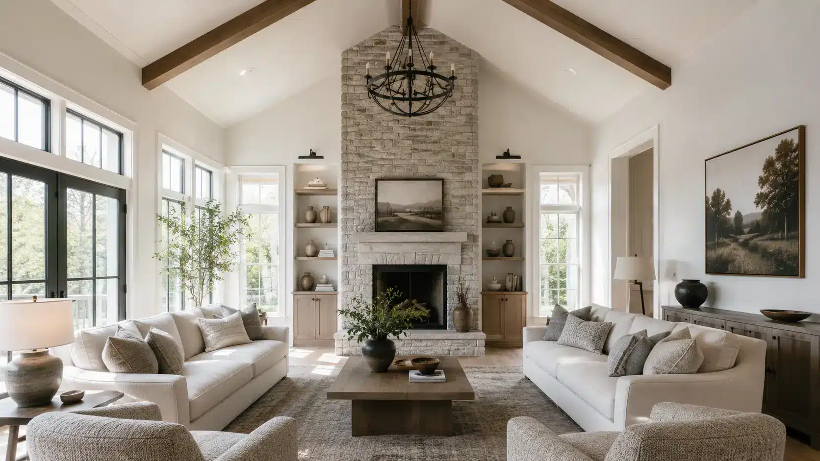
Quick Answer: Cathedral ceilings work best when tall proportions are balanced with appropriately scaled lighting, architectural details, warm materials, and a layout suited to the room’s everyday use. A cathedral ceiling can become one of the most eye-catching features in a home, but decorating the space beneath it takes the right balance of scale, warmth, and function. From exposed beams and dramatic lighting to wood finishes, skylights, and statement fireplaces, there are plenty of ways to make that extra height feel purposeful rather than empty. In this blog, you’ll find practicalcathedral ceiling ideas for different rooms, plus inspiration for lighting, finishes, costs, and design choices that can help you plan the space with confidence. Cathedral Ceiling Living Room Ideas to Try The living room is where cathedral ceilings are most often used, since the extra height suits large furniture and gathering spaces. It is also where ceiling proportions are most noticeable, especially when compared withlow-ceiling design, so getting the scale and balance right from the start matters. 1. Exposed Wood Beams in a Contrast Color Painting exposed beams a contrasting shade draws the eye upward and adds definition. Reclaimed oak feels rustic, while faux wood beams are lighter and easier to install. A matte or satin finish reduces glare under strong overhead lighting, which matters more under a cathedral ceiling than under a flat one. Budget for scaffolding or a lift rental if the beams sit higher than a standard ladder can safely reach. 2. Oversized Statement Chandelier A large chandelier fills the vertical space and keeps the room from feeling empty at the top. Choose a fixture with a lift kit or an extendable cord so bulb changes don’t require setting up a full ladder every time. Measure the room’s width before buying, since a chandelier sized for an 8-foot ceiling can look lost under a peak that reaches 18 or 20 feet. A dimmer switch also helps the fixture work for both bright gatherings and quiet evenings. 3. Floor-to-Ceiling Stone Fireplace Wall Extending stone or brick from the floor to the peak turns the fireplace into the room’s anchor. This works especially well in great rooms where the fireplace is already the focal point. Lighter stone tones keep the wall from feeling heavy in a room that already reads as large, while darker stone adds warmth in spaces with a lot of glass. Check with a structural engineer to see whether the chimney chase needs reinforcement to support the added weight at that height. 4. Clerestory Windows Below the Peak A row of small windows set just below the roofline brings in extra daylight without altering the wall layout below. This is a strong option for interior rooms that lack natural light on the main walls. Fixed panes keep costs down by eliminating the hardware needed to open and close, though operable versions help vent hot air that collects near a high ceiling. Placement matters too, since north-facing windows provide steady, even light without the glare of direct afternoon sun. 5. Two-Tone Paint Split at the Roofline Painting the lower wall one shade and the upper slope a lighter or darker tone visually breaks up the height. This costs far less than structural changes and can be repainted easily if you change your mind later. A line of painter’s tape along the roofline keeps the split crisp, and testing both colors on a large swatch board under actual room light avoids surprises once it dries. This idea also pairs well with crown molding or a simple trim line marking exactly where the two tones meet. Cathedral Ceiling Kitchen and Dining Ideas Kitchens and dining areas with cathedral ceilings often feel larger and more open, almost like one big shared space. Because the ceiling is so high, lighting and finishes need to stand out enough to be noticed from below. 6. Shiplap Ceiling Over a Farmhouse Island White shiplap panels reflect light and pair naturally with a wood island. It is a lower-cost way to add texture than full-wood-plank ceilings. Pre-primed shiplap saves a painting step and keeps the finish consistent across a large ceiling area. Leaving small gaps between boards during installation also prevents buckling as humidity shifts with the seasons. 7. Pendant Lights Following the Slope A row of pendants installed at graduated heights along the slope keeps task lighting close to the counter, even though the ceiling itself is far overhead. Sloped-ceiling adapters or swivel canopies keep each pendant hanging straight rather than tilted to the roofline. Spacing pendants evenly over the island, rather than centering them on the ceiling peak, keeps the light aimed where the work actually happens. 8. Skylight Above the Dining Table A single skylight centered over the table adds daylight exactly where people gather. Structural review is required before cutting into the roof, so a licensed contractor should assess the rafters first. Solar-powered shades help control heat gain on south-facing skylights without adding wiring. Flashing installed correctly around the opening is what actually prevents leaks, so this is not a step to shortcut on a DIY basis. 9. Exposed Trusses Over an Open Kitchen Leaving structural trusses visible, rather than covering them with drywall, reduces material costs and adds an architectural detail that a flat ceiling cannot offer. A clear or lightly tinted sealant protects the wood from kitchen grease and moisture without hiding the grain. This works best when the trusses are already in good condition, since sanding and refinishing older wood significantly increases the project cost. Cathedral Ceiling Bedroom Ideas to Create a Stunning Space Bedrooms with cathedral ceilings need a softer approach, since the goal is comfort rather than drama. Scale and warmth matter more here than in a living room, since an overly grand feel can work against a good night’s sleep. 10. Canopy Bed Under a Wood-Paneled Peak A canopy bed frame draws the eye down, while the wood-paneled ceiling above still gets its moment. This balances the room so it does not feel too vast for sleep. Lightweight linen drapery on the canopy softens the room without blocking airflow near the ceiling. Pairing the frame’s wood tone with the paneling above, rather than contrasting it, keeps the look intentional instead of accidental. 11. Reading Nook Under the Low Slope The lower sides of a cathedral ceiling are often wasted space. Building a window seat or reading nook there uses the awkward height instead of ignoring it. Built-in storage under the seat uses the shallow space that is often too low for standing furniture. A single well-placed sconce or floor lamp is usually enough light for the nook, since overhead fixtures rarely reach that low an angle well. 12. Painted Navy or Charcoal Ceiling A dark ceiling color visually lowers the ceiling, making a large bedroom feel more enclosed and restful at night. This approach also works well with black bedroom ideas, especially when deeper tones are balanced with lighter walls and bedding. A flat or matte sheen hides small surface imperfections better than a gloss finish, which matters more on a ceiling than on a wall. 13. Dormer Window in an Attic Bedroom Adding a dormer brings headroom and light to an attic space with a cathedral ceiling, which is often too dim and too steep on its own. Shed dormers add more usable floor space than gable dormers, though they change the roofline more visibly from outside. Permitting requirements vary by municipality, so confirm with a local building department before finalizing a design. Cathedral Ceiling Lighting Ideas to Refresh Your Space Lighting is the most repeated topic in every cathedral ceiling article, yet most posts scatter tips rather than group them, so here they are together. 14. Layered Lighting Plan Combine ambient overhead lighting, task lighting near seating or counters, and accent lighting on architectural details. No single fixture can light a cathedral-ceiling room well on its own. Putting each layer on its own switch or dimmer makes it easier to adjust the room’s mood without turning everything on at once. Smart bulbs or a basic lighting control panel is worth the extra cost here, since re-wiring after the fact is far more disruptive at height. 15. Track Lighting Along the Ridge Beam Track lighting mounted at the ridge can be aimed in different directions, which is useful in irregularly shaped rooms where a center fixture would leave dark corners. LED track heads run cooler and use less energy than older halogen versions, which matters when fixtures are hard to reach for maintenance. Adding a few extra heads beyond the minimum gives room to redirect light later as furniture layouts change. 16. Wall Sconces to Break Up Bare Walls Sconces placed partway up a tall wall provide light at a human scale, rather than relying solely on fixtures hung from the ceiling. Hardwired sconces look cleaner than plug-in versions but require an electrician to add wiring inside the wall. Spacing them evenly, roughly 60 to 66 inches from the floor, keeps the light consistent across a long wall run. Ways to Add Texture and Depth to a Cathedral Ceiling The finish you choose on a cathedral ceiling changes the mood of the entire room, from airy to grounded. The surface area here is much larger than a standard flat ceiling, so small material choices have an outsized visual impact. 17. Whitewashed Wood Planks A whitewash treatment keeps the wood grain visible while brightening the ceiling, which suits coastal or farmhouse styles. A diluted paint-to-water ratio, tested first on a scrap board, controls how much grain shows through versus how bright the finish looks. Unfinished pine takes whitewash more evenly than pre-sealed wood, so checking the board type before starting saves rework. 18. Board and Batten on the Sloped Walls Applying board-and-batten to the angled portion of the wall, not just the flat sections, adds texture without competing with the ceiling. Pre-cutting battens to match the roof pitch avoids visible gaps where the angle changes. Painting the boards and wall the same color keeps the texture subtle, while a contrasting color makes the detail more of a statement. 19. Metal Beams for an Industrial Look Exposed or added metal beams work well in loft-style homes and pair naturally with black metal light fixtures and concrete or polished wood flooring. Faux metal-wrapped wood beams cost less than solid steel and are far easier to install without heavy equipment. A matte black or bronze powder coat finish resists fingerprints and scuffing better than a raw or polished metal surface. Cathedral Ceiling vs. Vaulted Ceiling Before picking an idea, it helps to know exactly what you are working with. Feature Cathedral Ceiling Vaulted Ceiling Roofline Follows the exact pitch of the roof Does not have to match the roofline Shape Symmetrical, rises to a center ridge Can be asymmetrical, curved, or single-sloped Framing Uses the roof rafters directly Often needs separate framing below the roof If your ceiling mirrors the shape of your roof perfectly, you have a true cathedral ceiling. Most of the ideas below apply to both styles, since they share the same design challenges. How Much Does a Cathedral Ceiling Cost Converting an existing flat ceiling into a cathedral ceiling generally costs between $16,000 and $35,000, depending on the size of the space, the extent of structural changes, and the complexity of the project. A smaller project may cost less, while larger renovations can become more expensive if pipes, wiring, insulation, or HVAC ducts need to be adjusted during construction. Building a cathedral ceiling in a new home is usually more affordable than modifying an existing structure because the roof framing can be planned from the start to accommodate the added height. Which Rooms Suit a Cathedral Ceiling Best Not every room benefits equally from the extra height, so it helps to know where a cathedral ceiling actually earns its cost. Living rooms and great rooms: ideal, since the height reads as grand rather than empty. A vaulted or cathedral ceiling here also gives the most flexibility for large furniture groupings and statement lighting. Open kitchens: work well when paired with the lighting ideas covered earlier. The added height also helps vent cooking heat and odors away from the main living space. Primary bedrooms: can work with softer, cozier touches. Darker paint or lower-hanging fixtures help keep the room feeling intimate despite the extra volume. Small bedrooms, bathrooms, and closets: usually feel oversized and offer little practical benefit. The added heating and cooling cost in these smaller rooms rarely matches the visual payoff. Pros and Cons of Having a Cathedral Ceiling Every idea above looks appealing in a photo, but living with a cathedral ceiling day to day comes with real trade-offs worth weighing first. Pros Cons More perceived space Higher heating and cooling costs More natural light Harder fixture and fan maintenance Can raise home value by 5 to 25 percent (NAHB data via Bob Vila) Higher construction costs Makes rooms feel grander for gatherings Limit furniture and decor placement near the slopes Compare both sides against your budget and lifestyle before committing to a cathedral ceiling. The best choice depends not only on visual appeal but also on how well the ceiling suits your daily needs and how you use the space. Frequently Asked Questions What are the three types of ceilings? The three common ceiling types are flat, cathedral, and vaulted ceilings. Each offers a different look, ceiling height, and structural design depending on the home’s layout. What is the most expensive ceiling type? Coffered ceilings are generally among the most expensive because they require detailed framing, trim work, and skilled installation. Costs vary based on materials and design complexity. Do cathedral ceilings make a room look bigger? Yes. Cathedral ceilings create more vertical space, making rooms feel larger, brighter, and more open. They also allow for larger windows and better natural light. What is a fancy ceiling called? A decorative or fancy ceiling is often called a coffered, tray, vaulted, or cathedral ceiling. The name depends on the ceiling’s shape and architectural style. What do you call a fake ceiling? A fake ceiling is commonly called a false ceiling, drop ceiling, or suspended ceiling. It is installed below the main ceiling to hide wiring or ducts or to improve lighting and insulation. Final Thoughts A cathedral ceiling is not just a look you install once and forget. It changes how a room feels, how much it costs to heat, and how much upkeep it demands over time. Picking the right idea for the right room and going in with real cost numbers instead of guesswork makes the difference between a ceiling you love and one you regret. Start with the room where the height will be used most, then match the lighting and materials to how that space functions day to day. A cathedral ceiling, done thoughtfully, pays off for years, while one chosen purely for looks often becomes a source of ongoing maintenance and higher bills.
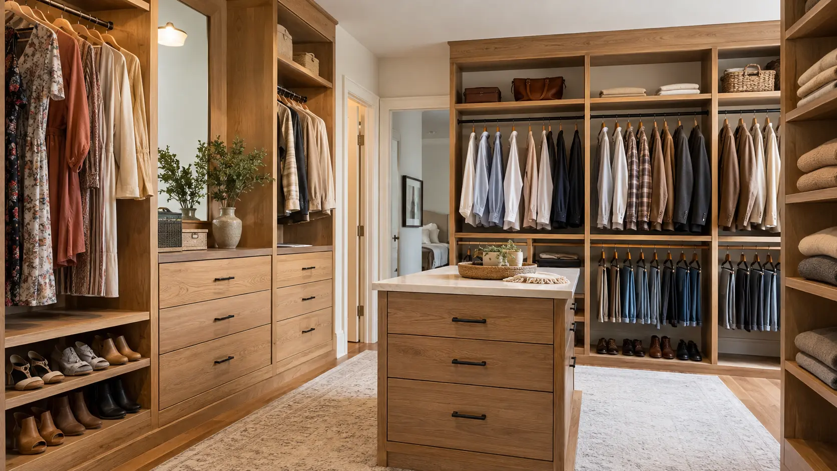
With over 12 years in interior design, I focus on practical layouts that make everyday spaces easier to use. A well-designed closet is more than just adding shelves or storage bins. Balance, movement, and placement all shape how comfortable the space feels. Proper proportions prevent shelves, drawers, and islands from making the room feel cramped. A clear layout keeps clothing, shoes, and accessories within easy reach. Choosing the right lighting and colors can make a small closet feel brighter and more open. You can solve many closet problems by improving storage placement, keeping walkways clear, and choosing finishes that work well together. Plan Your Master Closet Around Everyday Needs The best master closet ideas combine usable storage, clear walking space, suitable lighting, and an organized layout. A closet that looks great but leaves clothes crammed onto a single rod or forces you to squeeze past an island every morning misses the point. Function should come first. Once the layout works for your daily routine, you can focus on style. A functional closet adapts as your storage needs change. Shoe collections grow, seasonal wardrobes shift, and accessories often pile up faster than you expect. The best designs build in flexibility from the start, like adjustable shelves or modular bins. From full-height cabinets to a dedicated vanity, these ideas can help turn an ordinary closet into a well-organized space. 1. Install Floor-to-Ceiling Cabinets Use the full height of the room to store clothing, bags, bedding, and seasonal items without wasting space above the closet. Cabinets that reach the ceiling turn the empty space above eye level into useful storage. If you have a tall closet with low cabinets, you waste valuable space above each shelf. A pull-down rod or a small step stool makes it easy to reach the top sections without much effort. Best for: Rooms with tall ceilings and limited floor space. 2. Add a Center Island with Drawers A closet island provides extra storage for jewelry, accessories, folded clothing, and everyday essentials while also serving as a useful countertop. It also gives you a place to lay out outfits or fold laundry without leaving the room. Just make sure there’s enough space around the island to move comfortably. A built-in outlet on the island can also power a steamer or charging station right where you get dressed. Best for: Larger closets with enough clearance on all sides. 3. Set Up Separate Zones for Each Person Divide hanging rods, drawers, shelves, and shoe storage so each person has a clearly organized section. Clear zones help cut down on morning clutter and show exactly where everything belongs. This also avoids confusion about whose sweater is on which shelf. Color-coding each side with different hardware or labels makes the split even easier to maintain. Best for: Shared closets used by couples. 4. Use Double Hanging Rods Install one rod above another to create separate areas for shirts, jackets, skirts, and folded pants. This setup doubles your hanging space without taking up more room, which is great for closets with limited wall space. It works especially well if you have lots of shorter items, like blouses and folded trousers. Keep the upper rod at a height you can comfortably reach for daily items without a step stool. Best for: Wardrobes with lots of shorter hanging items. 5. Include Adjustable Shelving Movable shelves let the closet layout change as clothing collections and storage needs evolve over time. A shelf that fits sweaters now can be adjusted for taller storage bins next season. This flexibility keeps your closet useful for years, so you don’t have to redesign it every time your needs change. Adjustable shelving also makes it easier to fit unexpected items, like new boots or heels. Best for: Anyone whose storage needs shift by season. 6. Add Pull-Out Shoe Shelves Slanted or pull-out shelves keep shoes visible, easy to reach, and protected from overcrowding. This storage makes it easy to spot matching pairs at a glance, instead of digging through a pile. It also keeps shoes off the floor, helping your closet stay tidier. A slight downward tilt on each shelf lets shoes rest naturally without sliding off. Best for: Larger shoe collections. 7. Install Glass-Front Cabinet Glass doors protect special clothing and accessories while giving the master closet a clean, display-style appearance. They’re great for handbags, shoes, or seasonal pieces you want to see without opening a door. The display also makes your closet feel more like a boutique than just a storage space. Adding a small interior light behind the glass makes the display pop even more at night. Best for: Displaying handbags, shoes, or special-occasion pieces. 8. Build a Vanity Area A small vanity with drawers, a mirror, and suitable lighting creates a convenient place for makeup, skincare, and grooming. Having your routine in the closet frees up bathroom space and keeps all your supplies together. It also saves you from running between rooms in the morning. A comfortable stool or chair nearby makes the space feel more like a real routine stop rather than an afterthought. Best for: Closets with enough room for a dedicated counter. 9. Add a Storage Bench A padded bench provides comfortable seating, while the hidden storage beneath can hold shoes, bags, or seasonal items. It’s a small upgrade that makes putting on shoes much more comfortable than balancing on one foot. It also gives you a place to sit while you pick out an outfit. A hinged top on the bench makes the storage underneath easy to reach without moving the cushion aside. That means less lifting and less mess when you just need one pair of shoes. Best for: Closets with a bit of extra floor space near the entry. 10. Create a Full-Length Mirror Wall A large mirror makes dressing easier and can help a narrow or small master closet feel brighter and more open. Mirrored surfaces reflect light around the room, which is especially helpful in closets without windows. A full wall of mirrors also makes it easier to check your outfit from every angle.e. Framing the mirror to match your cabinet hardware helps it feel like part of the design, not an add-on. Best for: Small or windowless closets. 11. Use Hidden Laundry Hampers Built-in pull-out hampers keep worn clothing separated and prevent baskets from taking up valuable floor space. Putting hampers in a cabinet or drawer keeps the room tidy, even during busy weeks. It also helps you sort laundry by color or fabric without any extra work. Using two separate hamper inserts makes it simple to split lights from darks right from the start. Best for: Keeping laundry out of sight in a tidy layout. 12. Add Dedicated Jewelry Drawers Shallow-lined drawers with small compartments protect watches, necklaces, rings, and other accessories from damage. Dedicated compartments help prevent tangled chains and lost earrings. A soft lining in each compartment also protects your jewelry’s finish over time. Best for: Larger jewelry or accessory collections. 13. Install LED Closet Lighting Use recessed lights, illuminated hanging rods, or shelf lighting to improve visibility and create a polished finish. Good lighting makes it far easier to tell navy from black on a dark morning. It also helps highlight textures and colors that get lost under dim, standard overhead fixtures. Best for: Closets without natural light. 14. Use Corner Storage Efficiently Corner shelves, rotating racks, or angled hanging sections can turn difficult areas into practical storage. Corners are easy to overlook, but with the right fixtures, they can store more than you might think. A rotating rack, for example, makes it much easier to reach items in a tight corner. Best for: L-shaped or irregularly shaped closets. 15. Sliding Doors Work Best in Small Spaces DIY cabinet doors save floor space because they don’t need clearance to swing into the bedroom or closet. This makes them a smart choice for smaller layouts where every square foot of walking space counts. They also work well near tight hallways where a swinging door would be a hazard. Best for: Small closets with tight floor plans. 16. Add Storage Baskets to Open Shelves Matching baskets keep small items organized while reducing visual clutter on open shelving. Labeling each basket also makes it faster to find scarves, belts, or other small accessories. Best for: Open shelving that tends to look cluttered. 17. Reserve Upper Cabinets for Seasonal Storage Use upper cabinets for luggage, winter clothing, spare bedding, and items you don’t need every day. Keeping these out of reach but still accessible frees up prime storage space for daily essentials. A small step stool nearby makes those upper cabinets easy to access as the seasons change. Best for: Storing items you only need a few times a year. How to Create a More Functional Master Closet Lighting is where many closet designs fall short; without it, colors are harder to read, and sections of the closet become dead zones. Durable flooring and proper ventilation round out the basics, keeping the space easy to maintain and protecting clothing from moisture and odor over time. The finer details are what separate a closet that works from one that just holds things. Drawer dividers, belt racks, valet rods, scarf organizers, and pull-out trays put everything within reach without the usual rummaging. A full-length mirror keeps outfit checks in the room where they belong. Electrical outlets handle steamers, chargers, and a vacuum without running cords to the nearest hallway. Labels on bins and drawers pay off most during seasonal swaps or in shared spaces, where it is easy to lose track of what belongs where. How to Plan a Master Closet Remodel A little upfront planning saves you from having to redo work later, so start with these four steps before picking out cabinets or paint colors. 1. Measure the Available Space: Record the room’s width, depth, ceiling height, door placement, and any windows or outlets. These measurements shape every decision that follows, from cabinet size to lighting placement. 2. Review What You Need to Store: Count hanging clothing, folded items, shoes, bags, accessories, and seasonal belongings. Knowing the actual volume of what needs to fit prevents a beautiful closet from running out of space within a year. 3. Choose a Practical Layout: Select a single-wall, galley, L-shaped, U-shaped, or island layout based on the available room. The right layout depends on the closet’s shape and how much walking space you want to keep open. 4. Set a Realistic Budget: Include cabinetry, labor, lighting, flooring, hardware, and storage accessories in the total cost. Building in a little extra for unexpected changes during the project helps avoid surprises later. Mistakes That Can Ruin a Master Closet Even well-planned closets can run into a few recurring problems, most of which are easy to avoid once you know what to look for. Ignoring vertical storage space wastes the wall height above eye level, which adds up over the life of the closet, while shelves that are too deep hide items in the back and make them hard to reach. Adding an oversized island can eat up the walking space a closet needs to function, and insufficient lighting makes it hard to distinguish colors or find items quickly. Failing to measure clothing and shoes before designing storage often leads to a layout that doesn’t actually fit what’s being stored. Frequently Asked Questions What are the closet design trends for 2026? Closet designs in 2026 focus on built-in storage, warm wood finishes, LED lighting, glass-front cabinets, adjustable shelving, and dedicated spaces for shoes, bags, and accessories. What is a good size for a master closet? A comfortable master closet is typically 100 to 150 square feet, providing enough room for hanging clothes, shelving, drawers, and easy movement around the space. How do rich people organize their closets? Luxury closets are usually organized by clothing type first, then by color. Custom shelves, drawers, display cabinets, and dedicated sections for shoes, bags, and jewelry help keep everything easy to find. Is 3 feet too deep for a closet? No. A 3-foot-deep closet works well for standard hanging clothes and shelving. It offers enough depth for hangers while keeping items easy to reach. Should I organize my closet by color or type? Start by grouping clothing by type (shirts, pants, dresses, jackets), then arrange each group by color. This makes finding outfits quicker while keeping the closet neat and visually organized. Design a Closet That Fits Your Lifestyle A great master closet doesn’t have to include every idea on this list. The best setup is the one that fits your space, storage needs, and daily routine. Pick the features that match how you actually get dressed and how much room you have, then build the rest of the layout around those priorities. Whether that means a full island setup or just a smarter shelf and better lighting, small, well-planned changes add up to a closet that feels organized, comfortable, and easy to use.
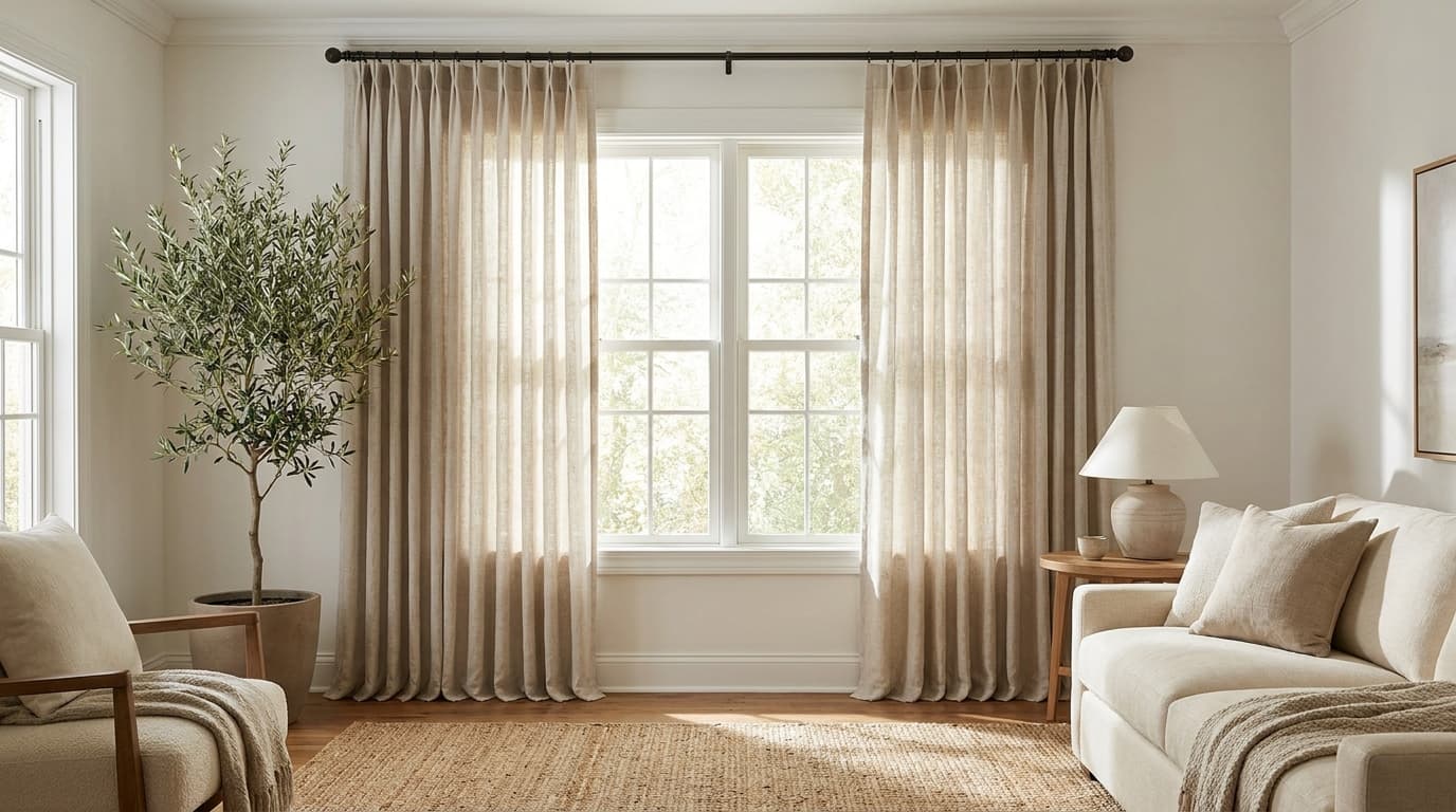
Curtains can completely change how a room feels, but the installation process often comes with more measuring, drilling, and adjusting than expected. If the height is wrong, your window looks smaller, if the width is wrong, the room feels cramped instead of open. To hang curtains, install brackets 4–6 inches above the window frame and 3–4 inches out on each side. Attach the rod, then hang your curtain panels. Learning how to hang curtains the right way changes how a whole room feels. A few extra inches in the right spots can make ceilings look taller, and windows look wider. You will learn every step by the end, from gathering tools to hanging the final panel. What You Need to Hang Curtains Before you touch the wall, gather everything on this list. Having tools ready saves trips up and down the ladder. Tool/Material: Tape Material Level Pencil Drill Wall Anchors Stud Finder Curtain Rod Brackets Curtain panels Step ladder If you’re working with plaster or brick walls, a masonry drill bit makes the job easier. Standard wall anchors don’t always grip well in these materials. How to Hang Curtains Step-By-Step Once you’ve gathered your tools and hardware, the actual process moves quickly. Each step builds on the last, from measuring your window to giving the panels a finished look. Follow these steps to get a rod that sits straight and curtains that hang the way you pictured them. Step 1: Measure Your Window and Decide Curtain Placement Start by measuring the width of your window frame. Add extra inches on each side if you want curtains that let in more light when open, and measure your curtains accordingly. Next, decide how high you want the rod. Most designers suggest placing it 4 to 6 inches above the window frame. This trick makes ceilings look taller. For length, decide if you want curtains that graze the floor, break slightly, or pool at the bottom. Each style gives a different look, measured from where the rod sits to your chosen endpoint. Width: Measure your window frame, then add 4 to 8 inches to each side for the rod. This extra width lets curtains stack neatly when open, rather than covering the glass. Length: Measure from where your rod will sit down. A common example is a standard 84-inch panel, which works well for windows with 8-foot ceilings when the rod sits close to the top. Step 2: Mark Where the Curtain Brackets Will Go Use your pencil to mark bracket positions on the wall. Check both marks with a level so the rod hangs straight. Brackets usually sit 3 to 4 inches beyond the window frame on each side. This width lets curtains stack fully open without blocking daylight. Suppose you’re using a stud finder, mark where the studs are, too. Hitting a stud gives your bracket extra hold, especially with heavier curtains. Step 3: Install The Curtain Brackets Drill pilot holes at your marked spots. If you’re not hitting a stud, insert wall anchors first for added grip. Screw each bracket into place. Test them by gently pulling to make sure they feel secure before moving forward. Double-check both brackets with your level. A small tilt now becomes an obvious slant once the rod and curtains go up. Step 4: Attach The Curtain Rod Slide the rod into the installed brackets. Most rods snap into place or rest with a simple locking mechanism. Give the rod a gentle shake to confirm it’s secure. If it wobbles, tighten the bracket screws or check that the rod is seated correctly. Step 5: Hang the Curtain Panels Slide your curtain panels onto the rod before locking the final bracket piece, if your rod design requires it. This step depends on the curtain style you’ve chosen. Different curtain styles hang in different ways: Rod pocket curtains: They slide directly onto the rod through a built-in fabric channel. Grommet curtains: They have metal rings sewn into the top that slip easily over the rod. Tab top curtains: They use fabric loops that wrap around the rod. Pinch pleat curtains: Need hooks that clip onto rings, which then hang from the rod. Tie-top curtains: They are tied directly around the rod with fabric strips. Each curtain style creates a different fold pattern when hung. Grommet curtains tend to fall in neat, even waves, while rod pocket styles bunch more loosely. Step 6: Adjust Curtains for a Finished Appearance Once your panels are hanging, take a step back and check the fall. Smooth out any twisted fabric near the rod. Give the curtains a light steam or iron if they look creased from packaging. This small step makes a noticeable difference in the finished look. Pull the panels open and closed a few times. This helps the fabric relax into its natural folds faster. How High Should You Hang Curtains Most curtains look best when the rod sits 4 to 6 inches above the window frame. This small gap makes the window look taller than it is. If your room has high ceilings, go higher. A rod placed closer to the ceiling stretches the wall and makes the whole room feel bigger. Based on ceiling height: Standard 8-foot ceiling: Hang the rod 4 to 6 inches above the frame. 9- to 10-foot ceiling: Hang the rod 6 to 10 inches above the frame. Very high ceiling: Hang the rod close to the ceiling, leaving a 2- to 3-inch gap. For length, let the panel end where you want the eye to stop. Floor-length curtains should sit just above the floor or graze it. Puddled curtains need extra fabric pooling at the bottom. Pro Tip: When in doubt, hang the rod higher, not lower. Extra height rarely looks wrong, but a low rod always makes a window look smaller. Choose the Right Curtain Rod and Hardware Picking the right rod affects both how your curtains hang and how long they last. Not every rod works for every curtain weight. Standard curtain rods work well for lightweight or medium curtains. They come in adjustable lengths, so you can match them to most window sizes. Double rods let you layer sheers with heavier drapes. This setup works well if you want both privacy and light control. Traverse rods use a pulley system to open and close curtains smoothly. These suit heavier fabrics that are harder to pull by hand. Decorative rods with finials add a finishing touch to the room. These work best when the rod remains visible rather than hidden behind fabric. For hardware, match your bracket size to your curtain weight. Heavy blackout panels require deeper brackets and stronger anchors than sheer curtains do. How to Hang Curtains with Drilling Drilling gives your curtain rod the strongest hold. This method works best for heavy fabric or a rod that carries a lot of weight. Here’s the quick version of the process: Mark your bracket spots with a pencil and a level. Drill pilot holes into the wall. Add wall anchors if you’re not hitting a stud. Screw the brackets into place. Attach the rod, then hang your curtain panels. Drilling works on drywall, wood, plaster, and brick. Just match the anchor or bit to your wall type, and it holds up well for years. How to Hang Curtains without Drilling Renters and anyone looking to avoid wall damage still have solid options. These methods skip the drill entirely. Tension rods: These fit inside the window frame and are held in place by spring pressure. No screws or anchors needed. Adhesive hooks: Command-style hooks hold light-to-medium curtain rods. Check the weight limit printed on the packaging first. Magnetic curtain rods: These work only on metal frames, such as those on sliding doors or garage windows. Clip-on rods: These attach directly to the top of the window frame using spring clips. Tip: Adhesive hooks work best with lightweight curtains, since heavier fabric can pull the hooks loose over time. Test the hook’s grip for a full day before hanging your final panels. Benefits of Hanging Curtains without Drilling Skipping the drill comes with real perks, especially if you rent your home or want a quick fix. Here are the main benefits: No wall damage: Your walls stay free of holes and marks. Renter-friendly: You keep your security deposit safe, since there’s nothing to patch or repair. Faster setup: Most no-drill methods take minutes, not hours. No tools required: You skip the drill, screws, and anchors altogether. Easy to move: You can shift your curtains to a new spot or room without any wall repair. Budget-friendly: You save money on drill bits, anchors, and other hardware. These methods work well for lightweight and medium curtains. If you plan to hang heavy blackout panels, check the weight limit on your hardware first. Common Curtain Hanging Mistakes to Avoid Hanging the rod too low makes the window and ceiling look shorter than they are. Choosing a rod that’s too narrow blocks light, since curtains can’t clear the window even when fully open. Skipping the level creates a visible slant, since uneven brackets show once the rod and curtains go up. Ignoring curtain weight causes trouble, too, since heavy fabric on weak brackets can pull loose within weeks. Buying panels that are too short can make a room feel unfinished, since curtains stop above the floor. Forgetting the wall type is another common slip, since plaster and brick need different anchors than drywall. Tips for a Polished Curtain Look A few finishing touches make a noticeable difference once your curtains are up. Steam or iron panels before hanging to remove packaging creases. Use curtain weights sewn into the hem for a straighter fall. Tie back curtains during the day to let in more natural light. Match curtain color to your wall tone for a coordinated look, or contrast for a bolder statement. Rotate panels occasionally if they hang in direct sunlight, since fabric can fade unevenly over time. Use curtain-sewing techniques to add curtain weights to the hem for a straighter fall and a more tailored appearance. Final Thought Curtains shape the feel of a room in ways that are easy to overlook. The right rod height turns a standard window into something that feels intentional. The right width keeps panels from swallowing daylight when pushed open. Both measurements take five minutes to get right and much longer to fix once the brackets are in the wall. Follow the steps in order, check each one with a level, and mark the wall before drilling. A careful, patient first pass beats a rushed one every time. Whether you are drilling into drywall for blackout panels or clipping a tension rod into a rental window, the process is the same. Measure carefully, hang with care, then stand back and let the room tell you if it worked. Frequently Asked Questions How High Should Curtain Rods Be Hung? Most curtain rods should sit 4 to 6 inches above the window frame. This placement makes the window and ceiling look taller. How Much Wider Than the Window Should a Curtain Rod Be? A curtain rod should extend 3 to 8 inches beyond the window frame on each side. This width lets curtains stack open without blocking the glass. Can You Hang Curtains without Drilling Holes? Yes, tension rods, adhesive hooks, and clip-on rods all work without drilling. These options suit renters or anyone who wants to avoid wall damage. What Curtain Length Looks Best? Curtains that graze the floor or break slightly work well in most rooms. Pooling fabric suits a more formal look, while a slight break lends a casual feel. How Do You Keep Curtains from Sagging in the Middle? Use a sturdy rod rated for your curtain weight, and add a center support bracket for wide windows. This prevents the rod from bowing under heavier fabric.
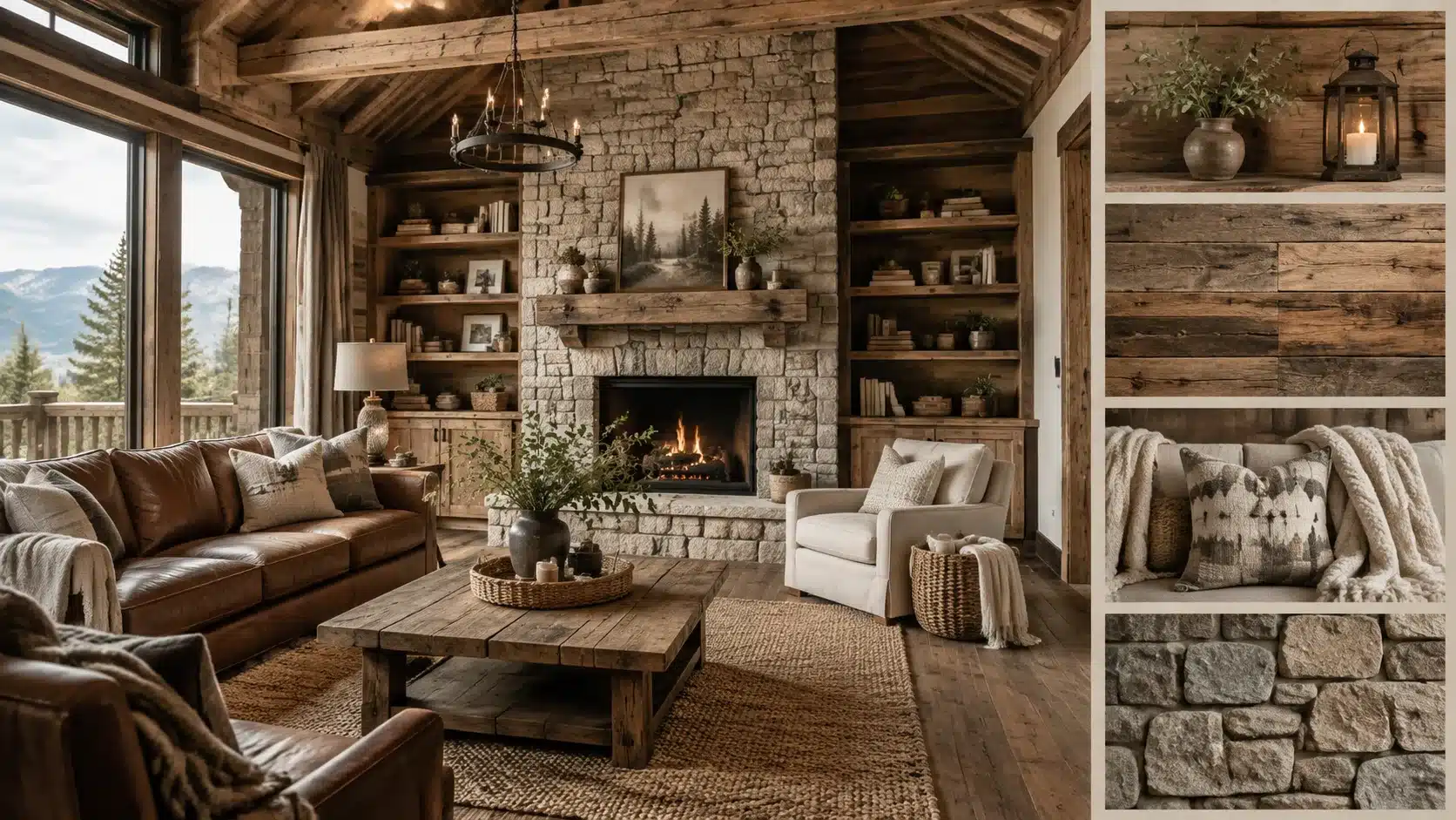
Some homes create an instant sense of comfort the moment you step inside. They feel warm, relaxed, and connected to nature. That is the charm of rustic interior design. While once associated mainly with cabins and rural homes, this style now works beautifully in apartments, modern houses, and urban spaces. Rustic interiors combine natural wood, stone finishes, cozy fabrics, and thoughtful details to create a balanced look. This blog explains the essential elements, color choices, and furniture styles that define rustic design. It also includes room-by-room ideas and tips for blending rustic features with other interior styles. What is Rustic Interior Design? Rustic interior design blends natural materials, earthy tones, and cozy textures to create a warm, welcoming home. Inspired by nature, it brings the outdoors inside through materials like reclaimed wood, stone, leather, and metal. Unlike polished modern styles, rustic design has raw finishes, imperfections, and handcrafted details. Exposed beams, vintage furniture, handmade ceramics, and textured fabrics add character and make each space feel unique. Comfort is a defining part of the style, with cozy blankets, linen fabrics, woven accents, and layered textures creating a relaxed atmosphere. Rustic interiors focus less on perfection and more on creating a practical, personal, and welcoming space that feels connected to nature. Core Elements of Rustic Interior Design Rustic interiors balance natural beauty with everyday comfort. These key elements help shape a space that feels warm, personal, and connected to nature. 1. Natural Materials: Rustic interiors use materials like reclaimed wood, stone, leather, and woven fabrics to bring texture and a natural feel indoors. 2. Earthy Colors: Warm browns, beige, cream, terracotta, and muted greens create a calm, nature-inspired atmosphere. 3. Rustic Furniture: Wooden furniture with visible grain, handcrafted details, and distressed finishes adds character and timeless appeal. 4. Warm Lighting: Soft lighting, wooden fixtures, lanterns, and fireplaces create a cozy and welcoming rustic mood. Rustic Interior Design For Every Room Rustic style can be adapted to different areas of the home by combining natural materials, warm colors, and comfortable textures. Each room can highlight rustic elements while keeping the space functional and inviting. 1. Rustic Living Room with Wood Features A rustic living room brings together natural materials like reclaimed wood, exposed beams, stone fireplaces, and comfortable furniture to create a warm gathering space. Wooden textures add character, while stone elements provide contrast and a grounded feel. Layer the room with linen fabrics, woven rugs, leather seating, and warm lighting to balance the heavier materials. Keeping the décor simple allows the natural textures to become the main feature of the space. 2. Rustic Kitchen with Farmhouse-Inspired Idea A rustic kitchen combines practical design with natural materials. Wooden cabinets, stone countertops, open shelving, farmhouse-style sinks, and rustic kitchen islands create a functional, welcoming space. Use simple ceramics, glass containers, and handcrafted details to add personality without making the kitchen feel cluttered. The focus should remain on durable materials and a comfortable layout. 3. Rustic Bedroom with Layered Natural Textures A rustic bedroom creates a comfortable retreat through natural materials and soft textures. Wooden bed frames, linen bedding, wool blankets, woven rugs, and warm lighting work together to create a relaxed atmosphere. Neutral colors help highlight the beauty of wood and fabric textures while keeping the room calm. Simple furniture and minimal décor allow each material to stand out. 4. Rustic Bathroom With Stone Materials Rustic bathrooms use natural finishes to create a warm and grounded look. Stone walls or countertops, wooden vanities, matte fixtures, and earthy colors add texture without making the space feel outdated. Soft lighting and simple textiles help balance the roughness of stone and wood, creating a bathroom that feels comfortable and connected to nature. 5. Rustic Dining Room With a Statement Wooden Table A solid wood dining table often becomes the centerpiece of a rustic dining room. Its natural grain and imperfect details add character while creating a welcoming place for everyday meals and gatherings. Pair the table with simple chairs, pendant lighting, and subtle natural décor to keep the look balanced. The goal is a space that feels comfortable rather than overly decorated. 6. Rustic Entryway With Functional Storage A rustic entryway combines style with everyday function. Wooden benches, wall hooks, woven baskets, vintage mirrors, and natural rugs help organize daily items while adding warmth to the entrance. Practical storage pieces with natural finishes create a welcoming first impression without taking up unnecessary space. 7. Rustic Home Office with Warm Elements A rustic home office combines a productive workspace with natural warmth. Wooden desks, leather chairs, open shelves, and soft lighting create a comfortable, less formal environment. Adding plants and simple accessories can soften the space while keeping the focus on functionality and organization. 8. Rustic Beverage Station with Earthy Touch A rustic beverage station adds a practical entertaining area while maintaining the style’s warmth. Wooden counters, open shelves, glassware, and natural finishes create a dedicated corner without taking up much space. Warm lighting and simple accessories help the area blend naturally with the rest of the home. Traditional Rustic vs Modern Rustic Design Modern rustic design retains the warmth of traditional rustic style while giving it a cleaner, lighter appearance. Instead of filling a room with heavy wood finishes, it uses natural materials more sparingly. The color palette often includes soft neutrals, warm whites, and earthy shades that create an open feel. Furniture tends to have simpler shapes, with pieces like linen sofas or streamlined chairs replacing oversized designs. The style combines aged materials with modern forms. Rustic details provide texture, while contemporary elements keep the room fresh and practical. Traditional Rustic Modern Rustic Dark wood throughout Balanced wood accents Large, heavy furniture Custom furnitures Decorative approach Simple and purposeful details Modern rustic design creates a comfortable space that feels natural without looking outdated. Blending Rustic Style with Modern Aesthetics Rustic design works well with many interior styles because natural materials create a flexible foundation. Wood, stone, leather, and woven textures can take on a different character depending on the elements paired with them. Here are some popular combinations and how they work. 1. Rustic Modern Design A wooden dining table paired with clean-lined chairs creates a balanced look, where the wood adds warmth and the chairs keep the space refined. Soft neutrals such as warm white, beige, and gray help connect both styles. Concrete surfaces, linen fabrics, and minimal accessories support the look without taking attention away from the natural materials. 2. Rustic Farmhouse Design Rustic and farmhouse styles share many similarities, including wood finishes, neutral colors, and a focus on comfort. The main difference is that farmhouse design draws more inspiration from practical rural living, while rustic style has a broader connection to nature, with open shelving, apron sinks, and shiplap walls. 3. Rustic Industrial Design Rustic industrial style creates contrast by combining warm materials with stronger structural elements. Reclaimed wood works well with metal, exposed brick, concrete, and iron details. The balance between materials is important. Warm wood tones help soften the harder look of industrial features, while metal accents add structure and depth. 4. Rustic Scandinavian Design A Scandinavian design blends natural materials with simple, functional styling. Both styles value wood, wool, and comfortable textures, but Scandinavian interiors usually use lighter colors and cleaner forms. Birch and ash woods often replace darker timber, creating a brighter appearance. Simple furniture, soft fabrics, and subtle decor keep the space calm. Mistakes That Can Ruin a Rustic Interior Design Style Rustic interiors depend on balance. Too many heavy materials, decorations, or dark tones can make the space feel crowded instead of comfortable. Using too much wood: Too much wood can make a room feel dark and heavy. Balance it with lighter colors and fabrics. Adding too many vintage pieces: Too many old pieces can create clutter. Use a few statement items for character. Choosing harsh lighting: Cool lighting can make rustic spaces feel cold. Use warm lights for a cozy feel. Creating a flat color scheme: Only using dark tones can make the room feel dull. Add lighter shades for balance. Filling every surface with décor: Too much décor can make the space feel crowded. Keep only meaningful pieces. Ignoring furniture size: The wrong-sized furniture can affect comfort and flow. Choose pieces that fit the room. How to Add Rustic Style on a Budget? Rustic interiors do not always require major renovations or expensive materials. You can achieve a rustic style without expensive renovations. Small upgrades, secondhand finds, and simple DIY projects can add natural textures, warmth, and character while keeping costs low. Rustic Update How it adds rustic style Average cost Reclaimed wood accents Adds natural texture through shelves, wall panels, or small décor pieces $20–$150 Thrifted furniture Brings aged character and a lived-in feel to the space $50–$300 Furniture refinishing Creates a rustic finish by highlighting natural wood grain $30–$100 Natural fabric décor Adds warmth with linen curtains, woven rugs, and cozy throws $25–$200 Vintage accessories Adds personality through baskets, pottery, and antique-style pieces $10–$100 Warm lighting upgrades Creates a cozy atmosphere with softer, rustic-inspired lighting $20–$150 Start with a few meaningful changes instead of replacing everything. Rustic interiors feel best when they combine natural materials, comfort, and personal touches. Frequently Asked Questions Is modern rustic still in style? Yes, modern rustic remains popular because it combines natural materials, cozy textures, and clean designs for a comfortable yet contemporary look. How do I make my house look more rustic? Use reclaimed wood, stone, textured metals, earthy colors, vintage accents, and warm lighting to bring a rustic feel into your home. What colors make a rustic look? Rustic interiors often use cream, beige, brown, gray, muted greens, and other earthy tones to create a warm and relaxed atmosphere. What stain works best for a rustic look? Dark walnut, classic gray, and aged barrel stains create a weathered wood appearance that adds rustic character to furniture and surfaces. Can rustic design work in a small home? Yes, rustic design works well in small spaces by using simple furniture, natural textures, and warm colors. What stain works best for a rustic look? Dark walnut, weathered gray, and aged oak stains create a rustic finish with a natural, reclaimed wood appearance. Bringing Nature’s Warmth into Your Home Rustic interior design is more than a decorating style, it is a way of creating spaces that feel warm, personal, and connected to nature. By combining natural materials, earthy colors, handcrafted details, and comfortable textures, rustic interiors create a relaxed, timeless atmosphere. Whether you add a few rustic touches or embrace the style throughout your home, the focus remains on simplicity, comfort, and authenticity. The beauty of rustic design comes from celebrating imperfections and creating a space that feels lived-in, welcoming, and uniquely yours.
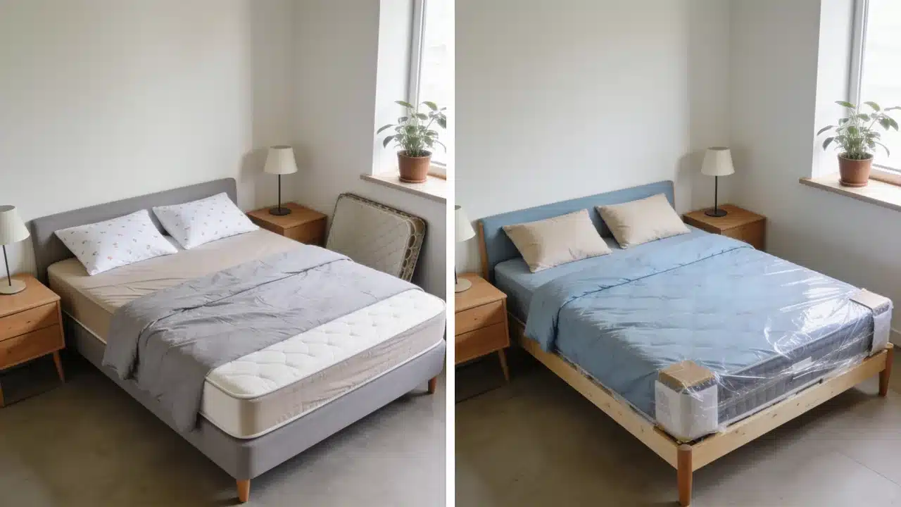
Summary: Most mattresses last between 7 and 10 years. Latex models can often last 10–15 years, while innerspring mattresses usually wear out sooner. Replace your mattress when it no longer provides proper support, comfort, or quality sleep. How long it actually lasts depends on the materials, usage, and maintenance. A mattress gets replaced only after the problem becomes impossible to ignore. A sore back that has been building for months, sleep quality that has quietly dropped, a mattress that looks fine but no longer feels that way. The challenge is that mattresses rarely fail suddenly. They degrade gradually, and because the change is slow, it’s easy to adjust to it without realizing the mattress is the cause. Those ranges in the summary are a starting point, not a fixed deadline. A mattress that is seven years old and still performing well does not need to be replaced. One that is five years old and already sagging does. This blog covers everything that determines a mattress’s lifespan and when to replace it. How Long Does a Mattress Typically Last? Different mattress types age at different rates, depending on how their materials respond to regular use. The table below shows the average lifespans of common mattress types and how long each typically provides proper support. Mattress Type Average Lifespan Durability Latex Mattress 10–15 years Long-lasting and resistant to sagging Hybrid Mattress 7–10 years Good durability from foam and coils Memory Foam Mattress 7–10 years Depends on the foam density Innerspring Mattress 5–8 years Coils and padding wear faster Pillow Top Mattress 5–7 years Comfort layers compress sooner 6 Signs You Need to Replace Your Mattress These signs indicate that a mattress can no longer support proper sleep. Checking for them helps catch the problem before it affects your health or daily routine. 1. Visible Sagging Deep dips or visible body impressions show that the mattress has lost its original support structure. Sagging of one inch or more is a clear sign that replacement is due. Look along the side of the mattress. Uneven areas you do not feel while lying down are often visible from that angle. 2. Morning Aches and Stiffness Persistent back, neck, or hip discomfort upon waking suggests that the mattress no longer adequately supports your body. Stiffness that clears up within the first hour of waking is a common sign. If you sleep better in a hotel or on another bed, your mattress is likely the cause. 3. Poor Sleep Quality Increased tossing and turning or trouble staying comfortable at night can mean the mattress is breaking down. Sleep problems that appear only in bed often point to the mattress first. If your sleep has declined without any other changes in your routine, the mattress deserves a closer look. 4. Uneven or Lumpy Surface A surface that feels uneven or shows visible spring bumps indicates that internal materials have broken down. Sleeping on an uneven surface affects spinal alignment and disrupts sleep quality. You may not notice the unevenness at first. Over time, your body registers it through increased discomfort and restless nights. 5. More Allergies or Odors An older mattress accumulates dust mites and allergens, which worsen allergy symptoms over time. A persistent musty odor usually means moisture has reached the inner layers. If your symptoms improve when sleeping elsewhere, the mattress is likely the cause. A protector alone will not fix the underlying buildup. 6. Increased Motion Disturbance Feeling a partner’s movements more strongly than before can mean the mattress is losing its ability to absorb motion. Springs or foam that no longer isolate movement signals internal wear. Small shifts in the night should not wake you. If they do, the mattress has likely broken down inside. How Often Should You Replace Your Mattress? Replacing a mattress depends more on how it feels than on a fixed schedule. The table below outlines what to check at each stage of a mattress’s age. Mattress Age What to Consider Under 5 years Usually within a normal lifespan 5–7 years Check comfort and support 7–10 years Common replacement period 10+ years Evaluate the condition carefully This comes down to how the mattress performs and feels, not a fixed number of years. That’s really the honest answer to how often you should replace your mattress. What Affects How Long a Mattress Lasts? Three things shape this: materials, usage frequency, and the conditions in which the mattress is kept. 1. Material Quality and Construction The materials inside a mattress shape how long it holds its shape. High-density foam compresses less under body weight and typically lasts longer than low-density options. Latex resists breakdown better than most foam types. Coil design and layer construction also affect how long the support holds up. 2. Usage Frequency A mattress used every night ages noticeably faster than one kept in a guest room. Daily use means more compression cycles and less recovery time between uses. Guest room mattresses often last years longer because they carry body weight far less often. 3. Body Weight and Sleeping Style Greater body weight increases the total pressure on the foam and coils, causing the materials to break down faster. Sleeping positions also affect wear patterns. Side sleepers place concentrated pressure on the hips and shoulders. Stomach sleepers tend to put more strain on the center of the mattress. 4. Mattress Foundation and Support System A mattress typically lasts longer when placed on a compatible foundation. Box springs, slatted bases with gaps of less than 3 inches, and platform beds all affect how weight is distributed. An unsupported or broken frame leads to faster sagging and uneven wear. 5. Sleep Environment The bedroom environment affects how long materials stay in good condition. High humidity causes moisture buildup inside the mattress, which accelerates foam breakdown. Poor ventilation and temperature swings put extra strain on materials. Using a breathable cover and keeping the room dry extends the mattress’s life. Can You Make a Mattress Last Longer? None of the upkeep below takes much time, and it adds up over the years. Use a waterproof mattress protector to stop spills and moisture from reaching inner layers. Rotate the mattress every three to six months if the manufacturer recommends it. This spreads compression across different areas of the foam or coils. Vacuum the surface occasionally and avoid sitting on the same edge every day. Use a compatible foundation and check that it still supports the mattress evenly. A mattress topper can delay surface wear, but it cannot repair underlying structural issues. If sagging is already noticeable, a topper only temporarily covers the problem rather than addressing the cause. What Your Mattress Warranty Covers A mattress warranty covers manufacturing defects, not loss of comfort. The table below compares warranty reality with actual replacement timing across common situations. Situation Replacement Consideration Warranty Reality Daily-use mattress Usually 7–10 years Warranty covers defects, not normal aging Couple’s mattress May wear faster Comfort loss is usually not covered Guest mattress Often lasts longer A longer warranty does not guarantee lifespan Premium latex mattress Can last 10–15 years Warranty reflects coverage, not perfect performance Older mattress (10+ years) Inspect support and comfort Replacement depends on the condition Mattress Topper vs Full Replacement A topper improves the surface feel but cannot fix underlying structural problems. Use a topper if: The mattress has a solid structure but feels too firm or too soft There is no visible sagging, body impressions, or uneven areas The mattress is under 7–8 years old with no signs of structural damage You want to protect the sleep surface and add time before a full replacement Replace the mattress if: Visible sagging or deep body impressions are present Springs feel broken, or the surface is noticeably uneven You wake with pain regularly that eases within an hour of getting up The mattress is over 10 years old Poor sleep quality persists night after night despite no other changes In my experience, a topper usually buys a few months before the underlying problem resurfaces. If the mattress has already given out, replacement is the right call. The clearest test is to press down firmly across the sleep surface. If the mattress springs back evenly, a topper may be enough. If certain areas stay compressed, the structure has already given out. Happy Reading A mattress does not announce when it’s done, it just quietly stops supporting you. So how long does a mattress last? Usually 7 to 10 years, though the actual timing depends on the type, usage, and how it feels. Sag, poor sleep, and persistent stiffness are clearer signals than the calendar. A good foundation, regular rotation, and a protector add real years. As for how often you should replace your mattress, as soon as it stops giving you good sleep. If yours already shows two or more signs above, start comparing mattresses today. Frequently Asked Questions How Long Should a $2000 Mattress Last? A $ 2,000 mattress can typically last 8–12 years when made with quality materials and properly maintained. Lifespan still depends on construction, usage, and care. Can a Mattress Last for 20 Years? Most mattresses do not maintain proper support for 20 years. High-quality latex models may last longer than average, but replacement depends on condition and comfort. How Often Should You Replace a Mattress? Most mattresses should be replaced every 7–10 years, but signs like sagging, discomfort, and poor sleep quality matter more than age alone. How to Tell if a Mattress is Worn Out? Common signs include visible sagging, uneven surfaces, increased motion transfer, waking with stiffness, and a noticeable decline in sleep comfort. Based on the confirmed snippet text from the article, here is the full modified FAQ answer with the link embedded: Do Toddler Beds Use the Same Mattress Size as a Crib? Often yes. Many toddler beds are designed to use a standard crib mattress, with the same 28 x 52-inch dimensions. Check the toddler bed’s instructions before assuming the transition will work, as some designs differ slightly.
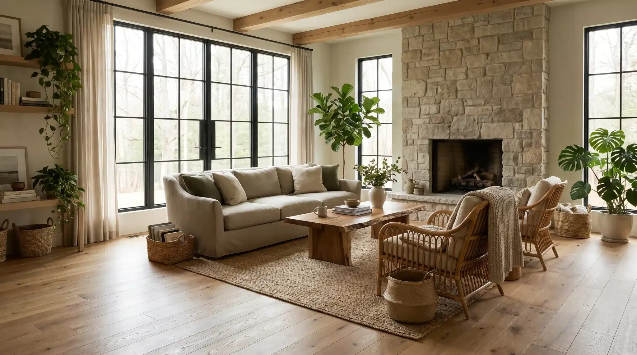
While building my home, I knew I did not want it to feel like a space made only of concrete, glass, and polished surfaces. I wanted it to have a sense of life, warmth, and connection, something that changed with the light, the seasons, and everyday moments. I imagined rooms filled with natural sunlight, the softness of wood and stone, the movement of plants, the calmness of water, and colors that echoed the outdoors. That feeling is what drew me toward biophilic interior design. By bringing together natural elements, organic textures, earthy tones, and sensory details, I made my home more than a place to live. It became a space that felt grounded, personal, and connected to the world outside. 11 Ways to Bring Biophilic Design Into Your Home Biophilic design does not mean turning your home into a greenhouse or copying a picture-perfect space. It is about adding small touches that create a stronger connection with nature. From natural textures and calming colors to plants, light, and organic shapes, these ideas can help you create rooms that feel warmer, more personal, and full of life. 1. Create a Living Green Corner with Indoor Plants Plants are the fastest way to connect a room to nature. Group a few small plants on a shelf. Hang trailing vines near a window, or place one large tree in an empty corner. Choose plants based on the light in the room, not the ones you saw online. A plant that dies within a month teaches you nothing except frustration. Plants also change over time, unlike most furniture. A fern grows new leaves. A vine climbs a wall. I think of plant corners as cozy reading nooks from an old film. Imperfect, a little wild, and completely alive. 2. Use Natural Light as a Design Element Daylight is free, and it does more work than most lighting fixtures. Sheer curtains let light in without losing privacy. Mirrors placed across from windows bounce light deeper into a room. Light colored walls and floors help a small space feel brighter without adding a single lamp. Morning light in a breakfast nook feels different from the golden light of a late-afternoon living room. Once you notice how light shifts throughout the day, you start designing around it rather than against it. 3. Bring in Natural Materials and Organic Textures Wood, stone, bamboo, rattan, linen, and clay all carry small imperfections that machines cannot fake. A wood grain that runs slightly off gives a room texture. So does a hand-thrown ceramic bowl with a rough edge. These materials also age well, which matters more than most trend pieces. Modern earthy homes lean into this fully. Rustic home interiors use it in smaller doses, such as a linen throw or a rattan chair. Either way, texture gives your hand something to notice, not just your eyes. 4. Choose Organic Shapes for Furniture and Decor Nature rarely produces a straight line. A rounded sofa, a curved mirror, or an arched doorway softens a room in a way that hard angles cannot. Sculptural decor pieces do the same job on a smaller scale. Think of a carved wood bowl or an organically shaped vase. Curved furniture has become more common in modern architecture lately. It is not only a style choice. Rooms with soft shapes tend to feel calmer to move through. 5. Build a Nature-Inspired Color Palette Forest green, sage, sand, terracotta, and soft blue all pull from the outdoors. None of them turns a room into a theme park. The trick is balance. One earthy accent wall paired with neutral furniture reads as intentional. Four different greens in one small room read as chaotic. A botanical bedroom might feature sage-colored walls with warm wood furniture. A calm home office might lean on sand and soft blue instead. Pick two or three tones and let them repeat quietly through the room. 6. Introduce Water Elements for Calm and Movement Water brings sound and motion into a space, qualities that plants and materials cannot provide on their own. A small tabletop fountain or a reflective glass surface can add this quality. Artwork featuring water works too, without any renovation. Spa interiors and nature resorts use this constantly. The sound gives your mind something steady to settle on. You do not need an indoor pond to get the benefit. A single fountain on a console table can shift how a whole room feels. 7. Blur the Boundary Between Indoors and Outdoors Large windows, glass doors, and a clear view of a garden or balcony all pull the outside in. If your apartment does not have much of a view, do not worry. A small balcony garden or window box can do surprising work. Outdoor-style seating placed near a big window also helps a room feel less boxed in. Resort-style homes have leaned into this for years. Smaller homes are catching up with clever glass and layout choices. 8. Design for All Five Senses Biophilic design isn’t just something you see. Natural scents like cedar or citrus shape how a room feels. So do soft fabrics, a breeze through an open window, and fresh air. A bedroom with linen sheets, quiet sounds, and fresh air from a cracked window feels restful. A room that only looks good in photos doesn’t feel good. Think about what a room smells like and sounds like, not just what it looks like in a listing photo. 9. Create a Biophilic Home Office Home offices benefit the most from small nature-focused changes. A desk near a window, a plant within reach, and wood furniture instead of laminate all help. Even a view of a tree from your desk chair can make a long workday feel shorter. Creative studios shown in films often mix nature with function. Plants on the desk, natural light, a comfortable chair. It is a small setup, but it works because it removes the sterile feeling most offices default to. 10. Mix Vintage Pieces with Natural Elements A vintage wooden cabinet or a handmade ceramic vase adds a layer of new furniture that cannot be replicated. So does a woven textile passed down from a relative. These pieces carry history, and history makes a room feel personal instead of staged. Pairing an old wooden dresser with a new linen chair does not clash. It tells a story. Rooms built entirely from new furniture can feel like a catalog page. Rooms with a few collected pieces feel like someone actually lives there. 11. Add Botanical Artwork and Nature-Inspired Decor Botanical artwork brings the feeling of the outdoors into rooms where adding real plants is not always practical. A framed leaf print, pressed-flower artwork, landscape painting, or nature-inspired sculpture can create a visual connection to the outside world. Choosing pieces that feel organic rather than overly decorative helps create a balanced look. A handmade ceramic vase, a wooden sculpture, or artwork with earthy tones can add personality without making the room feel themed. Why You Need Biophilic Interior Design A home built around natural light, texture, and greenery tends to feel more relaxing to live in. Several studies in environmental psychology link time spent near natural elements to better focus and lower stress levels. 1. Better Sleep: A bedroom with natural materials, calm colors, and soft light tends to make winding down easier. Harsh overhead lighting, synthetic fabrics, and sterile surfaces pull your body in the wrong direction at the end of the day. Swapping those out for linen bedding, a warmer bulb, or a small plant on the nightstand is a small change that adds up over weeks of better rest. 2. Lower Stress Levels: There is a reason you feel calmer after a walk outside than after sitting in a windowless room. Natural elements, whether real or evoked through texture, color, and material, carry that same quality indoors. A room that includes wood grain, soft green, and a plant in the corner gives your nervous system something gentler to settle on. Over time, that quieter baseline changes how a home feels to return to. 3. Sharper Focus During the Day: Working or studying near a window with a view, even a partial one, tends to reduce mental fatigue. The same effect occurs in plants. A desk positioned near natural light, with a single plant nearby, reduces some of the sensory flatness that comes with enclosed indoor environments. The brain responds to natural variation in light, color, and living things in ways that artificial settings do not replicate. 4. A Stronger Sense of Personal Connection: Homes built with natural materials and collected pieces tend to feel more personal than those filled entirely with new, polished furniture. Wood weathers and changes over time. A handmade clay pot carries marks no machine can reproduce. Living with those things builds a relationship between you and your space that purely aesthetic design does not create. That sense of connection is quieter than most design benefits, but it tends to last longer. Biophilic Design Ideas for Every Room Biophilic design works best when it feels natural to your everyday routine. Instead of adding random nature-inspired elements, think about how each room is used and choose details that bring warmth, texture, light, and a stronger connection to the outdoors. Room Biophilic Design Ideas Living Room Add plants near seating areas, choose wood or rattan furniture, and layer natural fabrics like linen or wool to create a warm, inviting atmosphere. Bedroom Use calming colors, soft natural fabrics, and gentle lighting. Choose simple materials and avoid harsh overhead lights to create a peaceful resting space. Kitchen Place herbs on a windowsill, keep wooden cutting boards visible, and use stone surfaces or natural finishes to add texture to this functional area. Bathroom Add humidity-loving plants, natural stone accents, and soft towels to create a relaxing space that feels more like a spa retreat. Home Office Position your desk near a window, add a nearby plant, and choose natural materials like wood to make the workspace feel calmer and more inspiring. Small changes can make each area of your home feel more connected to nature without requiring a complete redesign. Biophilic design can work in any space, with simple choices that reflect your personal style and bring a more natural feel into everyday living. 5 Biophilic Interior Design Mistakes to Avoid Adding nature-inspired elements can transform a home, but balance matters. Biophilic design works best when it feels natural and personal, not forced. Avoid these common mistakes when creating a nature-connected space: Buying plants without considering your home conditionsA room full of plants looks beautiful in photos, but choosing greenery without considering sunlight, humidity, and the time you have for care can cause plants to struggle or die. Turning your home into a greenhousePlants are an important part of biophilic design, but too much greenery can overwhelm a room. Leave space for furniture, movement, and other natural elements like wood, stone, and textiles. Choosing fake natural materials over authentic texturesPlastic finishes that imitate wood, stone, or plants often feel disconnected up close. Real materials bring warmth, texture, and natural variation that artificial alternatives cannot replace. Ignoring your room’s natural lightEvery room interacts differently with sunlight. A north-facing room may need different plants and colors than a bright south-facing space, so design around the light you actually have. Copying inspiration photos without adapting themA room from Pinterest or a magazine may have different lighting, dimensions, and architecture than your home. Use ideas as inspiration, but adjust them to suit your own space and lifestyle. Final Thoughts Biophilic interior design was never about building a perfect nature-themed room. It is about noticing small things. Morning light on a wood floor, the smell of a plant after watering, a soft throw under your hands. Those moments add up to more than any single design choice. Your home will keep changing, and that is fine. Future homes will likely continue to blend nature, smart technology, and personal touches in new ways. For now, start with one corner, one plant, or one better-placed lamp, and let the rest follow. Frequently Asked Questions How Many Plants Should a Biophilic Room Have? There is no fixed number. Start with one or two plants that match your light and schedule. Add more once you know you can keep them alive. Can Renters Create a Biophilic Interior Without Renovations? Yes. Plants, textiles, mirrors, and furniture choices need no permanent changes. They still shift how a rented space feels. What Furniture Styles Work Best With Biophilic Design? Wood, rattan, and other natural materials pair well with biophilic design. Curved or organically shaped furniture also fits the style naturally. Does Biophilic Design Work with Minimalist Interiors? Yes. A few well-chosen natural materials can bring a minimalist room to life. One or two plants help without adding clutter.