

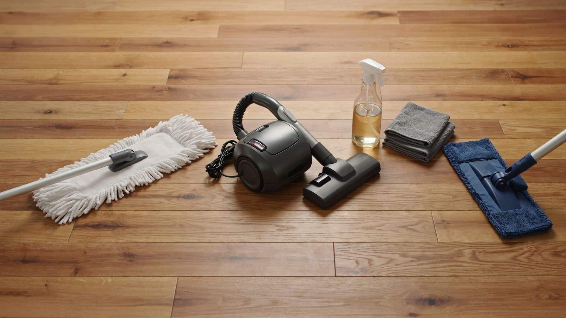
Hardwood floors add warmth and value to a home, but their finish can wear down quickly without proper care. Dust, grit, excess moisture, and the wrong cleaning products often cause scratches, dullness, and surface damage. Keeping hardwood floors clean starts with simple habits. Remove debris before mopping, use a cleaner suited to the floor’s finish, and avoid soaking the wood. The right tools and cleaning routine help protect the finish while keeping the surface looking fresh. Essential Tools and Cleaner for Hardwood Floors Before cleaning hardwood floors, gather the right tools and products to avoid scratches, residue, and moisture damage. The items below help remove dirt safely while protecting different floor finishes. Tool / Care Item How to Use It Microfiber mop Picks up dust and grime without scratching the finish, making it a safe choice for regular hardwood floor cleaning. Soft-bristle broom and microfiber cloths Remove loose dirt and handle spills, corners, and small cleaning areas quickly. Hardwood-safe vacuum Use the bare floor setting, turn off the beater bar, and choose soft attachments to prevent scratches and scuffs. pH-neutral hardwood cleaner Choose a water-based cleaner that matches your floor’s finish. Avoid harsh chemicals and residue-forming products that can dull or damage the surface. Know your floor finish. Polyurethane floors handle light damp cleaning, while oil, wax, and water-based finishes require specific products and care methods. Control moisture Use a spray bottle or a lightly damp mop instead of soaking the floor, as excess water can cause swelling or damage. Using the correct tools and controlling moisture make routine cleaning safer and more effective. Always match your cleaning method to your floor’s finish to prevent unnecessary damage. How to Clean Hardwood Floors Step by Step Before you start cleaning, it helps to follow the right order to protect your hardwood finish. The process begins with removing dirt and buildup, then moves through careful mopping, drying, and maintenance steps that keep floors looking clean without exposing them to excess moisture. 1. Remove Dirt and Stubborn Buildup First, remove dust, pet hair, and loose debris using a microfiber mop, soft broom, or hardwood-safe vacuum. For high-traffic areas, use a microfiber cloth with hardwood cleaner to lift stubborn dirt. Gently clean between floorboards with a soft attachment, avoiding excess moisture that can seep into seams. 2. Prepare the Cleaning Solution Always follow the cleaner’s instructions instead of adding extra product. Too much solution can leave behind a sticky film that attracts more dirt and makes the floor look dull. Spray a light mist over a small area rather than soaking the surface. 3. Damp Mop the Floor Use a mop that feels slightly damp, not wet. Work in small sections so moisture does not sit on the wood for too long. Rinse the mop regularly, or replace the microfiber pad when it gets dirty, to avoid spreading grime across the floor. 4. Dry the Floor Properly After cleaning each section, wipe away leftover moisture with a dry microfiber cloth or make a dry pass with your mop. Removing excess water helps protect seams and prevents issues like swelling or warping. 5. Restore Shine After Cleaning If your hardwood looks dull after cleaning, the issue may be a worn finish rather than leftover dirt. Hardwood polish can temporarily improve the appearance, but it does not repair damaged coatings. Floors with heavy wear may need professional refinishing to restore their original look. 6. Maintain Clean Floors Between Deep Cleanings Regular maintenance keeps hardwood floors cleaner and reduces the need for frequent wet cleaning. Sweep high-traffic areas often, place mats near entrances, use furniture pads to prevent scratches, and clean spills as soon as they happen to protect the finish. How to Clean Different Types of Hardwood Floors Sealed Hardwood Floors: Most modern hardwood floors are sealed with polyurethane. Use a damp mop with a pH-neutral cleaner and avoid harsh products that can damage the finish. Unfinished Hardwood Floors: Without a protective coating, hardwood is more susceptible to moisture damage. Use dry cleaning methods and avoid excess water to prevent stains or warping. Engineered Hardwood Floors: The thin layer of real wood over a composite core requires careful moisture control. Use minimal liquid and avoid soaking the surface. Older Hardwood Floors: Older finishes may react differently to cleaners. Test products in a hidden area first and use gentle cleaning methods on worn or aged floors. What Not to Use on Hardwood Floors Before cleaning hardwood floors, knowing what to avoid is just as important as knowing what to use. Certain products and cleaning methods can damage the finish, trap moisture, or create buildup that affects the floor’s appearance over time. Keep these common mistakes in mind to protect your hardwood investment. Avoid Excess Water: Standing water can seep into seams, causing swelling, warping, or cupping. Use a lightly damp mop instead of a wet one. Avoid Steam Cleaners: Steam adds heat and moisture that can penetrate between boards, damaging the wood or subfloor. Avoid Harsh Chemicals: Bleach, ammonia, and abrasive cleaners can dull or strip the hardwood finish. Avoid Wax and Oil-Based Products on Certain Finishes: These products can leave buildup on modern polyurethane floors and affect future refinishing. Always check your floor’s finish first. Common Mistakes When Cleaning Hardwood Floors One of the most common hardwood floor cleaning mistakes is mopping before removing dust and debris, as grit can scratch the finish during cleaning. Using the wrong mop can also cause problems, with abrasive materials damaging the surface and overly wet mops increasing the risk of moisture. Avoid cleaning with water too frequently, as repeated exposure to moisture can wear down the finish over time. Clean spills quickly, since liquids left sitting can seep into the wood and cause water stains or surface damage. Conclusion Keeping hardwood floors looking good comes down to gentle tools and the right cleaner for your finish. Keeping moisture to a minimum every time you clean matters just as much. None of this requires anything complicated, just a routine you actually stick to. A little consistency now saves you from a much bigger refinishing job later. It keeps the floor looking like the investment it was. Frequently Asked Questions What is the best thing to wash your hardwood floors with? Use a microfiber mop with a pH-neutral hardwood floor cleaner recommended for your finish. Avoid excess water and harsh cleaners that can damage the protective coating. Can I use Swiffer wet cloths on hardwood floors? You can use Swiffer wet cloths on some sealed hardwood floors if you use them lightly, but avoid leaving moisture behind. Always check your flooring manufacturer’s recommendations first. What do professional cleaners use on hardwood floors? Professionals typically use microfiber mops and hardwood-safe, pH-neutral cleaners designed for the floor’s specific finish. They focus on low-moisture methods to protect the wood. What is the best homemade cleaner for hardwood floors? A simple, damp microfiber mop is often the safest homemade option for many sealed hardwood floors. Avoid vinegar mixtures, as they may dull or weaken some finishes over time. Is Murphy’s Oil Soap good for wood floors? Murphy’s Oil Soap can be used on some finished wood surfaces, but it may leave residue on certain hardwood floors. Check your finish type and the manufacturer’s care instructions before using it regularly.
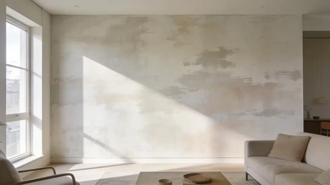
Limewashing walls starts with preparing the surface and applying thin mineral-based layers with a block brush. Random crisscross strokes create the cloudy variations that define this finish. The appeal comes from how the color changes as lighting shifts throughout the day. A wall that reads soft white at noon can look warm and shadowed by late afternoon. After a decade working with color, I have found that this changing appearance is one reason homeowners connect with limewash. The process involves preparing the wall, applying multiple coats, and caring for the finished surface. What is Limewash Paint and How Does It Work? Limewash is one of several textured wall finishes unlike regular paint, which creates an even surface with a consistent sheen, it’s applied in thin, semi-transparent layers that leave visible brushstrokes. Limewash is applied in thin, semi-transparent layers, allowing brushstrokes and color variation to remain visible. The brushwork stays visible in the final coat. That variation is the point. Color behavior matters here. The paint appears darker when wet and noticeably lighter once dry. Adding extra paint too early can reduce the soft variation that gives limewash its character. Let each layer dry fully before assessing the wall. Tools and Materials Needed to Limewash Walls Collect all materials before starting. Limewash dries differently from standard wall paint, so stopping halfway across a wall can create visible transition marks. Item Purpose Limewash paint Creates the textured finish Mineral primer Helps limewash bond with walls Block brush Creates the signature movement Drop cloth Protects floors Painter’s tape Protects edges Stir stick Keeps paint consistent Spray bottle Helps maintain a wet edge How to Prepare Walls for Limewashing Proper preparation helps limewash absorb evenly and creates a more consistent finish. Skipping any of these steps affects the final result. Clean and Repair the Wall: Remove dust, grease, and dirt with a damp cloth and mild cleaner. Fill holes with patching compound. Let everything dry before priming. Prime the Surface: New drywall requires mineral primer. Previously painted walls need primer only if the existing finish is glossy or in poor condition. Highly porous surfaces can absorb limewash quickly, resulting in uneven color if not properly prepared. Test the Color and Finish: Apply a sample patch to the actual wall. This finish reads differently at 7 am than at 7 pm. Check both before committing. How to Limewash Walls Step by Step Follow the order carefully because preparation, drying time, and application technique all affect the final appearance. Step 1: Prepare the Limewash Paint Stir thoroughly for at least two minutes before use. Follow the product’s dilution instructions if thinning is required. Pour the paint into a clean application bucket and stir again. Continue stirring during application to maintain an even consistency. Settled paint creates uneven coverage and color variation across the wall. Step 2: Apply the First Coat Using the Limewash Technique Load the block brush about a quarter of the way up the bristles. Apply using loose, unstructured crisscross strokes from the center of each section. Keep a wet edge throughout and work in small sections. Deposit most of the paint at the center and feather outward to blend the edges. Do not aim for full coverage on the first coat. Step 3: Add Additional Layers for Depth Let the first coat dry fully before adding a second coat, typically 12 to 24 hours, depending on humidity and temperature. The wall will look darker when wet and lighter when dry. Apply each additional coat using the same crisscross technique. Two coats suit most walls. A third thin coat adds consistency where needed. Step 4: Finish, Cure, and Evaluate the Wall Remove painter’s tape once the final coat dries. Stand back and assess the full wall in both morning and evening light before deciding if another coat is needed. Allow full curing before touching the surface. Mist lightly if the manufacturer recommends it. A matte sealer is optional but adds protection in high-traffic areas. Limewash Wall Care and Maintenance Limewash walls require less maintenance than many traditional painted surfaces. Keeping water exposure to unprotected areas to a minimum is what matters most. For cleaning, use a dry or barely damp cloth. Strong cleaners strip the finish. For repairs, apply a thin layer of the original product over the affected area. Feather the edges using the same crisscross approach as the original coat. Sealing is optional. A matte sealer adds protection in high-traffic areas. Without sealer, the surface may change gradually as it ages. How to Choose Limewash Colors for Different Rooms Limewash changes with lighting, so a shade can look different throughout the day. This helps reveal how the color responds to morning and evening light. Bedrooms: Soft neutrals like warm white, beige, and muted taupe work well. These shades create a calm backdrop while keeping the limewash texture visible. Living Rooms: Warm earth tones such as sand, clay, soft brown, and muted olive pair well with natural materials and add depth to larger spaces without feeling heavy. Small Rooms: Lighter shades like soft cream, pale beige, and light gray can help small rooms feel more open. Always test the color first, because limewash can appear stronger across an entire wall. Low-Light Rooms: Avoid very cool shades in rooms with limited sunlight, as they can make the space feel cold. Warmer neutrals and earthy colors usually work better under softer lighting. Can You Paint Over Limewash? You can paint over limewash after checking the surface condition and preparing it for the new coating. Run a hand over the existing wall. If material transfers, the layer must be stabilized before anything is placed on top. Remove loose or dusty limewash, or stabilize it before applying primer and new paint. Clean the wall with a damp cloth, then let it dry completely. Apply a suitable primer before the new paint. Water-based paints tend to work over primed limewash. Oil-based products need a compatible intermediate primer. Mistakes to Avoid When Limewashing Walls These common issues usually arise from problems during preparation or application. Mistake Cause Fix Finish looks streaky Too much paint applied Use thinner layers Texture looks flat Not enough stroke variation Add another coat Paint color does not stick Poor surface preparation Prime correctly first Color looks wrong Assessed before full drying Wait until completely dry Application lines visible Wet edge lost mid-wall Work faster and maintain wet edge Frequently Asked Questions What are The Disadvantages of Limewash Paint? Limewash may require more preparation than regular paint, and the final color can be difficult to judge until each coat has fully dried. Does Limewash Paint Need a Primer? Primer is recommended on new drywall, glossy surfaces, and highly porous walls to improve adhesion and create more even absorption. How Long Does Limewash Last on Interior Walls? A properly applied limewash finish can last for years indoors when protected from excessive moisture and cleaned gently. Can You Apply Limewash with a Roller? A roller can speed up coverage on large areas, but a block brush creates the natural variation and texture associated with limewash. What Surfaces Can be Limewashed? Limewash works best on porous surfaces such as plaster, brick, and mineral-based walls that allow the finish to be properly absorbed. Happy Reading The process for limewashing walls is more forgiving than most paint techniques. Variation is the point, and a perfectly even coat works against the finish. Get surface preparation right, use the crisscross stroke, and let each layer dry before assessing the color. The finish looks different at 7 am than at 7 pm. That movement is part of what makes it worth the effort. Try a small section first to test the technique. Share the result in the comments once done.
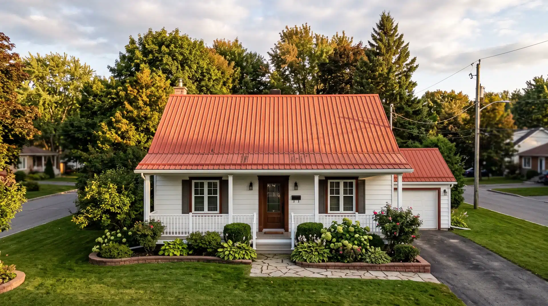
Quick Answer: Yes, painting a metal roof works well when done right. Remove rust first, apply a primer matched to your roof’s metal type, then finish with UV-resistant paint. Proper prep adds a decade or more of life for a fraction of the replacement cost. I’ve painted two metal roofs. The first looked great for eight months and then started peeling at every seam. I had skipped the primer and rushed the rust removal. The second one is still holding up years later. The difference was entirely in how I prepared the surface. So when people ask me whether you can paint a metal roof, the answer is yes, and it is one of the better calls you can make if your roof is starting to fade or showing rust. It costs 40 to 60 percent less than a full replacement and adds 10 to 15 years to the roof’s life. That’s the real advantage metal has over shingles when you’re deciding what to do with an aging roof. Do the prep right. That is exactly what this blog is for. Tools and Materials for Painting a Metal Roof I showed up on my first metal roof paint job without the right primer. I climbed back down, drove to the hardware store, and lost half a day. Tool / Material Purpose Pressure washer Remove dirt, mold, mildew, and loose paint Wire brush and sandpaper (80-grit) Remove rust and smooth rough spots Paint scraper Strip flaking old paint from the surface Safety harness, non-slip shoes, gloves, eye protection Personal protection on the roof Rust converter or rust-inhibiting solution Stop rust spreading under new paint Metal-specific primer (rust-inhibiting, aluminum, or galvanized depending on roof type) Bonds new paint to the metal surface Acrylic latex paint formulated for metal roofing (UV-resistant, water-repellent) Main protective and weatherproofing coat Paint sprayer Even fast coverage on large roof areas Roller and brush Detail work, edges, seams, and corrections Exterior caulk and sealant Seal gaps, joints, and open seams Drop cloths and masking tape Protect gutters, fascia, and trim Ladder with stabilizer Safe, stable roof access How to Paint a Metal Roof the Right Way Preparation is 70 percent of this job. The steps below are in the order they need to happen. Skip one or reorder them, and you are looking at a two-year finish instead of a fifteen-year one. Step 1: Set Up Safety Equipment and Inspect the Roof Before anything else, anchor a safety harness to a structural point on the roof. Non-slip shoes are not optional on any metal surface, wet or dry. Once you are safe, walk the entire roof and look for rust spots, loose or bent panels, holes, cracked seams, and areas where old paint is peeling. Note every problem before you clean. Paint does not fix structural damage. It traps moisture against it, which accelerates the very corrosion you are trying to stop. If your roof is new, wait at least six months before painting. Some factory coatings come with a warranty that can be voided if you paint too early. Step 2: Clean the Entire Roof Surface A pressure washer removes the bulk of the work in a fraction of the time a brush would take. Run it across the full surface to lift dirt, bird droppings, mold, mildew, and algae. Follow with a wash using a diluted trisodium phosphate solution or a dedicated roof cleaner to cut through grease and oil residue. Rinse completely. Soap residue left behind prevents primer from bonding and is one of the most common causes of paint failure that homeowners never trace back to the cleaning step. The roof needs to be completely clean before anything else happens. Step 3: Remove Rust and Strip Flaking Old Paint Work through every rust spot with a wire brush, 80-grit sandpaper, or an angle grinder fitted with a wire wheel. Remove all loose, flaking, and bubbling rust down to bare metal. A paint scraper handles old paint that is lifting along seams and edges. Do not paint over rust under any circumstances. Rust sealed under new paint does not stop. It spreads, and within months, it pushes the new paint off from underneath. I know it is tempting to rush through this one. Don’t. Every minute you spend here adds months to the finish. Step 4: Apply Rust Converter to Remaining Rust After rust removal, any area where rust has penetrated deeply needs chemical treatment before primer is applied. A rust converter reacts with iron oxide, converting it into a stable compound that stops further corrosion and provides a surface for primer to bond to. Apply with a brush and allow it to dry per the manufacturer’s instructions, which is typically around 24 hours. Do not rush this step on older roofs or roofs with visible corrosion pitting. The converter needs time to complete the chemical reaction before it can hold anything on top of it. Step 5: Repair Damage and Seal all Seams and Joints Fill small holes with a metal roofing patch or a roof repair sealant rated for exterior use. Run a bead of exterior caulk along all open seams, panel overlaps, around fasteners, and at every point where the roof meets flashing or trim. Allow all repairs and caulk to cure fully before moving to primer. Paint applied over uncured sealant wrinkles and fails. This step protects the roof’s waterproofing as much as the paint does, and skipping it leaves the roof’s most vulnerable points exposed to water entry, no matter how good the paint job looks. Step 6: Let the Roof Dry Completely Apply primer only to a dry roof. Any moisture trapped underneath creates bubbles, blistering, and adhesion failure that show up within the first season. Ideal conditions are 50 to 85°F, low humidity, and no rain forecast for at least 24 hours. Avoid painting on metal in direct midday sun: the surface heats up quickly, causing the primer to skin over before it penetrates. Wait at least 24 hours after pressure washing before you prime. In humid climates like the Southeast, I would wait 48 hours to be safe. Step 7: Apply Metal-Specific Primer This is the step I see skipped most often, and it is the single biggest reason DIY metal roof paint jobs fail early. I skipped it on my first roof and had to redo the whole thing. The first selection depends on your specific roof type. Steel roofs need a rust-inhibiting primer. Aluminum roofs have a naturally slick surface and require an aluminum-bonding primer: standard primers do not adhere to aluminum without it. Galvanized metal has a zinc coating that actively prevents standard primers from bonding. Use a galvanized metal primer specifically, or the paint will peel within months. Apply with a sprayer for full coverage, a roller for flat runs, and a brush along seams and edges. Allow the full cure time listed on the label before touching it. Step 8: Choose Your Paint and Check Weather Conditions The best paint for a metal roof is a 100% acrylic latex formula designed for metal roofing. UV-resistant and water-repellent versions protect against the two conditions that degrade metal roofs fastest. Oil-based paints are more durable but harder to apply and dry significantly slower. Color matters more than you would expect on a metal roof. Light colors reflect heat and reduce cooling costs, making them a practical choice in warmer US climates like the South and Southwest. Dark colors absorb heat and can noticeably raise attic temperatures. Do not paint outside the 50 to 85°F window, in wind, or when rain is expected within 24 hours of application. Step 9: Apply the First Coat of Metal Roof Paint Start at the peak and work downward on every pass. Working downward keeps overspray off already-painted surfaces and prevents you from stepping on wet paint. A sprayer provides the most even coverage on large roof areas. Follow with a roller to work paint into seams and around fasteners where a sprayer leaves thin spots. Apply thin, even coats. Thick coats sag, drip, and take far longer to dry without adding any extra protection. Allow the first coat to dry fully before applying the second, which typically takes four to eight hours, depending on the product and conditions. Step 10: Apply the Second Coat and Do a Final Inspection A second coat is not optional. One coat on a metal roof does not provide adequate UV or moisture protection, no matter how thick it is. Repeat the peak-down method. Once the second coat has dried for 24 to 48 hours, do a walk-through inspection of the entire roof. Look for thin spots, missed seams, runs, and any places where the primer is still showing through. Touch up with a brush before calling it done. A properly painted metal roof lasts 10 to 15 years. You will know it is time to repaint when you start seeing fading, peeling, or rust spots returning. Pros and Cons of Painting a Metal Roof Before you climb up there, here is a look at what you are getting into. Pros Cons Costs 40 to 60 percent less than a full roof replacement Prep work is time-consuming, especially rust removal Extends roof life by 10 to 15 years when done correctly The wrong primer for your roof type causes early peeling Protects against UV damage, rust, and corrosion Steep or multi-story roofs require a professional Reflective paint options reduce cooling costs in summer Paint can trap moisture if applied over unrepaired damage Refreshes curb appeal and updates exterior color Needs repainting every 8 to 15 years, depending on climate Can be a DIY project on single-story roofs Falls from roofs are among the most common home improvement injuries Stops existing rust from spreading when treated correctly New roofs with factory coatings may have warranties that painting voids Conclusion I’ve made most of the mistakes on a metal roof paint job. I skipped the primer, rushed the rust removal, and painted in the heat of the day. Every single one cost me time and money. The version that holds up for a decade is not complicated. Inspect before you paint, treat every rust spot before you prime, and give each coat the full time it needs to dry before applying the next. That is it. A painted metal roof, done with proper prep, lasts 10 to 15 years and costs a fraction of the cost of a replacement. Do it without the prep, and you are doing it twice. The prep is the job. Everything else is just paint. Frequently Asked Questions How long does paint last on a metal roof? Most painted metal roofs last 10 to 15 years with proper preparation and quality materials. Regular maintenance and early touch-ups on faded or peeling areas can extend that further. Can you paint a metal roof yourself, or do you need a professional? A single-story metal roof with a moderate pitch is manageable as a DIY project if you follow the prep steps and use the right safety equipment. Can you paint a metal roof in winter? Not in most of the US. Paint and primer need temperatures between 50 and 85°F to adhere and cure properly. Applying paint below 50°F results in poor adhesion, slow drying, and a finish that fails sooner than it should.

My grandma once painted her kitchen a green so bright it looked like a lime popsicle. She loved the idea of adding color, but within a month, she was ready to repaint. That memory stayed with me for years and made me hesitant about green walls. Then I came across Benjamin Moore Saybrook Sage, and it completely changed how I saw green paint. This is a soft, muted sage that feels calm, natural, and timeless. It brings a touch of the outdoors inside without making the entire room revolve around the color. Choosing the right green is about more than liking a paint chip. Undertones, lighting, flooring, and trim all influence how the shade comes to life in a space. Saybrook Sage works because it brings color in a way that still feels comfortable and easy to live with. What Makes Benjamin Moore Saybrook Sage Stand Out? Saybrook Sage HC-114 comes from Benjamin Moore’s Historical Colors collection, and it has a quiet, grounded quality that works in both older homes and newer spaces. Unlike brighter greens that demand attention, Saybrook Sage has a soft, grayed-down look that blends naturally into a room. It adds color while still letting your furniture, textures, and decor take the spotlight. Feature Details Color Name Saybrook Sage Code HC-114 Collection Historical Colors LRV Around 45 to 46 Color Family Green Undertone Soft gray-green with a touch of yellow LRV, or Light Reflectance Value, shows how much light a paint color reflects back into a room on a scale from 0 to 100. With an LRV around45 to 46, Saybrook Sage sits comfortably in the medium range. It has enough depth to feel intentional without becoming too dark or heavy. The result is a balanced sage that feels fresh in bright rooms and cozy in softer lighting. Why Does Saybrook Sage Feel So Calm and Natural? Saybrook Sage connects a room to nature without turning it into a themed space. Think of dried herbs, olive leaves, and weathered stone, all soft and worn by time. The gray running through Saybrook Sage takes the edge off the green, so it never feels artificial or sharp. That softness is what makes everyone pick it when they want personality on the walls without a bold statement. This color complements a room instead of overpowering it. Think of a living room with a linen sofa and a wooden coffee table. Saybrook Sage sits behind those pieces like a quiet backdrop. It lets the textures do the talking. In a bedroom, paired with soft cotton bedding and warm lamp light, it feels like a place to rest. In a home office, it creates a calm backdrop without feeling cold or plain. Is Saybrook Sage Too Green? You are probably wondering if Saybrook Sage will feel like a true sage green or if it will lean too far into green once it reaches your walls. One reason it works well is that it stays on the softer side. Saybrook Sage leans more toward gray than green in most spaces, and that muted quality is what keeps it feeling calm and natural rather than bright or artificial. The finishes around it will still influence the way it reads. Warm wood tones can bring out the earthy side, while crisp whites and cooler finishes can make the gray influence stand out more. In bright natural light, Saybrook Sage reveals a fresher side, with sunlight making the green feel lighter and more natural while keeping its soft, muted character. In lower light, the shade becomes deeper and quieter, with gray undertones becoming more noticeable. Warm lighting can bring out subtle olive tones, while cooler light may emphasize its gray influence. Testing a sample on your wall is the best way to see how it works with your room’s lighting, flooring, and finishes. Where Does Saybrook Sage Work Best? Saybrook Sage is one of those colors that can move comfortably from room to room. It does not need a specific style or a perfect setting to work, but certain spaces really bring out its personality. The fun part is seeing how differently it can feel depending on what surrounds it. In one room, it feels warm and earthy. In another, it feels calm and refreshing. Here are the spaces where Saybrook Sage naturally fits in. 1. Living Rooms with Warm Textures Saybrook Sage works especially well in a modern living room where natural materials and simple design elements create a balanced feel. Wood furniture, linen upholstery, woven rugs, and soft textures bring out the earthy side of the green while adding warmth and comfort without making the space feel overly styled. Used as the main wall color, Saybrook Sage creates a calming backdrop for a modern living room with layered textures, natural finishes, and pieces that add character over time. 2. Kitchens with Sage Green Cabinets A kitchen is one of the places where Saybrook Sage can make a real impact. On islands or cabinets, it adds color while still keeping the space feeling timeless and easy to live with. Pair it with white countertops, warm wood shelving, brass hardware, or a marble backsplash, and the green starts to feel balanced rather than trendy. It gives the kitchen personality without taking over the entire room, and the right approach topainting kitchen cabinets can help this soft green finish look even more polished. 3. Bedrooms with a Softer Palette Bedrooms are a natural match for Saybrook Sage because the color has a quiet, calming quality. Neutral bedding, soft lighting, and natural fabrics like cotton or wool create a space that feels comfortable and settled. It adds enough character to make the room interesting while still keeping the peaceful feeling you want in a place meant for rest. 4. Bathrooms and Smaller Spaces Saybrook Sage can be a beautiful choice for bathrooms, powder rooms, and entryways where you want a little more personality. It pairs nicely with white tile, natural stone, and brushed metal finishes. Smaller spaces are a great place to experiment with this shade because the color feels intentional without overwhelming the room. The result is fresh, inviting, and full of character. Is Saybrook Sage Good for Exteriors? Painting a house green can feel like a big risk. Saybrook Sage offers a gentler way to try it. Its muted, gray-green quality reads as sophisticated rather than loud from the street. Outdoor light changes throughout the day, so the color shifts slightly from morning to evening. That shift is part of what makes it feel connected to the surrounding landscape. With natural materials like cedar shakes, stone foundations, and brick walkways, Saybrook Sage creates a cohesive exterior by enhancing its earthy, muted tones. White trim can brighten the shade and create a classic look, while darker accents such as charcoal, black, or deep navy add contrast and depth without overpowering the soft green. What Colors Pair Well with Saybrook Sage? Saybrook Sage is flexible, but the surrounding colors determine whether it feels cozy, fresh, or dramatic. The same green can feel softer with warm whites, more natural with earthy textures, or more dramatic with broader accents. The good thing about this shade is that it already has a muted, balanced quality, so you do not need to fight against it. A few thoughtful choices can help bring out the side of Saybrook Sage that best fits your home. Warm White Trim Colors Warm whites are one of the easiest ways to make Saybrook Sage feel comfortable and inviting. Benjamin Moore White Dove creates a soft, classic contrast, while Simply White adds a little more brightness. For a cleaner, sharper look, Chantilly Lace creates a crisp edge that works well in more modern spaces. Beyond trim, these whites also work beautifully on ceilings, cabinets, and larger surfaces when you want the room to feel fresh without losing the green’s warmth. Natural Materials and Earthy Tones Saybrook Sage pairs naturally with materials that bring warmth and texture into a room. Oak, walnut, rattan, linen, leather, and stone all complement its earthy side and keep the space feeling grounded. Decor colors like warm beige, soft tan, cream, and muted brown work especially well here. These tones help the green feel connected to nature while adding layers that make the room feel comfortable rather than flat. Deeper Colors for Contrast If you want Saybrook Sage to feel a little more dramatic, deeper colors can add beautiful contrast. Shades like Hale Navy, Kendall Charcoal, and Essex Green work well on doors, built-ins, furniture, or accent walls. You can also bring in darker decor through charcoal seating, navy textiles, black metal accents, or deep wood finishes. These richer elements add depth to the room while letting the softness of Saybrook Sage remain the foundation. Saybrook Sage Compared to Other Benjamin Moore Greens Choosing between sage greens can be tricky because many shades have a similar calm, nature-inspired feel. The small differences in undertones and depth are what make each one feel different once it is on your walls. Saybrook Sage sits in a comfortable middle ground. It has enough color to add personality, but it stays muted enough for everyday spaces. Paint Color LRV Undertone Overall Feel October Mist Lighter Green with gray Fresh, gentle, slightly cooler Pale Smoke Lighter Gray with faint green Airy, subtle, almost neutral Healing Aloe Similar range Green with blue hints Fresh, coastal, cooler Saybrook Sage and October Mist are close in feel, but October Mist is lighter and softer, while Saybrook Sage feels slightly warmer and more grounded. Against lighter shades like Pale Smoke and Healing Aloe, it brings more warmth and earthy character. Mistakes to Avoid When Using Saybrook Sage Saybrook Sage is a fairly easy color to live with, but a few small choices can change how it feels in your home. Taking a little time before painting can help you avoid surprises once the color is on the wall. The biggest mistake with Saybrook Sage is skipping the natural light test. A shade that feels perfect in the morning can tell a completely different story by evening. It is also worth checking how it works with your existing floors, furniture, and trim. A white with the wrong undertone or too many competing green shades nearby can make the room feel less balanced. A sample on your own wall, viewed at different times of day, will always tell you more than a paint chip ever could. Is Saybrook Sage the Right Green for Your Home? Saybrook Sage is a great choice if you want to bring color into your home without going too bold. Its soft, muted quality works beautifully for nature-inspired spaces, homes with warm textures, and anyone looking for an alternative to traditional neutrals. It may not be the right fit if you prefer a brighter green, a cooler modern shade, or a true neutral. Like any paint color, the final look depends on your lighting, finishes, and surroundings. Before committing, test a sample on your own walls and watch how it changes throughout the day. The right color is the one that feels natural in your space. Frequently Asked Questions Is Benjamin Moore Saybrook Sage a Good Whole Home Color? Yes, its muted quality makes it easy to carry through multiple rooms without feeling repetitive. It shifts slightly with different lighting, which keeps each room feeling distinct even with one shade throughout. Does Saybrook Sage Work with Dark Wood Furniture? Yes, dark wood tones like walnut bring out the warmth in Saybrook Sage. The pairing feels grounded and traditional rather than mismatched. Is Saybrook Sage a Good Front Door Color? Yes, Saybrook Sage can work beautifully as a front door color, especially on homes with natural stone, brick, or wood details. If you want stronger contrast, deeper shades like Hale Navy can create more impact. What Flooring Looks Best with Saybrook Sage? Light to medium wood floors pair especially well, since they echo the earthy quality in the paint. Natural stone tile also works nicely in bathrooms or entryways.
I’ve spent more hours than I’d like to admit digging into this color, and it still catches me off guard every time. Edgecomb Gray is one of those Benjamin Moore colors people can never quite agree on: gray or beige? Honestly, both, and that’s the whole appeal. How it actually looks in your room depends on more than the paint chip. I’ve seen homeowners fall for a sample at the store, only to watch it look completely different once it’s up on their living room wall. Natural light, flooring, and nearby finishes can shift it from soft beige to a cooler gray, so this blog breaks down the undertones, LRV, and pairings that actually hold up before you commit to a gallon. What Color is Benjamin Moore Edgecomb Gray? Edgecomb Gray HC-173 sits in Benjamin Moore’s Historical Collection. It is also known as Baby Fawn OC-15 in some regional collections. That trips people up when they’re comparing swatches online, leading to two names for the same chip. It’s a warm greige, built from both beige and gray rather than leaning hard into either. That middle-ground quality makes it a transitional color. It doesn’t scream farmhouse, and it doesn’t scream modern gray box. It just sits quietly in the background and lets furniture and trim do the talking. A simple way to think about it. Too gray? No. Too beige? No. A balanced warm neutral that adapts to the room? Yes. Feature Details Paint Color Benjamin Moore Edgecomb Gray Color Code HC-173 Collection Historical Collection Type Warm greige LRV 63 Undertones Warm beige-tan base with a faint green-gray note Best For Walls, open-concept spaces, bedrooms, exteriors What Undertones Does Benjamin Moore Edgecomb Gray Have? Edgecomb Gray carries a faint gray-green undertone beneath its warm beige-tan base. It rarely reads as true green on the wall. Instead, it mostly shows up under fluorescent bulbs or in rooms with heavy greenery just outside the window. What it does is keep the color from tipping too far into pink or peach, which is part of why it photographs so evenly across different rooms. If you want to lean into that undertone rather than mute it, Saybrook Sage carries a similar gray-green base at full strength. It’s an easy match for an adjoining room or a powder bath. Does Edgecomb Gray Look Pink or Purple? Occasionally, in low or artificial light. Warm flooring, brick, or incandescent bulbs can pull out a dusty pink cast more than the paint itself does. Is Edgecomb Gray More Beige or Gray? It depends on exposure. North-facing rooms push it toward gray, south-facing rooms bring out beige, and evening light adds warmth either way. Does Edgecomb Gray Have a Yellow Undertone? Not really. Its warmth reads more beige-tan than yellow, which keeps it from getting the golden cast that some warm neutrals show under bright artificial light. Best Rooms to Use Benjamin Moore Edgecomb Gray Edgecomb Gray works in almost any room, but it shines where natural textures and warm materials already exist. Here is how it performs across the most common spaces. Living rooms handle this color well, particularly open layouts with natural textures like wood flooring, linen upholstery, and stone accents. It reads calm without going flat. Bedrooms benefit from the same softness. Paired with soft whites and warm neutrals on bedding, it creates a restful, low-contrast feel that doesn’t compete with décor. Kitchens work well when this greige is on the walls behind white or off-white cabinetry, especially with marble or quartz counters and brass or matte black hardware for contrast. Bathrooms do best when paired with warm-toned stone or tile. A very cool blue-gray tile can clash with its warmth, making both look slightly off. Colors That Pair Well with Edgecomb Gray Edgecomb Gray rarely stands alone in a room. Its warm, in-between quality makes it a great backdrop for both bold accents and quiet neutrals. The right pairing depends on whether you want strong contrast, added depth, or something that blends in without competing for attention. 1. Benjamin Moore Hale Navy Hale Navy and Naval give Edgecomb Gray something grounded to play against. It works well on a front door, a kitchen island, or an accent wall in a living room or entryway, where the contrast reads as intentional rather than heavy-handed. Keep the surrounding trim in a soft white so the navy has room to stand out. 2. Natural Wood Tones Oak and walnut reinforce the earthy quality of Edgecomb Gray rather than fighting it. Use them for flooring, open shelving, or furniture in a living room, kitchen, or bedroom to keep the palette grounded and warm. Lighter wood tones, such as white oak, also work well, especially in rooms with plenty of natural light. 3. Benjamin Moore Kendall Charcoal Kendall Charcoal adds depth without clashing with Edgecomb Gray’s warmth. Use it on trim, built-ins, or a fireplace surround in a living room, study, or home office, anywhere you want definition without introducing a colder undertone. It also works well as a door color in a hallway painted in Edgecomb Gray. 4. Benjamin Moore White Dove White Dove is the most common whole-home pairing, since it creates a soft, cohesive palette. It works well on trim, ceilings, and kitchen or bathroom cabinetry throughout a house painted mostly in Edgecomb Gray. The two colors share enough warmth that the transition between rooms never feels abrupt. 5. Benjamin Moore Vintage Vogue Vintage Vogue brings a moody, smoky green that grounds a room without clashing with Edgecomb Gray’s warmth. It works especially well on a kitchen island, a dining room accent wall, or an entryway for a bit of drama. Keep it to one surface rather than the whole room, so it reads as an intentional accent. Similar Paint Colors Edgecomb Gray is often compared with a handful of other Benjamin Moore neutrals, since several fall within the same warm, medium-light range. Edgecomb Gray vs Revere Pewter Edgecomb Gray is noticeably lighter and reads softer on the wall. Revere Pewter’s LRV is around 55, giving it more visual weight and making it a better fit for rooms that need a grounded, moodier feel. Edgecomb Gray vs Pale Oak Pale Oak reads airier and slightly cooler than Edgecomb Gray, with less beige presence overall. It works well in bright, light-filled rooms, while Edgecomb Gray holds its warmth better in spaces with less natural light. Edgecomb Gray vs Agreeable Gray Edgecomb Gray leans warmer and more beige overall, while Agreeable Gray reads cooler and closer to a true neutral gray. It suits homes already built around cool finishes, where Edgecomb Gray would feel out of place. Edgecomb Gray vs Accessible Beige Edgecomb Gray carries more gray influence and reads less tan than Accessible Beige. It leans further into a warm tan, with less gray to soften it, making it the warmer choice of the two for traditional interiors. Of these, Revere Pewter draws the most comparisons, since the two colors are easy to confuse. Its lower LRV gives it more weight, making it the better pick for rooms that need depth. How Does Edgecomb Gray Look in Different Lighting? The same gallon can look different from room to room. Daylight direction and bulb temperature pull Edgecomb Gray toward its gray or beige side in ways a paint chip never shows. 1. North-facing rooms The gray side becomes more noticeable here. It still reads warm compared to a true cool gray, but loses some beige softness. Pairing it with warm wood tones or brass fixtures helps counter the coolness. 2. South-facing rooms This pulls the color toward its beige and tan side. According to one in-depth color review, warm southern light plays up the color’s beige undertones and can even bring out a hint of pink. 3. East-facing rooms Eastern light runs warm and yellow in the morning but turns cooler by afternoon, pushing the color from beige toward a cooler greige as the day goes on. 4. West-facing rooms Western light does the opposite. It starts cool and shadowy in the morning, then turns warm and red-tinged by evening, which draws out the color’s beige tendencies later in the day. Can You Use Benjamin Moore Edgecomb Gray on Cabinets? Yes. It’s a common choice for traditional and transitional kitchens looking for something softer than stark white. It pairs naturally with: Benjamin Moore White Dove Benjamin Moore Chantilly Lace Brass or aged-brass hardware Natural wood open shelving or floating shelves One caution worth repeating from professional painters: always test a sample directly on the cabinet material before committing. Cabinet finishes reflect light differently than flat wall paint, especially with satin or semi-gloss sheens. A color that reads warm and soft on a wall can look noticeably different on cabinet doors. Is BM Edgecomb Gray Good for Exteriors or Interiors? It holds up well outdoors, particularly on homes with natural stone, brick, or wood accents. The warmth in the undertone complements farmhouse and traditional exteriors without looking stark against greenery or brick. Indoors, it works just as well on walls, cabinets, and trim, since the same warm base that reads well in daylight also holds up under standard interior bulbs. Exterior sunlight is far more intense than interior lighting, which changes how the color behaves compared to an interior wall: Setting How Edgecomb Gray Reads Interior walls Balanced warm greige that shifts with room exposure and bulb type Exterior siding or trim Brighter and lighter overall, since direct sunlight is much stronger than indoor light. Always test a large sample board outdoors, on more than one side of the house, before painting the full exterior. The Pros and Cons of Choosing Edgecomb Gray No paint color works everywhere, and Edgecomb Gray is no exception. Weighing where it excels against where it can fall short helps set realistic expectations before you commit to a full room or a whole house. Pros Cons Warm without tipping into full beige, so it avoids feeling dated Appearance shifts noticeably depending on room orientation and light, so a single swatch can be misleading Works across traditional, transitional, and modern farmhouse styles without a full redesign Can look slightly muddy in rooms with limited natural light or heavy shade Pairs easily with both cool and warm wood tones, which simplifies furniture shopping Needs testing against existing flooring and furniture before committing, especially in older homes None of this makes Edgecomb Gray a bad choice. It just means the room’s light and existing finishes matter as much as the paint chip does. Is Edgecomb Gray Right for Your Home If you want a neutral that leans warm rather than cool, this color is a good fit. The bigger question is whether your room gets consistent light and already leans warm in its existing finishes. Edgecomb Gray shifts more than most colors depending on exposure and what’s around it. It works best in homes already leaning toward warm tones, with wood tones, brass fixtures, or natural stone nearby. It’s less reliable in cool, blue-based spaces. A sample board checked across a few hours of daylight will tell you more than any photo online. Start there before buying the gallon. Frequently Asked Questions Will Edgecomb Gray clash with cool-toned flooring? It can. Gray-based tile, cool oak, or blue-undertone hardwood may pull out unwanted contrast. Warm or neutral wood tones are a safer match, so test a sample against your actual flooring before committing. How many coats of Edgecomb Gray does a room need? Most walls need two coats for even coverage, especially over a darker existing color. A tinted primer matched to the paint base can help reduce streaking on the first coat. Does Edgecomb Gray look good in small rooms or hallways? Yes. Its medium-light LRV keeps small spaces from feeling boxed in, though hallways with little natural light may need a warmer bulb to avoid a flatter, grayer look. Is Edgecomb Gray a safe choice for resale value? Real estate agents often favor warm neutrals like this one because they appeal to a wide range of buyers and photograph well for listings, without the risk of a trend-heavy color. Does Edgecomb Gray work on ceilings? It can, particularly at a lighter tint, if the walls are already the full shade. A flat ceiling finish in Edgecomb Gray softens the contrast between walls and ceiling in rooms with lower light.
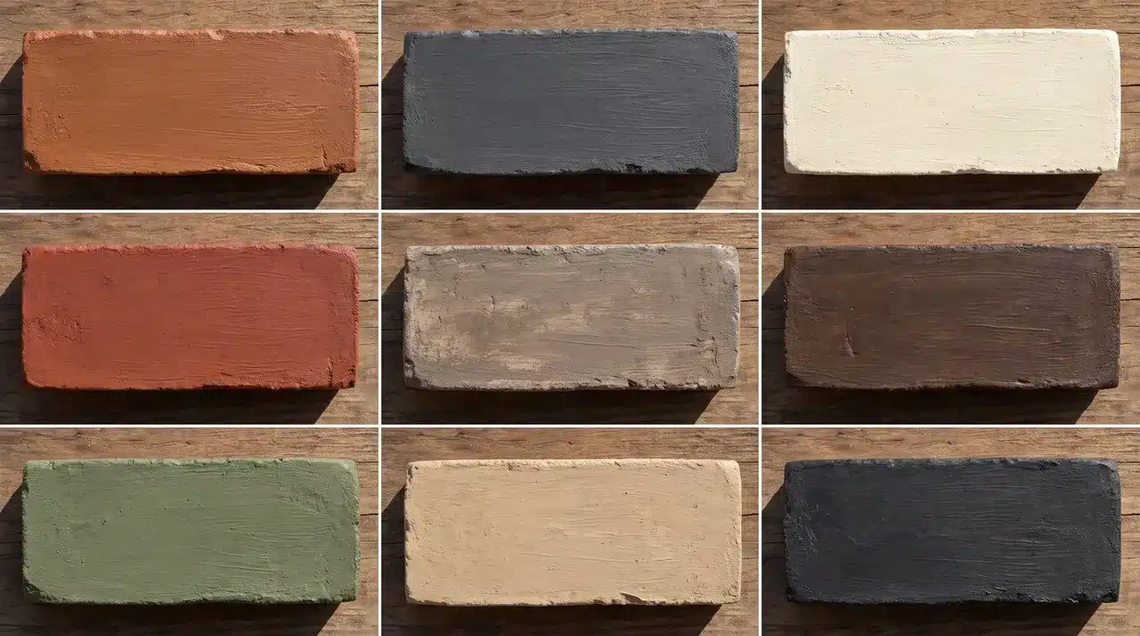
Brick either makes a home look put-together or makes it look tired. There’s rarely an in-between. Faded, chipped, or oddly colored brick stands out fast, especially next to a new roof or door. The fix doesn’t have to mean tearing anything down. Brick stain colors change the brick’s color while keeping its real texture and grain intact. Nothing gets hidden under a flat coat. Your final result depends on a few things. Your brick’s original color matters, along with its porosity, your mortar, your lighting, and how opaque you go. What is Brick Stain and How Does It Change Brick Color? Brick stain is a mineral-based or acrylic colorant that absorbs into the porous surface of masonry. Because it penetrates the brick, the natural texture and variation stay visible after application. Unlike paint, which creates a surface coating that hides brick texture and will eventually peel, stain bonds with the masonry, keeping the natural variation visible. The brick changes color but retains its surface character throughout. Because the colorant bonds to the masonry surface, peeling is less likely than with a paint coating. 11 Brick Stain Colors for Exterior Brick The right shade should complement the architecture of the home. Different styles work better with certain shades, finishes, and color depths. 1. Crisp White White stain gives dark or heavily red brick a bright, clean lift. It brightens the brick without hiding its natural texture. This has more depth than an opaque white coating. Crisp white pairs well with black windows, dark roofs, and natural wood doors. Red, pink, or brown undertones may still show through, though. A test patch shows exactly how much comes through before you commit. 2. Warm Off-White Off-white softens a home’s look without the stark feel of bright white. This shade creates a softer result than a true white stain. It complements cream mortar and warm roofing nicely. Warm off-white suits traditional, cottage, and farmhouse exteriors especially well. It keeps a home from looking too stark or clinical. Many homeowners choose it for a gentle, welcoming update. 3. Light Gray Light gray calms down brick with strong orange or red tones. It reduces the intensity of warm, orange-heavy brick colors. This shade creates a clean, neutral background for your whole exterior. Light gray pairs well with white, navy, charcoal, or black accents. Keep in mind it can look cooler on north-facing walls. Check a sample against your actual wall before committing to the full project. 4. Warm Gray Warm gray offers a softer alternative to a blue-based gray stain. It works well with beige mortar and warm roof shingles. This shade suits ranch, Craftsman, and transitional homes especially well. Warm gray also helps connect gray siding with brown exterior materials. It avoids the cold, flat look that cooler grays sometimes create. Homeowners often pick this shade when they want a balanced, neutral finish. 5. Charcoal Gray Charcoal gray gives brick a bold, grounded look. It makes natural texture appear less busy to the eye. This shade works well with cedar, cream trim, and matte-black fixtures. Charcoal gray suits modern homes that want strong visual contrast. Dark colors absorb more heat, so testing first matters here. Always check a sample in full sun before staining the entire wall. 6. Greige Greige blends the coolness of gray with the warmth of beige. It coordinates well with stone, stucco, and natural wood finishes. This shade softens red brick without looking cold. Greige suits homes with a mix of warm and cool materials. Its flexible undertones make greige a reliable option because it rarely clashes with existing materials. 7. Taupe Taupe creates a quiet, earthy finish with less contrast than darker shades. It complements bronze windows and brown roofing nicely. Taupe pairs well with cream, olive, and muted black accents. This shade offers a softer look than charcoal or bright white. It suits traditional homes that want a subtle, understated update. Taupe rarely overwhelms other exterior colors already in place. 8. Medium Brown Medium brown restores an earthy look to faded or discolored masonry. It suits traditional, rustic, and Craftsman-style exteriors especially well. This shade pairs nicely with beige trim and dark brown doors. Medium brown can unify brick with mismatched red and orange tones. It works particularly well on older homes with weathered, uneven brick. This makes it a reliable pick for restoring a tired exterior. 9. Refreshed Red Refreshed red brings depth back to washed-out or repaired brick. It restores richness to brick that has faded over time. This shade keeps a home’s traditional character fully intact. Refreshed red also helps new bricks blend into older masonry. It pairs well with black, sage, cream, and warm white accents. This shade is often chosen to fix patchy repair work. 10. Muted Sage Green Sage green gives brick a soft, gray-green cast. It introduces a subtle, muted tone without looking bold or unusual. This shade complements landscaping and natural wood details nicely. Test sage green against the roof and mortar first. It may look different across light and dark brick sections. A small test patch helps confirm the color reads consistently. 11. Soft Black Soft black creates a bold, modern exterior update. It produces a contemporary, architectural look without feeling harsh. Soft black shows more natural variation than an opaque black paint. This shade pairs well with warm wood and off-white trim. It works best in homes with plenty of natural light. Strongly contrasting trim also helps this shade stand out. How to Choose the Right Brick Stain Color Start with your roof, since it’s the hardest material to change. Brown roofs pair well with brown, greige, or off-white stains. Black roofs pair with white or charcoal. Mixed shingles call for a neutral like greige. Mortar color also shapes your brick stain color, light mortar brightens it, while dark mortar adds contrast. Factor in fixed exterior materials you can’t easily change, like stonework, siding, window frames, gutters, and walkways. Your home’s exterior style points toward certain color families. Colonial homes often suit refreshed red, while contemporary homes suit soft black. Sunlight changes everything. Direct sun can wash out light colors, and shade can flatten warm tones. North-facing walls often look cooler than south-facing ones. Before you decide, test two or three stain concentrations directly on your exterior brick. Texture and lighting both affect the final color. Brick Stain Color Pairing Ideas Picking a brick stain color is only half the job. The right trim, door, and roof pairing ties the whole exterior together. Use this table for quick pairing ideas once you have a shade in mind. Brick Stain Trim Front Door Roof Warm White Soft black Natural oak Charcoal Light Gray Crisp white Navy Black Charcoal Cream Cedar Black Greige Warm white Dark bronze Brown Taupe Ivory Olive green Weathered brown Refreshed Red Cream Black Dark gray Medium Brown Beige Deep green Brown Sage Off-white Walnut Charcoal These pairings are a starting point, not a fixed rule. Your own lighting, landscaping, and personal taste still matter. Test your chosen brick stain color next to real trim and door samples before you commit. DIY Brick Staining vs. Hiring a Professional DIY works well on small, easy-to-reach projects with bare brick in good condition. It also suits projects that require a single uniform color, as long as you test samples first. That’s the idea behind painting brick stain. Hire a professional instead if your house has multiple stories or if the brick needs repairs or deep cleaning. A pro also helps when you want several blended colors or when replacement bricks need to match older ones. The same goes for surfaces that may already have a sealer or coating. Signs of water intrusion or masonry failure call for expert eyes right away. When a project feels risky, hire a pro. How to Test Brick Stain Colors Correctly Clean a section of brick and mortar that represents the whole wall Choose a spot with some natural color variation Test at least three nearby shades Apply the coats or dilution level you plan to use on the full project Let every sample dry completely Check the colors in the morning, afternoon, and evening light Step back and view the samples from the street, not just up close Confirm the color on both a sunny day and a cloudy one Physical testing matters because brick texture, porosity, and original color all change how a stain looks once it dries. Mineral Stains recommends testing samples directly on your own surface for this same reason. Conclusion The best brick stain color depends on your brick, mortar, roof, and fixed materials. Natural light plays a role too. Start with physical samples. Test a few colors and dilution levels before you commit. Before you begin, confirm your brick is clean, porous, unsealed, and structurally sound. Once you’ve picked a favorite, compare your test patches from the street, not just up close. That is the view your neighbors and guests will actually see. Take your time with the final choice, since the right brick stain color should complement your home for years to come. Frequently Asked Questions What Is the Best Stain to Use on Brick? There’s no single best stain. Water-based and mineral-based options both work well, as long as the product matches your brick’s porosity and exposure to outdoor weather. Is Staining Brick a Good Idea? Yes, in most cases. Staining refreshes faded or mismatched brick while keeping its natural texture. It usually costs less than a full brick replacement, too. What Colors Does Brick Stain Come in? Brick stain comes in many colors, including white, gray, charcoal, brown, greige, and taupe. Sage, refreshed red, and custom color blends are also common today. What are the Most Popular Brick Colors? White, gray, and charcoal rank among the most popular brick stain colors right now. They pair well with many rooflines, trim colors, and door choices. What are the Popular Brick Colors in 2026? In 2026, white, black, charcoal, and classic red remain popular brick stain colors. Blonde, tan, and warm earthy tones round out this year’s top picks.
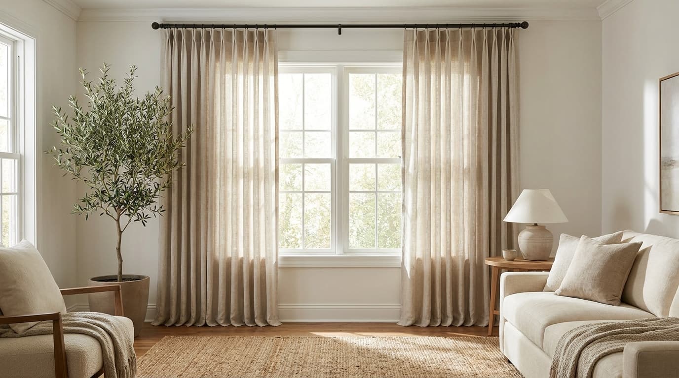
Curtains can completely change how a room feels, but the installation process often comes with more measuring, drilling, and adjusting than expected. If the height is wrong, your window looks smaller, if the width is wrong, the room feels cramped instead of open. To hang curtains, install brackets 4–6 inches above the window frame and 3–4 inches out on each side. Attach the rod, then hang your curtain panels. Learning how to hang curtains the right way changes how a whole room feels. A few extra inches in the right spots can make ceilings look taller, and windows look wider. You will learn every step by the end, from gathering tools to hanging the final panel. What You Need to Hang Curtains Before you touch the wall, gather everything on this list. Having tools ready saves trips up and down the ladder. Tool/Material: Tape Material Level Pencil Drill Wall Anchors Stud Finder Curtain Rod Brackets Curtain panels Step ladder If you’re working with plaster or brick walls, a masonry drill bit makes the job easier. Standard wall anchors don’t always grip well in these materials. How to Hang Curtains Step-By-Step Once you’ve gathered your tools and hardware, the actual process moves quickly. Each step builds on the last, from measuring your window to giving the panels a finished look. Follow these steps to get a rod that sits straight and curtains that hang the way you pictured them. Step 1: Measure Your Window and Decide Curtain Placement Start by measuring the width of your window frame. Add extra inches on each side if you want curtains that let in more light when open, and measure your curtains accordingly. Next, decide how high you want the rod. Most designers suggest placing it 4 to 6 inches above the window frame. This trick makes ceilings look taller. For length, decide if you want curtains that graze the floor, break slightly, or pool at the bottom. Each style gives a different look, measured from where the rod sits to your chosen endpoint. Width: Measure your window frame, then add 4 to 8 inches to each side for the rod. This extra width lets curtains stack neatly when open, rather than covering the glass. Length: Measure from where your rod will sit down. A common example is a standard 84-inch panel, which works well for windows with 8-foot ceilings when the rod sits close to the top. Step 2: Mark Where the Curtain Brackets Will Go Use your pencil to mark bracket positions on the wall. Check both marks with a level so the rod hangs straight. Brackets usually sit 3 to 4 inches beyond the window frame on each side. This width lets curtains stack fully open without blocking daylight. Suppose you’re using a stud finder, mark where the studs are, too. Hitting a stud gives your bracket extra hold, especially with heavier curtains. Step 3: Install The Curtain Brackets Drill pilot holes at your marked spots. If you’re not hitting a stud, insert wall anchors first for added grip. Screw each bracket into place. Test them by gently pulling to make sure they feel secure before moving forward. Double-check both brackets with your level. A small tilt now becomes an obvious slant once the rod and curtains go up. Step 4: Attach The Curtain Rod Slide the rod into the installed brackets. Most rods snap into place or rest with a simple locking mechanism. Give the rod a gentle shake to confirm it’s secure. If it wobbles, tighten the bracket screws or check that the rod is seated correctly. Step 5: Hang the Curtain Panels Slide your curtain panels onto the rod before locking the final bracket piece, if your rod design requires it. This step depends on the curtain style you’ve chosen. Different curtain styles hang in different ways: Rod pocket curtains: They slide directly onto the rod through a built-in fabric channel. Grommet curtains: They have metal rings sewn into the top that slip easily over the rod. Tab top curtains: They use fabric loops that wrap around the rod. Pinch pleat curtains: Need hooks that clip onto rings, which then hang from the rod. Tie-top curtains: They are tied directly around the rod with fabric strips. Each curtain style creates a different fold pattern when hung. Grommet curtains tend to fall in neat, even waves, while rod pocket styles bunch more loosely. Step 6: Adjust Curtains for a Finished Appearance Once your panels are hanging, take a step back and check the fall. Smooth out any twisted fabric near the rod. Give the curtains a light steam or iron if they look creased from packaging. This small step makes a noticeable difference in the finished look. Pull the panels open and closed a few times. This helps the fabric relax into its natural folds faster. How High Should You Hang Curtains Most curtains look best when the rod sits 4 to 6 inches above the window frame. This small gap makes the window look taller than it is. If your room has high ceilings, go higher. A rod placed closer to the ceiling stretches the wall and makes the whole room feel bigger. Based on ceiling height: Standard 8-foot ceiling: Hang the rod 4 to 6 inches above the frame. 9- to 10-foot ceiling: Hang the rod 6 to 10 inches above the frame. Very high ceiling: Hang the rod close to the ceiling, leaving a 2- to 3-inch gap. For length, let the panel end where you want the eye to stop. Floor-length curtains should sit just above the floor or graze it. Puddled curtains need extra fabric pooling at the bottom. Pro Tip: When in doubt, hang the rod higher, not lower. Extra height rarely looks wrong, but a low rod always makes a window look smaller. Choose the Right Curtain Rod and Hardware Picking the right rod affects both how your curtains hang and how long they last. Not every rod works for every curtain weight. Standard curtain rods work well for lightweight or medium curtains. They come in adjustable lengths, so you can match them to most window sizes. Double rods let you layer sheers with heavier drapes. This setup works well if you want both privacy and light control. Traverse rods use a pulley system to open and close curtains smoothly. These suit heavier fabrics that are harder to pull by hand. Decorative rods with finials add a finishing touch to the room. These work best when the rod remains visible rather than hidden behind fabric. For hardware, match your bracket size to your curtain weight. Heavy blackout panels require deeper brackets and stronger anchors than sheer curtains do. How to Hang Curtains with Drilling Drilling gives your curtain rod the strongest hold. This method works best for heavy fabric or a rod that carries a lot of weight. Here’s the quick version of the process: Mark your bracket spots with a pencil and a level. Drill pilot holes into the wall. Add wall anchors if you’re not hitting a stud. Screw the brackets into place. Attach the rod, then hang your curtain panels. Drilling works on drywall, wood, plaster, and brick. Just match the anchor or bit to your wall type, and it holds up well for years. How to Hang Curtains without Drilling Renters and anyone looking to avoid wall damage still have solid options. These methods skip the drill entirely. Tension rods: These fit inside the window frame and are held in place by spring pressure. No screws or anchors needed. Adhesive hooks: Command-style hooks hold light-to-medium curtain rods. Check the weight limit printed on the packaging first. Magnetic curtain rods: These work only on metal frames, such as those on sliding doors or garage windows. Clip-on rods: These attach directly to the top of the window frame using spring clips. Tip: Adhesive hooks work best with lightweight curtains, since heavier fabric can pull the hooks loose over time. Test the hook’s grip for a full day before hanging your final panels. Benefits of Hanging Curtains without Drilling Skipping the drill comes with real perks, especially if you rent your home or want a quick fix. Here are the main benefits: No wall damage: Your walls stay free of holes and marks. Renter-friendly: You keep your security deposit safe, since there’s nothing to patch or repair. Faster setup: Most no-drill methods take minutes, not hours. No tools required: You skip the drill, screws, and anchors altogether. Easy to move: You can shift your curtains to a new spot or room without any wall repair. Budget-friendly: You save money on drill bits, anchors, and other hardware. These methods work well for lightweight and medium curtains. If you plan to hang heavy blackout panels, check the weight limit on your hardware first. Common Curtain Hanging Mistakes to Avoid Hanging the rod too low makes the window and ceiling look shorter than they are. Choosing a rod that’s too narrow blocks light, since curtains can’t clear the window even when fully open. Skipping the level creates a visible slant, since uneven brackets show once the rod and curtains go up. Ignoring curtain weight causes trouble, too, since heavy fabric on weak brackets can pull loose within weeks. Buying panels that are too short can make a room feel unfinished, since curtains stop above the floor. Forgetting the wall type is another common slip, since plaster and brick need different anchors than drywall. Tips for a Polished Curtain Look A few finishing touches make a noticeable difference once your curtains are up. Steam or iron panels before hanging to remove packaging creases. Use curtain weights sewn into the hem for a straighter fall. Tie back curtains during the day to let in more natural light. Match curtain color to your wall tone for a coordinated look, or contrast for a bolder statement. Rotate panels occasionally if they hang in direct sunlight, since fabric can fade unevenly over time. Use curtain-sewing techniques to add curtain weights to the hem for a straighter fall and a more tailored appearance. Final Thought Curtains shape the feel of a room in ways that are easy to overlook. The right rod height turns a standard window into something that feels intentional. The right width keeps panels from swallowing daylight when pushed open. Both measurements take five minutes to get right and much longer to fix once the brackets are in the wall. Follow the steps in order, check each one with a level, and mark the wall before drilling. A careful, patient first pass beats a rushed one every time. Whether you are drilling into drywall for blackout panels or clipping a tension rod into a rental window, the process is the same. Measure carefully, hang with care, then stand back and let the room tell you if it worked. Frequently Asked Questions How High Should Curtain Rods Be Hung? Most curtain rods should sit 4 to 6 inches above the window frame. This placement makes the window and ceiling look taller. How Much Wider Than the Window Should a Curtain Rod Be? A curtain rod should extend 3 to 8 inches beyond the window frame on each side. This width lets curtains stack open without blocking the glass. Can You Hang Curtains without Drilling Holes? Yes, tension rods, adhesive hooks, and clip-on rods all work without drilling. These options suit renters or anyone who wants to avoid wall damage. What Curtain Length Looks Best? Curtains that graze the floor or break slightly work well in most rooms. Pooling fabric suits a more formal look, while a slight break lends a casual feel. How Do You Keep Curtains from Sagging in the Middle? Use a sturdy rod rated for your curtain weight, and add a center support bracket for wide windows. This prevents the rod from bowing under heavier fabric.