


If you’re considering Granite Peak sherwin williams, you’re probably looking for a deep, refined color that feels strong but not overwhelming.
I’ve seen how tricky it can be to judge a dark shade just from a small swatch. What looks balanced in one space can feel too heavy or too blue in another.
That’s why it helps to understand how this color actually behaves in real rooms. Throughout the process ofchoosing the right paint colors, I’ll help you see how Granite Peak reacts to light, where it works best, and how you can use it without making common mistakes. By the end, you’ll know exactly if this shade fits your space.
Granite Peak SW 6250: Everything You Need to Know
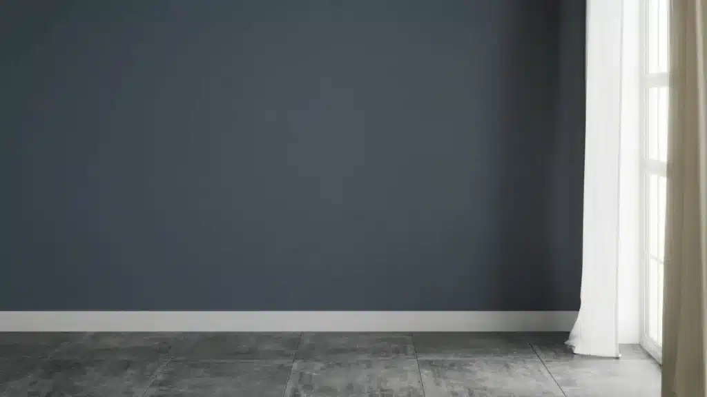
Granite Peak (SW 6250) is a deep blue-gray paint from Sherwin-Williams with subtle slate undertones and a low LRV of 14, meaning it absorbs roughly 86% of light.
It belongs to the Blue Collection but carries enough gray to feel grounded rather than overtly bold, making it a sophisticated dark neutral. In natural light, the color shifts toward a noticeable blue tone; in lower or artificial light, it deepens into rich charcoal gray.
Temperature-wise, it runs cool, though the gray base softens any sharpness. Moody, refined, and highly adaptable, it suits accent walls, cabinetry, vanities, and exteriors with equal confidence.
- Color Family: Blue-Gray, Sherwin-Williams Blue Collection
- Hex Code: #606375
- RGB Values: 96, 107, 117
- Color Temperature: Cool
- Undertones: Slate, Gray.
How Granite Peak Works in Different Lighting
Lighting plays a huge role in how Granite Peak looks on your walls. Understanding how this color behaves in both natural and artificial light will help you make smarter decisions before you paint.
Natural Light
Granite Peak is very sensitive to natural light. In bright daylight, it leans toward a clear blue-gray tone, while on cloudy days or in shaded spaces, it deepens into a richer, moodier charcoal. The direction your room faces makes a big difference in how the color reads throughout the day.
- North-Facing Rooms: North-facing rooms get little direct sunlight, which makes Granite Peak appear darker and more charcoal-leaning. Adding warm lighting and light-colored furniture helps keep the space from feeling too dim or cold.
- South-Facing Rooms: South-facing rooms receive the most natural light throughout the day, which beautifully brings out Granite Peak’s blue undertones. This is the most flattering direction for this color, giving it a balanced and polished look.
- East-Facing Rooms: East-facing rooms get bright, warm morning light, which softens Granite Peak and gives it a slightly warmer feel early in the day. By afternoon, the light fades, and the color shifts back to a cooler, deeper tone.
- West-Facing Rooms: West-facing rooms catch warm, golden light in the evening, adding a subtle warmth to Granite Peak at that time. In the morning, however, the room stays dim, making the color look quite dark and cool.
From the field: I always tell clients in north-facing rooms to test Granite Peak on a large board before committing. I had one client in a north-facing home office who fell in love with the color in the store, painted the whole room, and then hated how flat and cold it felt.
The fix was simple; we swapped her overhead cool-white LEDs for warm 2700K bulbs, and the room was completely transformed. The color came alive. Don’t skip that lighting test
Artificial Light
The type of bulb you use changes how Granite Peak looks just as much as natural light does. Warm bulbs, like soft white or Edison-style lights, bring out the gray tones and make the color feel cozy and grounded.
Cool white or daylight bulbs push the blue undertones forward, giving the room a crisper, more modern feel. For the best result, test your lighting before finalizing the look.
Which Sherwin-Williams Paint Line to Use
The paint line matters more than people realize, especially with a dark color. For Granite Peak, I recommend:
- Sherwin-Williams Emerald Interior: Best overall, superior coverage, excellent durability, and the depth of color is noticeably richer. Worth the price for accent rooms or cabinetry.
- Sherwin-Williams Duration: A close second and often more available in stores. Good scrubbability, which matters in kitchens and bathrooms.
- Sherwin-Williams SuperPaint: Fine for low-traffic bedrooms or accent walls where budget is a priority. You may need a third coat for full depth with a dark color like this.
Pro tip: For full-room color drenching (painting walls, trim, and ceiling the same shade), go with a satin finish throughout. It unifies the look while keeping each surface slightly distinct in how it catches light.
I used this approach in a client’s dining room with Granite Peak and the result was dramatic but never oppressive. Flat matte on all four walls plus the ceiling can start to feel airless with a dark color like this.
Best Finishes for Granite Peak
The finish you choose matters just as much as the color itself. When understandingdifferent types of paint finishes, you’ll find that pairing Granite Peak with the right sheen brings out its depth and ensures it looks intentional in every space
- Matte Finish: Matte gives Granite Peak a smooth, velvety appearance that feels soft and elegant on walls. It hides surface imperfections well and keeps the moody tone looking rich and refined.
- Satin Finish: Satin offers a subtle sheen that adds quiet sophistication without being too shiny. It works well in bathrooms and bedrooms where you want durability alongside a polished, easy-to-clean surface.
- Semi-Gloss Finish: Semi-gloss is ideal for trim, doors, and cabinets. Its reflective surface creates a sharp contrast against matte walls and holds up well against moisture, frequent cleaning, and everyday wear.
Best Rooms to Use Granite Peak
Granite Peak isn’t just a single-room shade. It’s a versatile, whole-home color that adapts beautifully to every space. Here’s exactly where it earns its place.
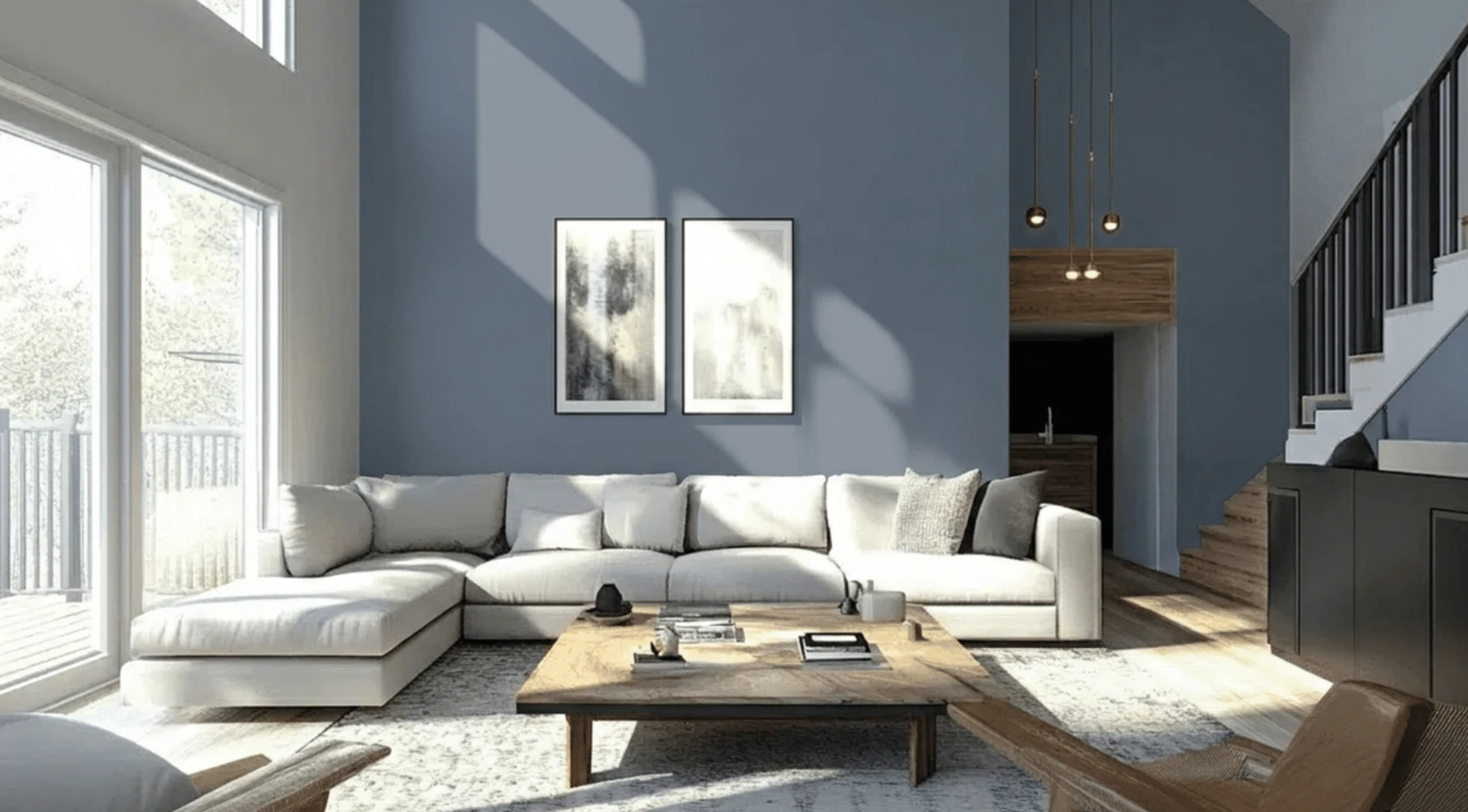
1. Living Room
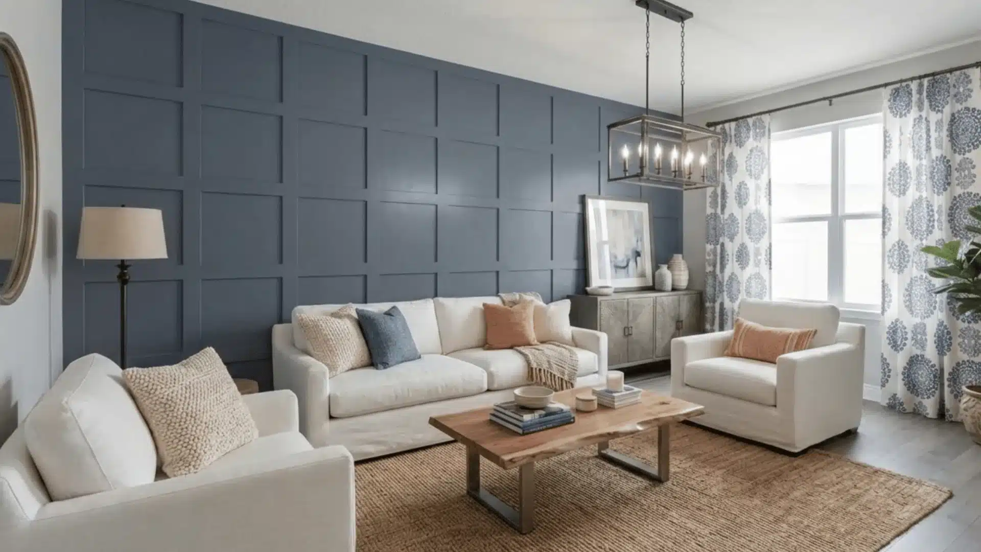
Granite Peak brings understated richness to a living room, offering the kind of depth that makes a space feel deliberately designed. Apply it to a single accent wall to create a striking focal point, or envelop all four walls for a warm, enveloping atmosphere.
It harmonizes beautifully with natural wood, warm whites, and textured fabrics like linen or leather. Edison bulbs or ambient floor lamps coax out its green undertones, lending the room genuine warmth.
2. Bedroom
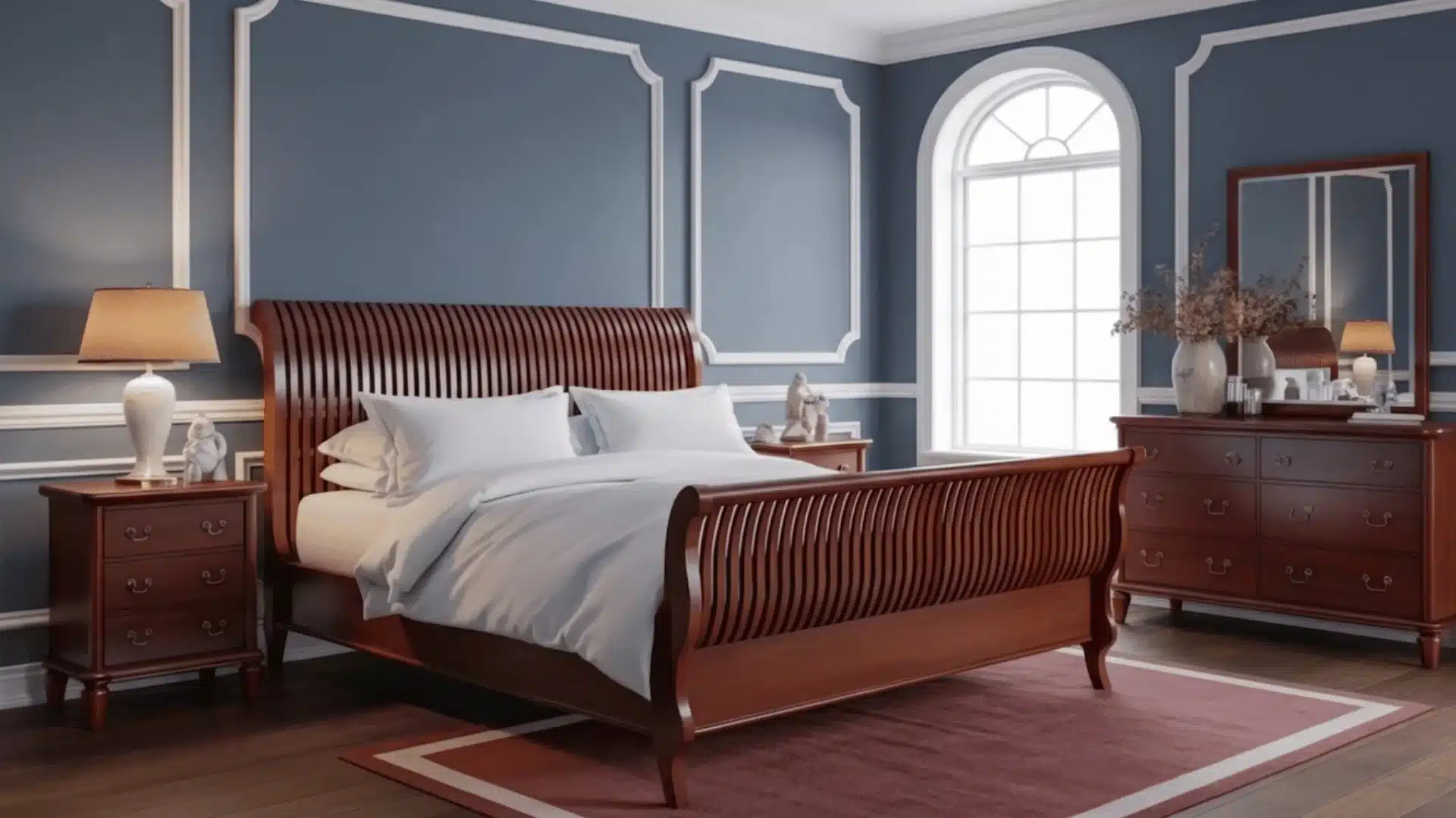
Granite Peak transforms a bedroom into a calm, nature-inspired retreat. Use it as a dramatic feature wall behind the bed, or wrap the entire room for a deeply restful cocoon.
Balance its richness with crisp white or soft cream bedding to keep the space feeling light. Warm wood nightstands and muted gold or bronze fixtures add just the right finishing touch without competing with the color.
3. Kitchen Cabinets
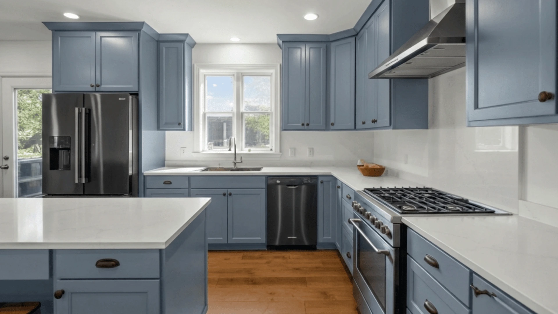
Granite Peak on cabinetry delivers a refined, high-end look without the starkness of full black. It pairs sharply with white or soft gray countertops, creating a clean, considered contrast.
White ceramic knobs lend a charming cottage feel, while brushed brass hardware elevates the look with warmth and sophistication. Introduce open shelving in natural wood alongside the cabinets to complete a cohesive, layered kitchen aesthetic.
4. Bathroom
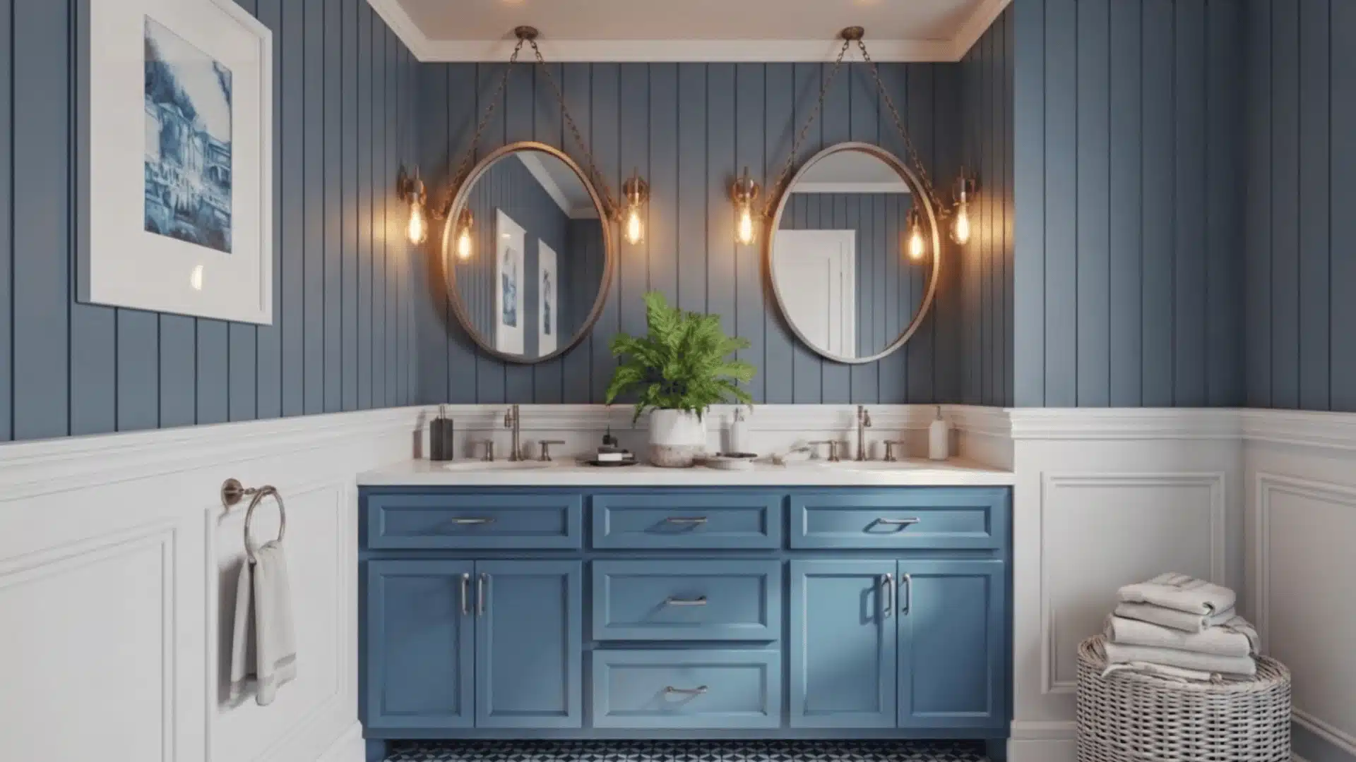
Granite Peak turns an ordinary bathroom into a space that feels genuinely designed. Paired with white subway tile or large-format floor tile, the contrast is crisp and striking while white fixtures keep everything feeling fresh and clean.
Choose chrome or matte black hardware for a contemporary edge, or brushed gold for warmth. Even a compact powder room finished in Granite Peak feels polished and purposefully styled.
5. Exterior Use
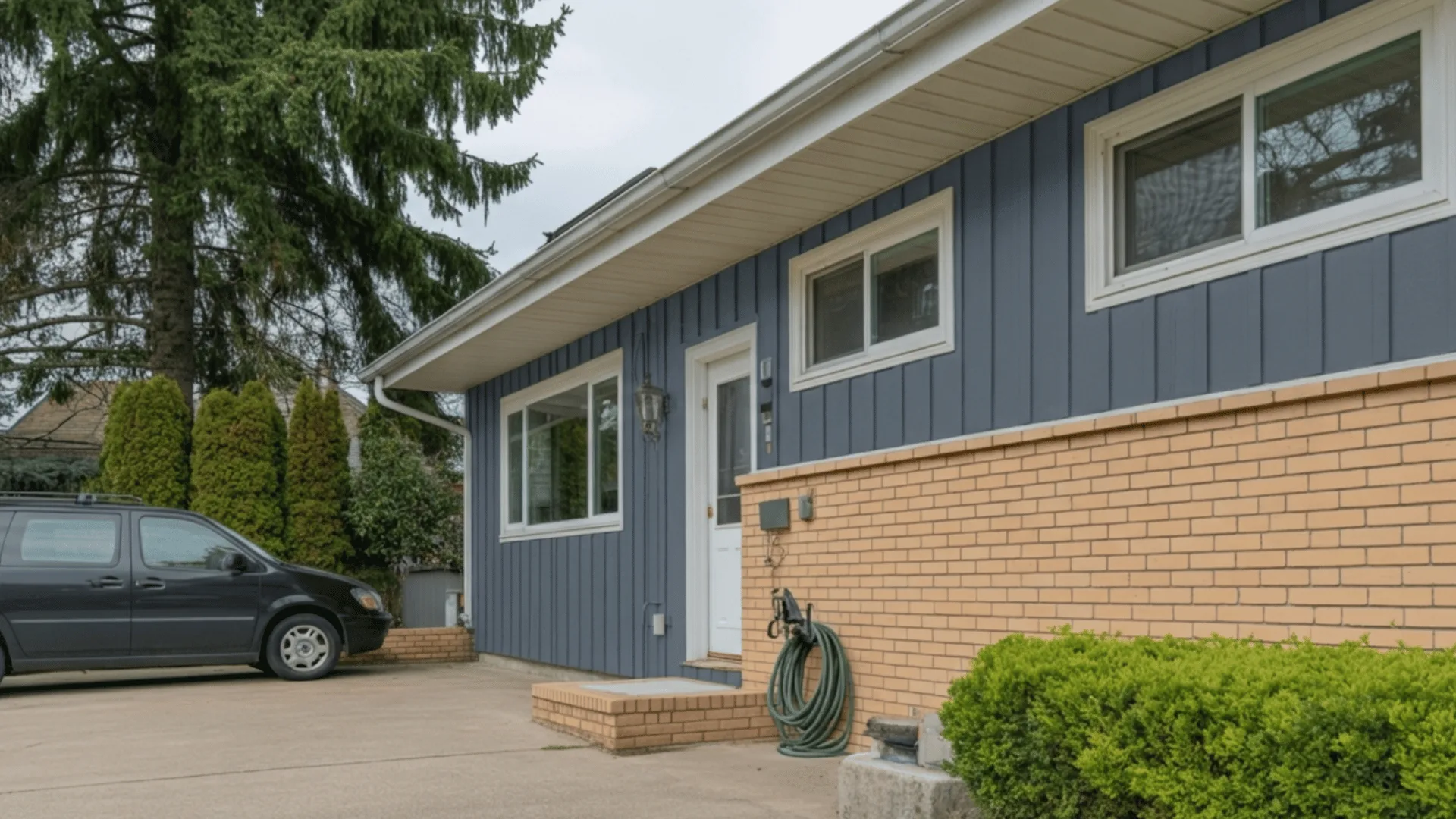
Granite Peak holds its own outdoors, reading as sophisticated and grounded against natural surroundings. Go bold with full siding coverage, or keep it refined with just the shutters and front door.
A Granite Peak door alongside light gray or white siding with black iron house numbers is a classic pairing. For a stronger statement, clad the lower half in board-and-batten with crisp white trim above.
On exteriors, this color reads slightly lighter than it does indoors because of the abundance of natural light. What looks like a deep charcoal inside will read more as a mid-toned blue-gray on a sunny exterior wall. That’s not a negative; it actually makes Granite Peak more usable outside than many other dark paints of this depth.
Granite Peak vs. Similar Sherwin-Williams Colors
Choosing the right dark neutral can be tricky. And here is how Granite Peak SW 6250 stacks up against four closest Sherwin-Williams alternatives in one clear comparison:
| Color | SW Code | Tone | Key Difference vs. Granite Peak |
|---|---|---|---|
| Naval | SW 6244 | Deep Navy Blue | Much darker and more saturated blue, less gray, more bold and dramatic |
| Distance | SW 6243 | Soft Denim Blue | Lighter and softer reads more like a relaxed denim than a moody dark neutral |
| Indigo Batik | SW 7602 | Rich Saturated Indigo | Higher saturation and more purple undertones feel more vivid and intense |
| Mindful Gray | SW 7016 | Warm Greige | Warmer undertones with no blue, softer and more neutral compared to Granite Peak’s cool edge |
Each of these colors has its own personality, but if you want that perfect balance of cool blue and grounded gray, Granite Peak remains the strongest choice among them all.
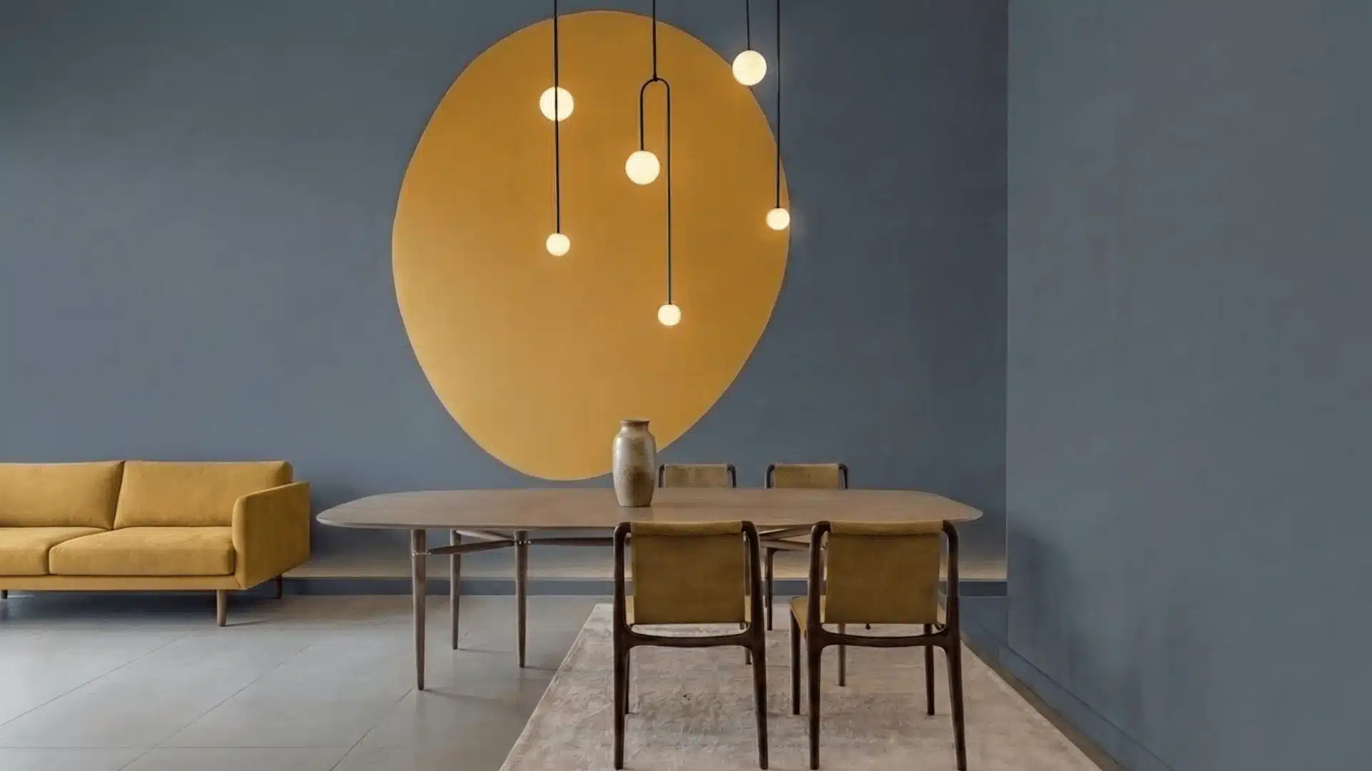
Coordinating Colors That Work With Granite Peak

One area most blogs leave thin is a concrete, practical palette. Here’s what genuinely works alongside Granite Peak:
- SW Extra White (SW 7006): The cleanest white to pair with Granite Peak for trim, ceilings, and doors. Crisp without being harsh. My go-to combination for dining rooms and bedrooms.
- SW Alabaster (SW 7008): A creamier off-white that softens the contrast for a more relaxed, cottage-style feel. Works well in bedrooms and living rooms.
- SW Pure White (SW 7005): A slightly cooler bright white. Good for kitchens where you want the cabinets and countertop to pop against the Granite Peak island or lower cabinets.
- SW Repose Gray (SW 7015): A soft warm-neutral gray that bridges Granite Peak with lighter walls in an open-plan layout. Useful when you want to use Granite Peak in one zone without it feeling disconnected.
Common Mistakes When Using Granite Peak
Granite Peak is a stunning color, but like any dark shade, it comes with a few things to watch out for. Avoid these common mistakes to get the best results:
- Ignoring Lighting: Granite Peak shifts between blue and deep charcoal depending on natural and artificial light. Not accounting for this can leave the color looking very different from what you expected.
- Pairing With Too Many Dark Shades: Combining Granite Peak with other dark tones can make a room feel heavy and closed in. Balance it with lighter furniture, white trim, or soft neutrals to keep the space breathing.
- Skipping the Sample Test: Never go straight to painting a full wall. Always test a sample patch first and observe it at different times of day before committing.
- Overlooking Room Size: In very small rooms with little natural light, Granite Peak can feel overwhelming. Make sure the space has enough light or contrast to carry the color well.
Getting these details right makes all the difference between a space that feels moody and refined and one that feels dark and uninviting. Keep these points in mind before you pick up that paintbrush.
Who Should Choose Granite Peak and Who Should Avoid It?
Granite Peak is a bold, confident color that works beautifully in the right hands, but it isn’t suited to every space or style. Understanding where it thrives and where it struggles will save you time and effort before you commit to a full room.
Who Should Choose It: If you love deep, cool-toned spaces with a modern, refined feel, Granite Peak is a strong fit. It works best in well-lit rooms with warm bulbs and light contrasting elements.
Who Should Avoid It: If your style leans toward warm, soft, or earthy tones, this color may feel out of place. Small rooms with limited natural light will feel darker and more cramped with Granite Peak on the walls.
Final Thoughts
Take your time before you commit: one weekend of testing will give you years of a room you love. Granite Peak is a rare color that feels bold and calm at the same time.
It works in living rooms, bedrooms, kitchens, bathrooms, and even outdoors. It pairs well with warm whites, natural wood, brass, and matte black hardware. It shifts with the light and rewards rooms with good lighting and the right finish.
The rule is simple: always test before you commit. Get a large sample board, check it morning and night, and trust what you see. Done right, Granite Peak won’t just be paint; it’ll be the reason your room finally feels finished.
Tried it in your home? Drop a comment below on which room you painted, and how it turned out.


