


| Color Name | Inkwell SW 6992 |
| Brand | Sherwin-Williams |
| LRV | 4 – very dark |
| Undertones | Cool blue-black; faint green visible in strong south-facing light |
| Best For | Cabinets, accent walls, front doors, bathrooms with good artificial light, home offices |
| Avoid In | Small rooms with no natural light; spaces with no warm contrast elements (wood, brass, cream) |
Inkwell Sherwin-Williams SW 6992 is a deep blue-black with an LRV of 4, and the single most important thing to understand before buying it is that “blue-black” is not marketing language.
In the right light, those blue notes are real, and they change how the color reads across a room. It is not the same as Tricorn Black. It is not Iron Ore. It has its own register, and getting familiar with that register before you paint is what separates a confident result from a second-guess.
Below, I’ll take you through the undertones, light behavior, finish recommendations, room-by-room uses, coordinating colors, and the comparisons people ask about most often. I’ll tell you where this color performs brilliantly and where it will disappoint you.
Inkwell SW 6992 Undertones: What You Are Actually Seeing

Sherwin-Williams describes Inkwell as having “a hint of blue,” and that is accurate as far as it goes. But the forum discussions and real-world reviews tell the rest of the story: some people get a room that reads navy in afternoon light, while others insist theirs looks purely black. Both are reporting correctly. The undertone is there and what changes is how much light you have to activate it.
The RGB breakdown (43/48/53) shows something useful: the blue channel is slightly higher than the red, which is exactly why the blue notes can surface under certain lighting conditions. There is also a faint green influence that most people never consciously register, but which can become visible on bright south-facing days or next to warm yellows.
- North-facing rooms: Expect the blue undertone to be most visible. The color reads deeper, cooler, and distinctly blue-black rather than neutral black.
- South-facing rooms: Incoming warmth softens the color slightly. It will feel less intense than a north-facing reading, and the green note has the best chance of showing here.
- East-facing rooms: Morning light brings out a clear, calm blue quality that settles by midday.
- West-facing rooms: Late afternoon light adds a warmer, slightly charcoal shift to the color. This is often the most flattering reading of Inkwell.
The practical takeaway: if you are working in a north-facing room and want this to read as near-black rather than blue-black, add warm light sources (brass-toned pendants, warm-white bulbs) to counteract the cool ambient. If you want to play up the blue depth, let the natural light do the work.
How Light Behaves with Inkwell Sherwin-Williams Throughout the Day
LRV 4 means this color absorbs a large amount of light rather than reflecting it back. That affects how the room feels at different times of day more dramatically than it would with a mid-tone paint.
In morning light, Inkwell tends to read at its most blue and dimensional – the color has a rich, layered quality. By noon, it settles into a deeper, more neutral blue-black. In the evening under warm artificial lighting, it reads almost as a very dark charcoal with a warm edge. That shift is what makes Inkwell livable across long days.
A pure black paint does not do that. Inkwell moves, which is part of why so many people find it sophisticated rather than oppressive.
One practical note: test a large sample on the actual wall and look at it at 7am, noon, and 8pm before committing. The evening version and the afternoon version can feel like different colors in a well-lit room.
Where to Use Inkwell SW 6992
Because Inkwell’s cool undertones stop it from feeling purely flat or neutral, it works across more surfaces than most near-black paints. Here is where it performs best, and what finish to use in each case.
Inkwell on Kitchen Cabinets
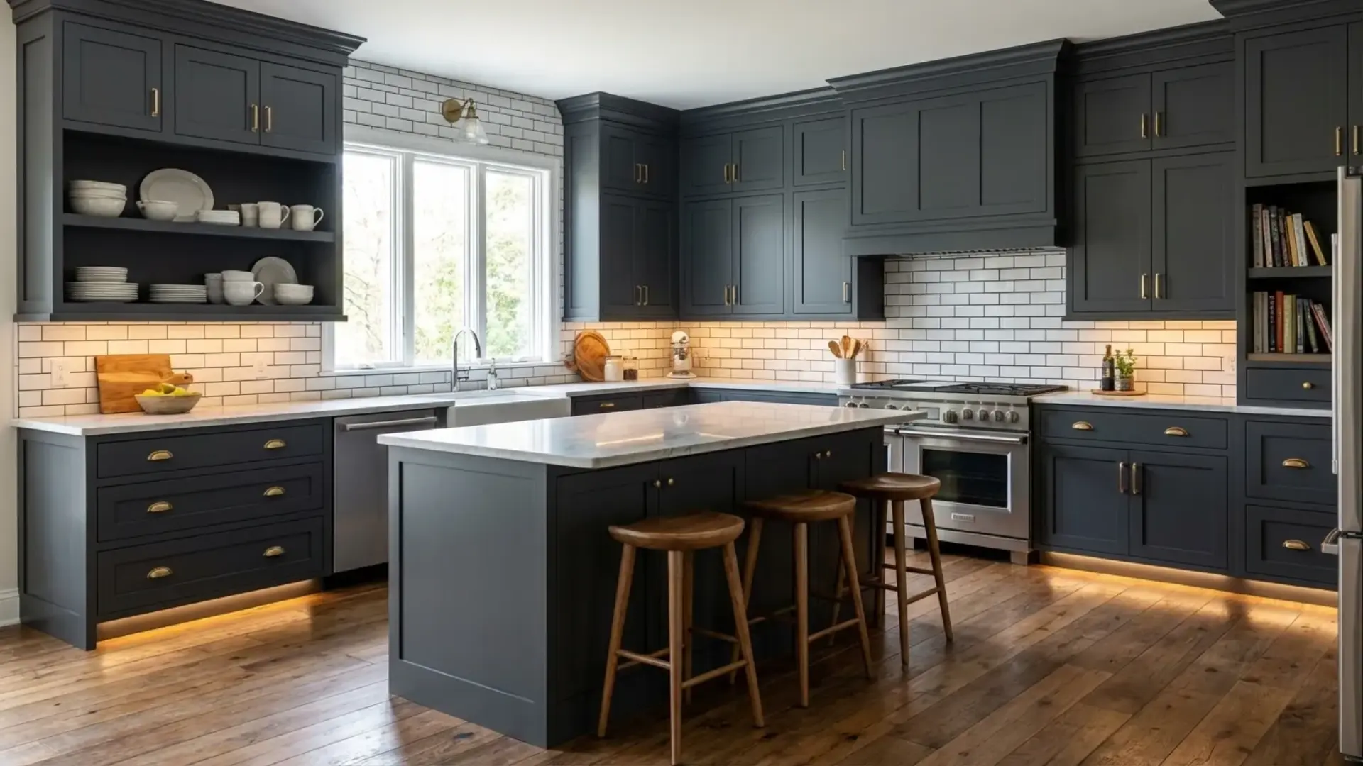
Inkwell on kitchen cabinets works best in satin or semi-gloss. Both finishes make the surface wipe-clean and give the color a slight sheen that plays off brass and gold hardware.
Matte Inkwell on cabinets attracts fingerprints and tends to look chalky at close range rather than dramatic. Use it on lower cabinets or the island first if you want a confident starting point before committing all four walls of cabinetry.
Pair with white quartz or marble countertops for a high-contrast look that keeps the kitchen feeling open.
Inkwell in the Home Office
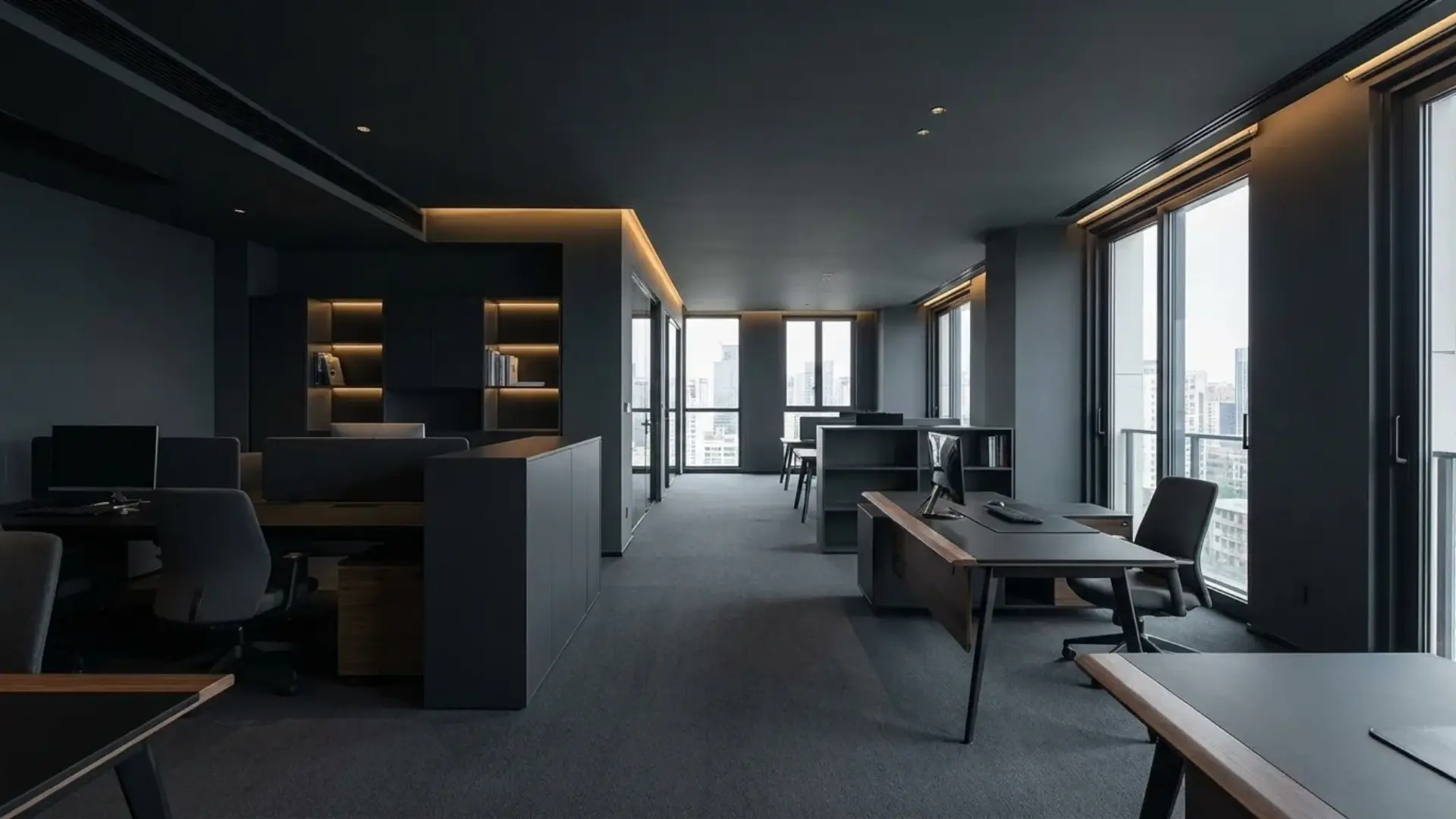
A home office with Inkwell on all four walls is one of the best uses of this color.
The deep blue-black creates an immersive, focused atmosphere that a matte finish enhances the velvety quality of flat Inkwell in an enclosed space is difficult to replicate with satin.
Pair it with warm wood furniture and a brass desk lamp, and the result feels like a proper workspace rather than a converted spare room. The cool-toned walls benefit from warm light sources; without them, a fully-enclosed Inkwell office can feel cold.
Inkwell in the Bathroom
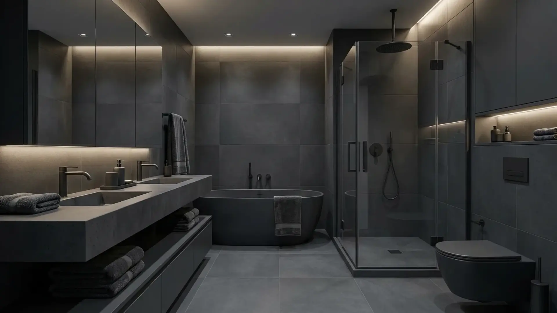
In a bathroom, use satin or eggshell, not matte. Bathrooms generate moisture, and a matte finish will absorb it over time, dulling the surface and making it harder to clean.
Satin Inkwell in a bathroom catches tile-and-fixture light in a way that amplifies the spa atmosphere. White fixtures like sink, tub, toilet, pop sharply against it.
Add gold or brass hardware and a statement mirror, and the bathroom reads as designed rather than just decorated.
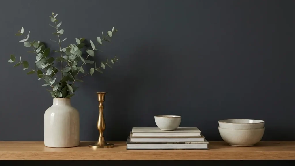
Inkwell in the Living Room
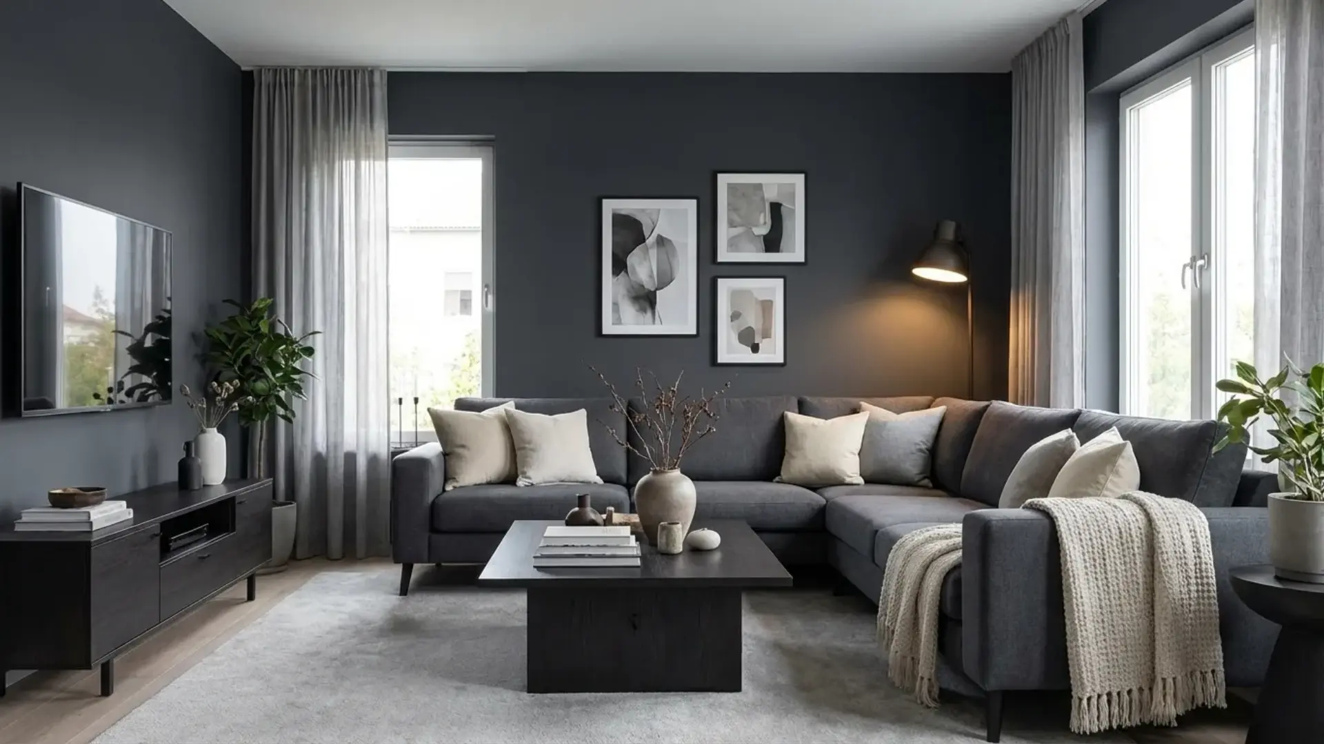
Inkwell on a single accent wall in a living room – behind a fireplace or a TV console, adds depth without dominating the room.
It also works exceptionally well on built-in shelves or bookcases, where the dark background makes artwork and objects stand out the way a gallery wall would.
Pair with light sofas, textured rugs, and warm metals to balance the depth. Going all-four-walls in a large living room with good natural light is achievable; in a smaller, darker living room, start with one wall and see how it feels before committing.
Inkwell on the Front Door
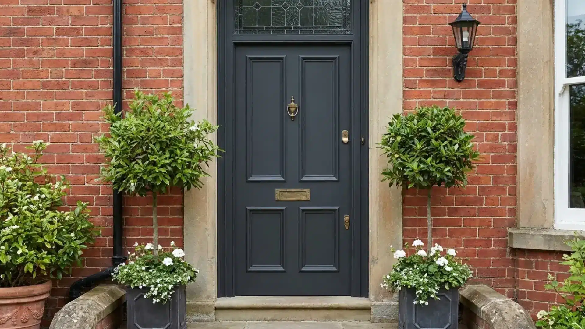
On a front door, Inkwell reads as classic and commanding from the curb.
The blue-black is distinct enough from standard black doors to be interesting, but not so different that it looks trendy.
Warm white or cream trim sets it off cleanly. Brick, stone, or wood siding all work well with it. Use a semi-gloss finish on exterior doors for durability and for the visual impact of a slight sheen in sunlight.
Inkwell on the Exterior
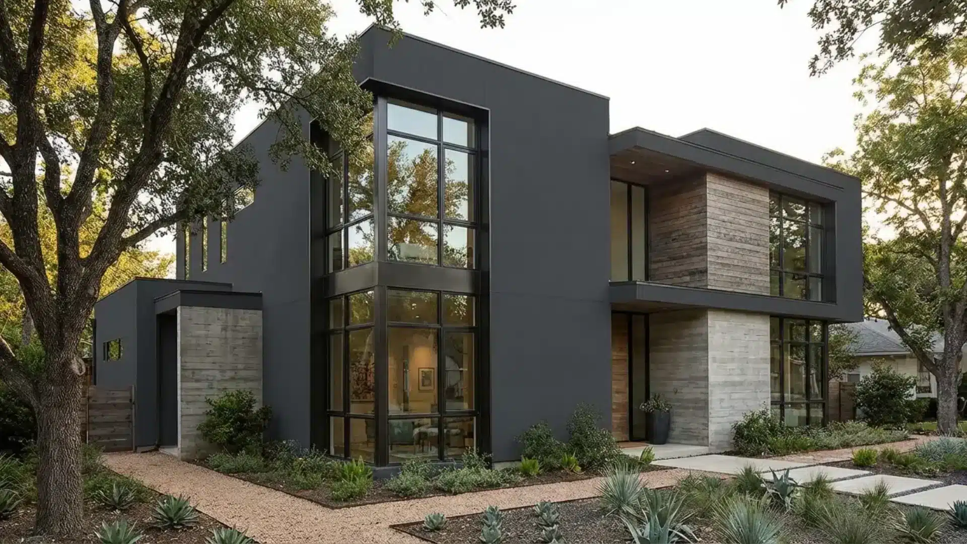
Inkwell exterior is a strong choice for craftsman, modern farmhouse, and contemporary-style homes. On siding, it creates a high-contrast, architectural look that bright white trim sharpens considerably.
If the home has natural stone accents or warm wood detailing, Inkwell provides a backdrop that highlights both.
One practical note for exterior use: dark paint colors absorb heat, which can expand and contract siding materials more than lighter colors. Sherwin-Williams does offer Inkwell in an exterior formula – confirm the sheen level with your SW rep based on your siding material.
That covers the main application options. The finish and surface choices above reflect what actually holds up in daily use – how a color performs at month six matters as much as how it looks on day one.
Sherwin-Williams Inkwell Coordinating Colors
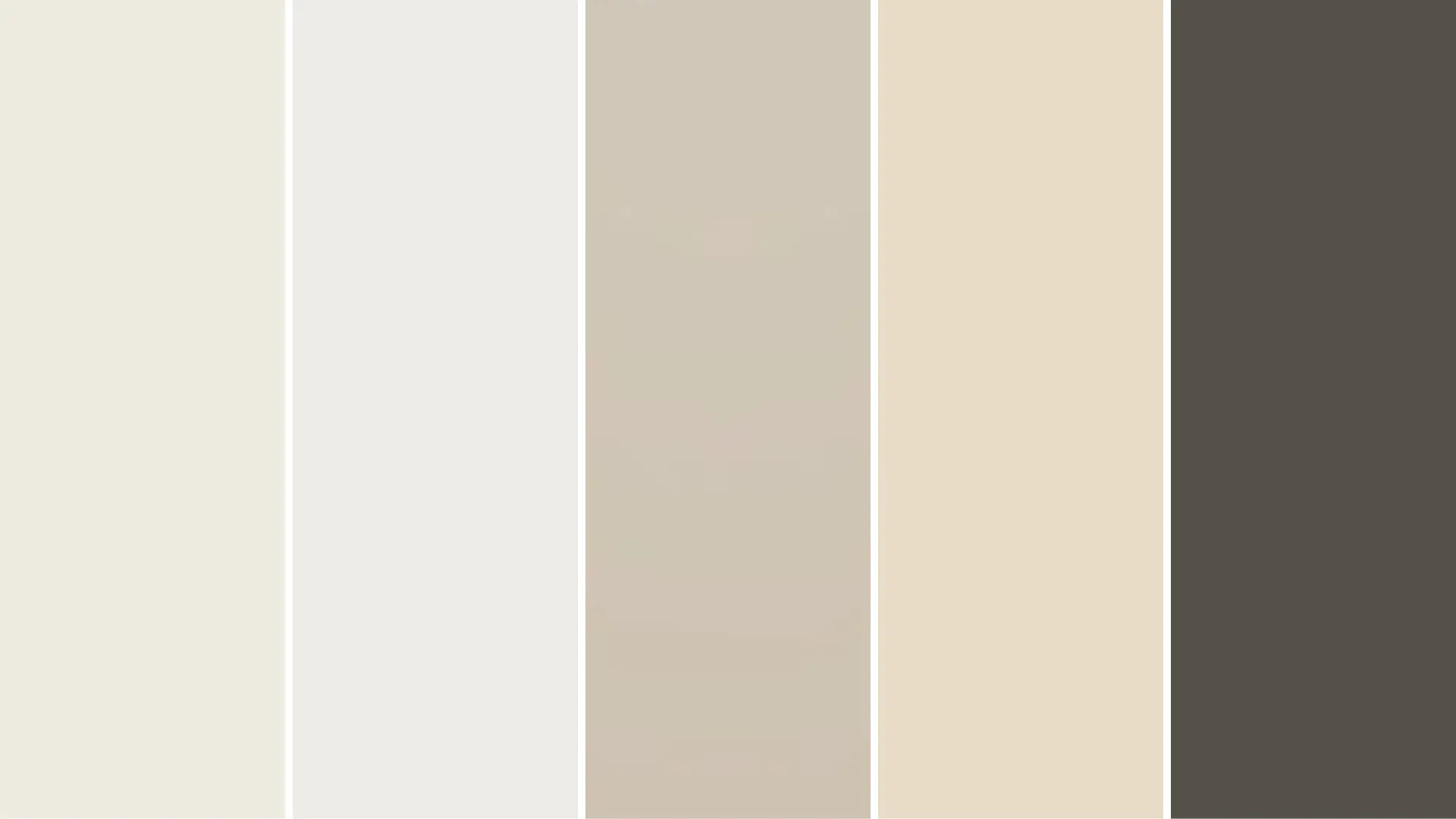
Because Inkwell carries cool blue undertones, it pairs best with warm, slightly creamy neutrals rather than stark bright whites. A cold white next to Inkwell can make the room feel harsh.
A warm white – something with an ivory or yellow base – pulls the warmth out of the color and makes the whole palette feel intentional.
| Coordinating Color | Undertone | Why It Works with Inkwell | Best Use |
| Alabaster SW 7008 | Warm creamy white | Softens Inkwell’s cool depth; the warmth in Alabaster counterbalances the blue undertone directly | Trim, ceilings, upper cabinets |
| Pure White SW 7005 | Soft neutral white | Creates a clean contrast without competing with Inkwell’s depth; works well where Alabaster might read too yellow | Cabinet contrast, trim, doors |
| Accessible Beige SW 7036 | Warm greige | Adds warmth in adjacent rooms without reading as a completely different palette | Adjacent walls, hallways |
| Antique White SW 6119 | Warm off-white | A slightly softer contrast than Pure White; particularly good in traditional or transitional homes | Trim, ceilings, built-ins |
| Urbane Bronze SW 7048 | Deep warm charcoal | Creates an earthy, layered palette when used in adjacent spaces or on exterior accents alongside Inkwell | Accent walls, doors, exteriors |
The right coordinating palette does not just look good in a photo- it makes the Inkwell spaces feel cohesive as you move through the home. If you are using Inkwell in multiple rooms, Alabaster on trim throughout creates the thread that ties everything together.
Inkwell SW 6992 vs. Similar Dark Sherwin-Williams Colors
Even small undertone differences between near-black paints become significant once they are on a wall. These three comparisons come up most often from people who are choosing between Inkwell and something else.
Inkwell vs. Iron Ore SW 7069

Iron Ore has brown-black undertones that make it feel warmer and more grounded than Inkwell. In bright rooms, Iron Ore reads as industrial and earthy – which works well in spaces with warm wood tones, exposed brick, or rust-toned accents. Inkwell reads as sleeker and more polished in the same conditions.
If your furniture and materials run warm (walnut, amber, terra cotta), Iron Ore will blend more naturally into that palette. If you want Inkwell but your room reads warm, add enough brass or cream to balance the cool.
Inkwell vs. Urbane Bronze SW 7048

Urbane Bronze is a deep brownish-gray with organic, earthy qualities. It is significantly warmer than Inkwell and blends easily into spaces with natural materials – linen, stone, reclaimed wood. Inkwell is darker, cooler, and makes a bolder contrast statement against light elements.
If your room already has a lot of warm wood and natural texture, Urbane Bronze fits in; Inkwell stands out against it. That distinction matters depending on whether you want the color to anchor the room or pull focus.
Inkwell vs. Tricorn Black SW 6258

Tricorn Black is a true neutral black with no perceptible undertone. It reads flat and clean across most lighting conditions – which can work beautifully on trim, doors, and exterior accents where you want something definitive. On walls, though, that flatness can feel harsh in bright light. Inkwell’s blue undertones give it a complexity that Tricorn Black does not have – it moves differently as the day changes, which is why many people find it easier to live with as a wall color over time. Choose Tricorn Black when you want clean and decisive; choose Inkwell when you want deep and dimensional.
| Pro Tip: If you are deciding between Inkwell and Tricorn Black for cabinets, get a Samplize peel-and-stick sample of each and put them side by side on your cabinet door for three days. Look at them under morning light, noon sun, and evening lamp light. The difference in undertone becomes very clear by day two. |
Design Styles That Work with Inkwell Sherwin-Williams
Inkwell’s cool blue-black sits between pure black and navy, which makes it more flexible across design styles than a purely neutral dark paint.
- Moody Modern: Deep blue-black walls, matte black fixtures, and clean architectural lines. Inkwell adds drama without cold emptiness, especially alongside warm metals and sparse decor.
- Organic Modern: Natural wood, linen, and warm neutrals soften Inkwell’s intensity. The color reads grounded and rich – perfect for calm spaces that still have a point of view.
- Traditional: Brass hardware, rich wood furniture, and classic white trim bring out a library-like quality in Inkwell. It feels distinguished rather than trendy in formal rooms.
- Transitional: Inkwell bridges classic and contemporary without effort. It plays with ornate details and clean lines equally well.
- Coastal Modern: Paired with crisp whites, natural textures, and warm wood, Inkwell’s blue undertones echo depth and water without reading as a coastal cliche.
The common thread across all these styles: Inkwell works when there is something warm nearby to pull against. Brass, cream, wood, or warm-white lighting – some contrast element is always in the mix. Without it, the cool undertone can read as cold rather than sophisticated.
When NOT to Use Inkwell SW 6992
Most paint guides skip this section. Here is where Inkwell will give you trouble.
In rooms with no natural light and no warm artificial lighting, Inkwell will feel oppressive rather than dramatic. A basement office or interior bathroom lit only with cool fluorescent bulbs is a bad match for this color.
The blue undertone amplifies the cool quality of the light, and the LRV of 4 means the room will absorb most of what light there is.
In very small rooms where the goal is to make the space feel larger, Inkwell works against you. It is a color for rooms where you want to feel enclosed, immersed, or focused – not for spaces where you are trying to push the walls out visually.
If your furniture, flooring, and fixtures all run cool (grey stone floor, chrome hardware, blue-grey sofa), Inkwell will amplify that coolness rather than balance it.
The color needs warmth somewhere to come alive. Without it, the room feels cold and flat rather than sophisticated and layered.
Finally, if you are uncertain about dark colors and looking for a lower-commitment starting point, consider Sherwin-Williams Greenblack – it shares the dark, complex character of Inkwell but reads differently in certain lighting conditions and may feel like a more gradual move toward a very dark palette.
Inkwell SW 6992 Paint Specs and Where to Buy
Inkwell is available at any Sherwin-Williams retail location and through sherwin-williams.com in both interior and exterior formulas. Available finishes include flat/matte, eggshell, satin, semi-gloss, and gloss. For walls: matte or eggshell. For cabinets and doors: satin or semi-gloss. For exterior siding: consult the exterior formula availability with your local store.
To test the color before committing, a Samplize peel-and-stick sample is the most practical option. It shows the actual paint color in your specific lighting without the mess of a traditional roller sample – and because Inkwell is very dark, seeing it in your room is far more reliable than judging a chip in-store.
Color specs for reference: RGB 43/48/53, HEX #2B3035, LRV 4.
Frequently Asked Questions
These are the questions I hear most from people who have already got the chip on their wall and are trying to make a final call.
What color is Inkwell Sherwin-Williams?
Inkwell SW 6992 is a deep blue-black paint color with an LRV of 4. It reads as near-black in most conditions, with cool blue undertones that become more noticeable in north-facing rooms or under cool light. In warm or west-facing light, it reads as a very dark charcoal-black with minimal blue visibility.
What are the undertones in Inkwell SW 6992?
The primary undertone is cool blue. There is also a faint green influence that can surface in strong south-facing natural light. Both are subtle – Inkwell reads as near-black to most eyes – but they are present and will become visible depending on your room’s light exposure.
Is Inkwell a good color for kitchen cabinets?
Yes, particularly in satin or semi-gloss. The cool blue-black reads as dramatic and intentional on cabinet fronts, and the finish makes it wipe-clean. It pairs well with brass or gold hardware and white or light stone countertops. Avoid matte on cabinets – it shows fingerprints and can look chalky rather than dramatic at close range.
How does Inkwell compare to Tricorn Black?
Tricorn Black is a true neutral black with no visible undertones. Inkwell has cool blue undertones that give it a layered, dimensional quality Tricorn lacks. In bright light, Tricorn Black can feel flat and harsh; Inkwell maintains a moody, shifting quality across the day. For walls: Inkwell. For trim or accent applications where you want clean and definitive: Tricorn Black is the stronger choice.
Can Inkwell be used on exteriors?
Yes. Sherwin-Williams offers Inkwell in an exterior formula. It works well on craftsman, modern farmhouse, and contemporary homes. Pair it with bright white trim for maximum contrast. Because dark colors absorb heat, verify the finish and formula with your Sherwin-Williams store based on your specific siding material before purchasing.
What white paint coordinates best with Inkwell?
Alabaster SW 7008 is the most reliable pairing. Its warm, creamy undertone counterbalances Inkwell’s cool blue depth and prevents the combination from reading as cold or stark. Pure White SW 7005 works where you want a slightly cleaner contrast. Avoid bright cool whites – they amplify the blue undertone in Inkwell rather than softening it.
Is Inkwell Sherwin-Williams good for front doors?
It is one of the better near-black options for a front door because its blue undertone makes it more interesting than a straight black. It reads as classic and composed from the curb rather than stark. Semi-gloss finish is the right call for exterior door applications. Brass or gold hardware and warm white trim complete the look.
Is Inkwell too dark for a small room?
In a small room with good natural light and warm contrast elements, Inkwell can work by creating an immersive, cocooning atmosphere. In a small room with no natural light and no warm tones, it will feel oppressive. The honest answer is: test it before committing. A large sample on the wall is the only reliable way to know whether your specific room can carry it.
Final Verdict: Is Inkwell Sherwin-Williams SW 6992 Right for Your Room?
Here is what I would tell you at the paint counter: Inkwell Sherwin-Williams is not a safe color and should not be treated like one. LRV 4 is genuinely dark, and the blue undertone will show up in ways that a chip in-store never fully communicates.
That said, it is one of the more livable near-blacks available because it shifts across the day instead of sitting flat. If you have a room with some natural light, warm contrast elements already in place (wood, brass, cream), and a finish plan that matches the surface – cabinets in satin, walls in matte – this color will deliver on its promise.
If your room is dark and cold to begin with, consider Iron Ore as a gentler first step. If you are ready to commit: order a Samplize sample of Inkwell and test it on the north and south walls of your room before picking up a gallon.


