


After years of helping people choose white paint, I can say this with confidence: white is never just white.
That is exactly why the Shoji White vs Alabaster debate comes up so often in my work. Both are warm Sherwin-Williams whites, but they do not act the same once they are on a wall.
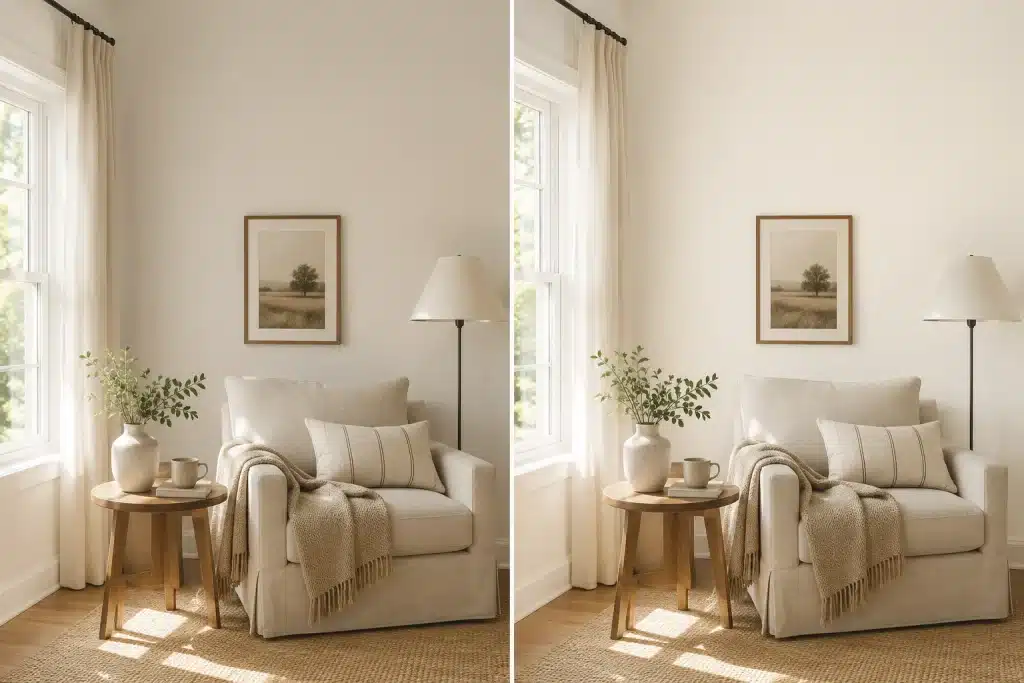
Alabaster feels brighter, creamier, and closer to a soft classic white. Shoji White feels deeper, calmer, and more greige. That small shift can change how your entire room reads at 8 am, at sunset, and under warm lamps at night.
And here is the part most comparison articles skip: the wrong one does not just look a little off. It can make your trim look yellow, your floors look washed out, and your whole room feel like something is not quite right without you being able to name it.
This comparison will help you understand undertones, LRV, lighting, room use, trim, cabinets, and sample testing so you can pick the one that fits your home instead of guessing from a tiny chip.
What Is Sherwin-Williams Shoji White SW 7042?
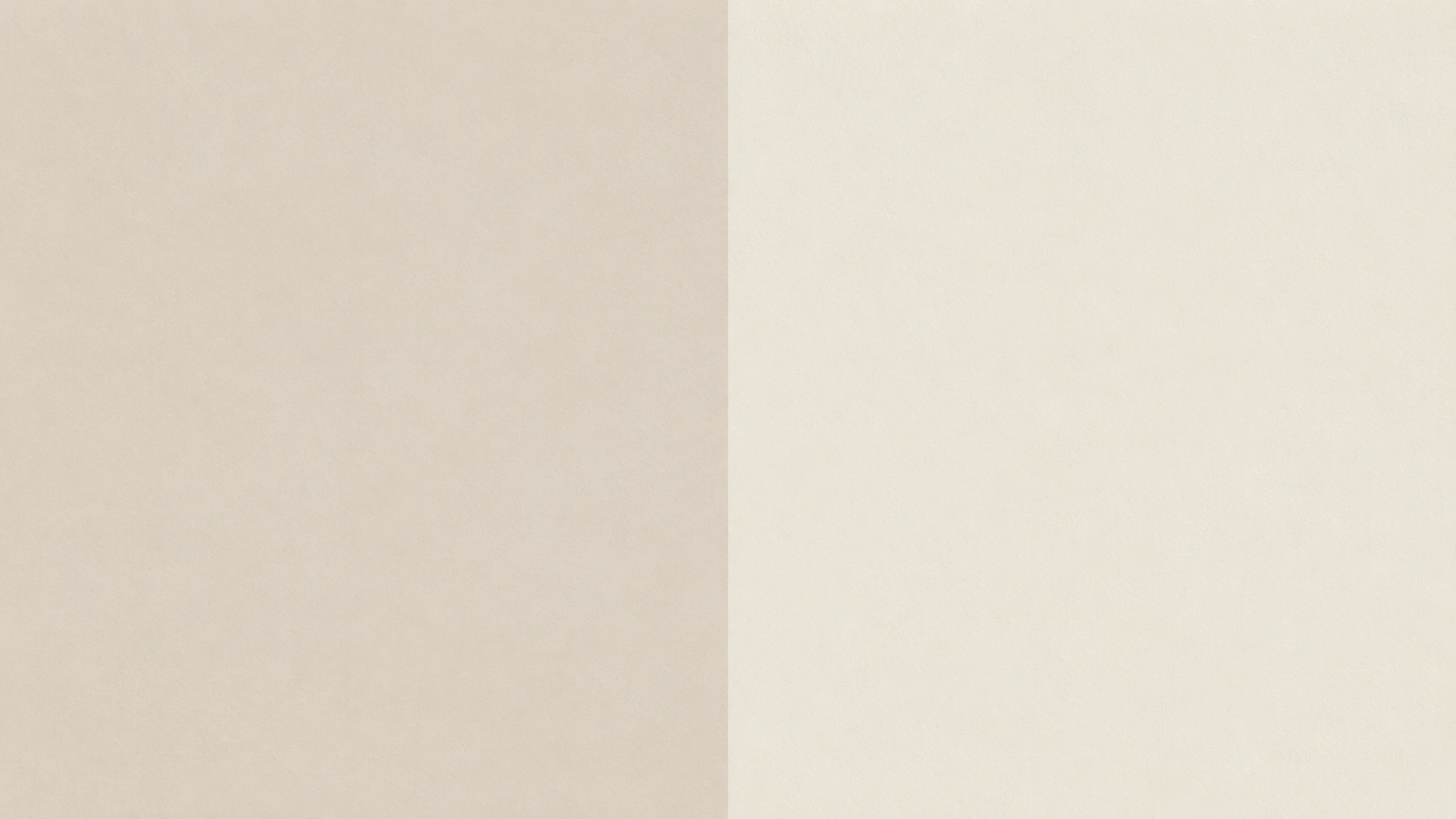
Shoji White SW 7042 from Sherwin-Williams sits between white and light beige. It is a warm off-white with a greige base, which gives it more depth than a bright white without making it feel like a true beige.
With an LRV of 74 and a HEX value of #E6DFD3, Shoji White reflects a good amount of light but still has enough body to soften a room. Its undertones lean greige, soft beige, and subtle gray-green, so it can shift depending on light and nearby finishes.
What makes Shoji White useful is its quiet warmth. In bright rooms, it can feel soft and clean. In darker spaces, it may look more muted or slightly gray-green. It works best when you want walls that feel calm, warm, and grounded without turning creamy yellow.
What Is Sherwin-Williams Alabaster SW 7008?
Alabaster SW 7008 from Sherwin-Williams is a soft warm white that reads brighter and cleaner than Shoji White. It still has warmth, but it sits closer to a classic white than a greige off-white.
With an LRV of 82 and a HEX value of #EDEAE0, Alabaster reflects more light, which makes it a strong choice for trim, cabinets, ceilings, and rooms that need a brighter feel. Its undertones lean cream and soft yellow-beige, so it avoids feeling cold or stark.
What people like about Alabaster is its balance. It feels warm without looking heavy. The one caution is placement. Besides cool whites, blue-gray tile, or icy countertops, its creamy base can look more yellow than expected.
Shoji White vs Alabaster: Quick Comparison
SW Shoji White is deeper, warmer, and more greige, while Alabaster is brighter, creamier, and closer to a classic soft white. If you only take one thing from this guide, that sentence is it. The table below shows exactly where they differ across every major decision point.
| Feature | Shoji White SW 7042 | Alabaster SW 7008 |
| LRV | 74 | 82 |
| Main Feel | Deeper, soft off-white with a greige quality | Brighter, warmer white with cream softness |
| Undertones | Greige, soft beige, subtle gray-green | Cream, soft yellow-beige |
| Best For | Walls, whole-home color, exteriors, open layouts | Trim, cabinets, ceilings, and brighter rooms |
| Looks Like | Soft warm greige-white | Soft creamy white |
| Risk | Can look muted or dingy in dark or cool rooms | Can look yellow beside cool or stark whites |
| Best Trim Pairing | Pure White SW 7005 for cleaner contrast | Can be used on the trim itself |
| Overall Pick | Better for depth and softness | Better for brightness and classic warmth |
Choose Shoji White if you want a warmer, deeper, calmer off-white that adds presence to walls without reading as cream or yellow. It is the better choice when the room already has warmth, and you want the walls to settle into the background.
Choose Alabaster if you want a brighter, softer white that still feels warm and welcoming. It is the more flexible color for trim, cabinets, and rooms where you need light reflection without starkness.
Real Homeowner Feedback
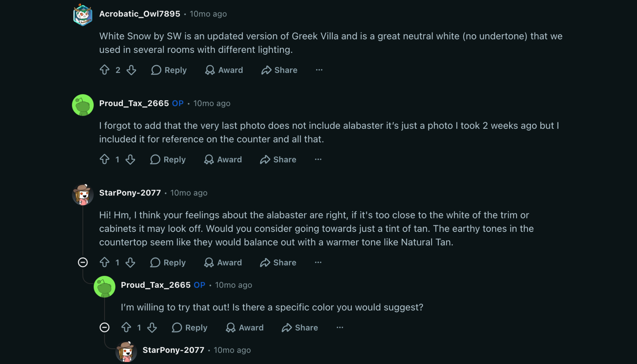
Paint choices get personal fast, and homeowner feedback often shows what swatches cannot. In a Reddit thread, the Shoji White vs Alabaster debate came up often, with a few clear patterns.
Shoji White users liked its greige quality on whole-home walls, especially with warm wood floors. Many said it made rooms feel calm and settled. A few noticed it looked flatter or greener in north-facing rooms until they changed to warmer bulbs. Some also said it looked more like a very light beige beside stark white trim.
Alabaster users were happiest with trim and cabinets. Several described it as a safe, warm white for kitchens, though some said it looked yellow in rooms with strong afternoon light or warm wood tones. In side-by-side tests, Shoji White often felt more interesting, while Alabaster felt safer.
The main lesson is simple: your light, finishes, and surface matter more than the paint name. Test both colors side by side before choosing.
How Each Color Behaves in Different Light
Light is what decides whether the undertone you chose works for you or against you. No color behaves identically across morning, afternoon, and evening, or across north-facing and south-facing rooms. These two are no different.
Shoji White in Different Light Conditions
In a south-facing room with strong daylight, Shoji White reads warm, soft, and slightly beige, the way it looks on the chip, or better. The light fills out its warmth, and the greige quality settles nicely.
In a north-facing room with cool diffused light, the gray-green shoji white undertones can come forward. At 7 a.m. in winter in a room with white or cool-gray tile and no warm wood anchor, Shoji White can look flat, not warm.
By 7 pm under warm lamps it recovers. But if the room spends most of its hours in cool northern light, test carefully before committing.
Under warm LED or incandescent bulbs at night, Shoji White softens and reads beautifully as a warm neutral. It is one of the better-performing off-whites in evening light.
Alabaster in Different Light Conditions
Alabaster is the more consistent performer across light conditions, which is part of why it gets recommended so often for trim, cabinets, and ceilings. Its higher LRV keeps it reading clean and bright across most conditions.
In a north- or east-facing room with limited direct sun, Alabaster is often a stronger choice than Shoji White because it has more reflectance to keep the room feeling open rather than dim. It will not get moody or green in low light.
The watch-out for Alabaster is placement beside cool whites in strong afternoon sun. South-facing rooms in the late afternoon can pull Alabaster’s yellow undertone forward noticeably, especially if it is sitting next to a crisp, bright white on the trim or adjacent wall.
| Pro Tip: Before buying a gallon of either color, get a Samplize peel-and-stick sample (or paint a 12×12-inch patch on foam board) and move it around the room at 7 am, noon, and 7 pm. What you see under noon light in a south-facing room will be different from what you see at dusk under warm lamps. That 20-minute test prevents a full repaint. |
Best Rooms for Shoji White and Alabaster
Both colors can work across the home, but they solve different problems depending on the room. The key is matching each color to what the room actually needs.
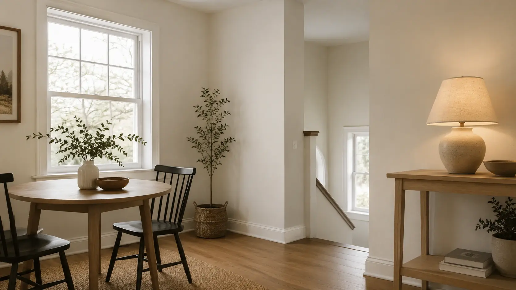
1. Living Rooms
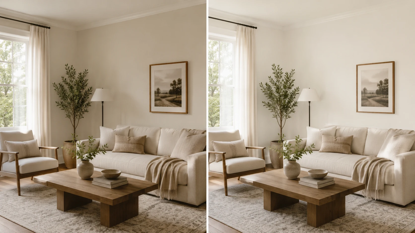
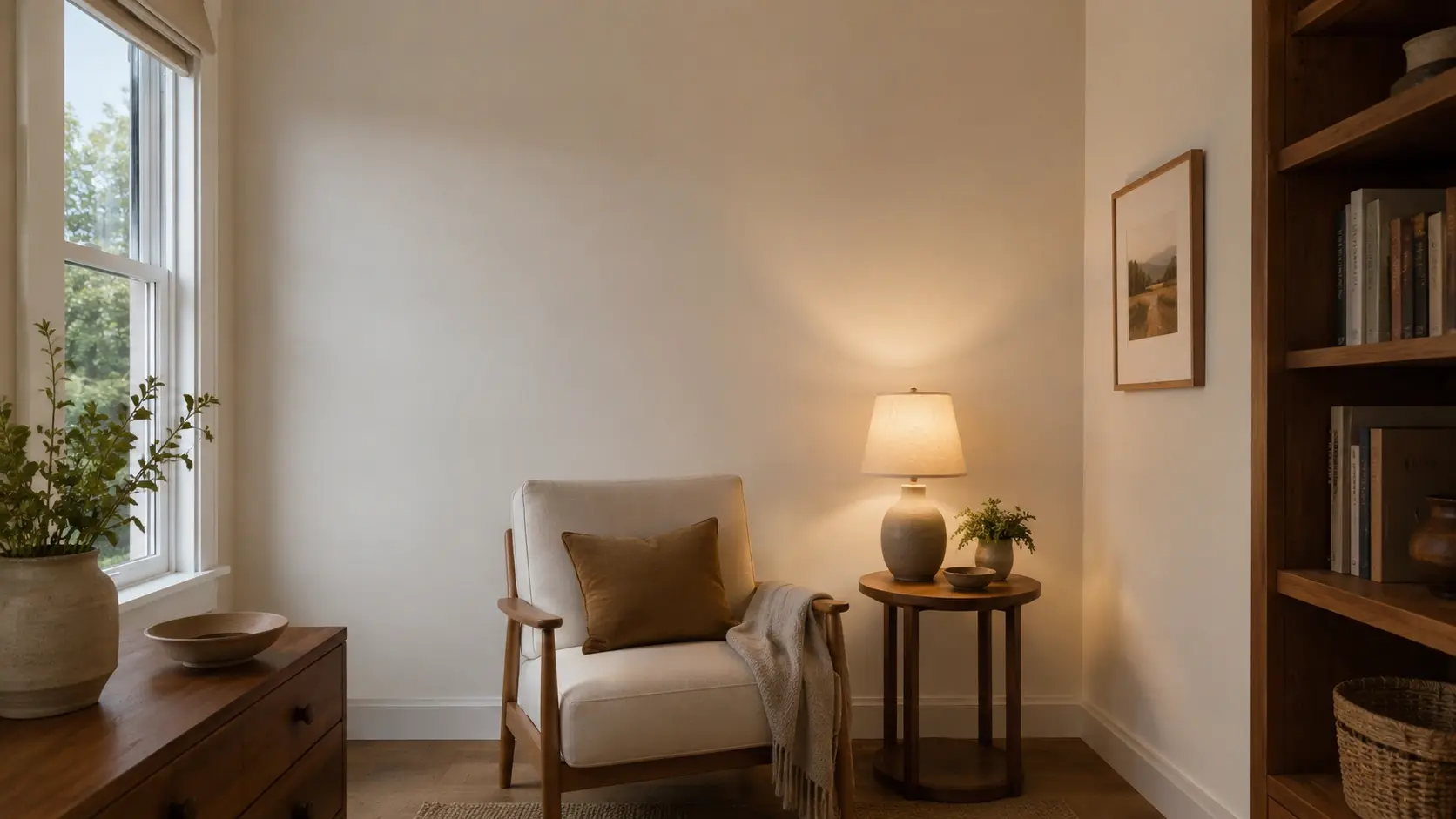
Shoji White works better in living rooms where you want warmth, softness, and a backdrop that lets wood tones, linen, and natural textures carry the space. It creates a grounded, settled quality that feels calm rather than designed.
Alabaster works better in living rooms that need more brightness, especially if the room has limited natural light or if you want the walls to feel lighter than the furnishings. It also pairs more cleanly with rooms that have cooler material accents.
2. Bedrooms
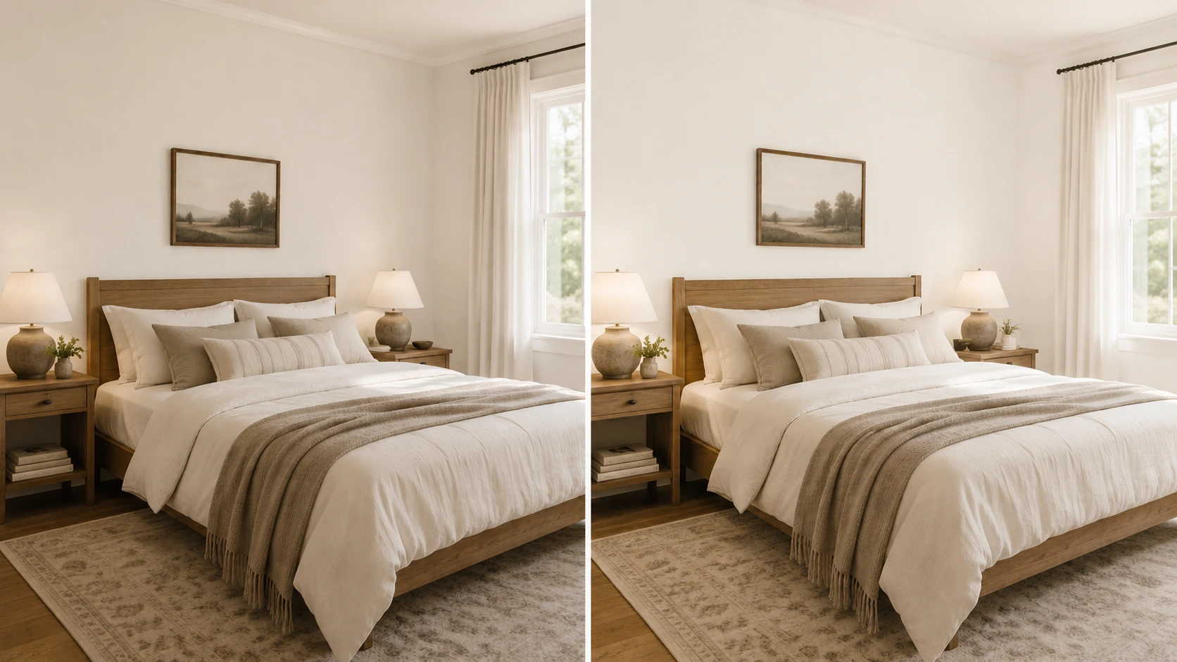
Shoji White gives a bedroom that quiet, wrapped-in quality that makes a room feel restful at any hour. It works especially well in bedrooms with warm wood furniture, soft linen bedding, and warm lamps.
Alabaster creates a lighter, fresher bedroom feel. It is the better choice when the room has low ceilings or limited natural light, and you want the space to feel open rather than cozy.
3. Kitchens
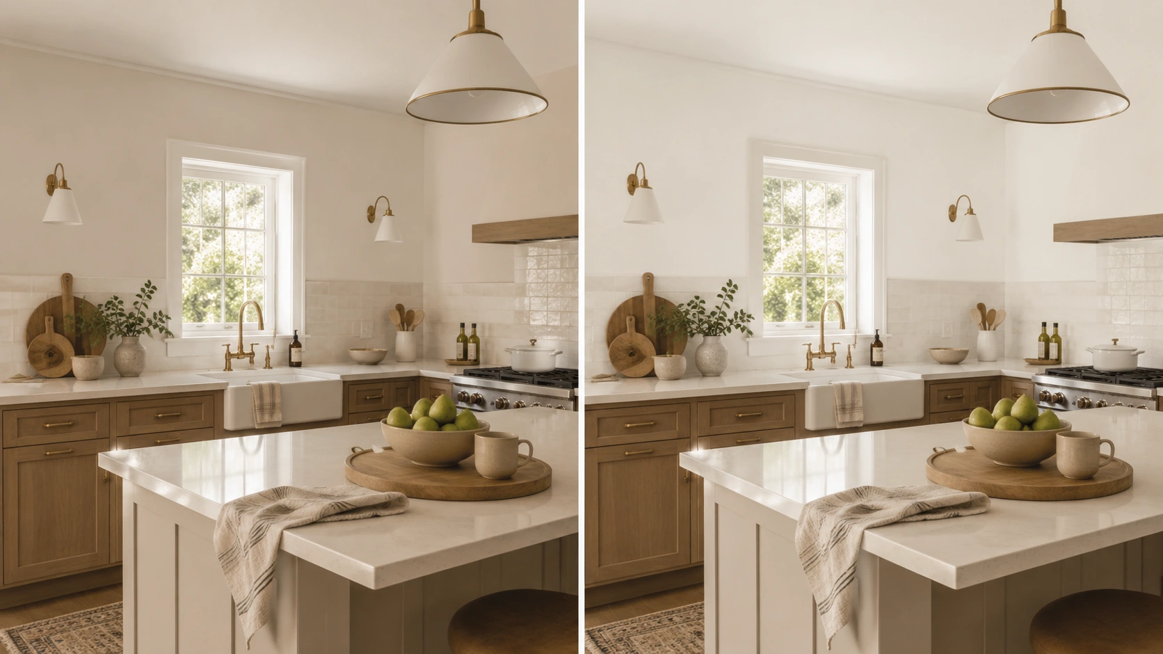
Alabaster is almost always the stronger kitchen cabinet choice. Its LRV of 82 reads cleaner and brighter against most countertop materials, especially against quartz, honed stone, or subway tile.
That same dynamic applies when the walls are a different white entirely, since white cabinet paint pairings shift significantly depending on whether the countertop is warm stone or cool quartz.
Shoji White on the walls may create a dull contrast if your kitchen has white quartz, cool stone, or gray tile, which is hard to resolve. In a kitchen with warm oak, butcher block, or earthy stone, Shoji White can feel deliberate and grounded.
4. Bathrooms
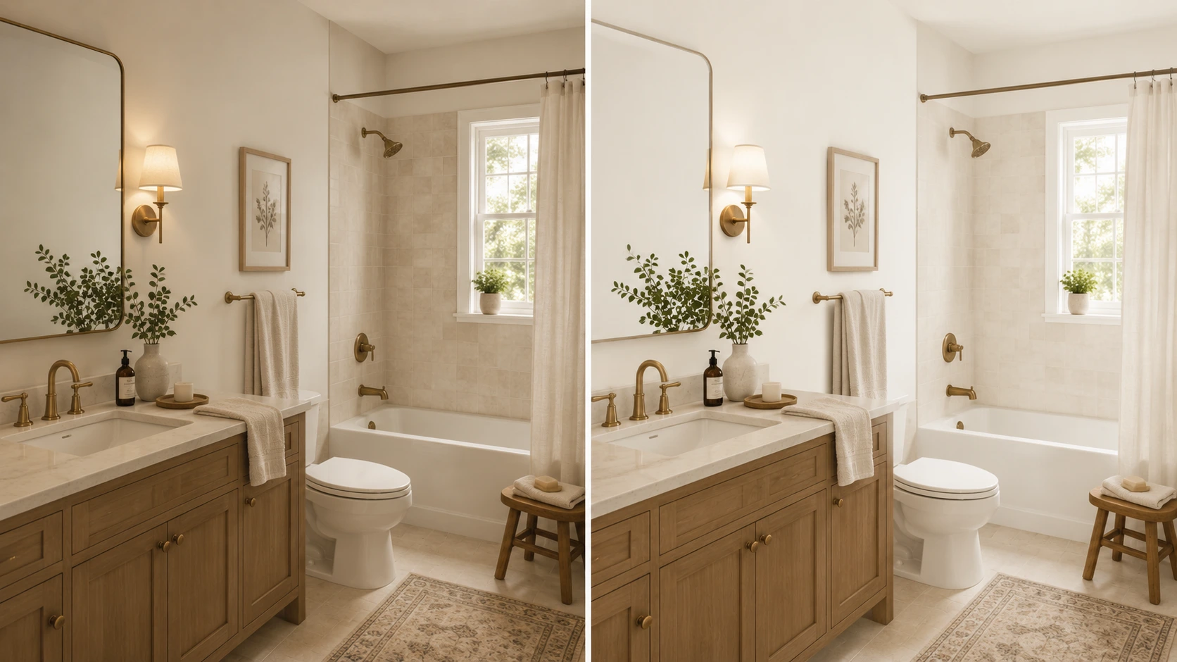
Alabaster is usually the safer bathroom choice because the higher LRV keeps small or low-light spaces feeling fresh and open.
Shoji White can work in bathrooms that have warm tile, natural stone, brass fixtures, and wood accents, but test it carefully. Bathrooms with white or gray porcelain tile and chrome hardware can make Shoji White’s gray-green side come forward in a way that reads as dingy rather than warm.
5. Exteriors
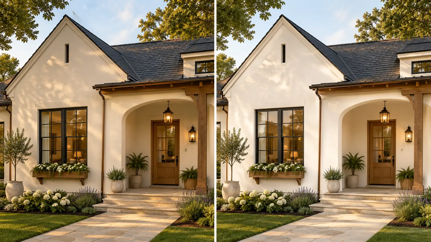
Shoji White is often a surprisingly strong exterior choice. Natural daylight makes it read as lighter and more balanced outdoors than indoors, which means many of the low-light concerns disappear on the exterior. It gives a soft, organic white quality that works well with natural wood, warm brick, and earthy stone.
Alabaster produces a brighter white exterior and suits homes with more contrast in their architectural details, though it can appear creamier in direct afternoon sun.
6. Open-Plan Spaces
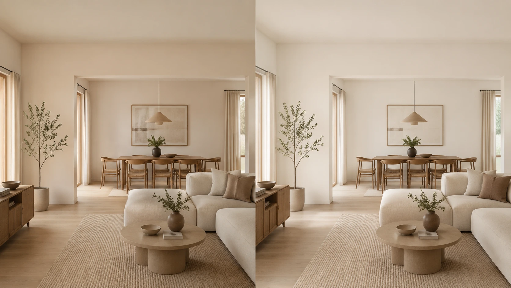
Alabaster works better for open-plan homes that have significant white architectural detail — white millwork, coffered ceilings, built-in shelving- where everything needs to feel consistent and clean.
Shoji White’s LRV of 74 gives it enough depth to sit comfortably beside richer accent walls, while Alabaster performs better alongside the warm white paint options that already lean bright and airy throughout the space.
Room use gets you part of the way there. Trim and cabinets are where many otherwise good choices fall apart.
Paint Finish and Product Line to Use
Finish affects how the undertone reads in real conditions. The wrong finish on the right color can still produce a result that looks off. The difference between satin vs semi-gloss matters more on trim and cabinets than on walls, where matte and eggshell both soften undertones effectively.
| Surface | Best Finish | Better Color Choice | Notes |
| Walls | Eggshell or matte | Shoji White or Alabaster | Choose based on light level and depth preference |
| Trim | Semi-gloss | Alabaster or Pure White | Provides cleaner definition and durability |
| Cabinets | Satin or semi-gloss | Alabaster usually | Test Shoji White only with warm counters and materials |
| Bathrooms | Satin | Alabaster for brightness | Shoji White only with warm tile and warm fixtures |
| Exteriors | Satin or low-luster exterior | Either | Test outdoors in direct and shaded conditions |
For the product line, Sherwin-Williams Emerald Interior and Duration are both strong wall choices. Emerald has better depth and durability for rooms where performance matters.
For trim and cabinets, Emerald Urethane Trim Enamel is worth the investment because it levels well, cures hard, and makes both white tones look intentional on architectural detail. The final pick should be based on how the room feels with the color on the wall, not just the color name on the chip.
How These Two Colors Compare to Other Popular Sherwin-Williams Whites
Both Shoji White and Alabaster sit in a crowded field of popular Sherwin-Williams neutrals. Here is how each compares with the colors most often mentioned alongside them.
Shoji White vs Other Sherwin-Williams Colors
If you are drawn to Shoji White’s depth and greige warmth, here is how it sits against its closest Sherwin-Williams neighbors:
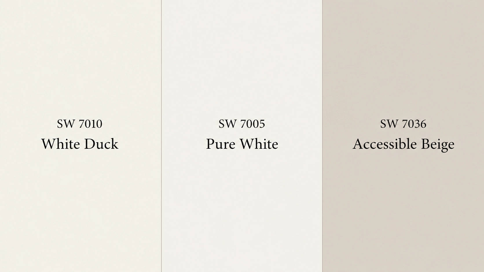
- White Duck SW 7010: Nearly identical LRV of 74. White Duck can carry a slightly more noticeable green-gray undertone while Shoji White leans a touch creamier and warmer overall. In most rooms, they look very similar, but Shoji White is the warmer of the two.
- Pure White SW 7005: Noticeably cleaner and cooler with an LRV of 84. Better suited for trim than for walls when you want a crisp result beside Shoji White. Not interchangeable on walls.
- Accessible Beige SW 7036: It is essentially a deeper version of Shoji White with an LRV of 58. Same greige-leaning undertones, more committed to a warm neutral than an off-white. Natural Choice SW 7011 sits in that same greige family, a warm off-white with beige and green-adjacent undertones that behaves similarly to Shoji White in low light.
Shoji White and Alabaster remain the main pair to test if you want a soft warm Sherwin-Williams white. Everything in this list helps you confirm which direction to step in from there.
Alabaster vs Other Sherwin-Williams Colors
If Alabaster is on your shortlist, here is how it compares with the alternatives that come up most often:
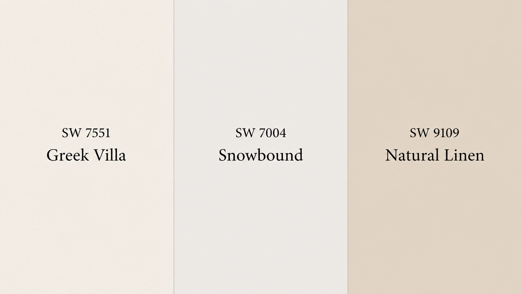
- Greek Villa SW 7551: A touch lighter and softer than Alabaster with a similar warm quality. Greek Villa can feel a little more cream-yellow and less grounded. Alabaster sits slightly more muted and neutral beside it.
- Snowbound SW 7004: Cleaner and slightly cooler than Alabaster, but still soft. It works better when Alabaster feels too creamy, especially beside cooler finishes or cleaner trim colors.
- Natural Linen SW 9109: Warmer and more committed to a beige feel than Alabaster. Suits interiors that lean traditional or organic rather than clean and fresh.
Alabaster remains the better test color if you want a soft warm white that still feels bright. These comparisons help you decide whether you need something creamier, cleaner, or warmer than Alabaster.
Coordinating Colors for Shoji White and Alabaster
Shoji White and Alabaster both work best with warm, soft, and slightly muted colors. The main difference is simple: Shoji White needs cleaner contrast because it is deeper, while Alabaster can handle warmer pairings because it reflects more light.
| Main Color | Coordinating Color | Best Use | Why It Works |
| Shoji White SW 7042 | Pure White SW 7005 | Trim, ceilings, doors | Adds clean contrast without feeling harsh. |
| Shoji White SW 7042 | Fawn Brindle SW 7640 | Accents, built-ins | Adds muted greige depth. |
| Shoji White SW 7042 | Accessible Beige SW 7036 | Connected rooms | Creates a deeper warm neutral flow. |
| Alabaster SW 7008 | Townhall Tan SW 7690 | Accents, exteriors | Adds warm beige depth. |
| Alabaster SW 7008 | Dakota Wheat SW 9023 | Warm accents | Supports Alabaster’s creamy base. |
| Alabaster SW 7008 | Pure White SW 7005 | Trim, ceilings, doors | Gives cleaner white contrast. |
For Shoji White, I would keep trim cleaner and accents muted. For Alabaster, I would use broader warm accents when the room needs contrast. Both colors can look beautiful, but they need different support colors to feel intentional.
Common Mistakes When Choosing Between Shoji White and Alabaster
Getting this decision wrong is easier than it should be, and most of the time it comes down to one of these situations.
- Choosing from photos only: Online images rarely show the true undertone. A photo taken in a south-facing room with warm oak floors shows you a completely different version of the color than what your north-facing bathroom will produce.
- Ignoring trim color: Trim can make white look wrong. Two warm whites side by side without testing can create a visual muddiness that neither color deserves.
- Using Shoji White in a dark room without testing: In low natural light with cool bulbs, Shoji White can shift from warm greige to a flat, slightly greenish tone. Testing is not optional here.
- Pairing Alabaster with stark white: Placed beside a crisp, cool white, Alabaster can look more yellow than you expected. The contrast amplifies the cream undertone.
- Testing only one wall or one time of day: Both colors shift meaningfully with the direction of light. A sample on one wall at 10 am is a partial answer, not a full one.
- Forgetting fixed finishes: Your floors, countertops, tile, and stone are not moving. Those materials control how the paint color reads more than the chip ever will.
The right choice becomes much clearer once the design goal is set before the color is.
Trim, Cabinets, and Ceilings: Which Color Works Better?
This question comes up often when Shoji White and Alabaster are both on the shortlist. The simple answer is that Shoji White usually works better on walls, while Alabaster is usually stronger for trim, cabinets, and ceilings.
| Surface | Better Choice | Why It Works |
| Walls | Shoji White | Gives more softness, depth, and a calmer wall color result. |
| Trim | Alabaster | Its higher LRV creates definition without looking as stark as pure white. |
| Cabinets | Alabaster | Gives a clean, warm-white cabinet look that works in most kitchens. |
| Ceilings | Alabaster | Keeps ceilings brighter and avoids the flat look Shoji White can have in low light. |
| Shoji White Walls + Trim | Pure White SW 7005 | Creates cleaner contrast than Alabaster while still looking soft beside Shoji White. |
Shoji White cabinets can work in warm kitchens with natural materials, but they may look muted beside cool countertops. Alabaster trim beside Shoji White walls can look creamy rather than crisp, while Shoji White trim beside Alabaster walls can look dull. If you want clean contrast, Pure White is usually the safer trim test.
Frequently Asked Questions
Can I use Shoji White walls with Alabaster trim?
You can, but test it first. Alabaster beside Shoji White may read creamy rather than crisp, which softens the definition between wall and trim. If you want cleaner visual contrast with Shoji White walls, test Pure White SW 7005 against your sample before choosing the trim color.
Why does Shoji White look beige in my house?
Shoji White has greige undertones and an LRV of 74, which gives it more depth than a typical white. Warm flooring, warm bulbs, and lower light levels all pull the beige side forward. Test it beside your trim and materials under both daylight and artificial light before deciding it is wrong for your room.
Is Alabaster too yellow for kitchen cabinets?
Alabaster can read as yellow on cabinets when placed beside cool-white counters, blue-gray tile, or stark white walls. In warmer kitchens with wood tones, brass hardware, and cream or warm stone, it usually reads soft and clean. Test a sample on an actual cabinet door in your kitchen lighting before ordering paint.
Which color is safer for a home sale?
Alabaster is generally the safer resale choice because buyers typically expect brightness on trim, cabinets, and ceilings. Shoji White can still work well for walls in homes with warm finishes, but it carries more risk in rooms with cool or mixed materials where the greige side might not appeal to every buyer.
Can I paint the walls and trim the same color?
Yes, with a finish change. Use eggshell or matte on walls and semi-gloss on trim. This creates definition through sheen rather than color contrast. This approach works better with Alabaster than Shoji White if the goal is a bright, cohesive result. With Shoji White, the same approach can work in warm, well-lit rooms, but test first.
Final Thoughts
Picking between two warm whites sounds like it should be simple. In practice, it is the kind of decision that catches people off guard because both colors look fine on a chip and then behave very differently on a wall.
The comparison between Shoji White vs Alabaster is really a question about what your room needs. Shoji White is softer, deeper, and more beige. Alabaster is brighter, creamier, and more versatile across surfaces and finishes. Neither is the universal answer.
Test them together in your actual light beside your actual materials. Wait 48 hours. Then choose based on the room, not the screen.
Drop a comment with your room direction, flooring color, and whether you are painting walls, trim, or cabinets. I will help you think through which one makes more sense.


