


I still remember the first time I noticed how calm a space could feel without much effort. It made me slow down and really look at what was around me. You may have felt the same way when walking into a home that just feels easy to live in. That feeling often comes from Scandinavian minimalism, even if you did not know the name for it yet. Many people feel stuck with clutter, busy rooms, and spaces that take work to manage every day. This approach matters because it focuses on keeping what helps and removing what gets in the way. Ahead, you will see how design choices, habits, and layout work together to support daily life and keep things clear. What Scandinavian Minimalism Means And Where It Started Scandinavian minimalism is a way of shaping homes and daily life around clarity, comfort, and real use. It brings together simple forms, practical layouts, and a focus on ease. The aim is not to remove everything from a space. The aim is to keep what works well and let go of what creates stress or blocks movement. Homes built around this idea feel open, calm, and functional. Each item has a clear purpose, which helps reduce visual strain and daily effort. This approach was developed in Nordic countries, where long winters and limited daylight shaped how people lived indoors. Homes needed to feel bright, easy to care for, and supportive during many hours inside. Over time, this led to interiors that rely on light colors, open plans, and materials that feel comfortable during daily routines. The result is a steady, balanced style that supports normal life without excess. Core Characteristics of Scandinavian Minimalism Every Scandinavian minimalist space follows the same foundation, whether it’s a studio apartment or a full house. These principles work together to create rooms that feel calm, functional, and warm, not empty. Function First: Every piece solves a real problem. Built-in storage, dual-purpose furniture, and zero decorative clutter. Light Matters: Natural light + layered warmth. Large windows, white walls, candles, and soft lamps everywhere. Calm Palette: Neutrals with whispers of color. White, gray, beige base with muted blues, greens, or blush. Natural Materials: Wood, wool, linen, and leather. Raw textures that age well and feel warm to the touch. Clear Space: Less visual noise, more breathing room. Empty surfaces and open flow so rooms feel larger. Quality Over Quantity: Fewer pieces, built to last. One solid oak table beats five cheap ones. Master these six elements and the rest falls into place naturally. Now let’s see how to spot true Scandinavian minimalism in real spaces. What Scandinavian Minimalism is Not This style is misunderstood, so limits explain what Scandinavian minimalism avoids and how it differs from strict or empty spaces. Not Cold or Bare Scandinavian minimalism does not aim to remove warmth from a home. Comfort is treated as necessary, not optional. Soft lighting, supportive seating, and practical layouts help rooms stay welcoming during daily use. Textiles such as rugs, throws, and curtains are used with restraint to prevent clutter while still adding softness. Spaces are arranged for rest, conversation, and routine activities, which keeps rooms usable rather than stiff or uninviting. This balance supports comfort without filling surfaces or reducing open movement. Not Extreme Reduction Scandinavian minimalism avoids the strict removal of belongings simply to meet a number or rule. Items remain when they support daily routines, comfort, or shared activities. Storage is used to organize necessities, not hide excess. Personal objects, books, and tools are kept when they serve a clear role. The goal is steady balance, where spaces stay manageable without forcing constant decisions or creating pressure to live with too little. This approach allows flexibility as needs change over time. Scandinavian Minimalism in Interior Spaces Scandinavian minimalism works in any room when you follow the same foundation, then adjust for how you actually use the space. 1. Living Room The living room shown reflects Scandinavian minimalism through balance and restraint. Seating is simple and grounded, with clean shapes that feel comfortable without taking over the room. A light wood table sits low and centered, allowing movement to stay open. Storage remains subtle, often built in or placed low, so walls stay visually calm. Soft fabrics and neutral tones reduce visual strain while still supporting everyday use. Natural light and clear spacing help the room feel steady, making it suitable for rest, conversation, or quiet time without frequent adjustment. 2. Bedroom This bedroom uses Scandinavian minimalism to support rest and routine. The bed frame is simple and raised slightly, allowing storage underneath without crowding the room. Light bedding and soft textures add comfort while keeping the space easy to maintain. Wall decor is limited, which helps the room feel open and quiet. Furniture remains minimal and purposeful, with bedside tables holding only daily items. Natural light and muted tones reduce distraction, creating a setting that supports sleep and calm mornings without excess objects competing for attention. 3. Kitchen The kitchen image shows how Scandinavian minimalism prioritizes function and order. Countertops remain mostly clear, allowing daily tasks to feel easier. Open shelving is limited and used for items that are both useful and consistent in appearance. Containers match in tone and size, which helps reduce visual noise. Light cabinetry and smooth surfaces reflect light and support easy cleaning. Materials feel practical and familiar, making the space ready for frequent use without feeling crowded or difficult to reset after meals. 4. Bathroom This bathroom reflects Scandinavian minimalism through clarity and structure. Only daily items remain visible, grouped neatly to avoid scattered surfaces. Storage is built in and understated, keeping the focus on ease of use rather than display. Light tile and wood tones support brightness while remaining simple to maintain. Fixtures are clean, in shape, and easy to wipe down. Towels and accessories are limited, which reduces clutter and makes the space feel calm. The result is a bathroom that supports routine without extra sorting or effort. 5. Entryway The entryway image shows how Scandinavian minimalism supports smooth transitions in and out of the home. A simple bench provides seating without blocking movement. Hooks are placed at an easy height and spaced evenly, keeping coats organized and accessible. Shoes are stored neatly below, preventing buildup on the floor. The layout leaves space open, which helps the area feel calm even during busy mornings. Each item has a clear place, reducing the chance of clutter forming near the door. 6. Small Spaces and Apartments This small apartment shows how Scandinavian minimalism supports limited square footage without feeling crowded. The bed frame is raised, which allows storage boxes to fit underneath while keeping the floor open. Shelving stays light and wall-mounted, freeing up walking space and reducing bulky furniture. A round mirror reflects natural light, helping the room feel brighter and more open. Furniture uses light wood tones and simple shapes, which keep the space visually calm. Each item has a clear role, allowing the room to support sleep, storage, and daily routines without competing for attention or adding visual strain. Scandinavian Minimalism as A Way of Living This approach shapes daily choices, habits, and routines, helping spaces stay clear and useful without constant effort or repeated resets. 1. Buying Fewer Items In Scandinavian minimalism, buying fewer items reduces long-term clutter and decision stress. Each purchase is considered carefully before money changes hands. Items are chosen for durability, comfort, and daily use rather than short-term appeal. If something cannot serve a clear role, it is usually skipped. This habit lowers waste and limits storage needs over time. By slowing purchases, homes stay easier to manage, and belongings remain familiar and useful instead of overwhelming or forgotten. 2. Everyday Habits Daily habits play a strong role in keeping spaces clear. Small resets, such as returning items to their place each evening, prevent buildup before it starts. Tasks are spread out instead of being saved for long cleaning sessions. Surfaces stay open because fewer items need attention. These routines do not require strict schedules or long checklists. They work because they fit into normal life and reduce effort instead of adding more rules or pressure. 3. Clothing Choices Clothing choices follow the same thinking as home design. Wardrobes focus on pieces that work across seasons and daily routines. Items are comfortable, easy to care for, and simple to combine. Fewer pieces mean faster mornings and less storage strain. Clothing is kept only when it fits current needs, not future guesses. This approach keeps closets clear and reduces the urge to buy replacements too often. Scandinavian Minimalism Compared to Similar Styles Many styles look similar at first glance, but their goals, comfort level, and daily use differ in clear ways. Style Main Focus Materials Overall Feel Scandinavian Minimalism Comfort with simplicity Wood, wool, cotton, stone Calm and lived in Standard Minimalism Reduction and restraint Metal, concrete, plain finishes Strict and spare Japandi Order and balance Wood, ceramics, natural fibers Quiet and controlled Wabi Sabi Acceptance of wear Aged wood, clay, raw finishes Soft and imperfect Understanding these differences helps you choose a style that supports daily life, comfort, and long-term use without confusion. Why Many People Choose This Style Many people choose Scandinavian minimalism because it supports real daily life without adding pressure or extra work. The focus on fewer, useful items makes homes easier to clean, organize, and maintain over time. Clear spaces help reduce distraction, which can support focus, rest, and smoother routines. This approach also limits impulse buying, which lowers waste and saves money long term. Because the style relies on simple forms and practical materials, it adapts well to changing needs, family sizes, and living spaces. It works in apartments, houses, and shared homes without heavy adjustments. Over time, this steady structure creates spaces that feel manageable, supportive, and calm, even during busy or demanding periods of life. Wrapping Up Scandinavian minimalism supports everyday living through clear spaces, useful items, and steady routines. The focus stays on comfort, real use, and balance rather than strict rules or empty rooms. I find this approach helpful because it works with normal life instead of adding more pressure. One simple change, like clearing a surface or slowing purchases, can make a real difference over time. If you are thinking about small steps that could help your home feel easier to manage, this style offers a solid place to start. How could Scandinavian minimalism fit into your space right now? Keep finding related ideas and check out other blogs on the website to build a setup that truly supports you.
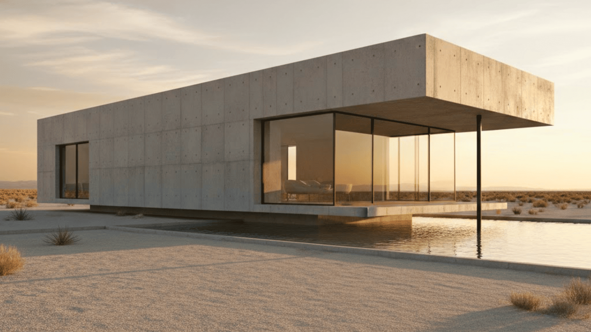
If you’ve ever wished your home felt calmer and easier to be in, minimalist architecture might be exactly what you’re looking for. This style focuses on clean lines, simple shapes, and open spaces that help you breathe a little easier. In this blog, I’ll walk you through what minimalist architecture means. You’ll see how it works in real homes, learn about well-known buildings, and get a feel for the key features that define the style. You’ll also find insights on why people enjoy minimalist spaces and what to keep in mind if you’re planning to use these ideas yourself. By the end, you’ll have a clearer sense of how light, space, and thoughtful design can shape the way a place feels. What Makes Minimalist Architecture Special? Minimalist homes today still follow classic principles but often include warm touches to make them feel cozy and livable. The focus stays on space, comfort, and clean design. Common Elements in Modern Minimalist Homes: Neutral colors with soft, earthy tones Light wood, stone, or concrete surfaces Smooth built-in storage to avoid clutter Large windows facing nature Open layouts that allow easy movement Simple, bold shapes used again and again All of these features work together, and each element supports the whole design. Here’s a quick breakdown: Element Purpose Natural light Makes the space feel larger and brighter Empty space Highlights the building’s structure and form Neutral colors Creates calm visual balance Simple materials Adds texture without crowding the room Together, these choices create a peaceful environment that feels open, grounded, and easy to enjoy every day. Famous Minimalist Architecture Around the World Minimalist architecture appears all over the world. These well-known examples show how simple forms, clean lines, and natural light can create spaces that feel peaceful, thoughtful, and visually strong. 1. Barcelona Pavilion: Spain The Barcelona Pavilion uses marble, glass, and steel to create smooth surfaces and clean lines. Its open layout makes the whole structure feel calm and balanced, almost like a sculpture. The building highlights how light and materials can create beauty without extra details. Tip: Focus on one or two strong materials to keep the design feeling clean. 2. Farnsworth House: United States This famous glass house blends with nature through wide windows and an open interior. Sunlight moves through the space all day, creating a soft, peaceful mood. The simple structure shows how minimalism can make even a small home feel open and full of life. Tip: Use large windows to bring nature into the design. 3. Glass House: United States Philip Johnson’s Glass House has floor-to-ceiling windows on every side, turning the outdoors into part of the room. With almost no walls, the home feels open, bright, and connected to the landscape. Its simplicity makes the view the main feature. Tip: Let the surroundings become part of the experience. 4. Wall-Less House: Japan Designed by Shigeru Ban, this home has no fixed internal walls. Movable panels change the layout based on the moment’s needs. The open plan brings plenty of air and natural light, showing how minimalism supports flexibility and comfort. Tip: Keep spaces adaptable for different daily activities. 5. Therme Vals: Switzerland This peaceful spa, created by Peter Zumthor, uses thousands of stone slabs to build calm, cave-like rooms. Soft lighting highlights the natural textures and creates a relaxing mood. It proves that minimalism can feel warm, soothing, and deeply inviting. Tip: Use natural textures to add warmth without clutter. 6. Off-Grid Chapel: Algarve This simple chapel sits quietly in nature with clean lines and a soft, open design. The structure blends with the landscape, showing how minimalism can support peaceful moments of reflection. Its gentle shapes and light create a calming experience. Tip: Keep shapes simple to make the surroundings stand out. 7. Casatome House: Mexico Casatome House blends indoor and outdoor spaces through wide openings and clean surfaces. Sunlight and fresh air move freely through the home, creating a relaxed feeling. Its minimal design turns nature into a key part of daily life. Tip: Create easy pathways between indoor and outdoor areas. 8. Mermaid Beach Residence: Australia This coastal home uses soft colors, wood, and open layouts to match the beach setting. The simple design feels breezy and calm, letting natural light fill every corner. It shows how minimalism can pair beautifully with coastal landscapes. Tip: Choose gentle colors to support a peaceful mood. Minimalist Architecture vs. Contemporary Architecture Many people mix up these two styles because both use clean lines. But they are different in clear ways and follow different design goals. To see the differences more clearly, here is a simple side-by-side comparison: Minimalist Architecture Contemporary Architecture Focuses on simplicity and essential forms Changes with trends and new ideas Uses a small, limited set of materials Uses bold shapes and advanced technology Calm, neutral colors Can include playful, bright, or surprising elements Very little decoration Often, experiments with unique and eye-catching features Minimalism stays consistent over time, while contemporary architecture shifts based on what feels new, fresh, and creative in each era. Where Minimalist Architecture Comes From? Minimalist architecture did not start from one place or one person. It slowly grew from a mix of design ideas that all loved simple shapes, natural light, and calm spaces. Japanese Zen Design: Japanese architecture values simplicity, quiet, and a close connection to nature. Sliding doors, open layouts, and soft, filtered light helped shape the calm feeling of modern minimalism. Empty space is treated as something meaningful, not something that must be filled. Scandinavian Design: Scandinavian homes use clean lines, bright rooms, and simple materials like wood and stone. They focus on comfort, warmth, and everyday function. This balance of simplicity and coziness fits perfectly with the goals of minimalist architecture. Bauhaus and De Stijl Movements: These early 20th-century movements promoted simple geometric shapes and the idea that “form follows function.” Designers were encouraged to remove anything that did not have a clear purpose and let the structure and layout do the talking. Together, these influences shaped the minimalist buildings seen today, spaces that feel clear, balanced, and thoughtfully designed with only what truly matters. Benefits and Criticisms of Minimalist Architecture Minimalist architecture has clear benefits, but it also comes with a few challenges. The table below gives a simple, easy-to-scan view of both sides. Benefits of Minimalist Spaces Concerns About Minimalist Spaces Calm, clutter-free environments Some people feel the rooms look too empty Better focus and relaxation Limited storage can be hard in daily life Easy-to-clean surfaces High-quality, simple finishes may cost more More natural light Homes can feel cold without softer touches Strong connection with nature — Clear, balanced layouts — Materials that feel timeless — Because of both the benefits and concerns, many designers add warm lighting, textures, plants, and soft details so minimalist spaces stay simple but still feel welcoming. The Future of Minimalist Architecture Minimalist architecture continues to grow as new lifestyles and technologies shape the way people live. Today’s designs often move toward warm minimalism, blending simple forms with natural textures for comfort. There is a stronger push forsustainable design, with materials and methods that support long-term environmental health. Many homes now feature open layouts that bring nature indoors, creating brighter and more peaceful spaces. Modern tools also make it easier to build minimalist cabins, retreats, and off-grid homes. As cities get busier, architects focus on creating places that feel calm, clear, and restful. Wrapping Up Minimalist architecture can be a quiet reset for your eyes and your mind. Instead of rooms packed with stuff, you get space, light, and a few strong details that actually mean something to you. It’s less about following a trend and more about supporting how you live every day. You now have a better sense of what makes this style work, from simple shapes and natural light to real projects around the world. If you decide to use some of these ideas at home, you can start small and move at your own pace. If this helped you think differently about your space, I’d love for you to check out my other blogs for ideas, tips, and gentle inspiration.
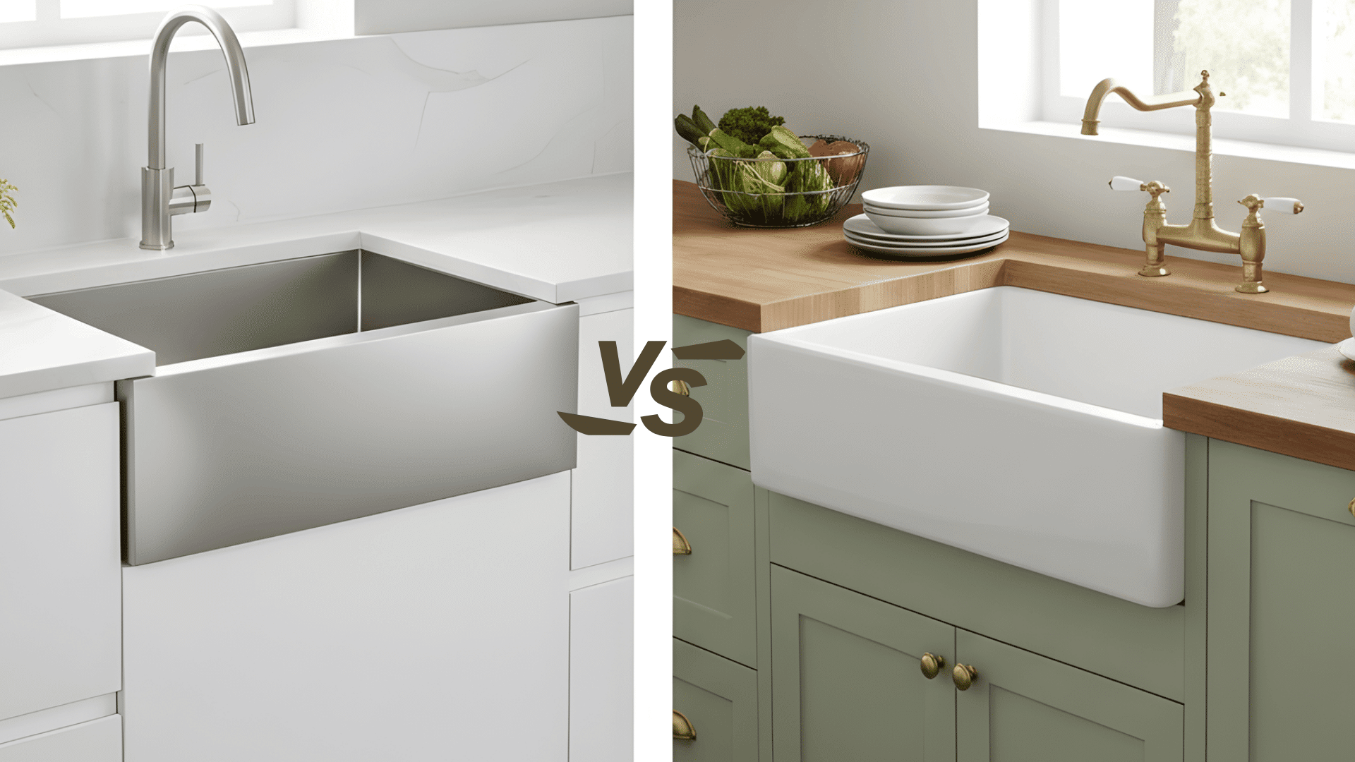
When you start planning a kitchen update, it is easy to feel lost in all the sink choices. You want something that looks good, works hard, and fits your space without extra stress. That is where the apron sink vs. farmhouse sink question really, truly matters. In this guide, I’ll walk you through both options in plain language. You will see how they differ in size, style, cost, and daily use, so you are not guessing. When you’re tired after cooking, you want the cleanup to feel simple, not annoying. My goal is to help you think about your kitchen, your habits, and your budget, so you can pick the sink that feels right for you. What is an Apron Sink? An apron sink is a deep sink with a front panel that extends a little past the countertop. This front edge helps protect the cabinet from splashes and lets you stand closer to the bowl without leaning as much, which can make long kitchen tasks feel easier on your back. Key features: Exposed front panel Works with many kitchen styles Can be installed as undermount, top-mount, or flush-mount Everyday benefits: An apron sink offers many sizes and material options, making it simple to match with different layouts. The forward design reduces leaning, and the wide range of sizes helps it fit into small or mid-size kitchens. Best fit: Homes that want a standout sink without major cabinet changes and kitchens built around modern or mixed-style designs. What is a Farmhouse Sink? A farmhouse sink is a deep, wide sink with an exposed front panel. This style comes from older European kitchens where large bowls were needed for cooking tasks and hand-washing clothes. Its roomy design still works well today, especially in busy kitchens that handle big cookware. Key features: Deep bowl for large items Usually made from fireclay or cast iron Rounded corners for comfort Everyday benefits: The extra depth makes washing pots and pans easier, and the bold front panel creates a strong focal point in the room. The design also helps keep water inside the bowl, reducing splashes on surrounding surfaces. Best fit: Larger kitchens and homes that prefer a warm, classic style with a sink that stands out. Apron Sink vs. Farmhouse Sink Comparison Choosing between an apron sink and a farmhouse sink becomes much easier when you see how they differ side by side. The table below highlights the features that matter most in real kitchens, from size to cost to installation needs. Feature Apron Sink Farmhouse Sink Front Panel Exposed Exposed Typical Size Many options Usually large and deep Installation Often fits standard cabinets Often needs cabinet changes Style Range Modern or classic Mostly traditional Cost More flexible Higher cost Best For Small or medium kitchens Large kitchens and heavy use With these differences in mind, it becomes easier to decide which sink matches your space, your routine, and the look you want in your kitchen. Installation Differences You Need to Know Installing either sink takes planning, and the steps can look very different once you get to the cabinet and countertop stage. Apron sink installation: Fits into a cutout in the cabinet Can sometimes use the same cabinet base already in place Can be mounted in three ways: undermount, top-mount, or flush Lighter materials make support easier Farmhouse sink installation: Often needs a special base cabinet made for farmhouse sinks Must support heavy weight, especially when the bowl is full of water The cabinet front needs a clean, exact cut that matches the sink front Usually works best when a pro handles the measuring and install These differences matter most when you are working with existing cabinets, so it helps to match the sink style to how much change the kitchen can handle. Common Materials Used in Apron and Farmhouse Sinks Both apron and farmhouse sinks come in several materials, and each one changes how the sink looks, feels, and holds up over time. Fireclay: Fireclay has a smooth, strong surface that works well in busy kitchens. It keeps a bright, clean look and holds up against daily use, which makes it a common pick for classic and modern spaces. Cast iron (with enamel finish): Cast iron is very sturdy and comes with a glossy enamel coating. This coating wipes clean with little effort and gives the sink a polished look that fits many kitchen styles. Stainless steel: Stainless steel fits naturally in modern kitchens. It is light, simple to maintain, and handles regular wear without much trouble. Its clean look also works well with many faucet and hardware finishes. Copper: Copper brings a warm color that stands out in the room. Over time, the surface changes naturally, giving it a lived-in look. It does need gentle cleaning, but many homeowners enjoy the character it develops. Stone or composite: Stone and composite sinks have a soft, matte appearance that blends well with natural materials. They are resistant to dents and scratches, making them a steady option for kitchens that want strength without a shiny finish. Each material offers its own mix of comfort, care, and style, so the best choice depends on how you use your kitchen and the look you want to create. Pros and Cons of Apron Sinks vs. Farmhouse Sinks Understanding the strengths and limits of each sink style helps you match the right option to your kitchen size, cooking routine, and budget. The table below shows the key points that matter most during daily use. Sink Type Pros Cons Apron Sink – Many sizes for different kitchens– Wide range of materials– Easier installation in most remodels– Comfortable working position – Some models have smaller bowls– The front surface can show marks if the material is soft Farmhouse Sink – Deep, wide bowl holds large cookware– Strong visual feature in the kitchen– Smooth surfaces are simple to clean – Needs strong cabinet support– Reduces base cabinet storage– Higher cost for sink and installation With these points in mind, it becomes easier to see which sink offers the comfort, look, and setup that match your kitchen and the way you work in it every day. Kitchen Design Ideas with Apron and Farmhouse Sinks Once you know the basics of apron sinks and farmhouse sinks, it helps to see how they actually look in real kitchens. These ideas show how each sink style can shape the mood of your space and match the way you use your kitchen every day. 1. Classic Farmhouse Look A farmhouse sink made from fireclay pairs well with shaker cabinets and warm metal fixtures. Soft, neutral colors help the sink stand out without overpowering the space. This style is a strong match for kitchens that want a cozy, lived-in look with gentle details and simple finishes. 2. Modern Apron-Front Look A stainless apron sink fits nicely with flat-panel cabinets and clean hardware. Straight lines and smooth fronts give the room a clear, modern feel. This setup works best in kitchens that prefer simple shapes, open counters, and a layout that feels organized without extra design details. 3. Light Coastal Look A white apron or farmhouse sink works well with light-colored cabinets and soft accents. Pale blue, cream, or sand tones add a gentle coastal touch without making the space too themed. This look suits kitchens that want a bright, relaxed feel with plenty of natural light. 4. Transitional Look An apron sink blends smoothly into a transitional kitchen that mixes classic and modern features. Simple cabinet doors, natural wood touches, and mixed metal finishes help tie everything together. This design fits homes that like warm, comfortable details balanced with clean, current elements. How to Choose Between an Apron Sink and a Farmhouse Sink To pick the right sink, it helps to look at the main factors side by side. This way, you can match each option with your kitchen size, routine, and cleaning style. Factor Choose an Apron Sink Choose a Farmhouse Sink Kitchen size The kitchen is small or medium, and the space feels tight. The kitchen is large and has room for a deep, wide bowl. Daily use Cooking is light, and dish loads stay fairly small most days. Cooking is frequent, and you often wash large pots, pans, or baking sheets. Budget You want something that fits a mid-range budget and works in a remodel. You can spend more for a feature sink that changes the feel of the whole room. Cleaning style You prefer low-effort care with materials like stainless steel or fireclay. You are okay with extra care for materials like copper or certain stone sinks. Looking at each row, think about which column sounds closer to your kitchen and your habits. The sink that matches most of your answers is usually the best fit. Common Mistakes to Avoid Before you order or install an apron or farmhouse sink, watch out for these easy-to-miss mistakes. Choosing the wrong size: Buying a sink wider or deeper than the cabinet can force expensive changes, so always measure the inside of the base first. Ignoring weight and support: Heavy fireclay or cast iron sinks need extra bracing; without it, the cabinet can sag or crack over time. Misjudging faucet space: Tall faucets need room to move; check that the handle and spout clear the backsplash and wall behind the sink. Forgetting storage loss: These sinks use more room inside the cabinet, so plan ahead for where cleaners, bins, and supplies will go. Picking a hard-to-care-for material: Stainless steel and fireclay suit low-effort cleaning, while copper and some stone options need gentle, regular care. Skipping pro help on tricky cuts: Cutting the cabinet front and countertop for the apron edge must be precise, and a pro can prevent gaps and chips. Keeping these points in mind helps your new apron or farmhouse sink feel like a smart upgrade instead of a stressful project. Bottom Line Now that you’ve worked through the apron sink vs farmhouse sink comparison, you have a clearer sense of how each one will behave in your kitchen. You’ve seen the differences in size, style, cost, and daily use, so your choice does not have to be a guess. As you look at your own layout, think about how you cook, how much space you have, and how much care you want to give your sink. Those details point you toward the option that fits your routine and your home. If you’d like a bit more help planning your kitchen, you can check out my other posts, too. You and your space deserve ideas that actually make everyday cooking feel easier.
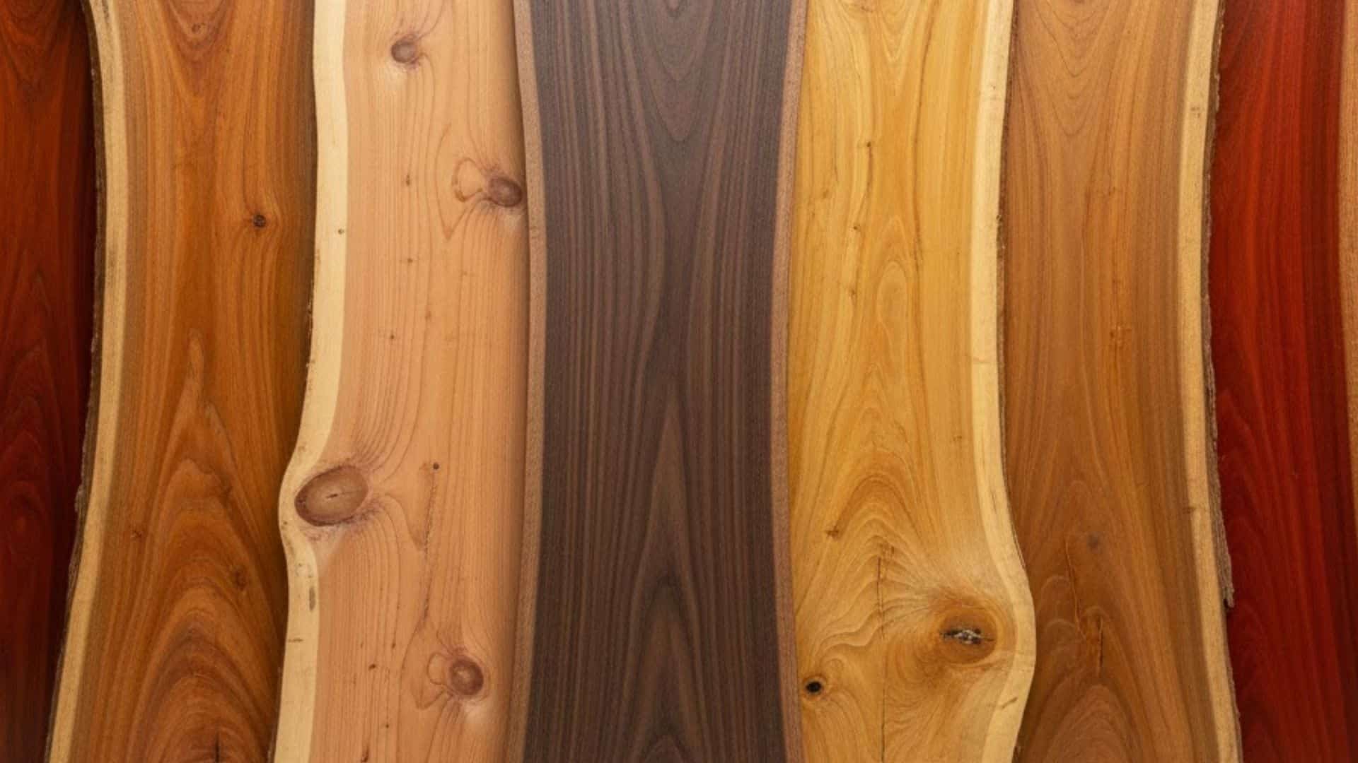
Struggling to choose the right material for your patio or deck furniture that actually lasts? Finding the best wood for outdoor furniture makes all the difference between pieces that survive and ones that rot quickly, especially when comparing the strongest wood types for durability. I spent years testing different woods before finding which ones truly hold up outside. The right choice saves you money, reduces maintenance headaches, and keeps your space looking great. Different woods handle rain, sun, and temperature changes in entirely different ways based on their properties. Some resist insects naturally, while others need constant protection to survive outdoors. Understanding your options helps you pick wood that matches your climate, budget, and preferences. Let’s see the best wood for outdoor use. Quick Look at the Best Woods for Outdoor Furniture Outdoor furniture is specifically built for use in spaces outside your home, like patios and decks. These pieces differ from indoor furniture in how they’re constructed and what materials are used. Wood Type Durability Level Natural Rot & Insect Resistance Maintenance Level Best Climate Teak Very High Excellent (natural oils) Low All climates, heavy rain, coastal Cedar Medium–High Very Good Medium Mild to moderate climates Cypress Medium–High Very Good Medium Humid or wet regions Redwood High Very Good Low–Medium Dry to moderate climates Mahogany High Very Good Medium Moderate to humid climates Ipe Extremely High Excellent Low Harsh sun, heavy rain Shorea High Very Good Medium Tropical, humid areas Robinia (Black Locust) Very High Excellent Low–Medium Cold winters, wet climates Eucalyptus Medium Good Medium Moderate climates Acacia Medium Good Medium Mild climates Pressure-Treated Pine Low–Medium Good (treated) High Dry climates, covered spaces This quick view helps you spot the balance between longevity, upkeep, and budget. Now let’s break each wood down in detail so you can see how it performs in real outdoor conditions. Top Wood Species for Outdoor Furniture I tested several wood types before finding what actually works well for outdoor furniture. Each species performs differently based on your climate and how you maintain it. Here are the best wood options for outdoor use: 1. Teak This wood stands out for its incredible durability and natural resistance to water, insects, and decay. Natural oils in teak protect it from harsh elements without any extra treatment needed. The rich golden-brown color looks pretty when new, but gradually ages into a beautiful silvery-gray patina. This conversion happens naturally over several years of outdoor exposure. The main downside is the price since teak costs significantly more than most other options. Best for: Premium furniture needing to withstand heavy weather exposure and last for decades. 2. Cedar Cedar naturally fights off rot, decay, and insects without chemical treatments or special coatings. It’s surprisingly lightweight compared to hardwoods while still being plenty durable for outdoor conditions. The warm reddish-brown color comes with a distinct, pleasant aroma that many people love. Cedar maintains its beauty well, but it can warp or crack if you skip regular maintenance. Proper sealing and occasional care keep it looking great for many years. Best for: Casual furniture like chairs, tables, and benches in covered or protected areas. 3. Cypress High oil content in cypress makes it naturally resistant to rot and decay over time. This wood performs exceptionally well in areas with lots of moisture and humidity throughout the year. The light to medium brown color has a slight yellowish tint that gives it character. Cypress is softer than many hardwoods, so it dents and scratches more easily with heavy use. Handle it with reasonable care, and it serves you well for years. Best for: Furniture in humid or wet climates where moisture resistance is essential. 4. Redwood Redwood offers excellent durability along with natural resistance to both water damage and insect problems. The deep reddish-brown color with attractive grain patterns makes gorgeous furniture pieces that draw attention. This wood holds up beautifully in outdoor conditions year after year with minimal maintenance required. The cost runs high, and finding sustainably sourced redwood can be challenging in many areas. When you can get it responsibly, redwood delivers outstanding results. Best for: High-end furniture and structures where appearance matters as much as durability and longevity. 5. Mahogany Mahogany resists water and decay exceptionally well while providing beautiful color and smooth grain patterns. The rich, reddish-brown color actually deepens and becomes more attractive as years pass outdoors. This wood combines gorgeous looks with solid performance that justifies its luxury status completely. Like other premium woods, mahogany comes with a hefty price tag attached. Sustainable sourcing can also be difficult, so always check where your mahogany originates. Best for: Luxury furniture pieces where beauty and refinement are top priorities for your space. 6. Ipe Ipe ranks as one of the most durable woods available for any outdoor application imaginable. Its extreme density and hardness make it incredibly resistant to rot, insects, and harsh weather. The dark brown color with fine grain creates a urbane, sleek look that ages gracefully. Working with ipe requires special tools because of how dense and hard it is. This difficulty, plus limited availability, makes ipe one of the pricier wood choices around. Best for: Heavy-duty furniture like decks, benches, and tables facing constant weather exposure and use. 7. Shorea (Philippine Mahogany) Shorea is a dense hardwood that naturally resists rot, decay, and insect damage effectively. Many people use it as a more affordable alternative to teak with similar strength. The color ranges from light reddish-brown to darker shades with fine grain. It ages beautifully into a silvery-gray patina but needs more maintenance than premium woods. Best for: Outdoor tables, chairs, lounge furniture, decks, and various exterior structures needing durability. 8. Robinia (Black Locust) Robinia ranks among the hardest and most durable hardwoods available for outdoor use today. It naturally fights off rot, decay, and insect damage without chemical treatments needed. The light to medium brown color sometimes has greenish hues with coarse texture. Its extreme density makes it harder to work with, requiring specialized cutting tools. Best for: Outdoor furniture, garden structures like pergolas, and decking that faces harsh weather conditions. Lesser-Known Outdoor Wood Options Most people don’t know about these wood types, but I’ve had great experiences using them for outdoor projects. They deliver solid performance at prices far below what premium species cost you. Here are budget-friendly wood options worth considering: 9. Eucalyptus Eucalyptus offers affordable pricing along with good natural resistance to weathering and insect problems. The wood has a pleasant appearance and holds up reasonably well with basic maintenance. While not as durable as premium hardwoods, it provides excellent value for the money. Regular sealing helps extend its life and keeps it looking attractive longer. Best for: Casual furniture pieces like bistro sets, folding chairs, and small outdoor tables. 10. Acacia Acacia combines durability with affordability, making it popular for budget-conscious outdoor furniture buyers. The beautiful golden-brown hue adds warmth and natural charm to any outdoor space immediately. Acacia requires some maintenance to prevent cracking and fading over extended outdoor exposure. With proper care, it serves as an excellent alternative to expensive hardwoods. Best for: Mid-range outdoor furniture, including dining sets, benches, and decorative garden pieces. 11. Pine (Pressure-Treated) Pressure-treated pine offers an affordable, lightweight option for outdoor furniture on tight budgets. Chemical treatment helps it resist rot and insect damage that untreated pine cannot handle. The light color and softer texture make it easy to work with for projects. Regular staining or sealing protects it and significantly extends its outdoor lifespan. Best for: Budget-conscious buyers needing basic outdoor furniture like simple benches, planters, and casual seating. Factors that Matter when Picking Outdoor Furniture Wood Picking the right wood for your outdoor furniture requires thinking about several important factors first. Each consideration affects how long your furniture lasts and how well it performs in your space. Here are the main factors to keep in mind: Climate: Your local weather conditions determine which wood types will perform best and last longest outdoors. Durability: Some woods naturally resist rot, insects, and decay better than others when exposed to outdoor elements constantly. Appearance: Different wood species change color and develop unique characteristics as they age over the years outside. Cost: Higher-priced woods often last longer, so balance your initial budget against long-term replacement costs carefully. These factors work together to help you find the perfect wood for your specific situation. Taking time to evaluate each one ensures you make a smart investment in outdoor furniture. How to Maintain Outdoor Wood Furniture? Proper maintenance dramatically extends the life of your outdoor wood furniture and keeps it looking beautiful for years. Here’s how to care for your outdoor wood furniture: Regular Cleaning: Use mild soap and water to clean furniture regularly and remove built-up dirt and grime. Sealing and Oiling: Apply sealant or oil to protect wood from moisture damage, harmful UV rays, and accumulated dirt. Storage Tips: Store furniture indoors or under protective covers during extreme weather conditions to prolong its lifespan. Repairing Damage: Sand down rough spots and apply a fresh finish to restore wood furniture and keep it looking new. I follow these maintenance steps religiously, and my outdoor furniture still looks great after five years. Taking just a little time for regular care saves you money on replacements down the road. Wrapping Up Choosing the best wood for outdoor furniture depends on balancing durability, appearance, maintenance needs, and your budget. You now know which woods naturally resist weather damage and which ones need extra care regularly. Premium options like teak and ipe cost more but last decades with minimal maintenance required. Budget-friendly choices like eucalyptus and pressure-treated pine work well when you maintain them consistently. Your climate plays a huge role in determining which wood performs best in your specific area. Regular cleaning, sealing, and proper storage during harsh weather extend any wood’s lifespan significantly. The perfect wood exists for every budget once you understand each type’s strengths. Which wood caught your attention? Share your choice below!
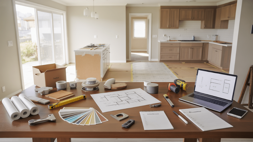
Planning a whole home remodeling feels overwhelming when you’re staring at six-figure estimates. I get it, the numbers seem impossible to predict. But here’s what contractors won’t tell you upfront: your budget blows up because of planning gaps, not because renovations are inherently expensive. Most projects run $100–$300 per square foot, depending on scope, but that range means nothing without context. I’m breaking down real costs, the factors that push prices higher or lower, and a bulletproof budgeting system that prevents overruns. With inflation still affecting materials and labor, guessing your numbers isn’t an option anymore. How Much Does a Whole House Remodel Cost? National averages give you a starting point, but remember, square footage alone won’t tell your story. Projects vary wildly based on scope, not just size. Home Size Light Remodel ($100–$150/sq ft) Mid-Range ($150–$250/sq ft) High-End ($250–$350/sq ft) 1,500 sq ft $150,000–$225,000 $225,000–$375,000 $375,000–$525,000 2,000 sq ft $200,000–$300,000 $300,000–$500,000 $500,000–$700,000 2,500 sq ft $250,000–$375,000 $375,000–$625,000 $625,000–$875,000 3,000 sq ft $300,000–$450,000 $450,000–$750,000 $750,000–$1,050,000 Light remodels keep existing layouts and upgrade systems. Mid-range adds some layout changes and better finishes. High-end means custom everything. Your location, home age, and material choices can shift these numbers ±30% easily. Use these as checkpoints, not promises. What Impacts the Cost of a Whole Home Remodel? Seven factors control where your budget lands. Some you can manage, others you can’t, knowing the difference saves money. 1. Scope and Layout Changes Moving walls, adding square footage, or changing room locations eats budget fast. Each structural change adds engineering fees, permits, and labor hours that compound quickly across your project timeline. Keep the footprint and major systems where they are. Prioritize must-haves and challenge every “nice-to-have” requiring structural work. This is your biggest cost control lever. 2. Kitchen and Bathroom Count These rooms cost more per square foot than any other space. Expect $25,000–$75,000 per bathroom and $50,000–$150,000+ per kitchen. The number in your project directly impacts your bottom line significantly. You can’t reduce existing bathrooms easily, but you can phase work across multiple years to spread costs. Updating two bathrooms this year and one next year helps cash flow. 3. Plumbing and Electrical Moves Every pipe or wire you relocate requires opening walls and rerouting systems. Moving a kitchen island with a sink adds $3,000–$8,000 just for plumbing. Electrical panel relocations cost even more with permits. Keeping sinks, toilets, and panel locations where they are saves thousands. Design around existing infrastructure whenever possible. This decision alone can drop costs by 15% or more. 4. System Upgrades HVAC, electrical panels, and water heaters over 20 years old often require replacement for code compliance. Budget $15,000–$40,000 for major system overhauls depending on home size and system complexity chosen. You can’t skip aging system replacements, but you control efficiency levels. A basic furnace costs half what high-efficiency heat pumps do. Choose system tiers that match your budget and needs. 5. Home Age and Code Requirements Older homes hiding knob-and-tube wiring, asbestos, or foundation issues force expensive upgrades. Once walls open, inspectors require current code compliance regardless of your original budget or scope plans. Homes built before 1980 need an automatic 20% contingency for surprises. You can’t skip code work, but planning for it prevents mid-project financial panic and contractor disputes. 6. Finish Quality Builder-grade cabinets, laminate counters, and vinyl floors cost 50-70% less than custom cabinetry, quartz, and hardwood. Finish selections create the widest price gap between identical layouts in similar-sized homes. This is your biggest control lever. Pick three rooms for high-end finishes and go mid-range everywhere else. Most guests can’t distinguish quality in hallways or secondary spaces anyway. 7. Location and Labor Rates Urban contractors charge $75–$150 per hour, while rural areas run $50–$85. Coastal markets cost 40% more than Midwest cities. Material delivery fees and permit costs also vary significantly by region and jurisdiction. You can’t change your location, but timing helps. Winter brings lower contractor demand and better availability, creating negotiating room. Off-season scheduling can save 10-15% on labor costs. How to Budget for a Whole House Remodel Smart budgeting happens in stages. Skip one, and you’re guessing. Follow all six, and you’ll sleep through demo day without financial nightmares. Step 1: Lock Your Scope First. Write every must-have before discussing money. Separate needs (safety, function) from wants (aesthetics). This stops mid-project upselling. Step 2: Allocate by Priority Buckets. Kitchen: 25-30%. Bathrooms: 20-25%. Systems: 15-20%. Structure/permits: 10-15%. Finishes: 20-30%. Adjust based on scope. Step 3: Build a 15-20% Contingency Fund. Hidden rot and code upgrades hit 80% of projects. Set money aside separately for genuine surprises only. Step 4: Account for Soft Costs. Permits run 2-5%. Temporary housing: $5,000–$15,000. Design fees: 8-15%. These aren’t in construction bids. Step 5: Compare Three Scope-Matched Quotes. Use identical scope documents. Compare line items, not bottom-line numbers. One bid might exclude demolition or trim. Step 6: Create a Cash Flow Timeline. Map payments to milestones: 10% upfront, 40% midpoint, 40% completion, 10% walkthrough. Decide on a phasing strategy. These six steps prevent budget chaos. Lock your numbers before signing contracts, and surprises become manageable instead of catastrophic. Common Mistakes to Avoid and Their Fixes Issue Fix Chasing the Lowest Bid Low quotes often mean missing work; demand itemized quotes showing labor, materials, and tasks. Compare line items, not totals. Unrealistic Material Allowances Visit showrooms before signing contracts. Pick actual products, then add 15% to prices for waste and installation complexity. Scope Creep During Construction “While walls are open, let’s add…” adds 30-50% markup for rescheduling and rush orders. Lock all decisions pre-construction. Demolishing Before Selections Are Final Order long-lead items (cabinets, tile, windows) 8-12 weeks before demo. Delays mean contractors move to other jobs and timelines collapse. Ignoring Value Engineering Find savings in aesthetics (paint vs wallpaper), not systems. Cheap HVAC or electrical systems create repair bills within years. Avoid these mistakes, and your budget stands a fighting chance. Most overruns come from preventable decisions, not bad luck. The Bottom Line I’ve walked you through the real numbers behind a whole house remodel, from $100–$300 per square foot ranges to the seven factors that control costs. Your success doesn’t come from finding magical, cheap contractors. It comes from defining scope precisely, budgeting a 15-20% contingency automatically, and avoiding mistakes that sink projects before they start. The difference between budget disasters and smooth renovations isn’t luck. It’s preparation. Start today by writing your must-have list and getting three detailed, scope-matched quotes. Don’t demo a single wall until your numbers and scope are completely locked in writing. What’s your biggest budget concern going into a project? Drop a comment below, I’d love to hear what’s keeping you up at night and help you work through it.

I remember staring at my old fireplace and feeling unsure about how to update it. Maybe you’ve had the same experience, wanting a clear way to refresh the space without making a huge mess or spending too much. That’s where simple, practical fireplace tile ideas make everything easier. Many people get stuck because there are so many materials, layouts, and finishes to choose from, and it’s hard to know what will hold up to steady heat. I’ve been through that same confusion, so I put together the details I wish I had from the start. Here you’ll find store options, layout tips, and style examples that work in real homes. So let’s take the first easy step forward together. Understanding Tile Finishes Tile finishes change how your fireplace looks and how easy it is to maintain. A matte finish gives a soft look with low shine, which helps hide fingerprints and dust. This option works well near busy seating areas or in rooms with steady light. Gloss tile has a smooth, bright surface that reflects light and feels fresh in small rooms. Textured tile brings slight depth and helps reduce slips on nearby hearth areas. It also adds gentle variation without looking heavy. A honed finish sits between matte and gloss, offering a smooth feel with limited shine. Each finish handles heat well, so your choice depends on cleaning needs, room light, and the overall direction you want Fireplace Tile Ideas Find ready-to-use tile replacement ideas examples arranged by style. Use these ideas to choose shapes, colors, and layouts that match your room and heating setup well. Modern Fireplace Tile Ideas Modern tile ideas focus on clean lines, smooth surfaces, and simple shapes. These options help your fireplace look steady and updated without adding heavy texture or busy patterns. 1. Large Format Porcelain Large format porcelain gives your fireplace a smooth, steady surface with fewer grout lines. This helps the wall look calm and open, even in tight rooms. The tile size reduces pattern breaks and keeps attention on the firebox. Porcelain also holds up well to heat and daily cleaning. This makes it a good choice for busy homes. Use simple trim pieces around edges to keep the face neat. Stick to one solid color to keep the look steady and balanced. 2. Vertical Stacked Layout A vertically stacked layout builds height around the firebox. The lines pull the eye upward, which helps low rooms feel taller. This setup works well with narrow tiles or long planks. Keep grout lines tight for a tidy look. Choose one color for all pieces so the lines stay easy to read. This layout also pairs well with simple mantels. If your room needs a calm update without heavy detail, this direction gives a strong impact with very little fuss. 3. Matte Black Surround A matte black surround creates a bold frame around the firebox. The dark tone keeps attention centered and adds strong contrast near light walls. This setup works well in living rooms with simple furniture and clean shapes. Choose porcelain or ceramic that handles heat well. Keep the grout narrow so the surface stays smooth. This direction also mixes well with metal accents near the firebox. If you want a clear and steady mood without shine, matte black gives you that outcome easily. 4. Thin Grout Lines Thin grout lines help the tile blend into one steady surface. This works well when using large tiles or long planks. Narrow joints keep the wall neat and free of busy lines. Choose grout that matches your tile color closely. This keeps attention on the shape rather than the gap between pieces. Thin grout also cuts down on cleaning. It gives the fireplace a calm and tidy appearance, which works well in small rooms or open layouts with simple decor. Classic Fireplace Tile Ideas Classic designs use calm colors and familiar layouts. These ideas work well in many rooms and give your fireplace a steady, comfortable look without strong patterns or sharp edges. 5. Marble Herringbone Marble herringbone brings a soft, gentle pattern without heavy detail. The repeating angles add movement while keeping the surface calm. Marble handles heat well but needs sealing to manage stains. Use a light grout so the design stays soft. This setup works well with white or wood mantels. Choose smaller strips for tighter detail or larger strips for a looser feel. If you want a long-lasting look that fits many home styles, herringbone gives steady interest without feeling busy. 6. White Subway Tile White subway tile offers a clean look that fits many rooms. The even rows create a steady rhythm around the firebox. This tile is easy to clean and works well with many grout colors. Use matching grout for a quiet direction or darker grout for clearer lines. Subway tile also comes in many sizes, so you can choose tight or wide spacing. It pairs well with wood, metal, or painted mantels. If you need a simple, safe choice, subway tile works well. 7. Checkerboard Stone Checkerboard stone uses two colors to make a steady, repeating layout. The squares give the wall a clear and balanced direction. This setup works well with slate, marble, or limestone. Keep the scale tight for small rooms or use larger squares for wide spaces. Choose grout that matches both colors to keep the focus on the shapes. This pattern pairs well with simple furniture and clean mantels. If you want a clear contrast without strong patterns, a checkerboard gives gentle shape and balance. Rustic Fireplace Tile Ideas Rustic tile ideas highlight warm tones, natural surfaces, and soft color shifts. These options work well in relaxed rooms and help your fireplace feel grounded and inviting. 8. Ledger Stone Ledger stone adds depth through layers and rough edges. Each piece has slight shifts in thickness and tone, which helps the fireplace feel warm and grounded. This works well in living rooms with wood beams, soft lighting, or natural fabrics. Use a simple mantel so the surface stays the main feature. Ledger stone handles heat well but needs brushing or vacuuming to keep dust away. If you want a textured face that stands out, ledger stone gives a strong, steady presence. 9. Slate in Deep Tones Slate tile in deep colors brings a calm, earthy feel to the fireplace. The surface has slight shifts in shade that catch light softly. Slate handles heat well and works in both small and large rooms. Keep grout lines narrow to let the stone show clearly. This layout works well with wood mantels and warm lighting. If you want a grounded look with natural movement, slate offers a steady blend of texture and color without feeling too heavy or rough. 10. Brick Tile Surround Brick tile gives the fireplace a warm, familiar look. The edges have slight shifts that add texture and depth. Brick handles heat well and holds color over time. Choose red tones for a classic look or whitewashed pieces for a calm direction. Use medium grout to keep the lines clear but not too bold. This layout pairs well with wood mantels and soft wall colors. If you want a relaxed feel with simple upkeep, brick tile fits many rooms easily. Farmhouse Fireplace Tile Ideas Farmhouse tile ideas mix warm colors, simple prints, and easy shapes. These choices help your fireplace feel comfortable and relaxed while keeping the overall look neat and simple. 11. Patterned Cement Tile Patterned cement tile adds shape and rhythm to the fireplace surround. These tiles come in many prints, letting you choose calm or bold designs. Cement needs sealing to prevent stains, but it handles heat well. Use light grout to soften the pattern or matching grout for a smooth look. This layout pairs well with wood mantels, woven baskets, and simple furniture. If you want a clear point of interest without heavy texture, cement tile gives you many choices and steady color. 12. Terracotta Tile Terracotta tile brings warm color and soft edges to your fireplace. The clay tones shift slightly from tile to tile, which adds gentle variation. Terracotta handles heat well but needs sealing to prevent marks from soot. Choose square pieces for a steady look or long planks for a different feel. Pair terracotta with wood mantels or light walls for a calm setup. If you want a warm, relaxed face that ages well, terracotta gives steady comfort and simple upkeep. 13. Wood-Look Planks Wood-look planks give you the feel of wood with the safety of porcelain. The printed grain adds soft movement. This works well around electric or gas units. Choose long planks for a smooth direction or shorter ones for more detail. Keep grout narrow so the seams stay subtle. The planks pair well with black, white, or wood mantels. If you want the warmth of wood without the risk of heat damage, wood-look tile gives a safe and steady alternative. Contemporary Statement Ideas Contemporary tile ideas focus on strong shapes and bold scale. These options work well when your fireplace needs to stand out as the main feature in the room. 14. Geometric Mosaics Geometric mosaics bring clear shapes and repeat patterns to the fireplace. The small pieces create movement without heavy texture. These mosaics come in stone, glass, or porcelain. Choose a shape that fits your room, like hexagons or triangles. Use matching grout to keep the pattern smooth. This layout works well with simple mantels, so the tile stays the main focus. If your room feels plain and needs one strong feature, geometric mosaics help set a clear direction. 15. Wall-To-Ceiling Tile Tiling from the firebox up to the ceiling creates one tall line. This helps the fireplace feel bigger and gives the room a clear center point. Choose large tiles for a smooth face or small tiles for more detail. Keep grout lines narrow to avoid breaks. This setup works well in living rooms with light walls and simple shelves. If you want the fireplace to guide the room without adding many other features, this layout gives clear height and presence. 16. Metallic Accent Strips Metallic strips add a thin shine along the tile surface. These strips work well between porcelain or stone tiles. They reflect light and give the surroundings a soft highlight. Keep spacing even so the lines stay clear. Choose steel, copper, or bronze tones that suit nearby hardware. This setup does not overwhelm the fireplace, but it adds interest with very little extra detail. If your room needs a small touch of contrast near the firebox, metallic strips offer that with ease. Small Fireplace Tile Ideas Small fireplace ideas use light colors, simple shapes, and tidy lines. These layouts help tight rooms feel open without adding clutter or heavy visual detail. 17. Light Gloss Tile Light gloss tile helps small rooms feel open. The shine reflects light and makes the wall look smooth. Choose soft colors like white, cream, or pale gray. Keep grout narrow so the joints stay subtle. This setup works well in apartments or older homes with tight living rooms. The gloss finish also cleans easily, which helps near the firebox. If your fireplace sits in a small corner or a narrow wall, light gloss tile gives steady brightness with simple upkeep. 18. Simple Subway Layouts Simple subway layouts work well in small spaces. The neat rows create calm lines without drawing too much attention. Choose medium or small tiles based on your surround size. Use matching grout to keep the face smooth. This layout pairs well with both painted and wood mantels. It also fits many room styles, so you can change furniture or wall colors later without replacing the tile. If you want a safe option for tight rooms, subway layouts keep things clear and steady. 19. Narrow Vertical Surround Tile Narrow tile pieces help small fireplaces stay balanced. They fit tight spaces without feeling oversized. Choose long pieces placed vertically or horizontally based on the height of your wall. Keep the grout thin so the lines stay smooth. Narrow tiles work well with small mantels or floating shelves. They also help the firebox feel centered, even when the wall space is limited. If you want a clean layout that suits smaller rooms, narrow tile delivers clear lines without crowding the area. Summary: This section offers many tile directions based on room size, color needs, and layout. Each idea gives you a clear way to shape your fireplace without guesswork. Where to Buy Fireplace Tile by Material You may want to see store options before choosing a tile style. This section helps you find the right place to buy stone, ceramic, porcelain, glass, or metal tile. It also explains what to check before ordering, so you choose a tile that holds up well around heat. How to Choose a Tile Store Pick a store that offers: Look for clear heat rating details in the product notes. Check if you can order small samples to test color at home Easy returns Quick shipping or local pickup A wide range of colors and sizes If you want help in person, a showroom is useful. If you want more options or lower prices, online stores often work better. Best Places to Buy Ceramic and Porcelain Tile and Stone Home Depot: Large selection of ceramic and porcelain tile at budget-friendly prices. Many styles ship quickly. Floor & Decor: Strong collection of porcelain tile, including wood-look and large format pieces. TileBar: Online store with stylish ceramic and porcelain designs. Good for finding patterns you may not see locally. These stores offer wide choices, fast shipping, and easy sample orders. Best Places to Buy Glass and Metal Tile Specialty Tile Products: Shops that focus on mosaics carry many glass and metal tile panels. These work well if you want a bright or reflective finish. Online Mosaic Stores: You can find sheets in many shapes and sizes. Good for accent areas around the firebox. Etsy Tile Makers: Independent makers sell handmade glass or metal pieces. These can give your fireplace a unique look. Glass and metal tile help add light or shine, but samples are important because colors shift under different lighting conditions. Heat Rating Checklist Before You Order Before buying your tile, check: The tile is rated for indoor fireplace use The material can handle high heat The tile thickness works with your wall The store lists grout and adhesive that pair well with your tile Sample tiles match your main order A quick check now saves time, money, and installation issues later. What to Know Before Choosing Fireplace Tile Picking the right tile matters because fireplaces reach a steady heat and collect soot over time. A few basic checks help you avoid problems and choose tile that lasts. Start by looking for material rated for fireplace use so it can handle warm surfaces without damage. Natural stone may need sealing, so review care notes before you buy. Grout also plays a role, since some colors hide soot better than others. Tile size affects the layout, so match it to the height and width of your wall. Finishes change how much cleaning you will do each week, and samples help you see the true color in your room. Planning your layout early keeps cuts clean around the firebox. Common Mistakes To Avoid Knowing frequent mistakes helps you plan better and avoid issues during installation. These points guide you toward safer choices and a smoother overall project: Using a tile that is not rated for steady heat near the firebox Skipping surface prep, which leads to weak tile bonds Choosing grout that stains easily near soot Leaving wide or uneven grout lines Forgetting to seal natural stone before use Cutting tile without checking the final layout first Using the wrong adhesive for your tile type Allowing gaps around the firebox where heat escapes Rushing measurements and wasting material Ignoring trim pieces needed for clean edges Conclusion Now that you’ve seen how different tile types and layouts can change the look of your fireplace, you can move forward with more confidence. Each option works in a slightly different way, but the goal stays the same: choose a safe material, keep the layout simple, and match the size of the tile to your wall. That approach makes your tile fireplace ideas feel much easier to apply in daily life. I hope this helps you plan a setup that fits your home and your routine. If you want more support, I invite you to keep reading and check out my other home project guides. There’s plenty more you can do to update your space at a comfortable pace.
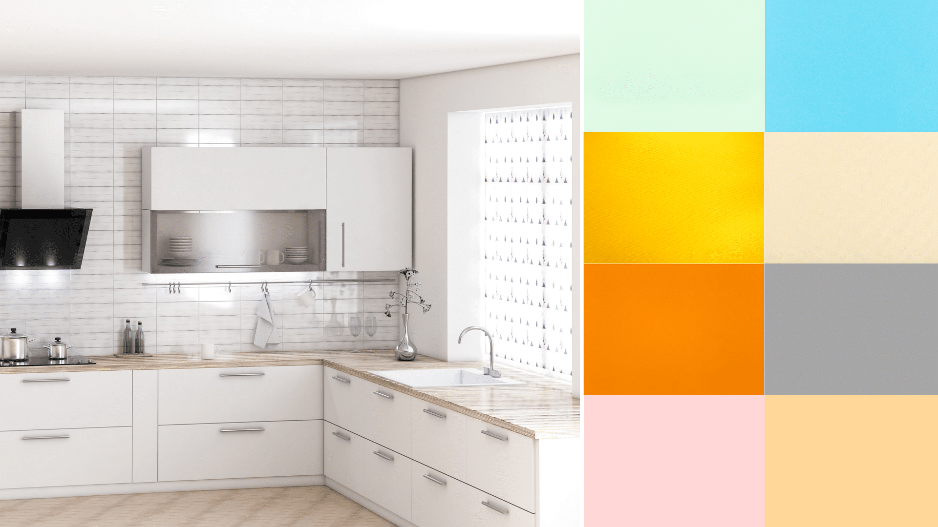
I used to think choosing a kitchen paint color was simple, but once you pair anything with white cabinets, the details start to matter. You notice the light, the shadows, the small shifts in tone that change the whole room. If you’re sorting through kitchen paint colors for white cabinets, you might feel stuck between warm shades, cool shades, and colors that seem to change every time you look at them. I’ve been there too, and I know how important it is to look at what truly fits your space. This guide walks you through steady options, clear steps, and real examples so you can make a choice that feels right. Considerations Before Choosing a Kitchen Paint Color Picking a color for your kitchen walls or cabinets works best when you slow down and look at a few key details first. Start by checking the shade of your cabinets. Some whites lean warm, while others look cool or bright, and this will affect how any wall color appears beside them. Then look at the light in your kitchen during the day and at night. Sun, shadows, and bulbs can shift a color more than most people expect. Think about the look you want. Soft and calm? Bold and dark? Light and open? Once you know these basics, it becomes much easier to choose a color that feels right in your space. Kitchen Paint Colors with White Cabinets These shades give you steady options when comparing white kitchen paint colors for rooms with bright or warm cabinets. Soft Neutral Kitchen Paint Colors These shades stay steady in most rooms and give you an easy, low-stress match with almost any white cabinet finish. 1. Sherwin-Williams Accessible Beige This shade works well when you want warmth without a heavy look. It sits between beige and gray, so it helps soften bright white cabinets while still keeping the room light. It works well in both sunny and low-light kitchens because it stays steady through the day. It also pairs nicely with stainless steel, wood floors, and warm counters. Accessible Beige is a safe pick if you want a gentle touch that never competes with other features. 2. Sherwin-Williams Repose Gray Repose Gray sits in the middle of warm and cool, giving steady balance around white cabinets. It helps calm strong whites without making the room feel dark. It works well in kitchens with steady daylight but also holds up under soft evening light. Many people like it because it fits modern and older homes without feeling heavy. If your cabinets look bright or sharp, this shade helps tone them down in a simple, clean way. 3. Sherwin-Williams Agreeable Gray Agreeable Gray is a soft mix of gray and beige that works well beside warm or cool white cabinets. It keeps the room feeling open while adding enough color to avoid a flat look. This shade performs well in many lighting setups, which makes it a steady option if your kitchen has both bright areas and shadowed corners. The color pairs well with stone counters, wood shelves, and simple hardware. It’s a strong pick if you want a calm space without strong undertones. 4. Benjamin Moore Edgecomb Gray Edgecomb Gray leans warm and gentle, making it a great match for white cabinets that look bright or sharp. It adds a soft backdrop that keeps the room from feeling plain. This shade works well in kitchens with warm floors, stone counters, or natural wood accents. It stays steady through most lighting changes, which makes it easy to trust in busy homes. If your space needs a light touch that still brings warmth, this color fits well. 5. Benjamin Moore Classic Gray Classic Gray is a pale gray with understated warmth, making it ideal for kitchens where you want a quiet, steady feel beside white cabinets. It does not compete with other colors in the room, which helps your cabinets stand out without looking harsh. This shade works well with natural light because it reflects enough brightness to keep the space open. It also pairs well with stainless steel and light counters. Choose this color if you want a soft, clean backdrop that stays calm all day. Warm and Cozy Kitchen Paint Colors These shades help soften bright cabinets and bring calm warmth into the room without making the walls feel heavy or dark. 6. Sherwin-Williams Alabaster Alabaster gives you a warm white that feels steady around bright cabinets. It adds a soft layer that reduces glare and makes strong whites feel calmer. Many kitchens benefit from its gentle tone because it sits between bright white and beige. It works well with wood floors, brass hardware, and warm counters. Alabaster also holds steady in shadowed areas, which helps the room look even throughout the day. Choose it when you want warmth without any strong color. 7. Sherwin-Williams Shoji White Shoji White brings a mix of warm beige and soft gray, making it a useful choice for bright white cabinets that feel too sharp. It adds gentle warmth while keeping the room light and open. This shade works well with both warm and cool counters, giving you flexibility during updates. Shoji White also looks steady under different lighting, so it’s helpful in kitchens with shadowed corners. Use this color if you want a warm look without strong yellow notes. 8. Benjamin Moore White Dove White Dove is a warm white that softens crisp cabinets and adds a smooth, steady backdrop. It offers warmth without feeling heavy, making it ideal for kitchens that need a calm touch. The shade works well with stone counters, wood accents, and soft lighting. It also handles bright sun without turning harsh. Many homeowners pick it because it gives the room a gentle glow while keeping the layout light. Choose this color when your cabinets feel too bright and need balance. 9. Benjamin Moore Swiss Coffee Swiss Coffee brings warm depth without overpowering white cabinets. It gives the room a soft, steady look while reducing the sharp edges of bright whites. This shade works especially well with warm floors, beige counters, and low-light kitchens. It stays consistent during the day, which helps the room feel even. Swiss Coffee also pairs nicely with brushed metal hardware and wood shelves. Use this color if you want your kitchen to feel warm, smooth, and grounded. Soft Color Kitchen Paints with White Cabinets These shades add gentle color while staying light enough to match bright cabinets in small or large kitchens. 10. Sherwin-Williams Sea Salt Sea Salt offers a soft mix of green and gray that shifts gently with the light. It pairs well with bright cabinets because it adds color without feeling bold. This shade works in sunny kitchens, shadowed areas, and open layouts. It matches well with brushed metal, natural wood, and stone counters. Sea Salt brings a calm feel to the space, giving you a hint of color that never feels strong. Choose this shade if you want a light color with a steady look. 11. Sherwin-Williams Evergreen Fog Evergreen Fog is a muted green with gray notes that works well beside crisp white cabinets. It adds depth without overwhelming the room. This shade performs well in bright and low-light areas, holding a steady tone throughout the day. It pairs with wood accents, black hardware, and warm counters. Evergreen Fog is a good fit for kitchens needing a grounded wall color that still feels light enough for everyday use. Choose it when you want gentle depth. 12. Benjamin Moore Palladian Blue Palladian Blue is a soft blue with a gentle green touch, making it great for bright, cabinet kitchens needing subtle color. It brings a calm feel that stays steady in many lighting setups. The shade pairs with white trim, stone counters, and natural wood elements. It works especially well in kitchens with steady daylight, keeping the room light and open. Palladian Blue offers color without sharp contrast. Choose this shade when you want a soft, airy look beside white cabinets. 13. Benjamin Moore Soft Fern Soft Fern gives you a muted green tone that fits well with white cabinets in both small and large kitchens. It adds color without pulling attention away from cabinets or counters. This shade works well with warm floors, stone surfaces, and simple hardware. It stays even with changing light, which helps the room look smooth throughout the day. Soft Fern is a great pick when you want gentle color with a natural feel that still keeps the space light. Bold Accent Kitchen Paint Colors These deeper shades work well on small areas, feature walls, or islands when you want a stronger contrast beside white cabinets. 14. Sherwin-Williams Naval Naval is a deep blue that brings strong contrast to bright cabinets without overpowering the room. It works well on islands, hood covers, and short walls. The color holds steady under most lighting, which keeps it looking rich throughout the day. Naval also pairs nicely with brushed metal, warm wood, and stone counters. This shade helps highlight key features while keeping the rest of the kitchen calm and simple. Choose it when you want a dark color that still feels controlled. 15. Benjamin Moore Hale Navy Hale Navy offers a dark blue tone that gives clear contrast beside white cabinets. It works well in kitchens with good light and can be used on islands or accent areas. The shade pairs smoothly with silver hardware, wood shelves, and white trim. It stays steady as the light changes, which makes it easy to trust in busy homes. Hale Navy adds depth without causing the kitchen to feel tight. Pick this shade when you want a strong yet steady accent. 16. Benjamin Moore Revere Pewter Revere Pewter is a warm gray that brings a deeper look without feeling harsh. It works well around white cabinets because it adds contrast while staying soft enough for daily use. The color fits many features, including warm floors, stone counters, and brushed metal hardware. Revere Pewter stays even in most lighting, which helps the kitchen look smooth from morning to evening. This shade is useful for small walls or islands where you want depth without a strong dark tone. 17. Sherwin-Williams Iron Ore Iron Ore is a very dark charcoal that gives a strong contrast next to white cabinets. It works well on islands, pantry doors, or a single short wall. The shade looks almost black but has enough softness to keep the space from feeling closed in. It pairs nicely with light counters, wood floors, and simple hardware in black or brass. Iron Ore is a smart pick when you want a bold accent that still ties in with the rest of the kitchen. How to Choose the Right Kitchen Paint Color with White Cabinets Choosing a kitchen paint color works best when you look at your cabinet shade, room light, and the level of contrast you want. Check if your cabinets lean warm, cool, or bright. Look at how sunlight and bulbs change the wall color during the day. Pick soft walls if you want a calm look with less contrast. Pick darker walls if you want a strong contrast around bright cabinets. Test small paint samples on different walls before choosing one. Match the wall color to your counters and floors so nothing clashes. Kitchen Paint Colors for White Cabinets: Quick Guide Use this chart to match wall tones with your kitchen style and countertop, so white cabinets stay balanced and simple. Kitchen Situation Good Wall Tone Why It Helps Modern white cabinet kitchen Cool gray Keeps lines clean and cuts harsh glare. Farmhouse white cabinet kitchen Warm greige Softens bright cabinets and wood tones. Coastal white cabinet kitchen Soft blue Works well with sun and light finishes. Traditional white cabinet kitchen Beige Adds steady warmth beside white cabinets. Quartz with cool veining Cool gray Matches cool stone lines and trim. Quartz with warm veining Warm neutral Balances warm pattern without feeling dark. Busy granite counters Soft neutral Calms strong movement in the stone. Butcher block counters Warm neutral Fits the wood and keeps cabinets clear. Marble counters Soft gray Echoes light gray lines in the stone. Use these groups as a starting point when testing white kitchen paint colors from your sample cards. Common Mistakes to Avoid Many problems come from quick choices, missed undertones, and skipping sample tests, which can make white cabinets look uneven or sharp. Picking a wall color without checking cabinet undertones first. Ignoring how sunlight and bulbs change the paint during the day. Choosing a white that makes cabinets look yellow or washed out. Skipping large paint samples on more than one wall. Forgetting to compare the wall color with the floors and counters. Using one sheen for walls, trim, and cabinets when each needs a different finish. Concluison By now, you should have a clearer sense of how small paint choices can shape the overall look of your kitchen, especially when you’re working with white cabinets. The key steps stay simple. Check your cabinet tone. Pay attention to your natural and artificial light. Pick colors that support the space instead of competing with it. When you follow that process, choosing the right shade feels much less stressful. If you’re still deciding on kitchen paint colors with white cabinets, test a few samples and watch them from morning to night. The right one will stand out once you see it in real light. Want more help narrowing it down? Browse other kitchen color guides and cabinet paint ideas on the website to find combinations that fit your style and space.

I used to think a fireplace was just something you worked around, not something you planned a room around. But once you notice modern fireplace accent walls, it’s hard to ignore how much they shape a space. You’ve probably seen homes where the fireplace looks awkward, too plain, or way too heavy for the room. That usually comes down to poor layout or the wrong material choice. A well-planned accent wall can fix that by adding balance, focus, and purpose. In this blog, I walk you through real design ideas, material choices, and layout tips that help modern fireplace accent walls feel natural in everyday homes. Key Features of Modern Fireplace Accent Walls Modern fireplace accent walls focus on clean lines, simple materials, balanced colors, and layouts that feel intentional, uncluttered, and visually calm. Clean lines with simple shapes and straight edges Neutral color palettes with subtle contrast Focus on texture instead of heavy decoration Minimal mantels or no mantel at all Floor-to-ceiling designs that create visual height Large-format materials with fewer seams Balanced proportions that fit the room size Smooth finishes mixed with light texture Built-in elements like shelves or storage Hidden or subtle lighting to highlight the wall Limited decor to keep the wall uncluttered Matte or low-sheen finishes for a soft look Modern Fireplace Accent Wall Ideas Modern fireplace accent wall ideas focus on clean layouts, balanced materials, and simple finishes that highlight the fireplace without overwhelming the room. These ideas help you plan a wall that feels modern, functional, and suited to real home layouts. 1. Floor-to-Ceiling Stone Fireplace Wall A floor-to-ceiling stone fireplace wall creates a strong focal point while keeping the design grounded. This style works well in rooms with higher ceilings, as it draws the eye upward and adds visual height. You can use natural stone for a raw look or manufactured panels for easier installation. Lighter stone keeps the space open, while darker stone adds depth and contrast. To keep it modern, choose stone with clean cuts and consistent sizing. Avoid heavy mantels and extra decor so the texture remains the main feature without feeling busy. 2. Large-Format Tile Fireplace Accent Wall Large-format tile helps create a clean and modern fireplace wall with fewer grout lines. This gives the wall a smoother, more unified look. Porcelain or ceramic tiles work well and come in finishes that mimic stone, concrete, or marble. This option suits both small and large rooms because it keeps visual clutter low. A vertical or stacked layout can change how tall or wide the wall feels. Keep the grout color close to the tile shade to maintain a simple and modern appearance that does not distract from the fireplace itself. 3. Vertical Wood Slat Fireplace Wall Vertical wood slats add warmth while keeping the wall structured and modern. The vertical lines help make ceilings feel taller, which works well in average-height rooms. Choose wood tones that feel natural and avoid heavy stains. Spacing between slats should stay even and clean for a modern result. This style pairs well with linear fireplaces and simple mantels. You can extend the slats across the full wall or limit them to the fireplace area. Keep the surrounding decor minimal so the wood texture stays balanced and not overpowering. 4. Smooth Concrete Fireplace Feature Wall A smooth concrete fireplace wall gives a modern and slightly industrial feel without heavy decoration. This style works best with clean furniture and neutral colors. You can use real concrete or concrete-look panels, depending on budget and installation needs. The smooth finish keeps the wall from feeling rough or unfinished. Concrete works well with linear fireplaces and hidden lighting. To soften the look, add warm elements like wood furniture or soft textiles nearby. Avoid adding too many accessories so the wall keeps its clean and calm appearance. 5. Matte Black Modern Fireplace Wall A matte black fireplace wall adds contrast while still feeling modern and controlled. This style works best in rooms with good natural light, so the space does not feel closed in. Matte finishes reduce glare and keep the wall looking smooth. Black pairs well with stone, wood, or metal accents. Keep the fireplace surround simple and avoid shiny hardware. This idea works well for both gas and electric fireplaces. Balance the dark wall with lighter furniture, flooring, or ceilings to keep the room visually comfortable. 6. Minimal White Fireplace Accent Wall A minimal white fireplace wall keeps the space bright and open while still creating a focal point. This design works well in small rooms or open layouts. White materials like tile, plaster, or painted panels keep the wall clean and simple. The key is texture rather than decoration. Subtle tile patterns or smooth plaster add interest without clutter. Avoid heavy mantels and dark trim. This style pairs well with modern furniture and light wood tones, creating a calm and balanced living space. 7. Two-Tone Fireplace Accent Wall A two-tone fireplace wall uses contrast to add interest without overcomplicating the design. This can include mixing light and dark colors or combining two materials like tile and wood. The key is keeping the transition clean and intentional. Horizontal splits feel wider, while vertical splits add height. Use simple lines and avoid patterns that compete with each other. This style works well when you want visual depth without a bold statement wall. Keep surrounding decor simple so the two-tone design stays clear and organized. 8. Built-In Shelves Around Fireplace Wall Built-in shelves around a fireplace create balance and add function without taking attention away from the wall. This layout works well for modern homes that need storage or display space. Keep shelf lines clean and spacing even. Open shelving works best with limited decor and neutral colors. Closed storage below helps hide clutter. Use the same material or color as the fireplace wall to keep everything connected. Avoid overfilling shelves so the fireplace remains the main focus of the wall. 9. Floating Fireplace Accent Wall A floating fireplace wall creates the illusion that the wall or fireplace is not fully grounded. This effect works well with modern linear fireplaces and clean materials. The floating look can come from a recessed base, hidden supports, or a raised hearth. This style adds visual interest while keeping the wall simple. It works best in rooms with open floor space. Keep finishes smooth and colors neutral. Avoid heavy mantels or bulky surrounds so the floating effect remains clear and intentional. 10. Vertical Tile Layout Fireplace Wall A vertical tile layout changes how the fireplace wall feels without changing materials. Vertical placement helps draw the eye upward and makes the room feel taller. This works exceptionally well with narrow tiles or large-format slabs. Keep grout lines thin and consistent. Choose neutral tile colors to avoid visual clutter. This style fits modern and contemporary homes and pairs well with simple mantels or no mantel at all. Keep the tile pattern clean so the layout itself becomes the main design feature. 11. Slim Profile Fireplace Accent Wall A slim-profile fireplace wall is ideal for smaller rooms or modern spaces with limited depth. This design keeps the wall clean and avoids bulky surrounds. Linear fireplaces work best for this look. Choose materials that sit close to the wall, such as tile, panels, or plaster. Avoid thick mantels or heavy framing. This style helps the fireplace blend into the room while still acting as a focal point. Keep nearby furniture scaled properly so the wall does not feel crowded. 12. Marble Slab Fireplace Feature Wall A marble slab fireplace wall adds a smooth and polished surface with natural pattern variation. Using large slabs keeps seams minimal and maintains a clean look. Lighter marble works well for bright rooms, while darker marble adds contrast. Keep the rest of the wall simple so the stone remains the focus. This style pairs well with modern furniture and minimal decor. Avoid ornate trim or heavy mantels. Let the natural veining provide interest without adding extra design elements. 13. Mixed Wood and Stone Fireplace Wall Mixing wood and stone creates a balance between warmth and texture. This style works best when both materials stay simple and neutral. Use clean stone shapes and straight wood lines. One material should lead, while the other supports. This keeps the wall from feeling busy. Mixed materials work well in open layouts where you want the fireplace to connect with other finishes in the room. Keep colors muted and finishes matte to maintain a modern look. 14. Modern Farmhouse Fireplace Accent Wall A modern farmhouse fireplace wall blends simple materials with clean lines. This style avoids heavy rustic elements and focuses on balance. Light stone, smooth wood beams, or simple tile work well here. Keep the mantel slim and avoid decorative trim. Neutral colors help the wall feel fresh and current. This design works well in family rooms and open living areas. Keep decor minimal and functional so the wall stays modern rather than overly traditional. 15. Concrete-Look Tile Fireplace Wall Concrete-look tile offers the appearance of concrete with easier installation and maintenance. This option works well for modern and industrial-inspired spaces. Large tiles help reduce grout lines and keep the wall smooth. Choose a matte finish for a softer look. This style pairs well with black, white, or wood accents. Keep the fireplace surround simple and avoid decorative framing. Concrete-look tile works well in both small and large rooms without feeling heavy. 16. Fireplace Accent Wall with Hidden Storage Hidden storage keeps the fireplace wall clean while adding function. This design works well for modern homes that need space for media or daily items. Use push-to-open cabinets or flush panels to hide storage areas. Keep lines straight and hardware minimal or hidden. Matching the storage finish to the wall helps everything blend together. This approach keeps the fireplace as the focal point while maintaining a clutter-free look that suits modern living. 17. Corner Fireplace Accent Wall A corner fireplace accent wall is a smart solution for rooms with limited space or unusual layouts. Placing the fireplace in a corner frees up wall space while still creating a focal point. To keep the design modern, use clean materials like tile, smooth stone, or plaster. Vertical elements help balance the angled placement and prevent the corner from feeling awkward. Slim fireplace profiles work best here. Avoid bulky mantels or heavy framing so the corner feels open, not crowded. This option works well in apartments, small living rooms, or open floor plans. 18. Minimal Mantel Fireplace Wall A minimal mantel fireplace wall focuses on simplicity and clean proportions. Instead of a thick or decorative mantel, this design uses a slim shelf or skips the mantel entirely. This keeps attention on the wall material rather than added details. Tile, stone, or plaster works well with this approach. A minimal mantel also helps the fireplace blend into modern interiors with uncluttered layouts. Limit decor to one or two simple items to avoid distraction. This style suits homeowners who want a refined look without extra layers or visual weight. 19. Fireplace Accent Wall With Integrated Lighting Integrated lighting adds depth and highlights texture without adding clutter. This design often uses recessed lighting, wall washers, or hidden LED strips to softly illuminate the fireplace wall. Lighting works especially well with stone, tile, or textured finishes. The key is subtle placement, so fixtures stay out of sight. Warm light tones help balance cooler materials like concrete or marble. Integrated lighting also makes the fireplace wall stand out in the evening while maintaining a calm, modern feel during the day. 20. Textured Plaster Fireplace Wall A textured plaster fireplace wall adds soft movement and visual interest without bold patterns. This option works well in modern spaces that want texture but not heavy materials. Plaster finishes should stay subtle and even to avoid a rough look. Neutral colors like white, beige, or light gray help keep the wall calm. This style pairs best with simple fireplace inserts and minimal decor. Avoid mixing too many materials nearby so the plaster remains the main feature. Textured plaster works well in living rooms and bedrooms alike. 21. Full-Tile Fireplace Wall with No Mantel A full-tile fireplace wall without a mantel creates a clean, uninterrupted surface. This approach works best with large-format or vertically stacked tiles to reduce visual breaks. Removing the mantel keeps the design simple and modern. Tile choices should stay neutral or lightly textured to avoid overpowering the space. This style pairs well with linear or flush-mounted fireplaces. Keep decor off the wall to maintain a smooth look. A full-tile wall works well in modern homes that value clean lines and minimal detailing. 22. Neutral-Tone Fireplace Accent Wall Neutral-tone fireplace accent walls use soft colors to create a calm and flexible backdrop. Shades like warm white, beige, greige, or light gray work well in many spaces. The focus shifts from color to texture and proportion. Materials like stone, tile, or plaster add depth without a strong contrast. Neutral walls pair easily with changing furniture and decor styles over time. This option works well in both small and large rooms. Keeping finishes matte helps maintain a soft and modern appearance. 23. Linear Modern Fireplace Accent Wall A linear modern fireplace accent wall features a long, horizontal fireplace that emphasizes width. This style works well in open layouts and rooms with wide walls. Materials should follow the horizontal line to reinforce the design. Stone slabs, tile, or smooth panels work best. Keep the wall low-profile and avoid decorative trim. Linear fireplaces pair well with minimal furniture and open shelving nearby. This design feels clean and modern when kept simple and balanced within the room. 24. Fireplace Accent Wall with Framed Surround A framed surround adds definition while keeping the wall organized. This design uses clean borders to outline the fireplace area without heavy decoration. Frames can be created with thin stone edges, metal trim, or subtle tile borders. The goal is structure, not ornament. Framed surrounds work well when you want the fireplace to stand out slightly from the wall. Keep colors simple and finishes consistent. This style fits modern homes that prefer clear boundaries and tidy design. 25. Scandinavian-Style Fireplace Accent Wall Scandinavian-style fireplace accent walls focus on light colors, natural materials, and simplicity. White or soft gray walls paired with light wood elements create a bright and calm space. The fireplace design stays minimal, often without a mantel. Texture comes from subtle materials rather than bold patterns. This style works well in smaller rooms or spaces with good natural light. Keep decor limited and functional. The result feels comfortable, clean, and easy to live with. 26. Industrial Modern Fireplace Wall An industrial modern fireplace wall uses raw-looking materials in a controlled way. Concrete, metal, or dark tile are common choices. Finishes should stay smooth to avoid a harsh feel. This style works best in open spaces or rooms with higher ceilings. Pair the wall with simple furniture and neutral colors to keep the balance. Lighting plays an important role here, helping soften darker surfaces. Avoid adding too many textures so the wall feels intentional rather than unfinished. 27. TV and Fireplace Combined Accent Wall A combined TV and fireplace accent wall requires careful planning to avoid clutter. Both elements should align cleanly and feel balanced. Large accent walls work best for this setup. Recessed TVs or simple frames help maintain clean lines. Materials should stay neutral so neither feature overwhelms the other. Consider heat placement and viewing height when planning. This design suits family rooms where function matters as much as appearance. Keeping the wall simple helps both elements work together smoothly. 28. Subtle Pattern Statement Fireplace Wall A subtle pattern statement on the fireplace wall adds interest without overwhelming the space. Soft tile patterns, gentle texture changes, or low-contrast designs work best. The pattern should support the fireplace, not compete with it. Neutral colors help keep the wall calm. This style works well when you want a feature wall that still feels modern and controlled. Avoid bold graphics or high-contrast designs. Let the pattern add depth while the fireplace remains the main focal point. How to Choose the Right Fireplace Accent Wall for Your Space Choosing the right fireplace accent wall depends on your room size, layout, ceiling height, and how the fireplace fits into daily use. Measure wall width and ceiling height before choosing materials Match the fireplace wall scale to your room size Use lighter colors and slim profiles in smaller rooms Choose bolder materials for large or open spaces Consider furniture placement and walking paths Decide if the fireplace should be the main focal point Select heat-safe materials suited to your fireplace type Conclusion After going through these ideas, it’s clear that fireplace design is less about trends and more about smart choices. The right materials, layout, and lighting can completely change how your room feels and functions. I covered different styles, wall setups, and practical tips so you can avoid designs that look forced or out of place. When modern fireplace accent walls are planned with scale and simplicity in mind, they become a strong part of daily living, not just a background feature. If you’re planning a change, start with your space and how you actually use it. Want more ideas like this? Check out my other home design blogs and keep building a space that works for you.
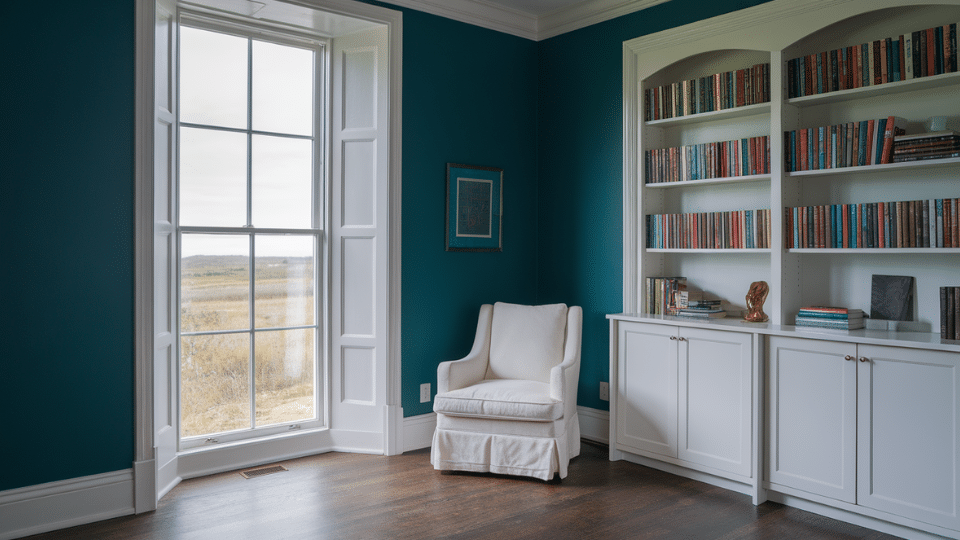
Choosing wall and trim color feels deceptively simple until the paint dries and something feels off. Maybe that charming dark trim color scheme looked moody in the catalog, but now it swallows the room whole. Those white walls with white trim seem foolproof, but the space feels flat. The issue isn’t the colors but the invisible rules about undertones, sheen, lighting, and flow that most advice ignores. This isn’t about following trends or mimicking Pinterest boards. It’s about understanding why certain pairings amplify architecture while others erase it, and how to make intentional choices that transform rooms instead of just covering walls. The Quick Science of Wall and Trim Pairings Understanding wall and trim color combinations doesn’t require a design degree, just a few practical truths. Contrast acts like volume control for architecture: high contrast makes trim pop and adds dimension, while low contrast (think white walls with white trim) creates seamless, airy flow. Here’s the trick most overlook: finish creates contrast, too. Semi-gloss trim paired with matte walls distinguishes boundaries even when using identical colors. Lighting changes everything. Cool whites can feel sterile under evening bulbs, warm whites might read yellow in bright daylight. Room size matters: generous spaces handle bold contrasts beautifully, while compact or dimly lit rooms benefit from monochromatic schemes that expand visual space. Bold Dark Trim Color Schemes Dark trim creates strong architectural definition and instantly changes a room’s personality. These pairings suit readers who want their trim to stand out, add depth, and frame spaces beautifully. 1. Soft Warm White Walls with True Black Trim A classic high-contrast pairing that feels crisp and architectural. Warm white softens harshness while black frames the room and highlights windows and doorways beautifully. Best for: Medium or large rooms, vintage or modern homes Why it works: Warm walls prevent black trim from feeling too stark Pair with: Natural wood, matte black hardware, textured fabrics 2. Creamy Beige Walls and Deep Espresso Trim A rich, inviting combination that replaces stark black with warm depth. Espresso trim adds sophistication and pairs well with warm flooring and cozy decor styles. Best for: Traditional homes, warm-light rooms Why it works: Espresso echoes natural wood tones for cohesive warmth Pair with: Tan rugs, brass accents, warm woods 3. Light Greige Walls Paired with Charcoal Trim A softer dark-trim alternative that feels grown-up and calm. Charcoal defines architecture without overwhelming the room, creating a modern, understated sense of contrast. Best for: Minimalist or transitional interiors Why it works: Greige and charcoal share neutral undertones Pair with: Black fixtures, gray textiles, neutral art 4. Pale Putty Walls with Deep Olive Trim Earthy yet graceful, this pairing gives quiet drama. Deep olive adds character without harshness, working well in moody spaces or rooms with natural textures and warm materials. Best for: Studies, reading rooms, design-forward homes Why it works: Olive adds depth while remaining grounded and natural Pair with: Leather, linen, natural stone 5. Misty Blue-Gray Walls paired with Navy Trim A layered cool-toned combination that feels serene and coastal. Navy trim deepens the palette without feeling heavy, especially in well-lit rooms or spaces with warm flooring. Best for: Bedrooms or offices needing calm Why it works: Cool colors stack harmoniously and feel intentional Pair with: Light woods, silver metals, soft blues Clean White on White Pairings White on white can look effortless or flat, depending on undertones, lighting, and sheen. These combinations keep spaces bright, cohesive, and layered instead of sterile or washed out. 6. Pure Bright White Walls and Same White Trim This seamless pairing works when you rely on sheen differences instead of color contrast. Matte walls and semi-gloss trim create subtle depth within a clean, unified palette. Best for: Small rooms, low-light spaces, minimalist homes Why it works: Different finishes add dimension without changing color Pair with: Light woods, woven textures, soft neutral fabrics 7. Warm White Walls with Crisp Neutral White Trim Warm walls soften the space while neutral white trim adds clarity. This subtle contrast helps large rooms feel structured and prevents an all-white palette from looking overly creamy. Best for: Open floor plans, warm climates Why it works: Balances warm and neutral undertones for stability Pair with: Oak floors, natural fabrics, black accents 8. Cool White Walls with Soft Cream Trim A gentle warm-cool mix that creates lift and contrast. Cream trim takes the edge off cool whites in bright rooms, keeping the palette inviting instead of sharp or blue. Best for: Sunny rooms, contemporary homes Why it works: Cream trim warms up the reflective quality of cool walls Pair with: Beige textiles, warm woods, brass details 9. Off-White Walls with Gray-White Trim Subtle but intentional, this pairing adds a quiet definition to otherwise soft walls. Gray-white trim keeps the space feeling structured without introducing harsh lines or stark contrast. Best for: Transitional interiors, mixed wood tones Why it works: Gray undertones add refinement without heaviness Pair with: Soft grays, muted blues, natural oak 10. Soft Ivory Walls paired with Bone-White Trim A warm, comforting pairing that still feels polished. Ivory creates a welcoming backdrop, while bone-white trim offers a gentle highlight perfect for traditional or mid-century inspired rooms. Best for: Bedrooms, living rooms, warm lighting Why it works: Warm whites complement each other without clashing Pair with: Walnut furniture, warm metal finishes, textured fabrics Soft Contrast and Low Contrast Combinations Soft contrast is ideal for homes that need harmony instead of strong graphic lines. These combinations use gentle shifts in tone to create depth without visual tension or sharp edges. 11. Greige Walls with Soft Beige Trim A calm and cohesive pairing that blends warm and cool undertones. Soft beige trim warms up greige walls, creating a neutral envelope that feels balanced and comfortable throughout the day. Best for: Versatile family spaces, rentals, mixed lighting Why it works: Undertones align without matching too closely Pair with: Beige rugs, warm woods, soft gray accents 12. Pale Sage Walls with Creamy Off-White Trim This biophilic-inspired pairing feels peaceful without leaning trendy. The soft cream trim gently outlines sage walls, offering just enough definition to keep the room feeling light and natural. Best for: Bedrooms, kitchens, calm spaces Why it works: Cream amplifies sage’s warmth and earthiness Pair with: Woven baskets, oak decor, matte black accents 13. Dusty Rose Walls Paired with Mushroom Taupe Trim A warm and modern mix that avoids overly sweet tones. Taupe trim grounds dusty rose, creating a mature and cozy palette perfect for intimate rooms and personal spaces. Best for: Bedrooms, nurseries, reading corners Why it works: Muted taupe balances rosy warmth Pair with: Warm woods, gold accents, neutral textiles 14. Light French Gray Walls Paired with Warm Gray Trim A monochrome palette that feels refined and airy. Warm gray trim adds depth without breaking the color flow, ideal for minimalist homes that still want quiet style. Best for: Modern apartments, clean-lined interiors Why it works: Warm gray keeps cool gray from feeling cold Pair with: Stone textures, black metals, soft white fabrics 15. Pale Sand Walls with Light Latte Trim A gentle and welcoming combination reminiscent of coastal neutrals. Light latte trim enhances the warmth of pale sand without overpowering it, creating a laid-back but polished aesthetic. Best for: Living rooms, dining rooms, relaxed interiors Why it works: Natural warm tones complement each other effortlessly Pair with: Linen upholstery, rattan details, warm metals Colorful Wall and Trim Pairings Color-forward rooms work best when the trim balances saturation rather than competes with it. These combinations offer depth, personality, and livability while avoiding the harsh mismatches common with bright colors. 16. Muted Terracotta Walls with Cream Trim A warm, inviting palette that feels grounded and timeless. Cream trim lightens terracotta’s richness, preventing heaviness and creating a softly glowing space perfect for cozy or Mediterranean-inspired interiors. Best for: Living rooms, dining rooms, warm-light spaces Why it works: Cream softens terracotta without dulling its warmth Pair with: Textured rugs, brass accents, warm woods 17. Dusty Blue Walls Paired with Soft Gray Trim A serene, airy combination that offers subtle contrast without sharp edges. Soft gray trim adds a calming frame, making dusty blue feel sophisticated rather than juvenile or overly coastal. Best for: Bedrooms, offices, calm environments Why it works: Gray trim echoes blue undertones for harmony Pair with: Light wood, silver metals, white bedding 18. Moody Teal Walls and Bright White Trim A bold, artsy pairing for dramatic spaces. Bright white trim refreshes the depth of teal, creating crisp lines that elevate architectural details without overwhelming the room’s visual balance. Best for: Feature walls, dining rooms, high-ceiling spaces Why it works: White creates clarity against deep saturated teal Pair with: Brass lighting, deep woods, patterned textiles 19. Soft Blush Walls with Clean White Trim A gentle, upbeat pairing that feels chic and modern. Clean white trim prevents blush walls from leaning too pink, making the palette fresh, neutral-leaning, and easy to style. Best for: Bedrooms, nurseries, home offices Why it works: White cools blush just enough for balance Pair with: Light woods, gold accents, soft fabrics 20. Muted Mustard Walls Paired with Warm White Trim A heritage-inspired combination that feels rich yet modern. Warm white trim steadies mustard’s boldness, adding lift and preventing the walls from appearing too vintage or overpowering in smaller rooms. Best for: Accent rooms, eclectic homes, sunny spaces Why it works: Warm white harmonizes with mustard’s golden tones Pair with: Dark woods, black accents, warm textiles 21. Forest Green Walls and Greige Trim A deep, luxurious palette ideal for moody spaces. Greige trim grounds forest green’s intensity and adds an earthy softness that feels upscale and layered rather than monochromatic or heavy. Best for: Libraries, dens, dramatic dining rooms Why it works: Greige adds gentle warmth without competing with green Pair with: Leather accents, dark woods, brass hardware 22. Lavender Gray Walls Paired with Stone Taupe Trim A soft, elegant mix that reads mature and refined. Stone taupe trim neutralizes lavender’s coolness, creating an elevated palette suitable for serene bedrooms or romantic, soft-lit spaces. Best for: Bedrooms, boutique-style interiors Why it works: Taupe tempers lavender’s cool floral undertones Pair with: Soft whites, brushed nickel, muted florals Designer Midtone and Boutique Pairings These combinations draw from boutique hotels and designer studios, using midtone colors that feel curated rather than bold. They balance saturation with softness, creating polished, layered, high-end looking spaces. 23. Charcoal Blue Walls with Soft White Trim A dramatic yet calming palette that avoids the heaviness of navy. Soft white trim brightens charcoal blue, adding clarity without breaking the rich, moody atmosphere of the room. Best for: Bedrooms, studies, modern homes Why it works: Soft white lifts deep blue without harsh contrast Pair with: Walnut furniture, brass lighting, textured fabrics 24. Warm Clay Walls and Light Taupe Trim A grounded, earthy combination with subtle sophistication. Light taupe trim complements clay’s warmth, offering definition without stark edges and creating a soft, inviting palette suitable for modern rustic interiors. Best for: Living rooms, hallways, warm-toned homes Why it works: Taupe gently outlines clay’s warm midtone depth Pair with: Woven textiles, natural woods, matte black accents 25. Muted Plum Walls paired with Mushroom Gray Trim A rich, boutique-inspired pairing that feels intentional and elegant. Mushroom gray trim neutralizes plum’s intensity, creating a moody yet refined palette perfect for dramatic or softly lit rooms. Best for: Dining rooms, guest rooms, statement spaces Why it works: Gray undertones stabilize plum’s deep color Pair with: Velvet textures, dark woods, metallic accents Interior Paint Tips for Coordinating Walls and Trim Most color combinations fail on overlooked basics, not bold choices. Here’s what actually moves the needle in real spaces: Match undertones religiously: Warm walls need warm trim; cool walls need cool trim. Mixing them only works when intentional, not accidental. Sheen creates contrast: Matte walls with semi-gloss trim generate dimension even in identical colors. This trick makes white walls with white trim feel layered, not flat. Decide trim’s role early: Want modern simplicity? Low contrast. Crave architectural character? High contrast. Room realities matter: Small or dim spaces struggle with a dark trim color scheme. Bright, spacious rooms risk looking washed out with monochromatic pairings. Natural light dictates everything, test samples on opposite walls, and check morning versus evening. What looks crisp at noon might feel sterile at dusk. The Bottom Line The difference between forgettable paint jobs and spaces that feel intentionally designed comes down to deliberate choices, not bigger budgets. Committing to a dramatic dark trim color scheme or refining white walls with white trim through strategic sheen, every decision either amplifies or erases architectural character. Small rooms gain breathing room through thoughtful contrast. Bright spaces avoid sterility with warm undertones. The real skill isn’t picking trendy colors; it’s understanding how light, finish, and scale interact in specific spaces. Walk through the room at different times of day and trust what feels right, not what looks good on a screen.
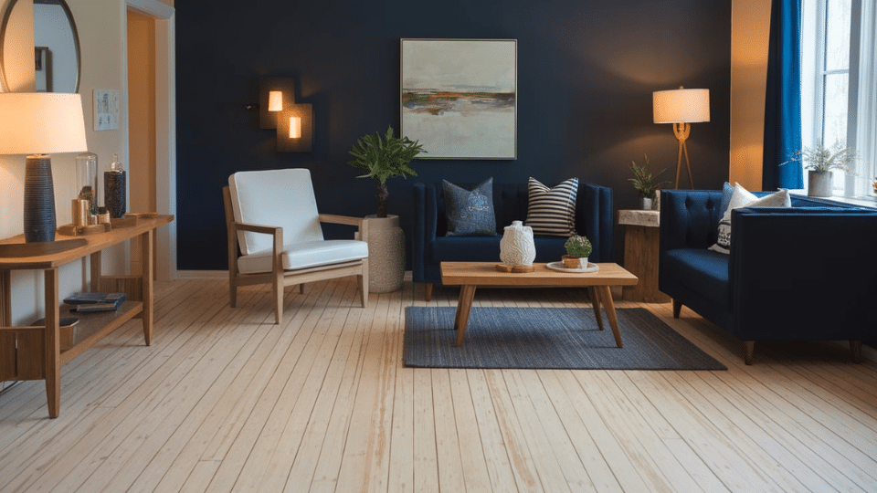
Choosing wall colors for light hardwood floors trips up even experienced decorators because light wood doesn’t behave like other flooring. It bounces light, amplifies undertones, and changes paint colors throughout the day in ways that catch people off guard. Most advice tells you what colors to pick, but skips the crucial why behind color compatibility. In this guide, I’ll explain how to decode your floor’s undertone, choose harmony or contrast before selecting paint, test colors for a good look, and avoid costly do-overs. By the end, you’ll have a simple framework and a cheat sheet that cuts through the confusion. Why Light Hardwood Makes Wall Color Choice Tricky Light hardwood floors act as massive reflectors, bouncing natural and artificial light back onto your walls. This amplification makes wall colors appear brighter and often shifts them cooler than expected. The high reflectivity also reveals undertones with ruthless clarity; a small mismatch between your floor’s warmth and your wall’s coolness becomes glaringly obvious. However, there’s good news: light hardwood is the most versatile wood tone you can work with. Its neutral foundation pairs well with an enormous range of colors, making it far more forgiving than dark or red-toned floors. This versatility sets a reassuring tone for your color selection process. The Simple Framework for Matching Wall Color With Light Hardwood Follow this two-step system to eliminate guesswork and narrow your options to colors that will actually work in your space. Step 1: Identify Your Floor’s Undertone Place a sheet of white paper on your floor in natural light. Compare the floor color to pure white. Does it lean peachy, golden, or yellow? If yes, you’re dealing with warm undertones Gray or slightly pink means cool undertones. And if you can’t figure out which way it leans, you’re dealing with neutral undertones. This single test determines which color families will harmonize with your floors. Step 2: Decide Between Blending or Contrast Blending means choosing wall colors with the same temperature as your floor, warm with warm, cool with cool. This creates a cohesive, flowing space. Contrast means pairing opposite temperatures, like cool gray walls with warm honey floors. This adds visual interest and definition. Your preference here determines your entire color direction before you ever look at a paint chip. Best Wall Colors that Pair with Light Hardwood Choosing the right white for light hardwood floors depends on undertone, brightness, and the mood you want. These whites enhance the wood’s character without washing out the space. 1. Best Whites for Light Hardwood White paint colors create bright, airy foundations that let light hardwood shine without competing for attention in any space. These shades work beautifully in living rooms, bedrooms, and open-concept areas where you want walls to recede and floors to take center stage. Choosing the right white depends on your floor’s undertones and whether you prefer warm, cozy vibes or crisp, modern aesthetics. Warm white: Adds softness and balances yellow or honey-toned floors without making them look overly golden. Soft cream: Introduces gentle warmth that complements traditional, cozy, or farmhouse styles without overwhelming light wood. Clean white: Pairs beautifully with cool or neutral light floors for a crisp, modern look; avoid if wood has strong orange tones. 2. Best Neutrals for Light Hardwood Neutral paint colors offer versatility and sophistication that adapts to any decorating style while complementing light hardwood’s natural warmth beautifully. These shades work perfectly in living rooms, bedrooms, and hallways where you want timeless elegance that won’t feel dated. The key is matching your neutral’s undertones to your flooring to create harmonious spaces that feel intentional and cohesive. Greige: A universally flattering mix of gray and beige that works with every undertone, making it the safest neutral for light wood floors. Pale taupe: Adds subtle depth without overpowering the room; avoid it if your floors lean pink, as it can amplify that undertone. Light warm beige: Creates a cozy, natural backdrop but should be avoided with heavily yellow floors to prevent a too-warm, dated feel. 3. Best Soft Color Options Soft colors introduce personality and style while maintaining the calm, airy feel that light hardwood naturally creates in any space. These gentle hues work beautifully in bedrooms, bathrooms, and living areas where you want subtle color without overwhelming bold statements. They bridge the gap between neutral safety and colorful expression giving rooms character that feels both modern and timeless. Sage green: A calming, nature-inspired shade that grounds warm light hardwood and adds freshness without overwhelming the space. Dusty blue: Soft and airy, this hue cools down warm floors and complements cool-toned wood for a serene look. Muted blue-green: A flexible, modern choice that works with neutral floors and adds a subtle wash of color without feeling bold. 4. Best Dark Accent Colors for Light Hardwood Dark accent colors create dramatic contrast that makes light hardwood floors pop while adding depth and sophistication to modern spaces effectively. These bold shades work best as accent walls in living rooms, dining rooms, or bedrooms where you want impact without darkness. Used strategically, dark colors ground airy rooms and prevent them from feeling too lightweight or lacking in visual interest and drama. Charcoal: Adds modern contrast and style, giving light hardwood floors stronger definition without making the space feel closed in. Deep green: Dramatic yet earthy, it pairs beautifully with light wood and introduces richness without overwhelming the palette when used sparingly. 5. Wild Card Shades that Surprisingly Work These unexpected colors prove that light hardwood can handle unusual choices than you might think when selected thoughtfully and carefully. They work beautifully in bedrooms, creative spaces, and powder rooms where you want unique personality without sacrificing sophistication or elegance. These shades create memorable spaces that feel fresh and modern while still complementing your flooring’s natural warmth and beauty perfectly. Soft blush: A muted, barely-there pink that warms up neutral wood tones and adds a modern, cozy feel without reading “pink.” Smoky lavender: A subdued lavender-gray that subtly offsets yellow or pink undertones in the flooring, creating an unexpectedly balanced look. How to Test Paint Colors Properly Most paint failures stem from testing in the wrong location or lighting conditions. This streamlined checklist eliminates guesswork and prevents costly repainting mistakes. Step Action What To Check 1 Paint large swatches on poster board Easy to reposition without wall commitment 2 Place directly beside the hardwood floor Undertone harmony or clash becomes obvious 3 View throughout the day Morning, afternoon, and evening shifts reveal true color 4 Test under your artificial lighting LED and warm bulbs alter appearance dramatically 5 Compare three similar options side by side Identifies which is too warm, cool, or balanced 6 Live with samples for 3+ days Initial excitement fades; true preference emerges This methodical approach reveals problems before you commit to gallons of paint, saving time and disappointment down the line. Common Mistakes to Avoid Even experienced decorators make these preventable errors when choosing wall colors for light hardwood. Recognizing these pitfalls before you start saves time and disappointment. Matching wall and floor too closely: When both surfaces are too similar in tone, the room loses dimension and feels flat. You need some differentiation to create visual interest and depth. Picking bright white without checking undertone: Pure white walls with warm honey floors create jarring contrast. Cool white with cool floors can feel sterile. Match your white’s undertone to your floor. Choosing colors under store lighting: Paint stores use bright, neutral lighting that bears no resemblance to your home. Colors that look perfect in-store often fail in natural home lighting conditions. Ignoring artificial light temperature at home: Your LED bulbs matter as much as your paint. Cool-temperature bulbs (5000K+) make warm colors look muddy. Warm bulbs (2700K) make cool colors appear dingy. Factor in your lighting. Remember that these mistakes are easy to avoid once you’re aware of them, proper testing and undertone matching solve most problems. Wrapping Up The secret to finding perfect wall colors for light hardwood floors isn’t memorizing color names or following trendy palettes; it’s understanding your specific floor and testing systematically. You now have the two-step framework to decode undertones and choose your design direction, plus a testing protocol that prevents expensive mistakes. Light hardwood’s reflective nature isn’t an obstacle when you work with it. The best part? It’s the most versatile flooring, giving you more creative freedom than you thought. Trust your testing process, compare your options thoughtfully, and remember that even professionals rely on samples before committing.
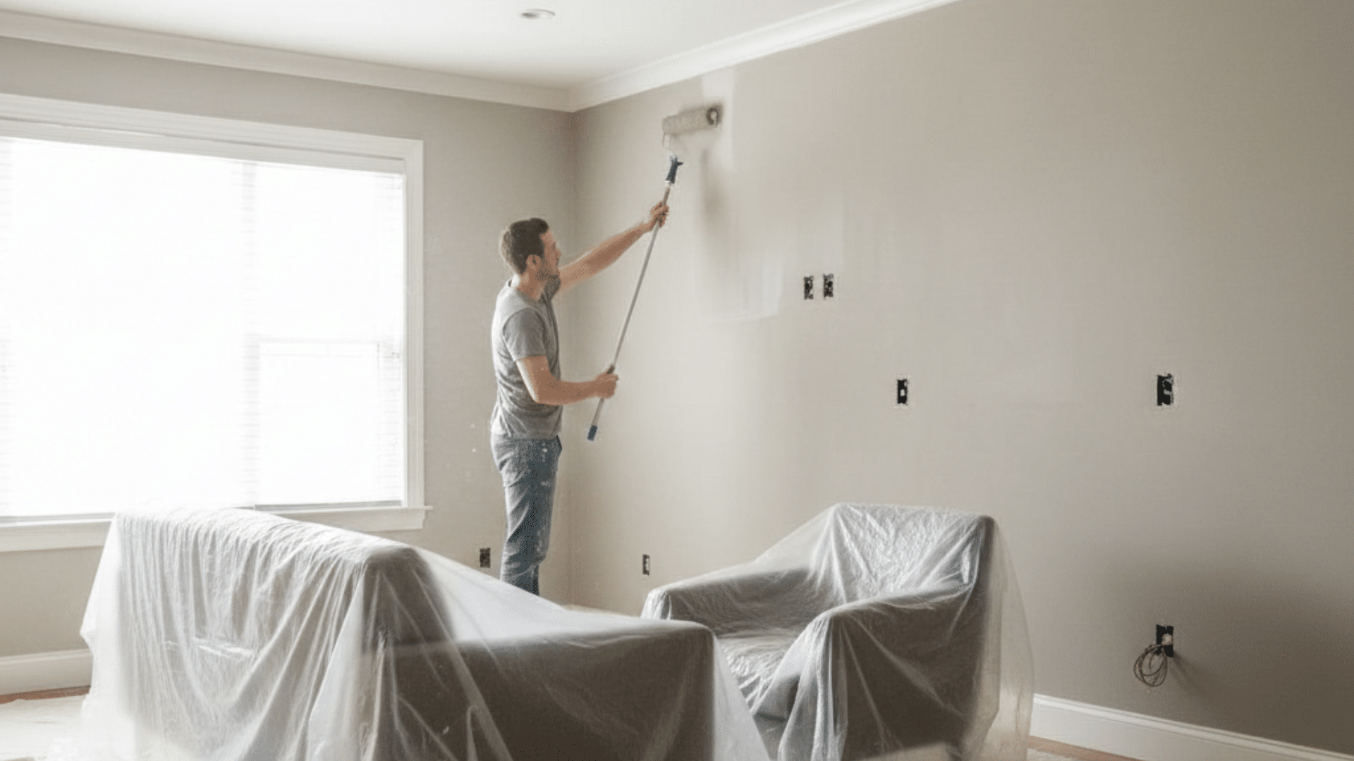
I remember walking into my living room one afternoon and noticing how dull the walls looked. Maybe you’ve had that same moment where you realize fresh color could make your space feel better. Interior residential painting can seem like a big task, but it becomes simple once you understand the steps. You might want to paint on your own, or you might feel better having a crew handle the work. Either choice can work well when you know what to expect. I’ll walk through the key parts so you can plan with confidence and avoid stress. What Does Interior Painting Cover? Interior painting includes the main surfaces inside your home, plus any extra features you choose to add. Standard Surfaces Most projects focus on the areas used and seen every day. This includes walls, ceilings, baseboards, door frames, and window trim. These parts form the base of the room and set the tone for a new color. Crews usually clean, sand lightly, and apply steady coats to create a smooth finish. These areas also show wear the quickest, so updating them brings the most noticeable change. When planning your project, list each surface clearly so your estimate reflects the full scope. Optional Add-Ons Some homes have extra features that need attention during a project. Closets, built-ins, cabinets, and stair rails fall into this group. These parts take more time because they have edges, hinges, or tight corners. They can raise project cost, but they also help the room look complete once finished. If these areas match the main surfaces, the room feels consistent. If they stay older or marked, they can stand out. Decide early which extras matter most based on use and budget. Prep and Repairs Smooth results rely on good prep. This includes patching small holes, sanding rough spots, and filling gaps with caulk. These steps help paint sit flat and last longer. Some spots need primer, especially where stains show or where dark colors change to lighter ones. Taking time to prep reduces the need for touch-ups later. Many crews include basic repairs, but larger issues may call for separate help. Clear prep notes in your estimate prevent confusion once work begins. Interior Painting Costs Interior painting prices shift based on the size of your home, the number of rooms, and the condition of each surface. Across the U.S., most professional interior painting projects fall between $2.50 and $5.50 per square foot. In some areas or for higher-end finishes, costs can range from $2 to $6 per square foot, with premium or complex jobs reaching higher. Walls usually sit at the lower end of the range. Ceilings, trim, and detailed areas cost more because they take extra time and care. Cost by Surface Different parts of the room are priced differently. Walls: about $1.50 to $3.50 per square foot Ceilings: about $1.00 to $3.00 per square foot Trim and detailed work: around $2 to $6 per linear foot If your home has high ceilings, textured walls, tight corners, or stair rails, labor time increases. That pushes pricing toward the higher end. Cost by Home Size Total cost depends on how much space needs paint. 500 sq ft: roughly $200 to $1,000 1,000 sq ft: about $2,000 to $6,000 2,000 sq ft home interior: typically $3,950 to $6,250 A single average-sized room often falls between $990 and $1,320, depending on prep work and surface condition. What Affects the Final Price Labor makes up the largest part of the total. Homes with multiple rooms, heavy prep work, repairs, or several coats will cost more. Paint quality matters too. Higher-grade paint costs more per gallon but often covers better and lasts longer. Extra areas such as closets, cabinets, and stair railings add to the total because they require detailed work. A clear list of all surfaces helps you see exactly how your estimate is built and why your final number lands where it does. DIY or Hire a Pro Choosing between doing the work yourself and bringing in a crew depends on your time, skill level, budget, and project size. Factor DIY Hire a Pro Cost Lower cost, higher effort Higher cost, less effort Time Slower pace, flexible schedule Faster results, set schedule Skill Basic skills needed Skilled crew handles details Finish Good with steady prep Consistent finish across all rooms Tools Must buy or rent gear Tools included in the service Safety Ladder work and fumes Crew manages safe setup Stress More steps to manage Less to coordinate Use this to decide which option fits your comfort level and timeline, then follow the path that supports your goals. DIY Interior Painting Process: Step-By-Step Before you start, set yourself up like a pro. When you use the right tools and a simple order, you can paint faster with cleaner lines and less tape. Tools And Materials You’ll Need Paint tray with disposable liner Quality roller cage Extendable pole (paint stick) with a secure locking handle Microfiber roller sleeve (good for smooth, even coverage) Three-inch angle brush Five-in-one tool (scraper, screwdriver, and roller cleaner) Utility knife Ladder or step stool Sanding sponge or sanding pad Drop cloths or tarps Good interior wall paint Small bucket or can for cutting-in paint Damp rag (for quick wipe-ups) Step 1: Prepare the Space and Fix Old Lines Start by clearing the hallway so you can move freely without bumping the roller. Cover floors and stairs with drop cloths, and slide furniture away from the walls. Remove all outlet and switch covers with your knife or screwdriver instead of painting around them. Next, fix old, messy edges where wall paint sits on trim or ceiling. Use trim or ceiling paint to clean that line first, so you’re not fighting three different colors later. This gives you a fresh, clean starting edge. Step 2: Sand for A Smooth, Professional Finish Lightly sand the walls with a sanding sponge or sanding pad. Builders often skip this step, which leaves walls feeling gritty and rough. You don’t need to press hard or remove paint; you’re just knocking down bumps, dust, and tiny splatters. Run your hand across the wall before and after sanding so you feel the difference. Smooth walls make your paint glide better, cover evenly, and look more finished. This one step separates a “good enough” job from a pro-looking result. Step 3: Cut in Ceilings, Corners, Trim, and Outlets Load your three-inch angle brush and start cutting at the ceiling line, but on the first coat, stay about one-quarter inch away if the old paint is flat. Then move to outside corners, using the heel of the brush to pull a clean line and gently push paint to the edge. Cut along baseboards and trim with your head low so you can see clearly. Finally, brush around outlets and switches, so your roller never hits them. This avoids splatters on plastic and hardware. Step 4: Roll Walls with An Extension Pole and Wet Edge Attach your roller to an extendable pole, so your hands stay below your heart, and you can use two hands. Load the microfiber sleeve slowly until it’s fully saturated. Roll straight up and down from almost floor to ceiling, not in a “W” pattern. Work in sections about two roller widths wide. After each section, back-roll lightly to even the texture. Always keep a wet edge by rolling into paint that’s still wet. If you stop mid-wall, you risk ridges and lap marks. Step 5: Sand Lightly, Then Do a Precision Cut and A Second Coat Once the first coat dries, sand the walls again very lightly to remove dust nibs and small bumps. For your second cut, load the brush, then wipe extra paint so it sits inside the bristles, not globbed on top. Now you can press gently right into the corner or ceiling line for a crisp edge. On coat two, always finish one wall at a time: cut that wall, then roll it immediately. This keeps the brush and roller work wet together and blends the texture perfectly. Step 6: Let the Paint Cure, Then Clean up And Reset After the second coat looks even, let the paint dry and begin curing. Avoid hanging pictures or mounting hooks for at least forty-eight hours so you don’t dent soft paint. Wait about a month before scrubbing or washing high-traffic spots, so the finish hardens fully. Clean brushes before they gum up, and use your five-in-one tool to scrape extra paint from the roller back into the can. Peel any tape carefully, reinstall cover plates, and label leftover paint for future touch-ups. For an in-depth walkthrough of the whole process, check out the complete interior painting video tutorial below: How To Hire an Interior Painter Hiring the right crew saves time, avoids stress, and gives you steady results that last. Use these points to guide your choice. Look for painters with solid reviews and a clear record of completed projects. Ask for proof of insurance before any work begins. Request a written estimate that lists surfaces, prep steps, and coat count. Confirm the paint brand and finish they plan to use. Ask who will be on the crew and how many days the job should take. Check how they handle minor repairs or extra surfaces not listed. Review warranty terms for touch-ups or early wear. Avoid bids that seem unclear or far lower than others. Compare at least two quotes side by side for accuracy. Make sure communication feels steady and easy before you commit. Preparing Your Home For Painting A little planning helps the project move smoothly and keeps daily life comfortable while work is underway. 1. What You Handle Take down wall decor, remove shelf items, and clear furniture tops so nothing gets in the way. Confirm your colors before the crew arrives, including sheen for each room. Move small items out of walking paths to prevent tripping hazards. Set aside a spot for painters to place tools and paint cans, and keep valuables in a safe location. This simple prep gives the crew room to work and prevents delays once the job starts. 2. What Painters Handle Most crews protect floors with drop cloths and cover large furniture that cannot be moved. They mask windows, doors, and fixtures as needed. Many also handle light repairs, such as filling small holes or smoothing minor rough spots. These steps help create a clean base for paint and reduce the risk of splatter or drips. Once they begin, try to give them steady access to each room so they can finish on schedule. 3. Living in the Home During Painting If you stay in the home, plan which rooms will be painted first so you always have space to sleep and relax. Open windows when possible, and use fans to keep air moving. Keep pets and kids away from wet walls and tools to avoid accidents. Choose one hallway or entry as the main path to reduce mess. Good airflow and clear routes help keep the home comfortable while the work gets done. 4. Vacant Home Advantages An empty home allows painters to move quickly, reach every wall with ease, and set up tools without shifting furniture. They can complete several rooms at once, which shortens the overall schedule. Drying time improves because nothing blocks airflow. This often results in fewer interruptions, cleaner results, and a smoother finish. If timing allows, scheduling painting before moving in is one of the simplest ways to speed up the entire process. How Long Does Painting Take The time needed for interior painting depends on your home’s size, the number of rooms, and how much prep each surface requires. A single bedroom with simple walls may take part of a day, while larger rooms with high ceilings need more time for cutting, rolling, and drying. Hallways and stairwells often add extra hours because of tight corners and detailed trim. Whole homes can take anywhere from one to several days based on crew size and surface conditions. Drying also plays a role, since some paints feel ready quickly but still need time before the next coat. Planning room order and clearing paths helps keep the schedule on track and reduces downtime between stages. Paint Care and Wall Maintenance Dry Time: Give fresh paint at least two days before hanging frames or pressing anything on the wall. Early Cleaning: Avoid washing new paint for about a month so the finish can harden fully without marks. Gentle Wash: Use a soft cloth or sponge with mild soap and water, then pat dry instead of scrubbing hard. Spot Marks: For scuffs or fingerprints, start with plain water first, then mild soap only if needed. Touch Ups: Keep a small labeled container of leftover paint for small spots, and use a clean brush or foam pad. Room Checks: Look over busy areas every few months, fix small chips early, and wipe dust from trim and baseboards. Final Thoughts Now you’ve seen how simple planning, steady prep, and the right tools can shape your results. I wanted to give you a clear path so you feel ready for the next stage, whether you paint on your own or hire a service. Interior residential painting can refresh your rooms without a large budget when each step is done with care. Keep your paint labeled, fix small marks early, and check busy areas from time to time. These habits help your walls stay clean longer. If you’re ready to try another project or want more home guidance, check out other blogs on the website and see what fits your next goal.
I remember standing in a paint aisle trying to figure out why some walls looked calm while others felt too shiny. If you’ve had the same moment of confusion, you’re not alone in trying to understand what makes one finish feel right. A big part of that choice comes down to knowing what eggshell paint is and how it behaves in real rooms. It can be tricky to choose a finish when each one looks similar on the shelf but acts very differently on your walls. I’ll help you feel clear and confident about the differences so you can pick the finish that fits your home. So let’s take a closer look at how each option works and where it fits. Understanding Eggshell Paint Eggshell paint is a wall finish with a soft, low shine that sits between a flat surface and a satin surface. It gives your walls a smooth, calm look without strong light reflection. When applied, the finish has a gentle glow that helps hide small marks or uneven spots, making it a common choice for everyday rooms. On the sheen scale, it falls in the middle: Flat → Matte → Eggshell → Satin → Semi-Gloss → Gloss. This helps you see how much light bounce to expect before choosing it for a room. Eggshell works well when you want a finish that looks clean, wipes easily, and keeps the surface from looking too bright or dull. Differences Among Eggshell, Satin, and Semi-Gloss Use this table to compare the three finishes quickly so you can pick the right one for your walls, trim, or busy areas. Feature Eggshell Satin Semi-Gloss Shine Level Low glow Medium shine Bright shine Durability Moderate Strong Very strong Cleanability Wipes clean Scrubs clean Scrubs clean with ease Best Walls Living and sleeping areas Kitchens and busy paths Rare for full walls Best Trim Possible but rare Good choice Ideal choice Moisture Use Dry rooms only Mild moisture Good for moisture Wall Texture Softens marks Shows more detail Shows most detail Best Use Calm wall areas High-use rooms Trim, doors, cabinets Touch-Ups Can show changes Blends better Hard to blend Eggshell works well for simple wall areas. Satin fits spots that need more cleaning. Semi-gloss is the strongest option for trim and high-use surfaces. How to Choose the Right Sheen for Your Walls Use these quick guidelines to match each finish to the room’s needs, cleaning level, and the look you want for your walls. When Eggshell Works Best Eggshell fits low- and mid-traffic rooms where you want a soft, calm surface that hides small marks. It works well in living rooms, bedrooms, and hallways because it balances gentle shine with easy wiping. If you want walls that look smooth without bright reflection, this finish gives you that effect. It handles daily touch and light cleaning, making it a steady choice for many homes. It also helps soften uneven spots on older walls. When Satin is the Better Choice Satin is the right option when a room needs stronger cleaning and steady use. It holds up better in kitchens, playrooms, and paths where hands, bags, or toys often touch the walls. The surface is firm enough to scrub without dulling, which makes upkeep quick. Satin shows more detail on the wall, so it looks best on smooth surfaces. If your home has busy areas that need a tougher finish, satin gives you that support. When Semi-Gloss Makes Sense Semi-gloss is best for trim, doors, cabinets, and rooms with moisture. Its firm surface stands up to frequent cleaning, making it a smart choice for kitchens and bathrooms. It also gives trim a clean, sharp look that holds up through years of touching, wiping, and opening. Because it reflects more light, it highlights surface details, so it works best on smoother areas. Choose semi-gloss when you want strong wear and easy, regular cleaning. Pros and Cons of Eggshell Paint This section helps you understand how eggshell performs in daily use so you can decide if it fits your walls and room needs. Pros Eggshell offers a gentle surface that works in many rooms and gives you easy upkeep without a strong shine or complicated cleaning steps. Soft, low shine Helps soften small wall marks Wipes clean with mild effort Works in living rooms, bedrooms, and halls Cons Eggshell has limits in damp rooms and may show changes when you try to fix small spots after the paint fully dries. Not suited for bathrooms or wet areas Harder to match during touch-ups Less strong than satin in busy rooms How Eggshell Looks on Different Surfaces Eggshell can be used on several areas in the home, but each surface needs the right prep, cleaning habits, and strength level. Walls Eggshell is a common pick for walls because it creates a smooth surface that works in many rooms. The low glow keeps the wall from looking flat while still hiding small marks. It fits living rooms, bedrooms, and hallways because these spaces need simple upkeep without harsh scrubbing. If you want walls that look clean and handle light daily use, eggshell gives you that balance. It also helps older walls look more even. Wood Trim Eggshell can be used on trim when you want a softer look, but it is not the strongest option. Trim takes steady contact from hands, furniture, and daily activity, so a tougher finish often works better. Satin holds up longer on trim because it handles scrubbing and minor bumps without dulling. Still, eggshell can work on trim in calm rooms where contact is low. A smooth base and careful prep improve the final result. Furniture Eggshell can be used on simple furniture projects that do not need heavy cleaning. It gives small pieces a soft surface without harsh shine, making it useful for light-use items like side tables, shelves, or decor pieces. It is not ideal for pieces that face steady touching, food spills, or frequent wiping. Many DIY users choose it when they want a simple finish that hides small marks and is easy to refresh with a new coat later. How Long Does Eggshell Paint Last Eggshell holds up well, as long as the space does not deal with heavy moisture or constant cleaning. The finish stays steady in living rooms, bedrooms, and hallways because these areas mostly need light wiping and routine care. Over time, eggshell keeps its soft glow and stays smooth as long as the wall surface is prepped well before painting. It can handle small bumps or marks, but steady scrubbing may dull the finish. Touch-ups may show slight shifts in sheen, especially on older walls, so careful blending is important. With basic upkeep and calm room conditions, eggshell stays reliable for many years and continues to give the walls a clean, easy look. Lighting and the Look of Eggshell Paint Light plays a big part in how eggshells appear on your walls, so these points help you understand what to expect in each room. Natural Light Natural light gives eggshell a soft, smooth glow that feels calm and steady throughout the day. Sunlight spreads across the surface without creating sharp reflections, which helps the wall look even from different angles. This makes eggshell a good choice for rooms with windows where you want gentle light without harsh shine. It also helps soften small marks or uneven areas that might stand out under stronger lighting. Overhead Lighting Overhead lighting makes the sheen on eggshell slightly more noticeable, especially with stronger bulbs or direct fixtures. The finish will show a mild bounce that highlights smoother areas of the wall, though it still stays far less bright than satin or semi-gloss. This effect works well in rooms where you want a clean look without a strong shine. If the ceiling lights sit close to the wall, the glow may appear a little stronger than in natural light. How to Apply Eggshell Paint To get a smooth eggshell finish, start by cleaning the wall so dust, marks, and loose material don’t affect the surface. Patch any holes, sand rough spots, and place tape around trim and edges for clean lines. Use a medium-nap roller and stir the paint well before pouring it into the tray. Roll in a steady pattern without pressing too hard, then let the first coat dry before adding the next. When the paint is set, check the wall in good light to be sure the coverage looks even and consistent. Common Mistakes to Avoid These points help you prevent issues that can affect the look, strength, and long-term performance of an eggshell finish on your walls. Using eggshells in damp rooms where moisture collects Skipping patching and sanding before painting Using low-quality rollers that leave lines Adding a second coat before the first coat dries Painting over dirty or greasy spots without cleaning Forgetting to check the wall in bright light for thin areas Using heavy pressure with the roller causes an uneven sheen Touching up large areas instead of small, controlled spots Conclusion I hope you now feel more comfortable sorting through sheen levels and choosing a finish that fits your space. Knowing how each option behaves makes the whole process easier, and it helps you avoid the guesswork that usually slows things down. The eggshell finish can be a helpful guide if you want calm walls without a bright shine. As you work through your room plans, keep the strengths of each finish in mind so you can match the right surface to the right space. If you’d like more support with home projects or material choices, I’d be glad to help. Take a moment to look through other blogs on the website for more simple, clear tips.