


When I first started helping people pick cabinet colors, one question kept coming up. Should you paint cabinets Accessible Beige? It’s a fair question.
Choosing the right paint color for cabinets can feel stressful because it changes the whole kitchen. Accessible Beige by Sherwin-Williams is one of those colors that sits right between gray and beige, making it a standout among Sherwin-Williams’ top-rated greige and beige selections.
That balance makes it work in many homes. I’ve seen it used in modern kitchens, classic spaces, and even farmhouse styles.
In this guide, I’ll walk you through everything you need to know about Accessible Beige cabinets. You’ll learn how the color looks, what countertops and hardware work best, kitchen ideas, and helpful tips before you paint.
Quick answer: Yes, Accessible Beige (SW 7036) is a strong cabinet color choice for most kitchens, especially those with warm wood floors, natural stone countertops, or transitional styling. It earns its reputation as a versatile greige. But it has real limitations, particularly in north-facing kitchens and alongside pink-toned wood, that most guides don’t mention. This guide covers both
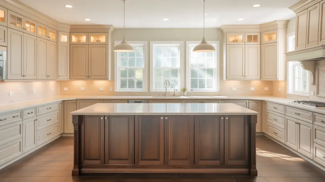
What Color is Accessible Beige?
Accessible Beige is a warm neutral paint color from Sherwin-Williams. It sits between gray and beige, which is why many people call it a “greige.” The color feels soft and balanced without leaning too cool or too yellow.
The official shade is SW 7036 with a Light Reflectance Value of 58, meaning it reflects a moderate amount of light. In most kitchens, it appears calm and welcoming rather than bold.
It has gray undertones that prevent it from looking like older beige tones, along with a very slight green hint that may show in certain lighting.
Because it is a lighter greige, it can limit wall color choices slightly. Its tone may shift with lighting and surrounding materials, which adds to its flexibility.
Accessible Beige Cabinet Ideas for Kitchens
Accessible Beige cabinets provide a soft, steady base that works with many styles. You can pair them with light counters, warm metals, or darker accents.
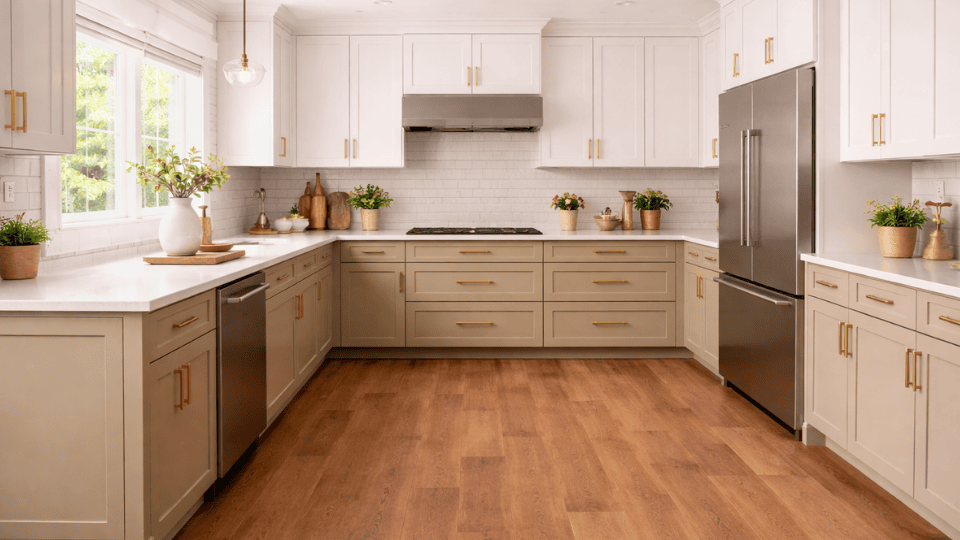
1. Accessible Beige Cabinets with White Countertops
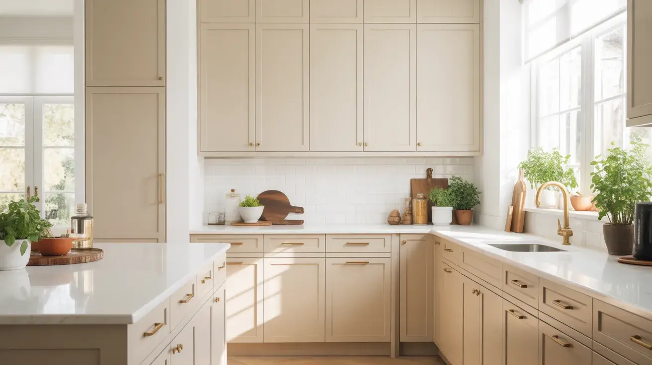
Accessible Beige cabinets with white countertops create a kitchen that feels clean, warm, and easy to live with. The white surface brightens the room, while the beige cabinets keep it from feeling too plain or cold.
This pairing works especially well with quartz, marble, or other light stone counters. It fits many styles, including modern, transitional, and farmhouse kitchens. If your kitchen does not get a lot of natural light, white countertops can also help reflect light and keep the space feeling more open.
One practical note here: if you choose stark, bright white countertops (think pure quartz with no movement), the contrast against Accessible Beige can be sharper than expected. A warmer white quartz with subtle veining softens the transition and keeps the overall palette cohesive
2. Accessible Beige Cabinets with Black Hardware
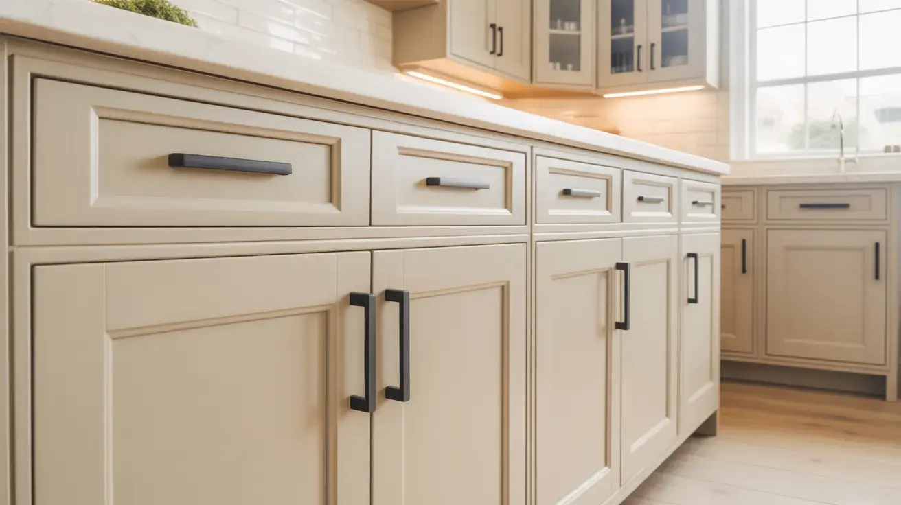
Black hardware adds a strong, simple contrast to Accessible Beige cabinets. The darker finish helps define the cabinet lines and makes the beige color stand out more clearly.
This combination works well if you want the kitchen to feel a little sharper without losing warmth. Black pulls and knobs are often used in modern, farmhouse, and transitional kitchens.
They also pair nicely with black light fixtures, faucets, or window frames, which can help tie the whole kitchen together in a clean and balanced way.
3. Accessible Beige Cabinets with Brass Handles
Brass handles bring warmth and a soft shine to Accessible Beige cabinets. Since Accessible Beige already has a warm greige base, brass works naturally with it and adds a more polished look.
This pairing can make the kitchen feel a bit more inviting without being too bold. It works well in traditional, transitional, and even modern kitchens when the brass finish is simple and clean.
If you have warm wood floors or creamy wall colors, brass hardware can help connect those elements and make the room feel more complete.
My preference is aged or unlacquered brass over polished brass alongside Accessible Beige. Polished brass can read as too shiny against a quiet, matte greige. The warmer, slightly worn quality of unlacquered brass matches the earthiness of the cabinet color better.
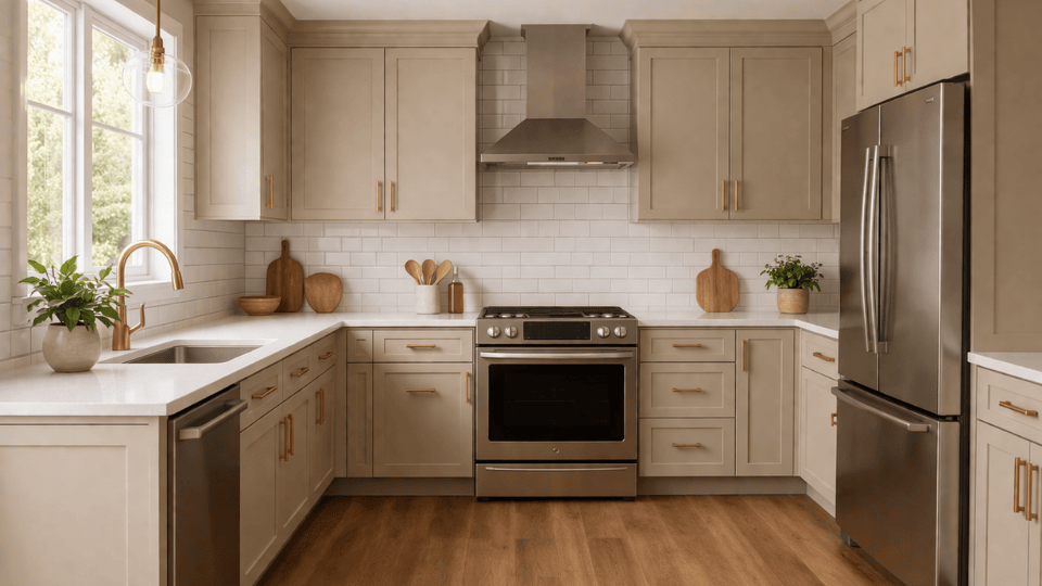
4. Accessible Beige Cabinets with Wood Accents
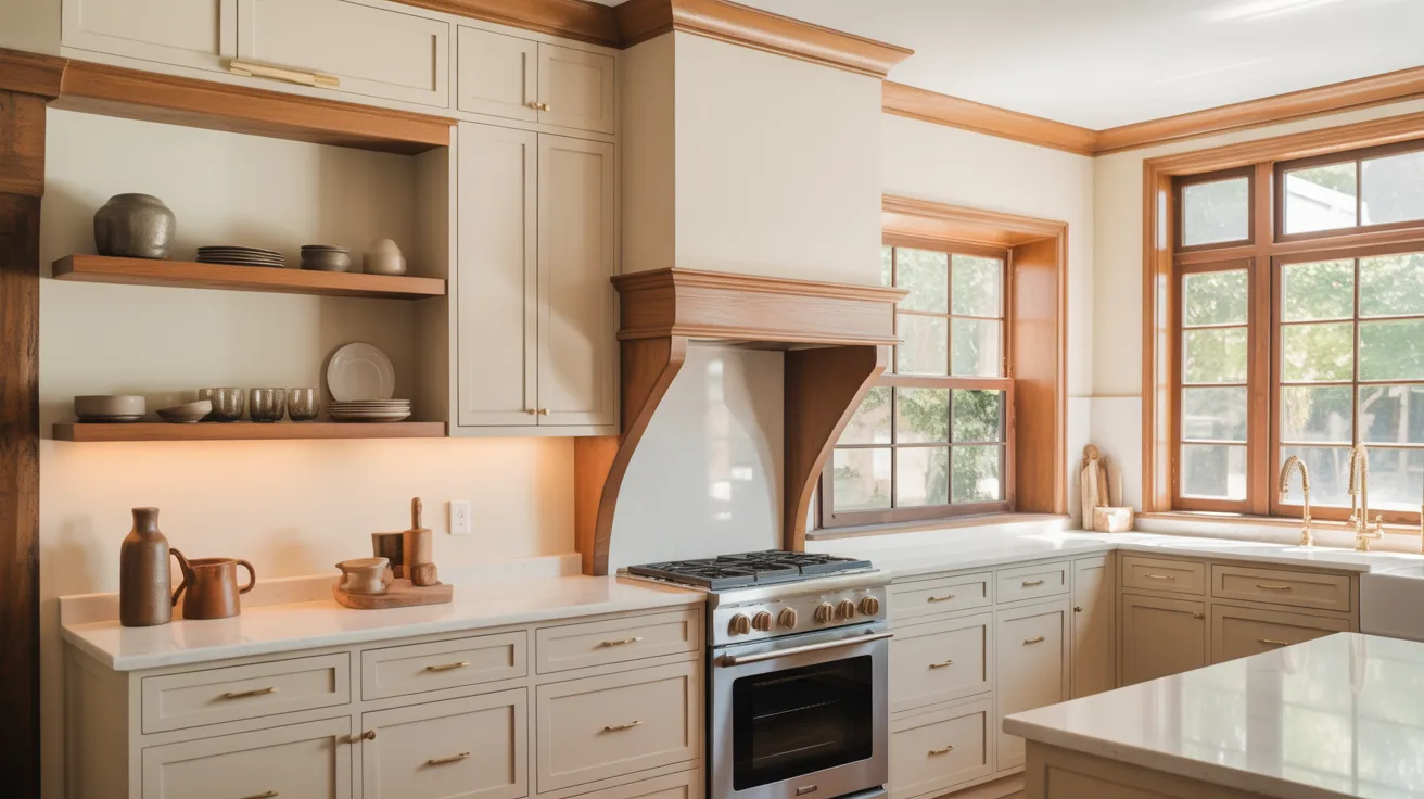
Wood accents pair very naturally with Accessible Beige cabinets because both have a soft, warm feeling. You can bring in wood through open shelves, stools, trim, beams, or even a wood range hood.
This mix helps the kitchen feel more relaxed and welcoming. It also keeps the space from looking too flat if most of the cabinets are painted the same color.
Light wood creates a softer look, while medium or darker wood adds more contrast. This idea works especially well in farmhouse, rustic, and organic modern kitchens.
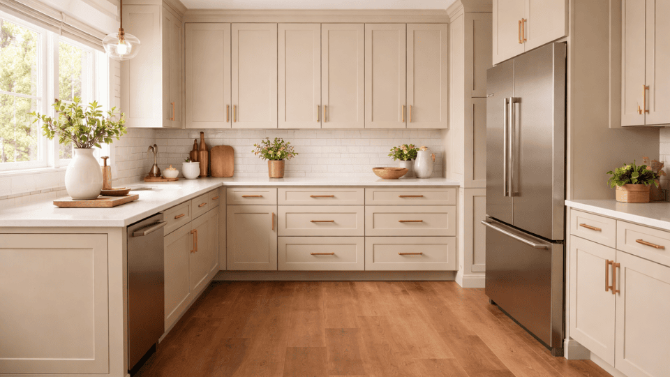
5. Two-Tone Kitchen with Accessible Beige Lower Cabinets
Using Accessible Beige on lower cabinets can help anchor the kitchen while keeping the overall look light. When paired with white or off-white upper cabinets, the room feels open at eye level and grounded below.
This setup works well in both small and large kitchens because it adds contrast without making the space feel busy.
It is also a smart option if you want some color on the cabinets but do not want the whole kitchen painted in a single shade. This look works especially well with neutral backsplashes and simple hardware.
The best upper-cabinet pairings for this two-tone approach: Alabaster (SW 7008) for a warm, seamless result, or Shoji White (SW 7042) if you want something slightly creamier. Avoid using Pure White uppers, as the contrast can be too stark and makes the Accessible Beige lowers look heavier than they are.
6. Accessible Beige Cabinets with a White Subway Tile Backsplash
A white subway tile backsplash is one of the easiest ways to brighten a kitchen with Accessible Beige cabinets. The clean white tile reflects light and gives the cabinets a fresh, crisp contrast.
This combination works in many kitchen styles because subway tile is simple and timeless. It also helps the warm greige cabinets feel balanced instead of too heavy.
If you want a classic look that still feels current, this is a strong option. You can also change the grout color slightly to make the backsplash look softer or more defined.
7. Accessible Beige Cabinets with a Warm Gray Backsplash
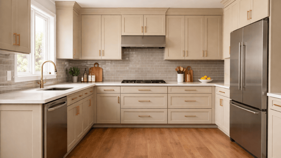
A warm gray backsplash adds gentle contrast to Accessible Beige cabinets without making the kitchen feel too cool. Since Accessible Beige already has some gray in it, the two colors usually work well together.
This pairing can make the kitchen feel calm and layered, especially if you want a neutral design that still has some depth.
Warm gray tiles also work nicely with stainless steel appliances, brushed nickel hardware, and soft white walls. If you want the kitchen to feel modern but not stark, this is a very workable direction.
8. Accessible Beige Cabinets with Marble Countertops
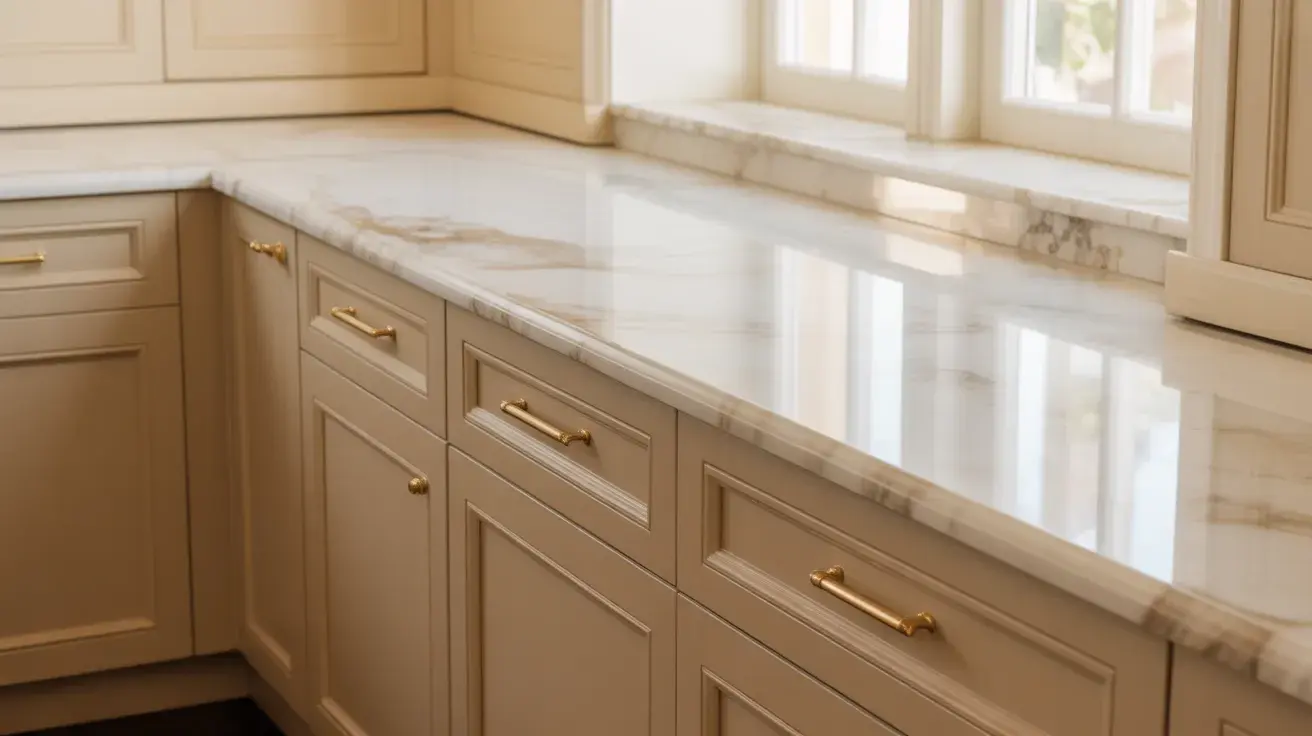
Marble countertops bring softness and texture to Accessible Beige cabinets. The natural veining in marble adds movement, while the cabinet color keeps the kitchen feeling warm and grounded.
This pairing works especially well if you want a timeless look that still feels light. White or soft gray marble can help brighten the space and connect nicely with the gray-beige balance of Accessible Beige.
It also looks beautiful with brass or black hardware, depending on the style you want. This combination works well in classic, stylish, and transitional kitchens.
9. Accessible Beige Cabinets with Dark Island Cabinets
A dark island can add depth and contrast to a kitchen with Accessible Beige cabinets. Colors like navy, deep gray, charcoal, or espresso help the island stand out as a clear focal point.
This setup works well if you want the kitchen to feel a little more layered without changing the main cabinet color.
The beige cabinets keep the room soft, while the darker island adds structure and visual interest. This idea is especially useful in larger kitchens where one strong feature can help break up the space and make the layout feel more intentional.
My go-to dark island pairing with Accessible Beige perimeter cabinets: Iron Ore (SW 7069) or Peppercorn (SW 7076). Both are deep enough to read as a clear contrast without going full black, and their warm-dark quality feels intentional alongside Accessible Beige rather than arbitrary.
How Accessible Beige Cabinets Look in Different Lighting
Lighting changes how cabinet colors appear throughout the day. Accessible Beige reacts to both natural and artificial lighting, which can slightly shift its tone.
| Lighting Type | How Accessible Beige Cabinets Usually Look |
|---|---|
| Natural daylight | Cabinets appear lighter and softer, showing more beige warmth and helping the kitchen feel open and bright. |
| Warm artificial lighting | The cabinets look warmer and slightly richer, making the kitchen feel cozy and comfortable. |
| Cool white lighting | Gray undertones become more noticeable, giving the cabinets a slightly cooler and more modern look. |
| Low lighting | The color appears deeper and slightly darker, making the cabinets feel more grounded. |
| North-facing kitchen | Cooler light brings out gray tones strongly. It may look more gray than beige and sometimes show a slight green hint. |
| South-facing kitchen | Warm light highlights the beige base. The color looks its best but may appear lighter in strong afternoon sun. |
Because lighting changes throughout the day, I always suggest testing the color on a cabinet door or sample board. It is also important to consider how different paint sheens reflect light, as a glossier finish will bounce more artificial light than a matte one, altering the color’s appearance in the evening.
Best Countertop and Backsplash Pairings for Accessible Beige Cabinets
Choosing the right surfaces helps balance the warmth of Accessible Beige and keeps your kitchen looking clean, connected, and easy to style.
Countertop Pairings
These countertop options work well with Accessible Beige cabinets and help define the overall look of your kitchen.
- Creamy white quartz with soft veining: The warmest and most forgiving pairing. Look for quartz with subtle gray or beige movement rather than stark bright white.
- White or gray marble: Adds natural texture and movement that Accessible Beige cabinets welcome. Works best when the marble leans warm rather than cool-blue-veined.
- Butcher block or light wood: A natural complement to the earthy greige. Keeps the kitchen feeling warm and organic.
- Dark granite or soapstone: Creates a strong contrast. Works well as a grounding element, especially on a dark island paired with Accessible Beige perimeter cabinets
Backsplash Pairings
The backsplash adds texture and helps balance the cabinet color without overwhelming the space.
- White Subway Tile: White subway tile keeps the kitchen bright and clean. The crisp white color contrasts gently with Accessible Beige cabinets while reflecting light and helping the space feel open.
- Beige or Greige Tile: Beige or greige tiles create a smooth and balanced color flow with Accessible Beige cabinets. This option keeps the palette soft while maintaining a calm, coordinated kitchen design.
- Marble Backsplash: A marble backsplash adds gentle movement through soft gray veining. These natural patterns pair nicely with beige cabinets and bring light texture without making the kitchen look busy.
- Zellige Tile for Texture: Zellige tiles add depth and natural variation behind Accessible Beige cabinets. Their uneven surface reflects light in different ways, giving the kitchen texture while keeping the palette warm.
The backsplash plays an important role when you use Accessible Beige cabinets. The right tile helps balance the warmth of the cabinets while adding texture and contrast.
Wall Colors That Go with Accessible Beige Cabinets
Choosing the right wall color helps Accessible Beige cabinets look balanced and natural. Some colors brighten the kitchen, while others add softness and warmth.
| Wall Color | Brand | How It Affects the Kitchen Mood |
|---|---|---|
| Alabaster (SW 7008) | Sherwin-Williams | Alabaster is a soft, warm white that keeps the kitchen light and welcoming. It blends smoothly with Accessible Beige cabinets, helping the space feel calm and balanced without strong contrast. |
| Pure White (SW 7005) | Sherwin-Williams | Pure White creates a brighter contrast with Accessible Beige cabinets. The crisp white walls make cabinets stand out more while keeping the kitchen fresh, clean, and open. |
| Agreeable Gray (SW 7029) | Sherwin-Williams | Agreeable Gray adds a gentle gray tone to the side of Accessible Beige cabinets. This pairing creates a calm, neutral palette that works well in kitchens with stainless steel appliances and modern finishes. |
| Shoji White (SW 7042) | Sherwin-Williams | Shoji White has a soft, creamy tone that pairs naturally with Accessible Beige cabinets. It keeps the kitchen warm and relaxed while maintaining a light, airy overall feel. |
Looking at similar colors side by side helps you understand their undertones and brightness. I always recommend testing samples before painting cabinets to see which color best suits your kitchen.
Wall color caution: Because Accessible Beige has an LRV of 58, it is relatively light. This means very creamy or ivory wall colors can make the cabinets look darker than expected, rather than creating a clean contrast. Avoid walls that are significantly warmer or creamier than the cabinet color unless you are intentionally going for a monochromatic layered look.
Tips Before Painting Accessible Beige Cabinets
Choose a durable cabinet paint finish such as satin or semi-gloss. These finishes resist wear better, making cabinet surfaces easier to wipe and clean. When choosing between satin and semi-gloss sheens, consider that the higher the gloss, the more durable—but more reflective—the cabinets will appear
- Paint Sample: Test Accessible Beige on a cabinet door or sample board before painting everything. This helps you see how the color looks with your kitchen lighting, countertops, and flooring.
- Lighting Check: Observe the paint sample during morning, afternoon, and evening lighting. Accessible Beige can shift slightly depending on light, so checking throughout the day helps you understand its true tone.
- Right Finish: Choose a durable cabinet paint finish such as satin or semi-gloss. These finishes resist wear better, making cabinet surfaces easier to wipe and clean.
- Surface Prep: Clean cabinet surfaces of grease and dust, lightly sand, and apply primer. Proper preparation helps the paint stick evenly and improves the durability of the finish.
- Color Matching: Compare Accessible Beige with countertops, backsplash, flooring, and hardware. Making sure these materials work together helps the kitchen feel balanced and visually connected.
One tip I give every client choosing a greige: do not test paint on the wall and evaluate it next to white primer. The primer’s stark brightness will make any warm neutral look muddy or dull. Test it on the actual cabinet surface, cleaned and lightly sanded, against your real countertop and flooring. That’s the only honest test.
Taking the time to properly prepare cabinets makes a big difference. When everything is well planned, Accessible Beige cabinets can look smooth and balanced and last longer in everyday kitchen use.
Summing Up
By now, you can see why Accessible Beige cabinets are such a popular choice. It’s a color that works quietly with many styles without feeling too plain or too bold.
I’ve seen it add balance to bright kitchens and bring warmth into modern spaces. That mix of gray and beige makes it flexible, which most kitchens need.
It may not suit every setup, especially in cooler lighting or very modern designs. But in well-lit, warm kitchens, it performs reliably and looks natural.
If you want a calm and easy-to-style cabinet color, this is a strong option. Test it in your lighting first, then pair it with the right surfaces for the best result.


