


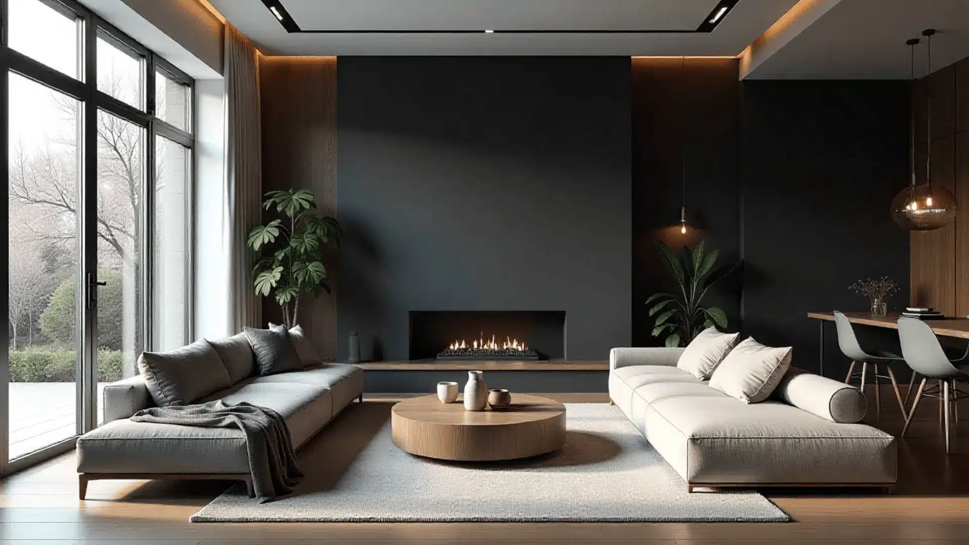
Thinking about giving your home a bold refresh? Sometimes, the right paint color can completely shift the atmosphere of a room, adding personality and sophistication without feeling heavy. Choosing deeper hues can make a space feel more intentional and welcoming, especially when paired with thoughtful design touches and balanced tones like Balanced Beige SW 7037. In this blog, I’ll talk about one of the shades that designers adore for its perfect mix of drama and comfort. You’ll learn how to use it in different rooms and how a darker palette can make your home feel both stylish and cozy. Benjamin Moore Soot 2129-20 is a dark charcoal paint with cool blue-gray undertones. Its LRV of 6.19 makes it nearly as dark as true black while still adding depth and softness to a space. Understanding Soot by Benjamin Moore Benjamin Moore Soot is not your average black paint. It’s a dark, moody charcoal with a hint of navy that adds depth without feeling flat or overly stark. It’s perfect for those who want to go dark without feeling overwhelmed. As a color consultant, I often recommend Soot for spaces where you want depth without the harshness of a true black. Subtle undertones give it a warmth that keeps spaces cozy and balanced, making it a favorite for creating sophisticated yet comfortable interiors. Color Code 2129-20 LRV (Light Reflectance Value) 6.19 RGB 55, 60, 65 HEX #363C40 Collection Part of Benjamin Moore’s Color Preview® Collection, known for bold, high-impact colors. Undertones Cool blue-gray undertones that become more obvious in well-lit spaces. Why it’s special: Instead of feeling harsh, this Benjamin Moore black paint has a velvety depth that makes it perfect for creating cozy, warm spaces. Interior Design Inspiration: How to Use BM Soot Inside Here’s how soot’s versatile hue works in every room, offering a classic and stylish way to bring depth and drama to your home: 1. Accent Walls Use Soot as a feature wall in rooms like the bedroom or living room to introduce a dramatic yet subtle depth to the space. The rich, dark hue draws attention without overpowering the room. To maximize the visual impact, pair Soot with crisp white trim, which upgrades the contrast and highlights the wall’s presence. 2. All-Over Walls for a Cozy Feel In larger, open spaces with plenty of natural light, painting all the walls in Soot can create a bold and inviting cocoon-like atmosphere. The dark, blue-gray tone envelops the room, making it feel intimate and cozy. To prevent the space from feeling too heavy or dark, balance it out with light and warm furnishings. 3. Bedrooms Soot is an excellent choice for creating a classy, moody retreat in your bedroom and works well with other bedroom paint color ideas if you’re searching for similar styles. The blue undertones in Soot bring a cool, serene feel that’s perfect for winding down after a long day. To soften the dark color, incorporate plush bedding in white, cream, or muted jewel tones like deep emerald or rich plum. 4. Cabinetry & Built-Ins The cool blue undertones in Soot make it an ideal choice for cabinetry, built-ins, or accent furniture in spaces like kitchens and bathrooms. Using Soot on kitchen islands, custom shelves, or bathroom vanities can uplift the look of your space and create a modern, high-end feel. For an added touch of charm, incorporate sleek hardware in gold, brushed nickel, or matte black. 5. Dining Rooms When used in dining rooms, Soot creates an intimate and inviting atmosphere, perfect for family meals or entertaining guests. Pair it with a warm wood dining table for a grounded, earthy look that complements the depth of the color. The dark hue sets a cozy, comfortable tone that motivates relaxed dining experiences. Exterior Applications: Curb Appeal with Soot It also works well with different exterior paint color combinations to create a balanced and high-contrast exterior look. 1. Front Doors A front door painted in Soot makes an immediate, bold statement and can be the focal point of your home’s exterior. It stands out beautifully, especially when paired with lighter siding colors like white, cream, or gray, creating a striking contrast. This color combination brings edge and drama to the entrance. 2. Window Trim & Shutters On homes with white or brick exteriors, Soot works beautifully as an accent color for window trim and shutters. The dark hue offers a sharp contrast to the lighter surroundings, framing the home’s windows and creating visual interest. This use of color highlights architectural details and gives the exterior a polished, well-defined look. 3. Siding on Modern Homes For contemporary or modern-style homes, Soot works wonderfully as a primary color for the entire exterior. This deep, rich hue gives the house a sleek, architectural look that feels bold and refined. Soot’s blue undertones add a subtle layer of complexity to the design, making it stand out in an understated, stylish way. To break up the darkness and add dimension, pair it with natural elements like wood, stone, or metal accents. Soot vs. Other Benjamin Moore Blacks When you’re choosing a dark paint, it helps to understand how your options compare. Here’s how Soot stacks up against other popular choices: Soot vs. Black Ink (2127-20) Black Ink (2127-20) is a rich, deep black with cool blue undertones, giving it a sleek and modern edge. It feels slightly more dramatic and crisp compared to Soot (2129-20), which leans warmer and more welcoming. Choose Black Ink when you want bold contrast with a contemporary vibe, and Soot when you prefer a softer, more inviting depth. For a similar near-black with a subtle green undertone, Sherwin-Williams Greenblack is another popular alternative. With an LRV of 6.19, Soot appears slightly softer compared to deeper true blacks. Soot vs. Midnight (2131-20) Midnight (2131-20) is an intense, almost-black shade with faint blue tones that give it a moody, sophisticated feel. It carries a touch more color than Soot, which stays closer to true charcoal. Go with Midnight if you want a deep hue that hints at navy, or choose Soot for a balanced, neutral darkness that complements a wider range of spaces Soot vs. Black Iron (2120-20) Black Iron (2120-20) offers a sleek, powerful black with a cool undertone that feels strong and refined. It’s slightly crisper than Soot, which has a softer finish and more adaptable warmth. Pick Black Iron for maximum depth and sophistication, or Soot for a bold look that still feels livable and versatile Best Color Pairings for Soot One of the best things about Soot is how well it plays with other colors. The key is understanding which combinations will uplift its character versus which might make it feel too harsh. Trim and Ceiling Suggestions Chantilly Lace (OC-65): This crisp, clean white creates beautiful contrast without competing undertones. It’s my go-to choice for Soot because it keeps things modern and sharp.Cloud White (OC-130): A softer option that’s still bright but feels less stark. Great if you want contrast without the high-drama look.Super White (OC-152): The brightest option that really makes Soot pop. Use this if you want maximum contrast and a very contemporary feel. Accent Wall and Furniture Colors Soft sage greens, including options from sage green paint colors, complement Soot’s cool undertones beautifully. Dusty blues create a classy, monochromatic scheme Warm whites and creams add softness without competing Blush pinks provide unexpected warmth that plays off the purple undertones Hardware and Flooring Compatibility Brushed brass or warm gold: Creates beautiful contrast and adds warmth to balance Soot’s coolness. Polished chrome or brushed nickel: Keeps things sleek and modern, emphasizing the cool undertones. Matte black: Bold choice that creates a cohesive, high-contrast look. Aged bronze: Adds warmth while maintaining class. Best Paint Finish for Benjamin Moore Soot Matte Finish: Matte gives dark shades like Soot a smooth, velvety look that hides wall imperfections beautifully while adding depth and richness, making it ideal for bedrooms, dining rooms, and other low-traffic areas. Eggshell Finish: Eggshell offers a soft sheen that reflects just enough light to keep dark walls from feeling flat, while still maintaining a refined, matte-like texture, making it perfect for living rooms, hallways, and medium-traffic areas that need a balance of beauty and practicality. Satin Finish: Satin brings a gentle shine and high durability, making it easy to clean and maintain, which makes it best suited for kitchens, bathrooms, and high-traffic spaces where both style and toughness matter. Tips Before Buying Benjamin Moore Soot Test in different lighting: Natural daylight, warm bulbs, and cool LEDs all bring out different tones. Paint a few sample spots and watch how the color changes throughout the day. Try larger samples: Small paint chips can be misleading. Use at least 12″x12″ swatches or peel-and-stick samples to see the true depth of the color. Compare finishes: A matte wall will look richer and softer, while an eggshell or satin finish reflects more light, each of which changes the overall mood. Consider surrounding colors: Look at how Soot pairs with your flooring, furniture, and trim to ensure harmony. Start small: If you’re unsure, begin with a single accent wall or smaller area before committing to the whole room. Soot Equivalents in Other Brands Here are some closely matched alternatives to Benjamin Moore Soot 2129‑20 in other U.S. paint brands: From Sherwin-Williams:Black of Night (SW 6992) and Inkwell (SW 6994) both capture Soot’s deep, moody character. Black of Night offers a crisp, modern black with subtle warmth, while Inkwell leans slightly blue, giving it a sophisticated, inky depth that feels rich and dramatic. From Behr:Little Black Dress (PPU24-23) echoes Soot’s refined darkness. Little Black Dress delivers a smooth, charcoal-like finish with a touch of softness. Final Thoughts Benjamin Moore Soot proves that dark paint doesn’t have to feel cold or intimidating. Its deep charcoal base and subtle blue undertones bring warmth, balance, and a refined sense of calm to both interiors and exteriors. Whether you’re highlighting architectural lines, defining cabinetry, or creating a cozy retreat, this shade adds sophistication without overpowering the space. Soot also pairs beautifully with natural materials and contrasting whites, offering flexibility for any design style. Start by testing the paint in different lighting and finishes to see how its depth and character redefine your home’s atmosphere. Frequently Asked Questions Is Benjamin Moore Soot warm or cool? Benjamin Moore Soot is considered a cool paint color due to its blue-gray undertones, but it still feels balanced and not overly cold in most lighting conditions. What is the LRV of Benjamin Moore Soot? The LRV of Benjamin Moore Soot is 6.19, which makes it a very dark color that absorbs most light and creates a rich, deep appearance. Is Benjamin Moore Soot good for exteriors? Yes, Soot works well for exteriors, especially on doors, trim, and modern siding where a bold, clean contrast is desired. What trim color goes with Benjamin Moore Soot? Crisp whites like Chantilly Lace OC-65 or Super White OC-152 pair best, creating strong contrast without clashing undertones. Is Soot darker than black paint? Soot is very close to black but slightly softer due to its undertones, which gives it more flexibility compared to a flat true black.
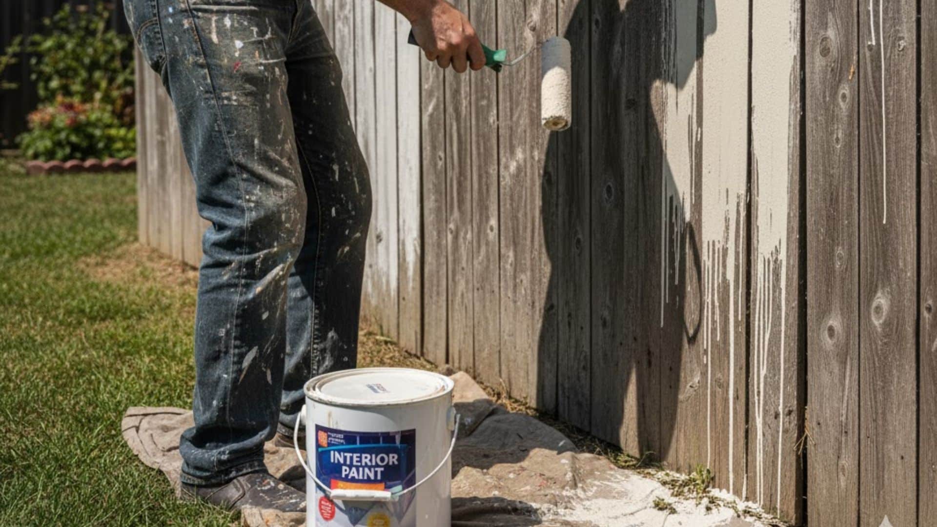
Got leftover interior paint, and thinking if you can use interior paint outside to finish that fence or shed project? Many homeowners face this exact situation when trying to save money or use up extra paint sitting in garages. I’ve seen countless DIY projects fail because people didn’t understand the crucial differences between interior and exterior paint formulations. You might think paint is paint, but the truth about what works outdoors versus indoors is more important. Making the right choice now saves you time, money, and the frustration of redoing failed paint jobs later. Let me break down everything about using interior paint outdoors and what actually works best. Can You Use Interior Paint Outside? Interior paint is not made for outdoor conditions and will fail quickly when exposed to weather and sunlight. You can technically apply interior paint outside, but it won’t last more than a few months before problems appear. Interior paint lacks the additives and resins that protect against UV rays, temperature changes, moisture, and mildew growth outdoors. Exterior paint contains special binders that create flexible films that expand and contract with temperature changes without cracking badly. Interior formulations focus on easy cleaning and low odor rather than weather resistance or long-term outdoor durability. Using interior paint outside means you’ll face peeling, fading, cracking, and mold within months of application, requiring costly repainting. What Happens When You Use Interior Paint Outdoors? Using interior paint outdoors creates multiple problems that damage your surfaces and cost you money in repairs. Here’s what goes wrong when you use interior paint outside: 1. It Fades Quickly in Sunlight UV rays from direct sunlight break down pigments in interior paint that aren’t designed for outdoor exposure. Your paint loses its color and vibrancy within just weeks or months, making surfaces look washed out. Interior formulations lack UV-blocking additives that protect exterior paints from sun damage and color degradation over time. Bright colors fade fastest, turning pale and chalky as the sun destroys the pigment molecules. 2. It Peels and Cracks Easily Interior paint lacks the flexible binders needed to handle outdoor temperature changes that cause surfaces to expand constantly. Peeling, flaking, and blistering occur fast, especially on wood or metal surfaces exposed to heat and cold cycles. The rigid film cracks when temperatures swing because it can’t stretch and move with the surface underneath properly. You’ll notice paint bubbling and peeling away from the edges within the first few months. 3. It Can Grow Mold and Mildew Interior paint doesn’t include strong mildewcides or fungicides that prevent biological growth in outdoor environments with moisture present. Moisture exposure leads to mold and mildew growth, especially in humid areas or shaded spots that stay damp. Black, green, or gray spots appear on painted surfaces as mold colonies establish and spread across everything. The organic materials in interior paint actually feed mold growth rather than resisting it. 4. It Damages the Surface Underneath Poor adhesion and lack of weatherproofing allow interior paint to trap moisture against wood, drywall, or masonry surfaces. Trapped water seeps behind the paint film and causes rot, decay, warping, or crumbling of the underlying material. Wood surfaces develop soft spots and structural weakness as moisture penetrates and breaks down the fibers continuously. The damage often goes unnoticed until the paint peels away, revealing serious deterioration that requires expensive repairs. 5. It Wastes Time and Money Repairs and repainting with proper exterior paint cost significantly more than simply using the right paint from the start. You’ll spend money removing failed interior paint, repairing damaged surfaces, and buying exterior paint to do jobs correctly. The labor involved in scraping, sanding, and prepping surfaces again wastes valuable time you could spend elsewhere. Using cheap interior paint outside turns into an expensive mistake that costs double or triple the initial savings. Why are Interior and Exterior Paints Different? Interior and exterior paints are formulated with different ingredients to meet the specific challenges of their environments. Here’s how interior and exterior paints differ in composition and purpose: Feature Interior Paint Exterior Paint Resin and Binder Uses rigid resins for smooth, even finishes on indoor walls and ceilings. Uses flexible resins that expand and contract with temperature changes without cracking. Additives and Protection Focuses on washability, stain resistance, and rich color saturation for indoor beauty. Includes UV blockers, mildewcides, and fungicides to protect against weather and biological growth. VOC and Safety Contains lower VOC levels to maintain safe indoor air quality for people. Can handle higher VOC levels since outdoor ventilation disperses fumes quickly and safely. Understanding these differences helps you choose the right paint for each project and avoid costly mistakes. Using the wrong type of paint leads to poor performance, early failure, and expensive repairs down the road. Where You MIGHT Get Away with Using Interior Paint Outside? You can sometimes use interior paint outside in very specific situations where weather exposure is minimal or temporary. Covered or sheltered spaces, such as screened porches, enclosed patios, or areas under deep roof overhangs, may work temporarily if protected. These spots shield paint from direct rain, harsh sunlight, and extreme temperature swings that cause the most damage. Small decorative projects or seasonal crafts can also use interior paint safely since they’re not permanent outdoor fixtures. Items like wooden signs, holiday decorations, or garden accents that you bring inside during bad weather work fine. However, even in these protected situations, expect interior paint to perform poorly compared to proper exterior paint formulations. What to Do If You’ve Used Interior Paint Outside? If you have already painted outdoor surfaces with interior paint, don’t panic because you have several options to fix it. Here’s what you can do to address the problem: Check for early damage like peeling, fading, cracking, or mold growth on your painted surfaces as soon as possible. Seal it with a clear outdoor sealant or varnish to extend the paint’s life slightly and add some protection. Clean affected areas gently with mild soap and water to remove dirt, mold, or mildew before applying any protective coats. Plan to repaint with proper exterior paint by sanding, priming, and applying quality outdoor paint for long-lasting, durable results. Acting quickly can help minimize damage and buy you some time before a full repaint becomes absolutely necessary. However, understand that these fixes are temporary, and proper exterior paint remains the only permanent solution for outdoor surfaces. The Right Way to Paint Exterior Surfaces Painting exterior surfaces correctly ensures your work lasts for years without peeling, fading, or requiring constant touch-ups. Follow these essential steps for professional, long-lasting results: Step 1: Remove all dirt, grease, mildew, and old flaking paint from the surface using a pressure washer or scrub brush. Step 2: Apply an exterior primer suited for your surface material to ensure better paint adhesion and long-term durability. Step 3: Choose high-quality exterior paint designed for your surface type: wood, metal, masonry, vinyl, or composite. Step 4: Apply at least two coats of exterior paint, allowing proper drying time between coats as recommended on the label. Step 5: Inspect your painted surfaces yearly for cracks, peeling, or wear, then touch up problem areas immediately to prevent damage. Taking time to follow these steps properly means your exterior paint job will look beautiful for years. Proper preparation and quality materials make all the difference between paint that lasts and paint that fails quickly. Wrapping It Up The big question about if you can use interior paint outside has a clear answer: technically, yes, but never for lasting results. You now understand why interior paint fails outdoors, what problems it causes, and how to fix mistakes properly. I’ve learned through experience that choosing the right paint from the start always beats dealing with failures later. Remember that cutting corners with the wrong paint types always costs more when you factor in repairs and repainting later. Invest in proper exterior paint from the start, prep your surfaces correctly, and maintain them regularly for beautiful results. Your home deserves paint that actually survives weather instead of peeling away after a few months of exposure. Share your painting experiences or questions in the comments below!

Natural Choice SW 7011 is warm enough to feel cozy at 7 am but soft enough that it won’t yellow out by noon. That balance is harder to find than it sounds, and it’s the main reason I keep recommending this color to clients who are stuck between “too stark” and “too creamy.” With an LRV of 73, it sits in a useful middle ground, reflective enough to keep rooms bright, grounded enough to feel like something rather than nothing. Below, I’ll walk through exactly how Natural Choice behaves across light conditions, which rooms it works in and which it doesn’t, and how it stacks up against the colors it gets compared to most often. Color Name Natural Choice SW 7011 Brand Sherwin-Williams LRV 73 — medium-light Hex #E3DED0 Undertones Warm beige-greige; yellow hue family with subtle gray pull Best For South- and east-facing walls, open floor plans, exteriors, trim, cabinets Avoid In Rooms with cool LED lighting and no warm accents; spaces where you want a true white Natural Choice is part of Sherwin-Williams’ Warm Whites and Finest Whites collections, officially classified as a white paint color — though in practice it reads more like a warm off-white with a soft greige undertone depending on your light source. The Undertones of Natural Choice SW 7011 Natural Choice comes from the yellow hue family, which is the scientific basis of its warmth. But “yellow hue family” sounds more aggressive than the color actually is. In real rooms, the yellow reads as beige. The gray read is what gives it the greige quality people often describe. What you end up with is a color that shifts between soft cream and muted greige depending almost entirely on your light source, and that adaptability is exactly what makes it useful. The tricky part: if yellow in your flooring or furniture is already pulling warm, Natural Choice can push the whole room toward cream. Always sample it against your existing floor and any warm wood tones before committing. What the Undertones React To Warm incandescent or Edison bulbs: The beige-yellow undertone surfaces. The room reads cozy, not yellow, unless the bulb temperature is very warm (below 2700K). Cool LED daylight bulbs (5000K+): The yellow drops out almost entirely. The color reads closer to a gray-white, and the warmth you wanted may disappear. Natural daylight, south-facing: This is where Natural Choice performs best. The warm light amplifies the creamy tone without pushing it into butter territory. Natural daylight, north-facing: Cooler, bluish light pulls out more of the gray. The color stays nice — just expect less warmth than the chip suggests. Pro Tip: Before you paint, tape a large painted cardboard sample (at least 12×12 inches) to the wall and check it at 8 am, noon, and 8 pm. The afternoon reading is the most honest, it shows you the color in the light conditions you’ll see it in most often. How Natural Choice SW 7011 Behaves in Different Light Conditions Light behavior is where Natural Choice either earns its place or reveals its limits. Here’s what I’ve observed across client projects: Light Condition How Natural Choice Reads Verdict South-facing, direct sun Airy, creamy white, a good amount of warmth shows Best condition for this color East-facing, morning light Warm and flattering in the morning; softens to neutral by afternoon Works well North-facing, diffused light Leans greige; warmth is muted. Still nice, but test first Proceed with caution — warm your bulbs to compensate Cool LED (5000K+) Gray-white, flat. Warmth disappears Consider a different color or switch bulb temperature first Warm incandescent / Edison (2700K–3000K) Creamy and comfortable — best artificial light pairing Works well The single most common complaint I hear about Natural Choice is that it “looks gray” in someone’s finished room. Nine times out of ten, the culprit is cool LED bulbs. Swap to a 2700K bulb before you repaint. Where to Use Natural Choice SW 7011 Natural Choice is one of those rare colors that earns its place on walls, trim, cabinets, and exteriors without looking like a cop-out. But some rooms suit it better than others. 1. Bedroom Bedrooms are where Natural Choice is most forgiving. The soft beige-greige reads calm without being clinical, and it works with virtually any bedding palette, white, warm linen, muted green, or even blush. Pair it with SW Pure White SW 7005 (LRV 84) on the trim for a clean contrast that doesn’t fight the wall color. If you want to keep the whole room tonal, use Natural Choice on the trim too, but switch to a semi-gloss for subtle differentiation. 2. Bathroom Bathrooms with natural light are a strong use case. The color’s warmth offsets the cold that white tile and chrome fixtures can create. Pair it with a warm wood vanity and brushed brass or matte black hardware. One thing to watch: if your tile grout is very cool (white or gray), the contrast with Natural Choice can look unintentional. Opt for a warm beige or linen grout to keep the palette coherent. 3. Kitchen On kitchen walls, Natural Choice creates a backdrop that gets out of the way and lets your countertops and hardware do the work. On kitchen cabinets, it’s a softer alternative to pure white; you get warmth without the yellow risk of something like Creamy SW 7012. It reads well with brass hardware and off-white quartz. If you want cabinet ideas in a similar warm neutral, the Accessible Beige cabinet is a useful comparison point. Natural Choice is a step lighter and more off-white in tone. 4. Living Room Living rooms are where open floor plans benefit most from Natural Choice. The color is soft enough to work across zones, it won’t clash when it runs from the kitchen into the dining area into the family room. Add contrast with dark metal light fixtures or a charcoal area rug to prevent the space from feeling flat. When NOT to Use Natural Choice SW 7011 Not every room is a good fit. Here’s where I’d steer you toward a different color: Rooms where you want true white: Natural Choice will always have warmth. If you want a crisp, clean white — like for a modern minimalist kitchen or a dental-office-clean bathroom, look at SW Extra White SW 7006 (LRV 86) or SW Pure White SW 7005 instead. Rooms dominated by cool gray furniture or cool stone countertops: The warm undertone in Natural Choice can look dirty or mismatched against cool gray upholstery. In these cases, SW Shoji White SW 7042, which has a more greige-neutral quality, handles the transition better. Very dark, windowless rooms: At LRV 73, Natural Choice has decent reflectance, but it can’t overcome a genuinely dark space. A higher-LRV color like Alabaster SW 7008 (LRV 82) will do more work in a room without natural light. Rooms with existing warm yellow flooring: The beige undertone in Natural Choice can stack with a yellow-toned floor and push the whole room toward cream. Test the combo carefully before committing. Natural Choice SW 7011 vs. Similar Sherwin-Williams Colors These are the four comparisons I’m asked about most often. Each color solves a slightly different problem. Color LRV Undertone How It Differs from Natural Choice Choose It When Natural Choice SW 7011 73 Warm beige-greige, yellow hue — You want a versatile warm off-white for walls, trim, or exteriors Alabaster SW 7008 82 Warm white, light gray pull Noticeably brighter; less depth You need more light reflectance — darker rooms or low-window spaces Oyster White SW 7637 72 Warm off-white, softer cream Nearly identical LRV; slightly more cream, less greige You want warmth but the greige quality of Natural Choice feels too neutral Shoji White SW 7042 74 Greige, hint of green More contemporary and gray-neutral; less warm You have cool gray furniture and need the wall color to not fight it Alpaca SW 7022 ~65 Deep greige, taupe Noticeably deeper; acts as an accent or grounding color You want a greige with more depth for an accent wall or exterior trim SW Agreeable Gray SW 7029 (LRV 60) and SW Accessible Beige SW 7036 (LRV 58) are often mentioned in the same breath as Natural Choice, but they’re a full tier darker. Natural Choice will feel notably lighter and cooler in comparison, which is useful if you’re trying to brighten a space that those two colors make feel heavy. Coordinating Colors for Natural Choice SW 7011 Natural Choice is generous with what it works alongside. Here are the pairings I rely on most. Trim and Ceiling SW Pure White SW 7005 is the standard trim companion, with enough contrast to define the edge without creating a jarring gap. If you want the trim to disappear into the wall for a more seamless look, use Natural Choice itself in semi-gloss on the trim. For ceilings, Pure White or SW Ceiling Bright White keep things lifted without competing. For guidance on getting wall-and-trim combinations right, the wall-and-trim color combinations cover the contrast logic in detail. Accent Colors Urbane Bronze SW 7048 (LRV 8): Used on front doors, window frames, or an accent wall, it creates a strong grounding contrast against Natural Choice’s lightness. This is the combination I recommend most often for modern farmhouse exteriors. Muted sage or olive green: A soft tonal approach. Pulls the organic quality out of Natural Choice’s warm undertone. Terracotta or rust: Earthy, warm, and complementary. Works well in living rooms and dining spaces where you want character without contrast overload. Deep charcoal or navy: For those who want drama — pillows, cabinetry, an island. Natural Choice’s neutrality makes almost any saturated accent look intentional against it. Materials Light to medium oak or walnut floors, the warm undertone in Natural Choice reads naturally with the wood grain Brushed brass or matte black hardware, both work; brass leans warmer, black leans contemporary White quartz or off-white marble countertops; avoid stark cool-white quartz, which can make Natural Choice look dingy in comparison Linen, cotton, and rattan textures reinforce the organic quality of the color Furniture and Décor Pairings 1. Warm Wood and Linen Light oak or walnut furniture, beige linen upholstery, and rattan accents let the warmth in Natural Choice come through without adding any competing visual noise. This is the easiest pairing to land — the materials do the heavy lifting, and the wall color holds everything together. 2. Modern Black Accents Matte black metal frames, pendant lights, and hardware create definition against Natural Choice’s softness. This pairing solves the most common problem with off-white rooms — that they look unresolved. One or two strong black elements anchors the palette. Don’t overdo it: three or more black pieces in a small room can tip from modern to harsh. 3. Brass and Gold Brushed gold cabinet pulls, brass lamps, and champagne-framed mirrors all respond to the warm undertone in Natural Choice rather than fighting it. This is the combination to use when you want the room to feel elevated without a lot of additional color. 4. Earthy Green and Terracotta Olive green cushions, terracotta planters, and clay-toned art pull out the organic quality in Natural Choice. This works particularly well in rooms with natural wood flooring or exposed brick — the palette stays grounded in earth tones throughout. 5. Coastal Neutrals White slipcovered sofas, driftwood or light pine furniture, and blue-gray textiles push Natural Choice toward a breezy coastal register. The warm undertone prevents the room from feeling cold even with the cooler accents in play. Tips for Using Sherwin-Williams Natural Choice SW 7011 Test in your actual light Paint a 12×12-inch cardboard sample and move it around the room at different times of day. The paint chip under the fluorescent store light is not your reference point. Finish matters Matte or eggshell on walls, semi-gloss on trim. Semi-gloss on Natural Choice walls can make the warmth feel too pronounced in small spaces. Bulb temperature first If you have 4000K or 5000K LED bulbs, the warmth in Natural Choice will be significantly muted. Switch to 2700K before sampling — it changes the picture entirely. Check against your floor Natural Choice interacts with warm-toned wood floors. If your floor pulls orange or yellow, test carefully — the combination can be too warm. Avoid very bright white trim High-LRV whites like Extra White SW 7006 (LRV 86) will create a visible gap against Natural Choice’s warmth. Pure White SW 7005 or Alabaster SW 7008 are better-calibrated trim choices. The most expensive mistake with Natural Choice, and with most off-whites, is painting an entire room before testing. Order a Samplize peel-and-stick sample or mix a quart and put it on the wall first. For a broader look at how Natural Choice sits within the warm white category alongside similar options, the warm white paint color is worth reviewing before you make a final call. Frequently Asked Questions These are the questions that come up most often after someone has the sample on their wall and is second-guessing themselves. Does Natural Choice SW 7011 look yellow on walls? It can shift slightly creamy in strong south-facing sunlight, but it does not read as yellow in balanced light. The greige component of the undertone holds the yellow in check. If your room is already warm-toned, test carefully, stacked warmth from floor and walls together can tip the color further than expected. Is Natural Choice SW 7011 good for north-facing rooms? It works but needs help. Cool north light draws out the gray in the undertone, muting the warmth you’re after. Offset this with 2700K bulbs, warm wood tones, and linen or wool textiles. Always sample before painting a north-facing room in this color. What is the difference between Natural Choice and Shoji White? Both sit at LRV 73–74 and read similarly in terms of brightness. The difference is undertone: Natural Choice leans beige-greige from a yellow hue family, while Shoji White SW 7042 has a more contemporary gray-greige quality with a faint green tint. Shoji White handles cool-gray furniture better; Natural Choice is warmer and more organic-feeling. What trim color goes with Natural Choice? SW Pure White SW 7005 is the most reliable companion — it’s warm enough not to look jarring against Natural Choice but bright enough to define the trim clearly. Alabaster SW 7008 works for a tonal, softer contrast. Avoid Extra White SW 7006 or Snowbound SW 7004 — both are cool-leaning and will make Natural Choice look dingy in comparison. Can Natural Choice be used on kitchen cabinets? Yes — it’s a strong cabinet color. It reads softer than pure white and warmer than most greiges. Pair it with brass or matte black hardware and off-white or warm stone countertops. Avoid pairing it with stark-white quartz, which can make the cabinets look dingy by comparison. For more on how this color category works in kitchens, see the kitchen paint colors with white cabinets guide. Does Natural Choice work as an exterior paint color? It’s one of the stronger warm off-whites for exteriors. It photographs well, holds up under direct sunlight without bleaching out, and reads consistently across different exterior materials — brick, siding, and stucco. Dark trim (black or Urbane Bronze) gives it a modern farmhouse finish; white trim keeps it traditional. What carpet color goes with Natural Choice walls? Warm beige, oatmeal, taupe, and greige carpet all complement it naturally. Avoid cool gray carpet unless you have enough warm wood or brass in the room to bridge the contrast, otherwise, the warm wall and cool floor will look like they belong to different rooms. Is Natural Choice the same as Accessible Beige? No — these are meaningfully different colors. Accessible Beige SW 7036 has an LRV of 58 and reads as a full medium beige, warm and grounded. Natural Choice at LRV 73 is substantially lighter and reads as an off-white in most conditions. If you want more depth on the SW greige and beige spectrum, that page maps how these colors relate to each other. Final Verdict: Is Natural Choice SW 7011 Right for Your Room? Here’s what I’d tell you standing at the paint counter: Natural Choice SW 7011 earns its reputation as a go-to warm off-white because it balances two things most off-whites don’t: it’s warm enough to feel intentional but neutral enough that it won’t dominate the room. The LRV of 73 means it works in most well-lit spaces without becoming stark. The one situation where I’d steer you away is cool-LED-dominated rooms with no warm accents; the yellow undertone disappears, and you’ll end up with something flat and gray. If that’s your situation, switch your bulbs to 2700K before you decide. Otherwise, order the Samplize peel-and-stick sample, put it up against your floor and trim, and check it morning and evening before you commit. Sources:Sherwin-Williams, “Natural Choice SW 7011 Color Details.” sherwin-williams.com/en-us/color/color-family/white-paint-colors/SW7011-natural-choiceSherwin-Williams, “Warm Whites and Finest Whites Collections.” sherwin-williams.com
Picking paint can feel tricky when every can seems to promise something different. A little understanding goes a long way in saving time, money, and frustration later. In this post, I’ll help you understand what is latex paint, why it’s such a common choice, and how it differs from acrylic and oil-based options. You’ll also see when latex paint is the best fit for your walls and when another type might work better. By the end, you’ll have a clear idea of which paint suits your project and why the label details actually matter. What Is Latex Paint? Latex paint is a water-based paint. The color and resin particles float in water, then dry to form a film. The resins are synthetic polymers, usually acrylic or vinyl acrylic. When the water evaporates, the resins link together and create a solid, even layer. Latex paint dries fast, cleans up with soap and water, and has a lower odor. Most options also have fewer VOCs than traditional oil-based paints. That makes it a friendly pick for busy homes and small spaces. Because it is easy to use and versatile, latex is now the most common choice for both interior and exterior projects. It works well on drywall, masonry, and many primed surfaces. Latex vs. Acrylic vs. Oil-Based Paint Choosing among these three can feel confusing. All can give you a good finish, but they shine in different places. Use the quick summary below to see the tradeoffs. Latex Paint “Latex” usually refers to water-based paints that use vinyl, acrylic, or acrylic latex resins. You get quick dry times and easy cleanup. This makes latex popular for walls and ceilings. It also works on low-traffic trim when you choose a tougher enamel latex. Acrylic Paint Acrylic paint uses 100% acrylic resin. It sticks better, flexes with temperature changes, and resists sun damage. That is why many “premium” latex paints are actually acrylic latex at heart. Acrylic is a strong pick for exteriors and moisture-heavy rooms. Oil-Based Paint Oil-based paint uses a solvent, not water. It dries slower and smells stronger. The payoff is a very smooth, hard finish with great leveling. It still earns a spot on some trim and furniture. You need mineral spirits for cleanup. To make things clearer, here’s a quick side-by-side look at how latex, acrylic, and oil-based paints compare in key areas like drying time, odor, and durability. Feature Latex Paint Acrylic Paint Oil-Based Paint Base Water Water Solvent (oil/alkyd) Odor Low Low Strong Dry Time 1–2 hours 1–2 hours 6–24 hours Cleanup Soap and water Soap and water Mineral spirits Durability Moderate High Very high Best Use Walls, ceilings Exteriors, bathrooms Trim, furniture As you can see, latex and acrylic paints are easier to live with for most projects, while oil-based paint still wins when a hard, glass-smooth finish is needed. Advantages and Disadvantages of Latex Paint Every type of paint comes with its own set of pros and cons. Here’s a quick look at what you can expect from latex paint. Pros Cons Easy to apply and clean up Not as smooth or hard as oil on furniture or high-abuse trim Low odor and lower VOC levels Weak adhesion on glossy or oil-painted surfaces without proper primer Quick dry and recoat times Finish quality can suffer in very humid or cold conditions Good color retention and flexibility in changing weather — Overall, latex paint offers the best mix of convenience, safety, and flexibility for most household projects, especially if you prepare the surface well before painting. Types of Latex Paint Latex paint isn’t just one formula; it comes in several versions designed for different surfaces and environments. Understanding these options helps you get the right finish, avoid peeling or cracking, and ensure lasting results both indoors and outdoors. 1. Vinyl Acrylic Latex Vinyl acrylic latex is an affordable option for large rooms and ceilings with low wear. It spreads easily, covers well, and dries quickly, making it ideal for DIY projects and quick updates. Best Use: Perfect for bedrooms, hallways, or ceilings where you want reliable coverage without spending much. 2. 100% Acrylic Latex This premium version of latex paint uses high-quality acrylic resins for stronger adhesion and color stability. It holds up against humidity, sunlight, and temperature swings better than standard latex. Benefit: Excellent for high-moisture rooms like kitchens and bathrooms, or outdoor areas exposed to weather. 3. Enamel Latex Paint Enamel latex paint dries to a harder, more durable finish that resists scuffs and scratches. It’s great for doors, trim, and cabinets that need frequent cleaning or contact resistance. Tip: Use a good-quality brush or sprayer to achieve a smooth, factory-like finish without switching to oil paint. 4. Interior vs. Exterior Latex Interior latex is made for easy cleaning, low odor, and smooth coverage inside the home. Exterior latex contains additives that resist UV rays, mold, and harsh weather. Use: Pick interior latex for living spaces and exterior latex for siding, fences, or outdoor furniture that face the elements. Key Performance Factors of Latex Paints Several factors affect how well latex paint performs once it’s on the wall. Understanding these helps you choose the right formula and avoid problems like uneven coverage, early wear, or fading over time. Coverage and Hiding Coverage shows how much surface a gallon can paint, while hiding measures how well it conceals the old color. When painting over dark walls, use a primer to improve hiding and cut down on extra coats. Tip: Choose paints labeled “high hide” for faster, more even results. Dry Time vs. Cure Time Dry time is when the surface feels dry, but cure time is when it hardens completely. Most latex paints dry within a few hours, though full curing can take days. Tip: Avoid washing or heavy use until the paint has fully cured for maximum durability. Washability and Scrub Resistance Premium acrylic latex paints handle cleaning without losing their finish. They resist marks, stains, and scuffs, keeping walls fresh longer. This is especially important in busy areas like kitchens, hallways, and kids’ rooms. Benefit: Go for washable or scrub-resistant paint for easy upkeep and fewer touch-ups. VOCs and Air Quality Latex paints have lower VOC levels than oil-based options, making them safer for indoor use. Low-VOC and zero-VOC labels mean fewer fumes and better air quality. Tip: If you’re painting enclosed spaces, choose low-VOC latex paint to minimize odor and protect indoor air. When to Use Latex Paint (and When Not To) Latex paint is a reliable choice for most home projects, offering easy application, quick drying, and low odor. It works best on drywall, plaster, and masonry, making it ideal for walls, ceilings, and even exterior siding when you use 100% acrylic latex. However, it’s not suitable for surfaces that take heavy wear, like tabletops, railings, or metal. For those, choose a tougher option such as a waterborne enamel, waterborne alkyd, or oil-based paint for lasting durability. Surface Preparation and Priming Great results start with prep. Wash the surface and let it dry. Scuff sand glossy areas so the new coat can grab on. Vacuum dust and wipe clean. Use a bonding primer on slick or glossy surfaces. Use a stain-blocking primer if you see water marks, tannin bleed, or heavy smoke stains. Primers save coats and improve long-term adhesion. Tips for Applying Latex Paint A good paint job depends on more than just quality paint; the right tools and technique make all the difference. Follow these key tips to get smooth, professional-looking results with latex paint: Use proper tools: Choose synthetic bristle brushes and quality rollers suited to your surface. Watch the weather: Paint within the temperature and humidity ranges listed on the label to prevent peeling or uneven drying. Work in sections: Cut in first, then roll in small areas while keeping a wet edge to avoid lap marks. Clean up promptly: Wash brushes and rollers with warm, soapy water right after painting. Store correctly: Seal the paint can tightly and keep it in a cool, dry place for future use. Following these steps ensures your latex paint looks smooth, dries evenly, and lasts longer. Cost and Quality Differences Among Latex Paints Not all latex paints are created equal. The difference in price often reflects the quality of materials used, such as pigments, resins, and solids. These factors directly affect coverage, durability, and overall performance. Here’s how higher- and lower-quality latex paints compare across key features. Quality Feature High-Quality Latex Paint Low-Quality Latex Paint Solids Content (Pigments and Resins) Contains more solids for thicker coverage and better film build Has fewer solids, leading to thin coats and reduced protection Binder / Resin Quality Uses premium acrylic resins for stronger adhesion and flexibility Cheaper binders cause peeling, cracking, and a weaker finish Required Coats and Coverage Fewer coats needed thanks to high hide and rich pigment Needs multiple coats to achieve full, even coverage Durability and Longevity Withstands wear, moisture, and cleaning for years Fades, chips, or wears out faster in high-traffic areas Overall Cost Value Higher price per gallon, but longer-lasting results and lower repainting costs Lower upfront cost but higher long-term expense due to frequent repainting Overall, paying a little more for high-quality latex paint gives you smoother coverage, fewer touch-ups, and a finish that lasts far longer than budget options. Common Mistakes to Avoid Even the best paint can fail if it’s applied the wrong way. Avoid these common latex paint mistakes to get a smooth, long-lasting finish every time: Skipping primer: Never paint latex directly over oil without a proper bonding primer; it won’t adhere well and may peel. Ignoring conditions: Avoid painting in high humidity or low temperatures that fall outside the product’s label range. Poor prep: Always clean and lightly sand glossy or dirty surfaces before painting to ensure proper adhesion. Mixing types: Don’t mix or layer incompatible paints without using the correct primer between them. By following these simple precautions, your latex paint will stick better, dry evenly, and hold up beautifully over time. Wrap Up Now that you understand what is latex paint, choosing the right one for your project should feel a lot easier. You’ve seen how it differs from acrylic and oil-based options, what makes it so practical, and where it truly performs best. I hope this guide helps you paint with more confidence and get the kind of results you want without the guesswork. Remember, the key is knowing your surface, following prep steps, and picking quality products that last. If you found this helpful, check out more of my posts for simple tips and ideas that make home projects a little easier to tackle.
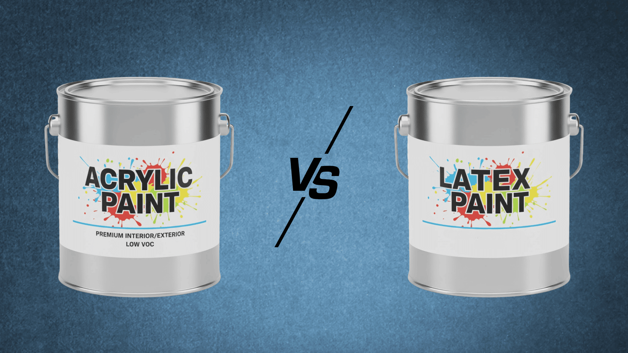
If you’ve ever found yourself stuck between acrylic vs latex paint, trust me, I’ve been there too. Both promise great results, but they’re not quite the same. Choosing the right one can make or break your project, so it helps to know what sets them apart. In this blog, I’ll walk you through everything you need to know to pick the right one for your next project. We’ll look at how each paint is made, how long it lasts, where it works best, and how much it costs. By the end, you’ll know exactly when to grab acrylic paint for toughness or latex paint for easy, budget-friendly jobs. What Is Acrylic Paint? Acrylic paint is made with acrylic resins and chemical binders, giving it superior flexibility and long-term durability. It’s known for its excellent adhesion, resistance to fading, and ability to handle temperature fluctuations. The chemical composition creates a paint film that moves with the surface underneath. This means when wood expands in summer heat or contracts in winter cold, acrylic paint moves right along with it. This flexibility prevents the cracking and peeling you might see with other paint types. Best Uses for Acrylic Paint Outdoor Projects: siding, decks, exterior trim, and fences High-traffic interiors: hallways, kitchens, garages Surfaces that expand or contract: wood, metal, and masonry Areas with direct sunlight exposure Coastal or humid climates where moisture is a concern Because acrylic paint forms a tight bond, it holds up beautifully on surfaces that face moisture or direct sunlight. The trade-off? It costs more and takes a little longer to dry, but you get long-lasting results that can save you money over time by reducing the need for frequent repaints. What Is Latex Paint? Latex paint is water-based, made with synthetic polymers that mimic natural latex (though it contains no actual rubber latex). It’s the go-to choice for homeowners because it’s budget-friendly, low-odor, and easy to clean. The water-based formula means it releases fewer harsh fumes during application and drying. This makes it safer for indoor use, especially in homes with children, pets, or people sensitive to strong odors. The paint dries as water evaporates, leaving behind a polymer film that bonds to the surface. Best Uses for Latex Paint Interior walls and ceilings DIY or beginner projects Budget-conscious renovations Bedrooms and living spaces where low odor matters Quick repainting jobs or rental property updates Latex paint dries quickly, allowing you to finish projects in a day. It’s also ideal for large indoor areas that don’t need extreme durability. The simple soap-and-water cleanup makes it perfect for quick touch-ups or small repaint jobs. If you spill some on your hands or tools, a little warm water takes care of it. Which Lasts Longer: Acrylic or Latex? When it comes to long-term performance, acrylic paint wins, hands down. Acrylic paint stretches and contracts with the surface beneath it, preventing cracking when temperatures change. That’s why it’s preferred for exteriors, wooden siding, and metal trim. It can handle expansion rates up to 400% without losing adhesion. Latex paint performs well indoors but can peel or flake when exposed to the elements. Temperature swings and moisture can accelerate the breakdown of the paint film. If you live in an area with fluctuating seasons, acrylic paint will hold up much better. Homes in regions with harsh winters and hot summers particularly benefit from acrylic’s ability to move with building materials as they expand and contract. The color retention is another factor. Acrylic paint maintains its original shade much longer, even with constant sun exposure. Latex paint can fade faster outdoors, though indoor applications typically maintain color well. Drying Time, VOCs, and Ease of Use If you’re impatient or working on a tight timeline, latex paint might be your new best friend. Feature Acrylic Paint Latex Paint Drying Speed Slower; may need 4–6 hours between coats Dries in 1–2 hours per coat VOC Levels Higher, stronger odor Lower, mild smell Cleanup Needs paint thinner Cleans with soap and water Beginner Friendly Slightly harder to handle Very easy for DIY use Application Tools Quality brushes recommended Works with standard brushes Acrylic paint offers more professional-grade performance but requires more prep and cleanup. You’ll need to plan your painting schedule around longer drying times, which can extend project timelines. However, the wait pays off with a harder, more durable finish. Latex paint is better for quick jobs, especially in homes with limited ventilation. You can often apply two coats in a single day and sleep in the room that same night without strong fumes bothering you. Cost Comparison and Maintenance Paint costs can add up, especially for big projects. Here’s what you can expect: Acrylic paint: $35–$60 per gallon Latex paint: $20–$40 per gallon While acrylic paint costs more upfront, it typically lasts longer, so you won’t have to repaint as often. A quality acrylic exterior paint job can last 10-15 years, while latex might need refreshing every 5-7 years outdoors. Latex is cheaper but might need retouching sooner, especially in high-humidity or high-traffic spaces. Factor in your labor time when calculating true costs. Repainting every few years with cheap paint can end up costing more than one application of premium acrylic. Consider coverage too. Higher-quality paints often cover better, meaning you need fewer coats and less paint overall. This can narrow the cost gap between the two options. When to Use Acrylic Paint? You should reach for acrylic paint when: Painting outdoor surfaces that face the sun, rain, or temperature changes Working on trim, wood, or metal that expands and contracts You need maximum durability and color retention Painting high-traffic interior areas (like hallways or kitchens) The surface gets regular cleaning or scrubbing You want the longest possible time between repaints Acrylic paint is also ideal for commercial projects that require long-term protection and weather resistance. Storefronts, rental properties, and office buildings benefit from the reduced maintenance schedule. When to Use Latex Paint? Choose latex paint if: You’re painting interior walls or ceilings You’re working on a DIY or first-time project You need fast drying and easy cleanup Budget is a key concern You’re painting in spaces with limited ventilation The project involves painting around kids or pets You’re doing touch-ups or small repairs It’s forgiving, fast-drying, and great for getting a professional look without heavy fumes or complicated prep. First-time painters appreciate how easily it flows and how mistakes can be quickly corrected. Can You Paint Acrylic Over Latex? Yes, with proper prep, you can paint acrylic over latex. Here’s how: Step 1: Clean the surface thoroughly to remove all dirt, grease, dust, and any loose paint using a degreasing cleaner and allow it to dry completely before moving forward. Step 2: Lightly sand the entire latex-painted surface using fine-grit sandpaper to create texture that helps the new acrylic paint grip and adhere properly to the existing coat. Step 3: Apply a high-quality primer compatible with both latex and acrylic paint bases, ensuring even coverage across the entire surface, and let it cure per the manufacturer’s instructions. Step 4: Paint with acrylic as the top coat using smooth, even strokes, applying multiple thin layers rather than one thick coat for the best finish and durability. However, don’t apply latex over acrylic, as it won’t adhere properly and could peel. The acrylic surface is too smooth and non-porous for latex to grab onto effectively. If you must use latex over acrylic, heavy sanding and a bonding primer are required. Best Paint Type by Project Project Type Recommended Paint Why Interior Walls Latex Smooth finish, easy cleanup Bathrooms / Kitchens Acrylic Handles humidity and moisture Exterior Siding Acrylic Weather and UV resistant Ceilings Latex Fast drying and affordable Furniture / Trim Acrylic More durable and chip-resistant Large DIY Projects Latex Budget-friendly and forgiving Doors and Cabinets Acrylic Withstands frequent touching Guest Rooms Latex Quick application for updates Tips for Choosing the Right Paint Choosing the right paint starts with a few smart steps to ensure lasting, flawless results. Match your paint type to the surface and environment. For humid areas like bathrooms, go with acrylic for better moisture resistance. Always check VOC levels; lower is safer for indoor air quality. Test a small section before committing to the whole wall. Use a primer that matches your paint base for best adhesion. Read the manufacturer’s instructions for temperature and humidity requirements during application. Consider the sheen level separately from paint type — both come in flat, satin, semi-gloss, and gloss finishes. Buy slightly more paint than you think you need for touch-ups later. Final Verdict At the end of the day, both acrylic and latex paint can give you great results; it just depends on what you’re working on. I personally like using acrylic paint for outdoor projects or areas that need extra durability, and latex paint for quick, easy indoor makeovers. The key is to match the paint to your surface, environment, and the amount of time you want to spend on prep and cleanup. Painting doesn’t have to be stressful. Once you know the difference, choosing the right paint becomes simple. Ready to start your next project? Grab your brushes, pick your paint, and let’s turn those walls into something amazing!

Planning to paint outdoor furniture or create art that might get wet, and wondering if your work will survive? The question “Is acrylic paint waterproof?” confuses many artists and DIY lovers who want lasting results without constant repairs. I’ve painted numerous projects over the years and learned that understanding water resistance saves time, money, and frustration. You might assume dried acrylic paint can handle any weather, but the truth is more nuanced than that. Different surfaces, sealers, and techniques dramatically change how well your paint withstands moisture and rain exposure over time. From my experience working on DIY and painted surfaces, proper sealing is what truly determines how long a project lasts. Acrylic paint is not truly waterproof but becomes water-resistant once fully dry. To make it waterproof, you need to apply a sealant like varnish, polyurethane, or resin over the painted surface. Understanding Acrylic Paint and Water Resistance Water-resistant means the paint can handle light moisture or brief water exposure. Waterproof means it completely blocks water, even during long exposure or submersion. Acrylic paint contains three main ingredients that work together to create the colors you see on surfaces. The pigment gives paint its color, while the acrylic polymer acts as a binder that holds everything together. Water helps thin the paint during application and makes it easier to spread smoothly across different surfaces, which is why understanding spray paint dry time is also important for similar projects. Understanding water-resistant versus waterproof makes a huge difference in how you protect your painted projects from moisture damage. Water-resistant means your paint can handle brief water exposure, like light rain or occasional splashes, without problems. Waterproof means water cannot penetrate the surface at all, even with prolonged exposure or complete submersion underwater. Most acrylic paint is water-resistant once dry, but not waterproof. Is Acrylic Paint Waterproof? Acrylic paint is not truly waterproof, but it becomes water-resistant once it dries completely on your surface. When acrylic paint dries, the water evaporates and leaves behind a flexible, plastic-like film that resists moisture reasonably well. The acrylic polymer molecules bond tightly during drying, forming a barrier that repels water for short periods. Your painted surface can withstand light rain, humidity, and brief splashes without the paint washing away or immediately becoming damaged. So does acrylic paint wash off? It won’t wash off with brief water contact, but prolonged water exposure or complete submersion will eventually break down the paint, causing it to soften or peel. Exposure to rain for a few minutes usually won’t harm your paint, but prolonged soaking will. How Acrylic Paint Performs on Different Surfaces? Acrylic paint behaves differently depending on the material you’re painting, with some surfaces requiring more preparation than others. Here’s how acrylic paint works on common surfaces: Surface Adhesion Level Prep Required Sealing Needed Water Resistance Recommended Sealer Wood Good Primer required Topcoat essential Poor without sealer; good with topcoat Polyurethane Fabric and Clothes Poor Fabric medium mix Heat-set required Poor; hand-wash only Fabric sealer Glass and Ceramics Very Poor Clean thoroughly Bake or seal Poor; hand-wash only Epoxy or spray seal Plastic Very Poor Sand and prime Clear spray essential Very poor without; moderate with spray Acrylic spray sealer Rocks or Stone Excellent Clean surface Outdoor varnish Good adhesion; excellent with sealer Outdoor varnish Choosing the right surface preparation and sealing method makes all the difference in your project’s durability. Always match your technique to the specific material you’re working with for the best results. How to Make Acrylic Paint Waterproof? Making acrylic paint waterproof requires applying the right sealer and following proper techniques for maximum protection. Here’s how to waterproof your acrylic paint projects step by step: Step 1: Let your paint dry and cure fully before applying any sealer, which usually takes twenty-four to seventy-two hours. Step 2: Choose the right sealer or topcoat based on your surface and if the project will be indoors or outdoors. Step 3: Apply thin, even layers using either spray or brush-on sealer, making sure to cover the entire painted surface. Step 4: Let each coat dry completely before adding another layer, following the drying time recommended on the sealer label. Step 5: Test your waterproofing by spraying water on a small area after the final coat dries to ensure proper protection. Following these steps ensures your acrylic paint stays protected from water damage for years, and also helps you understand is acrylic paint safe for skin for different use cases. Common Myths About Waterproof Acrylic Paint Many people believe acrylic paint is completely waterproof, but several common myths create confusion about its true water resistance. Here are the biggest myths about acrylic paint and the real facts you need to know: 🧱 Myth 💡 Fact Myth 1: Thicker paint automatically means better waterproofing Paint thickness helps with water resistance, but proper sealing matters more than how thick you initially apply your paint layers. Myth 2: You can skip priming if using expensive paint Even premium acrylic paint needs proper surface preparation and priming to achieve maximum adhesion and lasting water resistance. Myth 3: Indoor acrylic paint never needs sealing Indoor projects exposed to humidity or cleaning still need protective topcoats, especially in bathrooms and kitchens with moisture. Maintenance and Longevity Tips of Acrylic Paint Projects Proper maintenance keeps your waterproofed acrylic paint projects looking fresh and protected from damage for many years ahead. Here’s how to care for your painted items properly: Keep painted items indoors when possible to protect them from harsh weather, UV rays, and moisture that break down sealers. Clean gently with mild soap and a soft cloth instead of abrasive scrubbers that can scratch or damage the protective coating. Reseal outdoor items every one to two years to maintain waterproofing, as weather and sunlight gradually wear down protective topcoats. Inspect your projects regularly for chips, cracks, or peeling, then touch up and reseal damaged areas immediately before problems worsen. Following these simple maintenance habits ensures your acrylic paint projects stay beautiful and waterproof for the longest time possible. Regular care prevents costly repairs and keeps your artwork looking professional and protected from water damage throughout the years. That’s a Wrap! So, is acrylic paint waterproof? The answer is no, but you can make it water-resistant with the right sealers and techniques applied correctly. You now know which surfaces need extra preparation, how environmental factors affect durability, and when projects need resealing for protection. I hope this clears up the confusion and helps you protect your painted projects from water damage effectively and permanently. Remember that taking time to properly seal and maintain your work pays off with years of beautiful results ahead. Start by choosing quality paint, preparing surfaces correctly, and then applying appropriate sealers for your specific project needs today. Share your waterproofing tips or questions in the comments below! Frequently Asked Questions Is acrylic paint waterproof when dry? No, acrylic paint is not waterproof. It becomes water-resistant once dry but still needs a sealer for full waterproof protection. How do you waterproof acrylic paint? You can waterproof acrylic paint by applying a clear sealer like varnish, polyurethane, or resin after the paint fully cures. Is acrylic paint waterproof on wood? Acrylic paint is not waterproof on wood unless sealed. Without a topcoat, moisture can damage both the paint and the surface. Is acrylic paint waterproof on fabric? No, acrylic paint is not waterproof on fabric. It may resist light moisture, but will wash out without proper sealing and care. What sealer makes acrylic paint waterproof? Polyurethane, acrylic varnish, epoxy resin, and spray sealers are the most effective options for waterproofing acrylic paint.
If you’ve ever painted a wall or piece of furniture, you’ve probably asked yourself how long to wait between coats of paint. I know the feeling, you just want to finish and see the final result. But timing really matters. Painting too soon can cause peeling or uneven color, while waiting too long can make it harder for new paint to stick. In this guide, I’ll walk you through everything you need to know about drying times, recoating, and what affects them, including how different paints, like latex paint, behave during drying. You’ll learn how to plan your painting schedule, test if the surface is ready, and fix timing mistakes before they turn into problems. How Long to Wait Between Coats of Paint? Wondering how long between coats of paint? Each paint type has its own drying speed. Knowing these differences helps you plan your project with better results. Latex or acrylic (water-based): Wait 2–4 hours between coats. Oil-based paint: Wait about 24 hours before recoating. Primers: Most dry fast and can be recoated after 1 hour. Always check your paint can label for the most accurate directions. Some modern paints are designed to dry faster or slower, depending on the finish quality. The Difference Between Dry, Cure, & Recoat Times Dry time and cure time may sound similar, but they describe different stages of paint drying. Term What It Means Typical Time Frame Notes Dry Time The paint feels dry to the touch but isn’t ready for another coat. 30 minutes to 1 hour for latex; 6–8 hours for oil-based. The surface may still be soft underneath. Recoat Time The paint is dry enough for another layer. 2–4 hours for latex; about 24 hours for oil-based. Wait longer in cool or humid conditions. Cure Time The paint has fully hardened and reached maximum durability. 2–3 weeks for latex; 5–7 days for oil-based. Avoid washing or heavy contact until fully cured. Even if the paint feels dry, it may not be cured. Give it time to harden fully before cleaning or scrubbing. Factors That Affect How Long Paint Takes to Dry Several factors determine how quickly paint dries, and understanding them helps you plan each coat more effectively. From room temperature to paint thickness, these details affect how your finish looks and how well it holds up over time. 1. Temperature and Humidity Paint dries best between 65°F and 80°F with low humidity. Cool or damp air slows evaporation, while warm, dry air speeds it up. Keep windows open or use a fan to move air across the surface. Tip: Always check weather conditions before starting so you can plan your painting hours for faster drying. 2. Paint Formula and Finish Type Water-based paints dry quickly than oil-based options, making them better for fast weekend projects. Gloss and semi-gloss finishes seal faster, so they need more drying time between coats. Tip: If you’re short on time, choose a matte or eggshell finish; they dry faster and are easier to recoat without streaks. 3. How Thickly You Apply the Paint Thick coats trap moisture underneath and take much longer to dry, sometimes leading to uneven sheen or peeling. Thin, even layers dry more smoothly and look cleaner. Tip: Two thin coats are always better than one thick coat; you’ll get stronger coverage and fewer issues with bubbles or drips. 4. The Type of Surface You’re Painting Porous materials like bare drywall or raw wood soak up paint and dry faster. Nonporous surfaces, such as metal or laminate, slow drying because paint sits on top rather than being absorbed. Tip: For slick surfaces, lightly sand or use a bonding primer first; this helps paint grip better and dry more evenly. Recommended Recoat Times for Common Painting Projects Every surface and paint type has its own drying pace. Knowing how long to wait between coats helps prevent streaks, smudges, and uneven color. 1. Walls and Ceilings (Latex Paint) Wait about 4 hours between coats when using latex paint. In humid or cool spaces, extend that time to around 6 hours to let the first coat dry evenly. Painting too soon can lead to uneven color and visible roller marks. A longer wait helps the next coat bond better and look smoother. 2. Trim, Doors, and Cabinets (Oil or Enamel Paint) Oil-based paint needs about 24 hours before you add another coat. The slower drying time allows the surface to level out, reducing brush marks and giving a cleaner, glossier finish. Avoid painting too soon; if the first coat is still soft, it can pull or wrinkle under the next layer. 3. Primers and Undercoats Most latex primers are ready for a second coat after about 1 hour, but bonding or stain-blocking primers take longer, around 2 to 4 hours. Letting primer dry properly gives the paint something solid to grip, improving coverage and durability. Always touch-test before painting to make sure the surface feels dry. 4. Product and Brand Differences Each brand has its own formula, which affects drying and recoat time. For example, Benjamin Moore paints can often be recoated in about an hour, while Behr enamel paints may need 2 hours or more. Quick Overview: Paint Drying and Recoat Time Chart Here’s a quick reference chart to help you compare drying, recoat, and curing times for different types of paint. Use it as a general guide when planning your project Paint Type Touch Dry Recoat Time Full Cure Best Use Latex / Acrylic 1 hour 2–4 hours 2–3 weeks Walls, ceilings Oil / Alkyd 6–8 hours 24 hours 5–7 days Trim, doors Primer (Water-Based) 30–60 min 1 hour 1–2 days Base coat Spray Paint 10–30 min 1 week Small projects Chalk Paint 30–60 min 1–2 hours 2–3 weeks Furniture Always read your can label; manufacturer directions are tested for real results and prevent common issues like tackiness or peeling. Simple Ways to Check If Paint Is Ready for Another Coat You don’t need special tools to know if your paint is ready; just rely on simple checks. Touch test: Lightly press the surface. It should feel dry and firm, not sticky or soft. Glide test: Run your fingers gently across. If they move smoothly without drag, it’s ready. Look test: The surface should appear even with no shiny or darker spots. If the paint still feels cool, tacky, or has a strong odor, wait longer before applying the next coat. How to Help Paint Dry Faster Without Damaging the Finish You can speed up paint drying without ruining the finish by keeping your workspace balanced and your application light. Step 1: Control air and temperature. Keep air moving with a fan or open window. Avoid direct heat; it can cause cracks or uneven drying. Step 2: Apply thin, even coats. Thin layers dry faster and more evenly. Don’t overload your brush or roller. Step 3: Keep conditions steady. Maintain a room temperature of around 65°F–80°F with low humidity for the best drying results. Consistent airflow, thin coats, and mild temperatures help paint dry faster while keeping the surface smooth and durable. How Long to Wait Between Spray Paint and Chalk Paint Coats Spray and chalk paints have very different drying habits, so timing matters. Use the chart below to avoid peeling, cracking, or uneven results. Paint Type Recoat Time What to Avoid Best Practice Spray Paint 10–30 minutes or after 24 hours Never recoat in the middle of that window; it can cause wrinkles or lifting. Apply several thin coats close together or wait a full day before the next one, following proper spray paint drying time guidelines. Chalk Paint 1–2 hours Don’t handle or move the item right after painting; it’s still soft. Allow several days for the paint to harden before sealing or heavy use. This comparison makes it clear how timing affects results for both paint types, helping you finish projects faster without ruining the surface. Checklist Before You Start the Next Coat Before applying another coat of paint, take a moment to check these basics. Making sure everything is ready will help you avoid peeling, bubbling, or uneven coverage. The room temperature is between 65°F and 80°F with low humidity. The paint feels dry and smooth when you touch it. The recommended recoat time has fully passed. There are no shiny, sticky, or wet areas left on the surface. If all these points look good, your surface is ready for the next coat. Wrap Up Knowing how long to wait between coats of paint makes every project smoother and less stressful. Once you understand how temperature, humidity, and paint type affect drying, you can plan your work with more confidence. I’ve found that taking your time pays off; you get cleaner lines, stronger color, and a finish that lasts. If you’re working on walls, trim, or furniture, use what you’ve learned here to paint with fewer mistakes and better results. And if you’d like more practical tips for home projects, check out my other posts for ideas that make painting easier from start to finish. Frequently Asked Questions What Happens if You Wait Too Long Between Coats of Paint? If more than 48 hours pass, lightly sand the surface before painting again. This helps the new coat stick and prevents peeling. How Many Coats of Paint Do I Need? Most walls and ceilings need two coats. Darker colors may need one more coat for full coverage and an even finish. What Happens if You Paint Another Coat Too Soon? Recoating too early can trap moisture, causing bubbles or peeling. Wait until the first coat feels dry and smooth before repainting. Can I Use a Hair Dryer or Heater to Speed Up Drying? Avoid direct heat; it can cause cracking or uneven drying. Use a fan or open a window for better airflow instead.
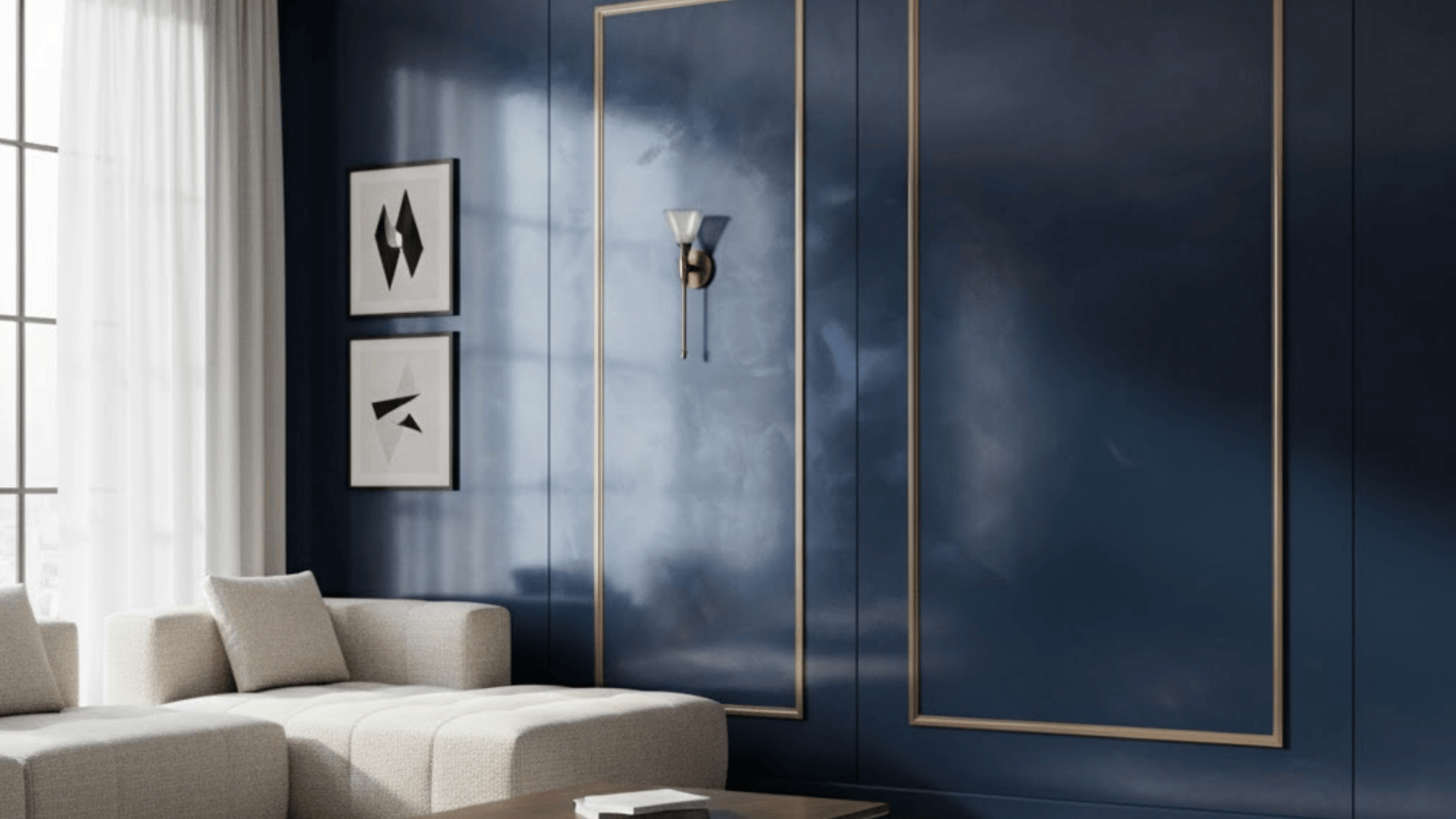
Choosing paint colors is the fun part, but picking the right finish is where things actually get tricky. I’ve learned that paint finish changes how your walls look, how much light they reflect, and even how easy they are to clean. Some finishes hide bumps and cracks. Others make walls shine like glass. In this blog, I’ll walk you through the different types of paint finishes, from flat to high-gloss, and explain what makes each one unique. You’ll also find tips on which finishes work best in each room of your home, plus a few tricks to help you achieve the perfect look and feel for your space. Why Paint Finish Matters? Most people focus on color, but paint finish can make or break a room’s look. The finish controls light reflection, texture, and overall feel; two walls painted the same color can look completely different just because of sheen. A higher sheen (like satin or gloss) makes a space feel brighter and more polished, while a lower sheen (like matte or eggshell) creates a softer, cozier vibe. Finish also affects durability and cleaning; glossier paints resist stains and moisture better, while flatter finishes hide imperfections. In short: Flat hides flaws, but is harder to clean. Glossy, easy to clean, but it shows every flaw. Mid-range finishes (eggshell, satin) offer the best balance of looks and performance for most rooms. So before you pick your favorite color, think about how shiny or soft you want your walls to look, and how much cleaning you’re willing to do. Explained: Paint Sheen Levels Paint sheen works on a scale. Think of it like a sliding bar from no shine at all to a mirror-like reflection. The more sheen a paint has, the shinier it looks and the tougher it usually is. Here’s how the levels break down: Finish Type Gloss Level Description Flat / Matte 0–10% gloss No shine; absorbs light and hides wall flaws. Least durable and hardest to clean. Eggshell 10–25% gloss Soft, warm sheen with slight depth. More durable than flat and easy to wipe. Satin 25–40% gloss Smooth, subtle glow. Moisture-resistant and ideal for high-traffic areas. Semi-Gloss 40–70% gloss Shiny, durable, and washable. Highlights imperfections if not applied well. High-Gloss 70–90% gloss Very reflective and dramatic. Tough, easy to clean, but shows all flaws. Types of Paint Finishes 1. Flat or Matte Finish Flat paint creates a smooth, non-reflective surface. It soaks up light instead of bouncing it around the room. This quality makes it perfect for hiding wall problems. Got some dings from moving furniture? Texture from old repairs? Flat paint covers them up better than any other finish. The downside is durability. Flat paint marks easily and doesn’t handle scrubbing well. Try to wash a scuff mark off, and you might end up with a shiny spot or with some paint removed. Touch-ups are simple, though. Just brush on a bit more paint, and it blends right in. Where It Works: Bedroom ceilings and walls Formal dining rooms Home offices with low activity Any ceiling in the house Quick Tip: Keep flat paint away from bathrooms, kitchens, and other areas where moisture tends to accumulate. It doesn’t resist water well and can develop mildew. 2. Eggshell Finish Eggshell sits right in the middle, more durable than flat but not as shiny as satin. The finish has just enough reflection to add character to walls without making them look glossy. Many people find it the most natural-looking option for main living spaces. This finish cleans more easily than flat paint. You can gently wipe down marks without damaging the surface. It works well in spaces where people spend time but aren’t constantly bumping into walls or leaving handprints. Where It Works: Family rooms and living areas Adult bedrooms Hallways with moderate foot traffic Dining rooms Quick Tip: Eggshell works great in rooms with lots of natural light. The subtle sheen adds warmth without creating glare. 3. Satin Finish Satin paint gives walls a soft, pearl-like appearance. The finish reflects enough light to add dimension and make colors look richer. Rooms painted with satin feel a bit more polished than those with eggshell. Cleaning is straightforward with satin. Most marks wipe off with a damp sponge. The finish resists moisture well, making it suitable for humid areas. Many people choose satin for trim and doors because it holds up to regular use. Where It Works: Kitchen walls Bathrooms (walls, not ceilings) Playrooms and kids’ bedrooms Laundry rooms Trim and baseboards Quick Tip: Use good-quality brushes when applying satin paint. Cheap brushes can leave streaks that show up in the sheen. 4. Semi-Gloss Finish Semi-gloss paint is shiny and reflective. Light bounces off these surfaces clearly, making colors look bright and vivid. The high shine means water and grease slide right off, which is why this finish dominates kitchens and bathrooms. This finish is tough. It stands up to repeated cleaning, humidity, and daily wear. Doors painted with semi-gloss can withstand years of opening and closing, and the occasional bump, without showing damage. The main challenge with semi-gloss is that it highlights imperfections. Any bumps, dents, or uneven areas are clearly visible in the reflection. Wall prep matters a lot with this finish. Where It Works: Bathroom walls and ceilings Kitchen cabinets Interior doors Window trim and sills Banisters and railings Quick Tip: Sand and prime surfaces well before applying semi-gloss. The extra prep time pays off with a smoother final look. 5. High-Gloss Finish High-gloss paint creates an almost mirror-like surface. The shine is dramatic and eye-catching. This finish makes colors look incredibly rich and deep. It’s also the most durable paint you can buy; scratches and stains wipe away easily. Most people use high-gloss sparingly. A little goes a long way. Too much shine can make a room feel cold or overwhelming. But used on the right surfaces, it creates beautiful contrast and visual interest. Because high-gloss shows every flaw, surface preparation is critical. Any dent, scratch, or uneven patch will stand out. Some professionals even skim-coat walls before applying high-gloss to ensure perfect smoothness. Where It Works: Furniture pieces (dressers, side tables) Kitchen and bathroom cabinets Crown molding and decorative trim Front doors (exterior and interior) Statement accent pieces Quick Tip: High-gloss works best on surfaces that are already smooth. Use it to make beautiful things shine, not to cover up problems. 6. Pearl or Silk Finish Pearl finish sits between satin and semi-gloss on the sheen scale. It has a refined, elegant look with a soft luminous quality that catches light beautifully. The sheen is noticeable but not overwhelming, giving walls a subtle glow rather than an obvious shine. Pearl finish adds sophistication to spaces without the high shine of semi-gloss. Many designers choose this finish for rooms where they want something special but not too bold. The smooth surface cleans well and holds up to regular use. Where It Works: Formal living rooms Dining rooms Master bedroom accent walls Entryways Quick Tip: Pearl finish looks especially good with deeper, richer colors. The sheen brings out their depth. 7. Low-Lustre or Velvet Finish The velvet finish has a gentle, smooth appearance with minimal glare. The look is softer than satin but more substantial than eggshell, creating a comfortable middle ground. This finish does a good job covering minor wall imperfections while still being cleanable enough for everyday living. The name comes from the surface’s soft, velvet-like texture—smooth to the eye but not shiny. The velvet finish provides just enough durability to withstand daily wear and tear without the reflective quality that can make walls look busy. The matte-like quality reduces eye strain from light bouncing off walls, making rooms feel calmer and more comfortable for extended periods. Where It Works: Home offices Hallways with warm lighting Bedrooms where you want more durability than a flat Dens and studies Quick Tip: Velvet finish works well in rooms with lots of artificial lighting because it doesn’t create harsh reflections. 8. Textured Finish Textured finishes focus on adding depth and pattern rather than shine. These paints create three-dimensional effects on walls that you can see and often feel. Some contain sand or other materials, while others form raised patterns as they dry. The sheen level varies depending on the specific product you choose. Textured paints serve both decorative and practical purposes. They can hide serious wall damage, such as cracks or uneven surfaces, that would show through regular paint. Some people use them to add character to plain walls or create focal points in a room. Where It Works: Accent walls Spaces with architectural interest Rooms with wall damage that’s hard to repair Creative or artistic interiors Quick Tip: Test textured paints on poster board first. The pattern is permanent once it dries on your wall. Choosing the Right Paint Finish for Each Room Different rooms need different finishes based on how you use the space. Here’s a simple guide: Room / Area Recommended Finish Why It Works Bedrooms Flat or Eggshell Low-traffic, low-moisture areas need softer finishes for a calm atmosphere and to hide minor wall imperfections. Living Rooms & Family Rooms Eggshell or Satin These spaces see moderate use. The slight sheen adds warmth and wipes clean easily. Satin is best if kids or pets are around. Kitchens Satin (walls), Semi-Gloss (cabinets) Handles grease, moisture, and splatters well. Satin cleans easily, while semi-gloss provides extra protection near sinks and stoves. Bathrooms Semi-Gloss Highly moisture-resistant, prevents mildew, and wipes clean after splashes or messes. Ideal for humid spaces. Hallways & Stairs Satin or Eggshell Durable enough for frequent contact and scuffs. Slight sheen helps surfaces resist marks from movement or furniture. Trim, Doors & Baseboards Semi-Gloss or High-Gloss Easy to clean and wear-resistant. The shine contrasts nicely with matte walls and keeps the trim looking crisp. Ceilings Flat Hides imperfections, prevents glare, and provides a smooth, soft finish for low-contact areas. Tips for Getting the Right Paint Finish Painters have learned tricks over the years of working with different finishes. Here are some of the top recommendations: Mix Finishes for Contrast: Matte walls with glossy trim create visual interest. The difference in sheen makes architectural details stand out. This combo is common in older homes with lots of molding and woodwork. Test Before Committing: Buy sample pots and paint large swatches on your walls. Look at them in morning light, afternoon light, and with your lamps on at night. Sheen looks different depending on the light source. Remember the Cleaning Trade-off: Higher sheen means easier cleaning but more visible flaws. Lower sheen hides problems but marks easily. Choose based on your priorities for each room. Prep Matters More with Shinier Paints: Flat paint forgives rough prep work. Gloss paint does not. Sand, fill holes, and prime properly when using satin or higher finishes. Consider Your Lighting: Rooms with lots of windows can handle flatter finishes. Dark rooms benefit from satin or semi-gloss to reflect available light and brighten the space. Conclusion After painting a few rooms myself, I realized how much the finish can change everything. A flat finish gives a soft, calm look, while a glossy one makes the space bright and easy to clean. Most of my rooms now have eggshell or satin; they strike the right balance between beauty and durability. The key is to think about how you use each room before choosing the finish. A little planning can make your walls look great for years. If you’re getting ready to paint, take a minute to test a few finishes first; you’ll thank yourself later! Ready to start your project? Grab some paint samples and see which finish feels right for your home.
If you’ve ever spray-painted something, you know the waiting game can be the hardest part. You spray a perfect coat, step back to admire it, and then, oops, you touch it too soon and leave a fingerprint. I’ve been there too! In this blog, I’ll walk you through how long spray paint takes to dry, why drying and curing times matter, and what factors affect them, such as temperature, humidity, and surface type. You’ll also learn about the different drying stages, how each paint type behaves, and the best tricks to make paint dry faster. By the end, you’ll know exactly when it’s safe to recoat, handle, or use your freshly painted project without any smudges or sticky surprises. How Long Does Spray Paint Take to Dry? Spray paint usually takes 15–30 minutes to dry to the touch and 24–48 hours to fully cure, depending on temperature, humidity, and the type of paint you’re using. Understanding drying time matters because touching wet paint can ruin your project with smudges and fingerprints. Plus, knowing when your paint is truly ready helps you get that smooth, professional finish you’re after. As someone who has worked on multiple DIY and home painting projects, I’ve seen how drying time can make or break the final finish. Understanding the Different Drying Stages Spray paint dries in stages, and each stage tells you when it’s safe to touch, handle, or use your project. Stage What It Means Time Dry to touch Surface feels dry but still soft underneath 15–60 minutes Hard Dry Can handle lightly without leaving marks ~24 hours Fully Cured Fully hardened and durable for regular use 24–72 hours Keep in mind that these times can vary depending on the type of paint, the surface, and environmental conditions like temperature and humidity. Dry Time vs. Cure Time: What’s the Difference? People often confuse these two terms, but they mean different things. Term What It Means How Long Does It Take Dry Time When the paint feels dry to your touch, or you can handle the object without leaving fingerprints Happens relatively quickly (15–60 minutes) Cure Time When the paint reaches full hardness, and the chemical bonds are completely formed Takes much longer (24–72 hours) Why does cure time matter? A fully cured surface is more durable, scratch-resistant, and color-stable. If you use an item before it’s cured, you risk denting the paint or causing it to peel. For items that will see heavy use, like outdoor furniture, kitchen cabinets, or toys, wait for the full cure time before putting them to work. Type of Paint Affecting Drying Times Different spray paints have different formulas, which means they dry at different speeds. Paint Type Dry to Touch Full Dry/Cure Best Used For Acrylic Spray Paint 15–30 minutes 1–2 hours Crafts, home decor, and indoor projects Oil-Based Spray Paint 2–6 hours 24+ hours Outdoor furniture and metal surfaces (offer great durability) Fast-Drying Spray Paint 5–10 minutes Varies by brand Quick projects where speed matters Epoxy and Enamel Spray Paint 30 minutes–2 hours 24+ hours Surfaces that get a lot of use (create a harder, more durable finish that resists scratches and weather) Latex Spray Paint Up to 8 hours 8+ hours Many surfaces (flexible finish) Quick Tip: Quick Tip: Always check your spray paint can for the recoat window and follow the recommended wait time between paint coats. This tells you how long to wait between coats. Applying another layer too soon can cause the paint to wrinkle or peel. How Your Surface Affects Drying Time? The material you’re painting affects how quickly the paint dries. Metal Surfaces: Metal is smooth and non-porous, so paint dries relatively quickly. You can usually touch it after 10–20 minutes, and it fully cures in about 24 hours. This makes metal one of the easiest surfaces to work with. Wood Surfaces: Wood takes longer to dry because it absorbs paint, reaching touch dry in about 1 hour and curing in 24 hours. Soft or unsealed wood requires extra drying time as paint absorbs deeper. Plastic Surfaces: Plastic poses challenges because paint doesn’t bond well. It takes about 30 minutes to dry and 24 hours to cure. Using a plastic primer improves adhesion and drying. Rough or Porous Surfaces: Materials such as concrete, brick, or unfinished wood have tiny holes that absorb paint, slowing drying and possibly requiring multiple coats. Allow longer drying times between coats. Environmental Factors That Affect Drying Time Even with the right paint and surface, the environment around your project makes a big difference. 1. Temperature The ideal range for spray painting is 65°F-80°F (18°C–27°C). Too hot: Paint can dry unevenly, crack, or bubble. Too cold: Paint may stay sticky or take days to fully dry. If it’s chilly outside, warm up the room before painting or use a space heater nearby, but never too close to the paint. 2. Humidity Humidity is the biggest factor that affects drying speed. The ideal humidity level is around 40–50%. When the air is too humid, moisture slows evaporation, and paint can feel tacky or sticky for hours. On the other hand, air that’s too dry may cause the paint to dry too quickly, leading to cracks. A dehumidifier or air conditioner can help create a balanced environment for even drying. 3. Air Circulation Good air movement helps spray paint dry faster by carrying away the evaporating solvents. Open windows or doors to let fresh air flow, or use a fan to gently circulate air. However, avoid pointing the fan directly at the painted surface, as it can blow dust or debris onto the finish. Steady airflow also keeps fumes from building up, making the space safer and more comfortable. 4. Sunlight and Wind A little sunshine can warm up the surface and speed drying, but too much direct sunlight may cause bubbles, cracks, or discoloration. Wind also helps remove moisture from the paint, reducing drying time outdoors. However, strong gusts can carry dirt and pollen, ruining the smooth finish. Choose a shaded, breezy spot or paint in mild weather for best results. How to Make Spray Paint Dry Faster? Sometimes you need your project done quickly, especially if mistakes mean removing spray paint from concrete later. Here are proven ways to speed things up without ruining your finish. Apply Thin, Even Coats: Hold the can 6–8 inches away and spray with steady, sweeping motions. Multiple thin coats dry faster and look better than one thick coat. Choose Fast-Drying Formulas: If time matters, buy spray paint labeled as “fast-drying” or “quick-dry.” These products contain ingredients that evaporate more quickly than those in standard paints. Increase Air Circulation: Set up a fan in the room or open windows to create a cross-breeze. Better airflow means faster evaporation. Just keep the area clean so you don’t blow debris onto your wet paint. Use a Dehumidifier: Especially helpful on damp days, a dehumidifier removes moisture from the air, helping paint dry at the speed the manufacturer intended. Paint in Warm, Dry Conditions: When possible, choose a day that’s warm but not hot, with low humidity. Morning or late afternoon often provides the best conditions. Use Heat Carefully: For small objects, use a hairdryer on a low, cool setting about 12 inches away. Never use high heat to avoid bubbling. Some also place painted items in a warm (not hot) oven to cure faster, but only if they’re heat-safe. Always work in a well-ventilated area when spray painting. The fumes can be harmful, and good airflow protects your health while helping paint dry faster. Popular Paint Brands and Their Drying Times Different spray paint brands use unique formulas, so drying times vary slightly. Each manufacturer tests their products under specific conditions, which is why you’ll see different times listed on different cans. Knowing what to expect from major brands helps you choose the right paint for your timeline and project needs. 1. Rust-Oleum Rust-Oleum is one of the most trusted names in spray paint, known for reliable coverage and durability. Their standard formulas work well for both indoor and outdoor projects. The brand offers a range of product lines, including specialty paints for metal, plastic, and wood. Their 2X Ultra Cover line dries even faster than their standard formula. Rust-Oleum paints provide excellent protection against rust and weather, making them a go-to choice for outdoor furniture and metal surfaces. Dry to the touch: 20 minutes Handle in: 1 hour Fully dry: 24 hours Pro Tip: Apply a second coat within 1 hour or after 48 hours for best results. 2. Krylon Krylon has built its reputation on speed and quality, making it perfect when you need results quickly. The brand offers a wide range of colors and finishes, from matte to glossy. Their ColorMaster line provides exceptional coverage with minimal overspray. Krylon products bond well to many surfaces without requiring a separate primer in most cases. The quick-dry formula means you can complete multi-coat projects in a single afternoon, saving time without sacrificing quality. Dry to the touch: 10 minutes Recoat anytime: After 10 minutes Krylon is a favorite for craft and DIY projects due to its fast drying and smooth coverage. 3. Montana Montana Gold spray paints are premium products favored by professional artists and muralists worldwide. These paints deliver high-pigment color with low pressure, allowing for detailed work and precise control. The formula contains no lead or heavy metals, making it safer for indoor use. Montana Gold offers over 200 colors with excellent lightfastness, meaning your colors won’t fade quickly. The quick-drying nature, combined with superior coverage, makes these paints worth the higher price point. Touch dry: 5–10 minutes Fully cured: 24–48 hours These paints are popular with artists for their precision and quick drying. Always check the product label for specific recoat windows; that’s the safest way to avoid stickiness or peeling. Brand Dry to the touch Handle Time Full Cure Rust-Oleum 20 minutes 1 hour 24 hours Krylon 10 minutes 1 hour 24 hours Montana 5–10 minutes 1–2 hours 24–48 hours Wrapping It Up And that’s everything you need to know about spray paint drying time. I’ve learned that the secret to a smooth, long-lasting finish isn’t just in how you spray, it’s in how patiently you let it dry. Rushing the process can lead to smudges, bubbles, or peeling, but giving it the right time and conditions makes all the difference. Always check your paint label, apply thin coats, and let the surface fully cure before using it. If you’re painting furniture, metal parts, or a DIY craft, a little patience goes a long way. I’d love to hear how your next spray-paint project turns out, share your results or best drying tips in the comments below! Frequently Asked Questions How long before spray paint is dry to the touch? Spray paint is usually dry to the touch within 15 to 30 minutes. However, it is still soft underneath, so avoid pressure or handling. How long to wait between spray paint coats? Most spray paints allow recoating within 10 minutes to 1 hour. Always check the label for the exact recoat window. Does cold weather affect spray paint drying? Yes, cold temperatures slow down drying and can leave paint sticky for hours or even days. Always paint in recommended temperature ranges. How do you make spray paint dry faster? Use thin coats, increase airflow, reduce humidity, and paint in warm conditions. Fast-drying formulas also help speed up the process. How long does spray paint take to fully cure? Spray paint typically takes 24 to 48 hours to fully cure, but some paints may take up to 72 hours depending on conditions.
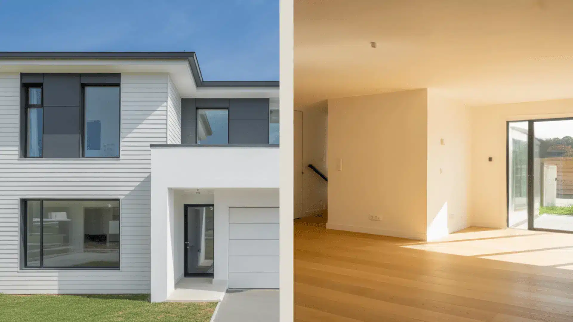
If you’re planning to paint your home, you’re probably thinking about how much it’ll cost. The truth is, there isn’t a single price that fits every house. Costs can change based on your home’s size, the type of paint you choose, how much prep work is needed, and local labor rates. In this guide, you’ll learn how much it costs to paint a house, both inside and out, plus what affects pricing and how to estimate your total before hiring a painter. It’s a simple way to plan your budget with confidence and make sure you get the best results for your money. How Much Does It Cost to Paint a House? When you combine all factors: size, prep, paint quality, and labor, the total cost to paint a home can range from $2,000 to $15,000 or more. Interior jobs usually fall between $2–$6 per square foot, while exteriors average $1.50–$5.00 per square foot. Getting a few local quotes, checking what’s included, and planning ahead will help you stay within budget and get long-lasting results. Painting a house isn’t a one-price-fits-all project. The cost depends on several things: your home’s size, wall or siding condition, paint quality, and local labor rates. On average, interior painting costs $2–$6 per square foot, while exterior painting costs $1.50–$5 per square foot. Let’s try to breakdown this cost! Costs of Painting the Interior If you’re planning to refresh your home’s interior, understanding how prices are calculated helps you budget wisely before hiring a painter. 1. Cost per Square Foot Interior painting costs usually include paint, prep, and labor. Most homeowners spend around $2–$6 per square foot for walls and ceilings. The price depends on surface condition, the number of coats, and ceiling height. Homes needing repairs, detailed finishes, or color changes often fall on the higher end of this range. 2. Interior Cost by Home Size The total cost depends largely on your home’s size. Smaller homes typically cost less overall but more per square foot. Home Size Estimated Cost Range 1,000 sq. ft. $2,000–$6,000 1,500 sq. ft. $3,000–$9,000 2,000 sq. ft. $4,000–$12,000 2,500 sq. ft. $5,000–$15,000 For example, painting a 1,000 sq. ft. home may cost $2,000–$6,000, while a 2,500 sq. ft. home can reach $15,000 depending on prep work, trim, and paint quality used throughout. 3. Room-by-Room Cost Estimates If you’re only painting certain rooms, costs vary by size and complexity. Bedrooms may run $300–$800, while larger spaces like living rooms range from $600–$1,500. Room Type Average Cost Range Bedroom $300–$800 Living Room $600–$1,500 Kitchen $400–$1,000 Bathroom $150–$400 Ceiling or Trim (separate) $200–$600 Kitchens and bathrooms usually cost less but may need moisture-resistant paint. Ceilings and trim are often priced separately depending on height and detail. 4. Labor and Material Breakdown Labor is the biggest part of any painting job, often 70–85% of the total cost. Paint quality also matters; premium paints offer better coverage and last longer. Prep work, such as sanding, taping, or patching, can raise the price slightly but ensures a smoother, longer-lasting finish that looks professional. Costs of Painting the Exterior If you’re updating your home’s exterior, the cost can vary based on siding material, home size, and prep work. Understanding these details helps you plan a realistic budget before hiring a painter. 1. Cost per Square Foot Exterior painting typically ranges from $1.50–$5.00 per square foot. Single-story homes usually cost less because painters can reach most areas easily. Two-story homes need extra prep, ladders, and safety equipment, which raises labor costs and extends project time. 2. Cost by Home Size Here’s an overview of what you might spend depending on the home’s total square footage: Home Size Estimated Cost Range 1,500 sq. ft. $2,500–$7,500 2,000 sq. ft. $3,000–$10,000 2,500 sq. ft. $4,000–$12,500 3,000 sq. ft. $5,000–$15,000 Larger homes often need more prep and paint, especially if there’s peeling or exposed wood. Multi-story homes also take longer due to setup time. 3. Cost by Siding Material Different siding materials require specific prep methods and paints. Here’s how costs compare across common types: Siding Material Average Cost Range (per sq. ft.) Wood $1.50–$4.00 Vinyl $1.50–$3.50 Stucco $2.00–$5.00 Brick $2.50–$5.00 Aluminum $1.75–$4.00 Wood and stucco usually cost more because they absorb more paint and need extra prep before coating. 4. Prep and Add-On Work Before painting begins, prep work helps create a smooth, durable finish and adds to the total cost. Here’s what those extra tasks might include: Pressure washing: $200–$450 Scraping and sanding: $0.50–$1.00 per sq. ft. Caulking: $200–$500 Priming: $20–$50 per gallon Trim, doors, and shutters: $200–$1,000 Proper prep makes paint last longer and protects the home from weather damage. Factors That Affect Painting Costs of a House Before you plan your budget, it helps to understand what actually drives painting prices up or down. Knowing these details can save you from surprises when comparing quotes or estimating materials. Home Size and Layout: Larger spaces mean more paint, more time, and higher overall cost. Surface Condition: Cracks, stains, or rough walls require extra prep before painting. Paint Quality: High-end paints cost more but can reduce the need for multiple coats. Number of Coats: Lightening a dark color often needs primer and an extra coat. Access and Height: Tall walls and steep exteriors take longer and need special equipment. Location and Season: Rates rise during busy months or in areas with higher labor costs. Each of these factors adds up in different ways, so it’s important to evaluate them early. A quick walkthrough with a painter can help you identify which ones will matter most for your home. Painting a House: DIY vs. Hiring a Professional Deciding between doing it yourself and hiring a pro depends on your time, skill, and budget. Painting a room yourself can cost around $150–$300 in supplies, but it takes effort and patience. Hiring professionals for a 1,500 sq. ft. interior may run $3,000–$9,000, yet you’ll save time and get high-quality results with prep and cleanup handled for you. How to Estimate Your Own Paint Job? Estimating your paint job ahead of time helps you plan costs and stay on budget. Use these steps as a simple guide: Step 1:Measure the total wall or siding area you plan to paint. Step 2:Subtract doors and windows from that total to get accurate coverage. Step 3: Decide how many coats you’ll need based on color and surface condition. Step 4: Estimate paint quantity, about 350–400 sq. ft. per gallon is typical. Step 5: Multiply gallons needed by paint price and add local labor rates. Step 6: Include costs for prep, primer, and trim work if they apply. Step 7: Add 10–15% extra for touch-ups or any hidden repairs. Following these steps keeps your estimate realistic and helps you compare quotes with confidence. Ways to Save Money on Painting the House Even with careful planning, painting can get expensive. The good news is that there are simple ways to cut costs without lowering quality or skipping important steps. Get at least three quotes: Make sure each painter bids on the same job scope for fair comparison. Buy paint during sales: Ask about bulk discounts or store promotions to reduce material costs. Handle small prep work: Move furniture, remove outlet covers, or tape edges yourself. Paint in the off-season: Labor rates are often lower during slower months. Choose mid-range paints: They cover well, need fewer coats, and balance quality with affordability. Saving money doesn’t mean cutting corners. By planning ahead and handling small tasks yourself, you can stay on budget while still getting a clean, professional finish. How Often Should You Repaint the House? Repainting frequency depends on how much wear and weather your home faces. Interior walls usually need a new coat every 5–7 years, especially in high-traffic or humid areas like kitchens and bathrooms. Exterior siding often lasts 5–10 years, depending on material, sunlight, and climate. Routine care, like washing walls, cleaning trim, and sealing cracks, helps extend your paint’s lifespan and keeps surfaces looking fresh. Wrap Up Now that you understand how much it costs to paint a house, you’re better prepared to plan your next project. I wanted to make this guide clear and practical, so you know what really affects the price, from your home’s size and paint type to labor and prep work. If you’re getting ready to hire a painter, take time to compare local quotes and see what fits your budget. A little planning now can save you money later and help your home look its best. If you liked this post, I hope you’ll check out more of my blogs for simple, real advice on home projects that make your space feel like yours.
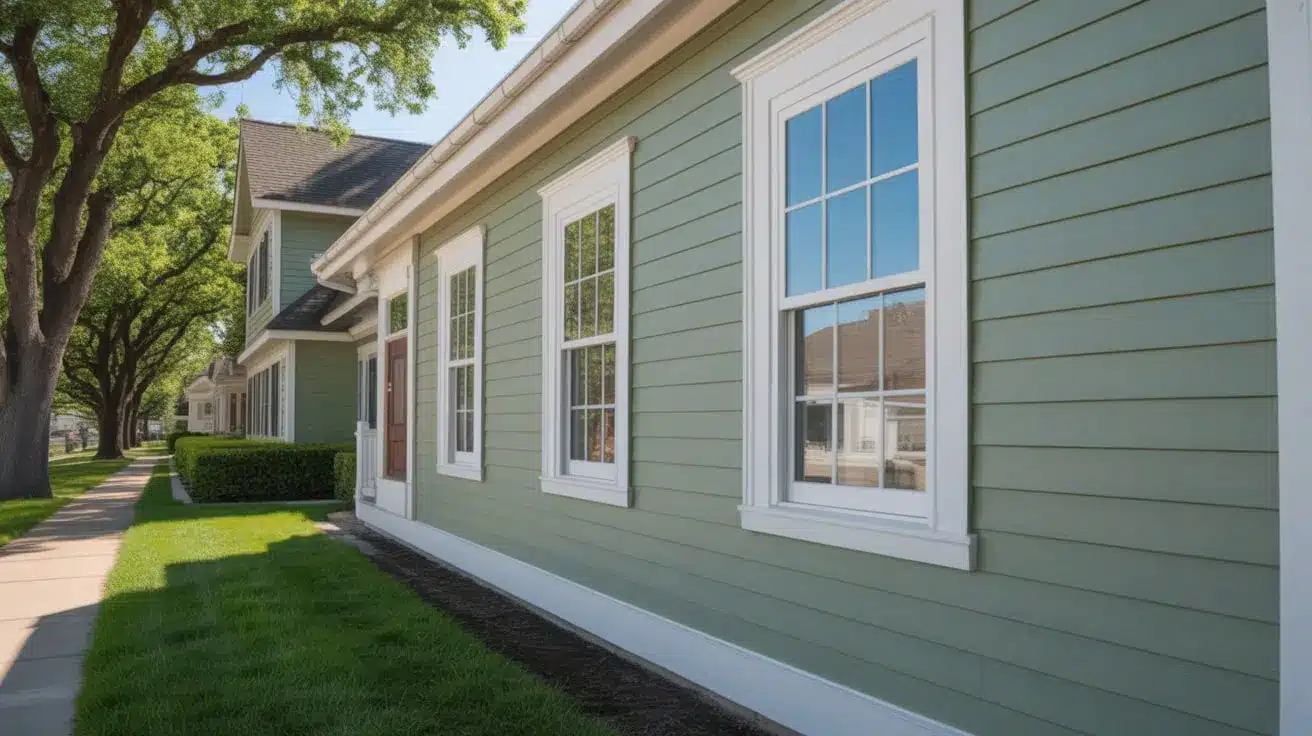
Have you ever looked at your faded vinyl siding and thought about giving it a fresh coat of paint? It’s a common question many homeowners ask: Can you paint vinyl siding, and is it worth it? In this post, I’ll walk you through everything you need to know before starting. You’ll learn when painting makes sense, how long it lasts, and the right way to do it for lasting results. I’ll also share simple care tips to keep your siding looking clean and new for years. Can You Paint Vinyl Siding? Yes, you can paint vinyl siding, but only if it’s in good shape. Paint won’t fix cracks, warping, or brittle spots, so replacement is the better option for damaged panels. Before painting, check your warranty; many manufacturers void it once the siding is painted. If your siding is older or no longer under warranty, painting is generally safe. With proper cleaning, prep, and the right vinyl-safe paint, you can refresh your home’s look without replacing the entire exterior. Why You Might Paint Vinyl Siding Vinyl siding is popular because it’s low-maintenance and built to last. Still, years of sunlight, rain, and temperature changes can make it fade or look dated. You might want to paint it if: The color has faded unevenly. You’re updating your home’s style. You want a fresh look without replacing the siding. Painting can give your home new life, but it won’t fix cracks, warping, or brittle panels. How Long Does Painted Vinyl Siding Last? When done the right way, painted vinyl siding can last 5 to 10 years before it needs a fresh coat. Some homeowners even see it last up to 15 years when the paint is applied correctly and the siding is kept clean. The lifespan mostly depends on your prep work, paint choice, and local climate. Areas with mild weather tend to see better results than regions with intense heat, humidity, or freezing winters. What Shortens Its Life Several factors can shorten how long your painted vinyl siding holds up if you’re not careful. Skipping prep work: Dirt, chalk, or mildew left behind will stop paint from sticking properly. Wrong paint type: Regular exterior paint can crack or peel since it expands differently than vinyl. Dark color choices: Dark shades absorb more heat, which can cause the panels to warp or bubble. Painting in bad weather: High humidity, direct sun, or very cold temperatures prevent paint from curing evenly. Neglecting maintenance: Not washing the siding regularly allows dirt buildup and moisture damage. Even small mistakes like painting in bad weather or skipping prep can cause early fading or peeling. The paint needs a clean surface and the right conditions to bond well. If you rush through those steps, you’ll likely end up repainting much sooner than expected. What Helps It Last Longer On the flip side, good prep work and steady upkeep can help your paint job stay bright for years. Deep cleaning first: Use mild detergent or a pressure washer to remove all dust and residue. Use vinyl-safe paint: Choose 100% acrylic exterior paint labeled for vinyl siding; it flexes with temperature changes. Paint in mild conditions: Aim for dry, overcast days between 50°F and 85°F to let paint cure smoothly. Stick with lighter colors: They reflect heat and protect the siding from thermal stress. Apply two thin coats: This improves coverage and durability while reducing peeling over time. Do regular upkeep: Rinse the siding once or twice a year and touch up small chips before they spread. A little effort goes a long way in keeping painted siding looking fresh. Cleaning it once in a while and touching up small flaws can add years to its life. When you combine good prep, the right paint, and mild weather, you’ll get a finish that lasts much longer than average. Pros and Cons of Painting Vinyl Siding Before you decide whether to paint or replace your siding, it helps to look at both sides. Painting can be a smart choice in some cases, but it also comes with a few trade-offs you should know about. Pros Cons Much cheaper than a full replacement. Adds upkeep; you’ll likely repaint every 5–10 years. Refreshes your home’s look in any color you like. Wrong paint or color choice can cause peeling or warping. Extends the life of siding that’s still in good shape. Doesn’t fix damaged panels or aging material. Painting vinyl siding offers a quick and affordable refresh, but it’s not a permanent fix. If you’re comfortable handling some future maintenance and want to save money now, painting can be worth it. But if your siding is already worn or you prefer a long-term solution, replacing it might be the smarter move. Step-by-Step: How to Paint Vinyl Siding Step 1: Clean the Surface. Pressure wash the siding, trims, and gutters to remove dirt and mildew. Skip the soffit to avoid pushing out trapped grime, and let everything dry completely before painting. Step 2: Protect the Surroundings. Cover windows, doors, decks, and soffits with masking paper or plastic. Proper masking keeps paint lines neat, prevents overspray, and saves time during cleanup. Step 3: Choose the Right Paint and Tools. Use vinyl-safe exterior paint in light or medium shades to prevent warping. A paint sprayer gives smooth, even coverage and works faster than brushes or rollers. Step 4: Apply the paint. On a mild, dry day between 50°F and 85°F. Move the sprayer in steady, overlapping passes and apply two thin coats for the best results. Step 5: Let It Dry and Clean Up. Allow at least 24 hours for drying and a few days for full curing. Once the paint has set, remove the masking carefully to reveal a clean, refreshed finish. By following these steps carefully, you’ll get a smooth, long-lasting finish on your vinyl siding. Good prep, the right paint, and proper drying make all the difference in how well the result holds up over time. Maintaining Painted Vinyl Siding Keeping your siding in good shape doesn’t end once the paint dries. A little regular care goes a long way in helping the finish stay bright and strong for years. Clean Regularly: Wash your siding once or twice a year using mild soap and water. Avoid harsh cleaners or strong pressure settings that could damage the surface. Keeping it clean helps prevent dirt buildup and mildew. Inspect for Wear: Check your siding each year for cracks, peeling, or fading. Touch up small spots early so they don’t grow into bigger issues or force a full repaint too soon. Extend Its Life: With basic upkeep and gentle cleaning, your painted vinyl siding can keep a smooth, fresh look for up to a decade before another coat is needed. When you stay consistent with cleaning and inspections, the paint will hold up longer and continue to protect your home’s exterior from weather and wear. Paint or Replace: What’s Better for You? If your vinyl siding is in good condition but looks faded, painting is a budget-friendly way to refresh your home’s exterior. It can last up to a decade with the right prep and care. However, if your siding is cracked, brittle, or warped, painting will only hide problems temporarily. In that case, replacement is the smarter long-term choice. It costs more upfront but offers decades of durability with less upkeep. Think about your siding’s condition and future plans before deciding. Summing Up So now that you know the facts, you can finally stop wondering, can you paint vinyl siding, and start planning your next step. Painting can be a smart way to bring new life to your home if your siding is still solid and worth saving. You’ve learned how long it lasts, what affects its durability, and how to keep it looking good for years. I hope this helped you feel more confident about tackling your own siding project. If you want more simple home improvement tips or step-by-step guides like this, check out my other blog posts for more ideas and advice that make a real difference.
If you’ve ever hunted for a paint color that feels soft but not washed out, warm but not yellow, I completely get it. I went through the same thing before finding Sherwin-Williams Oyster White (SW 7637). It’s that rare neutral that makes any room feel calm and welcoming without looking plain. I’ve seen it work beautifully in living rooms, bedrooms, and even exteriors. This post breaks down everything I’ve learned about Oyster White, how it looks in different lighting, what undertones to expect, and where it fits best. You’ll also see how it compares to other Sherwin-Williams whites and find similar colors in other brands. By the end, you’ll know exactly if this shade matches the look you want for your home. What is Sherwin-Williams Oyster White? Sherwin-Williams Oyster White (SW 7637) is a warm, beige paint that bridges the space between white and beige. It’s part of the neutral color family and works well for both interior and exterior surfaces. The shade gives off a soft, creamy look with a gentle green-beige undertone that changes slightly depending on lighting. Attribute Detail LRV 72 RGB 218 / 213 / 200 HEX #DAD5C8 Color Family Warm Greige Finish Options Flat, Satin, Semi-Gloss Oyster White by Sherwin-Williams offers more depth than a plain white but stays lighter than most beige tones. It’s sold at Sherwin-Williams stores and through sample providers like Samplize and Lowe’s. This balance of warmth and softness makes it a dependable choice for spaces that need a gentle, adaptable neutral. Understanding Oyster White’s Undertones Oyster White can look different depending on the light and surroundings, which often causes confusion. It’s not a true gray or beige but a balanced mix of both with a slight green tint. This faint green-beige undertone gives the color a warm, earthy look that keeps it from feeling cold or flat. In rooms with natural sunlight, it appears softer and creamier, while in shaded spaces, it leans more neutral. Wall texture, trim color, and nearby furnishings also affect how the undertone shows. For example, pairing it with pure white trim highlights its warmth, while darker accents draw out the gray side. How Lighting Changes Oyster White Lighting has a major effect on how Oyster White looks once applied. It shifts noticeably under both natural and artificial light, so it’s important to see it in real conditions before painting. North-facing rooms: Natural light from the north is cooler, which makes Oyster White lean toward gray. It feels soft and muted in these spaces. South-facing rooms: Warm sunlight brightens the beige undertone, giving the color a creamy, cozy look during the day. East-facing rooms: Morning light adds a gentle warmth that fades into a balanced neutral tone by afternoon. West-facing rooms: Evening sun deepens the color, bringing out a warm beige hue with a touch of gray. Artificial lighting: Warm bulbs enhance its beige notes, while cool LED lights make it appear more gray. Test large samples on multiple walls to see how the tone shifts through the day. Where to Use Sherwin-Williams Oyster White Oyster White adapts easily to different spaces, offering a balanced tone that complements both warm and cool materials. 1. Living Room / Dining This shade works beautifully in shared spaces where comfort and balance matter. Its soft undertone pairs well with natural wood, greenery, and neutral furnishings, giving the room a calm and cozy feel. Oyster White provides enough warmth to feel inviting yet remains light enough to keep the area open and airy. Try pairing it with medium-toned wood furniture, woven textures, or linen curtains for a balanced look that works across different design styles. 2. Kitchen Cabinets Oyster White is a great choice for kitchen cabinetry because it adds softness without looking stark. It pairs well with brass, nickel, or matte-black hardware, offering flexibility across styles from farmhouse to modern. Against white countertops, it shows more beige warmth, while with darker surfaces, it reads as a gentle greige. The color’s neutrality makes it easy to coordinate with tile, backsplash, and flooring choices, creating a consistent, natural flow throughout the kitchen. 3. Bedrooms / Bathrooms For bedrooms and bathrooms, Oyster White brings a quiet, spa-like feel. Its green-beige base adds warmth without being too creamy, helping the space feel peaceful and light. It complements soft fabrics, woven textures, and brushed-metal fixtures perfectly. Use it with crisp white trim for a clean contrast or with muted greens and taupes for a layered, restful palette. The result is a relaxed, classic look that feels both fresh and grounded. 4. Exterior Outside, Oyster White performs just as well. It’s an excellent option for siding, brick, or stucco, offering enough depth to stand out in bright daylight. Pair it with black, greige, or deep charcoal trim for a refined contrast. On exteriors surrounded by natural elements like stone or wood, the subtle undertone blends beautifully. Its ability to handle strong sunlight without looking yellow makes it a dependable color for year-round curb appeal. Choosing the Right Finish for Oyster White The finish you choose affects how Oyster White looks and how well it holds up over time. Flat finish: Best for ceilings or low-traffic walls. It hides imperfections well but can be harder to clean. Satin finish: Ideal for most walls. It reflects a small amount of light, showing the color’s depth without glare, and offers easy wipe-down maintenance. Semi-gloss finish: Great for trim, doors, and cabinetry. It highlights architectural details and resists scuffs and moisture better than lower-sheen paints. Color depth and sheen: Higher sheens slightly deepen the color, making Oyster White appear warmer and richer under direct light. How Oyster White Compares to Other Popular Whites Oyster White often gets compared to other Sherwin-Williams neutrals because of its balance between gray, beige, and warmth. Each color has its own LRV (light reflectance value), undertone, and ideal setting, which can change how it looks in your space. Oyster White vs. Shoji White SW 7042 Shoji White (SW 7042) has an LRV of 74, slightly higher than Oyster White’s 72, meaning it reflects more light and appears brighter. Shoji has a cream-beige undertone, making it warmer and softer overall. It suits farmhouse or cottage-style homes where you want a cozy, creamy feel. Oyster White’s green-beige undertone keeps it more neutral, offering a calm, balanced finish that pairs well with both warm and cool accents. Choose Shoji White for warmth and comfort, or Oyster White for subtle depth and balance. Oyster White vs. Alabaster SW 7008 Alabaster (SW 7008) is noticeably lighter, with an LRV of 82, making it one of Sherwin-Williams’ brighter whites. It carries a cream-yellow undertone that feels soft and classic, perfect for traditional interiors or rooms with limited natural light. In comparison, Oyster White’s greige tone feels more grounded, offering warmth without looking creamy. If your goal is brightness and airiness, Alabaster works best. For a softer, low-contrast neutral that still feels warm, Oyster White is the better fit. Oyster White vs. White Duck SW 7010 White Duck (SW 7010) has an LRV of 74 and a beige-gray undertone, placing it close to Oyster White but with a smoother, less variable appearance. It reflects slightly more light, giving interiors a soft, blended look. Oyster White, with its green-beige base, can appear cooler or warmer depending on lighting. White Duck is ideal for transitional or modern farmhouse spaces that require steady warmth. Choose Oyster White if you prefer a color with gentle shifts and a touch more visual depth. Coordinating Colors That Work With Oyster White Oyster White pairs easily with both warm and cool shades, giving you flexibility in designing balanced color schemes. The best coordinating colors come from similar natural tones and subtle contrasts: SW Evergreen Fog (SW 9130): A muted green that works beautifully as an accent color on furniture or feature walls. SW Greek Villa (SW 7551): A clean, creamy white perfect for trim and ceilings, keeping the space light and cohesive. SW Urbane Bronze (SW 7048): A deep brown-gray ideal for doors, cabinets, or window frames, grounding the palette with contrast. Use these together to build a soft, layered look. For example, Oyster White walls with Greek Villa trim and Urbane Bronze accents create a calm yet refined balance suitable for both interiors and exteriors. How Oyster White Feels in a Room Oyster White gives a room a calm and restful atmosphere. Its soft tone helps create a welcoming feel without appearing too warm or too cool. The color naturally brings balance, making spaces feel open yet comfortable. In cozy, natural interiors, it works as a quiet backdrop that lets wood textures, greenery, or woven materials stand out. Because it’s neither stark white nor dark beige, it adds gentle depth that feels easy on the eyes. Rooms painted in Oyster White often feel steady, clean, and soothing, perfect for bedrooms, living areas, and reading corners. It’s the kind of neutral that helps you relax while still giving the space a finished, well-balanced look. Expert Tips for Testing and Sampling Before painting, it’s smart to see how Oyster White looks in your own lighting. You can start with Samplize peel-and-stick samples to preview the color directly on your walls without any mess. These reusable samples make testing fast and simple. Start with peel-and-stick samples: Large stickers help you view the color across multiple walls and spaces. Test under different lighting: Look at the paint in both natural daylight and artificial light to catch tone shifts. Paint sample boards: Apply two full coats on foam or poster boards for accurate color depth. Move samples around: Check the boards in various rooms and corners throughout the day. Compare with trim and flooring: Hold samples near existing finishes to confirm harmony. Wait 24 hours: Let the paint dry completely before finalizing your decision. Colors Similar to Sherwin-Williams Oyster White in Other Brands If you like the look of SW Oyster White but want to explore similar tones in other brands, there are a few close matches worth checking out. Each one carries the same soft, warm greige balance with slight shifts in undertone and depth. Brand Color Name Undertone / Character LRV (if known) Notes Benjamin Moore White Dove (OC-17) Warm, creamy, slightly muted yellow ~85.4 Lighter and brighter than Oyster White; excellent for walls, trim, or lighter rooms. Behr Swiss Coffee (12) Warm neutral/soft beige ~84 Similar brightness, but leans a bit more toward creamy tones. Valspar Drumskin (7003-10) Beige-gray — Close in tone; it may read slightly warmer than Oyster White. Farrow & Ball School House White (291) Muted greige with soft warmth — Slightly cooler and softer in tone; fits classic or layered interiors. Benjamin Moore Simply White (OC-117) Pure neutral white (low undertone) ~91.7 Much brighter and cleaner, useful when you want more contrast or a crisper white. These options offer similar versatility and can help you achieve the same inviting, balanced look if you prefer a different paint brand. Maintenance Tips for Sherwin-Williams Oyster White Keeping Oyster White looking fresh doesn’t take much effort if you care for it the right way. Follow these simple maintenance steps to help it stay clean and bright over time. Dust walls regularly: Use a microfiber cloth or duster to prevent buildup, especially in high-traffic areas. Wipe gently: For marks or smudges, use a soft sponge with mild soap and water; avoid harsh cleaners. Spot clean early: Address scuffs or stains quickly to stop them from setting into the paint. Protect corners and baseboards: These areas take the most wear; touch them up once or twice a year. Store leftover paint properly: Seal the can tightly and label it for easy touch-ups later. Avoid strong sunlight exposure: In bright rooms, use window coverings to reduce fading over time. Summing Up After trying SW Oyster White in different spaces, I can honestly say it’s one of the most dependable neutrals out there. It strikes that perfect balance, warm but not yellow, soft but not flat. On walls, it gives a relaxed, lived-in look. On cabinets or exteriors, it adds quiet depth that fits right in with almost any style. If you’re thinking about using it, start with a small sample first. Move it around, check it in morning and evening light, and see how it changes through the day. You’ll quickly notice how natural and easy it feels in every setting. When you’re ready, check out my other paint color guides and ideas to find shades that pair beautifully with Oyster White. Your perfect palette might be just a scroll away.