

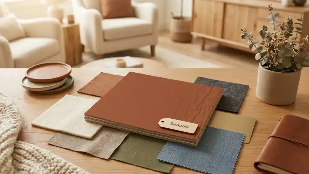

| Color Name | Sequoia |
| Common Hex Code | #804839 |
| RGB | 128, 72, 57 |
| Undertones | Brown, Red, Slight Orange |
| Best For | South- or west-facing rooms, warm-lit interiors, earthy accent walls, fall palettes |
| Avoid In | North-facing rooms with cold light, spaces already heavy with dark wood tones |
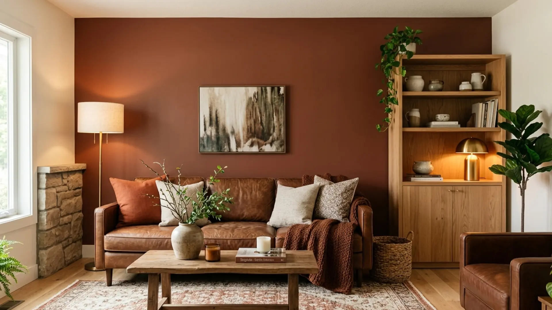
Sequoia in a south-facing room with afternoon sun looks genuinely rich, a warm, reddish-brown that feels grounded without being heavy. Put that same color in a north-facing room under cool gray light, and it can read muddier, flatter, almost like dried clay. That shift is what you need to understand before you commit to this color anywhere.
The short answer to “what color is sequoia” is a warm reddish-brown with earthy brown, soft red, and slight orange undertones. It sits between redwood and mahogany on the warm brown spectrum, less vivid than rust, deeper than cinnamon, less purple-red than burgundy.
But the name gets applied across paint, fashion, and design palettes in ways that don’t always match, which is where the confusion starts.
Here I’ll walk through how Sequoia behaves in real light, what it pairs with, and how to use it well, if you’re choosing a paint color, a fabric tone, or building a design palette.
Sequoia Color: Undertones and Shade Family
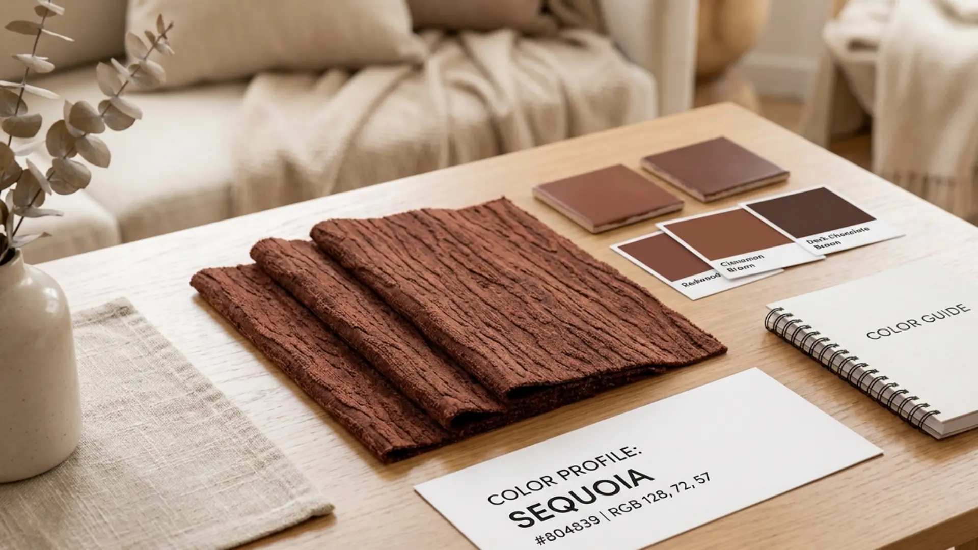
Sequoia’s base is brown. Its undertones are red and a trace of orange, which is what gives it that warmth and stops it from reading as a flat chocolate or espresso. The red component is subtle; this is not a brick red or a terracotta. It reads as brown first, warm second.
That undertone profile puts it in the same family as redwood, mahogany, cinnamon brown, and bark brown — and it shares that warm earthy register with colors like sage, whose sage undertones follow a similar warm-versus-cool split depending on light. Here’s how to tell them apart in practice:
| Shade | How it differs from Sequoia |
| Redwood | Slightly redder overall; less brown base |
| Mahogany | Darker and richer; heavier red-purple cast |
| Cinnamon Brown | Warmer and more orange; less red depth |
| Rust | Brighter and more orange-red; less brown |
| Chocolate Brown | Cooler and deeper; less red in the base |
| Espresso | Much darker; cooler; almost neutral brown |
The table above is a useful starting point, but the real test is always the physical sample in your specific room. Adjacent colors and flooring already in the space will pull Sequoia toward its warm or cool edge more than any chip comparison can predict.
One thing worth knowing: despite the name, sequoia as a color refers to the tree’s bark, not its foliage. The leaves are green. The bark is that layered, fibrous reddish-brown, which is exactly the shade this name describes.
If someone shows you a “sequoia green,” that’s a different interpretation entirely, and not the one used in mainstream design or paint contexts.
How Sequoia Behaves in Different Light Conditions
Sequoia reacts strongly to light, shifting in warmth and depth. Understanding how north, south, east, and west exposures, plus artificial light, affect it is key to avoiding flat or heavy results.
- South- and West-Facing Rooms: Warm afternoon light amplifies red and orange undertones, making sequoia feel rich, vibrant, and almost luminous against natural wood flooring.
- North-Facing Rooms: Cold, indirect light flattens sequoia, emphasizing brown over red. Use smaller surfaces and pair with warm creams to avoid a heavy appearance.
- East-Facing Rooms: Morning light enhances warmth, but midday cool light slightly shifts the tone. Ideal for morning-focused spaces but less consistent in the afternoons.
- Artificial Light: Warm incandescent or soft LED bulbs maintain sequoia’s warmth; cooler daylight bulbs flatten it. Aim for 2700K–3000K lighting in heavily used rooms.
| Pro Tip: Before choosing any Sequoia paint or stain, take a physical sample home and tape it to the wall. Check it at 8 a.m., 12 p.m., and 8 p.m. The evening reading under your actual lighting is usually the most honest preview of what the color will live like day-to-day. |
Why Sequoia Looks Different Across Paint, Fashion, and Design
The reason sequoia reads differently depending on where you find it is that the name carries no universal color standard, it’s descriptive, not proprietary. Different industries use it to mean slightly different things.
- In Design and Digital Palettes: Design tools and palette generators typically assign sequoia to a hex code around #804839, a warm mid-depth reddish-brown. This is the most consistent usage and the best reference point for digital work, branding, and web design.
- In Paint and Stain: Paint brands write their own formulas, so two products both labeled “Sequoia” may look noticeably different on a wall. One brand’s version may lean darker and more bark-like; another may shift toward a muted terracotta. The only reliable way to evaluate a paint-labeled sequoia is with the brand’s own physical chip, tested on your actual surface.
- In Fashion: Clothing brands, including Lululemon, which uses Sequoia as a seasonal name, typically interpret it as a deeper, darker shade closer to chocolate brown or espresso than to the bark-brown hex code. Fabric type affects this further: a matte jersey will read darker than a shiny nylon, even with the same dye formula. Natural light is the only fair way to compare fabric swatches.
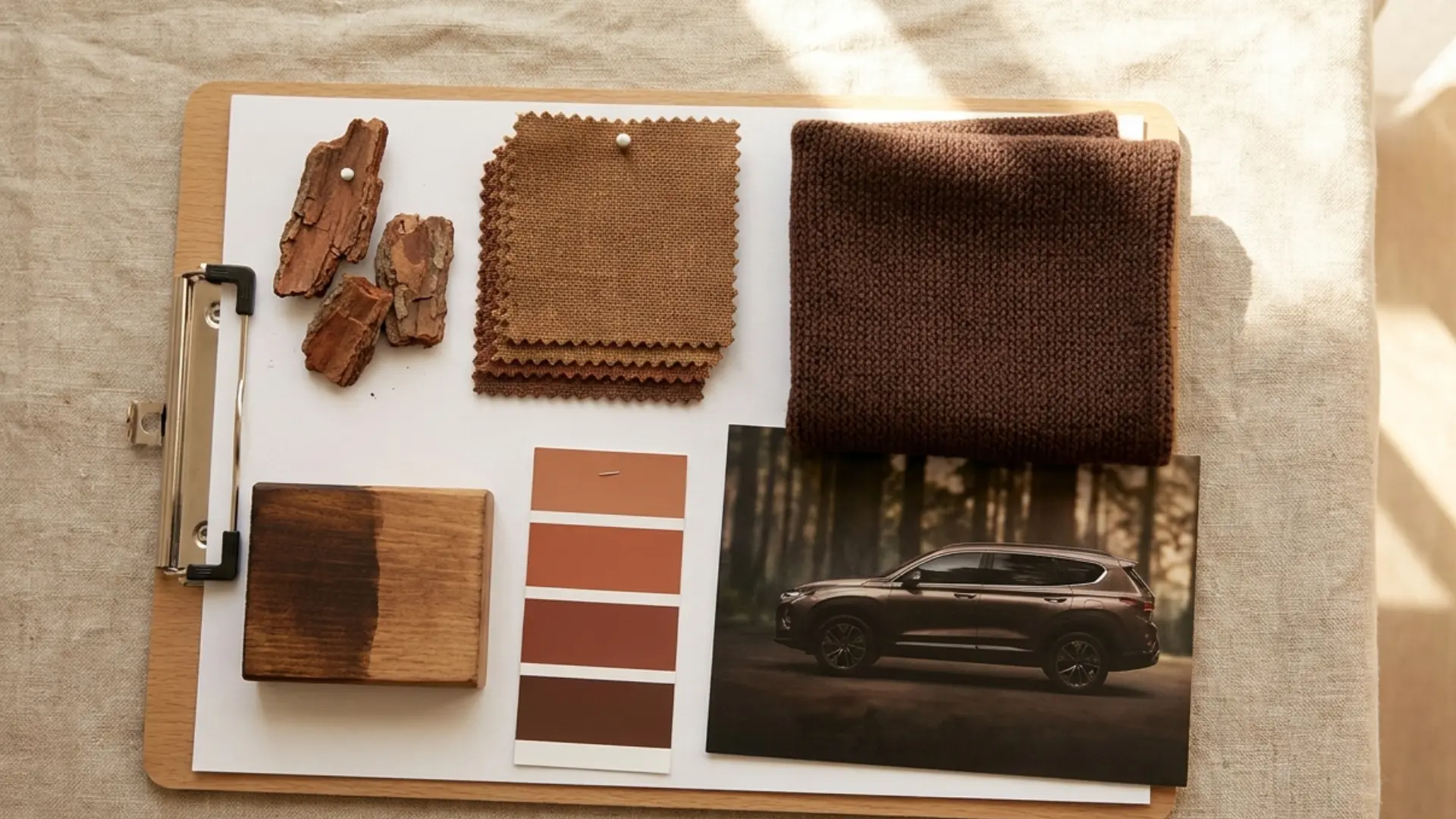
- In Toyota Research: If you arrived here searching “Toyota Sequoia colors,” the answer is different. Toyota Sequoia is an SUV name, not a color. For the 2026 model year, exterior color options include Ice Cap, Wind Chill Pearl, Lunar Rock, Celestial Silver Metallic, Magnetic Gray Metallic, Midnight Black Metallic, Mudbath, Supersonic Red, Blueprint, and Wave Maker. Toyota Sequoia interior options include Black, Boulder, Cockpit Red, Saddle Tan, and Shale. None of these is the reddish-brown “sequoia” color this article covers
What Colors Pair Well with Sequoia
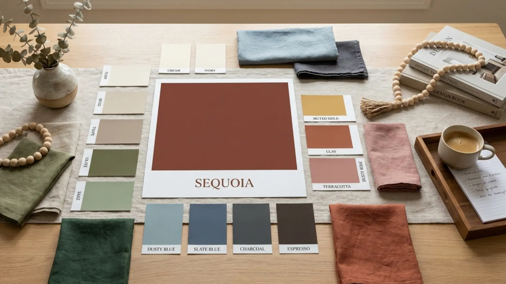
Sequoia is rich enough to carry weight on its own, but it needs the right supporting colors to stay balanced rather than heavy. The goal is usually to either soften its warmth with lighter neutrals or ground it further with broader accents.
| Pairing Type | Colors | Best Use |
| Warm Neutrals | Cream, Ivory, Beige, Tan, Sand, Taupe | Walls, rugs, sofas, curtains, keep Sequoia from reading dark |
| Earthy Greens | Olive, Sage, Moss, Forest Green | Natural palettes, outdoor-inspired interiors, grounded branding |
| Cool Balance | Dusty Blue, Slate Blue, Denim Blue | Fashion, mixed interiors, add contrast without clashing |
| Dark Accents | Charcoal, Espresso, Black, Deep Brown | Bold rooms, formal outfits, dramatic accent layering |
| Soft Accents | Muted Gold, Clay, Dusty Rose, Terracotta | Warm decor, cozy layering, softer styling |
A few combinations worth calling out specifically: sequoia and sage green paint together are particularly effective in rooms with natural wood. The green reads as organic rather than cool, and the two tones share enough of the same earthy warmth to feel cohesive.
Sequoia and dusty blue is the more surprising pairing, but it works well in fashion and in rooms where you want the warmth of the brown offset by something lighter and slightly cooler.
The combination to avoid: sequoia with multiple other deep, saturated tones, chocolate brown furniture, dark wood floors, and charcoal walls all at once.
Too many dark warm shades in the same space flatten each other out. At least one element in the room needs to be noticeably lighter to give Sequoia room to read.
How to Use Sequoia in Interior Design
The most common mistake with sequoia in interiors is overusing it. Because it reads rich, there’s a temptation to carry it through multiple elements, walls, furniture, rugs, and cushions, but that compounds quickly into a space that feels dim rather than warm.
1. Accent Walls
One sequoia accent wall in a room with cream or off-white on the other three sides is the clearest way to use this color without it overwhelming the space. It works particularly well on a wall behind a sofa, bed, or fireplace, where it has a natural anchor point.
In a south-facing room, this approach looks genuinely architectural. The same one-dominant-neutral, one-accent structure that works well in a minimalist living room applies directly here.
2. Cabinetry and Furniture
Sequoia on kitchen or bathroom cabinetry works well when the walls are kept in the cream-to-warm-white range. Paired with brass or matte gold hardware, it reads premium rather than rustic.
On furniture, leather sofas, upholstered chairs, or wooden pieces with a reddish-brown stain, it brings warmth without demanding attention the way a brighter accent color would.
3. Textiles and Soft Furnishings
Rugs, throw pillows, and curtains in Sequoia are the lowest-commitment way to test the color in a space. Because fabric absorbs light differently from a painted wall, the tone often reads slightly softer and darker than the paint equivalent. This is a useful property; it means you can layer sequoia into a room without the same intensity risk you’d take with a fully painted wall.
For rooms that already have warm brown or reddish wood tones on the floor, use sequoia sparingly, a single rug or one or two cushions rather than a dominant surface color.
The wood and the sequoia will compete for the same warm frequency if both are prominent, a pattern that applies to most warm-toned interiors under the broader home decor rules around carrying one material tone at a time.
4. Paint and Stain
If you’re choosing a Sequoia paint color from a specific brand, request the physical chip, not the online swatch. Screen calibration varies enough that what looks like a warm medium brown on one monitor reads almost burgundy on another.
Test the chip on your actual wall surface in both natural and artificial light before committing. The same advice applies to wood stain: sequoia-labeled stains can range from a muted red-brown to a dark bark tone depending on the brand, and the base wood species underneath will affect the final result significantly.
How to Style Sequoia in Fashion
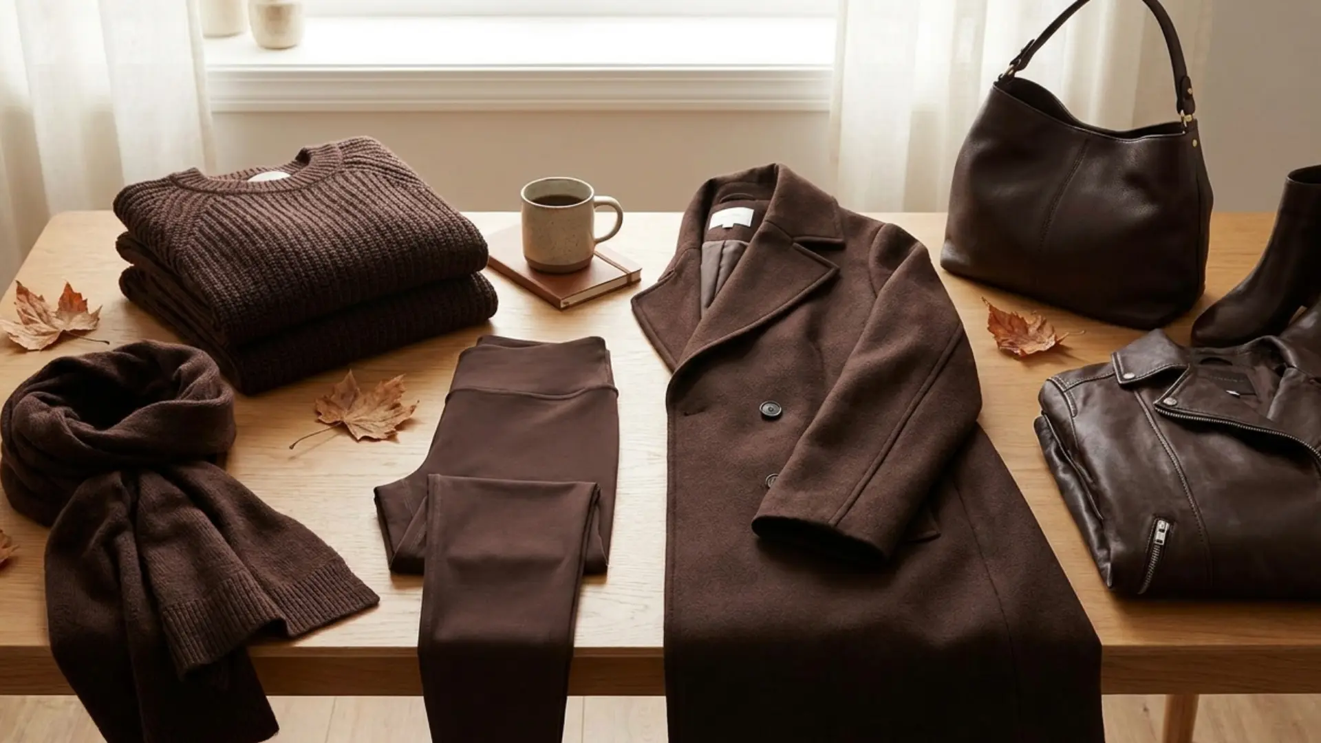
In clothing, sequoia tends to be interpreted as a deeper, darker shade than its design-palette counterpart. Brands that use the name Lululemon, being the most-searched example, typically produce something closer to dark chocolate brown or espresso than to the mid-tone reddish-brown of the hex code.
That gap matters in practice. If you’re trying to match a sequoia piece of clothing with something from a design palette or a paint chip, they may not read as the same color at all.
Fabric type compounds this further: a matte fleece will absorb light and read darker than a smooth nylon in the same dye formula.
In fall wardrobe styling, sequoia works well as a grounding neutral. It pairs cleanly with ivory, oatmeal, denim, black, camel, and olive. A sequoia coat with cream knitwear and black boots is a straightforward combination.
Where it gets harder is mixing it with other warm browns, camel, and sequoia together can blur into each other if the tones are too similar. Keep at least one piece clearly lighter or darker to give the outfit definition.
How to Use Sequoia in Branding

For digital work, the hex code #804839 is the standard reference point. It’s a useful primary or accent color for brands that want to communicate warmth, naturalness, and a grounded quality; coffee brands, wellness, handmade goods, home decor, and outdoor-oriented businesses all fit this register.
Sequoia in Web Design

In web design, Sequoia works well for buttons, icon fills, callout borders, and section backgrounds. It has enough depth to register as a clear action color but not so much saturation that it reads aggressive.
One practical note: white text on a Sequoia background needs checking for contrast. At #804839, the contrast ratio with white is around 4.5:1, which meets the WCAG AA standard for normal body text but sits at the boundary. Use a tool like the WebAIM contrast checker before deploying it behind small or light-weight text.
The palette combinations that work best in branding contexts: sequoia anchored by off-white or stone gray, with muted gold as a secondary accent. Deep brown or charcoal for body text.
The combination signals quality and warmth without tipping into rustic cliché. The same warm-neutral pairing logic behind wall and trim combinations applies here; sequoia needs a clearly lighter or cooler supporting tone to stay legible rather than muddy.
Common Mistakes When Using Sequoia
These come up consistently, and most of them are avoidable with a little upfront testing.
- Choosing from a screen alone: Sequoia’s warmth and depth are both highly susceptible to screen color calibration. What reads as a rich reddish-brown on one monitor can look closer to burgundy or flat chocolate on another. Always use a physical sample, paint chip, fabric swatch, or printed card before making a decision for walls, cabinetry, or large furniture pieces.
- Stacking too many dark warm tones: If sequoia is competing with dark hardwood floors, chocolate brown furniture, and terracotta accents all at once, the room will read heavy and closed. Sequoia needs contrast to register properly. At least one surface in the space — usually walls or ceiling — should be noticeably lighter.
- Using the design hex code to match fashion: The #804839 reference hex and a Lululemon “Sequoia” garment are not the same color. If you’re building a room around a sequoia clothing piece or accessory, match the actual fabric in natural light rather than pulling a digital color code.
- Skipping the light test: As described in the light behavior section above, Sequoia reads differently at different times of day and in different room orientations. A paint chip viewed only under store lighting or only at midday will give you an incomplete picture. Test it across morning, afternoon, and evening in the actual room.
- Treating Toyota Sequoia colors as the same category: Toyota Sequoia exterior and interior colors are vehicle-specific options chosen by Toyota’s design team. They don’t map to the reddish-brown shade discussed in this article and aren’t useful references for interior design, fashion, or branding work.
Frequently Asked Questions
Is Sequoia a warm or cool color?
Sequoia is a warm color. Its brown base is lifted by red and slight orange undertones, placing it firmly in the warm half of the color spectrum. Cool-toned rooms or blue-gray color schemes will create a noticeable contrast with sequoia rather than a natural blend.
What is the hex code for Sequoia color?
The most commonly referenced hex code for sequoia is #804839, with RGB values of 128, 72, 57. This applies to the general design interpretation. Paint brands and clothing labels may use slightly different formulas under the same name.
Does Sequoia look good in a small room?
It can be used selectively. A single sequoia accent wall with cream or warm white on the remaining three sides adds depth without closing a small room down. Avoid full-room sequoia in spaces under roughly 120 square feet — the warmth compounds and the room will feel darker than intended.
What is the difference between sequoia and mahogany?
Mahogany is darker, richer, and carries more of a red-purple cast. Sequoia is lighter and browner, with a warmer orange undertone. In a side-by-side comparison, mahogany reads as a deep jewel-toned brown while sequoia reads as a natural, bark-like warm brown.
Is Sequoia a good exterior paint color?
It can work well on exterior trim, doors, or as an accent on a neutral-bodied house. On full exterior walls, it tends to be more effective on smaller structures or architectural features rather than as a dominant whole-house color. Sequoia’s warm earthy depth follows the same logic as other brown roof pairings; it holds well against natural stone, warm cream, and wood accents, but needs a lighter body color to avoid reading heavy at scale.
What colors go with Sequoia in a living room?
Cream, ivory, and warm beige on walls; olive or sage through plants or soft furnishings; dusty blue or slate for a cooler accent. Keep dark accents, espresso, and charcoal on smaller surfaces like side tables or picture frames. Warm lighting in the 2700K to 3000K range will help the whole palette hold together.
Is Sequoia the same color as terracotta?
No. Terracotta is brighter, more orange-red, and less brown. Sequoia has more brown in its base and less orange saturation, making it darker and more subdued overall. They belong to the same earthy, warm family but are clearly distinct colors when placed side by side.
Final Verdict
Sequoia is easier to use once you know which version you are dealing with. If you came here asking, “what color is Sequoia?” the safest answer is a warm reddish-brown shade with earthy depth.
I also want you to remember that the name can shift across design palettes, fashion, paint, stain, and Toyota Sequoia colors.
That matters because the right choice depends on your actual use. A hex code helps with digital work, samples help with paint, and trim details matter for Toyota research.
Use the pairings, palettes, and tips above to choose with more confidence. Try the ideas in your next project, and share which Sequoia shade works best for you.
Sources: Toyota.com, 2026 Toyota Sequoia product pages. Hex reference: #804839 per standard design palette usage (RGB 128, 72, 57).


