

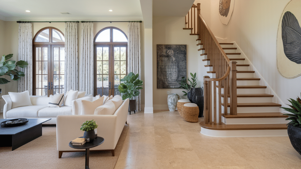
Scrolling through residential interior design ideas online feels like drowning in a sea of perfection. Every pin-worthy room looks beautiful, yet translating those images into livable spaces often leads to disappointment. As someone who has spent years helping homeowners work through space planning challenges, from studio apartments that felt perpetually cramped to large open-plan homes that somehow still felt wrong. I’ve learned that great design isn’t about copying trends, it’s about making intentional choices that fit real life. I’ll walk you through how to think about design before choosing ideas, share practical concepts that balance beauty and function, and highlight mistakes most sources won’t mention. By the end, you’ll be able to make confident decisions that actually improve daily living. Key Considerations When Choosing Your Ideal Design Style Selecting the right design style goes beyond aesthetics. It’s about creating a space that works functionally and practically for your lifestyle. Consider these key factors before making your decision: Functionality Over Aesthetics: Choose a style that suits how you live, not just what looks good. Consider Layout Needs: Ensure the style works with your space layout, whether open-plan or divided zones. Storage and Organization: Make sure the style offers enough storage and keeps your space clutter-free. Lighting Requirements: Different styles require specific lighting setups; ensure yours complements the design. Complement Your Lifestyle: From family homes to single apartments, choose a style that fits your daily routine. These factors ensure your design is both practical and beautiful. High-Impact Residential Interior Design Ideas These ideas target the structural decisions, layout, light, scale, and visual hierarchy that determine whether a space feels right before a single decorative choice is made. According to my experience, fixing these elements first consistently produces results that no amount of styling can replicate. 1. Zone Open-Plan Spaces without Walls Anchor the seating area with a large rug, hang a pendant above the dining table, and place a console table behind the sofa to mark boundaries. These three moves create clear zones without any structural change. If the layout still feels unclear, add one defining element per zone until it reads naturally. This is one of the most common space planning problems I encounter. I worked with a couple in Portland whose open-plan ground floor was all one room, and they hated it. Not for lack of furniture, but because nothing told the eye where one zone ended and another began. A 9×12 rug in the living area, a rattan pendant over the dining table, and a low-profile console behind the sofa transformed it in a single afternoon. No walls, no budget for renovation, just deliberate placement 2. Layer Lighting to Control Mood One ceiling light flattens a room and strips out warmth. Replace it with three sources at different heights, ambient, task, and accent. Add dimmer switches to at least two of them. This gives you real control over how the space feels, shifting from functional during the day to warm and inviting by evening. A good rule: if your lighting setup can’t change with your mood, it’s not finished yet. 3. Use One Flooring Throughout Visual breaks between flooring materials make connected spaces feel smaller and disjointed. Carrying one floor finish across the living, dining, and kitchen zones removes friction. If you are currently calculating your kitchen remodel cost, remember that unified flooring is one of the highest-impact investments you can make. If a full re-floor isn’t viable right now, start by eliminating the single most jarring transition in your home; the difference will be noticeable straight away. 4. Scale Furniture to the Room Walk the most-used path through your room. If you’re adjusting your route or brushing past anything, something is oversized. Swapping one large piece for a correctly proportioned alternative frees up circulation and changes how the room feels every day. In compact apartments, especially, furniture scale matters more than almost any styling decision. A practical test I give clients: you should be able to walk from any entry point to any exit point without turning sideways. If you can’t, scale is your problem, not décor. 5. Build Storage Into the Walls Built-in shelving and cabinetry keep clutter out of sight without sacrificing storage capacity. Bedrooms, corridors, and living rooms all benefit in different ways. It sits at the higher end of the budget, but for long-term homeowners, it fundamentally reshapes how a space feels to live in every single day. 6. Draw the Eye Up in Low-Ceilinged Rooms Floor-to-ceiling curtains and tall shelving pull the eye upward, making low-ceilinged apartments feel significantly less compressed. Hang curtain rods as close to the ceiling as possible, even if the window sits lower. It costs relatively little, adds genuine airiness, and works without touching any part of the room’s structure. 7. Leave Space Empty to Reduce Clutter A bare wall, a clear corner, a surface with nothing on it, these are design choices, not oversights. If your home feels cluttered but you can’t identify why, the fix is usually removal rather than addition. Deliberately leaving space empty brings an immediate sense of calm to any room. 8. Anchor Every Room Around One Focal Point A fireplace, a large artwork, or a striking chair gives the eye somewhere natural to land. Without one, rooms feel visually noisy and directionless. Choose a single bold element and arrange everything else around it. Most rooms only need one strong focal point to feel considered, complete, and worth walking into. 9. Arrange Furniture Around Natural Paths Walk through your room and note where movement feels blocked or awkward. Rearranging furniture to allow clear, natural paths removes that constant low-level friction that makes smaller shared spaces feel frustrating to live in. It costs nothing, takes an afternoon, and the impact on how the home feels daily is immediate. Functional Residential Interior Design Ideas Tailored to Everyday Lifestyles Find out practical residential interior design ideas that align with real routines, prioritizing durability and usability over looks alone. These strategies ensure homes support busy lives, from remote work to family demands, with lasting functionality. 10. Design Around Your Daily Routines A home that works against your habits creates friction you stop noticing but never stop feeling. Place frequently used items within natural reach, position seating toward natural light, and arrange spaces around how you actually move through the day. Small layout shifts like these cost very little but make routines noticeably smoother. 11. Decorating with Durability in Mind Floors, kitchens, and bathrooms absorb the most daily punishment, particularly in homes with children or pets. Choosing durable fabrics and resilient surfaces from the start reduces the cost and frustration of frequent replacements. Investing here isn’t about looks alone; it’s about choosing things that continue performing well years after the initial decision. 12. Define a Workspace to Separate Work From Home Without a dedicated zone, remote workers find that both productivity and relaxation suffer because neither mode ever feels fully separate. A rug, a partition, or consistent furniture placement is enough to create a real boundary. Living rooms and spare bedrooms both work well once the space is clearly and consistently defined. 13. Pick Finishes that Handle Real Daily Use Stain-resistant upholstery, sealed surfaces, and hard-wearing floor finishes keep a home looking decent amid active daily use. For households with children or pets, these choices matter far more than visual trends. Selecting practical finishes upfront prevents the slow, frustrating feeling of watching a home deteriorate faster than expected through entirely normal, unavoidable wear. I’ve had clients who swore the problem was their home’s size. After carving out a defined work corner, same chair, same desk lamp, same position every day, their evenings felt genuinely different. The brain picks up on spatial cues faster than we expect. 14. Choose Multi-Functional Furniture Selectively In compact homes, a storage ottoman, a fold-down desk, or a sofa bed can make a genuine difference to how spacious a space feels. The key is selectivity; only choose pieces that solve a real, specific problem. Poorly chosen multi-functional furniture creates exactly the clutter and visual noise you were trying to avoid. 15. Put Storage Where You Actually Use Things Hooks near the door, shelving beside the desk, organizers inside kitchen cabinets, storage works best when it’s placed exactly where things are naturally used. Things get put away more consistently when doing so requires almost no effort. It’s a low-cost change that stops everyday mess from migrating across the entire home. 16. Add Textiles to Reduce Noise and Echo Rugs, curtains, and upholstered furniture absorb sound in ways hard surfaces simply cannot. Open-plan apartments and homes with tiled or wooden floors often suffer from persistent echo that makes spaces feel less comfortable than they should. Adding textile even a single large wool or jute rug in a hard-floored open-plan space layers costs relatively little but noticeably reduces noise fatigue and makes rooms feel warmer and more pleasant. 17. Add Task Lighting Where You Actually Need It General overhead lighting rarely provides enough focused visibility for cooking, reading, or detailed work. Under-cabinet strips in kitchens, a proper desk lamp, and a well-placed bathroom mirror light make these activities noticeably easier and less straining. It’s a modest upgrade that improves daily functionality far more than its relatively low cost would suggest. 18. Give Your Entryway a Job to Do A few hooks, a narrow bench, and a small basket near the front door intercept bags, shoes, keys, and coats before they spread further into the home. It’s one of the lowest-cost changes available, yet it consistently has an outsized effect on how tidy and composed the rest of the living space feels. If space is genuinely tight, a wall-mounted rail with three to four hooks and a single shelf above it can achieve the same result with as little as 30 cm of wall depth. Personalization in Residential Interior Design Your home should feel like you, not like a showroom. The ideas here are about adding personality without losing the calm you’ve worked to create. Small, restrained details do this better than bold statements. They accumulate quietly into something that feels genuinely yours rather than assembled from a catalog. 19. Display Art Selectively Rather Than Filling Every Wall A small, carefully chosen selection of artworks adds genuine personality without tipping into clutter. Quality and placement matter far more than quantity here. One well-positioned piece creates more impact and says more about the people who live there than a crowded arrangement of loosely related images ever could, regardless of how individually interesting each piece might be. 20. Repeat One Material Across Rooms for Cohesion Repeating the same wood tone, fabric weave, or metal finish across different rooms creates a sense of flow that feels deliberate rather than accidental. It doesn’t require matching everything precisely, just enough quiet repetition to make the whole home feel considered as one thing. Open-plan homes benefit most from this approach applied consistently throughout. 21. Paint One Wall to Add Depth Without Commitment A single painted accent wall adds depth and visual interest to a flat, unremarkable room without the cost or commitment of redecorating entirely. Bedrooms and living rooms respond well to this. The key is intention; choose a wall that already holds architectural significance rather than picking one at random and hoping the impact lands correctly. 22. Layer Texture Over a Neutral Base for Warmth Layering different weaves, grains, and finishes over a neutral base adds richness without introducing competing colors. Linen cushions, a jute rug, and a timber shelf against a white wall create quiet warmth that feels considered and calm. This approach is the foundation of a successful organic modern living room, where texture stops a room from feeling bare or unfinished. 23. Invest in One Light Fitting That Stands Out Rather than installing several average fixtures, investing in one genuinely well-designed pendant or chandelier does more for a room’s character and atmosphere than almost any other single purchase at a similar price point. Dining spaces and living rooms benefit most. One strong fitting gives the room a clear visual hierarchy without requiring much else around it. 24. Use Built-Ins to Fit Awkward Spaces Perfectly Custom shelving, cabinetry, or paneling designed around the specific angles and dimensions of a room eliminates dead space and gives a home a finished quality that off-the-shelf furniture rarely achieves. Corridors, alcoves, and awkward corners benefit most from this approach. It sits at the higher end of the budget, but the result feels genuinely seamless throughout. 25. Add Personal Touches That Feel Genuine, Not Styled An inherited textile, a meaningful motif, an object collected over time, these details give a home warmth that purely styled spaces often lack. They don’t need to be prominent or expensive to be effective. Used with restraint across living areas, they accumulate quietly into something that feels genuinely personal rather than assembled directly from a catalog. 26. Build a Cozy Reading Nook Into Your Bedroom A reading nook tucked into a bedroom corner is one of the simplest upgrades in interior design; a small armchair or floor cushion, a wall-mounted light, and a narrow shelf for books are all it takes. The rest of the room stays untouched while this little corner becomes the most-used spot in the house. It works in small and large bedrooms alike and costs very little to put together. Residential Interior Design Styles: A Quick Comparison A key gap in most design content is a clear, honest breakdown of the most popular styles and what each actually requires in practice, not just aesthetically, but functionally. Here’s a grounded comparison to help you choose a direction before making purchases. Style Core Principle Best Suited To Minimalist Only what’s necessary stays Small apartments, low-clutter households Scandinavian Warmth through natural materials and a muted palette Family homes, northern light conditions Mid-Century Modern Clean lines, organic shapes, honest materials Homes with architectural bones from 1950–1975 Industrial Exposed structure, raw surfaces, dark palette High-ceiling lofts, converted spaces Transitional Classic structure with contemporary finishes Most mainstream homes, resale value focus Japandi Japanese simplicity + Scandinavian warmth Calmer, slower-paced households No style is inherently better than another. The right one is the one that matches how you actually live, not how you imagine you’ll live once the room is finished. Common Residential Interior Design Mistakes Most design content showcases success stories but rarely addresses what goes wrong in real homes. In my experience, the same mistakes appear across projects of very different budgets and sizes, and they’re almost always more costly to fix later than to avoid from the start. Designing room by room rather than holistically: treating each space as isolated creates disjointed flow and a choppy visual throughout the home. Copying luxury interiors without matching scale or budget: High-end looks require proportional investment; cheaper versions often feel like obvious imitations. Ignoring lighting during initial planning: Relying on afterthought fixtures means spaces never achieve the right ambiance or functionality. Over-accessorizing before understanding needs: Adding decor too early creates clutter before figuring out what the space actually requires daily. Choosing trends before solving storage and layout: Pretty surfaces can’t hide dysfunctional fundamentals like inadequate storage or awkward traffic patterns. These errors waste money and create spaces that photograph well but live poorly in reality. The Bottom Line Good residential interior design ideas aren’t about collecting inspiration; they’re about making deliberate choices that solve real problems. I’ve covered how to think strategically before selecting design concepts, shared principles that balance looks with daily function, and exposed mistakes that derail most projects. The takeaway? Start small. Pick two or three ideas that address actual pain points, not just visual wishes. Build from there with intention rather than impulse. Great spaces evolve through thoughtful editing, not instant makeover. Ready to rethink your approach? Drop a comment sharing which concept resonates most, or read through again with your specific space in mind.

Getting a bathroom layout right for accessibility is not just a code requirement; it is a matter of dignity and usability. From my experience researching accessible design, the difference between a compliant bathroom and a truly functional one often comes down to a few key measurements and smart fixture placement. No matter if you are planning a commercial restroom or updating a residential space for aging in place, understanding these standards from the start saves time, money, and a great deal of frustration later. I’ll walk you through everything you need to know about ADA bathroom layout: the core dimensions, clearance rules, fixture placement, and practical floor plan strategies. What Is an ADA Bathroom Layout? An ADA-compliant bathroom layout is a restroom design that meets the accessibility standards set by the Americans with Disabilities Act. These guidelines define the minimum space required for a bathroom, where fixtures must be positioned, and the features that must be included to ensure that wheelchair users, elderly individuals, and people with mobility challenges can use the space safely and independently. Under the Americans with Disabilities Act (ADA), ADA compliance is legally required in most public buildings, offices, restaurants, retail stores, healthcare facilities, hotels, schools, and government buildings in America. Beyond commercial spaces, many homeowners are now applying these same principles to their own bathrooms as part of aging-in-place planning, making the layout relevant far beyond just public restrooms. Key ADA Bathroom Dimensions and Measurement Standards Every ADA-compliant bathroom is built around specific measurements that reflect how wheelchair users move and transfer. Getting these right at the planning stage prevents costly modifications later. Here’s a clear breakdown: Feature ADA Requirement Why It Matters Door opening Min. 32 inches clear Allows wheelchair entry Turning space 60-inch diameter circle Enables full wheelchair rotation Sink floor clearance 30″ wide × 48″ deep Supports the forward wheelchair approach Toilet centerline 16–18 inches from the wall Position the toilet for safe transfers Grab bar height 33–36 inches from the floor Aligns with seated reach range Toilet seat height 17–19 inches from the floor Matches standard wheelchair seat height These measurements form the structural backbone of any compliant layout. Confirm the floor plan accommodates all of them simultaneously, not just each one in isolation. ADA Bathroom Layout Accessibility Requirements Clearance is arguably the most critical factor in an accessible bathroom. A bathroom can have all the right fixtures and still fail compliance if the open floor space is insufficient for a wheelchair to move safely. Wheelchair Turning Space ADA standards require a 60-inch diameter turning circle somewhere within the bathroom. This allows a standard wheelchair to complete a full turn without obstruction. In situations where a full circle is not possible due to space constraints, a T-shaped turning space is an accepted alternative; it allows a three-point turn and must be at least 36 inches wide in each arm of the T. The turning space can overlap with fixture clearance zones, which helps in tighter layouts. Key considerations: The turning circle must be unobstructed It can be located near the entrance or the center of the room Fixtures should be arranged around it, not within it Doorway and Entry Layout Requirements The doorway is the first accessibility checkpoint. ADA standards require a minimum 32-inch clear opening, though 36 inches is widely recommended for easier use. Door swing direction matters significantly in small bathrooms; an inward-swinging door can block wheelchair movement or trap a user who has fallen. For this reason, outward-swinging or sliding doors are strongly preferred in compact ADA layouts. Key entry considerations: The door must not obstruct any fixture clearance zone when open A clear floor space of at least 18 inches must exist beside the latch side of the door for wheelchair approach Door hardware must work with one hand and avoid tight grasping or twisting; lever handles are commonly used because they are easier to operate. ADA Sink, Lavatory, and Shower Layout Requirements Sink and shower areas have distinct ADA requirements, but both follow the same core principle: an open, unobstructed space that allows a wheelchair user to approach, position, and use each fixture independently. 1. Sink and Lavatory Clearance Requirements Most sink areas fail compliance because standard cabinets block the knee clearance wheelchair users need to pull close to the basin. An accessible layout requires a fully open space beneath the fixture. The maximum sink height is 34 inches; the knee clearance height must be at least 27 inches; the knee clearance depth is 17–25 inches; and a 30” × 48” clear floor space must remain open in front. Lever, touch, or sensor-activated faucets are required; standard twist knobs do not qualify. 2. Roll-In Shower Layout A roll-in shower allows a wheelchair to enter directly without transferring. Under ADA standards, a roll-in shower must measure at least 60 × 30 inches to allow wheelchair entry and maneuvering. Entry must be curbless, sitting flush with the floor. A fold-down seat at 17–19 inches, grab bars on the control and back walls, and a handheld showerhead on a minimum 60-inch hose are all required features for full seated usability. 3. Transfer Shower Layout A transfer shower is designed for users who move from their wheelchair onto a built-in seat rather than rolling in directly. Typically 36 × 36 inches, the wheelchair parks beside the opening, and the user slides across. Grab bars on the side and back walls support the transfer, and shower controls must be positioned so they can be reached from a seated position on the shower seat without requiring the user to reach across the water spray. Selecting between these fixture types comes down to the user’s mobility level and available floor space; both can meet full ADA compliance when the layout is planned around clearance zones from the start. Accessible Sink Design Features Good sink design goes beyond measurements; the right fixture choices make compliance practical, and the space easier to use daily. The following table gives feature ideas and their specifications: Feature Specification Reason Sink type Wall-mounted or undermount Keeps the knee space fully open below Pipe covering Insulated or covered pipes Prevents leg contact burns Faucet controls Lever, touch, or sensor-activated Operable with one hand or a closed fist Mirror height Bottom edge no higher than 40 inches Usable from a seated wheelchair position Drain placement Toward the rear of the basin Reduces obstruction to knee clearance depth These four details are easy to overlook during fixture selection, but they directly affect how functional the sink area feels for wheelchair users every day. ADA Toilet Placement and Grab Bar Layout Toilet placement in an ADA bathroom is precise. The toilet cannot simply be pushed against a wall; it must be positioned so that a wheelchair user can pull alongside it and transfer safely. Toilet Location and Clearance Requirements Correct toilet positioning depends on four specific clearance rules that work together to create a safe, functional transfer zone. Here’s how it works: The toilet centerline must sit 16–18 inches from the nearest side wall A 60-inch clear floor space must extend from the front of the toilet Side clearance is non-negotiable; being too close to a wall eliminates the transfer zone entirely A minimum clear floor space of 60 inches wide and 56 inchesdeep measured from the rear wall to allow wheelchair transfer. Even a layout that looks compliant on paper can fail in practice if any one of these clearances is compromised by a partition or poorly placed fixture. Grab Bar Placement Around the Toilet Two grab bars are required in every compliant toilet area; their positions and load capacities are strictly defined. Here’s how it works: Side grab bar: At least 42 inches long, mounted 33–36 inches above the floor beside the toilet Rear grab bar: At least 36 inches long, mounted behind the toilet at the same height range Both bars must support a minimum of 250 pounds of force The side bar must extend forward past the toilet front to assist users pushing up from a seated position Towel bars and decorative rails do not meet this standard. Only purpose-built grab bars rated for the required load qualify for compliance. Common ADA Bathroom Floor Plan Layouts The right floor plan depends on available square footage and building type; no single layout fits every situation, but the same core rules apply across them all. Here’s a clear breakdown of floor plans: Layout Element Standard Requirement Compact Space Strategy Minimum room size 60 × 60 inches for single-user 56 × 60 inches with careful planning Turning circle 60-inch diameter at the room center Overlap with fixture clearance zones Sink placement Near the entrance, left or right Wall-mounted to free up floor space Toilet placement Along the opposite wall from the sink Corner placement with measured side clearance Door type Outward-swinging preferred A sliding or pocket door eliminates swing conflict Clearance zones Each fixture has a dedicated space Overlapping zones permitted under ADA standards Even the smallest compliant bathroom can work well when the layout is built around clearance zones first, and fixtures are chosen to fit around them. ADA Bathroom Design Tips Planning a compliant bathroom is easier when you approach the layout systematically rather than trying to fit accessibility features into an already-designed space. Here are some helpful tips: Map the 60-inch turning circle on your floor plan first; every fixture placement works around it Choose wall-mounted sinks from the start; retrofitting open knee clearance into existing cabinetry is expensive Specify lever faucets and lever door hardware early; adding them later costs more and disrupts finishes Use non-slip flooring throughout; smooth tile becomes a safety risk when wet, compliance status aside Verify door clearances on both sides before finalizing the plan; the approach side matters as much as the swing side Keep the path from door to toilet unobstructed; even a small fixture placement error makes a compliant bathroom hard to use A well-planned layout does more than meet the minimum standard; it makes the bathroom genuinely comfortable, safe, and easy to use every day. Frequently Asked Questions Does ADA compliance apply to private homes? ADA rules apply to commercial spaces, not private homes. However, homeowners often follow them for accessibility, aging in place, or future needs. Multi-family housing may still require compliance under Fair Housing Act regulations. Can the toilet clearance zone overlap with the sink clearance zone? In commercial settings, toilet and sink clearances cannot overlap. In residential units, limited overlap is allowed if dimensions are increased. Misinterpreting this rule often leads to layout errors in compact bathroom designs. Do ADA bathrooms need to be larger than standard bathrooms? Not always. ADA bathrooms can fit compact spaces if planned properly. Prioritizing turning space, using wall-mounted fixtures, and optimizing layout allows compliance without significantly increasing overall bathroom size. Final Thoughts An ADA bathroom layout is built on precision: specific clearances, precise fixture positioning, and deliberate floor-plan decisions that prioritize mobility and independence. After years of helping people optimize their spaces, I’ve learned that accessible design is some of the most intentional work you can do; every measurement earns its place. The standards here, from the 60-inch turning circle to grab bar heights to sink knee clearance, each serve a real functional purpose. Getting the layout right from the start means fewer redesigns and a space that works for everyone. The best accessible bathrooms are not just compliant, they are genuinely easy to use. Drop a comment below and let me know whether this blog was helpful.

I used to think remodeling a bathroom had to be expensive and stressful. But once I started exploring low-cost, simple bathroom designs, I realized you can make a big change without spending much money. With a few smart ideas and some DIY effort, even a small bathroom can look fresh and modern. Here, I’ll walk you through easy and budget-friendly ways to upgrade your space. You’ll find simple design ideas, practical tips, and things you can do yourself without hiring a professional. Whether you want a quick refresh or a full makeover, this will help you create a bathroom you actually enjoy using. The Psychology of a Well-Designed Bathroom A bathroom is used multiple times every day, and how it looks and feels has a measurable impact on mood, stress levels, and overall comfort that most people underestimate. Cleanliness signals order to the brain, reducing background anxiety even before a single design decision is made. Color directly influences how spacious and relaxing a room feels. Cool tones, like soft whites and pale blues, create a sense of calm, while warmer tones add intimacy. Removing visual noise is one of the fastest ways to make a small bathroom feel significantly larger. Even on a limited budget, targeted bathroom upgrades and intentional design choices consistently outperform expensive renovations in terms of daily enjoyment, because how a space feels to use every day matters more than what it costs to build. Low-Cost Simple Bathroom Design Ideas You don’t need a big budget to give your bathroom a fresh look. I’ve tried many of these simple ideas myself, and they really work. Start small, take it one step at a time, and you’ll see a big difference without spending too much. 1. Paint Your Walls in Light Colors I always start with paint because it’s the easiest and cheapest upgrade. Light colors like white, beige, or soft grey make a small bathroom feel bigger and brighter. Spending some time looking into small bathroom colors before picking a shade made a real difference in the final result. You don’t need fancy tools, just a roller and some time. Even one fresh coat can make the space feel clean and new. It’s a simple change, but the impact is huge. Time Required: A few hours to a full day Cost Range: $20–$80 USD Best for: Renters and homeowners 2. Refresh the Vanity with Paint Instead of buying a new vanity, I like to repaint the old one. Just clean it, lightly sand it, and apply paint in a modern color like white, navy, or black. It instantly changes the look of your bathroom without spending much. You can also change the handles for a better finish. It’s an easy weekend project that feels like a full upgrade. Time Required: One weekend Cost Range: $15–$50 USD Best For: Homeowners wanting a quick modern update 3. Install Peel-and-Stick Floor Tiles Peel-and-stick tiles are one of my favorite budget hacks. They are easy to install and don’t need any special tools. You just peel and place them over your old floor. They come in many designs, so you can choose the one that fits your style. It’s a quick way to give your bathroom a fresh, modern look without a high cost or mess. Time Required: 2–4 hours Cost Range: $30–$100 USD Best For: Renters and budget-conscious homeowners 4. Swap Out Old Hardware Small details matter more than you think. I like to replace old cabinet handles, towel bars, and hooks with new ones. Choose simple styles like matte black or brushed metal for a modern feel. This change is quick and doesn’t cost much, but it makes everything look more up-to-date. It’s one of the easiest ways to refresh your bathroom in just a few minutes. Time Required: 30 minutes to 1 hour Cost Range: $10–$40 USD Best For: Anyone wanting an instant refresh 5. Upgrade Your Showerhead Changing the showerhead is simple but makes a big difference. I always pick one that looks modern and gives better water flow. It can make your daily shower feel more relaxing without costing much. Most showerheads are easy to install by yourself, so you don’t need a plumber. It’s a small upgrade that improves both comfort and style at the same time. Time Required: 15–30 minutes Cost Range: $20–$80 USD Best For: Renters and homeowners 6. Add Floating Shelves When I need more storage, I go for floating shelves. They don’t take up floor space and are easy to install. You can use them to store towels, toiletries, or even small decor items. It keeps everything organized and looks neat. Plus, shelves help make the bathroom feel more open and less cluttered, which is perfect for small spaces. Time Required: 1–2 hours Cost Range: $15–$60 USD Best For: Small bathrooms with limited storage 7. Use a Stylish Shower Curtain A new shower curtain can change the whole look of your bathroom. I like to pick simple patterns or soft textures that match the space. It’s a low-cost item, but it adds style right away. You can switch it anytime if you want a new look. It’s one of the fastest and easiest ways to refresh your bathroom without any hard work. Time Required: 10–15 minutes Cost Range: $15–$50 USD Best For: Renters and anyone wanting a quick style change 8. Frame Your Bathroom Mirror Plain mirrors can look boring, so I like to add a simple frame. You can use wood or paint to create a custom look. It makes the mirror stand out and feel more stylish. This small change gives your bathroom a more finished and high-end feel. It’s an easy DIY project that doesn’t cost much but looks like you spent a lot. Time Required: 1–2 hours Cost Range: $10–$40 USD Best For: Homeowners wanting a custom look on a budget 9. Improve Lighting Good lighting makes a big difference in how your bathroom feels. I usually switch to warm LED bulbs or update the light fixture. Bright and soft lighting makes the space feel clean and comfortable. It also helps when getting ready in the morning. You don’t need to spend much, but better lighting can make your bathroom look more modern and welcoming. Time Required: 30 minutes to 1 hour Cost Range: $10–$60 USD Best For: Any bathroom needing a brighter, more welcoming atmosphere 10. Regrout or Clean Tiles Old tiles can look dirty even when they are clean. I like to refresh the grout or clean it properly to bring back the shine. It makes the tiles look new again without replacing them. If regrouting is not enough, looking into the tile painting option is a great next step before committing to a full replacement. This simple fix can completely change the look of your bathroom. It takes some effort, but the results are worth it and much cheaper than new tiles. Time Required: 2–4 hours Cost Range: $5–$30 USD Best For: Bathrooms with aging or discolored grout 11. Add Indoor Plants I love adding a small plant to the bathroom. It makes the space feel fresh and calm. You can choose low-maintenance plants that do well in humidity. Even a small plant on a shelf or near the sink can make a big difference. It adds a natural touch and makes your bathroom feel more relaxing and alive without spending much. Time Required: 5–10 minutes Cost Range: $5–$25 USD Best For: Anyone wanting a fresher, more relaxing bathroom atmosphere 12. Use Matching Accessories I like to keep things simple by using matching items like soap dispensers, jars, and towels. It makes the bathroom look neat and well-put-together. You don’t need expensive items, just choose a similar color or style. This small change helps create a clean and organized look. It’s an easy way to make your bathroom feel more stylish and less messy. Time Required: 30 minutes Cost Range: $15–$50 USD Best For: Anyone wanting a more polished, cohesive bathroom look 13. Install Storage The space on the toilet is often unused, so I like to add shelves or a cabinet there. It gives extra storage without taking up more room. You can store towels, paper, or decor items. It helps keep things organized and easy to reach. This is a smart and affordable way to make the most of every inch in a small bathroom. Time Required: 1–2 hours Cost Range: $20–$80 USD Best For: Small bathrooms with limited storage options 14. Paint or Replace Cabinet Doors If your cabinets look old, you don’t need to replace everything. I usually paint the doors or swap them for simple ones. This gives a fresh look without a high cost. It’s a great way to update the bathroom without doing a full remodel. With a little effort, your cabinets can look clean, modern, and almost new again. Time Required: One weekend Cost Range: $20–$70 USD Best For: Homeowners with outdated cabinets wanting a budget-friendly refresh 15. Add Wall Art or Decor Bathrooms don’t have to feel plain. I like to add simple wall art or small decor pieces to make the space feel warm. Choose prints or frames that match your style. It adds personality and makes the bathroom more inviting. Even one or two pieces can make a big difference without spending too much money. Time Required: 20–30 minutes Cost Range: $10–$40 USD Best For: Anyone wanting to add personality to a plain bathroom 16. Use Baskets for Organization Baskets are one of the easiest ways to stay organized. I use them to store towels, toiletries, and other small items. They keep things tidy and easy to find. Plus, they add a nice texture to the space. You can place them on shelves or under the sink. It’s a simple and affordable way to reduce clutter. Time Required: 15–30 minutes Cost Range: $10–$40 USD Best For: Any bathroom struggling with clutter and limited storage 17. Upgrade Faucets on a Budget Replacing the faucet can instantly improve your sink area. I like simple, modern designs that don’t cost too much. It’s a quick upgrade that improves both style and use. Many faucets are easy to install, so you can do it yourself. This small change can make your bathroom feel more updated and polished. Time Required: 30–60 minutes Cost Range: $25–$80 USD Best For: Homeowners wanting a noticeable upgrade without major plumbing work Smart Budget Bathroom Design Tips That Save Money If you want to save money, focus on smart choices instead of big changes. I’ve learned that simple decisions can cut costs without affecting the final look. Here are a few tips that really help: Don’t move plumbing: Keeping your sink, toilet, and shower in the same place avoids expensive plumbing work and reduces labor costs, making your renovation much more affordable. DIY where possible: I always try to handle simple tasks like painting, installing shelves, or changing fixtures myself to save money and still get great results. Reuse and repurpose materials: Instead of replacing everything, I update old items with paint, polish, or small changes, which helps save money and reduce waste at the same time. Shop second-hand or clearance items: I often check discount stores and online sales to find quality fixtures, decor, and accessories at much lower prices than regular retail. In the end, it’s not about spending more, it’s about spending smart. Small steps like these can make a big difference in your budget. The Bottom Line After trying a few of these ideas myself, I’ve learned that you don’t need a huge budget to create a bathroom that looks clean, stylish, and comfortable. Small changes like paint, lighting, and better storage can make a big difference. The best part is that most of these upgrades are easy to do yourself, which saves even more money. If you’re feeling stuck, just start with one simple change and build from there. Over time, your bathroom will come together in a way that feels fresh and personal. If you found these ideas helpful, save this guide and start your bathroom makeover today. Frequently Asked Questions How long does peel-and-stick tile last in a bathroom? Peel-and-stick tiles can last several years with proper installation on smooth surfaces. Regular maintenance and cleaning help extend their durability, especially in humid environments like bathrooms. Can I repaint my bathroom tiles instead of replacing them? Yes, repainting tiles is a cost-effective option. Use tile-specific paint and a bonding primer. Sealing the tiles afterward will improve durability and help the paint last longer in a bathroom. How do I replace a showerhead myself? To replace a showerhead, unscrew the old one with a wrench. Apply plumber’s tape to the new one’s threads and screw it on by hand for a secure, watertight seal. Can I install floating shelves without drilling into the wall? Yes, adhesive floating shelves are available for renters or those avoiding wall damage. These shelves are easy to install and are a perfect solution for adding storage without drilling. Are there any cheap but effective ways to improve bathroom storage? Maximize bathroom storage with floating shelves, under-sink organizers, or baskets. These simple solutions add functionality and organization without needing expensive renovations or extra floor space.
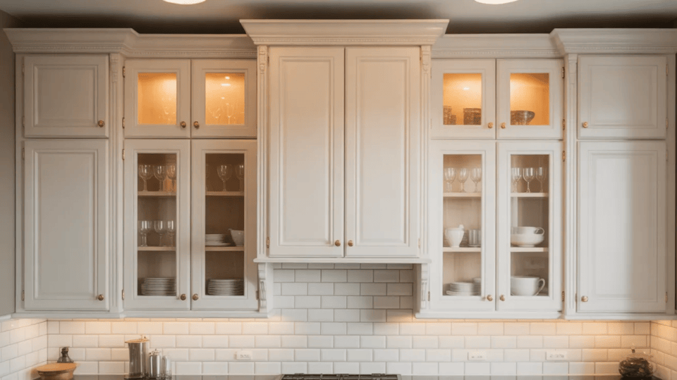
When I first started working with kitchen layouts, one question kept coming up: how deep are kitchen cabinets? It may seem like a small detail, but cabinet depth plays a big role in how a kitchen looks, feels, and functions every day. Along with picking out popular kitchen cabinet colors, choosing the right depth can make your space more organized, comfortable, and easy to use. Here, I’ll break it all down in a simple way. I’ll cover the standard depths for base, wall, and pantry cabinets, along with options for smaller kitchens and custom setups. By the end, you’ll have a clear idea of what works best and how to plan your kitchen space more efficiently. The Importance of Cabinet Depth in Kitchen Design Cabinet depth might seem like a small detail, but it actually makes a big difference in your kitchen. The depth of your cabinets decides how much stuff you can store, from plates and pots to pantry items, so picking the right size helps keep things organized. It also affects how much space you have to move around, which is important if your kitchen is small or busy. Cabinets that are too deep or too shallow can make it hard to reach things or fit appliances like dishwashers and ovens properly. Even simple tasks, like cooking or cleaning, feel easier when your cabinets are the right size. Paying attention to depth can make your kitchen more comfortable, efficient, and just nicer to use every day. Factors That Affect Cabinet Depth Choosing the right cabinet depth isn’t just about numbers; it depends on a few important factors that can change how your kitchen feels and works. Here are the main things to consider: Appliance Alignment: Standard appliances like dishwashers and ranges are 24 inches deep to sit flush with base cabinets for a seamless look. Countertop Overhang: Factor in the extra 1–2 inches of countertop extension beyond the cabinet box when measuring your total floor space. Layout & Flow: Whether you have a galley or U-shaped kitchen, ensure cabinet depth leaves enough room for comfortable, unobstructed walkways. Storage Requirements: Choose deeper cabinets for bulky cookware and shallower units for small kitchens or frequently used items. Proportional Height: For ceilings 9 feet or higher, consider 42-inch wall cabinets or stacked units to maintain visual balance and maximize vertical storage. Ergonomics & Accessibility: Adjust toe kicks for taller users, or follow ADA guidelines (34-inch max counter height) to ensure the space is accessible for everyone. Considering these factors helps make your kitchen more comfortable, organized, and easy to use every day. How Deep are Kitchen Cabinets? Getting the right depth for your kitchen cabinets is important. It affects how much you can store, how easy it is to reach things, and how comfortable your kitchen feels. 1. Base Cabinets Base cabinets serve as the vital foundation of your kitchen’s workspace and storage. The industry standard depth is 24 inches for the cabinet box, which typically extends to 25–26 inches once the countertop is installed. If you are refinishing your current bases to save on costs, choosing a durable formula from reputable paint brands will help them stand up to daily wear and tear This specific depth is designed to maximize storage for heavy pots, pans, and appliances while ensuring the average person can still reach the back of the shelf comfortably. In tighter layouts, you might opt for shallower 18-inch boxes to maintain a 42–48 inch walkway, ensuring the kitchen remains easy to navigate during busy meal prep. 2. Wall (Upper) Cabinets Upper cabinets are designed to provide essential storage for glassware and plates without obstructing your view or workspace. The standard depth is 12 inches, which sits perfectly at eye level and prevents you from bumping your head while cooking. While deeper 15–24 inch units are often used specifically above refrigerators or microwaves to create a flush look, sticking to the 12-inch standard preserves an airy, open feel. For the best ergonomics, these should be mounted roughly 18 inches above the countertop to allow plenty of room for small appliances. 3. Tall and Pantry Cabinets Tall pantry cabinets offer incredible storage flexibility, typically ranging from 12 to 24 inches in depth. Choosing the right size depends entirely on your organizational style; a shallower 12-inch pantry is excellent for visibility, preventing cans and jars from getting “lost” in the back. Conversely, a 24-inch deep pantry maximizes vertical space for bulkier items but truly requires pull-out drawers or rotating organizers to remain functional. Planning this depth carefully ensures your pantry stays organized rather than becoming a cluttered, dark corner where food items are forgotten. 4. Kitchen Island Cabinet Depth A kitchen island is a multi-functional centerpiece, and its depth should reflect its primary purpose. While many islands use standard 24-inch base cabinets, the total depth often reaches 30 to 40 inches to accommodate breakfast bar seating or double-sided storage. If you plan to include seating, remember to include a 12–15 inch overhang for legroom. For smaller kitchens, keeping the depth closer to 30 inches ensures you maintain the necessary 36–42 inches of clearance around the perimeter, allowing for smooth traffic flow and safe appliance door opening. US vs. European Cabinet Depth Standards If you are buying cabinets through an international supplier or renovating a home with existing European cabinetry, the depth numbers will look slightly different. <class=”table-wrapper”> Cabinet Type US Standard European (EU/UK) Standard Base Cabinets 24 inches (61 cm) 56–60 cm (~22–23.6 inches) Wall Cabinets 12 inches (30.5 cm) 30–37 cm (~12–14.5 inches) Tall / Pantry 12 or 24 inches 56–60 cm for full-depth units European base cabinets run slightly shallower, which is why their standard 60 cm countertop is narrower than a US countertop. The practical difference for appliance fit is minimal once door fronts are installed, but it matters if you are trying to mix US-sourced appliances with European-spec cabinetry. ADA-Compliant Cabinet Depths ADA (Americans with Disabilities Act) guidelines set specific requirements for accessible kitchens. These are worth knowing whether you are designing for a family member with limited mobility, planning to age in place, or building to code in a multi-family or commercial setting. Counter height: Maximum 34 inches (vs. the standard 36 inches) Knee clearance: At least 27 inches of vertical clearance beneath accessible work surfaces Base cabinet depth: Still typically 24 inches, but paired with lower countertops Walkway clearance: Minimum 60 inches of turning radius in wheelchair-accessible kitchens If you are remodeling with accessibility in mind, talk to a certified aging-in-place specialist or an NKBA-certified designer. These adjustments are most cost-effective when planned from the start, not retrofitted later. Kitchen Cabinet Sizes for Small Kitchens Choosing the right cabinet sizes is key in a small kitchen. The table below shows common dimensions that help save space while keeping your kitchen functional and easy to use. Cabinet Type Standard Depth Small Kitchen Depth Height Range Best Use Case Base Cabinets 24 inches 18–21 inches 34–36 inches Cooking, sink, storage for pots and pans Wall Cabinets 12 inches 9–12 inches 12–42 inches Storing dishes, cups, and light items Tall/Pantry 12–24 inches 12–18 inches 84–96 inches Food storage, bulk items, vertical storage Corner Cabinets 24 inches 18–24 inches 34–36 inches Maximizing corner space efficiently Pull-Out Cabinets 12–24 inches 9–18 inches 34–36 inches Easy access storage in tight spaces This helps you quickly compare options and choose cabinet sizes that make your small kitchen feel more open while still giving you enough storage. In truly tight kitchens, think galley layouts under 8 feet wide, I often recommend going to 18-inch base cabinets on one side and keeping the opposite wall at standard 24 inches. You preserve most of your storage while gaining 6 inches of walkway clearance, which makes a real difference when two people are trying to cook at the same time. Stock, Semi-Custom, and Custom Cabinets: How Depth Options Differ The type of cabinet you buy directly affects how much flexibility you have with depth. Stock cabinets come in fixed standard sizes, typically 24-inch base and 12-inch wall. They are the most affordable option and work well for most kitchens with straightforward layouts. Semi-custom cabinets offer more width and height options and often allow some depth modification, making them a practical middle ground for kitchens with unusual dimensions or specific appliance needs. Custom cabinets can be built to any depth, from 12 to 30 inches or beyond, which is particularly useful for kitchen islands, ADA-accessible layouts, or homes with angled walls or non-standard alcoves. When I worked with a client who had a shallow kitchen wall, roughly 20 inches from the back wall to where a doorframe started, stock 24-inch base cabinets were simply not an option. A semi-custom 20-inch run solved the problem cleanly. It is worth knowing what category your cabinetry falls into before you start comparing prices. Tips Before Choosing Cabinet Depth Before you decide on cabinet depth, consider a few key points. These can make sure your kitchen is functional, comfortable, and fits your daily needs: Precise Measurements: Measure your kitchen carefully to ensure cabinet depth allows for comfortable movement and a proper fit. Appliance Alignment: Match cabinet dimensions with your fridge, oven, and dishwasher for a seamless, functional look. User-Centric Design: Choose deeper cabinets for bulky tools or shallower ones to keep a small kitchen feeling open. Customization: If standard sizes don’t fit, use custom cabinets to optimize your specific layout and storage needs. Hardware Planning: Confirm interior clearances for pull-outs and organizers before finalizing cabinet depth. Site Assessment: Identify plumbing and electrical constraints early through a professional walkthrough to avoid costly mid-renovation changes By keeping these tips in mind, you’ll pick the right cabinet depth that makes your kitchen comfortable, efficient, and easy to enjoy every day. Final Thoughts After going through all the details, it’s clear that how deep kitchen cabinets are is about more than just following standard sizes. While common measurements work well for most kitchens, the best choice always depends on how you use your space and what makes your daily routine easier. I’ve seen how small adjustments in layout and sizing can completely change how a kitchen feels and functions. Taking the time to plan these details can help you create a space that is both practical and visually balanced. If you’re planning your kitchen or looking to improve your current setup, if you found this helpful, don’t forget to share it with others, and drop a comment with your thoughts or questions! Frequently Asked Questions Does cabinet depth affect countertop depth? Yes. Countertop depth comes from cabinet depth plus overhang. A 24-inch base cabinet with a 1–1.5 inch overhang creates a 25–26-inch countertop surface. What depth should cabinets be if I am tall or short? Cabinet depth usually stays standard. Adjust countertop height instead. Shorter users may prefer slightly shallower cabinets around 20–21 inches for easier reach and better comfort. Are deeper base cabinets always better for storage? No. Depth beyond 24 inches can reduce usability. Items at the back become harder to reach, so pull-out shelves or drawers make standard-depth cabinets more efficient. How much space should be between upper and lower cabinets? Keep about 18 inches between the countertop and the upper cabinets. This allows space for small appliances. A range of 15–20 inches works, depending on kitchen size and layout. Do cabinet depths differ for bathrooms versus kitchens? Yes. Bathroom cabinets are usually about 21 inches deep, compared to 24 inches in kitchens, since bathrooms need less storage space and do not hold large appliances.