

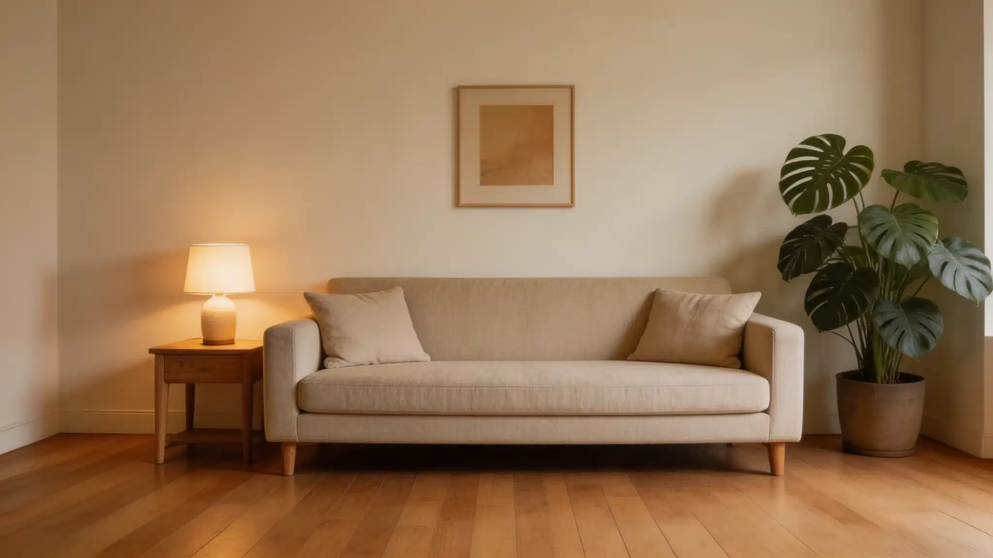
After more than a decade of helping clients choose paint colors, one thing stands out clearly: white is never just white. The right off-white can make a room feel settled and warm. The wrong one can leave it looking dingy or flat before the furniture even arrives. From my work as a color consultant, the questions about warm whites come up constantly, and Benjamin Moore White Down (OC-131) is one that deserves a thorough answer. If you’re planning a full refresh, it also helps to understand the cost to paint a house before making final color decisions. What does it actually look like on a wall? How does it behave in different lighting? And most importantly, will it work in your specific space? Let me answer all your questions. This review covers undertones, LRV, lighting performance, finish options, and coordinating colors, so you can make a well-informed call before opening a can. Getting to Know Benjamin Moore White Down White Down (OC-131) is part of Benjamin Moore’s Off-White Collection, a curated group of roughly 150 neutral shades that sit between true white and cream. The color also appears under the codes 970 and CC-50, depending on which Benjamin Moore collection you’re browsing; all three refer to the same paint. It’s also worth knowing that White Down has roots in Benjamin Moore’s Historical Collection, drawing on the warm cream palettes common in America’s colonial and federal-era interiors. That heritage shows up in how the color reads on a wall, settled, considered, and timeless, rather than trendy. With an LRV of 76.7, it reflects a generous amount of light without tipping into stark or clinical territory. That middle-ground quality is exactly why it shows up in so many designer palettes. It feels livable rather than loud. Homes with warm wood flooring, natural stone, or beige textiles tend to respond especially well to it, because those materials echo the color’s warmth without competing with it. Undertones and Lighting: What Shapes This Color White Down carries a cream-beige undertone that stays quiet until the surrounding light or materials draw it out. Multiple sources and my own client work confirm it has both a yellow base and a soft gray balancing element; the gray is what keeps it from tipping into pure cream territory and makes it more adaptable than most off-whites. If you’ve looked at similar shades like the Natural Choice SW 7011, you’ll notice how slight shifts in undertone can completely change how a color behaves in real spaces. It rarely pulls gray, which keeps it consistent across different rooms. Here is how light shapes it in practice. Natural Light Natural light changes how White Down (OC-131) shows up throughout the day. In my experience consulting on color for rooms with complex orientation, direction matters far more than most people expect, and White Down is unusually sensitive to it. I’ve noticed that direction matters more than people think. In north-facing rooms , the color stays soft and slightly more beige, with less visible warmth due to cooler light. South-facing rooms do the opposite, bringing out the cream undertone and making the color feel warmer and fuller. East-facing rooms start the day brighter and a bit cooler, then settle into a gentle warmth by midday. West-facing rooms build warmth in the afternoon light, where the color looks richer before calming again in the evening. These small shifts keep the color feeling steady but never flat. Artificial Light Artificial lighting takes over once natural light fades, and bulb type makes a clear difference. Warm bulbs in the 2700K–3000K range highlight the cream undertones and create a softer, more relaxed feel. Cooler LEDs at 4000K or higher reduce that warmth and make the color appear more neutral. Using a mix of overhead lights and lamps helps balance the tone and keeps the color from looking too dull or overly warm at night. Practical tip from client projects: In rooms where I’ve seen White Down fall flat at night, the culprit was almost always a single overhead fixture with a cool-white bulb. Swapping in a 2700K bulb and adding one warm lamp transformed how the color read. It’s a $10 fix worth trying before repainting Finish Options and What They Do to the Color Sheen affects more than durability; it alters how light interacts with the paint surface, thereby altering how the color reads. Matte /Flat absorbs light, giving the color its softest, most grounded appearance. Best for low-traffic walls where you want the paint to recede quietly. Eggshell is the most versatile option for living rooms and bedrooms. It has just enough sheen to clean easily, without adding noticeable brightness. Satin works well in kitchens, hallways, and bathrooms. The slight sheen adds durability and makes the color appear a touch crisper. Semi-Gloss is the standard for trim, doors, and cabinetry. On cabinets, especially, it pulls more light into the color, making it appear slightly brighter and more defined. A note on paint lines: Benjamin Moore’s Aura formula in White Down offers notably better durability and color depth than their entry-level lines. For high-traffic areas or cabinets, Aura is worth the price difference. Regal Select is a solid mid-tier option for standard walls. When in doubt, match the finish to how hard the surface works; the busier the space, the higher the sheen needs to be. Room Performance: Where This Color Works Best That range, from living rooms to cabinet finishes, is what makes this color worth serious consideration. The key is matching it to spaces where its warmth adds something rather than fighting what’s already there. 1. Living Rooms A natural fit for this space. The warmth creates a comfortable, settled atmosphere that works with wood floors, linen upholstery, and both traditional and contemporary furniture. It doesn’t compete with existing materials; it supports them. Rooms that already carry warm tones in their flooring or textiles tend to respond especially well. In open-plan layouts, White Down’s gray-balanced undertone is a particular asset: it creates a cohesive visual flow between connected spaces without looking monotonous. I’ve used it across a combined living-dining area where one end received direct afternoon sun, and the other didn’t, and it held together beautifully throughout the day. 2. Bedrooms The low-key warmth keeps the space feeling restful without making it feel heavy or closed in. Pairing it with soft white trim in the same warm family maintains cohesion without sharp contrast. It’s a reliable choice when the goal is a calm, easy room that holds up across changing daylight. 3. Kitchens Works best when the surrounding materials are warm, such as wood cabinetry, brass hardware, or natural stone countertops. It reads clean without going cold, which solves a common problem with brighter whites in food spaces. If your kitchen runs cool in materials or light, a sample test first is the smarter move. 4. Bathrooms Can work well or fall flat depending on what else is in the room. In bathrooms with white tile and cool stone, the warmth reads as a welcome contrast. In spaces that already run warm from materials or light exposure, test a sample first; the undertone can tip too creamy in those conditions. One specific scenario worth noting: if your bathroom has beige fixtures or warm-toned tile that you can’t replace, White Down can actually help unify those elements. I’ve recommended it in exactly that situation to avoid the clash a cooler white would create. 5. Cabinets Cream-adjacent cabinet colors have staying power in current design, and this shade delivers a softer alternative to crisp white. It pairs particularly well with marble, warm quartz, and open wood shelving. The muted quality keeps cabinets feeling considered rather than flat. That range, from living rooms to cabinet finishes, is what makes this color worth serious consideration. The key is matching it to spaces where its warmth adds something rather than fighting what’s already there. If you’re considering White Down on cabinets, the semi-gloss finish is worth the investment. I’ve seen flat or eggshell on cabinets look soft and lovely at first, but they show handling marks faster, and touch-ups become a recurring chore. How It Compares to Similar Colors Not all whites are created equal. Seeing how White Down stacks up against similar shades helps you spot exactly what makes it tick and whether it suits your space. Here are some similar colors: Color Undertone LRV Key Difference White Down(OC- 131) Cream-beige 76.7 Soft, muted warmth Ballet White(OC- 9) Beige-white 73 Slightly darker, more beige Soft Chamois(OC- 13) Light beige 77 Richer and warmer overall Linen White(OC- 146) Cream 80 More noticeably yellow White Dove(OC- 17) Warm-neutral 83 Brighter, less creamy Ballet White runs slightly deeper and more beige, a good option if you want a bit more visual weight. Soft Chamois is warmer and richer, closer to a true cream. If you’re cross-shopping with Sherwin-Williams, White Duck is a frequently compared alternative; it leans grayer and cooler, which works better in rooms with very warm existing materials that could make White Duck look too yellow. Your final pick really comes down to how much warmth you want and how much natural light your room gets. White Down sits comfortably in the middle. Coordinating Colors That Work Well With It White Down plays well with others, but a thoughtful pairing makes all the difference. These coordinating colors share its warmth without competing or clashing. Here are some coordinating colors: Simply White (OC-117): A brighter, cleaner trim choice that creates intentional contrast against White Down’s creamier tone. Cloud White (OC-130): A close Off-White neighbor, perfect for ceilings or adjacent rooms to keep your palette visually connected. White Dove (OC-17) : Slightly brighter than White Down, this warm trim option keeps the whole scheme feeling cohesive. Revere Pewter (HC-172): A warm gray that transitions cleanly from White Down in open-plan layouts without feeling disconnected. Edgecomb Gray (HC-173): This light greige sits comfortably beside White Down in connecting rooms, avoiding any jarring visual contrast. These pairings give you flexibility whether you’re working with trim, ceilings, or adjoining rooms. The shared warmth keeps everything feeling intentional and well-thought-out. When White Down Doesn’t Work (And What to Use Instead) Most paint reviews focus on where a color shines. After years of consulting, I find it equally useful to flag situations where a color is likely to disappoint, because the wrong shade on a wall costs real time and money. White Down tends to struggle in these specific situations: Rooms with beige or almond fixtures you can’t replace: The undertones can clash subtly, creating a “double beige” effect that reads as unintentional rather than warm. In these rooms, a cooler off-white like White Dove often works better. Very bright, south-facing rooms with white or cool-tone countertops: White Down can read noticeably yellow against cool stone in strong sunlight. I’ve had clients repaint cabinets from White Down after discovering this in full afternoon sun. Test in those exact conditions before committing. Rooms trying to read as crisp and modern: If the design intent is clean-lined and contemporary with cool metals and white stone, White Down’s creaminess can undercut that aesthetic. A higher-LRV white like Chantilly Lace (OC-65) would serve better. Open-plan spaces with a cooler adjacent room: If the connecting room is painted in a cool gray or blue-toned neutral, White Down can look out of place. Make sure the warmth of your full palette is consistent across the connected space Sampling: The One Step Worth Doing Before committing to a full gallon, put a sample on the actual walls you plan to paint. Samplize peel-and-stick samples are a convenient option, no brushes, no mess, and they sit flush against the wall for an accurate read. Place them on at least two walls in the room, preferably one that gets direct light and one that doesn’t. Check the sample in the morning, midday, late afternoon, and at night under your usual lighting. The color will shift each time, and that range tells you more about how the paint will perform than any store swatch. Leave the sample up for at least 48 hours before deciding. Paint dries differently than it looks wet, and undertones can shift slightly as the finish cures. I also recommend holding the sample against your largest fixed elements, flooring, countertops, and cabinetry, rather than looking at it in isolation. The color doesn’t live on the wall alone; it lives in conversation with everything else in the room. That context check has saved many of my clients from a repaint. Final Thoughts In my experience working with clients across all kinds of spaces, the colors that perform best are rarely the ones that look boldest on a swatch; they’re the ones that hold steady across changing light, work quietly with the materials already in the room, and make people feel good the moment they walk in. Benjamin Moore White Down does all three when placed in the right conditions. The cream-beige undertone is gentle enough to stay calm, the LRV keeps rooms feeling open, and the overall warmth translates into spaces that feel considered rather than accidental. Sample it in your own light, hold it next to your trim and flooring, and give it a full 48 hours. That process has never steered my clients wrong, and it won’t steer you wrong either. Have you used White Down in your home? Drop a comment below with what space you used it in and how the light treated it; those real-world details help everyone make a better decision. Frequently Asked Questions What undertones does White Down OC-131 have? White Down carries soft cream and beige undertones with a slight gray balance. This mix keeps it from feeling overly yellow, allowing it to appear warm yet controlled in most interior settings. Is White Down a good choice for cabinets? White Down works well on cabinets when paired with warm materials like wood or brass. Use a semi-gloss finish for durability, as lower sheens may show wear and require more frequent maintenance. How does White Down compare to White Dove? White Down is slightly creamier and more muted, while White Dove appears brighter and more neutral. White Down offers a softer, cozier feel, whereas White Dove leans cleaner and more versatile in mixed palettes. Does White Down work in low-light rooms? Yes, it performs well in low-light spaces due to its higher LRV. It helps reflect available light while maintaining warmth, preventing the room from feeling dull or overly shadowed.
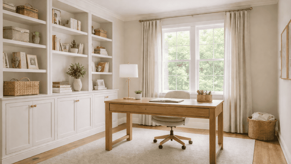
If you’re looking for a neutral color that feels calming without being too dull, Benjamin Moore November Rain might be just what you need. When you’re choosing paint colors for your home, it’s important to select a versatile soft gray with subtle warmth that works well in many spaces. If you’re considering it for your living room, bedroom, or even kitchen, it brings a peaceful vibe while adapting to different lighting throughout the day. I’ll help you understand how November Rain behaves in various settings, its undertones, and the best ways to use it in your home. By the end, you’ll have a clear idea of whether this soft shade is right for your space. Quick note on a common confusion: There are two paints called “November Rain”, Benjamin Moore OC-50 (a warm greige) and Sherwin-Williams SW 7641 (a cool blue-gray). They are completely different colors. This review covers Benjamin Moore November Rain OC-50 only Official Product Details of November Rain Benjamin Moore November Rain Benjamin Moore is a soft, versatile neutral that blends warmth and subtle depth. It is not a bright white, but rather a refined off-white with gentle greige influence. The balance of beige and soft gray keeps it from feeling stark or overly creamy. Unlike cooler gray neutrals, November Rain carries a mild warmth that helps rooms feel calm and welcoming. It shifts slightly depending on lighting, sometimes revealing a faint green-gray undertone that adds quiet complexity. It belongs to both the Off-White Collection and the Classic Color Collection, making it one of Benjamin Moore’s reliable neutral staples. This shade works beautifully on walls, trim, and even cabinetry, offering a light yet grounded foundation. Color Code OC-50 / 2142-60 LRV 71.23 RGB 221 / 218 / 208 HEX #DDDAD0 Collections Off-White Collection, Classic Color Collection November Rain Undertones and Lighting Effects Lighting plays a major role in how Benjamin Moore November Rain appears in your space. Its undertones shift gently depending on the direction of light and the type of bulbs you use. While it reads as a soft neutral at first glance, its beige warmth and subtle green-gray base become more noticeable once it’s on the wall. This unique quality makes it a great alternative to more traditional soft sage green paint tones when you want a hint of color without committing to a full green. In Natural Light Natural light highlights different parts of November Rain throughout the day, affecting how warm or muted it feels. North-facing rooms: North-facing light is cooler and softer. In these rooms, November Rain can appear slightly grayer, and its green undertone may show more clearly. The result feels calm and understated rather than warm. South-facing rooms: South-facing rooms receive strong, warm sunlight. Here, November Rain leans more beige and feels softer and more inviting. The warmth balances the gray base and keeps the color from looking dull. East-facing rooms: Morning light is bright and slightly cool. Early in the day, the color may look a bit sharper and more neutral. As the light fades, it settles into a gentle greige tone. West-facing rooms: Afternoon and evening light from the west adds warmth. November Rain can look richer and creamier later in the day, with less of the green-gray influence visible. In Artificial Light Artificial lighting also changes how November Rain behaves after sunset. Under warm bulbs, the beige undertones become more noticeable, and the color feels softer and cozier. Under cool LED or daylight bulbs, the gray-green cast becomes more defined, giving the paint a slightly crisper appearance. To keep the color balanced, use layered lighting. Combine overhead fixtures with lamps or sconces so the shade stays consistent and doesn’t shift too dramatically from day to night. November Rain Benjamin Moore in Different Paint Lines November Rain Benjamin Moore is available in several product lines, each designed for different durability levels and surfaces. Choosing the right paint formula ensures the color performs well in your space and holds up over time. Below is a simple breakdown to help you match the right line and finish to your project. Aura: Very high durability, ideal for high-traffic walls, kitchens, and bathrooms. Available in Matte, Eggshell, Satin, and Semi-Gloss. Regal Select: High durability, great for living rooms, bedrooms, and hallways. Offered in Matte, Eggshell, Satin, and Semi-Gloss. Ben: Moderate durability, suited for budget-friendly or low-traffic areas. Comes in Matte, Eggshell, and Satin. Advance: Cabinet-grade durability, best for cabinets, trim, and doors. Available in Satin and Semi-Gloss. For walls, Matte or Eggshell provides a soft look with enough durability for everyday living. If you are undecided on the sheen, choosing between eggshell and satin finishes depends on how much moisture and traffic the room receives. Satin works well in kitchens and bathrooms where moisture resistance matters. November Rain in Real Rooms November Rain can look slightly different from room to room. I have seen it shift based on lighting, furniture, and flooring choices. 1. Living Rooms November Rain creates a soft and welcoming backdrop in living rooms. It works beautifully with medium- and dark-wood floors, adding warmth without overpowering the space. I’ve noticed it pairs well with neutral sofas, textured rugs, and both modern and traditional furniture styles. Because it’s light but not stark, it keeps the room feeling open while still adding subtle depth. In bright spaces, it feels airy, while in softer light, it becomes slightly cozier and more grounded. 2. Bedrooms In bedrooms, November Rain feels calm and restful. The gentle warmth in the color helps the space feel relaxed rather than cold. It pairs especially well with warm white trim and natural fabrics, such as cotton or linen bedding. I’ve seen it work nicely with layered textures and soft lighting, creating a comfortable atmosphere without feeling dull. The subtle undertones add interest, but the overall look remains quiet and soothing throughout the day. 3. Kitchens November Rain performs well in kitchens where balance matters. It pairs easily with white cabinets, natural wood tones, and light quartz or marble countertops. The shade avoids looking overly gray or beige, which helps maintain a clean appearance. In spaces with good natural light, it feels bright without becoming stark. Under warmer lighting, it softens slightly and complements wood finishes nicely. It provides a neutral foundation that supports both modern and classic kitchen styles. For kitchen walls specifically, I recommend the Aura Eggshell finish. It’s easy to wipe down, holds the color accurately, and the slight sheen reads well under the bright task lighting most kitchens have. 4. Bathrooms In bathrooms, November Rain reflects light well and keeps smaller spaces feeling fresh. It avoids the harshness of bright white while still maintaining a clean look. I’ve seen it work particularly well with chrome fixtures, white tile, and light stone surfaces. Because bathrooms often have shifting light throughout the day, the soft undertones help it adapt without feeling too cool. It’s a reliable choice for creating a balanced and relaxed environment. 5. Open Floor Plans November Rain flows smoothly through open floor plans. Its balanced tone helps connected spaces feel cohesive without obvious color breaks. I’ve noticed it transitions well between living areas, kitchens, and hallways, especially when trim remains consistent. Because it sits between off-white and greige, it adapts easily to changing light across larger areas. The result is a unified look that feels intentional and steady rather than segmented or visually busy. How to Sample November Rain Before You Commit Sampling is the step most people skip, and the one that saves the most regret. November Rain’s chameleon undertones make it particularly important to see on your specific walls before ordering a full gallon. Buy a sample quart and paint two large swatches (at least 12 x 12 inches) on opposite walls in the room you’re painting. Observe them at different times of day: early morning, midday, and after dark under your actual lighting. Don’t evaluate the color on a small paint chip in the store; the scale difference alone will fool you. Peel-and-stick paint swatches are a convenient alternative and work reasonably well for initial testing, though I’ve found they can slightly alter how the undertone reads compared to the paint applied directly to your wall. For a final decision, nothing replaces a painted swatch. November Rain Shade Variations and Related Colors Before you decide, take note of how these colors compare in warmth, coolness, and overall tone to fit your desired atmosphere. Testing a sample on your walls in different lighting can make all the difference. Color Name Brand LRV Shade Type November Rain Benjamin Moore 38 Soft gray with blue undertones Rainstorm Benjamin Moore 22 Deep stormy gray Gray Owl Benjamin Moore 65 Light, cool gray Silver Chain Behr 57 Light gray with subtle warmth Stonington Gray Benjamin Moore 53 Cool, balanced gray Ashen Fog Sherwin-Williams 55 Light gray with soft green undertones These related colors give you a broader range of options while maintaining a similar aesthetic to November Rain, with various undertones to match different room vibes. Similar Colors to November Rain Before choosing Sherwin-Williams November Rain SW 7641, it’s helpful to compare it with other popular gray-blue shades. Even slight undertone differences can completely change how a color feels in your space. 1. November Rain vs. Benjamin Moore Rainstorm Rainstorm is a deeper, stormier gray with subtle blue undertones. It offers a moodier, more dramatic tone than November Rain, while still maintaining a soft, cool base. Rainstorm is perfect for larger spaces, where you want to introduce richness without overwhelming the room. If you’re after a bolder look, Rainstorm will add more intensity to your space. On the other hand, November Rain offers a calmer and more livable atmosphere with its gray undertones. 2. November Rain vs. Benjamin Moore Gray Owl Gray Owl is a light, cool gray with subtle green undertones. It offers a fresh, airy feel similar to November Rain, but with a bit more warmth. Gray Owl reflects light well, making it ideal for smaller or less-lit rooms. It pairs beautifully with both modern and traditional furniture, adding a soft elegance to the space. November Rain, however, feels more refined and muted in comparison, offering a balance of softness and neutrality. 3. November Rain vs. Benjamin Moore Stonington Gray Stonington Gray is a cool, balanced gray that offers more depth than November Rain. With subtle blue undertones, it creates a calming and serene atmosphere, making it perfect for spaces that need a neutral yet soothing touch. While Stonington Gray feels slightly deeper, it offers a softer and more approachable option, especially in rooms that need a balanced and refined look without too much depth. 4. November Rain vs. Benjamin Moore Silver Chain Silver Chain is a cool gray with a touch of warmth, making it a great alternative to November Rain if you prefer a more neutral, less blue-toned option. Silver Chain creates a soft and inviting atmosphere without feeling too cool or harsh. With an LRV of 57, it’s slightly lighter than November Rain, allowing for more light reflection, making it ideal for brighter spaces. If you want a calming, neutral color that still feels warm, Silver Chain is a strong contender. 5. November Rain vs. Sherwin-Williams Evergreen Fog Ashen Fog is a light gray with soft green undertones, giving it a more earthy feel than November Rain. It’s perfect for creating a serene, natural ambiance, especially in spaces like bedrooms or bathrooms. While both colors have a similar LRV, Ashen Fog brings a subtle warmth that balances the cool gray tones, making it ideal for rooms that need a little more depth. November Rain, with its gray-blue blend, provides a cleaner, more balanced neutral tone. Should You Choose November Rain, Benjamin Moore? If you’re thinking about a soft gray paint color that feels calm and neat, November Rain from Sherwin‑Williams might be a great pick for you. I’ve found that its cool, muted tone works well in most rooms, especially where you want a gentle, relaxed feel. You’ll notice that it doesn’t lean too dark or too light, so it can help your space feel balanced without fighting with your furniture or decor. When you’re picking paint, think about how much light your room gets and what look you want overall. If you want a color that stays easy to work with and won’t look dated as styles shift, this shade is worth testing on your wall. A sample helps you really see it in your own light. Final Thoughts Now that you know how Benjamin Moore November Rain shifts with light and complements different spaces, you can decide if it’s the right color for you. Its balance of warmth and softness makes it a flexible choice for various rooms. Remember to test a sample in your home to see how it reacts with your unique lighting and décor. If you’ve found this breakdown helpful, I’d love to hear your thoughts. Feel free to share your experience with this color or let me know if you have any questions. Your space deserves the perfect color, and I hope this guide has brought you one step closer to finding it.
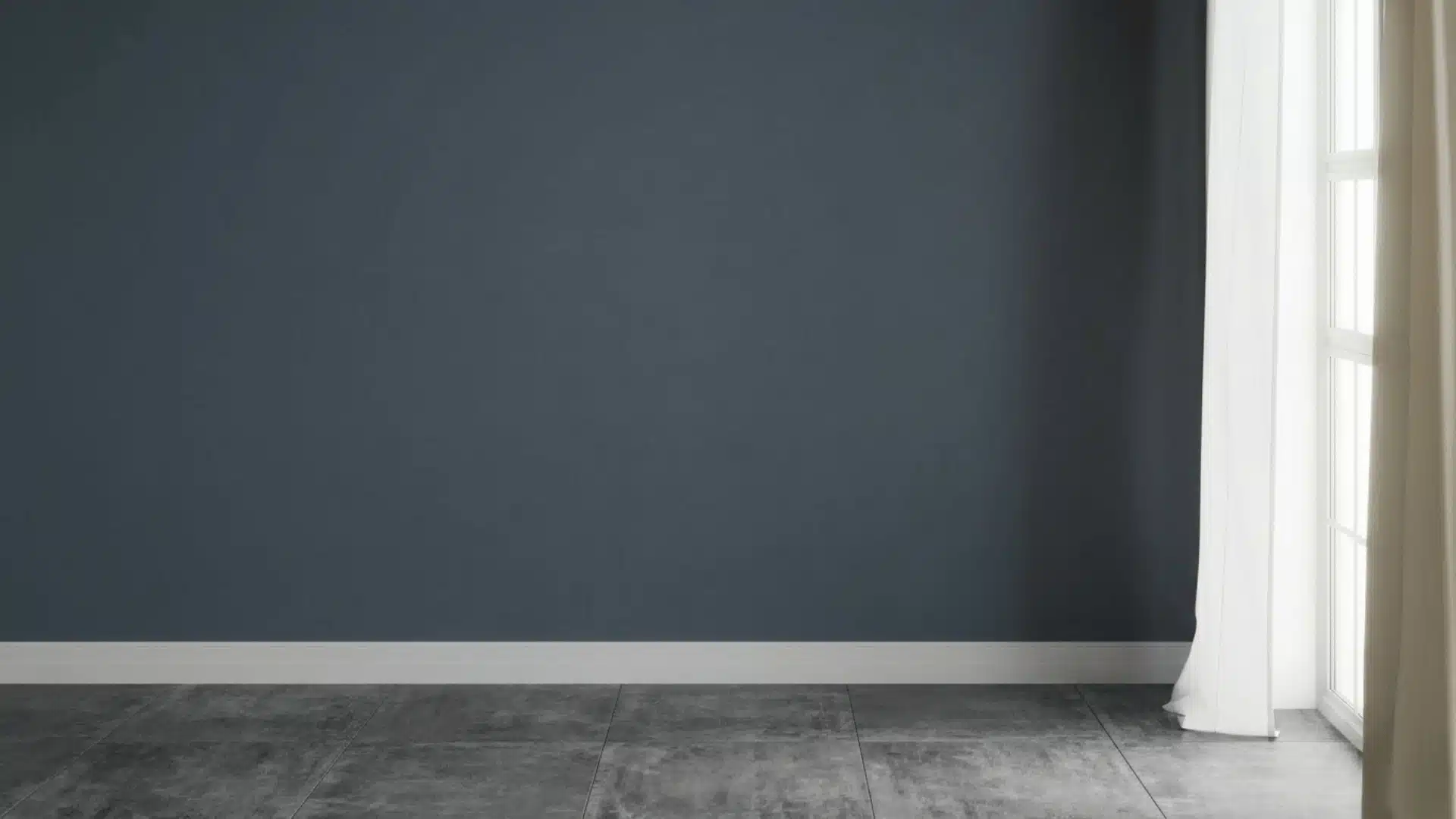
If you’re considering Granite Peak sherwin williams, you’re probably looking for a deep, refined color that feels strong but not overwhelming. I’ve seen how tricky it can be to judge a dark shade just from a small swatch. What looks balanced in one space can feel too heavy or too blue in another. That’s why it helps to understand how this color actually behaves in real rooms. Throughout the process ofchoosing the right paint colors, I’ll help you see how Granite Peak reacts to light, where it works best, and how you can use it without making common mistakes. By the end, you’ll know exactly if this shade fits your space. Granite Peak SW 6250: Everything You Need to Know Granite Peak (SW 6250) is a deep blue-gray paint from Sherwin-Williams with subtle slate undertones and a low LRV of 14, meaning it absorbs roughly 86% of light. It belongs to the Blue Collection but carries enough gray to feel grounded rather than overtly bold, making it a sophisticated dark neutral. In natural light, the color shifts toward a noticeable blue tone; in lower or artificial light, it deepens into rich charcoal gray. Temperature-wise, it runs cool, though the gray base softens any sharpness. Moody, refined, and highly adaptable, it suits accent walls, cabinetry, vanities, and exteriors with equal confidence. Color Family: Blue-Gray, Sherwin-Williams Blue Collection Hex Code: #606375 RGB Values: 96, 107, 117 Color Temperature: Cool Undertones: Slate, Gray. How Granite Peak Works in Different Lighting Lighting plays a huge role in how Granite Peak looks on your walls. Understanding how this color behaves in both natural and artificial light will help you make smarter decisions before you paint. Natural Light Granite Peak is very sensitive to natural light. In bright daylight, it leans toward a clear blue-gray tone, while on cloudy days or in shaded spaces, it deepens into a richer, moodier charcoal. The direction your room faces makes a big difference in how the color reads throughout the day. North-Facing Rooms: North-facing rooms get little direct sunlight, which makes Granite Peak appear darker and more charcoal-leaning. Adding warm lighting and light-colored furniture helps keep the space from feeling too dim or cold. South-Facing Rooms: South-facing rooms receive the most natural light throughout the day, which beautifully brings out Granite Peak’s blue undertones. This is the most flattering direction for this color, giving it a balanced and polished look. East-Facing Rooms: East-facing rooms get bright, warm morning light, which softens Granite Peak and gives it a slightly warmer feel early in the day. By afternoon, the light fades, and the color shifts back to a cooler, deeper tone. West-Facing Rooms: West-facing rooms catch warm, golden light in the evening, adding a subtle warmth to Granite Peak at that time. In the morning, however, the room stays dim, making the color look quite dark and cool. From the field: I always tell clients in north-facing rooms to test Granite Peak on a large board before committing. I had one client in a north-facing home office who fell in love with the color in the store, painted the whole room, and then hated how flat and cold it felt. The fix was simple; we swapped her overhead cool-white LEDs for warm 2700K bulbs, and the room was completely transformed. The color came alive. Don’t skip that lighting test Artificial Light The type of bulb you use changes how Granite Peak looks just as much as natural light does. Warm bulbs, like soft white or Edison-style lights, bring out the gray tones and make the color feel cozy and grounded. Cool white or daylight bulbs push the blue undertones forward, giving the room a crisper, more modern feel. For the best result, test your lighting before finalizing the look. Which Sherwin-Williams Paint Line to Use The paint line matters more than people realize, especially with a dark color. For Granite Peak, I recommend: Sherwin-Williams Emerald Interior: Best overall, superior coverage, excellent durability, and the depth of color is noticeably richer. Worth the price for accent rooms or cabinetry. Sherwin-Williams Duration: A close second and often more available in stores. Good scrubbability, which matters in kitchens and bathrooms. Sherwin-Williams SuperPaint: Fine for low-traffic bedrooms or accent walls where budget is a priority. You may need a third coat for full depth with a dark color like this. Pro tip: For full-room color drenching (painting walls, trim, and ceiling the same shade), go with a satin finish throughout. It unifies the look while keeping each surface slightly distinct in how it catches light. I used this approach in a client’s dining room with Granite Peak and the result was dramatic but never oppressive. Flat matte on all four walls plus the ceiling can start to feel airless with a dark color like this. Best Finishes for Granite Peak The finish you choose matters just as much as the color itself. When understandingdifferent types of paint finishes, you’ll find that pairing Granite Peak with the right sheen brings out its depth and ensures it looks intentional in every space Matte Finish: Matte gives Granite Peak a smooth, velvety appearance that feels soft and elegant on walls. It hides surface imperfections well and keeps the moody tone looking rich and refined. Satin Finish: Satin offers a subtle sheen that adds quiet sophistication without being too shiny. It works well in bathrooms and bedrooms where you want durability alongside a polished, easy-to-clean surface. Semi-Gloss Finish: Semi-gloss is ideal for trim, doors, and cabinets. Its reflective surface creates a sharp contrast against matte walls and holds up well against moisture, frequent cleaning, and everyday wear. Best Rooms to Use Granite Peak Granite Peak isn’t just a single-room shade. It’s a versatile, whole-home color that adapts beautifully to every space. Here’s exactly where it earns its place. 1. Living Room Granite Peak brings understated richness to a living room, offering the kind of depth that makes a space feel deliberately designed. Apply it to a single accent wall to create a striking focal point, or envelop all four walls for a warm, enveloping atmosphere. It harmonizes beautifully with natural wood, warm whites, and textured fabrics like linen or leather. Edison bulbs or ambient floor lamps coax out its green undertones, lending the room genuine warmth. 2. Bedroom Granite Peak transforms a bedroom into a calm, nature-inspired retreat. Use it as a dramatic feature wall behind the bed, or wrap the entire room for a deeply restful cocoon. Balance its richness with crisp white or soft cream bedding to keep the space feeling light. Warm wood nightstands and muted gold or bronze fixtures add just the right finishing touch without competing with the color. 3. Kitchen Cabinets Granite Peak on cabinetry delivers a refined, high-end look without the starkness of full black. It pairs sharply with white or soft gray countertops, creating a clean, considered contrast. White ceramic knobs lend a charming cottage feel, while brushed brass hardware elevates the look with warmth and sophistication. Introduce open shelving in natural wood alongside the cabinets to complete a cohesive, layered kitchen aesthetic. 4. Bathroom Granite Peak turns an ordinary bathroom into a space that feels genuinely designed. Paired with white subway tile or large-format floor tile, the contrast is crisp and striking while white fixtures keep everything feeling fresh and clean. Choose chrome or matte black hardware for a contemporary edge, or brushed gold for warmth. Even a compact powder room finished in Granite Peak feels polished and purposefully styled. 5. Exterior Use Granite Peak holds its own outdoors, reading as sophisticated and grounded against natural surroundings. Go bold with full siding coverage, or keep it refined with just the shutters and front door. A Granite Peak door alongside light gray or white siding with black iron house numbers is a classic pairing. For a stronger statement, clad the lower half in board-and-batten with crisp white trim above. On exteriors, this color reads slightly lighter than it does indoors because of the abundance of natural light. What looks like a deep charcoal inside will read more as a mid-toned blue-gray on a sunny exterior wall. That’s not a negative; it actually makes Granite Peak more usable outside than many other dark paints of this depth. Granite Peak vs. Similar Sherwin-Williams Colors Choosing the right dark neutral can be tricky. And here is how Granite Peak SW 6250 stacks up against four closest Sherwin-Williams alternatives in one clear comparison: Color SW Code Tone Key Difference vs. Granite Peak Naval SW 6244 Deep Navy Blue Much darker and more saturated blue, less gray, more bold and dramatic Distance SW 6243 Soft Denim Blue Lighter and softer reads more like a relaxed denim than a moody dark neutral Indigo Batik SW 7602 Rich Saturated Indigo Higher saturation and more purple undertones feel more vivid and intense Mindful Gray SW 7016 Warm Greige Warmer undertones with no blue, softer and more neutral compared to Granite Peak’s cool edge Each of these colors has its own personality, but if you want that perfect balance of cool blue and grounded gray, Granite Peak remains the strongest choice among them all. Coordinating Colors That Work With Granite Peak One area most blogs leave thin is a concrete, practical palette. Here’s what genuinely works alongside Granite Peak: SW Extra White (SW 7006): The cleanest white to pair with Granite Peak for trim, ceilings, and doors. Crisp without being harsh. My go-to combination for dining rooms and bedrooms. SW Alabaster (SW 7008): A creamier off-white that softens the contrast for a more relaxed, cottage-style feel. Works well in bedrooms and living rooms. SW Pure White (SW 7005): A slightly cooler bright white. Good for kitchens where you want the cabinets and countertop to pop against the Granite Peak island or lower cabinets. SW Repose Gray (SW 7015): A soft warm-neutral gray that bridges Granite Peak with lighter walls in an open-plan layout. Useful when you want to use Granite Peak in one zone without it feeling disconnected. Common Mistakes When Using Granite Peak Granite Peak is a stunning color, but like any dark shade, it comes with a few things to watch out for. Avoid these common mistakes to get the best results: Ignoring Lighting: Granite Peak shifts between blue and deep charcoal depending on natural and artificial light. Not accounting for this can leave the color looking very different from what you expected. Pairing With Too Many Dark Shades: Combining Granite Peak with other dark tones can make a room feel heavy and closed in. Balance it with lighter furniture, white trim, or soft neutrals to keep the space breathing. Skipping the Sample Test: Never go straight to painting a full wall. Always test a sample patch first and observe it at different times of day before committing. Overlooking Room Size: In very small rooms with little natural light, Granite Peak can feel overwhelming. Make sure the space has enough light or contrast to carry the color well. Getting these details right makes all the difference between a space that feels moody and refined and one that feels dark and uninviting. Keep these points in mind before you pick up that paintbrush. Who Should Choose Granite Peak and Who Should Avoid It? Granite Peak is a bold, confident color that works beautifully in the right hands, but it isn’t suited to every space or style. Understanding where it thrives and where it struggles will save you time and effort before you commit to a full room. Who Should Choose It: If you love deep, cool-toned spaces with a modern, refined feel, Granite Peak is a strong fit. It works best in well-lit rooms with warm bulbs and light contrasting elements. Who Should Avoid It: If your style leans toward warm, soft, or earthy tones, this color may feel out of place. Small rooms with limited natural light will feel darker and more cramped with Granite Peak on the walls. Final Thoughts Take your time before you commit: one weekend of testing will give you years of a room you love. Granite Peak is a rare color that feels bold and calm at the same time. It works in living rooms, bedrooms, kitchens, bathrooms, and even outdoors. It pairs well with warm whites, natural wood, brass, and matte black hardware. It shifts with the light and rewards rooms with good lighting and the right finish. The rule is simple: always test before you commit. Get a large sample board, check it morning and night, and trust what you see. Done right, Granite Peak won’t just be paint; it’ll be the reason your room finally feels finished. Tried it in your home? Drop a comment below on which room you painted, and how it turned out.
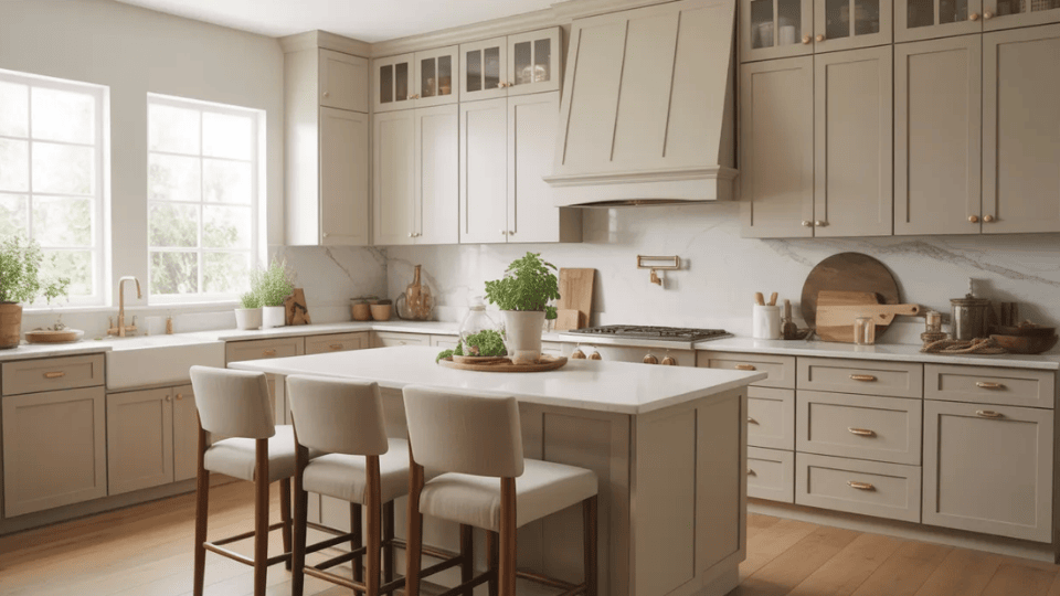
When I first started helping people pick cabinet colors, one question kept coming up. Should you paint cabinets Accessible Beige? It’s a fair question. Choosing the right paint color for cabinets can feel stressful because it changes the whole kitchen. Accessible Beige by Sherwin-Williams is one of those colors that sits right between gray and beige, making it a standout among Sherwin-Williams’ top-rated greige and beige selections. That balance makes it work in many homes. I’ve seen it used in modern kitchens, classic spaces, and even farmhouse styles. In this guide, I’ll walk you through everything you need to know about Accessible Beige cabinets. You’ll learn how the color looks, what countertops and hardware work best, kitchen ideas, and helpful tips before you paint. Quick answer: Yes, Accessible Beige (SW 7036) is a strong cabinet color choice for most kitchens, especially those with warm wood floors, natural stone countertops, or transitional styling. It earns its reputation as a versatile greige. But it has real limitations, particularly in north-facing kitchens and alongside pink-toned wood, that most guides don’t mention. This guide covers both What Color is Accessible Beige? Accessible Beige is a warm neutral paint color from Sherwin-Williams. It sits between gray and beige, which is why many people call it a “greige.” The color feels soft and balanced without leaning too cool or too yellow. The official shade is SW 7036 with a Light Reflectance Value of 58, meaning it reflects a moderate amount of light. In most kitchens, it appears calm and welcoming rather than bold. It has gray undertones that prevent it from looking like older beige tones, along with a very slight green hint that may show in certain lighting. Because it is a lighter greige, it can limit wall color choices slightly. Its tone may shift with lighting and surrounding materials, which adds to its flexibility. Accessible Beige Cabinet Ideas for Kitchens Accessible Beige cabinets provide a soft, steady base that works with many styles. You can pair them with light counters, warm metals, or darker accents. 1. Accessible Beige Cabinets with White Countertops Accessible Beige cabinets with white countertops create a kitchen that feels clean, warm, and easy to live with. The white surface brightens the room, while the beige cabinets keep it from feeling too plain or cold. This pairing works especially well with quartz, marble, or other light stone counters. It fits many styles, including modern, transitional, and farmhouse kitchens. If your kitchen does not get a lot of natural light, white countertops can also help reflect light and keep the space feeling more open. One practical note here: if you choose stark, bright white countertops (think pure quartz with no movement), the contrast against Accessible Beige can be sharper than expected. A warmer white quartz with subtle veining softens the transition and keeps the overall palette cohesive 2. Accessible Beige Cabinets with Black Hardware Black hardware adds a strong, simple contrast to Accessible Beige cabinets. The darker finish helps define the cabinet lines and makes the beige color stand out more clearly. This combination works well if you want the kitchen to feel a little sharper without losing warmth. Black pulls and knobs are often used in modern, farmhouse, and transitional kitchens. They also pair nicely with black light fixtures, faucets, or window frames, which can help tie the whole kitchen together in a clean and balanced way. 3. Accessible Beige Cabinets with Brass Handles Brass handles bring warmth and a soft shine to Accessible Beige cabinets. Since Accessible Beige already has a warm greige base, brass works naturally with it and adds a more polished look. This pairing can make the kitchen feel a bit more inviting without being too bold. It works well in traditional, transitional, and even modern kitchens when the brass finish is simple and clean. If you have warm wood floors or creamy wall colors, brass hardware can help connect those elements and make the room feel more complete. My preference is aged or unlacquered brass over polished brass alongside Accessible Beige. Polished brass can read as too shiny against a quiet, matte greige. The warmer, slightly worn quality of unlacquered brass matches the earthiness of the cabinet color better. 4. Accessible Beige Cabinets with Wood Accents Wood accents pair very naturally with Accessible Beige cabinets because both have a soft, warm feeling. You can bring in wood through open shelves, stools, trim, beams, or even a wood range hood. This mix helps the kitchen feel more relaxed and welcoming. It also keeps the space from looking too flat if most of the cabinets are painted the same color. Light wood creates a softer look, while medium or darker wood adds more contrast. This idea works especially well in farmhouse, rustic, and organic modern kitchens. 5. Two-Tone Kitchen with Accessible Beige Lower Cabinets Using Accessible Beige on lower cabinets can help anchor the kitchen while keeping the overall look light. When paired with white or off-white upper cabinets, the room feels open at eye level and grounded below. This setup works well in both small and large kitchens because it adds contrast without making the space feel busy. It is also a smart option if you want some color on the cabinets but do not want the whole kitchen painted in a single shade. This look works especially well with neutral backsplashes and simple hardware. The best upper-cabinet pairings for this two-tone approach: Alabaster (SW 7008) for a warm, seamless result, or Shoji White (SW 7042) if you want something slightly creamier. Avoid using Pure White uppers, as the contrast can be too stark and makes the Accessible Beige lowers look heavier than they are. 6. Accessible Beige Cabinets with a White Subway Tile Backsplash A white subway tile backsplash is one of the easiest ways to brighten a kitchen with Accessible Beige cabinets. The clean white tile reflects light and gives the cabinets a fresh, crisp contrast. This combination works in many kitchen styles because subway tile is simple and timeless. It also helps the warm greige cabinets feel balanced instead of too heavy. If you want a classic look that still feels current, this is a strong option. You can also change the grout color slightly to make the backsplash look softer or more defined. 7. Accessible Beige Cabinets with a Warm Gray Backsplash A warm gray backsplash adds gentle contrast to Accessible Beige cabinets without making the kitchen feel too cool. Since Accessible Beige already has some gray in it, the two colors usually work well together. This pairing can make the kitchen feel calm and layered, especially if you want a neutral design that still has some depth. Warm gray tiles also work nicely with stainless steel appliances, brushed nickel hardware, and soft white walls. If you want the kitchen to feel modern but not stark, this is a very workable direction. 8. Accessible Beige Cabinets with Marble Countertops Marble countertops bring softness and texture to Accessible Beige cabinets. The natural veining in marble adds movement, while the cabinet color keeps the kitchen feeling warm and grounded. This pairing works especially well if you want a timeless look that still feels light. White or soft gray marble can help brighten the space and connect nicely with the gray-beige balance of Accessible Beige. It also looks beautiful with brass or black hardware, depending on the style you want. This combination works well in classic, stylish, and transitional kitchens. 9. Accessible Beige Cabinets with Dark Island Cabinets A dark island can add depth and contrast to a kitchen with Accessible Beige cabinets. Colors like navy, deep gray, charcoal, or espresso help the island stand out as a clear focal point. This setup works well if you want the kitchen to feel a little more layered without changing the main cabinet color. The beige cabinets keep the room soft, while the darker island adds structure and visual interest. This idea is especially useful in larger kitchens where one strong feature can help break up the space and make the layout feel more intentional. My go-to dark island pairing with Accessible Beige perimeter cabinets: Iron Ore (SW 7069) or Peppercorn (SW 7076). Both are deep enough to read as a clear contrast without going full black, and their warm-dark quality feels intentional alongside Accessible Beige rather than arbitrary. How Accessible Beige Cabinets Look in Different Lighting Lighting changes how cabinet colors appear throughout the day. Accessible Beige reacts to both natural and artificial lighting, which can slightly shift its tone. Lighting Type How Accessible Beige Cabinets Usually Look Natural daylight Cabinets appear lighter and softer, showing more beige warmth and helping the kitchen feel open and bright. Warm artificial lighting The cabinets look warmer and slightly richer, making the kitchen feel cozy and comfortable. Cool white lighting Gray undertones become more noticeable, giving the cabinets a slightly cooler and more modern look. Low lighting The color appears deeper and slightly darker, making the cabinets feel more grounded. North-facing kitchen Cooler light brings out gray tones strongly. It may look more gray than beige and sometimes show a slight green hint. South-facing kitchen Warm light highlights the beige base. The color looks its best but may appear lighter in strong afternoon sun. Because lighting changes throughout the day, I always suggest testing the color on a cabinet door or sample board. It is also important to consider how different paint sheens reflect light, as a glossier finish will bounce more artificial light than a matte one, altering the color’s appearance in the evening. Best Countertop and Backsplash Pairings for Accessible Beige Cabinets Choosing the right surfaces helps balance the warmth of Accessible Beige and keeps your kitchen looking clean, connected, and easy to style. Countertop Pairings These countertop options work well with Accessible Beige cabinets and help define the overall look of your kitchen. Creamy white quartz with soft veining: The warmest and most forgiving pairing. Look for quartz with subtle gray or beige movement rather than stark bright white. White or gray marble: Adds natural texture and movement that Accessible Beige cabinets welcome. Works best when the marble leans warm rather than cool-blue-veined. Butcher block or light wood: A natural complement to the earthy greige. Keeps the kitchen feeling warm and organic. Dark granite or soapstone: Creates a strong contrast. Works well as a grounding element, especially on a dark island paired with Accessible Beige perimeter cabinets Backsplash Pairings The backsplash adds texture and helps balance the cabinet color without overwhelming the space. White Subway Tile: White subway tile keeps the kitchen bright and clean. The crisp white color contrasts gently with Accessible Beige cabinets while reflecting light and helping the space feel open. Beige or Greige Tile: Beige or greige tiles create a smooth and balanced color flow with Accessible Beige cabinets. This option keeps the palette soft while maintaining a calm, coordinated kitchen design. Marble Backsplash: A marble backsplash adds gentle movement through soft gray veining. These natural patterns pair nicely with beige cabinets and bring light texture without making the kitchen look busy. Zellige Tile for Texture: Zellige tiles add depth and natural variation behind Accessible Beige cabinets. Their uneven surface reflects light in different ways, giving the kitchen texture while keeping the palette warm. The backsplash plays an important role when you use Accessible Beige cabinets. The right tile helps balance the warmth of the cabinets while adding texture and contrast. Wall Colors That Go with Accessible Beige Cabinets Choosing the right wall color helps Accessible Beige cabinets look balanced and natural. Some colors brighten the kitchen, while others add softness and warmth. Wall Color Brand How It Affects the Kitchen Mood Alabaster (SW 7008) Sherwin-Williams Alabaster is a soft, warm white that keeps the kitchen light and welcoming. It blends smoothly with Accessible Beige cabinets, helping the space feel calm and balanced without strong contrast. Pure White (SW 7005) Sherwin-Williams Pure White creates a brighter contrast with Accessible Beige cabinets. The crisp white walls make cabinets stand out more while keeping the kitchen fresh, clean, and open. Agreeable Gray (SW 7029) Sherwin-Williams Agreeable Gray adds a gentle gray tone to the side of Accessible Beige cabinets. This pairing creates a calm, neutral palette that works well in kitchens with stainless steel appliances and modern finishes. Shoji White (SW 7042) Sherwin-Williams Shoji White has a soft, creamy tone that pairs naturally with Accessible Beige cabinets. It keeps the kitchen warm and relaxed while maintaining a light, airy overall feel. Looking at similar colors side by side helps you understand their undertones and brightness. I always recommend testing samples before painting cabinets to see which color best suits your kitchen. Wall color caution: Because Accessible Beige has an LRV of 58, it is relatively light. This means very creamy or ivory wall colors can make the cabinets look darker than expected, rather than creating a clean contrast. Avoid walls that are significantly warmer or creamier than the cabinet color unless you are intentionally going for a monochromatic layered look. Tips Before Painting Accessible Beige Cabinets Choose a durable cabinet paint finish such as satin or semi-gloss. These finishes resist wear better, making cabinet surfaces easier to wipe and clean. When choosing between satin and semi-gloss sheens, consider that the higher the gloss, the more durable—but more reflective—the cabinets will appear Paint Sample: Test Accessible Beige on a cabinet door or sample board before painting everything. This helps you see how the color looks with your kitchen lighting, countertops, and flooring. Lighting Check: Observe the paint sample during morning, afternoon, and evening lighting. Accessible Beige can shift slightly depending on light, so checking throughout the day helps you understand its true tone. Right Finish: Choose a durable cabinet paint finish such as satin or semi-gloss. These finishes resist wear better, making cabinet surfaces easier to wipe and clean. Surface Prep: Clean cabinet surfaces of grease and dust, lightly sand, and apply primer. Proper preparation helps the paint stick evenly and improves the durability of the finish. Color Matching: Compare Accessible Beige with countertops, backsplash, flooring, and hardware. Making sure these materials work together helps the kitchen feel balanced and visually connected. One tip I give every client choosing a greige: do not test paint on the wall and evaluate it next to white primer. The primer’s stark brightness will make any warm neutral look muddy or dull. Test it on the actual cabinet surface, cleaned and lightly sanded, against your real countertop and flooring. That’s the only honest test. Taking the time to properly prepare cabinets makes a big difference. When everything is well planned, Accessible Beige cabinets can look smooth and balanced and last longer in everyday kitchen use. Summing Up By now, you can see why Accessible Beige cabinets are such a popular choice. It’s a color that works quietly with many styles without feeling too plain or too bold. I’ve seen it add balance to bright kitchens and bring warmth into modern spaces. That mix of gray and beige makes it flexible, which most kitchens need. It may not suit every setup, especially in cooler lighting or very modern designs. But in well-lit, warm kitchens, it performs reliably and looks natural. If you want a calm and easy-to-style cabinet color, this is a strong option. Test it in your lighting first, then pair it with the right surfaces for the best result.