



Choosing a light neutral paint color sounds simple until you see how much it changes once it reaches your walls.
A shade that looks warm and balanced on a small paint card can appear cooler, flatter, or completely different depending on the room around it.
Sherwin-Williams City Loft is a soft greige that sits between beige and gray, making it a versatile choice for modern interiors.
Its appearance shifts with natural light, flooring, trim, and nearby finishes. In the morning, it may feel warm and beige, while evening lighting can bring out subtle pink or violet notes.
What Color Is Sherwin-Williams City Loft?
City Loft SW 7631 is a light, warm greige that sits closer to white than to true gray.
It balances beige warmth with a soft gray base, which is part of why it reads as calm rather than flat. Designers reach for City Loft when a room needs warmth without committing to a strong color statement.
| Feature | Details |
|---|---|
| Paint Color | City Loft |
| Color Code | SW 7631 |
| Brand | Sherwin Williams |
| Color Family | Greige |
| Undertones | Warm beige and red-pink, with a hint of violet |
| LRV | 70 |
| Best Styles | Modern, transitional, farmhouse, minimalist |
It works especially well in modern and transitional interiors that want a soft, quiet backdrop.
What is the LRV of Sherwin-Williams City Loft?
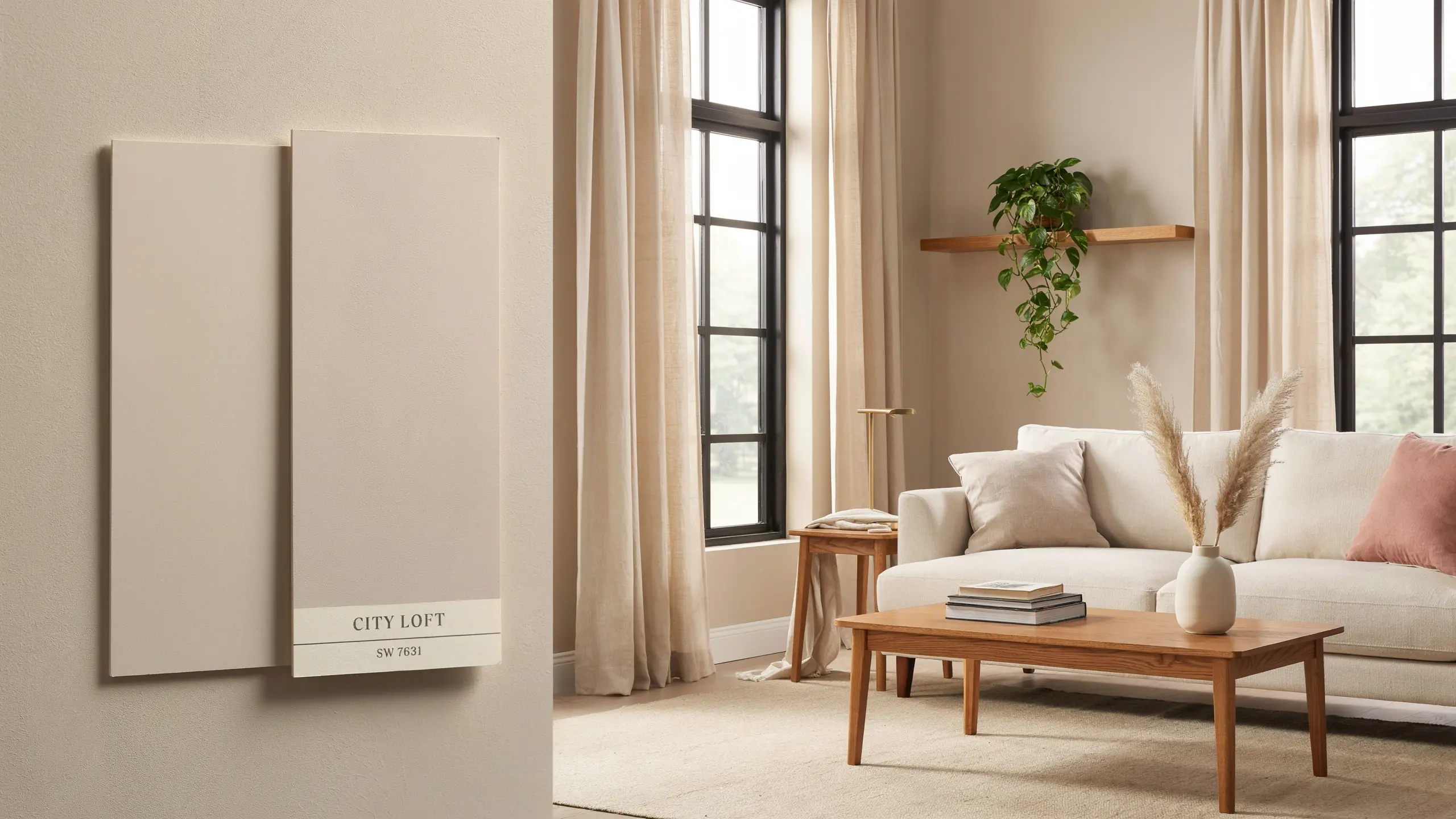
LRV, or Light Reflectance Value, measures how much light a color bounces back versus absorbs, on a scale from 0 to 100. Higher numbers mean lighter, more reflective colors.
City Loft comes in at 70, which puts it firmly on the lighter side.
That’s meaningfully deeper than a true white like Alabaster, which sits around 82, but noticeably lighter than mid-tone grays closer to 58.
In practice, this means City Loft keeps a room feeling open and bright while still holding enough color to avoid looking stark.
Where to Use Sherwin-Williams City Loft in Your Home
Sherwin-Williams City Loft creates a soft, warm greige backdrop that feels calm without looking plain.
Its subtle undertones work beautifully with natural textures, warm woods, and balanced finishes while adding depth to different lighting conditions.
1. Living Room
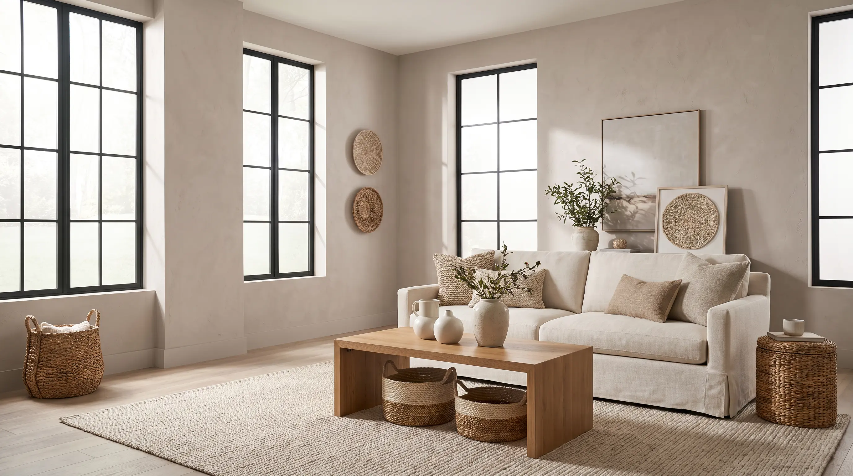
City Loft is a great choice for living rooms where you want an airy, relaxed atmosphere. Its warm greige tone creates a comfortable foundation that works well with modern, transitional, and minimalist interiors.
The color pairs naturally with wood furniture, linen fabrics, textured rugs, woven décor, and black accents that add contrast.
In rooms with large windows, City Loft helps maintain a bright feel while adding more depth than a standard white.
North-facing living rooms may bring out more of its gray undertones, while spaces with warmer sunlight usually highlight its beige warmth.
2. Bedroom
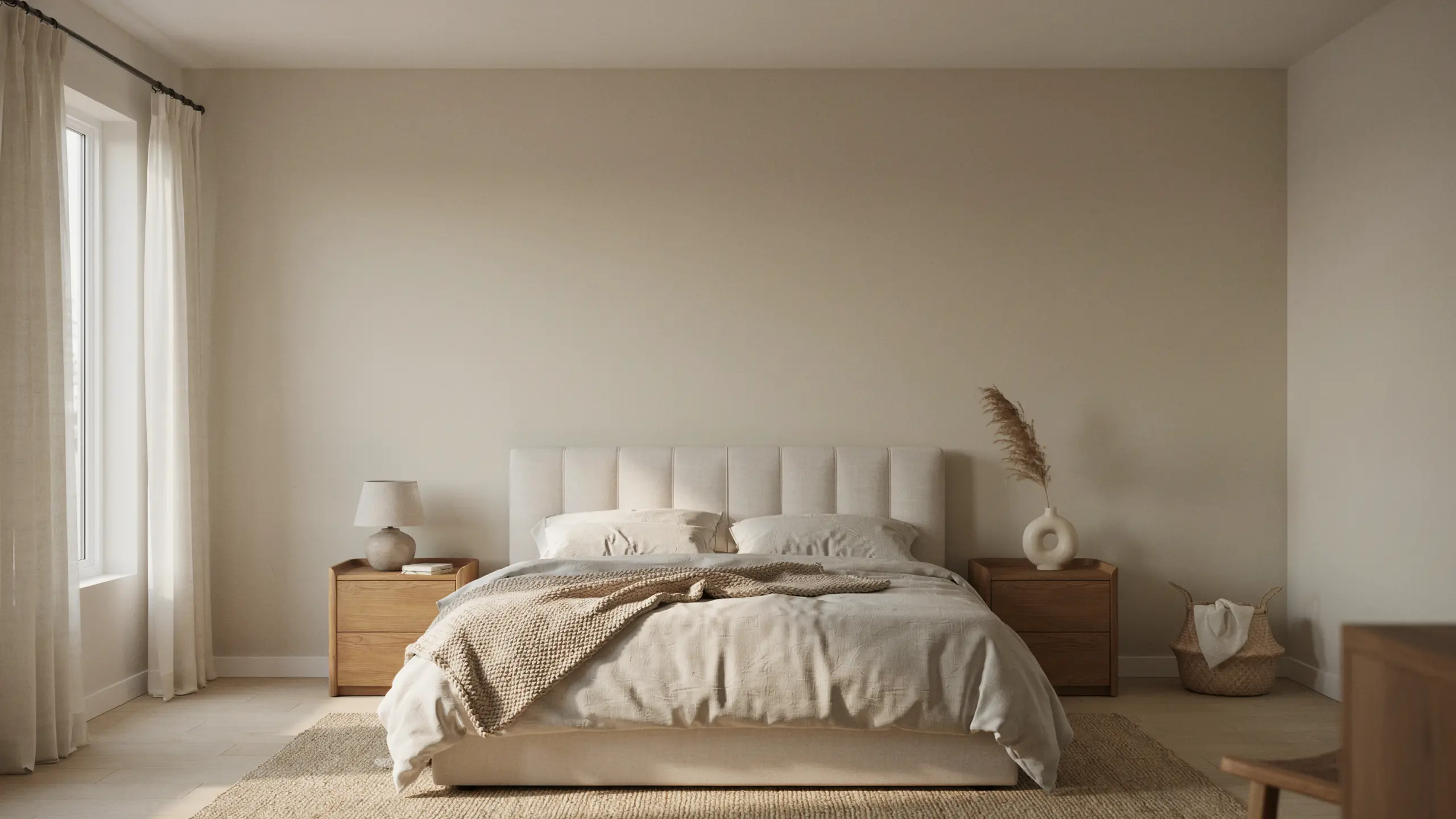
City Loft creates a peaceful bedroom environment with its soft, muted appearance. It works well when you want a wall color that feels warmer than a traditional gray but lighter and calmer than a deeper beige.
Pairing it with ivory bedding, beige textiles, warm wood furniture, and soft metallic finishes can create a cozy and balanced look.
Since City Loft has a subtle warmth, it helps bedrooms feel settled and relaxing without making the space feel heavy or overly dark.
3. Kitchen Cabinet
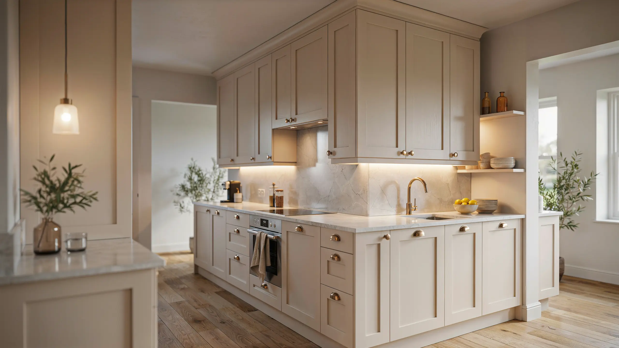
City Loft can give kitchen cabinets a sophisticated neutral finish without the stark look of pure white. Its warm greige tone works especially well in kitchens with natural materials and soft contrasts.
It pairs beautifully with quartz countertops, marble or light stone backsplashes, brass or brushed nickel hardware, warm wood flooring, and cream-toned finishes.
Since cabinet lighting can change the appearance of paint more noticeably than wall lighting, testing City Loft directly on your cabinets under your existing fixtures can help you see the true color before committing.
4. Bathroom
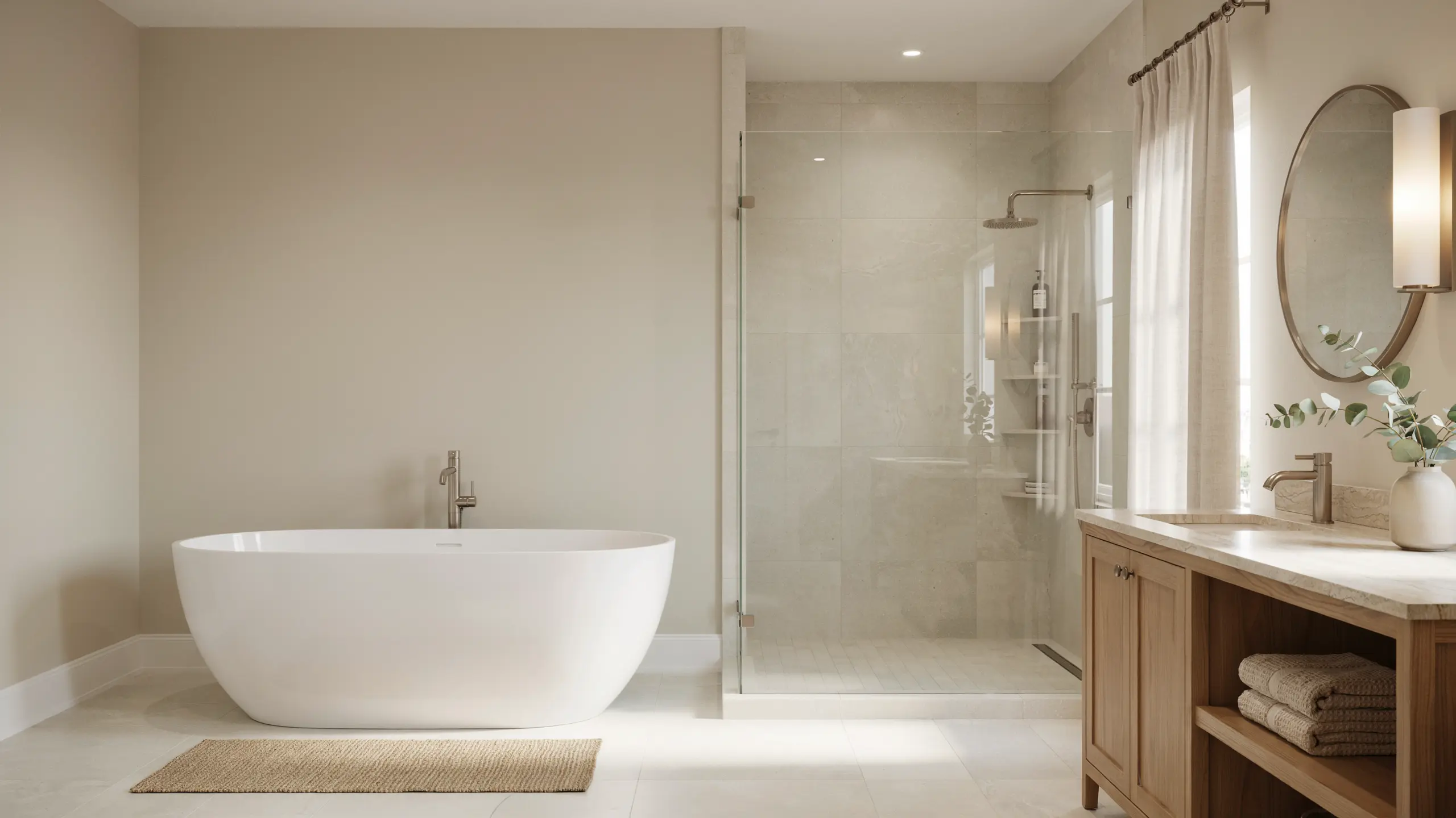
City Loft brings a soft, spa-like feel to bathrooms by adding warmth while keeping the space clean and bright.
It works well with white tile, natural stone surfaces, light wood vanities, and brushed metal fixtures.
In bathrooms with limited natural light, City Loft can soften the room without making it feel too beige. Warm bulbs will enhance its cozy side, while cooler lighting may reveal more of its gray and violet undertones.
5. Exterior

City Loft can create an elegant exterior when you want a light neutral with more warmth and depth than a plain white.
Outdoor lighting affects paint colors differently than indoor lighting, so City Loft may appear lighter and slightly warmer on exterior walls.
It pairs well with white trim, black-framed windows, natural stone, dark wood doors, and charcoal accents.
Since sunlight, shade, and surrounding landscaping can influence how the color appears, testing City Loft on different sides of your home before painting the entire exterior is the best way to understand its final look.
Colors That Go Well With Sherwin-Williams City Loft
Sherwin-Williams City Loft works beautifully with a range of warm and cool neutrals because of its balanced greige base.
Pairing it with the right colors can either enhance its cozy beige warmth or create a cleaner, more contrasting look. Soft whites, earthy greens, deeper charcoal tones, and natural wood f
| Paint Color | Why It Works |
|---|---|
| Sherwin-Williams Pure White | Creates soft, gentle contrast |
| Sherwin-Williams Alabaster | Adds extra warmth |
| Sherwin-Williams Extra White | Gives a cleaner, crisper look |
| Sherwin-Williams Urbane Bronze | Adds depth and drama |
| Sherwin-Williams Evergreen Fog | Builds an earthy, layered palette |
For trim, Pure White and Extra White both offer clean contrast, while Alabaster softens the pairing if you want less separation between wall and trim.
For accent walls, Urbane Bronze or Evergreen Fog give City Loft something to visually lean against.
Sherwin-Williams City Loft vs Similar Paint Colors
City Loft shares similarities with several popular light neutrals, but small differences in undertones, depth, and LRV can change how each shade feels in a room.
Comparing City Loft with colors like Agreeable Gray, Repose Gray, Accessible Beige, and Pale Oak makes it easier to choose the right neutral for your lighting, finishes, and overall design style.
City Loft vs Agreeable Gray
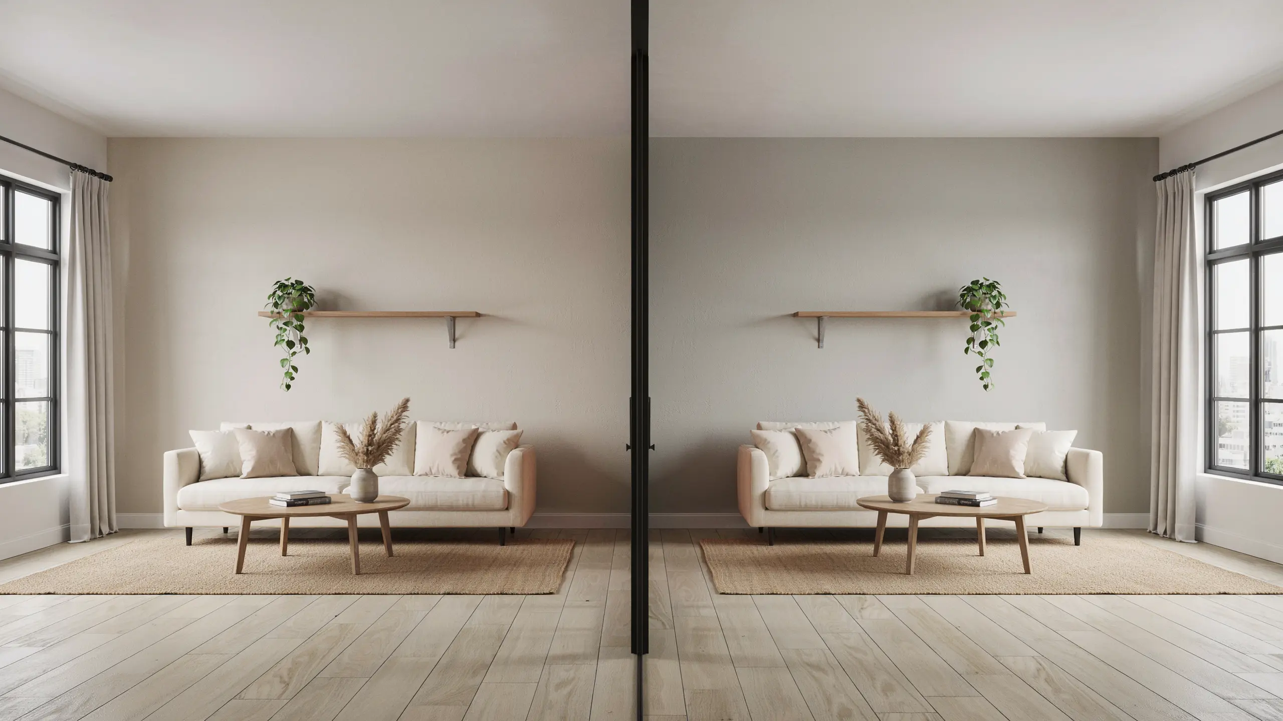
Sherwin-Williams City Loft and Agreeable Gray are both popular neutral shades, but they create different moods in a space.
City Loft is lighter and softer with warm beige, pink, and violet influences, while Agreeable Gray has a deeper greige appearance with more balanced taupe undertones.
Comparing their brightness, undertones, and overall feel helps determine which color works better for your room.
| Feature | City Loft | Agreeable Gray |
|---|---|---|
| Undertone | Beige, red, pink, violet | Taupe brown with a touch of violet |
| Appearance | Lighter, warmer greige | Slightly deeper, more balanced greige |
| LRV | 70 | 60 |
| Best For | Soft, warm minimalist spaces | Whole home neutral |
City Loft sits noticeably lighter on the LRV scale, and its undertones lean more toward pink beige than the brown taupe base in Agreeable Gray.
City Loft vs Repose Gray
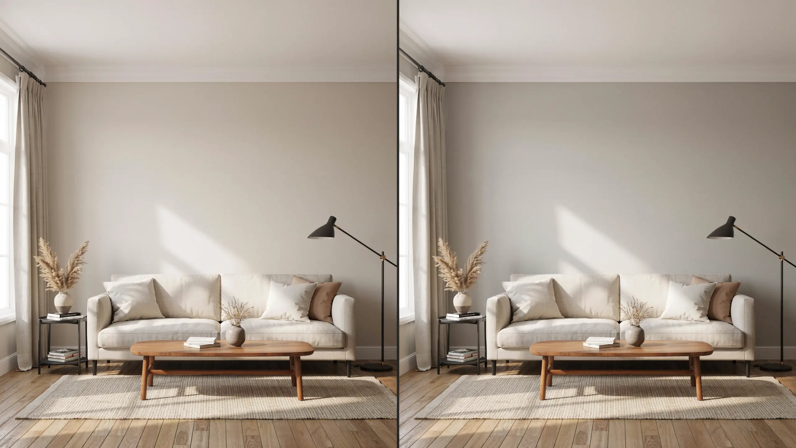
Repose Gray reads cooler and more purely gray, with an LRV around 58. City Loft is both lighter and warmer, making it a better fit for rooms that want softness rather than a crisp, modern gray.
| Feature | City Loft | Repose Gray |
|---|---|---|
| Undertone | Warm beige with red, pink, and violet influence | Warm gray with subtle beige undertones |
| Appearance | Soft, light greige | Cleaner, cooler gray |
| LRV | 70 | 58 |
| Overall Feel | Warm, airy, and relaxed | Balanced, modern, and understated |
| Best For | Bedrooms, minimalist spaces, bright interiors | Whole home walls, modern and transitional rooms |
City Loft works better when you want a lighter and softer neutral, while Repose Gray suits spaces where you prefer a more traditional gray with less beige warmth.
City Loft vs Accessible Beige
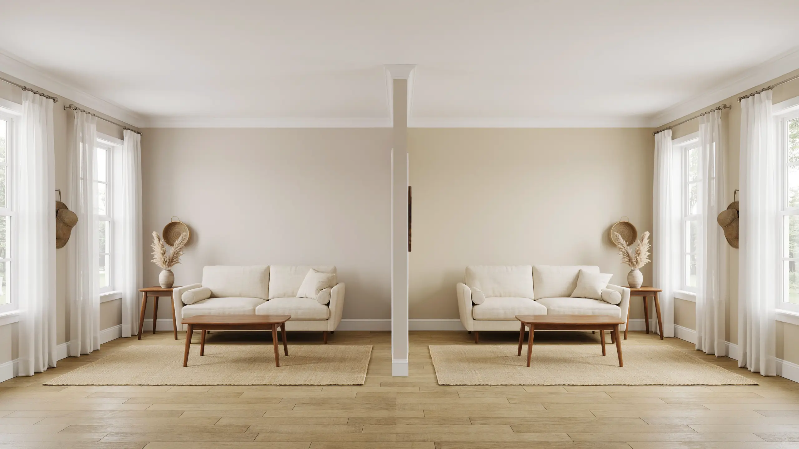
Accessible Beige carries a stronger, more straightforward beige base with an LRV close to 58. City Loft is considerably lighter and carries more complexity in its undertones, thanks to that underlying violet note.
| Feature | City Loft | Accessible Beige |
|---|---|---|
| Undertone | Beige with red, pink, and violet notes | Warm beige with gray influence |
| Appearance | Light, soft greige | Deeper beige greige |
| LRV | 70 | 58 |
| Overall Feel | Fresh, subtle, and calming | Warm, inviting, and grounded. |
| Best For | Bright interiors, soft neutral palettes | Living rooms, traditional and transitional spaces |
City Loft is a better fit for spaces that need a lighter neutral, while Accessible Beige works well when you want more warmth and a stronger beige presence.
City Loft vs Pale Oak
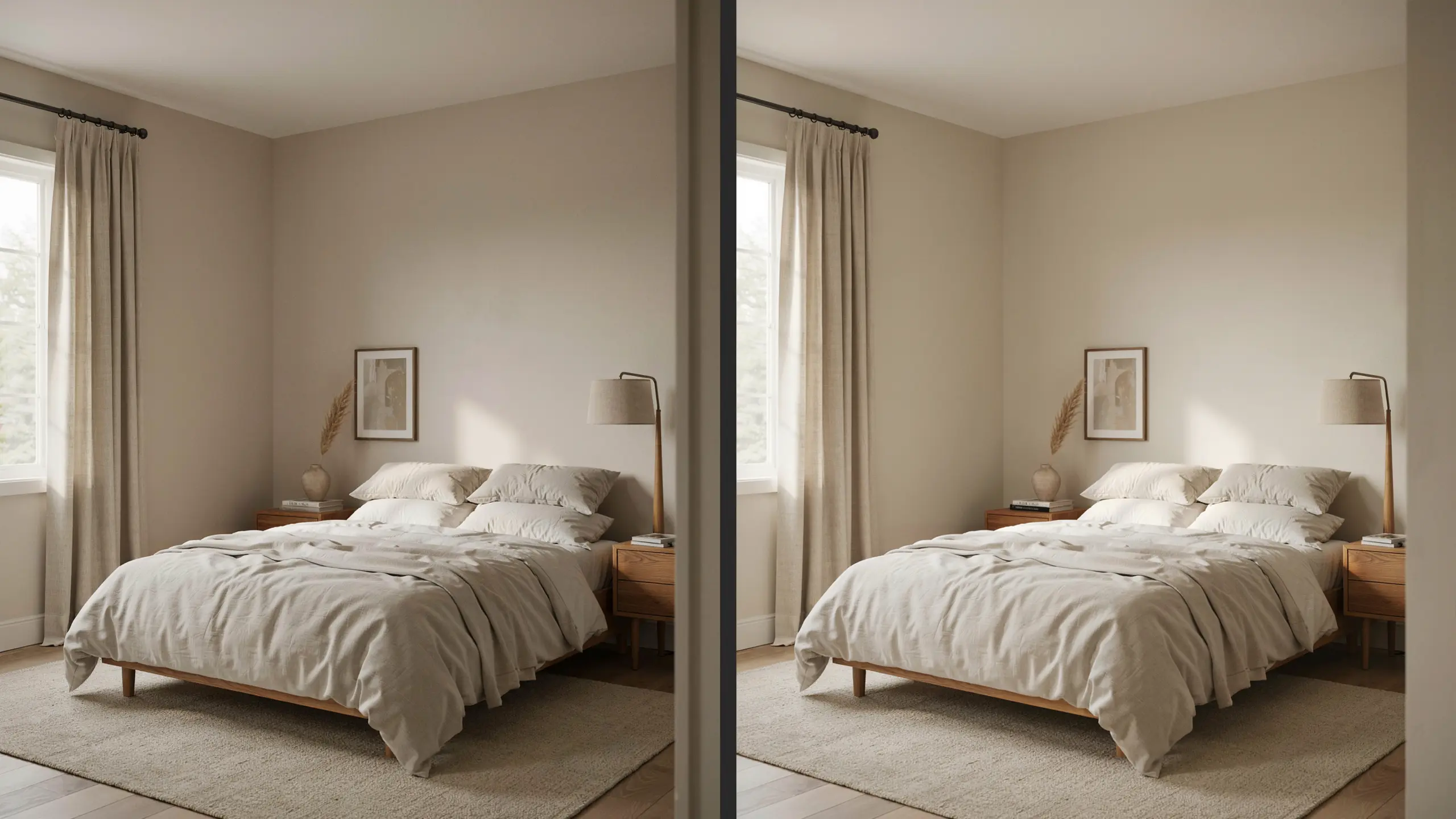
Both colors share a soft, quiet neutral quality, but Pale Oak leans more consistently warm and beige-toned.
City Loft’s violet undertone gives it a bit more range, since it can shift cooler under certain lighting in a way Pale Oak generally doesn’t.
| Feature | City Loft | Pale Oak |
|---|---|---|
| Undertone | Warm beige with red, pink, and violet influence | Warm beige with subtle gray undertones |
| Appearance | Light greige with slight cooler shifts | Soft, warm beige greige |
| LRV | 70 | Around 69 |
| Overall Feel | Airy, modern, and adaptable | Warm, elegant, and classic |
| Best For | Minimalist interiors, modern spaces | Bedrooms, traditional and soft neutral rooms |
City Loft is ideal if you want a neutral that changes slightly with lighting, while Pale Oak offers a more consistently warm and beige appearance.
Is Sherwin-Williams City Loft Right for Your Home?
Choosing a paint color is rarely about finding a shade that looks perfect everywhere.
It is about finding one that works with the way your home already feels, from the flooring under your feet to the light coming through your windows.
Sherwin-Williams City Loft is a thoughtful choice for spaces that need a neutral backdrop with a little more personality than plain white.
It allows furniture, textures, and architectural details to take the spotlight while adding warmth in the background.
Before making the final decision, spend time with a sample in your own space and view it throughout the day.
The right neutral should feel natural from morning coffee to evening relaxation. Share your experience with City Loft in the comments if you have used it in your home.
Frequently Asked Questions
Does City Loft look yellow?
City Loft does not usually look yellow. It has a warm beige base with subtle pink and violet undertones, but lighting and nearby finishes can influence how warm it appears.
What color makes a house look expensive?
Elegant neutrals like soft whites, warm greiges, deep charcoal, and earthy tones often create a high-end look. The right choice depends on the home’s lighting, materials, and overall style.
Is City Loft darker than Aesthetic White?
No, City Loft and Aesthetic White are both light neutrals. Still, City Loft generally reads slightly deeper because of its stronger greige character compared to Aesthetic White’s softer off-white appearance.
What is Sherwin-Williams’ recommended most popular white paint?
Sherwin-Williams Alabaster SW 7008 is one of the brand’s most popular white paints. It is known for its warm, balanced appearance that works well in many interior styles.
Which is better, Drift of Mist or City Loft?
Both are soft neutral colors, but they create different moods. Drift of Mist feels lighter and more subtle, while City Loft offers more warmth and depth with its greige undertones.