


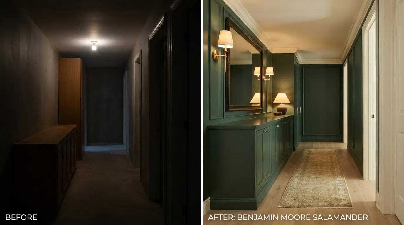
Are you looking for a deep forest green that doesn’t feel boring? Benjamin Moore Salamander looks stunning on paper, but it can be incredibly tricky to pin down in a real room.
It is highly frustrating to choose a moody paint color only to watch it turn into a flat, harsh black on your walls.
I want to help you avoid that disappointment before you purchase a full gallon. This guide will reveal exactly how this dramatic shade behaves across different rooms.
By the end, you will know its true blue-black undertones, see how it compares to popular alternatives, and learn how to pair it beautifully with your existing finishes.
What Benjamin Moore Salamander Actually Looks Like in a Real Room
Benjamin Moore Salamander 2050-10 is not the dark forest green it looks like on a chip. In a room with good natural light, it reads as a deep, blue-tinged green with real presence.
In a north-facing room or under warm incandescent bulbs at night, it can push so close to black that the green disappears almost entirely. That shift is the thing most people don’t account for, and it’s why I always tell clients to test this one across a full day before ordering a full gallon.
If you’re considering Salamander for cabinets, an accent wall, or exterior trim, the information below will tell you exactly how it behaves, when it works, and when it doesn’t.
| Detail | Benjamin Moore Salamander |
|---|---|
| Brand | Benjamin Moore |
| Color Name | Salamander |
| Color Code | 2050-10 |
| Color Family | Green |
| LRV | 5.72 |
| Collection | Color Preview |
| Overall Feel | Deep green with blue-black undertones; mood-shifting across lighting conditions |
| Official Page | View Salamander 2050-10 on Benjamin Moore |
Rooms that rely on natural light alone will push Salamander toward flat and very dark. Rooms with good fill lighting let the green come forward, and the color reads as intended.
Salamander’s Undertones: Blue-Black, Not Pure Green

Salamander is not a straightforward forest green. Its base is green, but the dominant character comes from blue and black undertones that sit underneath the surface. Understanding those undertones is what separates a confident sample test from a regrettable full-room repaint.
The blue side is the one that surprises people most. In strong directional daylight, especially from a south or west window, Salamander can shift noticeably toward teal. This is not a problem if you expected it.
It becomes a problem if you choose Salamander expecting a steady, neutral forest green and the teal undertone conflicts with your fixed finishes, flooring, or cabinetry.
The black undertone is what closes the color down at night. Under warm incandescent or Edison-style bulbs, the green retreats and the black dominates. The room can feel intimate and dramatic, or heavy and closed in, depending on how much ambient light you have working against the darkness.
Where Salamander’s undertones work against you: cool-toned or gray-heavy rooms, spaces with blue-gray tile or flooring, and cabinets paired with cool white quartz. The blue undertone will amplify the chill in those combinations in a way that reads discordant rather than layered.
| Pro Tip: Before committing to Salamander on cabinets, hold your sample next to your countertop and hardware under both daylight and your evening bulb type. The blue undertone behaves differently under warm versus cool artificial light, and that difference is the one you will live with most. |
That undertone behavior is what makes Salamander fundamentally different from other dark greens in the Benjamin Moore line. Once you know what to look for, you can test for it properly.
How Salamander Behaves in Different Lighting Conditions
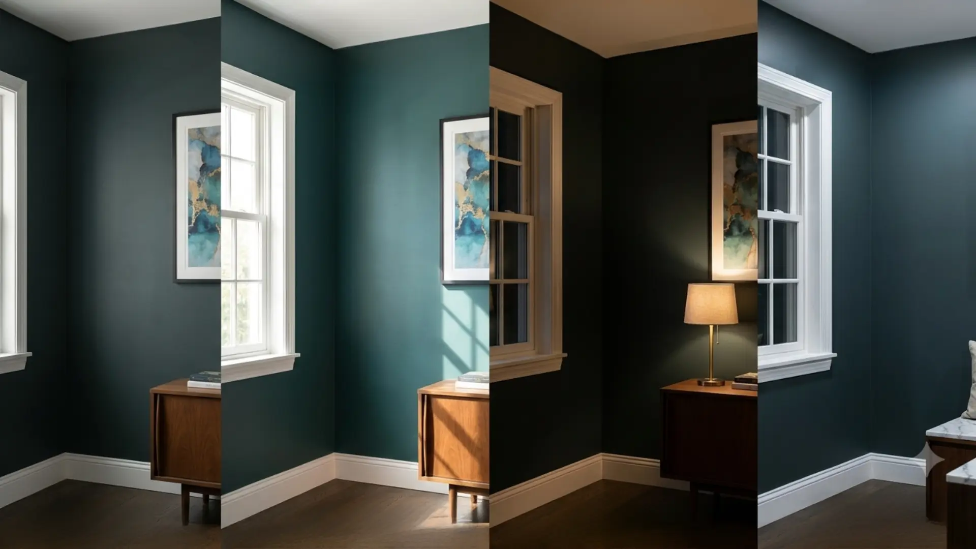
Salamander changes most when the light source changes, not just when the room gets brighter or darker. Direction, bulb color, window size, and nearby surfaces all affect how much green, blue, or black you see. That is why this shade needs to be judged under real conditions, not from a single still image or a quick glance at a chip under store fluorescents.
- Morning light: Salamander looks cleaner and more balanced early in the day, especially in rooms where sunlight enters softly rather than directly. The green is most readable here.
- Afternoon light: Stronger daylight makes the green feel more visible, which helps the color read less heavy on walls or cabinetry. South and west exposures can trigger the teal shift at this time.
- Evening light: Lamps deepen the shade significantly. A salamander can feel more intimate and almost black once natural light leaves the room. The green character retreats.
- Nearby reflections: Light bouncing from floors, counters, tiles, or large furniture can change the undertone and make the color feel warmer or cooler depending on what it is reflecting from.
A good sample test should follow the room for a full day. Move it near trim, flooring, and the main furniture pieces so you can see how Salamander behaves in all conditions before you commit to buying paint.
Benjamin Moore Salamander vs. Essex Green: Which One Is Right?
Salamander and Benjamin Moore Essex Green HC-188 are both very dark greens that get compared constantly. They are close in LRV but different in character, and choosing the wrong one between them is one of the more common dark-green mistakes. Here is how they actually differ in practice.
| Comparison Point | Benjamin Moore Salamander | Benjamin Moore Essex Green |
|---|---|---|
| Color Code | 2050-10 | HC-188 |
| LRV | 5.72 | 5.64 |
| Undertone Character | Blue-black; shifts toward teal in strong light | True green-black; less blue movement |
| Overall Mood | Rich, layered, slightly modern | Classic, grounded, traditional |
| Best Design Fit | Spaces needing depth, contrast, and some drama | Rooms and exteriors needing a settled, historic look |
| Common Project Type | Cabinets, built-ins, vanities, accent walls | Shutters, front doors, trim, formal rooms, exteriors |
| Pairing Style | Warm whites, natural wood, brass, bronze | Cream, brick, stone, black accents, aged metal |
| Better Choice For | Dark green with a layered, shifting personality | Dark green that stays steady and reads classic |
The practical split: if you want a dark green that moves and surprises you across lighting conditions, Salamander is the more interesting choice. If you want a dark green that stays consistent and reads as a reliable background, Essex Green is the safer one. The LRV difference is negligible, but the undertone difference is real. Test both in your actual room before deciding.
The Closest Sherwin-Williams Equivalent to Salamander

Sherwin-Williams does not have an exact match for Benjamin Moore Salamander, but several dark greens come reasonably close depending on what you need from the color.
| Sherwin-Williams Color | Why It Works as an Alternative |
|---|---|
| Cascades SW 6990 | Closest option in LRV and cool blue-green depth. Reads slightly more teal than Salamander. |
| Rookwood Shutter Green SW 2809 | A good option if you want a darker green with less blue movement. |
| Night Watch SW 6209 | Works well if you want a deep, moody green that feels softer than near-black. |
| Greenblack SW 6994 | A strong choice if you want a near-black green with minimal teal shift. |
Salamander has a specific blue undertone in Benjamin Moore’s formula that no Sherwin-Williams shade will match exactly. If you need to match an existing Salamander surface, ask your local Sherwin-Williams store for a custom color match rather than choosing by name alone.
Where to Use Benjamin Moore Salamander
Salamander earns its place when it has a clear purpose. At LRV 5.72, it needs the right surface, enough contrast, and a space where its depth is intentional. These are the applications where it performs best.
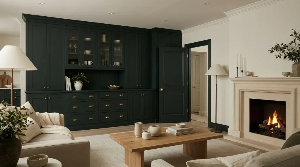
1. Cabinets and Built-Ins
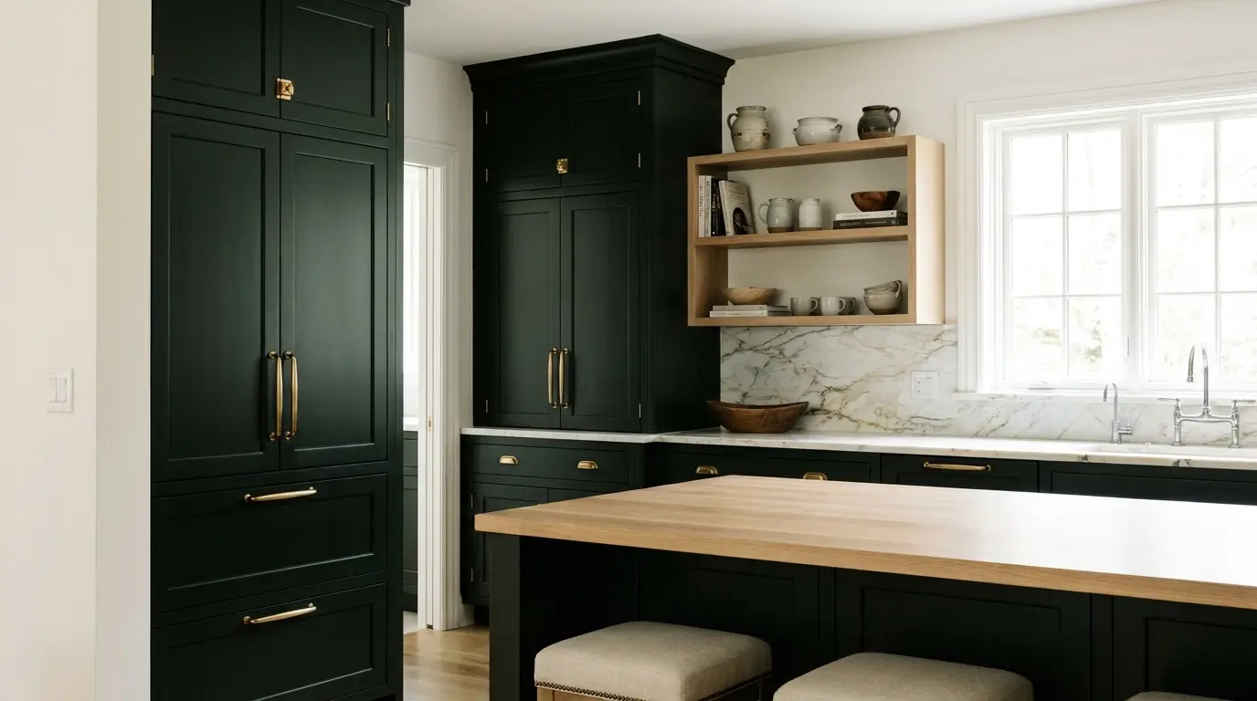
Salamander gives kitchen cabinets and built-in shelving a finished, custom look that lighter greens rarely achieve. It makes storage feel like part of the design rather than furniture added later.
Pair it with lighter walls, warm hardware, and a countertop or backsplash that provides breathing room. White oak, marble, cream tile, and brass all work well against it. If your surrounding finishes are already dark, Salamander will feel too heavy. The color needs contrast to show its green character rather than collapsing into black.
For cabinetry specifically, sheen selection matters more than most people expect. A semi-gloss finish will intensify the blue undertone under directional kitchen lighting, while satin keeps the surface readable without excessive reflection. Understanding the difference between satin and semi-gloss finishes is worth doing before you spec the product for cabinets.
2. Interior Doors and Trim
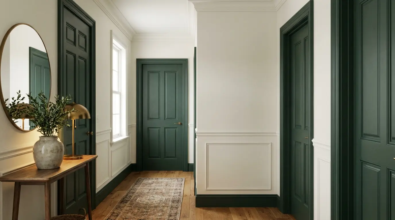
On interior doors, Salamander delivers depth and contrast without resorting to plain black. It works best in hallways where light walls give the dark green something to push against.
On a front door, it reads bold but classic enough to last through changing trends. For trim, keep the surrounding palette simple. Salamander on baseboards and window trim alongside light walls can be striking, but adding more strong colors nearby will tip the space from deliberate into busy.
3. Small Rooms Designed for Mood
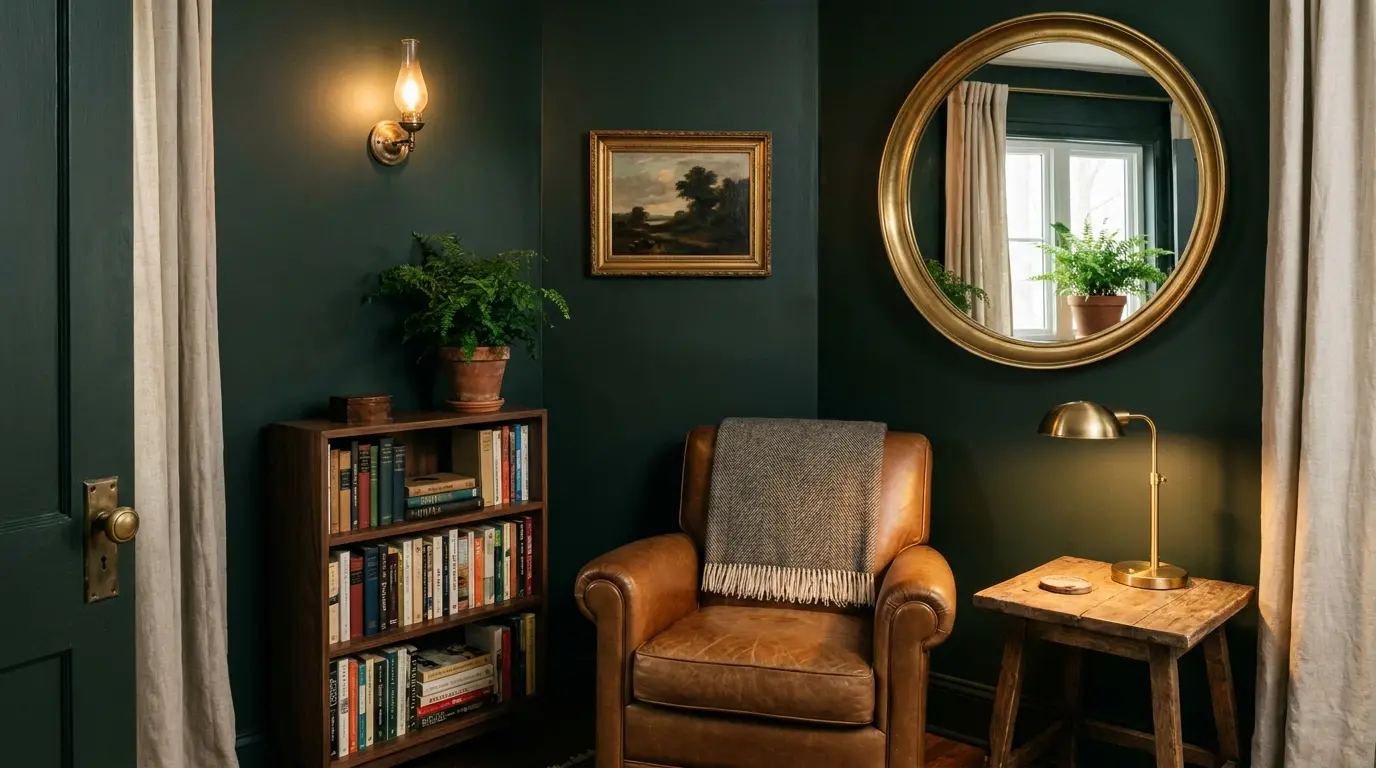
Powder rooms, dining rooms, and home offices are where dark colors like Salamander make the most sense. You are not asking the room to feel large.
You are asking it to feel intentional. In a powder room with warm lighting, a simple mirror, and metal accents, Salamander can feel genuinely considered.
In a dining room, it adds depth behind artwork and warm furniture. In an office, it creates a focused, tucked-away feeling that suits concentrated work.
4. Exterior Accents
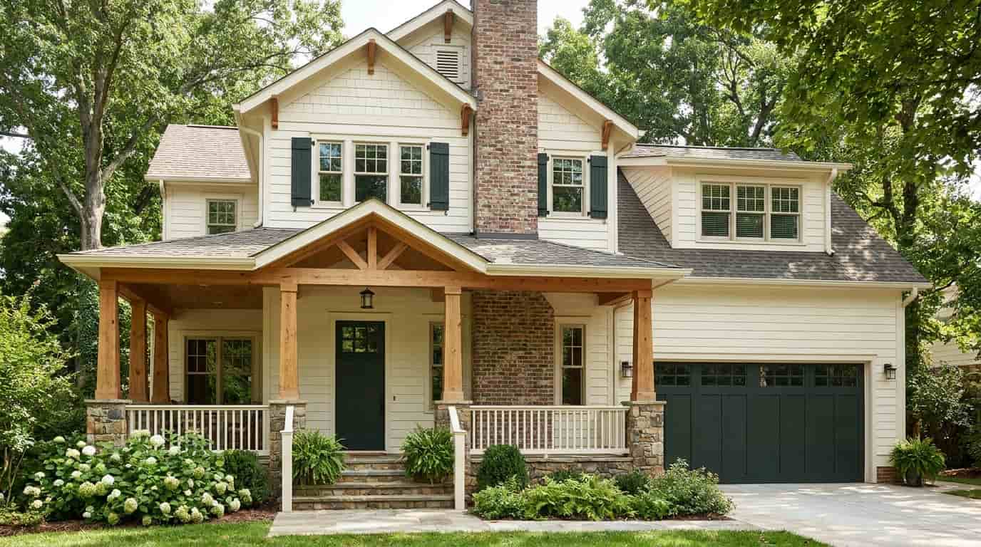
Outdoors, Salamander reads more green than it does inside because natural daylight pulls more color from it. That can work well on front doors, shutters, and porch details alongside cream siding, warm white trim, brick, or stone.
On homes with very dark siding, it can get lost. Before painting any exterior surface with Salamander, check it at different times of the day. The blue undertone can behave unexpectedly in afternoon sun compared to how it reads at 8 am.
When NOT to Use Salamander
Salamander is not the right choice for every dark-green situation. Three conditions where it consistently falls short:
Narrow corridors and low-ceilinged rooms with little natural light. On all four walls without contrast or adequate lighting, Salamander will feel closed in. It is a color that needs room to breathe, and squeezing it into a dark space without compensating with fill light produces a result that reads oppressive rather than dramatic.
Rooms with cool-toned fixed finishes. Blue-gray flooring, cool white quartz, or gray-heavy tile will amplify Salamander’s blue undertone in a way that reads discordant rather than sophisticated. Test it against your actual materials before committing.
Spaces where you want a steady, consistent green. Salamander shifts noticeably between lighting conditions. If you want a dark green that holds its character through the day without moving toward teal or near-black, Essex Green HC-188 is a more predictable option. For a Sherwin-Williams alternative that also stays steadier, Privilege Green SW 6193 is worth comparing alongside your sample test.
Finish selection in rooms where the paint will take heavy use also matters more with dark colors. The right paint sheen affects how much the undertone shifts under different light angles, and getting it wrong on a dark color is more visible than on a mid-tone.
Colors That Go With Benjamin Moore Salamander
Building a palette around Salamander means giving the color enough contrast and warmth to read as rich rather than heavy. The goal is not to match the green. It is to frame it with materials and colors that let its depth stay visible.
| Pairing Type | Best Options | Why It Works |
|---|---|---|
| Soft white trim | White Dove OC-17, Sebring White OC-137, Chantilly Lace OC-65 | Warm whites frame Salamander gently and prevent the contrast from reading too sharp or cold |
| Warm neutrals | Edgecomb Gray HC-173, warm greige, soft beige, light taupe | These calm Salamander’s depth and make the overall room feel more livable |
| Muted greens | Gray-green, sage, olive-gray | Keeps the palette connected without making the space feel overly matched or flat |
| Natural wood | White oak, walnut, medium brown wood tones | Wood adds warmth and texture, keeping Salamander grounded rather than severe |
| Metal finishes | Aged brass, bronze, antique gold, matte black | Warm metals bring out richness; matte black creates quieter, more modern contrast |
| Stone and tile | Cream stone, marble, warm terrazzo, handmade tile | These materials add movement and prevent the dark green from feeling too solid |
| Fabric accents | Linen, boucle, velvet, leather, woven textures | Soft materials layer the color, especially in bedrooms, offices, and sitting areas |
Start with one light anchor (a warm white trim color), one warm material (wood or brass hardware), and one accent finish before adding anything else. That structure keeps the room from going too dark while letting the Salamander remain the strongest color moment.
What to Check Before You Buy
Dark colors reward careful pre-purchase decisions and punish shortcuts. Run through these before placing an order.
- Color confirmation: Match the name and code together before checkout. Dark greens look similar in thumbnails, and it is easy to order the wrong one.
- Surface match: Select wall, trim, cabinet, or exterior formulation based on where the paint will actually be applied.
- Finish choice: Softer finishes suit broad walls. Stronger, washable sheens suit doors, trim, cabinetry, and vanities. Knowing how to choose the right paint finish matters, especially with a dark color where sheen affects how much the undertone shifts visually.
- Order details: Confirm size, local stock, pickup or shipping timing, and return terms. Tinted paint is non-returnable at most retailers.
One more check at this stage: if Salamander only looked right in one corner of your room at one time of day during your sample test, keep comparing. A color that works across your lighting conditions is a better investment than one that works only in ideal circumstances.
Frequently Asked Questions
Is Salamander too dark for a living room?
Salamander can work in a living room if the space has enough natural light, lighter trim, and warm materials. It may feel too heavy on all four walls in a dim room. For safer use, try it on built-ins, a fireplace wall, or one feature wall first.
What trim color works best with Salamander?
Warm white trim usually works best with Salamander because it softens the contrast and keeps the green from feeling too cold. Creamy whites, soft off-whites, and warm neutral whites are safer than stark blue-white trim, which can bring out Salamander’s cooler undertone.
Does Salamander look blue or green?
Salamander is a dark green, but it can show blue undertones in strong daylight. In low light, it may look almost black. This color shift is normal for Salamander, so test it beside flooring, counters, and furniture before deciding where to use it.
Can Salamander work in a bedroom?
Yes, Salamander can work in a bedroom if you want a deep, restful, cocoon-like feel. Use warm bedding, soft lighting, wood tones, and lighter trim to keep the room from feeling too closed in. It is often safer behind the bed than on every wall.
What flooring looks good with Salamander?
Warm wood flooring pairs especially well with Salamander because it balances the cool blue-black undertone. White oak, walnut, medium brown wood, warm stone, and cream tile can all work. Gray flooring may make Salamander feel colder, so sample it carefully before painting.
Is Salamander better for walls or accents?
Salamander is often easier to use as an accent because of its very dark depth. Doors, trim, vanities, built-ins, and accent walls let the color stand out without taking over the room. Full walls can work, but they need good lighting and strong contrast.
What rooms should avoid Salamander?
Very narrow halls, dark basements, low-ceilinged rooms, and spaces with cool gray finishes may not be the best fit for Salamander. In those conditions, the color can lose its green character and feel heavy. Testing a large sample is especially important in these rooms.
What mood does Salamander create?
Salamander creates a rich, moody, grounded feeling. It can make a room feel intimate, dramatic, and polished when paired with warm light and natural textures. In poor lighting, it can feel darker and heavier, so the final mood depends strongly on the room.
Final Verdict
Choosing a moody, dark green comes down to finding a shade that plays well with your unique space and lighting.
Now that you understand how Benjamin Moore Salamander reacts to natural light and artificial bulbs, you can use its shifting personality to your advantage.
Bringing out its rich green side requires strong contrast from soft white trim, warm wood tones, and intentional brass hardware.
Skipping a proper test in a dim room will only leave you with a space that feels entirely black and heavy. Grab a large sample and observe it on your walls morning, noon, and night.
Are you planning to use this color on cabinets or an accent wall? Leave a comment below and share your design plans.


