


Natural Choice SW 7011 is warm enough to feel cozy at 7 am but soft enough that it won’t yellow out by noon. That balance is harder to find than it sounds, and it’s the main reason I keep recommending this color to clients who are stuck between “too stark” and “too creamy.”
With an LRV of 73, it sits in a useful middle ground, reflective enough to keep rooms bright, grounded enough to feel like something rather than nothing.
Below, I’ll walk through exactly how Natural Choice behaves across light conditions, which rooms it works in and which it doesn’t, and how it stacks up against the colors it gets compared to most often.
| Color Name | Natural Choice SW 7011 |
| Brand | Sherwin-Williams |
| LRV | 73 — medium-light |
| Hex | #E3DED0 |
| Undertones | Warm beige-greige; yellow hue family with subtle gray pull |
| Best For | South- and east-facing walls, open floor plans, exteriors, trim, cabinets |
| Avoid In | Rooms with cool LED lighting and no warm accents; spaces where you want a true white |
Natural Choice is part of Sherwin-Williams’ Warm Whites and Finest Whites collections, officially classified as a white paint color — though in practice it reads more like a warm off-white with a soft greige undertone depending on your light source.
The Undertones of Natural Choice SW 7011
Natural Choice comes from the yellow hue family, which is the scientific basis of its warmth. But “yellow hue family” sounds more aggressive than the color actually is. In real rooms, the yellow reads as beige.
The gray read is what gives it the greige quality people often describe. What you end up with is a color that shifts between soft cream and muted greige depending almost entirely on your light source, and that adaptability is exactly what makes it useful.
The tricky part: if yellow in your flooring or furniture is already pulling warm, Natural Choice can push the whole room toward cream. Always sample it against your existing floor and any warm wood tones before committing.
What the Undertones React To
- Warm incandescent or Edison bulbs: The beige-yellow undertone surfaces. The room reads cozy, not yellow, unless the bulb temperature is very warm (below 2700K).
- Cool LED daylight bulbs (5000K+): The yellow drops out almost entirely. The color reads closer to a gray-white, and the warmth you wanted may disappear.
- Natural daylight, south-facing: This is where Natural Choice performs best. The warm light amplifies the creamy tone without pushing it into butter territory.
- Natural daylight, north-facing: Cooler, bluish light pulls out more of the gray. The color stays nice — just expect less warmth than the chip suggests.
| Pro Tip: Before you paint, tape a large painted cardboard sample (at least 12×12 inches) to the wall and check it at 8 am, noon, and 8 pm. The afternoon reading is the most honest, it shows you the color in the light conditions you’ll see it in most often. |
How Natural Choice SW 7011 Behaves in Different Light Conditions
Light behavior is where Natural Choice either earns its place or reveals its limits. Here’s what I’ve observed across client projects:
| Light Condition | How Natural Choice Reads | Verdict |
| South-facing, direct sun | Airy, creamy white, a good amount of warmth shows | Best condition for this color |
| East-facing, morning light | Warm and flattering in the morning; softens to neutral by afternoon | Works well |
| North-facing, diffused light | Leans greige; warmth is muted. Still nice, but test first | Proceed with caution — warm your bulbs to compensate |
| Cool LED (5000K+) | Gray-white, flat. Warmth disappears | Consider a different color or switch bulb temperature first |
| Warm incandescent / Edison (2700K–3000K) | Creamy and comfortable — best artificial light pairing | Works well |
The single most common complaint I hear about Natural Choice is that it “looks gray” in someone’s finished room. Nine times out of ten, the culprit is cool LED bulbs. Swap to a 2700K bulb before you repaint.
Where to Use Natural Choice SW 7011
Natural Choice is one of those rare colors that earns its place on walls, trim, cabinets, and exteriors without looking like a cop-out. But some rooms suit it better than others.
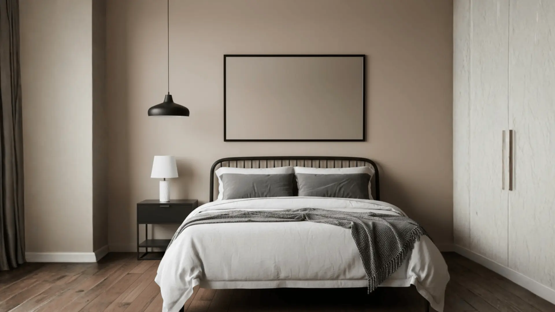
1. Bedroom
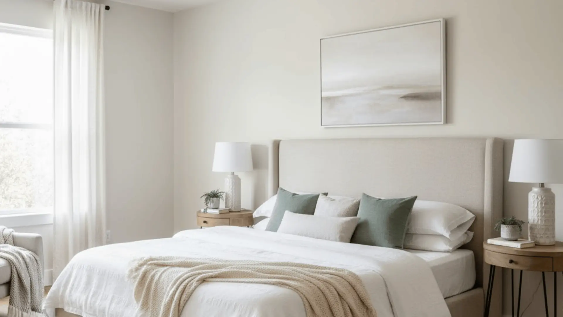
Bedrooms are where Natural Choice is most forgiving. The soft beige-greige reads calm without being clinical, and it works with virtually any bedding palette, white, warm linen, muted green, or even blush.
Pair it with SW Pure White SW 7005 (LRV 84) on the trim for a clean contrast that doesn’t fight the wall color. If you want to keep the whole room tonal, use Natural Choice on the trim too, but switch to a semi-gloss for subtle differentiation.
2. Bathroom
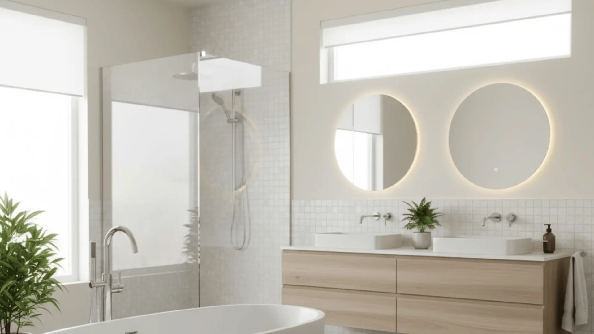
Bathrooms with natural light are a strong use case. The color’s warmth offsets the cold that white tile and chrome fixtures can create. Pair it with a warm wood vanity and brushed brass or matte black hardware.
One thing to watch: if your tile grout is very cool (white or gray), the contrast with Natural Choice can look unintentional. Opt for a warm beige or linen grout to keep the palette coherent.
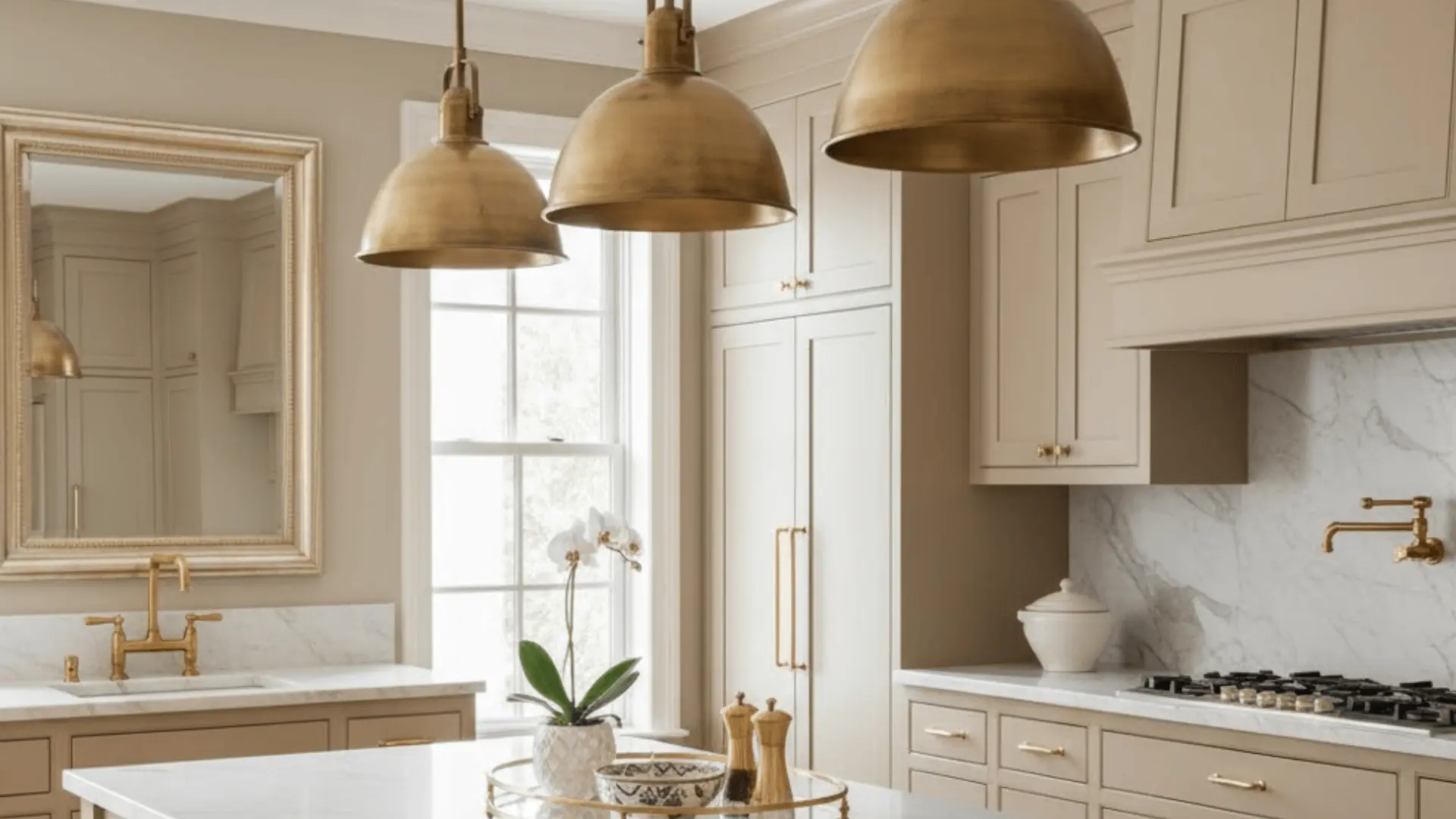
3. Kitchen
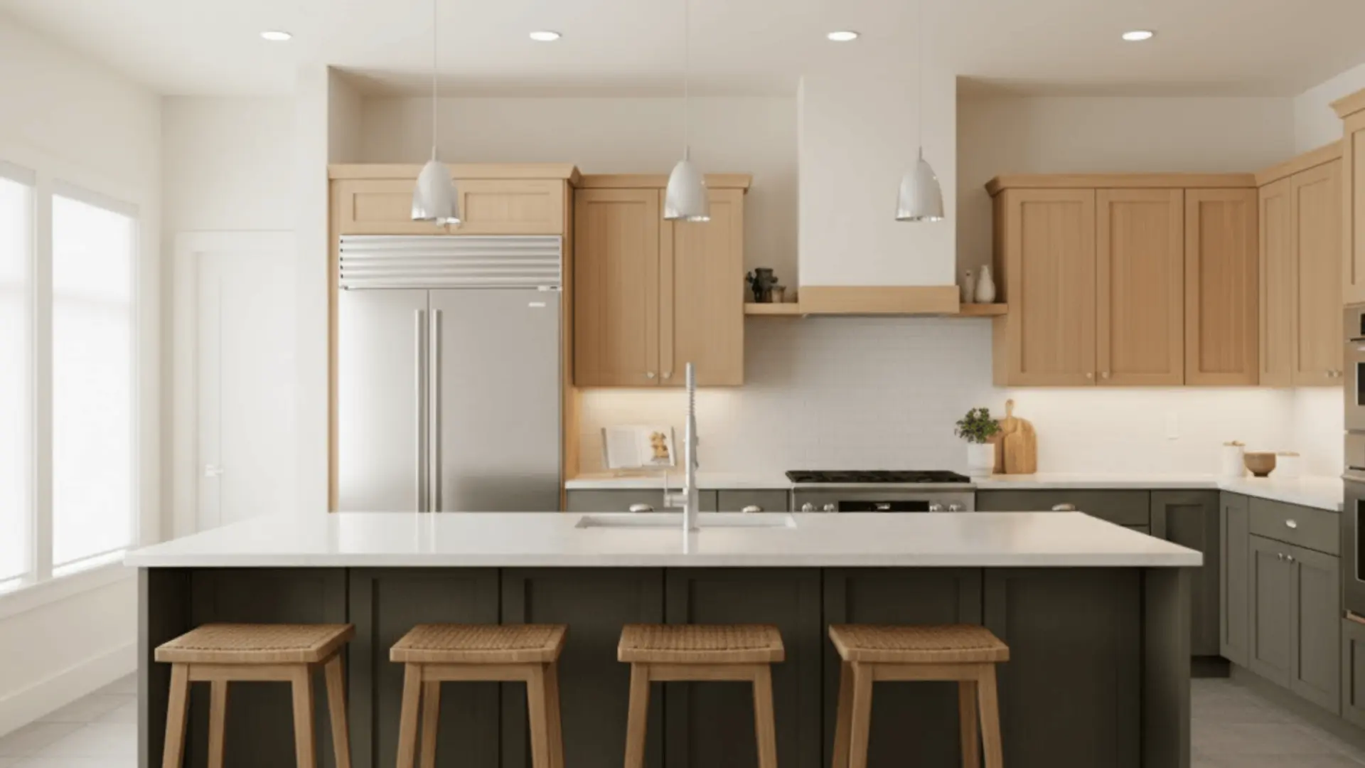
On kitchen walls, Natural Choice creates a backdrop that gets out of the way and lets your countertops and hardware do the work.
On kitchen cabinets, it’s a softer alternative to pure white; you get warmth without the yellow risk of something like Creamy SW 7012. It reads well with brass hardware and off-white quartz. If you want cabinet ideas in a similar warm neutral, the Accessible Beige cabinet is a useful comparison point. Natural Choice is a step lighter and more off-white in tone.
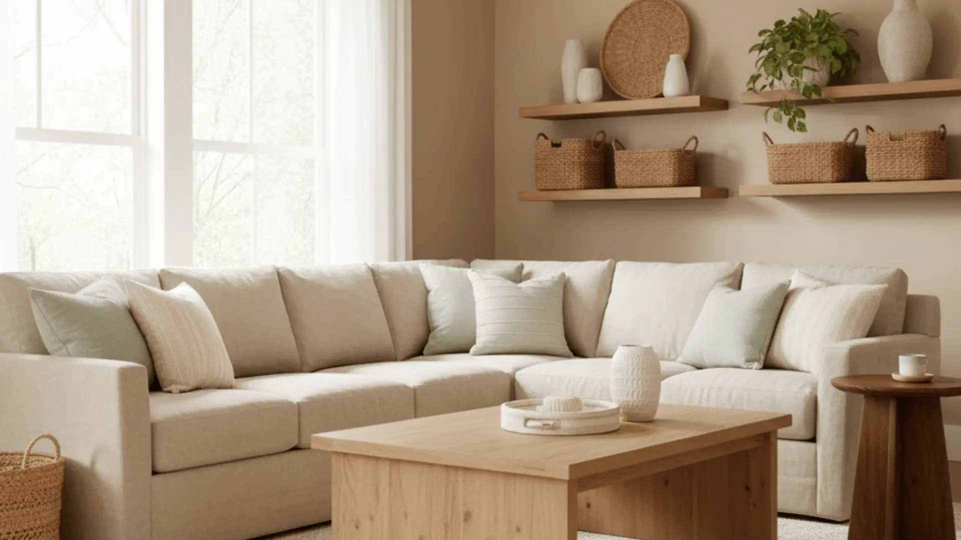
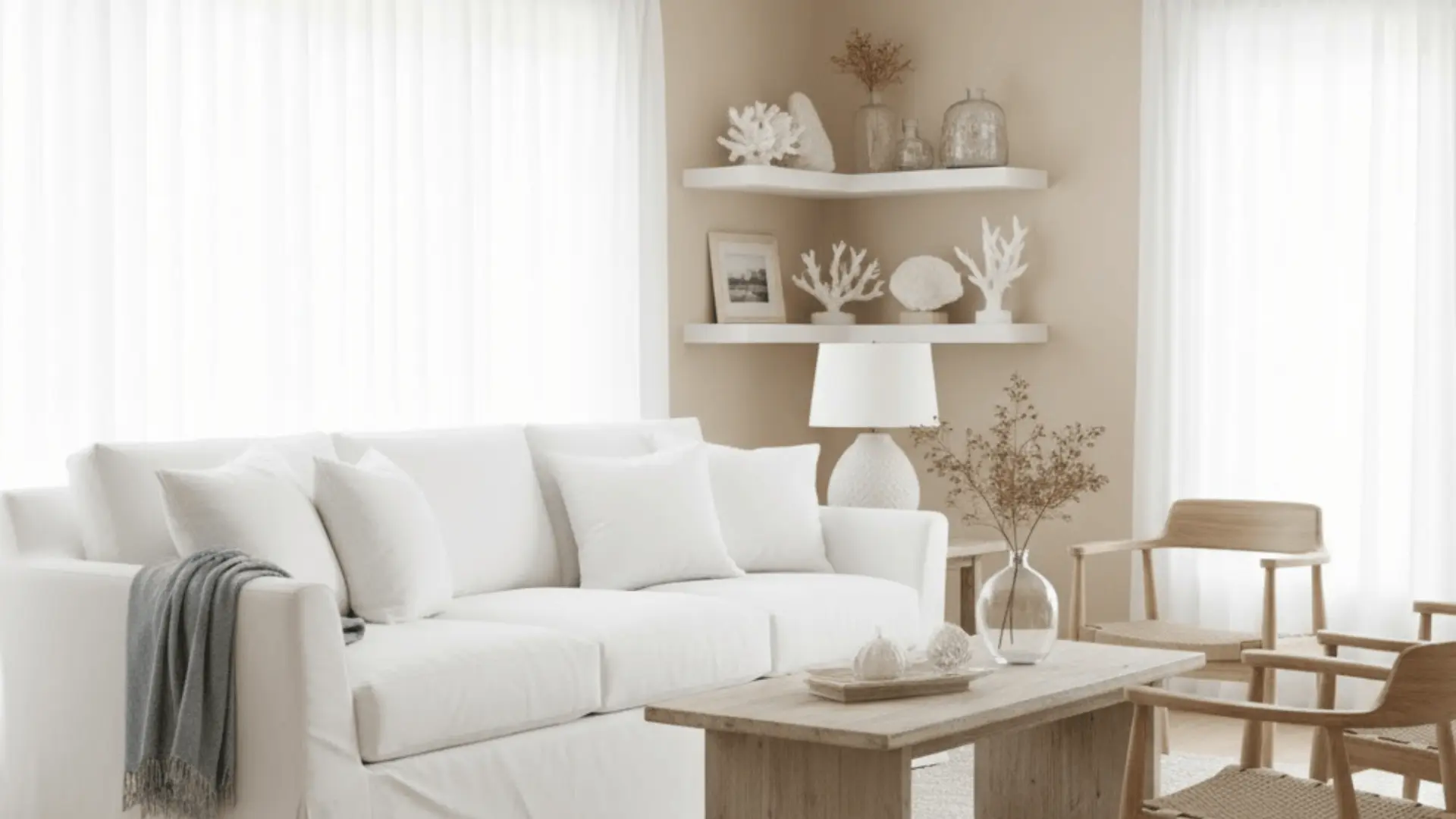
4. Living Room

Living rooms are where open floor plans benefit most from Natural Choice. The color is soft enough to work across zones, it won’t clash when it runs from the kitchen into the dining area into the family room.
Add contrast with dark metal light fixtures or a charcoal area rug to prevent the space from feeling flat.
When NOT to Use Natural Choice SW 7011
Not every room is a good fit. Here’s where I’d steer you toward a different color:
- Rooms where you want true white: Natural Choice will always have warmth. If you want a crisp, clean white — like for a modern minimalist kitchen or a dental-office-clean bathroom, look at SW Extra White SW 7006 (LRV 86) or SW Pure White SW 7005 instead.
- Rooms dominated by cool gray furniture or cool stone countertops: The warm undertone in Natural Choice can look dirty or mismatched against cool gray upholstery. In these cases, SW Shoji White SW 7042, which has a more greige-neutral quality, handles the transition better.
- Very dark, windowless rooms: At LRV 73, Natural Choice has decent reflectance, but it can’t overcome a genuinely dark space. A higher-LRV color like Alabaster SW 7008 (LRV 82) will do more work in a room without natural light.
- Rooms with existing warm yellow flooring: The beige undertone in Natural Choice can stack with a yellow-toned floor and push the whole room toward cream. Test the combo carefully before committing.
Natural Choice SW 7011 vs. Similar Sherwin-Williams Colors
These are the four comparisons I’m asked about most often. Each color solves a slightly different problem.
| Color | LRV | Undertone | How It Differs from Natural Choice | Choose It When |
| Natural Choice SW 7011 | 73 | Warm beige-greige, yellow hue | — | You want a versatile warm off-white for walls, trim, or exteriors |
| Alabaster SW 7008 | 82 | Warm white, light gray pull | Noticeably brighter; less depth | You need more light reflectance — darker rooms or low-window spaces |
| Oyster White SW 7637 | 72 | Warm off-white, softer cream | Nearly identical LRV; slightly more cream, less greige | You want warmth but the greige quality of Natural Choice feels too neutral |
| Shoji White SW 7042 | 74 | Greige, hint of green | More contemporary and gray-neutral; less warm | You have cool gray furniture and need the wall color to not fight it |
| Alpaca SW 7022 | ~65 | Deep greige, taupe | Noticeably deeper; acts as an accent or grounding color | You want a greige with more depth for an accent wall or exterior trim |
SW Agreeable Gray SW 7029 (LRV 60) and SW Accessible Beige SW 7036 (LRV 58) are often mentioned in the same breath as Natural Choice, but they’re a full tier darker. Natural Choice will feel notably lighter and cooler in comparison, which is useful if you’re trying to brighten a space that those two colors make feel heavy.
Coordinating Colors for Natural Choice SW 7011
Natural Choice is generous with what it works alongside. Here are the pairings I rely on most.
Trim and Ceiling
SW Pure White SW 7005 is the standard trim companion, with enough contrast to define the edge without creating a jarring gap. If you want the trim to disappear into the wall for a more seamless look, use Natural Choice itself in semi-gloss on the trim.
For ceilings, Pure White or SW Ceiling Bright White keep things lifted without competing. For guidance on getting wall-and-trim combinations right, the wall-and-trim color combinations cover the contrast logic in detail.
Accent Colors
- Urbane Bronze SW 7048 (LRV 8): Used on front doors, window frames, or an accent wall, it creates a strong grounding contrast against Natural Choice’s lightness. This is the combination I recommend most often for modern farmhouse exteriors.
- Muted sage or olive green: A soft tonal approach. Pulls the organic quality out of Natural Choice’s warm undertone.
- Terracotta or rust: Earthy, warm, and complementary. Works well in living rooms and dining spaces where you want character without contrast overload.
- Deep charcoal or navy: For those who want drama — pillows, cabinetry, an island. Natural Choice’s neutrality makes almost any saturated accent look intentional against it.
Materials
- Light to medium oak or walnut floors, the warm undertone in Natural Choice reads naturally with the wood grain
- Brushed brass or matte black hardware, both work; brass leans warmer, black leans contemporary
- White quartz or off-white marble countertops; avoid stark cool-white quartz, which can make Natural Choice look dingy in comparison
- Linen, cotton, and rattan textures reinforce the organic quality of the color
Furniture and Décor Pairings
1. Warm Wood and Linen
Light oak or walnut furniture, beige linen upholstery, and rattan accents let the warmth in Natural Choice come through without adding any competing visual noise. This is the easiest pairing to land — the materials do the heavy lifting, and the wall color holds everything together.
2. Modern Black Accents
Matte black metal frames, pendant lights, and hardware create definition against Natural Choice’s softness. This pairing solves the most common problem with off-white rooms — that they look unresolved. One or two strong black elements anchors the palette. Don’t overdo it: three or more black pieces in a small room can tip from modern to harsh.
3. Brass and Gold
Brushed gold cabinet pulls, brass lamps, and champagne-framed mirrors all respond to the warm undertone in Natural Choice rather than fighting it. This is the combination to use when you want the room to feel elevated without a lot of additional color.
4. Earthy Green and Terracotta
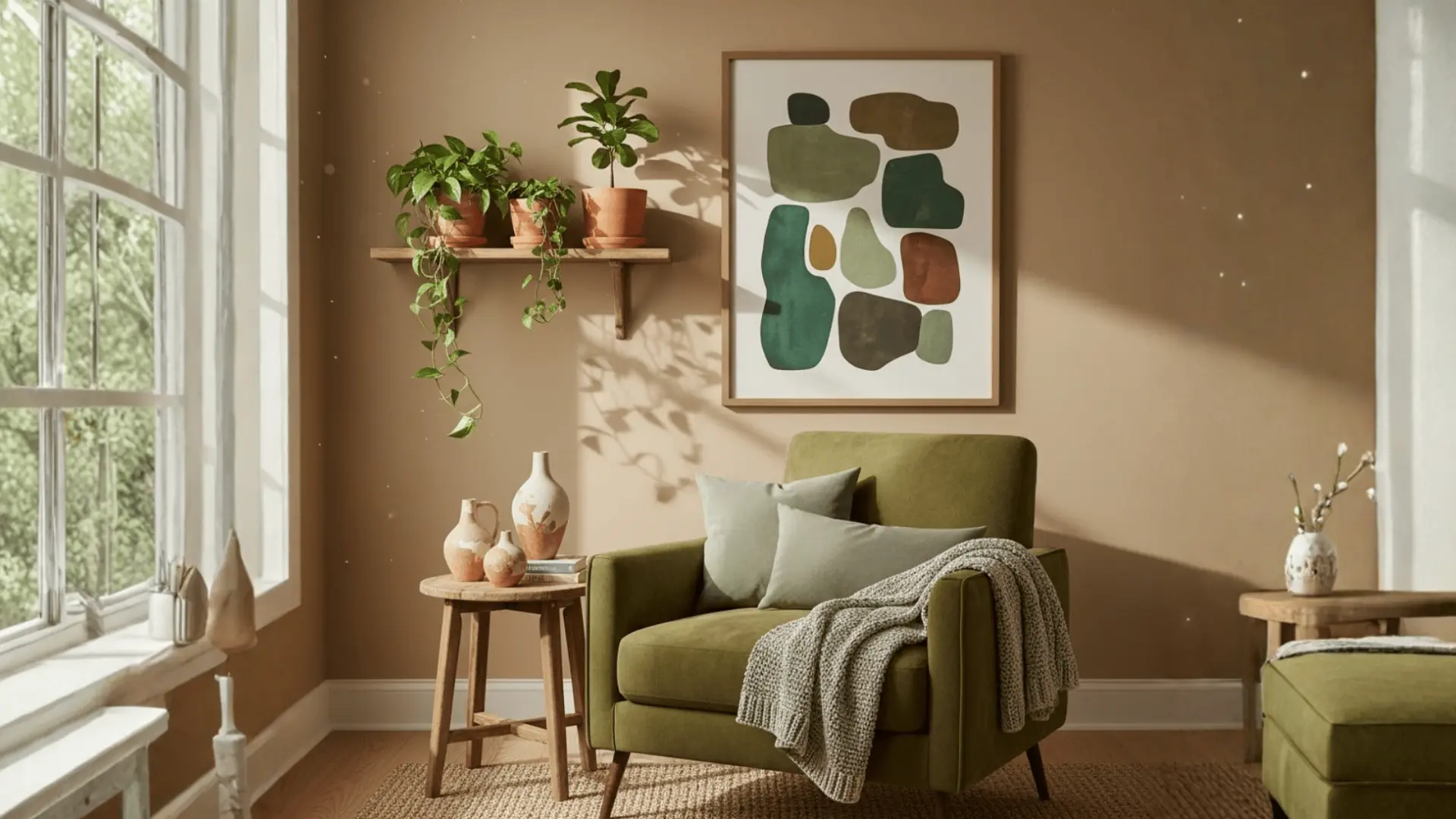
Olive green cushions, terracotta planters, and clay-toned art pull out the organic quality in Natural Choice. This works particularly well in rooms with natural wood flooring or exposed brick — the palette stays grounded in earth tones throughout.
5. Coastal Neutrals
White slipcovered sofas, driftwood or light pine furniture, and blue-gray textiles push Natural Choice toward a breezy coastal register. The warm undertone prevents the room from feeling cold even with the cooler accents in play.
Tips for Using Sherwin-Williams Natural Choice SW 7011
| Test in your actual light | Paint a 12×12-inch cardboard sample and move it around the room at different times of day. The paint chip under the fluorescent store light is not your reference point. |
| Finish matters | Matte or eggshell on walls, semi-gloss on trim. Semi-gloss on Natural Choice walls can make the warmth feel too pronounced in small spaces. |
| Bulb temperature first | If you have 4000K or 5000K LED bulbs, the warmth in Natural Choice will be significantly muted. Switch to 2700K before sampling — it changes the picture entirely. |
| Check against your floor | Natural Choice interacts with warm-toned wood floors. If your floor pulls orange or yellow, test carefully — the combination can be too warm. |
| Avoid very bright white trim | High-LRV whites like Extra White SW 7006 (LRV 86) will create a visible gap against Natural Choice’s warmth. Pure White SW 7005 or Alabaster SW 7008 are better-calibrated trim choices. |
The most expensive mistake with Natural Choice, and with most off-whites, is painting an entire room before testing. Order a Samplize peel-and-stick sample or mix a quart and put it on the wall first.
For a broader look at how Natural Choice sits within the warm white category alongside similar options, the warm white paint color is worth reviewing before you make a final call.
Frequently Asked Questions
These are the questions that come up most often after someone has the sample on their wall and is second-guessing themselves.
Does Natural Choice SW 7011 look yellow on walls?
It can shift slightly creamy in strong south-facing sunlight, but it does not read as yellow in balanced light. The greige component of the undertone holds the yellow in check. If your room is already warm-toned, test carefully, stacked warmth from floor and walls together can tip the color further than expected.
Is Natural Choice SW 7011 good for north-facing rooms?
It works but needs help. Cool north light draws out the gray in the undertone, muting the warmth you’re after. Offset this with 2700K bulbs, warm wood tones, and linen or wool textiles. Always sample before painting a north-facing room in this color.
What is the difference between Natural Choice and Shoji White?
Both sit at LRV 73–74 and read similarly in terms of brightness. The difference is undertone: Natural Choice leans beige-greige from a yellow hue family, while Shoji White SW 7042 has a more contemporary gray-greige quality with a faint green tint. Shoji White handles cool-gray furniture better; Natural Choice is warmer and more organic-feeling.
What trim color goes with Natural Choice?
SW Pure White SW 7005 is the most reliable companion — it’s warm enough not to look jarring against Natural Choice but bright enough to define the trim clearly. Alabaster SW 7008 works for a tonal, softer contrast. Avoid Extra White SW 7006 or Snowbound SW 7004 — both are cool-leaning and will make Natural Choice look dingy in comparison.
Can Natural Choice be used on kitchen cabinets?
Yes — it’s a strong cabinet color. It reads softer than pure white and warmer than most greiges. Pair it with brass or matte black hardware and off-white or warm stone countertops. Avoid pairing it with stark-white quartz, which can make the cabinets look dingy by comparison. For more on how this color category works in kitchens, see the kitchen paint colors with white cabinets guide.
Does Natural Choice work as an exterior paint color?
It’s one of the stronger warm off-whites for exteriors. It photographs well, holds up under direct sunlight without bleaching out, and reads consistently across different exterior materials — brick, siding, and stucco. Dark trim (black or Urbane Bronze) gives it a modern farmhouse finish; white trim keeps it traditional.
What carpet color goes with Natural Choice walls?
Warm beige, oatmeal, taupe, and greige carpet all complement it naturally. Avoid cool gray carpet unless you have enough warm wood or brass in the room to bridge the contrast, otherwise, the warm wall and cool floor will look like they belong to different rooms.
Is Natural Choice the same as Accessible Beige?
No — these are meaningfully different colors. Accessible Beige SW 7036 has an LRV of 58 and reads as a full medium beige, warm and grounded. Natural Choice at LRV 73 is substantially lighter and reads as an off-white in most conditions. If you want more depth on the SW greige and beige spectrum, that page maps how these colors relate to each other.
Final Verdict: Is Natural Choice SW 7011 Right for Your Room?
Here’s what I’d tell you standing at the paint counter: Natural Choice SW 7011 earns its reputation as a go-to warm off-white because it balances two things most off-whites don’t: it’s warm enough to feel intentional but neutral enough that it won’t dominate the room. The LRV of 73 means it works in most well-lit spaces without becoming stark.
The one situation where I’d steer you away is cool-LED-dominated rooms with no warm accents; the yellow undertone disappears, and you’ll end up with something flat and gray. If that’s your situation, switch your bulbs to 2700K before you decide.
Otherwise, order the Samplize peel-and-stick sample, put it up against your floor and trim, and check it morning and evening before you commit.
Sources:
Sherwin-Williams, “Natural Choice SW 7011 Color Details.” sherwin-williams.com/en-us/color/color-family/white-paint-colors/SW7011-natural-choice
Sherwin-Williams, “Warm Whites and Finest Whites Collections.” sherwin-williams.com


