


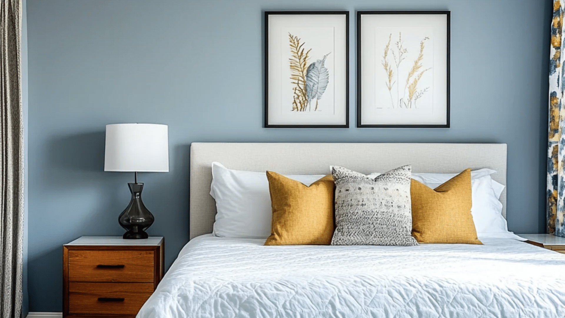
If you’ve been searching for a blue that feels calm but not dull,Debonair Sherwin-Williams (SW 9139) might be the one for you. I’ve seen how tricky it can be to find a shade that works in every light; some look too bright, others too dark. Debonair strikes the perfect middle ground with its mix of soft blue and gray, making it easy to live with every day. If you’re updating your bedroom, freshening up your kitchen, or giving your exterior a new look, this color adapts beautifully. In this post, I’ll walk you through what makesSherwin-Williams Debonair SW 9139 a medium blue-gray paint with an LRV of 45. It sits between soft pastel blue and deep navy, making it versatile for both interior and exterior use. What Color is Debonair Sherwin-Williams (SW 9139)? Debonair SW 9139 by Sherwin-Williams is a medium blue paint color softened with gentle gray undertones. It falls right between bold navy and pale pastel blues, giving it a balanced and versatile look. This muted tone adds calmness without feeling dull or heavy. Because of its neutral base, it fits beautifully in both interior and exterior spaces, from living rooms and bedrooms to entryways and siding. The color feels grounded yet fresh, offering a classic blue-gray mix that works in classic, modern, or coastal homes alike. RGB, HEX, and LRV Values: RGB: 150 / 168 / 179 HEX: #96A8B3 LRV: 45 LRV (Light Reflectance Value) measures how much light a color reflects. With a mid-range LRV of 45, Debonair balances light and depth; it won’t darken a space but still brings cozy definition to walls. Undertones of Debonair SW 9139 Explained Debonair SW 9139 stands out for its balanced mix of blue and gray. As a color consultant, I often recommend Debonair for spaces where you want a calm blue without it feeling too bright or too heavy.s. The blue keeps it lively, while the gray adds a touch of softness, making it easy to pair with warm or cool elements in your space. It sits comfortably among the colors that replace gray that designers are reaching for right now. Because of this balance, Debonair doesn’t lean too cold or too vivid; it holds a steady middle ground that feels natural and inviting. If you use it in a sunlit room or a dim hallway, the undertones help it stay consistent and relaxing. The color’s base is a medium blue softened by gray, reducing sharpness and keeping the tone mature and versatile. The gray layer ensures the color never feels too bright or cold, maintaining a steady, neutral appeal. It pairs best with gray-based neutrals like Site White, Alabaster, or Drift of Mist, and balances beautifully with warm finishes like brass, beige, or light oak. Lighting and Directional Tips for SW Debonair Lighting changes Debonair’s appearance dramatically, shifting it from airy blue in bright daylight to moody gray-blue in low evening light. Natural vs. Artificial Light In natural daylight, Debonair appears lighter and more open, with its blue tone standing out softly against neutral decor. When viewed under artificial light, the color gains richness and depth. Warm light bulbs tend to pull forward the blue, adding comfort and warmth to a space. In contrast, cool or daylight bulbs bring out the gray base, giving the walls a smoother, more refined tone. Testing the color under both conditions helps you understand how it will look throughout the day. North vs. South-Facing Rooms Debonair behaves differently depending on where your room faces. In north-facing rooms, the cooler light enhances its gray undertones, creating a calm, subdued atmosphere. In south-facing rooms, bright light makes it appear lighter and warmer, emphasizing the soft blue side. East-facing rooms show more blue in the morning, while west-facing rooms take on a richer hue as the sun sets. Best Light Bulbs for True Color To get the most accurate version of Debonair, focus on your lighting type. Daylight LED bulbs keep the tone crisp and balanced, especially in modern interiors. Warm white bulbs add comfort, deepening the blue while keeping rooms inviting. Always test the paint on a sample board or small wall section under your actual lighting setup to see how it changes during the day before painting the entire space. How to Use SW Debonair in Your Home SW Debonair is flexible and balanced, fitting beautifully into bedrooms, bathrooms, kitchens, or even exteriors with its calm gray-blue tone. 1. Bedroom: Promotes Rest and Calm Debonair creates a peaceful, restful feeling in bedrooms. Its muted blue-gray tone helps reduce visual noise, making the space more relaxing and inviting. Pair it with soft whites or natural wood furniture for a cozy atmosphere. For bedding and textiles, go with light beige, ivory, or pale gray. This combination helps you wind down after long days and wake up to a calm, gentle environment. 2. Living Room: Stylish with Neutrals and Gold Accents In living areas, Debonair adds quiet confidence. It balances well with white trim, beige furniture, and brushed gold details. The gray undertone keeps it from feeling too bright, making the room feel grounded and cozy. Add soft lighting or metallic fixtures for warmth, or mix in textured fabrics for depth. This color works well for both open spaces and smaller living rooms that need a refined touch. It also works well in a color-drenching technique, where one color is used across walls, trim, and ceilings for a cohesive look. 3. Bathroom: Spa-Like and Fresh Debonair is ideal for creating a soft, refreshing bathroom atmosphere. The muted blue shade feels soothing and clean, perfect for spaces where you want calm energy. Pair it with crisp white tiles or light stone countertops to keep the space bright and airy. Natural textures like woven baskets or warm wood accents add balance and prevent the space from feeling cold. 4. Kitchen: Beautiful Contrast In kitchens, Debonair pairs perfectly with white or cream cabinets, adding modern contrast without overpowering the space. The soft blue-gray tone brings a sense of freshness and sophistication. Add brass or matte black hardware for warmth and definition. Whether on walls or an island base, this shade complements wood floors, marble, or quartz counters beautifully. 5. Exterior: Refined Peace in Daylight Debonair shines outdoors, where natural light enhances its balanced tone. It reads as a polished blue-gray that complements brick, stone, or wood accents. Use white or soft gray trim to highlight architectural lines. The color holds up well across seasons, offering year-round elegance without looking too dark or faded. For a darker and more dramatic option, Sherwin-Williams Greenblack offers a near-black alternative with subtle depth. Best Trim and Ceiling Colors: Pair with Alabaster, Site White, or Pure White for a clean, crisp contrast that enhances Debonair’s depth. Recommended Finishes: Matte: Bedrooms for softness Satin: Living areas for light reflection Semi-gloss: Trim and cabinetry for durability and definition Coordinating Colors for Debonair Debonair SW 9139 pairs best with balanced neutrals and deeper contrasts like SW Pure White SW 7005 (LRV 84) for trim, SW Accessible Beige SW 7036 (LRV 58) for walls, and SW Urbane Bronze SW 7048 (LRV 8) for accents. Color Undertone LRV Mood Best Use Debonair SW 9139 Muted gray-blue 45 Calm & versatile Interiors/Exteriors Waterloo SW 9141 Deep navy-blue 35 Bold & moody Accent walls Bracing Blue SW 6242 Crisp cool blue 52 Light & airy Small rooms Misty Blue SW 6232 Soft gray-blue 44 Cozy & vintage Bedrooms Reflection SW 7661 Cool gray with a blue tint 66 Bright & refreshing Ceilings and trims North Star SW 6246 Pale silvery blue 62 Soft & peaceful Hallways and bathrooms Granite Peak SW 6250 Charcoal blue-gray 14 Sophisticated & deep Cabinets and exteriors Storm Cloud SW 6249 Medium blue-gray 23 Strong & grounded Accent or feature walls Let It Rain SW 9152 Muted stormy blue 36 Calm & balanced Living rooms or dining areas Upward SW 6239 Gentle sky blue 57 Airy & casual Kitchens or nurseries These shades offer a range of moods, from bright and airy to rich and dramatic, allowing Debonair to adapt seamlessly in both warm and cool settings. Debonair Sherwin-Williams vs. Blues from Other Brands It also helps to compare deeper shades like hale navy vs naval to understand how navy tones differ from softer blue-grays. Debonair vs. Benjamin Moore Debonair’s nearest Benjamin Moore equivalents are Van Courtland Blue and Newburyport Blue. Van Courtland Blue has a green-gray undertone, giving it a cozier, warmer vibe, while Newburyport feels slightly darker and more traditional. In comparison, Debonair remains softer and more neutral, blending gray and blue in a calmer way. It fits both modern and classic interiors, where you want color presence without heavy saturation or strong temperature shifts. Debonair vs. Behr Comparable Behr shades include English Channel and Light French Gray Blue. Behr’s blues typically appear bolder, leaning toward true navy or vivid sky tones. Debonair, on the other hand, reads more refined and balanced. Its subtle gray influence prevents it from feeling overpowering while maintaining enough pigment for depth. This makes Debonair an easier choice for everyday walls, especially when you prefer a paint color that adapts smoothly to changing light. Debonair vs. Valspar Valspar’s Blue Twilight and Coastal Dusk share a similar family but differ in brightness. Blue Twilight leans cooler and lighter, while Coastal Dusk feels more coastal and airy. Debonair falls right in the middle, with a steadier gray undertone that gives it better versatility for modern interiors. It feels grounded yet stylish, working equally well in rooms with natural light or shaded spaces. Brand Color Undertone LRV Best Use Sherwin-Williams Debonair SW 9139 Gray-blue 45 Interiors/Exteriors Benjamin Moore Van Courtland Blue HC-145 Green-gray-blue 43 Cozy interiors Behr English Channel PPU14-19 Navy-blue 38 Accent walls Valspar Blue Twilight 4009-6 Cool medium blue 50 Airy modern rooms Design Styles that Suit Debonair Sherwin-Williams Debonair’s balanced gray-blue tone adapts easily to different design styles, adding calmness and depth without overpowering your space. Coastal: Pair with whites, natural fibers, and woven textures for a breezy, seaside-inspired look that feels light and relaxed. Modern Farmhouse: Combine with black fixtures, warm oak furniture, and soft neutrals to create a grounded yet inviting style. Transitional: Match with creamy whites, subtle metallic accents, and layered fabrics for a smooth mix of traditional and modern elements. Minimalist: Use Debonair on clean walls with matte finishes, neutral décor, and simple forms to maintain balance and openness. Where to Buy Sherwin-Williams Debonair (SW 9139) You can easily find Debonair SW 9139 in Sherwin-Williams stores or online through trusted retail and delivery options. Sherwin-Williams Stores: Visit any Sherwin-Williams Paint Store to view color swatches, request samples, or order gallons directly. Official Website: Order from the Sherwin-Williams website, where you can preview the color, estimate paint quantity, and schedule pickup or delivery. Local Retailers: Some local paint suppliers and hardware stores carry Sherwin-Williams products; check availability by searching Debonair SW 9139. Sample Options: Purchase Color-to-Go paint samples or peel-and-stick sheets to test the color on your walls before buying full-sized cans. Professional Assistance: Ask Sherwin-Williams associates for finish advice and matching suggestions for trims, ceilings, and coordinating colors. Conclusion If you’re searching for a paint color that feels calm, versatile, and easy to style, Debonair Sherwin-Williams (SW 9139) fits perfectly. Its balanced blend of blue and gray gives you flexibility across styles, if you’re decorating a cozy bedroom, refreshing a living room, or painting an exterior. The color’s medium tone works well in all lighting, staying steady and relaxing throughout the day. Pair it with crisp whites or warm neutrals, and it instantly brings harmony to your space. If you’ve been unsure which blue to choose, this one offers the best of both worlds, subtle but full of depth. Would you try SW Debonair in your home? Share your thoughts or questions in the comments below. Frequently Asked Questions Is Debonair a blue or gray? Debonair is a balanced blue-gray paint that sits between soft blue and muted gray, making it feel calm without being too cool or too bold. What is the LRV of Debonair SW 9139? The LRV of Debonair is 45, which means it reflects a moderate amount of light while still adding depth to walls. What trim color goes with Debonair? Crisp whites like SW Pure White SW 7005 or SW Alabaster SW 7008 work best for clean contrast. Is Debonair good for bedrooms? Yes, its soft blue-gray tone creates a calm and restful atmosphere, making it a strong choice for bedrooms. Debonair vs Uncertain Gray, which is lighter? Debonair is lighter and more blue, while Uncertain Gray leans deeper and more neutral gray.
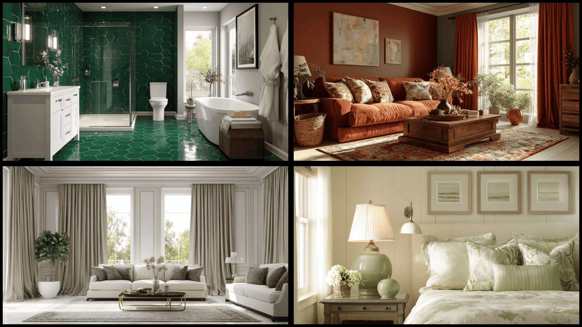
Want to make a room feel bigger without knocking down walls? Color drenching might be exactly what you need. In this post, I’ll walk you through picking the right shade and applying paint like a pro, including options like Sherwin-Williams Debonair review. You’ll learn which rooms work best for this technique and which mistakes to avoid. I’ll also share practical tips for testing colors before you commit to painting everything. If you’re tackling a bedroom, bathroom, or living room, I’ve got step-by-step guidance for you. No decorating background needed; just a willingness to try something different in your space. Let me show you how to pull off this look successfully. What is Color Drenching? Color drenching means painting your walls, ceiling, trim, and sometimes even furniture all in the exact same color. This bold technique creates a flawless, immersive look that envelops the entire room in a single, unified shade. Interior designers originally used this method in historical estates and dramatic commercial spaces during the past decades. The trend has resurged recently because people want maximalist, statement-making rooms that feel intentional and brave. Social media platforms showcase incredible color-drenched spaces that inspire homeowners to try bolder design choices. This approach works with any color, making small rooms feel larger or dramatic spaces even more impactful. Why Color Drenching Works So Well in Interior Design? Color drenching creates a cohesive, immersive atmosphere that makes rooms feel intentional and complete throughout every surface. This technique eliminates visual breaks between walls and ceilings, making small spaces appear larger and more expansive. Light colors open up tight rooms, while dark shades create intimate, cozy feelings that envelop you, especially when using rich tones similar tothose in this Greenblack paint color. The monochromatic approach reduces visual clutter and lets interesting textures like molding, furniture, and fabrics stand out beautifully. You get a bold personality and dramatic impact without filling rooms with excessive decorations or busy patterns. Color drenching simplifies decision-making, as you only need to choose one shade instead of coordinating multiple colors. Color Drenching vs. Monochrome Design People often confuse color drenching with monochrome design, but these techniques create completely different visual effects. Here’s how they compare across key design elements: Aspect Color Drenching Monochrome Design Coverage Paints walls, ceiling, trim, and sometimes furniture in the exact same color Uses various shades and tints of one color family across different surfaces Intensity Bold, saturated color applied uniformly throughout the entire room Lighter and darker variations of the same hue create a subtle contrast Tone Variations No variation – uses identical paint color on every surface Incorporates multiple tones like light gray, medium gray, and charcoal gray Visual Effect Creates an immersive, enveloping atmosphere that wraps the entire space Provides layered depth with tonal differences between surfaces Design Feel Dramatic, bold, and statement-making with maximum impact Urbane, subtle, and graceful with gentle visual interest Example Navy blue walls, navy ceiling, navy trim, navy bookshelf Light blue walls, medium blue ceiling, white-blue trim, dark blue accents Color drenching feels more immersive because the single unified color eliminates all visual breaks between surfaces. Understanding this difference helps you choose the right approach for your specific design goals and room characteristics. How to Color Drench a Bedroom: A Step-by-Step Guide Following these painting steps ensures you get professional-looking results without missing important details. Here’s exactly how to color-drench your bedroom: Test your chosen color on multiple walls and check how it looks in morning, afternoon, and evening light. Start by painting the ceiling first, let it dry completely, then paint the walls from top to bottom. Paint the trim and molding in the same color or a slightly lighter shade for a subtle depth effect. Apply a second coat to all surfaces once the first coat has dried to ensure rich, even color coverage. Touch up any missed spots or uneven areas and remove painter’s tape slowly while the paint is still slightly tacky. Your color-drenched bedroom should now have that wrapped-in-color look that feels cozy and complete. Allow everything to dry for 24 hours before moving furniture back and enjoying your newly converted space. Color Drenching Ideas and Inspiration Color drenching works in countless creative ways beyond just painting walls and ceilings one color. Here are inspiring ideas that show the full range of possibilities: 1. Woven or Painted Colorful Floor Mats Entry mats, kitchen runners, and bathroom rugs in bold colors add practical color at ground level. Bright striped runners in hallways guide foot traffic while injecting personality into transitional spaces. Geometric patterned mats in single color families maintain cohesion while adding visual interest. Choose durable, washable options for high-traffic areas needing both function and style. These smaller commitments let you experiment with bold shades. 2. Full-Wall Patterned Wallpaper Patterned wallpaper covers entire walls from floor to ceiling, creating striking focal points that demand attention. Large-scale patterns like oversized florals work best for maximum impact in living rooms. Match the surrounding walls to the wallpaper’s base color for consistency. Keep furniture simple and solid-colored so the pattern remains the star. Add matching throw pillows that pull colors from the wallpaper. 3. Vibrant Doors and Trim Brightly painted doors and trim pop against neutral walls, creating unexpected bursts of personality throughout homes. Choose bold colors like emerald green or coral pink for door fronts and trim pieces. This works especially well in hallways, where doors create a visual rhythm along the walls. Paint baseboards and window frames in the same vibrant shade for cohesive impact. 4. Color-Coordinated Cabinets and Backsplash Kitchen cabinets and backsplash tiles share matching or complementary colors that create a flawless visual flow. Deep blue cabinets paired with lighter blue subway tiles create a layered effect within the same color family. This coordination makes small kitchens feel larger by eliminating visual breaks. Add brass hardware that complements the color scheme. White countertops balance the bold color. 5. Monochrome Gallery Walls Picture frames, mats, and artwork all share similar tones, creating cohesive gallery walls that feel intentional and well-planned. Black frames with black and white photos create classic refinement on white walls. White frames with cream-toned artwork provide soft displays in bedrooms. Arrange frames in symmetrical grids or organic clusters, depending on your style. The unified color lets individual photos shine. 6. Upholstery and Textiles in One Hue Sofas, curtains, throw pillows, and rugs all feature the same color family for dramatic, pulled-together rooms. Layering different textures in the same color adds depth without introducing competing shades. Velvet sofas and wool rugs in matching burgundy create luxurious living rooms. This works especially striking with jewel tones or earthy neutrals. Add wooden furniture to break up the textile-heavy color. 7. Painted Stair Risers and Railings Stair risers painted in bold colors create eye-catching focal points in entryways that greet visitors immediately. Each riser can feature the same color or alternate between complementary shades for playful variation. Painting railings and spindles in matching colors extends the treatment throughout the entire staircase structure. This works especially well with white or light wood treads that provide contrast. The unexpected pop alters functional staircases into artistic architectural features. 8. Floor-to-Ceiling Accent Walls Accent walls stretch from the baseboard to the ceiling in a single, dramatic color that creates instant focal points. This approach includes the ceiling portion above the wall area for full impact. Dark accent walls behind beds add depth while making furniture pieces stand out visually. Light accent walls in small rooms create the illusion of more space without sacrificing personality. Paint adjacent walls in neutral tones so the colored wall commands attention. 9. Colorful Ceilings Painted ceilings in unexpected colors create surprise elements that most people overlook in traditional room design. Soft pink or sky blue ceilings make bedrooms feel dreamy and peaceful during evening relaxation. Bold colors, such as navy, on ceilings add drama without making the walls feel closed in. This works especially well in rooms with white walls, where the ceiling becomes the unexpected star. Add crown molding painted in the ceiling color. 10. Bright Outdoor Structures Pergolas, sheds, fences, and outdoor furniture painted in vibrant colors create cheerful, personalized outdoor living spaces. Turquoise pergolas or yellow garden sheds become focal points that draw the eye through windows. Color-coordinating multiple outdoor elements creates cohesive outdoor rooms that feel intentional. These bold colors stand out beautifully against green lawns and natural landscaping throughout the seasons. Weather-resistant exterior paint ensures colors stay vibrant despite sun exposure. 11. Monochromatic Bedding Sets Bedding in one color family creates restful, hotel-like bedrooms where everything feels deliberately coordinated. Layer sheets, duvet covers, and throw blankets in varying shades of the same color for subtle depth. Cream bedding with ivory accents creates soft, inviting retreats. Charcoal gray bedding with lighter pillows provides a modern culture. Different textures like linen and velvet in matching colors add visual interest without competing hues. 12. Custom-Colored Appliances Kitchen appliances in matching bold colors become design statements rather than just functional necessities. Retro-style refrigerators and stoves in mint green create playful vintage kitchens. Matte black appliances paired with black cabinets deliver sleek restaurant aesthetics. Coordinate small appliances like toasters in the same color family for complete relaxation. This unified approach converts kitchens into cohesive spaces supporting your color palette. 13. Large Area Rugs in Bold Colors Oversized rugs in saturated colors anchor rooms and define living spaces while adding warmth underfoot. Deep jewel-tone rugs in emerald create luxurious foundations for neutral furniture arrangements. Bright rugs in sunny yellow energize spaces and serve as jumping-off points for accent colors. Choose rugs large enough to fit under all major furniture pieces. The bold color grounds the room while allowing the walls flexibility. 14. Color-Drenched Shelving Units Built-in or freestanding shelves painted in vibrant colors change storage into decorative focal points. Paint the entire shelving unit, including back panels, in one saturated color for maximum impact. Display books and objects that complement or contrast with the shelf color. This works beautifully in home offices or living rooms needing personality. The colored shelving adds architectural interest while providing practical storage. 15. LED Color Lighting Washes Programmable LED strips bathe walls or ceilings in customizable colors that change room moods. Install strips behind headboards or under cabinets for indirect ambient lighting effects. Change colors to match seasons or moods without permanent paint commitments. Warm amber creates cozy evenings while cool blue promotes calm before bedtime. This modern approach lets you experiment with bold color without long-term commitment. 16. Saturated Bathroom Tiles Floor-to-ceiling tiles in one bold color create spa-like bathrooms that feel luxurious and intentionally designed. Emerald green subway tiles covering all walls make small bathrooms feel like jewel boxes. Navy hexagon tiles deliver a dramatic impact in powder rooms. Keep fixtures white or chrome so they pop against the colorful tile background. The waterproof nature makes tiles practical while delivering a serious color punch. 17. Large-Scale Color Murals Hand-painted or wallpaper murals in dominant colors create artistic focal walls that command attention. Abstract color-blocked murals in rust bring warmth to dining rooms or bedrooms. Botanical murals in deep greens convert walls into lush garden scenes. Commission local artists or use peel-and-stick options for temporary installations. The mural becomes a conversation-starting artwork that sets the entire room’s color direction. 18. Matching Curtains and Walls Curtains in the exact wall color create flawless expanses where windows disappear into backgrounds. This technique makes small windows appear larger by eliminating visual boundaries between fabric and paint. Floor-to-ceiling curtains in matching wall colors add height and classiness to standard rooms. Choose heavier fabrics that provide privacy while maintaining the monochromatic effect. The unified approach creates calm, urbane spaces. 19. Colored Glass Panels and Windows Stained or tinted glass panels in doors, cabinets, or windows filter light through colors. Amber glass cabinet doors warm kitchens while concealing contents behind beautiful translucent surfaces. Blue glass panels in bathroom windows provide privacy while casting cool, calming light. Install colored glass in transom windows above doors for subtle color without overwhelming rooms. The natural light interaction creates dynamic color changes. 20. Uniform Color Pottery and Lamps Decorative objects like vases, bowls, and lamp bases in matching colors create curated vignettes. Group terracotta pottery in varying sizes on white shelves for warm, earthy displays. Collect blue ceramic pieces ranging from navy to sky blue for layered arrangements. This intentional collecting creates designer looks without requiring expensive individual pieces. The color repetition ties disparate objects together into cohesive displays. 21. Coordinated Kitchenware and Linens Dish towels, pot holders, and dishware in matching colors create pulled-together kitchens that feel intentionally designed. Choose cheerful colors like lemon yellow or mint green for kitchens that need energy. Neutral options like cream provide urbane coordination that never feels overwhelming. Store matching dishware openly on shelves so colors become part of the decorative scheme. This practical approach combines function with aesthetics. How to Choose the Right Colors for Color Drenching Choosing the right color for a drenching effect requires understanding how warm and cool palettes affect a room’s mood. Warm colors like terracotta, cream, and rust create cozy, inviting feelings throughout your space. Cool colors like navy, sage green, and gray blue provide calm, refined atmospheres instead. Natural lighting changes how colors appear, with north-facing rooms showing cooler tones and south-facing rooms emphasizing warmth. Artificial lighting also shifts undertones, making yellows appear in warm bulbs and blues in cool LEDs. Pay attention to undertones since they determine if your chosen color feels pleasant or jarring overall. Trending colors include earthy greens, creamy neutrals, deep navy, and warm terracotta shades. Best Rooms to Try Color Drenching Color drenching works beautifully in specific rooms where immersive atmosphere creates the most dramatic impact. Here are the ideal spaces to experiment with this bold technique: Bedrooms: Wrapping walls, ceilings, and trim in one color creates a cozy cocoon, perfect for a color-drenched bedroom changeover. Living Rooms: One unified color makes open-concept spaces feel intentional and cohesive throughout. Bathrooms: Single-color treatment alters small bathrooms into spa-like monochrome retreats. Hallways/Entryways: Bold color throughout makes dramatic first impressions that set your home’s tone. These rooms benefit most from color drenching because the technique enhances their specific purposes effectively. Start with smaller spaces like bathrooms or hallways before committing to larger rooms if you feel nervous. Mistakes to Avoid When Color Drenching Color drenching looks amazing when done right, but small mistakes can ruin the effect. Knowing what to avoid helps you create a space that feels intentional and polished. Here are the most common mistakes people make: Using too dark colors in small rooms makes the space feel cramped and smaller than it actually is. Skipping undertone tests leads to colors that clash instead of working together harmoniously throughout the room. Adding contrasting accessories breaks the smooth visual flow that makes color drenching so effective and calming. Painting every surface the exact same shade creates a flat look without any depth or visual interest. Forgetting about lighting changes how colors appear, making your careful color choices look completely different than expected. Avoiding these mistakes ensures your color-drenched room turns out beautifully. Take your time with color selection and testing to get the best results. Final Thoughts I’ve found that color drenching can completely update the way a room feels. Using just one shade brings calm, flow, and intention without the stress of mixing too many colors. You can try it in bedrooms, bathrooms, or hallways and still get great results. Test your color in different lighting, take your time painting, and start small if you’re unsure. A powder room is an ideal space to practice before moving to larger areas. What color would you choose for your first color-drenching project? Share your ideas in the comments!
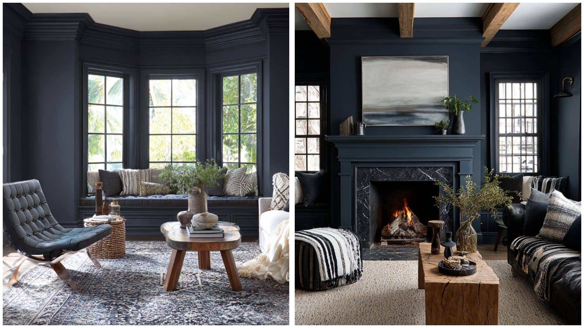
I’ve gone back and forth more than once between Benjamin Moore Hale Navy and Sherwin-Williams Naval for painting projects. These two gorgeous navy blues are among the most popular dark paint colors that homeowners love using today. Both colors bring refinement and style to any room, but they each have their own special personality and class, much like tones such as Smoky Blue SW 7604 that offer a softer take on deep blues. I created this comparison to help you understand which navy blue fits your space and decorating dreams perfectly. You’ll learn how these colors behave in different lighting, which rooms they work best in, and what colors pair beautifully with each shade. Get ready to find your perfect navy blue match! Color Comparison: Hale Navy vs. Naval Both Benjamin moore Hale Navy (HC-154) and Sherwin-Williams Naval (SW 6244) are popular dark blue paint colors that work well in many different rooms. These rich blues create calming spaces while adding refinement to your home decor. Hale Navy has a softer, more muted blue tone with subtle gray undertones that feel gentle and welcoming. This color works beautifully with white trim and creates a classic look in bedrooms and living rooms. Naval is a deeper, more intense blue with stronger pigments that make a bold statement in any space. This darker shade works especially well as an accent wall or in rooms with plenty of natural light for a dramatic effect, and it pairs nicely with lighter neutrals like Moonshine Benjamin Moore for balance. Color Terminologies and Undertones Understanding the technical specifications of these two popular navy paint colors helps you make the right choice for your space. These details highlight the key differences between the Naval and the Hale Navy, which affect their appearance in your room: Color LRV Hex Code RGB Values Undertones Sherwin-Williams Naval (SW 6244) 4 #2F3D4C 47, 61, 76 Blue with subtle maritime undertones Benjamin Moore Hale Navy (HC-154) 8.36 #434B56 67, 75, 86 Blue with charcoal undertones Naval has a very low LRV, making it an intensely dark color that absorbs most light, while Hale Navy has a slightly higher LRV, making it somewhat lighter but still a dark color. These technical differences help explain why the colors appear different on your walls and work better in certain lighting conditions. How Hale Navy and Naval Look in Different Spaces These two navy colors perform differently depending on which room you choose to paint in your home. Understanding how each color works in various spaces helps you pick the right shade for your specific needs. Here’s how the Hale Navy and Naval work in various spaces: Living Room Hale Navy offers similar enlightenment with a softer approach that works better in various lighting conditions. It creates depth without being too intense, making it perfect for larger wall areas in living rooms. Naval creates a dramatic focal point when used on an accent wall behind your couch or fireplace. The deep color makes lighter furniture and artwork pop against its rich backdrop, but might feel overwhelming in smaller spaces. Bedroom Hale Navy feels more relaxing and peaceful in bedrooms, creating a calming atmosphere perfect for rest. Its softer tone works well on multiple walls without overwhelming the room with darkness. Naval brings bold drama to bedrooms, working especially well behind headboards as a statement wall. The intense color creates a cocooning effect that some people love for their sleeping retreat space. Bathroom Hale Navy performs better in most bathroom sizes because it reflects more light while maintaining refinement. It creates a calming, spa-like atmosphere without making the space feel too closed in. Naval works best in larger bathrooms with excellent lighting, creating a spa-like luxury feel. However, it can make smaller powder rooms feel cramped and dark if not used carefully with proper lighting. Kitchen Hale Navy offers a refined style that works better in smaller kitchens or galley layouts. It provides depth and classiness while maintaining a more approachable feel for everyday cooking and family gatherings. Naval makes an attractive statement on lower cabinets or kitchen islands, hiding fingerprints well in busy cooking spaces. The dramatic color needs plenty of lighting to prevent the kitchen from feeling too dark and closed off. Color Pairing of Both Blues Both Naval and Hale Navy work beautifully with different color palettes that bring out their unique undertones. Choosing the right companion colors helps these navy shades shine in your home decorating projects. Here’s how they compare: Sherwin-Williams Naval (SW 6244) Naval’s deep maritime character with subtle blue hues creates a urbane backdrop that pairs beautifully with both warm and cool colors. The color’s low light reflectance makes it perfect for creating dramatic contrast with lighter shades. Its rich depth brings out the best in crisp whites, soft neutrals, and warm earth tones throughout your home. Icicle (SW 6238): A cool, crisp white that creates a surprising contrast Ramie (SW 6156): A warm beige that softens Naval’s intensity Roycroft Suede (SW 2842): An earthy brown that complements maritime undertones Benjamin Moore Hale Navy (HC-154) Hale Navy’s charcoal influences with blue hues offer versatility that works with both contemporary and traditional color schemes. The subtle gray qualities make it easier to pair with various neutrals and accent colors. Its balanced depth allows for flexible decorating while maintaining refinement in any room setting you choose. Coventry Gray (HC-169): A light gray that echoes Hale Navy’s undertones White Dove (OC-17): A soft white that balances the navy perfectly Lenox Tan (HC-44): A warm neutral that adds cozy contrast Glacier White (OC-37): A clean white for crisp, modern pairings Hale Navy vs. Naval: How to Decide Choosing between these two popular navy colors depends on your specific room and personal style preferences. Sherwin-Williams Naval (SW 6244) works best when you want to make a bold, dramatic statement in spaces with plenty of natural light. Its deeper tone creates a unique contrast but needs careful planning to avoid overwhelming smaller rooms. Benjamin Moore Hale Navy (HC-154) offers more flexibility for everyday living spaces because it feels less intense than Naval. It works well in various lighting conditions and room sizes without feeling too dark or heavy. Both colors create refined, classy looks that work with many decorating styles. Consider your room size, lighting, and how bold you want the space to feel. Benjamin Moore Hale Navy: Similar Colors from Sherwin-Williams Finding similar colors from different paint brands helps when you prefer a specific manufacturer or need better availability. These Sherwin-Williams alternatives offer comparable looks to Benjamin Moore Hale Navy for various projects: Sea Mariner (SW 9640): Often used as a close substitute for Hale Navy, especially for exterior projects where the result is almost identical Charcoal Blue (SW 2739): A deep blue-gray paint that is often listed by online color converters as a substitution for Hale Navy, though it has stronger violet undertones Indigo Batik (SW 7602): A bit lighter and brighter than Hale Navy with an LRV of 8, straddling the navy blue and regular blue line Sea Serpent (SW 7615): A dark, muted blue-green with stronger green undertones than Hale Navy, but often used as a substitute Naval (SW 6244): While not exactly similar, it’s frequently compared to Hale Navy as both are popular navy colors, though Naval is darker and more purely blue Keep in mind that no Sherwin-Williams color perfectly matches Hale Navy’s unique undertones and characteristics. Testing samples in your specific lighting conditions will help you choose the best alternative for your space. Can You Use Both Hale Navy and Naval in the Same Home Using both Hale Navy and Naval in the same home is definitely possible with careful planning. These colors work well together because they share similar blue undertones and complement each other nicely. You can use Naval in larger, well-lit spaces like living rooms for dramatic impact. Then use Hale Navy in smaller areas like bedrooms or bathrooms where you want enlightenment without overwhelming darkness. The key is creating visual flow by separating the colors with neutral hallways or different floor levels. Both colors pair with similar accent colors, so your decorating scheme stays coordinated throughout the house. Frequently Asked Questions Which navy paint is better for cabinets? Hale Navy is often easier to use on cabinets because it feels slightly softer and more flexible. Naval can also look beautiful, but it creates a stronger, darker statement. In smaller kitchens, test both colors on cabinet doors before choosing. Does Hale Navy look black at night? Hale Navy can look very dark at night, especially in rooms with weak lighting. However, it usually keeps a soft blue-gray look under warm lamps. Good lighting helps the color stay rich instead of reading flat, muddy, or nearly black. Does Naval look too dark on walls? Naval can feel very dark on full walls because it has a low LRV. It works best in rooms with strong natural light, layered lamps, or lighter furniture. If the room is small or dim, use Naval as an accent instead. What trim color works with both navy paints? Soft white trim works well with both Hale Navy and Naval. White Dove, Pure White, and similar warm whites can create clean contrast without feeling too stark. Avoid overly cool whites if your room already feels cold or shadowy. Which navy is better for exterior doors? Both can work well on exterior doors. Naval gives a bold, classic front-door look, while Hale Navy feels slightly softer and more traditional. Test each color outside because sunlight, shade, brick, siding, and trim can change how navy paint appears. Can I use navy paint in a low-light room? Yes, but use it carefully. In low-light rooms, navy paint can feel heavier than expected. Choose Hale Navy for a softer look, or use Naval on one feature wall. Add warm lighting, pale fabrics, mirrors, and light trim for balance. What flooring looks best with navy walls? Navy walls pair well with warm oak, walnut, natural wood, light neutral carpet, and soft beige tile. Warm flooring helps balance the cool depth of navy paint. Very cool gray floors may need brass, cream, or wood accents to soften the room. Should I use matte or satin finish? Use matte or eggshell for walls if you want a smooth, softer look. Satin or semi-gloss works better for cabinets, doors, and trim because those areas need more durability. Dark navy paint can show marks, so choose the finish based on use. Final Thoughts Now you have all the essential information about Benjamin Moore Hale Navy or Sherwin-Williams Naval to make the right choice. I’ve shown you how these navy blues differ in darkness, undertones, and performance across various rooms in your home. If you choose the softer grace of Hale Navy or the bold drama of Naval, both colors create beautiful, classy spaces. Remember that testing paint samples in your actual lighting conditions always gives you the best results before making your final decision. Your dream navy blue from Sherwin-Williams is ready to make your room look incredible, so drop a comment below about which shade you love most!

I’ve had those moments where I walk into my bathroom and the tile just feels outdated. It’s still in good shape, but the style is tired. When I wanted a quick, affordable refresh, painting my bathroom tile floor turned out to be the perfect solution. It’s a simple DIY project that can make a huge difference, without removing a single tile. I’ll walk you through how to prep the surface, choose the right tools, and apply the paint step by step. I’ll also share tips I’ve picked up to avoid common mistakes and keep the finish looking fresh. Let’s find out together if a painted tile floor can really stand the test of time. What to Know Before Painting Bathroom Tile Floors Painting tile floors can be a smart and budget-friendly way to refresh your bathroom, especially if the tiles are in good condition. It works best in low-traffic or guest bathrooms, or when you want a short-term makeover without the cost of new flooring. Some of the main benefits include low cost, easy DIY steps, and flexible design options. But it’s not without drawbacks. It requires proper prep and may wear faster in high-use or wet areas. You should avoid painting if your tiles are damaged, constantly damp, or if you want a long-term solution with no maintenance. In the right situation, with the right materials and prep, painting tile floors can be a great solution. Step-by-Step Guide to Painting Bathroom Tile Floors Painting bathroom tile floors can be a budget-friendly way to refresh your space without a full remodel. By the end, you’ll see a dramatic paint-over-tile before and after transition, dull, outdated tiles become a fresh, modern surface that brightens up the entire space. Here’s a step-by-step guide to help you do it right: Tools Required Before you begin, gather the right tools to make the job easier and neater. These basic items help you prep, paint, and clean up efficiently: Degreasing cleaner Sponge or scrub brush Clean water & clothes 120 or 220 grit sanding block Mini roller Angled brush or small paintbrush Painter’s tape (optional) Stencil (optional) Water-based polyurethane or topcoat Ventilation tools (e.g., fan) Step 1: Deep Clean the Surface Before you paint, the tile needs to be completely clean. Dirt, soap scum, and grease can prevent the paint from adhering properly. Use a strong degreasing cleaner to scrub the surface well. Rinse everything with clean water and let it dry fully before moving on. Step 2: Protect the Surrounding Areas Before you open your paint, tape off anything you don’t want painted, like the base of the toilet, the vanity, and the walls. If there’s any old caulk around the toilet or tub, remove it now. This gives you clean edges and helps the paint stay where it belongs. Step 3: Apply the Base Coat Using a high-quality brush, begin by trimming around the edges of the floor. Then grab a ⅜ inch nap roller to cover the rest of the tile in small, manageable sections. Work from one side of the room to the door so you don’t trap yourself inside. The paint is low-odor and easy to roll on. Just make sure to apply it evenly without overloading your roller. After your first coat, let it dry for six hours. During this time, only walk on it with socks to avoid scuffing. Once those six hours are up, apply a second coat in the same way, brush the edges, and roll the rest. Allow it to dry overnight before stenciling. Step 4: Apply the Top Coat After the stencil layer dries for two hours, it’s time to seal everything in. Use Rust-Oleum’s top coat and a ¼ inch nap roller for best results. Apply it just like the base coat trim, then roll. One coat is enough for most bathrooms, but you can add a second coat for extra durability. This top layer protects your floor from scratches and wear. Step 5: Let the Paint Cure Fully The final step is curing. While paint may feel dry to the touch in a few hours, full curing takes longer. Wait 24 to 48 hours before stepping on the floor, and give it up to 7 days to fully cure. During this time, avoid getting the surface wet or putting anything heavy on it. Heat and humidity can also affect how fast the paint cures, so keep the room well-ventilated. And that’s it, once everything’s cured, you’ll have a bathroom tile floor that looks brand new, all without breaking the bank or tearing anything out. If you’d like to follow along with a visual tutorial, you can watch it here: Tips for Best Results A few smart tips can make your painted tile floor look better and last longer. Painted tile floors need patience and attention to detail. Rushing the process or skipping steps can lead to chipping, peeling, or uneven color. Here are some tips to help your project go smoothly: Work in small sections: This gives you more control and helps you keep edges clean while the paint is still wet. Use light, even coats: Thick coats can bubble or peel. Thin layers dry better and give smoother results. Avoid high-humidity days: Moist air slows down drying and can affect how the paint sticks. Choose a dry day with good airflow. Don’t skip primer: Primer is what makes the paint last. Without it, the paint may peel within weeks. Learn from real DIYers: Many bloggers and YouTubers share their results after 1, 3, or even 5 years. Their reviews can help you avoid mistakes and pick the right products. Following these tips gives you the best chance at a durable, great-looking finish that holds up in your bathroom. How Long Will Painted Bathroom Tile Last? Painted bathroom tile can last anywhere from one to five years, depending on how well it’s prepped and how much daily use it gets. In low-traffic areas like guest bathrooms, the finish may stay smooth for years. But in busy bathrooms with lots of foot traffic, water, or steam, the paint may start to wear down sooner, especially near sinks, tubs, and entry points. Moisture, strong cleaning products, and skipped prep steps are the main reasons paint fails early. If the floor wasn’t cleaned, sanded, and primed properly, it won’t hold up well. The good news is that you can touch up small chips or worn spots by sanding lightly, repainting the area, and letting it cure. With the right care and maintenance, a painted tile floor can keep looking fresh much longer than you might expect. How to Maintain Your Painted Tile Floor To keep your painted tile floor looking good, clean it gently and regularly. Use a damp mop with mild soap or a pH-neutral cleaner. Avoid steam mops, as high heat can weaken the paint and shorten its lifespan. Stick to soft cloths, microfiber pads, or sponge mops to avoid scratching the surface. Avoid soaking the floor or letting water sit for too long. Good ventilation helps the floor dry faster and keeps moisture from building up. If your bathroom has poor airflow, consider using a fan or leaving the door open after showers to reduce humidity. Do not use bleach, harsh chemicals, or abrasive scrubbers, as they can wear down the paint and cause it to peel. Even “tile-safe” cleaners meant for glazed surfaces might be too strong for painted floors. Always test a small area first if you’re unsure about a product. If you start to see dull spots, chipping, or color fading in high-traffic areas, it may be time for a quick touch-up. Lightly sand the worn area, clean it, and reapply paint and sealer as needed. Regular care and gentle cleaning can keep your painted floor looking great for years without the need for a full redo. Common Mistakes and How to Avoid Them Even a small mistake can lead to peeling, chipping, or uneven results. Here are the most common issues people run into and how to prevent them. Skipping prep: Not cleaning or sanding properly is the fastest way to ruin a paint job. Dirt, grease, or a slick surface will stop the paint from sticking. Using the wrong paint type: Regular wall or latex paint won’t hold up on tile. Always use tile-specific or epoxy-based paint made for floors and moisture. Overloading the paint roller: Too much paint can cause drips, bubbles, and uneven coverage. Light, even coats work best and dry more smoothly. Inadequate drying time: Rushing between coats or walking on the floor too soon can cause smudging or peeling. Always follow the dry and cure times on the label. Applying sealant too soon: If you add a topcoat before the paint is fully dry, it can trap moisture and ruin the finish. Let the paint cure before sealing. Taking your time and following the right steps will save you from most problems and give you a smoother, longer-lasting result. Conclusion I’ve found that painting bathroom tile floor can totally change the feel of a space, without the stress (or cost) of a full remodel. Now that you know what tools to use, how to prep, and what to avoid, you’re set up to tackle this project with confidence. Taking the time to prep properly really does make a difference, and a little patience goes a long way in making those results last. You’ve got what you need to nail this project, whether it’s a clean white finish or a bold design. If you want to know what else you can tackle around the house, check other blogs on the website for more DIY guides.
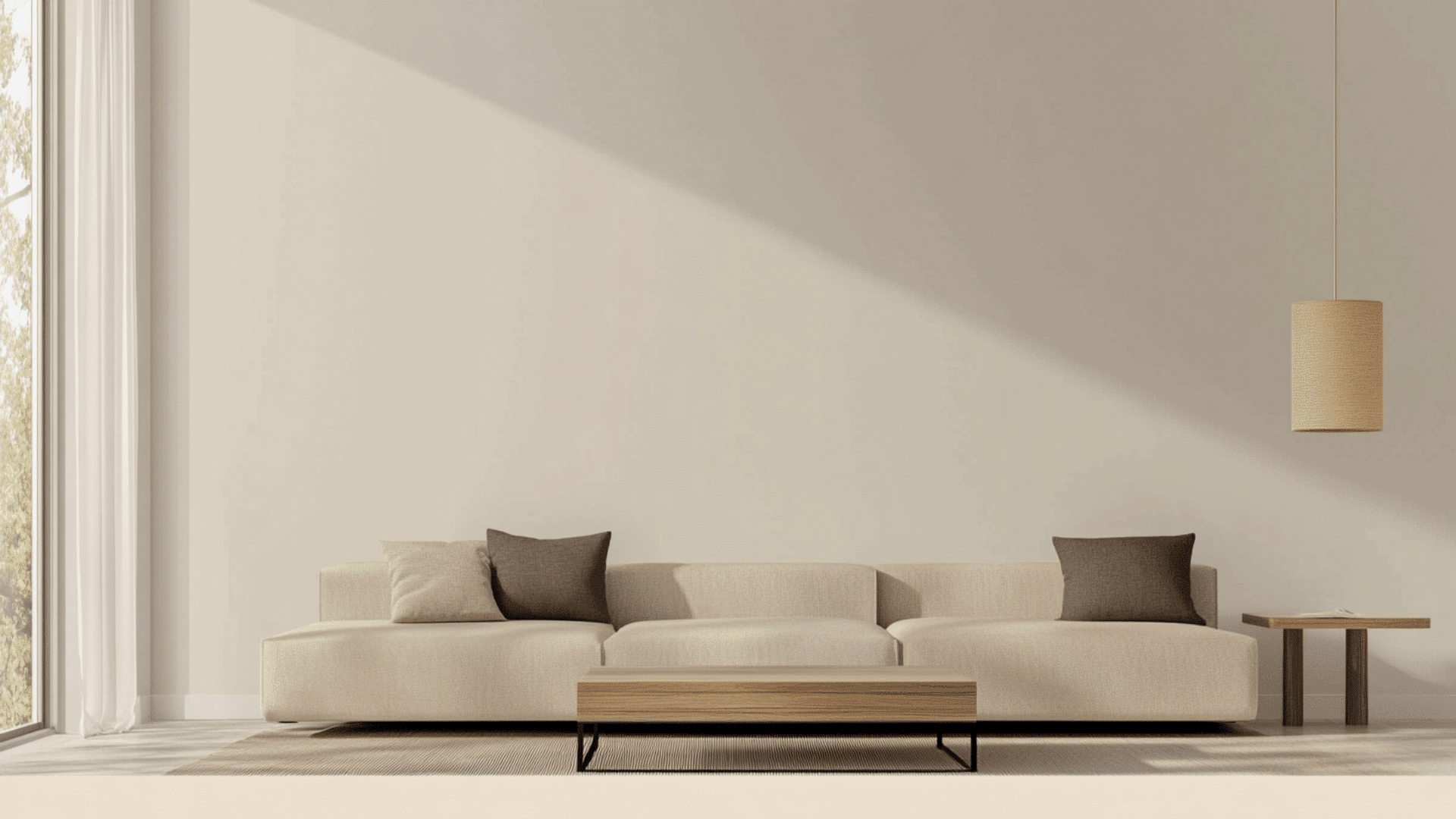
Choosing a paint color sounds easy until every shade of gray and greige starts mixing together. I’ve been there, staring at samples that all look the same, wondering which one will actually work once it’s on the wall. If you’ve been eyeing Sherwin-Williams Alpaca, SW 7022 is a warm gray-greige paint with an LRV of 57 and subtle taupe, purple, and pink undertones. It works well in bedrooms, living rooms, and whole-house color schemes thanks to its soft, balanced warmth. That’s why I put together this guide. I’ll walk you through how Alpaca looks in different lighting, how it compares to similar shades, what it pairs well with, and where it works best. Still not sure if it’s the right fit? Let’s take a closer look and figure it out together. Getting to Know Sherwin-Williams Alpaca Sherwin-Williams Alpaca (SW 7022) As a color consultant with hands-on experience testing neutral paint shades in real homes, I’ve seen how Alpaca shifts across lighting conditions and why it works so well as a flexible greige. Alpaca Quick Facts LRV: 57 HEX: #D4CEC5 RGB: 212, 206, 197 Undertones: Taupe, purple, pink Color Type: Warm greige Best Rooms: Living rooms, bedrooms, kitchens, hallways Best Trim Colors: Pure White SW 7005, Alabaster SW 7008 Paint collection: Sherwin-Williams Neutrals This color gives off a relaxed and inviting tone. It’s not harsh or cold. It leans warm, with just enough depth to feel balanced. Alpaca is exactly the kind of enduring paint color that earns its place on walls across different design eras without ever needing to be replaced. Undertones Explained Alpaca has subtle undertones of taupe, purple, and pink. These hints are soft and muted but noticeable in the right lighting. In warm light (like morning or afternoon sun), Alpaca tends to show more of its taupe or beige side. In cool light (like north-facing rooms), the purple-pink undertones can appear stronger. Under artificial light, it may shift depending on the bulb temperature (warm white vs. daylight). This is why Alpaca can look slightly different from room to room. It reacts to its surroundings, especially wall decor, furniture, and light conditions. SW Alpaca in Real Spaces I’ve found that Sherwin-Williams Alpaca works really well in different parts of the home. Its warm gray tone adds a cozy feel without making the space look too dark or heavy. How It Looks in Different Rooms Alpaca adapts easily to different rooms. Below are examples of how it looks and feels in each space. Living Rooms Alpaca creates a cozy, grounded feel in living rooms. It softens the space while staying neutral enough to pair with bold or subtle decor, from leather furniture to textured fabrics. Bedrooms This color adds a soothing touch to bedrooms and works well alongside other best bedroom paint colors that focus on calm, relaxing tones. Kitchens Alpaca is a smart choice for kitchen cabinets or walls. It pairs nicely with white tile, stainless steel, and wood accents, giving the kitchen a modern yet relaxed and welcoming feel. Bathrooms In bathrooms, Alpaca works especially well with white vanities and marble countertops. It adds gentle contrast while keeping things light, clean, and spa-like without becoming too cold or sterile. Dining Areas and Hallways This shade brings understated warmth to dining spaces and hallways. It adds a soft, beautiful backdrop that highlights wood trim, framed art, or pendant lights without drawing too much attention. How Lighting Affects It Alpaca’s appearance changes based on the direction and strength of light in the room. North-facing rooms: It can look slightly cooler or muted, sometimes bringing out faint purple tones. South-facing rooms: Warm sunlight boosts its beige and greige qualities. East-facing rooms: Light starts soft in the morning and fades quickly, giving Alpaca a light gray appearance. West-facing rooms: Afternoon and evening light bring out its warmth and slight pink/taupe hints. Testing it in your space before committing is always a good idea. Lighting and surrounding materials make a big difference. SW Alpaca vs. Other Popular Sherwin-Williams Colors Alpaca is often compared to other top Sherwin-Williams neutrals, including Sherwin-Williams Natural Choice, which is a lighter, warmer neutral. Alpaca vs. Agreeable Gray Agreeable Gray (SW 7029 / HEX #D1CCC1) is a soft, warm greige that leans more beige. Undertones and Warmth: Agreeable Gray feels warmer and more beige. Alpaca has more of a muted gray-pink look in some lights. Lighting Reaction: Alpaca may shift slightly purple in north-facing rooms. Agreeable Gray holds steady and looks more neutral under most lights. Alpaca (LRV 57) is slightly darker than Agreeable Gray (LRV 60), which makes it feel a bit more grounded. Choose Alpaca for depth and softness, or Agreeable Gray for a safe, neutral backdrop that works in nearly any room. Alpaca vs. Repose Gray Repose Gray (SW 7015 / HEX #CCC8C1) is a light gray with cool green undertones. It’s cooler and less “taupey” than Alpaca. Tone Difference: Repose Gray is clean and airy. Alpaca leans warm and layered. Best Fit: Repose Gray suits modern or minimalist homes. Alpaca is great for cozy, transitional spaces with soft textures. Use Repose Gray in bright rooms for a crisp feel. Use Alpaca where you want warmth without going full beige. Alpaca vs. Accessible Beige Accessible Beige (SW 7036 / HEX #D0C4B4) leans warmer than Alpaca, with less gray in the mix. Color Contrast: Alpaca is more balanced between gray and beige. Accessible Beige is clearly more beige and earthy. Room Style: Accessible Beige is ideal for farmhouse or classic styles. Alpaca fits transitional and modern homes with light wood, rattan, or soft textures. Alpaca (LRV 57) has more gray balance compared to Accessible Beige (LRV 58), which leans more beige. Both are versatile, but Alpaca feels more updated and subtle. Alpaca vs. City Loft City Loft (SW 7631 / HEX #DDD7CE) is brighter and softer than Alpaca, with fewer visible undertones. Lightness and Neutrality: City Loft has a higher LRV (70) and feels brighter overall. Alpaca is slightly deeper and moodier. Best Use: City Loft is perfect for open layouts and connected spaces. Alpaca shines in cozy rooms like bedrooms or living rooms. If you want light and breezy, go with City Loft. For layered warmth, Alpaca wins. Quick Comparison Table Color Undertones LRV Pros Cons Alpaca Taupe, pink/purple 57 Warm, cozy, layered look May shift pink in some lighting Agreeable Gray Beige, slight green 60 Safe, balanced, flexible Can feel flat in dim spaces Repose Gray Cool gray, green 58 Crisp, clean, modern Too cool in north-facing rooms Accessible Beige Warm beige 58 Soft, classic warmth Less gray balance City Loft Neutral beige/gray 70 Light, versatile, non-distracting May feel too light or washed out Best Color Pairings for SW Alpaca I’ve noticed that Alpaca really comes to life when it’s paired with the right colors, finishes, and materials. These are the combos that have helped me create a more balanced, pulled-together look: Trim and Ceiling Suggestions The right trim color can make Alpaca stand out or blend in smoothly, depending on the effect you want. Pure White (SW 7005, #F8F8F6) and Extra White (SW 7006, #F4F4F4) offer clean contrast. These are great choices if you want fresh, modern lines around baseboards and ceilings. Try Alabaster (SW 7008, #EDEAE0) from SW Alabaster coordinating colors for a warmer, more traditional feel, orGreek Villa (SW 7551, #F7F5EF) for a warmer, more traditional feel. These pair well if you’re using wood tones or vintage decor. Finish Tips: Use flat or matte paint on ceilings to reduce glare. For trim, semi-gloss or satin finishes are ideal. They highlight edges and are easier to clean. Accent Wall and Furniture Colors Accent colors can bring out Alpaca’s subtle undertones and add dimension to your space. Exact coordinating accent colors:Urbane Bronze (SW 7048, #5B504A) adds depthPewter Green (SW 6208, #5E6B5B) brings an earthy toneTricorn Black (SW 6258, #2D2A26) creates a strong contrast Best Uses: Use these shades in textiles like pillows, rugs, curtains, or statement furniture to build a layered look. Sherwin-Williams Picks: Consider Tricorn Black (SW 6258, #2D2A26) for bold accents or Pewter Green (SW 6208, #5E6B5B) for earthy balance. These work well for feature walls or painted furniture pieces. Hardware and Flooring Compatibility The finish on your fixtures and the tone of your flooring can either ground or brighten up Alpaca-painted spaces. Metal Hardware Options: Matte black and brushed nickel give a modern, clean finish. Antique brass adds a bit of warmth and pairs well with vintage decor. Best Flooring Matches: Light oak and gray-stained wood bring out Alpaca’s greige tones. Neutral or white-washed tile floors also keep the space feeling airy. Balance Tips: Use darker floors or metals if you want contrast. Stick to lighter tones and subtle textures if you want a calm, blended look overall. Cabinet pairing ideas: Alpaca works well on cabinets when paired with Alabaster (SW 7008) for upper cabinets or Urbane Bronze (SW 7048) for lower cabinets. Natural wood finishes like oak or walnut also complement its warmth. Paint Finish Recommendations In my experience, picking the right finish for Sherwin-Williams Alpaca makes a big difference. Each one reacts a bit differently depending on the light, texture, and the room it’s in, so it’s worth thinking through before you start painting. When to Use Each Finish Each paint finish has its place. Here’s how to choose based on room use and durability needs: Flat: Best for ceilings and low-traffic areas like adult bedrooms or formal dining rooms. It hides surface flaws well and has a soft, non-reflective look. Eggshell: Ideal for living rooms and bedrooms. It offers a slight sheen that reflects just enough light to feel clean, but not shiny. Easier to clean than flat. Satin: Great for kitchens, bathrooms, and hallways. It’s more moisture-resistant than eggshell and stands up to occasional scrubbing without looking glossy. Semi-gloss: Best for doors, cabinets, and high-traffic trim areas. It has a smooth, shiny finish that’s easy to wipe clean and highlights architectural details. Finish and Color Behavior Paint sheen not only affects durability but also how Alpaca appears on your walls. Undertones: The higher the sheen, the more it reflects light. This can make Alpaca’s subtle pink or taupe undertones more visible, especially in bright rooms. Reflectivity: Glossy finishes bounce light and may show more wall imperfections. Matte or flat finishes absorb light, creating a more muted and even tone. I’ve found that the right finish really helps Alpaca look its best while still working for each room’s needs. When unsure, always test a small patch in the actual lighting. It’s the easiest way to see how it’ll behave on your walls. Sampling and Buying Options Before I committed to painting with Sherwin-Williams Alpaca (SW 7022), I tested it in a few spots around the house, and I’m glad I did. Lighting really changes how it looks. Here’s how you can get samples and where to buy the paint in the U.S.: Where to Get Peel-and-Stick Samples Peel-and-stick samples are mess-free and show the true paint color on your wall. Samplize ($5.95): These 9″ x 14″ samples are made with real Sherwin-Williams paint and can be repositioned without damaging walls. Order directly from samplize.com. Sherwin-Williams: Visit a nearby location to get traditional swatches or small test pots. Find a store using the Sherwin-Williams Store Locator. Place samples on multiple walls to see how Alpaca shifts in different lighting. Always check during both day and evening. Where to Buy the Paint Once you’re ready to paint, you’ve got several reliable options: Sherwin-Williams Stores: Available nationwide, these stores carry all finishes and offer helpful in-person advice. Local Hardware Stores: Ace Hardware and Lowe’s often stock or can mix Sherwin-Williams colors. Check with your local store for availability. Online Orders and Delivery: Order directly from Sherwin-Williams for home delivery or in-store pickup. Their website shows current stock, delivery options, and any deals. Sampling first ensures Alpaca fits your lighting and style before you make the full investment. Paint Equivalents in Other Brands If you can’t get Sherwin-Williams Alpaca or want a similar color from another brand, here are close matches from Benjamin Moore, Behr, and Valspar. Each offers a comparable look with slight variations. Benjamin Moore Equivalents Sherwin-Williams Alpaca is often compared to: Pale Oak (OC-20, #EAE3D8): A light greige with warm undertones. It’s slightly creamier and brighter than Alpaca, making it great for open spaces. Edgecomb Gray (HC-173, #DAD2C8): A balanced beige-gray that shares Alpaca’s warmth but leans a bit more into beige with less taupe. Both are great choices if you like Alpaca’s feel but want a slightly lighter or more neutral base. Behr Equivalents Behr has a couple of options that come close to Alpaca’s tone: Silver Drop (790C-2, #DEDBD5): A cool gray that may appear warmer in natural light, similar in depth but less taupe. Campfire Ash (PPU18-08, #D7D0C7): A soft greige with a muted, cozy feel. It shares Alpaca’s warmth but has fewer pink undertones. These shades work well in calm, modern spaces or transitional rooms. Valspar Equivalents For Valspar users, these are close alternatives: Gravity (4005-1B, #D4D7DC): A cool, silvery gray with blue undertones. Lighter and airier than Alpaca, but visually related in low light. Filtered Shade (4003-1B, #CDCBC4): A warm gray that matches Alpaca’s depth and softness with a slightly less pronounced undertone. They offer a similar neutral backdrop, especially when paired with crisp white trim or warm wood floors. Just a heads-up, these colors are close in tone, but they’re not exact matches. I’ve learned that each brand uses different base formulas and finishes, so the final look on your walls might vary a bit. Conclusion If you’ve made it this far, you probably have a good feel for whether Sherwin-Williams Alpaca is right for your home. It’s a warm, soft gray that fits nicely in cozy, modern, or transitional spaces. If you want a neutral with depth, it’s a solid pick. This guide walked you through how it compares to similar shades, how lighting affects it, and what colors pair well with it. Before you commit, be sure to test a sample in your space; lighting can change everything. Still deciding or looking for similar tones? Check out my other paint reviews and comparisons on the website. They’re built to save you time, stress, and second-guessing. Frequently Asked Questions Is SW Alpaca warm or cool? Sherwin-Williams Alpaca is a warm gray with greige undertones. It leans warm due to taupe and pink hints, but can appear slightly cooler in north-facing rooms. What is the LRV of SW Alpaca? The LRV of Sherwin-Williams Alpaca is 57. This means it reflects a moderate amount of light and works well in both bright and dim spaces. What trim color goes with SW Alpaca? Pure White SW 7005 and Alabaster SW 7008 are the best trim choices. They provide clean contrast without clashing with Alpaca’s warmth. Alpaca vs Agreeable Gray, which is warmer? Agreeable Gray is warmer and more beige. Alpaca has more gray depth and can show slight pink or purple undertones depending on lighting. Is an alpaca good for living rooms? Yes, Alpaca works well in living rooms. It creates a cozy, balanced look and pairs easily with both light and dark furniture.
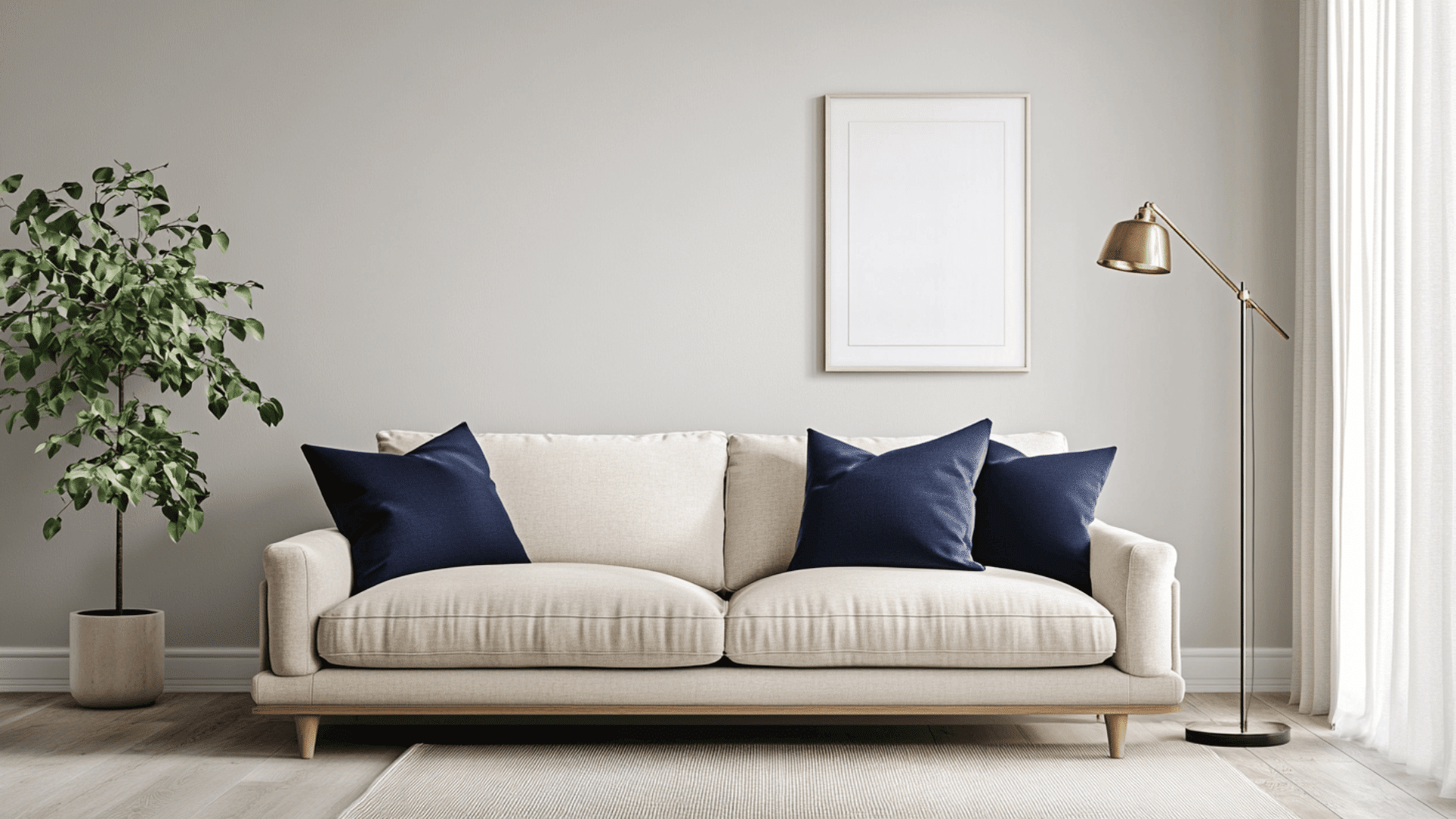
Choosing a gray paint seems easy, until you realize how many versions of “light gray” exist. I’ve been there too, trying to figure out which one won’t feel too blue, too beige, or just plain dull once it’s on the wall. That’s exactly why I put this guide together: to help you decide if Benjamin Moore’s Moonshine is the right shade for your home. I’ll walk you through how it looks in real spaces, how it compares to other popular light grays, and what colors it works best with. You’ll also get tips on sampling, buying, and what to expect in different lighting. Let’s figure this out together. Getting to Know Benjamin Moore’s Moonshine Moonshine (OC-56 or 2140-60) by Benjamin Moore is a soft, muted paint color that’s often described as a cool light gray. Basic Color Profile HEX code: #D8D9D2 LRV (Light Reflectance Value): 68.28 Color family: Light gray with subtle cool tones This color belongs to Benjamin Moore’s Off-White Collection, also referred to as the Color Preview Collection, depending on where you find it. Moonshine sits in that sweet spot between warm and stark. It’s cool without feeling icy, giving your space a calm, clean look. Undertones Explained Moonshine has blue and green undertones hiding just beneath the surface. These don’t jump out right away, but come through more clearly depending on the light in your room. In daylight, especially from north-facing windows, you’ll likely see more of the blue undertone. Under warm artificial light, the green undertone can appear more noticeable. This shifting undertone effect is what makes Moonshine such a flexible color. But it also means you should test it in your actual space before painting the whole room. Moonshine in Real Spaces Moonshine looks different depending on the room and lighting. Here’s how it usually behaves, so you can decide if it’s the right fit for your home. How It Looks in Different Rooms Kitchens Moonshine gives kitchens a soft, clean base. It works well with white cabinets, stainless steel, and natural wood tones. The cool undertones help balance out warm lighting from pendant or overhead fixtures. Bathrooms In bathrooms, it feels fresh and calming. Pair it with white or marble tile to keep the space feeling bright. Just keep in mind, small bathrooms with little natural light may bring out more of the green tint. Living Rooms This color adds a relaxed and airy feel to living rooms. It works with both modern and traditional styles and doesn’t overpower other colors. The subtle tone keeps things neutral while adding a bit of depth to your walls. Bedrooms Moonshine can make a bedroom feel peaceful and light. It pairs nicely with soft bedding and wood or metal furniture. Just be mindful of how your windows face, it’ll change how the undertones show up. Overall, Moonshine works best in rooms where you want a light, easy-going backdrop without stark white walls. How Lighting Affects It Lighting plays a huge role in how Moonshine looks. The same paint can shift tones depending on direction and time of day. North-facing rooms: These get cooler light, so Moonshine may look more blue-gray. South-facing rooms: These are bright and warm, which can soften Moonshine and make it feel more neutral. East-facing rooms: Morning light brings out its crispness; it may feel cooler and cleaner early in the day. West-facing rooms: In the evening, warm sunlight can draw out subtle green or slightly beige tones. Light changes throughout the day, so always test a sample on multiple walls and check it morning, noon, and night. That way, you’ll know exactly how it behaves in different lighting conditions. Moonshine vs. Other Benjamin Moore Grays Benjamin Moore has a lot of popular gray shades, and it can be tough to pick the right one. Here’s how Moonshine stacks up against some of the most talked-about grays from the brand. Moonshine vs. Gray Owl Gray Owl (OC-52, #D3D4CC) is a fan favorite. It is a flexible, soft gray with blue-green undertones—just like Moonshine. Gray Owl is lighter and can look cooler, especially in low light. Moonshine has a slightly softer and less crisp feel, with less of a blue cast. If you want a sharper gray, Gray Owl may suit you better. If you’re after something more muted, Moonshine is a safer bet. Moonshine vs. Balboa Mist Balboa Mist (OC-27, #DAD5CC) leans toward the warm gray side (a.k.a. greige). It has purple-pink undertones that make it feel warmer than Moonshine. Balboa Mist is ideal for cozy, soft-toned spaces. Moonshine stays more neutral and cooler, especially in daylight. Choose Balboa Mist if you want warmth without going beige. Stick with Moonshine for cooler, more modern rooms. Moonshine vs. Classic Gray Classic Gray (OC-23, #E3DFD5) is a warm, almost off-white gray that’s very soft and subtle. Classic Gray can appear almost beige or greige. Moonshine is cooler, with clearer gray tones. Classic Gray works better in traditional spaces or paired with warm woods. Moonshine is better if you’re leaning modern or coastal. Moonshine vs. Edgecomb Gray Edgecomb Gray (HC-173, #DAD1C4) is another warm greige with earthy undertones. Edgecomb Gray shifts beige in warm light. Moonshine stays cool with green/blue hints. If your room has warm light and wood accents, Edgecomb Gray may feel more balanced. For cooler light or a fresher look, go with Moonshine. Undertone and LRV Comparison Table Paint Color Undertones LRV Warm or Cool Moonshine Blue-green 68.28 Cool Gray Owl Blue-green 65.77 Cool Balboa Mist Violet-pink 67.37 Warm Classic Gray Warm beige 73.67 Warm Edgecomb Gray Taupe/beige 63.88 Warm All of these shades are popular for a reason, but they behave differently in real homes. Test them side by side before making a final call. Best Color Pairings for Moonshine I’ve found that Moonshine is a flexible neutral, but it really shines when paired with the right trim, accents, and finishes. Here’s how I like to match it throughout the home for a clean, balanced look. Trim and Ceiling Suggestions Pairing Moonshine with the right white paint helps keep the room feeling bright and clean. Here are some options that work best: Chantilly Lace (OC-65, #F5F5EF): Crisp, bright white with no strong undertones. Keeps the space modern and sharp. White Dove (OC-17, #F0EDE4): A soft, warm white that pairs well with Moonshine’s cooler tones for a subtle contrast. Super White (OC-152, #F1F2EE): A high-brightness option if you want a stark trim or ceiling. If you’re painting the ceiling the same color as the trim, stick to one of these whites in a flat finish to avoid glare. Accent Wall and Furniture Colors You can go in two directions with Moonshine: soft and serene, or bold and dramatic. For a calm, layered feel, try pairing it with pale blue, warm greige, soft sage, or dusty rose. These colors add dimension without overwhelming the space. They’re especially nice for bedrooms and living rooms where you want a gentle atmosphere. If you’re after more contrast and personality, go for navy blue, charcoal gray, forest green, or even matte black. These shades stand out against Moonshine’s cool backdrop and bring depth to modern or industrial-style spaces. When it comes to furniture, neutral upholstery, like beige, off-white, or light gray, keeps the look cohesive. But adding a bold accent chair, colorful throw, or rich-toned wood piece can bring the whole room to life. Hardware and Flooring Compatibility I’ve noticed that Moonshine works well with all kinds of materials, but pairing it with the right metal finishes and flooring really brings out its undertones. For hardware, brushed brass adds a touch of warmth and makes Moonshine feel more inviting. If you prefer a cleaner, sleeker look, polished chrome is a great choice. Want a bold, modern vibe? Go with matte black, it creates a striking contrast against the soft gray. When choosing flooring, light oak or whitewashed wood will keep the room feeling open and breezy. Medium brown tones like walnut add a cozy richness that grounds the space. If you’re using tile or stone, try soft grays with similar undertones for a smooth, tonal effect. No matter what you choose, always test samples together in your space. Moonshine is subtle but responsive. Paint Finish Recommendations I’ve learned that the finish you pick doesn’t just change how tough your walls are, it also changes how Moonshine shows up in your space. Here’s what each finish does and how it can shift the look of the color. Matte is great for low-traffic areas like ceilings or guest rooms. It hides wall flaws and gives Moonshine a soft, powdery appearance. The cool undertones feel more subtle, especially in dim or shadowed spaces. Eggshell works well in living rooms and dining rooms. It offers a slight sheen that reflects just enough light to keep things bright without highlighting wall texture. This finish makes Moonshine feel balanced; still soft, but a little more lively. Satin is ideal for kitchens, bathrooms, and busy hallways. It’s smooth, easy to clean, and moisture-resistant. The extra shine can bring out Moonshine’s green or blue undertones more clearly, especially in natural or overhead lighting. If you’re stuck between finishes, try a sample swatch on your wall with your room’s lighting. That’ll give you the best feel for how Moonshine will behave. Sampling and Buying Options Before you commit to a gallon, it’s smart to test Moonshine in your own space. Light, room size, and surrounding colors can all affect how it looks. Where to Get Peel-and-Stick Samples The easiest way to try Moonshine without making a mess is with peel-and-stick samples. Samplize offers real paint samples with an adhesive back. They’re removable, repositionable, and damage-free. Local hardware stores often carry Moonshine chips or small sample pots. Benjamin Moore retailers usually offer both painted cards and tester jars for brushing on small sections of your wall. Stick samples on different walls and check them in morning and evening light to see how the undertones shift. Where to Buy the Paint You can buy Benjamin Moore Moonshine both online and in-store. benjaminmoore.com offers direct ordering with store pickup or home delivery. Independent retailers often carry Moonshine in various finishes. Larger hardware stores may have it in stock or can place custom orders. Some retailers also offer curbside pickup or delivery options. Check ahead for availability. Moonshine Equivalents in Other Brands If you don’t have access to Benjamin Moore paint nearby or you’re trying to match another brand, I’ve found a few close alternatives to Moonshine. Just remember that each brand has its own formula, so the finish and undertones might look a little different. Sherwin-Williams: Look at Olympus White (SW 6253, #D8DDE1) or First Star (SW 7646, #E5E5E1) for a similar soft gray with cool undertones. Behr: Try Silver Drop (790C-2, #DDDACF) or Dolphin Fin (790C-3, #CCCAC1) for a comparable light gray with a muted look. Valspar: Check out Gravity (4005-1B, #C6C9CB) or Filtered Shade (4003-1B, #CBC9C4) for subtle, cool-leaning grays. These options can come close, but it’s always best to sample them side by side if possible. Even a small difference in base color or gloss level can change how the paint feels on your wall. Conclusion If you’ve made it this far, you’ve got a clear idea of whether Benjamin Moore’s Moonshine is the right fit for you. You’ve seen how it looks in real rooms, how light and finishes affect it, and which colors it pairs best with. Now, shopping online or in-store will feel a lot easier. One last tip: always sample it on your own walls. Lighting can shift the color more than you’d expect. Still comparing shades? Take a look at my other paint guides on the website. They’re laid out just like this one to help you choose with confidence.
Choosing white paint sounds simple until you’re standing in front of a dozen shades that all look the same. I’ve been there too, wondering which one won’t feel too yellow, too cold, or too flat once it’s on the wall. That’s why I put this guide together to help you figure out if Benjamin Moore’s Snowfall White is the right pick for your space, along with other warm white paint colors that create a soft and balanced look. I’ll show you how it looks in real rooms, how it compares to other popular whites, and what it pairs well with. I’ll also share tips on where to buy it, how to sample it, and what to watch out for. Still unsure how it’ll look in your lighting? Let’s find out together. Getting to Know Benjamin Moore Snowfall White If you’re thinking about painting a room white but want something softer than a pure bright white, Snowfall White might be just what you need. It’s clean, calm, and just warm enough to avoid feeling cold or sterile. Basic Color Profile Snowfall White (2144-70) is part of Benjamin Moore’s Color Preview collection. It has a HEX code of #F7F6F1 and a Light Reflectance Value (LRV) of 92.4, which means it bounces a lot of light around the room. It’s not a harsh white. It leans slightly warm, which makes it feel cozy without looking yellow or dingy. That’s why I like it for rooms where I want a fresh but not clinical look. Undertones Explained Snowfall White has soft yellow undertones. That doesn’t mean it looks yellow on the wall, but in certain lighting, especially warm bulbs or morning sun, you might catch a hint of that creamy warmth. In cooler, natural daylight, it reads more neutral and soft. So if your space gets different kinds of light throughout the day, you’ll probably notice it shifting subtly but always staying peaceful and easy on the eyes. Snowfall White in Real Spaces Snowfall White changes slightly depending on where you use it. The room’s size, light, and purpose can all affect how the color feels. Based on my own experience and what others have shared, here’s what to expect in each space. How It Looks in Different Rooms Kitchens In a kitchen, Snowfall White feels clean and airy. It works well with both stainless steel and warm-toned appliances. I’ve seen it used with wood cabinets and white quartz counters. It keeps the space looking bright without being harsh, and works even better when paired with the right tones using light hardwood floor matching. Bathrooms This shade adds a soft glow to bathrooms. If your bathroom doesn’t get much light, Snowfall White can help make it feel more open. Pair it with soft grays or brushed nickel fixtures for a fresh, relaxed look. Living Rooms In a living room, this color creates a cozy but open feel. It pairs well with warm woods, leather furniture, and even bold accent colors. I like how it reflects light without overpowering the space. Bedrooms Snowfall White in a bedroom feels restful and soft. If you want a calm, peaceful retreat, this color gives you that. It also works great with light bedding and soft pastels for a gentle finish. How Lighting Affects It Lighting plays a big role in how Snowfall White shows up on your walls. Depending on which direction your room faces, this color can shift slightly in tone throughout the day. North-facing rooms: In a north-facing room, you’ll notice cooler natural light. Snowfall White might take on a slightly muted or grayish look here, but it still feels soft, not cold. It’s a good choice if you want to warm up the space just a bit. South-facing rooms: South-facing rooms get warm, golden light most of the day. That really brings out the soft yellow undertones in Snowfall White. It’ll look warm, glowy, and comforting without leaning too yellow. East-facing rooms: Morning light from the east is cooler and brighter. In these spaces, Snowfall White looks clean and fresh early in the day, with a touch of warmth that balances out the cool light. West-facing rooms: With warmer afternoon and evening light, west-facing rooms tend to make Snowfall White look richer and cozier as the day goes on. It’s a great way to add softness without darkening the space. Daylight vs. evening lighting: During the day, it looks brighter and more neutral. In the evening, under warm bulbs, it shifts slightly warmer but still stays balanced and calm. Snowfall White vs. Other Benjamin Moore Whites When you’re choosing between white paints, the small differences can make a big impact. Here’s how Snowfall White compares to other popular Benjamin Moore whites, along with their color codes. Snowfall White vs. Simply White Simply White OC-117 / HEX: #F8F5E9 Simply White leans warmer and more yellow than Snowfall White. That difference is easy to spot in rooms with lots of natural light. Pros of Simply White: Bright, cheerful, and cozy. Cons: It can look too yellow in sunny spaces or under warm bulbs. Why pick Snowfall White: It stays more neutral and feels softer in changing light. Snowfall White vs. White Dove White Dove OC-17 / HEX: #F0EFE8 White Dove is more muted, with gray undertones that give it a creamier, softer feel. Pros of White Dove: Ideal for concealing imperfections and creating a cozy ambiance. Cons: Might look dull or dingy in low-light areas. Why pick Snowfall White: It offers a lighter, fresher appearance without being stark. Snowfall White vs. Chantilly Lace Chantilly Lace OC-65 / HEX: #F8F8F3 Chantilly Lace is Benjamin Moore’s brightest white, with a clean and crisp look. Pros of Chantilly Lace: Pure and bright; perfect for modern or minimalist styles. Cons: Can feel cold or too clinical in cool light. Why choose Snowfall White: It adds a subtle warmth while still feeling bright. Snowfall White vs. Swiss Coffee Swiss Coffee OC-45 / HEX: #F4F0E6 Swiss Coffee has noticeable beige and yellow tones, making it much creamier. Pros of Swiss Coffee: Warm and rich, ideal for traditional or rustic rooms. Cons: It can appear too yellow in some lighting. Why pick Snowfall White: It keeps a cleaner, more balanced tone across different light sources. Best Color Pairings for Snowfall White Snowfall White is soft and flexible, so it works well with a wide range of colors and finishes. If you’re wondering what matches best, here are some simple pairing ideas to help you create a balanced, pulled-together space. Trim and Ceiling Suggestions For trim and ceilings, you’ll want something that keeps the look clean but adds just enough contrast. Chantilly Lace or Super White (OC-152) works great if you want crisp, sharp lines against the softness of Snowfall White. For a seamless look, you can use Snowfall White on the walls and ceiling and go one shade brighter on the trim. In older homes, try White Dove for a gentler contrast that still feels warm. Stick with a satin or semi-gloss finish on the trim to highlight the shape without overwhelming the room. Accent Wall and Furniture Colors Accent colors help break up all the white and add personality to the space. Soft blues, sage greens, or earthy taupes add a calm, natural feel. For something bolder, go with charcoal, navy, or even black as a striking accent. Wood tones, like oak or walnut, warm things up and bring out Snowfall White’s subtle warmth. Light fabrics, woven textures, and neutral upholstery also pair beautifully with it. Hardware and Flooring Compatibility Snowfall White pairs well with a variety of hardware and flooring tones. Brushed nickel and matte black hardware create clean, modern lines. For a warmer look, use brass or aged bronze, which brings out the soft yellow undertones. On the floor, medium-tone hardwoods, white oak, or even warm tile look great. Avoid very cool grays or icy tones. They can clash with Snowfall White’s warmth and make the room feel off balance. Stick with soft, natural finishes for the most cohesive look. Sampling and Buying Options Where to Get Peel-and-Stick Samples Before you commit, it’s smart to test colors on your walls. Peel-and-stick samples give you flexibility and instant feedback. Samplize: Samplize offers reusable peel-and-stick samples from Benjamin Moore and other major brands like Sherwin-Williams and PPG. Their Snowfall White sample costs around $5.95, ships fast, and peels off cleanly, so you can test it on multiple walls. Many people love how easy they are to use, with no mess and no cleanup. Local paint stores: They also offer helpful sampling tools. At places like Sherwin-Williams, Home Depot (for Behr), and Lowe’s (for Valspar), you can get free color swatches and purchase small brush-on sample pots. These liquid samples usually cover about 2 square feet and cost around $5.99. Online: If you prefer to shop from home, you can order peel-and-stick or liquid samples directly from Samplize or Benjamin Moore’s website. Colors Similar to Snowfall White in Other Brands If you want a similar white to Snowfall White using other popular brands in the U.S., here’s what will align best: High Reflective White (SW 7757) This shade from Sherwin-Williams closely matches Snowfall White in brightness and neutrality. Great if you want a crisp, clean white without warmth. Whisper White (HDC-MD-08) Behr shows Whisper White as the top match on Match My Paint Color. Other close alternatives include Fresh Popcorn, Polar Bear, and Snowy Egret. Valspar’s Ewe (8007‑5A) Valspar’s Ewe is a very close match with nearly identical lightness and warmth (ΔE ≈ 1.01). Crumb Cookie, Gypsum, or Clear Yellow PPG lists Crumb Cookie (PPG18-01), Gypsum (PPG1006-1), and Clear Yellow (PPG1215-1) as strong matches to Snowfall White based on warmth and brightness. These shades offer a soft, creamy look without leaning too yellow. Where to Buy the Paint You can buy Benjamin Moore Snowfall White at several convenient places, both in-store and online. Benjamin Moore retailers: Use the store locator on the Benjamin Moore website to find an authorized dealer near you. Many of these stores offer custom mixing, expert advice, and same-day pickup. Local paint shops: Independent hardware stores and paint centers often carry Benjamin Moore products. They may even offer small batch mixing or delivery options. Online: You can order Snowfall White directly from the Benjamin Moore website. Most orders ship within a few days, and you can choose your preferred finish and size. Some local dealers also allow online ordering through their own sites. When ordering online, make sure to confirm the sheen (matte, eggshell, satin, semi-gloss, etc.) and paint type (Regal Select, Aura, ben®, etc.), so you get the right version for your space. Conclusion If you’ve made it this far, you’ve got a solid feel for whether Benjamin Moore’s Snowfall White is right for your space. You’ve seen how it looks, what it pairs with, and where to try or buy it. Now, you can walk into a store or shop online, knowing exactly what to look for. Just one last tip from me: always sample it on your walls first. The lighting in your home can significantly impact its appearance more than you might expect. If you’re still unsure or comparing other shades, take a look at my other blogs for honest paint reviews and real-world tips. I’ve broken things down the same way to help you choose with confidence. Frequently Asked Questions Is Snowfall White too warm for most rooms? Snowfall White has a soft warmth without looking yellow. It stays balanced in most lighting, making it suitable for living rooms, bedrooms, and kitchens without feeling overly creamy. What finish works best for Snowfall White walls? Eggshell or satin finishes are commonly used for walls. They provide a slight sheen, are easy to clean, and help reflect light without making imperfections too noticeable. Does Snowfall White work with gray furniture? It can work, but choose warmer grays. Very cool or bluish grays may clash slightly, while soft, warm-toned grays create a more cohesive and comfortable look. How many samples should I test before painting? Test at least two or three similar whites. Compare them on different walls and check throughout the day to see how lighting changes the color before making a final decision. Can Snowfall White be used on trim and ceilings? Yes, but it’s often better to use a slightly brighter white for trim. This adds contrast and keeps edges looking crisp while maintaining a soft overall appearance. Is Snowfall White good for small spaces? It works well in small rooms because of its high light reflectance. It helps spaces feel brighter and more open without appearing stark or overly cold.

Many people think all soft pinks look the same, but Pleasant Pink by Benjamin Moore proves that wrong. This shade adds warmth without being too strong, and it works in many types of spaces. If you’re trying to find a pink that feels clean, calm, and not too sweet. In this guide, I will help you learn where it works best, how it compares to similar shades, what finishes to choose, and how to care for it. Want a pink that feels right in any light? Keep reading. Color Overview: BM Pleasant Pink Pleasant Pink 2094-60 brings warmth and softness to any room. It is a soft blush with a muted base. It feels calm without looking faded or flat. The color has just enough warmth to keep it from feeling cold. It’s easy on the eyes and adds a quiet touch to a room. This pink is often used in spaces where people want comfort without anything too bold. It works well with neutrals and soft whites, offering a grounded and gentle look. LRV and Technical Details This color has a Light Reflectance Value (LRV) of 68.86, making it bright enough to reflect light and keep rooms feeling open. The HEX code is #F5E3E1, and the RGB mix is 245, 227, and 225. That balance gives it a slightly warm feel. It’s available in finishes like matte, eggshell, and satin. Each finish gives the color a slightly different look, depending on the lighting and surface. It’s easy to apply and holds color well. Where it Sits in the Benjamin Moore Collection Pleasant Pink is part of the Color Preview Collection. This collection includes rich and expressive tones, and Pleasant Pink offers a soft contrast. It’s one of the lighter pinks in the group, making it suitable for walls, ceilings, or accents. The collection is popular for design flexibility, and this shade fits well into many home styles. It’s often chosen for rooms that need a calm backdrop but still want a bit of personality through color. Room-by-Room Paint Ideas Using Pleasant Pink Pleasant Pink shade fits in many parts of the home, but a few stand out more than others. Below, we will find out how it performs in specific rooms and why it works. Bedroom Pleasant Pink adds a soft touch to bedrooms, making the space feel calm and easy to rest in. It works well with simple decor or layered textures like quilts, curtains, and throw pillows. The color doesn’t feel loud, so it fits on full walls or in small corners. Under warm lighting, it brings a cozy feel. Under cooler lights, it stays fresh and light. Try pairing it with off-white bedding, tan furniture, or natural wood pieces for a soft and steady look that helps promote rest. Nursery This pink is a gentle choice for nurseries. It offers warmth without being too bold. It creates a quiet feel that’s great for rest and comfort. Pleasant Pink works with pale gray, soft yellow, or baby blue accents. It’s easy to match with neutral furniture and looks good with both modern and classic styles. You can add colorful toys, wall art, or playful patterns without clashing. The color supports a soft base while letting other items in the room stand out. It’s a flexible pick for long-term use as the child grows. Bathroom In a bathroom, Pleasant Pink gives a fresh and clean look while keeping things soft. It pairs nicely with white tiles, brushed nickel or brass fixtures, and soft cotton towels. This color helps small spaces feel more open and less sharp. You can use it on the walls or as a surprise inside cabinets or shelves. Pleasant Pink also blends well with stone, wood, or marble elements. It offers a gentle shift from plain white without being too strong. This makes it a useful shade for both new and classic designs. Living Room Pleasant Pink makes living rooms feel warm and easy to relax in. It adds just enough color to bring interest without being loud. You can pair it with cream furniture, soft brown woods, or cool gray tones. The shade works well across different styles, from simple setups to cozy seating areas. It suits both full wall coverage and as an accent behind bookshelves or art. If you’re reading, talking with guests, or spending time with family, this color brings a steady tone that helps the room feel balanced and welcoming. How Pleasant Pink Affects Light and Mood I’ll cover how lighting influences the appearance of Pleasant Pink and how the color shapes the feel of a space in this section. Both factors are important to consider before painting. How Lighting Affects the Color Pleasant Pink reacts strongly to lighting. In warm lighting, it appears creamy, adding a soft and cozy feel to the room. In cool lighting, it shifts to a fresher and cleaner tone. South-facing rooms bring out their warmth and blush tones. North-facing rooms show more of their muted and calm side. Because light changes throughout the day, it’s best to try a sample first. This lets you see the full range of color shifts and helps you plan where the shade will look its best. Mood and Style Impact This pink brings a steady, peaceful mood to any room. It doesn’t shout for attention but adds quiet charm and warmth. Pleasant Pink fits nicely in cozy bedrooms, open living areas, or calm bathrooms. Its soft presence blends with many styles, vintage, soft, modern, or simple layouts. The color helps the space feel settled without being dull. Light woods, white fabrics, or soft tan accents can be added to create a room that feels both personal and restful. It’s a helpful choice for anyone who prefers calm color over bold contrast. Pleasant Pink Compared to Similar Shades Many soft pinks look alike at first, but small differences change how they feel in a room. Here’s how Pleasant Pink compares to other well-known Benjamin Moore shades. Shade Tone Best Use Warm/Cool Softness Level Notes Pleasant Pink 2094-60 Muted blush Bedrooms, bathrooms, nurseries Warm Very soft Balanced and quiet, not too sweet First Light 2102-70 Fresh rose Entryways, living rooms, studios Cool Soft Lighter and cooler, and feels a bit brighter Tissue Pink 1163 Slightly peachy Kids’ rooms, accents, trim Warm Soft-medium Has a hint of peach, a touch more color Tender Pink 2090-50 Bright pink Playrooms, accent walls Neutral Low softness More bold and lively, it works as a pop Styling Tips from Paint Experts This section offers helpful tips on how to make Pleasant Pink work well in real homes. From finish choices to matching colors, these ideas can help you use this shade with more confidence. Best Accent Colors Pleasant Pink pairs well with creamy whites, soft gold, and natural woods. These accents help the pink stay gentle while adding interest. Gold adds warmth, cream keeps things light, and wood tones bring comfort. You can use white trim for a clean frame, or mix in light taupe or tan furniture for extra depth. These combinations work in both simple and more styled spaces. Keep the tones soft to match Pleasant Pink’s calm feeling. Finish Options for Each Room The finish you choose affects how Pleasant Pink looks and feels. Eggshell is a great option for most walls. It gives a smooth look and handles light wear well. Satin is better in bathrooms or kitchens because it’s more moisture-friendly and easy to clean. Flat finishes offer a soft look for ceilings or low-traffic spots. Trim usually works best in semi-gloss or satin to add just a bit of shine. Choosing the right finish helps the color stay fresh and clean-looking. Expert Color Pairings Designers often suggest pairing Pleasant Pink with warm whites, pale tan, or soft blush tones. These choices keep the look light and steady. Some also mix in muted greens or grays for a calm contrast. A painter might say it’s best used in rooms with steady light to enjoy its full tone. While quotes weren’t found directly, advice from professionals often focuses on keeping the space grounded and simple. Pleasant Pink does best when paired with other soft shades. Wall Care Tips and Mistakes to Avoid Keep your Pleasant Pink walls looking great by following a few simple maintenance tips and avoiding common pitfalls. Care Tips With the right cleaning routine and a bit of protection, your Pleasant Pink walls can stay fresh and inviting for years. Clean gently: Use a soft cloth or sponge with mild soap and water—ideal for satin or eggshell finishes. Avoid harsh scrubbing: It can dull the paint, especially in high-touch areas. Touch up as needed: Check for scuffs in places like hallways or kids’ rooms and plan to repaint every 2–3 years. Block direct sunlight: Use curtains or shades during peak sun hours to help prevent fading. Dust regularly: This keeps the color looking clean and even. Mistakes to Avoid Small errors in painting or color pairing can diminish Pleasant Pink’s charm. Here are the most common mistakes to avoid. Skipping samples: Always test the paint under both natural and artificial light. Using the wrong finish: Avoid flat paint in high-use areas; it marks and wears faster. Overlooking undertones: Clashing shades, like cool grays or bright reds, can disrupt the look. Skipping prep: Dust, cracks, or rough patches will show through if not smoothed first. Overusing in small rooms: Too much pink in tight spaces can feel overwhelming instead of soft. Where to Buy Pleasant Pink 2094-60 Finding Pleasant Pink is easy, thanks to its wide availability through trusted paint retailers. If you prefer shopping online or visiting a local store, you’ll find several ways to get this popular Benjamin Moore shade. Most sellers offer samples, quarts, and gallons in different finishes. You can test the color at home before buying a larger size, which helps ensure it works well in your lighting. Some retailers also provide advice or help with product selection. If you’re planning a project, it’s smart to check for seasonal promotions or store deals. Summing Up Pleasant Pink offers a soft, steady tone that works in nearly any room. It’s easy to pair, simple to maintain, and flexible in style. You now know how lighting affects it, what colors go well with it, and how it compares to other pinks. I make it easier to decide if it fits your space and needs. Test it in your home, check the light, and see how it feels. Browse our other posts for more paint ideas and color guides.