


Is your kitchen too cramped for cooking yet too cold to enjoy? It is frustrating to feel squeezed between bulky appliances while trying to host friends. You want an open, airy feel without losing the cozy warmth that makes a house a home. Designing the perfect barndominium kitchen ideas is about more than picking cabinets; it’s about balancing rugged, industrial bones with modern comforts. Even if you are focusing on a barndominium interior design, you can master this balance through the right focal points. This guide helps you choose durable materials and optimize layouts for better flow. By avoiding common design traps that clutter beautiful spaces, you can create a kitchen that is both practical and inviting Key Design Elements for a Barndominium Kitchen When it comes to a farmhouse barndominium interior, focus on creating a balance between natural materials and efficient functionality. These elements work together to create a warm, inviting atmosphere that feels like home while being practical. Mixed Materials: Combine the warmth of reclaimed wood or shiplap with the durability of quartz or granite. Use a butcher block for prep areas to add a traditional, tactile feel. Contrast & Openness: Use two-toned cabinets, dark lowers, and light uppers to create depth. Swap heavy upper cabinets for open shelving to make the room feel larger and more personal. Signature Features: Install a deep farmhouse sink for heavy-duty tasks and vintage-style pendant lights to anchor the room’s character. Efficient Flow: Prioritize a layout that allows easy movement between the stove, sink, and fridge. An open design ensures the kitchen remains the social heart of the home. Layered Lighting: Blend bright task lights with soft ambient fixtures. Finish the look with cohesive hardware like rustic faucets and handles to tie the aesthetic together. Barndominium-Specific Design Challenges to Know First Before getting into specific kitchen ideas, it’s important to understand a few design challenges unique to barndominiums. High ceilings need layered lighting: Barndominiums often have 10–14 ft ceilings, so one light won’t cut it. Use under-cabinet, pendant, and ambient lighting together. Moisture matters with metal walls: Condensation can be an issue. Choose moisture-resistant materials like MDF cabinet boxes with durable fronts to prevent warping. Open layouts need definition: Without walls, kitchens can blend into living spaces. Use islands, beams, or bold backsplashes to visually anchor the area. Keeping these factors in mind will help you make smarter design choices as you plan your barndominium kitchen. Countertop Material Comparison for Barndominium Kitchens Material Approx. Cost (per sq ft) Best For Watch Out For Quartz $50–$150 High-traffic families; low maintenance Less heat-resistant than stone; can look sterile without warm accents Butcher Block $40–$100 Prep zones; add warmth Needs oiling; avoid near sinks without sealed edges Granite $50–$200 Durability and unique patterning Requires periodic sealing; heavier than quartz Concrete $65–$135 Industrial-rustic aesthetic; custom shapes Sealing required; can crack; DIY-risky Reclaimed Wood $5–$15 (board ft) Accent islands; visual warmth High maintenance; not ideal for primary prep surfaces The most practical combination for a barndominium kitchen is quartz on the main runs paired with butcher block on the island. You get durability where it counts and warmth where people gather. Modern and Functional Barndominium Kitchen Ideas Designing a barndominium kitchen involves creating a space that combines rustic style with modern functionality. Each design element plays a role in making your space beautiful. Before you get started on calculating your kitchen renovation budget, let’s look at the best ways to bring your dream barndominium kitchen to life. 1. Open Shelving for Easy Access Approximate Cost: $20–$100 per shelf Instead of traditional cabinets, consider using open shelving to display your favorite kitchenware. This creates a modern, airy feel while offering easy access to dishes and cooking essentials. Open shelves also provide a space to showcase your style with unique bowls, vintage jars, or decorative items, adding a personal touch to your kitchen design. One thing I consistently tell clients: open shelving only looks good when you’re honest about your habits. If your dishes are mismatched and your spice jars are unlabeled, open shelves will highlight the clutter rather than hide it. Easy Upgrade: Use under-shelf lighting or spotlights to highlight the items on your open shelves, adding both functionality and charm while creating a warm, welcoming ambiance. 2. Reclaimed Wood Accents Approximate Cost: $5–$15 per board foot Using reclaimed wood for countertops, shelving, or exposed beams brings a warm, rustic touch to your kitchen. This eco-friendly material improves the natural beauty of your space while reducing environmental impact. Its rich texture and unique character make it a standout feature, adding both beauty and sustainability to your barndominium kitchen. Easy Upgrade: Pair reclaimed wood with soft, warm lighting to highlight its natural textures and create a cozy, inviting atmosphere in your kitchen. 3. Modern Farmhouse Sink Approximate Cost: $250–$1,500 A farmhouse sink, or apron-front style, brings a classic rustic feel to your kitchen. Its deep basin is perfect for handling large pots and dishes, offering both style and practicality. The sleek design seamlessly fits into any barndominium kitchen, creating a timeless and functional space with a cozy, traditional touch. If you’re choosing between fireclay and cast iron for your farmhouse sink, go with fireclay. Cast iron chips under heavy use, and barndominium kitchens tend to be high-activity spaces. Fireclay is harder, easier to clean, and the white holds up longer. Budget at least $500 if you want one that won’t show wear within five years. Easy Upgrade: Illuminate the sink area with focused task lighting above the farmhouse sink. This ensures perfect lighting for cleaning and food prep while highlighting the sink’s rustic charm. 4. Stainless Steel Appliances Approximate Cost: $1,000–$4,000 per appliance Pair stainless steel appliances with your rustic wood features to add a modern touch to your barndominium kitchen. Stainless steel is durable, easy to maintain, and provides a sleek contrast to the warm, natural tones of wood. It also improves the kitchen’s functionality with high-performance equipment that can handle daily use while maintaining a polished, contemporary look. Easy Upgrade: To complement the sleekness of stainless steel, use cool-toned LED lighting or pendant lights with metallic finishes. This adds a modern touch while still maintaining the rustic charm of your kitchen. 5. Quartz Countertops Approximate Cost: $50–$150 per square foot Quartz countertops are durable, low-maintenance, and available in enough colors and patterns to work with almost any barndominium aesthetic. Unlike natural stone, quartz doesn’t need sealing, which matters in a high-traffic kitchen where upkeep is the last thing you want to think about. For a more layered look, pair quartz main runs with a wood or concrete island. The contrast adds depth without adding complexity to maintenance. If you’re interested in how quartz holds up against other countertop materials in a clean, open kitchen layout, the same principles apply regardless of style. Easy Upgrade: Pair quartz countertops with under-cabinet lighting to highlight their sleek surface and create a warm, inviting ambiance. Consider pairing quartz with modern fixtures or wood accents for a perfect balance of rustic and contemporary styles. 6. Pendant Lighting Over the Island Approximate Cost: $50–$300 per fixture Install pendant lights above your kitchen island to create a focal point. Choose fixtures that complement your rustic style, such as mason jar lights or wrought iron chandeliers. These lights provide task lighting while adding a decorative element, helping your kitchen feel both warm and inviting. Easy Upgrade: Hang multiple pendant lights in a cluster or at varying heights for a more dynamic, customized look that enhances your kitchen’s atmosphere. 7. Sliding Barn Door Pantry Approximate cost: $150–$800, depending on size and material A sliding barn door pantry is both functional and stylish. It saves space while adding a touch of rustic beauty to your kitchen. The sliding door system allows for easy access to pantry items without using up extra room, making it an ideal solution for smaller kitchens or open-concept spaces. One thing most people don’t consider: the track for a barn door needs a wall section that’s at least as wide as the door itself, since the door slides to the side rather than swinging out. Easy Upgrade: Choose a barn door with a simple, sturdy track system for smooth operation and to complement the rustic aesthetic of your kitchen. 8. Two-Toned Cabinets Approximate cost: $1,000–$5,000, depending on cabinet materials and size Usually used for creating contrast and visual interest by incorporating two-toned cabinets in your kitchen. For example, use dark lower cabinets and light upper cabinets, or vice versa, to achieve a balanced and dynamic look. This design adds depth and dimension, making the space feel larger and more open, while maintaining a stylish, cohesive aesthetic. Easy Upgrade: Pair two-toned cabinets with matching hardware to tie the design together and keep the look cohesive. 9. Vintage-Inspired Appliances Approximate cost: $800–$3,000, depending on brand and features Incorporating vintage-inspired appliances can add a nostalgic touch to your kitchen. Choose retro-style refrigerators, stoves, or dishwashers that offer modern features while evoking beauty and history. These appliances blend seamlessly with both rustic and modern elements, creating a unique and timeless kitchen design that stands out. Easy Upgrade: Pair vintage appliances with sleek, contemporary finishes to create a balance of old-world charm and modern efficiency in your kitchen. 10. Exposed Beams in the Ceiling img src=”https://www.minimalandmodern.com/wp-content/uploads/2026/05/beams-are-rustic-and-unpolished-adding-warmth-to.webp” alt=”beams are rustic and unpolished, adding warmth to the space”> Approximate cost: $200–$1,000 depending on material and finish Exposed wooden beams do structural work visually; they break up the volume of a tall ceiling and give the eye something to rest on. In a barndominium with 12 or 14-foot ceilings, an uninterrupted ceiling plane feels unfinished. Beams fix that. Use them to frame specific zones. A beam running above the island or dining area signals a zone boundary without needing a wall, which matters in open-concept barndominium builds where interior definition is otherwise hard to achieve. Easy Upgrade: Use beams to frame key areas, such as the kitchen island or dining space, to visually divide and define the zones. 11. Large Kitchen Island Approximate Cost: $500–$2,500 A large kitchen island serves as the heart of the kitchen, offering extra prep space, storage, and seating. This multifunctional feature adds both practicality and style. It can also serve as a casual dining area or a gathering spot for family and friends, making it an essential part of your kitchen design. Easy Upgrade: Choose an island with built-in storage to maximize space, keeping the kitchen organized while providing additional functionality. 12. Mix of Natural Materials Approximate Cost: $30–$150 per material Incorporate a mix of natural materials like stone, wood, and metal to create a balanced and inviting kitchen design. For instance, combine a stone backsplash with wooden shelves to add texture and warmth. This blend of materials not only adds depth to the space but also maintains a harmonious and stylish look, making your kitchen feel both cozy and sophisticated. Easy Upgrade: Mix different textures to add visual interest and make your space feel dynamic without overwhelming it. 13. Industrial-Style Lighting Fixtures Approximate Cost: $50–$250 per fixture Industrial-style lighting fixtures, featuring exposed bulbs or iron frames, bring a modern rustic vibe to your kitchen. These fixtures add character and contrast to softer materials like wood or stone, creating a sleek yet warm environment. Ideal for the above islands, dining areas, or workspaces, they combine both style and function. They provide excellent task lighting while becoming a focal point in your kitchen design. Lighting Tip: Use dimmer switches to adjust the light intensity, adding versatility and energy savings. Avoiding Common Barndominium Kitchen Design Mistakes Careful planning is the secret to a kitchen that looks stunning and works perfectly. Focus on these core areas to avoid common design traps: Declutter the Decor: Limit decorative items and use smart storage like open shelving to keep countertops clear and the room feeling airy. Prioritize Durability: Skip low-quality finishes. Investing in solid wood and quartz prevents costly repairs and stands up to daily wear. Layer Your Lighting: Don’t rely on a single source. Combine bright task lighting for safe cooking with warm ambient lights for a cozy mood. Optimize the Flow: Ensure your layout allows for easy movement between work zones to keep the space functional. By choosing quality over quantity, you’ll create a balanced, beautiful kitchen that lasts for years. Frequently Asked Questions What is the best layout for a barndominium kitchen? Use a zone-based layout with separate prep, cooking, and cleanup areas. An L-shaped or U-shaped perimeter paired with a large island keeps workflow efficient while maintaining an open-plan feel. Maintain 42–48 inches of clearance on all working sides of the island. What countertops work best in a barndominium kitchen? Quartz offers durability and low maintenance. Butcher block adds warmth to islands but needs regular oiling. Concrete suits industrial styles but requires sealing and professional installation. A quartz-and-butcher-block combination balances function and character. How do I make a barndominium kitchen feel less cavernous? Add visual anchors: exposed beams, pendant lighting over the island, and darker lower cabinets. Full-height backsplashes or accent walls reduce empty vertical space and make the room feel scaled to the people in it. Can you use reclaimed wood in a barndominium kitchen safely? Yes, if it’s properly dried, treated, and sealed. Use it for shelves, beams, or island accents. Avoid placing it near water or food prep zones unless finished with a food-safe protective coating. How much does a barndominium kitchen cost to build? Costs range from $15,000 to over $80,000 depending on materials, cabinets, and appliances. Mid-range builds typically fall between $30,000 and $60,000. Always compare at least three local contractor estimates before finalizing a budget. What lighting works best in a barndominium kitchen with high ceilings? Layer three types: under-cabinet task lighting for prep surfaces, pendant fixtures over the island for focal light, and ambient ceiling or recessed fixtures for overall coverage. Dimmer switches on the decorative fixtures give you control over the room’s mood at different times of day. Final Thoughts Your kitchen is truly the heart of the home, and seeing it transition from a simple concept to a finished space is incredibly rewarding. I have shared how mixing reclaimed wood with sleek quartz and layered lighting can create that perfect barndominium kitchen idea you have been dreaming about. I covered everything from the necessity of a deep farmhouse sink to the smart use of two-toned cabinets for added depth. By focusing on durable materials and a functional layout, you ensure your space stays as practical as it is beautiful. These choices help you avoid a cluttered look while maximizing every square inch. Which of these design ideas is your favorite? Let me know!

Do you ever look at your porch or windowsill and think it could use a little more life? A DIY flower box could be just what you need! I know how easy it is to feel like a space needs something extra, but the great news is that you don’t need to spend a lot of money or be a pro to create something beautiful. This DIY flower box project runs about 3 to 5 hours of active work, costs between $50 and $100 in materials (if you own the tools), and sits solidly at a difficulty level of 2 out of 5. I’ve done this build twice. The second time was faster, cheaper, and the box is still standing three seasons later. Here’s what I’d tell you before you buy a single board. Difficulty 2 out of 5, basic cuts, no joinery skills needed Time 3 to 5 hours across one weekend Cost $50 to $100 in materials (tools not included) Tools Needed Circular saw or handsaw, power drill, measuring tape, sandpaper (80 and 120 grit), level, clamps Skill Required Beginner, if you can drive a screw straight, you can do this Cost Note: Figures in this article are estimates based on national averages. Actual costs vary significantly by region, store, and wood species. Tools are a one-time purchase; if you already own a drill and saw, your material cost drops to $50 to $100. Understanding Sunlight Before You Choose a Spot Step outside and spend a few minutes watching your space before you decide where the box goes. Note which direction the wall faces, how nearby overhangs or trees create shade, and whether afternoon light hits directly or bounces off a surface. If you’re mounting the box on a porch railing or deck, it’s worth thinking about how the box works as part of the overall outdoor deck layout, not just in isolation. A south-facing wall gets the most sun exposure throughout the day. North-facing spots stay consistently shaded. East-facing positions receive gentle morning sun, and west-facing areas take the full intensity of afternoon heat. This matters because it determines which plants will survive in your box, and building the wrong box for the wrong spot wastes both the build and the planting investment. Pick your location first, then build to fit it. Materials and Tools Needed for Your DIY Flower Box Before you start building, I recommend gathering everything you’ll need. Don’t worry, most of these materials are budget-friendly and easy to find at your local hardware store. Here’s your complete shopping list: Material / Tool Cost (USD) Notes Cedar / Pine Boards $15–30 Cedar resists rot; pine needs sealing Wood Screws (Exterior) $5–8 Avoid drywall screws outdoors Wood Glue (Exterior) $4–6 Weather-resistant (e.g., Titebond III) Stain / Paint $10–25 Stain shows grain; paint hides flaws Wood Sealer $8–15 Required for pine Landscape Fabric $5–10 Helps drainage, slows rot Sandpaper $3–8 Smooth finish Drill (if buying) $40–80 For holes & assembly Saw (if buying) $15–60 The hand saw works fine Safety Gear $10–22 Essential for protection If you already own the tools, your actual spend is the first six rows, roughly $45 to $94. That’s the number to budget against. Tools like a power drill and circular saw are one-time investments that pay off across many projects. The same drill you use to build this box is the one you’ll use if you ever tackle something more involved, like a fireplace remodel. Step-by-Step Guide to Building Your Flower Box Ready to bring your flower box to life? I’ve got you covered! Follow these simple steps, and you’ll have a beautiful planter in no time. Take your time with each step; precision now means a sturdy box later. Here are the steps: Step 1: Measure and Cut Wood Pieces Start by carefully measuring your wood boards to your desired box dimensions. Mark each cut clearly with a pencil, then use your saw to cut the pieces to length. Double-check your measurements before cutting; you want all corners to meet at perfect right angles. Accuracy here sets the foundation for a professional-looking finished product. Step 2: Resaw Boards If you’re working with thicker lumber, use a table saw to resaw the wood into thinner, more manageable pieces. Make multiple shallow passes rather than one deep cut; this ensures straighter, cleaner cuts and reduces the risk of kickback. Keep your hands safely away from the blade and work slowly for the best results. Step 3: Sand and Prepare Wood Now it’s time to smooth everything out. Use medium-grit sandpaper to sand down all rough edges, splinters, and saw marks on each piece. Pay special attention to the cut edges where your saw blade worked. This step ensures your box looks polished and prevents splinters when you’re handling it later during planting. Step 4: Assemble the Box Frame Begin assembling your flower box by applying wood glue to the edges where pieces will join. Attach the side pieces together using your drill and screws or a hammer and nails. Use a carpenter’s square or level to ensure all corners are perfectly square. Clamps can help hold pieces steady while the glue dries. Pro Tip: Pre-drill your screw holes about an inch from the board ends. Without pre-drilling, screws near the edge of cedar or pine will split the wood almost every time. Step 5: Attach the Bottom Panels and Add Trim Measure and cut bottom panels to fit between the assembled sides, leaving 1/4-inch gaps for drainage. Secure with wood glue and nails, ensuring they’re flush and stable. Next, cut and attach decorative trim around the top edge or corners using wood glue and finishing nails. Sand any rough spots, then apply your chosen stain or paint. Let it dry completely before planting. Here is the detailed video by Guardian Woodworking What Soil Mix to Use in a Wooden Planter Box? Don’t use standard garden soil in a flower box. It compacts in containers, drains poorly, and gets heavy enough to warp a wooden box over time. Use a lightweight potting mix designed for containers, something with perlite or vermiculite already in it. For a standard 36-inch box, you’ll need roughly 0.5 to 0.75 cubic feet of mix. If you’re planting herbs or vegetables alongside flowers, add a slow-release granular fertilizer into the mix at planting time. Container plants deplete nutrients faster than in-ground plantings because watering flushes them out. Best Flowers and Plants for a DIY Flower Box When I pick plants for a flower box, I always think about sunlight first. You’ll get better results when your plants match your space. The right mix makes your box look full and healthy without extra work. Let’s break it down by light type so you can quickly find what works best for your spot: Full Sun Flower Ideas If your flower box gets six or more hours of direct sunlight daily, these bright bloomers will perform beautifully all season long. Here is a quick look at the best full sun options and what makes each one worth planting: Plant Light Requirement Why It Works Petunias Full Sun (6+ hours) Produces continuous blooms from spring until first frost in a wide range of colors Geraniums Full Sun (6+ hours) Handles heat exceptionally well and stays colorful even during dry spells Marigolds Full Sun (6+ hours) Naturally repels common garden pests while adding bold yellow and orange color Zinnias Full Sun (6+ hours) Extremely heat-tolerant with bright, dome-shaped blooms that attract butterflies throughout summer Lantana Full Sun (6+ hours) Multicolored flower clusters bloom all season, heavily with very little watering or maintenance needed These sun-loving plants are low-maintenance and keep your flower box looking vibrant from spring through fall. Shade-Friendly Plants Got a shaded porch or north-facing windowsill? These plants handle low-light conditions well and still deliver plenty of color. Take a look at the top shade-friendly picks and why they work so well in low-light flower boxes: Plant Light Requirement Why It Works Impatiens Partial to Full Shade Produces masses of small flowers in pink, red, and white without needing any direct sun Begonias Partial Shade Attractive glossy foliage looks great even between bloom cycles, adding year-round visual interest Ferns Full Shade Lush green fronds add rich texture and fullness to any shaded flower box arrangement Hostas Full to Partial Shade Bold, broad leaves in green, gold, and blue tones create a strong visual presence in shaded spots Coleus Partial to Full Shade Vividly patterned foliage in red, purple, and lime green adds dramatic color without needing any blooms These shade-tolerant options prove that a flower box in a darker spot can still look just as lively and full. Trailing Plants for a Cascading Look Want your flower box to spill over beautifully? These trailing plants add depth and movement that flat upright plants simply cannot match. Here’s a simple breakdown Plant Light Requirement Why It Works Sweet Potato Vine Full Sun to Part Shade Fast-growing foliage in purple or lime green cascades dramatically over box edges Ivy Partial Shade Classic trailing vines create a clean, structured spill that pairs well with any blooming plant Lobelia Full Sun to Part Shade Tiny flowers in deep blue and purple trail softly, adding color at the box edges Bacopa Full Sun to Part Shade Produces a carpet of small white or pink flowers that spill neatly over the sides all season long Creeping Jenny Partial Shade Bright chartreuse foliage spreads quickly and adds a bold pop of color between flowering plants Mixing trailing plants with upright bloomers creates a full, layered look that makes any flower box stand out instantly. Maintenance Tips for Long-Lasting Flower Boxes Your flower box is built, now let’s keep it looking great! Follow these simple care tips to protect your investment and enjoy vibrant blooms all season long: Water consistently, but don’t Overdo It: Check soil moisture regularly and water when the top inch feels dry. Fertilize Every Two Weeks: Use diluted liquid fertilizer to keep your plants healthy and blooming. Deadhead Spent Blooms: Remove faded flowers weekly to promote new growth and keep your box fresh. Reapply Wood Sealer Annually: Protect your box from the elements by reapplying sealer or paint every 1-2 years. Monitor for Pests: Check plants regularly for pests like aphids, and treat them promptly with insecticidal soap or neem oil. With these straightforward maintenance habits, your DIY flower box will stay beautiful and productive season after season. A little regular attention goes a long way! Final Thoughts I hope this has inspired you to create your very own DIY flower box and refresh your outdoor space. With just a few materials and some creativity, you can easily craft something beautiful that adds color and personality to your home. Remember, it’s all about having fun and enjoying the process; don’t worry if your first attempt isn’t perfect. The most important thing is that you’re learning and creating something you’ll love. I’d love to hear how your project turns out! Drop a comment below and let me know which flower box design you tried. Happy building and planting! Frequently Asked Questions How deep should a flower box be for flowers? Use at least 8 inches of soil for most flowers. For plants with deeper roots, aim for 10 to 12 inches. Shallow boxes dry out quickly and require frequent watering during warm weather. What wood is best for outdoor flower boxes? Cedar works well because it resists rot and handles outdoor conditions without treatment. Pine can be used as a lower-cost option, but it must be sealed thoroughly on all surfaces before use. How do you keep a wooden flower box from rotting? Ensure proper drainage with holes, line the interior with landscape fabric, and apply a protective sealer to all surfaces. Maintain it by reapplying the sealer every one to two seasons. What to put in the bottom of a flower box for drainage? Skip gravel layers and rely on drainage holes instead. Cover the holes with landscape fabric to keep soil in place while allowing excess water to escape efficiently. What size should a window flower box be? Match the length to your window width. Keep width around 8 inches minimum and depth between 8 to 10 inches to support healthy root growth without making the box overly heavy. How do I waterproof a wooden flower box? Apply an exterior wood sealer to every surface, including edges and joints. Use at least two coats and allow proper drying time before adding soil to ensure long-lasting moisture protection. Can I use pressure-treated wood for a flower box? It can be used for decorative flowers since modern treatments are safer. For growing edible plants, choose untreated wood with a suitable sealer to reduce potential chemical exposure.
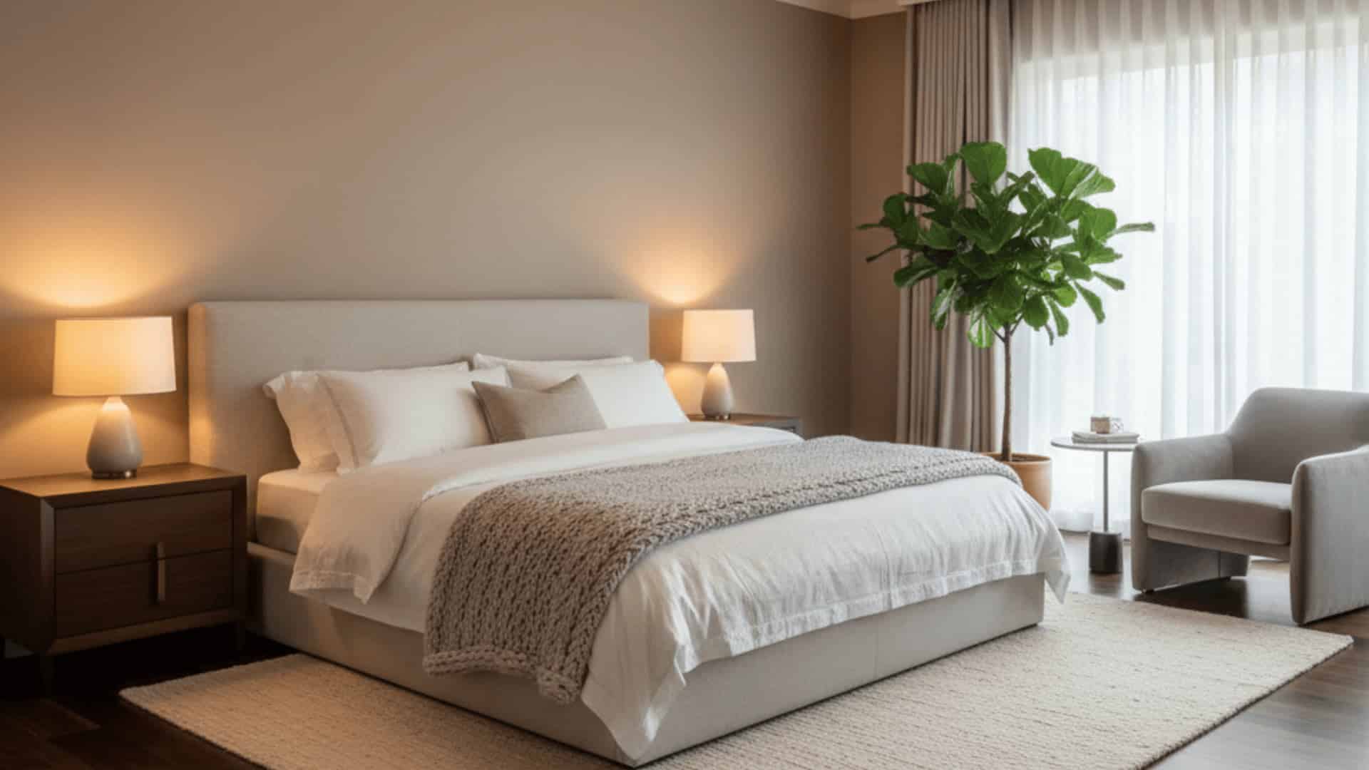
Choosing the right wall color for wood floors tripped me up for years, and I say that as someone who has spent over a decade helping clients do exactly that. Pick the wrong shade and the room feels off, dull, cramped, or disconnected, even when every other detail is right. What I’ve learned through hundreds of client consultations is that color affects how you feel the moment you walk in, it is the foundation of creating a cozy and warm living room aesthetic. Knowing how to match wall color with wood floor comes down to three things: undertones, contrast, and light. Get those right and the whole room shifts. This covers floor-specific pairings, wall colors by floor type, a 4-step framework, current trends, and the most common mistakes to avoid. The Impact of Wall Color on Wood Floors Most people pick a paint color they love and hope it works; that’s where things go wrong. Wall color doesn’t exist in isolation. It reacts with your floor’s tone, the room’s lighting, and the undertones in the wood itself. When those elements don’t align, even a beautiful paint color makes a room feel flat, cold, or overpowering. Color harmony is about balance, not matching. You’re not looking for a wall color that mimics your floor; you’re looking for one that complements it. The color wheel is my starting point with every client. Warm floors, red, orange, or golden wood, pair naturally with cool walls like soft blue, sage, or muted gray. Cool floors need warm walls like beige, taupe, or creamy white to feel complete. I call this the “temperature balance” principle: the wall and floor should sit on opposite ends of the warm-cool spectrum. When both run warm, or both run cool, the room loses tension, and without tension, it loses life. The undertone test I use with every client: Take a piece of pure white paper and lay it flat on your floor in natural daylight. The contrast will make the floor’s undertone visible immediately. Red or orange cast? Warm floor. Grayish or silvery cast? Cool floor. Almost no shift? Neutral floor, and you have the most flexibility of any floor type. Framework for How to Match Wall Color With Wood Floor Getting this right doesn’t require a design degree. Follow these four steps in order, and you’ll have a confident color decision every time. Step 1: Check your floor in natural daylight; warm tones look red, gold, or orange; cool tones appear gray, silver, or cool brown. Step 2: Light floors pair with darker walls; dark floors pair with lighter walls; avoid similar tones to prevent a flat look. Step 3: Shortlist one warm, one cool, and one neutral color based on undertone and contrast. Step 4: Paint a large sample (at least 12×12 inches), apply two coats, and observe it in different lighting for 3–5 days. Colors shift dramatically across lighting conditions, and what looks perfect on day one can reveal problems by day three. This step alone saves most people from a costly repaint. Where to put your test swatch: Paint it directly on the wall above the baseboard so it sits as close to the floor as possible, that proximity is where the color interaction actually happens. Don’t test it in the center of the wall in isolation. The floor is part of the equation, and your swatch needs to be near it to give you an honest reading. Best Wall Colors by Wood Floor Type Not every color works with every floor. Here’s what actually pairs well with yours. 1. Best Whites for Any Wood Floor White walls create bright, airy foundations that let wood floors take center stage without competing for attention. These shades work across living rooms, bedrooms, and open-concept spaces where you want walls to recede and floors to lead. Choosing the right white depends entirely on your floor’s undertone and the mood you’re after. Warm white: soft and balancing for yellow or honey-toned floors. Test Sherwin-Williams Alabaster (SW 7008) or Benjamin Moore White Dove (OC-17) Soft cream: gentle warmth for traditional or farmhouse styles. Check Benjamin Moore Linen White (OC-146) Clean white: crisp and modern; best for cool or neutral floors. Try out Benjamin Moore Chantilly Lace (OC-65) or Sherwin-Williams Extra White (SW 7006) 2. Best Neutrals for Wood Floors Today’s Trending Colors and Pairings: Warm neutrals are taking over from cool grays. Mushroom, warm khaki, and smoky taupe are replacing the icy gray-white combos that dominated the last decade. These tones are essential for anyone designing an earthy, organic modern space where the wood floor acts as the primary natural element. The key is matching your neutral’s undertone to your floor’s undertone so the two feel intentional rather than accidental. Greige: works with every undertone; the safest all-around neutral. Test Sherwin-Williams Accessible Beige (SW 7036) or Benjamin Moore Pale Oak (OC-20) Pale taupe: subtle depth without overpowering; avoid with pink-leaning floors. Try Benjamin Moore Revere Pewter (HC-172) Light warm beige: cozy and natural; avoid with heavily yellow floors. Check Sherwin-Williams Antique White (SW 6119) 3. Best Soft Colors for Wood Floors Soft colors add personality while keeping the calm, airy quality that wood floors naturally bring to a room. These gentle hues work well in bedrooms, living areas, and bathrooms where you want subtle color without a bold statement. They sit between neutral safety and full color, enough to give a room character without overwhelming it. Sage green: grounding and fresh; balances warm wood tones naturally. Check Sherwin-Williams Clary Sage (SW 6178) or Benjamin Moore October Mist (1495) Dusty blue: cools down warm floors; serene and very current. Try out Sherwin-Williams Watery (SW 6478) or Benjamin Moore Blue Echo (1648) Muted blue-green: flexible and modern; works well with neutral floors. Check Sherwin-Williams Sea Salt (SW 6204) 4. Best Dark Accent Colors for Wood Floors Dark accent colors create the kind of contrast that makes wood floors stand out. These shades work best as accent walls in living rooms, dining rooms, or bedrooms where you want impact without committing to a fully dark room. Used strategically, they ground a space and prevent it from feeling too lightweight or flat. Charcoal: modern contrast that gives light floors strong definition. Try Sherwin-Williams Tricorn Black (SW 6258) or Benjamin Moore Kendall Charcoal (HC-166) Deep green: earthy and rich; pairs beautifully with light to medium wood. Check Benjamin Moore Hunter Green (2041-10) or Sherwin-Williams Jasper (SW 6216) Navy: dramatic and grounding; works especially well with light oak floors. Test Benjamin Moore Hale Navy (HC-154) or Sherwin-Williams Naval (SW 6244) 5. Wild Card Shades That Surprisingly Work These unexpected colors prove that wood floors can handle more unusual choices than most people think when selected carefully. They work best in bedrooms, creative spaces, and powder rooms where personality matters more than playing it safe. Each one creates a memorable space that still feels balanced and considered. Soft blush: barely-there pink that warms neutral wood without reading overtly pink. Check Benjamin Moore Pale Blush (2173-60) Smoky lavender: subdued lavender-gray that offsets yellow or orange undertones beautifully. Try Sherwin-Williams Quixotic Plum (SW 6293) Warm terracotta: earthy and bold; pairs surprisingly well with medium and dark wood floors. Test Benjamin Moore Terra Mauve (2173-30) Common Mistakes to Avoid Even experienced decorators fall into these traps. Here’s what to watch for: Matching your wall color to your floor exactly: This makes the room look monotone and aged. Contrast creates depth; always aim for a clear difference in tone or temperature. Choosing paint from a small chip: Colors shift dramatically at scale. A soft gray chip can look blue or purple on a full wall. Always test large swatches (at least 12×12 inches, ideally larger). Ignoring artificial lighting: Your floor looks different under warm Edison bulbs versus cool LED overhead lighting. Test your swatches under the actual bulbs you use in the space. Stacking warm on warm: This is the most common mistake with honey oak and pine floors. Adding a warm yellow or beige wall doubles the warmth and overwhelms the room fast. Forgetting trim and ceilings: White trim with a warm wall and warm floors can create a jarring three-way clash. Match your trim undertone to the rest of the palette. Current and Future Wall Color Trends for Wood Floors Design trends continue to shift as homeowners seek fresh ways to style their spaces. Understanding current and future color directions helps you make choices that stay relevant and appealing for years to come. Today’s Trending Colors and Pairings Warm neutrals are taking over from cool grays. Mushroom, warm khaki, and smoky taupe are replacing the icy gray-white combos that dominated the last decade. Colors like BM Pale Oak and SW Accessible Beige pair beautifully with medium oak and natural walnut, creating a biophilic, grounded look. Color drenching is another major trend, painting walls, ceilings, and trim in one deep tone. Deep charcoal, espresso, or forest green paired with dark walnut floors creates a moody, library-style atmosphere that feels rich and intentional. What’s Next: Future Design Directions? Warm mahogany and reddish-brown floors are gaining ground as homeowners move away from pale Scandinavian woods. The emerging pairing combines rich red-brown floors with icy blues or soft aquas, a striking warm-meets-cool contrast expected to dominate modern interiors over the next few years. Earthy terracottas and dusty warm pinks are also showing up more frequently alongside natural wood floors, especially in living rooms and dining areas. From a psychological standpoint, this shift makes sense: after years of the emotionally cool gray-and-white palette, people are gravitating toward colors that feel physiologically warmer and more human-scaled. Terracotta and warm pink are the interior design world’s response to a broader cultural desire for comfort and groundedness. Tips to Test Wall Colors in Your Space Testing paint colors properly saves time and money and prevents costly mistakes. Use these practical tips to ensure your wall color complements your wood floors in all lighting conditions: Paint Large Swatches: Apply two coats on 2ft x 2ft sections and observe them in morning, afternoon, and evening light for 3-5 days. Check Adjoining Rooms: Test colors in connected spaces to ensure smooth transitions and maintain consistent undertones throughout open-concept layouts. Compare Side by Side: Review all options together after several days, take photos for clarity, and eliminate any that clash with your floors. Trust Natural Light: View samples during different times of day to see how sunlight and artificial lighting change the color’s appearance against your floors. Photograph under artificial light: Most people test swatches in the afternoon but forget to check under the actual evening lighting they use daily. A warm recessed downlight can shift a cool sage to a yellow-green overnight, and take photos in every lighting condition you actually live in. With the right approach, matching wall colors to wood floors becomes simple. Use these tips to test confidently and create a space that feels perfectly balanced Final Thoughts Matching the wall color with the wood floor doesn’t have to be overwhelming. Start with your floor’s undertone, deliberately choose a contrasting color, and test before you commit. If you’re working with light oak, rich cherry, or cool gray planks, the right wall color is out there; you just need the right process to find it. Every client I’ve walked through how to match wall color with wood floor has landed on a choice they felt confident about, not just hopeful. It works every time. The biggest takeaway: avoid matching and embrace balance. Your floor already brings character to the room. The right wall color simply lets it shine. What wood floor are you working with? Drop your question in the comments, I’d love to help.
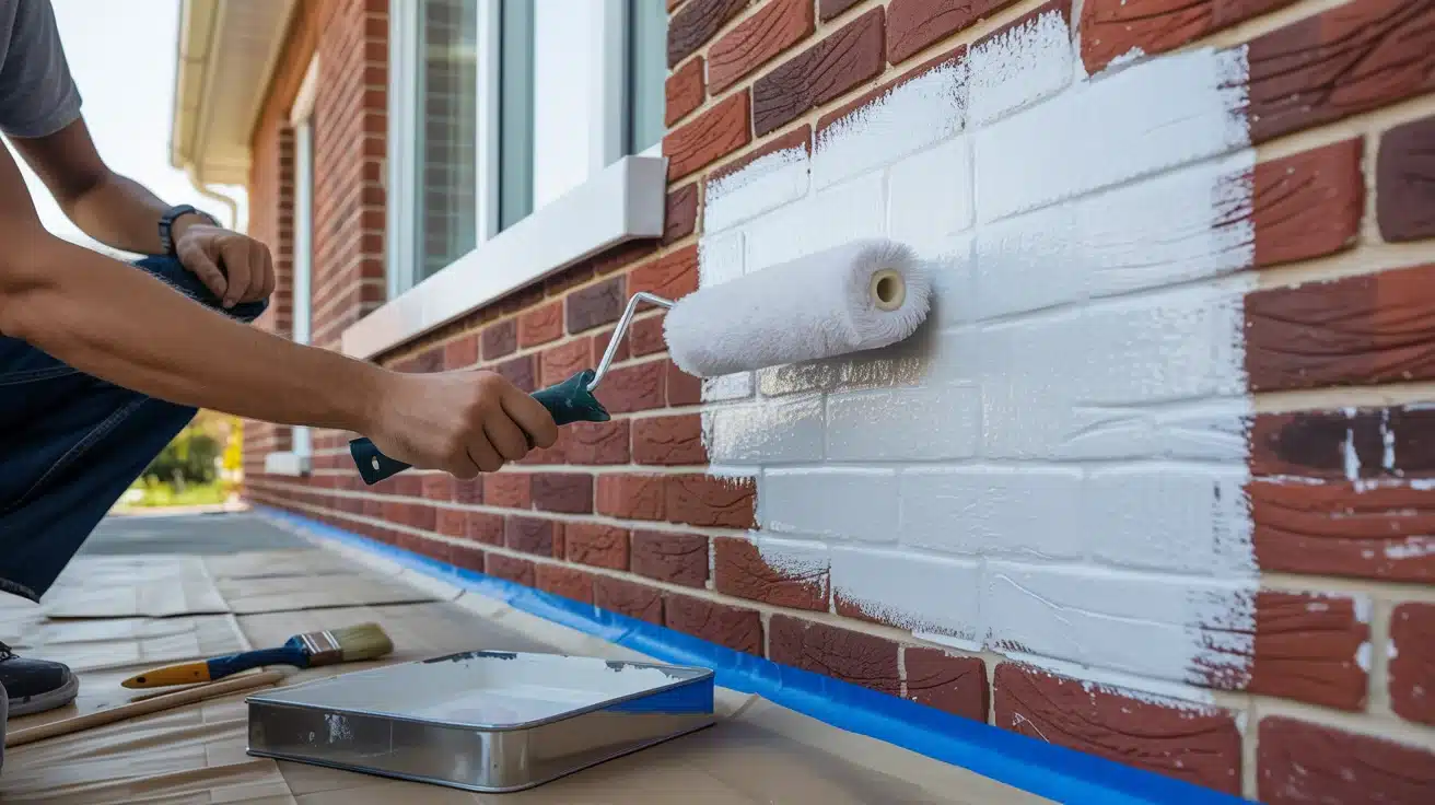
Painting brick is a moderate DIY project, plan for one to two days on an exterior wall, three to four hours on an interior one, and a supplies budget between $200 and $600, depending on surface size. That’s the honest headline. The steps themselves are not complicated, but the prep work is where most projects fail, and it fails in the same three ways every time. I’ll walk you through what goes wrong, what to use, and how to paint brick so the finish actually holds up. Difficulty 3/5; Moderate. Manageable for a first-timer, but prep is unforgiving. Time Exterior house: 1–2 days. Interior wall: 3–4 hours. Cost $200–$600 for supplies (paint, primer, tools). Paint alone runs $30–$60 per gallon for quality masonry paint, and brick is porous; budget for two full coats. Tools Needed Pressure washer, stiff brush, mortar repair caulk, painter’s tape, drop cloths, masonry paint, primer, thick-nap roller (3/4–1 inch), paintbrushes, paint tray, ladder or scaffolding, safety gear. Skill Required Beginner to intermediate. No specialist tools. One person can manage an interior wall; exterior jobs benefit from a helper. The One Thing That Kills Most Brick Painting Projects Before the steps, the failure mode worth understanding: brick painting projects almost always fail at prep, not application. I’ve seen it repeatedly. Someone cleans the surface quickly, skips the drying time, paints right over hairline cracks, and uses whatever latex paint was left over in the garage. Six months later, the paint bubbles, peels, or traps moisture in cracks that are now hidden but getting worse. Three things go wrong most often: First, painting over damp brick, even slightly damp, causes blistering as moisture tries to escape through the paint film. Second, using standard interior or exterior wall paint instead of masonry-specific paint; standard paint doesn’t flex with brick’s thermal movement and peels within a season. Third, skipping crack repair and painting over mortar damage, which locks moisture in and accelerates spalling. None of these is hard to avoid. They just require patience the first time through. Important: If your brick has active moisture intrusion, efflorescence (white chalky powder), or crumbling mortar, painting will make the underlying problem worse, not better. Have a masonry contractor inspect the surface before you commit to painting. What You Need to Know Before Painting a Brick House? Painting a brick house can instantly update your home’s appearance, add a layer of weather protection, and give you a cleaner exterior that reads as intentional rather than tired. But once painted, reversing the process is expensive and often incomplete. Stripped brick rarely looks as it did before. Beyond aesthetics, painted surfaces need ongoing maintenance. A fresh coat every five to ten years is typical for exterior brick, and any peeling needs addressing immediately or it compounds. If you own a historically significant home, check with your local preservation authority before committing; some jurisdictions restrict painting original brick. If the structure is sound and you’ve made the decision, here’s how to do it properly. Choosing the Right Paint for Brick Standard wall paint does not work on brick surfaces. Brick is porous, expands and contracts with temperature, and needs a paint that can move with it. Using the wrong product is the second-fastest path to peeling, after skipping prep. Paint Type Best For Key Benefit Masonry Paint Porous brick surfaces Superior adhesion and long-term protection, the safest default choice Latex-Based Paint Interior and light exterior use Breathable, flexible, and easy to apply, good for interior brick walls Elastomeric Paint Cracked or weathered exterior brick Bridges’ hairline cracks and handles harsh weather; a thick application is required Vapor-Permeable Paint Any brick with moisture sensitivity Let the brick breathe and release trapped moisture, important for older structures Acrylic Paint Smooth or sealed brick Durable finish with good color retention, works well on interior brick Mineral Paint Aged or historic brick Bonds deeply without trapping moisture, the right call for older, softer brick For exterior walls: elastomeric or masonry paint. For interior surfaces: latex or acrylic. When you are not sure which condition you are dealing with, masonry paint covers most situations and is widely available at any hardware store. How to Paint Brick: Step-by-Step Guide These steps apply to a brick house exterior. The interior brick section below has a shorter version adjusted for indoor conditions. Step 1: Clean the Brick Surface Properly Remove all dust, dirt, cobwebs, mildew, and any white chalky powder (efflorescence) from the brick surface. A pressure washer handles large exterior areas faster than a brush and gets into mortar lines more effectively. For interior walls or smaller sections, a stiff brush with a diluted TSP solution works well. After washing, allow the brick to dry for at least 24 to 48 hours before painting. Painting over damp brick is the most common cause of bubbling and peeling. If you are in any doubt, wait another 24 hours. Brick holds moisture longer than it looks like it does. Step 2: Inspect and Repair Any Damage Once the surface is fully dry, examine the entire wall for cracks, holes, crumbling mortar joints, or signs of water damage. Fill small gaps and hairline cracks with mortar repair caulk. Larger damage, anything wider than a pencil tip or with visible structural movement, needs professional repointing before you paint over it. Painting over active moisture intrusion or mold does not seal the problem. It hides it while making it worse underneath. Address water issues now, or the finish will fail in the exact spots where the damage was. Step 3: Protect Surrounding Areas Remove light fixtures, house numbers, mailboxes, and any hardware that could get splattered. Seal windows and doors with painter’s tape and plastic sheeting, and be thorough along the edges. Lay drop cloths over plants, pathways, and any nearby hard surfaces to catch drips and overspray. Lightly mist plants before covering them to keep them from overheating underneath the plastic. Step 4: Choose and Prepare Your Paint Use a paint specifically formulated for masonry or exterior brick. A combined paint-and-primer product simplifies the process and works well on surfaces that are structurally sound. Measure your total surface area before buying. Brick is highly porous, and almost every project needs at least two full coats. If you are considering dark colors for a brick house exterior, colors like Sherwin-Williams Greenblack in a masonry-rated formula hold well and read as intentional against the texture of painted brick. For lighter neutrals, Sherwin-Williams Natural Choice translates cleanly to brick without looking washed out. Step 5: Apply the Paint Using the Right Method Use a quality brush first to cut in along all edges, corners, window frames, door surrounds, and into mortar lines where a roller cannot reach. Then switch to a thick-nap roller , 3/4 to 1-inch nap , for the flat sections of the brick. The thicker nap pushes paint into the porous surface rather than sitting on top of it, which is what you need for adhesion. Work from the top of the wall downward to catch any drips as you go. Let the first coat dry completely before applying the second. Rushing this is the most common mistake at the application stage. For exact wait times based on your specific paint, how long to wait between paint coats covers the variables that actually matter; humidity, temperature, and coat thickness all affect drying time more than the number on the can. Faster the Second Time: On a large exterior, use a paint sprayer for the first coat to get deep penetration into the porous brick surface, then follow up with a roller for the second coat to even out coverage and texture. The sprayer does the bonding work; the roller does the finishing work. I learned this the hard way after spending twice as long with a roller on the first coat of a full house exterior. It was fine, but the sprayer approach on the second house was significantly faster with a better result. Step 6: Finish and Clean Up Once the final coat has dried completely, remove all painter’s tape, sheeting, and drop cloths without disturbing the fresh edges. Walk the entire surface in good light and look for thin spots, missed mortar lines, or uneven areas, and touch them up with a brush. Clean all brushes, rollers, and trays according to the paint manufacturer’s instructions. Masonry paint cleans up with water if you catch it before it dries, but it sets hard and is difficult to remove once cured. For a polished result on a brick house exterior, consider repainting shutters and doors in a coordinating color, updating light fixtures, and tidying landscaping to frame the fresh exterior cleanly. Watch this video for a step-by-step guide on how to clean, prep, and paint your brick house for a professional finish. How to Paint Interior Brick Painting interior brick requires careful preparation, the right materials, and a steady technique to achieve a clean, lasting, and professional-looking finish every time. Step 1: Prep the Space: Open windows and place a fan facing outward to ventilate the room. Cover all floors, furniture, and nearby surfaces with drop cloths or plastic sheeting to protect them from paint splatter and stains. Step 2: Clean the Brick: Scrub the brick surface using a stiff brush and mild detergent to remove dust, grease, and dirt. Rinse thoroughly and allow the brick to dry completely for at least 24 hours before applying any paint. Step 3: Pick the Right Paint: Choose a low-VOC masonry paint or a paint-and-primer combo for safer indoor air quality. These options provide better adhesion, reduce the number of coats needed, and leave a smooth, clean finish on interior brick surfaces. Step 4: Apply the First Coat: Use a brush to work paint into mortar lines and edges first. Then switch to a roller for the flat brick surface. Keep coats thin and even to avoid drips and ensure proper adhesion throughout. Step 5: Apply the Second Coat: Once the first coat dries fully, inspect for missed spots, uneven areas, or thin patches. Apply a second thin coat evenly across. Common Mistakes to Avoid When Painting Brick In my experience, most brick painting projects go wrong not because of poor technique, but because of easily avoidable mistakes that I’ve seen homeowners make time and again. Skip Prep Work: Never paint over dirty or damp brick. Always clean, dry, and prime the surface first to ensure strong adhesion and a lasting finish. Ignore Crack Repairs: Painting over cracks traps moisture and worsens damage over time. Fix all cracks and repoint mortar joints before applying any paint. Wrong Paint Choice: Using standard wall paint on brick leads to early peeling and cracking. Always use masonry or elastomeric paint for durable and lasting results. Rushing Drying Time: Applying a second coat too soon causes a patchy and uneven finish. Follow the recommended drying time strictly between each coat. Avoiding these simple mistakes makes all the difference, saving you time, money, and the frustration of redoing your entire project from scratch. Tips to Maintain Painted Brick Painted brick needs consistent but simple maintenance. The goal is catching problems early; a small amount of peeling addressed immediately is a ten-minute touch-up job; the same problem ignored for two seasons becomes a full recoat. Task How When Clean the surface Soft brush, mild detergent, warm water, rinse thoroughly Every few months, or after heavy weather Avoid harsh chemicals No bleach, acid cleaners, or high-pressure washing, as they all strip paint from brick Always Repaint exterior surfaces Full recoat with the same masonry paint product used originally Every 5 to 10 years, or when fading or chalking appears Protect the interior brick Keep away from steam, direct moisture, and hard contact near fireplaces Ongoing Check for early warning signs Look for peeling edges, fading patches, or chalking, and address them immediately with a touch-up coat Every season The most important habit is the seasonal walk-around. Catching peeling early keeps a simple maintenance schedule from turning into a full repaint. Final Verdict Painting brick is one of those home projects that looks simple but rewards careful planning. I hope this guide has given you everything you need to move forward with confidence. You now know how to paint brick the right way, from choosing the right paint and tools to prepping your surface and avoiding the most common mistakes. More importantly, you know how to protect your investment and keep it looking great for years to come. The process isn’t complicated when you follow the right steps. Take your time, trust the process, and don’t skip the prep work. If you found this guide helpful, try these tips on your next project and share your experience in the comments below. Frequently Asked Questions About Painting Brick How to paint a brick fireplace? Start by cleaning and fixing any damage. Apply primer, then two coats of paint. Use heat-resistant paint for areas near flames. Let it cure fully, usually about 72 hours, before using the fireplace. Should you paint a brick fireplace? Paint works well if the brick looks outdated or stained. Avoid it if there are moisture issues or damaged mortar. Fix those first. A light neutral shade can change how the whole room feels. Can you paint a brick house? Yes, and it can last many years with proper prep. Make sure there are no moisture problems and the mortar is in good shape. Once painted, it becomes a long-term finish that is not easy to reverse. What does limewash paint look like on brick? Limewash gives a soft, aged look. It lets the brick texture and some color variation show through. It does not fully cover like regular paint. It suits older brick and is easier to change later. How much does it cost to paint a brick house? DIY cost is around $200 to $600 for supplies. Brick uses more paint, so plan for extra. Hiring a professional usually costs $1,500 to $4,000, depending on size, location, and prep work needed. What colors work well on a painted brick house? Dark shades like charcoal, black, and navy give a strong contrast. White and off-white keep things classic. Warm neutrals work well with red or orange brick tones. Always test a sample section before painting. Can you paint brick? Yes, brick can be painted if it is clean and dry. Use masonry or elastomeric paint for best results. Once painted, going back to natural brick is very hard, so decide carefully before starting.

When I first heard contractors talking about “squares” during my roof replacement, I was confused. They weren’t talking about shapes; they were discussing measurements. If you’ve ever thought what a square in roofing is, you’re not alone. Understanding what a square is in roofing can save you money and help you make smarter decisions before signing a contract. Roofers use this standard unit to quickly estimate shingles, material, and labor costs, much like understanding the structure of a hip roof can impact your project planning Once you grasp this simple concept, reading estimates and comparing quotes becomes much easier and far less stressful. What Is a Square in Roofing? In roofing, a square is a unit of measurement that represents 100 square feet of roof surface area. It is commonly used by contractors to calculate materials and costs for a roofing project. Key Points: One roofing square = 100 square feet of roof surface. A 10-foot by 10-foot section of roof equals one roofing square. Roofing squares help standardize estimates and material calculations. Homeowners can use this to better understand roofing quotes and cost breakdowns. Why Roofers Use “Squares” Instead of Square Feet Roofers use squares instead of square feet because it simplifies calculations and speeds up communication during material ordering and job planning. Saying a roof is 20 squares sounds much cleaner than saying it measures 2,000 square feet in total area. Shingles, underlayment, and other materials are packaged and estimated by the square rather than by square foot. This system allows contractors across the country to use one common measurement language without confusion. Using squares also makes comparing roofing quotes easier, since most companies price their work per square rather than per square foot. How Many Bundles of Shingles Are in a Roofing Square? Most standard asphalt shingles require three bundles to cover one complete roofing square. However, this can vary depending on the type and style of shingle: Standard 3-tab shingles: Typically 3 bundles per square Architectural shingles: Usually 3 bundles per square, but check the manufacturer’s specifications Luxury or specialty shingles: May require 4-5 bundles per square due to their thickness and design Each bundle typically weighs between 50 and 80 pounds and covers approximately 33 square feet. Always verify the coverage rate on the shingle packaging, as coverage rates can vary by manufacturer and style. How Roof Pitch Affects Your Square Count One of the most commonly overlooked factors when calculating roofing squares is roof pitch, the steepness of your roof’s slope. Contractors use a pitch multiplier to account for the difference between your home’s footprint and its actual surface area, which can be similarly critical when considering the durability of outdoor furniture in different weather conditions. Roof Pitch (Rise per 12″ Run) Pitch Type Multiplier Example: 1,500 sq ft Footprint 2/12 to 4/12 Low slope 1.02 – 1.06 ~1,530 – 1,590 sq ft 4/12 to 6/12 Moderate slope 1.08 – 1.16 ~1,620 – 1,740 sq ft 6/12 to 9/12 Steep slope 1.20 – 1.36 ~1,800 – 2,040 sq ft 9/12 and above Very steep 1.40+ 2,100+ sq ft A home with a 1,500-square-foot footprint and a 6/12 pitch may require materials for 18 to 20 squares, not 15. Always ask your contractor to show their pitch factor before signing off on any estimate. How to Calculate Roofing Squares (Step-by-Step) Following these steps helps ensure accurate material estimates and prevents costly shortages during installation. Materials Required Before measuring your roof, gather these essential tools to ensure accurate calculations and safe movement while working at height. Tape measure (25–50 feet) Ladder Calculator Notebook and pen Note: Always wear non-slip shoes and safety gloves while measuring the roof to improve grip and reduce the risk of slipping or injury. Step 1: Measure Your Roof Area in Square Feet Begin by measuring the length and width of each roof section separately using a reliable tape measure. Multiply the length by the width to calculate the square footage for that section of the roof. If the roof has multiple sections, repeat the process for every flat surface or slope. Add all the square footage amounts together to determine the total roof area before converting it into roofing squares. Step 2: Convert Square Feet to Squares After measuring your total roof area in square feet, the next step is to convert it to roofing squares. Simply divide the total square footage by 100, since one roofing square equals 100 square feet. This calculation gives you the total number of squares needed, which contractors use to accurately estimate shingle quantities, materials, and overall project costs. Formula : Total Square Feet ÷ 100 = Roofing Squares Step 3: Add a Waste Factor Roofing projects always require extra material because some shingles must be trimmed around edges, ridges, and valleys. These cuts create waste that cannot be reused on other sections of the roof. Contractors usually add 10 to 15 percent extra material to prevent shortages during installation. Adding this waste factor ensures the project continues smoothly without delays caused by missing shingles or supplies. Roofing Square Example Calculations Here are simple examples that show how to convert square feet to roofing squares. The rule is to divide the total square footage by 100. Roof Size (Square Feet) Calculation Roofing Squares With 10% Waste Factor With 15% Waste Factor 1,200 sq ft 1,200 ÷ 100 12 squares 13.2 squares 13.8 squares 1,500 sq ft 1,500 ÷ 100 15 squares 16.5 squares 17.25 squares 2,000 sq ft 2,000 ÷ 100 20 squares 22 squares 23 squares 2,500 sq ft 2,500 ÷ 100 25 squares 27.5 squares 28.75 squares These examples make estimating roofing squares easier and help you plan material quantities with greater confidence before ordering shingles. Key Interpretations: When I first calculated roofing squares myself, these simple insights prevented expensive mistakes and unnecessary last-minute material shortages. The calculation is simple: Divide total roof square footage by 100 to determine how many roofing squares your project requires. Never order exact amounts: A 2,000-square-foot roof equals 20 squares, but you should order 22–23 squares, including waste. Waste factor depends on roof complexity: Simple roofs may need 10% extra, while complex roofs with valleys and peaks often require 15% or more. Round up, not down: If your total equals 13.2 squares, order 14 squares to avoid running short during installation. Convert to bundles for ordering: Since one square equals three bundles, 15 squares require 45 bundles, plus extra for waste. Waste covers more than mistakes: Extra shingles account for cuts around vents, chimneys, skylights, edges, ridges, and valleys. Larger roofs mean more waste material: A 2,500-square-foot roof may require 3–4 extra squares, adding 9–12 bundles. Knowing these practical details gave me confidence to review estimates carefully and avoid overspending on unnecessary roofing materials. Roofing Squares and Cost Estimation Roofing costs are usually calculated per square, so the total number of squares directly impacts the final project price. The more squares a roof has, the higher the total cost. For example: Contractor rate: $400 per square Roof size: 20 squares Total cost: $8,000 This price often includes materials, labor, and removal of old shingles before new installation begins. However, steeper roofs or complex designs may increase labor costs because they require more time, safety equipment, and skilled work. Understanding the total square count makes it easier to review estimates, compare contractor pricing, and ensure the project cost is calculated correctly. American Standard Preferences for Roofing Squares Before anything else, it helps to know what you are working within. The official ANSI roofing standards set the baseline that every low-slope roofing decision in the US should be measured against. American homeowners and contractors follow consistent industry standards when selecting roofing materials. These preferences shape how squares are ordered, priced, and installed across most residential projects nationwide: Asphalt Shingles, Dominance: Asphalt shingles cover over 80% of American roofs, with 3 bundles per square, each covering roughly 33.3 sq ft and weighing 50–80 lbs at standard thickness. Architectural Shingles, Preferred Style: Dimensional architectural shingles measure approximately 13¼” x 38⅜” per piece, with 64–66 shingles per bundle and 192–198 shingles needed to complete one full square. Waste Factor, Industry Norm: American contractors apply a 10% waste buffer on simple gable roofs and 15–20% on complex roofs with multiple valleys, adding 1.5–3 extra squares per 15-square project. Square Pricing, Standard Practice: Residential roofing rates run $350–$500 per square for standard asphalt, $500–$800 for architectural shingles, and $900–$1,500 per square for premium luxury shingle installations. Standard Roof Size, National Average: A typical American single-family home has a roof area of 1,700–2,100 sq ft, translating to 17–21 squares before pitch multipliers and waste factors are applied. Roof Pitch, Dominant Preference: The most common American residential pitch runs between 4/12 and 6/12, adding a 1.08–1.16 multiplier, increasing a 1,700 sq ft base footprint to roughly 19–20 billable squares. 30-Year Warranty, Baseline Expectation: Standard architectural shingles weigh 240–300 lbs per square and carry a 30-year warranty, while premium options weigh 320–400 lbs per square with 50-year coverage. Color Preference, Regional Variation: Charcoal and weathered wood tones account for nearly 70% of U.S. shingle purchases, with individual shingle dimensions standardized at 12″ x 36″ across most major manufacturers. These standards provide American homeowners with a reliable baseline for comparing contractor estimates, evaluating material quality, and making informed decisions before any roofing project begins. Common Mistakes Homeowners Make Understanding roofing squares helps avoid costly errors that can affect material estimates, contractor quotes, and overall project planning. Here are the common mistakes homeowners make: Assuming roof size equals home size: Roof surface area is often larger due to pitch, slopes, and overhangs. Ignoring roof pitch: Steeper roofs have more surface area than flat roofs with the same base measurement. Forgetting to add waste material: Not adding 10–15% extra shingles can cause shortages during installation. Assuming all shingles cover the same, some specialty shingles require different bundle amounts per square. Avoiding these mistakes ensures accurate estimates, smoother installation, and better control over roofing costs and material planning decisions. Roofing Square vs. Square Foot Understanding the difference between a roofing square and a square foot helps simplify roof measurements and contractor estimates. Measurement Type Definition How It Is Used Example Square Foot A basic unit of area equal to one foot by one foot. Used to measure total floor or roof surface area. 2,000 square feet describes the total roof size. Roofing Square A roofing unit equal to 100 square feet of roof area. Used by contractors to estimate materials and pricing. 2,000 square feet equals 20 roofing squares. Knowing this difference makes roofing estimates easier to read, compare, and understand without confusion during project planning discussions. Final Thoughts Now that I understand what a square in roofing means, reading roofing estimates feels much clearer and less stressful. A roofing square simply equals 100 square feet, but that small detail plays a big role in pricing and planning. Knowing how to calculate squares allows me to check estimates and ask smarter questions during contractor discussions. It also helps me understand how many shingles and materials my roof will actually require. If you are planning a roof repair or replacement, take a few minutes to calculate your roofing squares first. If this guide helped you, share it with someone preparing for a new roof project. Frequently Asked Questions What are common mistakes homeowners make when calculating roofing squares? Homeowners often mistake the roof size for the home’s size, ignore roof pitch, forget to add extra material for waste, or assume all shingles cover the same area. How does the waste factor affect roofing calculations? The waste factor accounts for extra materials needed due to cuts and overlaps. Typically, contractors add 10-15% more materials to avoid shortages during installation. Why does roof pitch impact the total square count? Roof pitch increases the roof’s actual surface area. Steeper pitches require more material, so contractors use a pitch multiplier to adjust the square count accordingly.
A sunroom addition costs between $22,000 and $75,000 for most US homeowners, with a national average around $47,000 as of 2026. That range sounds reassuring until you realize both a 120 sq ft prefab screen room and a 400 sq ft fully insulated four-season room sit somewhere inside it. Where your project lands depends on four things: the type of room you’re building, the foundation situation you’re starting from, what climate control it needs, and who’s doing the work. I’ve seen enough sunroom projects go sideways at the budget stage to know that the number contractors quote first and the number homeowners pay at the end are rarely the same. A pattern that shows up across most major home projects, including exterior house painting costs, where the final invoice routinely surprises homeowners. Here, I’ll break down everything you need to know about sunroom addition costs, the factors that drive prices up or down, and whether this upgrade truly delivers value for your money. Cost Note: Figures in this article are estimates based on national averages. Actual costs vary significantly by region, contractor, materials, and project scope. Always get at least three quotes before committing to any project above $1,000. What Is a Sunroom Addition? A sunroom addition is a glass-enclosed living space designed to maximize natural light while protecting from the elements. Through my research, I’ve learned that sunrooms come in two primary varieties: three-season and four-season rooms. Three-season sunrooms are typically used during spring, summer, and fall, featuring basic insulation and ventilation but lacking the robust climate control needed for harsh winters. Four-season sunrooms, on the other hand, are fully insulated with heating and cooling systems, making them comfortable year-round. The key features that define these spaces include expansive windows or glass walls, varying levels of insulation depending on the season rating, integrated HVAC systems for four-season models, and proper flooring that can withstand temperature fluctuations and sunlight exposure. What Kind of Sunroom Are You Actually Building? The type of sunroom you choose sets the cost ceiling before any other factor comes into play. There are four distinct categories, and they’re not interchangeable. 1. Screen Rooms and Sun Porches These are the most affordable options, typically $5,000 to $30,000, depending on size. They offer insect protection and some weather shielding, but no real climate control. If you’re weighing a screen room against a broader outdoor upgrade, understanding backyard remodel cost helps put both investments in perspective. Buyers often discount them at resale because of the limited usability. 2. Three-Season Sunrooms Designed for spring through fall use, these rooms use single or double-pane glass, minimal insulation, and no dedicated HVAC. A 150 to 250 sq ft three-season room typically costs $10,000 to $35,000. In colder states, expect them to sit empty from November through March, which limits both daily value and resale appeal. 3. Four-Season Sunrooms Fully insulated with heating and cooling, these rooms function as additional living space year-round. They require insulated glass panels, proper wall and ceiling insulation meeting local energy codes, and either extended ductwork or a dedicated mini-split system. Cost range: $40,000 to $80,000 for most projects, with premium builds running past $100,000. Four-season rooms are the only type that typically adds to your home’s appraised square footage. 4. Full Addition Sunrooms Architecturally integrated into the home’s footprint, with load-bearing walls, matched rooflines, and interior finishes continuous with the rest of the house. These cost $80,000 to $150,000 or more but carry the best resale return because appraisers count them as living space. If you’re in a market where price per square foot matters, this is the version worth pricing seriously. Factors That Affect the Cost of a Sunroom Addition The cost of adding a sunroom varies dramatically based on several key factors. I’ve found that understanding these elements upfront helps you budget realistically and avoid unexpected expenses down the line. 1. Size and Layout Size is the most obvious cost driver; larger sunrooms require more materials, labor, and time to complete. However, layout complexity matters just as much; a simple rectangular design will cost significantly less than an elaborate multi-angled structure with custom architectural details. I understood that even adding curves, multiple roof levels, or integrated structural columns can push costs up by 20-30% compared to basic designs. 2. Type of Materials Used Material selection dramatically impacts both upfront costs and long-term durability. Here’s a breakdown of your options: Material Cost Level Insulation Maintenance Best For Vinyl Frames Budget-friendly (30–40% less than premium) Decent Low Cost-conscious homeowners Aluminum Frames Mid-range Poor in extremes Low Modern aesthetics Wood Frames Premium Excellent High Traditional style Composite Materials High-end Excellent Low Best of both worlds Each material brings its own trade-offs between initial cost and upkeep. Your climate, budget, and style preferences should guide your choice. 3. Location and Site Preparation Where you build your sunroom significantly affects the bottom line. I found that ground-level additions on existing concrete patios are far more affordable than second-story installations or builds requiring extensive foundation work. Site conditions like sloped terrain, poor drainage, underground utilities, or the need to remove existing structures can add thousands to your project before construction even begins. 4. Additional Features and Upgrades Beyond the basic structure, customization options can quickly elevate your sunroom from simple to spectacular. Consider these popular upgrades: Custom or oversized windows: Large windows with UV protection and energy-efficient glass Skylights and roof windows: Extra natural light from above for an open, airy feel Premium flooring: Heated tile, hardwood, or vinyl that handles temperature changes and sunlight Integrated electrical and lighting: Ceiling fans, lights, outlets, and smart home controls Built-in furnishings: Window seats, storage benches, or shelving for extra space These features can add a few hundred to several thousand dollars each. I recommend choosing upgrades based on how you’ll actually use the space rather than adding everything available. Sunroom Addition Cost Breakdown: The Line Items That Move Your Budget Most estimates you’ll see online bury the variables that actually control your final number. Here’s what the real cost structure looks like. Line Item Cost Range Key Driver Foundation/Slab $0 – $8,000 Existing patio vs new slab Framing/Structure $4,000 – $25,000 Prefab vs custom build Windows/Glazing $2,000 – $15,000 Glass type and panel count Roofing $3,000 – $15,000 Standard vs glass panels HVAC (4-season) $1,500 – $10,000 Duct extension vs mini-split Electrical $800 – $3,000 Basic vs upgraded fixtures Flooring $1,500 – $6,000 Vinyl vs tile/hardwood Permits $250 – $2,000 Local rules and scope Site Prep $500 – $5,000 Flat vs complex lot Labor $8,000 – $30,000 Location + project size Labor still makes up a big chunk of the total, often 40% to 60%, so it’s usually the biggest factor behind final cost changes. A breakdown that looks similar to the cost to build small structures like tiny houses, where labor and materials follow the same proportional weight. Regional Pricing: Where You Live Changes Your Budget Significantly National averages are a starting point, not a contract. Labor markets and permitting requirements create real, measurable price differences by region. Region 3-Season Room (200 sq ft) 4-Season Room (300 sq ft) Key Cost Drivers Northeast / West Coast $20,000–$45,000 $65,000–$110,000 High labor rates, strict permitting, and energy code compliance Southeast $14,000–$32,000 $45,000–$75,000 Moderate labor costs; humidity-driven HVAC needs push 4-season costs up Midwest $12,000–$28,000 $38,000–$65,000 Lower labor rates; insulation requirements add cost in colder states Southwest / Mountain $15,000–$35,000 $50,000–$80,000 UV-rated glazing required; cooling loads drive HVAC sizing up Coastal and metro labor markets run 30% to 50% higher than rural equivalents. That gap compounds across every line item: your framing contractor, your electrician, and your HVAC installer all reflect local market rates. If you’re building in a high-cost area, budget accordingly and don’t rely on national averages to set your expectations. How to Reduce Your Sunroom Addition Cost Without Compromising the Structure There are legitimate ways to save money on a sunroom project, and there are ways that feel like savings now and show up as problems later. Here’s what actually works. Building on an existing concrete patio saves $4,000 to $8,000 in foundation work. Verify it’s structurally sound first. A prefab three-season kit with professional installation can run 30%–40% less than a custom stick-built room of the same size. Choosing a mini-split over ductwork extension is often cheaper when your existing HVAC system is near capacity, and it avoids the cost of system upgrades. Pulling your own permits, where your municipality allows it, removes the markup contractors add to permitting fees. This requires time and follow-up but saves $300 to $800 in most markets. Building a three-season room now and designing it for future four-season conversion saves $10,000 to $20,000 upfront. This only works if your contractor designs the structure to support the upgrade from the start. Pro Tip: Building in fall or winter typically saves 15%–25% on labor costs. Sunroom contractors are less busy, and you’ll have more scheduling flexibility. The main constraint is weather-dependent foundation work, so confirm your contractor’s cold-weather pour policy before booking. The True Value of a Sunroom Addition Based on my research into real estate data, sunrooms typically recoup 50-70% of their cost at resale, which is decent compared to other major renovations, as shown below: Screen rooms/sun porches cost $5,000–$30,000 and offer the lowest ROI of 20–40%, as limited seasonal use reduces buyer appeal. Three-season sunrooms cost $8,000–$50,000 and offer a 30–50% ROI. Affordable, but no insulation or heating means lower resale value in colder climates. Four-season sunrooms cost $20,000–$80,000 and deliver a stronger 50–60% ROI thanks to year-round usability and full HVAC integration. Full addition sunrooms are the priciest but offer the best return at 50–70% ROI. Since they add to the official square footage, they have the greatest impact on the appraised value. The more you invest in year-round functionality and seamless design, the better your financial return and your daily enjoyment will be. User Stories: Is a Sunroom Addition Worth It? I’ve spent hours reading real homeowner experiences and comparing sunrooms to other popular home additions. The consensus from threads, home improvement blogs, and forums is overwhelmingly positive. Most homeowners absolutely love their sunrooms and use them daily for morning coffee, reading, or family gatherings. However, many wish they’d invested in four-season options from the start or budgeted more for quality HVAC systems. Here is a “Reddit” post of “General cost of a sunroom and covered porch?” that can help you understand better. Questions to Ask Your Contractor Before Signing Anything The contractor conversation is where projects succeed or fail before construction even begins. These are the questions that surface the information you actually need. Does this project require separate electrical, HVAC, or zoning permits beyond the building permit, and will you pull all of them? The answer should be yes to both. What’s the realistic processing timeline for permits in this municipality? If they say “a few weeks,” ask for the actual average from their last five local projects. Is my existing HVAC system capable of handling this addition, or will I need a separate system? Get this answered before finalizing the scope. What’s your process if you encounter unexpected foundation or site issues during the build? You want a clear change-order process, not a verbal assurance. Do you carry general liability insurance and workers’ compensation coverage for this project? Request certificates of insurance, not just confirmation. Final Thoughts Sunroom addition costs, materials, and real homeowner experiences, one thing is clear: this investment is worth it if you’re looking to add natural light and a functional living space without the expense of a full home addition. Start by collecting quotes from at least three licensed contractors who specialize in sunrooms specifically. Be transparent about your budget, desired features, and timeline from the start. Ask for references, review past projects, and confirm they manage permits and inspections on your behalf. The most successful sunroom projects share a common thread: clear communication and realistic expectations around both cost and timeline. If you’re in the planning stages, drop a comment below, share your approach, and help others who are just getting started. Frequently Asked Questions How much does a small sunroom addition cost? A small sunroom addition in the 100 to 150 sq ft range typically costs $10,000 to $30,000 for a three-season build, or $20,000 to $45,000 for a four-season room. Building on an existing patio rather than pouring a new foundation is the single biggest cost lever at this size. Does a sunroom add to square footage for appraisal purposes? Only four-season rooms that meet your state’s building code requirements for livable space, including minimum insulation ratings, HVAC connectivity, and electrical standards, are counted as square footage in appraisals. Three-season rooms and screen rooms are not. Confirm with your appraiser and permit office before assuming your addition qualifies. Do you need a permit for a sunroom addition? Yes, in virtually every US municipality. Sunrooms are permanent structures that require building permits at a minimum. Four-season rooms often require additional HVAC and electrical permits. Building without permits creates liability issues, complicates resale, and can invalidate homeowner’s insurance claims related to the addition. How much does a four-season sunroom cost compared to a three-season room? A comparable-sized four-season room typically costs 60% to 100% more than a three-season build. The difference comes from insulated framing, higher-performance glazing, HVAC integration, and the additional permits and inspections that climate-controlled additions require. For a 200 sq ft room, expect to pay $25,000 to $40,000 for a three-season versus $45,000 to $70,000 for a four-season in most US markets. Can I finance a sunroom addition? Home equity loans and HELOCs are the most common financing options for sunroom additions, as they typically carry lower interest rates than personal loans, and the interest may be tax-deductible depending on your situation. Some sunroom specialty contractors offer financing programs directly. Consult a tax professional or financial advisor before assuming deductibility on your specific project. How long does a sunroom addition take to build? From permit approval to completion, a typical sunroom addition takes four to twelve weeks. Prefab three-season kits can go up in one to three days once permits clear. Custom four-season rooms take longer due to foundation work, framing inspections, and HVAC and electrical rough-in sequences. Permit approval timelines, which can run from two weeks to several months depending on your municipality, are not included in most contractor timeline estimates. Is a sunroom addition worth the cost? For homeowners who will use the space daily and plan to stay in the home at least five years, the lifestyle value combined with a 50% to 55% average resale return makes a four-season sunroom a reasonable investment. Three-season rooms make sense for moderate-climate markets or homeowners whose primary goal is seasonal use, not appraisal value. Screen rooms are worth it where the upfront cost is low, and the climate permits year-round use.
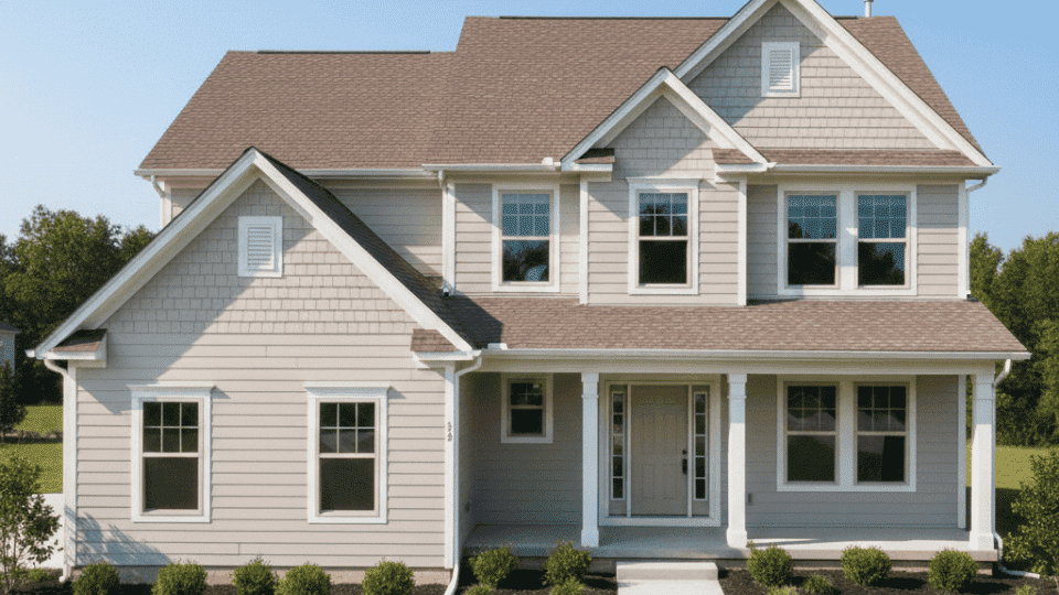
Roof Types Covered Warm red-brown, medium chocolate, dark espresso, light tan Best Starting Colors Warm white, cream, beige, greige, sage green Colors to Avoid Cool icy gray, bright stark white, purple-based tones, blue-heavy gray Key Rule Match the undertone temperature first. LRV difference of 20+ points between roof and siding. The question I hear most often from people standing in front of a brown roof they can’t change: what exterior paint color is actually going to work here? It sounds like it should be simple, but brown roofs have undertones, and those undertones change everything. A warm, reddish-brown roof needs a completely different wall color than a cool, dark espresso roof, even though both are technically “brown.” Get that wrong, and no amount of beautiful trim is going to save you. Here is what I know after years of working with homeowners on exterior color choices: brown is actually one of the most forgiving roofs to work with, once you understand what type of brown you have. The colors in this guide cover every major brown roof tone, from warm terra cotta shingles to deep chocolate, with specific paint codes and the LRV guidance to back each recommendation up. What Paint Goes with A Brown Roof? Before you pull a single paint chip, you need to know whether your roof runs warm or cool. This one step eliminates most of the mistakes I see homeowners make when choosing exterior paint colors for a brown roof. Hold a piece of plain white paper against your shingles in natural daylight. If the brown looks orange, reddish, or honey-toned next to the white, you have a warm brown roof. If it reads grayish, ashy, or taupe next to the white, your roof leans cool. Mixing the two temperatures, warm roof with a cool-toned siding, is the most common reason an exterior color looks “off” even when each piece seemed fine on its own. Warm Brown Roofs: Red, Honey, and Terra Cotta Undertones Warm roofs lean toward orange or red. They look rich and earthy in direct sun. These roofs pair best with creams, beiges, warm whites, and soft sage greens. Cool-toned colors, especially blue-based grays, will fight the warmth of the shingles and make the roof look more orange by comparison. Cool Brown Roofs: Chocolate, Espresso, and Gray-Brown Undertones Cool roofs read as truer, darker browns or near-blacks in natural light. They are the most versatile: they can handle a wider range of siding colors, including warm neutrals, greiges, and even carefully chosen blue-grays. Dark chocolate or espresso roofs look sharp against lighter walls because the contrast is clean and intentional. LRV: The Number That Tells You How Much Contrast You Need Light Reflectance Value, or LRV, measures how much light a color reflects on a scale from 0 (pure black) to 100 (pure white). For exterior pairings, aim for at least a 20-point LRV difference between your roof tone and your siding color. Dark roofs in the LRV range of 5 to 20 need a siding color above LRV 50 to avoid the house looking flat and heavy. Lighter tan roofs around LRV 30 to 40 can pair with mid-tone siding without losing contrast. Every paint color listed below includes the brand’s LRV, so you can check your pairing before you buy. Best Exterior Paint Colors for a Brown Roof These are the colors that hold up in real light on real houses. I have organized them by type, from the safest starting points to the bolder choices that require the right roof undertone to land correctly. 1. Warm White (LRV 82-90) Warm white is the safest exterior paint color for a brown roof because it creates contrast without tension. The slight cream pull in these whites keeps them from looking sharp or clinical against brown shingles, which is what happens when you choose a stark, cool white. Pair warm white siding with a darker brown or black trim for depth, or keep it soft with beige window frames. Warm white works on every brown roof type, but it is especially effective against darker chocolate or espresso shingles, where the contrast reads as clean and crisp. In morning and evening light, warm whites deepen slightly, which brings out the richness in brown shingles rather than fighting it. Brand Paint Color LRV Hex Code Sherwin-Williams Alabaster SW 7008 82 #EDEAE0 Benjamin Moore White Dove OC-17 83.16 #F0EFE7 Behr Swiss Coffee 12 81 #F1EDE0 If you have a warm red-brown roof and you want warmth without clashing, Alabaster is the one I reach for first. Warm white paint colors keep contrast soft while balancing the richness of brown shingles. 2. Cream (LRV 74-82) Cream sits between warm white and beige on the warmth spectrum. It works particularly well on reddish or honey-toned brown roofs because both share that yellow-orange base. So they read as related rather than competing. White trim with dark brown shutters or natural stone accents completes the look without introducing a clashing temperature. Brand Paint Color LRV Hex Code Sherwin-Williams Creamy SW 7012 81 #EFE2C6 Benjamin Moore Navajo White OC-95 74.26 #F3E4C8 Behr Cottage White 13 80 #EFE1C2 Creamy SW 7012 has yellow undertones that need testing in your specific light. In north-facing shade, it reads soft and quiet; in strong afternoon sun, it can push noticeably warm. Test it on the south-facing wall before committing. 3. Beige (LRV 55-70) Beige is the most reliable exterior paint color for a brown roof because it creates harmony rather than contrast. The earthy undertones in beige match the warmth already in the shingles, so the whole exterior reads as intentional. Brown or black shutters, white window frames, and a bronze or dark iron front door handle all work without overthinking. The mistake with beige is choosing a cool beige that has a pink or gray pull. That makes the brown roof look muddier. Stay in the warm yellow or peach end of the beige spectrum. Brand Paint Color LRV Hex Code Sherwin-Williams Accessible Beige SW 7036 58 #D3C7B6 Benjamin Moore Manchester Tan HC-81 54.74 #D9C8AF Behr Natural Linen PP-50 60 #D8C6AF Accessible Beige is one of the most-used exterior colors in the US for brown roofs because it reads warm in direct sun without pulling obviously yellow. It gives you 20-plus LRV points of contrast against most medium-brown shingles, which keeps the house from looking flat. 4. Greige (LRV 48-60) Greige blends gray and beige into a neutral that reads current without going cold. It pairs best with darker brown roofs, where the contrast works cleanly, and with modern or transitional home styles. Crisp white trim and black or dark bronze window frames sharpen the look. Agreeable Gray SW 7029 has become one of the most-used exterior greige colors in the US precisely because it stays warm in most light conditions. Brand Paint Color LRV Hex Code Sherwin-Williams Agreeable Gray SW 7029 60 #D1CBC1 Benjamin Moore Revere Pewter HC-172 55.51 #CFC9BE Behr Silver Drop 790C-2 56 #D4D6D2 One watch-out with Revere Pewter: in lower light conditions, it can pull noticeably green. If your home gets heavy morning shade, test it before committing. 5. Taupe (LRV 35-50) Taupe sits between brown and gray, which makes it one of the most natural transitions from a brown roof to the siding below it. It adds depth without making the house look heavy. White trim, bronze fixtures, and darker brown garage doors are the pairings that work best. Craftsman and Colonial homes especially suit this combination because the earthy base of taupe supports rather than fights the architecture. Brand Paint Color LRV Hex Code Sherwin-Williams Perfect Greige SW 6073 36 #B7AA9A Benjamin Moore Pashmina AF-100 40.35 #B5A89B Behr Mocha Foam N230-2 39 #B8A998 Taupe is where the LRV contrast rule matters most. These colors sit around LRV 36-40. Against a dark espresso roof (LRV 8-15), you will still have 20-plus points of contrast. Against a medium brown roof (LRV 25-30), the difference narrows, so the trim becomes critical for visual separation. 6. Sage Green (LRV 35-45) Sage green paint colors pair naturally with a brown roof because they share the same earthy, organic color temperature. Both feel rooted in the landscape rather than sitting on top of it. This works especially well on Craftsman homes, farmhouses, and any exterior surrounded by trees or natural stone. Cream or white trim keeps sage from pulling too dark, and the combination becomes one of the more distinctive and genuinely appealing options in this category. The key with sage is staying on the gray-green side rather than the yellow-green side. Sage colors with too much yellow in them can clash with warm brown shingles rather than complement them. Brand Paint Color LRV Hex Code Sherwin-Williams Clary Sage SW 6178 38 #ACB29A Benjamin Moore Saybrook Sage HC-114 36.09 #B2B79C Behr Softened Green N350-4 37 #A7B39A 7. Olive Green (LRV 14-22) Olive green is the boldest choice in the green family, and it works best against deep chocolate or near-black brown roofs. The low LRV of olive (14-22) means you need a darker roof for this pairing to have enough contrast. Against a medium brown shingle, the two tones will sit too close together and look muddy. Tan trim and wood accents, not white, are the right pairing here because they stay in the same earthy register. Brand Paint Color LRV Hex Code Sherwin-Williams Ripe Olive SW 6209 14 #6E705A Benjamin Moore Backwoods 469 18 #6C6F59 Behr Olive Grove N350-7 16 #5F664F 8. Soft Blue-Gray (LRV 48-60) Soft blue-gray is the option for homeowners who want some color presence without committing to a bold statement. The rule here is that you need the blue-gray to read as a warm blue-gray, not an icy or steel-blue shade. Colors that lean even slightly cool in their gray will pull the brown roof toward orange by comparison, which is exactly what you do not want. Pair with white trim to keep the facade feeling fresh rather than heavy. This category suits darker, cooler brown roofs, specifically those chocolate or dark taupe shingles that have a gray base. On a warm reddish-brown roof, a blue-gray siding will create color temperature conflict. Sherwin-Williams Debonair SW 9139 shows how blue-gray behaves across different light conditions, which matters here because this category is the most light-sensitive of the group. Brand Paint Color LRV Hex Code Sherwin-Williams North Star SW 6246 54 #CAD3D8 Benjamin Moore Smoke 2122-40 52.3 #BCC6CC Behr Misty Coast PPU25-13 50 #C6D0D4 9. Light Gray (LRV 50-65) Light gray works with brown shingles only if you choose a gray with warm undertones. Pure cool grays will fight the warmth in the roof and make both colors look like mistakes. The grays that work here pull slightly toward beige or taupe in their base. Repose Gray SW 7015 is a well-known example because its undertones sit between warm and cool, which keeps it from reading as cold against earthy brown shingles. For a deeper look at how Repose Gray behaves across different light conditions and rooms, our full review covers the specific undertone shifts that matter for exterior use, too. Brand Paint Color LRV Hex Code Sherwin-Williams Repose Gray SW 7015 58 #CCC9C0 Benjamin Moore Classic Gray OC-23 65.19 #E3E0D8 Behr Silver Drop 790C-2 56 #D4D6D2 10. Muted Yellow (LRV 68-78) Muted yellow is underrated in this category. At its best, yellow and brown sit in the same warm, earthy family, which means a soft, creamy yellow reads as a natural extension of the brown roof rather than a contrast to it. The keyword is muted. Saturated or bright yellows become overwhelming against brown shingles and start to read as a color mistake. You want a yellow that reads almost cream in low light and shifts golden in direct sun. Brand Paint Color LRV Hex Code Sherwin-Williams Friendly Yellow SW 6680 70 #F1D48A Benjamin Moore Hawthorne Yellow HC-4 67.11 #F2D488 Behr Butter Cream PPU6-9 74 #F0D37A 11. Sandstone (LRV 50-65) Sandstone is a warm, sandy neutral that fits between beige and cream without pulling as yellow as cream does. It blends naturally with brown roof tones and works especially well on homes with brick paths, stone details, or wood accents that share the same earthy base. Cream trim, dark brown shutters, and a wood-stained front door complete the palette without introducing any color temperature conflict. Brand Paint Color LRV Hex Code Sherwin-Williams Bungalow Beige SW 7511 52 #D2BFA3 Benjamin Moore Shaker Beige HC-45 50.37 #C9B79C Behr Sandstone Cove 730C-3 55 #D6C3A5 12. Warm Stone Gray (LRV 40-55) Warm stone gray sits between greige and taupe and looks particularly clean on farmhouse or transitional-style homes where the goal is a quietly updated exterior. It pairs well with brown shingles because the stone quality in these colors connects visually to earthy materials rather than pulling toward the blue-gray end. White or cream trim and dark garage doors complete the look. Brand Paint Color LRV Hex Code Sherwin-Williams Amazing Gray SW 7044 45 #B7B0A5 Benjamin Moore Edgecomb Gray HC-173 63.91 #CDC6B8 Behr Perfect Taupe PPU18-13 47 #B8B0A3 13. Slate Blue (LRV 20-35) Slate blue is one of the bolder choices in this guide, and it requires the right roof to land correctly. It works against medium to dark cool-toned brown roofs where the earthy, muted blue finds enough common ground with the shingle warmth to read as a deliberate pairing. On a warm reddish-brown roof, slate blue will clash. With white trim and natural wood shutters or stone detail, this combination can look distinctive and well-considered on Craftsman-style homes. Brand Paint Color LRV Hex Code Sherwin-Williams Distance SW 6243 22 #5D6F7C Benjamin Moore Van Deusen Blue HC-156 21.88 #4A6378 Behr Blueprint S470-5 25 #5C7281 14. Muted Teal (LRV 18-30) Muted teal adds character to an exterior without shouting. The green-blue base connects to the earthy quality of brown shingles at their darkest end, which is why this combination works best with dark chocolate or near-black brown roofs. Simple white trim is essential here, not beige or cream, because you need the clean contrast to keep the look from reading too heavy. The front door in a warm wood tone or oil-rubbed bronze finishes the palette. Brand Paint Color LRV Hex Code Sherwin-Williams Riverway SW 6222 9 #3F6A6A Benjamin Moore Aegean Teal 2136-40 17.59 #6E8B8B Behr Lagoon Rock N480-5 20 #4F7073 Riverway SW 6222 has a very low LRV of 9, which means you need a very dark brown roof to get adequate contrast. For most medium-brown roofs, Aegean Teal at LRV 17.59 is the more balanced entry point. 15. Mocha Brown (LRV 8-15) A mocha or deep brown siding against a brown roof is a tonal approach that works only when the two browns are genuinely different in value. You need lighter tan or mocha siding against a dark espresso or chocolate roof, not the same depth. White trim is what creates the visual separation that keeps the exterior from looking like one undifferentiated mass. This is the combination for homeowners who want a grounded, layered palette rather than contrast. Brand Paint Color LRV Hex Code Sherwin-Williams Turkish Coffee SW 6076 8 #4B3A2F Benjamin Moore Kendall Charcoal HC-166 9.43 #5B5750 Behr Espresso Beans N200-7 9 #4A3B34 What Colors to Avoid With a Brown Roof Choosing the wrong shade can make your home look mismatched or unbalanced. These colors often clash with the natural warmth found in most brown roofs. Cool Icy Grays: Cool grays with blue undertones often fight against the warmth of a brown roof. Instead of balancing the exterior, they can make the house look disconnected and slightly off in natural daylight. Bright White: A very bright white can look too sharp against a brown roof. The strong contrast sometimes feels harsh and unfinished, especially when the roof has deep or reddish-brown tones. Purple Tones: Paint colors with purple undertones rarely complement brown shingles. The mix can feel awkward because the tones lack the same warmth or natural base. Blue-Based Grays: Blue-heavy grays may appear cold against a warm roof. This contrast can make the roof look redder or more muddy, creating an uneven and unbalanced appearance. Very Dark Charcoal: Very dark charcoal, paired with brown, can make the home look heavy. Without enough contrast, the exterior may appear flat and lose visual separation between the roof and the walls. These colors are not impossible to use, but they require very careful testing. When in doubt, warmer shades usually give you safer and more balanced results. Trim Colors That Work With Every Brown Roof Pairing The trim choice matters almost as much as the siding color. A mismatched trim can undermine a pairing that would otherwise work, and the right trim can make a marginal siding choice look considered. For most brown roofs paired with warm neutrals (cream, beige, greige, sandstone), a crisp white trim gives you clean definition without introducing a cold note. White Dove OC-17 or Alabaster SW 7008 are the two I return to most often for trim on these palettes. For darker siding choices like slate blue, olive, or teal, a brighter white pulls the facade together and prevents the house from reading too heavy. For tonal brown-on-brown pairings, a warm cream trim, not stark white, keeps the palette cohesive. How to Match Exterior Paint Colors With Your Brown Roof by Home Style The style of your home plays a big role in how exterior colors look with a brown roof. The same color can feel balanced on one style and completely off on another. That’s because shape, size, and details all change how color shows up. Ranch Homes: These homes sit low and wide, so darker or heavier colors can make them feel smaller. Lighter shades like beige, warm white, and sage green help keep the space feeling open and balanced. Craftsman Homes: These homes have strong details like exposed rafters and thick columns. Rich, earthy tones such as sage green, taupe, olive, and warm stone gray work well here. Pair them with cream or tan trim to match the wood-focused design. Colonial Homes: Symmetry is key in Colonial design, so simple and clean color palettes work best. Warm white, cream, or greige with crisp white trim keeps the look sharp. Soft blue-gray or muted yellow can add a small update without breaking the structure. Modern Farmhouse: These homes lean toward a clean and minimal look. Soft white, greige, or warm stone gray with black trim creates a strong contrast. The black accents add a modern touch while keeping the overall palette calm with a brown roof. Choosing the right color is less about trends and more about matching the tone of your home’s design. When the color supports the structure, everything feels more put together and natural from the outside. Front Door Colors That Work With a Brown Roof When the main siding color is set, the front door is the easiest place to add contrast without overwhelming the exterior. The combinations below keep things balanced while still giving the entrance a clear focal point. Siding Color Front Door Colors That Work Why It Works Cream or Beige Deep navy, forest green, burgundy Adds depth without clashing with the warm base Greige or Warm Stone Gray Dark bronze, slate blue, matte black Feels clean and intentional against neutral tones Sage or Olive Green Wood-stained, matte black, deep terracotta Keeps an earthy look while adding contrast Warm White Charcoal, deep blue, rich red Neutral base allows stronger door colors to stand out The goal is to create contrast that feels natural with both the siding and the brown roof, so the front door stands out without looking disconnected. Real Home Examples (Community Insights) I read a Reddit post where someone asked, “Which color do you guys prefer? Eventually, I want to change the roof color to charcoal as well.” Many people replied, and most preferred green siding with a brown roof, saying it fits the natural landscape well. Some users agreed that blue is nice, adding that blue can bring good contrast with trim and doors. Others warned that charcoal roofs can trap heat or look flat without the right trim. Several people said cream or taupe trim would make both green and blue stand out more. A few comments suggested focusing on landscaping before painting. From my perspective, their back-and-forth suggests that it helps to test samples at your house first. Try the green and blue with cream trim next to your brown roof before you switch to charcoal. It gives you real feedback in your light and setting. How to Test Exterior Paint Colors Before Committing Here’s a quick, practical way to test exterior paint colors before you commit: Check The Roof Undertone: Use the white paper test to see if your brown roof leans warm or cool. This helps you narrow down your color options fast. Use Large Peel-And-Stick Samples: Skip small paint chips. Go for samples at least 12 inches wide so you can see how the color actually reads outside. Test On Multiple Sides: Place samples on at least two walls. Light changes from one side of the house to another, and the same color can look very different. Observe at Different Times: Check the samples in the morning, midday, and the evening. Light shifts through the day and affects how the color looks. These steps help you catch surprises early, so the final color looks right in real conditions, not just on a sample card. Final Verdict Choosing the right paint color for a brown roof doesn’t have to feel confusing. Once you understand your roof’s undertone and how warm shades work together, things get much easier. I’ve shared the best color options, real combinations, and common mistakes. Now you have a clear direction instead of guessing. Before you decide, take your time with samples and look at them in different lights. That small step can save you from regret later. If you found this helpful, share your thoughts in the comments below! Frequently Asked Questions What color house looks best with a brown roof? Warm white, beige, and greige are the three most consistently successful siding colors for a brown roof. They work across every brown roof undertone and every architectural style. If you want a color choice that will look right regardless of the exact shade of your brown shingles, start with Sherwin-Williams Accessible Beige or Alabaster. Does gray go with a brown roof? Warm gray goes with a brown roof. Cool gray, especially anything with blue or purple undertones, will fight the warmth in the shingles and make both colors look like they belong to different houses. Test any gray against your roof in outdoor light before buying. If it pulls blue or purple in natural daylight, keep looking. Can you paint a house white with a brown roof? Yes, but the type of white matters. Choose a warm white at LRV 82-88, such as Alabaster SW 7008 or White Dove OC-17, rather than a bright, stark white above LRV 90. The bright whites create contrast that is too sharp against warm brown shingles and can make reddish-brown roofs look more saturated. What trim color goes with a brown roof? White Dove OC-17 or Alabaster SW 7008 works for the majority of brown roof pairings. For darker siding colors like olive, slate blue, or teal, a slightly brighter white creates the clean definition you need. For tonal brown-on-brown pairings, shift toward a cream trim rather than stark white. What is the best front door color for a brown roof? Deep navy, forest green, and matte black are the three front door colors that work across the widest range of brown roof pairings. For cream or beige siding, any of those three reads well. For greige or gray siding, matte black or a dark bronze is the cleanest choice. Does blue go with a brown roof? Muted blue-gray and slate blue go with a brown roof when the roof has cool undertones. Bright or icy blues do not. On a warm reddish-brown roof, even a muted blue will read as a temperature clash. The safest blue for this pairing is a gray-blue that sits closer to the greige family than the sky-blue family. What colors to avoid with a brown roof? Cool icy gray, bright stark white above LRV 90, purple or mauve tones, and blue-heavy grays are the four categories that reliably fail against a brown roof. The problem in each case is color temperature conflict: the warm base of a brown roof reads as warmer and sometimes more orange when surrounded by cool-toned siding. What exterior paint color works for a tan or light brown roof? Light tan roofs with LRVs in the 30-45 range can handle a wider variety of siding tones than dark brown roofs because there is less inherent contrast between the roof and the wall. Darker siding, including forest green, slate blue, or deep taupe, creates the separation the house needs rather than making everything look the same tone. This is one situation where a lower-LRV siding color actually helps.
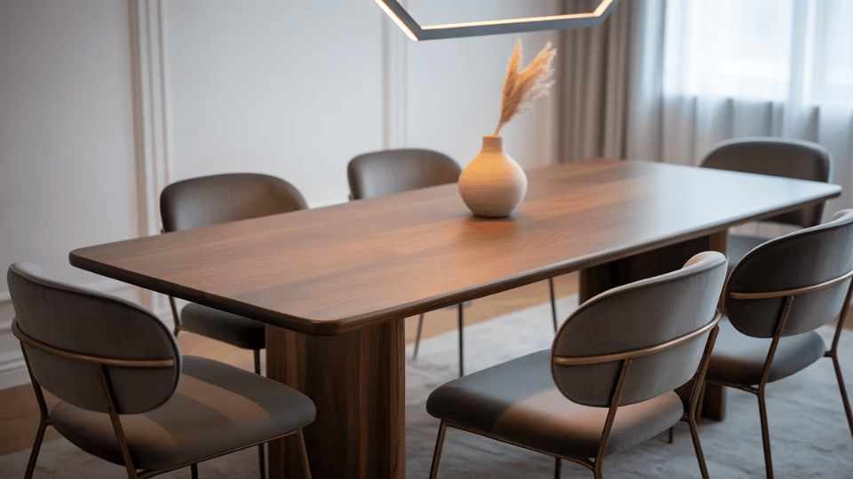
Standard Dining Table Height 28–30 inches (floor to tabletop) Chair Seat Height 17–19 inches Seat-to-Tabletop Clearance 10–12 inches Apron Underside to Floor 24–25 inches minimum Counter Height 34–36 inches Bar Height 40–42 inches The standard dining table height is 28 to 30 inches, measured from the floor to the tabletop surface. That number has been the industry benchmark long enough that most chair manufacturers design around it. Most apron depths assume it, and most people building or buying a dining table treat it as settled, much the same way bar stool height follows its own set of benchmarks for counter and bar seating. It mostly is. But “mostly” is doing a lot of work in that sentence, and the inch or two where it stops working is exactly where most build mistakes happen. I’ve seen enough tables come through the workshop that sit right but feel wrong to know the number alone isn’t enough. Height is a relationship: your chair, your apron depth, your floor, and the people eating at that table every night. Get the relationship right, and the table works for years. Get one element slightly off, and you’ll feel it at every long meal. The Core Height Numbers for Dining Tables Before anything else, here are the measurements that matter. These aren’t soft guidelines. They’re the numbers that determine whether a chair clears the apron and whether someone can sit comfortably for two hours. Measurement Standard Range Table surface height 28–30 inches Chair seat height 17–19 inches Seat-to-tabletop clearance 10–12 inches Apron underside to floor 24–25 inches minimum That last row is the one most guides skip. The apron underside-to-floor measurement matters more than the surface height for daily comfort, especially if your chairs have armrests. Start With the Chair, Not the Table The formula is straightforward: table height equals chair seat height plus 10 to 12 inches. That 10-to-12-inch range isn’t arbitrary. Ten inches produces a more relaxed seated posture. Twelve-inch suits people who prefer to sit upright. For long dinners, stay closer to 10. If your chairs sit at 18 inches, your table should land between 28 and 30 inches. If your chairs sit at 19 inches, build to 29–31 inches. The relationship is what you’re designing, not a single fixed number. One thing I’ve learned to always do: measure the actual chair, not the listed seat height on a spec sheet. Manufacturers measure inconsistently. Some measure to the top of the cushion, some to the frame. That variation can be 1 to 2 inches, which is enough to shift your entire table height calculation. Measure the chair you’re actually using before you cut anything. Pro Tip: Set plywood on sawhorses at your target height, sit at it for a full meal, and see how it feels. It takes twenty minutes and will tell you more than any calculation. The Apron: The Measurement Most Builders Miss The apron underside-to-floor measurement is where most dining table builds go wrong in ways that aren’t immediately obvious. The standard surface height of 29 to 30 inches assumes a certain apron depth. If you’re running a deep apron for visual weight or structural rigidity, that apron’s underside can drop below the comfortable threshold before you realize it. The target is 24 to 25 inches minimum from the apron’s lower edge to the floor. Below that, seated adults start to feel cramped in the thighs. Below 23 inches, it becomes genuinely uncomfortable for anyone with longer legs. Armrests make this more critical. Measure the height from the floor to the top of the armrest, then compare it to your apron’s lower edge. If the armrest height is greater than the apron underside height, the chair won’t push in cleanly. Allow at least a half-inch clearance between the armrest top and the apron underside. More is always better. This is one of those problems that’s easy to design around before the build and nearly impossible to fix after. Dining Table Height for Different Users Standard numbers are a starting point. The people sitting at your table are the actual specification. Here’s how the numbers shift across different users. User Table Height Seat Height Notes Standard adult 28–30″ 17–19″ Works for most adults in the 5’4″–6’1″ range Tall adult (6’2″+) 30–31″ 19–20″ Raise both table and chair; raising only the table doesn’t solve legroom Child (6–10 yrs) 22–24″ 12–14″ Separate kids’ table or a booster seat at the adult table Wheelchair user 28–34″ — Minimum 27″ knee clearance underneath; ADA guideline Mixed-height household 29″ 17–18″ No perfect solution; 29″ is the workable middle ground For mixed-height households, adjustable leg feet only give you a quarter to a half inch of range. That’s for leveling, not bridging a meaningful height gap. If you have both tall adults and shorter adults at the same table regularly, 29 inches is the realistic compromise height. It won’t be perfect for either end of the spectrum, but it won’t be actively uncomfortable for either. For long meals, tighter clearances become a problem over time. Holiday dinners and extended gatherings are where a table that’s “fine for regular use” starts to feel wrong. If you’re building for that kind of use, add clearance and keep the apron depth simple. Dining Height vs Counter Height vs Bar Height A lot of households eat at a kitchen island or a breakfast counter, not just a formal dining table. If you’re planning or building one, kitchen island height follows its own set of rules that are worth understanding alongside these dining table numbers. Each surface sits at a different height and needs a different seat to match. These are not interchangeable. Type Table Height Seat Height Best For Dining 28–30″ 17–19″ Standard seated meals, long dinners, and formal dining rooms Counter 34–36″ 24–26″ Kitchen islands, casual eating, open-plan layouts Bar 40–42″ 28–30″ Standing bars, high stools, and entertainment spaces A counter-height table with standard dining chairs doesn’t work. Neither does a dining table with counter stools. The seat-to-surface clearance falls outside the comfortable 10-to-12-inch range, and the whole fit feels wrong regardless of chair quality. Before you decide which height to build, decide how you actually use the space and whether you’re eating, working, or doing both. Community’s Words on Dining Table Heights A Reddit discussion about the blog post “Dining room table height” centers on a builder unsure whether the standard 30-inch measurement refers to the tabletop or the clearance beneath it. Most replies clarify that 30 inches typically means floor-to-tabletop, with minor variations (30–31 inches) considered negligible. Commenters emphasize flexibility, suggesting a range of 28 to 33 inches depending on user height and chair compatibility, while encouraging practical testing over overthinking details. Personally, this reflects how craftsmanship balances standards with real-life usability. Exact numbers matter less than comfort, proportions, and how the table actually feels during everyday use. How Your Room Type Affects the Right Dining Table Height The room itself introduces variables that affect which height works best in practice. In apartments and open-plan condos, counter-height tables tend to feel less imposing and integrate better with kitchen islands and casual layouts. In a dedicated dining room in a suburban or farmhouse home, the standard 30-inch table remains the most natural fit for a full chair set and extended meals. That said, room type is context, not a rule. The people sitting at the table and the specific chairs you’re using will always matter more than what the floor plan suggests. If you’re getting the height right for the chairs and the users, the room will work around it. Build Mistakes That Actually Ruin the Fit Most dining table height problems don’t come from bad math. They come from small assumptions that seemed reasonable during the build and turned out to be wrong. Here are the ones I see repeatedly. Trusting the listed seat height on a chair without measuring it yourself. Manufacturers measure seat height differently, top of cushion, frame, or compressed sit, with a 1-2-inch variation, affecting table-to-chair fit. Always measure the actual chair. Cutting legs to the final length before dry-fitting the top. Top attachment hardware, such as bolts, fasteners, and tenons, adds height you might not have considered. Dry-fit first, check height, then make cuts. Armrests are hitting the apron. A table and chair that are perfectly proportioned on their own can still be incompatible. Check armrest height against apron height before committing to your base design. Not accounting for chair leg splay. Chair legs angling outward reduce knee clearance underneath, which isn’t dramatic but noticeable on lower-clearance tables, especially with wider chairs. Building before the flooring is finalized. New hardwood, tile, or thick rugs can raise the floor ¼ to ½ inch after the table is complete, shifting the seat-to-table relation without touching the table. Know your final floor height before making final cuts. Height problems are easier to prevent than fix. If a scenario fits you, do a mock-up first: set plywood on sawhorses at your target height, sit at it for a meal, and see how it feels. It takes twenty minutes and reveals more than calculations. Final Verdict The standard dining table height is straightforward once you stop treating it as a single number and start treating it as a relationship among your chair, your top, your apron, your floor, and the people who’ll sit there daily. Get the chair height first. Protect the underside clearance. Mock it up before you cut. Those three things alone will save most builders from the mistakes I’ve seen come through my workshop over the years. If you’re building a dining table, I’d love to hear what you’re working on. Drop a comment below and share what you’re making. Frequently Asked Questions What is the standard dining table height? The standard dining table height is 28 to 30 inches, measured from the floor to the tabletop surface. Most dining chairs are designed around this range, with seat heights between 17 and 19 inches. How high should a dining table be for an 18-inch chair? With an 18-inch seat height, your table should land between 28 and 30 inches. That gives you the 10-to-12-inch seat-to-surface clearance needed for comfortable seating. Measure the actual chair, not the listed height, before finalizing your table height. What chairs fit a 30-inch dining table? Chairs with a seat height between 18 and 20 inches work comfortably with a 30-inch table. That produces 10 to 12 inches of clearance between the seat and the tabletop. Verify armrest height against the apron underside before committing to chairs with arms. What is counter height vs dining table height? Standard dining tables sit at 28 to 30 inches. Counter-height tables sit at 34 to 36 inches and require stools with a seat height of 24 to 26 inches. Bar-height tables sit at 40 to 42 inches and require stools at 28 to 30 inches. These heights are not interchangeable, and mixing the wrong chairs with the wrong table height produces a consistently uncomfortable setup regardless of quality. What is the ADA-compliant dining table height? ADA guidelines require a minimum of 27 inches of knee clearance underneath the table for wheelchair users, with a table surface between 28 and 34 inches. The apron design matters here as much as the surface height. A table at 30 inches with a deep apron that drops to 22 inches underneath doesn’t meet the clearance requirement, even though the surface height does. Can I adjust a dining table that’s too tall or too short? If a table is too tall, you can trim the legs if the construction allows it. Remove the top, trim each leg evenly, reassemble, and recheck. If the table is too short, furniture risers are the practical fix. Adjustable leg levelers give only a quarter to a half inch of range; they’re for leveling an uneven floor, not correcting a meaningful height mismatch. Does rug thickness affect dining table height? Yes, in practice. A thick area rug raises the chair legs by up to an inch, while the table legs may sit on the bare floor at the rug’s edge. That shifts the seat-to-table relationship without changing either piece of furniture. Always mock up your height with the rug in place before making final cuts.
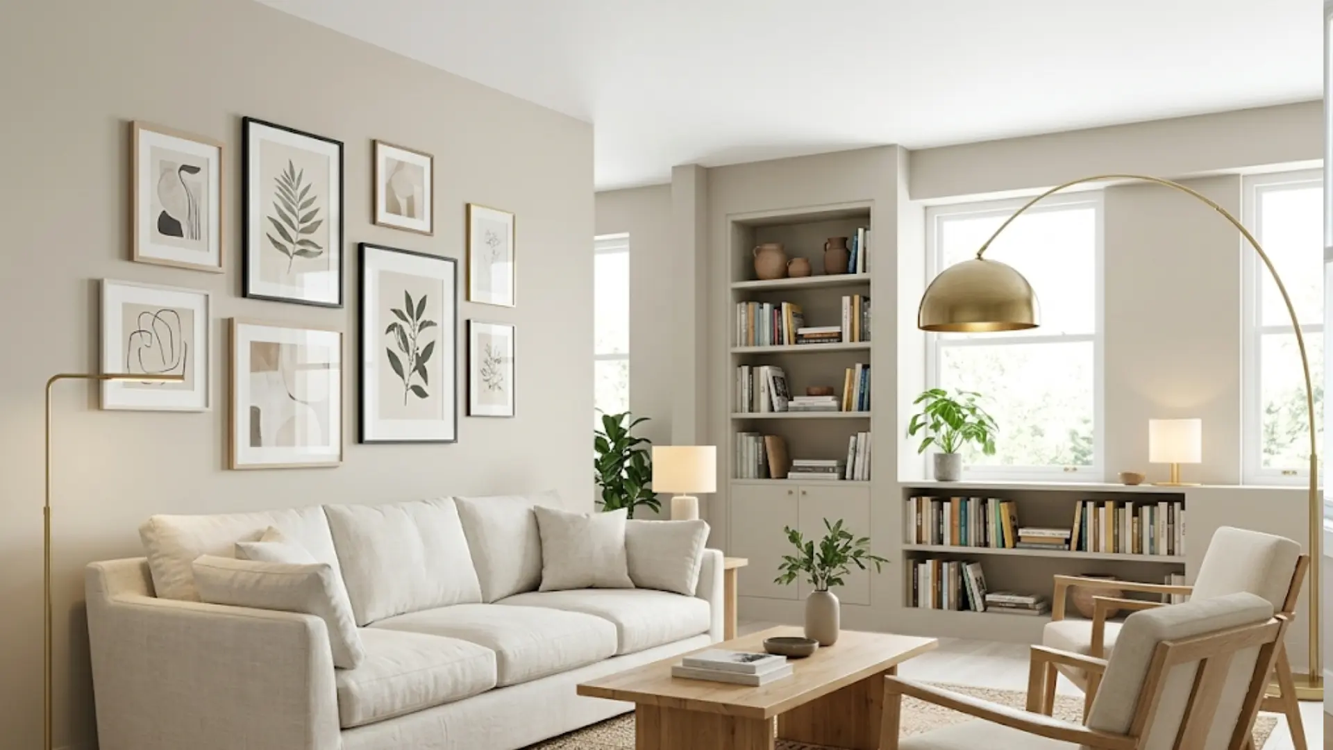
If you’ve been thinking about using a soft neutral that works in almost any space, Sherwin-Williams Agreeable Gray (SW 7029) is a strong choice. It’s a balanced greige that blends gray and beige, offering a calm, flexible base for your home. I’ve seen it work in many spaces, from open living areas to quiet bedrooms, and it adapts well when paired with the right finishes and colors. But like any paint, it can shift depending on lighting and surroundings. Here, you’ll learn how it behaves, what undertones to expect, the best coordinating colors, and where it fits best in your home. Understanding Sherwin-Williams Agreeable Gray (SW 7029) Sherwin-Williams Agreeable Gray is a soft greige paint color that blends gray with warm beige undertones. It’s not a cool gray or a heavy beige, but a balanced neutral that works in many spaces. The warmth in the color keeps it from feeling cold, while the gray undertone prevents it from looking too creamy or yellow. This balance is what makes it one of the most widely used neutral shades. It fits easily into both modern and traditional homes. Whether used on walls, cabinets, or exteriors, Agreeable Gray stays soft and adaptable without feeling flat. Color Details: RGB: 209 / 203 / 193 HEX: #D1CBC1 LRV: 60 Agreeable Gray Undertones and Lighting Effects Lighting can also affect how it compares to other beige paint colors in your space, especially as tones shift throughout the day. Its undertones shift slightly depending on natural and artificial light. In Natural Light Natural light brings out the soft warmth in Agreeable Gray, helping it feel open and relaxed. North-facing rooms: Cooler light makes Agreeable Gray look more gray than beige. It can feel slightly muted and calm, which works well for quiet spaces. South-facing rooms: Warm sunlight enhances the beige undertone, making the color feel softer and brighter. This is where it looks most balanced. East-facing rooms: Morning light makes the color appear lighter and slightly cooler. As the day progresses, it settles into a more neutral greige. West-facing rooms: Afternoon light adds warmth, giving Agreeable Gray a richer and cozier feel later in the day. In Artificial Light Artificial lighting plays a significant role in how Agreeable Gray appears as natural light fades. I’ve noticed that warm bulbs bring out the beige undertones, making the color feel softer and more relaxed in the evening. On the other hand, cool white or daylight bulbs push the color toward a cleaner, grayer tone, giving the space a slightly sharper look. This shift can change the mood of the room more than you might expect. To keep things balanced, use layered lighting with ceiling fixtures, lamps, and wall lights so the color stays consistent and comfortable throughout the day. Choosing the Right Finish The finish you choose can change how Agreeable Gray looks and how well it performs over time. Different sheens affect both the appearance and durability of the paint, so picking the right one matters. Matte finishes absorb light and give walls a soft, smooth look, making them a good fit for bedrooms and living areas. Satin finishes add a light sheen, which works well for trim, doors, and spaces with regular use. Semi-gloss finishes reflect more light and are easier to clean, making them ideal for cabinets, kitchens, and bathrooms where durability is important. Agreeable Gray in Different Spaces Agreeable Gray works well in many parts of your home, giving you a balanced look when paired with the right colors and finishes. 1. Living Room In a living room, Agreeable Gray creates a soft and welcoming base that works across different styles. It can be used on all walls without making the space feel too dark or closed in. The color reflects light well, helping the room feel open and balanced throughout the day. Pair it with light furniture, natural wood tones, and warm lighting to keep the space comfortable. A matte or satin finish works best here, giving the walls a smooth look while still being easy to maintain. 2. Bedroom Agreeable Gray is a great choice for bedrooms because it creates a calm and restful atmosphere. The soft greige tone helps reduce visual noise, making the space feel more relaxing and easy to unwind in. It works well behind the bed as a feature wall or across the entire room for a consistent look. Pair it with neutral bedding, soft textures, and warm lighting to keep the space cozy. A matte finish is ideal, as it softens the color and reduces glare for a more peaceful setting. 3. Kitchen and Cabinets In kitchens, Agreeable Gray works well on both walls and cabinets, offering a clean and balanced look. It pairs easily with white countertops, light backsplashes, and natural wood elements, making the space feel connected and simple. This versatility makes it a favorite for modern coastal kitchen ideas , where it provides a soft, sandy foundation for breezy blue accents. This color also works nicely with stainless steel or matte black hardware, depending on your style. For cabinets, a satin or semi-gloss finish is the best choice because it is durable and easy to clean. Proper surface prep helps the color apply evenly and last longer in daily use. 4. Exterior Agreeable Gray is also a reliable option for exterior walls because it looks balanced in different lighting conditions. It doesn’t feel too dark or too bright, which makes it easy to work with for full-home exteriors. The color pairs well with crisp white trim for a clean contrast or darker accents for a more defined look. It also works nicely with stone or wood details. Use an exterior-grade satin finish for durability, and make sure surfaces are cleaned and primed so the paint holds up over time. Agreeable Gray Coordinating Colors and Complementary Colors Choosing the right colors to pair with Agreeable Gray helps your space feel balanced, connected, and easy to style across different rooms. Best Whites to Pair With Agreeable Gray Choosing the right white makes a big difference in how Agreeable Gray looks on your walls. SW Pure White gives you a soft and neutral contrast without feeling too bright. SW Alabaster leans warmer and helps create a more relaxed and cozy feel. SW Snowbound offers a cleaner look with a slightly crisp edge. For trim and ceilings, brighter whites help define the space and keep it from feeling heavy. The right white pairing keeps Agreeable Gray looking balanced and fresh, rather than dull or flat. Accent Colors for Contrast Adding accent colors adds depth and interest without detracting from the main shade. Soft blues work well if you want a calm and relaxed feel in your space. Muted greens add a natural tone that feels grounded and easy to pair with wood elements. Warm navy brings a stronger contrast while still keeping the room balanced. Light blush tones can soften the overall look and add gentle warmth. Keep your accents simple and controlled so Agreeable Gray stays the focus, and the space feels steady. For a bold contrast, deeper tones like dark green black shades can work well on cabinets, doors, or accent walls. Complementary Neutrals Using complementary neutrals creates a smooth, layered look throughout your home. Greige tones work well because they stay close to Agreeable Gray without clashing. Soft taupe adds a bit more warmth while still keeping the palette neutral and easy to style. Off-white shades help brighten the space and prevent it from feeling too heavy. These combinations allow different areas to connect naturally, especially in open layouts. When you keep your neutral palette consistent, it becomes much easier to match furniture, flooring, and decor without confusion. How Agreeable Gray Compares to Similar Colors Small differences in undertones and depth can change how a color appears, so comparing options helps you choose what best fits your space. Shade Tone Best Use Warm/Cool LRV Notes Agreeable Gray (SW 7029) Greige Whole home, open spaces Warm 60 Balanced and flexible Repose Gray (SW 7015) Gray with slight violet Modern spaces Cooler 58 More gray, less warmth Accessible Beige (SW 7036) Warm beige Cozy interiors Warm 58 Stronger warmth Edgecomb Gray (HC-173) Light greige Bright rooms Warm-neutral 63 Lighter and softer Each of these colors has a slightly different feel, so your final choice depends on the lighting, finishes, and how warm or cool you want the space to feel. Tips for Using Neutral Paints Like Agreeable Gray Using neutral paint may seem simple, but small choices can change how the color looks and feels in your space over time. Test before painting: Try large samples on multiple walls instead of small swatches, so you can see how the color spreads and reacts in your space. Check lighting: Look at the color in the morning, afternoon, and evening to see how natural and artificial light affects its appearance. Pair with the right trim: Warm whites keep the look soft and connected, while bright whites create stronger contrast and make the wall color appear slightly cooler. Match flooring carefully: Warm-toned floors bring out the beige side of the color, while cool-toned floors highlight more gray and shift the overall feel. Use layered lighting: Combine ceiling lights, lamps, and wall fixtures to keep the color balanced and consistent throughout the day. Where to Get Sherwin-Williams Agreeable Gray You can buy Sherwin-Williams Agreeable Gray (SW 7029) at any Sherwin-Williams store or through the official website at www.sherwin-williams.com . It’s available in both interior and exterior paint options, so you can use it throughout your home. You can choose from matte, satin, or semi-gloss finishes based on your needs. For testing, you can order a Samplize peel-and-stick sample online. It lets you see how Agreeable Gray looks in your own lighting without making a mess before committing to a full paint purchase. Common Mistakes to Avoid Small mistakes can change how Agreeable Gray looks in your space, so paying attention to these details helps you avoid results that feel off. Skipping sample testing: Testing only a small area can mislead you; check larger samples on different walls to understand how the color behaves. Ignoring lighting changes: Lighting shifts the tone throughout the day, so without testing in different conditions, the color may look very different. Using the wrong trim color: The wrong white trim can throw off the balance, making Agreeable Gray appear too warm or slightly dull rather than clean. Overlooking flooring undertones: Flooring has a strong impact, and mismatched undertones can clash and change how the color looks across your space. Rushing the decision: Quick choices often lead to regret, so take time to observe the color at different times before fully committing. Wrap Up Agreeable Gray works because it stays balanced in situations where many neutrals fail. It blends warmth and gray in a way that adapts to different rooms, lighting, and finishes without feeling too heavy or too plain. You’ve seen how lighting shifts its tone, how finishes change its look, and how the right pairings keep it from feeling flat. Small choices like trim color, flooring, and lighting make a real difference in how it turns out. If you take the time to test it properly, Sherwin-Williams Agreeable Gray becomes a reliable base you can build around. Try a sample in your space and see how it responds, then explore more color guides to refine your choices. Frequently Asked Questions Is agreeable gray warm or cool? Agreeable Gray is a warm greige. It leans slightly toward beige but stays balanced with gray, so it doesn’t feel too yellow or too cool in most lighting conditions. What undertones does agreeable gray have? Agreeable Gray has subtle beige and soft warm undertones. In certain lighting, it may show a faint hint of green or taupe, but it usually stays neutral and easy to work with. Does agreeable gray look too dark on walls? Agreeable Gray is a mid-tone color with an LRV of 60, so it reflects a fair amount of light. It usually doesn’t feel too dark unless used in low-light rooms. What white trim goes with agreeable gray? Agreeable Gray pairs well with whites like SW Pure White, SW Alabaster, and SW Snowbound. These shades help create contrast while keeping the overall look clean and balanced. Is agreeable gray still popular in 2026? Agreeable Gray remains a popular choice because it works across many styles and spaces. Its balanced tone makes it reliable for whole-home use, even as color trends continue to shift. Can agreeable gray be used on cabinets? Agreeable Gray works well on cabinets when paired with the right finish. A satin or semi-gloss sheen helps improve durability and makes cleaning easier in kitchens and bathrooms.