


Have you ever stepped into a cathedral and felt instantly lifted by the soaring ceilings and colorful light? If you’ve ever wondered what makes a Gothic cathedral special, it can feel overwhelming to understand the arches, buttresses, and stained glass. I know it’s hard to notice all the details while visiting or looking at photos. In this article, you’ll learn how to identify Gothic features like pointed arches, ribbed vaults, and flying buttresses. I’ll also explain how Gothic differs from Romanesque and Gothic Revival, highlight famous cathedrals, and give practical tips so you can appreciate both the engineering and artistry when you explore one yourself. What Are Gothic Cathedrals? Gothic cathedrals are major Christian churches built in the Gothic architectural style, which began in northern France in the mid-12th century. One key starting point was the rebuilding of the Basilica of Saint-Denis near Paris from around 1135 to 1144. From there, the style spread across Europe between the 12th and 16th centuries, changing how sacred buildings looked and felt. A cathedral is not called a cathedral only because it is large or famous. It is the main church of a bishop, making it an important religious seat for the region. In medieval towns, a Gothic cathedral often stood at the center of public life. People came for worship, teaching, festivals, pilgrimage, ceremonies, and moments that shaped the whole community. What makes these buildings so moving is the way faith and design meet. Earlier Romanesque churches often felt heavy, with thick walls, rounded arches, and smaller windows. Gothic builders wanted more height, more light, and more openness. That is why places like Notre-Dame de Paris, Chartres Cathedral, and Cologne Cathedral feel so powerful when you stand inside them. Key Features of Gothic Cathedrals The beauty of Gothic cathedrals comes from how stone, height, and light work together. Medieval builders used clever support systems to raise ceilings, open walls, and fill interiors with color. What looks delicate at first is actually careful engineering shaped into sacred space. Here are the key features that define Gothic churches: Pointed arches: These sharp arches helped carry weight downward and made taller walls and wider openings possible. They also give Gothic interiors their strong upward pull. Ribbed vaults: Stone ribs span the ceiling and direct weight to the columns. They make the roof feel lighter while adding dramatic patterns overhead. Flying buttresses: These outer supports carry pressure away from the walls. Because of them, builders could add bigger windows and higher interiors. Stained glass and rose windows: Colored glass filled the church with blue, red, gold, and violet light while telling sacred stories. Rose windows created a glowing focal point. The way color behaves in a space shifts dramatically depending on where and how light enters, something Gothic builders understood centuries before it became a design principle. Towers, spires, and vertical lines: These features made the church visible across the town and gave the space a lifted, spiritual feeling. Stone sculpture and gargoyles: Carvings taught religious stories through figures and symbols. Gargoyles also helped move rainwater away from the walls. Together, these features make a Gothic cathedral feel powerful, bright, and deeply atmospheric. The structure supports the space, while the glass and height make it feel alive centuries later. Why Gothic Churches Were So Important Gothic churches played a major role in medieval society and influenced far more than religious life. They served as places of worship, gathering spaces, and important landmarks that reflected the identity of a town or city. Building a Gothic church often required the efforts of skilled architects, craftsmen, artists, and local communities working together over many years. These impressive structures demonstrated advances in engineering and construction while showcasing beautiful sculptures, stained glass, and detailed stonework. They also represented the wealth and influence of religious institutions and local rulers. Beyond their spiritual purpose, Gothic churches became centers of culture, education, and community life, leaving a lasting impact on European history and architecture. Most Famous Gothic Cathedrals and Churches Around the World The finest Gothic cathedrals are not famous for one reason. Some changed architecture, some guarded royal history, and others shaped the skyline of entire cities. What makes them worth your attention is how each one tells a different story through stone, glass, height, and local memory. 1. Notre-Dame de Paris, France Notre-Dame de Paris began construction in 1163 and became one of the great symbols of French Gothic architecture. Built on the Île de la Cité, it watched Paris grow around the Seine for centuries. Its towers, sculpted portals, and rose windows made it a model for later Gothic churches. When you stand before it, the building feels both royal and deeply human. Here is what makes it stand apart: Western facade with strong balance: The front is arranged with three portals, twin towers, and a central rose window, creating a calm yet powerful rhythm. Famous rose windows: Its stained glass brings soft color into the interior and shows how Gothic churches used light as part of worship. Cultural memory of Paris: Beyond architecture, Notre-Dame appears in literature, art, music, and national life, making it more than a historic church. 2. Chartres Cathedral, Chartres, France Chartres Cathedral was mostly rebuilt after a fire in 1194 and became one of the clearest examples of High Gothic architecture. It is especially loved for its medieval stained glass, much of which still survives. The cathedral has a quiet power. From outside, it rises above the town; inside, the blue glass gives the space a calm, almost floating glow. These details give Chartres its lasting value: Chartres blue glass: The deep blue tones in its windows are among the most admired in medieval Europe. That particular shade of blue carries the same quality found in historically symbolic blue paints, where color was chosen not just for beauty but for the feeling it produced in a space. Pilgrimage importance: The cathedral became a major pilgrimage site because of its sacred relic and religious status. Unified Gothic design: Since much of it was rebuilt in a focused period, the building feels unusually complete and balanced. 3. Amiens Cathedral, Amiens, France Amiens Cathedral was begun in 1220 and is one of the grandest achievements of High Gothic design. Its builders created a vast interior that feels open, bright, and perfectly ordered. The nave rises with a confidence that makes you instinctively look up. It was not built only to impress; it was made to show how far Gothic engineering could go. Look closely at these features: Exceptional interior height: The nave reaches a striking height, creating one of the most powerful vertical effects in French Gothic architecture. Rich sculpted entrance: The west front is filled with carved figures that once helped teach religious stories to visitors. Clean structural rhythm: Columns, arches, and vaults align with rare clarity, making the interior feel calm rather than crowded. 4. Reims Cathedral, Reims, France Reims Cathedral was started in 1211 and became closely tied to the history of French kings. For centuries, it served as the coronation church of France, giving it a rare political and spiritual weight. Its facade is one of the most sculptural in Gothic Europe. The stone figures feel full of movement, as if the cathedral is speaking before you enter. Its importance comes through these details: Royal coronation setting: Many French kings were crowned here, giving the cathedral a central place in national history. Expressive sculpture: The famous carved figures, including smiling angels, make the facade feel lively and personal. High Gothic elegance: Its design shows the French Gothic love of height, order, and richly decorated entrances. 5. Cologne Cathedral, Cologne, Germany Cologne Cathedral began in 1248, paused for centuries, and was finally completed in 1880. That long story makes it one of Europe’s most remarkable church projects. Its twin spires rise above Cologne with a force you can feel even from a distance. The cathedral holds both medieval ambition and 19th-century completion in one unforgettable shape. These points make Cologne especially powerful: Towering twin spires: The spires dominate the skyline and make the cathedral one of Germany’s most recognizable landmarks. Long construction timeline: Its completion after more than 600 years gives it a rare link between medieval and modern Europe. Major pilgrimage role: The cathedral was built in part to honor important relics, which drew pilgrims and elevated Cologne’s status. 6. Burgos Cathedral, Burgos, Spain Burgos Cathedral began construction in 1221 and brought French Gothic ideas into a Spanish setting. Over time, later additions gave it a richer and more decorative look. Its sharp towers, carved details, and chapels create a layered experience. You feel the original Gothic frame, as well as the personality of Spain in its stonework. Here is what gives Burgos its character: Spanish Gothic identity: The cathedral adapts French Gothic forms while adding local details, making it feel distinct from northern examples. Decorative towers: Its lace-like spires give the exterior a refined and elegant profile. Layered artistic additions: Chapels, tombs, and later details show how the building continued to grow with changing tastes. 7. Seville Cathedral, Seville, Spain Seville Cathedral was built from 1401 on the site of the city’s former Great Mosque. This gives it a layered history unlike many other Gothic churches. Its scale is overwhelming, but what makes it memorable is the blend of Gothic ambition with traces of earlier Islamic architecture. You feel the meeting of cultures in the stone, tower, and open spaces. These details make Seville unique: Immense Gothic scale: It is one of the largest Gothic churches in the world, built to reflect the city’s power and faith. La Giralda tower: The bell tower began as a minaret, preserving part of the site’s Islamic past. Cultural layering: The cathedral tells a story of religious change, urban power, and architectural reuse in southern Spain. 8. Westminster Abbey, London, England Westminster Abbey took much of its present Gothic form under Henry III, beginning in 1245. It became one of England’s most important religious and royal spaces. Unlike some cathedrals known mainly for height or glass, Westminster is famous for ceremony, memory, and national identity. Walking inside feels like moving through England’s history in stone. Its value sits in these details: Royal ceremonial role: It has hosted coronations, weddings, and burials, making it central to British public life. Gothic interior rhythm: Pointed arches, tall vaulting, and long lines create a solemn but graceful setting. Historic memorials: Poets, monarchs, scientists, and public figures are remembered here, adding layers beyond architecture. 9. York Minster, York, England York Minster developed over several centuries, with major Gothic work from the 13th to 15th centuries. It is one of the greatest Gothic churches in northern Europe. The building feels broad, bright, and deeply English in character. Its glass is a major reason to visit, especially when daylight brings the windows to life. These features make York Minster stand out: Great East Window: This vast stained-glass window is one of the largest and most important medieval windows in England. Strong northern presence: Its size and setting made it a major religious landmark far from London. Mix of Gothic phases: Different parts show changing English Gothic styles across several centuries. 10. Milan Cathedral, Milan, Italy Milan Cathedral began in 1386 and took nearly six centuries to complete. It has a very different mood from French Gothic cathedrals. Instead of a dark, compact mass, it rises in pale stone with countless spires, statues, and fine details. From the roof, you can stand close to the carved stone and see Milan spread below you. These details give Milan Cathedral its appeal: Forest of spires: The roofline is filled with pinnacles and statues, creating one of the most detailed Gothic silhouettes in Europe. Italian Gothic character: It blends northern Gothic ideas with local tastes, resulting in a style that feels uniquely Milanese. Walkable roof terraces: Visitors can climb close to the stonework, making the architecture feel personal and touchable. 11. Canterbury Cathedral, Canterbury, England Canterbury Cathedral has roots going back to 597, but much of its famous Gothic character developed after the fire of 1174, when the choir was rebuilt in a new Gothic style. It became one of England’s most important pilgrimage sites after the murder of Thomas Becket in 1170. When you walk inside, the building feels layered, sacred, and deeply tied to English history. Here is what makes Canterbury worth including: Early English Gothic choir: The rebuilt choir helped bring Gothic ideas into England, making Canterbury important in the spread of the style. Pilgrimage legacy: Becket’s shrine drew medieval pilgrims for centuries, giving the cathedral a powerful religious and cultural role. Layered architecture: The building holds Romanesque and Gothic parts together, so visitors can see how church design changed over time. Parts of a Gothic Cathedral Cathedral terms can feel confusing at first, but you only need a few to understand what you are seeing. Once you know the main areas, the building starts to feel less like a maze and more like a planned sacred space. Use this table as a simple guide while reading, visiting, or looking at photos. Part What It Means Why It Matters Nave The main central space where people gather It gives the cathedral its long, grand interior view Transept The cross-section that cuts across the nave It often creates the church’s cross-shaped plan Choir Area used by clergy and singers It sits closer to the altar and carries ceremonial importance Apse Rounded or angled end near the altar It frames the sacred focus of the building West facade Main front entrance It often holds towers, portals, and sculptures Portals Decorated doorways They welcome visitors with carved religious stories Clerestory Upper wall with windows It brings daylight into the high interior Knowing these parts helps you slow down. Instead of only saying “This church is beautiful,” you can understand how the space leads you from entrance to altar, from shadow to light, and from street noise to stillness. How to Recognize a Gothic Cathedral You do not need to be an architecture expert to spot Gothic architecture. Step back first, then move closer slowly. Look at the outline from the street, the entrance from eye level, and the ceiling from inside. The style reveals itself through the way the building rises, opens, and pulls light into the space. Look for these signs when you visit or view photos: Sharp pointed arches: You will often see them above doors, windows, side aisles, and interior walkways. Their pointed shape gives the building a taller and more upward-looking profile than round-arched churches. High vaulted ceilings: Inside, look for ceilings that seem to stretch far above you with visible stone ribs. These ceilings often make the nave feel long, lifted, and carefully ordered. The same principle that makes a low ceiling feel oppressive is what Gothic builders reversed through ribbed vaults and vertical proportion. External buttresses: Walk around the outside if you can. Gothic cathedrals often have stone supports that step away from the walls, sometimes shaped like half-arches, holding the upper structure in place. Large stained-glass windows: Instead of small wall openings, you may see wide panels of colored glass. From inside, these windows soften the stone with shifting tones of blue, red, gold, and violet. Circular rose window: Check the main facade or the ends of the transept. A rose window usually appears as a large round design made of stone tracery and colored glass. Tall towers or spires: From a distance, Gothic churches often rise above the surrounding streets. Their towers and spires were made to be seen from across the town, not only from the doorway. Carved portals: Pause at the main entrance. Gothic doorways often have layered arches, sculpted figures, and scenes carved into the stone, turning the entrance into a visual story. Light-filled nave: Once inside, notice how the central space feels. Gothic naves often feel taller, brighter, and more open than earlier medieval churches, with light guiding your eyes toward the altar. Not every Gothic church has all of these signs. Some are modest, some have been rebuilt, and some blend styles from different centuries. But when you see height, pointed forms, colored glass, carved entrances, and a bright upward interior together, you are likely standing before a Gothic cathedral. Gothic vs. Romanesque and Gothic Revival Romanesque, Gothic, and Gothic Revival churches may look related, but each belongs to a different age. The easiest way to tell them apart is by noticing weight, light, and height. Romanesque feels grounded, Gothic feels lifted, and Gothic Revival brings the Gothic look into a later period. Style Main Look Common Features Time Period Best Way to Recognize It Romanesque Heavy, solid, fortress-like Round arches, thick walls, barrel vaults, small windows, sturdy towers Mainly 10th to 12th centuries Look for rounded forms, darker interiors, and a strong, weighty structure Gothic Tall, bright, upward-reaching Pointed arches, ribbed vaults, flying buttresses, stained glass, rose windows Mainly 12th to 16th centuries Look for height, colored light, pointed forms, and wide window openings Gothic Revival Medieval-inspired but newer Pointed arches, spires, tracery, stained glass, decorative stonework Mostly 18th to early 20th centuries Look for Gothic details in buildings from a much later historical setting This comparison helps you read a church with more confidence. A Romanesque church often feels enclosed and protective. A Gothic cathedral feels open, vertical, and full of colored light. A Gothic Revival church may look medieval, but its story is newer and inspired by the past. Tips for Visiting Gothic Cathedrals A Gothic cathedral is best experienced slowly. Before you move from one famous corner to another, give your eyes time to adjust. These buildings reveal themselves through height, shadow, glass, stone, and silence, so a slower visit often feels much richer. Keep these tips in mind when you visit: Start from the back: Stand near the entrance and look down the nave. This gives you the full sense of length, height, and direction before you focus on smaller details. Look up before moving on: The ribbed vaults are easy to miss if you only look straight ahead. Notice how the ceiling lines guide your eyes upward. Study the stained glass from inside: Colored windows are best seen with natural light behind them. Morning or late afternoon light can make the glass feel especially vivid. Walk around the outside: Flying buttresses, towers, portals, and carvings often make more sense from the exterior. The outside explains how the inside stands. Pause at the main doorway: Many Gothic entrances carry carved figures and symbolic scenes. They often prepare you for the sacred stories inside. Read a short history first: Even a few facts about the cathedral’s age, city, or patrons can make the visit feel more personal and meaningful. A quiet place to do that reading matters too; the same instinct that draws people to a cozy reading room is what makes a cathedral nave so compelling to sit in before the crowds arrive. Try not to rush your visit. Gothic churches were built for layers of attention, not quick glances. The more slowly you move, the more you notice: a carved face, a shaft of colored light, or a quiet corner that stays with you later. Frequently Asked Questions Why do cathedrals face the east? They follow “liturgical orientation.” The altar faces east toward the rising sun, symbolizing the resurrection of Christ and his promised return. Consequently, the main entrance (west facade) welcomes visitors moving from western darkness toward spiritual light. What are labyrinth floors used for? Many Gothic floors, like Chartres, feature circular stone mazes. Medieval pilgrims who could not travel to Jerusalem walked these intricate floor paths on their knees as a symbolic, meditative substitute for a holy pilgrimage. How did builders pay for cathedrals? Funding came from royal donations, wealthy merchants, church taxes, and the lucrative sale of indulgences (spiritual forgiveness). Shrines housing famous saint relics also drew massive crowds of pilgrims whose entry donations funded generations of masonry. Who actually built these churches? Traveling guilds of specialized Freemasons, stone cutters, sculptors, and master engineers did the heavy lifting. Local peasants provided basic manual labor, like hauling heavy stone blocks, often working as an act of religious devotion. Why are there clocks on the towers? Monks and townspeople needed to track structural prayer times (liturgical hours). As mechanical clocks advanced in the late Middle Ages, cathedral towers naturally housed them, turning the church into the town’s official timekeeper. Where did they get the stained glass? Artisans melted silica sand, potash, and lime at high temperatures. They added metallic oxides to the molten batch—like copper for rich red or cobalt for deep blue—to stain the glass before blowing it into sheets. What is the meaning of a crypt? A crypt is a stone basement chamber located beneath the elevated altar floor. It served as a secure burial vault for saints, bishops, and martyrs, preserving holy relics while providing a quiet space for private worship. Why do floor plans look like crosses? Gothic builders intentionally laid out foundations in a Latin cross shape (cruciform plan). The long nave forms the vertical beam, while the intersecting transept forms the horizontal arms, structurally mirroring the primary symbol of Christian faith. Wrapping Up Standing inside a Gothic cathedral is more than just admiring stone and glass; it’s about feeling history, design, and faith all around you. I hope you now understand how pointed arches, flying buttresses, ribbed vaults, and stained-glass windows work together to create height, light, and atmosphere. You also know how to recognize Gothic features, distinguish them from Romanesque or Gothic Revival, and appreciate the significance of famous cathedrals like Notre-Dame, Chartres, or Seville. This knowledge helps you see both engineering and artistry in a new way. Next time you visit a cathedral, take your time, observe details, and notice how space and light tell centuries-old stories.
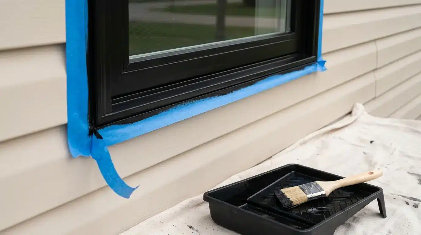
Difficulty 3 out of 5, Prep work is where most people go wrong Time One full weekend (prep + 2 coats + cure time) Cost (DIY) $50–$150 per window for materials Tools Needed 220-grit sandpaper, small angled brush, painter’s tape, bonding primer, vinyl-safe acrylic latex paint, soft cloth, drop cloth Skill Required Intermediate or basic painting experience helps Paint can change the whole mood of a home, even when the change is small. But can you paint vinyl windows without creating a peeling mess later? That answer depends on the paint, prep, color, and condition of the frame. I’ve seen many homeowners fall for a deep black frame before checking how much heat vinyl can hold. That one choice can decide whether the finish lasts or the frame bends. Vinyl needs more care than wood because it is smooth, flexible, and sensitive to heat. Ahead, you’ll see when painting makes sense, when to avoid it, what paint and primer to choose, how to handle dark colors, and whether DIY, a pro, or replacement is the better call. Can You Paint Vinyl Windows? Yes, you can paint vinyl windows, but it is a different project than painting wood trim or metal frames. Vinyl is smooth, non-porous, and slightly flexible, which means paint has no natural surface texture to grip. That does not make it impossible. It means the bonding primer and paint choice carry more weight than they would on any other material. The project works when the frames are still in solid condition, with no cracks, no warping, and no failed seals. Paint changes the visual character of the window. It does not fix a frame that has already started to fail. If the window sticks, leaks air, or has fogged glass between the panes, those problems need to be addressed before anyone opens a can of paint. When the windows are sound, painting vinyl frames is a reasonable way to update the look without the cost of full replacement. Many homeowners repaint white frames to a softer charcoal or warm black to match updated exterior siding, and the result can look clean and intentional when the prep is done right. The key phrase is “when the prep is done right.” Will Painting Vinyl Windows Void the Warranty? Yes, painting vinyl windows can void the warranty, but it depends on the brand, the window’s age, and the warranty terms. Many warranties are tied to the original factory surface, so once you paint over it, the manufacturer may limit coverage for frame damage, finish failure, or heat-related issues. Before painting, check your paperwork or search for the exact window model on the manufacturer’s website. I would not rely on general advice here because each brand sets its own rules. If the windows are newer, contact the company before you buy paint. If you still decide to paint, keep a record of the paint, primer, color name, and product label. That gives you proof of what was used. It may not save the full warranty, but it can help if questions come up later. When You Should and Shouldn’t Paint Vinyl Windows Before you buy paint, take a close look at the window itself. Vinyl frames can be painted when they are still solid and working well, but paint should not be used to hide damage, leaks, or weak material. This quick check helps you decide if painting is worth it. Use the table below to see where your windows fit. You Should Paint Vinyl Windows If You Shouldn’t Paint Vinyl Windows If The frames are faded, stained, or outdated, but still firm and smooth. The frames are cracked, warped, loose, or clearly damaged. The windows open, close, lock, and seal the way they should. The windows stick, leak, or have failed seals. You want a lower-cost color update without replacing working windows. You are trying to cover a problem that needs to be repaired first. The surface can be cleaned and lightly prepared before painting. The vinyl feels brittle, chalky, flaky, or weak to the touch. You are using exterior paint made for vinyl, PVC, or plastic surfaces. You only have regular wall paint, not paint approved for vinyl. Your color choice is safe for vinyl and not much darker than the original frame. You want a very dark color that is not listed as vinyl-safe. The window warranty allows painting, or the warranty no longer matters to you. The warranty is still active, and the manufacturer does not allow painting. If most of your window’s condition falls on the left side, painting can be a good way to refresh the look. If it falls on the right side, I would pause before picking a color. A repair, replacement, or professional opinion may save you from a finish that fails too soon. Note: Painting vinyl windows is not risky when the frame is solid and the right paint is used. Problems usually start when paint is used to hide damage, the color creates too much heat, or the surface is rushed. Treat painting as a finish update, not a repair. That mindset helps you avoid peeling, sticking, and regret later Best Paint and Primer for Vinyl Windows The paint and primer you choose matter more on vinyl than on many other surfaces. Vinyl is smooth, flexible, and exposed to heat, light, and moisture, so the product needs to bond well without stiffening or stressing the frame. I always tell people to read the label before falling in love with a color. A good result starts with two choices: the coating that adds color and the base layer that helps it hold. Paint for Vinyl Windows The best paint for vinyl windows is an exterior acrylic latex paint made for vinyl, PVC, or plastic surfaces. It should be flexible enough to move with the frame as temperatures shift. Satin or semi-gloss is usually the better finish because it looks cleaner and is easier to wipe down than flat paint. Before you choose a color, consider how the window will handle sunlight and heat during the day. Choose a vinyl-safe color range: Some paint brands list approved vinyl colors, which matters if you want a shade darker than the original frame. Think about the finish in real light: Satin feels softer and more forgiving, while semi-gloss can make frames look sharper but may show brush marks more easily. Primer for Vinyl Windows Primer is useful when the paint brand asks for it or when the frame feels very slick after cleaning. A bonding primer for vinyl, PVC, or other plastics provides a better base for the topcoat. It should support the paint system rather than act as a separate quick fix. Use primer only when it solves a real bonding need, not just because it feels safer. Pick a bonding primer for slick surfaces: The label should mention vinyl, PVC, plastic, or glossy exterior surfaces, not just wood or drywall. Keep primer coats thin and even: A heavy primer layer can create buildup around edges, making the final paint look bulky. How to Paint Vinyl Windows the Right Way This project shows how a plain vinyl window can shift the overall feel of a room with careful prep, bonding primer, and thin coats of paint. The process is simple, but the small details decide whether the finish looks clean or rushed. Before starting, gather everything you need so the paint process stays smooth from prep to final touch. Materials needed: 220-grit sandpaper or sanding disc Wet rag Small cleaning brush Bonding primer for shiny surfaces Vinyl-safe paint Small angled brush Painter’s tape Electrical tape for interior window grids Drop cloth or floor protection Clean cloth for wiping dust Once the materials are ready, move through the process in this order. Step 1: Prep the Vinyl Surface First Start by looking closely at the vinyl frame and deciding which areas need light sanding. In this project, only a few sections were sanded with 220-grit sandpaper to test the difference, while the rest were left smooth. The goal is not to scratch the frame deeply. You only want to dull the shine a little. After sanding, wipe the frame with a wet rag and use a small brush to clean dust from the corners. A clean surface helps the next layer sit evenly. Step 2: Apply a Bonding Primer for Shiny Surfaces Vinyl is glossy, so a regular primer is not the best choice. Use a bonding primer made for hard-to-coat or shiny surfaces. In this project, two bonding primers were tested by me on different parts of the frame. Both helped the paint hold better than bare vinyl would. Apply the primer in a thin, even coat and work it into the narrow frame edges. Let it dry as directed on the label. This base layer gives the paint something stronger to grip. Step 3: Paint the Frame in Thin Coats Once the primer is dry, apply the paint with a small brush and steady pressure. A soft black shade was used here instead of a harsh jet black, which gave the window a cleaner, more finished look. The first coat may still show a little white underneath, especially around corners and narrow lines. That is normal. Do not overload the brush to cover everything at once. Let the first coat dry, then add a second coat for an even color. Step 4: Cover the White Grids Inside the Glass If your window has white grids between the glass, paint will not reach them because they sit inside the pane. A simple way to make them match the black frame is to use black electrical tape on the glass surface. Place the tape in a straight line over each grid so it looks neat from both a distance and up close. Take your time here because crooked tape will stand out. This small detail helps the whole window look more complete. Step 5: Check the Finish Before Calling It Done After two coats, step back and look at the frame from different angles. Check whether the color looks even, whether any white areas remain, and whether the edges look clean. In this project, sanding did not make a major visible difference, but the bonding primer mattered. The finished vinyl frame looked uniform and no longer had that plastic look. Before moving on, open and close the window gently to make sure no painted edge feels stuck. Watch the video for a step-by-step tutorial: Can You Paint Vinyl Windows Black? Yes, and black-framed windows look clean against the right exterior. The issue is heat. Black paint absorbs more solar energy than lighter shades, and vinyl is sensitive to sustained high temperatures. On a south- or west-facing wall in summer, a standard black paint on white vinyl frames can cause the frame to expand beyond its engineered range, which leads to warping, sticking sashes, or stress on the sealed glass unit. The safer path is to use paint specifically listed as vinyl-safe in the manufacturer’s dark or black range, and to check the LRV before committing. An LRV at or above 55 carries less heat risk than deeper blacks at LRV 20 or below. A soft charcoal or dark gray at LRV 30–40 often gives the visual effect of a near-black frame without the same heat load. If the windows face south or west and receive strong afternoon sun for most of the year, either choose a lighter dark shade or hire a professional who can spray a factory-quality vinyl coat. A pro will also mask the glass more cleanly than most first-time brush jobs on large windows. For how dark trim colors interact with your overall exterior, the same principles that apply to black-framed window exteriors apply here, the frame reads as part of the full elevation, not on its own. Best Weather for Painting Vinyl Windows Weather can affect how well paint adheres to vinyl. A dry, mild, calm day gives the paint enough time to level, bond, and dry without dust, heat, or moisture getting in the way. I would always check the forecast before setting up. Use this table to pick the right painting conditions: Weather Condition Best Choice Why It Matters Temperature Mild weather within the paint label’s range Paint bonds better when the surface is not too hot or too cold. Surface feel Cool or slightly warm to the touch Hot vinyl can cause paint to dry too quickly and leave a rough finish. Rain Avoid painting before or during rain Moisture can weaken the finish before the paint has time to set. Humidity Low to moderate humidity Heavy moisture in the air can slow drying and affect the final surface. Wind Calm or light breeze Strong wind can blow dust, pollen, or debris into wet paint. Sun exposure Shade, morning, or late afternoon Direct, harsh sun can cause the paint to dry unevenly. The safest time is usually a mild morning or late afternoon when the frame is dry and not hot. You do not need perfect weather, but you do need steady conditions long enough for the paint to set clean Common Mistakes to Avoid When Painting Vinyl Windows Most mistakes happen when the project starts to feel too simple. Vinyl windows look easy to paint, but small shortcuts can show up later as rough edges, stuck parts, or a finish that wears faster than expected. The goal is not to overthink the job. It is to slow down at the points that matter most. Watch for these common mistakes before you start painting. Painting without testing window movement: Open, close, lock, and unlock each window before painting. If something already sticks, paint can make that tight spot worse. Letting paint build up around edges: Thick paint near corners, grooves, and sash lines can dry bulky and make the frame look uneven. Forgetting to protect nearby surfaces: Glass, siding, trim, screens, and hardware can catch small splatters, especially when using a roller or sprayer. Removing tape at the wrong time: Pulling tape too late can lift dried paint, while pulling it too soon can smear wet edges. Skipping a small test area: A hidden test spot helps you check grip, color, and finish before covering the full frame. Closing the window too soon: Fresh paint needs time to settle. Closing the sash early can mark the finish or seal two painted edges together. A clean result comes from the small habits that do not seem exciting while you work. Test the window, protect the edges, keep coats controlled, and give the finish time before using the window normally. Note: Painted vinyl windows can last several years when the surface is prepared well and the right product is used. Sun exposure, weather, paint quality, and color choice all affect the finish. Watch for peeling, bubbling, fading, chalking, or rough texture, as these signs usually mean the paint is starting to fail. Should You Paint Vinyl Windows Yourself, Hire a Pro, or Replace Them? Once you know the windows can be painted, the next question is who should handle the job, or whether painting is even the best route. This choice depends on the window’s condition, height, color, finish goals, and how much risk you are willing to take on. Use this table to compare the three main options: Option Best For What You Gain What to Watch For DIY Ground-floor windows in good condition, lighter color update Lower material cost, flexible timing Requires patience with prep and thin coats; edge finish takes practice Hire a pro Upper-floor windows, very dark colors, large homes, spray finish Cleaner edges, better masking, spray application for uniform coverage Costs more; still need to confirm they use vinyl-rated paint Replace the windows Leaking, cracked, sticking, or failed-seal windows Better function, new warranty, longer-term solution Higher upfront cost and more planning than a paint project A painted frame is best when the window already works well and only needs a visual update. If the job feels too risky, a pro can make sense. If the window itself is failing, replacement is usually the cleaner long-term choice How to Maintain Painted Vinyl Windows Once the paint cures, the goal is not to fuss over it every weekend. Good care is quiet and steady. Gentle cleaning, early touch-ups, and reduced water exposure will help painted vinyl frames stay neat in heat, rain, and dust. Keep the finish in better shape with simple habits. Wash a few times a year gently: Use mild soap, water, and a soft cloth to remove dust, pollen, and grime before they sit on the painted surface for too long. Avoid harsh cleaning products: Skip bleach-heavy cleaners, strong solvents, and abrasive scrubbers, as they can dull the finish or weaken the paint layer. Touch up small chips early: Fix tiny marks before moisture or dirt gets under the paint edge and turns a small spot into a larger peeling area. Reduce constant water exposure: Adjust sprinklers, clear blocked weep holes, and wipe standing water so the frame is not sitting wet more than it needs to. Check seals and caulk seasonally: Look around the frame once or twice a year for gaps, cracking, or loose caulk so moisture problems do not spread into the painted area. Frequently Asked Questions What is the best paint for vinyl windows? Exterior acrylic latex paint formulated for vinyl, PVC, or plastic surfaces. Satin or semi-gloss finishes hold up better than flat in exterior conditions and are easier to clean. Confirm the label specifically names vinyl compatibility before buying. Do you need to prime vinyl windows before painting? Yes. A bonding primer rated for slick or non-porous surfaces is necessary for paint to adhere to vinyl. Standard drywall or wood primers are not the right product and can soften PVC. The bonding primer is the most important step in the process. How long does paint last on vinyl windows? Typically 5 to 7 years when prep is done correctly and a vinyl-rated paint is used. Sun-exposed frames, very dark colors, and high-humidity climates can shorten that timeline. Poor prep is the most common reason paint fails in under two years. Will painting vinyl windows void the warranty? Usually yes. Most manufacturers tie warranty coverage to the original factory finish. Check your paperwork before painting. If the windows are still under warranty, contact the manufacturer to confirm what is permitted before buying supplies. Can you paint white vinyl windows black? Yes, but it requires a vinyl-safe paint in a color with an LRV at or above 55 to reduce heat risk. On south- or west-facing walls with heavy sun exposure, even vinyl-safe dark paints carry more risk than lighter shades. A soft charcoal around LRV 35–45 is often the better call. How do you prep vinyl windows for painting? Clean the frame with a damp cloth, lightly scuff with 220-grit sandpaper to dull the shine, wipe away all dust, then apply a bonding primer rated for slick or non-porous surfaces. Let the primer dry fully before any paint goes on. Can painted vinyl windows affect resale value? A clean, neutral finish on solid frames generally does not hurt resale. An uneven, peeling, or overly dark finish can raise concerns about upkeep during a buyer walkthrough. The quality of the application matters more than the fact that the windows were painted. When choosing exterior frame colors to complement exterior paint and roof combinations, cohesion with the overall exterior palette tends to read better to buyers than a frame color that stands alone. How do you remove paint from vinyl windows? Start with gentle scraping and warm soapy water. For more stubborn areas, use a vinyl-safe paint remover and test it on a hidden section first. Avoid aggressive sanding or harsh solvent strippers, which can permanently scar or warp the frame surface. Wrapping up Can you paint vinyl windows and still get a finish you feel good about? Yes, when the frames are sound, the paint is vinyl-safe, and the color suits the surface. I’d treat this as a careful color update, not a quick cover-up. Look at the window in morning and evening light, think about how the frame color works with your trim, and be honest about the window’s condition. If it leaks, sticks, or has a failed seal, paint will not fix the real problem. For more practical home color ideas, read our other blogs on exterior trim colors, modern window frame colors, and choosing paint shades that fit your home and daily light in every season without guesswork or stress.

Ever feel like your home is missing a space just for you? A quiet corner where you can escape into a good book can make all the difference. I know how frustrating it is when you don’t have a dedicated spot to relax, and that’s exactly why you need clever reading nook ideas. You can turn almost any corner, bedroom, living room, or even a hallway into a cozy retreat. In this post, I’ll show you practical ways to create functional, stylish, and inviting nooks. By the end, you’ll have inspiration and actionable tips to carve out a reading space that feels like your personal sanctuary. Creating a Cozy and Usable Corner for Reading Transforming a corner into a reading nook requires balancing aesthetics with practicality. Consider seating, lighting, and storage first to ensure the nook is comfortable and accessible. Use natural light where possible and add layered lighting for evenings. Incorporate shelves, baskets, or drawers for books and accessories. Add soft cushions, rugs, and personal touches to make it warm and inviting. With careful planning, even a small or awkward space can become a functional, cozy retreat where you can read, relax, and recharge without sacrificing style or organization Reading Nook Ideas For Every Room And Small Corner A reading nook is more than a chair in a corner. It’s a setup that balances comfort, light, storage, and scale, and those needs shift depending on where in the home you’re working. A nook tucked under a staircase needs a different approach than one carved out in a cozy minimalist bedroom. The section below breaks down twelve types by space, cost, and style so you can match the right approach to the room you’re actually working with. 1. Window Seat Reading Nook A window seat nook uses natural light and an elevated perspective to create a relaxing spot for reading. Cushions, throws, and a small backrest enhance comfort, while integrated drawers or under-bench storage keep books and essentials organized. This setup works well for both adults and children, creating a functional yet charming area without occupying too much floor space. Best For: Bedrooms, stair landings, bay windows, sunny living rooms Cost: Medium to High (built-in bench + cushions) Key Feature: Combines natural light and storage efficiently Style Idea: Coastal, cottage, or Scandinavian with soft tones 2. Hanging Chair Nook Install a suspended chair with a soft cushion in a corner to create a floating, playful nook. Add a hanging shelf or small side table nearby to hold essentials. The gentle sway adds relaxation, while the semi-enclosed space creates intimacy. This setup is ideal for bedrooms, lofts, or living rooms, giving a stylish, airy focal point that is fun for both kids and adults. Layer a small rug underneath for added warmth and comfort. Best For: Living rooms, bedrooms, lofts Cost: Medium Key Feature: Airy, suspended seating with personality Style Idea: Boho, contemporary, casual. 3. Under-Stair Reading Nook Under-stair spaces can be transformed into cozy retreats with cushions, a built-in bench, and wall-mounted lighting. It’s ideal for creating a tucked-away nook that feels private yet accessible. Bookshelves or cubbies can be added to maximize storage while keeping the area functional for children or adults. Best For: Homes with unused stair space, kid-friendly hideaways Cost: Medium (bench, wall lighting, cushions) Key Feature: Efficient use of awkward space Style Idea: Moody library or whimsical kid-friendly design 4. Indoor Garden Nook An indoor garden nook surrounds a small reading corner with plants, a vertical green wall, or hanging greenery. Use a floor cushion or a small chair, along with a side table, for comfort. Natural elements create a calming environment, reducing stress and improving focus while reading. Ideal for sunrooms, living rooms, or apartments with space for indoor plants, this nook blends aesthetics, comfort, and function. Soft ambient lighting and layered rugs complete the setup, making it a refreshing and inspiring place to read. Best For: Living rooms, sunrooms, apartments Cost: Medium Key Feature: Calming, plant-surrounded nook Style Idea: Boho, natural, eco-friendly 5. Round Alcove Chair A circular alcove chair or pod provides semi-private seating with a sculptural aesthetic. Layer in firm cushions and a cozy throw, and place a small side table or floating shelf nearby for essentials. This design encourages a feeling of enclosure while allowing light and air to circulate. It works well in living rooms, bedrooms, or loft spaces and can be a visual centerpiece. Add a small indoor plant or decorative object to personalize the nook. Its unique shape makes it appealing to both adults and teens, offering a stylish, comfortable spot for long reading sessions. Best For: Living rooms, bedrooms, loft spaces Cost: Medium Key Feature: Semi-private, sculptural seating Style Idea: Contemporary, boho, cozy chic 6. Kids Reading Nook Kids’ nooks should be safe, flexible, and engaging. Use low shelves, floor cushions, rugs, and playful decor. The space should allow kids to easily reach books and feel comfortable lounging. The design can evolve as children grow, maintaining a fun yet functional reading corner. Best For: Playrooms, bedrooms, under-stair spaces, closets Cost: Low Key Feature: Safe and flexible Style Idea: Whimsical, nautical, or playful themed 7. Patio Or Balcony Reading Nook Outdoor nooks require weatherproof seating, cushions, and ambient lighting. Adding a small table, potted plants, or string lights enhances comfort and atmosphere. This nook is perfect for apartments, balconies, or covered patios, providing a relaxing reading retreat with fresh air. Best For: Apartments, balconies, covered patios Cost: Medium (weatherproof seating + accessories) Key Feature: Outdoor comfort and aesthetic Style Idea: Coastal, boho, or nature-inspired 8. Kitchen Or Breakfast Nook A banquette or small bistro-style setup creates a functional reading spot in kitchens or breakfast areas. Ideal for morning coffee, cookbooks, or magazines, this nook doubles as dining seating while providing a dedicated reading space without needing extra furniture. Best For: Small kitchens, breakfast corners, open dining spaces Cost: Medium (banquette + table) Key Feature: Multi-purpose for meals and reading Style Idea: Farmhouse, modern casual, or colorful casual 9. Hallway Library Nook Wide hallways or landings can be transformed into functional reading areas. Narrow benches paired with shallow shelves provide storage while maintaining walkable space. Wall-mounted or table lighting ensures adequate visibility, creating a subtle yet practical nook in transition spaces. Best For: Wide hallways, landings, pass-through spaces Cost: Low to Medium Key Feature: Functional storage without taking a full room Style Idea: Vintage, coastal, minimalist 10. Floor-Level Reading Nook Floor-level seating is the most flexible reading nook format: no furniture required, fully rearrangeable, and naturally suited to small rooms and apartments. Layer a large rug to define the area, add a floor cushion or pouf for support, and lean a few pillows against the wall as backrests. A low side table or a stack of books completes it. This format appears a lot in Japanese-style living rooms for good reason: floor seating emphasizes calm and informality in a way that chair-height furniture doesn’t. Back support matters more here than in a chair setup; use a floor cushion with a firm core rather than a soft throw pillow. Best For: Playrooms, small bedrooms, apartments Cost: Low (cushions, rugs, or poufs) Key Feature: Comfortable and flexible floor-level seating Style Idea: Boho, casual, or eclectic layered textiles 11. Alcove Daybed An alcove daybed is the most complete reading-nook format available: three enclosed walls, a full-length lounging surface, and enough depth to read while lying down or sitting up. Add cushions along the back wall to serve as a bolster, a small side table, and a wall sconce at head height. The enclosed feeling is the point; it reads as a room within a room. For those building this into a loft or compact apartment, a well-designed home library reading space can draw from many of the same principles at a larger scale. Best For: Bedrooms, lofts, small living rooms Cost: Medium to High (daybed + cushions + custom alcove) Key Feature: Comfortable lounging with integrated nook design Style Idea: Boho, coastal, or modern minimalist 12. Closet Bench with Slide-Out Desk A closet bench with a slide-out desk doubles as a reading and small workspace. Include a padded seat, soft lighting, and a shelf for books or stationery. This multifunctional nook is perfect for compact apartments or homes with tight space, providing a private, comfortable corner for reading, journaling, or light work. Add a rug and throw for extra warmth and style. It’s functional, space-efficient, and ideal for adults or teens needing a personal reading retreat. Best For: Apartments, bedrooms, small home offices Cost: Medium Key Feature: Multi-functional private nook Style Idea: Minimalist, Scandinavian, functional Pick The Right Reading Nook For Your Space Before choosing the perfect reading nook, consider your space, natural light, noise, and storage needs. Use this table to quickly identify the best nook type for your available area. Space Available Best Reading Nook Idea Why It Works Empty Bedroom Corner Armchair And Floor Lamp Easy setup and portable Bay Window Window Seat Maximizes light and adds storage Under Stairs Built-In Bench Uses awkward space efficiently Spare Closet Closet Nook Private reading spot Living Room Corner Chair, Ottoman, And Shelf Separate yet connected Balcony Outdoor Chair And Side Table Quiet outdoor reading spot Kids’ Room Floor Cushions And Low Shelves Safe and child-friendly Wide Hallway Shallow Shelves And Bench Adds a function without a full room Even small setups with a chair, lamp, and small table can be as effective as a large built-in nook, providing comfort, convenience, and functionality in minimal space. Reading Nook Furniture And Decor Checklist A complete reading nook balances comfort, function, and style. Start with essentials, then layer in decor. Even a small corner can feel cozy and inviting with the right elements. Seating: Chair, bench, chaise, daybed, or cushion for comfort Lighting: Floor lamp, wall sconce, table lamp, or clip light Surface: Side table, stool, or ledge for books or drinks Storage: Built-ins, shelves, or baskets to organize books and items Soft Layers: Throws, pillows, and rugs for warmth and texture Personal Touch: Plants, art, or framed prints to add personality Tip: Even a single chair and lamp can make a small nook feel complete. Additional elements can be added gradually. Lighting Ideas for a Reading Nook A well-lit reading nook can transform a simple corner into a cozy retreat, making it comfortable for reading at any time of day. The table below outlines different lighting options and their benefits for creating the perfect reading space. Lighting Type Best For Benefits Tips Natural Light Window-side reading nooks Provides bright, eye-friendly illumination and creates an open, airy feel Use sheer curtains or Roman shades to reduce glare while maintaining brightness Wall Sconces Built-ins, closet nooks, and compact spaces Saves floor and table space while offering soft, focused lighting Renters can choose plug-in sconces for easy installation Floor Lamps Armchairs, daybeds, and larger reading corners Adjustable lighting that can be directed onto books or magazines Select a model with an adjustable arm for maximum flexibility Table Lamps Side tables and built-in seating areas Creates warm, targeted light and enhances the cozy atmosphere Pair with a warm-toned bulb for a relaxing ambiance String Lights Outdoor patios, balconies, or decorative indoor nooks Adds warmth, charm, and soft ambient lighting Choose weatherproof options for outdoor use Lanterns Outdoor reading spaces Provides inviting illumination and decorative appeal Use battery-powered or solar-powered versions for convenience By combining natural, task, and ambient lighting, you can create a reading nook that is both practical and inviting, ensuring a comfortable and relaxing experience from morning through evening. Reading Nook Mistakes To Avoid Creating a cozy reading nook sounds simple, but certain common mistakes can make it uncomfortable or less functional. Avoid these pitfalls to ensure your nook is practical, inviting, and enjoyable for daily use: Poor Lighting: Insufficient light makes reading difficult and strains your eyes. Always layer natural, ambient, and task lighting. Wrong Seat Depth: Seats that are too shallow or too deep can cause discomfort. Ensure seating supports proper posture and lounging preferences. No Nearby Table: Without a surface, books, drinks, or reading accessories have nowhere to go. Include a side table or ledge. Blocking Heating Vents: Avoid placing furniture in a way that obstructs heating or cooling vents, which can affect comfort. Excessive Pillows: Too many pillows can crowd the nook and reduce usable seating. Keep a few supportive and decorative ones. Hard-to-Reach Books: Shelving that’s too high or too deep can make your favorite books inconvenient. Keep essential reads within easy reach. No Outlet for Lamps: If you need plug-in lighting or phone chargers, ensure your nook has easy access to an electrical outlet Simple Reading Nook Setup Plan Choose the quietest usable spot: Identify a corner, window alcove, or small nook away from distractions and foot traffic. Pick seating first: Decide between a chair, bench, chaise, or floor cushions depending on space and comfort needs. Add lighting before decor: Include natural light, floor or table lamps, wall sconces, or string lights to make reading comfortable at any time. Include storage: Add shelves, baskets, or built-ins to keep books, throws, and accessories organized. Layer soft elements: Rugs, pillows, and throws define the nook and make it cozy. Personalize your nook: Add plants, framed art, or small decorative objects to make the space feel welcoming and unique. Following this setup plan ensures your nook is functional, cozy, and visually appealing, creating a small retreat you’ll actually use every day. Frequently Asked Questions How do I make a reading nook feel cozy without taking up much space? Use compact seating, floor cushions, a soft throw, and vertical storage like floating shelves or a low bookcase. A small rug defines the zone without requiring extra square footage. Can I create a reading nook in a shared room? Yes. A rug, a small bookshelf used as a partial divider, or simply angling the chair away from the main seating area is enough to define the corner. Add a lamp and the zone reads as intentional. What’s the best flooring for a reading nook? Wood and laminate both work well as a base. Layer a small rug over either for comfort and warmth underfoot; it also visually separates the nook from the surrounding floor, which matters in open-plan spaces. How do I organize books in a small nook? Use vertical shelving, floating ledges at seated height, or a low bookcase that doubles as a side table. Keep frequently read titles within arm’s reach; move the rest to a separate shelf or storage. How can I add personality to my reading nook? One plant, one framed print, and a throw in a color you chose deliberately go further than a collection of small objects. Layered textiles, a rug, a cushion, and a throw give the most impact per dollar spent. What’s the minimum space needed for a reading nook? An armchair requires roughly 3 x 3 feet of clear floor space. A floor cushion setup needs even less. The minimum functional requirement is enough room to sit, with a surface within arm’s reach and a light source in front of you. Wrap Up Now that you’ve explored all these reading nook ideas, you can see how even small spaces can be transformed into inviting corners. I’ve shared tips on seating, lighting, storage, and decor so you can build a nook that is functional and visually appealing. Whether it’s a window seat, under-stair nook, or a floor-level cozy setup, these ideas help you create a space that encourages reading and relaxation. Pick a spot in your home, start layering comfort and personality, and make it your own. Try these ideas and enjoy having a dedicated nook where you can truly unwind with your favorite books.

Difficulty 2 out of 5, no special skills required, just some measuring and basic assembly Time One weekend (frame build: 2–3 hours, filling: 1–2 hours) Cost $40–$120 depending on bed size and how much bagged soil you buy Tools Needed Drill, countersink bit, skill saw, measuring tape, level, pitchfork, wheelbarrow Skill Required Beginner The first raised bed I filled, I bought nine bags of bagged garden soil and still ran short. I hadn’t accounted for settling, I’d mixed in too much fresh grass clippings, and by week three, the whole thing had sunk three inches and smelled faintly sour. The fix was simple once I understood how diy raised garden bed layers actually work: rough organic material at the bottom, finished soil at the top, and nothing wet or green piled in thick. A layered raised bed costs less to fill because you’re not buying premium soil from the bottom board to the top. You’re using what you have: branches, dry leaves, compost, and putting the good stuff only where roots actually live. The result is a bed that drains better, settles less chaotically, and feeds itself as the lower layers break down over time. Below is the layer order, the right approach by bed height, five filling methods ranked by cost and setup time, and the step-by-step build sequence I’d use today. What Shapes Your Layer Plan Before You Start Before you add the first shovel of soil, take a minute to check your bed depth, budget, and planting timeline. These three choices shape the whole fill plan. A shallow bed needs more finished soil because roots have less room to spread, so bulky filler can quickly get in the way. A deep bed gives you more space to use safe lower materials, such as branches, leaves, straw, or compost, without crowding the top growing area. Your budget matters too. If bagged soil feels too costly, layering it can reduce how much you need to buy. Timing is just as important. If you want to plant right away, keep more finished compost and soil near the top. If you can wait, lasagna-style layers can settle first. The goal is simple: keep rough material low and keep the root zone soft, clean, and ready for planting. Once you know your bed depth and planting timeline, the next step is to stack the layers in the right order. The Right Order for Raised Bed Layers A raised bed works better when you build it from the bottom up instead of mixing everything together. After a few messy fills, you learn fast that each layer needs one job. The bottom creates a base, the middle adds bulk, and the top gives roots the clean growing space they need. Base layer: Add cardboard or newspaper first when the bed sits over grass or weedy soil. This gives you a cleaner starting point before the rest of the materials go in. Pest layer: Use hardware cloth only if digging pests are common in your yard. It belongs under the fill, not mixed into the soil. Filler layer: Place logs, branches, or sticks low in deep beds. This helps fill the space without using bags of soil from the top to the bottom. Brown layer: Add dry leaves, straw, or shredded paper on top of the filler. These materials create a light bulk and support slow breakdown. Compost layer: Spread finished compost or aged manure above the rougher materials. This brings better nutrition closer to the growing area. Growing layer: Finish with planting soil at the top, then add mulch after planting. This keeps roots in the cleanest and softest part of the bed. The main rule is simple: keep rough materials low and finished soil high. That one habit prevents most raised bed problems, from sinking too fast to roots hitting sticks too soon. Next, match this order to your bed height so you do not add bulky filler where roots need space Layer Choices by Bed Height Not every raised bed has enough room for the same materials. After working on small and deep beds, you learn that height changes everything. A short bed needs to stay simple because roots need most of that space. A taller bed gives you more room to use lower filler without wasting money on soil from the bottom to the top. Once the basic order is clear, check the bed height before choosing how much filler to use. Bed Height Safe Filler Amount Best Use What to Skip 8 to 12 inches Little to none Herbs, lettuce, spinach, and leafy greens Logs, thick branches, heavy filler 12 to 18 inches Light filler only Small vegetables, herbs, mixed greens Large wood and packed grass clippings 18 to 24 inches Moderate lower filler Most vegetables and budget-filling Premium soil from bottom to top 24+ inches More lower filler Tall beds, deep boxes, larger garden builds Loose gaps around wood and raw waste near roots This keeps the choice simple: the shorter the bed, the less filler you use. The deeper the bed, the more room you have to save soil with lower materials. After that, you can choose the filling method that fits your budget and your planting timeline. Five Cost-Effective Methods to Fill Raised Garden Beds This is where the real savings happen. Instead of asking, “What should I put in my raised bed?” it helps to ask, “Which filling method fits my bed depth, budget, and materials?” I use different methods depending on what I have around the yard. Method 1: Lasagna Gardening Method Lasagna gardening works best when you are not rushing to plant right away. It uses organic materials that break down slowly, so the bed becomes better over time. This method is a good fit for medium- or deep-raised beds where you want to save money and build healthier soil. Here’s how to think about this method before using it: Common materials: This method uses items that many gardeners already have, such as cardboard, dry leaves, straw, grass clippings, plant trimmings, and compost. That makes it useful when you want to fill the bed without buying too many bags of soil. Lower cost: Organic layers occupy the lower part of the bed, so you do not need to fill the entire frame with an expensive soil mix. It works especially well when the bed has enough depth for materials to settle. Long-term soil: As the layers break down, they add organic matter and improve the bed season after season. This makes lasagna gardening better for gardeners who want a slow soil-building method, not just a quick fill. Note: I’d use the lasagna method for medium or deep beds when the goal is to save soil and build better material over time. Skip it for heavy root crops if you’re planting right away, since fresh layers need time to settle and break down Method 2: Hugelkultur-Style Base Method A hugelkultur-style base is useful for deep raised beds, where the lower space can be filled with woody material rather than additional soil. It works best when the bed is high enough to keep rough wood away from the main growing area. Use this method when the bed is deep, and you want a lower fill that lasts: Wood placement: Put the largest pieces at the very bottom, then use smaller sticks around them. This keeps the heaviest material low and gives the bed a steadier base before lighter layers are added. Gap filling: Add leaves, straw, or loose soil between wood pieces so large empty pockets do not collapse later. This step helps the bed settle more evenly after watering. Top separation: Cover the woody base with compost and planting soil before anything goes in the bed. Young roots should start in soft, finished material, not against logs or rough branches. Method 3: Compost-and-Soil Layering Method The compost-and-soil method is best when the bed needs to be ready soon. It suits shallow beds, herb beds, and small vegetable beds because it does not rely on bulky filler or long breakdown time. Use this method when you want a clean, fast setup: Few supplies: You only need finished compost, topsoil, and cardboard if weeds are present. This keeps the project simple and easier to control, especially for a smaller bed. Smooth surface: The upper layer remains loose and even, which facilitates direct sowing, transplanting, and watering. This is useful for herbs, lettuce, and other shallow-root crops. Less settling: Since the fill is already finished, the bed will not sink as much as one packed with fresh leaves, grass, or rough yard waste. Note: For smaller planter boxes or shallow herb beds, this is the cleanest choice. You spend a little more than you would with yard waste, but you get a planting surface that feels ready right away instead of waiting on buried materials to settle. Method 4: Yard-Waste Layering Method Yard-waste layering is useful when you already have clean garden material. It is a budget-friendly choice, but it needs balance so the bed does not become wet, sour, or packed too tightly. Use this method when your yard gives you enough safe material: Brown first: Dry leaves, straw, and shredded paper should make up most of the fill. They help the bed stay lighter and stop fresh scraps from clumping together. Small greens: Grass clippings and soft plant trimmings should be added in thin amounts. A light spread breaks down better than a thick wet pile. Safe only: Keep out diseased plants, seed heads, pet waste, and oily food scraps. Free material is only helpful when it does not bring pests, weeds, or plant problems. Method 5: Hybrid Budget Method The hybrid budget method works best for tall raised beds where you want to lower soil costs while still keeping the planting area dependable. It combines different materials without making the bed too messy or slow to use. Choose this method when you want savings with better control: Lower support: Sticks or small branches can sit in the lowest part of the bed to take up space. This keeps expensive soil where it actually helps the plants. Middle body: Leaves, straw, or similar dry material can be placed around the lower layer to reduce large air gaps. This helps the bed settle more evenly after watering. Top quality: Finished compost and planting soil should stay near the surface. That gives roots a cleaner growing area while the lower materials slowly break down underneath. DIY Raised Garden Bed Layers Step by Step Raised beds let you grow fresh vegetables even if your soil is rocky, compacted, or full of tree roots. With a few affordable materials and a simple weekend project, you can build a productive growing space that is easy to maintain and harvest from. Whether you have a small backyard or need more room for your favorite crops, the steps below show you how to build and fill a sturdy raised bed garden from start to finish: Material Required: 3 untreated 2×10 boards, 8 feet long 3 untreated 2×4 boards, 8 feet long extra 2×4 scrap or one 8-foot 2×4 for cleats 3-inch deck screws cardboard or contractor paper, optional peat moss black leaf mulch homemade compost drill countersink bit skill saw measuring tape or marking tool level pitchfork wheelbarrow Step 1: Find a Spot That Works for Your Garden Before picking up any tools, take a good look at the space available in your yard. You may have an area where plants struggle because of tree roots, poor soil, or limited sunlight. A raised bed can solve many of these problems without requiring major changes to the ground below. In this project, the bed replaced a tree that was no longer thriving due to heavy shade. If you’re working with a similar situation, choosing the right location now will save you a lot of frustration later and give your vegetables a much better start. Step 2: Measure, Cut, and Prepare the Wood Once your materials are ready, start preparing the wood for the raised bed frame. For this build, the bed size is four feet by eight feet, which provides enough growing space while remaining easy to reach from both sides. Use untreated lumber for a safer vegetable garden, and check each board for bends, twists, or cracks before cutting. If cutting wood feels difficult, most home improvement stores can cut the boards for you when you provide the measurements. After the boards are cut, clear the garden spot before assembling the frame, so you do not have to move the heavy bed later Step 3: Build a Strong Frame Now comes the exciting part where your raised bed starts taking shape. Assemble the frame in the exact spot where it will stay because moving it later can be difficult. Using outdoor deck screws helps create a sturdy structure that can withstand years of exposure to the elements. Pre-drilling the holes is a small step that makes a big difference by preventing the wood from splitting. As you connect each piece, check that the corners remain square. A little extra attention here will give you a stronger and more professional-looking garden bed. Step 4: Add Support Rails for Comfort and Stability This step may seem optional, but it’s one of those small upgrades you’ll appreciate every time you garden. Adding top rails strengthens the bed while also creating a convenient place to sit as you plant, weed, or harvest. Once the rails are attached, check that the entire structure sits level on the ground. Instead of raising low spots, removing excess soil from higher areas often creates a more stable foundation. Taking the time to level the bed properly now will make watering easier and help your garden look neat and well planned. Step 5: Create Rich Soil That Helps Plants Thrive For this specific build, peat moss was mixed with leaf mulch first, then compost was added as the final layer. That combination holds moisture better than topsoil alone and doesn’t compact as quickly after watering. If you’re using yard-waste layers below, add them first and compress each 6-inch layer before adding the next. Save your best compost and planting mix for the top 10 to 12 inches; that’s where the roots live. For weekend builds with basic tools, filling the bed is genuinely the easiest part of the whole project. Quick Soil Calculation: Multiply bed length × width × soil depth to estimate how much planting mix you need. A 4 ft × 8 ft bed with a 12-inch top layer needs 32 cubic feet of soil. One 1.5 cubic foot bag covers about 2.25 square inches at 8-inch depth, buy more than you think you need on the first fill. Watch the video for a step-by-step tutorial: What Not to Put in Raised Garden Bed Layers? Some free materials are not worth using in a raised bed. The wrong filler can cause drainage issues, bring pests, spread weeds, or make the soil unsafe for vegetables and herbs. Check every material before it goes into the frame. Use this list as a quick safety check before filling the bed: Coated materials: Avoid treated wood, painted wood, glossy cardboard, and plastic sheets. These materials can break down poorly, block drainage, or bring unwanted chemicals into the bed. Problem plants: Keep out diseased plants and seeded weeds. Diseased material can carry trouble into the next crop, while weed seeds may sprout after watering. Unsafe waste: Do not add pet waste, meat, dairy, or oily scraps. These can smell bad, attract animals, and make the bed unsafe for food crops. Heavy fresh greens: Thick piles of fresh grass clippings can mat together, heat up, and turn sour. Use only thin amounts mixed with dry material. Unknown scraps: Skip anything you cannot clearly identify as clean and garden-safe. Random wood, coated paper, old debris, or questionable yard waste can create more problems than they solve. When in doubt, leave it out. Clean leaves, straw, plain cardboard, finished compost, and healthy plant trimmings are the safe baseline for every raised bed, if you’re building a larger outdoor DIY project or a single small bed off a concrete patio. Can You Plant Right After Filling a Raised Bed? Yes, you can plant right after filling a raised bed if the top layer is finished, the soil is loose, and the lower layers are not packed with fresh green material. The safest setup is a compost-and-soil top layer because roots can settle into it without coming into contact with scraps, clumped grass, or half-broken-down yard waste. If you used lasagna layers, lots of leaves, or fresh plant trimmings, water the bed well and give it 1 to 3 weeks to settle before planting. New layers often sink after the first few waterings, so check the soil level and add more compost or topsoil if needed. For the first planting, choose easy crops like lettuce, herbs, beans, peppers, or tomatoes. Save carrots, beets, and radishes for beds with deeper, smoother soil because their roots need fewer lumps and less resistance. Common Mistakes to Avoid When Layering a Raised Bed Most raised bed problems start before the first seed goes in. These are the mistakes I see most often when beds sink, smell, dry out, or grow poorly fast later. Use this table as a quick check before planting. Mistake Why It Causes Trouble Better Move Building the bed too wide You may step into the soil and compact it Keep the width easy to reach Skipping the level check Water and soil can shift to one side Level the frame before filling Using logs in shallow beds Roots lose needed growing space Save wood filler for deep beds Adding thick fresh grass It can mat, heat, and smell sour Use thin green layers only Forgetting cardboard in weedy areas Grass may grow through the bed Overlap plain cardboard at the base Adding too little topsoil Roots hit rough material too soon Keep enough soft soil at the surface Planting before watering Air pockets may collapse later Water first, then top off low spots Catch these issues early, and the bed becomes easier to water, fill, and plant. I always check the frame, base, and soil before the first planting day of the season. How to Maintain Layered Raised Beds A layered bed settles over time, so maintenance is mostly about topping up, feeding, and keeping the soil protected. You don’t need to rebuild the layers each season. The goal is to keep the top growing layer loose, rich, and covered while the lower organic layers slowly break down underneath. Add compost yearly: Spread a thin layer of finished compost before planting each season. This refreshes nutrients, improves soil texture, and helps replace what heavy-feeding vegetables used during the last growing cycle. Top off sinking soil: Add compost, topsoil, or raised bed mix when the soil level drops. Some settling is normal as leaves, sticks, and other buried materials break down inside the bed. Mulch the surface: Straw, dry leaves, bark, or untreated grass clippings over bare soil hold moisture, reduce surface temperature, and suppress weeds between plants. If you’re also building other backyard DIY projects, wood chip mulch from those builds works well here too. Avoid stepping inside: Keep your feet out of the bed so the growing layer stays light and loose. Compacted soil makes it harder for roots, water, and air to move through the bed. Loosen the top only: If the surface gets crusty or hard, gently fluff the top few inches with a hand fork. Avoid deep digging because it can disturb the layered structure below. Water deeply: Raised beds can dry out faster than in-ground beds, especially in warm weather. Check the moisture with your finger, and water slowly so it reaches the root zone rather than just wetting the surface. Cover rough filler: If sticks, leaves, or coarse material start showing near the top, add more finished compost or soil. Plant roots should grow in loose, finished soil, not directly through rough filler. Maintenance is not about starting over. It is about adding back what the plants and the breakdown process use up. A little care each season keeps the bed productive, easier to plant, and better prepared for the next crop. Frequently Asked Questions What is the best soil mix for raised garden beds? A mix of roughly 60% topsoil, 30% compost, and 10% perlite or coarse sand works well for most vegetables. Straight topsoil compacts too fast; straight compost dries out and shrinks. The combination drains well, holds moisture without waterlogging, and gives roots the loose structure they need to spread. How deep should a raised garden bed be? Twelve inches is the practical minimum for most vegetables. Eighteen to 24 inches works better for deeper-rooted crops like tomatoes, peppers, and squash. Anything shallower than 8 inches limits you to herbs and leafy greens with very compact root systems. Can I use treated lumber for a raised garden bed? Many gardeners prefer untreated cedar, redwood, or pine for vegetable beds. If you do use treated boards, line the inside of the frame with heavy plastic before filling. This keeps soil from sitting directly against the wood and extends the frame life without the concern of chemical contact with crops. Can I build a raised garden bed on concrete or a patio? Yes, you just need to plan for drainage. Water must exit the bed rather than sit at the base. A deeper bed helps because roots can’t reach ground soil below. This setup works well on patios, driveways, and balconies. For tight spaces or rented properties, a smaller planter box built from 2×6 boards is a practical alternative that still uses the same layering approach. How often should I water a raised garden bed? In mild weather, two to three times per week is usually enough. In heat above 85°F, daily watering may be needed. Push your finger one inch into the soil; if it’s dry, water. Aim for the base of plants, not the leaves, and water slowly enough that it soaks in rather than running off the sides. What vegetables grow best in a shallow raised bed? Lettuce, spinach, chard, green onions, radishes, most herbs, and compact greens do well in beds under 12 inches deep. Save tomatoes, carrots, potatoes, and beets for deeper beds, their root systems need more than a shallow frame allows. How long before a lasagna garden bed is ready to plant in? Two to four weeks after building, once the layers have settled and the initial heat from decomposing greens has dissipated. If you top the lasagna layers with a 4 to 6 inch layer of finished compost, you can plant annual transplants immediately into that top layer and let the lower layers break down beneath them. Bottom Line DIY raised garden bed layers can make the whole project easier, cheaper, and more practical. You do not have to fill the entire bed with expensive soil. Instead, you can use safe organic materials in the lower layers and save your best mix for the top, where young roots need it most. Your bed may settle over time, and that is completely normal. Just add more compost, refresh the top layer, and keep adjusting as each season teaches you what works best. The right method depends on your bed depth, what materials you have, and how soon you want to plant. Start small, keep the growing zone clean, and choose layers that support healthy plant growth. A well-filled raised bed can save money, reduce waste, and give your plants a stronger start. For more simple garden ideas, raised bed tips, and DIY growing guides, read the other blogs and keep building a garden that works for your space.

Most homes have at least one of these rooms. Many have both, and nobody’s quite sure which is which. The confusion makes sense because the names aren’t self-explanatory, and plenty of design guides treat them as interchangeable. They’re not. The living room vs family room distinction comes down to one question: who uses the room, and when? A living room is a formal space, oriented toward guests and occasional use. A family room is the daily hub, built around how your household actually lives. When you understand that split, every decision about furniture, layout, and placement gets easier. Feature Living Room Family Room Formality Formal Casual Primary Users Guests and occasional family use Household, daily use Typical Activities Reading, conversation, quiet entertaining TV, games, lounging, family time Furniture Matching sofas, accent chairs, decorative tables Sectionals, recliners, durable surfaces Location Near the front entrance Near the kitchen or rear of the home Tech Minimal or discreet TV, sound system, gaming The table above captures the headline differences, but the real value is in understanding why those differences exist and how they should shape your layout decisions. What a Living Room Is Actually For The living room is a formal receiving space. In most homes, it sits near the front entrance and handles guests, quieter leisure, and the kind of social situations where you want the room to make an impression. That’s not pretentious, it’s functional. Having one defined space that stays tidy and intentional means you’re not scrambling to clear toys and throw blankets every time someone knocks on the door. Furniture in a living room is chosen for visual coherence and measured comfort. Matched sofas, accent chairs that face each other, a coffee table at the right height for conversation, the layout is designed to support talking, not reclined watching. You’ll often see art, careful lighting, and textiles that would never survive daily family use. That’s by design. What you generally won’t find in a well-defined living room is a large TV front-and-center, kid-scale storage, or furniture positioned around a screen. That setup works against the room’s purpose. If your “living room” has a 65-inch TV as the focal point and a sectional, you’ve got a family room that happens to face the street. What a Family Room Is Actually For The family room is where the household actually lives. It handles daily use in a way a formal space can’t, because it doesn’t try to look polished under pressure. Sectional sofas, durable upholstery, storage that absorbs toys and remotes, and a TV that isn’t hidden behind a cabinet. The layout here points toward the screen or the fireplace layout decisions that define the room’s focal point, not toward a conversational cluster of chairs. Location matters in a way people underestimate. Family rooms sit near the kitchen for good reason. The sightline between the two spaces is the whole point, adults cooking while kids watch a show, or everyone congregating naturally after dinner without being routed through the formal front of the house. A family room buried in a basement fights this logic. A family room that opens to the kitchen or a rear outdoor space works with how households actually flow. The furniture needs to handle daily reality. Sofas that are too precious for a spilled drink or a dog that jumps up won’t work here. Performance fabrics, sectionals that can be reconfigured, coffee tables with lift tops or lower shelves, these aren’t compromises, they’re the right tools for the job. The Real Differences Between a Living Room vs Family Room 1. Formality Changes How You Arrange Furniture In a living room, furniture arrangement rules follow a symmetrical, conversation-first logic. Two sofas facing each other across a coffee table. An accent chair anchoring a corner. Traffic paths kept clear at 36 inches minimum so the room reads as intentional, not crowded. The goal is a room that looks considered when someone walks in. In a family room, the arrangement follows use instead of aesthetics. Everything faces the focal point, usually the TV or fireplace. Clearance between the sofa and the screen matters: a 55-inch TV works at around 7 to 9 feet from the seating; a living room with TV sized at 65 inches wants closer to 9 to 11 feet. Get that wrong and people are craning their necks or sitting so far back the screen feels distant. 2. Activities Define What Furniture You Actually Need Living rooms handle reading and quiet space activities, board games, cocktails before dinner, and conversations that benefit from a composed setting. The furniture and layout serve those activities, tables at the right height for a drink, seating close enough for easy conversation (typically 8 feet or less between facing seats), lighting that creates a calm atmosphere without leaving someone in shadow. Family rooms handle the louder, messier, more continuous side of household life. Streaming, gaming, homework sprawl, kids on the floor, pets on the couch. The furniture requirements shift accordingly: more seating total, lower and wider coffee tables, side tables that can take a glass without hovering over your lap, storage within arm’s reach. 3. Furniture Durability Is Not Optional in a Family Room Living rooms can carry delicate or dry-clean-only upholstery because the room isn’t used hard. Velvet sofas, light linen cushions, lacquered wood, all fine in a space that sees guests occasionally. A family room with that furniture will look wrecked within a year. For family room seating, look for durable furniture material rated for high rub counts (30,000 or above), or leather that improves with use. Coffee tables with solid wood or stone surfaces handle the daily abuse that a veneered piece won’t. Rugs need to be low-pile, flatwoven, or washable, not a light-colored area rug that shows every crumb. 4. Location in the Home Is Not Decorative, It’s Functional Living rooms placed at the front of the house solve a specific problem: guests arrive, they need somewhere to go, and that space should be presentable. It’s not about showing off, it’s about creating a buffer between the private, daily-use parts of your home and the front door. Family rooms work best adjacent to the kitchen or opening to a rear outdoor space. This is the traffic pattern that matches how households actually move through the day. Fighting that pattern by placing a family room at the front of the house, or isolating it on a different floor from the kitchen, reduces how naturally the space gets used. 5. Style and Technology Serve Different Goals Living rooms often keep technology discreet, a TV behind cabinet doors, speakers integrated into the architecture, lighting on dimmers. The aesthetic goal is a room that doesn’t look like it’s organized around a screen. Décor is curated: artwork that means something, a few objects chosen deliberately rather than accumulated. Family rooms are unapologetically media-forward. The TV is central, the sound system is accessible, and the lighting needs to handle both bright task conditions and darkened movie-watching without being stuck at one setting. Décor can be warmer and more personal — family photos, kids’ artwork, comfortable throws, because the room isn’t trying to impress anyone, it’s trying to be used. Do You Actually Need Both Rooms? Not every home can support two separate spaces, and not every household needs them. Here’s how to think about it honestly. You probably don’t need both if you rarely entertain formally, your household is small, or your home’s layout doesn’t give you two genuinely separate spaces. In that case, a single well-designed room that handles both functions, with some intentional zoning, is the smarter path. You’ll benefit from both if you regularly host guests and want somewhere to do that without clearing out the household’s daily mess, or if you have children and want the TV-and-noise zone separate from a quieter space for adults. The separation doesn’t require a big house, it requires two rooms with clear, distinct purposes. Note: In many newer homes and open floor plans, the distinction between a living room and a family room has collapsed into a single “great room” that spans the kitchen, dining, and lounge areas. If that’s your setup, the same principles apply, use furniture arrangement and lighting to create distinct zones within the open space, rather than expecting walls to do the work. How to Combine a Living Room and Family Room in One Space If your home has one large room doing both jobs, the goal is zone separation, not a full redesign. The room needs a formal zone that can receive guests and a casual zone that can handle daily household use, and those zones should feel distinct without a wall between them. Use a large area rug to anchor the casual seating group around the TV. A separate, smaller rug defines the formal conversation area. The rugs don’t need to match exactly, they need to make the spatial logic readable at a glance. Lighting does significant work here. Put the living zone on one dimmer circuit and the family zone on another. Ambient light that washes the whole room uniformly flattens both areas into one undifferentiated space. Directional or layered lighting, a floor lamp behind a reading chair, recessed lighting focused on the seating cluster, gives each zone its own character. Keep the TV away from the formal conversation area. If they share a sightline, the TV wins every time and the “living room” zone stops functioning. Even a 90-degree rotation in furniture placement can break that sightline and make the room feel like two intentional spaces. Pro Tip: If you’re combining both functions in one room, position the TV on a side wall rather than the wall opposite the main entrance. This keeps the first impression of the room from being dominated by a screen, and it preserves a clear conversation area near the entrance that reads as a living room zone. Common Mistakes That Break Both Rooms Mistake Why It Fails Fix Oversized furniture in a living room Blocks traffic paths, makes the room feel crowded and hard to use Leave 36 inches of clearance on all main paths; scale furniture to the room Delicate upholstery in a family room Deteriorates fast, creates anxiety around normal household use Use performance fabric or leather rated for heavy use No storage in the family room Clutter accumulates, room stops functioning Build in shelving, baskets, or lift-top furniture for everyday items Uniform overhead lighting only Flattens the room and makes it feel like a waiting room Layer ambient, task, and accent lighting with dimmer controls TV in the living room as focal point Undermines the conversational layout the room is supposed to support Keep TV discreet or move it to the family room where it belongs Most of these errors come from treating both rooms as generically “the place where you sit,” rather than spaces with specific jobs to do. Naming the purpose before buying a single piece of furniture saves a lot of reversals later. Frequently Asked Questions Can a formal living room still feel comfortable for daily use? Yes, a formal living room can feel comfortable if you avoid making it too stiff. Choose supportive seating, soft lighting, and a layout that invites conversation. The room can still look polished while feeling usable. The key is choosing pieces that look refined but do not make guests feel afraid to sit down. What should I do with an unused front living room space? An unused front living room can become a reading room, music room, office lounge, or quiet sitting area. Keep the layout simple and give the space a clear purpose. If it stays empty because nobody knows how to use it, add function first, then decorate around that purpose. Should a family room always have a television as its focal point? A family room does not always need a television, but it should have a clear focal point. That could be a fireplace, game table, large window, or media wall. The best choice depends on how your household spends time there. Design around the activity that happens most often. How can I make a family room look less cluttered every day? Use closed storage, baskets, drawers, and furniture with hidden compartments. Keep everyday items close to where they are used, so cleanup feels easy. Avoid too many open shelves because they can look messy fast. A family room should support daily life without looking like everything is on display. What colors work best in a living room used for guests? Guest-focused living rooms usually work well with soft neutrals, warm whites, muted greens, taupes, or gentle blues. These colors feel calm and flexible without taking over the space. If you want more personality, add deeper color through pillows, art, rugs, or accent chairs instead of every wall. How do I make one shared room feel more grown-up? Use cleaner furniture lines, fewer small decor pieces, layered lighting, and storage that hides daily clutter. Keep toys, remotes, and games organized in closed pieces. Add a rug, art, and side tables to make the room feel intentional. Comfort can stay, but the visual noise should be reduced. Which room should get the better quality furniture first? The family room usually deserves the better quality pieces first because it gets the most wear. Choose durable seating, strong tables, and washable or performance fabrics. A living room can handle more delicate pieces if it is used less often. Spend more where your household spends the most time. Final Thoughts The real difference between these two spaces comes down to purpose, not just furniture or room name. A living room works best when it feels ready for guests, conversation, and quieter use. A family room works harder every day, with durable seating, storage, media, and a layout built around how you actually relax. Once you understand the living room vs family room split, your choices become easier. You can place furniture with more confidence, avoid clutter, and stop forcing one room to do the wrong job. I would start by naming how you use each space, then adjust the layout to match.
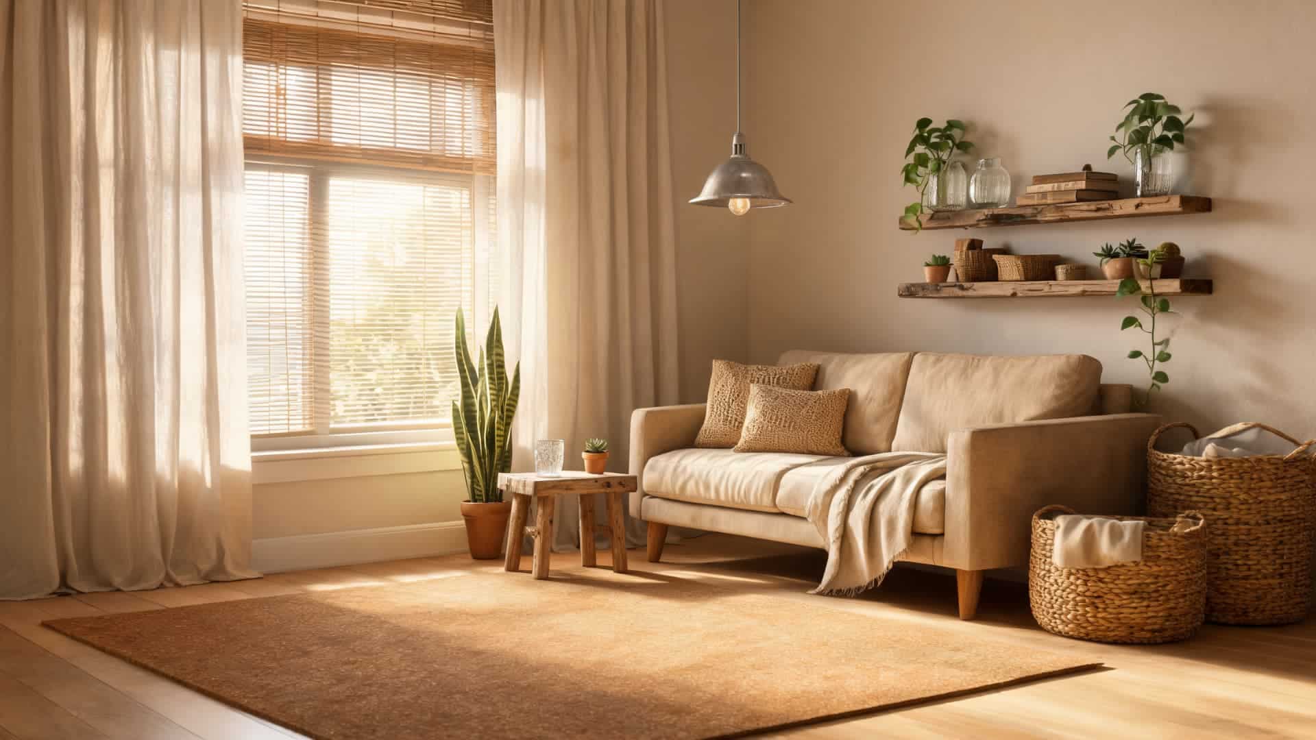
Most rooms don’t need a full renovation to become more sustainable. They need better decisions about what stays, what gets replaced, and what gets chosen the next time something wears out. Sustainable interior design is the process applied room by room, material by material, choice by choice. It covers where materials come from, how furniture is made, how much energy a space uses, and what happens to an item when it’s no longer needed. Done right, it produces rooms that are healthier to live in, cheaper to maintain, and less wasteful over time. Done wrong, it’s a label on a product that doesn’t hold up past the second year. This guide covers the materials that actually perform, how to choose them by room, what to avoid, and how to make progress without replacing everything at once. Sustainable Interior Design at a Glance Sustainable interior design means planning indoor spaces to reduce environmental impact, support healthier air quality, minimize waste, and extend the useful life of every material and piece of furniture in the room. It looks at the full life of a space: where materials come from, how they’re made, how much energy the room uses, and what happens when something is removed or replaced. A room can look responsible and still rely on finishes that off-gas for years, furniture that can’t be repaired, or materials that were sourced without accountability. The practical value is real. Durable furniture, repairable pieces, low-energy lighting, and quality materials tend to outlast cheaper alternatives that cycle in and out every few years. That saves money over time and keeps usable items out of landfills. Pro Tip: Before buying anything new, check what can be repaired, repainted, moved to a different room, or reused first. The most sustainable choice is almost always the one already in the house. Best Materials for Sustainable Interiors The right sustainable material depends on the room it’s going into. Moisture level, foot traffic, cleaning habits, sunlight exposure, and expected lifespan all affect whether a material will actually last. A natural label doesn’t mean much if the finish is high-VOC, the adhesive is toxic, or the piece won’t survive five years of daily use. Use this table to compare common materials before choosing one for a specific room. It shows where each material performs well and why it earns a place in a more sustainable interior. Material Best Used For Why It Works FSC-certified wood Furniture, flooring, cabinetry Responsibly sourced, auditable supply chain, durable Reclaimed wood Tables, beams, shelves, wall accents Reuses existing material, no new harvesting required Bamboo Flooring, furniture, accessories Fast-growing, renewable, comparable hardness to many hardwoods Cork Flooring, wall panels, underlayment Harvested without cutting the tree, soft underfoot, sound-absorbing Recycled metal Lighting, furniture frames, hardware Durable, reusable, and requires less energy to produce than virgin metal Recycled glass Tiles, countertops, decorative accents Diverts waste from landfill, adds texture and visual depth Natural fiber textiles Rugs, curtains, upholstery, bedding Biodegradable, breathable, no synthetic off-gassing Low-VOC paint Walls, trim, ceilings Reduces volatile organic compound emissions after application Linoleum Flooring Made from linseed oil and natural materials, long-lasting, biodegradable at end of life Wool Rugs, upholstery, acoustic insulation Natural, durable, flame-resistant without chemical treatment The best choice is rarely the most popular one. It’s the one that fits the room’s conditions, holds up under daily use, and uses finishes that won’t compromise indoor air quality. Best Sustainable Materials by Room A material that performs well in a bedroom may fail quickly in a bathroom or kitchen. Before choosing anything, think about the conditions that the room creates every day: moisture, sunlight exposure, foot traffic, cleaning chemicals, and how long you need the material to last. That context determines whether a sustainable choice is actually practical. 1. Living Room Living rooms see daily use from multiple people, so the materials here need to handle wear, support comfort over years, and be repairable when something eventually gives. Start with the largest pieces first: they drive the most cost, waste, and long-term impact. Reclaimed wood works well for shelves, coffee tables, media units, and wall accents. It keeps usable material out of landfills and gives the room a character that new MDF can’t replicate. Vintage furniture with solid frames offers the same advantage, especially pieces where broken joints or worn upholstery can be fixed rather than thrown out. The types of wood for furniture matter here: oak and walnut hold up significantly better under daily use than softer species. Wool rugs hold up in high-traffic seating areas better than most synthetic options and are naturally stain-resistant when cared for properly. Recycled metal lighting is a long-lasting choice. Low-VOC paint on the walls reduces ongoing chemical exposure. Bamboo blinds add natural texture and are a renewable alternative to synthetic window treatments. Key Materials Reclaimed wood shelving and tables, vintage furniture with repairable frames, wool rugs, recycled metal lighting, low-VOC paint, bamboo blinds Priority Start with the largest furniture pieces first. They account for the most waste and the most cost over time. 2. Bedroom Bedrooms are where most people spend six to eight hours a night, so indoor air quality matters more here than in almost any other room. Avoid finishes, adhesives, or synthetic textiles that continue off-gassing after installation. The bedroom is not the place to save money on paint or mattress covers. Organic cotton bedding and linen curtains create a breathable environment without synthetic fibers that trap heat or off-gas over time. Solid wood furniture is worth the investment here: it can be refinished when it shows wear instead of being replaced. Cork flooring is soft and quiet underfoot and performs well in a low-traffic room. Understanding VOC levels in paint matters in a room where the windows may stay closed for hours. Key Materials Organic cotton bedding, linen curtains, wool rugs, solid wood furniture, cork flooring, low-VOC paint Priority Paint and bedding first. These directly and continuously affect indoor air quality. 3. Kitchen Kitchens need materials that handle heat, moisture, cleaning products, and daily use without deteriorating quickly. Replacing worn-out cabinets or counters every few years is neither sustainable nor economical. Durability comes first here. FSC-certified wood cabinets are the responsible sourcing choice for new installations. Before replacing cabinets entirely, cabinet refacing is worth considering: it keeps the existing carcasses in place and updates only the door fronts and drawer faces, cutting both waste and cost significantly. Recycled glass tile handles moisture well and brings recycled content into a heavily used area. Low-VOC finishes on cabinets matter in a room where ventilation may be limited. A minimalist kitchen layout also reduces the total surface area requiring material, which compounds the savings across every material choice. Key Materials FSC-certified wood cabinets, reclaimed wood accents, recycled glass backsplash tile, recycled metal hardware, low-VOC cabinet finishes, LED task lighting Priority Assess existing cabinets for refacing before replacing. A refaced kitchen produces a fraction of the waste of a full replacement. 4. Bathroom Water, steam, and frequent cleaning are hard on weak finishes. Every material choice in a bathroom needs to be assessed for moisture resistance before anything else. A beautiful material that degrades in humid conditions is a replacement job waiting to happen. Recycled glass tile performs well on shower walls and backsplashes. Responsibly sourced stone is durable when maintained and sealed correctly. Water-saving fixtures are among the highest-impact changes in a bathroom: low-flow showerheads and dual-flush toilets reduce daily water consumption without a noticeable change in function. Low-VOC mildew-resistant paint protects walls that stay damp. Durable metal hardware outlasts cheaper finishes in high-humidity environments. Key Materials Recycled glass tile, responsibly sourced stone, water-saving fixtures, low-VOC mildew-resistant paint, durable metal hardware, bamboo accessories Priority Water fixtures first. They reduce ongoing resource use and pay back the investment over time. 5. Home Office A home office needs furniture that supports posture and focus across long days. The desk and chair are the most important pieces to get right. A second-hand solid wood desk often outlasts a new budget alternative by a decade or more, and it costs less. That’s not a compromise: that’s a better purchase. Bamboo shelving provides renewable storage that holds books and equipment without the particleboard off-gassing common in flat-pack alternatives. Cork boards replace single-use adhesive notes and sticky strips with a reusable surface. Recycled metal lamps and LED task lighting reduce energy use in a room that may be lit for eight or more hours a day. An ergonomic chair with replaceable parts extends the product’s useful life significantly. Key Materials Second-hand solid wood desk, bamboo shelving, cork board, recycled metal lamp, LED task lighting, repairable ergonomic chair Priority Desk and chair first. They affect both daily function and long-term cost more than any other piece in the room. 6. Small Apartment Every item in a small apartment has to earn its place. The sustainable choice here isn’t about finding the greenest product: it’s about buying fewer things that do more. A storage bench that seats two and holds linens replaces two separate pieces. A foldable dining table reclaims floor space for six hours a day. That’s the design principle that matters most in a compact layout. Second-hand storage pieces extend the useful life of furniture that would otherwise sit in a landfill. Natural fiber rugs add warmth without overwhelming a small floor plan. Modular shelving adapts as storage needs change, which reduces the need to buy new furniture when the room’s function shifts. Thermal curtains regulate indoor temperature and cut heating and cooling costs in apartments with older windows. Key Materials Multifunctional furniture, second-hand storage pieces, natural fiber rugs, LED lighting, thermal curtains, modular shelving Priority Multifunctional pieces first. They reduce the total number of items needed, which is the most direct path to a less wasteful room. How to Choose the Right Sustainable Material A product can carry every eco-friendly claim on the packaging and still be the wrong choice for the room. Before buying any material, run through these four checks first. What to Check Why It Matters What to Look For Room conditions Bathrooms and kitchens need moisture-safe materials. Bedrooms need breathable textiles and low-emission finishes. Getting this wrong produces early failures. Assess moisture, sunlight, foot traffic, cleaning routines, and whether children or pets are using the space before finalizing any choice. Full life cycle A reused or repairable material usually outperforms a new item that needs replacing in three years. Ask where it came from, how it was made, how long it’s expected to last, and what happens when it’s removed. Finish and adhesive Natural base materials can still use toxic adhesives, sealers, stains, or coatings that undermine the environmental case. Check finishes on wood furniture, bamboo flooring, cork tiles, cabinetry, upholstery, and rugs before purchasing. Maintenance requirements A material that fails early because it’s hard to clean or care for is not a sustainable choice regardless of its sourcing. Stone may need periodic sealing. Cork needs moisture protection in wet areas. Wool needs correct cleaning products. Solid wood may need refinishing over time. Know the maintenance schedule before buying. A good material fits daily life in that specific room, not just a certification label. The right choice is one that suits the conditions, lasts well under actual use, and can be maintained without ongoing stress or cost. Sustainable Interior Design Practices That Matter Most Sustainable interior design is not only about buying eco-friendly products. It often starts with buying less, using items longer, and choosing better when something needs replacing. Reuse First: Repair, repaint, refinish, or reupholster what is already there before buying new. Buy Second-Hand: Look for solid wood tables, sturdy chairs, lamps, mirrors, shelving, and storage pieces. Check Condition: Avoid items with mold, water damage, broken frames, or strong chemical odors. Choose Quality: Pick durable, repairable pieces instead of cheap items that need replacing quickly. Try The 50/50 Method: Mix second-hand or upcycled pieces with new items to reduce waste. Source Locally: Use nearby woodworkers, upholstery shops, salvage stores, and repair services when possible. Plan for Flexibility: Choose furniture that can work in more than one room as needs change. What To Avoid In Sustainable Interior Design A lower-waste room is not only about adding better materials. It also means avoiding choices that break quickly, affect indoor air, or create more waste later. Avoid fast furniture that breaks quickly and has limited repair value. Do not replace everything at once if existing pieces can be repaired, refaced, donated, or reused. Choose low-VOC paints, stains, sealers, and adhesives to support better indoor air. Avoid non-certified wood with unclear sourcing. Do not trust green claims without material details, certifications, or brand transparency. Check the finish, adhesive, and coating, not just the base material. Pick materials based on moisture, traffic, sunlight, pets, children, and cleaning needs. Avoid hard-to-recycle mixed materials unless the product is durable enough to last. Skip trend-only purchases that may be replaced quickly. Think about repair, resale, donation, recycling, and disposal before buying. Frequently Asked Questions What makes a home truly eco-friendly inside? A truly eco-friendly home reduces waste, uses durable materials, and avoids harmful emissions. It focuses on long-lasting furniture, safe finishes, and efficient energy use. The goal is not just appearance but how responsibly each item is sourced, used, and eventually replaced or reused over time. Can sustainable design still look modern? Yes, sustainable design can look very modern and stylish. Clean lines, neutral tones, natural textures, and minimal layouts often come from sustainable choices. Materials like wood, stone, cork, and recycled metals blend easily into contemporary interiors without losing visual appeal or comfort. Are eco materials more expensive overall? Eco materials can cost more upfront, but they often save money long term. Durable furniture, repairable pieces, and low-maintenance finishes reduce replacement costs. Over time, fewer replacements and lower energy use make sustainable choices more economical than cheaper short-life alternatives. Do sustainable interiors need special cleaning? Not always. Most sustainable materials can be cleaned with simple, mild products. Natural fiber rugs, wood, and stone may need gentle care, but they don’t require complex routines. The key is choosing materials that match your lifestyle so maintenance stays simple and realistic. Is second-hand furniture always sustainable? Second-hand furniture is often more sustainable, but condition matters. Items should be structurally sound, safe, and free from damage or harmful finishes. When chosen carefully, reused furniture reduces waste and extends product life, making it one of the most practical eco-friendly choices. How does lighting affect sustainability indoors? Lighting impacts energy use and comfort. LED lighting reduces electricity consumption and lasts longer than traditional bulbs. Good lighting design also reduces the need for excess fixtures. Natural daylight use further improves efficiency and lowers environmental impact over time. Can small changes really improve sustainability? Yes, small changes make a big difference over time. Switching to LED bulbs, choosing low-VOC paint, or repairing furniture instead of replacing it reduces waste. Sustainable design works best when improvements are made step by step rather than all at once. What is the biggest mistake in eco design? The biggest mistake is focusing only on labels instead of long-term durability. A product may look eco-friendly but fail quickly or use harmful finishes. True sustainability depends on lifespan, repairability, and how well the material performs in real daily conditions. Summing Up Creating a more thoughtful home doesn’t require a full renovation or expensive upgrades. With sustainable interior design, I focus on choosing materials, furniture, and finishes that last longer and reduce unnecessary waste over time. From FSC-certified wood to low-VOC paint and recycled materials, each decision adds up across every room in your home. When you start thinking in terms of durability, air quality, and long-term use, your space naturally becomes healthier and more efficient. Sustainable interior design works best when you apply it step by step, starting with the spaces you use the most and building from there. Try one small change today and see how your home improves naturally.

A standard garage size is not a fixed number; it is a range that shifts based on how many vehicles you are parking, how large those vehicles are, and whether the space needs to do more than hold a car. For most homes, a single-car garage runs 12 to 16 feet wide, a double-car garage runs 20 to 24 feet wide, and a triple-car garage starts at 30 feet wide. But those are the minimum figures, and minimum sizes rarely feel comfortable once you are actually using the space daily. What most homeowners do not realize until they are already in is that garage size affects more than parking. It affects how far the budget stretches, whether a permit is required for the footprint, and what the long-term cost of getting it wrong looks like. This breakdown covers single-, double-, triple-, and four-car garages, including width, depth, door sizing, clearance, storage planning, and the decisions that tend to go wrong before the concrete is poured. Cost Note: Figures in this article are estimates based on national averages. Actual costs vary significantly by region, contractor, materials, and project scope. Always get at least three quotes before committing to any project above $1,000. Standard Garage Size at a Glance Before getting into the details of each type, here is the basic footprint comparison most homeowners use as a starting point. These are planning numbers, not final answers for every lot or household. Garage Type Minimum Size Comfortable Size Best For Single-car 12 x 20 ft 14 x 22 ft to 16 x 24 ft Compact cars, sedans, and light storage Double-car 20 x 20 ft 22 x 22 ft to 24 x 24 ft Two cars, SUVs, daily parking Triple-car 30 x 20 ft 32 x 24 ft to 36 x 24 ft Three cars or two cars with extra room Four-car 40 x 20 ft 44 x 24 ft or larger Large homes, extra vehicles, hobby use Note: minimum sizes fit vehicles, while comfortable sizes fit real life. If you park daily, carry groceries through the garage, or keep tools nearby, the larger range will usually feel better than the tight option shown. What Does Standard Garage Size Mean? A standard garage size is the common size range used for a garage based on how many vehicles it holds. That means the number is not fixed. A single-car garage, double-car garage, and triple-car garage each have a common starting size, but the right size depends on the way you use the space. A garage built only for parking can be smaller than one that also holds bikes, bins, tools, or a workbench. I always think of garage size in two layers. The first layer is the vehicle footprint. The second layer is the space around that vehicle. You need room to open doors, walk without turning sideways, and reach anything stored near the walls. This is where many garage plans go wrong. They show a car fitting inside, but they do not show a person carrying shopping bags, a child opening a door, or someone trying to reach a shelf behind the bumper. A useful garage should handle those daily moments without making you fight the room. Factors That Affect Garage Size A garage size should come from your real needs, not from a number copied from a plan. I have seen small garages work well because they were planned carefully, and larger ones feel messy because no one thought through the layout. Here are the main things to check before you settle on the final size: Number of vehicles: Start with how many vehicles need regular space. A single-car garage works for one main vehicle, while a double-car garage needs enough width for two vehicles and space between them. A triple-car garage also needs better door placement and driveway flow. Extra moving items: Count anything that takes up vehicle-like space. A mower, motorcycle, trailer, scooter, golf cart, or small utility vehicle can quietly take over a bay if you do not plan for it early. Vehicle size: A compact car may fit in a tighter garage, but a pickup truck often requires more clearance. A tall SUV may need a higher door, while a wide vehicle may need more side room. Real measurements: Do not size a garage by vehicle type alone. Measure the actual vehicle, including mirrors, roof racks, hitches, wide doors, and anything added after purchase. Storage needs: Shelves, cabinets, bikes, tools, freezers, and bins reduce usable parking space. Plan storage before choosing the final dimensions, or the garage may feel pinched even when the car technically fits. Garage layout: Side-by-side parking needs more width, while tandem parking needs more depth. A double door provides a single broad opening, while separate doors create clearer parking lanes. Attached or detached setup: Attached garages may be shaped by the home’s floor plan. Detached garages often offer more freedom, but they still require driveway access, utility planning, and local approval. Future size note: One thing I would not shrink is future room. Your garage may work today, but a larger vehicle, EV charger, teen driver, or workbench can change that fast. If your lot and budget allow it, add a little width or depth now. It is often cheaper than fixing it later. 1 (One) Car Garage Dimensions A single-car garage can be more than a basic parking space. Some homeowners only need room for one compact car, while others want space for an SUV, mower, bike, tools, or a small workbench. The right size depends on how often you use the garage and how much room you want around the vehicle. Here is a simple way to think about single-car garage sizes: 12 x 20 ft for basic parking: This is a common minimum size for a single-car garage. It works best for compact cars and small sedans when the garage is mainly used for parking. I would choose this size only when the lot is limited or storage is planned elsewhere. 14 x 22 ft to 16 x 24 ft for daily comfort: This range gives you more room to open the car door, walk near the bumper, and use the garage without feeling boxed in. If you park here every day, this size usually feels much better than the minimum. 16 x 24 ft or larger for extra use: This size works well for an SUV, pickup, motorcycle, mower, or small workbench. It is a smart choice when you want one parking bay with added flexibility, but you do not need a full double-car garage. If I were planning a single-car garage for regular use, I would avoid the tightest size unless space was the main limit. A few extra feet can make the garage feel easier every single day. 2 (Two) Car Garage Dimensions A double-car garage is where standard garage size decisions get the most expensive to reverse. The most common sizing mistake here is choosing the 20 x 20 ft minimum for two vehicles and discovering that neither driver can open their door without brushing the wall or the other car. Two parked vehicles create pressure from three directions: the two side walls and the space between the vehicles. 20 x 20 ft is the technical minimum that proves two compact vehicles fit. It is not a comfortable daily-use layout, and it leaves almost no margin for storage. If this is the starting point due to budget or lot constraints, plan storage elsewhere from day one. 22 x 22 ft to 24 x 24 ft is where most households should land. A 24 x 24 ft layout gives 576 square feet, enough for two full doors to open, a walking lane between the vehicles, and wall storage that does not intrude on parking clearance. This is the size that tends to feel right after six months of daily use. 24 x 30 ft or larger is the right choice when either vehicle is a full-size truck or large SUV, when both cars are used every day, or when the garage needs to serve as a workshop or additional storage area. The added depth absorbs longer vehicles and the storage that builds up behind them. Match the size to the actual scenario: two compact cars fit in 20 x 20 ft, two sedans fit better in 22 x 22 ft, two SUVs need 24 x 24 ft, and a truck with storage behind it typically needs 24 x 30 ft or more. On a project that involves adding a garage to an existing home, the footprint choice affects not just comfort but permit scope and foundation requirements. 3 (Three) Car Garage Dimensions A triple-car garage is not just a double-car garage with one more bay attached. It has to support more vehicle movement, wider access, and a layout that does not slow everyone down. The right size depends on whether all three vehicles are used daily or one bay is only used sometimes. Here is a simple way to think about triple-car garage sizes: 30 x 20 ft for a basic triple-car garage: This is a common minimum size. It can work when the vehicles are smaller, and the garage is mainly used for parking. I would treat this as a tight starting point, not the most comfortable choice for a busy household. 32 x 24 ft to 36 x 24 ft for daily use: This range gives three vehicles more room to sit side by side without making the space feel crowded. It is a better fit when more than one person uses the garage every day, especially during busy mornings. Wider layouts for easier access: A triple-car garage can use three side-by-side bays or a wider layout with one bay set apart. This helps when one vehicle is larger or when drivers leave at different times. Tandem layouts for occasional vehicles: A tandem bay can work when the third vehicle is not used daily. It is better for a hobby car, motorcycle, mower, or seasonal vehicle than for a car that needs quick access every morning. Three vehicles create more movement than two, more doors opening at once, more people walking around bumpers, more chances for the layout to feel undersized. When planning the foundation, it is worth knowing how the foundation type under a larger structure affects cost and long-term performance. 4 (Four) Car Garage Dimensions A four-car garage needs more thought because the footprint gets wide, deep, or both. At this size, the goal is not only to fit four vehicles. The garage also needs a layout that makes sense from the driveway, supports daily movement, and avoids wasted corners. Here is a simple way to think about four-car garage sizes: 40 x 20 ft for basic four-car parking: This is a common minimum four-car garage size. It can hold four smaller vehicles, but it may feel tight if the cars are wide, tall, or used often. I would see this as a space-saving option, not the easiest daily layout. 44 x 24 ft or larger for better comfort: This size gives full-size vehicles more room and makes it easier to move around the parked cars. It also works better when more than two vehicles are used often. Side-by-side layouts for daily drivers: Four side-by-side bays are easier when every vehicle needs regular access. This layout takes more width, but it keeps cars from blocking each other. Tandem layouts for less-used vehicles: A tandem four-car layout can save width by placing two vehicles behind two others. It works best when the back vehicles are not used every day. Mixed layouts for larger properties: Some four-car garages use two daily bays and two secondary bays. This setup works well when the garage holds a mix of daily drivers, hobby vehicles, and occasional-use vehicles. At this scale, access matters as much as square footage. A four-car garage with a poor driveway angle or awkward bay order will feel frustrating at 44 feet wide just as it would at 40 feet. Plan the traffic flow before finalizing the dimensions. If the garage will include a coated or sealed floor, it helps to understand what epoxy flooring costs at this footprint before the project budget is set. How to Measure Your Vehicle for Garage Fit Before you settle on a garage size, measure the vehicle you actually drive. Do not rely only on labels like SUV, sedan, or pickup. Two vehicles in the same category can need different space once mirrors, roof racks, hitches, and door swings are included: heres how to measure it: What to Measure How to Check It Why It Matters Full length Measure from the front bumper to the farthest rear point, including a hitch or spare tire. Helps you choose enough garage depth. True width Measure with mirrors included, not just the body width. Helps avoid tight side spacing, especially in double-car garages. Full height Include roof rails, cargo boxes, racks, or lifted suspension. Helps confirm the vehicle can clear the door and overhead space. Door swing Open the driver’s door the way you normally would and note the space needed. Shows whether you can step out comfortably. Floor outline Mark the vehicle and walking area with tape, chalk, or cardboard. Gives you a real feel for the layout before finalizing dimensions. A garage should be sized around your largest vehicle, not your smallest one. Once the biggest vehicle fits with room to move, the rest of the layout becomes much easier to plan. Garage Width, Depth, and Height: What Each Measurement Controls Garage dimensions are written as width by depth, but height is the third variable most buyers overlook until a taller vehicle or overhead storage need appears. Here is what each measurement actually controls in daily use. Width controls side-by-side parking: In a double- or triple-car garage, width is the most critical dimension. It determines whether two cars can sit side by side without door contact, and whether the space between vehicles allows a person to walk comfortably rather than squeeze through. Depth controls longer vehicles and rear storage: A 20-foot depth is common in basic garage plans, but longer trucks and SUVs, combined with any rear-wall storage, often require 22 to 24 feet. Standard door widths follow a similar logic, the opening size has to match the vehicle it is serving. The same principle applies when looking at door widths throughout the home, where clearance requirements drive the final spec. Height controls clearance for taller vehicles and overhead storage: Most garage ceilings run 8 to 10 feet, but the door opening is often lower than the ceiling. Check both. A van, lifted truck, or roof-box vehicle needs confirmed clearance at the door frame, not just the room height. Shape matters as much as total square footage: A garage that is poorly proportioned, very wide but too shallow, or tall but narrow, will feel awkward regardless of the total square footage. Proportional dimensions that match actual vehicle and storage needs outperform raw size on paper. What Garage Door Size Do You Need? Garage doors can affect how easy the garage feels to use. A garage may have enough depth and width, but the wrong door size can still make parking feel tight. Use this table as a quick guide: Door Option Common Size Best For Key Note Single garage door 8 to 10 ft wide, 7 to 8 ft tall Single-car garages Wider is better for SUVs and wide mirrors. Double garage door 16 ft wide, 7 to 8 ft tall Double-car garages Gives one wide entry for two vehicles. Oversized double door 18 ft wide, 7 to 8 ft tall SUVs and trucks Adds an easier entry room. Two single doors 8 to 10 ft wide each Separate parking bays The center post can feel tight. Choose the door around your actual vehicle, not only the garage size. If you drive a wider SUV or truck, I would give the opening more room. How Much Clearance Should a Garage Have? Clearance is the space that makes a garage usable after the vehicle is parked. I think of it as the room that helps you open doors, walk around the car, and move from the garage into the house without feeling boxed in. Side clearance matters first because doors need space to open without hitting a wall, shelf, or another vehicle. In a double-car garage, the space between the two cars is just as important as the space near the outer walls. Front and rear clearance also matter because you need room to walk around the bumper and close the garage door safely. If your vehicle is long, this space becomes even more important. I also plan the walking path before adding storage. If you can carry groceries, tools, or laundry through the garage without turning sideways, the layout is doing its job. Storage and Extra Use Planning Storage should not be treated as leftover space. Most garages collect items over time, and those items can slowly take over parking areas. A good plan gives storage its own place before the garage starts feeling crowded. Here are the main storage and extra-use zones to plan early: Wall storage for narrow items: Hooks, slim racks, and shallow shelves work well for keeping tools, bikes, or small gear off the floor. Deep cabinets need more caution because they can reduce side clearance and block car doors. Back-wall storage for bulky items: Freezers, bins, toolboxes, and cabinets usually require extra depth behind the parked vehicle. If you want this kind of storage, a deeper garage often works better than a basic-size layout. Overhead storage for seasonal items: Ceiling racks can help with holiday boxes, camping gear, or items you do not use often. Just make sure they do not interfere with the garage door track, vehicle height, or overhead lighting. Workbench space for projects: A workbench needs a planned zone, not whatever space remains after parking. If you use tools often, place the bench where it does not block car doors or the walking path. Gym or hobby space for regular use: Weights, bikes, hobby tools, or craft supplies need clear floor space. If the garage will support these uses, add extra width or depth early instead of squeezing them in later. My advice is to plan the garage as if storage needs will grow over time, because they usually do. If every wall is already tight on day one, the space will feel crowded much sooner than you expect. Attached vs. Detached Garage: How Location Affects Size Options Type How It Constrains Size Best For What to Check First Attached garage Limited by the home’s floor plan and entry point placement Direct indoor access, minimal walking distance in weather Fire separation rules, door placement, setback requirements, permits Detached garage More freedom in width, depth, and footprint placement Flexible layouts, workshop or hobby use, separate access Driveway access, utility connections, distance from house, local zoning approval An attached garage is shaped by what the house allows. A detached garage gives more freedom, but it introduces its own planning requirements, utilities, driveway length, and zoning setbacks, which can each narrow what is realistically buildable. The timeline for a full construction project involving a new garage structure also ties directly into broader scheduling realities, which is worth understanding before committing to a start date. Knowing how long home construction typically takes helps set realistic expectations around permit approvals and framing schedules. How to Choose the Right Garage Size Once you know the common garage dimensions, choose the size by matching the garage to your daily routine. Start with the garage type you need, such as single-car, double-car, triple-car, or four-car, then check whether the vehicles will be used every day or stored only sometimes. A daily-use garage should feel easy to enter, park in, and leave without constant adjusting. Next, consider the largest vehicle that will use the space, because that vehicle will set the actual limit for the garage. After that, look at how the garage connects to the driveway, house entry, and lot shape. Before you commit, check local rules, permits, setbacks, and height limits. A good garage size should work on paper and feel simple in real life. Common Garage Size Mistakes to Avoid Most garage mistakes happen when the plan only proves that the car can fit. It does not always show how the space will feel when you open doors, walk through with bags, add storage, or use the garage every day. Watch out for these common mistakes before you choose the final size: Choosing only the minimum size: A minimum garage may save space and money, but it can feel tight if you use it daily. When the lot and budget allow it, moving one step above the minimum usually makes the garage easier to live with. Forgetting door swing: A parked car is not the full picture. You need space to open doors, load bags, help kids out, or reach items beside the vehicle. Always think beyond the parked footprint. Adding storage after the layout is set: Shelves, bins, and cabinets can quickly take away parking space. Plan storage while choosing dimensions so the garage does not become too tight later. Ignoring how the garage connects to the house: A garage that looks fine inside can still feel awkward if the entry path, driveway angle, or walking route is poorly planned. Skipping local rule checks: Permits, setbacks, height limits, drainage, electrical work, and attached garage safety rules can affect the final plan. Check these early so you do not have to fix problems later. I always treat the garage like a working room, not just a car box. If the space supports parking, movement, storage, and access, it will feel better long after the plan is built. Frequently Asked Questions What is the standard size of a 2-car garage? The recognized standard for a two-car garage is 20 x 20 ft at minimum, with 24 x 24 ft being the more comfortable everyday size for two full-size vehicles. A 24 x 24 ft layout gives 576 square feet and enough side clearance to open both car doors without contact. For trucks or SUVs, 24 x 30 ft is a better fit. Is a 20×20 garage big enough for 2 cars? Two compact cars can fit in a 20 x 20 ft garage, but it will feel tight. Door swing is restricted on the outer walls, and the gap between parked vehicles gives limited walking clearance. It works as a minimum; it does not work well as a daily-use layout. Most households find 22 x 22 ft or 24 x 24 ft noticeably easier. What is the minimum single-car garage size? The minimum single-car garage size is 12 x 20 ft, which fits one compact car or small sedan with minimal clearance. It does not allow for meaningful storage alongside the vehicle. For daily use with an SUV or regular storage needs, 14 x 22 ft or 16 x 24 ft is the practical range. Does garage size affect home value? Yes. A garage that is functionally undersized, one that cannot fit the vehicles a buyer owns, reduces perceived value even if the square footage on paper appears adequate. Buyers discount garages that require tight maneuvering or offer no storage capacity. Comfortable standard garage dimensions tend to hold value better than minimum-size builds. What size garage do I need for a full-size pickup truck? A full-size pickup typically runs 19 to 22 feet in length and up to 80 inches wide with mirrors. For a single-truck garage, 14 x 24 ft is the practical minimum. For a double garage with a truck as one vehicle, 24 x 24 ft is the minimum, and 24 x 30 ft is more realistic for comfortable daily use with rear storage. How wide should a 3-car garage be? A three-car garage should be at least 30 feet wide, with 32 to 36 feet being the functional range for daily-use vehicles. Narrower layouts cause crowding in the middle bay, where door swing is most constrained. If the third vehicle is a seasonal or occasional-use vehicle, a tandem bay layout can reduce the required width. What is a tandem garage? A tandem garage parks one vehicle directly behind another instead of side by side. It reduces the width footprint but limits access to the rear vehicle. It works well when the rear bay holds a seasonal car, motorcycle, or stored vehicle, not a daily driver that needs to leave and return independently. Wrapping Up A good garage should feel easy the moment you pull in, not like a daily puzzle. The right standard garage size gives you space for the vehicle, the door swing, the walking path, and the things you reach for often. I always tell homeowners to size the garage around the largest vehicle and the busiest day, not the cleanest floor plan. If you are comparing 2-car garage dimensions, avoid choosing the bare minimum unless space or budget makes that necessary. A few extra feet can change how the whole area works. Measure your vehicle, mark storage zones with tape, check the door opening, and use this guide before you commit to a final garage plan today with real confidence. Read our other blogs for more such informations.