


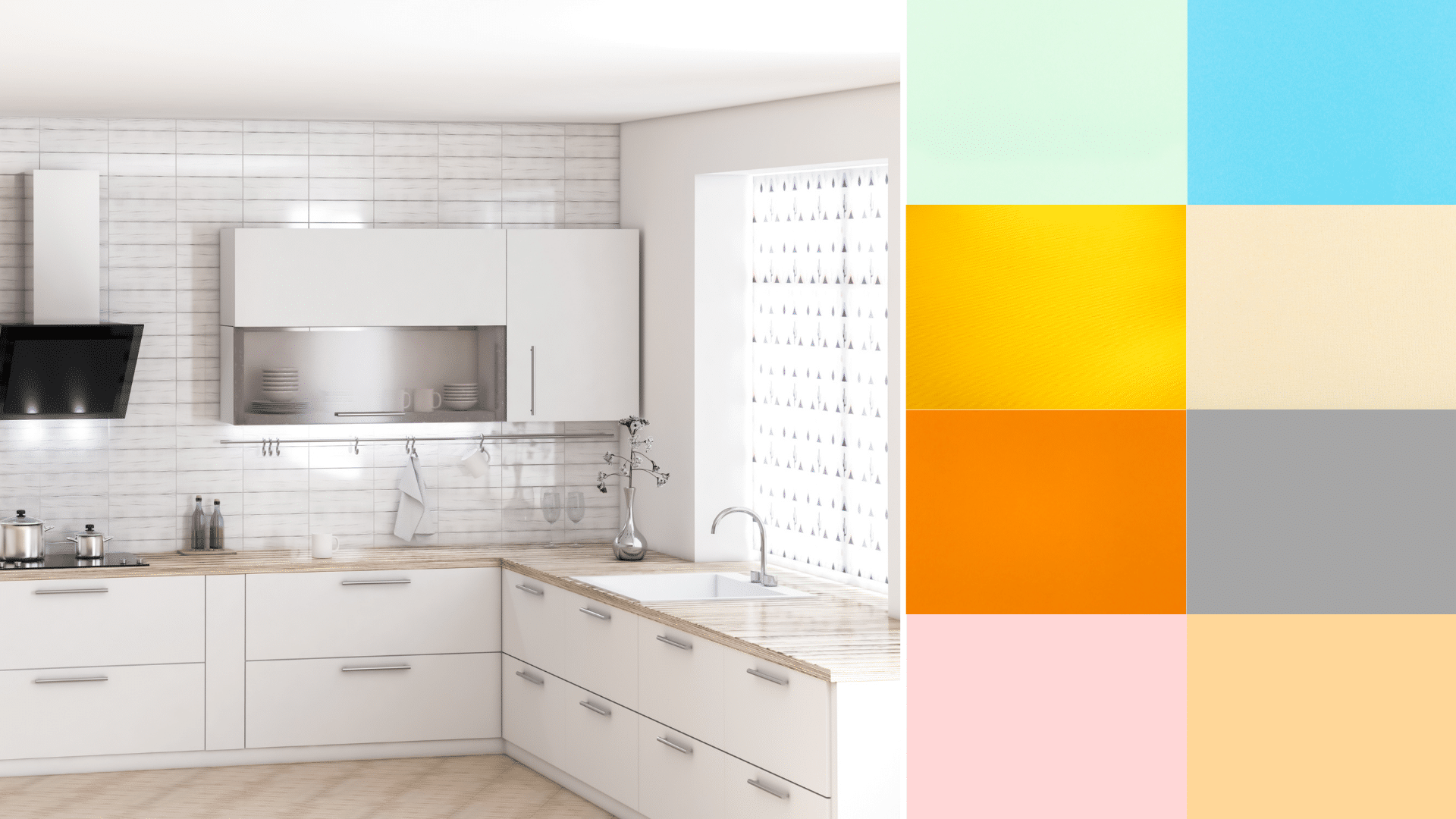
I used to think choosing a kitchen paint color was simple, but once you pair anything with white cabinets, the details start to matter. You notice the light, the shadows, the small shifts in tone that change the whole room. If you’re sorting through kitchen paint colors for white cabinets, you might feel stuck between warm shades, cool shades, and colors that seem to change every time you look at them. I’ve been there too, and I know how important it is to look at what truly fits your space. This guide walks you through steady options, clear steps, and real examples so you can make a choice that feels right. Considerations Before Choosing a Kitchen Paint Color Picking a color for your kitchen walls or cabinets works best when you slow down and look at a few key details first. Start by checking the shade of your cabinets. Some whites lean warm, while others look cool or bright, and this will affect how any wall color appears beside them. Then look at the light in your kitchen during the day and at night. Sun, shadows, and bulbs can shift a color more than most people expect. Think about the look you want. Soft and calm? Bold and dark? Light and open? Once you know these basics, it becomes much easier to choose a color that feels right in your space. Kitchen Paint Colors with White Cabinets These shades give you steady options when comparing white kitchen paint colors for rooms with bright or warm cabinets. Soft Neutral Kitchen Paint Colors These shades stay steady in most rooms and give you an easy, low-stress match with almost any white cabinet finish. 1. Sherwin-Williams Accessible Beige This shade works well when you want warmth without a heavy look. It sits between beige and gray, so it helps soften bright white cabinets while still keeping the room light. It works well in both sunny and low-light kitchens because it stays steady through the day. It also pairs nicely with stainless steel, wood floors, and warm counters. Accessible Beige is a safe pick if you want a gentle touch that never competes with other features. 2. Sherwin-Williams Repose Gray Repose Gray sits in the middle of warm and cool, giving steady balance around white cabinets. It helps calm strong whites without making the room feel dark. It works well in kitchens with steady daylight but also holds up under soft evening light. Many people like it because it fits modern and older homes without feeling heavy. If your cabinets look bright or sharp, this shade helps tone them down in a simple, clean way. 3. Sherwin-Williams Agreeable Gray Agreeable Gray is a soft mix of gray and beige that works well beside warm or cool white cabinets. It keeps the room feeling open while adding enough color to avoid a flat look. This shade performs well in many lighting setups, which makes it a steady option if your kitchen has both bright areas and shadowed corners. The color pairs well with stone counters, wood shelves, and simple hardware. It’s a strong pick if you want a calm space without strong undertones. 4. Benjamin Moore Edgecomb Gray Edgecomb Gray leans warm and gentle, making it a great match for white cabinets that look bright or sharp. It adds a soft backdrop that keeps the room from feeling plain. This shade works well in kitchens with warm floors, stone counters, or natural wood accents. It stays steady through most lighting changes, which makes it easy to trust in busy homes. If your space needs a light touch that still brings warmth, this color fits well. 5. Benjamin Moore Classic Gray Classic Gray is a pale gray with understated warmth, making it ideal for kitchens where you want a quiet, steady feel beside white cabinets. It does not compete with other colors in the room, which helps your cabinets stand out without looking harsh. This shade works well with natural light because it reflects enough brightness to keep the space open. It also pairs well with stainless steel and light counters. Choose this color if you want a soft, clean backdrop that stays calm all day. Warm and Cozy Kitchen Paint Colors These shades help soften bright cabinets and bring calm warmth into the room without making the walls feel heavy or dark. 6. Sherwin-Williams Alabaster Alabaster gives you a warm white that feels steady around bright cabinets. It adds a soft layer that reduces glare and makes strong whites feel calmer. Many kitchens benefit from its gentle tone because it sits between bright white and beige. It works well with wood floors, brass hardware, and warm counters. Alabaster also holds steady in shadowed areas, which helps the room look even throughout the day. Choose it when you want warmth without any strong color. 7. Sherwin-Williams Shoji White Shoji White brings a mix of warm beige and soft gray, making it a useful choice for bright white cabinets that feel too sharp. It adds gentle warmth while keeping the room light and open. This shade works well with both warm and cool counters, giving you flexibility during updates. Shoji White also looks steady under different lighting, so it’s helpful in kitchens with shadowed corners. Use this color if you want a warm look without strong yellow notes. 8. Benjamin Moore White Dove White Dove is a warm white that softens crisp cabinets and adds a smooth, steady backdrop. It offers warmth without feeling heavy, making it ideal for kitchens that need a calm touch. The shade works well with stone counters, wood accents, and soft lighting. It also handles bright sun without turning harsh. Many homeowners pick it because it gives the room a gentle glow while keeping the layout light. Choose this color when your cabinets feel too bright and need balance. 9. Benjamin Moore Swiss Coffee Swiss Coffee brings warm depth without overpowering white cabinets. It gives the room a soft, steady look while reducing the sharp edges of bright whites. This shade works especially well with warm floors, beige counters, and low-light kitchens. It stays consistent during the day, which helps the room feel even. Swiss Coffee also pairs nicely with brushed metal hardware and wood shelves. Use this color if you want your kitchen to feel warm, smooth, and grounded. Soft Color Kitchen Paints with White Cabinets These shades add gentle color while staying light enough to match bright cabinets in small or large kitchens. 10. Sherwin-Williams Sea Salt Sea Salt offers a soft mix of green and gray that shifts gently with the light. It pairs well with bright cabinets because it adds color without feeling bold. This shade works in sunny kitchens, shadowed areas, and open layouts. It matches well with brushed metal, natural wood, and stone counters. Sea Salt brings a calm feel to the space, giving you a hint of color that never feels strong. Choose this shade if you want a light color with a steady look. 11. Sherwin-Williams Evergreen Fog Evergreen Fog is a muted green with gray notes that works well beside crisp white cabinets. It adds depth without overwhelming the room. This shade performs well in bright and low-light areas, holding a steady tone throughout the day. It pairs with wood accents, black hardware, and warm counters. Evergreen Fog is a good fit for kitchens needing a grounded wall color that still feels light enough for everyday use. Choose it when you want gentle depth. 12. Benjamin Moore Palladian Blue Palladian Blue is a soft blue with a gentle green touch, making it great for bright, cabinet kitchens needing subtle color. It brings a calm feel that stays steady in many lighting setups. The shade pairs with white trim, stone counters, and natural wood elements. It works especially well in kitchens with steady daylight, keeping the room light and open. Palladian Blue offers color without sharp contrast. Choose this shade when you want a soft, airy look beside white cabinets. 13. Benjamin Moore Soft Fern Soft Fern gives you a muted green tone that fits well with white cabinets in both small and large kitchens. It adds color without pulling attention away from cabinets or counters. This shade works well with warm floors, stone surfaces, and simple hardware. It stays even with changing light, which helps the room look smooth throughout the day. Soft Fern is a great pick when you want gentle color with a natural feel that still keeps the space light. Bold Accent Kitchen Paint Colors These deeper shades work well on small areas, feature walls, or islands when you want a stronger contrast beside white cabinets. 14. Sherwin-Williams Naval Naval is a deep blue that brings strong contrast to bright cabinets without overpowering the room. It works well on islands, hood covers, and short walls. The color holds steady under most lighting, which keeps it looking rich throughout the day. Naval also pairs nicely with brushed metal, warm wood, and stone counters. This shade helps highlight key features while keeping the rest of the kitchen calm and simple. Choose it when you want a dark color that still feels controlled. 15. Benjamin Moore Hale Navy Hale Navy offers a dark blue tone that gives clear contrast beside white cabinets. It works well in kitchens with good light and can be used on islands or accent areas. The shade pairs smoothly with silver hardware, wood shelves, and white trim. It stays steady as the light changes, which makes it easy to trust in busy homes. Hale Navy adds depth without causing the kitchen to feel tight. Pick this shade when you want a strong yet steady accent. 16. Benjamin Moore Revere Pewter Revere Pewter is a warm gray that brings a deeper look without feeling harsh. It works well around white cabinets because it adds contrast while staying soft enough for daily use. The color fits many features, including warm floors, stone counters, and brushed metal hardware. Revere Pewter stays even in most lighting, which helps the kitchen look smooth from morning to evening. This shade is useful for small walls or islands where you want depth without a strong dark tone. 17. Sherwin-Williams Iron Ore Iron Ore is a very dark charcoal that gives a strong contrast next to white cabinets. It works well on islands, pantry doors, or a single short wall. The shade looks almost black but has enough softness to keep the space from feeling closed in. It pairs nicely with light counters, wood floors, and simple hardware in black or brass. Iron Ore is a smart pick when you want a bold accent that still ties in with the rest of the kitchen. How to Choose the Right Kitchen Paint Color with White Cabinets Choosing a kitchen paint color works best when you look at your cabinet shade, room light, and the level of contrast you want. Check if your cabinets lean warm, cool, or bright. Look at how sunlight and bulbs change the wall color during the day. Pick soft walls if you want a calm look with less contrast. Pick darker walls if you want a strong contrast around bright cabinets. Test small paint samples on different walls before choosing one. Match the wall color to your counters and floors so nothing clashes. Kitchen Paint Colors for White Cabinets: Quick Guide Use this chart to match wall tones with your kitchen style and countertop, so white cabinets stay balanced and simple. Kitchen Situation Good Wall Tone Why It Helps Modern white cabinet kitchen Cool gray Keeps lines clean and cuts harsh glare. Farmhouse white cabinet kitchen Warm greige Softens bright cabinets and wood tones. Coastal white cabinet kitchen Soft blue Works well with sun and light finishes. Traditional white cabinet kitchen Beige Adds steady warmth beside white cabinets. Quartz with cool veining Cool gray Matches cool stone lines and trim. Quartz with warm veining Warm neutral Balances warm pattern without feeling dark. Busy granite counters Soft neutral Calms strong movement in the stone. Butcher block counters Warm neutral Fits the wood and keeps cabinets clear. Marble counters Soft gray Echoes light gray lines in the stone. Use these groups as a starting point when testing white kitchen paint colors from your sample cards. Common Mistakes to Avoid Many problems come from quick choices, missed undertones, and skipping sample tests, which can make white cabinets look uneven or sharp. Picking a wall color without checking cabinet undertones first. Ignoring how sunlight and bulbs change the paint during the day. Choosing a white that makes cabinets look yellow or washed out. Skipping large paint samples on more than one wall. Forgetting to compare the wall color with the floors and counters. Using one sheen for walls, trim, and cabinets when each needs a different finish. Concluison By now, you should have a clearer sense of how small paint choices can shape the overall look of your kitchen, especially when you’re working with white cabinets. The key steps stay simple. Check your cabinet tone. Pay attention to your natural and artificial light. Pick colors that support the space instead of competing with it. When you follow that process, choosing the right shade feels much less stressful. If you’re still deciding on kitchen paint colors with white cabinets, test a few samples and watch them from morning to night. The right one will stand out once you see it in real light. Want more help narrowing it down? Browse other kitchen color guides and cabinet paint ideas on the website to find combinations that fit your style and space.
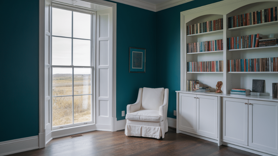
Choosing wall and trim color feels deceptively simple until the paint dries and something feels off. Maybe that charming dark trim color scheme looked moody in the catalog, but now it swallows the room whole. Those white walls with white trim seem foolproof, but the space feels flat. The issue isn’t the colors but the invisible rules about undertones, sheen, lighting, and flow that most advice ignores. This isn’t about following trends or mimicking Pinterest boards. It’s about understanding why certain pairings amplify architecture while others erase it, and how to make intentional choices that transform rooms instead of just covering walls. The Quick Science of Wall and Trim Pairings Understanding wall and trim color combinations doesn’t require a design degree, just a few practical truths. Contrast acts like volume control for architecture: high contrast makes trim pop and adds dimension, while low contrast (think white walls with white trim) creates seamless, airy flow. Here’s the trick most overlook: finish creates contrast, too. Semi-gloss trim paired with matte walls distinguishes boundaries even when using identical colors. Lighting changes everything. Cool whites can feel sterile under evening bulbs, warm whites might read yellow in bright daylight. Room size matters: generous spaces handle bold contrasts beautifully, while compact or dimly lit rooms benefit from monochromatic schemes that expand visual space. Bold Dark Trim Color Schemes Dark trim creates strong architectural definition and instantly changes a room’s personality. These pairings suit readers who want their trim to stand out, add depth, and frame spaces beautifully. 1. Soft Warm White Walls with True Black Trim A classic high-contrast pairing that feels crisp and architectural. Warm white softens harshness while black frames the room and highlights windows and doorways beautifully. Best for: Medium or large rooms, vintage or modern homes Why it works: Warm walls prevent black trim from feeling too stark Pair with: Natural wood, matte black hardware, textured fabrics 2. Creamy Beige Walls and Deep Espresso Trim A rich, inviting combination that replaces stark black with warm depth. Espresso trim adds sophistication and pairs well with warm flooring and cozy decor styles. Best for: Traditional homes, warm-light rooms Why it works: Espresso echoes natural wood tones for cohesive warmth Pair with: Tan rugs, brass accents, warm woods 3. Light Greige Walls Paired with Charcoal Trim A softer dark-trim alternative that feels grown-up and calm. Charcoal defines architecture without overwhelming the room, creating a modern, understated sense of contrast. Best for: Minimalist or transitional interiors Why it works: Greige and charcoal share neutral undertones Pair with: Black fixtures, gray textiles, neutral art 4. Pale Putty Walls with Deep Olive Trim Earthy yet graceful, this pairing gives quiet drama. Deep olive adds character without harshness, working well in moody spaces or rooms with natural textures and warm materials. Best for: Studies, reading rooms, design-forward homes Why it works: Olive adds depth while remaining grounded and natural Pair with: Leather, linen, natural stone 5. Misty Blue-Gray Walls paired with Navy Trim A layered cool-toned combination that feels serene and coastal. Navy trim deepens the palette without feeling heavy, especially in well-lit rooms or spaces with warm flooring. Best for: Bedrooms or offices needing calm Why it works: Cool colors stack harmoniously and feel intentional Pair with: Light woods, silver metals, soft blues Clean White on White Pairings White on white can look effortless or flat, depending on undertones, lighting, and sheen. These combinations keep spaces bright, cohesive, and layered instead of sterile or washed out. 6. Pure Bright White Walls and Same White Trim This seamless pairing works when you rely on sheen differences instead of color contrast. Matte walls and semi-gloss trim create subtle depth within a clean, unified palette. Best for: Small rooms, low-light spaces, minimalist homes Why it works: Different finishes add dimension without changing color Pair with: Light woods, woven textures, soft neutral fabrics 7. Warm White Walls with Crisp Neutral White Trim Warm walls soften the space while neutral white trim adds clarity. This subtle contrast helps large rooms feel structured and prevents an all-white palette from looking overly creamy. Best for: Open floor plans, warm climates Why it works: Balances warm and neutral undertones for stability Pair with: Oak floors, natural fabrics, black accents 8. Cool White Walls with Soft Cream Trim A gentle warm-cool mix that creates lift and contrast. Cream trim takes the edge off cool whites in bright rooms, keeping the palette inviting instead of sharp or blue. Best for: Sunny rooms, contemporary homes Why it works: Cream trim warms up the reflective quality of cool walls Pair with: Beige textiles, warm woods, brass details 9. Off-White Walls with Gray-White Trim Subtle but intentional, this pairing adds a quiet definition to otherwise soft walls. Gray-white trim keeps the space feeling structured without introducing harsh lines or stark contrast. Best for: Transitional interiors, mixed wood tones Why it works: Gray undertones add refinement without heaviness Pair with: Soft grays, muted blues, natural oak 10. Soft Ivory Walls paired with Bone-White Trim A warm, comforting pairing that still feels polished. Ivory creates a welcoming backdrop, while bone-white trim offers a gentle highlight perfect for traditional or mid-century inspired rooms. Best for: Bedrooms, living rooms, warm lighting Why it works: Warm whites complement each other without clashing Pair with: Walnut furniture, warm metal finishes, textured fabrics Soft Contrast and Low Contrast Combinations Soft contrast is ideal for homes that need harmony instead of strong graphic lines. These combinations use gentle shifts in tone to create depth without visual tension or sharp edges. 11. Greige Walls with Soft Beige Trim A calm and cohesive pairing that blends warm and cool undertones. Soft beige trim warms up greige walls, creating a neutral envelope that feels balanced and comfortable throughout the day. Best for: Versatile family spaces, rentals, mixed lighting Why it works: Undertones align without matching too closely Pair with: Beige rugs, warm woods, soft gray accents 12. Pale Sage Walls with Creamy Off-White Trim This biophilic-inspired pairing feels peaceful without leaning trendy. The soft cream trim gently outlines sage walls, offering just enough definition to keep the room feeling light and natural. Best for: Bedrooms, kitchens, calm spaces Why it works: Cream amplifies sage’s warmth and earthiness Pair with: Woven baskets, oak decor, matte black accents 13. Dusty Rose Walls Paired with Mushroom Taupe Trim A warm and modern mix that avoids overly sweet tones. Taupe trim grounds dusty rose, creating a mature and cozy palette perfect for intimate rooms and personal spaces. Best for: Bedrooms, nurseries, reading corners Why it works: Muted taupe balances rosy warmth Pair with: Warm woods, gold accents, neutral textiles 14. Light French Gray Walls Paired with Warm Gray Trim A monochrome palette that feels refined and airy. Warm gray trim adds depth without breaking the color flow, ideal for minimalist homes that still want quiet style. Best for: Modern apartments, clean-lined interiors Why it works: Warm gray keeps cool gray from feeling cold Pair with: Stone textures, black metals, soft white fabrics 15. Pale Sand Walls with Light Latte Trim A gentle and welcoming combination reminiscent of coastal neutrals. Light latte trim enhances the warmth of pale sand without overpowering it, creating a laid-back but polished aesthetic. Best for: Living rooms, dining rooms, relaxed interiors Why it works: Natural warm tones complement each other effortlessly Pair with: Linen upholstery, rattan details, warm metals Colorful Wall and Trim Pairings Color-forward rooms work best when the trim balances saturation rather than competes with it. These combinations offer depth, personality, and livability while avoiding the harsh mismatches common with bright colors. 16. Muted Terracotta Walls with Cream Trim A warm, inviting palette that feels grounded and timeless. Cream trim lightens terracotta’s richness, preventing heaviness and creating a softly glowing space perfect for cozy or Mediterranean-inspired interiors. Best for: Living rooms, dining rooms, warm-light spaces Why it works: Cream softens terracotta without dulling its warmth Pair with: Textured rugs, brass accents, warm woods 17. Dusty Blue Walls Paired with Soft Gray Trim A serene, airy combination that offers subtle contrast without sharp edges. Soft gray trim adds a calming frame, making dusty blue feel sophisticated rather than juvenile or overly coastal. Best for: Bedrooms, offices, calm environments Why it works: Gray trim echoes blue undertones for harmony Pair with: Light wood, silver metals, white bedding 18. Moody Teal Walls and Bright White Trim A bold, artsy pairing for dramatic spaces. Bright white trim refreshes the depth of teal, creating crisp lines that elevate architectural details without overwhelming the room’s visual balance. Best for: Feature walls, dining rooms, high-ceiling spaces Why it works: White creates clarity against deep saturated teal Pair with: Brass lighting, deep woods, patterned textiles 19. Soft Blush Walls with Clean White Trim A gentle, upbeat pairing that feels chic and modern. Clean white trim prevents blush walls from leaning too pink, making the palette fresh, neutral-leaning, and easy to style. Best for: Bedrooms, nurseries, home offices Why it works: White cools blush just enough for balance Pair with: Light woods, gold accents, soft fabrics 20. Muted Mustard Walls Paired with Warm White Trim A heritage-inspired combination that feels rich yet modern. Warm white trim steadies mustard’s boldness, adding lift and preventing the walls from appearing too vintage or overpowering in smaller rooms. Best for: Accent rooms, eclectic homes, sunny spaces Why it works: Warm white harmonizes with mustard’s golden tones Pair with: Dark woods, black accents, warm textiles 21. Forest Green Walls and Greige Trim A deep, luxurious palette ideal for moody spaces. Greige trim grounds forest green’s intensity and adds an earthy softness that feels upscale and layered rather than monochromatic or heavy. Best for: Libraries, dens, dramatic dining rooms Why it works: Greige adds gentle warmth without competing with green Pair with: Leather accents, dark woods, brass hardware 22. Lavender Gray Walls Paired with Stone Taupe Trim A soft, elegant mix that reads mature and refined. Stone taupe trim neutralizes lavender’s coolness, creating an elevated palette suitable for serene bedrooms or romantic, soft-lit spaces. Best for: Bedrooms, boutique-style interiors Why it works: Taupe tempers lavender’s cool floral undertones Pair with: Soft whites, brushed nickel, muted florals Designer Midtone and Boutique Pairings These combinations draw from boutique hotels and designer studios, using midtone colors that feel curated rather than bold. They balance saturation with softness, creating polished, layered, high-end looking spaces. 23. Charcoal Blue Walls with Soft White Trim A dramatic yet calming palette that avoids the heaviness of navy. Soft white trim brightens charcoal blue, adding clarity without breaking the rich, moody atmosphere of the room. Best for: Bedrooms, studies, modern homes Why it works: Soft white lifts deep blue without harsh contrast Pair with: Walnut furniture, brass lighting, textured fabrics 24. Warm Clay Walls and Light Taupe Trim A grounded, earthy combination with subtle sophistication. Light taupe trim complements clay’s warmth, offering definition without stark edges and creating a soft, inviting palette suitable for modern rustic interiors. Best for: Living rooms, hallways, warm-toned homes Why it works: Taupe gently outlines clay’s warm midtone depth Pair with: Woven textiles, natural woods, matte black accents 25. Muted Plum Walls paired with Mushroom Gray Trim A rich, boutique-inspired pairing that feels intentional and elegant. Mushroom gray trim neutralizes plum’s intensity, creating a moody yet refined palette perfect for dramatic or softly lit rooms. Best for: Dining rooms, guest rooms, statement spaces Why it works: Gray undertones stabilize plum’s deep color Pair with: Velvet textures, dark woods, metallic accents Interior Paint Tips for Coordinating Walls and Trim Most color combinations fail on overlooked basics, not bold choices. Here’s what actually moves the needle in real spaces: Match undertones religiously: Warm walls need warm trim; cool walls need cool trim. Mixing them only works when intentional, not accidental. Sheen creates contrast: Matte walls with semi-gloss trim generate dimension even in identical colors. This trick makes white walls with white trim feel layered, not flat. Decide trim’s role early: Want modern simplicity? Low contrast. Crave architectural character? High contrast. Room realities matter: Small or dim spaces struggle with a dark trim color scheme. Bright, spacious rooms risk looking washed out with monochromatic pairings. Natural light dictates everything, test samples on opposite walls, and check morning versus evening. What looks crisp at noon might feel sterile at dusk. The Bottom Line The difference between forgettable paint jobs and spaces that feel intentionally designed comes down to deliberate choices, not bigger budgets. Committing to a dramatic dark trim color scheme or refining white walls with white trim through strategic sheen, every decision either amplifies or erases architectural character. Small rooms gain breathing room through thoughtful contrast. Bright spaces avoid sterility with warm undertones. The real skill isn’t picking trendy colors; it’s understanding how light, finish, and scale interact in specific spaces. Walk through the room at different times of day and trust what feels right, not what looks good on a screen.
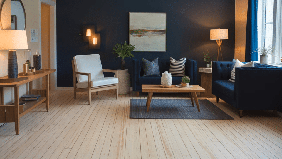
Choosing wall colors for light hardwood floors trips up even experienced decorators because light wood doesn’t behave like other flooring. It bounces light, amplifies undertones, and changes paint colors throughout the day in ways that catch people off guard. Most advice tells you what colors to pick, but skips the crucial why behind color compatibility. In this guide, I’ll explain how to decode your floor’s undertone, choose harmony or contrast before selecting paint, test colors for a good look, and avoid costly do-overs. By the end, you’ll have a simple framework and a cheat sheet that cuts through the confusion. Why Light Hardwood Makes Wall Color Choice Tricky Light hardwood floors act as massive reflectors, bouncing natural and artificial light back onto your walls. This amplification makes wall colors appear brighter and often shifts them cooler than expected. The high reflectivity also reveals undertones with ruthless clarity; a small mismatch between your floor’s warmth and your wall’s coolness becomes glaringly obvious. However, there’s good news: light hardwood is the most versatile wood tone you can work with. Its neutral foundation pairs well with an enormous range of colors, making it far more forgiving than dark or red-toned floors. This versatility sets a reassuring tone for your color selection process. The Simple Framework for Matching Wall Color With Light Hardwood Follow this two-step system to eliminate guesswork and narrow your options to colors that will actually work in your space. Step 1: Identify Your Floor’s Undertone Place a sheet of white paper on your floor in natural light. Compare the floor color to pure white. Does it lean peachy, golden, or yellow? If yes, you’re dealing with warm undertones Gray or slightly pink means cool undertones. And if you can’t figure out which way it leans, you’re dealing with neutral undertones. This single test determines which color families will harmonize with your floors. Step 2: Decide Between Blending or Contrast Blending means choosing wall colors with the same temperature as your floor, warm with warm, cool with cool. This creates a cohesive, flowing space. Contrast means pairing opposite temperatures, like cool gray walls with warm honey floors. This adds visual interest and definition. Your preference here determines your entire color direction before you ever look at a paint chip. Best Wall Colors that Pair with Light Hardwood Choosing the right white for light hardwood floors depends on undertone, brightness, and the mood you want. These whites enhance the wood’s character without washing out the space. 1. Best Whites for Light Hardwood White paint colors create bright, airy foundations that let light hardwood shine without competing for attention in any space. These shades work beautifully in living rooms, bedrooms, and open-concept areas where you want walls to recede and floors to take center stage. Choosing the right white depends on your floor’s undertones and whether you prefer warm, cozy vibes or crisp, modern aesthetics. Warm white: Adds softness and balances yellow or honey-toned floors without making them look overly golden. Soft cream: Introduces gentle warmth that complements traditional, cozy, or farmhouse styles without overwhelming light wood. Clean white: Pairs beautifully with cool or neutral light floors for a crisp, modern look; avoid if wood has strong orange tones. 2. Best Neutrals for Light Hardwood Neutral paint colors offer versatility and sophistication that adapts to any decorating style while complementing light hardwood’s natural warmth beautifully. These shades work perfectly in living rooms, bedrooms, and hallways where you want timeless elegance that won’t feel dated. The key is matching your neutral’s undertones to your flooring to create harmonious spaces that feel intentional and cohesive. Greige: A universally flattering mix of gray and beige that works with every undertone, making it the safest neutral for light wood floors. Pale taupe: Adds subtle depth without overpowering the room; avoid it if your floors lean pink, as it can amplify that undertone. Light warm beige: Creates a cozy, natural backdrop but should be avoided with heavily yellow floors to prevent a too-warm, dated feel. 3. Best Soft Color Options Soft colors introduce personality and style while maintaining the calm, airy feel that light hardwood naturally creates in any space. These gentle hues work beautifully in bedrooms, bathrooms, and living areas where you want subtle color without overwhelming bold statements. They bridge the gap between neutral safety and colorful expression giving rooms character that feels both modern and timeless. Sage green: A calming, nature-inspired shade that grounds warm light hardwood and adds freshness without overwhelming the space. Dusty blue: Soft and airy, this hue cools down warm floors and complements cool-toned wood for a serene look. Muted blue-green: A flexible, modern choice that works with neutral floors and adds a subtle wash of color without feeling bold. 4. Best Dark Accent Colors for Light Hardwood Dark accent colors create dramatic contrast that makes light hardwood floors pop while adding depth and sophistication to modern spaces effectively. These bold shades work best as accent walls in living rooms, dining rooms, or bedrooms where you want impact without darkness. Used strategically, dark colors ground airy rooms and prevent them from feeling too lightweight or lacking in visual interest and drama. Charcoal: Adds modern contrast and style, giving light hardwood floors stronger definition without making the space feel closed in. Deep green: Dramatic yet earthy, it pairs beautifully with light wood and introduces richness without overwhelming the palette when used sparingly. 5. Wild Card Shades that Surprisingly Work These unexpected colors prove that light hardwood can handle unusual choices than you might think when selected thoughtfully and carefully. They work beautifully in bedrooms, creative spaces, and powder rooms where you want unique personality without sacrificing sophistication or elegance. These shades create memorable spaces that feel fresh and modern while still complementing your flooring’s natural warmth and beauty perfectly. Soft blush: A muted, barely-there pink that warms up neutral wood tones and adds a modern, cozy feel without reading “pink.” Smoky lavender: A subdued lavender-gray that subtly offsets yellow or pink undertones in the flooring, creating an unexpectedly balanced look. How to Test Paint Colors Properly Most paint failures stem from testing in the wrong location or lighting conditions. This streamlined checklist eliminates guesswork and prevents costly repainting mistakes. Step Action What To Check 1 Paint large swatches on poster board Easy to reposition without wall commitment 2 Place directly beside the hardwood floor Undertone harmony or clash becomes obvious 3 View throughout the day Morning, afternoon, and evening shifts reveal true color 4 Test under your artificial lighting LED and warm bulbs alter appearance dramatically 5 Compare three similar options side by side Identifies which is too warm, cool, or balanced 6 Live with samples for 3+ days Initial excitement fades; true preference emerges This methodical approach reveals problems before you commit to gallons of paint, saving time and disappointment down the line. Common Mistakes to Avoid Even experienced decorators make these preventable errors when choosing wall colors for light hardwood. Recognizing these pitfalls before you start saves time and disappointment. Matching wall and floor too closely: When both surfaces are too similar in tone, the room loses dimension and feels flat. You need some differentiation to create visual interest and depth. Picking bright white without checking undertone: Pure white walls with warm honey floors create jarring contrast. Cool white with cool floors can feel sterile. Match your white’s undertone to your floor. Choosing colors under store lighting: Paint stores use bright, neutral lighting that bears no resemblance to your home. Colors that look perfect in-store often fail in natural home lighting conditions. Ignoring artificial light temperature at home: Your LED bulbs matter as much as your paint. Cool-temperature bulbs (5000K+) make warm colors look muddy. Warm bulbs (2700K) make cool colors appear dingy. Factor in your lighting. Remember that these mistakes are easy to avoid once you’re aware of them, proper testing and undertone matching solve most problems. Wrapping Up The secret to finding perfect wall colors for light hardwood floors isn’t memorizing color names or following trendy palettes; it’s understanding your specific floor and testing systematically. You now have the two-step framework to decode undertones and choose your design direction, plus a testing protocol that prevents expensive mistakes. Light hardwood’s reflective nature isn’t an obstacle when you work with it. The best part? It’s the most versatile flooring, giving you more creative freedom than you thought. Trust your testing process, compare your options thoughtfully, and remember that even professionals rely on samples before committing.
I remember standing in a paint aisle trying to figure out why some walls looked calm while others felt too shiny. If you’ve had the same moment of confusion, you’re not alone in trying to understand what makes one finish feel right. A big part of that choice comes down to knowing what eggshell paint is and how it behaves in real rooms. It can be tricky to choose a finish when each one looks similar on the shelf but acts very differently on your walls. I’ll help you feel clear and confident about the differences so you can pick the finish that fits your home. So let’s take a closer look at how each option works and where it fits. Understanding Eggshell Paint Eggshell paint is a wall finish with a soft, low shine that sits between a flat surface and a satin surface. It gives your walls a smooth, calm look without strong light reflection. When applied, the finish has a gentle glow that helps hide small marks or uneven spots, making it a common choice for everyday rooms. On the sheen scale, it falls in the middle: Flat → Matte → Eggshell → Satin → Semi-Gloss → Gloss. This helps you see how much light bounce to expect before choosing it for a room. Eggshell works well when you want a finish that looks clean, wipes easily, and keeps the surface from looking too bright or dull. Differences Among Eggshell, Satin, and Semi-Gloss Use this table to compare the three finishes quickly so you can pick the right one for your walls, trim, or busy areas. Feature Eggshell Satin Semi-Gloss Shine Level Low glow Medium shine Bright shine Durability Moderate Strong Very strong Cleanability Wipes clean Scrubs clean Scrubs clean with ease Best Walls Living and sleeping areas Kitchens and busy paths Rare for full walls Best Trim Possible but rare Good choice Ideal choice Moisture Use Dry rooms only Mild moisture Good for moisture Wall Texture Softens marks Shows more detail Shows most detail Best Use Calm wall areas High-use rooms Trim, doors, cabinets Touch-Ups Can show changes Blends better Hard to blend Eggshell works well for simple wall areas. Satin fits spots that need more cleaning. Semi-gloss is the strongest option for trim and high-use surfaces. How to Choose the Right Sheen for Your Walls Use these quick guidelines to match each finish to the room’s needs, cleaning level, and the look you want for your walls. When Eggshell Works Best Eggshell fits low- and mid-traffic rooms where you want a soft, calm surface that hides small marks. It works well in living rooms, bedrooms, and hallways because it balances gentle shine with easy wiping. If you want walls that look smooth without bright reflection, this finish gives you that effect. It handles daily touch and light cleaning, making it a steady choice for many homes. It also helps soften uneven spots on older walls. When Satin is the Better Choice Satin is the right option when a room needs stronger cleaning and steady use. It holds up better in kitchens, playrooms, and paths where hands, bags, or toys often touch the walls. The surface is firm enough to scrub without dulling, which makes upkeep quick. Satin shows more detail on the wall, so it looks best on smooth surfaces. If your home has busy areas that need a tougher finish, satin gives you that support. When Semi-Gloss Makes Sense Semi-gloss is best for trim, doors, cabinets, and rooms with moisture. Its firm surface stands up to frequent cleaning, making it a smart choice for kitchens and bathrooms. It also gives trim a clean, sharp look that holds up through years of touching, wiping, and opening. Because it reflects more light, it highlights surface details, so it works best on smoother areas. Choose semi-gloss when you want strong wear and easy, regular cleaning. Pros and Cons of Eggshell Paint This section helps you understand how eggshell performs in daily use so you can decide if it fits your walls and room needs. Pros Eggshell offers a gentle surface that works in many rooms and gives you easy upkeep without a strong shine or complicated cleaning steps. Soft, low shine Helps soften small wall marks Wipes clean with mild effort Works in living rooms, bedrooms, and halls Cons Eggshell has limits in damp rooms and may show changes when you try to fix small spots after the paint fully dries. Not suited for bathrooms or wet areas Harder to match during touch-ups Less strong than satin in busy rooms How Eggshell Looks on Different Surfaces Eggshell can be used on several areas in the home, but each surface needs the right prep, cleaning habits, and strength level. Walls Eggshell is a common pick for walls because it creates a smooth surface that works in many rooms. The low glow keeps the wall from looking flat while still hiding small marks. It fits living rooms, bedrooms, and hallways because these spaces need simple upkeep without harsh scrubbing. If you want walls that look clean and handle light daily use, eggshell gives you that balance. It also helps older walls look more even. Wood Trim Eggshell can be used on trim when you want a softer look, but it is not the strongest option. Trim takes steady contact from hands, furniture, and daily activity, so a tougher finish often works better. Satin holds up longer on trim because it handles scrubbing and minor bumps without dulling. Still, eggshell can work on trim in calm rooms where contact is low. A smooth base and careful prep improve the final result. Furniture Eggshell can be used on simple furniture projects that do not need heavy cleaning. It gives small pieces a soft surface without harsh shine, making it useful for light-use items like side tables, shelves, or decor pieces. It is not ideal for pieces that face steady touching, food spills, or frequent wiping. Many DIY users choose it when they want a simple finish that hides small marks and is easy to refresh with a new coat later. How Long Does Eggshell Paint Last Eggshell holds up well, as long as the space does not deal with heavy moisture or constant cleaning. The finish stays steady in living rooms, bedrooms, and hallways because these areas mostly need light wiping and routine care. Over time, eggshell keeps its soft glow and stays smooth as long as the wall surface is prepped well before painting. It can handle small bumps or marks, but steady scrubbing may dull the finish. Touch-ups may show slight shifts in sheen, especially on older walls, so careful blending is important. With basic upkeep and calm room conditions, eggshell stays reliable for many years and continues to give the walls a clean, easy look. Lighting and the Look of Eggshell Paint Light plays a big part in how eggshells appear on your walls, so these points help you understand what to expect in each room. Natural Light Natural light gives eggshell a soft, smooth glow that feels calm and steady throughout the day. Sunlight spreads across the surface without creating sharp reflections, which helps the wall look even from different angles. This makes eggshell a good choice for rooms with windows where you want gentle light without harsh shine. It also helps soften small marks or uneven areas that might stand out under stronger lighting. Overhead Lighting Overhead lighting makes the sheen on eggshell slightly more noticeable, especially with stronger bulbs or direct fixtures. The finish will show a mild bounce that highlights smoother areas of the wall, though it still stays far less bright than satin or semi-gloss. This effect works well in rooms where you want a clean look without a strong shine. If the ceiling lights sit close to the wall, the glow may appear a little stronger than in natural light. How to Apply Eggshell Paint To get a smooth eggshell finish, start by cleaning the wall so dust, marks, and loose material don’t affect the surface. Patch any holes, sand rough spots, and place tape around trim and edges for clean lines. Use a medium-nap roller and stir the paint well before pouring it into the tray. Roll in a steady pattern without pressing too hard, then let the first coat dry before adding the next. When the paint is set, check the wall in good light to be sure the coverage looks even and consistent. Common Mistakes to Avoid These points help you prevent issues that can affect the look, strength, and long-term performance of an eggshell finish on your walls. Using eggshells in damp rooms where moisture collects Skipping patching and sanding before painting Using low-quality rollers that leave lines Adding a second coat before the first coat dries Painting over dirty or greasy spots without cleaning Forgetting to check the wall in bright light for thin areas Using heavy pressure with the roller causes an uneven sheen Touching up large areas instead of small, controlled spots Conclusion I hope you now feel more comfortable sorting through sheen levels and choosing a finish that fits your space. Knowing how each option behaves makes the whole process easier, and it helps you avoid the guesswork that usually slows things down. The eggshell finish can be a helpful guide if you want calm walls without a bright shine. As you work through your room plans, keep the strengths of each finish in mind so you can match the right surface to the right space. If you’d like more support with home projects or material choices, I’d be glad to help. Take a moment to look through other blogs on the website for more simple, clear tips.
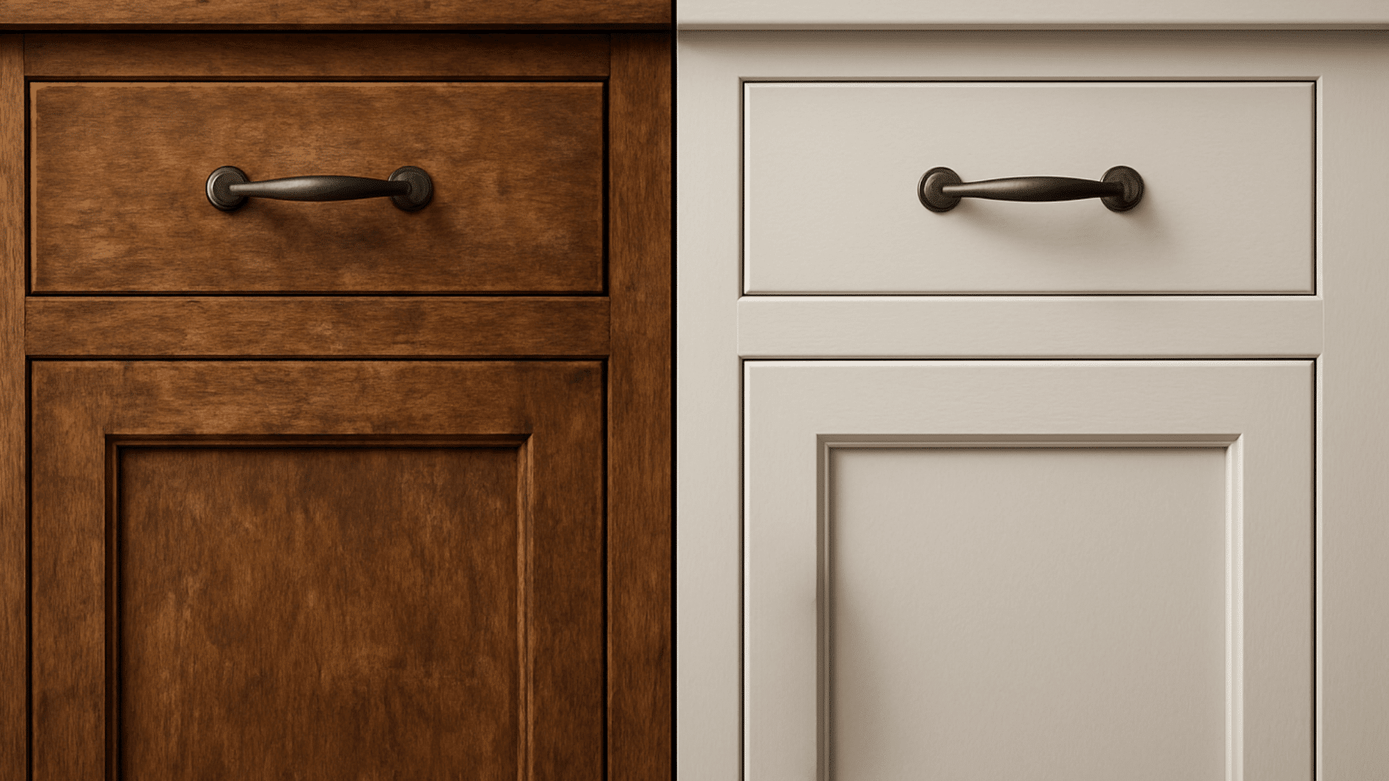
Painting over stained wood can feel scary at first, like the paint might peel right off the next day. I’ve been there. The good news is you can paint over stained wood without stripping it, and you can still get a strong, clean finish if you prep it the right way. In this blog, I’ll walk you through the steps to tell what kind of stain or finish you’re dealing with, the quick DIY tests, and the full step-by-step process to clean, degloss, prime, and paint for a durable result. I’ll also cover when you can skip sanding, the best primer choices to stop bleed-through, and simple fixes for common problems like peeling or yellow stains showing through. Can You Paint Over Stained Wood? Good news: you can absolutely paint over stained wood without stripping the stain first. The key is proper preparation, cleaning the surface, roughing it up a bit, and using a stain-blocking primer to prevent bleed-through and peeling. This works great for updating trim, doors, cabinets, and furniture without the mess of chemical strippers. Is It Advisable to Paint Over Stain? The Pros Painting over stain beats stripping in several ways: Much faster than chemical stripping or heavy sanding Way less messy (no gooey stripper, no sawdust everywhere) Perfect for giving tired trim, cabinets, and furniture a fresh look Saves money on refinishing supplies and labor The Cons Skip the proper steps, and these problems pop up: Peeling and chipping happen when paint can’t grip the slick surface underneath Yellow or brown bleed-through ruins light paint colors when tannins seep up Fish-eyes and craters appear when silicone polish contaminates the paint The good news? All these problems are preventable with proper prep. Identify What You’re Painting Before grabbing a brush, spend two minutes figuring out what’s actually on your wood. This determines which prep steps matter most. What Kind of “Stain” is It? There are two main situations: Penetrating stain or dye soaks into the wood. When you run your hand over it, you can feel the wood grain. The surface might feel slightly rough or natural. Film-forming finish on top means there’s a protective coating, such as polyurethane, varnish, lacquer, or shellac, over the stain. This creates a smooth, sealed surface that paint struggles to grip. Quick Tests (Simple, DIY-Friendly) Try these at-home tests: Test How to do it What to look for What it means Wax Test Scrape gently with your fingernail or a coin somewhere hidden, or lightly sand a small area. Soft, non-wood shavings come off or sandpaper “gums up” quickly. There’s likely wax on the surface (the paint/primer may not stick until the wax is removed). Water Bead Test Put a drop of water on the surface and watch it for a minute. The water beads up and sits there instead of soaking in. The wood is sealed with a finish (like poly/varnish/lacquer), so use de-glossing and primer for good adhesion. Tannin Risk Check Identify the wood type, look for knots, and note stain color. Oak/mahogany, visible knots, and very dark stain. Higher chance of tannin/stain bleed-through, so use a stain-blocking primer (shellac or oil-based). How to Paint Over Stained Wood: DIY Guide Ready to refresh stained wood without peeling or scratches, follow these simple prep-and-paint steps to lock in stains, boost adhesion, and get a tough, smooth finish. Materials and Tools Needed TSP cleaner and rag/sponge for washing. Liquid deglosser (sanding deglosser). Sanding block (fine to medium grit).(mentioned as optional but recommended) Stain‑blocking primer/sealer suitable for glossy stained/varnished wood. Quality paint (e.g., cabinet/trim enamel like Sherwin‑Williams ProClassic or equivalent). Paint brush (high‑quality angled sash brush, e.g., Purdy) and foam roller for flat areas. Paint additive like Floetrol (helps reduce brush marks).(optional) Wood filler/patching compound for holes or dings (optional but suggested). Glaze for highlighting details (optional) and water‑based clear coat/topcoat for protection. Tack cloth or clean brush to remove dust. Step 1: Clean the Stained Wood Thoroughly Mix TSP cleaner with water according to the product directions.f Use a rag or sponge dipped in the TSP solution to scrub all stained/varnished trim or wood surfaces, focusing on greasy areas like kitchens. Wipe until the surface feels clean and dull, then let it dry completely; the video shows how dirty the water becomes, stressing that grease and grime must be removed so primer and paint can adhere properly. Step 2: Degloss and Light Sand After cleaning and drying, lightly scuff the surface with a sanding block, especially on edges and any rough spots; this is not heavy sanding, just enough to scratch the gloss. Apply a generous amount of liquid deglosser over all stained/varnished areas using a rag or sponge, working it in to remove the sheen and improve adhesion. Allow the deglosser to work per product instructions; the video emphasizes using “a lot” of deglosser and getting it into all areas, especially if you are minimizing sanding. Step 3: Apply Stain‑Blocking Primer Once the surface is deglossed and dry, apply a stain‑blocking primer/sealer labeled for use over stained or varnished wood. Brush or roll on a uniform but not overly thick coat, just enough to give the paint something to grip while covering the stain color. At this stage, fill nail holes or minor defects with wood filler and let them dry before or right after priming, as suggested in the video. Step 4: Lightly Sand Primer and Remove Dust After the primer dries, inspect for imperfections like raised fibers or rough spots; lightly sand these areas with the sanding block to smooth the surface. Once sanding is done, remove all sanding dust using a brush, vacuum, or tack cloth so nothing loose remains on the surface; the video shows dust on the tape as a warning that paint will not adhere to dusty areas. Step 5: Prepare Paint and Tools for a Smooth Finish Add a small amount of Floetrol (or similar paint conditioner) to the paint if desired, especially for darker paints, to reduce brush marks; follow the product directions and note it can slightly lighten darker colors. Use a high‑quality brush (such as a Purdy angled brush) for detailed or profiled areas and a good foam roller for flat sections to minimize streaks and roller texture. Choose a durable trim/cabinet paint (such as a water‑based enamel) designed explicitly for woodwork and cabinets, which significantly improves long‑term durability. Step 6: Paint the Wood Cut in and cover detailed or narrow areas with the quality brush, working the paint into grooves and profiles. Use the foam roller on larger flat areas to level the paint and reduce visible brush marks, blending brush and roller sections while the paint is still wet. Allow the first coat to dry thoroughly, then add a second coat if needed for full coverage and an even finish (the video focuses on technique rather than coat count, but two coats are typically standard). Step 7: Apply Glaze to Highlight Details Once the paint is fully dry, apply a glazing product to the detailed areas to make grooves and edges stand out; the video shows “edge glazing” but does not go into the technique. Wipe or brush the glaze so it settles into details, then remove excess according to the glaze product directions; this step is decorative and optional. You can watch and follow this video for more detailed tutorial by da P.A: Can You Paint Over Stained Wood without Sanding? Yes, you can, but with a catch. On glossy or film-finished surfaces, paint adhesion is less reliable without some roughening. Think of it like trying to stick tape to glass versus tape to cardboard. Best compromise: Use liquid deglosser to chemically dull the surface, plus add a light scuff-sanding in high-wear spots (edges, corners, handles). “No-Sand” Scenarios Where People Succeed Some situations naturally work better: Matte or flat finishes that are already slightly rough Surfaces with existing texture or wear patterns Using specialty bonding paints (still recommend stain-blocking primer if there’s bleed risk) What’s the Best Primer for Painting Over Stained Wood? If you want paint that sticks and stays clean-looking, the right stain-blocking primer stops bleed-through, locks in tannins, and gives your topcoat a smooth base. 1. Best Overall Shellac-based stain-blocking primer is the best choice for most projects. It handles tannins, unknown finishes, and weird situations without complaint. Dries fast (usually one hour), seals everything, and works under any paint type. Popular brands include BIN and Cover Stain. 2. When Oil-Based Primer Makes Sense Choose oil-based stain-blocking primer for: Heavy stain bleed risk (very dark stains, high-tannin woods) Outdoor projects with weather exposure Situations where you can handle stronger odors and longer dry times Oil-based primers block stains extremely well but need good ventilation and take longer to dry (4-6 hours or more). 3. When Water-Based Primers are Okay Water-based primers work fine only if the bleed risk is low and you’re certain about what finish you’re dealing with. For most stained wood projects, shellac or oil-based is the safer bet. Better to overdo it on the primer than redo the whole project when stains bleed through. Troubleshooting Common Problems Problem Signs Causes Fix Stain/Tannin bleed Yellow/brown spots Weak primer block Spot-prime (stain-blocking), dry, repaint Peeling/scratching Chips/lifts easily No de-gloss, oil/wax, rushed dry Sand, clean, re-prime, repaint Fish-eyes/craters Round holes Silicone polish Strip/sand, solvent clean, restart Brush marks/orange peel Lines/texture Thick coats, rushing Thin coats, better tools, sand lightly, dry fully Pro Tips for a Factory-Smooth Finish Sanding happens at multiple stages. Even when “optional,” a light scuff between coats makes everything go more smoothly. Pros sand more than DIYers realize. Multiple thin coats beat one thick jacket every time. Thin coats dry faster, level better, and avoid drips. Plan for 2-3 coats of paint minimum. Cure time isn’t the same as dry time. Paint might feel dry after a few hours, but a full cure takes days or even weeks, depending on the product. Handle painted surfaces gently during this period. Choose the right sheen to hide prep flaws. Darker colors and flatter sheens (satin, eggshell) hide imperfections better than light colors with high gloss. Read the paint can instructions. Manufacturers know their products best. Follow recoat windows and compatibility recommendations. Final Takeaway Painting over stained wood isn’t hard, but it does reward patience. When I take time to clean off grime, dull the shine, and use a true stain-blocking primer, the paint goes on smoother and holds up much longer. If I rush or skip steps, that’s when I see chips, scratches, or those annoying yellow-brown spots creeping through. So my final advice is simple: prep first, paint second, and let each layer dry like it should. Also, remember that “dry” isn’t the same as “fully cured,” so I try to treat cabinets, trim, and doors gently for a few days. The extra effort up front saves you from doing the whole job twice. So, grab your primer, pick your paint color, and try these steps on a small test area today, then keep going with confidence.
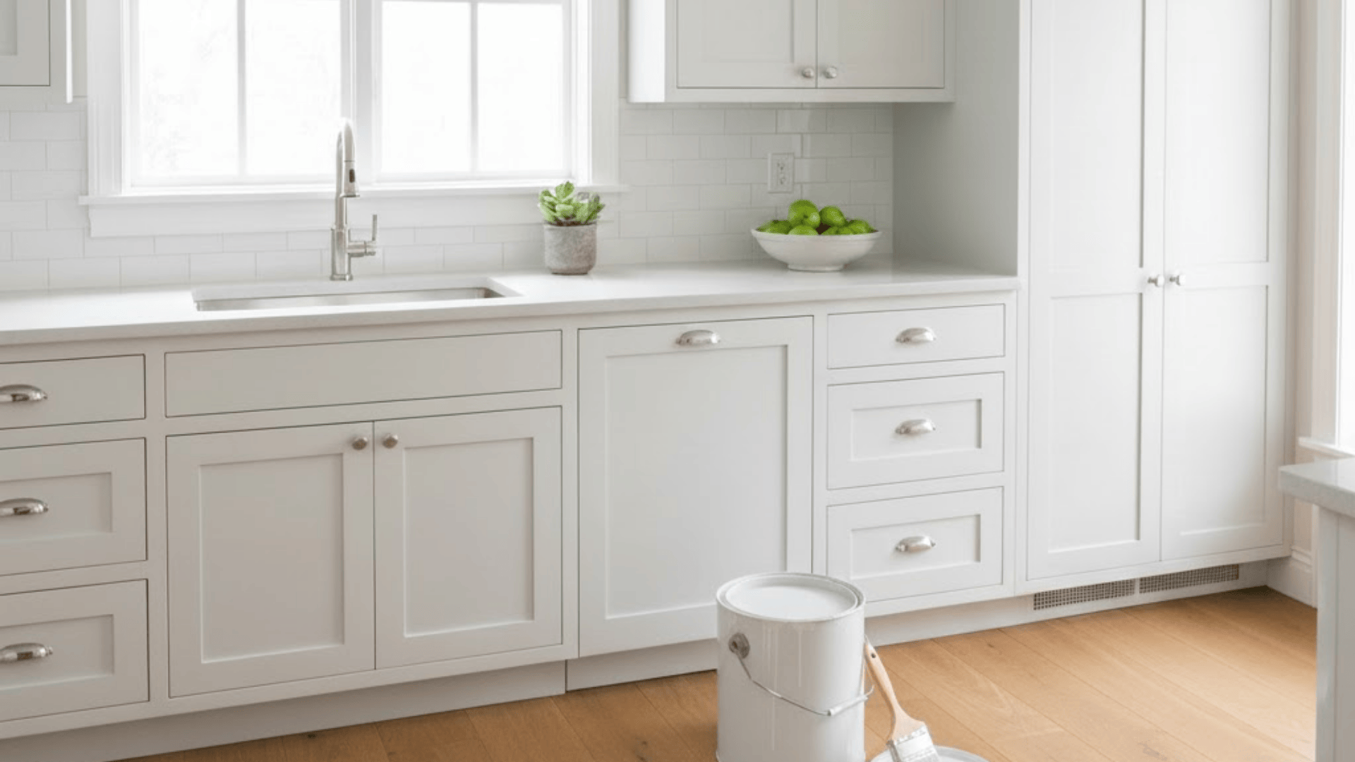
Planning a kitchen makeover and thinking about the cost to paint kitchen cabinets before you start your project? Understanding cabinet painting expenses helps you budget correctly and avoid surprise bills halfway through the renovation process. I know kitchen updates can drain your wallet fast, so knowing exact costs matters more than ever. Your total expenses depend on whether you hire professionals or tackle the painting yourself. Professional painters bring expertise and efficiency, while doing it yourself saves money but demands significant time and effort. Getting accurate price estimates before starting prevents budget disasters and helps you plan your kitchen changeover realistically. Let me show you exactly what you’ll spend and where your money goes. All costs mentioned are estimated averages and may vary based on your location, kitchen size, cabinet condition, materials chosen, and specific contractor rates in your area. What Goes Into the Cost of Painting Kitchen Cabinets? Painting kitchen cabinets involves two main expense categories: labor costs and materials like paint, primer, and supplies. Labor typically makes up the biggest chunk of your total cost, especially when hiring professional painters for the job. Material expenses include paint, brushes, rollers, sandpaper, cleaner, and protective gear you need for the entire project. Hardware removal, surface preparation, and multiple paint coats all add time and expense to the overall project. Understanding these basic cost components helps you plan your budget and decide your next steps moving forward. Let me break down what you’ll spend doing it yourself versus hiring a professional painter instead. Average Cost to Paint Kitchen Cabinets Most homeowners spend between $1,500 and $5,000 to paint their kitchen cabinets professionally, depending on kitchen size and project complexity. The national average falls around $3,000 for a standard-sized kitchen with typical cabinet configurations and reasonable condition. Low-end projects with minimal cabinets and basic paint start around $1,000 to $1,500 for budget-conscious homeowners doing simple updates. Mid-range projects with average kitchens, quality paint, and professional prep work typically cost $2,500 to $4,000 for great results. High-end projects with extensive cabinetry, premium materials, and detailed finishing work can reach $5,000 to $7,000 or more. Per-cabinet pricing typically ranges from $75 to $200 per cabinet box. Factors that Affect the Cost of Painting Kitchen Cabinets I’ve found that several key factors determine how much you’ll end up paying for your cabinet painting project. Here’s what impacts your final price: 1. Number of Cabinets and Doors The more cabinets and doors you have, the higher your total painting cost will be overall. Each cabinet door, drawer front, and cabinet box requires individual prep work, painting, and drying time throughout the process. Larger kitchens with extensive cabinetry naturally cost more than small kitchens with just a few cabinets installed. Painters typically charge per door or by linear foot, so counting your cabinets gives accurate estimates upfront. 2. Cabinet Material Different cabinet materials require different preparation methods and paint products to achieve professional-looking results that last for years. Solid wood cabinets are easiest to paint and accept paint well with proper sanding and priming beforehand. MDF cabinets need special primers to seal the porous surface before applying your chosen paint color. Laminate cabinets are trickiest because paint doesn’t adhere well without extensive sanding and specialty bonding primers applied. 3. Paint Type and Finish Oil-based paints cost more than latex paints but provide superior durability and a smoother finish that resists damage. The finish you choose, matte, satin, semi-gloss, or high-gloss, also affects the price and application difficulty significantly. High-gloss finishes require more coats and careful application to look perfect without visible brush strokes showing. Premium paint brands with better coverage and durability cost more upfront but often save money on future repaints. 4. Kitchen Layout and Accessibility Kitchens with tight spaces, high ceilings, or awkward layouts take longer to paint and cost more overall. Painters charge extra when they need special equipment like scaffolding or ladders to reach upper cabinets safely. Island cabinets and corner units require more time and effort to paint all sides thoroughly and evenly. Easy-to-access kitchens with standard layouts cost less because painters work faster without obstacles constantly slowing them down. 5. Local Labor Rates Professional painter rates vary widely depending on where you live and the local cost of living standards. Urban areas with high living costs typically charge more per hour than rural areas with lower expenses. Experienced painters with excellent reputations command higher rates than newer painters just starting their careers in cabinetry. Getting multiple quotes from local painters helps you understand average rates in your area before committing money. Professional vs. DIY Kitchen Cabinet Painting Costs I know choosing between hiring professionals and doing it yourself can feel overwhelming when you’re watching your budget. Here’s how the costs break down for each approach: Cost to Paint Kitchen Cabinets Professionally Professional cabinet painting includes all labor, materials, and expertise to change your cabinets without you lifting a finger. Here’s what you’re paying for when you hire the pros: Category Price (USA) Details Labor & Project Cost $1,500 to $8,000+ Full job from prep to finish. Price changes with kitchen size and complexity. Prep Work Included Cleaning, sanding, small repairs, and masking. Materials $60 to $300 (built into quote) Pros use higher-grade paint and primer. Spray Equipment Included Adds time and setup, but gives a smoother finish. Warranty & Coverage Included Support if anything goes wrong. Professional services remove all the hassle and guesswork from your cabinet painting project completely. You get expert results without spending weekends working on tedious prep and painting tasks yourself. DIY Kitchen Cabinet Painting Cost Breakdown DIY cabinet painting looks cheaper upfront because you only pay for materials and skip labor charges entirely. Here’s what you’ll actually spend doing it yourself: Category Price (USA) Details Paint and Primer $40 to $140 per gallon Most kitchens need 2 to 3 gallons plus primer. Tools & Supplies $75 to $200 Brushes, rollers, tape, sandpaper, cleaning items. Optional Sprayer $40 to $300 Rent or buy for smoother results. Total DIY Range $200 to $800 Typical cost for materials and basic gear. Extra Costs Varies Mistakes, extra paint, and time spent. DIY saves money on labor but requires significant time, effort, and patience to achieve professional-looking results. Be realistic about your skill level and available time before committing to this demanding weekend project. Is Painting Cabinets Worth the Cost? Painting cabinets costs significantly less than replacing them entirely, often saving you thousands of dollars on your kitchen renovation. New cabinets typically cost $5,000 to $25,000 or more, depending on the size, material, and quality you choose. Cabinet painting runs $1,500 to $5,000 for professional work, making it a fraction of replacement costs for similar results. Properly painted cabinets last five to ten years with good care, sometimes longer if you maintain them well. The return on investment is excellent because freshly painted cabinets dramatically update your kitchen’s appearance without major construction. Painting makes sense when your existing cabinets are structurally sound but just look outdated or worn. How to Save Money When Painting Kitchen Cabinets I’ve learned that smart planning and knowing where to splurge versus save can cut your cabinet painting costs significantly. Here are the best ways to keep your project affordable without sacrificing quality: Do Your Own Prep Work: Remove cabinet doors, clean and degrease all surfaces, and sand them yourself to save $500 to $1,000 on professional labor costs. Buy Paint During Sales: Watch for holiday sales at paint stores, where you can get 20-40% off quality cabinet paint and primer. Reuse Existing Hardware: Clean and spray paint your current knobs and pulls instead of buying new hardware that costs $3 to $15 per piece. Paint Only Visible Surfaces: Skip painting cabinet interiors and areas that don’t show to save time, materials, and money without affecting appearance. These money-saving strategies help you stay within budget while still achieving a professional-looking finish that lasts. Remember that cutting corners on essential steps like primer or quality paint will cost you more in repairs later. That’s a Wrap Your kitchen update is within reach now that you know the real cost to paint kitchen cabinets upfront. I’ve watched many homeowners alter their kitchens just by changing their cabinet color without replacing anything structural. These numbers give you a solid starting point for planning your budget without any guesswork or surprises later. Painted cabinets deliver results that make your kitchen feel completely different when you walk in each morning. If you’re planning your next update, take a look at the other guides on the site for clear costs, real tips, and simple decisions that actually help.
I remember standing in the paint aisle thinking every can looked the same. You’ve probably felt that way too. Picking the right color is one thing, but picking the right paint brand is a whole other challenge, something many people run into when trying painting ideas for beginners. That’s why I started paying closer attention to real feedback from people who actually used these products in busy homes, not just in perfect showroom spaces. If you’ve also been unsure about the best paint brands, you’re not alone in wanting clear answers that make your next project easier. You just want paint that looks good, holds up, and doesn’t turn into extra work. So let’s break things down in a simple way that helps you move forward with confidence using the best paint brands. Why Choosing the Right Paint Brand Matters The brand you choose makes a big difference in how your paint job looks and lasts. High-quality paint offers smoother coverage, stronger color, and easier application. It spreads evenly, hides old marks or stains, and needs fewer coats to get a clean finish. Good brands also resist peeling, fading, and scuffing, so your walls stay fresh for years. Lower-quality paints may seem cheaper, but they often require extra layers and touch-ups, which add cost and effort later. A trusted paint brand helps you get better results with less hassle, if you’re repainting one room or your whole home. It’s about finding a balance between price, performance, and how well the paint holds up over time. Why Real Homeowner Feedback Helps When Picking a Paint Brand When you read what actual homeowners report after painting, coverage, stain resistance, how colour looks under real home lights, you get much more useful information than you would from a manufacturer’s marketing. For example, in one Reddit thread titled “Best brand of paint and finish for interior walls” (on r/AskIreland), a user named u/EternalLova shared that they “never painted the interior of a house before,” and asked others for recommendations on good paint brands for modern homes. That kind of real-life conversation often includes follow-up replies describing how certain paints held up after weeks or months, which gives you a clearer sense of what to expect: how many coats are truly needed, whether the finish stayed even, and how fair the real-world coverage was. This guide pulls together those kinds of experiences, from first-time painters to regular homeowners, so you have a realistic basis for choosing paint, not just bright swatches and glossy claims. Top Paint Brands Most Recommended by Real Users These paint brands appear again and again in Reddit threads, DIY groups, and home chats where people share honest results from real rooms. 1. Sherwin-Williams Sherwin-Williams is a popular choice for many homeowners and contractors because it rolls on smoothly, covers well, and holds up over time. Lines like SuperPaint, Cashmere, and Duration are often picked for interior walls because they give even color and better wear in busy rooms. Many users feel Sherwin-Williams performs better than big-box brands. On Reddit, user u/Grolbark said Sherwin-Williams gave smoother rolling and easier cutting than Behr or Glidden, making long paint jobs feel easier. Another user, u/an_actual_lawyer, noted that Sherwin-Williams coatings last longer, cover better, and resist wear more effectively because of stronger formulas and consistent performance across rooms. 2. Benjamin Moore Benjamin Moore is a well-known paint brand that many homeowners and pros use for interior walls, trim, and cabinets. Lines like Regal Select, Aura, Ultra Spec, and Scuff-X are often chosen for good coverage, strong colour, and a smooth finish on both new builds and renovation projects. It sits in the higher price range, but many users feel the finish and durability justify the cost for key rooms. On Reddit, user u/OriginalLight, a designer, said the new Regal Select eggshell has a stronger smell and feels streaky after the reformulation, so they are rethinking their go-to choice. Painter u/Imapainter1956 instead praised Ultra Spec flat and low sheen eggshell for ceilings and walls, calling it a favourite for high-end residential work. 3. Behr Behr is a common choice for DIY painters because it is easy to buy at Home Depot and offers several lines at different prices. Products like Premium Plus, Ultra, Marquee, and Dynasty aim to give decent coverage and colour for walls, trim, and cabinets. Many people use Behr when they want to save money compared with paint-store brands. On Reddit, opinions are mixed. User u/daynares332311 said Behr Premium Plus from 2013 is still holding up well across rooms and cabinets, with no problems cleaning the surfaces. By contrast, u/Raelf64 felt that after using Sherwin-Williams, Behr “is like painting with jello,” while u/Relevant-Register-30 called Behr “decent” and said it has a place alongside their usual Sherwin-Williams work 4. Valspar Valspar is a retail paint brand often chosen because it is easy to get in big-box stores and offers custom colour mixing at the counter. It has several tiers, from cheaper “classic” options to higher-grade lines like Valspar Premium and V700. DIY users often choose it when they want strong colour choice and reasonable results without going to a trade paint store. On Reddit, opinions are split. In r/DIYUK, one decorator (deleted user) called Valspar “crap” and said they prefer Dulux Trade for reliability. By contrast, u/Globehead87 reported a solid finish after three coats of Valspar Premium matt in a busy family living room, and u/Lolabird2112 said V700 covered well in their kitchen and bedroom and was easy to clean. 5. Farrow & Ball Farrow & Ball is a high-priced UK brand often specified by designers for its curated colour card and very matte, soft-looking finishes. It is commonly used on feature rooms, period homes, and trim when clients want a “designer” label. The paint can be fussy: it usually expects the brand’s own primer, more careful prep, and extra coats compared to many trade lines, and the cost per gallon is near the top of the market. In r/paint, several pros were blunt about their frustration. User u/InsufficientPrep (who works for Sherwin-Williams R&D) called F&B “the most over priced product on the market.” Painter u/-St4t1c- described it as “overpriced sludge,” saying it doesn’t level well, has pigment problems, and shows batch-to-batch colour changes. What Homeowners Actually Look For in the Best Paint “Community discussions on reddit show people care about these factors more than anything else.” Key Needs: People want the colour to look right, the walls to stay in good shape, and the job to feel smooth from start to finish. Coverage Check: Many comments compare how well a paint hides older colours in the first or second coat. Cleaning Strength: Homeowners look for finishes that handle wiping without leaving marks. Cost Control: A cheap can that needs three coats is not a real deal, so value matters more than the shelf price. Rolling Feel: Some paints roll smoothly while others feel heavy or dry too fast. Sample Tests: Colours can shift under home lighting, so users often test small samples first. Daily Wear: People want surfaces that hold up during busy days and stay even over time. Ease of Use: A paint that spreads well helps new painters stay comfortable while working. Real User Pros and Cons for Each Paint Brand Homeowners often share clear feedback online, which helps show the strengths and weak points of each paint brand in everyday use. Brand Real User Pros Real User Cons Sherwin-Williams Smooth rolling, strong coverage, handles cleaning well, reliable colour match Higher price, some lines need sales to feel affordable Benjamin Moore Even finish, good adhesion, strong colour, trusted by many pros Some lines feel streaky, smell issues reported, higher cost Behr Easy to buy, wide colour options, decent results for budget projects Thick feel, fast drying, mixed durability feedback Valspar Strong colour choices, good for DIYers, decent coverage in premium lines Coverage varies, bonding issues reported, weaker results on woodwork Farrow & Ball Rich colour look, soft matte appearance, designer appeal Expensive, slow drying, tricky application, batch consistency concerns These pros and cons reflect common themes seen in forums where people compare paint results, tools, and daily performance. Color Accuracy: Which Paint Brands Match Their Swatches Best? Many homeowners pay close attention to how closely a paint matches its sample once it dries on the wall. In community threads, Benjamin Moore is often praised for steady colour results, especially in lines like Aura and Regal Select. Sherwin-Williams also receives positive feedback for colours that stay close to the sample when used in living rooms, bedrooms, and halls. Some brands show more noticeable shifts. Users mention that Valspar and Behr can lean warmer or cooler once dry, especially with lighter shades. People also point out that stronger colours from Farrow & Ball may look different under bright or low lighting. For the most steady results across different rooms, homeowners often rely on Benjamin Moore or Sherwin-Williams. Best Paint Brands by Project Type Different areas of your home need different kinds of paint, so users often choose brands based on how each space handles moisture and daily use. Best Paint for Kitchens Kitchens deal with heat, steam, and frequent cleaning, so users often choose paints that resist marks and stay even after wiping. Many homeowners recommend Benjamin Moore Aura and Sherwin-Williams Emerald because they stay smooth and handle moisture well. These paints can be cleaned often without leaving dull spots. Some people also use Behr Ultra for budget-friendly projects, but they note it may need an extra coat. A tougher finish helps keep kitchen walls clean and steady through busy days. Best Paint for Bathrooms Bathrooms need paint that deals with steam, splashes, and regular wiping. Users often select Sherwin-Williams Duration or Benjamin Moore Aura Bath and Spa because both handle damp spaces without losing their finish. These options stay steady on walls and ceilings and help prevent problems in rooms with low ventilation. Some homeowners also use Behr Marquee for small bathrooms, noting decent moisture resistance. Any bathroom paint should dry fully before use and handle cleaning without leaving shiny or worn areas. Best Paint for Bedrooms Bedrooms benefit from soft, calm colours and a finish that hides small marks. Many users choose Sherwin-Williams Cashmere or Benjamin Moore Regal Select because both give smooth results and steady colour. These paints also help keep walls clean with light wiping when needed. For budget projects, people often mention Behr Premium Plus, which works well with neutral tones. Bedroom walls don’t face heavy moisture or constant scrubbing, so a comfortable application and steady look matter most. Best Exterior Paint Outdoor surfaces deal with sun, rain, and large temperature changes, so users look for long-lasting protection. Many homeowners recommend Sherwin-Williams Duration Exterior or Benjamin Moore Aura Exterior because they keep their colour and resist peeling over time. These paints help shield siding, trim, and doors from harsh weather. Some people also mention Behr Premium Plus Exterior as a lower-cost choice for small areas. A strong exterior paint saves effort in the long run by holding up through changing seasons. Best Paint for Furniture or Cabinets Furniture and cabinets need paint that sticks well and dries hard. Homeowners often choose Benjamin Moore Advance because it levels smoothly and works well on wood. Many painters also use Sherwin-Williams ProClassic for drawer fronts, doors, and built-ins since it dries evenly and holds up to daily touch. Some DIYers mention Behr Cabinet and Trim Enamel as a workable budget choice. A strong bond, smooth finish, and steady colour are the main things people look for in cabinet paint. Ease of Application: What Beginners Should Know About Each Brand Many first-time painters look for paint that rolls smoothly, covers evenly, and gives steady results without extra effort or special tools. Sherwin-Williams: Rolls smoothly, good control for beginners, dries at a steady pace, and is easier to fix small misses. Benjamin Moore: Levels well, strong coverage, may feel thicker, works best with good rollers and slower strokes. Behr: Easy to find, but can feel heavy or dry fast; beginners may need to work in smaller sections. Valspar: Smooth on some walls, but coverage varies; may need extra coats for deeper colours. Farrow & Ball: Can be tricky for new painters; needs careful rolling and steady strokes to avoid patchy areas. What Paint Brand Users Choose Most Often In Reddit paint threads, most pros in the US say they reach for Sherwin-Williams first, with Benjamin Moore close behind. Painters like Sherwin-Williams because the stores are everywhere, contractor discounts are strong, and the range covers residential, commercial, and industrial jobs. Many users feel Benjamin Moore can be slightly higher in quality for certain lines, but it is used more in designer and residential work. Behr often gets labeled as “lower quality for the same price,” so many pros avoid it. Some painters also mention PPG as a solid option, especially for commercial projects. How to Choose the Best Paint Brand for Your Home Picking the right paint brand starts with knowing what your space needs. High-moisture rooms like kitchens and bathrooms usually need stronger lines from Sherwin-Williams or Benjamin Moore because they handle cleaning better. Bedrooms and halls can use softer, smoother paints that focus on steady colour rather than heavy scrubbing. Budget matters too, but users often warn that cheaper paint can take more coats, raising the final cost. You should also think about how comfortable you feel with the application. Some brands roll smoothly while others dry fast and need a quicker technique. Testing small samples helps you see real colour, texture, and coverage before you commit. Final Thoughts I covered what real homeowners like you notice most when choosing paint, from steady colour to smooth rolling and long-term wear. The goal is simple: pick something that saves you time and gives your rooms a clean, steady look without extra effort. When you focus on what matters, the right choice feels much easier. As you plan your project, keep user feedback close. It’s one of the easiest ways to avoid stress and get results you’re proud of, especially when you’re comparing the best paint brands for your space. If you want more simple guides like this, I’d love for you to check out my other blogs and keep exploring what helps you create a home you enjoy.
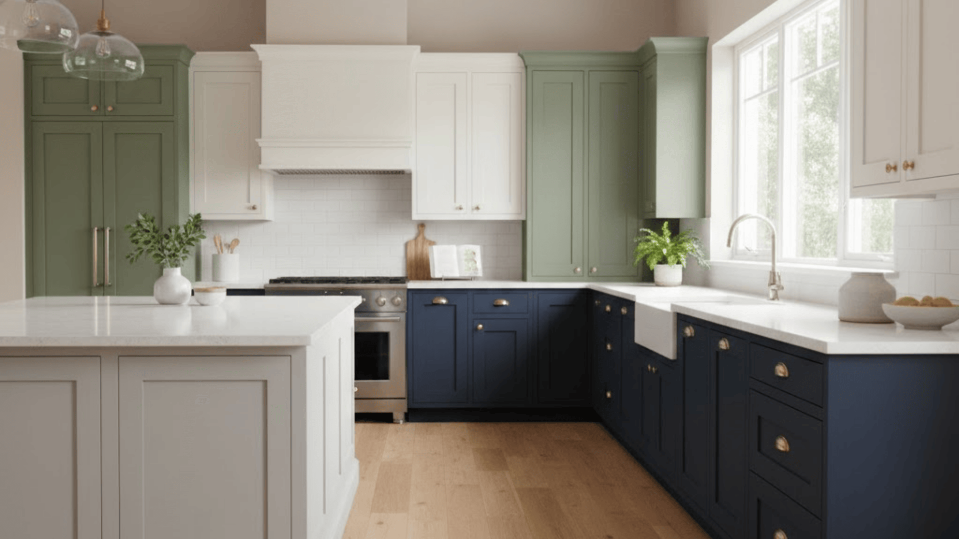
When you update your cabinets, the whole kitchen feels different. It doesn’t matter if the space is small or wide open. The right shade can shift the mood in a way you notice every day. That’s why looking at popular kitchen cabinet colors and how tones connect across a space through Alabaster coordinating colors. In this guide, you and I will walk through shades that are loved right now, why they work, and how to decide what fits your space. You’ll see simple ideas, clear steps, and helpful tips that make the choice easier. By the end, you’ll know which colors make sense for your kitchen. What Colors Are Trending for Kitchen Cabinets? Many kitchens are shifting toward colors that feel warm, calm, and grounded. Some shades open up a space, while others add depth and character. Here are the tone groups showing up the most right now: Warm whites and soft creams Beige, greige, and taupe Light gray and mushroom gray-green Sage, olive, and forest green Navy and deep blue Charcoal and soft black Warm browns and cocoa tones Natural wood and stained wood Soft yellow and powder blue Deep red and wine tones for bold rooms These color families work in many styles and tend to hold up well over time. Popular Kitchen Cabinets Colors that Always Work Neutrals help a kitchen feel fresh and balanced. They fit almost any layout and match a wide range of counters and floors. 1. Warm White Shaker Cabinets Warm white shaker cabinets fit almost any home. The color feels clean but not harsh, and helps small kitchens feel bigger. You can pair warm white with: Light wood floors Soft gray or white counters Simple black or brass pulls This idea works well if you want something safe that still feels fresh and bright. 2. Creamy Off-White With Soft Gold Hardware Creamy off-white cabinets give your kitchen a gentle glow. They suit open layouts and blend easily with warm floors. Add: Soft gold or brushed brass handles Warm white or beige walls Light stone or quartz counters This combo works well if you like a cozy feel without strong contrast. 3. Soft Greige Cabinets in Open Layouts Greige sits between gray and beige, which makes it easy to use with many finishes. It works well in open-plan homes where the kitchen flows into the living room. Try pairing: Greige cabinets Warm white walls Black or bronze hardware This mix feels calm and steady while still giving your room some depth. 4. Light Gray Cabinets with Black Pulls Light gray cabinets bring a neat, simple look to your kitchen. They keep the room feeling open, but add more character than plain white. Pair them with: White walls or tiles Black pulls and knobs Wood stools or shelves This idea fits well in small and medium kitchens that need a gentle contrast. 5. Mushroom Gray-Green for A Calm Space Mushroom gray-green sits between gray, green, and beige. It gives a soft, grounded look. This shade works well with: Warm white or cream walls Light or medium wood floors A stone or stone-look backsplash Use this idea if you want color that still feels neutral and easy to live with. 6. Sage Green Cabinets with Wood Shelves Sage green cabinets bring a nature-inspired feel into your kitchen. Open wood shelves help keep things light and airy. Try: Sage bases and uppers Oak or maple shelves White backsplash tile This mix is great if you want a relaxed, garden-like mood in your space. 7. Olive Green Lowers and White Uppers Olive green lowers add depth, while white uppers keep the room bright. This two-tone layout works very well in long galley kitchens or L-shaped layouts. Combine: Olive green lower cabinets Soft white uppers Warm metal hardware This idea makes your kitchen feel grounded without making it look dark. 8. Deep Forest Green with Stone Counters Deep forest green cabinets suit larger or well-lit rooms. They pair nicely with natural stone. Good matches include: Cream or warm white walls Stone or stone-look counters Wood or stone floors This choice works for homes that want a rich, nature-inspired kitchen with a strong presence. 9. Navy Island in A Mostly White Kitchen A navy island is a simple way to add color without repainting every cabinet. Keep most cabinets white, then paint the island navy. Pair with: White or pale gray uppers Warm wood stools Gold or black hardware This idea pulls the eye to the center of the room and makes the island feel special. 10. All-Navy Cabinets with Warm Metal Details If you love strong color, consider all-navy cabinets. This works best in kitchens with good natural light. Keep the rest of the space light: White or cream walls Pale counters Warm brass or bronze handles The mix feels deep and steady while the light walls stop the room from feeling heavy. 11. Powder Blue Cottage Cabinets Powder blue cabinets give a soft, cottage-like mood. They work very well in small kitchens or older homes. Try pairing: White or off-white walls Butcher block or pale stone counters Simple black, silver, or brass hardware This idea helps your kitchen feel bright, friendly, and relaxed. 12. Soft Yellow Cabinets for a Sunny Feel Soft yellow cabinets can make a kitchen feel bright even on cloudy days. To keep things balanced: Use white walls and tile Choose warm wood or stone counters Add simple black or silver pulls This idea works best in casual, family kitchens that need extra warmth and energy. 13. Charcoal Lowers with Crisp White Walls Charcoal lowers give depth while white walls keep the room bright. This layout is great if you like contrast, but do not want full black cabinets. Combine: Charcoal base cabinets White walls and backsplash Light wood or pale tile floors This idea works in both small and large kitchens when the lighting is strong. 14. Soft Black Cabinets with Wood Accents Soft black cabinets feel bold but still homey when paired with warm wood details. Think: Soft black bases and uppers Wood shelves or a wood island top White or light gray walls This mix suits homes that want a strong, simple look without feeling cold. 15. Two-Tone White and Wood Cabinets Mixing white cabinets with wood lowers or a wood island gives balance and warmth. Try: White uppers Light or medium wood lowers Black or dark bronze hardware This idea is great if you like a clean layout but still want some natural texture. 16. Light Oak Cabinets with White Walls Light oak cabinets are popular again, especially in simple, open kitchens. They bring in gentle warmth and work with many color schemes. Pair with: White or off-white walls Light stone or quartz counters Black, silver, or brass pulls This idea fits very well in homes that lean toward simple, airy rooms. 17. Medium Walnut Stain with Simple Hardware Medium walnut stain adds depth and a classic feel. It suits both older and newer homes. Use: Walnut-stained cabinets Soft white or pale greige walls Simple bar pulls in black or metal This idea is strong enough to stand alone, so keep backsplashes and counters simple. 18. Mixed Green and Wood Cabinets A mix of painted green and wood brings extra character without feeling busy. For example: Sage or olive lower cabinets Wood uppers or wood island White or light gray walls This layout keeps your kitchen grounded, warm, and full of soft contrast. 19. Warm Brown Cabinets with Cream Walls Warm brown cabinets work well if your home already has wood trim or floors. To keep the space from feeling dark: Pick cream or soft white walls Choose lighter counters Add metal or glass lighting This idea is perfect if you want a kitchen that feels steady and inviting. 20. Wine Red Island as a Statement Piece A wine red or deep berry island offers strong color without taking over the whole room. Keep the other cabinets neutral: White, cream, or greige surrounds Simple stone counters Black or brass handles This is a nice option if you want something bold that still feels balanced. 21. Teal Cabinets with Simple White Counters Teal cabinets give the room a lively but grounded tone. To make sure the kitchen stays calm: Use white or soft gray counters Keep walls light and plain Choose simple hardware and lighting This idea works best in rooms with good light and not too many patterns. 22. Blue-Gray Cabinets with Stone-Look Tile Blue-gray cabinets sit between blue and gray, which makes them easy to pair. They work well with: Stone or stone-look backsplash Light or medium wood floors Silver or black hardware This idea suits homes that want a quiet color that still feels a bit different from plain gray. 23. Color Pop Inside Cabinets or On Shelves If you are nervous about bold colors on every door, add color inside instead. You can: Paint the inside of glass-front cabinets Add color to the back of open shelves Keep doors and frames neutral This idea lets you enjoy strong shades like teal, yellow, or red, without locking your whole kitchen into one big color choice. How to Choose the Best Cabinet Color for Your Kitchen Choosing the right cabinet color is much easier when you follow a few clear steps. Step 1: Choose the mood you want: Soft greens and greige create a calm space, white and cream feel bright, and navy or deep green bring a bold tone. Match the mood to your home’s style. Step 2: Study light and room size: Small or dim kitchens usually look better with light colors, while larger or sunlit rooms can handle deeper shades without feeling tight. Step 3: Match cabinets to fixed surfaces: Busy stone works best with calm tones. Plain counters can support deeper shades. Make sure the undertones fit your floors. Step 4: Think about cleaning and wear: Mid-tones and satin or semi-gloss finishes hide marks better than very light or dark shades. Step 5: Test your top colors: Paint larger samples and check them in morning and evening light. Hold them near your counters and floors before choosing your final shade. With these steps in mind, picking a cabinet color becomes a simple and confident choice. Upcoming Trends to Watch: Cabinet Color Quiet neutrals like gray-green and mushroom bring calm depth to the kitchen without overpowering the space, while rich wine shades add strong, warm color that works well on islands or in moody layouts. Earth tones such as warm brown and taupe are becoming steady favorites, offering a softer feel than cooler grays. Pastels like powder blue and muted yellow are also appearing more often, especially in small areas where a light pop of color feels right. To make these trends last, keep soft shades on main cabinets and use deeper, stronger colors only as accents, making sure the undertones match your floors, counters, and lighting. Common Cabinet Color Mistakes to Avoid A few small oversights can make a big difference in how your cabinets look and feel. Here are key mistakes to avoid: Picking a color only from a tiny swatch: Small chips hide how a color looks on large doors. Always test bigger painted samples. Ignoring undertones and lighting: Colors can shift green, yellow, or pink at home. Check samples next to floors, counters, and backsplash in real light. Going too dark in a dim room: Deep shades in a low-light kitchen can feel tight. Keep most cabinets light and use dark tones only in small areas. Choosing a trend that doesn’t fit the house: Some viral colors fight with your trim and layout. Soften the shade or limit it to an island or feature run. Forgetting about finish (sheen): Matte hides flaws but is harder to wipe. Satin or semi-gloss usually cleans better on busy kitchen cabinets. If you watch for these small issues ahead of time, picking a cabinet color feels clearer and far less stressful. Bottom Line Now you’ve seen how many shades can shape a kitchen and how each one creates a different mood. This guide walked through popular kitchen cabinet colors, ideas that fit many homes, simple steps for choosing a shade, and a few mistakes to avoid. As you look at your own kitchen, you’ll have a clearer sense of what matches your light, layout, and daily routine. Your choice only needs to make sense for you. If you want more home ideas or support for your next project, feel free to check out my other posts.
Looking for a paint finish that works in almost every room without constant maintenance? Satin finish paint might be exactly what your walls need. When I first started decorating my home, I remember standing in the paint aisle feeling completely overwhelmed. After experimenting with various finishes throughout my house, I discovered one that consistently delivered the results I wanted. The right finish can transform how your space looks and functions. Your painting project deserves careful consideration before you open that first can. Let’s find out why this particular finish has become such a popular choice for homeowners. What is Satin Paint? Satin paint sits right in the middle of the paint finish spectrum. It has more shine than flat or matte paint but less gloss than semi-gloss or high-gloss finishes. Think of it as having a soft, smooth sheen that catches light gently. The finish looks almost like satin. When light hits a satin-painted wall, you’ll notice a subtle glow rather than a mirror-like reflection. This makes satin paint incredibly versatile for different rooms in your home. It’s not too shiny and not too dull. The balanced sheen level gives walls a polished look without being overpowering. Most people describe satin paint as having a velvety, pearl-like appearance that adds depth to any color. Characteristics of Satin Paint 1. Sheen and Appearance Satin paint gives your walls a soft, gentle glow that’s not too shiny or too flat. The finish catches light beautifully without looking overly polished or slick. This balanced sheen adds depth to your wall colors while keeping things sleek and understated. It’s perfect for rooms where you want a subtle sophistication without going bold. The pearl-like luster works with any decorating style you choose. 2. Durability Satin paint holds up incredibly well against everyday wear and tear that happens in busy homes. It resists scuffs, stains, and dirt better than flat or eggshell finishes do. High-traffic areas like hallways and kitchens benefit most from satin’s tough surface. The finish is more durable than matte but easier to maintain than high-gloss. Your walls stay looking fresh for years with minimal touch-ups needed. 3. Easy to Clean Satin paint wipes clean easily when spills or smudges happen on your walls. The smooth surface resists moisture and doesn’t absorb stains as flatter finishes do. You can use a damp cloth to remove marks without damaging the paint underneath. This makes satin ideal for kitchens, bathrooms, and kids’ rooms that need frequent cleaning. The finish bounces back quickly after washing without losing its original sheen. 4. Versatility Satin paint works beautifully on almost any surface you need to cover in your home. It adheres well to drywall, wood, metal, and even previously painted surfaces without issues. You can use it in bedrooms, living rooms, trim, doors, and cabinets with excellent results. The finish flawlessly adapts to both modern and traditional decorating styles. This flexibility makes satin paint a wise choice for whole-house painting projects. Where to Use Satin Finish Paint? I’ve used satin paint in almost every room of my home over the years. Figuring out where it works best has saved me time and money on repaints. Let me show you where satin finish really shines: Best Rooms for Satin Paint Certain rooms in your home benefit more from satin paint than others. The finish handles specific challenges like humidity and frequent cleaning exceptionally well. Consider using satin paint in these key areas: Bathrooms for steam resistance: Satin repels water vapor and condensation better than flat paint while wiping clean after showers. Kids’ rooms and playrooms: The washable surface handles sticky fingers, crayon marks, and toy scuffs without permanent damage. Home offices and study areas: Satin provides a professional look that’s sophisticated enough for video calls and focused work. These rooms get the most benefit from satin’s unique combination of beauty and toughness. You’ll appreciate how well the finish holds up over time in these spaces. Outdoor Uses for Satin Paint Satin paint isn’t just for interior projects anymore. It performs surprisingly well on exterior surfaces that face harsh weather conditions. Here’s how to use satin paint outside your home: Exterior trim and shutters: Satin holds up better than flat paint outdoors while avoiding the intense shine of high-gloss finishes. Porch columns and railings: The finish protects wood from moisture damage and sun exposure without requiring constant maintenance. Front doors and entryways: Satin creates an inviting entrance that looks polished but not overly glossy or commercial. Outdoor satin paint has come a long way in recent years, with better weather resistance. Many homeowners now prefer it over traditional gloss finishes for a more modern look. Satin Paint vs. Other Finishes: Which is Right for You? Feature Matte Paint Satin Paint Semi-Gloss Paint Gloss Paint Sheen Level No shine, flat appearance Soft, subtle sheen Noticeable shine, reflective High shine, mirror-like finish Light Reflection Absorbs all light Gentle light reflection Moderate to bright reflection Intense light reflection Durability Low, shows wear easily Moderate to high High, very tough Extremely high, most durable Cleaning Ease Difficult, not washable Easy, wipes clean Very easy, scrub-resistant Easiest, highly scrub-resistant Moisture Resistance Poor, absorbs moisture Good resistance Excellent resistance Best resistance available Hides Imperfections Best at hiding flaws Moderate hiding ability Shows some imperfections Highlights all surface flaws Overall Look Classy, urbane Balanced, versatile Polished, clean Bold, dramatic Price Range Most affordable Mid-range pricing Slightly more expensive Most expensive option Satin paint gives me the best balance for most projects. It handles daily life without looking too formal or requiring constant touch-ups like matte finishes do. Downsides of Satin Finish Paints Satin paint isn’t perfect for every situation, and knowing its limitations helps you make better choices. Here are the main challenges I’ve noticed with satin finish: Shows wall imperfections: The subtle sheen reflects light just enough to highlight dents, bumps, and uneven patches on your walls. Touch-ups can be tricky: Blending new paint into existing satin surfaces often leaves visible patches that don’t match the surrounding area perfectly. Not glossy enough for some projects: If you want a high-shine, dramatic look for furniture or trim, satin’s moderate sheen might feel too understated. Requires proper wall preparation: You’ll need to patch, sand, and prime surfaces more carefully than with flat paint to avoid visible flaws. These downsides don’t make satin paint a bad choice overall. I still use it frequently because the benefits outweigh these minor inconveniences for most of my painting projects. How to Choose the Right Paint Finish for Your Project? Picking the right paint finish depends on where you’re painting and how that space gets used daily. Start by thinking about how much traffic the room gets and whether moisture is an issue. High-traffic areas like hallways need durable finishes, while bedrooms can handle softer sheens. Consider the lighting in your space since natural light shows imperfections more than artificial light does. Look at your wall’s current condition, as rough surfaces require flatter finishes to hide flaws. Think about your decorating style and whether you want subtle elegance or bold drama. Satin paint works beautifully for most projects because it balances durability with appearance perfectly. Match your finish to both the room’s function and your personal taste for best results. Application Tips for Satin Finish Paint Getting a professional-looking satin finish requires some preparation and the right painting techniques. I’ve learned these tips through plenty of trial and error over the years. Follow these steps for the best results with satin paint: Clean and prime your walls thoroughly: Wash surfaces with soap and water, let them dry completely, then apply primer to ensure even paint adhesion. Sand down any rough spots: Use fine-grit sandpaper to smooth bumps and imperfections since satin’s sheen will highlight every flaw on your walls. Use quality rollers with medium nap: A good roller applies satin paint evenly without leaving texture marks, and medium nap works perfectly for most walls. Work in small sections with wet edges: Paint one area at a time and blend into wet paint to avoid visible lap marks or streaks. Allow proper drying and curing time: Wait at least two hours between coats and give the paint a full week to cure before cleaning or heavy use. Rushing through prep work always shows up in the final result. Taking the time with these steps ensures your satin finish looks smooth and professional every single time. Final Words You now understand everything about satin finish paint and how it compares to other options. I’ve found that choosing the right finish from the start saves so much time and frustration. My advice? Start with one room that sees the most activity in your daily life. This finish takes the guesswork out of decorating while giving your walls the protection they need. One thing I’ve learned: proper prep work makes any finish look professionally done. Check out other paint and home guides on the website to help you pick colors, finishes, and tools with confidence.
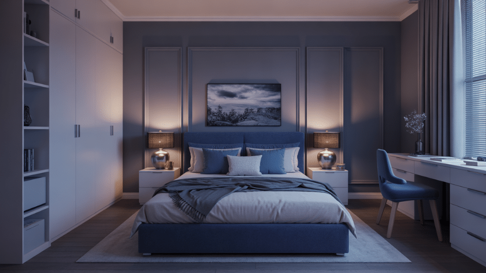
The right bedroom color directly impacts sleep quality and mood. Cool tones like blues and greens activate the parasympathetic nervous system, lowering heart rate and promoting relaxation, while warm neutrals create cocoon-like comfort. But the same paint looks completely different depending on whether your room faces north, south, east, or west. This guide shows how to choose colors that work in real conditions, not just staged photos. It covers how natural light shifts paint throughout the day, which shades expand small or dark spaces, and how to match colors to your desired mood, calm, cozy, airy, or boho. You’ll also learn which colors encourage restful sleep versus ones that overstimulate, plus testing methods to avoid regret. Best Bedroom Paint Colors Beyond Boring Regulars While beige and white remain safe defaults, they’re not the only, or even the best, options for creating a restful, stylish bedroom. 1. Soft Cool Gray Soft cool gray is ideal for bedrooms because it feels clean and calming without turning stark or industrial. These shades usually have a slight blue undertone that keeps walls feeling fresh and airy, especially in rooms with natural light. Soft cool grays balance warm furniture, wood floors, and layered textiles while remaining neutral enough for long-term use. They create a peaceful backdrop that supports rest without feeling flat or overly modern. Benjamin Moore Stonington Gray (HC-170) and Sherwin-Williams Repose Gray (SW 7015) soften bedrooms with a balanced gray that avoids cold undertones. 2. Smoky Lavender Gray Smoky lavender gray blends gray with muted purple undertones for a bedroom color that feels gentle and graceful. Unlike traditional lavender, this version stays grounded and neutral, making it easier to live with long-term. It adds softness and visual interest without overwhelming the space. These shades work especially well in bedrooms that need warmth but should still feel calm and grown-up rather than decorative. It is frequently cited as one of the best colors for a bedroom. Those who want a hint of personality without sacrificing serenity. Benjamin Moore Gray Lavender (2112-60) and Sherwin-Williams Gris Morado (SW 9156) introduce subtle purple warmth while staying muted and sleep-friendly. 3. Muted Navy Muted navy creates a cozy, cocooning effect that works well in larger bedrooms or as an accent wall behind the bed. These shades are softened with gray so they feel restful rather than bold or dramatic. Muted navy pairs beautifully with white bedding, warm woods, and brass or matte black accents. It adds depth and grace while still supporting a calm, sleep-focused atmosphere. Benjamin Moore Hale Navy (HC-154) and Sherwin-Williams Naval (SW 6244) deliver rich depth without overwhelming bedroom walls. 4. Mushroom Taupe Mushroom taupe sits comfortably between gray and beige, making it a flexible and timeless bedroom neutral. It carries subtle warmth without reading yellow and subtle coolness without feeling stark. This balance makes it ideal for bedrooms with mixed finishes or changing light throughout the day. Mushroom taupe feels grounded and calming, offering more character than standard beige while remaining easy to decorate around. Benjamin Moore Revere Pewter (HC-172) and Sherwin-Williams Accessible Beige (SW 7036) create a grounded neutral that avoids traditional beige tones. 5. Pale Silver Pale silver is a light gray with a gentle reflective quality that helps brighten bedrooms without feeling cold. It works especially well in smaller rooms or spaces with limited natural light. These shades improve white trim and soft textiles while keeping the room feeling open and restful. Pale silver adds polish and calm without introducing strong contrast, making it a safe but better bedroom wall color choice. Benjamin Moore Silver Satin (OC-26) and Sherwin-Williams Crushed Ice (SW 7647) brighten bedrooms with a soft, light reflective gray. 6. Washed Charcoal Washed charcoal offers depth without heaviness by softening traditional charcoal with gray undertones. It works well in bedrooms meant to feel cozy and enveloping, especially when paired with light bedding and warm accents. This shade adds contrast and grace while still feeling breathable. Used thoughtfully, washed charcoal turns a bedroom into a retreat without creating a dark or closed in feeling. Benjamin Moore Chelsea Gray (HC-168) and Sherwin-Williams Peppercorn (SW 7674) add depth while remaining soft enough for bedroom spaces. 7. Muted Plum Muted plum brings warmth and personality without leaning bold or dramatic. These shades are softened with gray or brown undertones, making them feel calm and mature. It creates a cozy and slightly romantic atmosphere, securing its spot among the best bedroom colors for a moody yet restful vibe. Benjamin Moore Shadow (2117-30) and Sherwin-Williams Mature Grape (SW 6286) introduce softened purple depth suited for restful bedrooms. 8. Soft Clay Gray Soft clay gray blends gray with subtle earthy warmth inspired by natural clay and stone. It feels grounded and calming without reading beige or orange. This shade works well across different lighting conditions and pairs easily with both cool and warm decor. In bedrooms, soft clay gray creates a relaxed, natural backdrop that feels cozy yet modern, making it ideal for layered textures and neutral color palettes. Benjamin Moore Balboa Mist (OC-27) and Sherwin-Williams Agreeable Gray (SW 7029) balance warmth and neutrality for versatile bedroom walls. 9. Cool Off-White This paint offers brightness without the harshness of pure white. These shades include subtle gray or blue undertones that prevent yellowing and keep bedrooms feeling crisp and airy. Cool off whites make rooms feel larger and work well with bold headboards, textured bedding, or darker furniture. They are ideal for minimalist or transitional bedrooms where calm and lightness are priorities. Benjamin Moore White Dove (OC-17) and Sherwin-Williams Snowbound (SW 7004) replace stark white with a softer, cooler brightness. 10. Stormy Blue Gray Stormy blue gray blends blue and gray to create a soothing, atmospheric bedroom color. It feels calm and balanced without leaning coastal or overly cool. These shades shift subtly throughout the day, adding depth without visual noise. Stormy blue gray pairs well with white linens, soft woods, and muted metals, making it an excellent choice for bedrooms designed for relaxation and visual quiet. Benjamin Moore Silver Chain (2132-60) and Sherwin-Williams Misty (SW 6232) create a tranquil blue-gray ideal for sleep-focused spaces. 11. Pale Putty Pale putty is a light neutral that blends gray and beige in a restrained, natural way. It adapts easily to changing light and surrounding decor, making it a dependable bedroom wall color. Pale putty feels soft, calm, and subtle, allowing furniture and textiles to stand out. It is ideal for bedrooms where you want warmth and neutrality without committing to a strong undertone. Benjamin Moore White Sand (OC-10) and Sherwin-Williams Worldly Gray (SW 7043) offer a flexible neutral that stays calm in varied lighting. How to Test Bedroom Paint Colors Properly Choosing paint from tiny store chips guarantees disappointment; colors change drastically under real lighting conditions. Proper testing prevents costly mistakes. Sample Patches: Paint large swatches (2×2 feet minimum) directly on walls. Tiny chips don’t show how color behaves across surfaces. Check at Different Times: Observe morning light, afternoon sun, and evening lamps. Colors shift throughout the day. Warm vs Cool Lighting: Test under both warm bulbs (2700K-3000K) and cool daylight to see artificial lighting effects. Shortlist Method: Narrow to 3-4 favorites, live with samples for 3-5 days, eliminate options that don’t perform consistently. Bottom Line At the end of the day, I don’t think there’s one “perfect” bedroom color for everyone. The best choice is the one that fits your room and helps you feel good when you walk in. If your bedroom gets cool light, warmer shades can make it feel more welcoming. If it gets intense sun, softer cool tones can keep it balanced. And if your room is small or dark, you now know which colors can help it feel more open or more cozy on purpose. Before you commit, test a few samples on your wall and check them from morning to night. So, pick your top 3 shades today and start testing, then share your favorite in the comments!
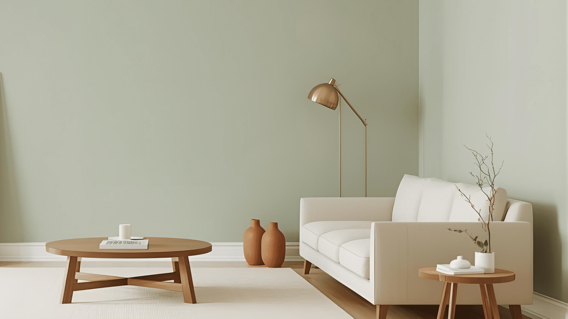
I used to think Sage was just “green,” until I saw it turn gray in one room and olive in another. If you are trying to figure out what color Sage is, that shift can feel confusing fast. The good news is, Sage is pretty simple once you know what to look for. It is a muted gray-green, and lighting plus undertones decide if it feels warm or cool. I will walk you through Sage’s mood in a room, easy palettes that work, and quick tips to pick the right shade with confidence. By the end of this blog, the question, “what color is Sage?” will feel much clearer. Sage Color Meaning and Mood in Design Sage is a muted green that feels calm and easy to live with. It sits between green and gray, so it reads softer than most greens. In a room, Sage often gives a clean, relaxed feel without looking cold. It also adds a natural, grounded touch that works with wood, stone, and simple fabrics. You will see Sage used a lot because it blends in like a neutral, but still adds color. It can feel fresh in bright light, or cozy in warmer light. That balance is why it fits modern farmhouse, cottage, Scandinavian, boho, traditional, and organic modern spaces. Quick Summary: Sage feels calm and natural, and it works in many design styles. Sage Color Palettes You Can Use Right Away These palettes help you use the color Sage with the right undertones, so your room feels balanced, calm, and planned. Warm Sage Palette (Cozy and Earthy) Warm Sage leans olive or slightly brown, so it looks best with warm neutrals and earthy accents. This palette feels relaxed and grounded, which works great in living rooms, bedrooms, and kitchens with warm lighting. If your space has warm wood floors or creamy trim, this mix usually looks natural right away. Keep the contrast soft, then add one deeper element for depth. Sage + Cream Sage + Warm Beige Sage + Terracotta Sage + Brass Sage + Walnut Wood Cool Sage Palette (Clean and Airy) Cool Sage leans gray or slightly blue, so it pairs well with crisp, cooler shades. This palette feels fresh and light, making it a safe pick for bathrooms, offices, and smaller rooms. If your home has cooler light, gray tile, or modern finishes, this combo helps Sage look smooth instead of muddy. Add one wood tone to keep it from feeling too flat. Sage + Bright White Sage + Cool Gray Sage + Dusty Blue Sage + Chrome Modern Contrast Palette If you want Sage to look modern, you need contrast. Dark accents make Sage feel sharper and more current, especially on cabinets, built-ins, or an accent wall. This palette works well in open spaces where you want clean lines and bold edges. Keep the background light, then use black or charcoal in small, repeated spots to make it feel intentional. Sage + Charcoal Sage + Black Sage + Crisp White Sage + Concrete Tones Soft and Romantic Palette This palette keeps Sage gentle by pairing it with light, warm tones and soft textures. It works best in bedrooms, nurseries, or quiet corners where you want a calm look without heavy contrast. Use blush as a small accent, not the main color. Linen tones and pale wood help the whole space feel light and easy. Sage + Blush Sage + Warm White Sage + Light Wood Sage + Linen Tones Nature Palette If you want Sage to feel outdoorsy and organic, pair it with clay, sand, and stone shades. This palette suits entryways, living rooms, and any space with natural materials like jute, rattan, or textured walls. Keep the colors muted so Sage stays the main “green,” while the other shades support it. Olive works best here when it is slightly darker than your Sage. Sage + Clay Sage + Sand Sage + Olive Sage + Stone Where Sage Works Best in Home Design Sage works best where you want soft color without heaviness, and where lighting and nearby finishes support its undertone. Sage Walls Sage walls work well in bedrooms, living rooms, home offices, and hallways because the color feels calm without going dull. It reads like a neutral, so it does not fight with rugs, art, or furniture. In bright rooms, Sage can feel fresh and clean. In dim rooms, it can look grayer and softer, which still works if you like a quiet look. Pair it with the right white trim, and it looks more finished. Best rooms: bedrooms, living rooms, offices, hallways Best trim: warm white for warm Sage, clean white for cool Sage Sage Cabinets and Islands Sage is a strong choice for cabinets and islands because it adds color without feeling loud. Many bright greens can look trendy fast or feel too bold in a kitchen. Sage stays softer, so it works with wood floors, stone counters, and metal hardware. It also hides daily smudges better than pure white. Use deeper Sage for islands if you want contrast, or lighter Sage for full cabinets. Works well with: white counters, warm wood, black or brass hardware Great spots: lower cabinets, islands, pantry doors Sage Bathrooms Sage works in bathrooms because it pairs easily with tile and stone, and it gives a clean but softer feel than plain white. Cool Sage looks great with gray tile, marble looks, and chrome. Warm Sage looks better with cream tile, travertine, and brushed brass. Since bathrooms can have mixed lighting, test the shade under your vanity lights too. Keep other colors simple so Sage stays calm. Cool look: Sage + gray stone + chrome Warm look: Sage + cream tile + brass or bronze Sage Exteriors and Front Doors Sage can look great outside, but outdoor light changes it a lot. Sun can pull Sage warmer and greener, while shade can pull it grayer or bluer. That is why testing is important. Paint a large sample board and check it in the morning, midday, and evening. Sage works well for front doors, shutters, and even siding if your roof, brick, or stone tones match its undertone. Test outside in: sun and shade, different times of day Best pairings: warm white trim, black accents, natural stone, wood tones Sage Undertones (How To Choose The Right One) Sage undertones decide if your shade looks warm, cool, or balanced once it is on the wall. Many Sages hide hints of gray, blue, yellow, or brown. To spot it fast, do a simple undertone test. Place your Sage sample next to pure white, medium gray, and warm beige. If it looks bluer next to white, it is cool. If it looks earthier next to beige, it is warm. Then do the neighbor color test. Hold the sample next to your flooring, countertop, and trim. If it clashes there, it will clash on the wall too. Sage Variations (Silvery, Olive, Minty, Deep) These Sage types help you pick the right shade faster, based on lighting, undertone, and how bold you want it. Sage Type What It Looks Like Feels Like Best For Avoid If Silvery Sage Pale gray-green Light, soft, neutral Small rooms, low light, calm walls You want warmth or richness Olive Sage Green with a warm, earthy tone Cozy, grounded Warm lighting, rustic spaces, warm woods Your room is cool or shadowy Minty Sage Green with a fresher, cooler cast Crisp, airy Bathrooms, bright rooms, modern spaces You dislike blue-leaning greens Deep Sage Darker, richer muted green Bold, settled Cabinets, doors, accent walls You want an airy, light look Pick Your Sage Want neutral and soft: Silvery Sage Want cozy and earthy: Olive Sage Want fresh and light: Minty Sage Want bold and deep: Deep Sage Conclusion Now you know why Sage feels so easy to use, even when it shifts a little in a different light. You saw how Sage sits between green and gray, how warm and cool undertones change the look, and where it works best in a home. You also got ready-to-use palettes, so you can match trim, wood, tile, and metals without guessing. My biggest tip is to test a large sample near your flooring and trim before you commit. If you still feel stuck on what color is Sage, tell me your room light and finishes in the comments. Also, check out my other blogs for more color help and pairing ideas.
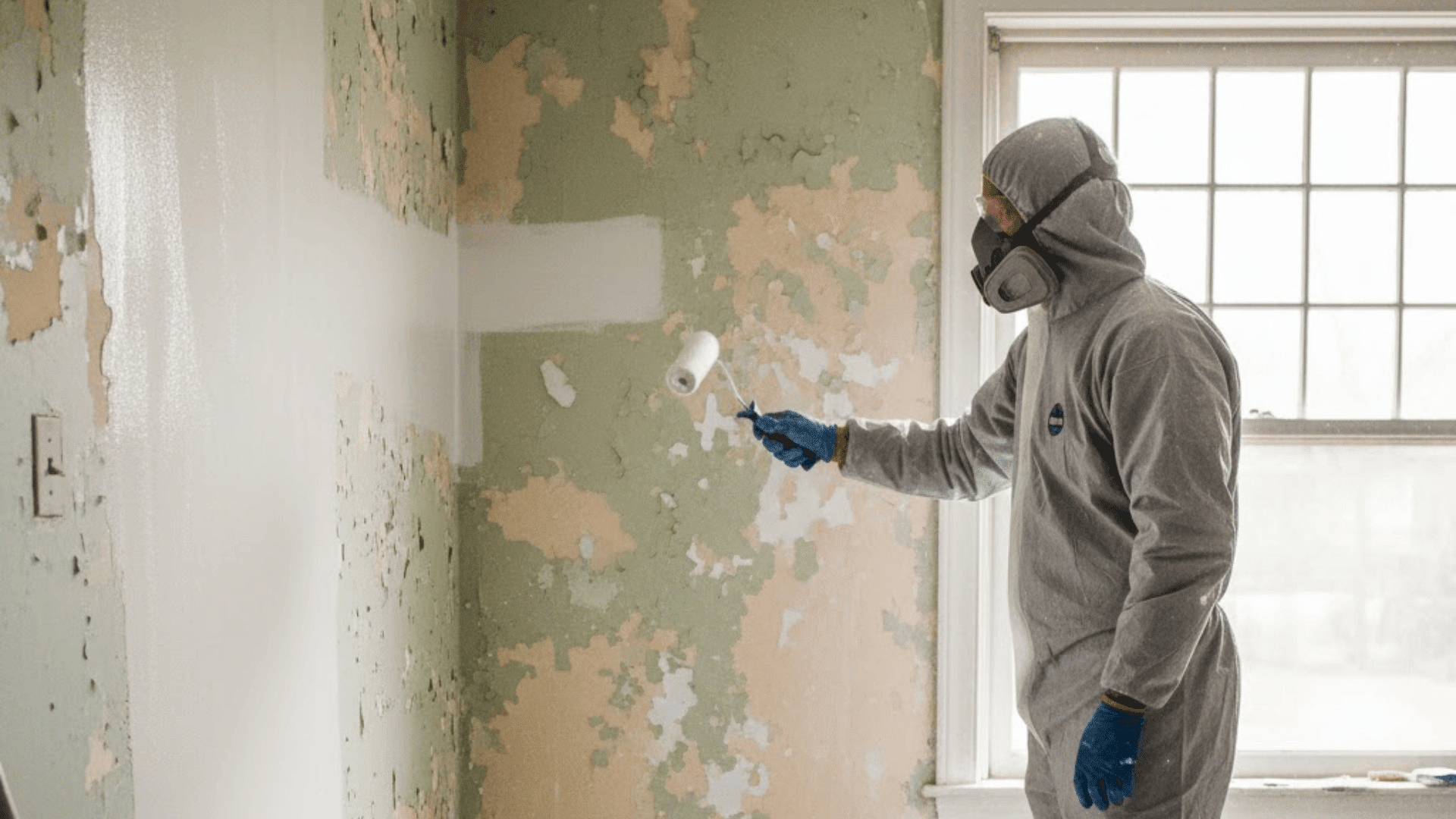
If you live in an older home, you may worry about lead paint. That worry often shows up right when you want to repaint. You might be asking, can you paint over lead paint and still keep your home safe. In this guide, I will walk you through what lead paint is and why it matters. You will learn when painting over it can work, and when it is a bad idea. You will also see what products to use, plus simple steps to prep, coat, and clean up. Along the way, you will get clear dos and don’ts, and signs it is time to call a lead-safe pro. What Lead Paint is and Why it Matters? Lead paint is paint that contains lead, a toxic metal. It becomes most dangerous when it breaks down into chips and dust. That dust can get into your body when you breathe it in or swallow it, even in tiny amounts. Lead paint is often found on: Window trim and sills Doors and door frames Baseboards Stair rails Cabinets and built-ins Exterior siding and trim Painting work can be risky because sanding, scraping, or grinding old paint can create lead dust. That dust can spread through your home and settle on floors, toys, and furniture. Kids and pregnant people face a higher risk from lead exposure, so it is important to be extra careful. Should You Paint Over Lead Paint or Not? You can paint over lead paint using encapsulation, which means sealing the old paint under a thick, strong coating so it cannot chip or create dust. This can be a safe option only when the old paint is in good shape, and the surface is not a heavy-wear area. Encapsulation may work if the paint is solid (not peeling or chalky), the surface is low-friction (nothing rubs or slides on it), the area is dry (no leaks or dampness), and the job can be done with no sanding or scraping. Do not paint over it if the paint is peeling, chipping, cracking a lot, or chalky, if moisture is present, or if prep would require sanding or scraping. Avoid encapsulation on wear zones like floors and stairs, sliding windows, doors, and door frames that rub, drawers and cabinets that scrape, and handrails in heavy-use areas. If any of the “do not” points fit your situation, it is safer to stop and choose another method or call a lead-safe pro. What Paint Can You Use Over Lead Paint? When you are covering lead paint, regular wall paint, and standard primer are not made to seal in lead risks. A lead encapsulant is the safer choice because it is built to form a stronger barrier. Encapsulant Type What It Is Where It Often Works Best Polymer-based coatings Thick coatings that form a flexible barrier Many painted walls and trim in low-friction areas Epoxy or polyurethane systems Tough coatings that can hold up better in some spots Areas that need a harder finish (but still not high-rub zones) Cement-like coatings Thick coatings are used more for masonry-type surfaces in some cases Masonry-style surfaces where a heavier coating makes sense After you pick the right product, always follow the label for where it can be used, how thick it must go on, and how long it needs to dry before the next step. Can Latex or Oil Paint Be Used? Yes, latex or oil paint can often be used, but usually only as a topcoat after the encapsulant fully cures, and only if the product label says it is allowed. Think of it like this: the encapsulant is the safety barrier that seals in the lead paint, while the topcoat is the finish color and the extra wear layer that helps protect the surface. Step by Step: How to Paint Over Lead Paint Safely Before you start, make sure the area is safe, sealed off, and ready so you do not spread lead dust while you work. Step 1: Test the Surface for Lead Before You Touch It Use a lead test stick (like the 3M LeadCheck style shown). Follow the kit directions, then check the color change. If it turns pink or red, treat it as a positive lead result. Step 2: Set up Containment and Prep for Lead-Safe Work Lay plastic in the work zone before scraping. Keep the work area separated so chips and dust do not spread. Wear a proper respirator before starting. Step 3: Wet the Area, Then Clean with Tsp (no Dry Dust) Lightly mist the surface with water to help keep dust down. Then spray or wipe on TSP cleaner and spread it across the area (the video shows a mop pad used for this). Let the surface dry after cleaning. Step 4: Mix and Apply the Sealant the Right Way Mix the EcoBond Lead Defender thoroughly until it is like heavy cream. Prep tools like the video shows (tape a roller to remove fuzz, slightly dampen the brush). Then apply with a quality roller (half-inch to three-quarter-inch nap) and brush for edges. Add a second coat after about 4 hours if needed, based on temperature and humidity. Step 5: Let It Cure, Then Re-Test and Recoat if Needed After the coating dries and cures (the video rechecks after two days), retest with a lead test stick. If the stick stays yellow, the test is negative. If your product allows it, add a topcoat or recoat after the listed dry time for extra protection. Watch this video for a detailed overview from YouTube: Dos and Don’ts for Painting Over Lead Paint Use these quick dos and don’ts to stay safer and avoid mistakes while painting over lead paint. Dos Don’ts Confirm lead paint when possible Sand or scrape lead paint Keep the area sealed off Paint over peeling or crumbling paint Use a true encapsulant product Encapsulate floors, stairs, or rubbing surfaces Keep kids and pets away Treat the standard primer as a lead barrier Clean with wet methods only Skip cleanup steps Follow cure and dry times Rush dry or recoat times If you stick to the “dos” and avoid the “don’ts,” you lower the risk and help the coating hold up longer. When to Hire a Lead-Safe Pro A lead-safe pro is the safer choice if paint is peeling, the job involves rubbing areas (windows, doors, stairs), the project is large, kids or pregnant people live there, or it is a rental or paid work. When hiring, ask about lead-safe certification, dust control, cleanup steps, and waste handling. Other Options Besides Painting Over Lead Paint If encapsulation is not a good fit, there are safer options that can reduce lead risk without relying on a coating to hold up in a tough spot. Enclosure: Cover the surface with a new barrier, like drywall over a wall, paneling over old trim (in some cases), or another cover layer that blocks access to the old paint. Replacement: Replace parts that fail often, like old windows, worn doors and frames, or damaged trim. Removal and abatement: This creates the highest dust risk, so it should be handled by trained pros using strict controls. Choosing the right option depends on the paint condition, how much the surface is rubbed, and how safely the work can be contained. Final Thoughts Before you start painting, it helps to slow down and plan for safety. In this post, I covered when it makes sense to seal lead paint in place, and when you should stop and choose another option. You also learned why sanding and scraping are risky, what an encapsulant does, and how to prep, coat, and clean up with care. If you are still asking, can you paint over lead paint, the key is simple: only do it when the old paint is solid, and the surface is not a high-wear spot. If things look damaged, I’d bring in a lead-safe pro. For more help, check out the other posts on my site.