

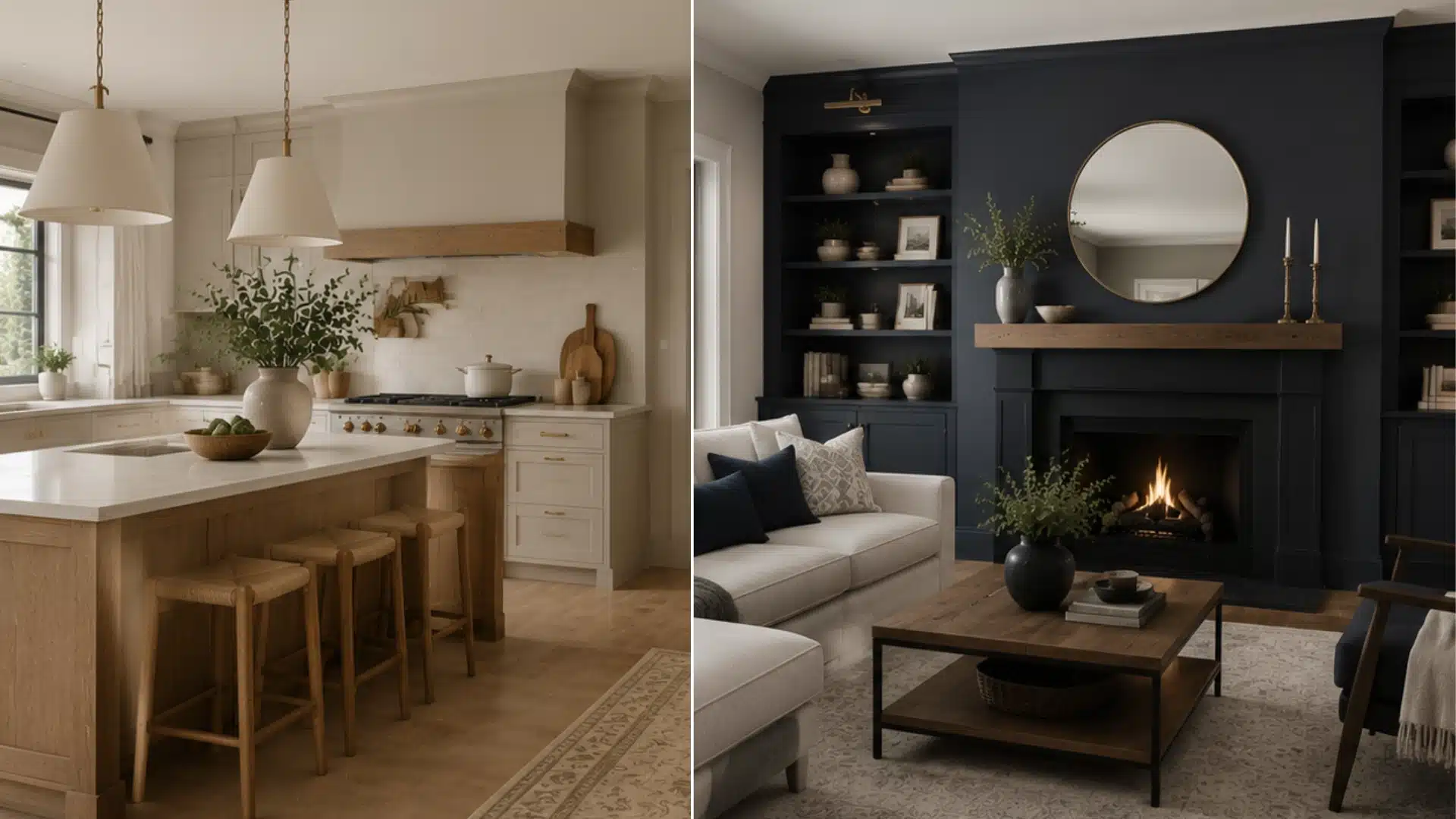
I’ve spent more hours than I’d like to admit digging into this color, and it still catches me off guard every time. Edgecomb Gray is one of those Benjamin Moore colors people can never quite agree on: gray or beige? Honestly, both, and that’s the whole appeal. How it actually looks in your room depends on more than the paint chip. I’ve seen homeowners fall for a sample at the store, only to watch it look completely different once it’s up on their living room wall. Natural light, flooring, and nearby finishes can shift it from soft beige to a cooler gray, so this blog breaks down the undertones, LRV, and pairings that actually hold up before you commit to a gallon. What Color is Benjamin Moore Edgecomb Gray? Edgecomb Gray HC-173 sits in Benjamin Moore’s Historical Collection. It is also known as Baby Fawn OC-15 in some regional collections. That trips people up when they’re comparing swatches online, leading to two names for the same chip. It’s a warm greige, built from both beige and gray rather than leaning hard into either. That middle-ground quality makes it a transitional color. It doesn’t scream farmhouse, and it doesn’t scream modern gray box. It just sits quietly in the background and lets furniture and trim do the talking. A simple way to think about it. Too gray? No. Too beige? No. A balanced warm neutral that adapts to the room? Yes. Feature Details Paint Color Benjamin Moore Edgecomb Gray Color Code HC-173 Collection Historical Collection Type Warm greige LRV 63 Undertones Warm beige-tan base with a faint green-gray note Best For Walls, open-concept spaces, bedrooms, exteriors What Undertones Does Benjamin Moore Edgecomb Gray Have? Edgecomb Gray carries a faint gray-green undertone beneath its warm beige-tan base. It rarely reads as true green on the wall. Instead, it mostly shows up under fluorescent bulbs or in rooms with heavy greenery just outside the window. What it does is keep the color from tipping too far into pink or peach, which is part of why it photographs so evenly across different rooms. If you want to lean into that undertone rather than mute it, Saybrook Sage carries a similar gray-green base at full strength. It’s an easy match for an adjoining room or a powder bath. Does Edgecomb Gray Look Pink or Purple? Occasionally, in low or artificial light. Warm flooring, brick, or incandescent bulbs can pull out a dusty pink cast more than the paint itself does. Is Edgecomb Gray More Beige or Gray? It depends on exposure. North-facing rooms push it toward gray, south-facing rooms bring out beige, and evening light adds warmth either way. Does Edgecomb Gray Have a Yellow Undertone? Not really. Its warmth reads more beige-tan than yellow, which keeps it from getting the golden cast that some warm neutrals show under bright artificial light. Best Rooms to Use Benjamin Moore Edgecomb Gray Edgecomb Gray works in almost any room, but it shines where natural textures and warm materials already exist. Here is how it performs across the most common spaces. Living rooms handle this color well, particularly open layouts with natural textures like wood flooring, linen upholstery, and stone accents. It reads calm without going flat. Bedrooms benefit from the same softness. Paired with soft whites and warm neutrals on bedding, it creates a restful, low-contrast feel that doesn’t compete with décor. Kitchens work well when this greige is on the walls behind white or off-white cabinetry, especially with marble or quartz counters and brass or matte black hardware for contrast. Bathrooms do best when paired with warm-toned stone or tile. A very cool blue-gray tile can clash with its warmth, making both look slightly off. Colors That Pair Well with Edgecomb Gray Edgecomb Gray rarely stands alone in a room. Its warm, in-between quality makes it a great backdrop for both bold accents and quiet neutrals. The right pairing depends on whether you want strong contrast, added depth, or something that blends in without competing for attention. 1. Benjamin Moore Hale Navy Hale Navy and Naval give Edgecomb Gray something grounded to play against. It works well on a front door, a kitchen island, or an accent wall in a living room or entryway, where the contrast reads as intentional rather than heavy-handed. Keep the surrounding trim in a soft white so the navy has room to stand out. 2. Natural Wood Tones Oak and walnut reinforce the earthy quality of Edgecomb Gray rather than fighting it. Use them for flooring, open shelving, or furniture in a living room, kitchen, or bedroom to keep the palette grounded and warm. Lighter wood tones, such as white oak, also work well, especially in rooms with plenty of natural light. 3. Benjamin Moore Kendall Charcoal Kendall Charcoal adds depth without clashing with Edgecomb Gray’s warmth. Use it on trim, built-ins, or a fireplace surround in a living room, study, or home office, anywhere you want definition without introducing a colder undertone. It also works well as a door color in a hallway painted in Edgecomb Gray. 4. Benjamin Moore White Dove White Dove is the most common whole-home pairing, since it creates a soft, cohesive palette. It works well on trim, ceilings, and kitchen or bathroom cabinetry throughout a house painted mostly in Edgecomb Gray. The two colors share enough warmth that the transition between rooms never feels abrupt. 5. Benjamin Moore Vintage Vogue Vintage Vogue brings a moody, smoky green that grounds a room without clashing with Edgecomb Gray’s warmth. It works especially well on a kitchen island, a dining room accent wall, or an entryway for a bit of drama. Keep it to one surface rather than the whole room, so it reads as an intentional accent. Similar Paint Colors Edgecomb Gray is often compared with a handful of other Benjamin Moore neutrals, since several fall within the same warm, medium-light range. Edgecomb Gray vs Revere Pewter Edgecomb Gray is noticeably lighter and reads softer on the wall. Revere Pewter’s LRV is around 55, giving it more visual weight and making it a better fit for rooms that need a grounded, moodier feel. Edgecomb Gray vs Pale Oak Pale Oak reads airier and slightly cooler than Edgecomb Gray, with less beige presence overall. It works well in bright, light-filled rooms, while Edgecomb Gray holds its warmth better in spaces with less natural light. Edgecomb Gray vs Agreeable Gray Edgecomb Gray leans warmer and more beige overall, while Agreeable Gray reads cooler and closer to a true neutral gray. It suits homes already built around cool finishes, where Edgecomb Gray would feel out of place. Edgecomb Gray vs Accessible Beige Edgecomb Gray carries more gray influence and reads less tan than Accessible Beige. It leans further into a warm tan, with less gray to soften it, making it the warmer choice of the two for traditional interiors. Of these, Revere Pewter draws the most comparisons, since the two colors are easy to confuse. Its lower LRV gives it more weight, making it the better pick for rooms that need depth. How Does Edgecomb Gray Look in Different Lighting? The same gallon can look different from room to room. Daylight direction and bulb temperature pull Edgecomb Gray toward its gray or beige side in ways a paint chip never shows. 1. North-facing rooms The gray side becomes more noticeable here. It still reads warm compared to a true cool gray, but loses some beige softness. Pairing it with warm wood tones or brass fixtures helps counter the coolness. 2. South-facing rooms This pulls the color toward its beige and tan side. According to one in-depth color review, warm southern light plays up the color’s beige undertones and can even bring out a hint of pink. 3. East-facing rooms Eastern light runs warm and yellow in the morning but turns cooler by afternoon, pushing the color from beige toward a cooler greige as the day goes on. 4. West-facing rooms Western light does the opposite. It starts cool and shadowy in the morning, then turns warm and red-tinged by evening, which draws out the color’s beige tendencies later in the day. Can You Use Benjamin Moore Edgecomb Gray on Cabinets? Yes. It’s a common choice for traditional and transitional kitchens looking for something softer than stark white. It pairs naturally with: Benjamin Moore White Dove Benjamin Moore Chantilly Lace Brass or aged-brass hardware Natural wood open shelving or floating shelves One caution worth repeating from professional painters: always test a sample directly on the cabinet material before committing. Cabinet finishes reflect light differently than flat wall paint, especially with satin or semi-gloss sheens. A color that reads warm and soft on a wall can look noticeably different on cabinet doors. Is BM Edgecomb Gray Good for Exteriors or Interiors? It holds up well outdoors, particularly on homes with natural stone, brick, or wood accents. The warmth in the undertone complements farmhouse and traditional exteriors without looking stark against greenery or brick. Indoors, it works just as well on walls, cabinets, and trim, since the same warm base that reads well in daylight also holds up under standard interior bulbs. Exterior sunlight is far more intense than interior lighting, which changes how the color behaves compared to an interior wall: Setting How Edgecomb Gray Reads Interior walls Balanced warm greige that shifts with room exposure and bulb type Exterior siding or trim Brighter and lighter overall, since direct sunlight is much stronger than indoor light. Always test a large sample board outdoors, on more than one side of the house, before painting the full exterior. The Pros and Cons of Choosing Edgecomb Gray No paint color works everywhere, and Edgecomb Gray is no exception. Weighing where it excels against where it can fall short helps set realistic expectations before you commit to a full room or a whole house. Pros Cons Warm without tipping into full beige, so it avoids feeling dated Appearance shifts noticeably depending on room orientation and light, so a single swatch can be misleading Works across traditional, transitional, and modern farmhouse styles without a full redesign Can look slightly muddy in rooms with limited natural light or heavy shade Pairs easily with both cool and warm wood tones, which simplifies furniture shopping Needs testing against existing flooring and furniture before committing, especially in older homes None of this makes Edgecomb Gray a bad choice. It just means the room’s light and existing finishes matter as much as the paint chip does. Is Edgecomb Gray Right for Your Home If you want a neutral that leans warm rather than cool, this color is a good fit. The bigger question is whether your room gets consistent light and already leans warm in its existing finishes. Edgecomb Gray shifts more than most colors depending on exposure and what’s around it. It works best in homes already leaning toward warm tones, with wood tones, brass fixtures, or natural stone nearby. It’s less reliable in cool, blue-based spaces. A sample board checked across a few hours of daylight will tell you more than any photo online. Start there before buying the gallon. Frequently Asked Questions Will Edgecomb Gray clash with cool-toned flooring? It can. Gray-based tile, cool oak, or blue-undertone hardwood may pull out unwanted contrast. Warm or neutral wood tones are a safer match, so test a sample against your actual flooring before committing. How many coats of Edgecomb Gray does a room need? Most walls need two coats for even coverage, especially over a darker existing color. A tinted primer matched to the paint base can help reduce streaking on the first coat. Does Edgecomb Gray look good in small rooms or hallways? Yes. Its medium-light LRV keeps small spaces from feeling boxed in, though hallways with little natural light may need a warmer bulb to avoid a flatter, grayer look. Is Edgecomb Gray a safe choice for resale value? Real estate agents often favor warm neutrals like this one because they appeal to a wide range of buyers and photograph well for listings, without the risk of a trend-heavy color. Does Edgecomb Gray work on ceilings? It can, particularly at a lighter tint, if the walls are already the full shade. A flat ceiling finish in Edgecomb Gray softens the contrast between walls and ceiling in rooms with lower light.
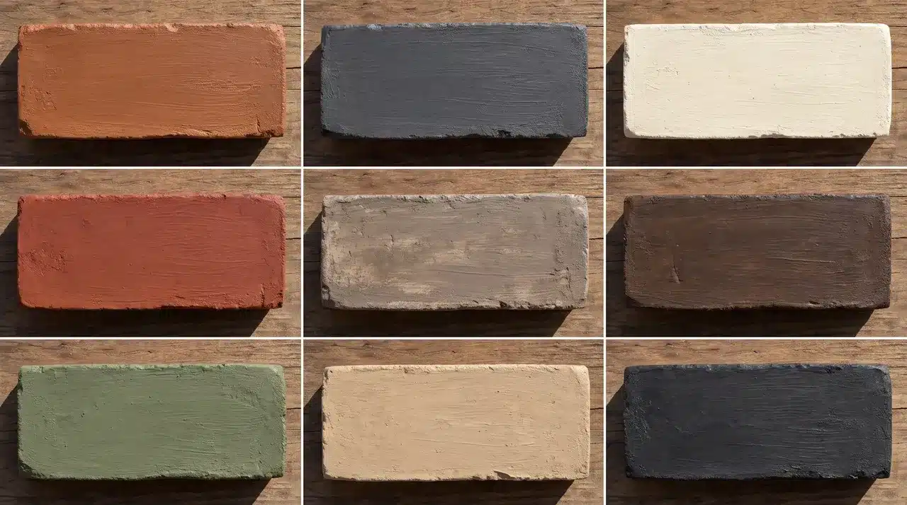
Brick either makes a home look put-together or makes it look tired. There’s rarely an in-between. Faded, chipped, or oddly colored brick stands out fast, especially next to a new roof or door. The fix doesn’t have to mean tearing anything down. Brick stain colors change the brick’s color while keeping its real texture and grain intact. Nothing gets hidden under a flat coat. Your final result depends on a few things. Your brick’s original color matters, along with its porosity, your mortar, your lighting, and how opaque you go. What is Brick Stain and How Does It Change Brick Color? Brick stain is a mineral-based or acrylic colorant that absorbs into the porous surface of masonry. Because it penetrates the brick, the natural texture and variation stay visible after application. Unlike paint, which creates a surface coating that hides brick texture and will eventually peel, stain bonds with the masonry, keeping the natural variation visible. The brick changes color but retains its surface character throughout. Because the colorant bonds to the masonry surface, peeling is less likely than with a paint coating. 11 Brick Stain Colors for Exterior Brick The right shade should complement the architecture of the home. Different styles work better with certain shades, finishes, and color depths. 1. Crisp White White stain gives dark or heavily red brick a bright, clean lift. It brightens the brick without hiding its natural texture. This has more depth than an opaque white coating. Crisp white pairs well with black windows, dark roofs, and natural wood doors. Red, pink, or brown undertones may still show through, though. A test patch shows exactly how much comes through before you commit. 2. Warm Off-White Off-white softens a home’s look without the stark feel of bright white. This shade creates a softer result than a true white stain. It complements cream mortar and warm roofing nicely. Warm off-white suits traditional, cottage, and farmhouse exteriors especially well. It keeps a home from looking too stark or clinical. Many homeowners choose it for a gentle, welcoming update. 3. Light Gray Light gray calms down brick with strong orange or red tones. It reduces the intensity of warm, orange-heavy brick colors. This shade creates a clean, neutral background for your whole exterior. Light gray pairs well with white, navy, charcoal, or black accents. Keep in mind it can look cooler on north-facing walls. Check a sample against your actual wall before committing to the full project. 4. Warm Gray Warm gray offers a softer alternative to a blue-based gray stain. It works well with beige mortar and warm roof shingles. This shade suits ranch, Craftsman, and transitional homes especially well. Warm gray also helps connect gray siding with brown exterior materials. It avoids the cold, flat look that cooler grays sometimes create. Homeowners often pick this shade when they want a balanced, neutral finish. 5. Charcoal Gray Charcoal gray gives brick a bold, grounded look. It makes natural texture appear less busy to the eye. This shade works well with cedar, cream trim, and matte-black fixtures. Charcoal gray suits modern homes that want strong visual contrast. Dark colors absorb more heat, so testing first matters here. Always check a sample in full sun before staining the entire wall. 6. Greige Greige blends the coolness of gray with the warmth of beige. It coordinates well with stone, stucco, and natural wood finishes. This shade softens red brick without looking cold. Greige suits homes with a mix of warm and cool materials. Its flexible undertones make greige a reliable option because it rarely clashes with existing materials. 7. Taupe Taupe creates a quiet, earthy finish with less contrast than darker shades. It complements bronze windows and brown roofing nicely. Taupe pairs well with cream, olive, and muted black accents. This shade offers a softer look than charcoal or bright white. It suits traditional homes that want a subtle, understated update. Taupe rarely overwhelms other exterior colors already in place. 8. Medium Brown Medium brown restores an earthy look to faded or discolored masonry. It suits traditional, rustic, and Craftsman-style exteriors especially well. This shade pairs nicely with beige trim and dark brown doors. Medium brown can unify brick with mismatched red and orange tones. It works particularly well on older homes with weathered, uneven brick. This makes it a reliable pick for restoring a tired exterior. 9. Refreshed Red Refreshed red brings depth back to washed-out or repaired brick. It restores richness to brick that has faded over time. This shade keeps a home’s traditional character fully intact. Refreshed red also helps new bricks blend into older masonry. It pairs well with black, sage, cream, and warm white accents. This shade is often chosen to fix patchy repair work. 10. Muted Sage Green Sage green gives brick a soft, gray-green cast. It introduces a subtle, muted tone without looking bold or unusual. This shade complements landscaping and natural wood details nicely. Test sage green against the roof and mortar first. It may look different across light and dark brick sections. A small test patch helps confirm the color reads consistently. 11. Soft Black Soft black creates a bold, modern exterior update. It produces a contemporary, architectural look without feeling harsh. Soft black shows more natural variation than an opaque black paint. This shade pairs well with warm wood and off-white trim. It works best in homes with plenty of natural light. Strongly contrasting trim also helps this shade stand out. How to Choose the Right Brick Stain Color Start with your roof, since it’s the hardest material to change. Brown roofs pair well with brown, greige, or off-white stains. Black roofs pair with white or charcoal. Mixed shingles call for a neutral like greige. Mortar color also shapes your brick stain color, light mortar brightens it, while dark mortar adds contrast. Factor in fixed exterior materials you can’t easily change, like stonework, siding, window frames, gutters, and walkways. Your home’s exterior style points toward certain color families. Colonial homes often suit refreshed red, while contemporary homes suit soft black. Sunlight changes everything. Direct sun can wash out light colors, and shade can flatten warm tones. North-facing walls often look cooler than south-facing ones. Before you decide, test two or three stain concentrations directly on your exterior brick. Texture and lighting both affect the final color. Brick Stain Color Pairing Ideas Picking a brick stain color is only half the job. The right trim, door, and roof pairing ties the whole exterior together. Use this table for quick pairing ideas once you have a shade in mind. Brick Stain Trim Front Door Roof Warm White Soft black Natural oak Charcoal Light Gray Crisp white Navy Black Charcoal Cream Cedar Black Greige Warm white Dark bronze Brown Taupe Ivory Olive green Weathered brown Refreshed Red Cream Black Dark gray Medium Brown Beige Deep green Brown Sage Off-white Walnut Charcoal These pairings are a starting point, not a fixed rule. Your own lighting, landscaping, and personal taste still matter. Test your chosen brick stain color next to real trim and door samples before you commit. DIY Brick Staining vs. Hiring a Professional DIY works well on small, easy-to-reach projects with bare brick in good condition. It also suits projects that require a single uniform color, as long as you test samples first. That’s the idea behind painting brick stain. Hire a professional instead if your house has multiple stories or if the brick needs repairs or deep cleaning. A pro also helps when you want several blended colors or when replacement bricks need to match older ones. The same goes for surfaces that may already have a sealer or coating. Signs of water intrusion or masonry failure call for expert eyes right away. When a project feels risky, hire a pro. How to Test Brick Stain Colors Correctly Clean a section of brick and mortar that represents the whole wall Choose a spot with some natural color variation Test at least three nearby shades Apply the coats or dilution level you plan to use on the full project Let every sample dry completely Check the colors in the morning, afternoon, and evening light Step back and view the samples from the street, not just up close Confirm the color on both a sunny day and a cloudy one Physical testing matters because brick texture, porosity, and original color all change how a stain looks once it dries. Mineral Stains recommends testing samples directly on your own surface for this same reason. Conclusion The best brick stain color depends on your brick, mortar, roof, and fixed materials. Natural light plays a role too. Start with physical samples. Test a few colors and dilution levels before you commit. Before you begin, confirm your brick is clean, porous, unsealed, and structurally sound. Once you’ve picked a favorite, compare your test patches from the street, not just up close. That is the view your neighbors and guests will actually see. Take your time with the final choice, since the right brick stain color should complement your home for years to come. Frequently Asked Questions What Is the Best Stain to Use on Brick? There’s no single best stain. Water-based and mineral-based options both work well, as long as the product matches your brick’s porosity and exposure to outdoor weather. Is Staining Brick a Good Idea? Yes, in most cases. Staining refreshes faded or mismatched brick while keeping its natural texture. It usually costs less than a full brick replacement, too. What Colors Does Brick Stain Come in? Brick stain comes in many colors, including white, gray, charcoal, brown, greige, and taupe. Sage, refreshed red, and custom color blends are also common today. What are the Most Popular Brick Colors? White, gray, and charcoal rank among the most popular brick stain colors right now. They pair well with many rooflines, trim colors, and door choices. What are the Popular Brick Colors in 2026? In 2026, white, black, charcoal, and classic red remain popular brick stain colors. Blonde, tan, and warm earthy tones round out this year’s top picks.
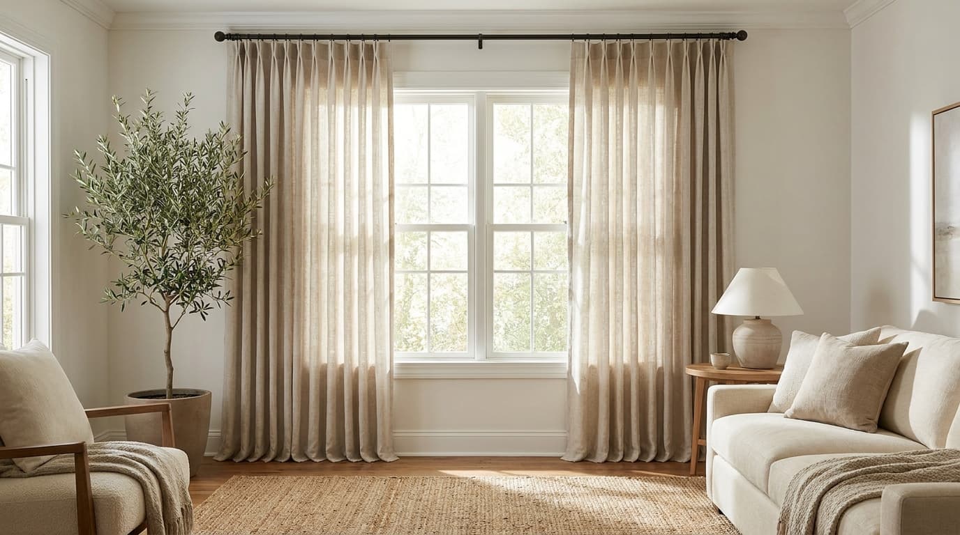
Curtains can completely change how a room feels, but the installation process often comes with more measuring, drilling, and adjusting than expected. If the height is wrong, your window looks smaller, if the width is wrong, the room feels cramped instead of open. To hang curtains, install brackets 4–6 inches above the window frame and 3–4 inches out on each side. Attach the rod, then hang your curtain panels. Learning how to hang curtains the right way changes how a whole room feels. A few extra inches in the right spots can make ceilings look taller, and windows look wider. You will learn every step by the end, from gathering tools to hanging the final panel. What You Need to Hang Curtains Before you touch the wall, gather everything on this list. Having tools ready saves trips up and down the ladder. Tool/Material: Tape Material Level Pencil Drill Wall Anchors Stud Finder Curtain Rod Brackets Curtain panels Step ladder If you’re working with plaster or brick walls, a masonry drill bit makes the job easier. Standard wall anchors don’t always grip well in these materials. How to Hang Curtains Step-By-Step Once you’ve gathered your tools and hardware, the actual process moves quickly. Each step builds on the last, from measuring your window to giving the panels a finished look. Follow these steps to get a rod that sits straight and curtains that hang the way you pictured them. Step 1: Measure Your Window and Decide Curtain Placement Start by measuring the width of your window frame. Add extra inches on each side if you want curtains that let in more light when open, and measure your curtains accordingly. Next, decide how high you want the rod. Most designers suggest placing it 4 to 6 inches above the window frame. This trick makes ceilings look taller. For length, decide if you want curtains that graze the floor, break slightly, or pool at the bottom. Each style gives a different look, measured from where the rod sits to your chosen endpoint. Width: Measure your window frame, then add 4 to 8 inches to each side for the rod. This extra width lets curtains stack neatly when open, rather than covering the glass. Length: Measure from where your rod will sit down. A common example is a standard 84-inch panel, which works well for windows with 8-foot ceilings when the rod sits close to the top. Step 2: Mark Where the Curtain Brackets Will Go Use your pencil to mark bracket positions on the wall. Check both marks with a level so the rod hangs straight. Brackets usually sit 3 to 4 inches beyond the window frame on each side. This width lets curtains stack fully open without blocking daylight. Suppose you’re using a stud finder, mark where the studs are, too. Hitting a stud gives your bracket extra hold, especially with heavier curtains. Step 3: Install The Curtain Brackets Drill pilot holes at your marked spots. If you’re not hitting a stud, insert wall anchors first for added grip. Screw each bracket into place. Test them by gently pulling to make sure they feel secure before moving forward. Double-check both brackets with your level. A small tilt now becomes an obvious slant once the rod and curtains go up. Step 4: Attach The Curtain Rod Slide the rod into the installed brackets. Most rods snap into place or rest with a simple locking mechanism. Give the rod a gentle shake to confirm it’s secure. If it wobbles, tighten the bracket screws or check that the rod is seated correctly. Step 5: Hang the Curtain Panels Slide your curtain panels onto the rod before locking the final bracket piece, if your rod design requires it. This step depends on the curtain style you’ve chosen. Different curtain styles hang in different ways: Rod pocket curtains: They slide directly onto the rod through a built-in fabric channel. Grommet curtains: They have metal rings sewn into the top that slip easily over the rod. Tab top curtains: They use fabric loops that wrap around the rod. Pinch pleat curtains: Need hooks that clip onto rings, which then hang from the rod. Tie-top curtains: They are tied directly around the rod with fabric strips. Each curtain style creates a different fold pattern when hung. Grommet curtains tend to fall in neat, even waves, while rod pocket styles bunch more loosely. Step 6: Adjust Curtains for a Finished Appearance Once your panels are hanging, take a step back and check the fall. Smooth out any twisted fabric near the rod. Give the curtains a light steam or iron if they look creased from packaging. This small step makes a noticeable difference in the finished look. Pull the panels open and closed a few times. This helps the fabric relax into its natural folds faster. How High Should You Hang Curtains Most curtains look best when the rod sits 4 to 6 inches above the window frame. This small gap makes the window look taller than it is. If your room has high ceilings, go higher. A rod placed closer to the ceiling stretches the wall and makes the whole room feel bigger. Based on ceiling height: Standard 8-foot ceiling: Hang the rod 4 to 6 inches above the frame. 9- to 10-foot ceiling: Hang the rod 6 to 10 inches above the frame. Very high ceiling: Hang the rod close to the ceiling, leaving a 2- to 3-inch gap. For length, let the panel end where you want the eye to stop. Floor-length curtains should sit just above the floor or graze it. Puddled curtains need extra fabric pooling at the bottom. Pro Tip: When in doubt, hang the rod higher, not lower. Extra height rarely looks wrong, but a low rod always makes a window look smaller. Choose the Right Curtain Rod and Hardware Picking the right rod affects both how your curtains hang and how long they last. Not every rod works for every curtain weight. Standard curtain rods work well for lightweight or medium curtains. They come in adjustable lengths, so you can match them to most window sizes. Double rods let you layer sheers with heavier drapes. This setup works well if you want both privacy and light control. Traverse rods use a pulley system to open and close curtains smoothly. These suit heavier fabrics that are harder to pull by hand. Decorative rods with finials add a finishing touch to the room. These work best when the rod remains visible rather than hidden behind fabric. For hardware, match your bracket size to your curtain weight. Heavy blackout panels require deeper brackets and stronger anchors than sheer curtains do. How to Hang Curtains with Drilling Drilling gives your curtain rod the strongest hold. This method works best for heavy fabric or a rod that carries a lot of weight. Here’s the quick version of the process: Mark your bracket spots with a pencil and a level. Drill pilot holes into the wall. Add wall anchors if you’re not hitting a stud. Screw the brackets into place. Attach the rod, then hang your curtain panels. Drilling works on drywall, wood, plaster, and brick. Just match the anchor or bit to your wall type, and it holds up well for years. How to Hang Curtains without Drilling Renters and anyone looking to avoid wall damage still have solid options. These methods skip the drill entirely. Tension rods: These fit inside the window frame and are held in place by spring pressure. No screws or anchors needed. Adhesive hooks: Command-style hooks hold light-to-medium curtain rods. Check the weight limit printed on the packaging first. Magnetic curtain rods: These work only on metal frames, such as those on sliding doors or garage windows. Clip-on rods: These attach directly to the top of the window frame using spring clips. Tip: Adhesive hooks work best with lightweight curtains, since heavier fabric can pull the hooks loose over time. Test the hook’s grip for a full day before hanging your final panels. Benefits of Hanging Curtains without Drilling Skipping the drill comes with real perks, especially if you rent your home or want a quick fix. Here are the main benefits: No wall damage: Your walls stay free of holes and marks. Renter-friendly: You keep your security deposit safe, since there’s nothing to patch or repair. Faster setup: Most no-drill methods take minutes, not hours. No tools required: You skip the drill, screws, and anchors altogether. Easy to move: You can shift your curtains to a new spot or room without any wall repair. Budget-friendly: You save money on drill bits, anchors, and other hardware. These methods work well for lightweight and medium curtains. If you plan to hang heavy blackout panels, check the weight limit on your hardware first. Common Curtain Hanging Mistakes to Avoid Hanging the rod too low makes the window and ceiling look shorter than they are. Choosing a rod that’s too narrow blocks light, since curtains can’t clear the window even when fully open. Skipping the level creates a visible slant, since uneven brackets show once the rod and curtains go up. Ignoring curtain weight causes trouble, too, since heavy fabric on weak brackets can pull loose within weeks. Buying panels that are too short can make a room feel unfinished, since curtains stop above the floor. Forgetting the wall type is another common slip, since plaster and brick need different anchors than drywall. Tips for a Polished Curtain Look A few finishing touches make a noticeable difference once your curtains are up. Steam or iron panels before hanging to remove packaging creases. Use curtain weights sewn into the hem for a straighter fall. Tie back curtains during the day to let in more natural light. Match curtain color to your wall tone for a coordinated look, or contrast for a bolder statement. Rotate panels occasionally if they hang in direct sunlight, since fabric can fade unevenly over time. Use curtain-sewing techniques to add curtain weights to the hem for a straighter fall and a more tailored appearance. Final Thought Curtains shape the feel of a room in ways that are easy to overlook. The right rod height turns a standard window into something that feels intentional. The right width keeps panels from swallowing daylight when pushed open. Both measurements take five minutes to get right and much longer to fix once the brackets are in the wall. Follow the steps in order, check each one with a level, and mark the wall before drilling. A careful, patient first pass beats a rushed one every time. Whether you are drilling into drywall for blackout panels or clipping a tension rod into a rental window, the process is the same. Measure carefully, hang with care, then stand back and let the room tell you if it worked. Frequently Asked Questions How High Should Curtain Rods Be Hung? Most curtain rods should sit 4 to 6 inches above the window frame. This placement makes the window and ceiling look taller. How Much Wider Than the Window Should a Curtain Rod Be? A curtain rod should extend 3 to 8 inches beyond the window frame on each side. This width lets curtains stack open without blocking the glass. Can You Hang Curtains without Drilling Holes? Yes, tension rods, adhesive hooks, and clip-on rods all work without drilling. These options suit renters or anyone who wants to avoid wall damage. What Curtain Length Looks Best? Curtains that graze the floor or break slightly work well in most rooms. Pooling fabric suits a more formal look, while a slight break lends a casual feel. How Do You Keep Curtains from Sagging in the Middle? Use a sturdy rod rated for your curtain weight, and add a center support bracket for wide windows. This prevents the rod from bowing under heavier fabric.

The biggest mistake with jute rugs is treating them like regular carpet. Too much water or aggressive scrubbing can damage the natural fibers and leave behind browning, stiffness, or larger stains. Jute rugs need a gentler approach because their plant-based fibers absorb moisture quickly. Fresh spills and surface dirt are usually easier to handle, while deep stains, pet accidents, and damage that reaches the backing can be much harder to remove. Understanding Jute Rugs and Their Unique Cleaning Needs Jute is a natural plant fiber made from the stem of the jute plant. Its soft texture, earthy look, and eco-friendly qualities make it a popular choice for area rugs. However, unlike synthetic carpets, jute fibers are highly absorbent and can react poorly to excess moisture, harsh cleaners, and rough handling. Water can cause the fibers to swell, weaken, or develop brown discoloration as they dry. Because of this, jute rugs require gentle cleaning methods that remove dirt and stains without compromising their natural texture and durability. Safe Cleaning Methods for Jute Rugs Clean jute rugs with low-moisture methods that protect the natural fibers. Regular vacuuming, dry deodorizing, and careful spot cleaning are generally safe, while soaking, steam cleaning, washing machines, and carpet shampoo machines can damage the rug. Cleaning Method Safe for Jute? Vacuuming Yes Dry baking soda deodorizing Usually yes Spot cleaning Yes, with care Steam cleaning No Washing machine No Soaking No The safest approach is to use gentle, low-moisture cleaning methods and avoid anything that saturates the fibers. Proper care helps prevent shrinking, staining, and weakening of the jute material. How to Clean a Jute Rug Step by Step Cleaning a jute rug requires a careful process that removes dirt and stains without soaking the natural fibers. Follow each step to prevent moisture damage, discoloration, and lingering odors. Step 1: Remove Loose Dirt and Debris Shake out the rug if possible or vacuum away crumbs, pet hair, dry soil, and surface debris. Removing loose dirt first prevents it from getting pushed deeper into the fibers during cleaning. Step 2: Vacuum the Rug Carefully Use low suction and turn off the rotating brush. Vacuum in the direction of the fiber grain and avoid pulling at loose fibers. Aggressive vacuuming can increase shedding over time. Step 3: Spot Clean Small Stains Remove any solids first, then blot liquid right away. Use a minimal amount of cleaner and work from the outside of the stain inward. If the stain is stubborn, choose a gentle carpet cleaner designed for delicate fibers and test it on a hidden area first. Dry the area quickly once the residue is gone. What not to do: Avoid scrubbing the stain, as rough friction can damage the natural fibers and push the mess deeper into the weave. Do not soak the area or pour cleaner directly onto the rug, since excess moisture can lead to browning, stiffness, or lingering odors. Avoid hot water, too, because it can affect the jute fibers and make the stain harder to remove. One thing I learned after ruining a small section of a jute rug is that adding more water rarely fixes the problem. Removing moisture first usually gives better results. Step 4: Dry the Rug Completely Lift any damp sections and get airflow underneath the rug. Check the backing before placing furniture back on top. Drying is one of the most important steps when cleaning a jute rug. Proper airflow helps prevent moisture damage, browning, and musty odors while protecting the natural fibers. How to Clean a Jute Rug without Water Those seeking safer cleaning methods often look for low-moisture options because excessive water can weaken jute fibers and affect the rug’s texture. Vacuuming on a regular schedule Dry brushing to lift surface dirt Sprinkling baking soda, letting it sit, then vacuuming it up Removing dry mud once it has fully hardened Rotating the rug to spread out wear and exposure These methods handle everyday dirt and light odors without increasing moisture risk. How to Clean Pet Stains and Urine From a Jute Rug Pet stains need faster attention than regular spills because urine, vomit, and other accidents can move beyond the surface and reach the backing or rug pad. The key is to remove moisture quickly while avoiding methods that can damage natural jute fibers. Step 1: Remove the Mess Immediately Start by removing as much of the accident as possible before applying any cleaner. Blot urine with dry towels to absorb moisture, and lift solid messes like vomit or feces carefully to avoid pushing them deeper into the weave. Step 2: Check the Rug Pad and Floor Below Lift the rug and inspect the area underneath after a pet accident. Urine can spread beyond the visible stain, so checking the backing, rug pad, and floor helps prevent lingering odors and hidden moisture problems. Step 3: Apply a Jute-Safe Pet Cleaner Carefully Use only a cleaner labeled safe for natural fibers and test it on a hidden area first. Apply a small amount with a cloth and blot gently instead of soaking the rug, as excess moisture can cause browning and stiffness. Step 4: Dry the Rug from Both Sides Proper drying is just as important as cleaning. Use a fan to improve airflow, lift the rug slightly if possible, and make sure both the surface and underside are completely dry before placing it back. Step 5: Decide if the Pet Stain is too Deep Some pet stains cannot be fully removed at home, especially when they reach the backing or rug pad. Signs of more serious damage include returning odor after drying, permanent discoloration, affected backing, or weakened fibers. A surface treatment may remove the visible mark, but hidden contamination underneath can bring the smell back. If the rug pad still holds odor, cleaning only the top layer will not solve the problem. Pet odors may return if the source isn’t fully removed, such as urine trapped in the backing or rug pad.Leftover moisture, old stains, or odor-masking cleaners can also cause smells to come back. How to Remove Different Types of Stains From a Jute Rug Different stains need different cleaning approaches to avoid spreading the mess or damaging the natural fibers. Learn the right methods for common jute rug stains, including mud, coffee, grease, food, pet accidents, and watermarks. Stain Cleaning Approach Mud Let it dry fully, then vacuum. Coffee Blot quickly and spot clean Grease Absorb before treating Food Remove solids first Pet urine Blot and treat carefully Vomit Remove solids, clean lightly. Water marks Dry fully before treating. After treating the stain, always dry the area completely and avoid adding excess moisture. Quick action and gentle cleaning help prevent discoloration, odors, and long-term damage to the natural jute fibers. Why Did My Jute Rug Turn Brown After Cleaning? Browning is a common issue with jute rugs after cleaning and usually happens when excess moisture affects the natural fibers. It can be caused by using too much water, dirt being moved to the surface as the rug dries, natural reactions within the plant fibers, soap residue, uneven drying, or moisture trapped underneath the rug. Fresh brown rings may fade with careful treatment, but older marks that have set for weeks or months are often permanent. To handle browning, let the rug dry completely, avoid adding more water, check the underside for hidden moisture, and try a gentle treatment only after the area is fully dry. If the mark does not improve after one careful attempt, professional cleaning may be the safer option. Why Does Your Jute Rug Smell or Feel Stiff After Cleaning? A stronger smell or stiff texture after cleaning usually means the jute fibers absorbed too much moisture. Trapped dampness, a wet rug pad, old urine becoming noticeable again as the rug dries, mold or mildew growth, or leftover cleaner residue can all cause odor problems. You can often identify moisture issues if the smell is stronger near the floor than on the rug’s surface, returns during humid weather, the rug pad feels different, or the flooring underneath has its own odor. To restore a stiff jute rug, allow it to dry completely before taking further steps. Once dry, vacuum gently to loosen the fibers, brush lightly along the grain, and flex small sections by hand to soften the texture. Avoid adding more water, as excess moisture can worsen stiffness and odor. Severe stiffness or damage may not fully reverse, especially if the rug was soaked rather than carefully spot-cleaned. Jute Rug Cleaning Mistakes to Avoid Jute rugs require gentle care because common cleaning mistakes can cause stains, odors, and fiber damage. Regular vacuuming, rotating the rug, and treating spills quickly all help maintain its natural texture. The most damaging mistake is using too much water, excess moisture soaks into jute fibers, leading to browning, stiffness, and musty odors. When a stain does appear, scrubbing will only spread it, roughen the fibers, and push it deeper, blotting is always the safer approach. Standard carpet cleaners are another problem, as most are formulated for synthetic carpets and are too harsh for natural jute. Beneath the rug, an ignored pad can trap moisture and odors just as effectively as the rug itself, so checking and cleaning it regularly matters. Finally, drying the rug flat after any cleaning restricts airflow and raises the risk of browning and mildew, the rug needs to dry with air circulating underneath it. For stubborn stains or persistent odors, professional cleaning is a safer option than repeated home treatments. Should You Professionally Clean or Replace Your Jute Rug? Professional cleaning is recommended when a jute rug has issues that are difficult to manage at home, such as large pet stains, mold growth, deep odors, major discoloration, or damage from repeated cleaning attempts. Before hiring a cleaner, ask about their experience with natural-fiber rugs, cleaning methods, moisture control, drying process, and pet-odor treatments to ensure they can protect the delicate fibers. However, some rugs may not be worth saving. Replacement may be a better option if the rug has extensive or repeated urine damage, active mold growth, badly broken or frayed fibers, permanent discoloration over a large area, or if professional cleaning costs nearly as much as a new rug. A skilled cleaner can help restore a damaged jute rug, but severe issues may make replacement the more practical choice. How to Prevent Future Jute Rug Stains Keeping a jute rug clean starts with preventing spills, moisture buildup, and pet accidents before they become difficult stains. Simple habits like proper placement, quick cleanup, and using protective layers can help preserve the rug’s natural fibers. Use the Right Rug Placement: Avoid placing jute rugs in pet-heavy areas, bathrooms, damp rooms, or spaces with frequent food and drink. Use a Protective Rug Pad: A good pad protects the floor underneath, helps manage moisture, and is much easier to replace than the rug itself after an accident. Clean Small Messes Early: Treating a small spill within minutes almost always prevents the deeper staining and odor problems covered above. Conclusion Cleaning a jute rug comes down to one core rule: keep moisture to a minimum. Vacuuming, quick blotting, and careful spot treatment handle most everyday dirt and spills without harming the fiber. Pet stains need extra care. Urine can settle into the backing and pad long before it shows on the surface. Catching accidents quickly and checking under the rug make the biggest difference in whether a stain fully clears or lingers. Not every stain comes out, and that is worth accepting early. If a jute rug shows deep discoloration, mold, or a smell that will not lift, weigh the cost of professional cleaning against simply replacing it. Frequently Asked Questions How Long Does a Jute Rug Take to Dry? A small spot usually dries within a few hours with a fan nearby. A thick rug section can take much longer. Always check the underside before assuming it is fully dry. How to Remove Pet Odor from a Jute Rug? Pet odors can linger even when a jute rug looks clean, because urine and other messes may penetrate the backing or rug pad. Use gentle, low-moisture methods to reduce smells without further damaging the fibers. Can You Use an Enzyme Cleaner on a Jute Rug? Enzyme cleaners break down organic pet residue at the source instead of just masking the smell. They usually need some moisture and time to sit on the stain. That is where the risk comes in for jute.

Frames often end up too high, even when you measure twice before drilling. The art creeps toward the ceiling, the wall looks empty underneath, and the room feels slightly off. Height is not really about the frame. It depends on eye level, the furniture below, the size of the piece, and how people use the room. You have probably heard the 57- to 60-inch center rule. That rule is a solid starting point, not a fixed requirement. This blog gives you exact numbers for sofas, beds, hallways, staircases, and gallery walls. It also covers the math for placing the hook. How High Should You Hang Pictures? The right height creates balance between artwork, furniture, and open wall space. Start with one simple measurement rule, then adjust it to suit your room layout. The 57-Inch Rule Explained The rule is short. Place the center of the framed piece about 57 inches above the finished floor. Two details matter here. First, you measure to the vertical center of the whole framed object, not the top of the frame. Second, you measure from the floor you actually walk on, including rug height if the rug stays put. Galleries and designers lean on this number because it sits near the average standing eye level. Adjust lower when people mostly sit in the room, such as a feng shui dining room. Adjust slightly higher when the piece is small, and the wall is very tall. Never adjust higher just because the ceiling is tall. How to Calculate the Exact Height for Your Picture Hook Finding the center of your artwork is only step one. Hook placement also depends on the frame height and on the hanging hardware screwed to the back. Step 1: Measure the Frame Height Every calculation starts with the frame itself, not the artwork inside it. Work with the outer dimension, since that is what people actually see on the wall. Measure the outside of the frame, top to bottom. Then halve it. Frame height = 24 inches Half the frame height = 12 inches Step 2: Find the Top Edge Position Now you know where the top of the frame needs to land. This number gives you a reference line before hardware changes the final hook position. Add half the frame height to your target center height. 57 + 12 = 69 inches. That is where the top of the frame will sit. Step 3: Adjust for the Hanging Hardware The hook does not go at 69 inches. It goes lower because the wire or bracket sits below the top edge. That gap is the hanging drop. Wire: pull the wire taut toward the top of the frame, then measure from the wire to the top edge. Drops of 2 to 4 inches are common. D-rings: measure from the top of the ring opening to the top of the frame. The drop is usually 1 to 3 inches. Sawtooth hangers: the drop is small, often under an inch, so the frame hangs close to the mark. Hook height = target center height + half the frame height minus the hanging drop Take a 24-inch frame, a 57-inch center, and a 3-inch wire drop. Your nail goes at 66 inches. Tools Needed to Hang Pictures Correctly Measuring tape: Used to find the exact placement and determine where the picture should be positioned on the wall. Level: Keeps frames straight and prevents artwork from appearing tilted after installation. Pencil: Helps mark hanging points lightly so you can adjust measurements or remove marks easily. Stud finder: Locates wall studs to provide stronger support for heavier frames. Picture hooks and anchors: Hold the artwork securely while matching the weight and wall type. Painter’s tape: Helps test layouts, mark spacing, and create temporary guides before drilling. Kraft paper: Used to trace frame shapes and create templates for arranging pictures before hanging them. A laser level can also be helpful for long hallway walls or multiple frame arrangements, while a two-foot spirit level is usually enough for most standard picture-hanging projects. Picture Hanging Height Chart Keep this table beside you while you measure. It gathers all recommended heights in one place, so you can check a wall without redoing the math. Location Recommended height Empty wall Center the artwork at 57 to 60 inches Above a sofa Bottom of frame 6 to 8 inches above the sofa back Above a bed 6 to 10 inches above the headboard Above a console table 4 to 8 inches above the furniture top Above a sideboard or buffet 4 to 6 inches above the surface Hallway Center the artwork at eye level, around 57 inches Staircase Follow the angle of the stair rail Dining room Center slightly lower, closer to 57 inches All the furniture numbers share one goal. They keep the art tied to the piece below it, rather than letting it drift up the wall. How High to Hang Pictures Above a Sofa Art above a sofa should read as part of the seating area. Once furniture sits below the wall, that furniture becomes your measuring point instead of the floor. Leave 6 to 8 inches above the back of the sofa: This gap binds the art and the seating into one block. Go closer to 8-10 inches if the sofa back is tall or if people lean against it. Match the width: Aim for a piece or grouping that spans roughly two-thirds of the sofa’s width. Some rooms carry 75 percent comfortably. Watch the empty gap: Once the space passes about 10 inches, the art starts floating toward the ceiling. Ignore tall ceilings: Raising the art to fill the height above the sofa breaks the link with the furniture. Choose a bigger piece instead. A 57-inch center often fails above a sofa. Say the sofa back sits 34 inches high and your canvas is 24 inches tall. That leaves an 11-inch gap. Drop it. How High to Hang Pictures Above a Bed Beds work much like sofas. The headboard sets your reference line, not the floor. Measure up from the top rail, not the finished floor. Standard spacing runs 6 to 10 inches above the top of the headboard. Tighten it to 4-6 inches when the headboard is tall or the canvas is deep. Three things change the number: Bed height: Platform beds sit low, giving you more wall space to work with. Artwork size: A tall piece needs the tighter end of the range. Ceiling height: Low ceilings call for horizontal art rather than a higher hang. Keep DIY bed frames above the reach of anyone sitting up in bed. Avoid heavy glass over a pillow, so choose canvas or acrylic if the piece is large. Queen bed example: a 60-inch headboard pairs well with art near 40 inches wide. Hang it 8 inches above the top rail. King bed example: a 76-inch headboard suits a 50-inch piece. Two 24-inch frames with a 3-inch gap also work, hung 8 inches up. How High to Hang Pictures in a Living Room Living rooms mix mantels, sofas, and console tables at different heights. One wall rarely follows a single rule, so handle each surface as its own measuring problem. Above a Fireplace Mantel: Fireplace clearance comes before design. Check the manufacturer’s instructions for your unit, as many require a specific clearance distance for combustible items above the opening. Above Console Tables: Console tables usually hold lamps, bowls, or books. Measure from the tallest object you plan to keep there, not the tabletop. Empty Feature Walls: With no furniture below, go back to the 57- to 60-inch center. Mark the wall, step back, and check the line against a nearby door frame or window head. How High to Hang Pictures in a Hallway People see hallway art as they walk past it, usually at speed. Consistency across the whole run matters far more here than the height of any single frame. Hold one center line at about 57 inches for every frame along the run. Match spacing between frames so the row reads as a set. Keep at least 4 to 6 inches between a frame and a door casing or corner. In a narrow hallway, hang smaller frames and skip deep shadow boxes that catch shoulders. Long horizontal pieces suit these walls well, since the eye travels with the direction of the hall. How High to Hang a Gallery Wall Gallery walls follow one principle. Treat every frame as part of one large rectangle. Hang that rectangle as though it were a single big piece of art. Center the Entire Arrangement: Find the visual center of the whole grouping and set that point at 57 to 60 inches. Individual frames will sit above and below the line, which is correct. Gallery Wall Spacing: Keep 2 to 3 inches between frames and hold that gap everywhere. Tighter spacing reads as one piece. Wider spacing scatters the wall. Small frames: 2-inch gap; larger frames: 3-inch gap. Gallery Wall Above Furniture: Align the bottom row 6 to 8 inches above the sofa or credenza, then build upward. Measure the outer width of the finished group, gaps included. How High to Hang Different Types of Artwork Frame size changes the right height as much as furniture does. A small print and a wide canvas need different treatment, even on the same blank wall. Small Pictures Small frames look stranded when they sit high on a big wall. Bring them down to true eye level, or group three or four together to give them visual weight. A single 8-by-10 frame above a full-length sofa rarely holds the wall. Large Statement Artwork Big pieces set their own rules. Center them near 57 inches. Then check that the bottom edge clears furniture. Keep the top edge at least 6 inches below trim or ceiling lines. Multiple Pictures Side by Side Align the centers of all frames along a single horizontal line, even when the frames differ in height. Keep the gaps between them identical. Matching centers look deliberate. Matching tops do not, once frame sizes vary. How to Hang Pictures without Damaging Walls Renters and anyone with fragile plaster walls still have real options. These methods hold artwork at the same height above, without leaving anchor holes to patch later. Adhesive strips: These suit light frames, usually under 4 to 16 pounds depending on the set. Clean the wall with rubbing alcohol first, since dust ruins the bond. Picture rails: A rail near the ceiling lets you hang and move pieces on wires with no new holes. Leaning art. Rest large canvases on a mantel, shelf, or floor against the wall. Height stops being a question. Removable hooks: Hardware store hooks that press into plaster leave pinholes rather than anchor holes. Pro Tip: Before hanging any artwork, take a photo of the wall and mark the frame position with painter’s tape. It helps prevent unnecessary holes and wall damage. Picture Hanging Mistakes to Avoid Five habits cause almost every hanging problem. Each one is easy to spot before you drill and easy to fix once you know the cause. Hanging Pictures Too High: This is the most frequent error in real rooms. High art disconnects from the furniture, leaving a dead band of wall underneath. Measuring to the Top of the Frame: The center is the reference point, not the top edge. Measuring to the top pushes every piece higher than intended, and taller frames drift further off. Ignoring Furniture Height: Once a sofa, bed, or console sits below the art, the furniture sets the height. Applying the 57-inch rule over a low sofa creates the floating look you were trying to avoid. Using the Wrong Hardware: Weight decides the hardware, so weigh the framed piece before you shop. Frames under 10 pounds should be hung on drywall hooks rated for that load. Skipping a Layout Test: Paper templates and painter’s tape cost almost nothing and save patched holes. Cut paper to frame size, tape it up, and view the wall from the doorway and from your seat. Planning the layout before drilling is standard advice in professional hanging guides, including the one from Architectural Digest. Frequently Asked Questions Should pictures be hung at eye level? Eye level is the right starting point on a blank wall. Furniture, seating height, and room use can all pull the correct height lower. How high should pictures hang above a couch? Keep the bottom of the frame 6 to 8 inches above the back of the sofa. Stretch to 10 inches only if the back is tall or the frame is deep. How far apart should pictures be on a gallery wall? Use 2 to 3 inches between frames, and keep the gap consistent across the whole group. Should all pictures in a room be the same height? Not always. Different furniture heights need different hangs. Maintaining a consistent centerline for the open walls keeps the room balanced. How do you hang pictures on a tall wall? Choose larger artwork or a grouped arrangement rather than raising the hang. Keep the center near 60 inches and let the size fill the wall. Give the Final Touch to Your Wall Hanging pictures is less about finding one perfect number and more about building a visual connection between the art, the furniture, and the people who use the room. The measurements in this blog give you a reliable starting point, but the room itself is the real test. Step back from the door. Sit where you normally sit. Look at the wall from the angles you use every day. If the art feels tied to the furniture beneath it and nothing looks like it is floating, the height is right. Paper templates cost almost nothing and save patches later. Tape before you drill, adjust what needs adjusting, and then commit to it. One careful hang is worth ten impatient ones.
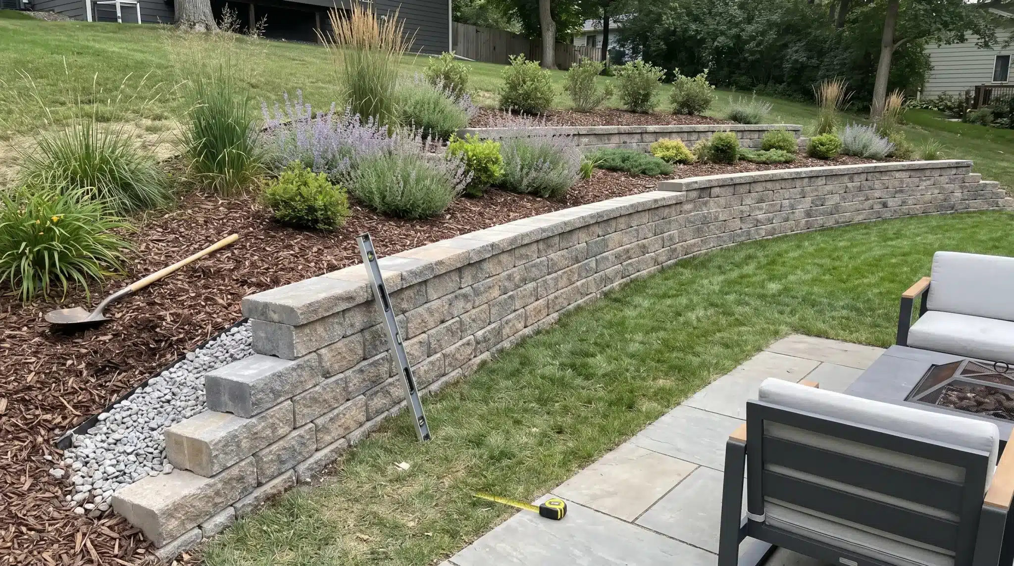
Quick Answer: A retaining wall requires a stable base, proper drainage, and correct block placement. Prepare the trench, compact the base, install blocks, and add backfill in layers. Interlocking blocks work well for small DIY walls, but always check soil, loads, and local requirements first. Building a retaining wall looks easier than it really is. The blocks are only the final layer of the work. What happens beneath them determines whether the wall stays stable after heavy rain and seasonal changes. For a small backyard wall, careful planning and the right installation steps can make the project manageable. This blog covers preparation, materials, and the building process, and explains when a project is better left to a professional. How to Plan a Retaining Wall Before Installation Good planning saves you from costly mistakes once you start digging. Measure the Wall Length and Height: Measure the full wall height and length, including the buried base. Mark corners, curves, and ends before digging, and account for block setback as each row moves back. Check the Slope and Nearby Loads: Inspect the area around the wall for extra weight from vehicles, patios, sheds, fences, or slopes. These loads can increase pressure and affect wall requirements. On sloped properties with multiple grade changes, a single retaining wall is rarely the whole answer, layered terracing and integrated hardscaping across the full yard are usually the more stable long-term approach. Locate Utilities and Property Lines: Check for underground utilities before digging and confirm property boundaries. Look for irrigation pipes, drainage lines, cables, or wiring that may need protection. Decide Where Water Will Go: Plan drainage before installation to prevent water buildup behind the wall. Check runoff paths, downspouts, and low spots, then create a safe outlet for water. Tools and Materials Needed for a Retaining Wall Gathering the right tools and materials before starting makes the installation smoother and helps avoid delays. Tools Materials Tape measure Retaining wall blocks Level Cap blocks Stakes and mason line Base aggregate Shovel Drainage stone Rake Perforated drainpipe Wheelbarrow Filter fabric Hand tamper Backfill material Rubber mallet Concrete adhesive Plate compactor Geogrid reinforcement (if required) How to Build a Retaining Wall Step By Step? Building a retaining wall starts with proper planning, a solid base, and careful placement to create a strong, stable structure that effectively holds back soil. Step 1: Mark The Wall Layout Start by marking the exact location of the retaining wall before digging. Place stakes slightly beyond both ends of the planned wall, then connect them with a mason line to create a straight reference line. For curved sections, use marking paint or a garden hose to outline the shape. Walk around the marked area from different angles to confirm the layout looks right. Step 2: Excavate The Trench Remove the topsoil, grass, roots, and other organic material before creating the trench. The excavation should provide enough space for the retaining blocks, drainage zone, working area, compacted base, and the portion of the first course that sits below ground. Dig until you reach firm, undisturbed soil rather than building over loose fill, mud, roots, or frozen ground. Step 3: Compact The Subgrade After excavation, inspect the trench bottom for weak or soft areas. Remove unstable soil and replace it with compactable aggregate when needed. Compact the entire trench evenly to create a firm foundation for the gravel base above it. Avoid filling deep low spots with loose soil or sand because they can settle later and affect the wall’s alignment. If water rises through the soil during compaction, address the drainage issue before continuing with construction. Step 4: Add and Compact The Gravel Base Add the approved base material in thin layers rather than applying the full depth at once. Compact each layer thoroughly before adding more material to create a stable foundation. Once the base reaches the required depth, screed it flat and check the surface carefully. Use a level to confirm the base is even from front to back and side to side. Correct any uneven areas before installing the first row because the accuracy of this layer affects the entire wall. Step 5: Set The First Course The first row of blocks is the most important part of the entire retaining wall. Begin placing blocks at the lowest point of the wall and set each unit directly on the prepared base. Check every block individually from front to back and side to side, then use a longer level to confirm the entire row stays consistent. Tap the blocks into position with a rubber mallet, keeping the front faces aligned with the mason line. Remove dirt, gravel, or debris from the base before placing each block. Step 6: Install the Drainage System Proper drainage helps reduce pressure behind the retaining wall and protects it from water-related movement. Place clean angular drainage stone directly behind the blocks as you build. If the wall design requires a perforated drainpipe, install it near the bottom of the wall and ensure it discharges to a safe outlet. Do not allow the pipe to release water into an area where it can collect behind the wall. Protect drainage outlets from soil, roots, and debris so water can continue flowing properly. Step 7: Add the Next Course Before adding another row, sweep the tops of the blocks clean so the next course sits properly. Install each new row using the block manufacturer’s connection system, such as lips, pins, or grooves. Stagger vertical joints between courses to improve stability and prevent continuous weak lines. Continue checking the wall for level and alignment as you work. Fix any movement or uneven sections immediately, rather than covering them with additional rows. Avoid stacking multiple courses without adding drainage stone and backfill behind the wall. Step 8: Backfill and Compact in Lifts Backfill gradually as the wall rises. Place drainage stone directly behind the blocks first, then add suitable soil or a recommended sand-and-gravel mixture farther back. Compact the fill in shallow layers rather than placing a large amount at once. Use hand tools near the wall face to avoid shifting the blocks, and keep heavy equipment away from smaller walls. Step 9: Add Geogrid If the Design Requires It Some retaining walls require geogrid reinforcement to handle additional soil pressure. If the design calls for it, use the exact geogrid type, placement, and spacing recommended by the manufacturer or engineer. Install it at the correct course, extend it in the proper direction, and pull it flat before covering it with fill. Avoid driving equipment directly over exposed geogrid and never replace structural reinforcement with landscape fabric, as they serve different purposes. Step 10: Continue Building and Checking Continue construction using the same process for each course. Set the blocks, check the level and alignment, add drainage stone, place backfill, and compact before moving upward. This repeated process keeps the wall stable and allows small adjustments before they become difficult to fix. Step 11: Cut and Install Cap Blocks Before securing cap blocks, place them temporarily to confirm the fit and layout. Where possible, stagger cap joints from the blocks below for a cleaner finish. Use a block splitter for a textured break, or a masonry saw for a smoother cut. Wear proper eye, hearing, and respiratory protection while cutting masonry. Clean dust from the surface before applying an exterior-grade concrete adhesive, and keep the adhesive away from visible edges to prevent mess around the finished wall. Step 12: Grade the Soil Above the Wall The final grading around the wall helps control future water problems. Shape the soil so that runoff flows away from the wall rather than collecting behind it. Keep downspouts, irrigation discharge, and other water sources directed away from the structure. If the design requires a specific surface soil type, follow those recommendations and avoid disturbing the drainage zone when planting. Quick Tip: Inspect your retaining wall after heavy rain, freeze-thaw cycles, or nearby landscaping work. Watch for leaning, bulging blocks, cracks, drainage issues, standing water, or soil erosion. Fix the cause of the problem instead of only covering visible damage, as these signs may point to deeper issues with drainage, soil pressure, or the wall base. How to Build Different Styles of Corners? Inside corners: Place blocks carefully to keep both wall sections connected. Follow the manufacturer’s overlap pattern and alternate the direction of each wall section as you add courses. Keep the drainage stone continuous behind the corner to prevent water from becoming trapped, and check the alignment regularly, as small shifts can affect the rest of the wall. Outside corners: Use matching corner blocks when available and follow the recommended bonding pattern to maintain strength. Avoid unsupported cut blocks at the corners, as they can shift over time and weaken the wall’s edge. Curved walls: Plan the curve before installation, because block setbacks change the shape of each higher course. Check the minimum curve radius for the block system, expect slightly wider joints on outside curves, and use smaller blocks or approved cuts for tighter curves. Recheck the curve alignment as the wall rises to ensure the correct shape is maintained. How Do Retaining Walls Create More Usable Space? A retaining wall holds soil between two different elevations, preventing the higher side from shifting, eroding, or spreading into the lower area. Once the wall is in place and the ground is level, that new flat area opens up options. A concrete patio or wood deck combination is a great next step in turning a previously sloped space into an actual outdoor living zone. Wet conditions can increase this pressure, especially in clay soil, during heavy rainfall, on steep slopes, or with added weight from vehicles and structures. A small garden border with little soil behind it carries far less pressure, so understanding the difference is important before planning a retaining wall project. Final Thought Building a retaining wall that lasts is not just about stacking blocks. The strength of the wall depends on the work below the surface, including proper excavation, a stable base, good drainage, and careful installation. Taking time to plan the layout, choose the right materials, and follow the correct building process can prevent costly repairs later. For smaller DIY projects, interlocking blocks can be a practical option when site conditions are suitable. However, always consider wall height, soil pressure, water flow, and local requirements before starting. A well-planned retaining wall will not only improve your landscape but also provide reliable support for years to come. The materials and plants you add around the wall matter just as much as the structure itself. Landscaping choices by region cover what actually holds up in your climate once the hardscaping is done. Frequently Asked Questions What is the Cheapest Way to Build a Small Retaining Wall? Pressure-treated timber and interlocking concrete blocks are usually affordable options. Keeping the wall simple, using local materials, and reducing the wall height can help lower costs. What is the 1/3 Rule for Retaining Walls? The 1/3 rule suggests burying about one-third of the wall height for stability. Actual depth depends on soil, drainage, frost conditions, and the wall system. Does a 2 Foot Retaining Wall Need a Footing? A two-foot block retaining wall usually uses a compacted gravel base instead of a traditional concrete footing. Requirements vary by wall type and site conditions. What Can I Use for a Small Retaining Wall? Common options include concrete blocks, timber, natural stone, brick, and landscape blocks. Interlocking blocks are popular for DIY projects because they are easy to install. What is the Easiest Retaining Wall to DIY? A low interlocking concrete block wall is often the easiest DIY choice. It requires fewer specialized skills but still needs proper base preparation and drainage.
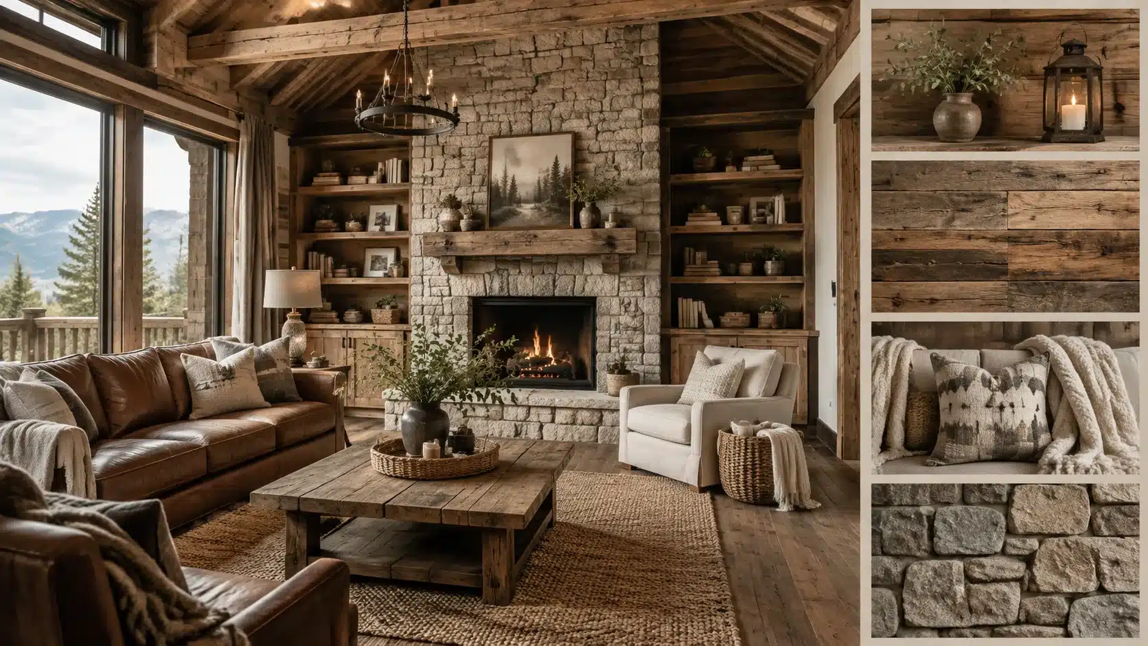
Some homes create an instant sense of comfort the moment you step inside. They feel warm, relaxed, and connected to nature. That is the charm of rustic interior design. While once associated mainly with cabins and rural homes, this style now works beautifully in apartments, modern houses, and urban spaces. Rustic interiors combine natural wood, stone finishes, cozy fabrics, and thoughtful details to create a balanced look. This blog explains the essential elements, color choices, and furniture styles that define rustic design. It also includes room-by-room ideas and tips for blending rustic features with other interior styles. What is Rustic Interior Design? Rustic interior design blends natural materials, earthy tones, and cozy textures to create a warm, welcoming home. Inspired by nature, it brings the outdoors inside through materials like reclaimed wood, stone, leather, and metal. Unlike polished modern styles, rustic design has raw finishes, imperfections, and handcrafted details. Exposed beams, vintage furniture, handmade ceramics, and textured fabrics add character and make each space feel unique. Comfort is a defining part of the style, with cozy blankets, linen fabrics, woven accents, and layered textures creating a relaxed atmosphere. Rustic interiors focus less on perfection and more on creating a practical, personal, and welcoming space that feels connected to nature. Core Elements of Rustic Interior Design Rustic interiors balance natural beauty with everyday comfort. These key elements help shape a space that feels warm, personal, and connected to nature. 1. Natural Materials: Rustic interiors use materials like reclaimed wood, stone, leather, and woven fabrics to bring texture and a natural feel indoors. 2. Earthy Colors: Warm browns, beige, cream, terracotta, and muted greens create a calm, nature-inspired atmosphere. 3. Rustic Furniture: Wooden furniture with visible grain, handcrafted details, and distressed finishes adds character and timeless appeal. 4. Warm Lighting: Soft lighting, wooden fixtures, lanterns, and fireplaces create a cozy and welcoming rustic mood. Rustic Interior Design For Every Room Rustic style can be adapted to different areas of the home by combining natural materials, warm colors, and comfortable textures. Each room can highlight rustic elements while keeping the space functional and inviting. 1. Rustic Living Room with Wood Features A rustic living room brings together natural materials like reclaimed wood, exposed beams, stone fireplaces, and comfortable furniture to create a warm gathering space. Wooden textures add character, while stone elements provide contrast and a grounded feel. Layer the room with linen fabrics, woven rugs, leather seating, and warm lighting to balance the heavier materials. Keeping the décor simple allows the natural textures to become the main feature of the space. 2. Rustic Kitchen with Farmhouse-Inspired Idea A rustic kitchen combines practical design with natural materials. Wooden cabinets, stone countertops, open shelving, farmhouse-style sinks, and rustic kitchen islands create a functional, welcoming space. Use simple ceramics, glass containers, and handcrafted details to add personality without making the kitchen feel cluttered. The focus should remain on durable materials and a comfortable layout. 3. Rustic Bedroom with Layered Natural Textures A rustic bedroom creates a comfortable retreat through natural materials and soft textures. Wooden bed frames, linen bedding, wool blankets, woven rugs, and warm lighting work together to create a relaxed atmosphere. Neutral colors help highlight the beauty of wood and fabric textures while keeping the room calm. Simple furniture and minimal décor allow each material to stand out. 4. Rustic Bathroom With Stone Materials Rustic bathrooms use natural finishes to create a warm and grounded look. Stone walls or countertops, wooden vanities, matte fixtures, and earthy colors add texture without making the space feel outdated. Soft lighting and simple textiles help balance the roughness of stone and wood, creating a bathroom that feels comfortable and connected to nature. 5. Rustic Dining Room With a Statement Wooden Table A solid wood dining table often becomes the centerpiece of a rustic dining room. Its natural grain and imperfect details add character while creating a welcoming place for everyday meals and gatherings. Pair the table with simple chairs, pendant lighting, and subtle natural décor to keep the look balanced. The goal is a space that feels comfortable rather than overly decorated. 6. Rustic Entryway With Functional Storage A rustic entryway combines style with everyday function. Wooden benches, wall hooks, woven baskets, vintage mirrors, and natural rugs help organize daily items while adding warmth to the entrance. Practical storage pieces with natural finishes create a welcoming first impression without taking up unnecessary space. 7. Rustic Home Office with Warm Elements A rustic home office combines a productive workspace with natural warmth. Wooden desks, leather chairs, open shelves, and soft lighting create a comfortable, less formal environment. Adding plants and simple accessories can soften the space while keeping the focus on functionality and organization. 8. Rustic Beverage Station with Earthy Touch A rustic beverage station adds a practical entertaining area while maintaining the style’s warmth. Wooden counters, open shelves, glassware, and natural finishes create a dedicated corner without taking up much space. Warm lighting and simple accessories help the area blend naturally with the rest of the home. Traditional Rustic vs Modern Rustic Design Modern rustic design retains the warmth of traditional rustic style while giving it a cleaner, lighter appearance. Instead of filling a room with heavy wood finishes, it uses natural materials more sparingly. The color palette often includes soft neutrals, warm whites, and earthy shades that create an open feel. Furniture tends to have simpler shapes, with pieces like linen sofas or streamlined chairs replacing oversized designs. The style combines aged materials with modern forms. Rustic details provide texture, while contemporary elements keep the room fresh and practical. Traditional Rustic Modern Rustic Dark wood throughout Balanced wood accents Large, heavy furniture Custom furnitures Decorative approach Simple and purposeful details Modern rustic design creates a comfortable space that feels natural without looking outdated. Blending Rustic Style with Modern Aesthetics Rustic design works well with many interior styles because natural materials create a flexible foundation. Wood, stone, leather, and woven textures can take on a different character depending on the elements paired with them. Here are some popular combinations and how they work. 1. Rustic Modern Design A wooden dining table paired with clean-lined chairs creates a balanced look, where the wood adds warmth and the chairs keep the space refined. Soft neutrals such as warm white, beige, and gray help connect both styles. Concrete surfaces, linen fabrics, and minimal accessories support the look without taking attention away from the natural materials. 2. Rustic Farmhouse Design Rustic and farmhouse styles share many similarities, including wood finishes, neutral colors, and a focus on comfort. The main difference is that farmhouse design draws more inspiration from practical rural living, while rustic style has a broader connection to nature, with open shelving, apron sinks, and shiplap walls. 3. Rustic Industrial Design Rustic industrial style creates contrast by combining warm materials with stronger structural elements. Reclaimed wood works well with metal, exposed brick, concrete, and iron details. The balance between materials is important. Warm wood tones help soften the harder look of industrial features, while metal accents add structure and depth. 4. Rustic Scandinavian Design A Scandinavian design blends natural materials with simple, functional styling. Both styles value wood, wool, and comfortable textures, but Scandinavian interiors usually use lighter colors and cleaner forms. Birch and ash woods often replace darker timber, creating a brighter appearance. Simple furniture, soft fabrics, and subtle decor keep the space calm. Mistakes That Can Ruin a Rustic Interior Design Style Rustic interiors depend on balance. Too many heavy materials, decorations, or dark tones can make the space feel crowded instead of comfortable. Using too much wood: Too much wood can make a room feel dark and heavy. Balance it with lighter colors and fabrics. Adding too many vintage pieces: Too many old pieces can create clutter. Use a few statement items for character. Choosing harsh lighting: Cool lighting can make rustic spaces feel cold. Use warm lights for a cozy feel. Creating a flat color scheme: Only using dark tones can make the room feel dull. Add lighter shades for balance. Filling every surface with décor: Too much décor can make the space feel crowded. Keep only meaningful pieces. Ignoring furniture size: The wrong-sized furniture can affect comfort and flow. Choose pieces that fit the room. How to Add Rustic Style on a Budget? Rustic interiors do not always require major renovations or expensive materials. You can achieve a rustic style without expensive renovations. Small upgrades, secondhand finds, and simple DIY projects can add natural textures, warmth, and character while keeping costs low. Rustic Update How it adds rustic style Average cost Reclaimed wood accents Adds natural texture through shelves, wall panels, or small décor pieces $20–$150 Thrifted furniture Brings aged character and a lived-in feel to the space $50–$300 Furniture refinishing Creates a rustic finish by highlighting natural wood grain $30–$100 Natural fabric décor Adds warmth with linen curtains, woven rugs, and cozy throws $25–$200 Vintage accessories Adds personality through baskets, pottery, and antique-style pieces $10–$100 Warm lighting upgrades Creates a cozy atmosphere with softer, rustic-inspired lighting $20–$150 Start with a few meaningful changes instead of replacing everything. Rustic interiors feel best when they combine natural materials, comfort, and personal touches. Frequently Asked Questions Is modern rustic still in style? Yes, modern rustic remains popular because it combines natural materials, cozy textures, and clean designs for a comfortable yet contemporary look. How do I make my house look more rustic? Use reclaimed wood, stone, textured metals, earthy colors, vintage accents, and warm lighting to bring a rustic feel into your home. What colors make a rustic look? Rustic interiors often use cream, beige, brown, gray, muted greens, and other earthy tones to create a warm and relaxed atmosphere. What stain works best for a rustic look? Dark walnut, classic gray, and aged barrel stains create a weathered wood appearance that adds rustic character to furniture and surfaces. Can rustic design work in a small home? Yes, rustic design works well in small spaces by using simple furniture, natural textures, and warm colors. What stain works best for a rustic look? Dark walnut, weathered gray, and aged oak stains create a rustic finish with a natural, reclaimed wood appearance. Bringing Nature’s Warmth into Your Home Rustic interior design is more than a decorating style, it is a way of creating spaces that feel warm, personal, and connected to nature. By combining natural materials, earthy colors, handcrafted details, and comfortable textures, rustic interiors create a relaxed, timeless atmosphere. Whether you add a few rustic touches or embrace the style throughout your home, the focus remains on simplicity, comfort, and authenticity. The beauty of rustic design comes from celebrating imperfections and creating a space that feels lived-in, welcoming, and uniquely yours.