

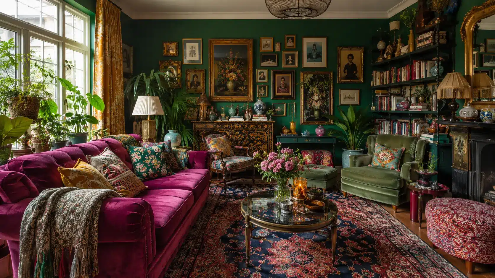
At some point, decorating started to mean taking things away. People were told to pare things back, stick to neutral colors, and hide their belongings. But for some homeowners, that approach never really felt right. Maximalist interior design takes a different approach. The colors you love should be on display. Your books go on the shelves. Ceramics, souvenirs from your travels, and even that inherited lamp that does not match anything all have a place in this style. The difference between a successful maximalist room and one that feels chaotic is all about intention, not just how much you have. Repeating colors, paying attention to scale, and sticking to a loose but consistent palette help keep a busy room feeling balanced. In this blog, you will learn about the history of maximalism, what makes it work, and how you can bring it into your own home step by step. What is Maximalist Interior Design? Maximalist interior design is a style that uses color, pattern, furniture, art, lighting, books, and personal objects to build a full, expressive room. It is often linked to the more-is-more idea, but the best maximalist rooms are still edited and thought through, with nothing added just to fill space. Bold color plays a big part, with deep, rich shades used across walls, furniture, and decor. Layered patterns and room layout ideas help florals, stripes, checks, and prints work together in the same room. Personal objects like books, art, and collections are displayed rather than hidden away. The result is a full room that still feels planned and intentional, never chaotic. A Brief History of Maximalist Interior Design Maximalist interior design is not new. Its roots can be traced to Victorian homes, Baroque interiors, Art Deco, and Hollywood Regency, where rich colors, ornate furniture, layered fabrics, and detailed artwork created dramatic spaces. Modern maximalism keeps that love of detail but focuses more on personality than wealth. Custom furniture, vintage pieces, modern lighting, travel finds, family heirlooms, and meaningful decor often appear together. The style made a strong comeback in the 1980s as bold colors and patterns returned to fashion. More recently, platforms like Pinterest and Instagram have helped popularize maximalism by showcasing colorful, layered homes to a wider audience. Key Features of Maximalist Interior Design These are the building blocks that give a maximalist room its bold, layered look. Most maximalist spaces use a mix of the features below. 1. Bold Colors: Maximalist rooms lean on jewel tones, bright paint, and deep, saturated shades. Some homeowners even paint the ceiling or a piece of furniture in a strong color to add contrast and make the room feel finished rather than flat. 2. Pattern Mixing: Florals, stripes, animal print, checks, and geometric patterns can all live in the same room. The trick is a shared color. When two patterns share at least one color, they read as a choice instead of a clash. 3. Layered Textures: Velvet, wood, metal, glass, wool rugs, cushions, wallpaper, curtains, and woven baskets all add texture. Mixing soft and hard materials gives a room depth, so it feels rich instead of flat. 4. Statement Furniture: A bold sofa, a patterned accent chair, a large coffee table, a vintage cabinet, or a sculptural side table can anchor an entire room. One strong piece often does more work than several small ones. 5. Gallery Walls and Art: Framed prints, paintings, mirrors, photos, and small wall objects grouped together build one of the most recognizable maximalist looks. A gallery wall turns empty space into a focal point. 6. Books, Collections, and Personal Objects: Shelves of books, ceramics, travel souvenirs, inherited decor, and plants give a maximalist room its personal feel. These pieces are what make the space feel like it belongs to one person, not a showroom. 7. Decorative Lighting: Chandeliers, colorful lampshades, table lamps, and wall sconces layered together add warmth and depth. Good lighting also keeps a full room from feeling dark or heavy. Why is Maximalist Interior Design Popular? Maximalist interior design is popular because it feels personal, warm, and creative. It gives homeowners permission to display what they love rather than hide everything away in storage. This style works especially well for people who enjoy color, vintage finds, art, books, and rooms that feel lived-in rather than staged. It also appeals to those tired of matching furniture sets and bare walls. Many people see their homes as a form of self-expression, and maximalism supports that idea. Social media has helped too, since bold, layered rooms tend to stand out and get shared more often. Stunning Maximalist Interior Design Ideas These ideas are an easy starting point if you want to bring maximalist style into a room without a full renovation. Each one works at a different budget, so you can pick where to start. 1. Use Bold Wallpaper Floral, tropical, geometric, vintage, or mural-style wallpaper can transform a plain room into a statement space in one step. Budget: Medium, averaging $50-$150 per roll of wallpaper. 2. Add Colorful Painted Furniture A cabinet, dresser, or sideboard painted in a deep teal, blue, green, or another saturated shade can bring character to the room while making older furniture feel fresh. Budget: Low to Medium, averaging $50-$300 depending on the furniture. 3. Mix Vintage and Modern Pieces Old furniture, modern lighting, and new decor can sit together in the same room without clashing, as long as a color or material ties them together. Budget: Medium, averaging $150-$600 per piece when buying secondhand or vintage. 4. Choose a Statement Sofa or Chair A velvet sofa, a patterned accent chair, a curved silhouette, or a bold color instantly creates a strong focal point. Budget: High, averaging $800 to $2,500 for a statement sofa, or $300 to $800 for an accent chair. 5. Layer Rugs, Cushions, and Curtains Textiles make a room feel warmer and fuller. Stacking a patterned rug under a plain one or piling different cushion prints together creates that layered maximalist look. Budget: Low to Medium, averaging $200 to $600 for a rug, cushions, and curtains combined. 6. Style Open Shelves Arrange books, ceramics, plants, candles, and photos with care so the shelf feels curated, not cluttered. Budget: Low, averaging $50 to $200 using items you already own plus a few new pieces. How to Start with Maximalist Interior Design Getting started does not mean redoing your whole home at once. These steps walk you through building the look gradually, so the room stays balanced instead of overwhelming. 1. Start with One Room Begin with a bedroom, living room, powder room, or reading corner instead of the whole house at once. This gives you a low-pressure space to test colors and patterns before committing further. 2. Choose a Color Palette Pick three to five main colors so the room feels connected, even with lots of pattern and decor. Write the colors down and refer back to them before buying anything new. 3. Pick One Statement Piece A large artwork, a bold rug, a patterned sofa, or a painted cabinet can serve as the anchor around which everything else builds. Choose this piece first, then build the rest of the room around its colors. 4. Add Layers Slowly Maximalism works best when it is collected over time. Rooms that are bought all at once often feel less personal than rooms built piece by piece. Give yourself permission to leave a corner unfinished while you look for the right piece. 5. Repeat Colors Around the Room Carry the same one or two colors through pillows, art, rugs, and lamps so the space feels tied together rather than scattered. This repetition is what makes a busy room read as designed instead of random. 6. Leave Breathing Space Keep walkways clear and avoid covering every surface. Empty space gives the eye somewhere to rest, which keeps a full room from feeling overwhelming. The Best Spaces to Embrace Maximalist Design Maximalist style can work throughout the home, but some rooms offer more freedom for bold colors, layered patterns, artwork, and personal collections. 1. Living Room Works well with gallery walls, patterned rugs, colorful sofas, books, plants, and layered lighting. This is often the room guests see first, so it can carry the boldest statement pieces. 2. Bedroom Works well with bold bedding, wallpaper, painted furniture, table lamps, and cozy textures. Keep the palette a little softer here so the room still feels restful at night. 3. Dining Room Great for statement lighting, dramatic wallpaper, mismatched chairs, and artwork. A bold dining room tends to feel more special for gatherings and meals. 4. Powder Room A small space where bold wallpaper, mirrors, and color can make a big impact without a big budget. Since guests only pass through briefly, it is a low-risk place to try a daring pattern. 5. Home Office Ideal for shelves, art, books, personal collections, and colors that feel creative rather than corporate. A layered, personal space here can make long work hours feel less sterile. Maximalist vs Minimalist: Two Opposite Design Philosophies These two styles sit at opposite ends of the interior design spectrum, so the differences are easy to see side by side. Style idea: Maximalism believes more is more, while minimalism believes less is more. Color: maximalism leans bold, rich, and mixed, while minimalism stays neutral, soft, and limited. Decor: maximalism is layered and personal, while minimalism is simple and reduced. Walls: maximalism favors art, wallpaper, and gallery walls, while minimalism keeps them clean, plain, and open. Mood: maximalism feels lively and expressive, while minimalism feels calm and quiet. Best for: maximalism displays personality, while minimalism creates visual calm. The Truth Behind Common Maximalist Design Myths Maximalist interior design is often misunderstood. Here are some common myths, cleared up. 1. Maximalism means clutter: Good maximalism is still planned. Every piece earns its place, even in a full room. Nothing gets added just to fill space. 2. It’s only for wealthy homes: Modern maximalism focuses on personality, not wealth. Homeowners mix vintage furniture, travel finds, and family heirlooms instead of buying everything new. 3. Patterns always clash in a maximalist room: Patterns feel intentional when they share at least one color. Florals, stripes, and checks can sit together without looking chaotic. 4. You have to fill every surface: Maximalist rooms still need breathing space. Keep walkways clear and leave some areas empty so the eye has somewhere to rest. 5. You need to buy everything at once: Maximalism works best when collected over time. Rooms built piece by piece often feel more personal than rooms bought all at once. Common Mistakes to Avoid with Maximalist Interior Design These are the most common ways a maximalist room can tip from bold into overwhelming. Mistake Why It Hurts the Room Adding too many unrelated items Every piece should connect through color, style, memory, or purpose Ignoring scale Too many oversized pieces can make a room feel cramped instead of full Mixing patterns without a color link Patterns feel intentional when they share at least one color Forgetting function A room should still be comfortable and easy to move through Not using enough lighting Layered rooms need enough light so they do not feel dark or heavy Final Thoughts Maximalist interior design is about bold color, layered detail, and personal expression. It’s popular because it feels warm and creative, giving homeowners permission to display what they love instead of tucking it away in storage. That’s why the style resonates with anyone drawn to color, vintage finds, art, books, and rooms that feel lived-in rather than staged. The best maximalist rooms feel full but thoughtful, built around repeated colors, useful furniture, and meaningful objects that make a space feel like home. Frequently Asked Questions Why Does Gen Z Like Maximalism? Gen Z likes maximalism because it supports self-expression, nostalgia, bold colors, and decorating with meaningful vintage or thrifted items. Which Interior Style Is Currently Trending? Maximalism is a leading 2026 interior trend, especially in spaces featuring layered patterns, rich colors, vintage details, and personal collections. What Design Style Is Shea McGee? Shea McGee’s “New Heritage” style combines classic architectural details, clean modern lines, warm materials, neutral colors, and layered textures. What is Y2K Interior Design? Y2K interior design recreates the late-1990s and early-2000s look using chrome, clear plastic, bright colors, curved furniture, and futuristic details. What Design Style is Jonathan Adler? Jonathan Adler is known for a playful modern style that blends mid-century furniture, bold colors, luxurious materials, and eye-catching decorative pieces.
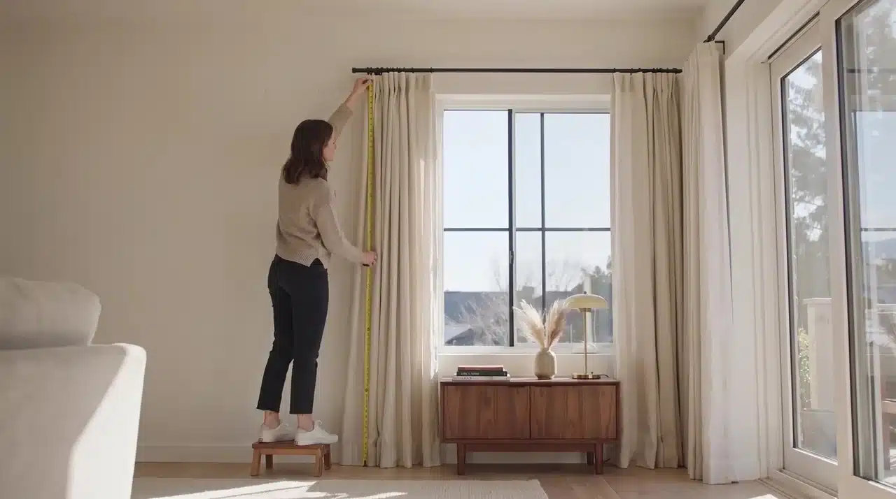
Quick Answer: Measure hardware placement first, calculate fabric width using your fullness multiplier, then determine drop length. Always measure at multiple points since walls aren’t perfectly even. Use a metal tape measure for best accuracy. A curtain that’s too short or narrow can make a room look unfinished, even with perfect fabric and color. Getting the fit right takes more than measuring your window. Measure the rod or track, decide the length, and factor in fullness before you buy. Hanging curtains the right way also matters. Skip these steps, and you risk gaps, thin panels, or curtains that don’t hang right. If you sew your own panels, knowing how to sew curtains matters as much as measuring them. Knowing how to measure for curtains helps you pick panels that fit your window and style. A few extra minutes with a tape measure save you from a costly reorder. Tools Needed to Measure Curtains You do not need special equipment to measure curtains. A few basic tools will get you accurate numbers: Metal tape measure: more rigid and accurate than fabric tape Step ladder: needed to reach rods mounted above eye level Pencil: to mark bracket positions on the wall Notebook or phone notes: to record measurements as you go Level (optional): to check that your rod brackets sit evenly Pro tip: Measure every window separately, even in the same room. Windows that look identical often have small differences of half an inch or more, especially in older homes. How to Measure for Curtains Step by Step Measuring for curtains is straightforward when you follow the right order. These four simple steps will help you get accurate measurements for a perfect fit and a professional-looking finish. 1. Decide Where the Curtain Rod or Track Will Go Measure only after you know where the rod will sit. Placement affects every number that follows. The standard rule is to mount the rod four to six inches above the window frame. Extending it beyond the frame on each side, usually four to ten inches, lets curtains stack fully open without blocking the glass. Expert recommendation: Place the rod several inches above and wider than the window frame, depending on your room style and available wall space. A higher rod also makes ceilings look taller, which is a common trick in small rooms. 2. Measure Curtain Width Curtain width follows this formula: Curtain width = Rod or track width × fullness ratio For example, a 60-inch rod × 2 fullness = 120 inches of fabric. If using two panels, each panel should be 60 inches wide. The extra width creates the folds for a fuller, more elegant look. Fullness is the extra fabric that creates soft folds when curtains are closed. Without it, curtains look flat and stretched, like a bedsheet pinned to a rod. Curtain Style Recommended Fullness Sheer curtains 2 to 3 times the width Standard curtains 1.5 to 2 times the width Heavy curtains 1.5 to 2 times the width Minimal look Around 1.25 times the width Never buy curtains equal to your window width. They will hang flat and stretched when closed, with no drape or texture at all. 3. Measure Curtain Length Curtain width is calculated by multiplying the rod or track width by your chosen fullness ratio. Fullness is the extra fabric that creates soft, natural folds instead of a flat appearance. Sheer curtains typically need 2–3× the rod width, while standard and heavy curtains look best at 1.5–2×, and minimalist styles around 1.25×. Avoid choosing curtains that match the exact width of your window or rod, as they will hang flat with little texture or drape when closed. 4. The Curtain Heading Style Your curtain heading style affects where you begin measuring, so it’s important not to overlook it. Eyelet curtains are measured from the top of the rod; rod pocket curtains require extra allowance for the fabric gathered above the rod; Tab-top curtains include the loop height; pinch-pleat curtains are measured from the hook position; and ring-top curtains start from the ring attachment point. Measuring from the wrong point can leave curtains hanging too high or dragging on the floor. Common Curtain Measuring Mistakes to Avoid Measuring the Window Instead of the Rod: This is the single biggest reason curtains look too narrow once hung. Measure curtains against the hardware, not the glass. Forgetting Fullness: Curtains need extra fabric width to form folds. Skipping this step leaves panels looking flat and stiff. Measuring Only One Side: Always check both width and height at multiple points. Walls and floors are rarely perfectly even. Ignoring Curtain Hardware: Rings, hooks, and clips all add height to your curtain’s starting point, which changes your final length. Buying Before Measuring: Ready-made curtain sizes vary between brands. An “84-inch” panel from one retailer is not always the same as one from another. How Curtain Length Changes the Look of a Room The exact drop length you choose changes the entire feel of a room, not just the fit. Floor Kiss: Curtains barely touch the floor, creating a tailored, clean look that suits modern spaces. Slight Break: A small amount of extra fabric folds gently at the bottom, giving a relaxed, lived-in appearance. Puddle Length: Extra fabric pools on the floor for a traditional, formal style, often used in dining rooms or living rooms. Homes with pets or young children usually do better with a floor-kiss or slightly shorter length, since puddled fabric collects dust and gets underfoot. High-traffic areas, such as hallways or entryways, also benefit from curtains that clear the floor rather than drag along it. Final thoughts Proper curtain measurements are the foundation of window treatments that truly complete a room. By measuring your hanging hardware first, calculating the width based on your desired fullness ratio, and selecting an appropriate drop length, you ensure the panels hang perfectly. Whether you’re hanging ready-made curtains or learning how to sew curtains from scratch, accurate measurements are essential. The right proportions transform a window from merely covered to elegantly finished. Taking time to measure correctly now prevents costly mistakes and ensures your curtains look professionally installed. These fundamentals apply whether you’re a beginner or an experienced sewer, making them indispensable for any curtain project. Frequently Asked Questions How Do You Measure What Size Curtains You Need? Measure the curtain rod width, choose a fullness ratio, then measure the drop from the rod to your desired curtain length. How Wide Should Curtains Be For a 54-Inch Window? Aim for a total curtain width of 81–108 inches (1.5–2× the width of the window) for a full, balanced appearance. What Size Curtains Do I Need For a 36-Inch Window? Choose curtains with a total width of 54–72 inches and measure the length from the rod to your preferred endpoint.
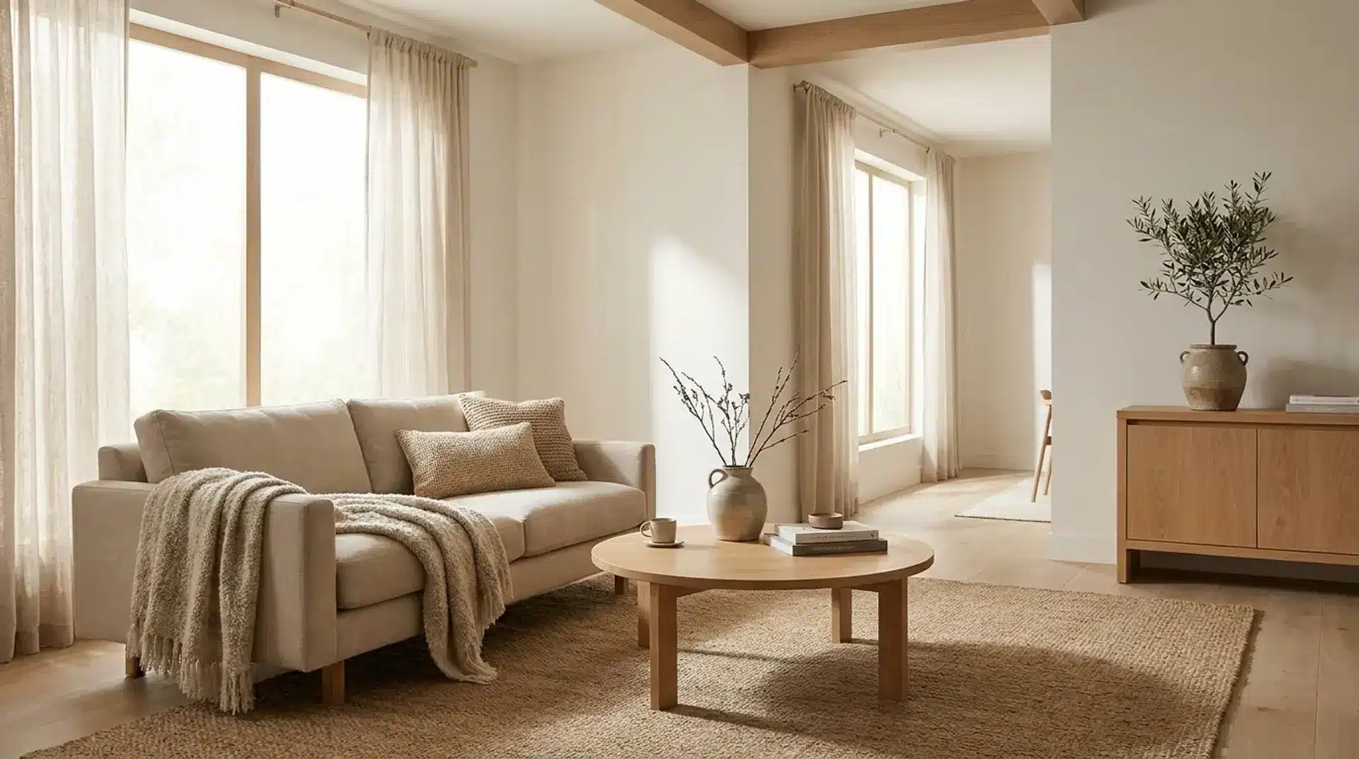
Quick Answer: Japandi interior design pairs natural materials like wood, stone, and linen with low-profile furniture and muted, earthy colors, favoring fewer well-crafted pieces over decoration to create rooms that feel simple, grounded, and purposeful. Japandi interior design blends Japanese minimalism with Scandinavian warmth to create rooms that feel calm, orderly, and lived in at the same time. It is not about buying matching furniture sets or copying a mood board. It is a way of choosing fewer, better objects and letting natural light, wood, and texture do the talking. If you have seen a room with low furniture, warm neutral walls, and a single ceramic bowl on a shelf, you have already seen Japandi in action. This blog breaks down where the style comes from, how to build its color palette, what materials and furniture belong in it, and how to apply it room by room, along with common mistakes people make along the way. What is Japandi Interior Design Japandi is a design style that merges Japanese wabi-sabi philosophy with Scandinavian hygge, creating homes that are simple, functional, and quietly warm. The word itself is a mashup of “Japanese” and “Scandi,” and design writers trace its rise in popularity to around 2017, when interest in slow living and decluttered spaces began to build momentum. Wabi-sabi is the Japanese idea that beauty exists in imperfection and the natural aging of things, such as a hand-thrown bowl with an uneven glaze. Hygge, the Danish concept, focuses on coziness, soft lighting, and creating a sense of comfort in everyday life. This fusion style has evolved from a niche trend into a mainstream approach used by architects and homeowners alike. Important Note: Japandi is not simply a beige room with wooden furniture. It is also not about making a space completely empty, filling it with Japanese-inspired decor, or using only light colors and minimalist furniture. The Core Principles of Japandi Style Before picking paint colors or furniture, it helps to know the values that hold the whole style together. These principles appear in every well-designed Japandi space and closely reflect the focus on natural materials, longevity, and mindful choices found in sustainable interior design. Intentional simplicity: Every object earns its place. Nothing sits in a room just for the sake of decoration. Natural materials: Wood, stone, linen, cotton, wool, and ceramic dominate, while plastic and glossy synthetic finishes are kept to a minimum. Muted, earthy colors: Warm neutrals and soft greens replace bright primaries and high-contrast feature walls. Craftsmanship over mass production: Handmade ceramics, joinery furniture, and woven textiles bring in small, honest imperfections. Functional beauty: A piece has to be both useful and attractive. If it fails either test, it will not be admitted to the room. Once these principles are clear, choosing furniture and colors becomes much easier because you filter every decision through the same short list of questions. Japandi vs Scandinavian vs Minimalist vs Wabi Sabi These four terms are often used interchangeably online, but they are not the same, and knowing the difference helps you shop and design with more confidence. Style Color Tone Furniture Key Idea Japandi Warm neutrals with earthy, darker accents Low, grounded, natural wood Balance of Japanese calm and Nordic comfort Scandinavian Bright whites, pale woods, occasional pastel pops Sleek, functional, light-colored Hygge, coziness, and long-winter brightness Minimalist Often stark white, gray, or black Sparse, sometimes industrial Reduction to the essential, less focus on warmth Wabi Sabi Muted, earthy, imperfect finishes Rustic, aged, handmade Beauty found in imperfection and aging Japandi: A balanced blend of Japanese minimalism and Scandinavian warmth, focused on natural materials, functionality, and understated comfort. Scandinavian: A bright, cozy design style that emphasizes light colors, clean lines, and practical furniture to create inviting, functional spaces. Minimalist: This approach removes unnecessary elements, prioritizing simplicity, clean forms, and only the essentials. Wabi-Sabi: A Japanese philosophy that celebrates imperfection, natural aging, and the quiet beauty found in handmade and weathered objects. As comparison guides from sites like 2Modern point out, Scandinavian rooms tend to be lighter and brighter, while Japandi leans into deeper, moodier contrast alongside its neutral base. Important Note: If bright, airy, and mostly white sounds like your taste, Scandinavian design may suit you better, while Japandi is the stronger fit if you want warmth paired with a bit of shadow and depth. The Best Colors for a Japandi Interior The Japandi color palette sits between the bright whites of Scandinavian design and the deeper, moodier tones found in traditional Japanese interiors. The right color choices play an important role in residential interior design, helping to create the warm, natural feel that Japandi spaces are known for. 1. Base Neutrals These soft, natural shades create a calming foundation that allows wood, stone, and textured fabrics to take center stage while keeping the room bright and balanced. Warm whites, sandy beige, taupe, and soft gray form the foundation for walls, ceilings, and larger furniture pieces. The word “warm” matters here, since a cool, blue-toned gray can clash with wood tones and make a room feel clinical rather than grounded. 2. Earthy Accents These nature-inspired tones add warmth and personality in small doses, bringing a sense of the outdoors into the space without disrupting its peaceful simplicity. They bring depth to neutral interiors through cushions, ceramics, artwork, and other handcrafted details without overwhelming the minimalist Japandi aesthetic. Use muted sage green, olive, clay, and terracotta sparingly on cushions, ceramics, or a single accent wall to bring in a bit of nature without overwhelming the palette. 3. Grounding Darks These deeper shades provide contrast and structure, helping define key features while adding depth to the otherwise light and neutral Japandi palette. Charcoal, espresso brown, and matte black show up in hardware, furniture frames, or dining tables to add contrast and keep the room from feeling flat. Keep finishes matte rather than glossy, since high shine reads as artificial and works against the natural, aged feel the style is going for. Japandi Design Materials, Furniture, and Textural Elements Materials are not just surfaces in a Japandi home, they are part of the design itself. The wood grain, the weave of a linen curtain, and the glaze on a ceramic vase are meant to be seen and felt, not hidden. 1. Wood and Natural Fibers Light oak, ash, walnut, bamboo, and rattan bring subtle variations in grain and texture while maintaining a clean aesthetic. Organic textiles like linen, cotton, hemp, and wool add softness to rugs, curtains, and upholstery. Natural fiber rugs typically range from $100–$400 for budget options and $500–$1,500 for higher-quality wool or handwoven designs. 2. Furniture Shapes Low-profile sofas, chairs, and tables create a relaxed atmosphere while reflecting traditional Japanese influences. Clean geometric forms replace decorative details, making craftsmanship, proportions, and natural materials the main visual elements. Expect to spend around $400–$900 on a budget Japandi sofa, $1,000–$2,500 on a solid wood dining table, and $200–$600 on a simple platform bed. 3. Ceramics, Metal, and Greenery Decorative elements are carefully chosen to add character while preserving a sense of calm. Brass, bronze, and copper details develop a unique patina over time, adding warmth and history to the space. Greenery is used thoughtfully, with plants like bonsai or peace lilies adding a refreshing natural element. Handmade ceramics and decor can cost anywhere from $50–$200 for a few accent pieces to $500 or more for artisan collections. How to Get the Japandi Look Room by Room The Japandi approach can be applied throughout the home by focusing on simplicity, natural materials, and thoughtful choices suited to each room’s purpose. Instead of adding more decoration, the style creates balance through texture, function, and carefully selected pieces. 1. Living Room Choose a low-profile sofa in breathable linen or wool, paired with a simple wooden coffee table and a textured rug to define the seating area. Keep surfaces uncluttered by displaying only meaningful objects, such as handmade ceramics, books, or natural accents. Soft lighting, warm neutrals, and organic textures help create a welcoming space. Furnishing a Japandi living room typically costs $1,000–$4,000, depending on the quality of the sofa, rug, lighting, and furniture you choose. 2. Bedroom The bedroom should support relaxation by using a restrained palette, limiting the room to a few complementary colors, and focusing on natural bedding materials like linen or cotton for a softer feel. A low platform bed, simple bedside tables, and minimal artwork can create a peaceful atmosphere. Avoid unnecessary decorations and instead introduce warmth. A Japandi platform bed typically costs $200–$600, while premium solid wood designs range from $800–$2,500. 3. Kitchen Light wood cabinetry, soft neutral tones, and understated hardware create a clean foundation without feeling overly modern or sterile. Keeping countertops clear and choosing durable natural materials help maintain an organized space. A Japandi-inspired kitchen refresh with new hardware, open shelving, and natural finishes can cost a few hundred dollars. At the same time, a full remodel may run into several thousand, depending on materials. 4. Bathroom Stone-inspired surfaces, wood-look vanities, woven storage baskets, and soft textiles can add depth to the space. Keep accessories minimal and focus on quality materials that create a spa-like atmosphere. Natural textures, warm lighting, and simple storage solutions help transform the bathroom into a quiet retreat that feels connected to the rest of the home. Updating a bathroom with wood-look vanities, stone-inspired surfaces, and quality fixtures typically ranges from $1,000 for minor upgrades to $5,000+ for a complete renovation. Common Mistakes to Avoid in Japandi Design A few small missteps can pull a room away from Japandi and toward a generic neutral interior instead. Choosing cool grays: Blue-toned grays clash with warm wood tones, making a room feel sterile rather than calm. Overfilling shelves: Open shelving should hold a few curated pieces, not double as general storage. Using glossy finishes: High-shine surfaces work against the natural, slightly imperfect feel the style depends on. Skipping contrast: A room that is all soft neutrals, with no darker anchor point, can feel flat rather than grounded. Mixing too many wood tones: Stick to one or two wood species to keep the room cohesive rather than busy. Avoiding these mistakes matters more than adding extra decor, since Japandi rewards restraint far more than it rewards accumulation. Final Thoughts Japandi interior design offers a practical way to create a calm, functional home without sacrificing warmth or personality. By focusing on natural materials, a considered color palette, and furniture that earns its place, any room can take on this balanced, grounded feel over time. Start small, choose one piece or one wall, and let the rest of the room follow at its own pace. Have you tried bringing Japandi style into your own home, or are you planning your first room? Share your experience, questions, or favorite sources of inspiration in the comments below. Frequently Asked Questions Why is Japandi Interior Design so Popular? Japandi has become popular because it combines the warmth of Scandinavian interiors with the simplicity of Japanese design. The result is a timeless, functional style that feels calm. Is Japandi A Good Choice for Families? Yes. Japandi prioritizes durable materials, functional layouts, and purpose-driven furniture, making it practical for everyday family life. Smart storage solutions also help. Can You Mix Japandi With Other Interior Styles? Yes. Japandi pairs well with modern, contemporary, rustic, and even industrial interiors as long as the overall look remains uncluttered and focused on natural materials. How to Make a Home Feel More Japandi without Renovating? Start by decluttering, replacing synthetic materials with natural ones, and switching to a warm neutral color palette. Add small updates like linen curtains, wooden accents, and handcrafted decor.

Removing a popcorn ceiling can give a room a cleaner, more updated finish, but the process involves more than simply scraping away the texture. Safety checks, proper preparation, careful removal, and surface repairs all play a role in achieving a smooth result without unnecessary damage. This blog explains how to remove a popcorn ceiling step by step, including asbestos testing, the tools you’ll need, DIY versus professional removal, expected costs and timelines, common mistakes, and alternatives if you prefer to cover the texture instead. Test Your Ceiling for Asbestos Before You Start This step determines everything else about your project, so it comes first for a reason. Older homes are more likely to have asbestos in the ceiling texture, so it is best to test first rather than guess. Testing is simple: Use an EPA-approved test kit, costing about $30 to $50 Results usually come back within about a week If positive, stop right away, do not scrape or sand, and call a certified asbestos abatement contractor If negative, you are safe to move forward with removal yourself Tools and Materials You Will Need Gather everything before you start so you don’t stop mid-job to run to the hardware store. Protective gear: Goggles, a dust mask or respirator, and old clothes you don’t mind ruining. Plastic sheeting: Enough to cover floors, walls, and furniture in the work area. A garden sprayer: For wetting down the texture in sections. A wide scraper and a sturdy ladder: For safely removing softened texture and reaching the ceiling. Joint compound, sandpaper, primer, and paint: For repairing and refinishing the ceiling once the texture is off, especially when preparing a smooth finish that complements a cathedral ceiling. How to Remove a Popcorn Ceiling Step by Step Working in small sections keeps the texture manageable and prevents the ceiling from drying out before you can scrape it. 1. Test a Small Area with Water Spray a small patch first to confirm the texture softens and comes off without damaging the drywall underneath. This test run tells you how long the texture needs to soak and whether your scraper is the right tool before you commit to the full ceiling. Reminder: Wait a few minutes after spraying before you test scrape, since rushing the test can give you a false read on how the texture behaves. 2. Spray the Ceiling in Small Sections Mist a three-foot by three-foot section with water from the garden sprayer, avoiding oversaturation that can soak into the drywall. Working in small patches keeps the texture wet enough to scrape while you finish each section before it dries out again. Reminder: Keep a light, even mist instead of soaking the surface, since heavy spraying is what leads to drywall damage down the line. 3. Let the Texture Soften Give the water a few minutes to soak in until the texture looks darker and feels soft to the touch. Softening time varies depending on texture thickness, so check a small spot with your scraper before working across the whole section. Reminder: Don’t let a sprayed section sit too long, since texture that dries back out will need another pass of water before it scrapes clean. 4. Scrape without Damaging the Drywall Hold the scraper at a low angle and work in gentle, even strokes to lift the softened texture without gouging the surface underneath. A wide, flexible scraper distributes pressure more evenly than a narrow one, helping protect the drywall as you go. Reminder: Stop and re-wet any spot that feels like it’s fighting back, since forcing a dry patch is what causes gouges and extra repair work. 5. Collect and Dispose of the Debris Scoop the wet debris into a trash bag as you go, then wrap up the plastic sheeting once the room is clear. Wet popcorn debris is heavier than it looks, so double-bag it before hauling it out to avoid tears or spills. Reminder: Check local disposal rules first if there’s any chance the texture contains asbestos, since regular trash pickup may not allow that material. DIY vs Professional Popcorn Ceiling Removal The right choice depends on how much time you have, how comfortable you are with the mess, and the condition of the ceiling. Factor DIY Professional Cost Lower, materials only Higher, includes labor Safety Depends on asbestos status Trained for hazardous materials Time Longer, especially for beginners Faster with experienced crews Mess Contained but hands-on Managed with less homeowner effort Ceiling condition Best for simple, unpainted texture Better for damaged or painted ceilings Finish quality Varies with skill level Consistently smooth results If your ceiling is simple and asbestos-free, DIY can save real money. Anything more complicated is usually worth handing off to a pro. How Long Does Popcorn Ceiling Removal Take The timeline depends on the room size, how well the texture absorbs water, and the amount of follow-up repair work. Preparing and covering the room can take a couple of hours, while spraying and scraping a single average bedroom often takes a few more hours. Drying time between repair coats, sanding, and painting usually stretches the full project across two to four days from start to finish. Painted or heavily textured ceilings tend to push that timeline toward the longer end, since extra scraping, skim coating, or minor concrete repair around adjoining surfaces can add more time. How Much Does Popcorn Ceiling Removal Cost Cost varies significantly depending on whether you do the work yourself or hire someone to do it. Option Typical Cost Notes DIY removal Often under $100 per room Covers an asbestos test kit, scraper, sprayer, and finishing supplies Professional removal $932 to $3,086 on average Contractors typically charge $1 to $6 per square foot Higher-end costs Toward the top of the professional range Driven by water damage, cracking, or unusually high ceilings needing extra repair and equipment Get a quote from at least two contractors before committing, since pricing can vary based on local labor rates. Factor in the cost of an asbestos test either way, since it protects you regardless of which route you choose. Popcorn Ceiling Removal Mistakes to Avoid A few small missteps can turn an easy weekend project into extra repair work, so it helps to know what to avoid. Oversaturating the drywall lets water soak through and damage the paper backing, while scraping too hard gouges the surface and creates more repair work than the texture removal itself. Skipping an asbestos test in an older home can expose you to fibers that are dangerous to breathe, and leaving fixtures uncovered puts them at risk of water and debris damage. Painting over damp joint compound is another common mistake, since it often bubbles, peels, or shows uneven texture once dry. Failing to protect floors and walls with plastic sheeting or drop cloths can leave behind a difficult cleanup, as wet texture tends to stick to nearby surfaces. Ways to Decorate Over a Popcorn Ceiling Removing the texture is not the only option, and decorating over it can work well if you would rather skip the mess entirely. Wood plank ceiling: Adds warmth and fully hides the texture once installed over furring strips. Works well in living rooms and bedrooms where a rustic or coastal look fits the space. Drop ceiling tiles: A straightforward option that also gives easy access to wiring or plumbing above. Popular in basements and utility spaces where future access matters more than a seamless finish. Textured wallpaper or ceiling paper: Covers the popcorn look with a fresh pattern without removing anything. A budget-friendly choice that can be swapped out again later if your style changes. Tin or faux tin ceiling tiles: Add a decorative, vintage look while fully covering the old texture. Common in kitchens and dining rooms, where a pressed-metal pattern adds character. Beadboard panels: Create a clean, cottage-style look and can be installed directly over the existing texture with minimal prep. A good fit for bathrooms and entryways seeking a classic, textured wall-to-ceiling look. Frequently Asked Questions Can I Just Put Drywall Over a Popcorn Ceiling? Yes, you can install drywall over a popcorn ceiling as long as the existing surface is stable and there are no signs of moisture damage or structural problems. Does Removing a Popcorn Ceiling Increase Home Value? Removing a popcorn ceiling can make a room look cleaner and more modern, which may improve buyer appeal, though the effect on resale value depends on the home and local market. Is It Safe to Sleep in a Room with a Popcorn Ceiling? Yes, sleeping in a room with an intact popcorn ceiling is generally safe, but you should avoid scraping, sanding, or damaging it if asbestos may be present. When Should I Worry About a Popcorn Ceiling? You should be concerned if the ceiling is crumbling, stained, water-damaged, or showing signs of disturbance, especially in homes built before the mid-1980s. Will 30 Minutes of Asbestos Exposure Hurt You? A brief exposure does not guarantee illness, but no asbestos exposure is considered completely safe; contact a professional if exposure occurred. Final Thoughts A smooth ceiling comes down to following the sequence: test first, prepare the room, soften the texture, scrape carefully, repair the surface, then prime and finish. Skipping a step creates more work later, so take it one stage at a time, and the results will hold up. Give yourself a full weekend if it’s your first time, and don’t rush the drying stages between repairs and paint. Once that last coat goes on, you’ll have a ceiling that finally matches the rest of the room.
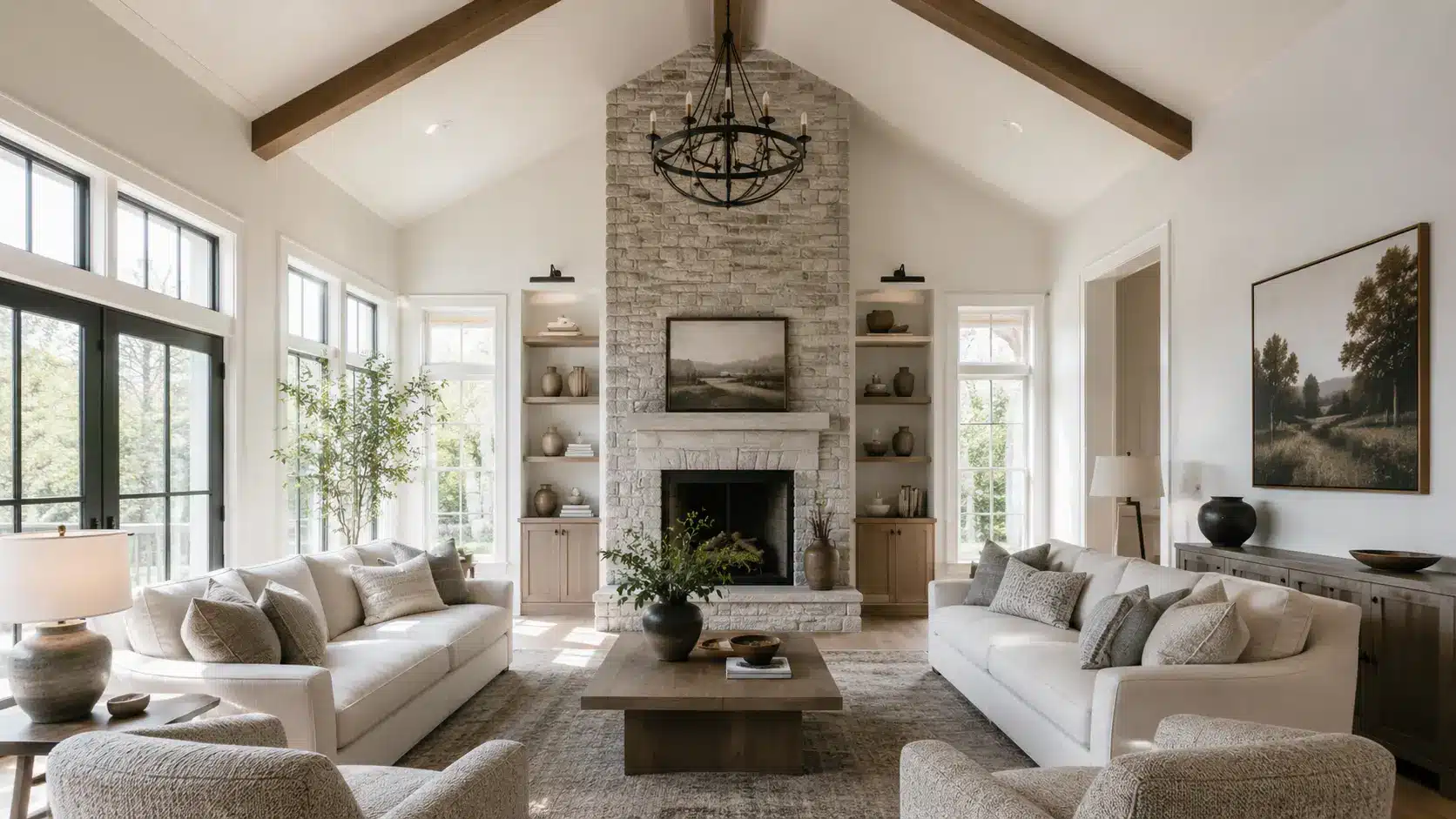
Quick Answer: Cathedral ceilings work best when tall proportions are balanced with appropriately scaled lighting, architectural details, warm materials, and a layout suited to the room’s everyday use. A cathedral ceiling can become one of the most eye-catching features in a home, but decorating the space beneath it takes the right balance of scale, warmth, and function. From exposed beams and dramatic lighting to wood finishes, skylights, and statement fireplaces, there are plenty of ways to make that extra height feel purposeful rather than empty. In this blog, you’ll find practicalcathedral ceiling ideas for different rooms, plus inspiration for lighting, finishes, costs, and design choices that can help you plan the space with confidence. Cathedral Ceiling Living Room Ideas to Try The living room is where cathedral ceilings are most often used, since the extra height suits large furniture and gathering spaces. It is also where ceiling proportions are most noticeable, especially when compared withlow-ceiling design, so getting the scale and balance right from the start matters. 1. Exposed Wood Beams in a Contrast Color Painting exposed beams a contrasting shade draws the eye upward and adds definition. Reclaimed oak feels rustic, while faux wood beams are lighter and easier to install. A matte or satin finish reduces glare under strong overhead lighting, which matters more under a cathedral ceiling than under a flat one. Budget for scaffolding or a lift rental if the beams sit higher than a standard ladder can safely reach. 2. Oversized Statement Chandelier A large chandelier fills the vertical space and keeps the room from feeling empty at the top. Choose a fixture with a lift kit or an extendable cord so bulb changes don’t require setting up a full ladder every time. Measure the room’s width before buying, since a chandelier sized for an 8-foot ceiling can look lost under a peak that reaches 18 or 20 feet. A dimmer switch also helps the fixture work for both bright gatherings and quiet evenings. 3. Floor-to-Ceiling Stone Fireplace Wall Extending stone or brick from the floor to the peak turns the fireplace into the room’s anchor. This works especially well in great rooms where the fireplace is already the focal point. Lighter stone tones keep the wall from feeling heavy in a room that already reads as large, while darker stone adds warmth in spaces with a lot of glass. Check with a structural engineer to see whether the chimney chase needs reinforcement to support the added weight at that height. 4. Clerestory Windows Below the Peak A row of small windows set just below the roofline brings in extra daylight without altering the wall layout below. This is a strong option for interior rooms that lack natural light on the main walls. Fixed panes keep costs down by eliminating the hardware needed to open and close, though operable versions help vent hot air that collects near a high ceiling. Placement matters too, since north-facing windows provide steady, even light without the glare of direct afternoon sun. 5. Two-Tone Paint Split at the Roofline Painting the lower wall one shade and the upper slope a lighter or darker tone visually breaks up the height. This costs far less than structural changes and can be repainted easily if you change your mind later. A line of painter’s tape along the roofline keeps the split crisp, and testing both colors on a large swatch board under actual room light avoids surprises once it dries. This idea also pairs well with crown molding or a simple trim line marking exactly where the two tones meet. Cathedral Ceiling Kitchen and Dining Ideas Kitchens and dining areas with cathedral ceilings often feel larger and more open, almost like one big shared space. Because the ceiling is so high, lighting and finishes need to stand out enough to be noticed from below. 6. Shiplap Ceiling Over a Farmhouse Island White shiplap panels reflect light and pair naturally with a wood island. It is a lower-cost way to add texture than full-wood-plank ceilings. Pre-primed shiplap saves a painting step and keeps the finish consistent across a large ceiling area. Leaving small gaps between boards during installation also prevents buckling as humidity shifts with the seasons. 7. Pendant Lights Following the Slope A row of pendants installed at graduated heights along the slope keeps task lighting close to the counter, even though the ceiling itself is far overhead. Sloped-ceiling adapters or swivel canopies keep each pendant hanging straight rather than tilted to the roofline. Spacing pendants evenly over the island, rather than centering them on the ceiling peak, keeps the light aimed where the work actually happens. 8. Skylight Above the Dining Table A single skylight centered over the table adds daylight exactly where people gather. Structural review is required before cutting into the roof, so a licensed contractor should assess the rafters first. Solar-powered shades help control heat gain on south-facing skylights without adding wiring. Flashing installed correctly around the opening is what actually prevents leaks, so this is not a step to shortcut on a DIY basis. 9. Exposed Trusses Over an Open Kitchen Leaving structural trusses visible, rather than covering them with drywall, reduces material costs and adds an architectural detail that a flat ceiling cannot offer. A clear or lightly tinted sealant protects the wood from kitchen grease and moisture without hiding the grain. This works best when the trusses are already in good condition, since sanding and refinishing older wood significantly increases the project cost. Cathedral Ceiling Bedroom Ideas to Create a Stunning Space Bedrooms with cathedral ceilings need a softer approach, since the goal is comfort rather than drama. Scale and warmth matter more here than in a living room, since an overly grand feel can work against a good night’s sleep. 10. Canopy Bed Under a Wood-Paneled Peak A canopy bed frame draws the eye down, while the wood-paneled ceiling above still gets its moment. This balances the room so it does not feel too vast for sleep. Lightweight linen drapery on the canopy softens the room without blocking airflow near the ceiling. Pairing the frame’s wood tone with the paneling above, rather than contrasting it, keeps the look intentional instead of accidental. 11. Reading Nook Under the Low Slope The lower sides of a cathedral ceiling are often wasted space. Building a window seat or reading nook there uses the awkward height instead of ignoring it. Built-in storage under the seat uses the shallow space that is often too low for standing furniture. A single well-placed sconce or floor lamp is usually enough light for the nook, since overhead fixtures rarely reach that low an angle well. 12. Painted Navy or Charcoal Ceiling A dark ceiling color visually lowers the ceiling, making a large bedroom feel more enclosed and restful at night. This approach also works well with black bedroom ideas, especially when deeper tones are balanced with lighter walls and bedding. A flat or matte sheen hides small surface imperfections better than a gloss finish, which matters more on a ceiling than on a wall. 13. Dormer Window in an Attic Bedroom Adding a dormer brings headroom and light to an attic space with a cathedral ceiling, which is often too dim and too steep on its own. Shed dormers add more usable floor space than gable dormers, though they change the roofline more visibly from outside. Permitting requirements vary by municipality, so confirm with a local building department before finalizing a design. Cathedral Ceiling Lighting Ideas to Refresh Your Space Lighting is the most repeated topic in every cathedral ceiling article, yet most posts scatter tips rather than group them, so here they are together. 14. Layered Lighting Plan Combine ambient overhead lighting, task lighting near seating or counters, and accent lighting on architectural details. No single fixture can light a cathedral-ceiling room well on its own. Putting each layer on its own switch or dimmer makes it easier to adjust the room’s mood without turning everything on at once. Smart bulbs or a basic lighting control panel is worth the extra cost here, since re-wiring after the fact is far more disruptive at height. 15. Track Lighting Along the Ridge Beam Track lighting mounted at the ridge can be aimed in different directions, which is useful in irregularly shaped rooms where a center fixture would leave dark corners. LED track heads run cooler and use less energy than older halogen versions, which matters when fixtures are hard to reach for maintenance. Adding a few extra heads beyond the minimum gives room to redirect light later as furniture layouts change. 16. Wall Sconces to Break Up Bare Walls Sconces placed partway up a tall wall provide light at a human scale, rather than relying solely on fixtures hung from the ceiling. Hardwired sconces look cleaner than plug-in versions but require an electrician to add wiring inside the wall. Spacing them evenly, roughly 60 to 66 inches from the floor, keeps the light consistent across a long wall run. Ways to Add Texture and Depth to a Cathedral Ceiling The finish you choose on a cathedral ceiling changes the mood of the entire room, from airy to grounded. The surface area here is much larger than a standard flat ceiling, so small material choices have an outsized visual impact. 17. Whitewashed Wood Planks A whitewash treatment keeps the wood grain visible while brightening the ceiling, which suits coastal or farmhouse styles. A diluted paint-to-water ratio, tested first on a scrap board, controls how much grain shows through versus how bright the finish looks. Unfinished pine takes whitewash more evenly than pre-sealed wood, so checking the board type before starting saves rework. 18. Board and Batten on the Sloped Walls Applying board-and-batten to the angled portion of the wall, not just the flat sections, adds texture without competing with the ceiling. Pre-cutting battens to match the roof pitch avoids visible gaps where the angle changes. Painting the boards and wall the same color keeps the texture subtle, while a contrasting color makes the detail more of a statement. 19. Metal Beams for an Industrial Look Exposed or added metal beams work well in loft-style homes and pair naturally with black metal light fixtures and concrete or polished wood flooring. Faux metal-wrapped wood beams cost less than solid steel and are far easier to install without heavy equipment. A matte black or bronze powder coat finish resists fingerprints and scuffing better than a raw or polished metal surface. Cathedral Ceiling vs. Vaulted Ceiling Before picking an idea, it helps to know exactly what you are working with. Feature Cathedral Ceiling Vaulted Ceiling Roofline Follows the exact pitch of the roof Does not have to match the roofline Shape Symmetrical, rises to a center ridge Can be asymmetrical, curved, or single-sloped Framing Uses the roof rafters directly Often needs separate framing below the roof If your ceiling mirrors the shape of your roof perfectly, you have a true cathedral ceiling. Most of the ideas below apply to both styles, since they share the same design challenges. How Much Does a Cathedral Ceiling Cost Converting an existing flat ceiling into a cathedral ceiling generally costs between $16,000 and $35,000, depending on the size of the space, the extent of structural changes, and the complexity of the project. A smaller project may cost less, while larger renovations can become more expensive if pipes, wiring, insulation, or HVAC ducts need to be adjusted during construction. Building a cathedral ceiling in a new home is usually more affordable than modifying an existing structure because the roof framing can be planned from the start to accommodate the added height. Which Rooms Suit a Cathedral Ceiling Best Not every room benefits equally from the extra height, so it helps to know where a cathedral ceiling actually earns its cost. Living rooms and great rooms: ideal, since the height reads as grand rather than empty. A vaulted or cathedral ceiling here also gives the most flexibility for large furniture groupings and statement lighting. Open kitchens: work well when paired with the lighting ideas covered earlier. The added height also helps vent cooking heat and odors away from the main living space. Primary bedrooms: can work with softer, cozier touches. Darker paint or lower-hanging fixtures help keep the room feeling intimate despite the extra volume. Small bedrooms, bathrooms, and closets: usually feel oversized and offer little practical benefit. The added heating and cooling cost in these smaller rooms rarely matches the visual payoff. Pros and Cons of Having a Cathedral Ceiling Every idea above looks appealing in a photo, but living with a cathedral ceiling day to day comes with real trade-offs worth weighing first. Pros Cons More perceived space Higher heating and cooling costs More natural light Harder fixture and fan maintenance Can raise home value by 5 to 25 percent (NAHB data via Bob Vila) Higher construction costs Makes rooms feel grander for gatherings Limit furniture and decor placement near the slopes Compare both sides against your budget and lifestyle before committing to a cathedral ceiling. The best choice depends not only on visual appeal but also on how well the ceiling suits your daily needs and how you use the space. Frequently Asked Questions What are the three types of ceilings? The three common ceiling types are flat, cathedral, and vaulted ceilings. Each offers a different look, ceiling height, and structural design depending on the home’s layout. What is the most expensive ceiling type? Coffered ceilings are generally among the most expensive because they require detailed framing, trim work, and skilled installation. Costs vary based on materials and design complexity. Do cathedral ceilings make a room look bigger? Yes. Cathedral ceilings create more vertical space, making rooms feel larger, brighter, and more open. They also allow for larger windows and better natural light. What is a fancy ceiling called? A decorative or fancy ceiling is often called a coffered, tray, vaulted, or cathedral ceiling. The name depends on the ceiling’s shape and architectural style. What do you call a fake ceiling? A fake ceiling is commonly called a false ceiling, drop ceiling, or suspended ceiling. It is installed below the main ceiling to hide wiring or ducts or to improve lighting and insulation. Final Thoughts A cathedral ceiling is not just a look you install once and forget. It changes how a room feels, how much it costs to heat, and how much upkeep it demands over time. Picking the right idea for the right room and going in with real cost numbers instead of guesswork makes the difference between a ceiling you love and one you regret. Start with the room where the height will be used most, then match the lighting and materials to how that space functions day to day. A cathedral ceiling, done thoughtfully, pays off for years, while one chosen purely for looks often becomes a source of ongoing maintenance and higher bills.
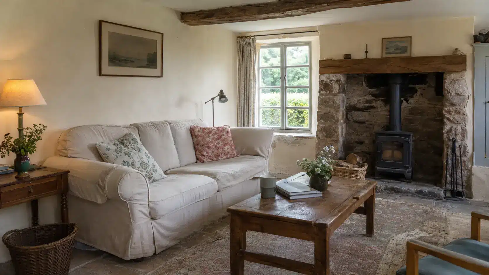
A worn armchair next to a wooden side table. Floral curtains paired with striped cushions. Old ceramics mixed in with newer finds. None of it matches perfectly, and that gentle mismatch is exactly what gives English cottage style its warmth. You don’t need a countryside cottage or a professional stylist to get this look right. A few simple choices in your own home can bring that same feeling to life. Here are easy ways to bring English cottage style into an American home, no big budget or full renovation required What is English Cottage Style? English cottage style is a design approach based on the small, rural homes found across the English countryside, built around warm colors, natural materials, and furniture collected over time rather than bought as a matching set. The look favors comfort and character over polish, with rooms that feel gathered instead of designed all at once. Floral patterns, aged wood, and soft, layered fabrics are signature elements of the style. The style traces back to centuries-old thatched cottages, where practical materials and small footprints shaped both the exterior and interior. That history still shows up today in the low ceilings, deep window sills, and cozy proportions that many cottage-inspired homes borrow from the original, setting them apart from softer, more romantic looks like French cottage style. 13 Ideas to Bring English Cottage Style Into Your Home These ideas cover the furniture, materials, and details that make this style recognizable, without requiring a full renovation. 1. Exposed Wood Beams Real or faux beams across a ceiling instantly signal age and character. Faux beams work well in most American homes where original timber framing was never part of the construction. A darker stain tends to read as more authentic than a light, raw wood finish. Pairing the beams with a lighter ceiling color also helps them stand out rather than blend into the room. Best for: living rooms, kitchens, and dining rooms with higher ceilings. 2. A Stone or Brick Fireplace A fireplace wall in natural stone or brick gives a room an anchor point. Even a painted brick surround can suggest the same weight and history. Leaving some of the natural texture exposed rather than fully smoothing it over keeps the rustic feel intact. A wood mantel on top adds a warmer contrast against the stone or brick. Best for: living rooms and family rooms used as the main gathering space. 3. Mixed Florals and Patterns Chintz, ticking stripes, and small florals layered together are a hallmark of the look. Committing to one dominant pattern across curtains and a chair keeps the mix from feeling chaotic. Adding a second, smaller-scale pattern on pillows or a lampshade builds depth without overwhelming the room. Keeping the color palette consistent across patterns is what makes the mixed patterns feel intentional rather than random. Best for: living rooms, bedrooms, and reading nooks. 4. Antique or Vintage Furniture A weathered dresser, a vintage armchair, or an old farmhouse table gives the room instant history. Pieces with visible wear tend to read as more authentic than brand-new ones. Mixing furniture from different decades adds to the collected feel, building a vintage room works best when pieces share a general tone rather than a matching set. Estate sales, thrift stores, and vintage marketplaces are reliable places to find these pieces. Best for: bedrooms, dining rooms, and entryways. 5. A Roll-Arm Sofa The rounded, rolled arm is one of the most recognizable features of this style. It pairs naturally with linen slipcovers or a soft floral. A slightly worn or loose-fit slipcover looks more at home in this style than a tightly upholstered, brand-new finish. Adding a few well-chosen throw pillows on top completes the look without extra cost. Best for: living rooms and sunrooms. 6. Wicker and Rattan Accents A wicker chair, basket, or side table softens the formality of antique wood pieces. It also brings in a natural texture that contrasts nicely with heavier furniture. Using wicker baskets for everyday storage adds both function and texture. A rattan headboard or mirror frame can bring the same softness into a bedroom. Best for: sunrooms, bedrooms, and entryways. 7. Layered Persian or Oriental Rugs A worn-in rug, ideally one that looks like it has been in the family for years, is often the easiest place to start building a color palette. Repeating a color from the rug elsewhere in the room ties everything together. Layering a smaller rug over a larger one adds depth and visual interest underfoot. Vintage and overdyed rugs both work well if a true antique is out of budget. Best for: living rooms, dining rooms, and hallways. 8. A Soft, Earthy Color Palette Soft creams, sage and moss greens, dusty blues, and warm ochre accents form a reliable starting palette. These colors read as pulled from the landscape rather than trend-driven. Using a single accent color across two or three rooms helps the whole home feel connected. Keeping wall colors muted lets patterned textiles and furniture stand out instead of competing with a bold backdrop. Best for: whole-home color planning, starting with the most-used rooms. 9. Linen and Wool Textiles Linen curtains, wool throws, and cotton slipcovers bring in the tactile, practical materials this style is known for. These fabrics also hold up well to daily use, which fits the lived-in feel. Linen, in particular, softens and looks better with age, unlike synthetic fabrics that tend to look worn out rather than worn in. Layering a wool throw over a linen sofa adds texture without adding another pattern. Best for: living rooms and bedrooms. 10. Open Kitchen Shelving Open shelves holding mismatched but coordinated dishware give a kitchen a collected, unfussy look. A farmhouse sink and vintage-style hardware round out the effect. Grouping dishware by color rather than by set makes an open shelf look curated, not cluttered. Hanging a few dried herbs or a small plant nearby adds a touch of garden to the space. Best for: kitchens with at least a little extra wall space. 11. A Gallery Wall A wall of framed art, family photos, or botanical prints adds the layered, personal feel central to this style. Mixing frame styles and sizes looks more natural than a uniform grid. Including a few personal or sentimental pieces alongside decorative art makes the wall feel more authentic. Leaving slightly uneven spacing between frames also helps it read as collected over time rather than professionally arranged. Best for: staircases, hallways, and living room walls. 12. Garden-Inspired Touches Fresh flowers in a simple ceramic jug, botanical wallpaper, or a small indoor herb garden all nod to England’s obsession with gardening. Even a single vase of seasonal flowers goes a long way. Botanical prints on fabric or wallpaper bring the same feeling into a room year-round. A small collection of potted plants near a window also echoes the look of a cottage garden indoors. Best for: kitchens, entryways, and sunrooms. 13. Layered Table Lamp Lighting Multiple table lamps, rather than a single central overhead fixture, create the warm, pooled light this style relies on. Soft lampshades in linen or a small print keep the lighting consistent with the rest of the room. Placing lamps at different heights throughout a room adds visual interest and improves light coverage. Warm-toned bulbs also help maintain the cozy, golden feel this style is known for. Best for: living rooms and bedrooms. Charming English Cottage Style Corners You don’t need to renovate to add cottage character. A few small corners can carry the whole feeling. Pick just one to start, and let it grow from there. 1. Reading Corner: A vintage chair as the centerpiece, a wooden bookshelf close by, and a warm lamp for evening light turn any quiet spot into a reading corner. Even a single armchair by a window can hold the whole feeling. 2. Tea Corner: Ceramic cups for a personal touch, a wooden tray for serving, and open shelves to display the pieces you use most bring cottage charm to a small tea corner. A shelf near the kettle is often all the space it needs. 3. Fireplace Corner: An antique mirror for light and depth, candles for warmth even without a fire lit, and vintage artwork on the mantel finish a cozy fireplace corner. The mantel is the easiest place to rotate seasonal touches. 4. Entry Corner: A wooden bench to sit on while putting on shoes, basket storage to keep everyday items organized, and simple wall hooks complete a functional entry corner. Keep it tidy but let it look used, not staged. Frequently Asked Questions What is the 3-5-7 rule in interior design? The 3-5-7 rule suggests decorating with odd-numbered groupings of three, five, or seven items to create a balanced and visually appealing space. What color makes a house look expensive? Neutral shades like warm white, cream, greige, soft taupe, and sage green can make a home look more elegant and timeless when paired with natural materials. What is the new trend for living rooms? Current living room trends focus on layered textures, natural materials, curved furniture, earthy color palettes, and personalized décor that create a warm, comfortable atmosphere. Which color is lucky for a living room? Many people consider green, blue, and earthy tones lucky because they symbolize growth, peace, harmony, and stability, and they create a calming environment. What color furniture is popular now? Natural wood finishes, warm oak, cream, beige, olive green, soft brown, and muted blue furniture are among the most popular choices for creating timeless interiors. Your Home, Slowly Becoming a Cottage English cottage style never arrives all at once. It shows up in a repainted door, a chipped teacup left out on purpose, a window box that finally gets its flowers. None of it needs to match, and none of it needs to be new. That’s the whole point. Give a room time to collect its own history, rather than rushing to finish it. A house doesn’t need old bones to feel like it has a story. It just needs someone willing to add to it, one warm detail at a time.
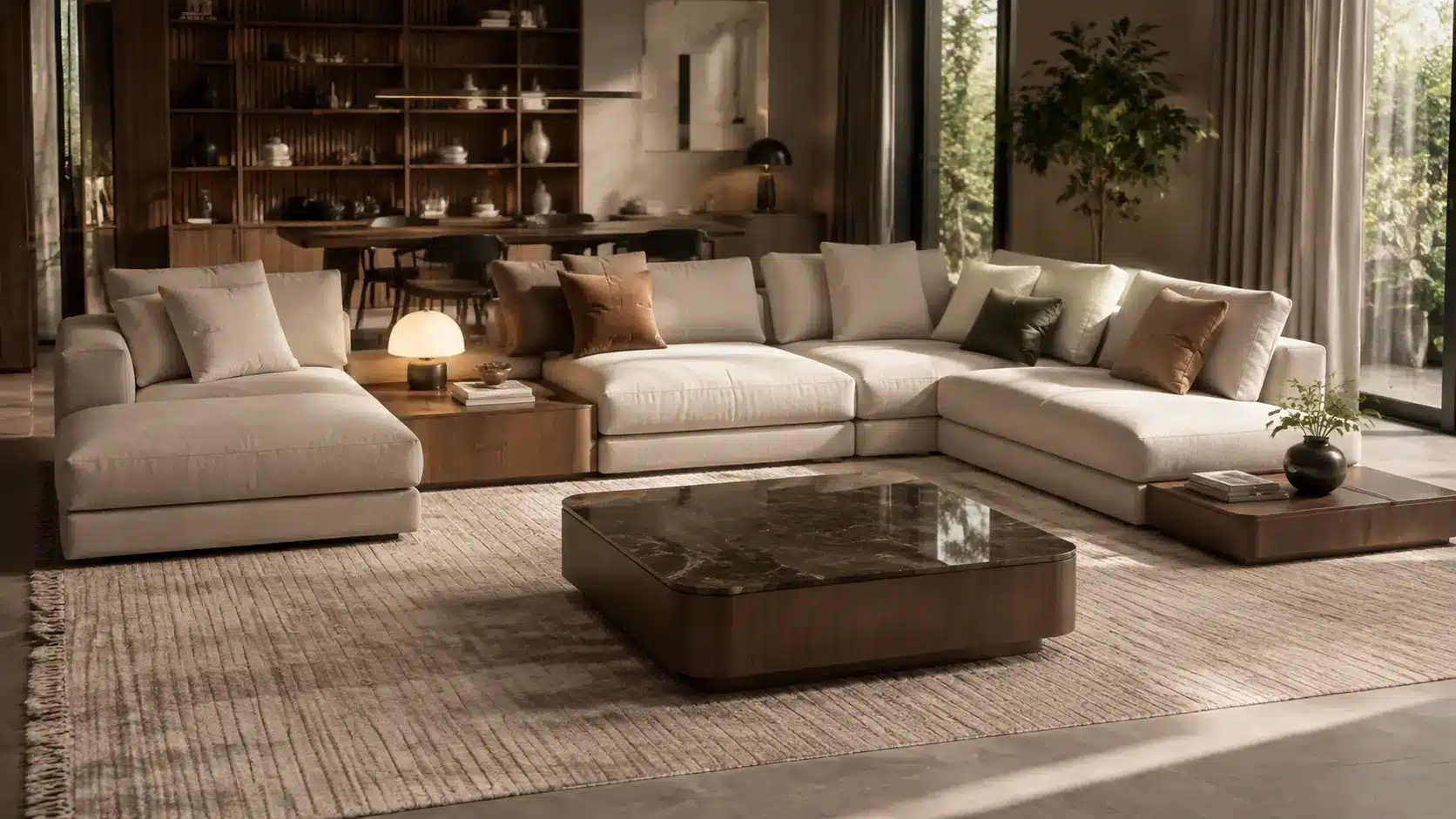
Most furniture is built for a fixed room in a fixed life. Buy a sofa, put it against the wall, leave it there for a decade. That approach works until the room changes, the family grows, or the apartment gets smaller, and the sofa suddenly does not fit through the door. Modular furniture was designed around that problem. Instead of one rigid piece, you get a system of components that can be rearranged, expanded, or scaled down as your space and needs shift over time. This blog covers what modular furniture actually is, the main types available, how it differs from sectional furniture, what it typically costs, and what to check before buying a system for your home. What is Modular Furniture? Modular furniture is built from separate, standardized units called modules that can be combined, rearranged, or expanded to fit different spaces and needs. Instead of buying one fixed piece, you assemble a system from individual components. A modular sofa might include armless seats, corner pieces, and ottomans that can be arranged in dozens of layout combinations. The same logic applies to shelving, storage, beds, and office furniture, where each module functions independently yet connects seamlessly with others. A modular shelving unit, for example, might start as a single small cube and later grow into a full wall of connected storage without replacing the original piece. Why Modular Furniture is Popular Now Modular furniture has moved well beyond a niche design trend to become a genuine market force, backed by real numbers. The U.S. modular furniture market reached $24.3 billion in 2025 and is projected to continue growing steadily through 2035, driven largely by shrinking home sizes and rising urban living costs. Younger buyers and small families are a major part of this shift, favoring pieces that combine practicality with style over furniture that locks them into one fixed layout. Demand from offices and co-working spaces has also added to the momentum, as businesses look for seating and desk systems that can be rearranged as teams and layouts change. This mix of residential and commercial demand is why modular furniture, once a mid-century design idea, has become an everyday shopping category rather than a specialty product. What are the Features of Modular Furniture True modular furniture is defined by four core traits that make it function as a system rather than just a collection of matching pieces. Each unit is built to standardized dimensions, so modules from the same collection connect without gaps or mismatched heights. Those same pieces can be rearranged into different configurations, an L-shape one month and a straight line the next, without buying anything new. Any individual module, such as an armless chair, also serves as standalone furniture when separated from the rest of the set. And because you can add new units later, the system grows with your space and needs rather than becoming obsolete when either changes. What are Types of Modular Furniture Modular design shows up in more categories than most people realize, well beyond the living room sofa. 1. Modular Sofas and Sectionals Armless chairs, corner units, chaises, and ottomans that combine into custom layouts. These pieces can be used as a sofa and a separate chair, or linked into a full sectional, depending on the room. Many systems also include a chaise module that can be moved to either end of the sofa. Best for: living rooms and shared spaces that need flexible seating arrangements. 2. Modular Shelving and Storage Systems Stackable cubes, adjustable shelves, and cabinets that expand as your storage needs grow. New units can be added on top of or beside existing ones without replacing what you already own. Some systems also allow shelves to be repositioned within the same frame as needs change. Best for: closets, home offices, and rooms that need storage to scale over time. 3. Modular Bed Systems Wall beds with built-in cabinetry, desks, or sofas that fold away when not in use. These systems allow a single room to function as a bedroom at night and an office or living space during the day. Some designs fold up vertically, while others tuck into a cabinet unit along the wall. For studios or smaller layouts, space-saving furniture can complement modular bed systems by maximizing available space and improving everyday functionality. Best for: studio apartments and guest rooms that double as other spaces. 4. Modular Office Furniture Desks, partitions, and seating systems designed to be reconfigured as office layouts change. Teams can shift from private desks to open collaboration areas without buying new furniture each time. Panels and dividers can also be added or removed to adjust privacy levels within a shared space. For home setups, minimalist home furniture choices can complement modular systems by creating flexible work areas with practical desk and storage solutions. Best for: co-working spaces and offices that frequently rearrange teams or layouts. How Much Does Modular Furniture Cost Pricing varies widely, but general market patterns give a useful starting point. Budget modular pieces, such as a single armless chair or storage cube, often start at $200 to $400 per module. Mid-range modular sectionals and shelving systems typically run $800 to $2,500 for a full set, depending on size and material. Higher-end designer modular systems, especially from brands rooted in the Eames and Nelson design tradition, can run well above that range. These figures reflect general retail patterns rather than a single fixed price, since cost depends heavily on materials, brand, and module count. What are the Benefits of Modular Furniture Modular furniture earns its popularity by solving problems that fixed furniture simply cannot. Space efficiency is usually the first draw, since modules can be rearranged or scaled down to suit furniture ideas for compact homes and multi-purpose rooms. That same setup gives you flexibility over time, letting the same pieces adapt as your needs shift, whether that is a growing family or a home office turning into a guest room. There is a cost angle too. Buying one module at a time spreads the expense, and you can replace a damaged piece individually rather than buying an entirely new set. That same modularity also makes moving day easier, since smaller pieces are far simpler to carry through narrow doorways and staircases. Modular Furniture Design Ideas for Every Home Beyond the showroom, modular design shows up in everyday settings where flexibility solves a real, ongoing problem. Micro-apartments and studio units: Wall beds and fold-away desks let one room serve as a bedroom, office, and living space depending on the time of day. Co-working offices: Movable desks and partitions let a single floor plan shift between quiet workstations and open team areas within the same day. Rental homes: Renters use modular pieces to furnish a space without committing to furniture that will not fit their next apartment. Growing families: Modular kids’ furniture, like bunk systems that separate into two beds, adapts as children grow or siblings need their own space. Hospitality and healthcare settings: Lobbies and waiting areas use modular seating to reconfigure layouts for events, social distancing needs, or changing foot traffic. How to Choose Modular Furniture for Your Space Picking the right system takes a bit more thought than a standard furniture purchase. Measure your room and doorways first, since modular pieces must still fit through hallways and entryways during delivery. Check how the modules connect, whether through clips, brackets, or simple friction fit, since sturdier connectors tend to hold up better over years of rearranging. Confirm that individual modules can be purchased separately later, in case you want to expand the set or replace a worn piece down the road, and stick to one collection or line rather than mixing modules from different product lines, since fabric and finish rarely match exactly across collections Modular Furniture vs. Sectional Furniture These two terms are constantly confused, so it helps to draw a clear line between them. Knowing the difference makes it easier to find the right product and avoid buying something that doesn’t meet your actual needs. Feature Modular Furniture Sectional Furniture Scope Covers sofas, shelving, beds, and office systems Refers specifically to seating Layout Can be split, expanded, or rearranged freely Arranged into an L-shape, U-shape, or straight line Relationship The broader category One specific type of modular seating Note: Every sectional is modular, but not everything modular is a sectional. Pros and Cons of Modular Furniture Most articles on this topic only list benefits, so here is a fairer, two-sided look. Modular furniture solves real problems, but it also comes with trade-offs worth knowing before you buy. Looking at both sides together gives a clearer picture than either list on its own. Pros Cons Rearranges to fit different rooms and layouts Can feel less structurally solid than one-piece furniture Damaged modules can be replaced individually Matching fabric or finish on future add-ons can be tricky Scales up or down as your space changes Larger systems can be complex to assemble Often easier to move through doorways in pieces Connector hardware can loosen over time with heavy use Weighing both sides against how you actually plan to use the furniture is the best way to decide if it fits your space. No single pro or con should decide the outcome, since the right answer depends on the specific room and household. Frequently Asked Questions Which brand is considered the best for modular sofas? Brands like Burrow, Lovesac, West Elm, and IKEA are highly regarded for modular sofas due to their quality, flexibility, and design options. Do modular couches stay together? Most modular couches use clips, brackets, or locking systems. These connectors prevent the individual sections from separating during use. What is the 4-inch rule for furniture? The 4-inch rule applies to the height of furniture seats. Sofas, chairs, and ottomans should have seat heights within four inches of one another. What furniture store has the best-quality furniture? The best furniture store depends on your needs and budget. Compare materials, construction, warranties, and customer reviews before purchasing. Does Walmart have quality furniture? Walmart offers several reliable and affordable furniture options. However, quality varies depending on the brand, materials, seller, and product. Final Thoughts Modular furniture solves a real problem for a country living in smaller spaces than it used to, but it works best when chosen with intention rather than picked for flexibility alone. Understanding the actual differences between modular and sectional pieces, knowing the honest trade-offs, and checking how well a system can grow with you make the difference between furniture that adapts to your life and furniture that just sits there looking flexible. The right modular setup should feel less like a compromise and more like furniture built for how you live.