


Painted stairs can completely change how a staircase feels inside a home, and they do it without the cost of a full replacement. A fresh coat of paint covers scratches, uneven wood tones, and the kind of wear that stain would only draw attention to. It also opens up a color range that stained wood simply cannot reach, from soft warm whites to deep charcoal and everything in between. Painted stairs are not a shortcut. They demand proper surface prep, the right primer, and a paint product built for foot traffic. Skip any of those steps and the finish will chip, scuff, or peel within months instead of lasting years. This blog covers how to paint stairs correctly, which colors work best for different home styles, and how to keep the finish looking good long after the project is done. Are Painted Stairs a Good Idea? Paint hides dents, old stains, and uneven wood grain better than any other finish. It also opens up a full range of colors, from crisp white to deep charcoal. Stained wood cannot match that range. Softer woods like pine and poplar take paint especially well. These woods are common in older staircases. Paint covers the flaws that stains would only highlight. Here is a quick side-by-side to help you decide: Factor Painted Stairs Stained Stairs Color options Unlimited, any shade Limited to wood tones Hides imperfections Yes, very well No, highlights flaws Durability on treads Chips and scuffs faster Wears more evenly Best for Softer woods, budget updates Hardwoods with good grain Maintenance Touch-ups every 1-3 years Occasional resealing Upfront cost Higher, needs primer and coats Lower, fewer materials 15 Painted Stairs Ideas for Every Home Style This finish works with nearly every design style. Farmhouse, modern, minimalist- it fits them all. The right color and pattern depend on your home’s palette and ceiling height. It also depends on how much contrast you want between treads and risers. Below are six popular directions homeowners take, each suited to a different look and budget. 1. Classic White Painted Stairs White remains the most requested option for good reason. It reflects light and makes a narrow stairwell feel larger. White also pairs with almost any wall color. A soft white with a bit of warmth tends to feel more inviting than a stark, cool white. The tradeoff is that the scuffs show more easily. A durable, washable sheen matters here more than in most other rooms. 2. Black Painted Stairs for a Modern Look Black creates drama and works well in contemporary or industrial-style homes. It also hides scuffs and dirt better than white. That makes it a practical pick for busy households. Pairing black treads with white risers, or the reverse, adds contrast. It does this without overwhelming a small space. 3. Two-Tone Painted Staircases This look pairs one color on the risers and another on the treads. Some homeowners paint the stringer and leave the treads as natural wood. This approach adds color without committing to one bold shade. It also works well when you want to tie the staircase to a nearby room’s color scheme. 4. Painted Stair Risers with Pattern or Design Patterned risers turn a staircase into a focal point. Homeowners use stencils, wallpaper, or hand-painted designs on each riser. The pattern often varies from step to step. This works well in hallways or basements where the stairs are the main visual feature. Keep the treads in a solid, durable color. That way, the pattern will not compete with foot traffic wear. 5. Neutral Painted Stairs Gray, greige, and soft taupe offer a middle ground. They sit between stark white and bold color. Neutrals hide everyday wear better than white. They still keep the space feeling calm and put together. This is a popular pick for homeowners who plan to change decor over time. 6. Bold and Colorful Painted Stairs Some of us want our staircase to make a statement. Navy, emerald, and even a bright yellow bring real personality to the space. This approach works best when surrounding walls stay neutral and best to paint the stairs. That way, the staircase becomes the clear focal point. It won’t compete with busy wallpaper or artwork nearby. 7. Ombre Painted Stairs An ombre staircase shifts gradually from a dark shade at the bottom to a lighter tint near the top. Some homeowners mix white into the same base color for each step. Others go the opposite way, moving from light to dark as the stairs rise. This effect works well in entryways and adds real visual movement without using more than one color family. Keep the transition subtle, since jumps that are too dramatic between steps can look uneven instead of intentional. 8. Painted Faux Runner Stairs A faux runner mimics a fabric stair runner using paint alone. Painters tape off a center strip on each tread and riser, then fill it with a contrasting color. The outer edges stay in a solid neutral to frame the look. This approach offers the charm of a traditional runner without the need to clean or replace fabric. A satin or semi-gloss finish on the runner section keeps it easy to wipe down. 9. Striped Painted Risers Striped risers bring a graphic, structured look to a staircase. Horizontal stripes tend to make a narrow staircase feel wider. Vertical or diagonal stripes draw the eye upward instead. Homeowners often use two contrasting shades, such as gray and white or navy and cream, for a clean finish. Careful taping matters most here, since crisp lines make the difference between a polished look and a messy one. 10. Chalkboard Painted Stairs Chalkboard paint turns stair risers into a spot for notes, doodles, or seasonal messages. It works well in family homes because kids can draw without leaving permanent marks. The dark, matte finish also gives the staircase a simple, modern edge on its own. This style suits basements, playrooms, and other casual spaces more than formal entryways. Wipe risers clean with a soft cloth before adding a fresh chalk design. 11. Geometric Stencil Painted Stairs Geometric stencils bring a modern, graphic pattern to plain risers. Triangles, hexagons, and diamond shapes are common choices for this look. A single accent color against a neutral base keeps the pattern from feeling too busy. This style works especially well in contemporary or minimalist homes with clean, simple decor elsewhere. Stencils also let you repeat a pattern from a rug or backsplash for a more pulled-together space. 12. Painted Stairs That Match the Walls Painting a staircase the same color as the surrounding hallway creates a calm, continuous look. This approach works well in smaller homes because it eliminates visual breaks between the stairs and the walls. It also makes a narrow hallway feel larger and more open. This style suits homeowners who want their staircase to blend in rather than stand out. A slightly higher sheen on the stairs than on the walls still gives the treads enough durability for daily wear. 13. Dark Treads with Light Risers This is a practical twist on the standard two-tone staircase. Painting the treads dark while keeping the risers pale puts the contrast where it works hardest. Black, charcoal, deep brown, and navy hide everyday scuffs better on a walking surface than lighter shades do. The pale risers keep the staircase from feeling too heavy overall. This split shows up often in real staircase projects because it suits traditional and modern homes alike. Use floor-rated paint on the treads, and add an anti-slip additive for better grip. 14. Alternating Color Painted Risers Unlike an ombre staircase, which shifts gradually, this treatment repeats two fixed colors riser by riser. Muted green and cream, or dusty blue and soft gray, can alternate from the bottom step to the top. The look adds color without stencil work or complicated patterns. Keeping the treads in one neutral shade stops the staircase from feeling too busy. Benjamin Moore features this exact alternating-riser technique in its own painted stair gallery, which makes it a tested look rather than a purely decorative idea. 15. One-Color Statement Stairs Paint the treads, risers, stringers, and often the balusters in one solid color, while the surrounding walls stay a contrasting shade. Deep green, charcoal, navy, or terracotta can turn the whole staircase into one architectural feature. Unlike stairs painted to match the walls, this treatment intentionally sets the staircase apart. It also cuts maintenance, since there are no pattern lines or color transitions to touch up. How to Paint Stairs for a Long-Lasting Finish Step 1: Prepare the Surface: Remove dirt and grease with a mild cleaner. Sand any existing finish so the new paint has something to grip. Repair cracks, dents, or damaged wood before you pick up a brush. Step 2: Prime the Stairs: Primer seals the wood and provides a surface for paint to bond to. This one step reduces peeling and chipping more than almost anything else you can do. Step 3: Apply Stair Paint: Use quality brushes and rollers suited to the paint you choose. Apply thin coats rather than one thick layer. Follow the drying times on the label between coats. Step 4: Allow Proper Curing Time: Paint can feel dry to the touch within hours, but full curing takes longer. Keep heavy foot traffic off the stairs for at least 24 to 48 hours, longer if the label recommends it. Choosing the Right Paint for Stairs Picking paint for a staircase means two decisions, not one. First comes color, then comes the product itself. The right shade depends on light levels, nearby wall colors, and how much wear the stairs get. 1. Best Paint Colors for Stairs Below is a quick reference of colors that consistently perform well, based on guidance from major paint brands. Color Name Brand Best For Pure White Sherwin-Williams Bright, airy stairwells Alabaster Sherwin-Williams Soft warmth without stark white White Dove Benjamin Moore Warm white for treads and risers Hale Navy Benjamin Moore Bold, dramatic staircases Agreeable Gray Sherwin-Williams Neutral, hides everyday wear Revere Pewter Benjamin Moore Warm greige for busy households 2. Use Floor and Porch Paint Stair treads need floor or porch paint, not standard wall paint. These products are built for horizontal surfaces that take constant foot traffic. They resist scuffing, cracking, and peeling far better than a regular interior paint. Risers and balusters can use a durable semi-gloss wall paint instead, since they see less direct wear. For exterior stairs, choose a paint rated for outdoor use and temperature swings. 3. Choose the Right Paint Finish Sheen matters as much as paint type. Semi-gloss and high-gloss finishes hold up best on treads because they resist scuffs and wipe clean easily. A flat or matte finish hides small imperfections well, but scratches and dents show through quickly. For a balance of durability and a softer look, try satin on risers. Save semi-gloss or gloss for the treads. Problems with Painted Stairs and How to Avoid Them Most issues with a painted staircase trace back to prep, product choice, or timing. Here are the four problems homeowners run into most, along with simple fixes. 1. Paint Peeling or Chipping: Peeling almost always comes down to skipped primer or rushed prep. Grease, dust, or old wax left on the wood keeps new paint from bonding. Sand the surface, clean it well, and prime before you paint. Let each coat cure fully before the stairs see regular foot traffic again. 2. Visible Scratches and Scuff Marks: Scuffs show up fastest on flat or matte finishes and on very dark or very light colors. A semi-gloss or gloss sheen resists marks better and wipes clean more easily. Adding a runner or rug on the treads also reduces visible wear over time. 3. Slippery Painted Stair Surfaces: Glossy paint can feel slick underfoot, especially in socks or smooth-soled shoes. Adding a non-slip additive or choosing stair-tread paint adds grip without significantly changing the look. Runners, grip strips, or textured paint on treads also help on stairs used by kids or older family members. 4. Uneven Paint Coverage: Thin or blotchy coverage has a few common causes. The paint may have gone on too thick, too thin, or too soon after the last coat. Apply thin, even coats and let each one dry completely before adding the next. Two coats over a properly primed surface almost always give full, even coverage. Painted Stairs vs Stained Wood Stairs Painted stairs give you more design freedom and hide flaws better. Stained stairs cost less upfront and wear more evenly over time. Consideration Painted Stairs Stained Wood Stairs Color flexibility Any color or pattern Limited to wood tones Wood grain visibility Covered Highlighted Best wood types Softer woods, pine, older stairs Hardwoods with strong grain Repair visibility Touch-ups can show Touch-ups blend in more easily Upfront cost Higher, primer plus paint Lower, fewer coats needed Long-term upkeep More frequent touch-ups Occasional resealing Useful Tips for Creating Durable Painted Stairs A few habits separate a paint job that lasts years from one that needs redoing within months. Sand between coats: Light sanding removes dust nibs and helps each layer bond to the last. Work in thin coats: Thick paint traps moisture underneath and can crack or bubble as it dries. Match the primer to the surface: Bare wood, old paint, and glossy finishes each need a different bonding primer. Paint every other step first: This keeps a path open on the staircase while each coat cures. Round sharp tread edges slightly: Thin, sharp edges chip faster under regular foot traffic. Give paint real cure time: Dry to the touch is not the same as fully cured. Keep heavy traffic off treads for at least 24 to 48 hours. Choose floor-grade paint for treads: Standard wall paint was never built for constant impact. Touch up small chips early: A quick fix now prevents water and dirt from working their way under the paint later. Final Thoughts A painted staircase is one of the most affordable ways to change the feel of a home. The right paint type, sheen, and primer make the difference between a finish that lasts years and one that needs constant touch-ups. A classic white, a bold navy, or a two-tone design all follow the same rules. Prep well, prime first, and use paint made for foot traffic. With a bit of patience, a fresh coat can keep a staircase looking good for years before it needs attention again. Frequently Asked Questions Can You Paint Wooden Stairs Without Sanding? Light sanding is usually recommended because it helps the paint bond properly and reduces the risk of peeling. Are Painted Stairs Slippery? They can be if you use glossy paint. Satin finishes and slip-resistant additives can improve traction. What is the Most Durable Paint for Stairs? Floor and porch paints, or high-quality enamel paints designed for heavy traffic, usually last longer. Should Stair Treads or Risers Be Painted? You can paint both, but many homeowners paint risers and stain or seal treads because treads take more wear. How Many Coats of Paint Do Stairs Need? Most stair projects need primer plus two coats of paint, depending on the surface and paint coverage.
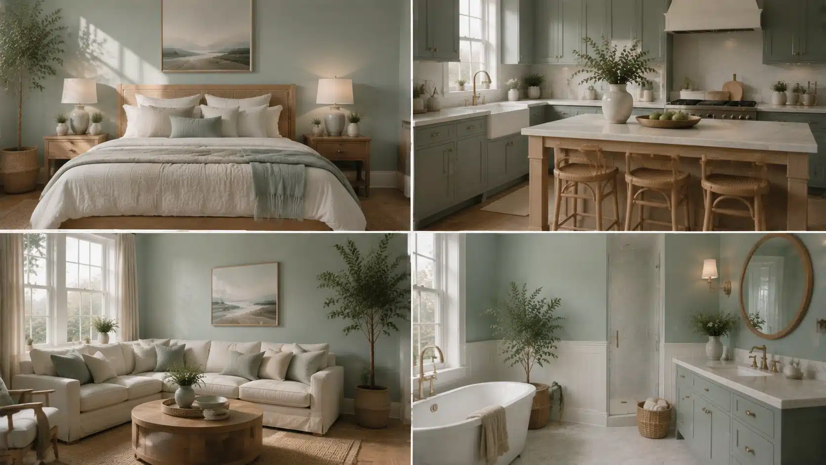
Quick summary: Benjamin Moore Beach Glass is a muted blue-green-gray shade that changes subtly with lighting and surrounding colors. Benjamin Moore Beach Glass is the kind of paint color that can look soft and coastal in one room, then slightly cooler or greener in another. That versatility is part of its appeal, but it also means choosing it requires a closer look at undertones, natural light, surrounding finishes, and coordinating colors. This article breaks down Benjamin Moore Beach Glass 1564, including its LRV and blue-green-gray undertones. How it behaves in different lighting conditions, the best rooms to use it in, how to coordinate whites and accent colors, and how it compares with similar popular shades. What Color is Benjamin Moore Beach Glass? Benjamin Moore Beach Glass 1564 is a soft blue-green paint color with a gray undertone that keeps it from ever looking too bright or too tropical. This shade sits in Benjamin Moore’s blue-green family, but it is not the bright aqua or classic beachy turquoise that its name might suggest. It reads as a muted, weathered blue-green with a gray cast, closer to the color of real sea glass than a swimming pool. Depending on lighting, some rooms will pull more blue while others lean slightly green, but the gray keeps both extremes in check. Benjamin Moore’s own product page describes it as a calming blue with a gray undertone, adding versatility to the shade. Color details Feature Details Paint brand Benjamin Moore Color name Beach Glass Color number 1564 Color family Blue-green LRV 49.7 Overall feel Calm, coastal, muted Benjamin Moore Beach Glass Undertones Undertones are the quiet influence sitting beneath the main color, and they are what make this shade a bit of a chameleon. Here is how each one shows up. Gray undertone: The gray keeps the color from ever feeling tropical or overly saturated. It softens the color and gives it a more grown-up, sophisticated quality, which is part of why it works in so many different design styles. Blue undertone: In cooler, north-facing light, the blue becomes more obvious. This is when the color leans closest to a true sea-glass blue, with an airy, almost weightless feel. Green undertone: Warm, direct sunlight tends to coax out the green side of the color. Paint experts who specialize in undertone analysis note that this warm-light shift is what gives the color its sea-glass character in south-facing rooms. Is Benjamin Moore Beach Glass Blue or Green? If you are trying to decide whether this color leans more blue or green, it can be a little hard to pin down at first. It is technically a muted blue-green, but on the wall it often reads more like a soft sea-glass blue. Its gray undertone keeps it from looking too teal or too close to seafoam. The gray undertone is what stops it from reading as a true teal or seafoam shade. How it compares to similar blues and greens: Color How it differs from Beach Glass Beach Glass Soft blue-green with gray Palladian Blue Brighter and more distinctly blue Healing Aloe Lighter and softer overall Quiet Moments Lighter, with an LRV close to 61, and leans slightly more blue Benjamin Moore Beach Glass LRV and Light Performance LRV, or light reflectance value, measures how much light a paint color bounces back into a room versus how much it absorbs. The scale runs from 0 (pure black) to 100 (white). This color has an LRV of 49.7, according to the official listing of Benjamin Moore, which places it almost exactly in the middle of the scale. North-facing rooms: Cooler, indirect light pulls the color deeper and grayer, and some of that airy, coastal quality fades. North-facing rooms never get direct sun, so the color settles into a moodier, more subdued side. South-facing rooms: Direct sun keeps the color feeling fresh and calming, and its blue-green tones read clearly without looking washed out. The strong, warm light in south-facing rooms tends to bring out the green side rather than the blue. East-facing rooms: Morning sun brings a brief window of warmth, so the color can look slightly greener early in the day before settling into a cooler, more blue-gray tone for the rest of the afternoon. West-facing rooms: Afternoon and evening sun bring the strongest warm light of the day, which can push the color toward its greener, warmer side as the sun gets lower in the sky. How Lighting Conditions Change the Look of Beach Glass Beyond room orientation, the type and intensity of light in a space play a big role in how the color performs day to day. Darker rooms: The color pulls deeper, grayer, and cooler, losing some of its lighter coastal quality when natural light is limited Lighter, sun-filled rooms: It reads fresh and clear, with the blue-green tones showing up most true to their intended shade. Warm bulbs: Warm-toned lighting emphasizes the green side of the color, giving it a slightly more sea-glass, earthy feel indoors. Cool LED bulbs: Cooler artificial light highlights the blue-gray side, making the color feel crisper and more subdued. Designer tip: Test the color on at least two walls in the room, ideally one that gets direct sun and one that does not, since the same gallon can look noticeably different depending on exposure. Where to Use Benjamin Moore Beach Glass in Your Home This color adapts well across the home, from calm living spaces to spa-style bathrooms, though its best use depends on light, function, and nearby finishes. 1. Living Rooms with Benjamin Moore Beach Glass This shade creates a relaxed, easygoing backdrop that works well with natural textures like linen, rattan, and light wood tones. It is calm enough to live with daily without feeling monotonous. In larger living rooms with plenty of natural light, it can anchor the whole space without competing with furniture or artwork. It also works well on a single accent wall for those who want the color without committing to a full room. 2. Bedrooms with Benjamin Moore Beach Glass Because it leans more toward soothing than energizing, it is a popular bedroom choice. Pairing it with soft white or warm cream bedding helps balance its cooler undertone. It tends to work best in bedrooms that get some natural light during the day, since darker bedrooms can make the color feel flatter and less restful. Layering in warm-toned nightstands or lamps also helps keep the room from feeling too cool at night. 3. Bathrooms with Benjamin Moore Beach Glass This is one of the most popular applications for the color, since its blue-green, water-inspired quality suits spa-style bathrooms especially well. It pairs naturally with white tile, marble, and brushed metal fixtures. Because bathrooms often rely more heavily on artificial lighting, it is worth testing the color under the room’s actual vanity lights before committing. This helps confirm whether it leans more blue or green once the sun goes down. 4. Kitchens with Benjamin Moore Beach Glass This shade also works as a cabinet color, particularly when the surrounding walls stay lighter and neutral. Warm hardware finishes, such as brass or bronze, help offset its cool base. It also pairs well with butcher block or light wood countertops, which help balance out the coolness of the paint. For kitchens with limited natural light, keeping the walls a shade or two lighter than the cabinets helps the space feel open. Colors That Pair Well with Benjamin Moore Beach Glass The right trim and accent colors can make this shade feel warmer, cooler, brighter, or more grounded, depending on the look you’re going for. Best White Trim Colors The right white trim can either soften the cool undertones of this shade or create a sharper contrast around doors, windows, and architectural details. Benjamin Moore White Dove: Adds warmth and prevents the overall palette from feeling too cool. Benjamin Moore Simply White: Creates a cleaner, crisper contrast against the blue-green walls. Benjamin Moore Super White: Gives the room a more modern, high-contrast finish. Benjamin Moore’s coordinating suggestions also include whites such as Snow White OC-66 and Super White OC-152, giving you additional options for creating a balanced color scheme. Overall, the best trim color depends on how much contrast you want. Softer whites create a warmer transition, while crisp whites highlight the wall color’s blue-green character. Best Accent Colors for Benjamin Moore Beach Glass Choosing the right accent colors can help this cool-toned shade feel more balanced and connected to the rest of the room. The best pairings either add warmth, create subtle contrast, or build on its soft coastal character. Navy Blue: Adds depth and a bit of drama without clashing with the cooler base tone. Warm wood tones: Balance the cool undertones and keep the space from feeling sterile. Soft beige and greige: Create a quiet, layered coastal palette that feels soft and cohesive. Natural greens: Reinforce the organic, sea-glass feel of the color and work especially well with plants and natural materials. Overall, these accent colors help bring out different sides of the shade. Navy creates contrast, wood adds warmth, and softer neutrals and greens keep the palette calm and natural. Benjamin Moore Beach Glass Compared with Similar Colors Beach Glass has good company among other Benjamin Moore blue-greens, and seeing how it stacks up can help confirm it’s the right fit before buying a sample. Paint color Difference from Beach Glass Benjamin Moore Quiet Moments Lighter and slightly softer, with a higher LRV near 61 Benjamin Moore Healing Aloe More muted and gray overall Benjamin Moore Palladian Blue Brighter and more clearly blue Benjamin Moore Mount Saint Anne Deeper and more saturated Benjamin Moore Night Mist Leans more green-gray and reads slightly lighter Benjamin Moore Iced Marble Very close in tone and often used as a match Of all these options, Beach Glass still stands out for its balance. It is neither as light as Quiet Moments nor as saturated as Mount Saint Anne, which is part of why it remains such a versatile, easy-to-live-with choice. What Not to Use with Benjamin Moore Beach Glass Choosing it without testing samples: Screen colors and in-store chips rarely match how a paint color behaves on an actual wall. A physical sample tested at home is the only reliable way to judge it. Using too many cool colors: Pairing this color with an entirely cool-toned room, including cool grays, cool whites, and chrome fixtures, can make the space feel cold rather than calm. Ignoring lighting direction: Because it sits at a mid-range LRV, the room’s light exposure has an outsized effect on how the color reads throughout the day. Pairing it with the wrong whites: Some stark, blue-based whites can make the color look flatter and more blue-gray than intended. Warmer whites tend to soften that effect. Is Benjamin Moore Beach Glass a Good Paint Color? Overall, Beach Glass earns its popularity. It suits many homes and styles, though like any mid-tone color, it rewards some planning around lighting and trim choices. Pros Cons Calm and versatile across multiple design styles Can shift noticeably depending on the room’s lighting Softer and more livable than a traditional bold blue May feel too cool in rooms with limited natural light Works well with both warm and cool accent colors Requires more careful trim selection than a true neutral Adds color to a room without overwhelming it Can look different across an open floor plan with varied light In the end, Beach Glass remains a dependable, versatile choice for homeowners seeking a calm, coastal-inspired color that adapts to nearly any room, style, or lighting condition. Testing at Different Times of Day Paint behaves differently under morning, afternoon, and evening light. Morning light tends to bring out the cooler blue-gray side of this shade, midday sun softens it toward green, and evening artificial light can deepen it slightly. Viewing a sample across all three helps avoid surprises after the whole room is painted. Real home application examples A Beach Glass bathroom vanity paired with brushed nickel hardware A single Beach Glass accent wall behind a bed with warm wood furniture Living room walls in Beach Glass paired with oak floors and linen upholstery Frequently Asked Questions Is Benjamin Moore Beach Glass Warm or Cool? It leans cool overall, thanks to its gray and blue undertones, though warm natural light can bring out softer green notes throughout the day. What is the LRV of Benjamin Moore Beach Glass? Benjamin Moore Beach Glass 1564 has an LRV of 49.7, placing it in the medium range of the light reflectance scale. Does Benjamin Moore Beach Glass Look Green? It can, particularly in warm, direct sunlight, but most homeowners describe it as a muted blue-green rather than a true green. What White Goes Best with Benjamin Moore Beach Glass? White Dove, Simply White, Snow White, and Super White are all strong options, depending on whether the goal is warmth or crisp contrast. Is Benjamin Moore Beach Glass Good for a Bathroom? Yes. Its soft, water-inspired blue-green tone pairs especially well with white tile, marble, and spa-style design details. Making Beach Glass Work in Your Home Benjamin Moore Beach Glass is the rare paint color that never quite settles, it shifts with the morning light, changes when a lamp turns on, and responds to every piece of furniture placed nearby. That quiet unpredictability is exactly what makes it worth living with. Test it on two walls, check it at different times of day, and pair it with a warm white trim before committing. Do that, and Beach Glass tends to earn its place on the wall, not just for one season, but for years.
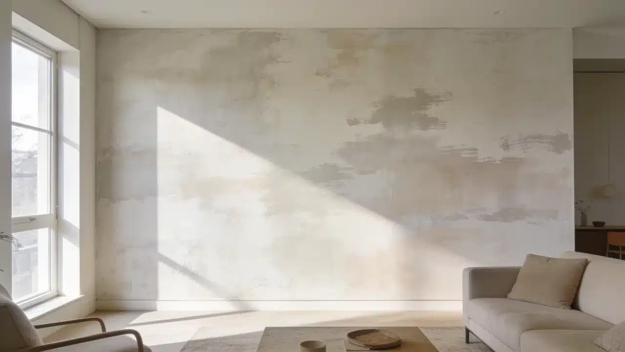
Limewashing walls starts with preparing the surface and applying thin mineral-based layers with a block brush. Random crisscross strokes create the cloudy variations that define this finish. The appeal comes from how the color changes as lighting shifts throughout the day. A wall that reads soft white at noon can look warm and shadowed by late afternoon. After a decade working with color, I have found that this changing appearance is one reason homeowners connect with limewash. The process involves preparing the wall, applying multiple coats, and caring for the finished surface. What is Limewash Paint and How Does It Work? Limewash is one of several textured wall finishes unlike regular paint, which creates an even surface with a consistent sheen, it’s applied in thin, semi-transparent layers that leave visible brushstrokes. Limewash is applied in thin, semi-transparent layers, allowing brushstrokes and color variation to remain visible. The brushwork stays visible in the final coat. That variation is the point. Color behavior matters here. The paint appears darker when wet and noticeably lighter once dry. Adding extra paint too early can reduce the soft variation that gives limewash its character. Let each layer dry fully before assessing the wall. Tools and Materials Needed to Limewash Walls Collect all materials before starting. Limewash dries differently from standard wall paint, so stopping halfway across a wall can create visible transition marks. Item Purpose Limewash paint Creates the textured finish Mineral primer Helps limewash bond with walls Block brush Creates the signature movement Drop cloth Protects floors Painter’s tape Protects edges Stir stick Keeps paint consistent Spray bottle Helps maintain a wet edge How to Prepare Walls for Limewashing Proper preparation helps limewash absorb evenly and creates a more consistent finish. Skipping any of these steps affects the final result. Clean and Repair the Wall: Remove dust, grease, and dirt with a damp cloth and mild cleaner. Fill holes with patching compound. Let everything dry before priming. Prime the Surface: New drywall requires mineral primer. Previously painted walls need primer only if the existing finish is glossy or in poor condition. Highly porous surfaces can absorb limewash quickly, resulting in uneven color if not properly prepared. Test the Color and Finish: Apply a sample patch to the actual wall. This finish reads differently at 7 am than at 7 pm. Check both before committing. How to Limewash Walls Step by Step Follow the order carefully because preparation, drying time, and application technique all affect the final appearance. Step 1: Prepare the Limewash Paint Stir thoroughly for at least two minutes before use. Follow the product’s dilution instructions if thinning is required. Pour the paint into a clean application bucket and stir again. Continue stirring during application to maintain an even consistency. Settled paint creates uneven coverage and color variation across the wall. Step 2: Apply the First Coat Using the Limewash Technique Load the block brush about a quarter of the way up the bristles. Apply using loose, unstructured crisscross strokes from the center of each section. Keep a wet edge throughout and work in small sections. Deposit most of the paint at the center and feather outward to blend the edges. Do not aim for full coverage on the first coat. Step 3: Add Additional Layers for Depth Let the first coat dry fully before adding a second coat, typically 12 to 24 hours, depending on humidity and temperature. The wall will look darker when wet and lighter when dry. Apply each additional coat using the same crisscross technique. Two coats suit most walls. A third thin coat adds consistency where needed. Step 4: Finish, Cure, and Evaluate the Wall Remove painter’s tape once the final coat dries. Stand back and assess the full wall in both morning and evening light before deciding if another coat is needed. Allow full curing before touching the surface. Mist lightly if the manufacturer recommends it. A matte sealer is optional but adds protection in high-traffic areas. Limewash Wall Care and Maintenance Limewash walls require less maintenance than many traditional painted surfaces. Keeping water exposure to unprotected areas to a minimum is what matters most. For cleaning, use a dry or barely damp cloth. Strong cleaners strip the finish. For repairs, apply a thin layer of the original product over the affected area. Feather the edges using the same crisscross approach as the original coat. Sealing is optional. A matte sealer adds protection in high-traffic areas. Without sealer, the surface may change gradually as it ages. How to Choose Limewash Colors for Different Rooms Limewash changes with lighting, so a shade can look different throughout the day. This helps reveal how the color responds to morning and evening light. Bedrooms: Soft neutrals like warm white, beige, and muted taupe work well. These shades create a calm backdrop while keeping the limewash texture visible. Living Rooms: Warm earth tones such as sand, clay, soft brown, and muted olive pair well with natural materials and add depth to larger spaces without feeling heavy. Small Rooms: Lighter shades like soft cream, pale beige, and light gray can help small rooms feel more open. Always test the color first, because limewash can appear stronger across an entire wall. Low-Light Rooms: Avoid very cool shades in rooms with limited sunlight, as they can make the space feel cold. Warmer neutrals and earthy colors usually work better under softer lighting. Can You Paint Over Limewash? You can paint over limewash after checking the surface condition and preparing it for the new coating. Run a hand over the existing wall. If material transfers, the layer must be stabilized before anything is placed on top. Remove loose or dusty limewash, or stabilize it before applying primer and new paint. Clean the wall with a damp cloth, then let it dry completely. Apply a suitable primer before the new paint. Water-based paints tend to work over primed limewash. Oil-based products need a compatible intermediate primer. Mistakes to Avoid When Limewashing Walls These common issues usually arise from problems during preparation or application. Mistake Cause Fix Finish looks streaky Too much paint applied Use thinner layers Texture looks flat Not enough stroke variation Add another coat Paint color does not stick Poor surface preparation Prime correctly first Color looks wrong Assessed before full drying Wait until completely dry Application lines visible Wet edge lost mid-wall Work faster and maintain wet edge Frequently Asked Questions What are The Disadvantages of Limewash Paint? Limewash may require more preparation than regular paint, and the final color can be difficult to judge until each coat has fully dried. Does Limewash Paint Need a Primer? Primer is recommended on new drywall, glossy surfaces, and highly porous walls to improve adhesion and create more even absorption. How Long Does Limewash Last on Interior Walls? A properly applied limewash finish can last for years indoors when protected from excessive moisture and cleaned gently. Can You Apply Limewash with a Roller? A roller can speed up coverage on large areas, but a block brush creates the natural variation and texture associated with limewash. What Surfaces Can be Limewashed? Limewash works best on porous surfaces such as plaster, brick, and mineral-based walls that allow the finish to be properly absorbed. Happy Reading The process for limewashing walls is more forgiving than most paint techniques. Variation is the point, and a perfectly even coat works against the finish. Get surface preparation right, use the crisscross stroke, and let each layer dry before assessing the color. The finish looks different at 7 am than at 7 pm. That movement is part of what makes it worth the effort. Try a small section first to test the technique. Share the result in the comments once done.
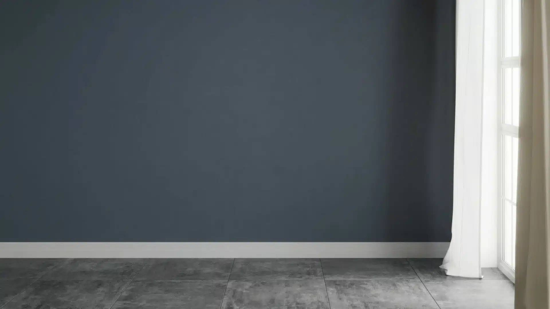
If you’re considering Granite Peak sherwin williams, you’re probably looking for a deep, refined color that feels strong but not overwhelming. I’ve seen how tricky it can be to judge a dark shade just from a small swatch. What looks balanced in one space can feel too heavy or too blue in another. That’s why it helps to understand how this color actually behaves in real rooms. Throughout the process ofchoosing the right paint colors, I’ll help you see how Granite Peak reacts to light, where it works best, and how you can use it without making common mistakes. By the end, you’ll know exactly if this shade fits your space. Granite Peak SW 6250: Everything You Need to Know Granite Peak (SW 6250) is a deep blue-gray paint from Sherwin-Williams with subtle slate undertones and a low LRV of 14, meaning it absorbs roughly 86% of light. It belongs to the Blue Collection but carries enough gray to feel grounded rather than overtly bold, making it a sophisticated dark neutral. In natural light, the color shifts toward a noticeable blue tone; in lower or artificial light, it deepens into rich charcoal gray. Temperature-wise, it runs cool, though the gray base softens any sharpness. Moody, refined, and highly adaptable, it suits accent walls, cabinetry, vanities, and exteriors with equal confidence. Color Family: Blue-Gray, Sherwin-Williams Blue Collection Hex Code: #606375 RGB Values: 96, 107, 117 Color Temperature: Cool Undertones: Slate, Gray. How Granite Peak Works in Different Lighting Lighting plays a huge role in how Granite Peak looks on your walls. Understanding how this color behaves in both natural and artificial light will help you make smarter decisions before you paint. Natural Light Granite Peak is very sensitive to natural light. In bright daylight, it leans toward a clear blue-gray tone, while on cloudy days or in shaded spaces, it deepens into a richer, moodier charcoal. The direction your room faces makes a big difference in how the color reads throughout the day. North-Facing Rooms: North-facing rooms get little direct sunlight, which makes Granite Peak appear darker and more charcoal-leaning. Adding warm lighting and light-colored furniture helps keep the space from feeling too dim or cold. South-Facing Rooms: South-facing rooms receive the most natural light throughout the day, which beautifully brings out Granite Peak’s blue undertones. This is the most flattering direction for this color, giving it a balanced and polished look. East-Facing Rooms: East-facing rooms get bright, warm morning light, which softens Granite Peak and gives it a slightly warmer feel early in the day. By afternoon, the light fades, and the color shifts back to a cooler, deeper tone. West-Facing Rooms: West-facing rooms catch warm, golden light in the evening, adding a subtle warmth to Granite Peak at that time. In the morning, however, the room stays dim, making the color look quite dark and cool. From the field: I always tell clients in north-facing rooms to test Granite Peak on a large board before committing. I had one client in a north-facing home office who fell in love with the color in the store, painted the whole room, and then hated how flat and cold it felt. The fix was simple; we swapped her overhead cool-white LEDs for warm 2700K bulbs, and the room was completely transformed. The color came alive. Don’t skip that lighting test Artificial Light The type of bulb you use changes how Granite Peak looks just as much as natural light does. Warm bulbs, like soft white or Edison-style lights, bring out the gray tones and make the color feel cozy and grounded. Cool white or daylight bulbs push the blue undertones forward, giving the room a crisper, more modern feel. For the best result, test your lighting before finalizing the look. Which Sherwin-Williams Paint Line to Use The paint line matters more than people realize, especially with a dark color. For Granite Peak, I recommend: Sherwin-Williams Emerald Interior: Best overall, superior coverage, excellent durability, and the depth of color is noticeably richer. Worth the price for accent rooms or cabinetry. Sherwin-Williams Duration: A close second and often more available in stores. Good scrubbability, which matters in kitchens and bathrooms. Sherwin-Williams SuperPaint: Fine for low-traffic bedrooms or accent walls where budget is a priority. You may need a third coat for full depth with a dark color like this. Pro tip: For full-room color drenching (painting walls, trim, and ceiling the same shade), go with a satin finish throughout. It unifies the look while keeping each surface slightly distinct in how it catches light. I used this approach in a client’s dining room with Granite Peak and the result was dramatic but never oppressive. Flat matte on all four walls plus the ceiling can start to feel airless with a dark color like this. Best Finishes for Granite Peak The finish you choose matters just as much as the color itself. When understandingdifferent types of paint finishes, you’ll find that pairing Granite Peak with the right sheen brings out its depth and ensures it looks intentional in every space Matte Finish: Matte gives Granite Peak a smooth, velvety appearance that feels soft and elegant on walls. It hides surface imperfections well and keeps the moody tone looking rich and refined. Satin Finish: Satin offers a subtle sheen that adds quiet sophistication without being too shiny. It works well in bathrooms and bedrooms where you want durability alongside a polished, easy-to-clean surface. Semi-Gloss Finish: Semi-gloss is ideal for trim, doors, and cabinets. Its reflective surface creates a sharp contrast against matte walls and holds up well against moisture, frequent cleaning, and everyday wear. Best Rooms to Use Granite Peak Granite Peak isn’t just a single-room shade. It’s a versatile, whole-home color that adapts beautifully to every space. Here’s exactly where it earns its place. 1. Living Room Granite Peak brings understated richness to a living room, offering the kind of depth that makes a space feel deliberately designed. Apply it to a single accent wall to create a striking focal point, or envelop all four walls for a warm, enveloping atmosphere. It harmonizes beautifully with natural wood, warm whites, and textured fabrics like linen or leather. Edison bulbs or ambient floor lamps coax out its green undertones, lending the room genuine warmth. 2. Bedroom Granite Peak transforms a bedroom into a calm, nature-inspired retreat. Use it as a dramatic feature wall behind the bed, or wrap the entire room for a deeply restful cocoon. Balance its richness with crisp white or soft cream bedding to keep the space feeling light. Warm wood nightstands and muted gold or bronze fixtures add just the right finishing touch without competing with the color. 3. Kitchen Cabinets Granite Peak on cabinetry delivers a refined, high-end look without the starkness of full black. It pairs sharply with white or soft gray countertops, creating a clean, considered contrast. White ceramic knobs lend a charming cottage feel, while brushed brass hardware elevates the look with warmth and sophistication. Introduce open shelving in natural wood alongside the cabinets to complete a cohesive, layered kitchen aesthetic. 4. Bathroom Granite Peak turns an ordinary bathroom into a space that feels genuinely designed. Paired with white subway tile or large-format floor tile, the contrast is crisp and striking while white fixtures keep everything feeling fresh and clean. Choose chrome or matte black hardware for a contemporary edge, or brushed gold for warmth. Even a compact powder room finished in Granite Peak feels polished and purposefully styled. 5. Exterior Use Granite Peak holds its own outdoors, reading as sophisticated and grounded against natural surroundings. Go bold with full siding coverage, or keep it refined with just the shutters and front door. A Granite Peak door alongside light gray or white siding with black iron house numbers is a classic pairing. For a stronger statement, clad the lower half in board-and-batten with crisp white trim above. On exteriors, this color reads slightly lighter than it does indoors because of the abundance of natural light. What looks like a deep charcoal inside will read more as a mid-toned blue-gray on a sunny exterior wall. That’s not a negative; it actually makes Granite Peak more usable outside than many other dark paints of this depth. Granite Peak vs. Similar Sherwin-Williams Colors Choosing the right dark neutral can be tricky. And here is how Granite Peak SW 6250 stacks up against four closest Sherwin-Williams alternatives in one clear comparison: Color SW Code Tone Key Difference vs. Granite Peak Naval SW 6244 Deep Navy Blue Much darker and more saturated blue, less gray, more bold and dramatic Distance SW 6243 Soft Denim Blue Lighter and softer reads more like a relaxed denim than a moody dark neutral Indigo Batik SW 7602 Rich Saturated Indigo Higher saturation and more purple undertones feel more vivid and intense Mindful Gray SW 7016 Warm Greige Warmer undertones with no blue, softer and more neutral compared to Granite Peak’s cool edge Each of these colors has its own personality, but if you want that perfect balance of cool blue and grounded gray, Granite Peak remains the strongest choice among them all. Coordinating Colors That Work With Granite Peak One area most blogs leave thin is a concrete, practical palette. Here’s what genuinely works alongside Granite Peak: SW Extra White (SW 7006): The cleanest white to pair with Granite Peak for trim, ceilings, and doors. Crisp without being harsh. My go-to combination for dining rooms and bedrooms. SW Alabaster (SW 7008): A creamier off-white that softens the contrast for a more relaxed, cottage-style feel. Works well in bedrooms and living rooms. SW Pure White (SW 7005): A slightly cooler bright white. Good for kitchens where you want the cabinets and countertop to pop against the Granite Peak island or lower cabinets. SW Repose Gray (SW 7015): A soft warm-neutral gray that bridges Granite Peak with lighter walls in an open-plan layout. Useful when you want to use Granite Peak in one zone without it feeling disconnected. Common Mistakes When Using Granite Peak Granite Peak is a stunning color, but like any dark shade, it comes with a few things to watch out for. Avoid these common mistakes to get the best results: Ignoring Lighting: Granite Peak shifts between blue and deep charcoal depending on natural and artificial light. Not accounting for this can leave the color looking very different from what you expected. Pairing With Too Many Dark Shades: Combining Granite Peak with other dark tones can make a room feel heavy and closed in. Balance it with lighter furniture, white trim, or soft neutrals to keep the space breathing. Skipping the Sample Test: Never go straight to painting a full wall. Always test a sample patch first and observe it at different times of day before committing. Overlooking Room Size: In very small rooms with little natural light, Granite Peak can feel overwhelming. Make sure the space has enough light or contrast to carry the color well. Getting these details right makes all the difference between a space that feels moody and refined and one that feels dark and uninviting. Keep these points in mind before you pick up that paintbrush. Who Should Choose Granite Peak and Who Should Avoid It? Granite Peak is a bold, confident color that works beautifully in the right hands, but it isn’t suited to every space or style. Understanding where it thrives and where it struggles will save you time and effort before you commit to a full room. Who Should Choose It: If you love deep, cool-toned spaces with a modern, refined feel, Granite Peak is a strong fit. It works best in well-lit rooms with warm bulbs and light contrasting elements. Who Should Avoid It: If your style leans toward warm, soft, or earthy tones, this color may feel out of place. Small rooms with limited natural light will feel darker and more cramped with Granite Peak on the walls. Final Thoughts Take your time before you commit: one weekend of testing will give you years of a room you love. Granite Peak is a rare color that feels bold and calm at the same time. It works in living rooms, bedrooms, kitchens, bathrooms, and even outdoors. It pairs well with warm whites, natural wood, brass, and matte black hardware. It shifts with the light and rewards rooms with good lighting and the right finish. The rule is simple: always test before you commit. Get a large sample board, check it morning and night, and trust what you see. Done right, Granite Peak won’t just be paint; it’ll be the reason your room finally feels finished. Tried it in your home? Drop a comment below on which room you painted, and how it turned out.
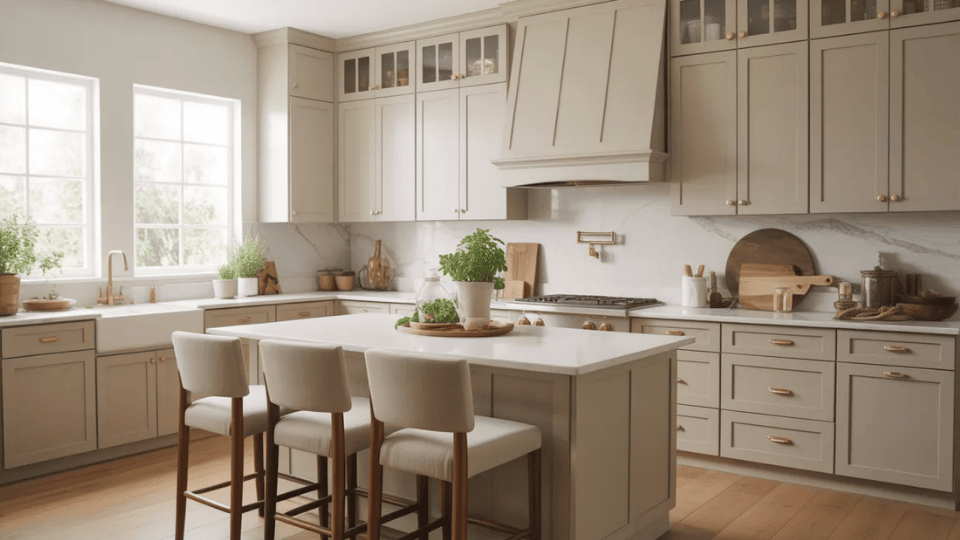
When I first started helping people pick cabinet colors, one question kept coming up. Should you paint cabinets Accessible Beige? It’s a fair question. Choosing the right paint color for cabinets can feel stressful because it changes the whole kitchen. Accessible Beige by Sherwin-Williams is one of those colors that sits right between gray and beige, making it a standout among Sherwin-Williams’ top-rated greige and beige selections. That balance makes it work in many homes. I’ve seen it used in modern kitchens, classic spaces, and even farmhouse styles. In this guide, I’ll walk you through everything you need to know about Accessible Beige cabinets. You’ll learn how the color looks, what countertops and hardware work best, kitchen ideas, and helpful tips before you paint. Quick answer: Yes, Accessible Beige (SW 7036) is a strong cabinet color choice for most kitchens, especially those with warm wood floors, natural stone countertops, or transitional styling. It earns its reputation as a versatile greige. But it has real limitations, particularly in north-facing kitchens and alongside pink-toned wood, that most guides don’t mention. This guide covers both What Color is Accessible Beige? Accessible Beige is a warm neutral paint color from Sherwin-Williams. It sits between gray and beige, which is why many people call it a “greige.” The color feels soft and balanced without leaning too cool or too yellow. The official shade is SW 7036 with a Light Reflectance Value of 58, meaning it reflects a moderate amount of light. In most kitchens, it appears calm and welcoming rather than bold. It has gray undertones that prevent it from looking like older beige tones, along with a very slight green hint that may show in certain lighting. Because it is a lighter greige, it can limit wall color choices slightly. Its tone may shift with lighting and surrounding materials, which adds to its flexibility. Accessible Beige Cabinet Ideas for Kitchens Accessible Beige cabinets provide a soft, steady base that works with many styles. You can pair them with light counters, warm metals, or darker accents. 1. Accessible Beige Cabinets with White Countertops Accessible Beige cabinets with white countertops create a kitchen that feels clean, warm, and easy to live with. The white surface brightens the room, while the beige cabinets keep it from feeling too plain or cold. This pairing works especially well with quartz, marble, or other light stone counters. It fits many styles, including modern, transitional, and farmhouse kitchens. If your kitchen does not get a lot of natural light, white countertops can also help reflect light and keep the space feeling more open. One practical note here: if you choose stark, bright white countertops (think pure quartz with no movement), the contrast against Accessible Beige can be sharper than expected. A warmer white quartz with subtle veining softens the transition and keeps the overall palette cohesive 2. Accessible Beige Cabinets with Black Hardware Black hardware adds a strong, simple contrast to Accessible Beige cabinets. The darker finish helps define the cabinet lines and makes the beige color stand out more clearly. This combination works well if you want the kitchen to feel a little sharper without losing warmth. Black pulls and knobs are often used in modern, farmhouse, and transitional kitchens. They also pair nicely with black light fixtures, faucets, or window frames, which can help tie the whole kitchen together in a clean and balanced way. 3. Accessible Beige Cabinets with Brass Handles Brass handles bring warmth and a soft shine to Accessible Beige cabinets. Since Accessible Beige already has a warm greige base, brass works naturally with it and adds a more polished look. This pairing can make the kitchen feel a bit more inviting without being too bold. It works well in traditional, transitional, and even modern kitchens when the brass finish is simple and clean. If you have warm wood floors or creamy wall colors, brass hardware can help connect those elements and make the room feel more complete. My preference is aged or unlacquered brass over polished brass alongside Accessible Beige. Polished brass can read as too shiny against a quiet, matte greige. The warmer, slightly worn quality of unlacquered brass matches the earthiness of the cabinet color better. 4. Accessible Beige Cabinets with Wood Accents Wood accents pair very naturally with Accessible Beige cabinets because both have a soft, warm feeling. You can bring in wood through open shelves, stools, trim, beams, or even a wood range hood. This mix helps the kitchen feel more relaxed and welcoming. It also keeps the space from looking too flat if most of the cabinets are painted the same color. Light wood creates a softer look, while medium or darker wood adds more contrast. This idea works especially well in farmhouse, rustic, and organic modern kitchens. 5. Two-Tone Kitchen with Accessible Beige Lower Cabinets Using Accessible Beige on lower cabinets can help anchor the kitchen while keeping the overall look light. When paired with white or off-white upper cabinets, the room feels open at eye level and grounded below. This setup works well in both small and large kitchens because it adds contrast without making the space feel busy. It is also a smart option if you want some color on the cabinets but do not want the whole kitchen painted in a single shade. This look works especially well with neutral backsplashes and simple hardware. The best upper-cabinet pairings for this two-tone approach: Alabaster (SW 7008) for a warm, seamless result, or Shoji White (SW 7042) if you want something slightly creamier. Avoid using Pure White uppers, as the contrast can be too stark and makes the Accessible Beige lowers look heavier than they are. 6. Accessible Beige Cabinets with a White Subway Tile Backsplash A white subway tile backsplash is one of the easiest ways to brighten a kitchen with Accessible Beige cabinets. The clean white tile reflects light and gives the cabinets a fresh, crisp contrast. This combination works in many kitchen styles because subway tile is simple and timeless. It also helps the warm greige cabinets feel balanced instead of too heavy. If you want a classic look that still feels current, this is a strong option. You can also change the grout color slightly to make the backsplash look softer or more defined. 7. Accessible Beige Cabinets with a Warm Gray Backsplash A warm gray backsplash adds gentle contrast to Accessible Beige cabinets without making the kitchen feel too cool. Since Accessible Beige already has some gray in it, the two colors usually work well together. This pairing can make the kitchen feel calm and layered, especially if you want a neutral design that still has some depth. Warm gray tiles also work nicely with stainless steel appliances, brushed nickel hardware, and soft white walls. If you want the kitchen to feel modern but not stark, this is a very workable direction. 8. Accessible Beige Cabinets with Marble Countertops Marble countertops bring softness and texture to Accessible Beige cabinets. The natural veining in marble adds movement, while the cabinet color keeps the kitchen feeling warm and grounded. This pairing works especially well if you want a timeless look that still feels light. White or soft gray marble can help brighten the space and connect nicely with the gray-beige balance of Accessible Beige. It also looks beautiful with brass or black hardware, depending on the style you want. This combination works well in classic, stylish, and transitional kitchens. 9. Accessible Beige Cabinets with Dark Island Cabinets A dark island can add depth and contrast to a kitchen with Accessible Beige cabinets. Colors like navy, deep gray, charcoal, or espresso help the island stand out as a clear focal point. This setup works well if you want the kitchen to feel a little more layered without changing the main cabinet color. The beige cabinets keep the room soft, while the darker island adds structure and visual interest. This idea is especially useful in larger kitchens where one strong feature can help break up the space and make the layout feel more intentional. My go-to dark island pairing with Accessible Beige perimeter cabinets: Iron Ore (SW 7069) or Peppercorn (SW 7076). Both are deep enough to read as a clear contrast without going full black, and their warm-dark quality feels intentional alongside Accessible Beige rather than arbitrary. How Accessible Beige Cabinets Look in Different Lighting Lighting changes how cabinet colors appear throughout the day. Accessible Beige reacts to both natural and artificial lighting, which can slightly shift its tone. Lighting Type How Accessible Beige Cabinets Usually Look Natural daylight Cabinets appear lighter and softer, showing more beige warmth and helping the kitchen feel open and bright. Warm artificial lighting The cabinets look warmer and slightly richer, making the kitchen feel cozy and comfortable. Cool white lighting Gray undertones become more noticeable, giving the cabinets a slightly cooler and more modern look. Low lighting The color appears deeper and slightly darker, making the cabinets feel more grounded. North-facing kitchen Cooler light brings out gray tones strongly. It may look more gray than beige and sometimes show a slight green hint. South-facing kitchen Warm light highlights the beige base. The color looks its best but may appear lighter in strong afternoon sun. Because lighting changes throughout the day, I always suggest testing the color on a cabinet door or sample board. It is also important to consider how different paint sheens reflect light, as a glossier finish will bounce more artificial light than a matte one, altering the color’s appearance in the evening. Best Countertop and Backsplash Pairings for Accessible Beige Cabinets Choosing the right surfaces helps balance the warmth of Accessible Beige and keeps your kitchen looking clean, connected, and easy to style. Countertop Pairings These countertop options work well with Accessible Beige cabinets and help define the overall look of your kitchen. Creamy white quartz with soft veining: The warmest and most forgiving pairing. Look for quartz with subtle gray or beige movement rather than stark bright white. White or gray marble: Adds natural texture and movement that Accessible Beige cabinets welcome. Works best when the marble leans warm rather than cool-blue-veined. Butcher block or light wood: A natural complement to the earthy greige. Keeps the kitchen feeling warm and organic. Dark granite or soapstone: Creates a strong contrast. Works well as a grounding element, especially on a dark island paired with Accessible Beige perimeter cabinets Backsplash Pairings The backsplash adds texture and helps balance the cabinet color without overwhelming the space. White Subway Tile: White subway tile keeps the kitchen bright and clean. The crisp white color contrasts gently with Accessible Beige cabinets while reflecting light and helping the space feel open. Beige or Greige Tile: Beige or greige tiles create a smooth and balanced color flow with Accessible Beige cabinets. This option keeps the palette soft while maintaining a calm, coordinated kitchen design. Marble Backsplash: A marble backsplash adds gentle movement through soft gray veining. These natural patterns pair nicely with beige cabinets and bring light texture without making the kitchen look busy. Zellige Tile for Texture: Zellige tiles add depth and natural variation behind Accessible Beige cabinets. Their uneven surface reflects light in different ways, giving the kitchen texture while keeping the palette warm. The backsplash plays an important role when you use Accessible Beige cabinets. The right tile helps balance the warmth of the cabinets while adding texture and contrast. Wall Colors That Go with Accessible Beige Cabinets Choosing the right wall color helps Accessible Beige cabinets look balanced and natural. Some colors brighten the kitchen, while others add softness and warmth. Wall Color Brand How It Affects the Kitchen Mood Alabaster (SW 7008) Sherwin-Williams Alabaster is a soft, warm white that keeps the kitchen light and welcoming. It blends smoothly with Accessible Beige cabinets, helping the space feel calm and balanced without strong contrast. Pure White (SW 7005) Sherwin-Williams Pure White creates a brighter contrast with Accessible Beige cabinets. The crisp white walls make cabinets stand out more while keeping the kitchen fresh, clean, and open. Agreeable Gray (SW 7029) Sherwin-Williams Agreeable Gray adds a gentle gray tone to the side of Accessible Beige cabinets. This pairing creates a calm, neutral palette that works well in kitchens with stainless steel appliances and modern finishes. Shoji White (SW 7042) Sherwin-Williams Shoji White has a soft, creamy tone that pairs naturally with Accessible Beige cabinets. It keeps the kitchen warm and relaxed while maintaining a light, airy overall feel. Looking at similar colors side by side helps you understand their undertones and brightness. I always recommend testing samples before painting cabinets to see which color best suits your kitchen. Wall color caution: Because Accessible Beige has an LRV of 58, it is relatively light. This means very creamy or ivory wall colors can make the cabinets look darker than expected, rather than creating a clean contrast. Avoid walls that are significantly warmer or creamier than the cabinet color unless you are intentionally going for a monochromatic layered look. Tips Before Painting Accessible Beige Cabinets Choose a durable cabinet paint finish such as satin or semi-gloss. These finishes resist wear better, making cabinet surfaces easier to wipe and clean. When choosing between satin and semi-gloss sheens, consider that the higher the gloss, the more durable—but more reflective—the cabinets will appear Paint Sample: Test Accessible Beige on a cabinet door or sample board before painting everything. This helps you see how the color looks with your kitchen lighting, countertops, and flooring. Lighting Check: Observe the paint sample during morning, afternoon, and evening lighting. Accessible Beige can shift slightly depending on light, so checking throughout the day helps you understand its true tone. Right Finish: Choose a durable cabinet paint finish such as satin or semi-gloss. These finishes resist wear better, making cabinet surfaces easier to wipe and clean. Surface Prep: Clean cabinet surfaces of grease and dust, lightly sand, and apply primer. Proper preparation helps the paint stick evenly and improves the durability of the finish. Color Matching: Compare Accessible Beige with countertops, backsplash, flooring, and hardware. Making sure these materials work together helps the kitchen feel balanced and visually connected. One tip I give every client choosing a greige: do not test paint on the wall and evaluate it next to white primer. The primer’s stark brightness will make any warm neutral look muddy or dull. Test it on the actual cabinet surface, cleaned and lightly sanded, against your real countertop and flooring. That’s the only honest test. Taking the time to properly prepare cabinets makes a big difference. When everything is well planned, Accessible Beige cabinets can look smooth and balanced and last longer in everyday kitchen use. Summing Up By now, you can see why Accessible Beige cabinets are such a popular choice. It’s a color that works quietly with many styles without feeling too plain or too bold. I’ve seen it add balance to bright kitchens and bring warmth into modern spaces. That mix of gray and beige makes it flexible, which most kitchens need. It may not suit every setup, especially in cooler lighting or very modern designs. But in well-lit, warm kitchens, it performs reliably and looks natural. If you want a calm and easy-to-style cabinet color, this is a strong option. Test it in your lighting first, then pair it with the right surfaces for the best result.
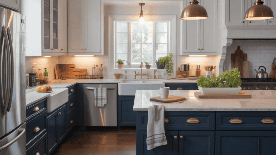
Picking a cabinet color sounds simple until you realize how quickly trends can date a kitchen. I’ve seen beautiful spaces feel outdated in just a few years because the color choice didn’t hold up. If you’re searching for timeless kitchen cabinet colors, you’re likely trying to avoid that exact mistake. The challenge is knowing which colors actually last and which ones only look good for now. Small differences in tone, lighting, and materials can completely change the outcome. Here, you’ll find cabinet colors that stay relevant over time, why they work, and how to choose one that fits your kitchen without second-guessing later. The Key Traits of Timeless Kitchen Cabinet Colors Classic kitchen cabinet colors share a few consistent traits that help them stay relevant over the years: Neutral or Nature-Based Tones: Colors like white, soft gray, green, and wood tones feel balanced and easy to live with. Easy Pairing: They work well with different countertops, backsplashes, and hardware without clashing. Adaptable Across Styles: These colors fit modern, traditional, and transitional kitchens without needing changes. Balanced Undertones: They don’t lean too warm or too cool, which helps them stay flexible in different lighting. Consistent Appeal: They show up in real homes repeatedly, not just short-term design trends. A word on what isn’t timeless: Wood cabinet stains with heavy red, orange, or honey undertones, think cherry, golden oak, and dark ebony, trend hard and date fast. I’ve watched clients repaint perfectly functional cabinetry simply because the stain tone stopped feeling current. If you’re committed to wood, mid-tone browns with minimal grain drama, like a clean maple or walnut, age the most gracefully. But painted cabinets in the right neutral give you the most long-term flexibility. Timeless Kitchen Cabinet Colors These kitchen cabinet colors stay relevant year after year. I like how they give your space a clean, lasting feel. You’ll find them easy to match with different counters, backsplashes, hardware, and styles, no matter how your taste changes over time. The right kitchen cabinet styles can make all the difference in achieving a timeless look. 1. Classic Duo: White Cabinets and Wood Island This combination balances lightness and warmth, creating a kitchen that’s both fresh and grounded. Why it works: White cabinets paired with a wood island create a bright, warm, and balanced space. Best with: Quartz or stone countertops, matte black or brushed brass hardware, light wood/tile flooring. Before/After: Before, your kitchen might feel too sterile, but after, this combination brings warmth without sacrificing that fresh, open vibe. Longevity: It’s an enduring choice that also boosts resale value, making it a safe long-term investment. This pairing provides timeless balance that will keep your kitchen feeling welcoming and relevant for years. 2. Bold Balance: White Uppers and Navy Lowers For a kitchen that feels bold yet airy, this pairing strikes a perfect balance of contrast and lightness. Why it works: Navy lowers, grounds the kitchen with depth, while white uppers maintain lightness and openness. Best with: Light stone or marble countertops, brass or polished gold hardware, subway or zellige tile backsplash. Before/After: Before, your kitchen may feel a bit plain, but after, this combo offers the perfect balance of light and dark. Longevity: Navy is a deep neutral that has lasting appeal, making it a versatile option for the long term. 3. Sharp Contrast: White Uppers and Charcoal Lowers For a more dramatic, sleek kitchen, this pairing offers high contrast while maintaining a light and open feel. Why it works: The contrast between white and charcoal adds drama while keeping the space open and light. Best with: Light quartz or concrete countertops, matte black hardware, light wood or polished tile flooring. Before/After: Before, your kitchen might feel too neutral, but after, this sharp combination introduces depth and focus. Longevity: The modern yet timeless contrast ensures it remains stylish for years. This combination adds a striking element to the kitchen while keeping it balanced and inviting. 4. Refined Edge: Greige Cabinets and Matte Black Hardware This pairing offers understated sophistication with a modern twist, creating a versatile and chic kitchen. Why it works: Greige cabinets with matte black hardware offer an elegant and refined look with subtle contrast. Best with: White or light gray quartz countertops, wood open shelving, large-format tile or hardwood flooring. Before/After: Before, the kitchen could feel too warm or too cool, but after, this combo strikes the perfect balance between the two. Longevity: This pairing works well across various kitchen styles and won’t feel dated. 5. Statement Center: Navy Island and White Perimeter Cabinets Create a focal point in your kitchen with a bold navy island, while the white cabinets keep the space feeling open and balanced. Why it works: A navy island acts as the kitchen’s center of attention, with white cabinets maintaining an airy feel around it. Best with: Light marble or quartz countertops on the perimeter, contrasting dark stone or butcher block on the island. Before/After: Before, your kitchen might lack a focal point, but after, the navy island draws attention, while the white perimeter keeps it light. Longevity: This high-impact look will never feel out of place and adds a custom, high-end feel. 6. Organic Balance: Sage Green Cabinets and Wood Accents This combination brings a natural, peaceful vibe to the kitchen, making it feel grounded and welcoming. Why it works: Sage green and wood accents create a calming, natural space that feels easy to live with. Best with: Butcher block or light wood countertops, stone or terracotta flooring, warm metal hardware. Before/After: Before, your kitchen might feel too cool, but after, the sage and wood bring warmth and comfort. I’ve seen sage green become a clear favorite, and it holds up better than most trend-based colors. Muted shades with gray undertones age best and are the ones clients continue to love years later. 7. Grounded Luxury: Walnut Cabinets and White Countertops This combination blends rich wood tones with bright countertops to create a kitchen that’s both luxurious and well-balanced. Why it works: Walnut’s deep tones contrast beautifully with white countertops, creating a luxurious and balanced feel. Best with: White or cream walls, matte black or brushed brass hardware, large-format stone or tile flooring. Before/After: Before, your kitchen might feel dark, but after, the white countertops lighten the space, making it feel open and balanced. 8. Crisp and Current: White Oak Cabinets and Black Hardware For a modern kitchen with natural warmth, this combination balances the best of both worlds with white oak and bold black hardware. Why it works: White oak provides a warm backdrop, while black hardware adds a sharp, modern edge. Best with: White or light gray countertops, large-format tile or light wood flooring, open shelving. Before/After: Before, your kitchen might feel too minimal, but after, the blend of oak and black hardware creates a bold yet inviting space. Longevity: White oak and black hardware remain stylish and adaptable, ensuring this design stands the test of time. This combination adds a natural yet contemporary feel, perfect for any modern kitchen that values warmth and style. 9. Quietly Enduring: Cream Cabinets and Warm Wood Flooring For a comfortable, classic kitchen, this combination creates a welcoming and timeless atmosphere. Why it works: Cream cabinets paired with warm wood flooring create a harmonious, inviting space that feels timeless. Best with: Brushed gold or bronze hardware, stone or marble countertops, soft white or linen-toned walls. Before/After: Before, your kitchen might feel a bit cold, but after, the cream and wood bring warmth and comfort without being overwhelming. 10. Soft Gray Cabinets and Marble Countertops For a refined, serene kitchen, this combination of cool tones offers a sophisticated, luxurious atmosphere. Why it works: Soft gray cabinets paired with marble countertops create a cool, sophisticated vibe that enhances the space without being overpowering. Best with: Polished chrome or brushed nickel hardware, white or light gray walls, large-format marble or porcelain tile flooring. Before/After: Before, your kitchen might lack a polished feel, but after, the gray and marble create a high-end, curated look. 11. Dramatic Flip: Black Lower Cabinets and White Uppers This twist on the traditional design gives your kitchen a bold edge while still feeling airy and open. What makes it stand out: Dark lower cabinets provide structure and weight, while white upper cabinets maintain lightness and visual space. Best paired with: Clean, light countertops (think quartz or marble), matte black or brushed metal hardware, warm wood or neutral tile flooring. Before/After: Before, your kitchen might feel flat, but after, the high contrast brings a sense of boldness and intentional design. 12. Moody Restraint: Charcoal Cabinets and Light Quartz Countertops For a kitchen that feels both deep and inviting, this combination contrasts dark cabinetry with light, reflective surfaces. Why it works: Charcoal cabinets add depth and mood, while light quartz countertops lift the space and provide brightness. Best paired with: Warm metal hardware (brass, gold, or copper), natural wood accents, light or neutral tile flooring. Before/After: Before, the kitchen might feel too dark, but after, the light quartz lifts the charcoal and adds warmth, preventing the space from feeling enclosed. Longevity: This blend of dark and light ensures that the look feels balanced over time, never too bold or too subdued. 13. Understated Warmth: Mushroom Cabinets and Brass Hardware Navy and gold bring a touch of luxury to your kitchen, creating an elevated atmosphere without feeling overwhelming. Why it works: Navy is bold but not too overpowering, and paired with warm gold hardware, it becomes a standout combination. Best paired with: Soft marble or cream-colored countertops, light walls, and natural wood accents. Before/After: Before, the space may feel too minimalist, but after, this striking combination adds warmth and a sense of elegance that doesn’t overwhelm. Longevity: The pairing of navy and gold has been a classic in design for centuries, ensuring its relevance over time. 14. Regal Pairing: Navy Cabinets and Gold Hardware Navy and gold bring a touch of luxury to your kitchen, creating an elevated atmosphere without feeling overwhelming. Why it works: Navy is bold but not too overpowering, and paired with warm gold hardware, it becomes a standout combination. Best paired with: Soft marble or cream-colored countertops, light walls, and natural wood accents. Before/After: Before, the space may feel too minimalist, but after, this striking combination adds warmth and a sense of elegance that doesn’t overwhelm. Longevity: The pairing of navy and gold has been a classic in design for centuries, ensuring its relevance over time. This rich duo feels grand yet approachable, giving your kitchen a regal flair that will remain appealing for years to come. 15. Natural Drama: Forest Green Cabinets and Warm Wood Shelving Nature, with this earthy combination of deep forest green and wood, brings an organic but polished look to your kitchen. Why it works: Forest green cabinets add a deep, rich tone, while warm wood shelving softens the intensity, making the space feel balanced. Best paired with: Stone or marble countertops, brushed brass or antique hardware, terracotta flooring. Before/After: Before, the kitchen may feel overly formal, but after, the natural wood adds warmth and softness, grounding the green. 16. Layered Neutral: Greige Perimeter Cabinets and Dark Island The combination of light greige cabinets with a contrasting dark island introduces depth and texture, creating a space that’s both calm and visually engaging. What makes it stand out: The subtle greige perimeter cabinets allow the dark island to serve as a strong focal point, adding dimension to the space. Best paired with: Warm countertops, matte black or aged brass hardware, and wood accents to tie the look together. Before/After: Before, your kitchen might feel flat, but after, the dark island adds a sense of depth while keeping the perimeter light and airy. This understated, layered look will continue to stand out without feeling outdated, providing an elegant contrast. 17. Classic Edge: White Cabinets and Soapstone Countertops Soapstone countertops paired with bright white cabinetry offer a visually rich and timeless combination that exudes effortless charm. What makes it special: The matte texture of soapstone contrasts perfectly with the brightness of white cabinets, creating an elegant yet grounded space. Best paired with: Brushed nickel hardware, light walls, and wood flooring. Before/After: Before, the space might feel too stark, but after, the soapstone brings texture and warmth, softening the white cabinets. This classic combination feels both fresh and grounded, making it a perfect kitchen style for the long haul. 18. Light and Airy: Light Oak Cabinets and White Backsplash This light, airy combination of oak cabinets and a crisp white backsplash creates a calm, Scandinavian-inspired look that feels fresh and open. What makes it stand out: Light oak cabinets add warmth and texture, while the white backsplash reflects light, creating an open, inviting space. Best paired with: Light countertops, matte black or brushed brass hardware, wood or neutral-toned flooring. Before/After: Before, your kitchen might feel overly minimalist, but after, the oak adds depth, creating a light, natural look that never feels too stark. 19. Grounded Modern: Taupe Cabinets and Black Hardware This warm, contemporary pairing adds a touch of sophistication with taupe cabinets and bold black accents, creating a calm yet modern atmosphere. What makes it special: The taupe cabinetry offers warmth, while the black hardware adds contrast and modern flair. Best paired with: White or warm quartz countertops, open wood shelving, large-format tile or matte stone flooring. Before/After: Before, your kitchen might feel too neutral, but after, the black hardware adds definition, creating a sharp yet warm design. Longevity: This blend of soft warmth and strong contrast ensures the look remains appealing for years. The taupe and black combination gives your kitchen a modern, grounded feel, ensuring it looks stylish and current for the long run. 20. Soft Contrast: Two-Tone Greige and White Cabinets For a refined look, this soft two-tone pairing combines the understated elegance of greige with the freshness of white, creating a balanced and relaxed kitchen. What makes it stand out: Greige and white cabinets offer a harmonious contrast, making the space feel open and inviting while still offering visual depth. Best paired with: Warm quartz or marble countertops, brushed brass or matte black hardware, wood flooring. Before/After: Before, your kitchen may feel too neutral, but after, the greige and white bring a level of contrast that adds subtle elegance. This pairing stays relevant, offering a balanced and approachable design for any space. 21. Rustic Modern: Navy Cabinets and Butcher Block Counters For a kitchen that balances boldness with natural warmth, navy cabinets and butcher block counters create a cozy, grounded feel with plenty of personality. What makes it special: Navy cabinets provide depth, while butcher block countertops introduce a warm, organic element to the space. Best paired with: Brass or unlacquered hardware, white or cream walls, open shelving. Before/After: Before, the space might feel too formal, but after, the butcher block adds a rustic charm, softening the boldness of the navy. 22. Open and Stylish: White Cabinets and Glass Upper Doors For a kitchen that feels open, fresh, and curated, glass upper cabinets allow you to showcase your personal style while keeping the space airy. What makes it stand out: Glass upper cabinets break up the visual monotony of all-white cabinetry, adding depth without introducing color. Best paired with: White or light quartz countertops, brushed nickel or polished chrome hardware, subway tile backsplash. Before/After: Before, your kitchen might feel flat, but after, the glass doors open up the space and add personality without overwhelming it. 23. Bold Anchor: Black Island and White Cabinets This dramatic design places a strong emphasis on the island, with a contrasting black island surrounded by light white cabinets to create a striking visual impact. What makes it special: The black island acts as the centerpiece of the kitchen, creating a strong focal point without overwhelming the space. Best paired with: Waterfall marble or light quartz on the island, matte black hardware, warm wood flooring. Before/After: Before, your kitchen might lack a sense of focus, but after, the black island grounds the space, while the white cabinets keep it open and fresh. 24. Warm Divide: Natural Wood Lower Cabinets and Painted Uppers For a kitchen that balances warmth and lightness, natural wood lower cabinets paired with painted upper cabinets create a balanced and organic design. What makes it stand out: The natural wood at counter level adds texture and warmth, while painted uppers keep the space feeling fresh and clean. Best paired with: Stone or quartz countertops, matte black or brushed brass hardware, white or soft greige walls. Before/After: Before, the space might feel flat, but after, the contrast between the wood lowers and light uppers creates visual interest and balance. Cabinet Colors That Tend to Date Quickly Understanding what ages badly is just as useful as knowing what lasts. From both my own consulting work and what I see consistently in the homes of new clients seeking updates, these are the cabinet colors and finishes most likely to feel tired within a decade: Cherry and red-toned wood stains: The warm, reddish undertone reads as heavily period-specific; it’s the finish most often cited by designers as a dating factor in kitchens from the late 1990s and early 2000s. Cool gray with blue or purple undertones: The dominant gray trend of the 2010s is already looking dated in markets that moved on. Gray with a green or warm undertone holds better. High-gloss cream or ivory with pink undertones: Reads as a specific era (early 2000s) and clashes with most modern countertop materials. Trendy colors without tonal grounding: Terracotta, cobalt, and similar bold cabinets can look wonderful for a season but require full replanning when the adjacent trend moves on. Heavily bleached or ebony-stained wood: Both extremes of the wood stain spectrum have trended hard and faded. The moderate middle of the range ages most gracefully. None of this means those colors are wrong for your kitchen; if you love them and plan to stay long-term, personal resonance matters more than resale logic. But if longevity is the goal, these are the ones to approach with caution How to Choose the Right Cabinet Color for Your Kitchen With so many kitchen cabinet colors to consider, narrowing it down takes more than picking a favorite. Here’s what actually helps: Start with lighting: Natural light shifts color throughout the day. Test samples in morning and evening light before committing. Match with existing countertops and floors: The cabinet color needs to work with what’s already fixed, not the other way around. Think about how long you’ll stay: Shorter stay? Lean toward broadly appealing neutrals. Long-term home? There’s more room for personal expression. Test on large boards: A small paint swatch tells very little. Paint a large board and prop it against the actual cabinets. Don’t choose based on social media alone: Trending kitchen cabinet colors on feeds often look very different in real-life lighting and space. The right color is one that works for the specific kitchen, not just the one that looks best on a screen. Once you’ve picked a color, you may want to check the kitchen island height to ensure your design flows well. The Bottom Line Choosing cabinet colors that last comes down to understanding what works beyond trends. I’ve seen how the right mix of tone, material, and balance keeps a kitchen feeling fresh without constant updates. The combinations that hold up best are easy to pair, adapt across styles, and stay steady in different lighting. That’s what makes timeless kitchen cabinet colors worth choosing. The strongest designs follow tonal logic, where the warmth or coolness of cabinets connects with flooring, hardware, or countertops. That connection makes the space feel intentional. When you focus on this, you avoid second-guessing later. Take time to test options in your space and go with what feels right. Frequently Asked Questions Which cabinet colors age poorly? Colors like cherry wood with heavy red tones, cool grays with blue or purple undertones, and high-gloss finishes often look outdated quickly and don’t complement other materials well. How do I choose the right cabinet color? Consider your kitchen’s lighting, existing materials, and how long you plan to stay in your home. Test samples in real conditions to see how they look throughout the day. What’s the best way to test a cabinet color? Paint a large board with your color choice and place it against your cabinets. Test it in different lighting throughout the day to see how it looks in various conditions. How can I make sure my cabinet color won’t go out of style? Select colors that are neutral, adaptable, and easy to pair with other materials. Colors like white, soft gray, and nature-based shades remain relevant across time and trends. What makes a kitchen cabinet color timeless? Timeless cabinet colors are neutral or nature-based, easy to pair with various materials, and have balanced undertones. They stay versatile across styles and hold up well over time.
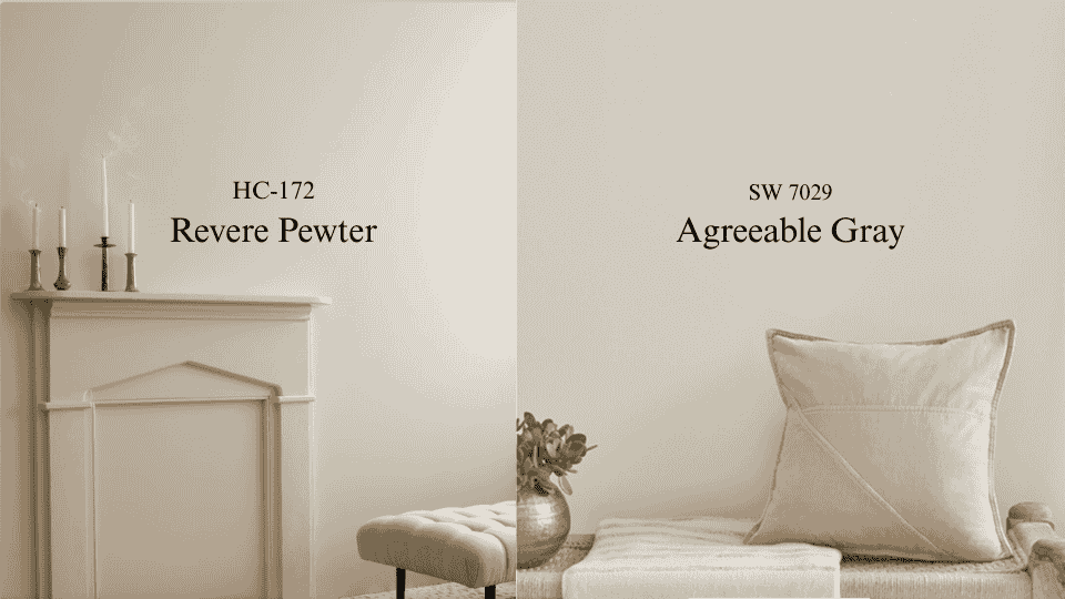
I have repainted more rooms in Revere Pewter than any other color on my shelf. Not because it is a bad color. Because people choose it from a showroom chip and then take it home to a room that cannot support it. That is the whole comparison, really. Revere Pewter HC-172 reads at LRV 55.51 and carries a green thread under a warm taupe base. Agreeable Gray SW 7029 sits at 60 with much quieter undertones. On a fan deck the two look like siblings. On a wall, in a specific room, with your specific windows, they are not close. If you want the short answer: Agreeable Gray if your light is limited, mixed, or north-facing. Revere Pewter if you have real daylight and you want the walls to hold some weight. What is Revere Pewter? Revere Pewter is a warm greige with green sitting underneath a taupe base. Benjamin Moore publishes its LRV as 55.51. Medium depth, so the walls read as an actual color rather than a soft white. The green is the whole story. Most people cannot see it on the chip. Nearly everyone sees it once it is on 300 square feet of drywall in the wrong light. The clearest version I have seen was a nursery on the north side of a house in Bend. Two windows, both facing a neighbor’s fence. The parents had fallen for Revere Pewter in a friend’s sunroom and could not understand why theirs looked like a hospital corridor by three in the afternoon. It was the same paint. Their friend had four hours of southern sun and they had none, and the green rose to fill the gap. Give it daylight and it turns into something else entirely. Warm putty, a little grounded, beautiful against wood floors and leather and stone. That is why the online photos of this color contradict each other so violently. Everyone is shooting a different house. What is Agreeable Gray? Agreeable Gray is lighter, at LRV 60, and built more simply. A beige-gray mix without much going on beneath it. I want to be honest about it: this is not an exciting color. It flattens in weak light and picks up a faintly cool, almost dusty cast against a bright white trim. I have had clients tell me their walls looked like a rental. What it does instead is behave. It moves a little through the day, but always within a narrow lane. It never shocks you in the fourth room after you have already committed in the first three. Sherwin-Williams sells more of this than any other color they make, and that is a fact about reliability rather than beauty. When I cannot control the light, or when one color has to run through an open plan that faces four directions, I specify Agreeable Gray without much internal debate. Revere Pewter vs. Agreeable Gray: Side by side Feature Revere Pewter HC-172 Agreeable Gray SW 7029 Brand Benjamin Moore Sherwin-Williams LRV 55.51 60 Beneath the surface Warm taupe, green thread Soft beige-gray, muted Through the day Moves a lot; green rises in cool light Moves within a narrow lane Poorly lit rooms Goes murky Goes flat, but holds Feel Grounded, weighted Open, undemanding Best company Wood, leather, stone, aged brass White trim, chrome, cooler metals How it fails Green cast in the wrong exposure Reads like a rental in a big empty room Is a 5-point LRV difference noticeable? LRV runs 0 to 100 and describes how much light a color throws back at you. A five-point gap sounds trivial. Clients hear it and stop worrying. Here is where it bites. In a bright room, both colors have plenty of light to work with and you would struggle to care. In a dim room, every point of reflectance is doing real labor, and Revere Pewter’s extra depth tips into heaviness much faster. The worse the light, the bigger that small number gets. Which is also why I no longer let anyone decide from a chip. A two-inch square held under kitchen downlights tells you nothing useful about November at four in the afternoon. Sampling properly in your own light is the only step in this process I refuse to skip. Best Rooms for Revere Pewter and Agreeable Gray Testing both colors in different rooms across dozens of homes has revealed where each one truly shines and why it matters. 1. Living Rooms This is Revere Pewter’s room. Living rooms are usually the largest and best-lit space in the house, which is exactly what it needs. The extra depth stops a big room from reading like a waiting area, and the warm base agrees with hardwood, jute, and linen without any effort from you. The exception is an open plan. Once a single color has to turn a corner into a kitchen with different windows, I stop caring about character and start caring about consistency. 2. Bedrooms Revere Pewter closes a bedroom in slightly, which is the point of a bedroom. I have specified it in primary bedrooms with white bedding and walnut furniture more times than I can count, and it has never once let me down when the room had a window worth the name. Agreeable Gray earns its place in the bedroom you get dressed in. Clearer light, easier to judge what you are wearing, and the higher value keeps a small room from tightening around you. That trade between depth and brightness runs through most warm bedroom color decisions. 3. Kitchens Agreeable Gray takes most kitchens, and it is not close. A kitchen is already full of finishes competing for attention. The wall color’s job is to stay out of the argument, and quiet undertones do that. It sits beside white cabinets and stainless steel without dragging green or yellow into the room. Revere Pewter works in a big farmhouse kitchen with windows on two walls. In a galley with one window over the sink, it will close in on you by winter. 4. Bathrooms Bathrooms are the hardest test I give a color, because most of them run entirely on bulbs. Cool LEDs pull Revere Pewter’s green straight to the surface. I have seen it read frankly sage under 5000K vanity strips. Put a real window in the room and it comes back into play, and it looks right next to stone, a wood vanity, and aged brass or oil-rubbed bronze. 5. Home Offices One practical reason I lean Agreeable Gray here: it throws less color onto your face on video calls. Revere Pewter can push a faint green tint into camera light, and once a client notices it on a Zoom recording they cannot unsee it. If the room is more study than workstation, reverse that. Revere Pewter gives it the settled, library quality that suits reading. Can you use both in one house? Not in rooms that can see each other. I have tried. Through a doorway, the beige in one and the green in the other read as a mistake rather than a decision, and the value gap makes whichever wall is darker look faintly dirty. Separate closed rooms on different floors, nobody will ever know. My rule: stand in one spot. If you can see both colors from there, pick one. There is a brand trap here too. These are mixed in different bases with different pigment loads. Ask Sherwin-Williams to match Revere Pewter and you will get something that looks right on the lid and loses exactly the behavior you wanted the color for. If you want Revere Pewter, buy Benjamin Moore. Real Opinions: What Homeowners Are Saying A thread on the InteriorDesign subreddit lays out the same split I see in consultations. Several people liked Agreeable Gray but said it did not read gray enough in their rooms, leaning beige. Another described it as light in the morning and noticeably deeper by evening. A few pointed the original poster toward Revere Pewter for warmth instead, with one summing it up as “some grey go a long way to warming the place up.” Both camps are right about their own houses. That is the part worth taking from it. Cost Comparison of Revere Pewter and Agreeable Gray Factor Revere Pewter Agreeable Gray Brand Benjamin Moore Sherwin-Williams Price per gallon $55 to $75 $40 to $70 Coverage per gallon About 400 sq ft About 400 sq ft Coats 2 2 12 x 12 room, walls only 2 gallons 2 gallons Primer Over bare or dark surfaces Over bare or dark surfaces Do the arithmetic before you get to the register, because the one-gallon assumption catches almost everyone. A 12 by 12 room with 8-foot ceilings gives you about 384 square feet of wall. Knock off roughly 35 for a door and a window and you are near 350. Two coats is 700 square feet. That is two gallons. Sherwin-Williams discounts often enough that the gap between the brands is usually smaller than the list prices suggest. For a whole house, the full interior painting cost breakdown covers labor and prep alongside the paint itself. If neither is quite right The three I reach for when a client likes Revere Pewter but the room will not take it: Gray Owl OC-52, cooler and lighter with the green removed. Edgecomb Gray HC-173, which keeps the warmth and drops the complexity, and is far easier to live with. Balboa Mist OC-27 for small rooms that cannot carry the depth. On the Sherwin-Williams side, Repose Gray SW 7015 is a truer gray with the beige pulled back. Accessible Beige SW 7036 pushes into Revere Pewter’s warmth without importing the green, and it is where a lot of my clients land when they wanted Revere Pewter and have a north-facing house. Worldly Gray SW 7043 sits at a similar value with a cooler cast. Durability: Which Lasts Longer? Both hold up. The finish matters more than the color does, and I would argue that more strongly than almost anything else here. Eggshell and satin wash clean without throwing glare, which is why they end up in hallways. Flat marks the moment anyone touches it, and picking the right sheen for the room buys you more durability than either of these colors will. On fading, lighter colors lose their look more slowly, so Agreeable Gray has a small advantage in a room that takes hard direct sun. Revere Pewter can drift a touch grayer over several years in that situation. Sun exposure drives it far more than the color choice does. What I would actually do For most houses, Agreeable Gray. It asks less of the room, it survives mixed exposures, and it will not ambush you in the third bedroom. Revere Pewter when the conditions genuinely suit it: real daylight, wood and stone already in the room, and a client who wants to notice the walls. Under those conditions, nothing else I specify has quite the same depth. Buy a sample pot of each. Paint two coats on poster board rather than the wall, and carry the boards around the room over a full day, including after the lamps go on. If you are choosing trim at the same time, settle how the trim white sits against the wall now rather than repainting baseboards twice. Frequently Asked Questions When should you not use Revere Pewter? Avoid it in north-facing rooms with small windows, bathrooms lit only by cool LEDs, and galley kitchens. In weak light the green surfaces and the walls turn murky. Is Revere Pewter still popular? Yes, though less dominant than a decade ago. It has held a place in Benjamin Moore’s best sellers for years. Warmer, simpler greiges now absorb some of that demand. What Sherwin-Williams color is closest to Revere Pewter? Anew Gray SW 7030 and Mega Greige SW 7031 come nearest on depth and warmth. Neither reproduces the green undertone, since the brands use different pigment bases. What is replacing Agreeable Gray? Warmer neutrals are taking its place in new work, mainly Accessible Beige and Shoji White. The move is away from gray-leaning greige toward colors with visible warmth. Can Revere Pewter and Agreeable Gray go in the same house? Only in rooms that cannot be seen at once. Side by side or across an open plan, the difference beneath them reads as a mismatch rather than a deliberate pairing. Which works better in a dark room? Agreeable Gray, clearly. Its LRV of 60 returns more light, and its muted base does not swing the way Revere Pewter’s green does when the light drops.
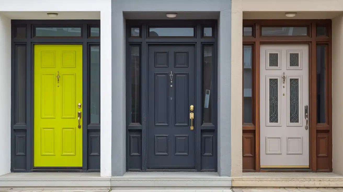
Your front door sets the tone before anyone steps inside, and one wrong color can throw everything off. I have seen homes look dull or harsh just because of a poor paint choice. If you’re unsure what works, this focus on the colors you should never use at Home will help you avoid common mistakes. You will learn which shades can clash, fade quickly, or require too much upkeep, and what to use instead. This makes your choice easier and saves time, money, and effort while giving better results. Let’s fix your front door paint color and make it feel right from the moment you first look at it. The Influence of Front Door Colors The front door is far more than just a functional entryway; it is the defining focal point of your home’s exterior and the first architectural detail a visitor encounters. Acting as the visual anchor of the façade, it frames the entire composition of a home’s curb appeal. A well-chosen front door color can upgrade even the most modest exterior, while a poor choice can completely undermine an otherwise beautiful home. Refined blue-gray tones like Debonair SW 9139 are increasingly appearing on front doors precisely because they strike that balance between calm authority and quiet personality. Beyond appeal, color psychology plays a pivotal role in design decisions: warm hues signal a welcoming, friendly atmosphere, cool tones project calm authority, and bold choices communicate a unique personality. Understanding these dynamics is essential before committing to any front door color for your home’s perfect look. Three Front Door Paint Colors to Never Use Your front door is the first thing visitors notice; choosing the wrong color can undermine your home’s entire curb appeal before anyone even steps inside. While personal taste always plays a role, certain colors consistently create problems that go beyond appeal. Here are three front door paint colors worth reconsidering before you pick up that brush. 1. Bright or Neon Colors Bright and neon colors might feel exciting on a mood board, but they rarely translate well onto a front door. These high-intensity shades can overwhelm your home’s exterior, clash with natural surroundings, and create a visual imbalance that feels unsettling rather than welcoming. What looks bold in theory often reads as harsh and uninviting in practice, particularly against brick, stone, or neutral siding. Over time, extreme saturation also fades unevenly, leaving your door looking worn far sooner than expected. You can consider these alternatives instead for your project next time: Sherwin-Williams Smoky Blue (SW 7604): A muted, urbane blue that adds character without overwhelming your exterior palette. Benjamin Rooftop Garden (CSP-765): A deep, earthy green that feels grounded, natural, and effortlessly stylish on any door. Farrow & Ball Mizzle (No.266): A soft, complex sage green that blends beautifully with both modern and traditional home styles. 2. Dark Colors Without Natural Light Dark shades like deep black or heavy brown can look strikingly sleek on the right home, but without adequate natural light, they quickly turn oppressive and uninviting. A shadowed entryway paired with a very dark door creates a visually heavy entrance that feels closed off rather than welcoming. Beyond appeal, dark colors absorb significantly more heat, accelerating paint deterioration and causing fading, peeling, and cracking far sooner than lighter alternatives would. For your next project, you can consider these alternatives: Sherwin-Williams Charcoal Blue (SW 2739): A rich, deep neutral that retains refinement while reflecting slightly more light than true black Benjamin Moore Slate Teal (2058-20): A refined slate tone that brings depth and interest without swallowing light from your entryway Behr Brodway (PPU18-20): A warm charcoal gray that feels strong and contemporary without creating an oppressive, lightless entrance 3. White (If Not Maintained Properly) White feels like the safe, classic choice for a front door, and in theory, it is. But in practice, a white front door demands relentless upkeep. It attracts dirt, scuffs, and staining faster than almost any other color, and without regular cleaning and repainting, it quickly shifts from crisp and graceful to tired and neglected. Against certain exterior styles, white can also read as flat and personality-free, blending into the facade rather than creating the welcoming focal point your entrance deserves. Consider these alternatives if you want next time: Sherwin-Williams Alabaster (SW 7008): A warm, creamy off-white that hides minor marks far better while retaining that clean, bright appeal. Benjamin Moore White Dove (OC-17): A soft, slightly warm white with gentle depth that feels refined and far more forgiving than stark pure white. Farrow & Ball Pointing (No.2003): A warm antique white with subtle complexity that adds quiet classiness without the harsh maintenance demands of bright white. Front Door Color Ideas That Stand the Test of Time Avoiding the wrong front door color is only half the battle; choosing the right one is where your home’s personality truly begins. Here are seven alternatives that deliver lasting curb appeal. Color Why It Works Perfect For Vibe Soft Pastels Light pink, mint, or powder blue create calm without overpowering Modern, coastal, neutral exteriors Gentle & serene Earthy Tones Olive, terracotta, and warm brown blend naturally with wood and stone Rustic, farmhouse, nature-inspired homes Grounded & natural Warm Neutrals Taupe, beige, and soft mocha pair effortlessly with almost any exterior Traditional homes, mixed-style neighborhoods Cozy & classic Charcoal or Slate Gray Dark yet understated, creates a sleek modern look without heaviness Contemporary, minimalist, lighter exteriors Sleek & urbane Classic Navy Blue Bold enough to stand out, refined enough to stay timeless Colonial, cottage, beach-style homes Calm & stately Bold Red or Burgundy Adds personality and warmth without feeling loud or overwhelming Traditional, Victorian, neutral exteriors Warm & inviting Black (With Caution) Classic and striking, especially paired with gold or brass hardware Modern, minimalist, classic-style homes Sleek & bold Each of these shades brings its own distinct character while standing the test of time. As part of the wider move toward colors replacing gray, deeper options show just how much personality a single door color can carry when matched thoughtfully to your exterior, architecture, and surrounding landscape. How to Choose the Perfect Front Door Color Choosing the right front door color starts with testing paint samples directly on your door, observing how they shift across morning, afternoon, and evening light before committing. Beyond aesthetics, consider what your chosen color communicates: red signals warmth and energy, blue evokes calm and trust, while black projects quiet confidence. It also helps to browse current design trends, not to follow them blindly, but to understand which directions feel fresh yet enduring. The perfect front door color balances your personal style, your home’s exterior palette, and the lasting impression you want every visitor to carry away. Common Mistakes to Avoid When Painting Your Front Door Even the best color choice can fall flat if the application goes wrong. Avoid these critical mistakes first. Finish Matters: Choosing the wrong finish, matte, satin, or gloss, can drastically affect how your door’s color looks and wears. Surface First: Skipping proper cleaning, sanding, and priming leads to peeling, uneven coverage, and a paint job that deteriorates quickly. Patience Pays: Rushing coats without allowing adequate drying time between layers results in streaks, bubbling, and an unprofessional finish. Color Isolation: Never choose your door color in isolation; always evaluate it alongside your siding, trim, and hardware. Nail these basics and your front door will look professionally painted, polished, and picture-perfect for years. Frequently Asked Questions (FAQ) How do undertones affect paint colors in different rooms? Undertones can shift with lighting and nearby colors, making the same shade look warmer, cooler, lighter, or slightly dull in different spaces. Should ceilings and trim use the same paint color as walls? Using the same color creates a smooth look, while different trim shades add contrast and help define edges, door, and architectural details. How often should you repaint to keep colors looking fresh? Most walls need repainting every five to seven years, but busy areas may require updates sooner due to marks, fading, and regular wear. Can neutral paint colors work with bold furniture or decor? Yes, neutral shades act as a steady base, helping bold furniture stand out clearly without making the space feel too busy or cluttered Final Touch Choosing the right front door color can make or break how your home feels from the outside. I have seen how small paint choices can change the whole look fast. You now know why neon shades feel harsh, dark tones need light, and white needs care to stay clean. You also have safer color ideas that hold up better over time. This helps you avoid wasted effort, extra costs, and a door that feels off. When you follow this Front Door Paint: Three Colors to Never Use at Home Guide, your entry looks more welcoming and balanced. Try a new shade, test it in daylight, and see the difference. Share your results or check more ideas next!
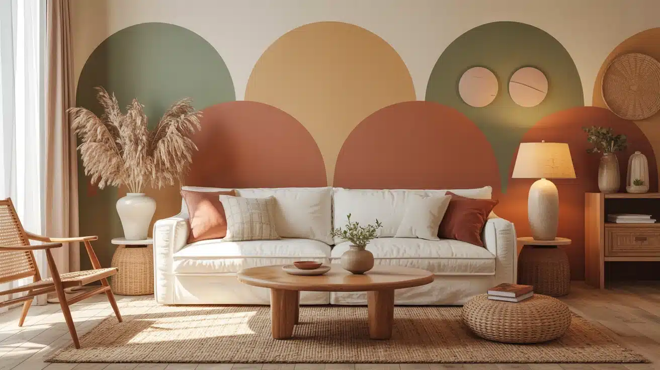
Gray has had a long run, but the walls are shifting, and the colors taking its place are warmer, richer, and far more personal. If you have been asking what color is replacing gray in modern homes, the answer is not one shade but a whole movement toward tones that feel lived-in rather than curated. The shades taking over bring depth, warmth, and personality that cool gray simply never delivered, and the shift is showing up in homes everywhere. I walk you through the top emerging home paint trends so you can find the shade that actually fits your space, your light, and the atmosphere you want to wake up to every day. Why Home Paint Colors Are Shifting For well over a decade, gray ruled the world of interior design, and honestly, it made a lot of sense. When minimalism swept into mainstream homes around the early 2010s, gray offered something no other color could. It was sleek without being stark, neutral without being boring, and effortlessly modern. From cool silver-tones to warm charcoal, it became the universal answer to the question of what color should I paint this, right down to picking a door paint color that felt safe and contemporary. As people spent more time at home, especially through the years of global disruption, they started craving color that felt alive, grounding, and deeply personal. Today, homeowners are turning to colors rooted in nature, memory, and warmth, signaling not just a design change, but a cultural one. Colors That Are Replacing Gray: Home Paint Home paint trends are shifting towards warmer, earthier tones, replacing cool grays with hues that bring personality, warmth, and depth to any space. These emerging shades are both inviting and versatile. 1. Warm Beige Warm beige creates an immediate sense of welcome, offering a soft and inviting atmosphere. Unlike gray, it adds warmth and comfort to any space, making it feel more lived-in. Beige evokes the familiar emotions of hearth and sand, blending effortlessly with natural elements like wood, linen, and terracotta. This versatile color is ideal for creating a cozy and relaxing environment that feels both stylish and inviting. Here are three great options for incorporating warm beige into your home, each offering unique qualities to suit different spaces: Sherwin-Williams Accessible Beige: A soft, versatile beige that pairs well with natural wood and linens. Benjamin Moore Revere Pewter: A warm, light beige perfect for creating bright, cozy spaces. Behr Swiss Coffee: A soft, light beige that brightens rooms without feeling sterile. 2. Soft Taupe Soft taupe strikes a balance between traditional richness and modern restraint, creating a refined and grounded atmosphere in any room. Its soft brown undertones add depth and dimension, offering more warmth than gray. Taupe pairs seamlessly with both antique and contemporary furniture, adding a touch of luxury without overwhelming the space. Perfect for creating a refined, welcoming environment, taupe works wonders in living rooms, bedrooms, or dining areas. Here are some great taupe options to consider for your next project: Sherwin-Williams Perfect Greige: A balanced taupe that adds warmth without overwhelming the space. Benjamin Moore Edgecomb Gray: A versatile taupe perfect for creating subtle refinement in any room. Behr Classic Taupe: A warm, neutral taupe ideal for both traditional and modern spaces. 3. Earthy Terracotta Terracotta brings a sun-baked warmth into your home, evoking imagery of clay pots and Mediterranean villages. This rich, earthy color connects interiors with nature, offering a bold statement while grounding a space. Its warmth conjures images of soil, pottery, and ancient earthen walls. Terracotta pairs beautifully with natural textures like rattan and woven materials, making it a perfect color for boho-inspired decor or accent walls. Here are some great examples of earthy terracotta hues to brighten your space: Sherwin-Williams Cavern Clay: A warm, sun-baked terracotta that adds rustic appeal. Benjamin Moore Rust: A rich, warm terracotta that brings depth and an earthy, grounded quality to accent walls and living spaces. Behr Red Curry: A deep terracotta that brings an earthy vibe to any room. 4. Sage Green Sage green soothes the mind, bringing calmness and serenity to a space. It embodies the tranquility of a garden at dusk and is ideal for bedrooms or wellness-focused rooms. The calming hue connects interiors to nature, helping lower stress levels. Sage green remains classy, never out of style, making it a versatile choice for creating a restful environment that fosters relaxation and peace. Here are three great sage green options to try in your home: Sherwin-Williams Sage: A muted green that evokes a calming, natural ambiance. Benjamin Moore Hollingsworth Green: A soft and serene shade, perfect for creating calm, restful spaces. Behr Silver Sage: A cool, relaxing sage green that pairs well with light neutrals 5. Warm Off-White Off-white with warm undertones is a gentler alternative to gray. It brightens a room while neutralizing the harshness of cooler tones. This soft, welcoming color creates a cozy atmosphere, offering more warmth and personality than traditional white or gray. Perfect for ceilings, walls, and trim, it improves the natural light in a room and serves as an ideal backdrop for art and furniture. Here are some warm off-white shades to try: Sherwin-Williams Alabaster (SW 7008): A creamy, warm off-white with subtle yellow undertones that feels inviting on walls, ceilings, and trim alike. Benjamin Moore White Dove: A clean, warm off-white that feels fresh without reading as stark or cold. Behr Antique White: A soft, warm neutral that works beautifully on walls, trim, and cabinetry alike. 6. Muted Blue Muted blues bring serenity and a peaceful vibe, making them perfect for bathrooms or spaces meant for relaxation. This cool color evokes the calmness of water and sky, adding depth without overwhelming the space. Muted blue pairs effortlessly with warm brass accents and white tile, creating an urbane and restful atmosphere. Ideal for coastal or Scandinavian-inspired designs, it’s both calming and stylish. Here are three beautiful muted blue shades to try: Sherwin-Williams Debonair: A refined, muted blue with quiet refinement that works beautifully in bathrooms and relaxation-focused spaces Benjamin Moore Misty Blue: A cool, muted blue perfect for adding calm refinement to a room. Behr Blueprint: A deep, tranquil blue that offers intricacy without feeling too bold. 7. Dusty Pink Dusty pink offers refinement and warmth without being overpowering. This refined shade is gender-neutral and adds a touch of classiness to bedrooms, dressing rooms, or living spaces. Unlike traditional pinks, dusty pink feels mature and welcoming, balancing warmth with subtlety. It pairs beautifully with dark woods, olive greens, and warm metallics, making it a versatile choice for any style. Here are some great dusty pink options to try: Sherwin-Williams Romance: A muted, refined pink perfect for creating soft, inviting spaces. Benjamin Moore First Light: A delicate, dusty pink ideal for adding warmth and character. Behr Rosewater: A soft, muted pink perfect for creating a cozy, feminine feel. 8. Olive Green Olive green brings a deep, earthy tone that grounds a room with its rich, natural feel. It adds depth and visual weight, making it perfect for living rooms, kitchens, or any space that needs a bit of grounding energy. Olive green pairs well with natural materials like wood, stone, and copper, creating a warm, inviting environment. This color is ideal for adding personality and purpose to your space without overwhelming it. Here are some top olive green shades to try: Sherwin-Williams Ripe Olive: A rich, earthy olive green perfect for living rooms and kitchens. Benjamin Moore Olive Branch: A warm, green that complements natural textures. Behr Chinese Jade: A deep green with brown undertones that creates a cozy, grounded space. 9. Deep Charcoal Deep charcoal adds drama to a room, providing a bold alternative to gray. This color offers rich depth and a striking contrast, making it perfect for accent walls or modern industrial spaces. Charcoal pairs beautifully with exposed concrete, steel, and raw timber, improving the natural textures of the room. It’s ideal for creating a striking focal point or adding an air of modern refinement to any room. Here are some bold, deep charcoal options to consider: Sherwin-Williams Peppercorn: A deep, dramatic charcoal that pairs beautifully with lighter accents. Sherwin-Williams has a strong lineup ofdeep, moody wall colors that work exceptionally well in accent-focused spaces. Benjamin Moore Kendall Charcoal: A rich, urbane charcoal that adds depth and drama to any space. Behr Cracked Pepper: A bold charcoal that creates contrast without overwhelming the space 10. Pale Lavender Pale lavender introduces a subtle grace that converts spaces into serene, dreamy environments. This soft color offers a calming atmosphere without being overly feminine or childish. Lavender pairs beautifully with warm grays, creating a layered, urbane look. It’s perfect for bedrooms, bathrooms, or any space where you want to evoke tranquility and relaxation. This color works in various interiors, making it a refined alternative to traditional neutrals. Here are some lovely pale lavender shades to explore: Sherwin-Williams Grape Mist: A soft, pastel lavender that improves the tranquility of any room. Benjamin Moore Misty Lilac: A soft, airy lavender that brings a delicate and refined quality to bedroom and bathroom walls. Behr Lavender Cloud: A calming, light lavender that pairs well with gray for a refined look 11. Golden Mustard Golden mustard adds warmth and personality to any room, infusing spaces with energy and vibrancy. This retro-inspired color offers a bold, sun-soaked feel, making it perfect for accent walls or small decor pieces. Mustard adds a sense of memories while remaining contemporary and fresh. It pairs beautifully with deep navy, black, and natural wood, adding a memorable touch to your home without being overwhelming. Here are some golden mustard options to brighten your space: Sherwin-Williams Gold Crest: A vibrant mustard that adds warmth and energy to any room. Benjamin Moore Golden Honey: A rich, golden mustard ideal for creating a statement wall. Behr Mustard Seedx: A bold, energetic mustard that adds a sunny pop of color to your space. How to Incorporate these New Home Paint Trends Introducing a new paint color doesn’t require a full renovation. Start small with an accent wall or a single room, and let the color breathe alongside your existing pieces before committing fully. Color Best Rooms Room Size & Light Pairs With Warm Beige Living rooms, hallways Any size; expands dim spaces Linen, oak wood, cream textiles Soft Taupe Bedrooms, dining rooms Medium–large; warm south light Bronze fixtures, walnut, velvet Terracotta Kitchens, accent walls Use sparingly in small, dark rooms Rattan, terrazzo, raw linen Sage Green Bedrooms, home offices Great in north-facing rooms White trim, matte black, natural wood Warm Off-White Any room, ceilings Best for small or low-light spaces works with everything Muted Blue Bathrooms, reading nooks Brightens north-facing rooms Warm brass, driftwood, white Dusty Pink Bedrooms, dressing rooms Mid-size, well-lit rooms Dark walnut, olive green, warm gold Olive Green Kitchens, living rooms Large rooms with bright windows Stone, copper, timber, terracotta Deep Charcoal Accent walls, offices Large, well-lit spaces only White plaster, brass, warm timber Pale Lavender Bedrooms, bathrooms Morning light improves it best Warm gray, ivory, soft metallics Golden Mustard Accent walls, alcoves Avoid in very dark or tiny rooms Deep navy, black iron, natural wood Creating harmony between new paint and existing furniture is less about matching and more about balancing. Anchor bold wall colors with neutral furnishings, and let warm tones in rugs, throws, or wood finishes bridge any contrast naturally. Tips for Maintaining Your New Trendy Walls Finish matters: Choose eggshell or satin finishes, which resist scuffs and help keep rich color tones intact longer. Gentle cleaning: Wipe walls with a damp microfiber cloth; harsh cleaners fade warm earthy tones and dusty hues prematurely. Touch-up stock: Always keep a small sealed tin of the exact paint. Color-matching years later is notoriously unreliable and frustrating. Sunlight protection: UV-filtering window film prevents warm tones like mustard and terracotta from fading or shifting over several years. Accessory harmony: Refresh cushions, throws, and art to complement your new wall color. Small changes make the palette feel intentional and complete Wrapping Up As homes move away from gray, warmer and more personal hues are gaining popularity in interior design. The answer to what color is replacing gray points clearly toward earthy tones that foster comfort and connection. Beige, taupe, terracotta, and sage green are just a few of the colors bringing warmth, dimension, and depth to your home. These shades help create a welcoming environment that gray simply could not. Each color offers unique benefits, from calming sage to bold terracotta, helping you craft the perfect atmosphere. If you are updating a room or making a bold change, these colors convert spaces into something special. I would love to hear your thoughts, drop a comment below or check out other ideas in related blogs.