


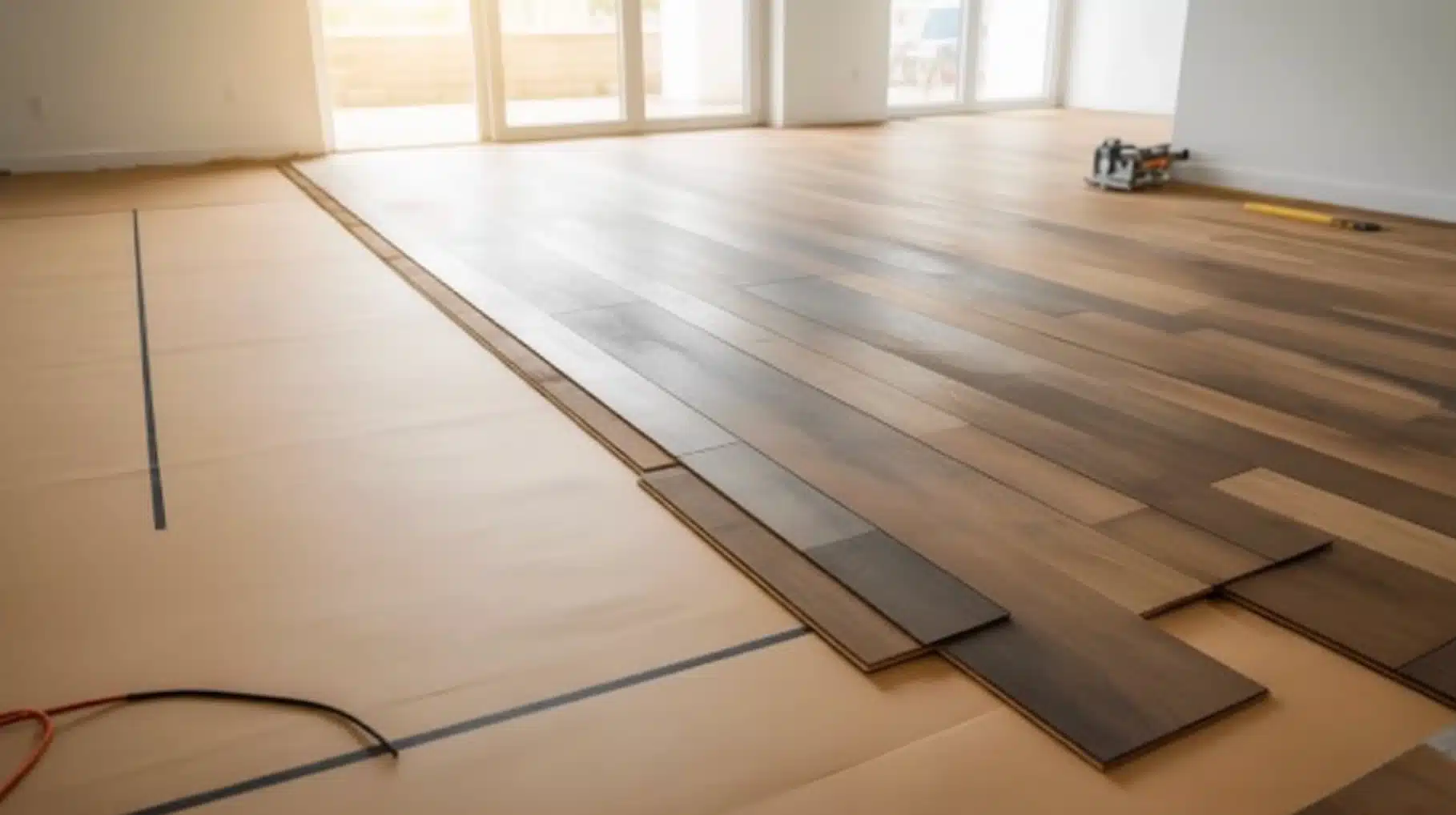
Choosing which direction to lay vinyl plank flooring seems simple until you start researching it. One source says follow the longest wall, another says follow the light, and a third says align with the joists. By the time I had read five articles, I had five conflicting opinions and a room full of unopened boxes. If that sounds familiar, I’ve been right where you are. The answer isn’t hidden in some expert formula. In my experience, it comes down to a few clear factors and making a call that fits your specific space. Let me help you by explaining everything you need to move forward with confidence. What Determines the Direction of Vinyl Plank Flooring? Before you lock in a direction, I find it genuinely useful to understand what’s actually driving the decision in the first place, because it’s less about rules and more about results. Here’s what determines which direction to lay vinyl plank flooring: Floating Floor Design: Plank direction is about visual outcomes, not structural rules, since vinyl isn’t nailed or glued down like hardwood. Room Shape Matters: Your room’s proportions determine which direction makes the space feel longer, wider, or more balanced. Natural Light Source: Running planks toward or across your light source can either highlight or soften the plank lines. Floor Joist Orientation: Joist direction rarely affects modern click-lock installs, but it’s still worth checking before you start. Entry Point Placement: Where someone first steps in sets the visual tone, making entry alignment a practical factor. Open Plan Continuity: One consistent direction across connected rooms creates flow and makes the whole space feel cohesive. Once you understand these factors, the decision starts to feel a lot less overwhelming, and in my experience, the right direction for your space becomes fairly clear on its own. The Main Rules for Which Direction to Lay Vinyl Plank Flooring Most flooring advice circles back to the same core principles. Understanding how each rule works and when it actually applies makes the decision far more straightforward. 1. Run Planks Parallel to the Longest Wall This is the most widely recommended starting point, and from my experience, it holds up in most situations. When planks run parallel to the longest wall, the eye follows them naturally from one end to the other. The space feels longer and more open without any structural changes. It works cleanly in living rooms, bedrooms, and any rectangular room with a clear dominant length, while also reducing cuts along the shorter walls. 2. Follow the Main Natural Light Source Some installers prioritize light direction over wall length, and there’s solid reasoning behind it. When planks run toward the main natural light source, light hits the floor surface more evenly across the full length. Seams catch less shadow, minor gaps become far less noticeable, and the floor reads as smoother overall. This matters most in rooms with large south- or west-facing windows where light is strong throughout the day. 3. Install Perpendicular to Floor Joists This rule most often applies to wood subfloor situations where stability is a genuine concern. Running planks perpendicular to floor joists adds rigidity and reduces the slight bounce older wood subfloors develop over time. On a concrete slab, joist direction is entirely irrelevant. For most modern click-lock products, this isn’t a make-or-break decision, but on an older wood subfloor with noticeable give, it’s worth checking before the first row goes down. 4. Run Lengthwise in Hallways Hallways follow a different logic from open rooms, and this direction choice is rarely worth debating. Running planks lengthwise naturally move the eye forward, making the space feel connected rather than broken up. Cross-installation creates short, choppy lines that make narrow spaces feel cramped. The hallway also reads as a natural extension of the adjoining room’s floor rather than a separate, disconnected zone, which is exactly what you want. 5. Keep Direction Consistent in Open Floor Plans In open floor plans where rooms connect without walls, a direction change mid-space creates a visual break that most people notice immediately. Maintaining a single, consistent direction across the entire area allows the floor to read as a single continuous surface. A transition strip can justify a change between doorway-separated rooms, but in fully open layouts, choosing direction based on the longest sight line across the whole space consistently produces the cleanest result. How Direction Changes the Way a Room Feels Most flooring guides focus on rules and skip the visual logic entirely. Plank direction controls where the eye travels, and that shapes how large or comfortable a room actually feels. Here’s a clear breakdown: Plank Direction Visual Effect Best Used When Parallel to the longest wall The room feels longer, the eye moves end to end Space feels short or lacks depth Across the longest wall The room feels wider, and space opens sideways Space feels narrow or cramped Toward the main window The eye moves toward the light, and the floor reads more smoothly. The room has a strong natural light source From the entry to the back wall Creates depth, space feels more generous The room is small or needs a sense of distance No extra material or cuts are needed to achieve any of these effects. The result comes entirely from which direction the lines run when someone stands at the doorway and looks in. Vinyl Plank Layout Patterns Worth Knowing Direction and pattern are distinct choices that both shape the final result. Getting the pattern right is just as important as deciding which way the planks run. 1. Standard Staggered Pattern The most common starting point for good reason, it mimics natural wood closely and works across nearly every room type, size, and style without looking out of place. Here’s what to know before committing: End joints are randomized, closely resembling real hardwood and avoiding rigid, repetitive lines Avoid the H-pattern and stair-step offsets, where joints in alternating rows align predictably Beginner-friendly and the most forgiving pattern for anyone installing vinyl plank for the first time Aside from avoiding those two specific joint patterns, this layout is difficult to get wrong and suits almost any space well. 2. Brick or Fixed Offset Pattern A fixed offset, typically one-third of a plank length, suits spaces where clean lines and deliberate symmetry matter more than a natural, organic floor appearance. Here’s the full picture: Creates a structured, uniform look with consistent and repeatable lines throughout the floor Works well in modern or contemporary interiors where geometry is part of the overall design Easier to plan than a randomized stagger, but less forgiving if plank lengths vary across the batch The fixed offset is a deliberate stylistic choice rather than a default. It pays off most in rooms where the floor is meant to feel intentional and structured. 3. Diagonal Layout Running planks at a 45-degree angle is one of the more practical ways to make a small or awkward room feel noticeably larger without any structural changes to the space. Here’s what sets it apart: Diagonal lines draw the eye outward, making tight or square rooms feel more open Requires significantly more cuts along every wall edge and increases material waste by 10–15% Intermediate skill level, manageable with patience, but not ideal as a first installation attempt The visual payoff is real in the right room, but the added cuts and waste make this a considered choice rather than a practical default for larger or straightforward spaces. What the Reddit Community Actually Says About Plank Direction After going through that Reddit discussion, I noticed something consistent. No one pushed a single hard rule. Instead, most advice focused on visual flow and how the floor feels once everything is installed. One user said following the longest line of sight from the main entrance made the space feel more natural. Another user said they changed direction between connected rooms and later regretted it because the break looked awkward. Many users preferred keeping one direction throughout an open floor plan, especially when rooms flow directly into each other. Several mentioned that changing direction without a wall or divider made the space feel chopped up. A few users also brought up natural light, saying they didn’t consider how sunlight would hit the seams until after installation. From what I gathered, the shared mindset was clear: continuity and light matter more than strict rules. How to Make the Final Call? Before the first plank goes down, a few quick checks at the entrance will give you a clear, confident direction for the entire floor. Here’s what you need to check: Main entrance first: stand there and look toward the longest sight line in the room Natural light source: identify where the strongest light comes from before committing to a direction Room connections: check whether adjacent rooms connect openly or are separated by a doorway Visual flow: ask which direction makes the space feel larger and more continuous Small square rooms: skip the analysis and choose whichever direction needs fewer cuts Starting position: begin in the left-hand corner with the tongue side facing the wall, working left to right Expansion gap: Leave a quarter-inch around the full perimeter to prevent buckling over time Taking two minutes to assess the room before the first plank goes down saves considerable frustration mid-installation. Get these basics right, and the rest of the process follows naturally. Final Thoughts Figuring out which direction to lay vinyl plank flooring comes down to reading the room rather than following a fixed rule. The longest wall is a reliable starting point in most spaces, but light, room shape, and open connections all shift that decision. My approach, and the one that worked best for me, is to stand in the doorway, look at the space honestly, and think about where I want the eye to go. The floor will be there for years, so a few minutes of thinking through direction before the first plank goes down is always worth it. Get the direction right, keep the pattern consistent, and the rest falls into place. Drop your question or experience in the comments below.
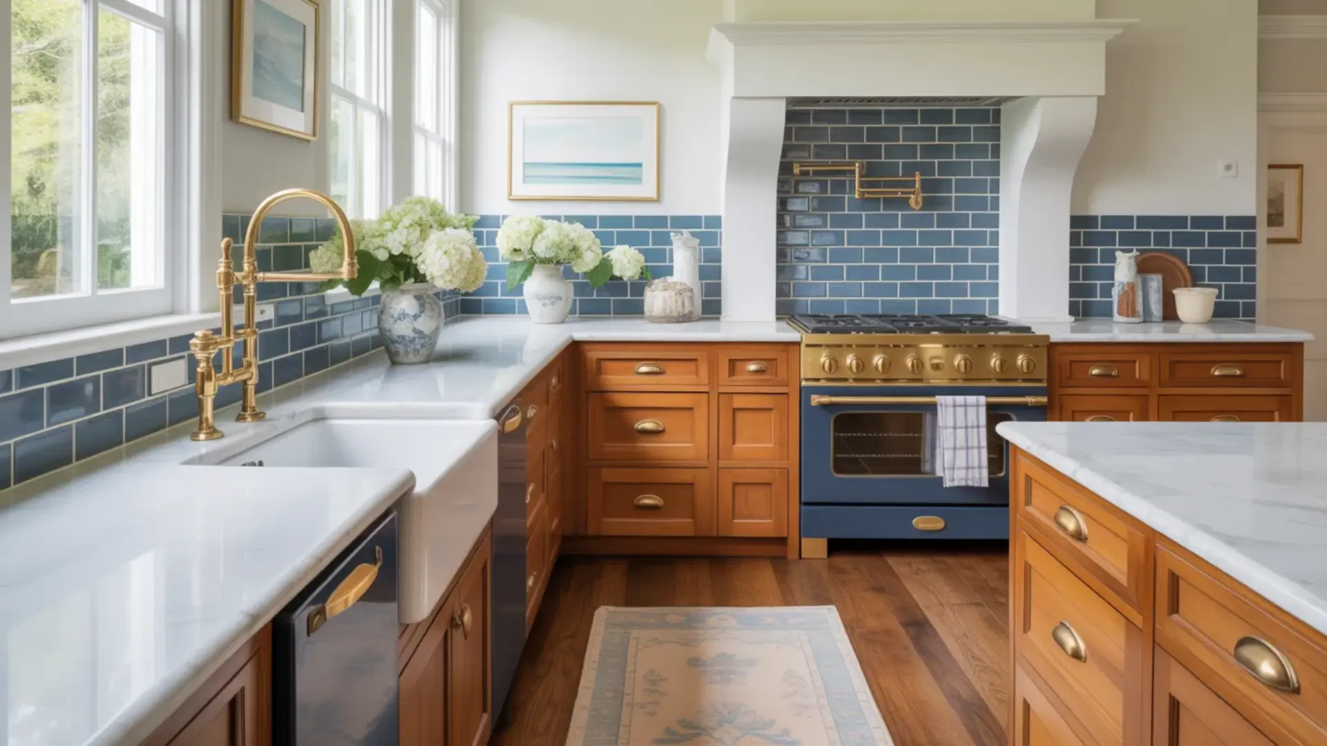
Oak kitchen cabinets were everywhere in the 80s and 90s, and honestly, I get why people fell in love with them. But that warm, honey-orange tone? It can make a kitchen feel really dated really fast. The good news is, you don’t need to rip everything out and start over. I’ve put together this guide to show you exactly how to make oak kitchen cabinets look modern without blowing your budget. I’ll cover everything from hardware swaps and lighting tricks to backsplash ideas and two-tone cabinet combinations. Let’s give your kitchen the refresh it deserves. Why Oak Cabinets Look Outdated Oak cabinets often look outdated because of their strong orange or yellow undertones, especially the popular honey oak finish from the 1990s. Over time, that warm tone can make a kitchen feel dark, heavy, or overly traditional. The visible wood grain can also feel busy compared to today’s smoother, cleaner cabinet styles. But here’s the good news: the problem usually isn’t the cabinets themselves. Oak is a durable, high-quality wood that can last for decades. In most cases, the color and surrounding design elements are what feel dated. Instead of replacing them, you can update the finish, hardware, lighting, or backsplash. A smart, budget-friendly refresh can completely transform the space without a full renovation. How to Make Oak Kitchen Cabinets Look Modern: 15 Proven Ways Oak cabinets are solid, durable, and built to last, but their dated look doesn’t have to be permanent. Here are 15 proven ways to modernise them. 1. Paint Them a Neutral, Modern Color Painting is the single most impactful way to modernise oak cabinets. Neutral shades like white, soft gray, navy, and sage green instantly eliminate the dated look while giving your kitchen a clean, contemporary feel. For a perfectly smooth finish, use a grain filler before painting to minimise oak’s natural wood grain texture. Not ready to paint? Swapping hardware and updating lighting can still make a significant difference without touching the cabinets themselves. 2. Restain Instead of Painting If you love the warmth of wood but want a fresher look, restaining is the answer. Contemporary stains in lighter whitewash tones or rich, darker finishes like espresso and walnut replace the telltale orange hue that makes honey oak feel so dated. The process strips back the old finish and applies a new one, completely transforming the cabinet colour while keeping the natural wood feel intact and the grain beautifully visible. 3. Swap Out the Hardware Never underestimate how much cabinet hardware affects the overall look of a kitchen. Replacing old brass or chrome handles with matte black, brushed nickel, or warm brass hardware is one of the quickest and most affordable upgrades you can make. It takes a few hours, requires no professional help, and the difference is immediately visible. Modern hardware gives oak cabinets a sharp, intentional look that feels completely current. 4. Add Glass Inserts to Cabinet Doors Replacing solid cabinet door panels with glass inserts instantly adds depth, lightness, and a modern open feel to any kitchen. Clear glass works best for displaying styled dishware or glassware; frosted glass is a better option if you prefer to conceal the contents while still letting light through. Either way, glass inserts break up the heaviness of solid oak doors and give the kitchen a more elevated, contemporary character. 5. Replace Some Upper Cabinets with Open Shelving Swapping a few upper cabinet units for open shelves creates an airy, contemporary look that feels instantly more modern. Style the shelves with a curated mix of everyday items, stacked white plates, glassware, small plants, and a few decorative objects, keeping it intentional rather than cluttered. Open shelving also makes smaller kitchens feel larger and more connected, which is one of the reasons it has remained one of the most popular modern kitchen trends. 6. Mix Oak Lowers with Painted Uppers The two-tone cabinet trend is one of the most effective ways to modernise oak without a full renovation. Keep the oak lower cabinets as they are and paint the upper cabinets in a fresh, contrasting colour. White uppers with oak lowers are the most classic and widely used combination, clean, balanced, and visually grounding. Soft sage green or navy uppers also work beautifully, adding personality while letting the natural wood warmth below anchor the space. 7. Update the Countertops Countertops frame the cabinets and have an enormous impact on how modern or dated the entire kitchen feels. White or light grey quartz immediately brightens the space and reduces the visual heaviness of oak’s warm tones. Dark concrete or charcoal countertops create a bold contrast that feels sleek and contemporary. Butcher block is a warmer, more natural option that complements oak beautifully while still feeling intentional, updated, and very much on-trend in modern kitchen design. 8. Install Modern Lighting Lighting can completely change how oak cabinets read in a kitchen. LED under-cabinet strip lighting adds a clean, modern glow that highlights the countertops and reduces shadows, making the whole kitchen feel brighter and more polished. Sleek pendant lights hung over an island or breakfast bar add a strong design statement overhead. Choose fixtures in matte black or brushed brass to tie the lighting in with updated hardware and create a cohesive, modern kitchen look throughout. 9. Change the Backsplash The backsplash sits directly behind and above the cabinets, making it one of the most visually connected surfaces in the kitchen. Large-format tiles in light grey, white, or cool-toned shades visually counterbalance the warmth of oak and significantly reduce its orange undertone. Sleek subway tiles in a vertical stack or herringbone pattern feel contemporary and clean. If you want to make a bolder statement, a patterned or textured tile adds personality while still pulling the kitchen into a more modern design direction. 10. Add a Kitchen Island or Peninsula If your kitchen layout allows it, adding an island or peninsula is one of the best ways to modernize the whole space. A painted island in a contrasting color like navy, black, or sage green instantly creates a two-tone look that feels very current. It also adds counter space, storage, and a natural focal point that draws the eye away from dated oak cabinetry. 11. Decorate with Modern Accessories and Styling Sometimes the fastest way to modernize a kitchen is simply changing what sits on the surfaces. Swapping out old decorative items for clean, intentional accessories can completely shift the feel of the space without any renovation at all. Think matte ceramic canisters, wooden cutting boards, and a simple herb pot. Less is more, aim for three to five purposeful items rather than a crowded, mismatched countertop. 12. Add Crown Molding or Updated Trim Crown molding is a small finishing detail that has a surprisingly strong effect on how polished and modern a kitchen looks. Adding clean, simple molding to the top of oak cabinets closes the gap between the cabinet and the ceiling, giving the kitchen a more built-in, intentional appearance. Choose a slim, minimal profile rather than an ornate style; simplicity is what keeps it feeling modern rather than traditional. Paint the molding to match the cabinets or the ceiling for a seamless, streamlined finish. 13. Add a Statement Range Hood A range hood is one of the most prominent features in any kitchen, and upgrading it can shift the entire room’s style. Most dated kitchens have a basic builder-grade hood that blends into the background. Replacing it with a stainless chimney, matte black metal, or a custom shiplap hood makes the kitchen feel far more designed and intentional, without touching a single cabinet. 14. Update the Flooring The floor is the largest surface in your kitchen, and outdated flooring can undermine even the most well-executed cabinet refresh. If you still have old vinyl, worn hardwood, or dated ceramic tile, updating it makes a massive difference. Large-format porcelain tile, luxury vinyl plank, or white oak hardwood all pair beautifully with oak cabinets. Best of all, peel-and-stick LVP and floating floor systems make this a very doable DIY weekend project without tearing everything out. 15. Incorporate Plants and Greenery Adding plants to your kitchen is one of the easiest and most affordable ways to modernize the space. Greenery softens the warm orange tones of oak cabinets and adds a fresh, organic element that feels very current in modern kitchen design. A trailing pothos on top of upper cabinets, a herb garden on the windowsill, or a snake plant in the corner can instantly make the whole kitchen feel alive and curated. Oak kitchen cabinets have more potential than most people give them credit for. Try even two or three of these updates, and the transformation will genuinely surprise you. Tips for Getting a Smooth Finish When Painting Oak Cabinets Want your oak cabinets to look modern and flawless? Proper prep and careful painting are key. Follow these steps for a smooth, professional finish. Remove Doors and Hardware: Remove all cabinet doors, drawers, and hardware. Label each piece for easy reassembly. Clean Thoroughly: Degrease surfaces with a strong cleaner to remove oils, dirt, and residue. Sand the Surface: Lightly sand with medium-grit sandpaper to remove the factory finish and improve primer adhesion. Apply Grain Filler: Fill oak’s deep pores with a quality grain filler; let it dry completely, then sand smooth. Prime the Cabinets: Use a high-bond or stain-blocking primer to prevent tannin bleed and ensure paint sticks. Sand Between Coats: Lightly sand after primer and between paint layers for an ultra-smooth surface. Apply Thin Paint Coats: Use multiple thin coats of high-quality paint rather than one thick layer for a flawless finish. Take your time with each step, and your oak cabinets will achieve a smooth, modern, and professional-looking finish that completely transforms your kitchen’s style. Final Thoughts Updating your oak kitchen cabinets doesn’t have to feel overwhelming or expensive. Knowing how to make oak kitchen cabinets look modern is all about small, smart changes that make a huge difference, whether that’s a fresh coat of paint, new matte black hardware, or a sleek backsplash that pulls everything together. The key is to pick the updates that work for your budget and your style, then take them one step at a time. I truly believe that with the right approach, oak cabinets can look just as fresh and modern as anything you’d find in a brand-new kitchen. Which of these tips are you trying first? Drop it in the comments below, I’d love to hear about your kitchen transformation!
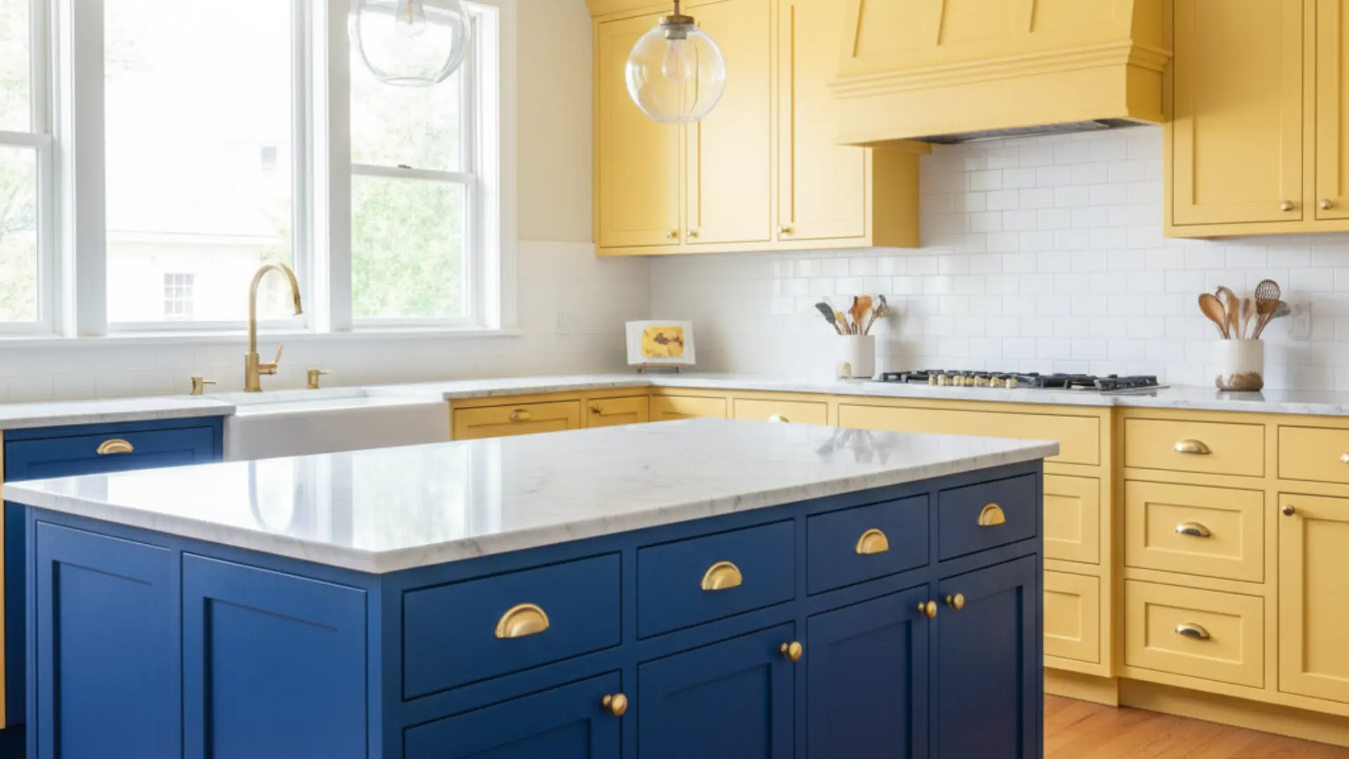
I’ll be honest, when I first heard about two tone kitchen cabinets, I wasn’t sure if they were right for me. But after seeing how they can totally upgrade a home, I’m completely sold! Two-tone cabinets use two different colors or finishes to create a look that’s both stylish and unique. Think white upper cabinets with dark navy lower cabinets, or a natural-wood island paired with painted perimeter cabinets. I’m going to walk you through everything you need to know about dual-colour kitchen cabinets. We’ll look at the best color combinations, the pros and cons, and common mistakes to avoid when tackling this project yourself. Understanding Two Tone Kitchen Cabinets When I talk about this style, I simply mean using two different cabinet colors, finishes, or even materials in the same kitchen. Instead of everything matching, you intentionally mix things up. It could be white upper cabinets with dark lower ones, a wood island paired with painted perimeter cabinets, or even the same color in two different finishes. The most common layout I see is lighter cabinets on top and darker ones on the bottom. This keeps the room feeling bright while still adding depth and contrast. This trend is popular because it makes a home feel more custom, modern, and visually interesting without needing a full remodel. Two-Tone Kitchen Cabinet Ideas If you’re anything like me, you need real examples to imagine the possibilities. Here are some beautiful dual colour cabinet ideas to spark inspiration. 1. White Upper + Navy Lower Cabinets This classic pairing keeps the room feeling bright while adding depth below. White upper cabinets reflect light and make the area feel open, while navy lowers ground the space with rich contrast. It works beautifully in coastal, transitional, and modern designs. Add brass or gold hardware for a polished, designer-inspired finish that completes the look perfectly. 2. White + Natural Wood Cabinets Combining white cabinets with natural wood creates warmth without losing brightness. The wood adds texture and character, while white keeps the space clean and airy. This look is perfect for Scandinavian, modern farmhouse, or minimalist designs. It feels cozy yet fresh, making it a timeless choice for homeowners who value both style and function in their cooking space. 3. Black Lower + Light Gray Upper Cabinets Black base cabinets anchor the room and hide wear and tear, while light gray uppers soften the contrast. This combination feels bold but not overwhelming. It works well in contemporary spaces where you want drama without going full dark. Pair with light countertops to keep everything balanced and inviting. The result is a modern look that feels grounded and complete. 4. Sage Green + White Cabinets Sage green lowers bring a calm, nature-inspired vibe to the area. When paired with crisp white uppers, the result feels airy and grounded at the same time. This combination works especially well in farmhouse or cottage-style designs. Natural wood accents and brushed brass hardware complete the look beautifully. It creates a fresh feeling that homeowners love for years. 5. Blue + Warm Oak Cabinets Deep blue cabinets paired with warm oak create a rich, layered design. The wood softens the boldness of the blue, making the space feel welcoming instead of dramatic. This pairing works well in both modern and transitional styles. It gives a custom, high-end appearance without feeling trendy. The combination effortlessly brings warmth and personality to any cooking area. 6. Charcoal + Cream Cabinets Charcoal lowers add an upgrade, while cream uppers keep the room soft and inviting. This pairing offers contrast without the starkness of black-and-white. It’s perfect for homeowners who want something moody but still warm. Add warm lighting to boost the creamy tones and prevent the space from feeling cold. This combination creates a cozy yet refined atmosphere throughout. 7. Dark Island + Light Perimeter Cabinets Keeping the perimeter cabinets light while painting the island a darker color creates a natural focal point. The island becomes the centerpiece of the room. This approach is ideal if you want a contrasting look without committing to upper and lower variations throughout the entire space. It offers flexibility and visual interest while maintaining an open, bright feeling overall. 8. Wood Lower + Painted Upper Cabinets Wood lowers add warmth and durability, while painted uppers keep the room feeling open. This combination blends rustic and refined elements effortlessly. It’s especially popular in modern farmhouse and transitional designs. Choose a soft neutral paint color to balance the natural richness of the wood tones. The result is a layered look that feels both inviting and polished. 9. Matte and Gloss Same-Color Mix Using the same cabinet color in both matte and gloss finishes creates a subtle contrast. The difference in sheen adds depth without introducing a second color. This approach works well in modern spaces where simplicity is key. It keeps the palette cohesive while still adding visual interest and texture. The layered finish brings dimension to the room in a refined way. 10. Beige + Brown Cabinets Layering beige and brown creates a soft, inviting neutral palette. The lighter beige keeps things airy, while the deeper brown adds warmth and depth. This pairing works beautifully in traditional or Mediterranean-inspired designs. It’s ideal for homeowners who want subtle contrast without bold color choices or dramatic statements. The combination feels timeless and comfortable in any home setting. 11. Classic Black and White Cabinets This classic tuxedo look delivers strong contrast and visual drama. White upper cabinets prevent the room from feeling heavy, while black lowers provide grounding. It suits both modern and traditional homes. Adding metallic hardware can improve the overall design and give it a more luxurious, polished touch. This pairing never goes out of style and works in many settings. 12. Blue and Gray Combination Blue and gray create a cool, contemporary feel. The tones blend well without clashing, making the area feel cohesive and calm. This pairing works well in modern spaces with stainless steel appliances. Choose lighter shades in smaller rooms to maintain brightness, openness, and a sense of airiness. The combination brings a serene quality, making the space feel peaceful. 13. Dusty Lavender + Soft Gray Dusty lavender brings a soft, unexpected touch of color that feels calming rather than bold. When paired with soft gray cabinets, the combination creates balance and visual appeal. I love this pairing for spaces that want personality without overwhelming the area. The gray keeps everything grounded, while lavender adds warmth and subtle charm that feels fresh and inviting throughout. 14. Appliance Wall in a Different Color Painting one cabinet wall in a contrasting shade creates subtle zoning within the space. The appliance or pantry wall becomes a visual feature that naturally draws attention. This approach works well in larger rooms where you want dimension without overwhelming the entire area with too much contrast or competing color schemes. It adds interest while maintaining overall balance and flow. 15. Butter Yellow + Charcoal Butter yellow instantly brightens a cooking space and adds cheerful warmth. When I pair it with deep charcoal cabinets, the contrast feels bold yet subtle. The charcoal prevents the yellow from looking too playful, creating a mature and balanced design that works well in rooms with natural light. This combination brings energy while staying grounded and functional for everyday use. 16. All White Kitchen + Wood Range Hood An all-white design feels bright and clean, but adding a wood range hood introduces warmth and texture. This subtle contrast creates a focal point without requiring two full cabinet colors. The natural wood element softens the crispness of white and makes the space feel more inviting and layered rather than sterile. It’s perfect for those wanting minimal contrast. 17. Walnut Cabinets + Soft White Uppers Walnut lowers provide deep, natural texture, while soft white uppers maintain brightness throughout the space. This pairing feels refined and timeless. It works beautifully in upscale spaces where natural materials are the focus. The wood grain adds warmth and visual interest without overpowering the room or feeling too heavy overall. This combination suits traditional and contemporary homes equally well. 18. Navy Island + WhiteCabinets Painting only the island navy adds contrast without overwhelming the space entirely. White cabinets around the perimeter keep the area bright and open. This subtle approach is perfect for homeowners who want a hint of bold color without committing to darker base cabinets throughout their entire cooking or dining area. It creates a focal point while maintaining overall brightness. 19. Soft Gray + Dusty Blue Cabinets Muted gray and dusty blue create a layered, calming effect throughout the room. The colors blend naturally, offering gentle contrast that feels cohesive. This pairing works well in transitional or coastal-inspired designs. Keeping the tones soft helps the space feel cohesive rather than busy, making it ideal for relaxed, comfortable home atmospheres where serenity matters most to homeowners. 20. Cream Uppers + Forest Green Lowers Cream-colored upper cabinets keep the room feeling light and open, while forest-green lower cabinets add richness and depth. This combination feels classic but still fresh, especially in traditional or cottage-style homes. The darker base grounds the room without making it feel heavy. Pair it with brass hardware, warm wood floors, and soft lighting for a complete look. 21. Light Wood + Matte Black Cabinets Light wood cabinets soften the boldness of matte black, creating a striking yet balanced contrast throughout the space. The natural wood grain adds warmth, while black delivers modern drama. This pairing works beautifully in Scandinavian or minimalist spaces where clean lines matter most. Keep countertops simple and décor minimal so the contrast between texture and tone becomes the statement. 22. Blush + White Cabinets Blush cabinets add a gentle touch of color without overpowering the space entirely. When paired with crisp white, the room feels airy, bright, and subtly playful throughout. This pairing works especially well in small cooking areas where you want personality but still need light reflection for an open, welcoming feel. Add gold or brushed-nickel hardware to complete the look. 23. Greige + Dark Brown Cabinets Greige is a soft, modern neutral that blends gray and beige tones beautifully. When paired with dark brown cabinets, the result feels layered and warm rather than stark. This combination works well in contemporary homes that lean toward earthy finishes while maintaining a calm, cohesive atmosphere throughout the space. It’s perfect for those wanting a subtle yet meaningful contrast. 24. Teal + Natural Maple Cabinets Teal cabinets introduce vibrancy and character, while natural maple keeps the design grounded and balanced throughout. The wood tones soften the boldness of teal, preventing it from feeling overwhelming in the space. This pairing works well in eclectic or transitional spaces that embrace personality and color. Add simple countertops and understated hardware to keep the overall design cohesive and welcoming. 25. Two Different Wood Tones Using two wood tones creates a natural contrast without paint or additional finishes. Light oak upper cabinets paired with darker walnut lowers add depth and dimension while maintaining warmth throughout the room. The variation in grain and shade makes the room feel layered and custom. This approach works beautifully in modern, rustic, or Scandinavian-inspired designs that seek an overall organic feel. These color pairings demonstrate the versatility of contrasting cabinets. Choose the one that fits your style and begin planning your makeover. Pros and Cons of Two-Tone Kitchen Cabinets Before I commit to a design choice, I always like to clearly see the advantages and drawbacks laid out side by side. Pros Cons Adds more personality and visual character Harder to match finishes, undertones, and hardware correctly. Creates contrast that makes the space feel layered and dynamic. Risk of clashing colors if combinations are not tested properly. Can increase perceived home value with a custom, upgraded look. May date faster if overly trendy or bold colors are chosen. Works beautifully in both modern and traditional homes. Requires more planning compared to single-color cabinetry. In my experience, thoughtful color choices and good lighting make all the difference when deciding if this style works long-term. Common Mistakes to Avoid When I work with clients on cabinet colors, I always remind them that small design choices can have a big visual impact later. What looks great on a paint card or showroom sample can feel very different once it’s inside your kitchen. Over the years, I’ve seen a few common mistakes come up again and again. Catching them early usually saves my clients time, money, and a lot of frustration. Using Too Many Bold Colors Sometimes it’s tempting to combine several bold shades in one kitchen. I usually guide clients toward limiting strong colors to one main focus. Too many bold tones competing with each other can make the space feel chaotic instead of balanced. Ignoring Color Undertones Two colors might look similar at first glance, but their undertones can be completely different. I always check whether a color leans warm or cool before pairing it with another finish. When undertones clash, cabinets can suddenly look mismatched even though the colors seemed fine on their own. Skipping Paint or Finish Samples I never recommend choosing cabinet colors without testing samples first. Lighting, wall colors, and flooring all affect how a shade appears. I usually suggest placing samples in the actual kitchen space and looking at them throughout the day before making the final decision. Overlooking Lighting Lighting changes everything in a kitchen. Natural daylight, overhead lighting, and under-cabinet lights all affect how cabinet colors appear. I always help clients think about the full lighting setup so darker cabinets don’t feel too heavy and lighter shades don’t end up looking dull. From my experience, slowing down and testing each choice carefully makes the entire design process smoother. When clients take that extra time upfront, they usually end up with a kitchen that feels balanced and exactly how they imagined it. Final Thoughts After looking at so many examples, I truly believe two tone kitchen cabinets are one of the easiest ways to make a home feel custom and thoughtfully designed. If you choose soft neutrals or bold contrast, the key is balance. I always suggest testing samples, checking your lighting, and keeping your overall style in mind before making a final decision. When done right, this design can make your kitchen feel brighter, bigger, and more modern without a full renovation. If you’re planning an update, start by choosing one area to highlight and build from there. Thinking about going two-tone? Tell me your favorite color combo in the comments below!
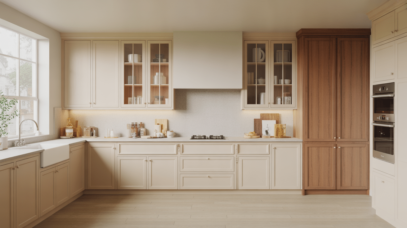
If you’ve been staring at kitchen photos and wondering why every cabinet starts to look the same, you’re not alone. Understanding the different types of cabinets is what helps you finally see the differences clearly. Once you know what separates shaker, slab, inset, overlay, and frameless styles, everything stops feeling overwhelming. I’m going to walk you through the main cabinet styles, construction types, and practical differences that actually matter in daily life. You’ll learn how each option affects storage, maintenance, budget, and overall design. By the end, you won’t just recognize cabinet names, you’ll understand which ones truly fit your kitchen, your habits, and your long-term plans. Why Understanding Different Cabinet Types Matters? Choosing cabinets for your kitchen can feel overwhelming with so many options available. Knowing the different cabinet styles helps you make informed decisions that match your space, budget, and lifestyle. Each cabinet type offers unique benefits in terms of functionality, appearance, and cost. When you understand these differences, you can pick options that work best for your needs rather than feeling confused by too many choices. This knowledge helps you create a kitchen that looks good and functions well for years to come. You’ll spend your money wisely and end up with a space you truly love. Kitchen Cabinet Styles and Types Kitchen cabinet doors come in many styles, and I’ve seen how the right one can change your whole space. Once you understand the options, it gets easier to match your taste and budget. The most common cabinet door styles include: 1. Shaker Cabinets Shaker cabinets feature a flat center panel surrounded by a clean, simple frame. Their timeless design adapts effortlessly to modern, farmhouse, and transitional kitchens. They pair well with virtually any hardware or color palette, making them one of the most widely chosen styles for homeowners who want flexibility without sacrificing character. 2. Slab / Flat-Front Cabinets Slab cabinets have a completely smooth, flat front with no panels or raised details. I like how simple and clean they look, especially in modern kitchens with bold colors or glossy finishes. I’ve noticed they’re also easy to wipe down since there are no grooves to trap dust. If you want a clutter-free feel with simple hardware or hidden handles, this style works really well. 3. Raised Panel Cabinets Raised panel cabinets feature a center panel that projects outward, adding dimension and a polished, traditional feel. The added depth creates visual interest that suits formal or classic kitchens. They pair naturally with warm wood tones and detailed hardware, giving spaces a sense of craftsmanship that feels both established and inviting. 4. Beadboard Cabinets Beadboard doors are defined by their vertical groove pattern, which adds gentle texture and a relaxed, cottage-like charm. They work especially well in farmhouse, coastal, and beach-inspired kitchens. Unlike flat doors, beadboard brings warmth through detail rather than ornamentation, making it a welcoming choice for casual, lived-in kitchen spaces. 5. Glass-Front Cabinets Glass-front cabinets swap a solid panel for clear, frosted, or decorative glass, allowing you to display dishware and décor while visually expanding the room. They work particularly well in smaller kitchens where creating a sense of openness matters. Paired with interior lighting, they add depth and a curated, intentional feel. 6. Louvered Cabinets Louvered cabinets use horizontal slats that create a breezy, textured look unique among cabinet styles. Originally popular in tropical climates, they suit coastal and island-themed kitchens where airflow and relaxed visuals matter. The slatted design introduces rhythm and shadow to cabinet doors, offering a distinctive alternative to flat or paneled options. 7. Distressed / Rustic Cabinets Distressed cabinets are intentionally aged using sanding, chipping, or layered staining techniques to achieve a worn, characterful finish. They thrive in rustic, farmhouse, or cabin-inspired spaces where imperfection is part of the appeal. Paired with natural stone or reclaimed wood elements, they bring genuine warmth that new, flawless finishes simply cannot replicate. 8. Craftsman / Mission-Style Cabinets Craftsman cabinets prioritize honest construction, visible wood grain, and clean horizontal and vertical lines without unnecessary decoration. Rooted in the Arts and Crafts movement, they suit older homes and classic interiors. Their sturdy, handcrafted quality speaks to people who appreciate natural materials and straightforward design over ornate or trend-driven choices. 9. Inset Cabinets Inset cabinets are set flush within the face frame rather than overlapping it, creating a precise, built-in appearance. The tight tolerances required make them a hallmark of custom cabinetry and high-end kitchens. They suit traditional and classic spaces where clean alignment and fine craftsmanship are priorities over maximizing interior cabinet storage. 10. Full Overlay Cabinets Full overlay cabinets cover nearly the entire face frame with their doors, leaving minimal frame visible between them. The result is a seamless, continuous surface that feels contemporary without being overly minimal. They offer slightly more interior access than partial overlay styles and work well in both transitional and modern kitchen designs. 11. Partial Overlay Cabinets Partial overlay cabinets leave a visible border of the face frame around each door, a look common in older homes and more budget-conscious builds. While less seamless than a full overlay, they remain fully functional and carry a simple, traditional quality. They make practical sense for kitchen updates that prioritize cost efficiency over a high-end finish. 12. Frameless (European-Style) Cabinets Frameless cabinets remove the front frame and attach the doors straight to the cabinet box. The cabinet box is usually thicker and built for strength since it holds everything together. I like how solid and simple it feels. This is my personal favorite for modern kitchens. You get more usable space inside, and the outside looks smooth and clean across the whole wall. 13. High-Gloss Cabinets High-gloss cabinets use lacquer or acrylic finishes to create a reflective, light-amplifying surface. Particularly effective in smaller kitchens, the sheen bounces light around the room to make it feel larger and brighter. They clean easily and pair well with bold or neutral tones, making them a strong choice for modern, polished interiors. 14. Plywood / Veneer-Front Cabinets Veneer-front cabinets showcase natural wood grain in a controlled, consistent way, offering warmth without heavy detailing. They suit Scandinavian, Japandi, and nature-inspired kitchen styles where simplicity and organic texture are central. The result feels calm and refined, appealing to those who want a connection to natural materials within a quietly contemporary design. 15. Thermofoil Cabinets Thermofoil cabinets apply a vinyl coating over MDF to produce a smooth, consistent finish that resists moisture and cleans effortlessly. They deliver a modern look at an accessible price point, making them a practical choice for budget-conscious renovations. If any of the above kitchen cabinet style suits you, check out this DIY kitchen cabinet to start working on your own cabinet. Getting the proper guidance according to your skill level will definitely help you in boosting your confidence. Different Types of Cabinets by Construction Before you even think about door styles, I always suggest you understand the basic cabinet structure first. Once you know these four cabinet types, everything else makes more sense. So here are the four main cabinet types you will find in almost every kitchen plan: Cabinet Type Key Dimensions Primary Use Wall (Upper) Cabinets ~12 inches deep; hung above counters with standard backsplash clearance Dishes, glasses, and lighter everyday items Base Cabinets ~34½ inches tall (without countertop); ~24 inches deep Supports counters, sinks, and cooktops; stores pots, pans, and heavier items Tall Cabinets / Pantries Full floor-to-ceiling height Pantry storage, oven towers, and large or bulky items Specialty Units Varies by unit type Corner units, lazy Susans, pull-out spice racks, trash units, appliance garages, hutches, and wine or bottle racks Knowing these four cabinet categories upfront makes it far easier to read floor plans, compare product catalogs, and plan a layout that works for how you actually use your kitchen. How to Choose the Right Cabinet Style Choosing the right cabinet style can feel overwhelming at first. I’ve found it gets much simpler when you focus on a few key factors that truly matter in daily life. Here’s what you should pay attention to before you decide: Match your cabinet style with your home’s overall design: shaker suits farmhouse spaces, slab fits modern builds perfectly. Set a realistic budget early: inset and custom cabinets cost far more than stock or thermofoil options ever will. Factor in daily maintenance: high-gloss shows fingerprints fast, while wood grain and distressed finishes hide everyday wear much better. Balance trends with personal taste: shaker and flat-front styles hold up over time without feeling dated too quickly. The right cabinet style sits at the intersection of what looks good, fits your budget, and holds up to how you actually live. Final Thoughts Now you’ve seen how cabinet styles, construction types, and layout categories all work together to shape your kitchen. When you understand the different types of cabinets, choosing becomes clearer and less stressful. You can match door style to your home’s design, balance cost with durability, and pick construction that supports how you cook and store items every day. I’ve found that once you narrow your choices to two or three solid options, the decision feels manageable. Take a moment to think about your space, your routine, and your budget. Then revisit the styles that stood out to you. Share your top pick in the comments and tell me what direction you’re leaning toward.
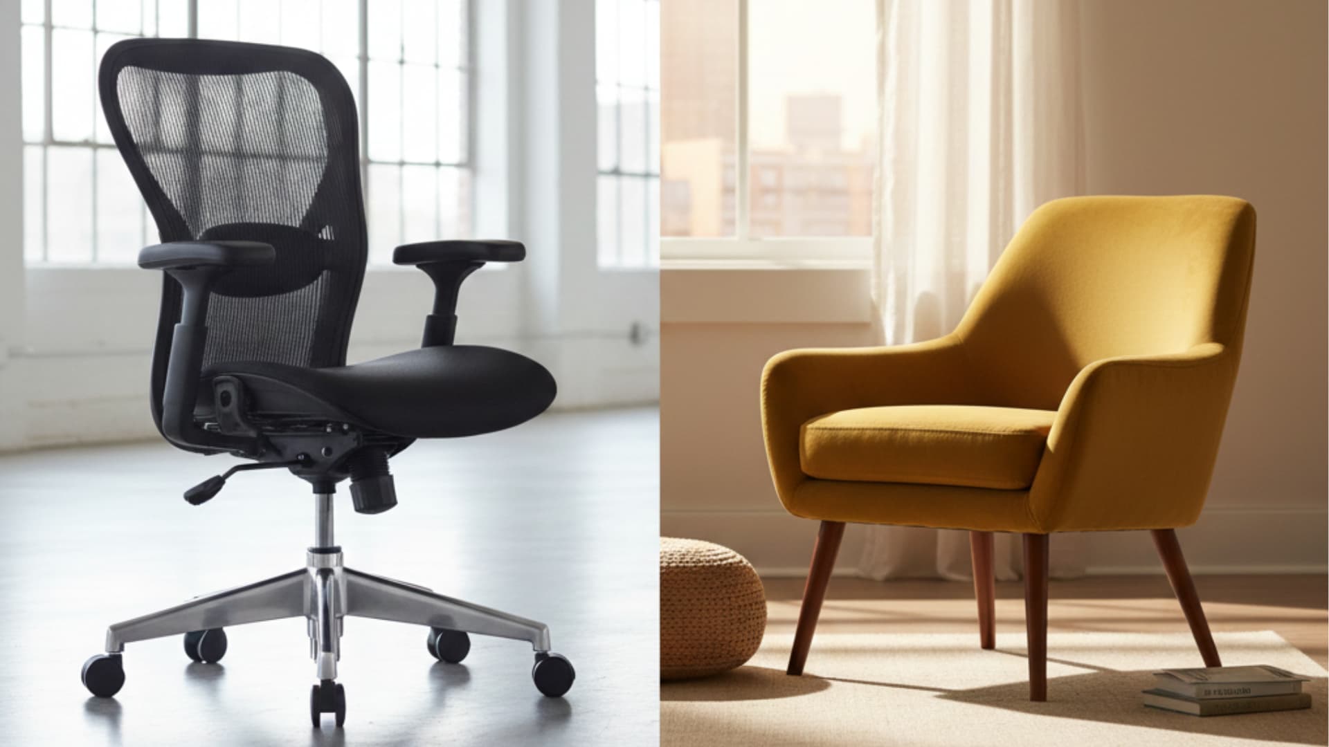
When you’re considering furniture for your business, it’s essential to know what makes contract-grade furniture a smarter investment. Designed for commercial environments, contract-grade pieces are built to endure heavy use, ensuring long-lasting durability and safety. But what is contract-grade furniture, and why should you choose it for your space? In this blog, I’ll walk you through everything you need to know, from the key features to customization options and how to maintain it. You’ll also find insights from business owners who have made the switch from residential to contract-grade furniture and how it positively impacted their operations. By the end, you’ll understand how this furniture can improve your space, save costs, and elevate your business What is Contract-Grade Furniture? Contract-grade furniture is designed specifically for commercial environments like hotels, offices, and restaurants. It’s built to handle heavy, daily use and meets strict safety and durability standards. Unlike residential furniture, which is designed for lighter, less frequent use, contract-grade furniture is built with stronger materials, such as steel and solid hardwood, often featuring reinforced joints and fire-resistant fabrics. This makes it more durable and longer-lasting in high-traffic areas. Business owners who have used both types note that while residential furniture may be cheaper initially, contract-grade options offer superior longevity and performance. Ultimately, contract-grade furniture is a more cost-effective investment for businesses that need furniture to withstand constant wear and tear. Key Features of Contract-Grade Furniture Contract-grade furniture is designed for heavy, continuous use in commercial spaces, ensuring durability, safety, and functionality. When I choose contract-grade furniture, I know I’m investing in pieces built to withstand the demands of high-traffic areas. It provides you with long-lasting performance and peace of mind, knowing it’s up to the task Durability: Built to endure high traffic with strong materials like steel, hardwood, and fire-resistant fabrics. Strict Testing: Undergoes rigorous testing of structural integrity, stability, and weight capacity to ensure long-lasting performance. Safety Standards: Meets safety requirements, including fire resistance and low-emission certifications (e.g., GREENGUARD). Specialized Materials: Made with high-density foam, sturdy metal gauges, and stain-resistant upholstery for prolonged use. Customization: Offers flexibility for design, sizes, and brand-specific colors to suit commercial spaces. Customization allows businesses to align the furniture with their unique branding and space requirements. Customization and Design Considerations Many businesses choose to customize their contract-grade furniture to align with their brand identity and functional needs. For example, a restaurant owner may select custom seating with their brand’s colors and logo to create a cohesive look that reinforces their brand message. Customizing furniture for office spaces can also improve the environment by selecting ergonomic chairs that promote employee well-being while maintaining a professional look. Additionally, customization improves both functionality and pleasing. A café owner explains how custom seating not only matched their branding but also helped maximize seating arrangements, improving customer flow and comfort. Custom options allow businesses to make the most of their space while presenting a polished and professional image. Contract-Grade vs. Non-Contract-Grade Furniture: A Deeper Comparison Switching from residential to contract-grade furniture can greatly impact your business’s operations. When I made the switch, I noticed the difference right away. Here’s a breakdown of the key differences that can make a real impact on your space. Aspect Contract-Grade Furniture Residential Furniture Durability Built for high traffic and heavy use, lasts longer Designed for lighter, less frequent use, wears out quicker Materials Made with reinforced materials like steel and hardwood Lighter materials, often not reinforced for heavy use Cost Higher upfront cost, but cost-effective in the long term Lower upfront cost, but more frequent replacements needed Maintenance Requires less maintenance, easier to clean and repair Higher maintenance due to wear and tear over time Usage Ideal for commercial spaces like offices, hotels, and restaurants Best suited for home use, not built for daily, heavy-duty use Investing in contract-grade furniture can improve your business by improving efficiency, reducing costs, and ensuring long-term durability. Why People Choose Contract-Grade Furniture for Their Business Many business owners start with residential-grade furniture to cut costs, but it can’t handle daily commercial wear and tear. After switching to contract-grade furniture, businesses see immediate improvements. Ergonomic chairs work for long hours, and solid desks with steel frames stand up to heavy use. A Reddit discussion confirms this: “Commercial grade furniture is absolutely made to be more durable and last for a long time and a few million customers, sits, etc. You can get lucky and find items at the thrift stores or you can search your local FB marketplace. Brands to keep an eye out for: Steelcase, Herman Miller, OFS, AMQ, KI. There’s many more out there but those are some of the bigger brands.” Ultimately, contract-grade furniture saves money long-term by reducing replacements and repairs. How to Choose Contract-Grade Furniture for Your Business When I select contract-grade furniture for my business, there are key factors I always consider to ensure it meets both functional and stylish needs. Assess Your Space Needs: Consider the size, layout, and functionality of your space to ensure the furniture fits well. The right furniture improves your space while accommodating specific commercial activities and traffic. Prioritize Durability: Choose pieces made from strong, long-lasting materials like steel, hardwood, and fire-resistant fabrics. Durability ensures the furniture can withstand heavy daily use in commercial environments without needing frequent replacements. Evaluate Comfort and Functionality: Focus on ergonomic designs that improve comfort while supporting the demands of the space, like offices or restaurants. Comfort improves the experience for employees or customers, enhancing overall satisfaction. Consider appearance Alignment: Match furniture with your business’s branding and design, ensuring it complements your style and creates a cohesive look. Aesthetics help convey your brand’s message and set the tone for customers and staff alike. Check for Customization Options: Ensure the furniture offers customization for specific sizes, colors, and finishes that align with your brand’s identity. Customization allows flexibility, helping you create a unique, branded environment tailored to your business. These considerations help me make an informed decision, while also enhancing the overall experience for both my employees and customers. Maintenance Tips for Contract-Grade Furniture Contract-grade furniture is designed for durability, but proper care is essential to extend its lifespan and keep it looking new. Here’s how to maintain your contract-grade furniture effectively: Regular Cleaning: Clean furniture regularly with appropriate cleaners for materials like leather, fabric, and metal to prevent dirt buildup and surface damage. Avoid Harsh Chemicals: Use non-abrasive cleaners and avoid harsh chemicals that can damage upholstery or finishes and compromise material integrity. Inspect for Damage: Periodically check for loose screws, stains, or wear in high-traffic areas and address issues promptly to prevent further deterioration. Upholstery Care: Use upholstery protectors on fabric and leather furniture, and reapply as needed to maintain appearance and reduce staining. Polish Wooden Surfaces: Occasionally polish wooden surfaces to maintain the finish, prevent drying or cracking, and keep the wood smooth and moisture-resistant. Rotate Seating: Rotate cushions or seating areas regularly to ensure even wear, prolong furniture life, and maintain consistent comfort for users. I’ve learned that consistent maintenance makes a huge difference in how long contract-grade furniture lasts and performs. Taking just a few minutes each week for basic care saves money and keeps spaces looking professional for years. Evaluating the Cost and Long-Term Value of Contract-Grade Furniture When considering contract-grade furniture, it’s important to weigh the upfront cost against the long-term benefits and savings. Factor Contract-Grade Furniture Residential Furniture Initial Cost Higher upfront cost due to durable materials and construction Lower initial cost, but may need more frequent replacements Durability Long-lasting, built to endure heavy daily use May wear out quickly in high-traffic areas, requiring replacements sooner Maintenance Low maintenance costs due to durable materials Higher maintenance costs from repairs and replacements Longevity Furniture can last many years with proper care Shorter lifespan, often requiring early replacement Cost Efficiency Over Time More cost-effective in the long run due to fewer replacements More expensive over time due to frequent replacements and repairs Investing in contract-grade furniture may seem expensive initially, but the long-term savings and durability make it a smart financial choice. Final Thoughts To wrap things up, we’ve found why contract-grade furniture is a must-have for businesses looking to improve their space with durable, functional, and customizable options. You’ve learned about its longevity, cost-effectiveness, and the importance of maintaining it for long-term use. If you’re thinking about upgrading your restaurant, office, or hospitality space, contract-grade furniture provides the value and performance you need. I hope this blog has helped you understand why it’s a smart investment. Now, I’d love to hear from you! What are your thoughts on contract-grade furniture? Feel free to share your experiences or ask any questions, and let’s get your business on the right track with the best furniture for your needs.
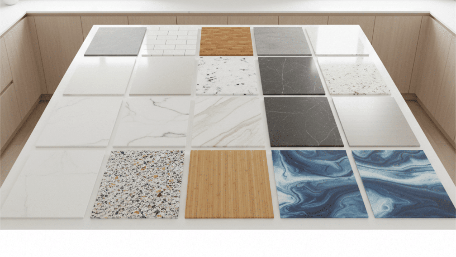
Choosing from types of countertop materials can feel confusing because everything looks great in photos. But what really matters is how it works in your everyday life, like hot pans, spills, kids, heavy cooking, and how much cleaning you’re willing to do, especially when comparing options like these popular granite colors. In this guide, I’ll walk you through the main countertop options, what each one is best for, the biggest pros and cons, and the care level you should expect. By the end, you’ll be able to compare your choices quickly and pick the one that fits your budget and your routine. Why Your Countertop Choice Matters Every Day Once your new counters are in, you’re going to see and touch them all day long, when you make coffee, pack lunches, cook dinner, or clean up after a late-night snack. Unlike paint or decor, this is not something you’ll swap out next year if you change your mind. If the surface stains easily, shows every scratch, or needs more care than you expected, you’ll feel it daily. That’s why looking past the pretty photos and thinking about how each material behaves in a real kitchen matters this much. With that in mind, let’s look at the specific materials one by one and see what they’re really like to live with. Different Types of Countertop Materials Before choosing a countertop, it helps to understand how different materials compare in cost, durability, and upkeep. Here’s a quick breakdown of the most common options and what you can expect from each: 1. Laminate Countertops Laminate is a layered countertop surface made by bonding a printed decorative sheet to a core, often particleboard or MDF. Many modern laminates are designed to mimic stone, wood, or concrete, so you can get the look without the high price. Pros Cons Lowest cost option for tight budgets Can scorch or bubble with hot pans Many colors and patterns (stone-look options too) Scratches and chips, especially at edges and seams Easy daily cleaning with mild soap and water Water can seep into joints and cause swelling Lightweight, often easier to install than stone Big damage is tough to fix; sections may need replacement Care tips: Use a cutting board and trivets every time. Wipe standing water fast, especially near the sink and seams. 2. Tile Countertops (Ceramic or Porcelain) Tile countertops are built using individual ceramic or porcelain tiles set on a base with grout lines between them. You can go simple with classic squares or create a custom look with patterns, textures, and bold colors. Pros Cons Handles heat well, so hot dishes are less of a worry Grout stains and traps crumbs, needs more scrubbing Lots of design options with sizes, colors, and finishes Tiles can chip or crack if heavy items drop Single tiles can be replaced without redoing everything Grout lines make the surface less smooth for wiping or dough Great for handmade or artistic kitchen styles Ignoring grout care can make it look worn over time Care tips: Seal grout if recommended. Clean grout regularly with gentle products and avoid harsh abrasive scrubbers. 3. Butcher Block Countertops Butcher block is made from strips or blocks of wood glued together, usually maple, oak, walnut, or birch. It gives a warm, natural feel that many people love, especially in farmhouse or cozy kitchens. Pros Cons Warm, inviting look that softens the kitchen Needs regular oiling or sealing to prevent drying and stains Scratches and dents can be sanded and refinished Water can cause swelling or dark marks near sinks Quieter than stone, less clanking from dishes Heat can burn it, and it may need sanding to fix Great for prep work and daily chopping comfort Shows wear faster in busy kitchens, and patina builds over time Care tips: Oil it on a schedule. Wipe water quickly, don’t let wet towels sit on it, and always use trivets for hot cookware. 4. Solid Surface (Acrylic) Countertops Solid surface is a man-made material, often acrylic or acrylic blends, made into sheets. A big selling point is that seams can be minimized and sinks can sometimes be integrated for a smooth, clean look. Pros Cons Seamless, clean look for modern kitchens Scratches more easily than stone; avoid cutting directly Easy wipe-down cleaning for daily mess Hot pans can scorch or warp the surface Light scratches can be buffed out Some styles look less natural up close Many calm, uniform color options Heavy impacts can leave marks, though repairs are often possible Care tips: Use trivets, cutting boards, and non-abrasive cleaners. Treat it gently around heat. 5. Concrete Countertops Concrete countertops are cast or poured to fit your kitchen layout. They can be tinted, textured, or finished in different ways. Because concrete is naturally porous, it is typically sealed to protect it. Pros Cons Highly customizable (color, thickness, edges, details) Can crack if the installation is poor or the home shifts Unique modern, industrial look Needs sealing and sometimes waxing Very durable when installed and sealed properly Can stain if sealer wears down or spills sit Feels custom-built, not mass-produced Heavy material usually needs a skilled installer Care tips: Follow the sealer schedule. Wipe spills quickly and avoid harsh, acidic cleaners that can damage the finish. 6. Granite Countertops Granite is a natural stone cut into slabs. Each slab is different, so you get natural pattern movement and color variation. Granite is often chosen because it balances durability with a timeless look. Pros Cons Handles everyday heat well Often needs sealing to help prevent stains Strong against scratches and daily wear Some patterns can look busy in small kitchens Many natural colors and patterns Poor installation can lead to stress cracks Seen as a valuable home upgrade Cutting on it can dull knives Care tips: Seal if recommended. Clean spills quickly, especially oils and dark liquids, and use a cutting board to protect knives. 7. Marble Countertops Marble is a natural stone known for soft veining and a luxury feel. Many people love the look, but it needs more careful habits compared to harder stones. Pros Cons Classic, high-end look Acidic foods can cause etching (dull spots) Stays cool, great for baking work Scratches more easily than granite or quartzite Handles heat fairly well (trivets still smart) Often needs sealing and quick cleanup to prevent stains Unique natural veining and premium feel Patina develops in busy kitchens, but not everyone likes it Care tips: Use cutting boards, wipe acidic spills fast, and seal on schedule so stains don’t set in easily. 8. Quartz Countertops Quartz countertops are made by combining crushed quartz with resins and pigments to form a slab. Since it is engineered, it can offer consistent patterns and colors, and it is typically non-porous. Pros Cons Non-porous, resists common stains well Hot pans can damage the resin (use trivets) Low maintenance, usually no sealing Some budget patterns look less natural up close Many styles, from solid colors to marble-look Seams depend on layout and slab size Durable for daily family use Strong sunlight may affect some colors over time Care tips: Use trivets for hot cookware. Clean with mild soap and water and avoid harsh, abrasive cleaners. 9. Quartzite Countertops Quartzite is a natural stone formed from sandstone under heat and pressure. It is often confused with quartz because of the name, but quartzite is natural, while quartz is engineered. Pros Cons Very scratch-resistant, handles heat well Often needs sealing, can stain if unsealed Natural marble-like movement with stronger performance Usually pricier than granite, and many mid-range options Great natural stone choice without marble’s softness Fewer pattern options than engineered quartz Care tips: Seal on schedule. Wipe spills quickly, especially oils, sauces, and dark liquids. 10. Soapstone Countertops Soapstone is a natural stone with a smooth, soft feel and deep, moody tones. It is known for its ability to handle heat, plus it develops character as it ages. Pros Cons Very heat-friendly and often resists stains well Softer stone, scratches more easily than granite or quartzite Rich, cozy look that improves with time Can darken unevenly with oiling, limited dark color range Scratches can often be sanded out, and patina is normal Not ideal if you want an “always new” look Care tips: Sand small scratches if needed. Oil it if you want a darker, more even tone, and use cutting boards for daily prep. 11. Stainless Steel Countertops Stainless steel countertops are metal surfaces often wrapped over a wood base. They are common in professional kitchens because they are hygienic and easy to sanitize. Pros Cons Very hygienic and easy to sanitize Shows fingerprints, smudges, and water spots Handles heat well for fast cooking routines Scratches and small dents can happen Water-safe, works well near sinks It can be noisy with dishes and pans Clean modern look for minimalist or industrial kitchens May feel too “commercial” in traditional spaces Care tips: Wipe with a microfiber cloth. Clean with the grain and use gentle cleaners to avoid dulling the finish. 12. Porcelain and Ultra-Compact Countertops These are dense, factory-made slabs designed for high durability. They often come in modern styles that mimic marble, concrete, or stone, and some lines are known for strong performance. Pros Cons Strong resistance to heat, stains, and scratches Often higher cost than standard options Thin, modern profiles for a sleek look Edges can chip if hit hard, especially corners High-end designs, including marble-look patterns Installation needs experience and careful handling Some options handle UV well in bright spaces Chips can be noticeable depending on the pattern Care tips: Avoid heavy impact on edges and corners. Follow the brand’s cleaning recommendations and use cutting boards as a habit. 13. Recycled Glass Countertops Recycled glass countertops are made from glass pieces set into a binder, usually cement-based or resin-based. The result is a surface with a unique, light-catching look that can feel modern and artistic. Pros Cons Eco-friendly option using recycled materials Can chip on edges if hit hard Unique sparkle look, no two slabs are the same Quality depends on the binder and brand Resists many stains when sealed properly Some types need sealing, especially cement-based ones Great for modern, statement designs Repairs can be noticeable Care tips: Use cutting boards and trivets. Follow the sealing and cleaning guidance from the manufacturer. 14. Bamboo Countertops Bamboo countertops are made from laminated bamboo strips. They have a clean, natural look similar to wood, but bamboo is a fast-growing material, so it’s often chosen for a more eco-friendly vibe. Pros Cons Warm, natural look with a lighter feel Needs sealing to handle water and stains More sustainable than many hardwoods Scratches and dents are like other wood surfaces Lighter than stone, easier to handle Heat can scorch; trivets are important Can be refinished depending on the finish Color may shift slightly over time in light Care tips: Keep it sealed, wipe water fast, and recoat or oil when the finish starts to wear. 15. Resin or Epoxy Countertops Resin or epoxy countertops are made by coating an existing surface or creating a layered top using epoxy resin. People often choose it for bold, glossy looks, creative colors, and “marble-style” effects on a budget. Pros Cons Bold custom looks for less than stone Scratches show, especially on glossy finishes Seamless look with many color options Heat can damage or discolor it Good for budget makeovers and DIY Installation mistakes are hard to fix Resists stains well when cured It can turn yellow over time, especially in sunlight Care tips: Always use trivets and cutting boards. Clean with gentle products and avoid abrasive scrubbers. Choosing the Right Countertop Material Before you choose a color or pattern, focus on these quick factors so the countertop fits your daily routine: Cooking habits: If you cook often, plan for heat. Pick a surface that handles warmth well and still use trivets as a smart habit. Spill level: If spills might sit for a bit, lean toward less porous materials. If you choose porous surfaces, be ready for sealing and faster cleanup. Maintenance comfort: Some materials need sealing or oiling. If you want simple care, choose a low-maintenance surface. Look and consistency: Natural stone has more variation and movement. Engineered surfaces tend to look more uniform and predictable. Real budget: Factor in more than the slab. Edges, cutouts, seams, delivery, and installation can change the final price a lot. Wrapping Up Choosing between different types of countertop materials comes down to how you want your kitchen to function five or ten years from now, not just how it looks today. Think about long-term wear, resale value, and how much effort you realistically want to put into upkeep. A surface that fits your habits will always feel like the better investment, even if it costs a little more upfront. When performance, maintenance, and style line up with your routine, you avoid daily frustration and costly replacements later. Take a final look at your priorities, narrow your top two choices, and visit a showroom to see them in person before making your decision.
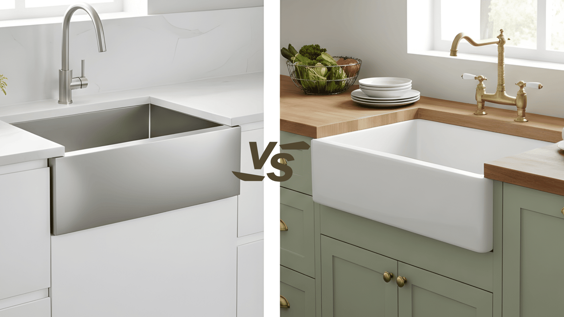
When you start planning a kitchen update, it is easy to feel lost in all the sink choices. You want something that looks good, works hard, and fits your space without extra stress. That is where the apron sink vs. farmhouse sink question really, truly matters. In this guide, I’ll walk you through both options in plain language. You will see how they differ in size, style, cost, and daily use, so you are not guessing. When you’re tired after cooking, you want the cleanup to feel simple, not annoying. My goal is to help you think about your kitchen, your habits, and your budget, so you can pick the sink that feels right for you. What is an Apron Sink? An apron sink is a deep sink with a front panel that extends a little past the countertop. This front edge helps protect the cabinet from splashes and lets you stand closer to the bowl without leaning as much, which can make long kitchen tasks feel easier on your back. Key features: Exposed front panel Works with many kitchen styles Can be installed as undermount, top-mount, or flush-mount Everyday benefits: An apron sink offers many sizes and material options, making it simple to match with different layouts. The forward design reduces leaning, and the wide range of sizes helps it fit into small or mid-size kitchens. Best fit: Homes that want a standout sink without major cabinet changes and kitchens built around modern or mixed-style designs. What is a Farmhouse Sink? A farmhouse sink is a deep, wide sink with an exposed front panel. This style comes from older European kitchens where large bowls were needed for cooking tasks and hand-washing clothes. Its roomy design still works well today, especially in busy kitchens that handle big cookware. Key features: Deep bowl for large items Usually made from fireclay or cast iron Rounded corners for comfort Everyday benefits: The extra depth makes washing pots and pans easier, and the bold front panel creates a strong focal point in the room. The design also helps keep water inside the bowl, reducing splashes on surrounding surfaces. Best fit: Larger kitchens and homes that prefer a warm, classic style with a sink that stands out. Apron Sink vs. Farmhouse Sink Comparison Choosing between an apron sink and a farmhouse sink becomes much easier when you see how they differ side by side. The table below highlights the features that matter most in real kitchens, from size to cost to installation needs. Feature Apron Sink Farmhouse Sink Front Panel Exposed Exposed Typical Size Many options Usually large and deep Installation Often fits standard cabinets Often needs cabinet changes Style Range Modern or classic Mostly traditional Cost More flexible Higher cost Best For Small or medium kitchens Large kitchens and heavy use With these differences in mind, it becomes easier to decide which sink matches your space, your routine, and the look you want in your kitchen. Installation Differences You Need to Know Installing either sink takes planning, and the steps can look very different once you get to the cabinet and countertop stage. Apron sink installation: Fits into a cutout in the cabinet Can sometimes use the same cabinet base already in place Can be mounted in three ways: undermount, top-mount, or flush Lighter materials make support easier Farmhouse sink installation: Often needs a special base cabinet made for farmhouse sinks Must support heavy weight, especially when the bowl is full of water The cabinet front needs a clean, exact cut that matches the sink front Usually works best when a pro handles the measuring and install These differences matter most when you are working with existing cabinets, so it helps to match the sink style to how much change the kitchen can handle. Common Materials Used in Apron and Farmhouse Sinks Both apron and farmhouse sinks come in several materials, and each one changes how the sink looks, feels, and holds up over time. Fireclay: Fireclay has a smooth, strong surface that works well in busy kitchens. It keeps a bright, clean look and holds up against daily use, which makes it a common pick for classic and modern spaces. Cast iron (with enamel finish): Cast iron is very sturdy and comes with a glossy enamel coating. This coating wipes clean with little effort and gives the sink a polished look that fits many kitchen styles. Stainless steel: Stainless steel fits naturally in modern kitchens. It is light, simple to maintain, and handles regular wear without much trouble. Its clean look also works well with many faucet and hardware finishes. Copper: Copper brings a warm color that stands out in the room. Over time, the surface changes naturally, giving it a lived-in look. It does need gentle cleaning, but many homeowners enjoy the character it develops. Stone or composite: Stone and composite sinks have a soft, matte appearance that blends well with natural materials. They are resistant to dents and scratches, making them a steady option for kitchens that want strength without a shiny finish. Each material offers its own mix of comfort, care, and style, so the best choice depends on how you use your kitchen and the look you want to create. Pros and Cons of Apron Sinks vs. Farmhouse Sinks Understanding the strengths and limits of each sink style helps you match the right option to your kitchen size, cooking routine, and budget. The table below shows the key points that matter most during daily use. Sink Type Pros Cons Apron Sink – Many sizes for different kitchens– Wide range of materials– Easier installation in most remodels– Comfortable working position – Some models have smaller bowls– The front surface can show marks if the material is soft Farmhouse Sink – Deep, wide bowl holds large cookware– Strong visual feature in the kitchen– Smooth surfaces are simple to clean – Needs strong cabinet support– Reduces base cabinet storage– Higher cost for sink and installation With these points in mind, it becomes easier to see which sink offers the comfort, look, and setup that match your kitchen and the way you work in it every day. Kitchen Design Ideas with Apron and Farmhouse Sinks Once you know the basics of apron sinks and farmhouse sinks, it helps to see how they actually look in real kitchens. These ideas show how each sink style can shape the mood of your space and match the way you use your kitchen every day. 1. Classic Farmhouse Look A farmhouse sink made from fireclay pairs well with shaker cabinets and warm metal fixtures. Soft, neutral colors help the sink stand out without overpowering the space. This style is a strong match for kitchens that want a cozy, lived-in look with gentle details and simple finishes. 2. Modern Apron-Front Look A stainless apron sink fits nicely with flat-panel cabinets and clean hardware. Straight lines and smooth fronts give the room a clear, modern feel. This setup works best in kitchens that prefer simple shapes, open counters, and a layout that feels organized without extra design details. 3. Light Coastal Look A white apron or farmhouse sink works well with light-colored cabinets and soft accents. Pale blue, cream, or sand tones add a gentle coastal touch without making the space too themed. This look suits kitchens that want a bright, relaxed feel with plenty of natural light. 4. Transitional Look An apron sink blends smoothly into a transitional kitchen that mixes classic and modern features. Simple cabinet doors, natural wood touches, and mixed metal finishes help tie everything together. This design fits homes that like warm, comfortable details balanced with clean, current elements. How to Choose Between an Apron Sink and a Farmhouse Sink To pick the right sink, it helps to look at the main factors side by side. This way, you can match each option with your kitchen size, routine, and cleaning style. Factor Choose an Apron Sink Choose a Farmhouse Sink Kitchen size The kitchen is small or medium, and the space feels tight. The kitchen is large and has room for a deep, wide bowl. Daily use Cooking is light, and dish loads stay fairly small most days. Cooking is frequent, and you often wash large pots, pans, or baking sheets. Budget You want something that fits a mid-range budget and works in a remodel. You can spend more for a feature sink that changes the feel of the whole room. Cleaning style You prefer low-effort care with materials like stainless steel or fireclay. You are okay with extra care for materials like copper or certain stone sinks. Looking at each row, think about which column sounds closer to your kitchen and your habits. The sink that matches most of your answers is usually the best fit. Common Mistakes to Avoid Before you order or install an apron or farmhouse sink, watch out for these easy-to-miss mistakes. Choosing the wrong size: Buying a sink wider or deeper than the cabinet can force expensive changes, so always measure the inside of the base first. Ignoring weight and support: Heavy fireclay or cast iron sinks need extra bracing; without it, the cabinet can sag or crack over time. Misjudging faucet space: Tall faucets need room to move; check that the handle and spout clear the backsplash and wall behind the sink. Forgetting storage loss: These sinks use more room inside the cabinet, so plan ahead for where cleaners, bins, and supplies will go. Picking a hard-to-care-for material: Stainless steel and fireclay suit low-effort cleaning, while copper and some stone options need gentle, regular care. Skipping pro help on tricky cuts: Cutting the cabinet front and countertop for the apron edge must be precise, and a pro can prevent gaps and chips. Keeping these points in mind helps your new apron or farmhouse sink feel like a smart upgrade instead of a stressful project. Bottom Line Now that you’ve worked through the apron sink vs farmhouse sink comparison, you have a clearer sense of how each one will behave in your kitchen. You’ve seen the differences in size, style, cost, and daily use, so your choice does not have to be a guess. As you look at your own layout, think about how you cook, how much space you have, and how much care you want to give your sink. Those details point you toward the option that fits your routine and your home. If you’d like a bit more help planning your kitchen, you can check out my other posts, too. You and your space deserve ideas that actually make everyday cooking feel easier.
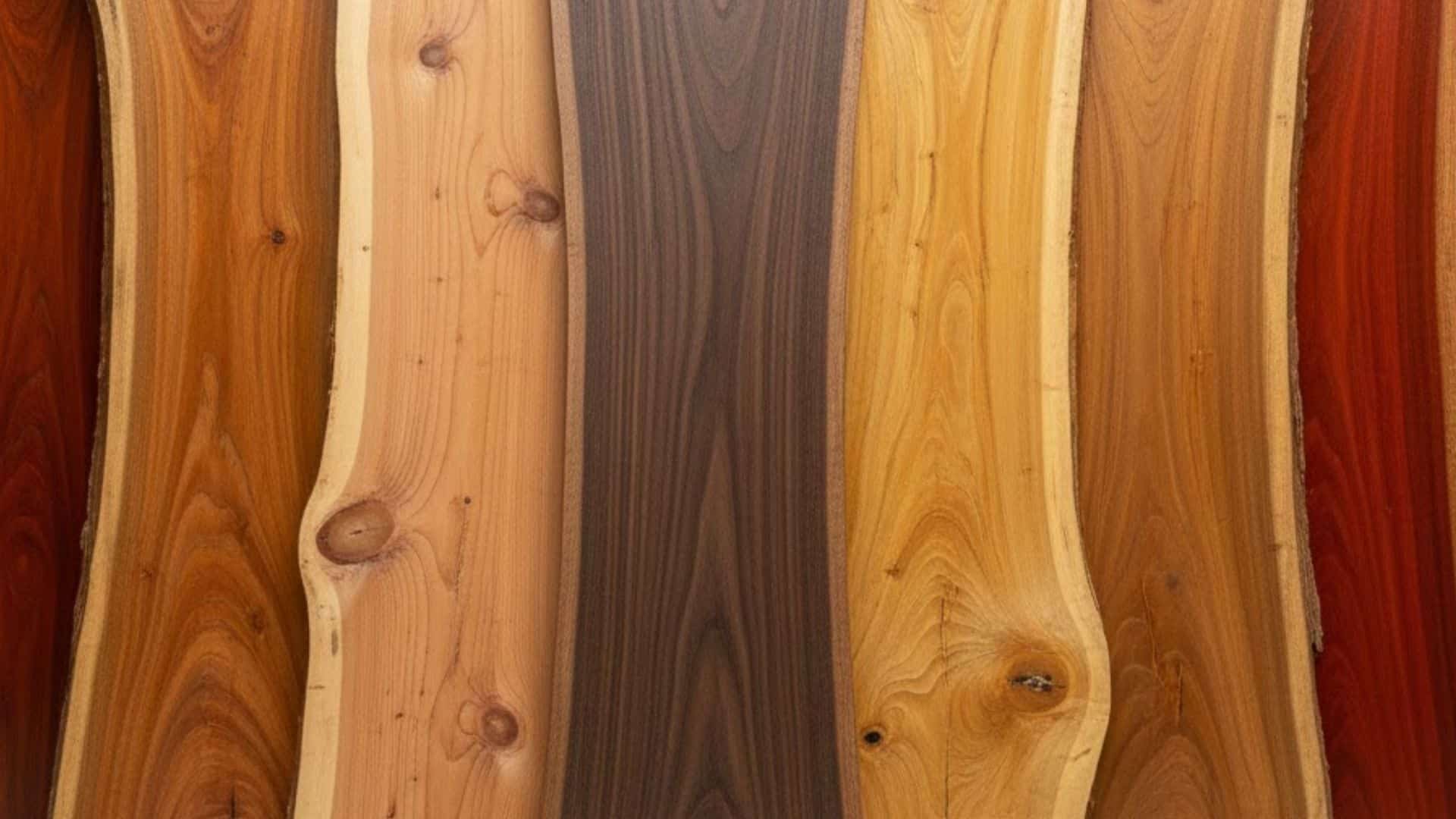
Struggling to choose the right material for your patio or deck furniture that actually lasts? Finding the best wood for outdoor furniture makes all the difference between pieces that survive and ones that rot quickly, especially when comparing the strongest wood types for durability. I spent years testing different woods before finding which ones truly hold up outside. The right choice saves you money, reduces maintenance headaches, and keeps your space looking great. Different woods handle rain, sun, and temperature changes in entirely different ways based on their properties. Some resist insects naturally, while others need constant protection to survive outdoors. Understanding your options helps you pick wood that matches your climate, budget, and preferences. Let’s see the best wood for outdoor use. Quick Look at the Best Woods for Outdoor Furniture Outdoor furniture is specifically built for use in spaces outside your home, like patios and decks. These pieces differ from indoor furniture in how they’re constructed and what materials are used. Wood Type Durability Level Natural Rot & Insect Resistance Maintenance Level Best Climate Teak Very High Excellent (natural oils) Low All climates, heavy rain, coastal Cedar Medium–High Very Good Medium Mild to moderate climates Cypress Medium–High Very Good Medium Humid or wet regions Redwood High Very Good Low–Medium Dry to moderate climates Mahogany High Very Good Medium Moderate to humid climates Ipe Extremely High Excellent Low Harsh sun, heavy rain Shorea High Very Good Medium Tropical, humid areas Robinia (Black Locust) Very High Excellent Low–Medium Cold winters, wet climates Eucalyptus Medium Good Medium Moderate climates Acacia Medium Good Medium Mild climates Pressure-Treated Pine Low–Medium Good (treated) High Dry climates, covered spaces This quick view helps you spot the balance between longevity, upkeep, and budget. Now let’s break each wood down in detail so you can see how it performs in real outdoor conditions. Top Wood Species for Outdoor Furniture I tested several wood types before finding what actually works well for outdoor furniture. Each species performs differently based on your climate and how you maintain it. Here are the best wood options for outdoor use: 1. Teak This wood stands out for its incredible durability and natural resistance to water, insects, and decay. Natural oils in teak protect it from harsh elements without any extra treatment needed. The rich golden-brown color looks pretty when new, but gradually ages into a beautiful silvery-gray patina. This conversion happens naturally over several years of outdoor exposure. The main downside is the price since teak costs significantly more than most other options. Best for: Premium furniture needing to withstand heavy weather exposure and last for decades. 2. Cedar Cedar naturally fights off rot, decay, and insects without chemical treatments or special coatings. It’s surprisingly lightweight compared to hardwoods while still being plenty durable for outdoor conditions. The warm reddish-brown color comes with a distinct, pleasant aroma that many people love. Cedar maintains its beauty well, but it can warp or crack if you skip regular maintenance. Proper sealing and occasional care keep it looking great for many years. Best for: Casual furniture like chairs, tables, and benches in covered or protected areas. 3. Cypress High oil content in cypress makes it naturally resistant to rot and decay over time. This wood performs exceptionally well in areas with lots of moisture and humidity throughout the year. The light to medium brown color has a slight yellowish tint that gives it character. Cypress is softer than many hardwoods, so it dents and scratches more easily with heavy use. Handle it with reasonable care, and it serves you well for years. Best for: Furniture in humid or wet climates where moisture resistance is essential. 4. Redwood Redwood offers excellent durability along with natural resistance to both water damage and insect problems. The deep reddish-brown color with attractive grain patterns makes gorgeous furniture pieces that draw attention. This wood holds up beautifully in outdoor conditions year after year with minimal maintenance required. The cost runs high, and finding sustainably sourced redwood can be challenging in many areas. When you can get it responsibly, redwood delivers outstanding results. Best for: High-end furniture and structures where appearance matters as much as durability and longevity. 5. Mahogany Mahogany resists water and decay exceptionally well while providing beautiful color and smooth grain patterns. The rich, reddish-brown color actually deepens and becomes more attractive as years pass outdoors. This wood combines gorgeous looks with solid performance that justifies its luxury status completely. Like other premium woods, mahogany comes with a hefty price tag attached. Sustainable sourcing can also be difficult, so always check where your mahogany originates. Best for: Luxury furniture pieces where beauty and refinement are top priorities for your space. 6. Ipe Ipe ranks as one of the most durable woods available for any outdoor application imaginable. Its extreme density and hardness make it incredibly resistant to rot, insects, and harsh weather. The dark brown color with fine grain creates a urbane, sleek look that ages gracefully. Working with ipe requires special tools because of how dense and hard it is. This difficulty, plus limited availability, makes ipe one of the pricier wood choices around. Best for: Heavy-duty furniture like decks, benches, and tables facing constant weather exposure and use. 7. Shorea (Philippine Mahogany) Shorea is a dense hardwood that naturally resists rot, decay, and insect damage effectively. Many people use it as a more affordable alternative to teak with similar strength. The color ranges from light reddish-brown to darker shades with fine grain. It ages beautifully into a silvery-gray patina but needs more maintenance than premium woods. Best for: Outdoor tables, chairs, lounge furniture, decks, and various exterior structures needing durability. 8. Robinia (Black Locust) Robinia ranks among the hardest and most durable hardwoods available for outdoor use today. It naturally fights off rot, decay, and insect damage without chemical treatments needed. The light to medium brown color sometimes has greenish hues with coarse texture. Its extreme density makes it harder to work with, requiring specialized cutting tools. Best for: Outdoor furniture, garden structures like pergolas, and decking that faces harsh weather conditions. Lesser-Known Outdoor Wood Options Most people don’t know about these wood types, but I’ve had great experiences using them for outdoor projects. They deliver solid performance at prices far below what premium species cost you. Here are budget-friendly wood options worth considering: 9. Eucalyptus Eucalyptus offers affordable pricing along with good natural resistance to weathering and insect problems. The wood has a pleasant appearance and holds up reasonably well with basic maintenance. While not as durable as premium hardwoods, it provides excellent value for the money. Regular sealing helps extend its life and keeps it looking attractive longer. Best for: Casual furniture pieces like bistro sets, folding chairs, and small outdoor tables. 10. Acacia Acacia combines durability with affordability, making it popular for budget-conscious outdoor furniture buyers. The beautiful golden-brown hue adds warmth and natural charm to any outdoor space immediately. Acacia requires some maintenance to prevent cracking and fading over extended outdoor exposure. With proper care, it serves as an excellent alternative to expensive hardwoods. Best for: Mid-range outdoor furniture, including dining sets, benches, and decorative garden pieces. 11. Pine (Pressure-Treated) Pressure-treated pine offers an affordable, lightweight option for outdoor furniture on tight budgets. Chemical treatment helps it resist rot and insect damage that untreated pine cannot handle. The light color and softer texture make it easy to work with for projects. Regular staining or sealing protects it and significantly extends its outdoor lifespan. Best for: Budget-conscious buyers needing basic outdoor furniture like simple benches, planters, and casual seating. Factors that Matter when Picking Outdoor Furniture Wood Picking the right wood for your outdoor furniture requires thinking about several important factors first. Each consideration affects how long your furniture lasts and how well it performs in your space. Here are the main factors to keep in mind: Climate: Your local weather conditions determine which wood types will perform best and last longest outdoors. Durability: Some woods naturally resist rot, insects, and decay better than others when exposed to outdoor elements constantly. Appearance: Different wood species change color and develop unique characteristics as they age over the years outside. Cost: Higher-priced woods often last longer, so balance your initial budget against long-term replacement costs carefully. These factors work together to help you find the perfect wood for your specific situation. Taking time to evaluate each one ensures you make a smart investment in outdoor furniture. How to Maintain Outdoor Wood Furniture? Proper maintenance dramatically extends the life of your outdoor wood furniture and keeps it looking beautiful for years. Here’s how to care for your outdoor wood furniture: Regular Cleaning: Use mild soap and water to clean furniture regularly and remove built-up dirt and grime. Sealing and Oiling: Apply sealant or oil to protect wood from moisture damage, harmful UV rays, and accumulated dirt. Storage Tips: Store furniture indoors or under protective covers during extreme weather conditions to prolong its lifespan. Repairing Damage: Sand down rough spots and apply a fresh finish to restore wood furniture and keep it looking new. I follow these maintenance steps religiously, and my outdoor furniture still looks great after five years. Taking just a little time for regular care saves you money on replacements down the road. Wrapping Up Choosing the best wood for outdoor furniture depends on balancing durability, appearance, maintenance needs, and your budget. You now know which woods naturally resist weather damage and which ones need extra care regularly. Premium options like teak and ipe cost more but last decades with minimal maintenance required. Budget-friendly choices like eucalyptus and pressure-treated pine work well when you maintain them consistently. Your climate plays a huge role in determining which wood performs best in your specific area. Regular cleaning, sealing, and proper storage during harsh weather extend any wood’s lifespan significantly. The perfect wood exists for every budget once you understand each type’s strengths. Which wood caught your attention? Share your choice below!
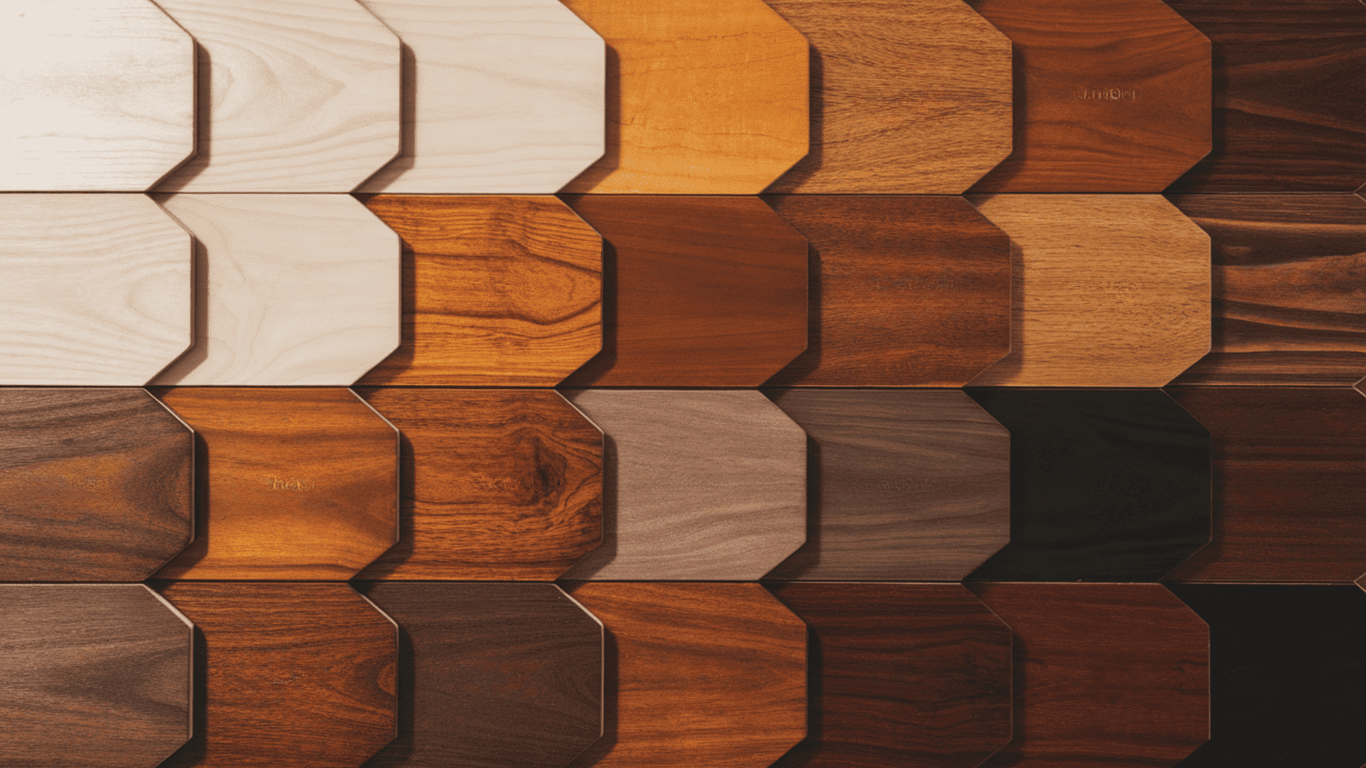
I remember staring at a stack of maple boards, trying to guess how each stain would actually look once it dried, especially when mixing different wood tones that go together. If you’ve been in that spot, you know the mix of curiosity and doubt that comes with choosing colors. A maple stain color chart sounds helpful, but the real challenge is knowing what those shades mean for your space. I want to make this easier for you by breaking things down in a clear, calm way that fits real projects. You’ll see what matters, what to expect, and how to pick shades with confidence using the maple stain color chart. So let’s move to the first step. Maple Stain Color Chart (Quick Overview) You can use this chart to compare common stain groups on maple. It helps you choose a shade before picking a brand or testing samples. Color Family Common Maple Stain Examples Light and Natural Natural, Fruitwood, Golden Maple Honey and Amber Golden Oak, Warm Maple, Light Brown Medium Browns Provincial, Special Walnut, Chestnut Dark and Espresso Coffee Brown, Dark Walnut, Espresso Maple Gray and Greige Classic Gray, Weathered Gray White and Washed Pickled Oak, Country White This simple chart keeps stain choices clear, so you can move forward with testing and planning your maple project confidently. Maple Stain Color Families Explained This section helps you compare colors fromcommon stain makers. Similar to how choices differ in walnut vs cherry wood, you can select products that match the look you want on maple before testing samples at home. 1. Light and Natural Maple Stains Light and natural stains keep maple close to its original state, which helps you see grain lines clearly across the surface. These colors work well when you want a calm look that does not draw attention away from nearby items or details in your room. They also reduce the chance of strong color shifts under different lights, giving you steady results during daily use. This group works for floors, cabinets, tables, and trim, where you prefer simple upkeep and easy matching with other wood pieces at home each day, safely. 2. Honey and Amber Maple Stains Honey and amber stains give maple a warm feel that highlights grain lines without making the surface too dark or heavy for most rooms. These colors work for kitchens, hallways, and living areas where you want a steady, welcoming look that supports daily use without drawing strong focus. They help reduce the sharp contrast between maple pieces and nearby wood, which is useful when you need smooth matching across older and newer sections. This group also keeps upkeep simple while allowing small marks to stay less noticeable during routine cleaning each day. 3. Medium Brown Maple Stains Medium brown stains bring steady color to maple and help reduce sharp contrast across the board, which makes surfaces look even under many lights. This group works well for floors in busy sections of your home because it hides minor marks that appear after shoes, chairs, or daily tasks move across it. These colors pair nicely with kitchens, family rooms, and trim where you want a steady color that stays reliable through different seasons and lighting changes. This group keeps upkeep simple and supports long use without quick fading or unevenness. 4. Dark Brown and Espresso Maple Stains Dark brown and espresso stains bring strong color to maple, helping you get deep results that stand out while still showing some grain. These colors work for large rooms, taller cabinets, and wide tables because they add depth and keep the surface steady under many lighting setups. This group is helpful when you want a solid base that hides small marks from chairs, shoes, and daily use across busy areas of your home. These colors support long use and remain steady through shifting light across different times of day. 5. Gray and Greige Maple Stains Gray and greige stains give maple a soft, calm look that reduces yellow notes and helps you keep a steady surface across many conditions. These colors work for modern rooms, open kitchens, and smaller areas because they lower the strong contrast and support even color across the wood. This group is useful when you want a quiet base that supports other items in the room without drawing too much focus toward the grain. These colors handle daily light changes well and help you keep surfaces steady through busy routines. 6. White, Pickled, and Bleached Maple Stains White, pickled, and bleached stains give maple a bright feel that reduces yellow notes and keeps the surface clear under many lighting setups. These colors work for small rooms, sunny spaces, and modern layouts because they open the area and help grain lines stay soft across the wood. This group helps you create a quiet base that supports other room items, letting light move across surfaces without strong color shifts. These colors handle daily changes well and give you steady results across cabinets, tables, trim, and other maple pieces. Maple Stain Colors by Brand This section helps you compare colors from common stain makers, so you can select products that match the look you want on maple before testing samples at home. Minwax Maple Stain Colors Minwax offers steady colors that work well on maple when you need simple matching and clear results under many lighting setups. Their range covers light, medium, dark, gray, and pale white shades, giving you enough room to find a tone that suits your room or project. These colors work for cabinets, floors, trim, and small items. Minwax shades also handle regular cleaning well, which helps your maple stay steady during long use. These options support everyday tasks and keep surfaces looking smooth without much upkeep from you. Light Picks: Natural, Golden Oak Medium Picks: Provincial, Special Walnut Dark Picks: Dark Walnut Gray and White Picks: Classic Gray, Pickled Oak Sherwin-Williams Maple Stain Colors Sherwin-Williams provides colors that hold steady on maple and give you clear results across many parts of your home. Their tones work well for cabinets, trim, and tables because they sit evenly on maple with good control over strong shifts in color. These options stay reliable under indoor light and help you reach a calm look across your surfaces. This brand is also handy when you want maple shades that match nearby wood or older items, giving you options that stay steady during daily use and regular cleaning routines. Warm Browns: Chestnut, Warm Hickory tones Gray Tones: Weathered Gray, Rustic Gray Duraseal Maple Stain Colors Duraseal colors handle high-traffic floors well, which makes them useful for maple in busy areas of your home. These tones stay steady under constant foot movement and regular cleaning, giving you long, steady results without sudden changes in shade. Duraseal options also help hide small marks that appear over time, which is helpful for homes with kids, pets, or heavy daily use. These colors give maple a clear, dependable look that supports strong use while keeping surfaces smooth across many lighting setups during regular routines at home. Floor Browns: Chestnut, Coffee Brown Floor Grays: Classic Gray, Country White How Maple Wood Takes Stain Maple has a tight grain that absorbs stain in uneven ways, which can change the final color across the surface. Some areas take in more stain than others, giving results that shift from light to dark if the wood is not prepared correctly. This happens on both hard and soft maple, and it can show up on floors, cabinets, and smaller projects. To control this, you often need a base coat that helps the stain spread evenly. When maple is prepared the right way, the color settles smoothly and stays steady under normal indoor light. How to Choose the Right Maple Stain Color Use these steps to pick a stain that fits your room, supports daily use, and keeps your maple pieces steady under different lights. Match Your Style: Choose a color that fits the room’s mood you want, such as light for calm spaces or deeper tones for strong, grounded surfaces. Match Room Size and Light: Small or dim rooms work better with lighter colors, while brighter or larger rooms can handle deeper tones without making the space feel tight. Match Existing Finishes: Check nearby floors, counters, and trim so your maple stain does not clash. Pick a tone that sits well beside other wood or surface colors. Pick Based on Project Type: Floors need colors that hide marks, cabinets need tones that suit counters, and tables need shades that stay steady under daily handling. Best Finishes and Topcoats for Maple A good finish protects maple, steadies the color, and helps the surface handle daily use without sudden changes in tone or texture. Oil vs. Water Finishes Oil finishes add warm notes over time and create a strong surface that holds up well with regular use. Water finishes stay clear, dry faster, and keep the original color closer to what you see during staining. Both options work on maple, but the right choice depends on how much warmth you want and how quickly you need to complete your project. Water finishes also reduce odor during use, which can help when working indoors on cabinets, trim, or smaller items. Choosing the Right Sheen Sheen affects how much light shows across your maple surface. Matte keeps reflections low and works well for rooms where you want a calm feel. Satin gives a small amount of shine that suits cabinets, tables, and trim without drawing too much focus. Gloss shows more reflections and highlights small marks, so it fits spaces that stay clean with gentle use. Picking the right sheen helps your maple stay steady under daily light and regular cleaning across busy areas in your home. Reducing Yellowing Over Time Maple can shift toward deeper tones if the finish reacts with light over long periods. Water finishes help keep color steady because they avoid warm notes that appear as time passes. Using a product with light protection can also slow color changes, especially near windows or bright areas. Keeping the surface clean and avoiding harsh products helps the finish stay smooth. With the right steps, your maple can hold its color for many years without quick shifts that make upkeep difficult. How to Test Maple Stain Colors Use these steps to check color changes on maple, control uneven spots, and see how each stain reacts under different lighting in your room. Prepare Sample Boards: Sand maple to the same grit as your project and use scrap pieces whenever possible for accurate color results. Use Conditioner: Apply a base coat that helps stain spread evenly and lowers the chance of dark patches across the surface. Apply and Label Stains: Brush or wipe on each stain the same way you plan to treat the final piece, then label every sample clearly. Check Lighting: View samples in morning, afternoon, and evening light to see how each shade shifts across the maple surface. Avoid Mistakes: Do not judge color while the stain is wet, skip uneven sanding, or rely on charts alone without real sample testing. Frequently Asked Questions Why does maple stain look blotchy? Maple has a tight, uneven grain that can absorb stain in patches. Some areas take more color while others stay lighter. Sanding evenly, using a wood conditioner, and testing samples first can help reduce blotching and create a smoother final look. Can maple be stained to look like walnut? Yes, maple can be stained darker to look closer to walnut, but it will not match walnut perfectly. Maple has a different grain pattern and density. Use dark brown or espresso stains, test first, and expect a cleaner, less grain-heavy result. Is gel stain better for maple? Gel stain can work well on maple because it sits more on the surface instead of soaking deeply into the wood. This helps reduce blotchy areas. It is especially useful for cabinets, furniture, and vertical surfaces where even color control matters. Should maple be sanded before staining? Yes, maple should be sanded before staining. Even sanding helps the stain absorb more evenly and prevents rough spots from showing through. Use consistent grit across the whole surface, and remove all dust before applying conditioner, stain, or finish. Can you stain maple without conditioner? You can stain maple without conditioner, but the result may look uneven or blotchy. Conditioner helps control absorption and gives you a more balanced color. It is especially helpful with darker stains, large surfaces, cabinets, and visible furniture pieces. What stain hides maple grain best? Darker stains, gel stains, and painted-style stains hide maple grain better than light or natural stains. Espresso, dark walnut, and deep brown shades reduce visible grain variation. However, maple grain may still show slightly depending on sanding, stain type, and finish. Does maple darken after staining? Yes, maple can appear darker after stain and topcoat are applied. Oil-based finishes may add warmth and deepen the color over time. Water-based finishes usually keep the stained color closer to the original sample, with less yellowing or darkening. Can stained maple be refinished later? Yes, stained maple can usually be refinished later if the wood is thick enough to sand safely. Old finish and stain must be removed evenly before applying a new color. Veneered maple needs extra care because sanding too much can damage the surface. Conclusion I hope this helped you feel more sure about choosing colors for your maple projects. You now know how different stain groups behave, how brands compare, and how simple steps can guide you toward results that stay steady in daily use. The goal is to give you a clear footing as you work through each choice. If you want a quick reference, the maple stain color chart is a steady guide you can return to as you plan your project. I’d love to hear what you try next, so share your thoughts or check out the other guides for more ideas. Let’s keep building your skills one step at a time.
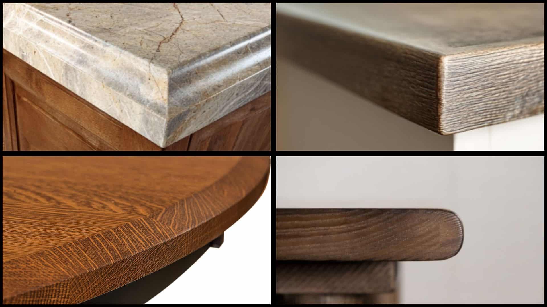
Have you ever noticed how some tables instantly catch your eye while others just mix into the background? The secret often lies in the table edge profiles that frame your furniture piece. These shaped edges are like the perfect outfit accessory that completes your entire look. Table edge profiles determine how your table feels, looks, and fits into your home decor style. I’m here to help you find the different edge types that can convert any ordinary table. You’ll learn how to pick the perfect edge for your space, family needs, and personal taste. Get ready to find the secret that turns ordinary tables into stunning centerpieces that everyone will admire! Why Table Edge Profiles Matter for Your Home Different edge shapes can completely change how your table looks and feels in your space. A sleek, angled cut makes any room feel more modern and urbane. Traditional curved designs bring classiness that complements formal dining rooms perfectly. Safety becomes really important when you have kids running around your home. Rounded corners eliminate sharp edges that could cause injuries during playtime. These soft shapes also feel more comfortable when you lean against the table. Some edge designs last much longer than others in busy households. Thicker, rounded shapes resist chipping and damage better than thin, sharp corners. You can make your table truly unique by choosing an edge shape that matches your style. Types of Table Edge Profiles I’ve found that you have many different edge shapes to choose from when designing your perfect table. You’ll see that each type brings its own special look and benefits to your furniture piece. Here are some common types to help you find the right style for your project: 1. Straight Edge Profile The straight edge gives you a clean, no-nonsense look that works with almost any decor style. This simple design costs less to make and fits perfectly in modern homes. You can easily match straight edges with sleek furniture and minimalist room designs. The sharp lines create a professional appearance that looks great in offices, too. This edge works best when you want your table to blend seamlessly with contemporary surroundings. 2. Bullnose Edge Profile Bullnose edges feature a smooth, rounded curve that feels soft and safe to touch. Families with young children love this design because it eliminates dangerous, sharp corners completely. The rounded shape also feels more comfortable when you rest your arms on the table. This edge gives your table a friendly, welcoming appearance that works in casual dining rooms. You can find bullnose edges on many kitchen islands and breakfast tables. 3. Beveled Edge Profile Beveled edges create an angled cut that adds instant sophistication to any table design. The slanted surface catches light beautifully, making your table look more expensive than it is. This edge works perfectly with both traditional and modern furniture styles throughout your home. The angled cut also makes the table appear thinner and more elegant from the side. Beveled edges require more skill to create but deliver stunning visual results. 4. Chamfered Edge Profile Chamfered edges feature a small, angled cut that softens the sharp corner without rounding it fully. This versatile design complements both rustic farmhouse tables and sleek modern pieces. The subtle angle adds visual interest without being too bold or attention-grabbing for your space. Chamfered edges are easier to create than complex curves, yet they still appear more finished than straight cuts. This edge strikes the perfect balance between simple and sophisticated design elements. 5. Waterfall Edge Profile Waterfall edges create a flowing, continuous curve that looks like water cascading over the table surface. This dramatic design makes any table the centerpiece of your room, boasting a stunning visual appeal. High-end restaurants and luxury homes often opt for waterfall edges due to their impressive, sculptural appearance. The smooth curve requires expert craftsmanship but creates an unforgettable focal point in any space. This edge works best with premium materials like marble or high-quality hardwood. 6. Coved Edge Profile Coved edges curve inward toward the table surface, creating a gentle, vintage-inspired look throughout your space. This classic design adds character and charm to farmhouse, cottage, and traditional dining room settings. The inward curve creates interesting shadows and highlights that change throughout the day with natural lighting. Coved edges work beautifully with distressed finishes and antique-style furniture pieces in your home. This edge brings warmth and personality to any table design you choose. NOTE: Many furniture makers can create custom edge designs that perfectly match your exact vision and style preferences. How to Choose the Right Table Edge Profile Start by looking at your room’s overall style and picking an edge that matches perfectly. Modern rooms work best with straight or beveled edges, while traditional spaces love curved designs. Think about how you use your table every day before choosing the prettiest option. Kitchen islands need durable edges that can handle daily cooking and cleaning activities. Different materials work better with specific edge shapes than others in your home. Wood handles intricate curves beautifully, while glass presents a stunning appearance with simple, clean lines. Safety should be your top priority if you have young children or pets in the home. Rounded edges, such as those found in bullnose designs, eliminate sharp corners that could cause injuries during playtime. Popular Materials for Table Edge Profiles The material you choose for your table’s edge profile affects both its appearance and durability. Here are some popular options to consider for different styles and uses: Material Edge Profile Options Best For Wood Classic and versatile, offering a range of edge profiles from simple to intricate Traditional and modern homes Glass Clean lines with options for sharp or soft edges Contemporary and minimalist spaces Stone/Marble Luxury materials with unique edge profile possibilities High-end kitchens and formal dining rooms Metal Modern, sleek profiles that enhance industrial styles Industrial and contemporary designs The right material choice will depend on your budget, style preferences, and how you plan to use your table. Take time to feel different materials in person before making your final decision. Maintenance and Care for Table Edges Taking good care of your table edges will keep them looking beautiful for many years to come. Different edge types require different care methods to maintain optimal condition. Here are some simple maintenance and care tips to follow: Use placemats and coasters to prevent scratches on beveled or straight edges from dishes and glasses. Wipe down all edge types with a soft, damp cloth, avoiding harsh chemicals that can damage finishes. Check rounded edges, such as bullnose, regularly for minor damage that can worsen if left untreated. Reapply wood stain, glass polish, or stone sealer every few years to maintain your edge’s original appearance. Regular maintenance prevents small problems from becoming expensive repairs later on. A little daily care goes a long way in preserving your table’s beauty and value. Wrapping It Up Choosing the right table edge profiles can completely change your furniture from ordinary to extraordinary in amazing ways. You now know how different edges affect safety, style, and durability in your home environment. The perfect edge profile balances your personal taste with practical needs like child safety and daily use. I hope this guide helps you make smart choices that create beautiful, functional furniture for the years ahead. Don’t be afraid to mix different edge styles throughout your home to create visual interest and personality. Your tables should reflect who you are and make every meal feel special and memorable. Ready to start your edge makeover? Share your favorite edge style in the comments below!
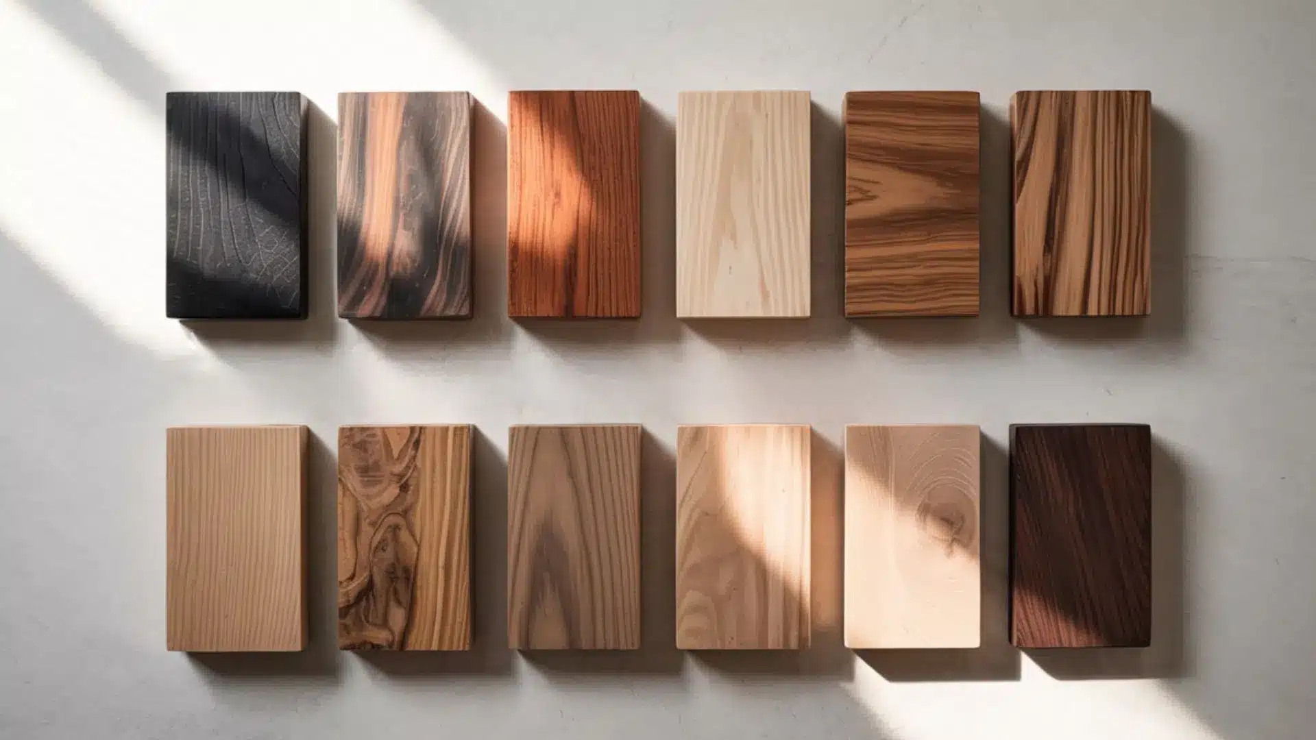
Have you ever wondered what the strongest wood is and if it’s right for your next project? You’re not alone. If you’re building a deck, crafting furniture, or simply curious about materials that last, knowing which woods withstand pressure and wear makes a significant difference. I’ll break down the top hardwoods ranked by strength, explain what makes them challenging, and show you how to choose the best one for your needs. Stick around, and you might be surprised by what you learn! Understanding Wood Strength Wood strength refers to a material’s ability to resist force, pressure, or damage under various conditions. It is measured using multiple factors, including hardness, density, bending strength, and compression strength. One widely recognized metric is the Janka Hardness Scale, which measures a wood’s ability to withstand denting or wear. However, hardness alone doesn’t define all aspects of strength. The type of force applied, such as impact, weight-bearing, or tension, affects how wood performs. Understanding these differences helps in choosing the right wood for construction, furniture, or outdoor use. In practical use, woods above 3,000 on the Janka scale are considered extremely hard, while most common hardwoods like oak fall between 1,200 and 1,400. What is the Strongest Wood? The strongest wood in the world, according to the Janka Hardness Scale, is Australian Buloke, with a rating of 5,060 pounds. This hardwood resists pressure, denting, and wear better than any other known species. Other top contenders include Lignum Vitae and Schinopsis brasiliensis. However, the strength of wood varies depending on its intended use; some excel in structural applications, while others are better suited for tool handles or flooring, so selecting the right one depends on the specific context. How Wood Hardness Affects Performance Wood hardness plays a key role in how a material handles wear, pressure, and impact over time. Harder woods are more resistant to dents, scratches, and daily use, making them ideal for flooring, tabletops, and heavy-use areas. However, extreme hardness can make cutting, shaping, or fastening more difficult, sometimes leading to tool damage or splitting. Balancing hardness with workability is essential; choosing a wood that fits both performance needs and project conditions ensures better results and fewer complications. Ranking the Toughest Woods Some woods stand out for their incredible strength, making them perfect for heavy-duty furniture, flooring, or construction. Here’s a ranking of the toughest woods you can find: 1. Australian Buloke Native to Australia, Australian Buloke holds the highest recorded Janka rating at 5,060 lbs. It’s used in industrial flooring, tool handles, and applications requiring exceptional resistance to wear. Its density offers durability but requires significant effort to machine, which adds to project time and tool strain. Due to limited supply, it’s often reserved for specialized or commercial use rather than residential projects. 2. Lignum Vitae Known for its oily texture and extreme density, Lignum Vitae is prized in marine and mechanical applications. It has a Janka rating of around 4,500 lbs. Historically used in ship propeller shaft bearings, it is now a protected species due to overharvesting. It’s very durable but hard to find in legal, sustainable sources. Today, it’s mainly used in marine parts, antique tools, and small mechanical repairs. 3. Schinopsis brasiliensis Exceptionally tough wood sourced from Brazil, measured at roughly 4,800 lbs, is used for structural beams, railroad ties, and industrial flooring. It performs well in humid climates and under intense weight. Its downside is low workability and a high cost due to density and harvesting limitations. It’s most practical where regional sourcing is possible or extreme strength is critical. 4. Snakewood Snakewood, found in Central and South America, is one of the densest and most visually distinct hardwoods, with a Janka hardness of around 3,800–4,000 lbs. Primarily used for violin bows, knife handles, and decorative objects, its hardness offers precision but increases fragility. Due to its rarity and high cost, it’s not used structurally. It’s favored for ornamental turning, limited-run artisan objects, and inlay work. 5. Ipe (Brazilian Walnut) Ipe is popular in outdoor decking and commercial boardwalks due to its high Janka score of 3,680 lbs and natural resistance to rot. Sourced mainly from South America, it’s long-lasting, weather-resistant, and moderately priced compared to rare exotic woods. However, installation requires pre-drilling, and its density makes fabrication labor-intensive. Sustainability depends on the source; FSC-certified suppliers are recommended. 6. Cumaru Also called Brazilian Teak, Cumaru has a Janka rating of 3,540 lbs. It is commonly used as a lower-cost alternative to Ipe in outdoor decking. It performs well in all climates and resists pests and moisture. While easier to work with than Ipe or Quebracho, it’s still quite dense and may require frequent sharpening or blade changes. Sourcing varies in quality and sustainability. 7. Ebony (African Blackwood) Renowned for its dark color and density (Janka around 3,000–3,220 lbs), Ebony is often used in musical instruments and luxury crafts. It’s tough and durable but prone to splitting. Due to overharvesting, it’s now heavily regulated and expensive. Its strength makes it ideal for small-scale, precision work, not construction or load-bearing structures. 8. Hickory With a Janka rating of 1,820–2,140 lbs, depending on species, Hickory is the hardest commercially available North American hardwood. used in flooring and tool handles, with additional roles in interior woodwork. Affordable and easy to find, it balances durability with workability better than many exotic options. It’s more prone to moisture movement, so proper sealing and acclimation are critical in installations. Wood Janka Hardness (lbs) Best Use Pros Cons Australian Buloke 5,060 Industrial, heavy-duty use Extremely strong and durable Very hard to work with, limited availability Lignum Vitae ~4,500 Marine, mechanical parts Naturally oily, highly durable Protected species, hard to source Schinopsis brasiliensis ~4,800 Structural, beams, and flooring Performs well under heavy load Expensive, difficult to machine Snakewood 3,800–4,000 Decorative, small items Unique grain, very dense Brittle, very expensive Ipe 3,680 Decking, outdoor furniture Weather-resistant, long-lasting Hard to install, sustainability concerns Cumaru 3,540 Decking, furniture Durable, more affordable than Ipe Still dense, requires effort to work Ebony 3,000–3,220 Instruments, luxury details Rich color, strong Expensive, can split Hickory 1,820–2,140 Furniture, flooring Strong, affordable, widely available Moves with moisture Strongest Woods for Furniture Making Not every strong wood works well for furniture. Some are too dense or difficult to machine, while others offer the right balance of durability and workability. Here’s how each of the strongest woods performs when used in furniture applications: 1. Australian Buloke Rarely used in furniture due to its extreme hardness and limited supply. It’s best suited for specialized components rather than full builds. 2. Lignum Vitae Used sparingly in antique furniture parts and mechanical elements. Its density and oils make it better for moving joints than for structural pieces. 3. Schinopsis brasiliensis It is too heavy and hard to machine for furniture. Most practical in heavy-duty fixtures, not home furnishings. 4. Snakewood Ideal for decorative inlays, drawer handles, and accents. Brittle and expensive, it’s not used for full furniture structures. 5. Ipe Excellent for outdoor furniture. Requires pre-drilling but offers great longevity in benches, patio sets, and tables. 6. Cumaru Used in outdoor and indoor furniture when durability matters. A budget-friendly alternative to Ipe, though still hard to process. 7. Ebony Common in decorative accents like knobs, legs, and veneers. Best for premium furniture details, not entire structures. 8. Hickory One of the best for indoor furniture. Affordable, strong, and shock-resistant, perfect for chairs, cabinets, and tables. This makes it easier to decide the best wood for furniture based on durability, workability, and long-term performance. Real-Life Uses for Strong Woods Strong woods aren’t just known for their durability, they play a key role in building long-lasting, practical, and beautiful items. Here’s how they’re used in everyday life: For Construction Structural needs demand woods that resist heavy loads, weather, and decay. Ipe and Cumaru are often selected for decking and exterior structures thanks to their density and natural resistance to moisture and pests. For interior framing or heavy-duty support beams, species like Douglas Fir and Southern Yellow Pine may be used, though they fall lower on the hardness scale. Denser hardwoods are chosen where durability outweighs ease of installation. For Specialty Applications Some woods shine in niche roles where strength, stability, or unique physical traits are essential. Lignum Vitae is still valued in marine applications like bearings due to its density and self-lubricating properties. Snakewood and African Blackwood are common in tool handles and musical instruments for their rigidity and durability. Strong woods also show up in sporting gear like baseball bats (Ash, Maple) and bows (Osage Orange), where consistent performance is key. Choosing the Best Wood for Your Needs Choosing the right wood depends on multiple factors, including where and how it will be used. For interior projects, woods like Maple or Hickory provide strength and a clean finish, especially when comparing the durability of oak vs walnut, while exterior builds benefit from rot-resistant options like Ipe or Cumaru. Heavier loads require denser species, such as Australian Buloke or Quebracho, whereas lighter tasks can use Ash or Oak. Budget-conscious builders may prefer regionally available woods like Southern Yellow Pine or Teak, which strike a balance between performance and price. Availability and climate conditions also influence the most practical choice by location. Best Wood Based on Use Case Choosing becomes easier when you match the wood to the job: For outdoor use: Ipe, Cumaru For furniture: Hickory, Maple For heavy-duty structural use: Australian Buloke, Schinopsis For decorative work: Snakewood, Ebony This helps you avoid picking a wood that’s too difficult or unnecessary for your project. Easy Tips for Hardwood Projects Working with hardwoods can be rewarding, but they require the right approach to get the best results. Here are some easy tips to help you handle your next hardwood project with confidence: Use carbide-tipped blades and bits to handle the density without dulling tools quickly. Pre-drill holes before inserting screws to prevent splitting. Allow wood to acclimate to the room’s humidity before cutting or installing. Sand with coarse grit first, then move to finer grits for a smooth finish. Seal edges and ends to reduce moisture movement and cracking. Wear protective gear, especially when cutting exotic species that release fine dust. With these tips in mind, you’ll be better equipped to work with hardwoods and bring out their full potential, creating projects that are both strong and beautiful. Conclusion Now you know what the strongest wood is and how to compare different types for strength, use, and performance. If you’re planning a project, you can feel confident picking a wood that works for both your needs and your tools. For me, it’s about finding something that’s practical for my space, my style, and my skill level. If you’ve ever wondered what the strongest wood is and if it’s the right fit for your next project, you’re one of many. If you’re building something, there’s always more to learn. Have a look through other blogs on the website and keep learning! Frequently Asked Questions What is the strongest wood in the world? Australian Buloke is the strongest wood, with a Janka hardness of 5,060 lbs, making it highly resistant to wear and pressure. Is harder wood always better? Not always. Extremely hard woods can be difficult to cut, shape, and install, so balance strength with workability for your project. Which wood is best for outdoor use? Ipe and Cumaru are excellent for outdoor use because they resist moisture, pests, and weather damage. What is the strongest wood in the USA? Hickory is one of the strongest commonly available hardwoods in the United States. How do I choose the right wood? Consider where you’ll use it, how much stress it will handle, and how easy it is to work with before choosing.
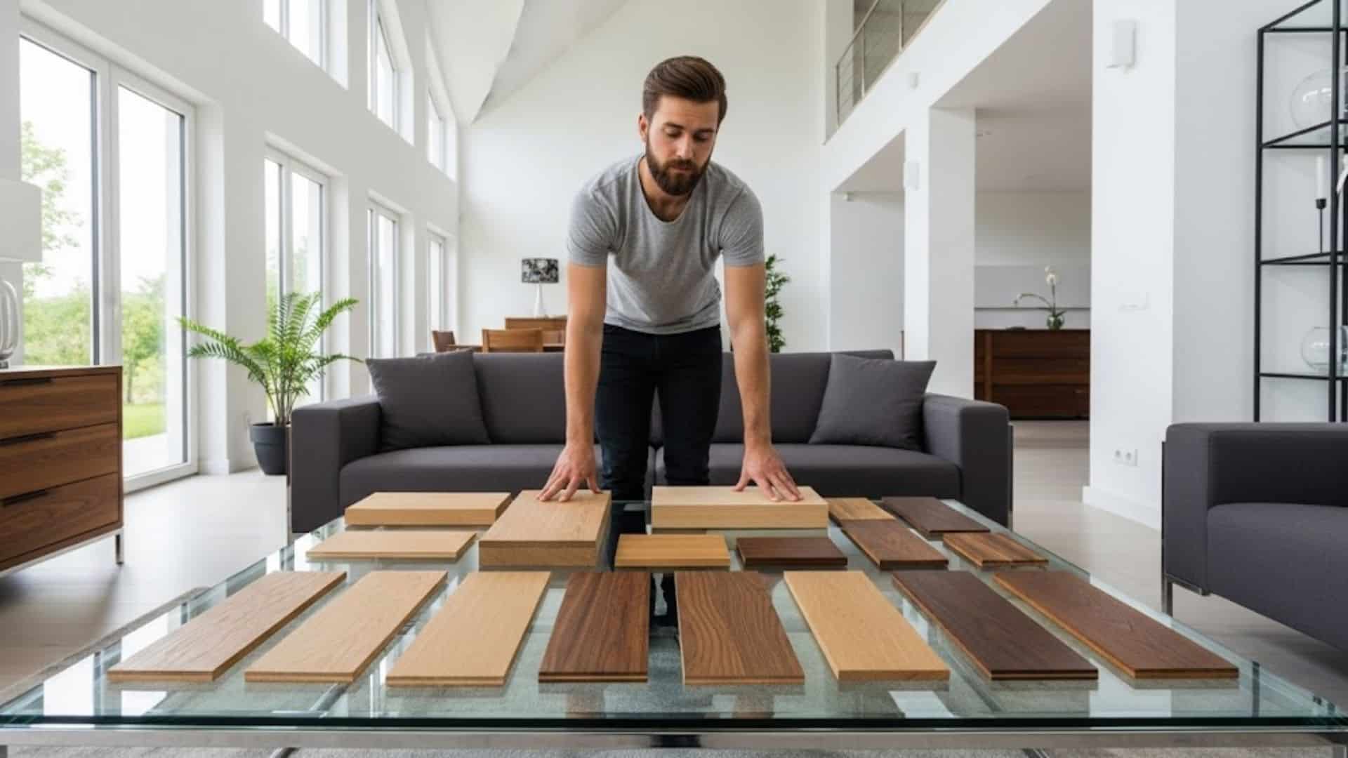
Mixing wood tones and finishes is much easier than you imagine! Different wood tones create visual interest and depth that make spaces feel layered and refined, much likehow oak vs walnut choices affect overall style and balance. I’ll show you how to identify undertones, create perfect contrast, and test combinations before making a purchase. You’ll find simple rules for confidently combining woods, proven combinations that always work beautifully, and room-specific tips that prevent costly mistakes. Get ready to convert your space into something stunning! Understanding Wood Tones Wood has its personality and undertones, just like paint colors. Warm woods have honey, golden, or red hints that make rooms feel cozy. Cherry, mahogany, and traditional oak all have warm undertones. Cool woods show gray, ashy, or white undertones that create a modern, crisp look. Maple, ash, and whitewashed pine fall into the cool category. Woods also fall into three categories: light, medium, and dark. Light woods, such as birch, naturally brighten spaces. Medium tones like walnut add richness without overwhelming. Dark woods like ebony create drama and refinement. The contrast between these levels affects your room’s mood completely. High contrast feels bold and striking. Low contrast looks calm and unified. Understanding these basics helps you mix woods confidently. The Rules for Mixing Wood Tones These three simple rules will save you from decorating disasters. Follow them, and your wood mixing will always look professional. Rule 1: Stick to the Same Undertone Family Warm woods play nicely with other warm woods. Cool woods combine beautifully with cool companions. This happens because similar undertones create balance instead of fighting each other. Your cherry dining table will love that walnut bookshelf nearby. But mixing warm oak with cool gray-washed pine creates awkward clashes. Rule 2: Vary the Intensity Levels Light, medium, and dark woods create perfect visual balance together. This variation adds depth and prevents your room from looking flat. A light maple coffee table pairs with medium walnut side tables and dark ebony frames. Without this contrast, everything mixes into one monotonous blur. Rule 3: Limit Yourself to 2-3 Wood Tones per Room Too many different woods create visual chaos and overwhelm your space entirely. Two to three wood tones provide enough variety to stay interesting without crossing into messy territory. More than three stars competing for attention make decorating decisions much harder while destroying cohesion. Perfect Wood Tone Combinations I’ve been watching these proven combinations make homes beautiful for decades. You’ll create a look that feels both intentional and effortless with any pairing. 1. Classic Warm Combinations Warm wood combinations bring cozy comfort to any space. These pairings never go out of style and work in both traditional and modern homes. Oak and walnut create the perfect balance of light and dark richness Cherry and maple mix beautifully with their shared red undertones Honey oak with darker browns adds depth while staying warm and inviting These combinations feel natural because they share similar golden undertones. You’ll find these pairings in well-designed homes everywhere. 2. Modern Cool Combinations Cool wood combinations create fresh, contemporary spaces that feel clean and cultured. These pairings work exceptionally well in minimalist and Scandinavian-inspired interiors. Gray-washed woods with white oak deliver crisp, airy refinement Ebony and light ash create stunning high-contrast drama Bleached pine with silver-toned finishes keeps spaces feeling light and modern These combinations feel current and fresh without being trendy. They’ll look stylish for years to come. 3. Neutral Combinations that Always Work Neutral combinations offer foolproof options that work with any decorating style. These safe choices let you experiment with colors and textures elsewhere in your room. Natural oak with painted wood creates a versatile, lasting appeal Weathered wood with fresh pine brings casual, relaxed vibes Unfinished wood with white-washed pieces keeps things simple and clean These combinations work because they’re subtle and understated. You can build any design style around these reliable foundations. Room-by-Room Application Each room in your home has unique opportunities for mixing wood tones successfully. I’ll show you how to apply the golden rules in your most important spaces. 1. Living Room: Mixing furniture pieces, flooring, and built-ins Your living room offers the most opportunities to mix wood tones successfully. Start with your flooring as your base tone, then choose furniture that complements it. Built-in bookshelves can bridge the gap between your floors and coffee table. Mix a light oak coffee table with medium walnut side tables and dark picture frames for perfect balance. 2. Kitchen: Cabinets, Islands, and Open Shelving Coordinate Kitchens work beautifully with two main wood tones that complement each other. Use your cabinets as the dominant wood tone, then add contrast with your island or open shelving. White oak cabinets paired with a darker walnut island create stunning visual interest. Maintain consistent hardware finishes to ensure a flawless integration. 3. Bedroom: Bed Frames, Nightstands, and Dressers Bedrooms feel most relaxing when wood tones stay within the same family. Your bed frame should be the focal point, with nightstands and dressers supporting that choice. A medium cherry bed frame works beautifully with lighter maple nightstands and a darker mahogany dresser. This creates depth without overwhelming your peaceful space. 4. Dining Room: Table and Chair Combinations Your dining table and chairs no longer need to match perfectly. Mix a rich walnut table with lighter oak chairs for contemporary appeal. The key is keeping undertones similar while varying the intensities. Add a matching walnut buffet to tie the room together and create a cohesive, intentional look. Tips for Testing Wood Combinations Testing wood combinations before you buy saves money and prevents decorating disasters. These simple strategies help you make confident decisions about your wood mixing choices. Get actual wood samples: Visit stores and collect real wood pieces, not just photos or online swatches. Check colors in different lighting: Move samples around your room throughout the day to see how they change. Create a simple mood board: Tape samples to cardboard and live with them for a few days. Match your fixed elements first: Start with your floors and built-ins, then choose furniture that works with them. Take your time with this testing process, and trust your instincts. You’ll know the right combination when you see it, because it’ll feel natural and balanced. Final Thoughts You now have all the tools to mix wood tones that go together like a professional interior designer. Remember the golden rules: stick to similar undertones, vary your light and dark intensities, and limit yourself to a few woods per room. These proven combinations and room-specific tips will guide your decorating decisions confidently every time. Don’t be afraid to experiment with samples and trust your instincts along the way. Your personal taste and style preferences matter more than any strict decorating rule I can give you. Start with one room and watch as the beauty of mixed wood tones alters your entire home. Drop a comment below and tell me about your exciting wood mixing experiences!