


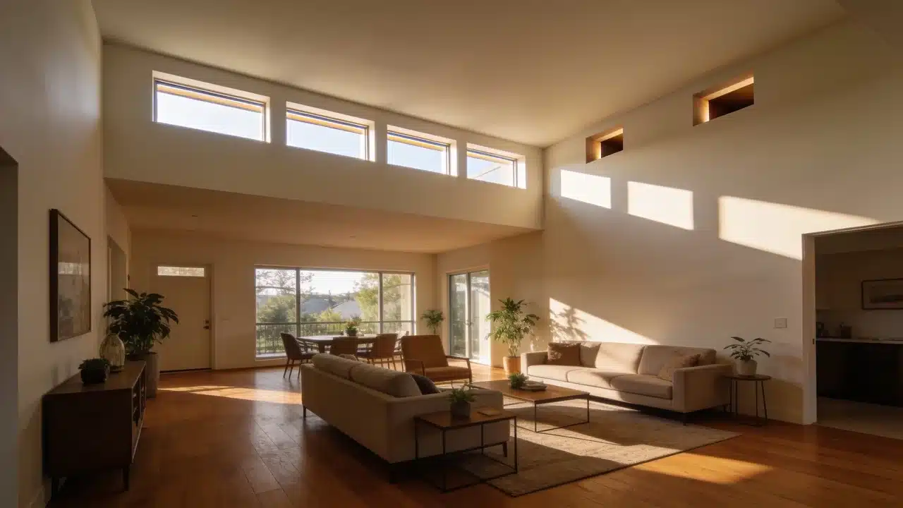
Quick Answer: A clerestory window is a high-set wall window, typically positioned near the roofline, designed to admit daylight and ventilation into a space without using lower wall area. Some windows do more than let in light. They change how a room feels, functions, and breathes. I’ve spent 12 years working through layout problems in real homes, and clerestory windows keep coming up as one of the most practical design decisions you can make. They solve problems that standard Windows simply cannot, a nd yet most people overlook them completely. In this piece, I’ll walk you through the full history and architectural role of clerestory windows, how they work, the types available, the benefits they bring to your home, where to place them, and what to check before installation. What is a Clerestory Window? A clerestory window is a window placed high on a wall, close to the ceiling or roofline. It takes its name from the clerestory, the strip of wall that sits above eye level. Sitting above the standard sight line, it keeps your lower walls free while still pulling daylight deep into the room. The idea is old. Ancient Egyptian temples used raised wall sections with openings to bring light into deep stone interiors, and Roman basilicas and Gothic cathedrals later used tall clerestory bands to fill vast spaces with daylight long before electric lighting existed. The core idea hasn’t changed much; only the materials and methods have evolved. Today, the same approach shows up in passive home design, where placement and orientation do the work artificial lighting used to handle. Standard windows trade wall space for daylight. Place one higher up instead, and sunlight will travel farther into the room, especially in longer or open-plan spaces. How Do Clerestory Windows Work? Placement is everything with clerestory windows. Because the glass sits high on the wall, sunlight enters at a steeper angle and reaches further into the room than a standard window at eye level ever could. In open-plan spaces, you notice the depth of light immediately. When the windows are operable, they also improve airflow through the stack effect. Warm air rises and exits through the upper opening, pulling cooler air in from below. Glazing choice, compass orientation, and external shading all affect how well this works in practice. Getting those three right is where most of the real performance comes from. What are the Types of Clerestory Windows Not every clerestory window works the same way. The type you choose affects the light, airflow, and the overall feel of the space. 1. Fixed Clerestory Windows Designed purely for daylight, fixed clerestory windows do not open. You’ll find them in most modern homes because they are simple to install and need little upkeep. They also cost less upfront since there’s no hardware involved. If ventilation isn’t a priority, this is usually the most practical starting point. 2. Operable Clerestory Windows These can be opened to let warm air out, making them useful in warmer climates or in rooms that heat up quickly. You get more control over indoor comfort without relying on air conditioning. Some models include automated controls, so you can manage airflow without manually reaching the window. 3. Continuous Clerestory Windows These run as long horizontal bands across the upper wall rather than sitting as individual units. This unbroken line of glass creates a strong visual statement in rooms with minimal detailing elsewhere. You’ll often see them in contemporary architecture because they distribute light evenly across a wide space. 4. Roofline Clerestory Windows These follow the angle of your ceiling or roofline rather than sitting in a flat wall section. Because they track the sun above you, they receive more direct sunlight during specific hours, making timing and orientation important. They work well with a pitched or vaulted ceiling The right type depends on your room layout, climate, and how much you want the windows to do beyond bringing in light. Why You Need Clerestory Windows in Your Home In my experience, homeowners come to clerestory windows trying to solve one problem and end up fixing several at once. The most immediate gain is daylight. Because the glass sits high on the wall, sunlight penetrates farther into the room than a standard window at eye level ever does. That depth of light reduces the amount of artificial lighting a room needs during the day, which matters most in longer layouts or open-plan spaces. Privacy is the second reason, and for many people, it is the deciding one. A clerestory window keeps the room bright while cutting direct sightlines from the street, a neighboring property, or a shared outdoor space. You get the light without the exposure. Because the glass sits above eye level, the lower walls remain completely free for shelving, storage, artwork, and furniture, without having to plan around window placement. In operable configurations, warm air rises and exits through the upper opening, pulling cooler air in from below. In rooms that heat up quickly, natural ventilation reduces the load on air conditioning without any mechanical system involved. Positioned and glazed correctly, they also support passive solar performance, retaining warmth in winter and managing heat gain in summer when combined with overhangs or external shading. High glazing also draws the eye upward, making a room read as taller and more open than its dimensions suggest. Best Rooms for Clerestory Windows Clerestory windows fit well in most rooms, but some spaces benefit more than others. Here is where they tend to work best. 1. Living Rooms: A natural fit, especially with vaulted ceilings. You get strong daylight throughout the space without sacrificing eye-level privacy. Since the glass sits well above furniture and seating areas, you can also arrange the room however you like without worrying that window placement will get in the way of a sofa or bookshelf. 2. Kitchens: Placed above cabinets and counters, they bring in light where task lighting often falls short. This works especially well in galley or U-shaped kitchens, where wall space is already occupied by cabinetry and appliances, leaving few options for standard counter-height windows. 3. Bathrooms: One of the most practical applications. You get daylight without compromising privacy, which matters most in bathrooms that face the street, a neighbor’s window, or a shared courtyard. It also reduces the damp, closed-in feel of windowless bathrooms, without the need for frosted glass or blinds. 4. Bedrooms: Clerestory windows provide light without direct exterior views, making them worth considering in street-facing rooms. They let you wake up to natural light each morning while keeping curtains or blinds unnecessary during the day, which is a small but noticeable change for anyone sensitive to overly dark rooms. 5. Home Offices: Natural light from above reduces screen glare and keeps the room feeling open without visual distractions from outside. For anyone working long hours at a desk, this steadier, indirect light is easier on the eyes than a standard window positioned right behind or beside a monitor. 6. Hallways and Staircases: These are often the hardest spaces to light well. A clerestory window can brighten areas with no exterior walls or other places to install glass. A dim, windowless corridor can turn into a space that feels connected to the rest of the home. Every room has different requirements. In my experience, the spaces that gain the most are those where privacy and daylight feel like competing needs. How Clerestory Windows Compare to Skylights All three bring extra light into a space, but they work differently and suit different situations. Knowing the distinction saves you from choosing the wrong option for your room. Feature Clerestory Windows Skylights Transom Windows Location High wall near ceiling Roof surface Above doors or windows Main Purpose Daylight and privacy Overhead lighting Supplemental light Ventilation Available in operable models Available in some models Usually limited Privacy High Depends on placement Depends on location Common Use Homes, offices, commercial buildings Dark rooms, upper floors Entryways and interiors In my experience, the choice usually comes down to one clear priority. If privacy matters most, clerestory windows are the stronger option. If you need overhead light in a room with no usable wall space, a skylight makes more sense. Transom windows work best as a decorative addition rather than a primary light source. Factors You Must Know for Installing a Clerestory Window Getting clerestory windows right takes more planning than you might expect. These are the factors worth thinking through before you commit. Room orientation and climate: South-facing windows bring more heat and light. In warmer climates, exterior shading or overhangs help manage direct sun. Glass type and energy performance: Low-E glazing reduces heat gain and improves overall efficiency. Accessibility and maintenance: High placement affects how you clean and operate the windows. Fixed units need a clear maintenance plan. Fixed vs operable and costs: Operable units cost more and need more upkeep. Structural changes for high-level glazing also add to the overall budget. Final Thoughts Not every home needs them. But if you are working with an open layout, high ceilings, a modern design, or a space where privacy and daylight feel like a trade-off, clerestory windows are worth serious consideration. If you have already noticed the problem of a room that never feels quite right, light that does not reach far enough, or walls too crowded for another standard window, this is likely the solution you have been looking for. Get the orientation, glazing, and ventilation balance right, and the results speak for themselves. If alternatives suit your space better, a skylight or transom may be the smarter call. Have you considered clerestory windows for your home? Drop your thoughts in the comments below. Frequently Asked Questions How much does it cost to install clerestory windows? Costs vary depending on size, glazing type, and whether structural changes are needed. Operable models and custom shapes typically cost more than standard fixed units. Do clerestory windows need planning permission? In many cases, yes. Any structural wall changes or additions to an existing home may require planning approval. Check with your local authority before starting work. Can clerestory windows be added to an existing home? Yes, but it requires structural work. A builder or structural engineer should assess the wall before any openings are cut. What is the best glazing for clerestory windows in hot climates? Low-E double glazing with a low solar heat gain coefficient works best. It limits heat entry while still allowing good light transmission. Do clerestory windows affect home insulation? They can if the wrong glazing is used. Well-specified double or triple glazing maintains thermal performance without sacrificing the daylight benefits.
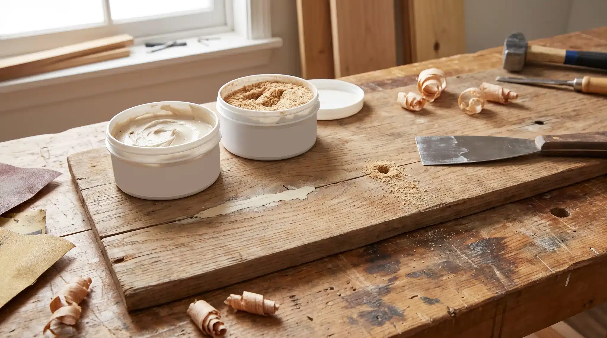
Small wood repairs can be surprisingly tricky. I have seen many projects where a simple crack, dent, or scratch turned into a noticeable patch because the wrong repair material was used. Wood putty and wood filler often look almost identical at first glance. However, each one is designed for a different type of repair. In my experience, wood filler works best for deeper repairs on unfinished wood that will be sanded, painted, or stained, while wood putty is better suited for small touch-ups on already finished surfaces. Choosing between wood putty vs wood filler comes down to understanding the surface you are repairing, the size of the damage, and the finish you want to achieve. You can merge both sections under a broader H2 that introduces the two materials before comparing their differences. What Is Wood Filler? Wood filler is a repair compound used to rebuild damaged areas of wood. It is made with wood fibers or synthetic materials mixed with binders to create a material that hardens as it dries. It works well for filling deeper holes, cracks, dents, and missing sections because it becomes a solid surface that can be sanded smooth. Since filler bonds with the wood rather than sitting only on top, woodworkers often use it during the repair and preparation stage before painting or finishing. Pros Cons Creates a hard surface that can be sanded, shaped, and painted. Can crack if used on wood that expands and contracts frequently. Works well for filling deep holes, cracks, gaps, and damaged wood areas. Usually requires sanding and surface preparation after drying. Bonds with the wood surface for stronger repairs. May not match the natural grain of stained wood. Suitable for unfinished wood projects before painting or staining. Some types dry quickly, leaving less working time. Helps create a smooth surface for professional-looking finishes. Not always ideal for repairs on already finished furniture. What Is Wood Putty? Wood putty is a softer, more flexible material designed for small surface imperfections on finished wood. It is typically made from oils, solvents, and synthetic compounds that keep it slightly pliable after application. Unlike wood filler, putty is not meant for rebuilding damaged areas. It is commonly used after staining or finishing to hide small scratches, nail holes, or minor flaws. Furniture restorers often keep multiple putty shades available to blend repairs into existing finishes without refinishing the entire piece. Pros Cons Stays flexible after drying, allowing it to handle slight wood movement. Not suitable for repairing deep holes, large cracks, or missing wood sections. Works well for small surface repairs like scratches, dents, and nail holes. Takes longer to dry compared to some wood fillers. Available in different colors to match finished wood surfaces. Cannot usually be sanded as smoothly as wood filler. Ideal for repairing finished furniture without removing the existing finish. May not hold up well in areas exposed to heavy wear or moisture. Helps restore the appearance of antique furniture and decorative pieces. Often needs a matching shade for a less noticeable repair. When Should You Use Wood Putty or Wood Filler? Choosing between wood putty and filler comes down to the type of wood and repair. Wood filler works well for serious damage or holes, while putty is best for smoothing surface imperfections and blending with finished wood. Knowing which product to use makes furniture restoration or DIY woodworking projects easier and the results more seamless. Feature / Aspect Wood Putty Wood Filler Best For Small cosmetic repairs on finished wood surfaces Larger repairs on unfinished wood where strength is important Typical Uses Hiding scratches, minor dents, small imperfections Filling nail holes, screw holes, gaps, cracks, small splits Finish Compatibility Matches existing finish, available in different shades Applied before painting or staining for smooth, even surfaces Wood Type Consideration Suitable for all finished wood Dense hardwoods handle differently than softwoods for durability. Strength / Durability Cosmetic only, not structural Strong, durable, can withstand wear Application Examples Furniture, cabinets, interior trim Furniture projects, cabinet prep, trim installation How to Apply Wood Filler Correctly? A smooth wood filler repair starts with proper preparation. Rushing the process can leave uneven patches or weak spots that show through the final finish. Follow these steps for a cleaner, longer-lasting repair. 1. Clean the Damaged Area: Remove dust, dirt, loose wood pieces, and debris before applying filler. A clean surface improves adhesion and helps create a smoother, more even repair. 2. Apply the Filler: Use a putty knife to press wood filler firmly into cracks or holes. Slightly overfill the area because some fillers shrink as they dry. 3. Let It Dry Completely: Allow the filler to dry fully before sanding. Drying time depends on the repair size, product type, and surrounding conditions, with larger areas needing more curing time. 4. Sand the Surface: Once hardened, sand the repaired area with fine-grit sandpaper until it becomes level with the surrounding wood. Create a smooth surface ready for finishing. 5. Finish the Wood: Remove sanding dust and apply paint, stain, or sealant based on the project. Choose a compatible finish to protect the repair and blend it with the wood. How to Apply Wood Putty Correctly? Putty rewards patience and a close color match. Here is the right way to do it. 1. Match the putty color: Choose a wood putty shade that closely matches the finish. Since putty is used for visible repairs on stained wood, a close color match helps the repaired area blend in instead of drawing attention. 2. Press putty into the repair: Apply the putty directly into the scratch, dent, or small surface flaw using a putty knife. For imperfections, you can use your finger to press the material into the damaged area. Make sure the putty fills the spot without leaving gaps. 3. Remove the excess: Once the repair is filled, wipe away extra putty from around the damaged area. Keep the patch level with the surrounding surface so it does not create a raised spot that stands out after drying. 4. Let it set: Allow the wood putty to dry and settle according to the product instructions. Avoid touching or disturbing the repair while it sets, as moving it too soon can affect the final appearance. 5. Seal if needed: Depending on the surface and location of the repair, adding a protective finish can help the putty last longer. Sealing is especially useful for furniture and frequently used wooden surfaces exposed to moisture, dust, or regular wear. How Much Do Wood Putty and Wood Filler Cost? Wood filler runs about $8 to $18 for a standard tub at major retailers. Common DAP fillers sit around $7.98 to $17.98 depending on the size. A single container fills many nail holes and cracks. Wood putty falls in a similar range. Small tubes cost only a few dollars each. A six-pack of Varathane putty runs about $29.69, which works out to $4.95 per unit. DAP putty multi-packs land near $5.57 per tube. Here is a quick price snapshot to compare the two. Product Typical Size Rough Price Wood filler 8 to 16 oz tub $8 to $18 Wood putty 3 to 4 oz tube $5 to $10 Exterior wood filler Larger tub with hardener $15 to $30 Wood Putty vs Wood Filler for Different Home Projects Real projects make the choice clearer. From furniture repairs to flooring fixes, the right product depends on the wood type, surface finish, and level of damage. Engineered hardwood floors, for example, have a layered construction that requires careful repair methods to avoid damaging the top veneer. Project Recommended Product Hardwood floor scratches Filler or repair kit, based on finish Painted cabinets Wood filler Stained furniture Wood putty Door frame repairs Wood filler Small trim damage Wood putty Outdoor wood repairs Exterior-rated wood filler Final Verdict When I choose between wood putty and wood filler, I always start by looking at the repair itself. Wood filler works best for damaged or unfinished wood that needs sanding, painting, or staining, while wood putty is better for small touch-ups on finished surfaces. Taking a moment to match the product to the job can save time and prevent uneven patches later, before applying either one. I recommend checking the type of wood surface and the size of the damage. Those two details usually make it clear which option will give the best result. Frequently Asked Questions Does wood putty harden like wood? No. Wood putty usually stays slightly flexible after it dries. That helps it move with finished wood. It never gets as hard as wood filler. When should you not use wood filler? Skip filler on finished surfaces that need flexibility or a color match. It also fails on large structural repairs and areas with heavy movement. How big of a gap can you fill with wood filler? Most fillers handle small to medium repairs, usually up to about a quarter inch. Bigger gaps may need several applications or another method. Does wood putty need to be sealed? Not always. But sealing helps guard the repair from moisture, dirt, and wear. This matters most on furniture you use every day. How do you apply wood putty correctly? Clean the area, press putty into the spot, and wipe off the excess. Let it set, then add finish protection if the surface needs it.
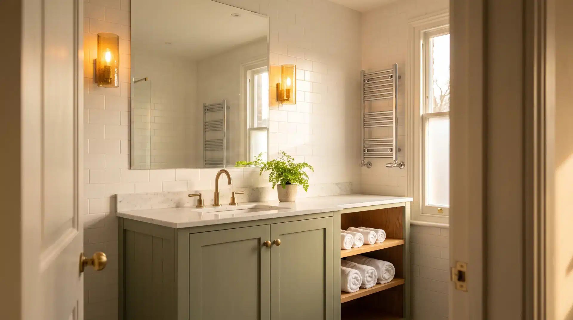
The guest bathroom is the room your visitors judge you by, and most of them do it in the first ten seconds. It does not need a full renovation to make an impression worth remembering. The right guest bathroom ideas can turn a forgotten corner of your home into the detail that guests bring up at dinner months later. A compact powder room, a dated half bath, a full guest suite that simply needs a refresh- the options available now go far beyond new towels and a candle. This list of guest bathroom ideas covers modern, luxurious, welcoming, and low-cost simple bathroom designs with something usable at every budget. Start here. 27 Guest Bathroom Ideas to Inspire Your Next Update The best guest bathroom inspiration does not come from doing more. It comes from doing the right things in the right order and knowing which single change carries the most weight in a small space. 1. Muted Green Vanity With Brass Fixtures A muted green vanity paired with warm brass hardware is one of the strongest guest bathroom combinations. The green adds personality without committing to something loud, and brass softens the contrast against white tile walls. Add a small potted plant and a ceramic soap dispenser to finish the look without overcomplicating it. It photographs well and lives even better in person. 2. White Shiplap Walls With Black Accents White shiplap walls and matte black accents deliver a clean, fresh look that feels inviting without demanding much upkeep. The black fixtures carry the visual work, so the rest of the room can stay quiet. This approach holds up particularly well in smaller guest bathrooms where clutter is the biggest problem to solve. Fresh without trying too hard, which is exactly where a guest bathroom should land. 3. Bold Patterned Wallpaper on One Wall One wall of bold patterned wallpaper turns a forgettable guest bathroom into one guests actually remember. Floral, geometric, or abstract prints all work as long as the rest of the room stays quiet and lets the paper lead. Look for wallpaper labeled for high-humidity rooms and pair it with a simple dark vanity for balance. One wall is enough. The whole room does not need to compete with itself. 4. Floating Vanity for a Modern Guest Bathroom Few upgrades modernize a guest bathroom as fast as a floating vanity without touching anything structural. It reveals the floor line and makes the space read larger than it is. For tighter layouts, the visual breathing room created beneath a floating vanity does more for the room than almost any other decorative choice. Pair with a frameless mirror, and the refresh is complete. 5. Statement Marble Tile Accent Wall A bold marble pattern on a single accent wall elevates a guest bathroom from functional to high-end. Balance it with warmer elements, like a wood vanity or soft lighting, so the drama does not tip into the cold. Large-format marble-look porcelain achieves a visual impact close to the of real marble without the sealing and maintenance demands. Guest bathroom inspiration that ages well rather than dating quickly. 6. Deep Green Vanity With Soft White Tile Deep green against soft white tile is one of the most searched guest bathroom color combinations in the US right now. The contrast is rich without feeling heavy, and the white tile keeps the room from closing in. Pair with brushed gold hardware for warmth or matte black for a sharper edge. Both work. The green carries the design either way. 7. Frameless Mirror Above a Sleek Single Sink A large frameless mirror above a single sink makes a guest bathroom feel designed rather than assembled. It reflects light, adds visual depth, and requires nothing else on that wall to work effectively. Among the highest-impact, lowest-cost upgrades available in any guest bathroom refresh, it suits every design direction from minimal to traditional without forcing a commitment to either. 8. Warm Neutral Palette With Natural Wood Touches Cream, oat, and soft beige tones give a guest bathroom a calm, hospitable quality that holds across seasons and styles. Natural wood touches on the vanity or a small shelf add organic texture without introducing color. This combination reads as intentional yet minimal, making it one of the most broadly appealing guest bathroom ideas for homeowners who want the space to work for a wide range of visitors. 9. Black and White Classic Tile Floor A black-and-white geometric tile floor does the decorating in a guest bathroom without requiring anything bold on the walls. Keep the walls white or off-white, choose simple fixtures, and let the floor carry the visual interest. This has been working in bathrooms for decades and shows no signs of dating. It is one of the most searched guest bathroom ideas for good reason. 10. Layered Lighting With Sconces and Overhead Dimmer Layered lighting transforms a guest bathroom from clinical to warm in a way no paint color or accessory can replicate. Wall sconces flanking the mirror at eye level eliminate the harsh shadows created by overhead-only lighting. Add a dimmer on the ambient circuit, and guests can adjust the room to their own comfort level at any hour. The upgrade most guest bathrooms are missing is the one that makes the biggest, most noticeable difference. 11. Open Shelving With Rolled Towels and Curated Products Open shelving in a guest bathroom signals thoughtfulness. Rolled white towels, a small plant, and two or three curated products displayed neatly communicate that this space was prepared for company rather than just cleaned. The discipline required to keep open shelving organized is part of what makes it so effective. When done right, it is one of the most memorable details in the room. 12. Spa-Inspired Guest Bathroom With Minimal Clutter A spa-inspired guest bathroom does not require expensive materials. It requires editing. Clear the counter of personal items, add one quality texture, invest in a rainfall showerhead if the budget allows, and keep the lighting warm. Guests recognize a spa feeling through what is absent from the room as much as what is present. This is guest bathroom inspiration that costs more in restraint than in spending. 13. Vintage Apothecary Cabinet for Storage and Character A vintage or apothecary-inspired cabinet with glass doors adds character to a guest bathroom while solving the storage problem at the same time. Display folded towels, small toiletry items, and a few curated objects inside. It gives the room a personality that a standard vanity never provides and suits both traditional and transitional interiors without forcing you into either direction. 14. Wainscoting With Bold Paint Above Wainscoting on the lower half of a guest bathroom wall paired with a bold paint color above creates a classic architectural detail that punches well above its cost. Deep navy, forest green, or charcoal above white wainscoting produces a high-end result achievable over a weekend with basic tools and one gallon of paint. Use satin finish above the wainscoting line: it is widely considered the best paint finish for bathroom walls because it handles moisture, wipes clean, and avoids the clinical glare of semi-gloss. 15. Vessel Sink on a Natural Wood Vanity A ceramic vessel sink on a natural wood vanity base reads as purposeful and elevated without approaching luxury price points. The organic quality of the wood grounds the ceramic vessel and keeps the look warm rather than sterile. Choose a countertop vessel over a wall-mount version for easier installation in an existing guest bathroom, and pair with a wall-mounted faucet for a clean, uncluttered counter. 16. Colorful Mosaic Tile Inside the Shower A colorful mosaic tile on the shower floor or back wall is a contained way to add personality to a guest bathroom without committing to bold color throughout. The tile is the feature; everything else stays neutral. Handcrafted tile in artisan finishes adds texture and color depth that standard ceramic tile cannot match, and the effect lands the moment a guest steps inside. 17. Brushed Brass Hardware Throughout Replacing dated chrome hardware with brushed brass throughout a guest bathroom is a low-cost, high-return update that changes how the room reads in an afternoon. Cabinet pulls, towel bars, toilet paper holders, and faucet handles in a consistent brushed brass finish create a cohesion that makes the room feel deliberately designed rather than accumulated over time. This is the single-afternoon project most guest bathrooms need first. 18. Floor-to-Ceiling Tile in a Compact Guest Bath Floor-to-ceiling tile in a compact guest bathroom eliminates the horizontal break that makes tight rooms feel shorter and more confined. A single tile run from floor to ceiling draws the eye upward and adds perceived height. Large-format tiles in a soft neutral tone produce the cleanest version of this effect and require fewer grout lines, which reduces maintenance considerably over time. 19. Rainfall Showerhead as a Luxury Touch A rainfall showerhead is the most consistently appreciated upgrade in a guest bathroom because guests feel it the moment they step in. In most cases, it requires only a showerhead swap and a new arm, not a full shower renovation. The experience it creates makes a guest bathroom feel considerably more premium than its price point suggests, and that gap between cost and perceived value is the whole point. 20. Moody Black and Gold Guest Bathroom Black walls or deep charcoal tile paired with gold hardware and a statement mirror produce a look that photographs well and lands even better in person. This works especially well in powder rooms where there is no shower to contend with. For homeowners who want their guest bathroom to have a point of view rather than a safe palette, this is the direction worth considering. 21. Neutral Linen Towels and Quality Soap Dispenser The accessories in a guest bathroom communicate the level of care that went into the space. Replace plastic soap bottles with ceramic or glass dispensers. Fold neutral linen towels and display them where guests can find them without asking. Add a small dish of hand cream. These are hotel-level touches that cost very little and are immediately apparent when a guest walks in. 22. Patterned Floor Tile With White Walls A patterned cement or encaustic tile floor with simple white walls adds personality to a guest bathroom without touching anything structural. The floor becomes the statement, and the walls recede. This approach works at almost every budget level because the tile is the only investment the design requires. Everything else in the room plays a supporting role. 23. Framed Art Above the Toilet A framed print or small gallery above the toilet is one of the most underused opportunities in a guest bathroom. Guests spend time in that zone, and giving them something worth looking at signals attention to detail. Choose pieces with calm or interesting subject matter and use humidity-rated frames to prevent warping. A small addition that shifts the room from functional to finished. 24. Pedestal Sink for a Classic Small Space A pedestal sink is the right call for a very small guest bathroom where floor space is tight. It opens the floor visually, feels architecturally considered, and suits both traditional and transitional design aesthetics. Pair with a recessed medicine cabinet above for storage that adds nothing to the visual bulk of the room. Simple, purposeful, and still one of the strongest choices for a narrow layout. 25. Statement Mirror as the Room’s Focal Point An oversized, architecturally interesting mirror in a guest bathroom does the work of multiple decorative decisions at once. It reflects light, adds personality, and gives the room a focal point that does not depend on expensive materials elsewhere. An arched, sunburst, or beveled mirror at the right scale can define the entire aesthetic of a small guest bathroom. Nothing else needs to work particularly hard around it. 26. Warm Wood or Shiplap Ceiling Detail A warm wood or shiplap ceiling in a guest bathroom adds dimension and warmth that walls and floors alone cannot deliver. It draws the eye upward, makes the room feel finished rather than incidental, and costs considerably less than tile or stonework. In a narrow bath with lower ceilings, this detail creates the kind of cozy character that guests notice and remember without being able to explain exactly why. 27. Scented Candle and Fresh Flowers as the Finishing Layer No guest bathroom idea works in isolation from how the room smells and feels when someone first walks in. A quality scented candle and a small arrangement of fresh or dried flowers are the finishing layer that ties everything together. They communicate hospitality and attention to detail in a way that no fixture or tile upgrade can replicate on its own. The last thing you add and the first thing a guest registers. Conclusion A guest bathroom does not need a renovation to make an impression. It needs one or two decisions that carry real weight in the space you have, and the kind of finishing touches that say the room was thought about before anyone arrived. The ideas in this list range from a full layout refresh to a thirty-dollar hardware swap that changes how the whole room reads. Pick the one that fits your space, your budget, and the visit you are preparing for. Guests rarely comment on a bathroom directly. But there is a difference between walking into a room that was ready for them and one that was not. They feel it immediately, even if they never say a word. Frequently Asked Questions What is the Best Flooring for a Guest Bathroom? Porcelain tile is the top choice for guest bathroom floors in 2026 due to its water resistance, durability, and wide range of style options at every price point. What Size Vanity Works Best in a Guest Bathroom? A 24-inch vanity suits most compact guest bathrooms without overwhelming the floor space. Wall-mounted versions with at least one drawer and cabinet-handle storage add visual bulk. What are the Guest Bathroom Size Requirements and Clearances? Maintain a minimum of 15 inches from the toilet center to any side wall or vanity, and 21 inches of clear space in front of the toilet to meet standard building code requirements.
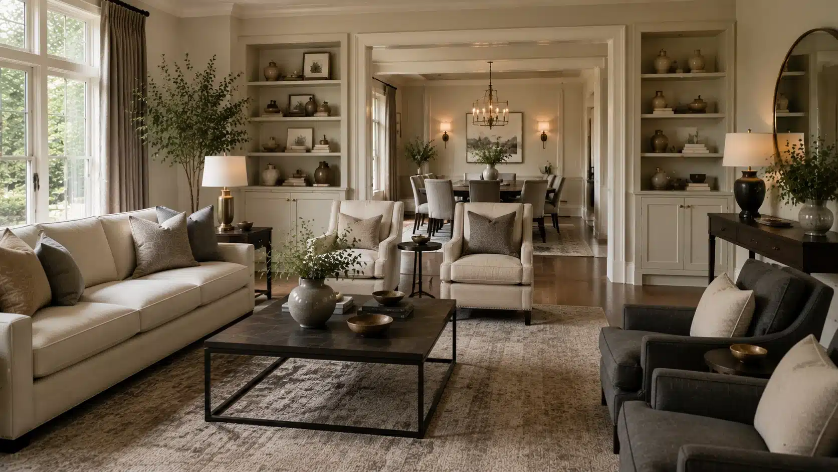
I’ve spent years walking into clients’ homes, where beautiful antique furniture sits awkwardly next to sleek modern lighting, and neither piece looks quite right. That mismatch is usually the moment someone calls a designer. It’s also exactly the problem this style was built to solve. This style sits in the middle ground between traditional warmth and contemporary simplicity. It borrows the comfort and detail of classic rooms while keeping the clean lines and restraint of modern spaces. In this blog, you’ll learn what defines the Transitional Interior Design, the key elements that make it work, how to apply it room by room, the mistakes that trip up, and how to get the look without a full renovation budget. What Is Transitional Interior Design? This style blends traditional furniture and details with the simplicity of contemporary design. It isn’t a strict rulebook so much as a balancing act. You keep the warmth and craftsmanship of traditional rooms, then pair it with the restraint and cleaner silhouettes of modern interiors. The style grew out of a simple shift in how people wanted to live. Formal, heavily decorated rooms started to feel impractical, while fully modern spaces often felt cold. Transitional design emerged as the middle path, and it has stayed popular because it doesn’t chase trends. A room designed a decade ago can still look current today, since it relies on proportion and material choices rather than whatever’s fashionable that year. Designers describe it the same way: understated, textural, and comfortable rather than heavily ornamented. The goal isn’t to notice the furniture first. It’s worth noticing how the whole room feels. Key Elements of Transitional Interior Design No single piece of furniture defines transitional style on its own. It’s a handful of choices working together: color, furniture, texture, architecture, and materials. Each one plays a small part, but together they create the balanced, comfortable feel the style is known for. 1. Neutral Color Palettes With Warm Undertones Transitional rooms almost always begin with a neutral base, typically featuring whites, beiges, taupe, warm greys, and soft browns. These colors don’t compete with the furniture or architecture, which is exactly the point. A neutral wall lets a carved wood console and a simple modern sofa sit in the same room without visual conflict. The trick is avoiding a flat, one-note space. Warm gray walls paired with wood furniture add depth. Cream upholstery grounded by black or bronze accents keeps a neutral room from feeling washed out. 2. A Mix of Traditional and Modern Furniture This is the clearest visual signal of the style. You’re not filling a room with only antiques or only contemporary pieces. You’re pairing them. A few combinations that consistently work: A tufted, traditional-shaped sofa with a simple modern coffee table Classic dining chairs under a contemporary pendant light A carved wood mirror above a streamlined console The one rule worth remembering is not to match every piece to the same era. A room full of only traditional furniture reads as traditional rather than transitional. The mix is the style. 3. Layered Textures Instead of Heavy Patterns Traditional rooms often rely on bold patterns; modern rooms often rely on none at all. This approach leans on texture instead, using linen curtains, wool rugs, leather accents, velvet cushions, and natural wood finishes to add depth without visual noise. This layering is what gives a transitional room its sense of comfort. A plain sofa in the right fabric can feel more inviting than a heavily patterned one, simply because of how the material reads and feels. 4. Balanced Architectural Details Crown molding, paneling, built-in shelving, and simple trim work all have a place in transitional homes, but the details are kept simpler than in fully traditional interiors. Ornate crown molding gets swapped for a cleaner profile. Elaborate paneling gets simplified into flat panels. The architecture still nods to tradition, just without the extra flourish. 5. Mixed Materials and Finishes Wood, glass, stone, and metal working together is a hallmark of transitional spaces. A stone fireplace surround, a glass coffee table, and matte black hardware can all coexist in the same room because none of them is fighting for attention. Mixing materials, rather than repeating a single finish throughout, is what keeps the space from feeling flat or overly matchy. Transitional Interior Design Ideas For Different Rooms The principles behind transitional design stay the same from room to room, but how they show up changes. A living room leans on furniture and lighting, while a kitchen or bathroom leans more on materials and finishes. 1. Living Room A transitional living room typically starts with a neutral sofa, rugs, and a mix of classic and contemporary lighting. Traditional details like a fireplace mantel or molding stay in place, while the furniture around them leans simpler. Classic artwork in a clean frame and a balanced furniture arrangement (rather than a rigid, formal layout) complete the look. 2. Kitchen Shaker cabinets are the backbone of most transitional kitchen designs because the door style itself bridges traditional paneling and modern simplicity. Pair them with marble or clean quartz countertops, mixed metal hardware, and simple backsplash tile. Wood accents, whether on an island or on open shelving, keep the space feeling warm rather than clinical. 3. Bedroom An upholstered headboard is one of the fastest ways to bring transitional style into a bedroom. Keep bedding neutral, then layer in texture through textiles like a knit throw or linen duvet cover. Traditional bedside tables paired with modern lamps are a small detail that does a lot of visual work. 4. Bathroom Bathroom designs lean transitional through a freestanding tub, classic tile patterns, and modern fixtures like a wall-mounted faucet or minimal cabinet hardware. Natural stone finishes on countertops or flooring add the same warmth that wood does in other rooms. Once a foundation is in place, repetition, ratio, and scale work together, and a mixed room stops looking accidental. Transitional Interior Design vs. Similar Styles It’s easy to confuse transitional design with the styles sitting on either side of it. Modern, contemporary, and traditional all overlap, but each treats ornamentation, trend sensitivity, and formality differently. 1. Transitional vs. Modern Interior Design: Modern design prioritizes minimalism, sharp lines, and little to no ornamentation. This style keeps some warmth and softness in furniture shapes and finishes, making it feel more lived-in than a strictly modern room. 2. Transitional vs. Contemporary Interior Design: Contemporary design house style shifts with current trends, which means a contemporary room from ten years ago can look dated fairly quickly. This look is built around longevity rather than trend cycles, so it tends to age better. 3. Transitional vs. Traditional Interior Design: Traditional interiors lean into ornamentation, formal furniture arrangements, and detailed millwork. Transitional spaces simplify it all: less decoration, more relaxed layouts, and cleaner finishes throughout. Quick comparison: Style Ornamentation Trend Sensitivity Overall Feel Transitional Simplified, selective Low, built for longevity Balanced, comfortable Modern Minimal to none Low Sleek, sparse Contemporary Varies with trends High Current, ever-changing Traditional Heavy, formal Low Ornate, classic The common thread across all three comparisons is balance. Transitional design borrows just enough from each neighboring style to feel current and comfortable, without fully committing to any single extreme. Errors to Avoid in Transitional Interior Design Even residential owners who understand the style well can tip a room too far toward one side without realizing it. These four mistakes come up the most, and each one is easy to fix once you know what to look for. Using too many decorative details. Overcrowding a room with antiques, patterns, and accessories pulls it back toward traditional design and away from transitional balance. Creating a completely neutral room without contrast. An all-neutral room without contrast can feel unfinished. Darker woods, metal accents, or textured fabric give the eye somewhere to land. Mixing styles without repeating elements. Furniture from different eras without a shared color, material, or finish feels disconnected rather than curated. Choosing trendy pieces over timeless ones. Trend-driven pieces undercut the entire point of the style. Ask if you’ll still want it in five years. Most of these mistakes come from the same root cause: overcorrecting in one direction, whether that’s too much decoration, too little contrast, or too much trend-chasing. Catching them early keeps a room feeling balanced instead of unfinished or overdone. How to Create Transitional Style on a Budget A full transitional redesign doesn’t require a renovation. Most of the look comes down to smart, targeted swaps rather than tearing out what’s already there, which means you can work room by room and spread the cost out over time. A few lower-cost changes go a long way: Keep existing architectural features rather than removing them Update lighting first, since fixtures change a room’s feel quickly Add texture through throw pillows, a new rug, or linen curtains Replace cabinet or door hardware with an inexpensive material update Mix in a vintage or secondhand find alongside newer furniture Repaint walls in a warm neutral tone None of these require a contractor, and most can be done over a weekend. Here’s a rough sense of what each change tends to cost: Change Approx. Budget Effort Repaint walls in a warm neutral $50–$200 Weekend project Replace cabinet or door hardware $30–$150 A few hours Add a new rug or throw pillows $50–$300 Same day Swap in linen curtains $60–$200 Same day Update a light fixture $75–$400 Weekend project Mix in a vintage or secondhand find $20–$150 Ongoing, as you find pieces Costs will vary by room size and materials, but none of these require touching the budget you’d set aside for a full renovation. Is Transitional Interior Design Right for Your Home? This interior design style tends to suit people who like classic details but don’t want a formal, museum-like room, and works less well for anyone drawn to a fully bare, minimal space or a heavily ornate, maximalist one. I’m not sure your taste fits the style. Here’s a quick gut check: If Your Vibe Is… Transitional Design Fit “I love antiques, but I don’t want my living room to look like a museum” Strong fit “I want a calm, neutral space that still feels warm” Strong fit “I keep collecting furniture from different eras and can’t tie it together” Strong fit “I want a completely bare, ultra-minimal room” Not a fit; lean modern instead “I want every piece ornate, patterned, and formal” Not a fit; lean traditional instead “I want a space that still feels current in ten years” Strong fit If most of your answers land in the “strong fit” column, transitional design is likely your style. If you’re drawn to the extremes on either end, one of its close cousins, fully modern or fully traditional, will probably serve you better. Frequently Asked Questions What is the 3-5-7 rule in interior design? It’s a styling guide for grouping decor in odd numbers, since asymmetrical groupings tend to look more natural and balanced than even ones. What colors are used in transitional interior design? Neutral tones dominate transitional spaces, including white, beige, taupe, warm gray, and soft brown, often layered with darker wood or metal accents for contrast. Is transitional design outdated? No. It’s built around timeless proportions and materials rather than trends, which is why it tends to stay relevant far longer than trend-driven styles. How do you make a room look transitional? Pair traditional furniture shapes with modern finishes, keep the palette neutral, layer in texture through fabrics, and simplify architectural details rather than removing them entirely. The Sweet Spot Between Old and New Good design rarely asks you to pick a side, and transitional style proves it. It takes the comfort of a room your grandmother would recognize and pairs it with the ease of one built for how you actually live now. No strict rulebook, no chasing whatever’s trending this year, just repetition, proportion, and texture doing the quiet work of holding a room together. That’s also why it lasts. A well-styled transitional living room today will still feel right in ten years, long after trend-driven looks have cycled out. If you’re ready to try it, don’t overhaul the whole house at once. Pick one traditional piece and one modern piece you already love, put them in the same room, and build outward from there. The balance tends to reveal itself once you stop overthinking it.
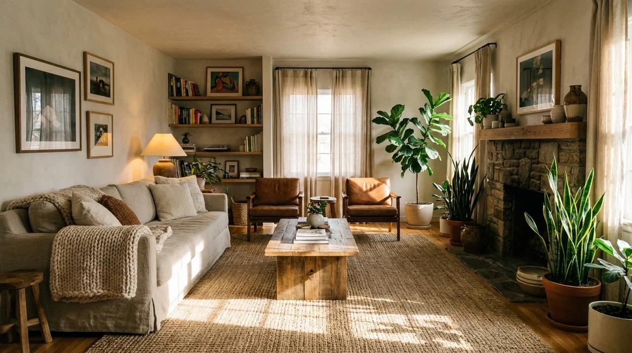
A room can still feel incomplete even after adding quality furniture and decor. The missing piece is often not the items themselves but how everything works together. A well-decorated space comes from the right balance of layout, colors, lighting, textures, and personal details. Small updates like moving furniture, adding soft fabrics, improving lighting, or changing wall art can make a noticeable difference. Creating a comfortable home does not always require a large budget or major changes. These practical decorating tips will help you make thoughtful updates that improve the look and feel of your space. 21 Simple Ways to Improve Your Home Decor Small changes can have a big impact on how a room looks and feels. These decorating ideas focus on furniture placement, colors, lighting, textures, and personal touches to help create a more balanced and comfortable home. 1. Define How You Want the Room to Feel Before selecting furniture, colors, or decorative pieces, think about the mood you want the room to create. Every space serves a different purpose, so the design should match how you want to feel when you spend time there. A bedroom may need calming colors and soft textures, while a living room can feel warm and welcoming. Defining the atmosphere first helps you make better decorating decisions and prevents random purchases that do not work well together. 2. Create a Decorating Plan Before Shopping A decorating plan helps you avoid mistakes and create a more balanced interior. Start by measuring your room, noting existing furniture, and deciding which pieces you want to keep or replace. Consider your budget, preferred colors, and how you use the space daily. Planning your layout before shopping makes it easier to choose furniture and accessories that fit properly. It also prevents overcrowding and ensures every item serves a purpose in the room. 3. Choose a Color Palette That Connects the Room A coordinated color palette can make a room feel more organized and visually comfortable. Instead of choosing colors separately for walls, furniture, and accessories, select a few shades that work together. Use a main color as the foundation, supporting colors for larger pieces, and accent shades through smaller decorations. Repeating similar tones in cushions, artwork, rugs, or curtains creates a connected look and makes the interior feel thoughtfully designed rather than randomly decorated. Before choosing colors or finishes, it is helpful to know the expected cost to paint the interior of a house. 4. Create One Main Focal Point A focal point gives a room direction and creates a natural place for the eye to rest. Without one, a space can feel scattered because every element competes for attention. Choose a feature that stands out, such as a large artwork piece, a fireplace, a statement furniture item, an accent wall, or a decorative mirror. Arrange the rest of the room around this feature so it supports the overall design. A strong focal point can make simple interiors feel more intentional. 5. Arrange Furniture Based on Room Function Furniture placement plays an important role in how comfortable and practical a room feels. Instead of arranging pieces only based on appearance, consider how people move and use the space. Create seating areas that encourage conversation, keep pathways open, and avoid blocking doors or windows. In smaller rooms, thoughtful placement can make the area feel larger and easier to use. A well-planned furniture layout improves both the look and everyday function of your home. 6. Choose Furniture That Fits the Room Scale Selecting furniture that matches your room’s size is crucial for a balanced and comfortable space. Oversized sofas or tables can overwhelm small rooms, while tiny pieces in large spaces can feel lost. Consider the dimensions of the room and the proportion of each item relative to others. Balancing larger furniture with smaller accents or accessories ensures harmony. The material of your furniture also affects the overall look and feel of a room. Choosing the right wood type for your furniture can influence the durability, style, and character of each piece, especially when selecting long-lasting furniture. 7. Add Texture to Make Rooms Feel Complete Layering different textures gives depth and warmth to any space. Mixing materials like wood, metal, glass, fabric, and stone creates visual interest and prevents rooms from looking flat. Incorporate soft textiles such as cushions, rugs, and throws alongside harder surfaces like furniture or flooring. Even small decorative objects with unique textures, like woven baskets or ceramic vases, can elevate the feel of a room. 8. Use Multiple Lighting Sources Lighting is one of the most powerful decorating tools. Combining ambient, task, and accent lighting creates a balanced and inviting environment. Ambient light provides overall illumination, task lighting focuses on specific activities like reading or cooking, and accent lighting highlights artwork, architectural features, or decorative objects. Layering different sources prevents harsh shadows and adds warmth. Using multiple lighting options also makes rooms more flexible, allowing the mood to be adjusted depending on the time of day or activity. 9. Maximize Natural Light Natural light brightens spaces, enhances colors, and makes rooms feel larger. To maximize it, keep windows clear of heavy drapes or obstructions and use sheer curtains to diffuse sunlight. Position mirrors to reflect light into darker corners or across the room, and choose furniture with reflective surfaces to enhance brightness. Light wall colors also help distribute sunlight. Proper use of natural light reduces the need for artificial lighting during the day while making interiors feel more open, airy, and welcoming. 10. Add Mirrors to Improve Space and Light Mirrors are a simple yet effective way to enhance both space and light. Placing a mirror opposite a window can reflect natural light, making rooms feel brighter and more open. Decorative mirrors above furniture or in small spaces add depth and create the illusion of additional square footage. Choosing frames and shapes that match your decor ensures they feel integrated. Mirrors are especially helpful in hallways, bathrooms, and compact rooms where visual expansion is needed without structural changes. 11. Bring Greenery into Your Interior Adding plants and natural elements instantly breathes life into a room. Indoor greenery adds color, texture, and freshness while improving mood and air quality. Place tall plants in empty corners, small potted plants on shelves or tables, and hanging plants in rooms with limited floor space. Combining plants of different heights and leaf shapes creates visual interest, while integrating them with furniture and decor ensures the space feels cohesive and inviting. 12. Style Shelves with Balance Well-styled shelves can transform a room’s look and add personality. Mix books with decorative items such as vases, sculptures, and small plants to create variety. Arrange objects in odd-numbered groupings for a natural feel, and vary heights and textures to maintain interest. Leave some empty space to avoid visual clutter. Thoughtful shelf styling combines organization with artistry, making shelves both functional and visually appealing within your interior decorating plan. 13. Decorate Walls without Overcrowding Walls offer a canvas for personality, but overdecorating can make spaces feel chaotic. Choose artwork, mirrors, or shelves that complement the room’s scale and color palette. For gallery walls, plan spacing carefully and mix frame sizes and orientations for balance. Leave portions of the wall empty to allow breathing space. Even a single statement piece can serve as a focal point when paired with complementary furniture and accessories. Minimal but intentional wall decor elevates the interior without overpowering the room. 14. Choose Artwork That Matches Your Space Artwork significantly influences a room’s character. Select pieces that harmonize with the color scheme, scale, and overall style of your space. Oversized artwork can anchor a room, while smaller pieces may work best in groupings or gallery walls. Incorporate personal or meaningful pieces to add authenticity. Position artwork at eye level to maintain balance, and ensure surrounding decor complements rather than competes with it. 15. Use Rugs to Define Areas Rugs are versatile tools for both function and style. They anchor furniture, define zones in open-plan spaces, and add warmth and texture. In living areas, ensure the rug is large enough for at least the front legs of furniture to rest on it. Layering smaller rugs or using runners in hallways can add visual interest. Choose materials, patterns, and colors that complement the overall design. A thoughtfully placed rug can visually unify a room, provide comfort underfoot, and make the interior feel polished and intentional. 16. Layer Curtains and Soft Furnishings Layering fabrics and soft furnishings adds depth, comfort, and a finished look to any room. Use curtains with texture or pattern to frame windows and add height, while coordinating with cushions, throws, and bedding for visual harmony. Mixing fabrics like linen, velvet, or knitted materials creates tactile interest. Rotating pillows and throws seasonally can refresh the space without major changes. Thoughtful layering balances aesthetics and functionality, making interiors feel cozier, welcoming, and carefully styled while reflecting your personal decorating taste. 17. Mix Old and New Decor Pieces Combining vintage and contemporary items brings character and personality to a room. Pair modern furniture with antique accents, such as a reclaimed wooden table or a vintage mirror. Mixing materials and styles prevents interiors from looking flat or overly matched. Carefully selected old and new pieces can complement one another, creating a cohesive yet dynamic look. This approach makes a home feel curated and personal while allowing you to incorporate meaningful or heirloom items alongside stylish modern decor. 18. Add Personal Items to Make the Space Yours Personal items give your home a sense of identity. Display meaningful objects such as framed photographs, travel souvenirs, handmade crafts, or personal collections. Integrate them with existing decor to maintain balance and avoid clutter. Including personal items ensures your home feels authentic, inviting, and reflective of your lifestyle. Even small touches like a decorative bowl or a favorite sculpture can add personality. Thoughtfully curated personal pieces elevate your interior decorating while making the space uniquely yours. 19. Keep Decorative Surfaces Organized Cluttered surfaces can make even a stylish room feel chaotic. Use trays, boxes, or baskets to group smaller items together. Limit the number of decorative objects on tables, shelves, or consoles to maintain balance. Rotate accessories occasionally to keep spaces fresh and interesting. Prioritize items that are both visually appealing and functional. Organized surfaces contribute to a clean, intentional look, allowing key decorative elements to stand out. This strategy enhances the overall harmony and professionalism of your interior decorating. 20. Use Vertical Space Effectively Vertical space is often underutilized, but it can make rooms feel taller and more organized. Install tall shelves, wall-mounted storage, or artwork to draw the eye upward. Floor-to-ceiling curtains create the illusion of height, while tall plants add both vertical interest and greenery. Using vertical space is especially valuable in smaller rooms where floor area is limited. By decorating upward, you maximize functionality, improve storage, and create a visually balanced interior that feels open, dynamic, and thoughtfully designed. 21. Add Seasonal Updates with Small Changes Refreshing a room for different seasons can keep your interior lively without major renovations. Swap cushion covers, throws, or curtains to reflect seasonal colors. Add fresh flowers, candles, or small decorative accents for a timely feel. These simple adjustments can create a sense of change and novelty while maintaining your core design. Seasonal updates are a cost-effective way to make a home feel dynamic and welcoming, allowing each space to reflect the time of year and keep your interior decorating fresh. Common Decorating Mistakes to Avoid Over time, I have noticed that many decorating mistakes come from making choices too quickly. A little planning can help a room feel more balanced and comfortable. Buying furniture without measuring is one of the most common issues. A piece that looks perfect in a store may feel too large at home, so checking dimensions first makes a big difference. I have also found that rooms feel more inviting when they mix textures instead of matching everything. Combining wood, fabric, metal, and different finishes adds depth and personality. Lighting is another detail that can change a space. Adding lamps and using natural light helps create a warmer feel than relying only on overhead lights. Trends can inspire ideas, but personal style matters more. Leaving some open space and choosing pieces that fit your lifestyle keeps a home comfortable and timeless. Create a Home That Feels Like You A well-decorated home is not about adding more things. It comes from making thoughtful choices with your space, furniture, colors, lighting, and decor. Small changes can make a room feel completely different. Moving a sofa, updating a lamp, adding texture, or choosing artwork that fits the space can improve the overall look without major changes. You do not have to redesign your entire home at once. Start with one room or one corner, make changes that suit your needs, and build from there. The best interiors are the ones that feel comfortable, personal, and easy to live in every day. Frequently Asked Questions How Often Should I Update My Home Decor? Small decor changes can be made seasonally, while larger updates depend on your preferences. Refreshing textiles, accessories, and layouts keeps your space feeling fresh. What are the Basic Rules of Interior Decorating? Focus on balanced layouts, suitable colors, layered textures, proper lighting, and a focal point to create a comfortable and well-designed space. HowCan I Decorate My Home Without Spending a Lot of Money? Refresh your home by rearranging furniture, updating soft furnishings, adding plants, improving lighting, and using existing decor in new ways. What Should I Decorate First in a Room? Start with the room layout and larger furniture pieces, then add colors, lighting, rugs, artwork, and accessories to complete the look. How Do I Make My Home Look Professionally Decorated? Use a cohesive color scheme, mix textures, improve lighting, choose the right furniture size, and keep the space balanced without adding too much clutter.
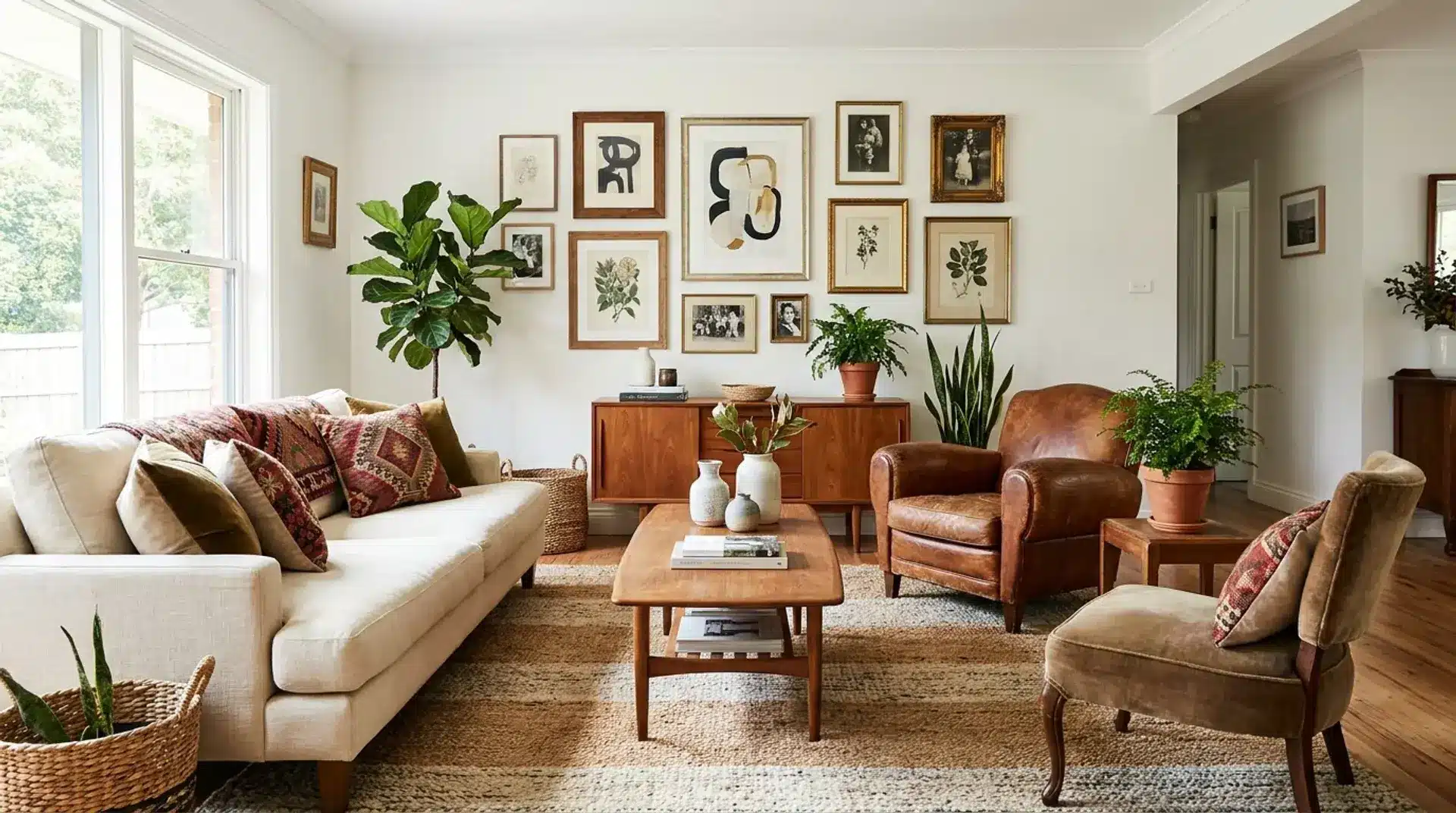
Eclectic interior design blends furniture, colors, textures, and influences from different styles and time periods to create a space that feels balanced, cohesive, and uniquely personal. Rather than following a single design trend, it combines carefully chosen elements that reflect your taste while maintaining harmony throughout the room. The result is a home with character instead of a perfectly matched showroom appearance. In this blog, you’ll learn what defines eclectic interior design, how it differs from bohemian and maximalist styles, and practical tips to incorporate it into your home. We’ll also explore simple, room-by-room ideas to help you achieve the look with confidence. What Is Eclectic Interior Design? Eclectic interior design is one of the most distinctive interior design styles, mixing pieces from different design periods, cultures, and aesthetics into one cohesive room. The word comes from the Greek term eklektikos, which means to select the best of everything rather than sticking to one rigid style. That single idea, selecting freely instead of following rules, is what makes eclectic decorating so popular right now. People are moving away from matched furniture sets. They want rooms that reflect years of collecting, travel, and personal taste rather than a single catalog order. That shift also explains why eclectic style pairs so well with thrifted and vintage finds. A room built this way rarely looks finished in one shopping trip. It grows slowly, piece by piece, as your taste and life change. Key Characteristics of Eclectic Style Design An eclectic room is never random, even though it might look that way at first glance. There is always a plan holding it together behind the mix. A neutral base with one or two accent colors: Walls and large furniture usually stay simple so bold pieces can stand out. Mixed furniture eras: A mid-century chair might sit beside a modern glass table, and that contrast is the point. Layered textures: Velvet, wood, wool, and metal often appear in the same room to add depth. Personal, meaningful objects: Travel finds, family pieces, and art on display give the space its story. Intentional curation: Every item earns its spot. Nothing sits there by accident, even if it looks casual. These traits work together, not separately. Remove the neutral base or the curation, and the room slides toward clutter instead of style. How to Achieve Eclectic Interior Design in Your Home Getting this look right takes a bit of planning, even though the finished room should feel effortless. Start small and build outward rather than buying everything at once. 1. Choose a core color palette first: Pick two or three colors to repeat across rugs, pillows, and accessories. This keeps the whole room feeling connected. 2. Pick one or two focal points: A bold piece of art or a statement chair gives the eye somewhere to land before it wanders to everything else. 3. Mix furniture eras on purpose: Pair an antique dresser with a modern lamp, or a Victorian chair with contemporary art. The contrast should feel deliberate, not accidental. 4. Layer textures with restraint: Combine two or three textures per room, such as wood, wool, and glass, instead of using every material you own. 5. Leave negative space: Empty wall or floor space gives the eye a rest and keeps a busy room from feeling cluttered. Start with large furniture and a neutral backdrop. Add one statement piece next, then layer in textiles, art, and smaller accessories over the course of weeks or months. Eclectic Interior Design Ideas by Room Eclectic interior design works best when each room balances contrast with cohesion. While the core principles remain the same, every space has its own purpose and styling needs. Here are practical ways to bring eclectic charm into different areas of your home. 1. Living Room A well-balanced eclectic living room combines different design eras through furniture, artwork, and accessories while maintaining a unified visual flow. Start with a neutral sofa as the foundation, then build character with layered accents. Add a bold area rug, a vintage coffee table, and a gallery wall featuring artwork in different frame styles and sizes. Mix textures through cushions, throws, and natural materials to create a space that feels inviting, curated, and visually balanced without looking overcrowded. 2. Bedroom An eclectic bedroom blends comfort with personal expression by mixing vintage finds, modern elements, and meaningful décor pieces. Keep the bed as the calming focal point by using simple, neutral bedding. Introduce personality with a patterned throw, mismatched bedside tables, and a statement artwork above the headboard. Layer soft lighting, textured fabrics, and decorative accents to make the room feel warm, comfortable, and thoughtfully collected while maintaining a restful atmosphere. 3. Dining Room An eclectic dining space allows different chair styles, finishes, and decorative elements to work together around a common theme. Create contrast by pairing a modern dining table with chairs from different styles or time periods. Unify the look with a shared color palette, similar upholstery, or coordinated table décor. A striking pendant light, textured rug, or eye-catching centerpiece can complete the space while keeping the overall design cohesive and welcoming. 4. Small Apartment Small, eclectic apartments benefit from thoughtful selections, with each piece of furniture adding function and personality. In compact spaces, focus on quality over quantity. Choose a few standout pieces, such as a statement chair or unique coffee table, instead of filling the room with many small accessories. Keep the color palette consistent, use multifunctional furniture, and add layers through textiles and artwork to create visual interest without making the space feel crowded. How to Design an Eclectic Style Interior on A Budget Creating an eclectic home does not require a large budget or expensive matching furniture sets. Among the many interior design styles, eclectic design stands out for its flexibility, allowing you to mix old and new pieces without following strict decorating rules. Shop Secondhand First: Thrift stores, estate sales, and online marketplaces are great places to find vintage furniture and unique decor pieces at lower prices. Older items often bring more character. Mix High and Low Price Points: Combine one investment piece, such as a statement light fixture or artwork, with budget-friendly cushions, prints, rugs, and accessories to create a stylish balance. Try Small DIY Updates: Refresh existing items with simple changes like new pillow covers, repainting an old dresser, or reframing thrifted artwork to give your room a fresh look. Buy Pieces Slowly: Eclectic spaces naturally develop over time, so there is no need to decorate everything at once. Add meaningful pieces gradually as you discover them. Explore Affordable Sources: Look for unique finds at estate sales, on Facebook Marketplace, at local thrift shops, and at flea markets. These places are ideal for discovering one-of-a-kind furniture. With thoughtful choices and patience, you can create a budget-friendly eclectic space that feels personal, layered, and full of character. Eclectic vs Bohemian vs Maximalist Interior Designs These three styles are often confused because they all mix patterns and reject strict rules. Feature Eclectic Bohemian Maximalist Color palette Neutral base, accent pops Bold, earthy tones Rich, saturated colors Furniture Mixed eras, curated Global, handmade pieces Ornate, statement pieces Structure Balanced, clean lines Organic, flowing Layered, dense Feel Curated art gallery Free-spirited, worldly Bold and abundant Eclectic design tends to feature a neutral color scheme, clean lines, and a few standout pieces. Bohemian style leans into bold, earthy colors, global textiles, and organic, flowing shapes with less structure. Maximalist design pushes further still, filling nearly every surface with pattern, color, and collected objects in a more-is-more approach. If you want a room that feels calm despite the mix, eclectic is the safer starting point. If you want warmth and global flavor, bohemian fits better. My Perspective on Eclectic Room Styling Eclectic style gives you so much freedom, but that doesn’t mean everything works together naturally. One common pitfall is creating too many focal points. When every corner has bold artwork, statement furniture, or eye-catching accessories, the room starts competing with itself, and nothing stands out. Another is skipping a unifying color or theme. Even when mixing styles, repeating colors, textures, or finishes helps the space feel curated rather than chaotic. Overcrowding is another trap. Filling every empty nook with furniture or decor diminishes the impact of each piece. Comfort and function matter too. Furniture that looks stunning but feels awkward or doesn’t suit your lifestyle disrupts the balance. Finally, mixing without intention can make the space feel random instead of thoughtfully layered. The good news is that most mistakes can be fixed without a full makeover. Remove unnecessary pieces, tweak the layout, or introduce a repeated color or texture, and your eclectic room instantly feels more harmonious and inviting. Final Thoughts Eclectic interior design allows you to create a home that feels personal, layered, and full of character by combining different eras, colors, textures, and meaningful pieces. The key is finding balance through a cohesive color palette, thoughtful placement, and a mix of elements that work together rather than compete. This style is not about filling a room with random decor, but about creating a space that reflects your personality and experiences. Whether you are updating a single room or designing an entire home, eclectic style encourages creativity, patience, and intentional choices that make your space feel uniquely yours. Have you tried mixing furniture styles in your own home? Share what worked, or what didn’t, in the comments below. Frequently Asked Questions What Makes A Room Look Eclectic? An eclectic room combines different styles, eras, colors, and textures while maintaining harmony through a shared theme, color palette, or design element. Is Eclectic Interior Design The Same As Bohemian Style? No, eclectic design focuses on a balanced mix of styles, while bohemian interiors usually emphasize layered patterns, natural elements, and a more relaxed, free-spirited look. How Do You Mix Different Furniture Styles In One Room? Combine contrasting furniture pieces by tying them together with similar colors, materials, shapes, or finishes to create a cohesive, intentional look. Can Eclectic Interior Design Work In Small Spaces? Yes, eclectic style works well in small homes when you choose fewer statement pieces, maintain visual balance, and avoid overcrowding the space.
Ever walked into a room and felt like it belonged to another era? I know the feeling; it’s frustrating when you want your home to feel classy and royal but end up stuck with mismatched furniture or bland walls. A Victorian house interior can solve that by blending heritage appeal with modern functionality. I’ve gathered practical ideas you can use to bring warmth, texture, and character into every room. You’ll see how to layer fabrics, choose complementary colors, and highlight architectural details so your space feels enduring yet livable. Understanding Victorian Interior Design The Victorian era, spanning 1837–1901, was a period of rapid industrial innovation and cultural refinement. Homes from this time reflected both personal taste and social status, with ornate details, handcrafted furniture, and intricate wallpapers that showcased exceptional craftsmanship. Each room was designed to impress and tell a story, blending functionality with artistry. Signature architectural elements such as high ceilings, bay windows, decorative cornices, wainscoting, and fireplaces form the foundation of a Victorian interior. These features create a sense of grandeur and set the tone for the overall design. They also provide structure for layering furniture, textiles, and decorative accents. If you live in a mansion or a smaller historic home, understanding these core elements helps you bring authentic period character into your space. Victorian Color Palettes and Materials Choosing the right colors, textiles, and wall treatments is key to capturing the rich, layered look of a Victorian house interior. Jewel tones, luxurious fabrics, and patterned walls create a sense of depth and elegance while allowing you to highlight architectural features and furniture. A deep jewel-toned green paint is a reliable way to anchor a feature wall without committing the whole room. Category Details Tips Jewel-Toned Schemes Deep, saturated hues like emerald green, burgundy, navy blue, and gold Use for feature walls, accent furniture, or statement pieces to add warmth and drama Textiles and Furniture Velvet, brocade, damask, lace; dark woods like mahogany and walnut Layer fabrics on upholstery, curtains, and cushions to create richness and texture Wallpaper and Wall Treatments Floral, damask, and toile patterns Consider an accent wall or full-room coverage, depending on the desired By thoughtfully combining these colors, fabrics, and wall treatments, you can craft a Victorian interior that feels luxurious, inviting, and authentic to the era while remaining functional for modern living. Room-by-Room Victorian Styling Layered lighting, color coordination, and clever use of architectural features allow you to maintain a lived-in feel while highlighting the distinctive characteristics of the Victorian era. 1. Entryways & Hallways Victorian entryways set the tone for your entire home. Highlight staircases, mantels, or stained-glass windows as visual focal points to draw attention to the era’s craftsmanship. Layered lighting, including pendant lights, wall sconces, or antique-inspired fixtures, ensures these spaces feel inviting and well-lit, enhancing the architectural details. Paint balustrades or dado rails in complementary or contrasting colors to define space and add visual interest. Consider adding a small runner rug with intricate patterns to guide guests’ eyes through the hallway, and incorporate a console table with curated accents to create warmth and personality as soon as they enter. 2. Living Rooms Victorian living rooms combine elegance with comfort through carefully layered furniture and textiles. Use tufted settees, velvet armchairs, and clawfoot tables to anchor the space and create conversation areas. Layer Persian rugs, drapes, and fringed lampshades to add richness and texture. Statement art, mirrors, and antique collectibles enhance visual interest while reflecting personal style. Balance ornate pieces with simpler, modern items to prevent overcrowding, and consider window seating or a small reading nook to make the most of natural light. Accessories like decorative pillows or throws can introduce color contrasts and patterns that bring the room together cohesively. 3. Bedrooms Victorian bedrooms are intimate retreats designed to feel both luxurious and personal. Layer quilts, embroidered pillows, and plush throws on beds to create a cozy yet sophisticated look. Custom built-in wardrobes and alcove storage allow you to maintain functionality without sacrificing style. Consider incorporating period-appropriate lighting, such as bedside lamps with fringed shades or an overhead chandelier, to add ambiance. Adding small decorative details, such as an ornate mirror or a vintage dressing table, completes the look while keeping the room inviting and comfortable for daily living. 4. Kitchens Kitchens in Victorian homes balance elegance with functionality. Shaker-style or paneled cabinetry with brass or bronze hardware creates period-authentic charm, while parquet, mosaic, or tiled flooring adds texture, color, and visual interest. Layered lighting plays a key role, combining overhead fixtures with task lighting to brighten work areas while highlighting cabinetry and decorative elements. Open shelving or glass-front cabinets allow you to display fine china or vintage cookware. By carefully planning layout and storage, you can maintain a kitchen that feels spacious, luxurious, and historically inspired, without sacrificing modern usability. 5. Bathrooms Victorian bathrooms are designed to feel luxurious while remaining functional. Freestanding clawfoot tubs, bold backsplash tiles, or statement sinks serve as focal points, bringing both style and elegance to the space. Walls and floors often feature intricate patterns or rich jewel tones, adding visual depth and period authenticity. Vintage-inspired fixtures, such as brass taps, ornate mirrors, and sconces, enhance the historic character while meeting modern needs. If the room is on the smaller side, some small bathroom paint colors can keep the space feeling open even with a deep, patterned floor. Open shelving, built-in cabinets, or glass-front units provide practical storage and an opportunity to display decorative towels, toiletries, or collectibles. 6. Small Spaces Adaptations Adapting Victorian style to smaller rooms requires thoughtful scaling and layering. Use light wall colors to make spaces feel larger, mirrors to reflect light and add depth, and compact furniture to preserve flow. Layered textiles, such as small rugs, cushions, and throws, maintain warmth and richness without overcrowding. Built-in storage and cleverly placed shelving maximize functionality while maintaining historic charm. Focus on key architectural details like cornices, window trim, or fireplaces, and emphasize them with subtle accent colors or lighting. Even in smaller rooms, the right balance of color, texture, and proportion ensures that Victorian elegance shines through. Victorian Lighting and Ambiance Lighting in a Victorian home isn’t just functional; it sets the mood, highlights architectural features, and adds drama to every room. The right combination of fixtures can make your interiors feel warm, inviting, and authentically Victorian. Chandeliers: Central statement pieces for living rooms, dining areas, or grand halls. Wall Sconces: Highlight artwork, fireplaces, or corridors with ambient lighting. Table & Floor Lamps: Add soft, layered lighting for reading nooks and bedrooms. Candlelight Accents: Use candle holders or electric candles for subtle Victorian charm. Layering different light sources ensures a balanced, cozy atmosphere while accentuating furniture, fabrics, and architectural details. Victorian Substyles Explained The Victorian era produced several distinct substyles, each with its own personality. Knowing these substyles helps you choose the right fit for your space, whether that’s dramatic Gothic, refined Eastlake, or a mix of historical charm with modern livability. 1. Gothic Revival Interiors Gothic Revival brings a rich, moody, medieval-inspired style to your home, featuring dramatic pointed arches, cathedral-style windows, and detailed woodwork. This style adds depth, character, and an atmospheric sense of historic grandeur, creating spaces that feel intimate, dramatic, and full of period-inspired elegance. Architectural Features: Pointed arches, cathedral-style windows, and intricate woodwork. Furniture: Dark woods, carved chairs, and sturdy tables. Accents: Wrought iron fixtures, candle holders, and gothic lighting. Ideal Spaces: Libraries, studies, or reading nooks that benefit from intimate, dramatic character. Use Gothic Revival elements sparingly to prevent a space from feeling heavy, and layer with light textiles to maintain balance. 2. Eastlake & Aesthetic Movement The Eastlake Movement substyles emphasize refinement, artistic beauty, and subtle elegance over heavy ornamentation. With geometric furniture, clean lines, and nature-inspired motifs, these styles create balanced, harmonious interiors that feel polished, sophisticated, and thoughtfully curated, allowing furniture and decorative elements to stand out without overwhelming the space. Furniture: Geometric, simple carvings, and clean lines. Motifs: Nature-inspired patterns, Asian influences, and subtle asymmetry. Décor: Art pieces, framed prints, and handcrafted accents. Ideal Spaces: Living rooms, parlors, and dining areas that benefit from sophisticated elegance. These styles emphasize harmony and proportion, letting furniture and décor speak for themselves without overcrowding the room. 3. Blending Modern Elements Modern Victorian design lets you enjoy the classic character of historic interiors while creating functional, livable spaces for today. By blending period features like chandeliers, clawfoot tubs, and detailed woodwork with contemporary furniture, open layouts, and modern finishes, this style achieves a balanced, practical, and visually cohesive home environment. Integrate Fixtures: Chandeliers, clawfoot tubs, or statement lighting with contemporary furniture. Open Layouts: Combine smaller rooms into larger, airy spaces while retaining period details. Color & Texture: Balance jewel tones or rich fabrics with neutral walls and modern materials. Functionality: Incorporate storage solutions, modern appliances, and lighting that complement the Victorian style. Blending modern and historic elements ensures your home feels authentic, practical, and visually cohesive without losing Victorian character. Quick Victorian Substyle Comparison Here’s a simple table to quickly compare the main Victorian substyles, their key features, and the rooms where they work best: Substyle Key Features Ideal Rooms Gothic Revival Pointed arches, dark woods, wrought iron Library, study, reading nook Eastlake Geometric furniture, subtle carvings, nature motifs Living room, dining room Aesthetic Movement Asymmetry, art-focused, Asian motifs Hallways, parlors, and feature rooms This quick reference helps you identify which substyle best fits each area of your home, making it easier to mix or stick to a particular Victorian feel. Outdoor Victorian Design Inspiration Victorian charm isn’t limited to interiors; it can extend beautifully to porches, verandas, and gardens, creating a cohesive look throughout your property. Wraparound porches with carved-wood railings and turned posts add character, while wrought-iron benches or vintage-inspired seating provide inviting outdoor spaces. Terracotta planters, climbing vines, and carefully arranged flower beds bring greenery and texture that complement Victorian interiors, much like what you’ll find in many French cottage ideas, where the same layered, garden-forward approach shows up. Lighting is also key; lantern-style sconces or post lights echo the elegance of indoor fixtures and highlight architectural features. Decorative touches like fountains, statues, or trellises provide visual interest, giving your outdoor areas the same historic elegance and timeless appeal as your interior design. Little-Known Victorian Design Details Before stepping inside to look at colors and fabrics, here are a few surprising details about Victorian design that shaped nearly every room in these grand houses: Good Parlors: Many homes kept a formal parlor reserved for guests, while everyday family life took place in a separate back room. Arsenic Green Wallpaper: Some wallpaper patterns used arsenic-based dye to achieve a vivid emerald shade, despite known health risks at the time. Sunset Windows: Staircase landings often included a small stained-glass window placed to catch colored light at a specific time of day. Hidden Servant Stairs: Narrow back staircases and corridors let household staff move through the home without crossing paths with the family. Tall Mantels: Fireplace mantels were often built above average eye level to showcase imported marble or hand-carved wood detailing. Layered Curtains: Sheer panels against the glass paired with heavy drapes on top gave homeowners control over both light and drafts. These small details show how much thought went into daily life behind Victorian walls, and knowing them makes it easier to pick colors and materials that feel true to the period. Victorian Décor Mistakes to Avoid Even with the best intentions, it’s easy to make design mistakes when decorating a Victorian home. Use this table to identify common pitfalls and practical ways to fix them, keeping your interiors stylish and authentic. Mistake Why It Happens How to Fix It Overcrowding Rooms Victorian style can tempt you to fill every space with furniture and décor. Focus on key statement pieces and leave breathing space. Layer textiles instead of furniture. Mismatched Styles Mixing modern furniture or contemporary colors without cohesion. Balance modern elements with Victorian accents; use a consistent color palette. Heavy Color Misuse Using jewel tones on every wall or surface can overwhelm the space. Reserve bold colors for feature walls, furniture, or accents; pair with neutrals. Ignoring Architectural Details Not highlighting cornices, bay windows, or fireplaces does not lose historic character. Use lighting, paint, or furniture placement to draw attention to key features. Cluttered Accessories Displaying too many small decorative items can feel messy. Select meaningful collectibles, rotate displays, and group items strategically. Following these guidelines helps maintain the elegance and authenticity of your Victorian interiors while avoiding common design missteps. Frequently Asked Questions Can Victorian interiors work with eco-friendly materials? Yes. You can choose sustainably sourced wood, recycled fabrics, and low-VOC paints. Maintaining the Victorian style doesn’t require only traditional materials; eco-conscious alternatives can replicate textures and finishes while reducing environmental impact. How do I maintain antique furniture in a Victorian home? Regular dusting, gentle polishing, and avoiding direct sunlight preserve antique pieces. Use protective pads under objects and maintain stable humidity to prevent wood from cracking or warping, ensuring your furniture stays beautiful for decades. What flooring options suit a Victorian interior besides wood? Patterned tiles, encaustic cement, and luxury vinyl planks that mimic historic designs work well. Layering rugs over these floors can add warmth and texture while maintaining a period-appropriate Victorian feel. How can I introduce color without overpowering a Victorian room? Use accent pieces like pillows, throws, or artwork to introduce pops of color. Feature walls or small furniture items in jewel tones allow vibrancy without overwhelming ornate architectural details or rich textiles. Are Victorian interiors suitable for pet-friendly homes? Yes, with some planning. Choose durable fabrics like velvet blends or patterned rugs, protect wood surfaces with pads, and select furniture that balances elegance with practicality to accommodate pets safely. Does Victorian style work in a small apartment? Yes, if you scale it down. Stick to one or two statement pieces, keep wall colors lighter, and save the boldest jewel tones for accents rather than full rooms, so the space still feels open. Final Reflections A Victorian house interior comes together through layering, not addition. If you only take one thing from this guide, let it be the small-space lesson: light walls, a mirror placed to catch the window, and one or two architectural details picked out in color will read as Victorian far more convincingly than filling every surface with them. Start with a single room and a single architectural feature, whether it’s a fireplace, a bay window, or a run of cornice, and build the color and textiles around that one thing before you touch anything else. Drop a comment below and tell me if you are a big fan of Gothic or Classic Victorian.
A room can have nice furniture and still feel wrong. Sometimes the sofa blocks the path. Sometimes the bed takes over the whole space. Sometimes a long room feels like a hallway with chairs. That is why room layout ideas matter before color, wall art, or new furniture. I like starting with the way the room needs to work each day, because that makes every choice easier. Your dream room should feel comfortable, useful, and easy to move through. Once the purpose is clear, you can place the largest pieces first, fix awkward corners, and build a room that feels good from the moment you walk in. I also keep comfort first. Let the Room’s Daily Job Decide the Layout Before moving anything, decide what the room needs to do most often. A living room for movies needs a different setup than one made for guests. A bedroom with a desk needs a clear sleep area and a separate work spot. A kids’ room needs open floor space. A gaming room needs screen comfort, cable control, and chair space. Write down the top three uses of the room. Keep the list simple. For example, your bedroom may need to support sleep, study, and storage. Your living room may need space for a TV, guests, and reading. Once you know this, the layout stops feeling random. Start with the biggest piece. In a living room, that is usually the sofa. In a bedroom, the bed is the focus. In a study room, the desk is. Place that item first, then add smaller pieces around it. Measure the Space Before Moving Furniture A good layout starts with real numbers. Guessing can lead to blocked doors, tight corners, and furniture that feels too large. Measure the room before you move heavy items or buy anything new. Measure: Each wall Doors and door swings Windows Closets Outlets Radiators Built-ins Main furniture pieces Take photos from each corner. This helps you see what the room looks like from different points. You can also use painter’s tape on the floor to mark where a sofa, bed, desk, or table might go. If the taped shape feels too tight, the furniture will likely feel too tight, too. How to Do a Living Room Layout Makeover Step by Step A cluttered, badly laid out living room is usually a sequence problem, not a furniture problem, since most people move one piece at a time instead of starting clean. Clear the room first, sort what stays and what goes, and measure the empty space before anything comes back in. From there, follow these steps. Identify the main walking path: Map the route from the entry to the sofa, TV, or exit, and keep it at least 30 to 36 inches wide. Pick one focal point: Choose the fireplace, TV, window, or largest wall, and build everything else around that single point. Place the largest piece first: Position the sofa or sectional relative to the focal point before anything else goes back. Tape out the footprint. Mark the sofa and coffee table positions with painter’s tape, then walk through them before moving the real furniture. Add secondary seating and the coffee table: Angle the chairs toward the focal point, and leave about 18 inches between the sofa and the table. Reintroduce storage and lighting with a purpose: Bring back only pieces that solve a clutter problem you noticed earlier, and add a lamp beyond the main ceiling light. Size the rug and do a final walk-through: Choose a rug large enough for the front legs of the furniture to sit on, then walk the room as you would on a normal day, adjusting one piece at a time. This takes longer than rearranging piece by piece, but it’s the difference between a living room that looks fine in photos and one that holds up to daily use. Room Layout Ideas for Every Space The best layouts start with how a room is used each day. These room layout ideas can help create better flow, improve comfort, and make every square foot work harder. 1. Balanced Seating Layout Best for: Square or medium living rooms This layout works well for square or medium-sized living rooms. Place a sofa across from two chairs, then add a coffee table in the center. Use side tables near the seats so people have a place for drinks, books, or lamps. This setup feels calm because both sides of the room carry similar weight. It is also great for talking with family or guests. If the room feels too formal, soften it with a round table, a textured rug, or chairs angled slightly inward. 2. TV-Focused Layout Best for: Family rooms, TV rooms, and casual living rooms A TV-focused setup is best for movie nights, weekend lounging, and daily family use. Place the sofa across from the TV, then angle extra chairs toward the screen. Keep the screen away from harsh window glare if you can. Leave a clear path beside or behind the seating. This keeps people from walking between the sofa and the screen all the time. Add closed media storage if remotes, wires, games, or chargers make the wall feel messy. 3. Conversation Layout Best for: Guest-friendly living rooms and no-TV sitting rooms If your room is mostly for guests, arrange seats so people face each other. A sofa with two chairs works well. Four chairs around a central table can also feel warm and relaxed. Keep the table close enough for everyone to reach. Add lamps near the seating, not just one ceiling light. This layout works best when the TV is not the main feature. It helps the room feel more personal and less like a waiting area. 4. Fireplace Layout Best for: Living rooms with a fireplace. A fireplace can make furniture placement easier because it already gives the room a strong center, though it’s easy to get wrong. This awkward living room layout with a fireplace breakdown shows a few common ways that happen. Place the sofa facing or angled toward it. Add chairs on either side to create a comfortable group. If the TV is also in the room, place it beside the fireplace if the wall allows it. Mounting it above the fireplace can work, but only when the height feels comfortable. A rug under the seating area helps the group feel connected. 5. Window-Facing Layout Best for: Rooms with large windows, views, or window nooks If your room has a large window or a nice view, use it as the main feature. Face the seating toward the window instead of hiding it behind furniture. Keep bulky pieces away from the glass so natural light can enter the room. A window nook can become a small reading spot with a chair, bench, lamp, and small table. Low storage works well under a window because it keeps the wall useful without making the room feel heavy. 6. Open-Center Small Room Layout Best for: Small living rooms, small bedrooms, and rental rooms Small rooms often feel better when the center stays open. Place larger furniture along the cleanest walls and keep the main path clear. Choose fewer pieces instead of filling every corner. Furniture with legs can make the floor look more open. Wall shelves, slim tables, and nesting tables also help. A mirror near natural light can make the room feel brighter. The key is to give your eyes and feet a clear path. 7. Corner Seating Layout Best for: Small rooms, studio corners, and compact bedrooms A corner layout is useful when the room has limited floor space. Place a chair, small sofa, desk, or reading seat in a corner, then build around it. This frees the middle of the room for movement. Use a floor lamp, a corner shelf, or a small side table to make the corner more useful. Avoid oversized pieces that block the path. This works well in small bedrooms, studio rooms, and compact living rooms. 8. Storage-First Layout Best for: Bedrooms, kids’ rooms, and busy living rooms If a room always feels messy, plan storage before styling. Think about what lands on the floor, bed, sofa, or desk every day. Then place storage near that exact spot. Use closed cabinets, storage beds, baskets, benches, and wall shelves. In a bedroom, under-bed drawers can hold extra bedding or clothes. In a living room, a storage ottoman can hide throws, remotes, and games. A tidy layout feels easier to enjoy. 9. Two-Zone Long Room Layout Best for: Long living rooms, long bedrooms, and open-plan spaces. Long rooms can feel awkward when all the furniture is lined up. If the room is also long and rectangular with a TV involved, a simple understanding of a long rectangular living room layout with a TV can walk through a few zoning options in more detail. Break the space into two zones instead. One end can be for seating, and the other can be for reading, work, play, or dining. Use rugs to mark each zone. Keep the walking path clear from one end to the other. Avoid placing every item against the same wall. This gives the room shape and keeps it from feeling like a hallway. 10. Across-the-Width Narrow Layout Best for: Narrow living rooms and tight rectangular rooms A narrow room needs furniture that works across the width, not only along the length. Place a sofa or pair of chairs across the shorter side when possible. This helps stop the tunnel effect. Choose slim arms, open legs, and smaller tables. Round or oval tables are easier to move around than sharp corners. Wall lights can also save floor space when floor lamps make the room feel tight. 11. Bed-as-the-Focus Bedroom Layout Best for: Main bedrooms and guest bedrooms Most bedrooms work best when the bed is the main feature. Place it on the strongest full wall, ideally where it does not block windows, closets, or doors. Leave space on both sides if the room allows it. Add nightstands, lamps, and a rug to complete the bed area. If one side is tighter, use a wall shelf instead of a full nightstand. This gives the bedroom a clear starting point. 12. Small Bedroom Layout Best for: Small bedrooms, student rooms, and rental rooms In a small bedroom, place the bed along the longest wall or in the position that leaves the clearest path to the door and closet. Two nightstands are nice, but one can work if space is tight. Use wall shelves instead of large dressers when possible. Add under-bed storage for items you do not need every day. Keep the floor as open as you can. Soft lamps can make a small room feel calmer at night. 13. Study and Sleep Layout Best for: Teen rooms, student rooms, and work-from-home bedrooms A bedroom that also works as a study space needs clear zones. Place the bed in the calmest part of the room. Put the desk near natural light if possible, but avoid glare on the screen. Use a small shelf, rug, or lamp to separate the desk from the bed. Keep books, chargers, and work items close to the desk so they do not spread across the room. This helps the room feel less busy. 14. Teen Dream Room Layout Best for: Teen bedrooms and personal rooms A teen room often needs space for sleep, study, storage, and personal space. Start with the bed, then add a desk, storage, and a chill corner if space allows. Use shelves for books, photos, sports items, crafts, or collectibles. Add soft lighting near the bed and desk. Keep storage simple so cleaning does not feel hard. Bedding, posters, lamps, and a carpet or rug can change the room without a full makeover. 15. Gaming Room Layout Best for: Gaming bedrooms, hobby rooms, and media rooms A gaming room needs comfort and order. Place the desk where screen glare is low. Leave enough space for the chair to move back without hitting the bed, wall, or storage unit. Keep cables grouped with clips, sleeves, or a cable box. Use shelves for consoles, headphones, books, and collectibles. Add lighting behind the screen or near shelves, but keep it easy on the eyes. Comfort matters more than filling the room. 16. Cozy Reading Corner Layout Best for: Bedroom corners, living room corners, and window spots Even a small corner can become a quiet reading spot. Use a comfortable chair, a small table, a lamp, and a shelf. Place it near a window if the light is good. Add a soft rug or throw if the space feels bare. Keep the setup simple. A reading corner should not need much furniture. It just needs a clear purpose and a place to sit without distractions, and browsing reading nook ideas can help narrow down a layout that fits the space. 17. Flexible Multi-Use Layout Best for: Studio apartments, guest rooms, and shared rooms Shared rooms, guest rooms, studio apartments, and small homes need flexible zones. Use rugs, shelves, curtains, or lighting to separate each area without adding walls. Choose furniture that can do more than one job. A daybed can work for seating and sleep. A foldable desk can save space. A storage bench can hold items and offer extra seating. Keep the main walking path open so the room still feels easy to use. Room Rules and Layout Tests Before moving furniture, use these quick rules to check if the layout will feel comfortable and easy to use. Rule Quick Use Main walkways Keep 30 to 36 inches clear Sofa to coffee table Leave about 18 inches Bedside space Keep 24 inches if possible Desk chair space Leave 30 inches or more Dining chair space Keep about 36 inches for pull-out Rug size Place the front furniture legs on the rug Painter’s tape Mark the furniture size before moving pieces Paper sketch Map doors, windows, outlets, and furniture Free room planner Test layouts in 2D or 3D These small checks can help you spot layout problems before you lift, shift, or buy anything new. Common Mistakes to Avoid Before choosing any layout, check these common mistakes so the room does not feel cramped, blocked, or hard to use. Buying furniture before measuring the room Blocking doors, windows, closets, or outlets Pushing every furniture piece against the wall Using too many items in a small space Choosing a rug that is too small for the seating area Ignoring storage needs for everyday items Creating narrow or awkward walking paths The best layouts feel easy to walk through, sit in, clean, and use. Frequently Asked Questions What if a door opens into the furniture? Move the largest piece away from the door swing first. If that is not possible, use slimmer furniture near the entry. The door should open fully without hitting a chair, table, bed, or storage unit. How do I place furniture around a radiator? Keep fabric, wood, and storage pieces away from direct heat. Use the radiator wall for low decor only if airflow stays open. A nearby chair can work, but avoid blocking heat from entering the room. What if outlets are in the wrong spot? Use cord covers, cable clips, or a floor outlet cover to keep wires safer and neater. Do not stretch cords across walkways. If a desk or TV needs power, place it near the safest outlet. How can renters test changes without damage? Use painter’s tape, removable hooks, freestanding shelves, and plug-in lights. Test furniture positions before buying anything large. For wall decor, choose light pieces and renter-safe strips that remove cleanly when used correctly. What should I do with an off-center window? Balance the wall with furniture rather than forcing perfect symmetry. A chair, plant, lamp, or narrow shelf can fill the empty side. Keep the window clear enough for light, curtains, and daily use. Final Thoughts The best room layout ideas make your space easier to live in, not just nicer to look at. Start with the room’s main job, measure the walls, choose one clear focal point, and move the largest piece first. I always think a room feels better when every item has a reason to be there. Your dream room does not need to be costly or full of new furniture. It needs comfort, clear paths, useful storage, and details that feel like you. Try one change today, such as moving a chair, testing a rug spot, or clearing a walkway, then adjust until the room feels right. Start small and notice the difference. Drop a comment below and let me know how your layout turned out.
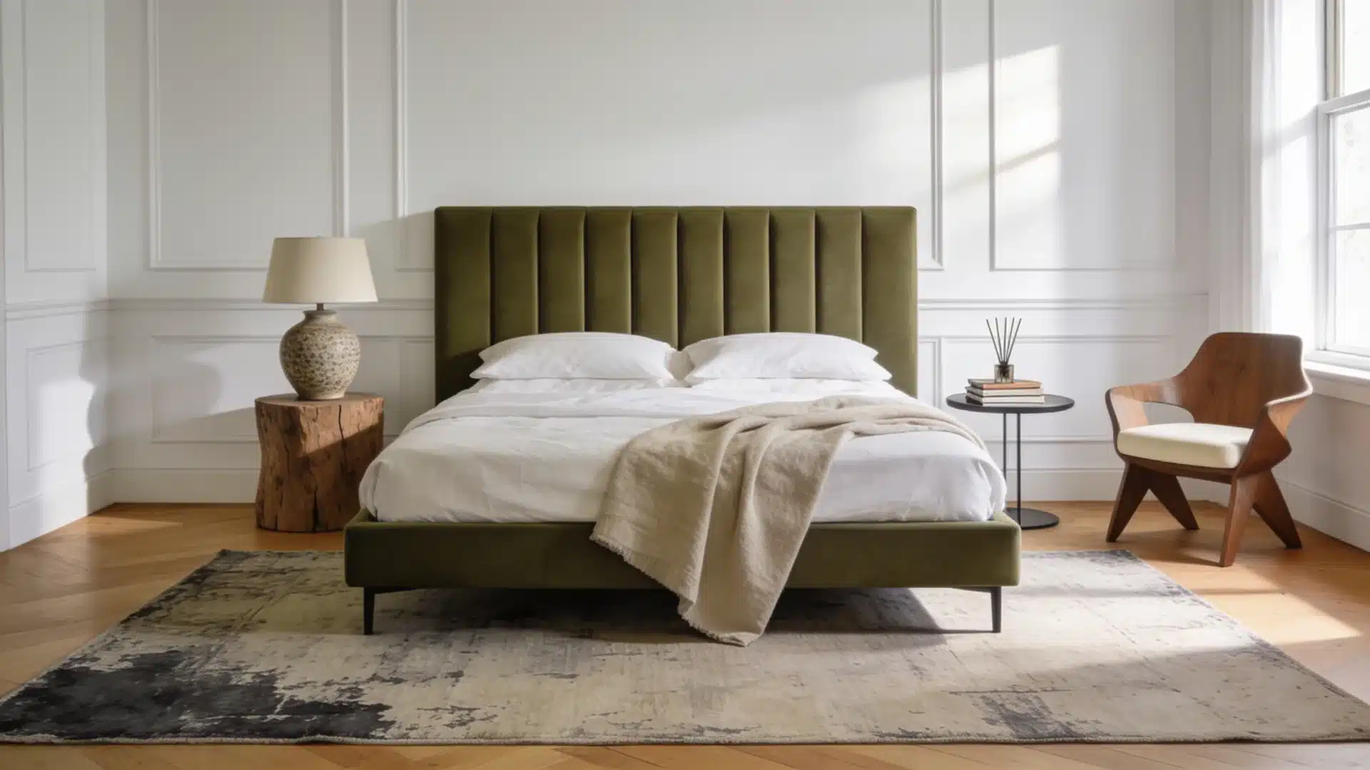
Ever stepped out of bed onto a floor that felt more like sandpaper than a cozy sanctuary? Finding the best carpet for bedrooms involves much more than just picking the softest sample in the showroom. You need something that handles bare feet, resists stains, and won’t flatten out in a year. I have broken down exactly how to match carpet construction and fibers to your actual daily routine. You will find how to evaluate pile heights, choose the right padding, and avoid costly installation mistakes. By the end, you can confidently select a durable, comfortable floor that fits your budget perfectly. Key Qualities of a Bedroom Carpet If you are shopping for the best carpet for bedrooms, softness is the starting point, not the finish line. The bedroom is a low-traffic room, which gives you flexibility that hallways and living rooms don’t. But low traffic doesn’t mean no demand. You still need a carpet that holds up to bare feet every morning, resists allergen buildup, and looks presentable years from now without a full replacement. Room Type Primary bedroom, guest room, kids’ room, or shared space Key Priorities Softness, noise reduction, easy cleaning, durability Best Fiber Nylon (durability), triexta (stain resistance + softness), polyester (budget), wool (premium) Pile Height Medium (most rooms); low (allergies, easy clean); high (primary bedroom comfort) Recommended Padding 7/16-inch rebond or 8 lb density for best support and feel Once you know how your bedroom is actually used, who sleeps there, whether pets come in, and how often you vacuum, the choice between carpet types becomes much more straightforward. Here’s how to match what you need to what the market offers. What to Know Before Comparing Carpet Types for Bedrooms Before comparing plush against textured or nylon against triexta, think about how the bedroom functions day-to-day. A quiet primary bedroom tolerates a softer, thicker pile that would flatten quickly in a high-traffic hallway. A kids’ room, guest room, or bedroom that doubles as a workspace needs something that can withstand more use and clean faster. Also, consider pets, allergies, the direction the room faces, furniture weight, and how often you actually vacuum in your house. Carpet padding matters more than most buyers realize; the right pad changes how a carpet feels underfoot and directly affects how long it lasts. Budget the full picture: carpet material, pad, removal of the old floor, and installation. Skipping any of those line items leads to surprises at the end of the project. Best Carpet Types for Bedrooms Choosing the right bedroom carpet involves more than how a sample feels in the showroom. The carpet type, meaning the construction style, fiber, and pile height, determines what the floor feels like after two years of daily use, not just the day it’s installed. Here’s what each option actually gives you. 1. Plush Carpet Material: Nylon, polyester, or wool Plush carpet has a smooth, dense surface that gets cut to an even height across the whole floor. The result is a velvety feel that works well in traditional, modern, and more formal bedroom designs. The fibers create a warm, cushioned surface that makes getting out of bed more bearable on cold mornings. It performs best in primary and master bedrooms where foot traffic stays light, and comfort is the main job. The trade-off is visibility; plush carpet shows footprints and vacuum lines more readily than textured styles, which bothers some people and doesn’t bother others. Homeowners who want a consistently soft, finished-looking floor and don’t mind a weekly vacuum pass to keep it neat tend to stay happy with plush long-term. 2. Saxony Carpet Material: Nylon, polyester, or wool blends Saxony carpet features upright, dense fibers that give the floor a polished, formal look. It’s a step above plush in refinement and suits guest bedrooms and primary suites where style matters alongside comfort. The thick pile creates a soft, cushioned surface that genuinely feels different underfoot than a mid-grade option. It adds warmth and absorbs sound well, which matters more in bedrooms directly above living spaces. Like plush, the upright fibers will show footprints, but many people appreciate the freshly vacuumed look that it creates. For a bedroom designed to feel welcoming and visually composed, Saxony reliably delivers both. 3. Frieze Carpet Material: Nylon, polyester, or triexta Frieze carpet uses tightly twisted fibers that curl at the tips rather than standing straight up. That curl is what makes it practical, footprints don’t register the way they do on plush, and everyday dirt and wear get hidden in the texture. This makes frieze a strong choice for kids’ bedrooms, teen rooms, and any space that gets more foot traffic than a typical primary bedroom. It still feels soft underfoot, but it holds its appearance longer than looser pile styles under real daily use. For homeowners who want comfort without the visual maintenance that plush requires, frieze tends to be the better long-term call. 4. Textured Carpet Material: Nylon, polyester, or triexta Textured carpet uses fibers cut at slightly different heights, which creates a multi-directional surface that resists showing marks. It’s the most versatile option in the lineup, comfortable enough for a primary bedroom, durable enough for a shared space, and visually flexible enough to work with most bedroom decor. Footprints, vacuum lines, and minor wear don’t register the way they do on plush or Saxony. That practical advantage makes textured carpet a reliable default for family bedrooms, shared kids’ rooms, or any space where appearance needs to stay consistent without constant maintenance. If you can only choose one style that works across multiple bedroom types in your home, textured carpet is the most defensible pick. 5. Low-Pile Carpet Material: Nylon, polyester, wool, or olefin Low-pile carpet has shorter fibers, typically under half an inch, that sit close to the backing. It’s not as cushioned as plush or Saxony, but it’s considerably easier to clean and less likely to trap dust, pet hair, and allergens deep in the pile. That cleaning advantage is the reason allergy-conscious households and pet owners often reach for low-pile first. It’s also a good fit in smaller bedrooms where a thicker carpet would make the room feel heavier and more closed in. The look is clean and understated, which works particularly well with modern and minimalist bedroom layouts. If easy maintenance matters more than maximum softness, low-pile gives you a floor that earns its place practically. With the five main carpet types covered, the next step is matching the right one to how your specific bedroom is actually used. How to Choose the Best Carpet for Bedrooms in Your Home Choosing bedroom carpet gets easier when you match it to the room’s real conditions rather than the softest sample on the rack. Here’s what actually drives the decision. Room Use: Choose softer, thicker carpet for quiet primary bedrooms. Use more durable options for kids’ rooms, guest rooms, or bedrooms that double as workspaces. Fiber Type: Nylon holds up best under wear. Triexta handles stains with built-in resistance and feels soft without requiring a high pile. Polyester works well on a tighter budget. Wool is the premium natural option with real long-term durability. Pile Height: Plush and Saxony maximize comfort. Textured and frieze handle daily use without showing wear. Low-pile keeps cleaning simple. Carpet Padding: Quality padding changes everything; it affects how soft the floor feels, how much sound it absorbs, and how long the carpet lasts. A 7/16-inch rebond pad at 8 lb density is a reliable starting point for most bedrooms. Color Choice: Warm neutrals, greige, taupe, beige, soft brown, hold up across changing decor and don’t show daily wear the way pale or very dark colors do. If you’re still working out the room’s palette, bedroom colors that feel cozy are worth settling before you commit to carpet. Common Mistakes to Avoid When Choosing Bedroom Carpet These are the decisions that look fine in the store and cause regret six months later. Mistake Why It Causes Problems Better Choice Choosing only by softness Soft carpet flattens quickly when the fiber quality is poor, regardless of how new it feels. Balance softness with fiber density and face weight. Skipping quality padding Poor padding makes even good carpet feel thin and shortens its lifespan significantly. Budget for supportive 8 lb rebond padding. Picking very light colors Pale carpet shows stains, dust, and daily marks much faster than medium tones. Use soft neutrals or medium warm tones. Choosing a high pile for messy rooms Thick fibers trap dust, crumbs, and pet hair in ways that short vacuuming passes can’t clear. Use textured, frieze, or low-pile carpet in active rooms. Skipping home samples Showroom lighting changes how carpet color reads, significantly. Test samples in your bedroom under its actual light. Forgetting cleaning needs Some carpets need more frequent vacuuming and spot cleaning than the buyer planned for. Match carpet type to your actual cleaning routine. Avoiding these six mistakes is often the difference between a floor that still looks right five years in and one that needs replacing before it should. These are the questions that come up most often once someone has a sample on the floor and a decision to make. Frequently Asked Questions Will ultra-soft carpets require a special vacuum cleaner? Yes. High-end, ultra-soft carpets (often made with specialized micro-fibers like Caress or Tactesse) are packed so densely that standard heavy vacuums create a tight suction seal against the floor. This makes the vacuum incredibly hard to push and can actually tear out the fine fibers. If you choose an ultra-soft pile, you will need a vacuum with adjustable height settings and vented hulls that allow airflow to bypass the seal. How do I minimize visible seams in a large primary bedroom? Carpet rolls standardly come in 12-foot and 15-foot widths. If your bedroom is larger than these dimensions, seams are inevitable. To keep them hidden: Ensure the installation crew runs the seams parallel to the natural light entering from your primary windows rather than perpendicular to it. Avoid placing seams right at the foot of the bed or directly in the center of high-visibility walking paths. What is “carpet off-gassing,” and how do I prevent it in a sleeping environment? New carpets and paddings can release volatile organic compounds (VOCs) for the first 24 to 72 hours after installation, often causing that distinct “new carpet smell.” If you have respiratory sensitivities, look for carpets tested and labeled with the Carpet and Rug Institute’s Green Label Plus certification. To stay comfortable, plan to ventilate the bedroom with open windows and a fan for at least 48 hours before sleeping in the room. Can I install thick bedroom carpet over radiant floor heating systems? You can, but you have to check the R-value (thermal resistance). Thicker carpets combined with heavy rebond foam padding act as an insulator, blocking the heat from rising into your room efficiently. For radiant heating, keep the combined R-value of your carpet and padding under 2.5. This typically means choosing a low-to-medium pile cut with a thin, dense rubber or felt pad instead of thick foam. Why do some bedroom carpets split or fray right at the doorway? Fraying at the threshold usually happens when installers skip a proper transition strip. The transition between your bedroom carpet and the hallway floor (hardwood, tile, or another carpet) takes the brunt of daily pivoting feet. Ensure your installer uses a solid metal binder bar, Z-bar, or a hidden tack strip transition rather than just cutting the edges flush and tucking them down. Final Thoughts Your bedroom floor should be a comfortable, lasting investment rather than a source of future maintenance regret. I want to ensure you remember that balancing plush softness with the right fiber density, correct pile height, and thick padding makes all the difference over time. Matching your material choices to your actual cleaning habits, family pets, and specific room traffic prevents premature wear and costly early replacements. Armed with these practical insights, you are fully ready to select the best carpet for bedrooms without falling for deceptive showroom tricks. Which carpet style do you think will work best for your home layout? Share your thoughts in the comments below, or check out my related flooring blogs today.
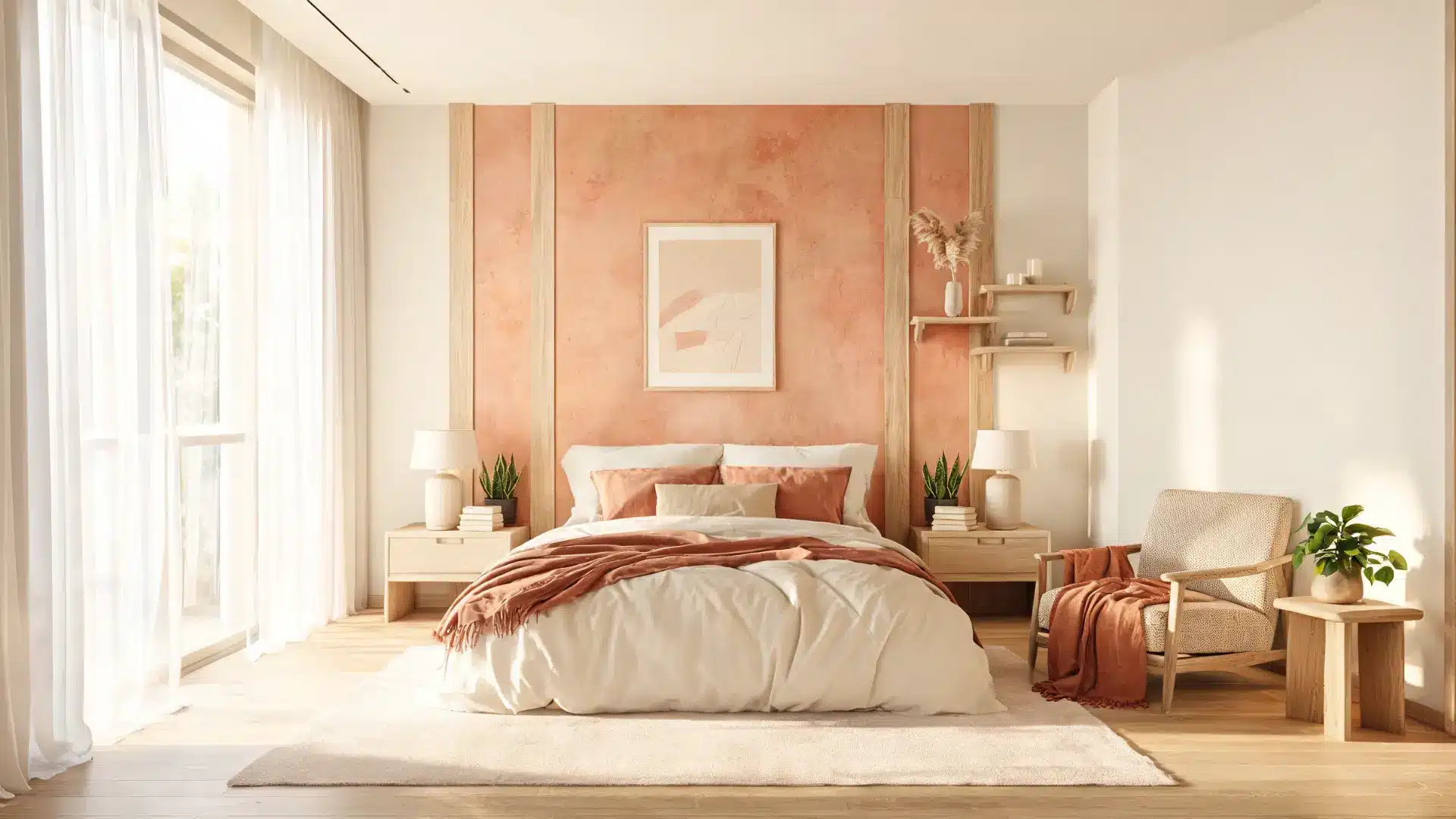
Accent walls can make a room feel stylish or leave it looking tied to an older trend. When I first look at a space, I always think about whether that one wall actually has a purpose or if it’s just filling an empty spot. If you’re asking whether accent walls are out of style, it usually comes down to wanting clarity before choosing a bold paint color. The idea still works, but only when it fits the room properly. A random wall, harsh shade, or flat finish can make a space feel unfinished. A better approach is to highlight something meaningful, such as a bed, fireplace, shelving, or dining area, while keeping everything connected to the rest of the room Are Accent Walls Out of Style? No, accent walls are not out of style. Basic painted accent walls can feel dated when the color is too harsh, the placement feels random, or the wall does not connect with the rest of the room. However, a well-planned accent wall can still look current when it highlights a clear focal point and supports the overall design. A bedroom accent wall, for example, can work well behind the bed because it gives the room structure and helps frame the main furniture piece. Accent walls also feel more updated when they include texture, soft contrast, trim, wallpaper, or a color already used in the space. The goal is not to create one loud wall, but to make the room feel more balanced, finished, and intentional. Room-by-Room Guide for Accent Wall Placement Accent wall placement matters more than the color itself. The right wall should support the way the room is used and help the eye land in a natural place. A random side wall can make the space feel uneven, even if the color is beautiful. Before choosing a wall, look at the room’s main furniture, lighting, and entry point. Ask what the wall is supposed to frame or improve. In some spaces, the answer is clear, such as the wall behind a bed or a fireplace. In others, a softer update, such as wallpaper, trim, or built-ins, may work better than paint alone. 1. Bedroom In a bedroom, the best accent wall is usually the wall behind the bed. This placement frames the bed, grounds it, and gives the room a clear focal point. A dark paint color, soft wallpaper, wood trim, or paneling can all work well here. Avoid choosing a side wall just because it is blank. That can pull attention away from the bed and make the layout feel awkward. Keep bedding, curtains, and decor connected to the wall color. If you’re working through bedroom paint colors that feel cozy, the accent wall choice and the overall palette need to be decided together, not separately. 2. Living Room In a living room, the accent wall should support the main seating area. The best choice is often the fireplace wall, media wall, or the wall behind built-in shelves. This helps the room feel centered and makes furniture placement easier. Avoid painting a random wall behind a sofa if it does not connect to the layout. The color or texture should also work with the rug, sofa, art, and lighting. A living room accent wall looks best when it feels layered, and if the fireplace is the focal point, fireplace accent wall ideas are worth looking at before you commit to paint alone. 3. Dining Room A dining room can handle a stronger accent wall because the space is often used for mood and gathering. The best wall is usually the one behind the dining table, sideboard, or main view from the entry. Wallpaper, limewash, deep paint, or picture-frame molding can make the room feel more finished. Avoid tiny, busy patterns on a large wall because they can feel cluttered. The accent should make the table area feel more intentional, not distract from it. 4. Entryway An entryway accent wall should create a strong first impression without making the space feel crowded. The best wall is usually the first one you see when you walk in. Paint, wallpaper, paneling, or a small gallery wall can work well here. Since entryways are often narrow, avoid very dark colors unless there is enough light. A mirror, console table, hooks, or warm lighting can help the wall feel useful. The goal is to set the tone for the home. 5. Office Or Workspace In an office or workspace, an accent wall should help the area feel focused and calm. The best wall may be behind the desk, behind shelves, or in the camera background for video calls. Muted greens, blues, warm neutrals, wallpaper, or painted built-ins can work well. Avoid colors that feel too loud or distracting during long work hours. If the space is small, color drenching may work better than one sharp accent wall. Keep the design simple, useful, and easy to work around. Why Some Painted Accent Walls Look Dated Painted accent walls often look dated when they feel separate from the rest of the room. A strong color can work, but it needs clear placement, visual support, and a real design purpose. The table below covers the most common problems and what to do instead. What Looks Dated Why It Feels Off What To Do Instead Random empty wall It does not guide the eye toward anything important Choose a wall that frames a bed, fireplace, shelves, dining table, or artwork A color that feels too harsh The shade does not connect with furniture, rugs, curtains, or decor Pick a softer shade or repeat the color in pillows, art, bedding, or accessories Flat paint with no depth The wall can look plain or unfinished without support Add lighting, molding, paneling, shelves, wallpaper, or artwork A wall that fights the layout It pulls attention away from the room’s best feature Stand at the entrance and choose the wall your eye naturally notices first One bold wall in a very pale room The contrast can make the space feel chopped up Use color drenching, softer contrast, or a shade already used in the room A dated accent wall usually does not need a full redesign. Most of the time, it needs better placement, softer contrast, or more support from texture, lighting, and decor. The best accent wall should make the room feel more balanced, not more divided. Why Accent Walls Became Popular in the First Place Accent walls became popular because they offered fast impact with less commitment. They helped people add color, pattern, and personality without repainting or decorating the entire room. This made them useful for quick updates, tight budgets, and spaces that needed a stronger focal point. They Saved Money: One wall costs less to paint, wallpaper, or panel than a full room. They Felt Less Risky: Bold colors and patterns were easier to try in smaller amounts. They Created Focus: They helped frame beds, fireplaces, sofas, shelves, and dining tables. They Defined Open Spaces: They gave open-plan homes clearer zones without adding walls. They Were Easy To DIY: Many accent walls could be finished in a weekend. Accent walls started fading when they were used without purpose. A random painted wall can make a room feel unfinished, especially when the color does not connect to the furniture, lighting, or decor Is A Bedroom Accent Wall Still A Good Idea? A bedroom accent wall is still one of the safest ways to use this idea. The bed already creates a focal point, so the wall behind it has a clear purpose. For a calm bedroom, try a muted green, soft clay, warm taupe, deep blue, or smoky charcoal. These shades feel more current than sharp red, bright teal, or high-gloss black. Texture can also help. Simple wall molding behind the bed can make the room feel finished without needing a bold color. Wallpaper works well too, especially when bedding and curtains stay simple. If your bedroom is small, avoid a color that feels too heavy beside pale walls. A mid-tone shade or soft textured finish can add depth without shrinking the room. For a broader look at master bedroom paint ideas, the same placement principles apply regardless of the specific shade you choose. Better Alternatives To Basic Painted Accent Walls A flat painted wall can still work, but other options may feel more finished. Use this table to compare which update best fits your room. Alternative Best For Why It Works Color drenching Bedrooms, offices, powder rooms Creates a calm, wrapped look with one color family Limewash or textured paint Bedrooms, living rooms, reading corners Adds depth and movement without a busy pattern Wood trim or slat walls Bedrooms, entries, living rooms Gives a plain wall structure and warmth Wallpaper or murals Dining rooms, nurseries, offices, bedrooms Adds pattern, story, and visual interest Painted built-ins Living rooms, offices, fireplaces Adds storage, color, and shape at once These options are useful when a single painted wall feels too flat. Choose the one that fits your room’s size, mood, and budget. Easy Ways To Update An Old Accent Wall An old accent wall does not always need to be removed or fully repainted to feel current again. Small changes can completely shift how the wall fits into the room and how balanced it feels overall. The goal is to make the wall feel intentional, connected, and less like a leftover design choice. In many cases, the fix is not about starting over, but improving what is already there. Soften the paint color if it feels too harsh or heavy. Add trim or molding to give the wall structure and depth. Repeat the wall color in decor, pillows, rugs, or artwork, to create a connection. Improve the lighting so the wall feels highlighted rather than flat or dark. Consider wallpaper instead of plain paint for more texture and interest. Paint built-ins rather than a blank wall to create a stronger, more functional focal point. Quick Decision Table: Keep It, Change It, Or Paint The Whole Room? Use this quick table if you already have an accent wall and cannot decide what to do next. The goal is to judge whether the wall supports the room or makes it feel awkward. Look at placement, color balance, texture, and how the wall works with your furniture before repainting everything Situation Best Choice Why Wall frames a bed or fireplace Keep it It supports the room’s natural focal point Wall feels random Change it The placement is likely the real issue Room feels chopped up Paint the whole room One color may feel calmer and more finished The wall feels too flat Add texture Trim, wallpaper, or limewash can make it feel planned A good wall should make the room easier to understand. If it conflicts with the layout, the design needs to change. Accent Wall Mistakes To Avoid Accent walls can work really well, but small mistakes can throw off the whole room. Here are the ones to avoid: Wrong Wall Choice: Don’t default to the shortest or random wall. Pick one that naturally highlights a bed, fireplace, shelving, or dining table. Color Imbalance: Avoid strong contrast colors unless they are repeated in rugs, pillows, art, or decor pieces. Paint-Only Approach: Don’t rely on paint alone when the space needs depth—add trim, lighting, shelves, or texture. Pattern Overload: Avoid small patterns on large walls, as they can feel busy and visually cluttered from a distance. Poor Lighting Setup: Don’t ignore lighting; deep colors and textured finishes often need sconces, lamps, or picture lights. These simple checks help an accent wall feel intentional, balanced, and well connected to the room. Frequently Asked Questions What is replacing accent walls? Color drenching, textured finishes, wallpaper murals, wood trim, and painted built-ins are the most common replacements. These options add depth throughout the room rather than relying on a single flat wall to carry the entire design. How do you change an accent wall without repainting everything? Use wallpaper, trim, limewash, or add shelves and artwork. These updates refresh the wall while keeping existing paint intact, so the space feels updated without a full repaint. Are accent walls a good option for renters? Yes, but removable options work best. Temporary wallpaper, peel-and-stick panels, or lightweight decals let renters personalize spaces without permanent paint changes or damaging the original wall surface. Should an accent wall be darker or lighter? Either can work, but the shade should relate to the rest of the room. Darker colors add mood and depth, while lighter textured finishes can create visual interest without making a smaller space feel closed in. Do accent walls hurt resale value? They rarely do, as long as the color is tasteful and easy to repaint. Very bold shades, poor placement, or heavy custom finishes may limit buyer appeal in a competitive market. What wall color works best for a bedroom accent wall? Muted greens, warm taupes, soft clay, deep blue, and smoky charcoal all read well in bedrooms. These feel current without being loud. Avoid very bright or high-gloss finishes behind the bed unless the rest of the room can support that contrast. Final Thoughts Accent walls are not gone, but the older approach often needs a rethink. When I look at a room, I still ask the same question you might be thinking-are accent walls out of style, but the answer depends on how the wall works, not the trend. A good accent wall highlights a natural focal point, connects with the room’s colors, and is supported by texture, lighting, art, or furniture. A dated one feels random, too harsh, or flat. I avoid painting a wall just because it is empty, since that rarely adds purpose. Instead, I prefer trim, wallpaper, limewash, or a softer shade. If unsure, test one small change and step back to see how the room feels.
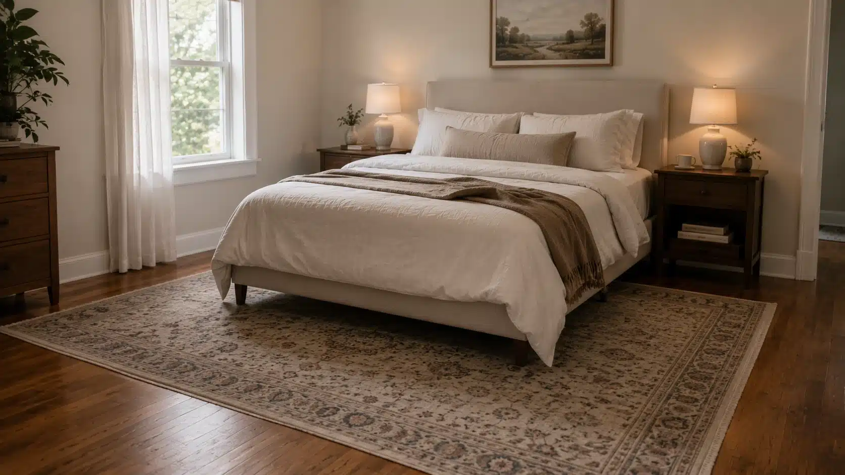
Bed Size or Type Mattress Size Best Rug Size Works Best When Twin bed 38 x 75 in 5 x 7 or runner Small bedroom, one-sided landing space Full bed 54 x 75 in 6 x 9 or 8 x 10 Guest room or compact main bedroom Queen bed 60 x 80 in 8 x 10 Most standard bedrooms Queen bed in a small room 60 x 80 in 5 x 8 or 6 x 9 The rug sits near the lower half or foot of the bed Queen bed in a large room 60 x 80 in 9 x 12 Nightstands can sit fully on the rug King bed 76 x 80 in 9 x 12 A wider bed needs more side coverage California king bed 72 x 84 in 9 x 12 or 10 x 14 Longer bed and larger room Platform bed Varies by frame 8 x 10 or 9 x 12 A low profile needs enough visible rug around it Storage bed Varies by frame 8 x 10 or runners Drawer clearance matters near bed sides A rug under a queen bed sounds simple until the room starts arguing back. One size looks too small. Another covers too much floor. The bed frame, nightstands, room width, and walking paths all change what actually works. After years of solving real bedroom layout problems, I have seen the same mistake often: people choose a rug size before checking the full room. A standard queen mattress is 60 inches wide and 80 inches long, but the frame, bedding, and furniture make the footprint feel larger. That is why choosing a queen bed rug size should start with the layout, not just the label. The right rug gives your feet a soft landing, makes the bed feel settled, and leaves enough open floor around it. What Is the Best Queen Bed Rug Size? For most bedrooms with a queen bed, the best queen bed rug size is 8 x 10. It gives enough width on both sides of the bed for a comfortable landing, enough length to extend past the foot, and it does not take over the room. In a small bedroom, 6 x 9 or 5 x 8 can work when the rug sits lower under the bed or only near the foot. In a larger room, 9 x 12 gives a more complete layout because the bed and nightstands can both sit on it. A queen mattress is 60 inches wide. That sounds like a lot, but a rug needs to extend well beyond the mattress edges to look intentional rather than accidentally small. If the rug ends too close to the mattress, the bed can look like it is sitting on a narrow strip. If the rug is too large for the room, it starts to feel like wall-to-wall carpet rather than a defined area. The general rule that works most often is to aim for about 18 to 24 inches of rug showing on each side of the bed. That is why 8 x 10 is the safe middle answer for most queen bedrooms. For a small room where that much exposure would eat up the floor, size down. For a larger room with space to spare, size up. One thing worth saying clearly before moving forward: the rug does not need to match the mattress size exactly. It needs to fit the room and the full furniture footprint, which is a different calculation. If one rule is worth keeping: Choose 8 x 10 for a standard queen bedroom, then size up or down based on how much walking space is left after the bed and nightstands are placed. Important Factors When Choosing an Area Rug The right rug size depends on more than the mattress. A queen bed can feel very different once the frame, nightstands, bench, closet doors, and room width are all considered. Measuring the full layout before choosing is far more reliable than guessing from a mattress dimension alone. Room size: A tight room usually needs a smaller rug or runners. A larger room can handle 8 x 10 or 9 x 12 without crowding the floor. The rug should not press against every wall. Bed frame width: Upholstered beds, platform frames, and storage beds often extend beyond the mattress by several inches on each side. Measure the frame, not just the mattress, before sizing. Nightstand placement: Decide before buying whether the nightstands should sit on the rug, off the rug, or near its edge. That decision alone often determines whether 8 x 10 or 9 x 12 is the right call. Walking space: Leave enough clear floor around the bed so the rug does not block doors, closets, or dresser drawers. A rug that fights the room’s moving parts never looks right. Rug exposure: The visible rug matters most on both sides of the bed and at the foot, where it affects both comfort and visual balance. Those are the spots where size becomes obvious. Rug thickness: Thick rugs can block storage drawers and make furniture feel slightly uneven. Low-to-medium pile tends to be more practical under heavy bedroom furniture. Budget: Larger rugs cost more. It helps to know whether the room genuinely needs 9 x 12 or if an 8 x 10 in the right position looks just as complete. Cleaning needs: Bedrooms with pets, kids, or high dust may need washable, low-pile, or easy-vacuum options. Material choices matter as much as dimensions. Note: Measure the open floor around the bed before shopping. A rug that looks right online can feel wrong once it is in the room and partially under a heavy bed frame. Check door and drawer clearance before placing any order. The best rug is not always the largest one. It is the one that fits the room’s daily use, clears the furniture, and gives the bed enough visual weight without making the floor feel completely covered. Queen Bed Rug Size Ideas With Visual Layout Examples Each rug size changes the bedroom in a different way. Some create only a soft landing near the bed. Others make the whole sleeping area feel connected. Use these examples to match the rug size to the room and the layout, not just the mattress dimensions. 1. Small Accent Choice: 4 x 6 Rug A 4 x 6 rug is usually too small to support a queen bed layout on its own. It works better near the foot of the bed, beside one side, or as part of a layered setup. Use this size only when the bedroom is very tight, the budget is limited, or the goal is a small landing area rather than full coverage for the whole bed or frame choice. 2. Tight-Room Option: 5 x 7 Rug A 5 x 7 rug can work in a small bedroom, but it gives limited coverage around a queen bed. It is best placed toward the lower half of the bed instead of trying to reach the nightstands. This size is useful when floor space is tight, and the main goal is comfort near the foot and sides rather than a fully connected layout in narrow rooms with less clearance. 3. Small Practical Pick: 5 x 8 Rug A 5 x 8 rug is one of the smallest useful choices for a queen bed. It can sit under the lower third or lower half of the bed, depending on the room. This size works best in compact bedrooms where a larger rug would block walkways, doors, or drawers. It is not ideal for a fully connected bed area or wider side coverage on both sides of the bed. 4. Compact Standard Choice: 6 x 9 Rug A 6 x 9 rug gives better coverage than a 5 x 8 and can work well in smaller standard bedrooms. It usually starts below the nightstands and extends past the foot of the bed. This size is a good compromise when 8 x 10 feels too large, but the room still needs softness and structure around the bed without crowding the floor or making the bedroom layout feel overfilled. 5. Middle-Ground Layout: 7 x 10 Rug A 7 x 10 rug is useful when a 6 x 9 feels too narrow, but an 8 x 10 takes up too much floor space. It gives more side coverage and better length at the foot while still leaving the floor open. This size works well in average bedrooms, especially when the nightstands stay off the rug, and the bed is centered in the room with clear walking space left. 6. Best Overall Fit: 8 x 10 Rug An 8 x 10 is usually the safest queen bed rug size for most bedrooms. It gives enough coverage on both sides for a comfortable landing and enough length at the foot for the bed area to feel complete. This size works well under the lower two-thirds of the bed and is the best starting point before sizing up or down for the room without taking over the entire floor. 7. Large Bedroom Choice: 9 x 12 Rug A 9 x 12 rug works best in a larger bedroom with enough open floor around the bed. It can sit under the bed, on nightstands, and even on a bench at the foot of the room if the room allows it. This size gives the most coverage, but it can feel too large in a compact room where the rug sits too close to the walls or doors, or leaves almost no visible floor. 8. Runner Rugs Beside a Queen Bed Runners are a practical alternative when a full area rug is too expensive, too hard to move under the bed, or too large for the room. Place one on each side of the bed for symmetry, or use a single runner on the main walking side. This gives softness underfoot without forcing a large rug into a space that was not built for it. The visual difference between sizes is mostly about how much rug appears at the sides and foot of the bed. Smaller rugs act as accents. Medium rugs create a landing zone. Larger rugs connect the entire sleeping area into a single defined space. Ways to Place a Rug Under a Queen Bed Rug placement changes how the same size looks under a queen bed. The rug can sit under the lower two-thirds of the bed, run fully under the bed and nightstands, sit only at the foot, or be replaced by runners in narrow rooms. Knowing the placement option first makes size decisions much easier. Placement Style How It Works Best Rug Size Useful When Lower two-thirds Rug starts below the nightstands, extends past the foot 6 x 9 or 8 x 10 Standard room with a centered bed Full bed placement The rug sits under the bed, and both nightstands 9 x 12 for queen bed Larger bedroom with space to spare Foot-only Rug near the foot of the bed, extends into the open floor 5 x 7 or 5 x 8 Minimal rooms or tight floor plans Side runners Two runners sit beside the bed instead of one rug Runners 2.5 x 8 Narrow rooms or very heavy beds Asymmetrical shift The rug moves toward the open side when one side is near the wall Any size, adjusted Beds against a wall or corner layout Bench-at-foot layout Rug extends past the bench at the foot of the bed 8 x 10 minimum Rooms with a bench or storage at the foot Placement decides whether the rug feels connected to the bed or looks like a separate piece sitting nearby. Center the rug on the bed first, then adjust for nightstands, benches, doors, and walking space. Tip: Center the rug under the bed, keep equal rug exposure on both sides, and leave enough visible at the foot. Avoid placing nightstands half on and half off the rug. Use a rug pad for stability, test dimensions with painter’s tape before buying, check door and drawer clearance, and leave some floor visible around the edges for a balanced look. Should the Rug Go Under the Nightstands? This is one of the most common layout questions that comes up after the rug is purchased, which is usually the wrong time to be asking it. The answer depends on the rug size and the room. With a 9 x 12 rug, nightstands in a queen bedroom can usually sit fully on the rug with room to spare. With an 8 x 10 rug, nightstands may sit off the rug or partly near the edge, depending on how deep the bed and room are. With a 5 x 8 or 6 x 9, the cleaner look is usually to keep the nightstands off the rug entirely and let the rug sit lower under the bed. A rug placed under nightstands can look very intentional when done with the right size. When it is done with a rug that is slightly too small, the nightstand legs end up partially hanging off the edge, which tends to look more like a measurement error than a design choice. The cleaner rule is this: put both nightstands fully on the rug or keep both fully off it. Consistency matters more than forcing a large rug into a room that was not quite sized for it. This also applies when one nightstand is taller or deeper than the other, if the legs will not land cleanly on both sides, leave both off. What Rug Material Works Best Under a Queen Bed? A bedroom rug should feel good under bare feet, sit flat under furniture, and be easy enough to clean. The right material depends on budget, pets, allergies, and how frequently the bedroom is used. Rug Material Best For What to Know Wool Long-term use and comfort Soft, durable, and long-lasting. It is usually the most expensive option, but it holds up well under furniture over time. Cotton Guest rooms and low-use bedrooms Light, casual, and easy to move. It may wear faster in high-traffic rooms but works well in rooms with lighter daily use. Synthetic fibers Pets, kids, and easier cleaning Usually more budget-friendly and easier to clean. A practical choice for families, pet owners, or anyone who wants a washable option. Jute or sisal Natural texture and layered layouts Adds texture and a grounded look, but it is not always soft enough for bare feet beside a bed. Low-pile rugs Storage beds, robot vacuums, and heavy furniture Easier under-bed legs and less likely to make furniture sit unevenly. Also, simpler to vacuum. Medium-pile rugs Comfort-first bedrooms Softer underfoot than low-pile rugs. Check that doors, drawers, and storage bed openings still clear the pile height. For most queen bedrooms, comfort and daily maintenance matter more than a perfect showroom look. A soft, natural-fiber rug with a rug pad underneath will perform better over time than a more fragile option that shows wear near the nightstands. If there is any doubt between two pile heights, go lower, heavier furniture legs compress a thick pile unevenly and the uneven legs become the more noticeable problem. Common Queen Bed Rug Size Mistakes Most rug mistakes happen before the rug arrives. The size looks fine online, but the bedroom tells a different story once the bed, nightstands, doors, and walking paths are taken into account. Measuring only the mattress: A queen mattress is not the full footprint. Measure the bed frame, bedding overhang, and nearby furniture before choosing the rug. Choosing a rug that is too narrow: If the rug barely extends past the bed sides, it will not give enough landing space or visual weight. Letting the rug stop too short: The rug should extend past the foot of the bed so the lower part of the layout does not feel cut off. Pushing the rug against the wall: Center the rug on the bed, not the wall. Leave some visible floor around the room edges. Placing furniture legs unevenly: Avoid nightstands with one leg on the rug and one leg off. Decide furniture placement before buying. Skipping a rug pad: A rug pad improves grip, comfort, and shifting, especially under a bed and along daily walking paths. Skipping the tape test: Tape the rug size on the floor before ordering. This catches layout problems better than numbers alone. Choosing by price only: A smaller rug may cost less, but it can make the whole bed area feel unfinished if the size does not work. The safest way to avoid these is to measure the full bed wall, not just the mattress. If the rug provides enough side-landing space and clears the room’s moving parts, the choice is usually sound. Getting this right is one of those basic space planning decisions that changes how the whole room reads once it is done. Frequently Asked Questions Does the rug need to match the headboard wall exactly? No. Center the rug on the bed, not the wall. Rooms are rarely perfectly even, and centering on the wall can make the rug look slightly off. The bed is the main anchor point for placement. Should the rug extend under a bench at the foot of the bed? Yes. If the bench sits off the rug, the two pieces can look disconnected. For a bench at the foot, a minimum of 8 x 10 is usually needed. A 9 x 12 is better if the bench is deep. Can two smaller rugs work instead of one large rug? Yes. Two runners placed on each side of the bed can work well in narrow rooms. Keep both runners the same size for visual balance. This works best when the space between the bed and wall is tight on both sides. How much floor should show around the rug? Aim for about 18 to 24 inches of bare floor between the rug edge and the wall. In very tight rooms, even 12 inches of visible floor on the sides can be enough to keep the rug from looking wall-to-wall. Does a patterned rug change which size works best? Yes. Patterned rugs with large repeats need enough space for the pattern to read fully. A large bold pattern on a small rug can look cut off. For strong patterns, sizing up by one step, such as from 8 x 10 to 9 x 12, often gives the pattern room to work. What is the minimum rug size for a queen bed? A 5 x 8 is generally the smallest size that works as a standalone area rug under a queen bed. Anything smaller functions as an accent piece at the foot rather than a rug that supports the full layout. Does rug size change for a platform bed versus a standard frame? Not significantly, but a low platform bed needs more visible rug around it to keep the profile from disappearing into the floor. An 8 x 10 or 9 x 12 tends to work better with platform frames than a 6 x 9, which can make a low-profile bed feel even more compressed. Is an 8 x 10 rug big enough for a queen bed with two nightstands? In most standard-sized bedrooms, yes. The nightstands will likely sit off the rug or at its edge with an 8 x 10. If you want both nightstands fully on the rug, size up to 9 x 12 and confirm the room has enough open floor left around the edges. Final Takeaway Choosing the right queen bed rug size depends on the room, not just the mattress. For most standard bedrooms, 8 x 10 is the safest choice because it gives good side coverage, enough length at the foot, and still leaves open floor. For smaller rooms, 6 x 9 or 5 x 8 can work when placed lower under the bed. For larger rooms, 9 x 12 works well when the nightstands can sit on the rug too. Before buying, tape the rug size on the floor and check the bed, nightstands, doors, and walking paths. The right rug should give your feet a soft landing, keep the furniture balanced, and leave enough floor visible around the edges.
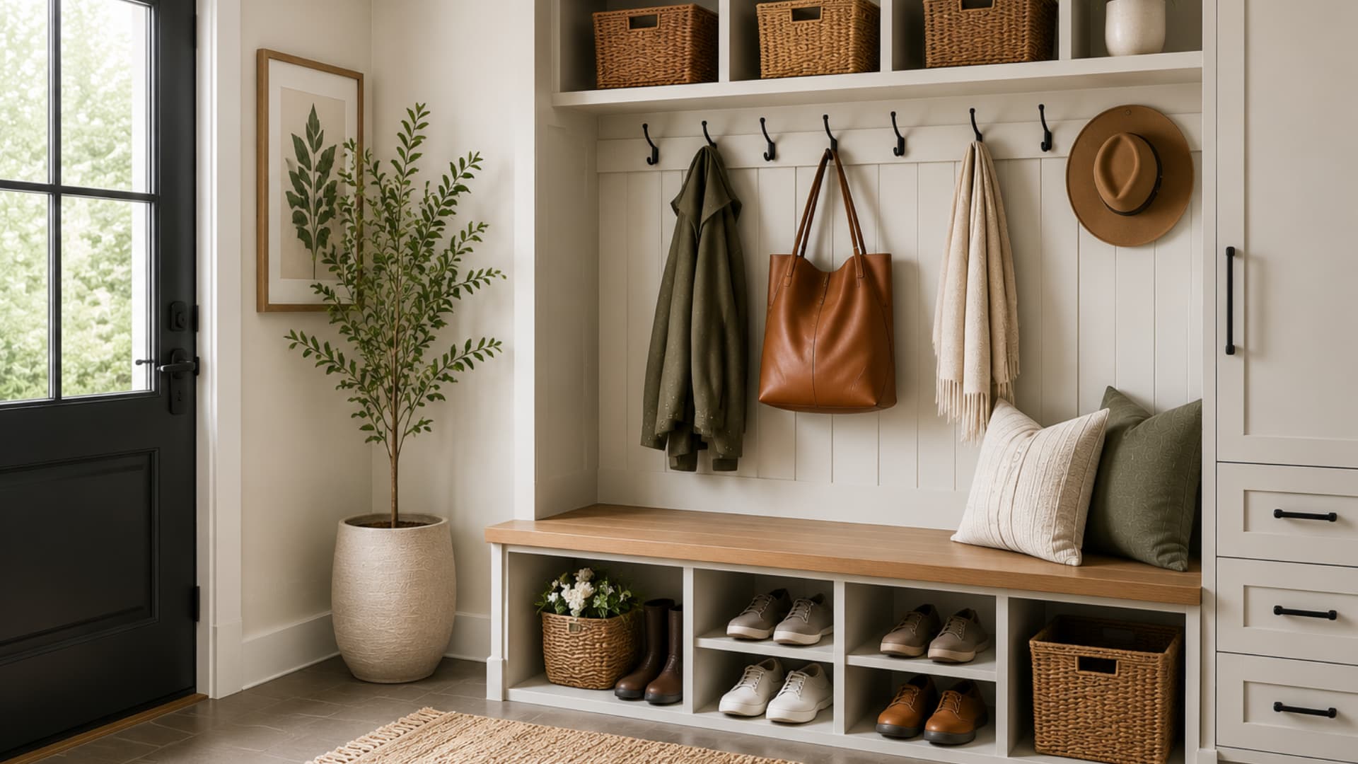
A mudroom is a transition zone near your home’s entrance where shoes come off, coats get hung, and daily clutter stops before it reaches the living room. That is the plain definition, and it is the only one that matters. If your entry is where wet boots, backpacks, dog leashes, and umbrellas pile up every single day, you already know the problem a mudroom is built to solve. The confusion usually comes from the photos. Some mudrooms are entire rooms with built-in lockers, laundry machines, and pet-washing stations. Others are a bench, three hooks, and a boot tray wedged into a hallway corner. Both work. The size is not what makes it a mudroom. The function is. I am going to break down what belongs in a mudroom, where it typically goes in a home, how it compares to a foyer or entryway, and which design approaches are worth your time depending on how much space you are actually working with. The One Job a Mudroom Does Every mudroom design decision should come back to a single question: Does this help contain the mess before it gets into the rest of the house? The purpose is not decoration. It is containment and transition. Shoes track in dirt, water, salt, and mud. Coats hold moisture. Backpacks carry everything from sports gear to grocery bags. A mudroom gives all of those items a defined landing spot near the door they actually enter through, which is usually the garage door, side entry, or back door, not the front. When it works, the rest of the house stays cleaner and daily routines run faster. When it does not work, it is usually because the storage does not match how the household actually moves through the entry. Key Features Every Mudroom Needs The features worth building around are the ones that match how your household actually enters and exits. A family of five with kids in sports needs different storage than a couple with two dogs. Start with the essentials and add from there. Bench or seating: The single most practical addition. Sitting down to remove shoes is a habit people will actually follow. Standing while balancing on one foot is not. Hooks or peg rails: Wall-mounted hooks keep coats, bags, hats, and leashes off the floor without consuming any footprint. A peg rail at 60 to 66 inches from the floor works for adults; drop a lower row at 42 to 48 inches for kids. Shoe storage: Cubbies, shelves, drawers, or boot trays. Open cubbies are easiest for daily use; closed drawers hide the mess. If you have kids, open cubbies win on habit compliance. Cubbies or lockers: Assign one per person. This is the move that eliminates the “where is my stuff” problem. Each cubby holds a backpack, a coat, and whatever gear belongs to that person. Closed cabinets: Everything that does not need to be grabbed on the way out the door, cleaning supplies, pet food, spare bags, and seasonal gear go behind a door. Durable flooring: Tile, luxury vinyl plank, sealed concrete, or brick. Any of these can handle water, mud, salt, and heavy daily use. Carpet does not belong here. Baskets and bins: Gloves, sunscreen, pet towels, reusable grocery bags, and accessories need a home. Baskets and bins keep these from becoming a pile on the bench. Good lighting: Overhead or wall-mounted task lighting. A dim entry makes cleaning up messes harder and the space feel smaller than it is. Mirror: A wall-mounted mirror frame near the door gives everyone a last check before heading out and adds reflected light to a typically darker entry. Optional sink or pet wash: Worth planning for during a renovation if you have dogs, do heavy gardening, or deal with sports gear regularly. Retrofitting plumbing is expensive. Building it in once is not. Laundry access: Many mudrooms run adjacent to or directly into the laundry room. Wet clothes, muddy uniforms, and sports gear go straight from the door to the wash. A small mudroom does not need everything on this list. A bench, hooks, and somewhere for shoes will outperform a space with no plan at all. Build what fits the space, then add once you see what the daily routine actually demands. Popular Mudroom Design Styles Design style matters less than the storage system behind it, but a coherent visual approach does make the space easier to live with. These are the four approaches I see work most consistently in real homes. 1. Modern Mudroom Modern mudrooms prioritize hidden storage and a visual calm that extends from the rest of the home. Shoes, coats, and bags go into closed cabinets and labeled compartments. Neutral tones, typically white, grey, or warm wood, keep the entry feeling consistent with adjacent rooms. The result is a space that does not visually announce how much daily chaos it is absorbing. This approach works especially well in open-plan homes where the entry is visible from the main living area. If someone can see your mudroom from the living room, hidden storage pays off more than open cubbies. 2. Farmhouse Mudroom Farmhouse mudrooms are built to look lived-in while staying organized. Rustic wood benches, shiplap or beadboard walls, black metal hooks, and woven baskets do most of the design work. Open cubbies make access fast, which matters in a household where kids and gear move in and out quickly. The warmth of the materials makes this a forgiving style. It does not look wrong when it is slightly messy, which is exactly what a working mudroom needs to be. 3. Minimal Compact Mudroom This is the approach for apartments, rentals, and tight entryways where a full built-in is not possible. A slim bench, wall-mounted hooks, narrow shoe storage, and a small basket for keys and accessories cover the essentials without making the entry feel cramped. The key discipline here is editing: every element earns its place, or it does not go in. Decorative objects that do not help contain mess come out. Visual openness is what makes a small entry feel workable rather than claustrophobic. 4. Luxury Built-In Mudroom Luxury mudrooms are custom-built spaces where every element is specified to handle daily load while looking like it belongs in the rest of the home. Full-height cabinetry, soft-close drawers, built-in lighting inside cabinets, and premium materials like wood panels, quartz, or stone countertops make these function as well as they photograph. Optional additions, a pet-washing station, a charging drawer, and a laundry chute are planned into the design from the start rather than retrofitted later. If you are building or doing a full renovation, this is when to add them. Small Mudroom Ideas for Compact Homes You do not need a dedicated room to get mudroom function. These three approaches consistently work in smaller homes, apartments, and tight entryways. 1. Narrow Hallway Mudroom A narrow hallway mudroom setup focuses everything on the wall and keeps the floor clear. Wall-mounted hooks at two heights cover adults and kids without consuming any footprint. A shallow floating shelf above the hooks handles hats and small baskets. A slim bench, 14 to 16 inches deep, provides seating without blocking movement through the hallway. This works in any entry that is at least 36 inches wide, which is the minimum clearance for comfortable daily use. The same traffic-flow logic that applies to furniture spacing in living rooms applies here: people need to move without turning sideways. 2. Vertical Storage Solutions In compact mudrooms, the floor is the most valuable space. Keep it clear by moving everything vertically. Tall cabinets for shoes and coats use wall height from floor to ceiling, keeping everyday items organized without spreading out. Hanging organizers for bags and accessories add storage without adding footprint. The visual result is a taller-feeling entry, which is the opposite of what most small entryways suffer from. 3. Multi-Use Entry Corner Design A corner bench with wall hooks and a small storage unit stacked above it puts seating, coat storage, and shoe storage into a single compact footprint. This works in apartments and small homes where there is no corridor to line with storage. The corner location means the bench does not block a traffic path, which is the usual problem with standalone benches in tight entries. It also creates a defined drop zone that does not visually intrude on the rest of the room. Best Materials for a Mudroom A mudroom handles more daily moisture, dirt, and impact than most rooms in the house. Materials need to be easy to clean first, and good-looking second. Feature Good Options Why It Works Flooring Tile, luxury vinyl plank, sealed concrete, brick, stone Handles moisture, dirt, and heavy daily traffic Walls Semi-gloss paint, beadboard, washable paneling, tile accents Wipes clean; flat paint absorbs splashes and stains Storage Painted cabinets, solid wood, metal hooks, durable shelving Holds heavy coats, bags, shoes, and gear without warping Rugs and Mats Washable rugs, indoor-outdoor runners, boot trays Traps water and mud at the door; must be machine-washable to stay clean One note on flooring: if you have pets or kids in sports, lean toward large-format tile or luxury vinyl plank flooring. Small tile formats have grout lines that collect mud and are difficult to scrub clean. Luxury vinyl plank is the most budget-friendly option that still handles moisture well, and it works with underfloor heating if the entry is cold in winter. Mudroom vs. Entryway vs. Foyer These three terms get used interchangeably online, and they are not the same thing. Understanding the difference helps you figure out which approach your home actually needs. Space Main Purpose Common Features Best For Mudroom Controls mess and stores daily outdoor items Bench, hooks, cubbies, shoe storage, durable flooring Families, pets, sports gear, wet weather, daily drop zones Entryway Creates a practical arrival point Console table, hooks, mirror, rug, light storage Everyday arrivals, guests, keys, shoes, light storage needs Foyer Creates a formal welcome area Lighting, decor, mirror, table, statement rug Guest-facing front entries and first impressions The simplest way to decide which one you need is: if you are dealing with mud, wet gear, sports equipment, or multiple people’s daily bags, that is a mudroom problem. A foyer is about the impression the home makes. A mudroom is about what actually happens when the family walks in the door. Mudroom Design Mistakes to Avoid Most mudrooms that fail do not fail because of budget. They fail because the storage does not match the actual daily habit. Here are the mistakes I see most often. No seating: Without a bench or chair near the door, taking shoes off means balancing against the wall. People stop doing it, and shoes end up everywhere. Wrong flooring: Soft or textured flooring holds moisture, dirt, and odors. It also cannot be mopped. Use hard, smooth surfaces. Open storage only: Open hooks and cubbies are practical for daily items, but without any closed storage, the visible mess accumulates fast and the space never looks controlled. No plan for wet items: Wet shoes, umbrellas, rain jackets, and dog towels need boot trays, drip hooks, and washable mats. Without them, moisture spreads onto the floor and walls. Ignoring small items: Keys, mail, sunglasses, pet bags, charging cables, and accessories need dedicated containers or drawers. A bowl on the bench is not a system. Choosing the wrong entry: The mudroom should be near the door the household actually uses most, which in most homes is the garage door or a side entry, not the front door. Too much decor: A mudroom can look good. But every decorative item that does not help contain mess is one more thing to clean around. These mistakes are fixable at any stage. If you have an existing entry that is not working, start by identifying which one of these is the actual problem before spending on a new setup. Mudroom Photo Checklist Before you save a mudroom inspiration photo, run it through this checklist. A photo can look organized in perfect light with no one’s actual belongings in it. What matters is whether the layout would work in your real entry on a real morning. Checklist Item What to Check Entrance location Is it near the door your household actually uses most? Floor clearance Can two people pass through it without squeezing? Hook count Is there one hook per person in the household, minimum? Bench depth Is it at least 14 inches deep for comfortable seating? Shoe plan Is there dedicated shoe storage, not just floor space beside the bench? Flooring type Can it be mopped or wiped after a muddy day? Wet gear storage Is there a plan for dripping umbrellas and wet boots? Kid and pet access Can everyone in the household reach their own storage? Daily maintenance Would this layout stay tidy on a normal Tuesday, not just after a photoshoot? Use this checklist as a filter, not a final decision. The best mudroom idea for your home is the one that matches your real entry size, the number of people using it, and the gear they actually carry through that door. Frequently Asked Questions Does a mudroom add value to a home? A well-organized mudroom adds practical value that buyers notice, particularly in family homes and wet climates. It signals that the home handles daily life well. A built-in mudroom with quality materials can contribute to resale appeal, though exact return on investment depends heavily on regional buyer expectations. Can I add a mudroom to an existing home without major renovation? Yes. Hooks, a bench, shoe storage, and baskets near your most-used door create mudroom function without construction. Unused closets, hallway corners, and garage entries are all workable starting points. Built-ins give you more storage, but they are not a requirement to get the benefit. What is the minimum space needed for a mudroom? A workable mudroom can fit in a 4-foot-wide wall section. A bench at 16 to 18 inches deep, wall hooks above, and a boot tray on the floor is enough for one or two people. For a family of four or more, plan for at least 6 to 8 feet of wall length to give each person a dedicated zone. What flooring is best for a mudroom? Large-format porcelain tile and luxury vinyl plank are the two most practical choices. Both handle moisture well, are easy to mop, and hold up under daily foot traffic. Avoid small-format tile with many grout lines, as mud collects in grout and is difficult to scrub out consistently. What should not be stored in a mudroom? Valuables, important documents, and electronics should not live in a mudroom. The space is exposed to moisture, temperature swings, and heavy traffic. Anything sensitive to those conditions belongs in a more controlled interior space. What is the best lighting for a mudroom? Overhead flush-mount or recessed lighting works for most mudrooms. If the entry is very small, a wall sconce at eye height avoids the flat-lit shadow that overhead fixtures create in narrow spaces. Aim for at least 50 foot-candles at floor level so you can spot mud and clean it before it tracks further into the house. Do I need a mudroom if I have a foyer? A foyer and a mudroom solve different problems. A foyer manages first impressions. A mudroom manages daily mess. If your foyer is where shoes, bags, and coats actually accumulate every day, adding mudroom storage to that space is worth considering, even if it changes the visual character of the entry slightly. Final Thoughts Creating an organized drop zone is all about mapping out your household’s actual patterns rather than just trying to copy a flawless interior design photo. Knowing what is a mudroom functionality allows you to prioritize simple habit compliance, keeping wet gear, heavy bags, and dirty shoes safely contained right at the door. Choosing durable, low-maintenance flooring and installing dedicated hooks or benches will immediately save you hours of deep cleaning. Now that you know how to maximize vertical space and avoid common layout mistakes, you can build a setup that fits your routines perfectly. Which storage features do you need the most? Share your thoughts below, or check out my related home organization guides to get started.